 TVC Helium 2022.1.0
./tvc-helium-2016.1.0.sh -silent -exploded -target=/opt/enovia/webapps/helium
TVC Helium : Configuration Guide
05 May 2016
Table of Contents
1. Legal Notes
© Copyright 2015-2019 by TECHNIA AB
All rights reserved.
PROPRIETARY RIGHTS NOTICE: This documentation is proprietary property of TECHNIA AB. In accordance with the terms and conditions of the Software License Agreement between the Customer and TECHNIA AB, the Customer is allowed to print as many copies as necessary of documentation copyrighted by TECHNIA relating to the software being used. This documentation shall be treated as confidential information and should be used only by employees or contractors with the Customer in accordance with the Agreement.
This product includes software developed by the Apache Software Foundation. (http://www.apache.org/).
2. TVC Helium
2.1. What is it?
The Technia Value Components (TVC) product suite has existed for 10+ years, and contains well-established products such as Structure Browser, Graphic Reporting and File Manager. TVC Helium is the new version of these components, with the first General Availablity release in May of 2016.
|
Please note that not all features and functionality of TVC Classic have been implemented in TVC Helium. |
2.2. Which are the differences compared to TVC Classic?
The progress of HTML5, JavaScript and web browsers enable us to move HTML rendering and parts of the business logic to the client side, within the end-user’s web browser.
-
You will likely use JavaScript more, but Java is still the backend language.
-
You will no longer render HTML on the server, but instead populate HTML templates on the client, which you will pass JSON response into.
2.3. What are the benefits?
Helium components are designed to be as efficient as possible in terms of reducing server requests, and they support consuming data from any backend serving JSON data. Server calls made by Helium do not return entire prerendered HTML pages - only the JSON data needed to populate the views, which are already cached on the client. This makes server requests both fewer and smaller, leading to benefits in terms of reduced data traffic and shorter load times. In short: Helium is faster and generates less server load.
TVC Helium pages consist of column based grids or dashboards, with all your data placed inside rearrangeable widget containers. This allows for a responsive, customizable design and seamless adoption to mobile devices. Helium is designed with the flat design concept in mind, for a modern, very lightweight look and feel. In short: Helium looks modern and it works on mobile devices.
3. System requirements and supported platforms
In general, TVC Helium supports the same operating systems and backend stacks as TVC Classic. However, due to the shift towards client side driven logic and extended use of HTML5 and next-gen JavaScript, Helium has additional requirements on the web browsers.
Browser support is therefore limited to so-called evergreen web browsers, which means browsers that are automatically updated. Firefox and Internet Explorer 11 belong in this category, whereas older Internet Explorer versions do not. Google Chrome is also supported for Helium in standalone mode.
For Helium in embedded mode with Internet Explorer, see IE Compatibility mode.
As TVC Helium is responsively designed, and therefore can be used on mobile devices, these browsers are also supported. For details on Mobile support, see OS and browser support.
4. Installation
| Prior to installing TVC Helium, you must install TVC Classic in the same release version (e.g. 2019.4.0 for both installers). |
TVC Helium does not contain any schema entities, hence the items being installed are solely web-application related files.
TVC Helium is distributed as an installer, one for Windows and one for UNIX like systems.
These installers will guide you through the installation and you will only need to answer a few questions.
After completing the installation, don’t forget to setup your Helium.xml configuration file, which controls elements like the login page, start page and commands in the topbar menu. An example file is included with the deployed webapp folder.
4.1. Silent Installation
You may install TVC Helium in silent mode. See example command below for details:
4.2. /META-INF/web-fragment.xml
The TVC Helium JAR file contains a /META-INF/web-fragment.xml, which contains
the necessary web application descriptor content for Helium to work in a
standard J2EE Web Application.
If you install to a web-application that has the metadata-complete="true" set
in the WEB-INF/web.xml file, you need to manually configure your web.xml file and
include the necessary configurations for Helium to work.
The web-fragment.xml file that is part of Helium looks like this:
<?xml version="1.0" encoding="UTF-8"?>
<web-fragment xmlns:xsi="http://www.w3.org/2001/XMLSchema-instance"
	xmlns="http://java.sun.com/xml/ns/javaee" xmlns:web="http://java.sun.com/xml/ns/javaee/web-app_2_5.xsd"
	xsi:schemaLocation="http://java.sun.com/xml/ns/javaee http://java.sun.com/xml/ns/javaee/web-fragment_3_0.xsd"
	id="tvc-helium" version="3.0">

	<filter>
		<filter-name>routing-filter</filter-name>
		<filter-class>com.technia.helium.core.routing.RoutingFilter</filter-class>
	</filter>
	<filter-mapping>
		<filter-name>routing-filter</filter-name>
		<url-pattern>/goto/*</url-pattern>
	</filter-mapping>

	<welcome-file-list>
		<welcome-file>/helium/main.jsp</welcome-file>
	</welcome-file-list>

</web-fragment>
4.3. IE Compatibility mode
Helium does not support ie compatibility mode but there are ways tell the browser to ignore this setting. Helium in standalone mode add these tags by default. For Helium embedded in tvc classic there is a filter that can be added to the web.xml that does the same.
Add to Web.xml
<filter>
      <filter-name>IECompatabilityFilter</filter-name>
      <filter-class>com.matrixone.apps.domain.util.IECompatabilityFilter</fil
ter-class>
      <init-param>
         <param-name>http-equiv</param-name>
         <param-value>X-UA-Compatible</param-value>
      </init-param>
      <init-param>
         <param-name>content</param-name>
         <param-value>IE=edge</param-value>
      </init-param>
   </filter>
   <filter-mapping>
      <filter-name>IECompatabilityFilter</filter-name>
      <url-pattern>*.jsp</url-pattern>
   </filter-mapping>
   <filter-mapping>
      <filter-name>IECompatabilityFilter</filter-name>
      <url-pattern>*.htm</url-pattern>
   </filter-mapping>
   <filter-mapping>
      <filter-name>IECompatabilityFilter</filter-name>
      <url-pattern>*.html</url-pattern>
   </filter-mapping>
4.4. Caching Client Resources
This feature requires https
|
Helium can use Service Workers to cache some service (dynamic) and static resources (.js, .css, .png etc.) so that they are served from the cache instead of making network requests.
4.5. Post Installation Configuration
4.5.1. Security Context in Helium
If security context is enabled for the 3DExperience platform and users wish to use it while working with Helium then administrators can enable it for them by configuring below entry in tvc.properties or as init-param in web.xml with value true.
tvc.core.login.useSecurityContext = true
5. Helium on Mobile devices
Being dashboard based, Helium is designed to work very similarly on a mobile device, compared to a computer. Some UI elements like the Topbar, are adjusted to better fit the screen size and orientation. Widgets are stacked vertically if they do not fit side by side. Elements such as icons may also become a bit larger, to increase touch screen usability.
On a mobile device, you may also leverage even more of the Progressive Web App characteristics. Read more about this in the following section.
5.1. OS and browser support
TVC Helium is continuously tested and validated with latest versions of Apple iOS (with Safari as browser) and Android (with Chrome), on both mobile and tablet devices.
Please note that some features of Helium may be unavailable on handheld devices, and some behaviour may on the other hand be exclusively applicable for handheld devices (such as device vibration or a different notification mechanism).
5.2. Progressive Web App
The Progressive Web App design approach to a web application is in part enabled by the Service Worker browser capability, that enables caching of data for later use. This, along with SSL, are prerequisites for using Helium in Offline mode. Please refer to the Cache section to learn about ServiceWorkers and which tvc.properties exist to enable it, also guaranteeing that static files like JS and CSS are cached by the browser.
5.3. Installable behaviour
With the Helium webapp folder, a manifest file called manifest.json is deployed. When a user opens the Helium webapp URL in their browser, the browser will prompt* the option to install the Helium webapp.
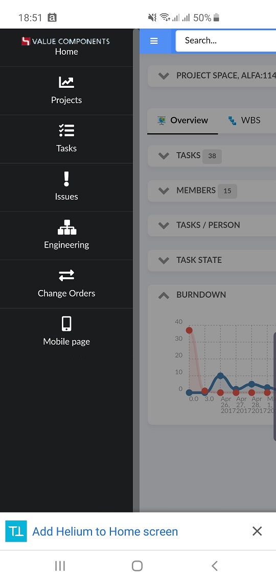
Figure 1. Chrome prompting user to install the app
If the user accepts, they can then launch the webapp independently of their web browser, with a native-like behaviour, that minimizes the URL bar to give the webapp UI the fullcreen size. When multi tasking between applications, the app will also look and behave like a native app.
*behaviour varies depending on browser.
On iOS/Safari, manually adding the App to Homescreen may be needed.


5.3.1. 3DPassport specifics
In a 3DExperience environment with 3DPassport, it may be necessary to exclude this file from the default servlet filters. Below you can find an example on how to do this.
<filter>
   <filter-name>CAS Validation Filter</filter-name>
   <filter-class>com.dassault_systemes.dspassport.cas.client.validation.DynamicServiceUrlCas20ProxyReceivingTicketValidationFilter</filter-class>
   <init-param>
   <param-name>skipFilterUrlPatterns</param-name>
   <param-value>/helium/manifest.json</param-value>
   </init-param>
</filter>

<filter>
   <filter-name>CAS Authentication Filter</filter-name>
   <filter-class>com.dassault_systemes.dspassport.cas.client.authentication.DynamicServiceUrlAuthenticationFilter</filter-class>
   <init-param>
   <param-name>skipFilterUrlPatterns</param-name>
   <param-value>/helium/manifest.json</param-value>
   </init-param>
</filter>
5.4. Offline functionality
If the Helium webapp detects that you have lost your network connectivity, it will indicate the offline status with a CSS class on the body element. You can then choose how this will be rendered in UI; using our examples you can e.g. color the Topbar element gray to indicate that you are not currently connected.
To keep using Helium offline in scenarios like this, you can leverage features like cached navigation to your previously visited Helium pages. To set this up, please refer to the example configuration, which you can customize for your needs.
In addition, it’s also possible to manually save object pages, e.g. for planned offline scenarios. To configure this behavior, please see Saving object pages for offline access.
5.5. Scan QR/ EAN/ DataMatrix Codes
A command can be added in the topbar or in any widget toolbar to allow scanning of QR, EAN and DataMatrix codes. By default, if the scanned content is detected as Enovia/ 3DEXPERIENCE object id, the framework will open corresponding object else it’ll perform a search for the matched content.
The default behavior can be overridden by providing a callback, onScanComplete. Once the framework detects a code, it’ll invoke the callback with the scanned content.
5.5.1. Configuration
Following examples demonstrate how a command can be configured
-
Topbar
  <Command>
      <Label>Scan Code</Label>
      <FontIcon>qrcode icon</FontIcon>
      <URL href="javascript:App.scanner.create({options: {'onScanComplete': App.hex.onCodeDetect}});" />
</Command>-
Widget Toolbar
  <Command>
      <Label>Scan Code</Label>
      <FontIcon>qrcode icon</FontIcon>
      <OnClick>App.scanner.create</OnClick>
      <!-- Optional -->
      <OnClickParams>{
        "onScanComplete": "App.hex.onCodeDetect"
       }
       </OnClickParams>
  </Command>
By default, back camera will be used to scan codes. It is also possible to have programmatic control over the scanner (for e.g. scan with own preferred camera) using JavaScript. More information on how to do so can be found in App.Scanner JS documentation.
Scan QR/ EAN/ DataMatrix Codes
5.6. Vibration
A javascript call can add vibration feedback for supported devices.
For more information see the App.Utils JS documentation.
App.Utils.vibrate();6. Routing General
In Helium, each business object the user is visiting is mapped to a page that defines the content to display. The mapping between business object and page is made within the main configuration file, called Helium.xml.
An example snippet of such a mapping is shown below:
<PageMapping>
   <!-- Route to displaying the 'PartPage' if the type of the current object is a part,
       and the state of the object is 'Released' and the current user belongs
       to the 'SeniorDesignEngineer' or 'ManufacturingDesignEngineer' roles,
       otherwise try the next page. -->
    <Page namespace="helium" name="PartPage.xml">
        <Type is="type_Part" and="current == Released">
            <Access>
                <Role>role_SeniorDesignEngineer</Role>
                <Role>role_ManufacturingDesignEngineer</Role>
            </Access>
        </Type>
    </Page>
    ...
The page mappings are read in the order they are defined, and the first match will define how the page is configured (e.g. the Dashboards / Widgets).
6.1. Route - URL Mapping
The routing framework in Helium is mapped to the following URL pattern:
/goto/*
This means that any URL that contains the /goto/… relative from the context root
will reach the Helium routing filter.
|
If the user is not logged in, e.g. the session has expired or the user clicks on a saved link, the routing framework will redirect the user to the login page that has been configured for Helium. After login, the login mechanism together with the routing framework will try to resolve the link again, so that you are redirected to where you initially tried to navigate. |
6.2. Route to Object
The URL to a particular business object is by default:
http://server:port/app/goto/o/Type/Name/Revision
                           ^^^
The first path part after the /goto url is /o, which
will trigger the object route mapping logic.
The URI after /goto/o/ must contain at least the Type and Name.
If the third parameter (revision) is omitted, the routing framework will make a query and
find the latest revision of the object having the specified Type and Name.
Example URL:
http://192.168.0.1:8080/app/goto/o/Hardware+Part/A-000002/6
For security reasons, the URI may not contain wild-cards
such as * or ?. In such cases, an exception is thrown.
|
6.3. Route to Global Page
A global page is a page that does not require a business-object as context. A global page is typically used as the first page the user see in Helium after login. The URL to a global page is by default:
http://server:port/app/goto/p/NameOfPage
                           ^^^
This will map to the page tvc:page/NameOfPage.xml.
If you want to map to a page in a sub-domain, see the next example:
http://server:port/app/goto/p/domain/subdomain/NameOfPage
This would then map to the page resource tvc:page:domain:subdomain/NameOfPage.xml.
You should omit the .xml suffix in the URL
|
See this page for more information about server side configuration within XML files.
6.4. Route to Dashboard
Routing to dashboard is typically used when embedding a Helium dashboard in another application, e.g. 3DExperience. Read the embedding chapter for more details.The URL to a dashboard is by default:
http://server:port/app/goto/d/NameOfDashboard
                          ^^^
This will map to the dashboard tvc:dashboard/NameOfDashboard.xml.
The dashboard may either have a context or be context-less. A widget in a dashboard showing details for a specific part is an example of a dashboard
with context and a widget in a dashboard listing recently visited object is a
example of a dashboard without context. Use the parameter objectId to
specify the context object.
Example showing a part details dashboard with a context:
http://server:port/app/goto/d/PartDetails?objectId=1.2.3.4
6.5. Route to Widget
Routing to widgets is typically used when embedding a single Helium widget in another application, e.g. 3DExperience. Read the embedding chapter for more details.
The URL to a widget is by default:
http://server:port/app/goto/w/NameOfWidget
                           ^^^
This will map to the widget tvc:widget/NameOfWidget.xml.
Mapping to widgets in sub-domains works in the same way as when routing to pages.
The widget may either have a context or be context-less. A widget
showing specifications for a specific part is an example of a widget
with context and a widget listing recently visited object is a
example of a context-less widget. Use the parameter objectId to
specify the context object.
Example showing a specification widget with a context:
http://server:port/app/goto/w/Specifications?objectId=1.2.3.4
When routing to a widget the Helium page is rendered without
the topbar menu and the widget rendered as headerless.
Note that actions in the header are not available when the widget is
displayed in headerless mode. For example, it’s not possible for users
to reset customizations unless an action is added inside the widget
(e.g. in the toolbar).
| Drill down in widgets is not supported when routing to a widget |
| Actions that interacts with other widgets or the sidepanel are not supported when routing directly a widget. For example, the workflow chart and discussion column in a table will not work as it uses the sidepanel. If you want such functionality, you can use the Page action, which not only contains a Widget, but the full Page, including any configured Sidepanel. |
6.6. Route to File
The routing framework also handles files that are checked-in to a business object. The URL to a particular file is by default:
http://server:port/app/goto/f/Object-ID/Format/File-Name
                           ^^^
The first path part after the /goto url is /f, which
will trigger the file download mechanism.
Even though this routing logic exists, it will typically only be used internally in Helium.
7. Extended Configuration
7.1. Theme support
There are currently three different UI themes included with TVC Helium out of the box. The default theme "light" is a gray-ish. It’s also suitable if you want to build your own theme from scratch.

The second theme, called "flat", is a bit more inspired by material design, and will evolve towards using more colors, icons and other visual elements.

The third theme, called "blue", is a bit more inspired by Enovia out of the box, that easily blends in if you are using Helium in embedded mode. This theme will be automatically applied on Helium in embedded mode. To disable this behavior, use tvc.helium.embed.forceConfiguredTheme=true in tvc.properties. The default value is false.

The fourth theme named "white", which easily blends with 3DDashboard. This theme will automatically applied when helium is embeded in 3DDashboard.
To disable this behavior, use tvc.helium.embed.forceConfiguredTheme=true in tvc.properties. The default value is false.
To switch between themes, change the tvc.properties as below:
tvc.helium.theme.current=flat where the value can be flat, blue,white or light (default).
7.1.1. Dark Theme
Dark theme makes it easier for users to use the application in low-light environment and improves visibility. On mobile devices, it can also save battery life.

Every theme available in application has its dark mode and user can switch to dark mode by using Themes Menu.
User’s theme preferences are persisted at application level.
|
Native OS dark theme is also supported. This means that Helium reads your OS display preferences (Light or Dark) from Windows, Android, iOS or Mac OS and automatically applies it within Helium, unless you actively choose another theme from the Theme menu Dark theme is not supported in Internet Explorer. |
7.2. Custom Resources (Scripts, Stylesheets)
TVC Helium allows including custom scripts and stylesheets and make them available to the client.
Simply putting the files to be included somewhere below /helium/custom and the TVC Helium framework
will automatically pick them up for inclusion on the main.jsp page. A good recommendation is to
use the following structure for the files.
/helium/custom/js
/helium/custom/css
Script files must have the suffix .js and stylesheets .css otherwise they will NOT be included.
|
|
In a production environment, the number of requests made by the client to the server should be as low as possible. Try to concatenate and minify the scripts and stylesheets into a single file for optimal performance. |
| Ensure that TVC is running in production mode in production systems. This will force Helium to use its own concatenated files instead of requesting multiple scripts and/or stylesheets. Read more about Production mode in the admin guide for TVC Core. |
7.3. Custom Translations (i18n)
UI labels and other information that needs to be translated should be kept inside translation files, which are in JSON format.
Helium contains built-in translations located in the directory /helium/lang.
There is a file called default.json that contains the built-in translations used
internally by Helium. The files below /helium/lang should NOT be changed.
To customize the translations and/or provide translations required by your custom logic, you should put your own translation file below:
/helium/custom/lang
The base language you support should be put into the file /helium/custom/lang/default.json.
Translations go into locale specific files, example:
-
/helium/custom/lang/en_us.json
-
/helium/custom/lang/en.json
-
/helium/custom/lang/sv_se.json
-
…
You can also maintain translations in modules structure.
-
/helium/custom/lang/projects/default.json
-
/helium/custom/lang/projects/en_us.json
-
/helium/custom/lang/projects/en.json
-
/helium/custom/lang/projects/sv_se.json
-
/helium/custom/lang/parts/default.json
-
/helium/custom/lang/parts/en_us.json
-
/helium/custom/lang/parts/en.json
-
/helium/custom/lang/parts/sv_se.json
-
…
| The data must be well-formed JSON data, if not, the application does not load correctly. It is wise to run a validation tool to sanity check the JSON files before deployment. |
Please read more here.
7.4. Data Handlers
In many cases there is a need to select more complex data structures from an object and/or relationship, or deal with different kind of business rules. One place where you can do this is via so called data handlers.
Data Handlers is a concept that has been around in TVC since many years. It is a well proven way of doing these kind of things, and it allows you to do so without comprimising the performance.
Data Handlers are deeply described in the TVC Classic documentation package, both within the developer documentation as well as in the administration guides.
One important thing to remember when using Data Handlers in the context of TVC Helium, is that the data (normally kept inside instances of different Cell implementations) works in a slightly different way. E.g. since the consumer of the data is logic that is executed on the client, there must be possibilities to transfer custom data structures down to the client. The TVC Helium Framework has solutions for this.
7.4.1. JSONWriteable
Data handlers are responsible for creating Cell instances. A Cell in its simplest form is an instanceof a StringCell, IntCell, RealCell or BooleanCell, etc. These cells are simple because they typically only contain a single value or an array of values.
In more complex situations, you need to keep track of more information than
just a literal value, and you need to manage it in a special data structure.
So how do you transfer such data structure to the client? The solution is to
let your Cell implementation also implement an interface called com.technia.tvc.core.util.json.JSONWriteable.
This interface has one method:
void toJSON(JSONWriter writer)
So letting your cell implement this interface and implement the toJSON
method will let you transfer any kind of data structure to the client, where in most cases you will pass the JSON data into a Handlebar template that will render and display this data.
7.5. Cell Renderers replaced by Templates
In TVC Helium, you will not perform any HTML creation on server side. All HTML is created on the client, typically by using so called Handlebars templates. In general terms, this will mean that you will create a file containing a snippet of HTML, with {{brackets}} inserted where you want to display your data or perform logic on it.
Helium’s client side rendering means that features from TVC Classic like Cell Renderers, Field Renderers etc are NOT supported.
You can read more about Handlebars (a superset of Mustache) in their own documentation, at http://handlebarsjs.com
7.6. File Manager
7.6.1. Firefox Extension Alert
Firefox does not allow the side loading of the web extensions which fails to auto install the file manager plugin.
To address this issue, We have enabled a feature to show an alert message in firefox so that user can add the plugin manually by clicking the url available on the message. If user does not want to install the filemanager web extension, user can continue with fallback HTML UI and in that case user needs to disable the alert message by clicking on the button which says Do not show this message again.
tvc.office.filemanager.extension.firefoxInstallAlert=true
Default value is set to false.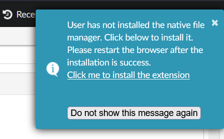
Figure 2. Filemanager extension alert for firefox.
7.7. Session timeout notification
Sometimes when user tries to edit some field but due to session timeout those changes might not get saved and he has to type in the value. To save these efforts a notification is shown to the user when session is timed out.
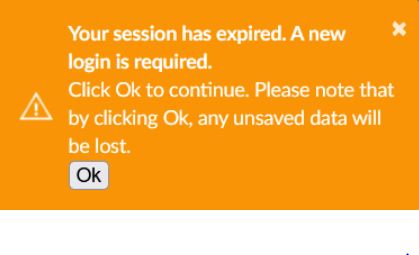
Figure 3. Logout Notification
This can be enabled by configuring below in tvc.properties
tvc.helium.showTimeoutAlert= true // defaults to false
In order to get this notification before getting timedout, this can configured as below:
tvc.helium.timeoutAlert= 60 // seconds
After adding abover property in tvc.properties user will get notifcaiton 60 seconds prior to the timeout so that they can save unsaved changes.
8. Components
This chapter describes the built in features of TVC Helium. Some of them may be configurable and some may not be enabled by default.
8.1. Helium
The main configuration of the application is performed in a file named Helium.xml which is located in WEB-INF/classes/.
This file is responsible for the following.
-
The name of the application
-
The login page of the application
-
What pages should be accessible and to which users
-
What the application topbar should contain
8.1.1. Configuration
The root element of the Helium.xml is <Application> and it supports the following child elements.
| Name | Description | Example |
|---|---|---|
Name |
The name of the application. May be visible in the TopBar. |
|
LoginPage |
Describes the LoginPage |
|
Sidepanel |
Describes the PageSidepanel |
|
DateFormat |
How should dates be formatted on the client. All moment.js formats is supported but each format must contain month, day and year. If the
element is omitted |
|
DateTimeFormat |
How should dates with time (used in some places like the history widget) be formatted on the client. All moment.js formats is supported. If the
element is omitted |
|
StartPage |
Specifies which page the user should be redirected to after a successful login (if no other page is requested). |
|
TopBar |
Specifies what the TopBar should contain. |
|
PageMapping |
Specifies the PageMapping. What pages are accessible given object type and what roles the user has. |
|
Login page
The <LoginPage> element is responsible for customization of the login page and it supports the following child elements.
| Name | Description | Example |
|---|---|---|
Path |
The path to the login page. |
|
Title |
The title of the login page |
|
FormTitle |
Specifies what title the login form should have. |
|
FormSubTitle |
Specifies what sub title the login form should have. |
|
TopBar
The TopBar is placed in a fixed, always-visible container in the top of the page, and it holds common actions and menus for the entire application.

Figure 4. Top Bar
The <TopBar> element supports the following child elements.
| Name | Description | Example | ||
|---|---|---|---|---|
ShowAppName |
Whether the application name should be visible or not. Valid values:
|
|
||
TooltipSettings |
Optional settings as given in Semantic Popup Settings can be passed for tooltip.
|
|
||
Left |
Child elements to the |
|
||
Middle |
Child elements that are aligned in the middle of the available remaining space between |
|
||
Right |
Child elements to the |
|
||
ShowBreadcrumb |
Whether the breadcrumb navigation should be visible or not. Valid values: true or false (default). See Breadcrumb section. |
|
Breadcrumb
A breadcrumb trail on a page indicates the page’s position in the application hierarchy. A user can navigate all the way up in the application hierarchy, one level at a time, by starting from the last breadcrumb in the breadcrumb trail. It has maximum length of 5 elements.
For breadcrumb trail to work properly, pages need Title element.
It is a fixed container below topbar of the and is configurable with ShowBreadcrumb setting in TopBar.
Figure 5. Breadcrumb
It is responsive by design. Once breadcrumb container exceeds device display width, it will get collapsed and an ellipsis icon will be shown to left of breadcrumb. One can expand it again by clicking on ellipsis icon.
Mobile Breadcrumb
Menu/Commands
The <Left> and <Right> elements mentioned above can have the following child elements.
Depending on their parent element, they will either be left or right aligned in the TopBar
| It is recommended to group commands in menus to avoid spill over of commands in topbar. |
| Name | Description | Example |
|---|---|---|
Separator |
Will render a horizontal separator |
|
Menu |
Will render a dropdown menu containing commands. The menu is defined in the xml referenced inside of the element. |
|
Command |
Will render a command. The command is defined in the xml reference from inside of the element. |
|
Dynamic Menu
Normally, a menu holds a list of pre-configured commands and/ or menus. As opposed to this, a dynamically defined menu allows different content. A dynamic menu is still configured as a regular menu, but has some extra settings which when configured allows developer to get control when the menu is activated. This means, it’s also possible to have a dynamic menu that has a mix of predefined commands as well as dynamically added ones.
An example of such a menu is Recently Viewed objects.
Options
| Name | Description | Required | Example | ||
|---|---|---|---|---|---|
dynamicmenu |
Defines a menu as a dynamic menu |
true |
|
||
href |
Ajax endpoint to fetch JSON data for dynamic content |
true |
|
||
id |
Unique identifier for the dynamic menu. Can be used, for e.g. to get hold of the menu from JavaScript. |
false |
|
||
template |
Reference to Handlebars template to render content on client |
false* |
|
||
onActivate |
JavaScript callback to handle menu when activated. If defined, it’s this callbacks' responsibility to configure dynamic menu content.
|
false* |
|
A JavaScript API, App.Topbar.dynamicMenus.getById(menuId) can be used to get access to the dynamic menu.
| Dynamic menus are currently available only in Topbar. |
Example
<Menu xmlns="http://technia.com/TVC/Menu" xmlns:xsi="http://www.w3.org/2001/XMLSchema-instance"
xsi:schemaLocation="http://technia.com/TVC/Menu http://products.technia.com/tvc/schema/latest/Menu.xsd">
<Label>recent.title</Label>
<Setting name="dynamicmenu" value="true" />
<Setting name="id" value="recent-objects" />
<Setting name="template" value="helium/templates/recentobject/recentobjectcommand" />
<Setting name="onClick" value="App.routing.open" />
<Setting name="onActivate" value="App.RecentObjects.render" />
<Setting name="href" value="tvc-action/heliumDataTable?config=tvc:tableconfig:helium:recentobject/RecentlyViewed.xml&reload=true&bindKey=foo" />
</Menu>Recently Viewed objects
"Recently Viewed" objects is a built-in dynamic menu which when configured shows a list of objects that the user has recently visited. The built-in menu uses TableConfig for defining and retrieving its data and a handlebars template to display the data. Both of them can be overridden if needed, for e.g. to fetch and display information in a different way.
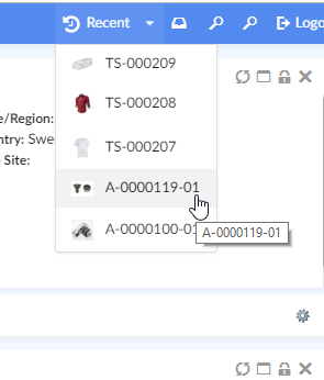
Figure 6. Recent Objects Menu
To enable it, add following in the Topbar definition in Helium.xml.
...
<TopBar>
<Right>
<Menu>tvc:menu:helium:recentobject/RecentlyViewed.xml</Menu>
</Right>
</TopBar>
...| Looking to configure recent objects in a widget instead? See Recent Object Widget Configuration for more information. |
Themes
"Themes" is a built-in dynamic menu which when configured gives user capability to switch between themes in real time. The built-in menu uses tvc.helium.themes property for retrieving the list of themes. Default value of this property is flat and light as tvc.helium.themes=flat|light.
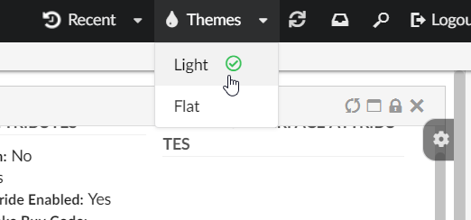
Figure 7. Themes Menu
To enable it, add following in the Topbar definition in Helium.xml.
...
<TopBar>
<Right>
<Menu>tvc:menu:helium:theme/ChangeTheme.xml</Menu>
</Right>
</TopBar>
...PageMapping
The <PageMapping> element controls which type of objects should be mapped to which pages. It is possible
to control the page mapping based on object type, object state and which access role the user belongs to.
This is done by creating a tree of Page elements with different rules. Given the following example:
<PageMapping>
<!-- Evaluate the 'PartPage' if the type of the current object is a part
and the state of the object is 'Released' and the current user belongs
to the 'SeniorDesignEngineer' or 'ManufacturingDesignEngineer' roles,
otherwise try the next page. -->
<Page namespace="helium" name="PartPage.xml">
<Type is="type_Part" and="current == Released">
<Access>
<Role>role_SeniorDesignEngineer</Role>
<Role>role_ManufacturingDesignEngineer</Role>
</Access>
</Type>
</Page>
<!-- If the above rule evaluates to false and the current object is of the 'Part'
type, evaluate 'OtherPartPage.xml' -->
<Page namespace="helium" name="OtherPartPage.xml">
<Type is="type_Part" />
</Page>
<!-- If the type of the page is ECR, evaluate the 'ECR.xml' page -->
<Page namespace="helium" name="ECR.xml">
<Type is="type_ECR" />
</Page>
<!-- If none of the above are true, evaluate the DefaultPage.xml -->
<FallbackPage namespace="helium" name="DefaultPage.xml" />
</PageMapping>The framework will try to evaluate the different pages from top to bottom until one of the criteria is met. If no
criteria is met, the <FallbackPage> will be evaluated.
The <PageMapping> element supports the following child elements.
| Name | Description | Example |
|---|---|---|
Page |
Specifies the current Page to evaluate via the Only evaluate the page if the rules given via the child elements |
|
FallbackPage |
The page to fall back to if none of the above rules have been applied. Supports the |
|
8.1.2. Example
<?xml version="1.0" encoding="UTF-8"?>
<Application xmlns="http://technia.com/helium/Application">
<Name>ACME</Name>
<LoginPage>
    <Path>/helium/login.jsp</Path>
    <Title>Login to Helium</Title>
    <FormTitle>Welcome to Helium</FormTitle>
    <FormSubTitle>Please enter your credentials</FormSubTitle>
</LoginPage>
<StartPage>
<Page namespace="helium">Page.xml</Page>
</StartPage>
<TopBar>
    <ShowAppName>true</ShowAppName>
    <Left>
        <Separator />
        <Menu>tvc:menu:helium/MyDashboards.xml</Menu>
        <Command>tvc:command:helium/ResetDashboards.xml</Command>
        <Command>tvc:command:helium/Create.xml</Command>
    </Left>
    <Right>
        <Myspace />
        <Search />
        <Logout />
    </Right>
</TopBar>
<PageMapping>
<Page namespace="helium" name="PartPage.xml">
<Type is="type_Part" and="current == Released">
<Access>
<Role>role_SeniorDesignEngineer</Role>
<Role>role_ManufacturingDesignEngineer</Role>
</Access>
</Type>
</Page>
<Page namespace="helium" name="PartPage.xml">
<Type is="type_Part" />
</Page>
<Page namespace="helium" name="ECO.xml">
<Type is="type_ECO" />
</Page>
<Page namespace="helium" name="ECR.xml">
<Type is="type_ECR" />
</Page>
<FallbackPage namespace="helium" name="DefaultPage.xml" />
</PageMapping>
<!--
<Sidepanel>
<Label>Collaboration</Label>
<OnInit>App.Collaboration.Panel.instance</OnInit>
</Sidepanel>
-->
</Application>8.2. Page
The page component contains Dashboards and/or Tabs. Each Dashboard holds references to one or more widgets and the Tabs element holds references to other Dashboards.
Pages are used when configuring start pages in the application. They are also used in the page mappings.
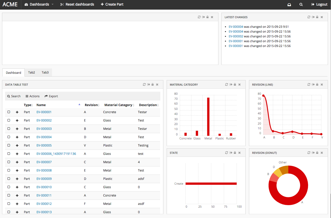
Figure 8. Page
8.2.1. Configuration
The <Page> element supports the following child elements.
| Name | Description | Example |
|---|---|---|
Title |
Optional. Page Title will be seen in browser window, and in Breadcrumb if enabled. Context object pages can use macros to resolve dynamic page titles. |
|
Dashboard |
Points to a reference to a Dashboard instance. |
|
Tabs |
Configures a list of Tabs |
|
Sidepanel |
Configures sidepanel Sidepanel |
|
Settings |
Simple key value pairs of settings that are passed to the page. If a setting named |
|
Access |
Defines access rules. |
See Access Control |
8.2.2. Example configuration
<?xml version="1.0" encoding="UTF-8"?>
<Page>
    <Title>${TYPE}, ${NAME}:${REVISION}</Title>
    <Dashboard ns="helium" name="TopPanel.xml" />
    <Tabs>
        <Tab>
            <Label>Dashboard</Label>
            <CacheBehaviour>disabled</CacheBehaviour>
            <Dashboard ns="helium" name="Dashboard.xml" />
        </Tab>
        <Tab>
            <Label>Tab2</Label>
            <CacheBehaviour>preload</CacheBehaviour>
            <Dashboard ns="helium" name="Tab2.xml" />
        </Tab>
        <Tab>
            <Label>Tab3</Label>
            <CacheBehaviour>cache</CacheBehaviour>
            <Dashboard ns="helium" name="Tab3.xml" />
        </Tab>
    </Tabs>
</Page>
8.3. Page Sidepanel
A sidepanel is a container component where additional content can be placed. It can be either built-in components like (Collaboration) or custom component with own rendering. The visibility of this sidepanel container is toggled by clicking it.
Each page supports defining a sidepanel which can be revealed (slided in) from the right side. When the page is first loaded, the initial state of the sidepanel can be controlled from the component’s status method. Ex: "expand", "hidden", "disabled" or "enabled"
The <Sidepanel> element supports the following child elements.
| Name | Description | Example |
|---|---|---|
Label |
The label of the sidepanel. If omitted no label will be rendered. If the value is an existing i18n key internationalisation will be performed |
|
OnInit |
Javascript function that creates the widget. |
|
OnInitOption |
Additional options that is to be passed to the OnInit function. |
|
8.3.1. Javascript API
The sidepanel can be expanded, collapsed and disabled via javascript using the following syntax:
var sidepanel = App.page.sidepanel;
sidepanel.expand() // expands sidepanel
sidepanel.collapse() // collapses sidepanel
sidepanel.enable() // enables sidepanel
sidepanel.disable() // disables sidepanel
sidepanel.hide() // hides sidepanel8.3.2. Custom Sidepanel Component
An Example Sidepanel component class with required methods in ES2016
function ExampleSidepanel($container, objectId, options) {
this.$container = $container;
this.objectId = objectId;
this.options = options;
}
ExampleSidepanel.prototype = {
constructor: ExampleSidepanel,
label: function() {
return {
label : 'custom.labels.example',
iconClass: 'fa-comments-o'
};
},
status: function() {
return 'expand'; /* 'hidden', 'enabled', 'disabled' */
},
load: function() {
this.$container.html('<div> Any html Content </div>');
},
unload: function() {
this.$container.html('');
}
};
ExampleSidepanel.instance = function($container, objectId, options) {
return new ExampleSidepanel($container, objectId, options);
};
App.Example = { Sidepanel : ExampleSidepanel };8.4. Tabs
The <Tabs> element renders a list of tabs, where each <Tab> element holds a reference to a Dashboard
or another set of <Tabs> that will be rendered beneath the current tab (multi-level tabs). It is possible to configure different cache behavior for each tab that holds a dashboard.

8.4.1. Tabs configuration
The <Tabs> Element supports the <Tab> child element which supports the following child elements.
| Name | Description | Example |
|---|---|---|
Label |
The text that should be rendered in the tab |
|
Tabs |
A new |
|
CacheBehaviour |
Describes how this tab should be cached. The cache behavior will only affect tabs that holds a dashboard. Valid values are:
|
|
Dashboard |
Holds a reference to a dashboard that will be rendered in this tab. |
|
Badge |
This element can be used to render a small "badge" on the side of the tab label that shows a status description (typically a number or other characters). See Tab Badge chapter for configuration syntax |
See Tab Badge section for example |
Access |
Defines access rules. |
See Access Control |
CustomClass |
Adds one or more HTML classes on the tab DOM element. This can be used for applying custom styling |
|
IconClass |
Adds an HTML class that represents a font icon. The icon will be rendered in front of the label |
|
Fixed |
Prevents users from hiding/moving the tab |
|
Visible |
Initially have the tab hidden or visible |
|
Settings |
Settings to control the behavior of this instance of tabs |
See Tab Settings section for details. |
8.4.2. Tab Settings
The Settings element is used to control the behavior of the tabs. Some settings can be set
as TVC properties to change the default values.
It supports the following child elements:
| Name | Description | Example | ||
|---|---|---|---|---|
Theme |
Control the visual style of the tabs. Valid values are:
|
|
||
IconTheme |
Control the visual style of all built in tabs icons. Valid values are:
|
|
||
Orientation |
Control the rendering of the tabs (vertical/horizontal)
|
|
||
TabDrop |
Feature that automatically "hides" tabs that does not fit on one row (default true) |
|
||
UserReset |
Ability for users to reset the customization (default true) |
|
||
UserRearrange |
Ability for users to change tab order (default true) |
|
||
UserOrientationSwitch |
Ability for users to toggle between horizontal and vertical orientation (default true) |
|
||
UserHide |
Ability for users to hide tabs (default true).
|
|
||
RememberUserSelection |
Enable the feature to automatically save the last selected tab (default true) |
|
8.4.3. Tab Customization
A user can customize tabs using the icon to the right. Depending on the settings: Visibility, order and orientation of tabs can be changed. Remembering the last visited tab can also be configured. All customization options are on by default but can be turned off by properties or settings.
If there are performance concerns the max size of the customizations can be controlled by the property:
tvc.core.customization.maxContentSize
default value: 100000 Characters
8.4.4. Tab Badge
The Badge element is used to render a small "badge" on the side of the tab label that shows a status description (typically a number or other characters).

It supports the following child elements:
| Name | Description | Example |
|---|---|---|
Label |
A simple text that should be rendered in the badge |
|
Position |
Badge position relative to the tab label. Valid values are:
|
|
Provider |
A provider can be used instead of a
|
|
8.4.5. Deeplinking to tab
If an id attribute is appended to the <Tab> element it will be possible to link to that specific tab.
Example:
Configure the tab with an id attribute, i.e <Tab id="documents"> and the following link will be accessible http://example.com/tvc/goto#documents.
| Currently it is only possible to deeplink to a root (top level) tab, i.e. child tabs are not supported for deeplinking. |
| It is possible to deeplink to a tab even if the user have hidden it. |
8.4.6. Example
This is placed within an Page element.
<Tabs>
<Tab id="dashboard">
<Label>Dashboard</Label>
<CacheBehaviour>disabled</CacheBehaviour>
<Dashboard ns="helium" name="Dashboard.xml" />
<Badge>
<Provider>mqlcount:temp query bus 'Part' * * where 'owner == context.user'</Provider>
</Badge>
</Tab>
<Tab>
<Label>Tab2</Label>
<CacheBehaviour>preload</CacheBehaviour>
<Dashboard ns="helium" name="Tab2.xml" />
</Tab>
<Tab>
<Label>Tab3</Label>
<CacheBehaviour>cache</CacheBehaviour>
<Dashboard ns="helium" name="Tab3.xml" />
<Badge>
<Label>New!</Label>
<Position>left</Position>
</Badge>
</Tab>
</Tabs>Example with child tabs:
<Tabs>
<Tab id="ebom">
<Label>EBOM</Label>
<CacheBehaviour>disabled</CacheBehaviour>
<Dashboard ns="helium" name="PartEBOM.xml" />
</Tab>
<Tab id="documents">
<Label>Documents</Label>
<Tabs>
<Tab>
<Label>Child 1</Label>
<Tabs>
<Tab>
<Label>Suppliers</Label>
<CacheBehaviour>cache</CacheBehaviour>
<Dashboard ns="helium" name="PartEBOM.xml" />
</Tab>
<Tab>
<Label>Where used</Label>
<CacheBehaviour>cache</CacheBehaviour>
<Dashboard ns="helium" name="Tab2.xml" />
</Tab>
</Tabs>
</Tab>
<Tab>
<Label>Child 2</Label>
<CacheBehaviour>cache</CacheBehaviour>
<Dashboard ns="helium" name="Tab2.xml" />
</Tab>
</Tabs>
</Tab>
</Tabs>8.5. Toolbar
Each widget supports an additional toolbar that may contain preconfigured actions. The toolbar can either be rendered in horizontal mode or in vertical mode. In vertical mode the toolbar will be placed to the left of the widget.
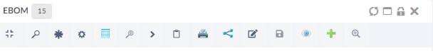
Figure 10. example horizontal toolbar
| If widget size is small and toolbar items are more than helium by default shows only icons corresponding to toolbar items. Hence, its always recommended to configure icon for toolbar items. |
8.5.1. Toolbar configuration
The <Toolbar> element supports the following attributes.
- actionHandler
-
Java class that points to an implementation of an action handler. See custom action handler
- vertical
-
Whether the toolbar should be configured to be rendered in vertical mode. Valid values
trueorfalse. Defaults tofalse.
- showUipToolbar
-
Whether to render uip-toolbar or default helium toolbar. Valid values
trueorfalse. Default is false. - isCustomizable
-
Signifies if the end user is allowed to customize the toolbar or not.If enabled the user hide and reorder the commands or rotate the toolbar. Valid values are
trueorfalse. Defaults to false.
The toolbar element supports the following child elements.
| Name | Description | Example |
|---|---|---|
Menu |
Creates a dropdown menu in the toolbar. The toolbar can have zero or multiple menus |
See specific Menu configuration below |
Command |
Creates a command in the toolbar |
See specific Command configuration below |
Toolbar menu
The <Menu> element renders a dropdown menu in the toolbar
The menu element supports the following child elements.
| Name | Description | Example | ||
|---|---|---|---|---|
Label |
The name of the dropdown for instance 'Actions' |
|
||
FontIcon |
What icon should be rendered next to the label. |
|
||
Image |
What image should be rendered next to the label |
|
||
RegisteredSuite |
Defines the registered suite. This will be used to resolve macros |
|
||
Command |
Creates a command in the toolbar |
See specific Command configuration below |
||
Menu |
If UIP Toolbar is configured, we can configure sub menus by configuring Menu inside.
|
|
||
Alt |
Tooltips can be configured for menu by adding <Alt>
|
|
Toolbar command
The <Command> element renders a command in either the toolbar itself, or in
an toolbar menu. A command describes a user action.
The <Command> element supports the following child elements.
| Name | Description | Example | ||
|---|---|---|---|---|
Label |
Name of the command, for example 'Promote'. By default, the content of it will be shown inside the tooltip. The tooltip is shown after a short interval after the mouse is over a "box". |
|
||
Alt |
Option for configuring tooltip other than label |
|
||
FontIcon |
What icon should be rendered next to the label. |
|
||
Image |
What image should be rendered next to the label |
|
||
RegisteredSuite |
Defines the registered suite. This will be used to resolve macros |
|
||
OnClick |
What javascript function should be executed when the
user clicks the command, for example:
|
|
||
OnClickParams |
Additional parameters to send to the javascript function. Usually a javascript object.
|
|
||
ValidFor |
Defines the command is valid for which rows in datatable |
|
Custom action handler
The <Toolbar> element supports the actionHandler attribute.
The actionHandler attribute value should point to an
implementation of a custom action handler. The action handler
can implement custom actions.
One actionHandler that ships with Helium is
com.technia.helium.table.config.action.TableActionHandler which provides
special actions that is intended to be used with a DataTable.
If the com.technia.helium.table.config.action.TableActionHandler is used, it is possible to add the following elements
to the toolbar.
| Name | Description | Example |
|---|---|---|
Search |
Whether the toolbar should have a search field. If the element is left out no search field will be rendered. If show parents is true than the parent rows of the matching rows will also be rendered in structure tables. It can also be defined using global setting |
default value of showparents is false |
ExpandAll |
Whether the toolbar should have a button to fully expand all nodes in structure table. |
|
ExportExcel |
Preconfigured command that exports the rows of the table to Excel format. |
|
ExportPDF |
Preconfigured command that exports the rows of the table to PDF format. |
|
ExportCSV |
Preconfigured command that exports the rows of the table to CSV format. |
|
Collection |
Adds a collection menu with below commands to manage businessobjects in Clipboard and Collection.
Refer Customize Collection section for customizations |
|
Expand all nodes in structure table
Example of a table widget with a toolbar
<DataTable>
<Title>First Level</Title>
<TableConfig namespace="helium">EBOMConfig.xml</TableConfig>
<Toolbar actionHandler="com.technia.helium.table.config.action.TableActionHandler">
<Search />
<ExpandAll />
<Menu>
<Label>Actions</Label>
<FontIcon>fa-bars</FontIcon>
<Command>
<Label>Promote</Label>
<FontIcon>fa-forward</FontIcon>
<OnClick>App.table.action.promote</OnClick>
</Command>
<Command>
<Label>Demote</Label>
<FontIcon>fa-backward</FontIcon>
<OnClick>App.table.action.demote</OnClick>
</Command>
<Command>
<Label>Edit</Label>
<FontIcon>fa-edit</FontIcon>
<OnClick>App.form.edit</OnClick>
<OnClickParams>{"formConfigName": "tvc:form:helium/Form1.xml", "fullscreen": true}</OnClickParams>
</Command>
</Menu>
<Menu>
<Label>Export</Label>
<FontIcon>fa-share</FontIcon>
<ExportExcel />
<ExportPDF />
<ExportCSV />
</Menu>
</Toolbar>
</DataTable>Example of a form with a vertical toolbar
<FormWidget>
<FormConfig namespace="helium">Form1.xml</FormConfig>
<ResolveContextId>page</ResolveContextId>
<FormMode>view</FormMode>
<ShowToggleButton>false</ShowToggleButton>
<Toolbar vertical="true">
<Command>
<Label>Toggle Edit Mode</Label>
<FontIcon>he-pencil</FontIcon>
<OnClick>App.custom.toggleEditMode</OnClick>
</Command>
<Command>
<Label>Some action</Label>
<FontIcon>he-chevron-right</FontIcon>
<OnClick>App.custom.toggleEditMode</OnClick>
</Command>
</Toolbar>
</FormWidget>8.5.2. Invoke Service
Like TVC Classic, 3DExperince services can be reused and called from Helium toolbar. This will allow leveraging existing 3DExperince in Helium table and perform actions like create change order, change request and other actions.
Built-in javascript function App.dataTable.invokeServiceAndCreateObject can be used to launch 3DExperince services, which can be configured using parameter config.
Invoke service requires that the result from the 3DExperience service is in form of objectId/physicalid that can be used with configured refreshBehavior.
<Command>
<Label>Invoke Service</Label>
<FontIcon>icon ti-c ti-plus</FontIcon>
<OnClick>App.dataTable.invokeServiceAndCreateObject</OnClick>
<OnClickParams>{
"config": "tvc:service:ups:classic:18x/CreatePartV5.xml",
"resultExpression": "id",
"from": "true",
"selection": "single",
"refreshBehavior": "add"
}</OnClickParams>
</Command>Following on click params can be used to invoke service / javascript function App.dataTable.invokeServiceAndCreateObject
| Parameter | Description | Required | Example |
|---|---|---|---|
config |
Name of the service configuration. It is used to configure the path to the service config. |
Yes |
|
resultExpression |
An expression that will be applied to the result from the service invoke. |
Yes |
|
from |
Direction to add the new object to table. |
Yes |
|
selection |
It defines how many object can be selected to perform this action. Default is |
No |
|
refreshBehavior |
It defines how a new node would be added from the result to the table. Default is |
No |
|
8.6. Service Toolbar
Like TVC Classic, we can also call OOTB service directly from client side. It will provide more flexibility and configuration support like allowing user to take input with the associated form and also it gives us possibility to perform multi selection and the chaining of the services. To call OOTB services, we need to predefined it in an XML configuration file. The services are then accessed from an ordinary service command, which contains the reference to the XML file that defines/configures the service.
Built-in javascript function App.dataTable.invokeServiceCall can be used to launch 3DExperience services, which can be configured using JSON config.
8.6.1. Service Command
ServiceCommand will be used to configure an OOTB service. XML configure is shown as below.
XML Definition
The example below illustrates how to define a service inside service command with xml.
<ServiceCommand>
<Label>Unreserve</Label>
<Setting name="OnClick" value="App.invokeServiceCallbacks.invokeService" />
<Setting name="OnClickParams">{
"url":
"resources/v1/collabServices/reservation/op/unreserve?tenant=OnPremise&isMultiSel=0&select=physicalid",
"header":{"content-type": "application/json"},
"addSecurityContext": "false",
"method":"POST",
"body":{"urls": ["{{model//{{physicalid}}}}"]},
"macro":"true",
"macroElements":"physicalid",
"selectionCriteria": "multiple"
}</Setting>
</ServiceCommand>We can also use the reference of this command.
<DataTable>
...
<Toolbar>
...
<Menu>
<Label>Service Actions</Label>
<ServiceCommand ref="tvc:servicecommand:hex:engineering:homepage/ReserveProduct.xml" />
<ServiceCommand ref="tvc:servicecommand:hex:engineering:homepage/UnreserveProduct.xml" />
<ServiceCommand ref="tvc:servicecommand:hex:engineering:homepage/MultiServiceChaining.xml" />
</Menu>
...
</Toolbar>
</DataTable>Child elements of OnClickParams
| Parameter | Description | Required | Example | ||
|---|---|---|---|---|---|
url |
This element defines the URL of intial service. |
Yes |
|
||
header |
The header of the initial service call. |
No |
|
||
body |
The body of the service call. It supports injecting macro statments |
No |
example: |
||
macro |
If we have any macros defined in Body, then this setting needs to be true |
No |
|
||
macroElements |
If we have any macros defined in Body, then that macro elements should be defined in this tag. It requires |
No |
|
||
addCsrfToken |
This setting can be configured as true to put 3dspace csrf token in service request header. |
No |
|
||
addSecurityContext |
This setting can be configured as true to put security context in service request header. |
No |
|
||
refreshRows |
It defines how the table rows will be refreshed after the processing is done. If this setting is enabled, only rows selected will be refreshed. |
No |
|
||
preRequestCallback |
Users can specify a reference to a javascript function that will be executed before service call. The function itself needs to be included in a javascript resource. The function needs to receive four parameter, which will be the payload of the service being modified or updated, second parameter is the response of macros, third and fourth parameter are resolve and reject respectively, which will be called at the end to resolve payload. |
No |
|
||
responseCallback |
Users can specify a reference to a javascript function that will be executed after service call. The function itself needs to be included in a javascript resource. The function needs to receive one parameter, which will be the response of the service being modified or updated. |
No |
|
||
successMessage |
User can specify, success messge in translation file (default.json) and use it’s key. |
No |
|
||
resolverPaths |
Service chaining can be configured using |
No |
|
Resolver-Paths Configuration
ResolverPaths configuration supports following elements/settings.
| Element | Description | Required | Example |
|---|---|---|---|
url |
This element defines the URL which we want to call after receiving the response of initial service. This can be resolved from response of intial service or can be configured separately. |
Yes |
Here, data[0].dataelements.ticketURL is the part of response object where we get the URL of next service call OR |
order |
A number value used to define in which order service will be executed. The lowest order number will get executed first. |
Yes |
|
header |
The header of the next service call can be configured for service request. |
No |
|
body |
The body of the service call. It supports injecting macro statments |
No |
` "body":{"fcsjobTicket":"{{data[0].dataelements.ticket}}"}` Here, |
bodyResolver |
It is used to resolve macro statement mentioned inside the |
No |
|
addCsrfToken |
This setting can be configured as true to put 3dspace csrf token in service request header. |
No |
|
addSecurityContext |
This setting can be configured as true to put security context in service request header. |
No |
|
method |
HTTP method/verb that should be used to invoke the next service. Valid values are:
By default it is |
No |
|
preRequestCallback |
Users can specify a reference to a javascript function that will be executed before service call. The function itself needs to be included in a javascript resource. The function needs to receive four parameter, which will be the payload of the service being modified or updated, second parameter is the resolved value of the macros, third and fourth parameters are resolve and reject respectively, which will be called at the end to resolve payload. |
No |
|
responseCallback |
Users can specify a reference to a javascript function that will be executed after service call. The function itself needs to be included in a javascript resource. The function needs to receive one parameter, which will be the response of the service being modified or updated. |
No |
|
XML Definition
Below is the example of uploading a document for a VPMReference object using 3DExperience services.
In the 3DExperience we see multiple requests. Initially it calls CheckinTicket and from its response object it will receive URL for the next service call and fcsjobTicket which it will pass in the body of next service. Then, it calls checkin service to upload the document. Below is the example illustrates how to configure this type of service chaining inside TVC Service command with xml.
<ServiceCommand>
<Label>Add New Document</Label>
<Setting name="OnClick" value="App.dataTable.invokeServiceCall" />
<Setting name="OnClickParams">{
"url":"resources/v1/modeler/documents/files/CheckinTicket?tenant=OnPremise&e6w-lang=en&e6w-timezone=-330",
"headers":{"content-type": "application/json"},
"addSecurityContext": true,
"method":"PUT",
"body":{"urls": ["model//{{physicalid}}"]},
"macro":true,
"macroElements":"physicalid",
"preRequestCallback": "App.invokeServiceCallbacks.initialRequestCallback",
"responseCallback":"App.invokeServiceCallbacks.initialResponseCallback",
"successMessage":"invokeservice.messages.service.documentSuccess",
"resolverPaths":[{
"order":1,
"preRequestCallback": "App.invokeServiceCallbacks.firstResolverPathCallback",
"url": "data[0].dataelements.ticketURL",
"header":{"content-type": "application/json"},
"body":{"__fcs__jobTicket":"{{data[0].dataelements.ticket}}"},
"method":"POST",
"bodyResolver": "data[0].dataelements.ticket",
"responseCallback": "App.invokeServiceCallbacks.firstResolverResponseCallback"
},
{
"order":2,
"url": "resources/v1/modeler/documents/?tenant=OnPremise&e6w-lang=en&e6w-timezone=-330&xrequestedwith=xmlhttprequest",
"method":"POST",
"addSecurityContext": true,
"header":{"content-type": "application/json"},
"body": {"csrf":{"name":"{{csrfName}}","value":"{{csrfValue}}"},"data":[{"dataelements":{"title":"{{fileName}}","parentId":"{{parentId}}","parentRelName":"PLMDocConnection","parentDirection":"from"},"relateddata":{"files":[{"dataelements":{"title":"{{fileName}}","receipt":"{{text}}"}}]},"tempId":"{{tempId}}"}]},
"bodyResolver": "csrfName,csrfValue,fileName,parentId,fileName,text,tempId",
"responseCallback":"App.invokeServiceCallbacks.secondResolverResponseCallback"
}
]
}</Setting>
</ServiceCommand>Here, at the begining, intial service will get call, the subsequent service call we define inside the tag of resolverPaths. The subsequents service will be executed in the defined order.
Below, is the definition of callback used for the above configuration.
(function(window, App, $) {
var invokeServiceCallbacks = {
// callbacks for creating doc element
initialRequestCallback: function(options, payload, resolve, reject) {
console.log('In initial service callback');
this.serviceOptions.parentId = payload[0];
var inputElement = document.createElement("input");
inputElement.type = "file";
inputElement.accept = window.accept;
inputElement.dispatchEvent(new MouseEvent("click"));
inputElement.addEventListener('change', (event) => {
event.preventDefault();
event.stopImmediatePropagation();
let files = event.target.files.length>0 ? event.target.files :event.dataTransfer.files; // FileList object
for (var index = 0; index < files.length; index++) {
const file = files[index];
var documentInfo = {
title: file.name,
fileInfo: {
comments: '',
file: file
},
relInfo: {
parentId: this.serviceOptions.parentId,
parentRelName: 'PLMDocConnection',
parentDirection: 'from'
}
};
this.serviceOptions.documentInfo = documentInfo;
this.serviceOptions.documentInfo.fileInfo = documentInfo.fileInfo;
}
resolve(options);
});
},
initialResponseCallback: function(response) {
console.log('In Initial Service Response Callback' + response);
this.serviceOptions.csrfTokenName = response.csrf.name;
this.serviceOptions.csrfTokenValue = response.csrf.value;
},
firstResolverPathCallback: function(payload, response,resolve, reject) {
console.log('In first pre request service callback');
var fileInfo = this.serviceOptions.fileInfo || (this.serviceOptions.documentInfo && this.serviceOptions.documentInfo.fileInfo);
var file = fileInfo && fileInfo.file;
var fileName = file && fileInfo.file.name; //case of overwritten file name
var formData = new FormData();
formData.append(
Object.keys(payload.body)[0],
Object.values(payload.body)[0]
);
formData.append('file_0', file, fileName);
payload.data = formData;
payload = {
method: payload.method,
url: payload.url,
data: payload.data,
contentType: false,
processData: false
};
resolve(payload);
},
firstResolverResponseCallback: function(response) {
response.text = encodeURI(response.text);
response.csrfName = this.serviceOptions.csrfTokenName;
response.csrfValue = this.serviceOptions.csrfTokenValue;
response.parentId= this.serviceOptions.parentId;
var fileInfo = this.serviceOptions.fileInfo || (this.serviceOptions.documentInfo && this.serviceOptions.documentInfo.fileInfo);
var file = fileInfo && fileInfo.file;
var fileName = file && fileInfo.file.name;
response.fileName = fileName;
var d = new Date();
var g = d.getTime();
response.tempId = "temp_" + g;
console.log('In first Service Response Callback' + response);
},
secondResolverPathCallback: function(options, payload,resolve, reject) {
console.log('In second pre request service callback');
resolve(options);
},
secondResolverResponseCallback: function(response) {
console.log('In second pre response service callback');
},
formResponseCallback:function(formInput){
console.log('In form response service callback');
}
};
App.invokeServiceCallbacks = $.extend({}, App.invokeServiceCallbacks || {}, invokeServiceCallbacks);
})(window, App, jQuery);8.6.2. Input Based Service
It is possible to call OOTB service and include the OOTB service response value in the Form for further processing. Also, it allows to open a form and prepare OOTB service body with the user input. First, form can be invoked to take user input and on submit it will process the OOTB service.
Form Configuration
Form configuration supports following elements/settings.
| Element | Description | Required | Example |
|---|---|---|---|
url |
This is the URL of service which will be called on the submission of the Form. This can be resolved from the response object of initial service or can be configured separately. |
Yes |
|
options |
This element defines Helium’s Form options setting which will looks for config file |
Yes |
|
header |
This setting can be configured to add addition values in the service request header which will be called on the submission of the form. |
No |
|
contentType |
This setting can be configured to add content type in service request header which will be called on the submission of the form. By default it is |
No |
|
body |
The body of the service which will be called on the submission of the form. It supports injecting macro statments |
No |
Here, |
bodyResolver |
It is used to resolve macro statement mentioned inside the |
No |
|
addCsrfToken |
This setting can be configured as true to put csrf token in service request header. |
No |
|
addSecurityContext |
This setting can be configured as true to put security context in service request header. |
No |
|
method |
HTTP method/verb that should be used to invoke the service. Valid values are:
|
No |
|
formCallback |
Users can specify a reference to a javascript function that will be executed after service call. The function itself needs to be included in a javascript resource. The function needs to receive one parameter, which will be the form input of the form being modified or updated. |
No |
|
XML Definition
The example below illustrates how to define a form based service inside service command with xml.
Below is the example of updating a part number for a VPMReference object using 3DExperience service. In the 3DExperience we see multiple requests, initially it will call retrievePartNumber and from its response object it will open a form where it shows Old Part Number and take input from the form to set new part number and call setPartNumber service on submission of the form. This example illustrates how to configure this type of service chaining inside TVC Service command with xml.
Here, inside the OnClickParams tag we defined the initial service call configuration. For example, retrievePartNumber and then inside form tag we will define next service call inside the url tag, which will call on the submission of the form eg. setPartNumber. Inside Form’s Body tag, macros are defined like physicalid and partNumber (It is the field id defined in the form using which we take user inputs).
<ServiceCommand>
<Label>Retrieve And Set Part Number</Label>
<Setting name="OnClick" value="App.dataTable.invokeServiceCall" />
<Setting name="OnClickParams">{
"url":"resources/v1/engineeringItem/retrievePartNumber?tenant=OnPremise&xrequestedwith=xmlhttprequest&_=1611277466036",
"header":{"content-type": "application/json"},
"addSecurityContext": true,
"method":"POST",
"body":{"references": [{"physicalid": "{{physicalid}}"}]},
"macro":true,
"macroElements":"physicalid",
"selectionCriteria": "single",
"form":{
"options":{
"formConfigName": "tvc:form:hex:engineering/Form1.xml",
"fullscreen":true,
"modal":{
"position":{"top":"30%","bottom":"20%","left":"40%","right":"10%"},
"controls":{"dock":true,"expand":true,"close":true}
}
},
"url":"resources/v1/engineeringItem/setPartNumber?tenant=OnPremise&_=1613402130670&xrequestedwith=xmlhttprequest",
"header":{"content-type": "application/json"},
"body":{"references": [{"physicalid": "{{references[0].physicalid}}", "partNumber": "{{partNumber.values[0].value}}"}]},
"method":"PUT",
"addSecurityContext": true,
"bodyResolver": "references[0].physicalid,partNumber.values[0].value",
"formCallback": "App.invokeServiceCallbacks.formResponseCallback"
}
}</Setting>
</ServiceCommand>XML Definition for Helium Form
Below is the defination of Helium form, It will be as usual. If we want to show the response of first service inside the form field, then we need to define Setting to map the response object to that field.
In the below configuration in the Old Part Number field we want to show the value retrieved from the response of retrievePartNumber service call. For this we mapped it with the response object. Here, references[0].partNumber is the response object of retrievePartNumber service call.
<Form>
<Title>Set Part</Title>
<Layout>
<Columns>1</Columns>
</Layout>
<Section>
<Field>
<Label>Old Part Number</Label>
<Setting name="options">{"mapping":"references[0].partNumber"}</Setting>
<Editable>false</Editable>
<FieldType>text</FieldType>
</Field>
<Field id="partNumber">
<Label>Part Number</Label>
<Editable>true</Editable>
<FieldType>text</FieldType>
</Field>
</Section>
</Form>XML Definition
The example below illustrates how to take user input and pass it to the OOTB service.
<ServiceCommand>
<Label>Set Part Number</Label>
<Setting name="OnClick" value="App.dataTable.invokeServiceCall" />
<Setting name="OnClickParams">{
"macro":"true",
"macroElements":"physicalid",
"selectionCriteria": "single",
"form":{
"options":{
"formConfigName": "tvc:form:hex:engineering/Form1.xml",
"fullscreen":true,
"modal":{
"position":{"top":"30%","bottom":"20%","left":"40%","right":"10%"},
"controls":{"dock":true,"expand":true,"close":true}
}
},
"url": "resources/v1/engineeringItem/setPartNumber?tenant=OnPremise&_=1613402130670&xrequestedwith=xmlhttprequest",
"body":{"references": [{"physicalid": "{{physicalid}}", "partNumber": "{{partNumber.values[0].value}}"}]},
"method":"PUT",
"addSecurityContext": true,
"bodyResolver": "physicalid,partNumber.values[0].value",
"formCallback": "App.invokeServiceCallbacks.formResponseCallback"
}
}</Setting>
</ServiceCommand>8.7. Dashboard
The main responsibility of the Dashboard is to hold references to different widgets.
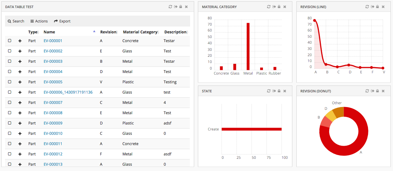
Figure 11. Dashboard with multiple widgets
8.7.1. Configuration
The <Dashboard> element supports the following child elements.
| Name | Description | Example |
|---|---|---|
Locked |
Whether the dashboard should be locked or not. A locked dashboard can not be customized. Valid values |
|
DisableCustomization |
Dashboard customization can be disabled for dashboard. Valid values |
|
Floating |
Whether the dashboard should be floating to the top of the page or not. Valid values |
|
ResizableHandles |
Configure different options i.e any combination of comma seperated valid value, to enable resize widget from different positions like right, left, bottom, left bottom or right bottom. Valid values are
|
|
Widgets |
Specifies what Widgets this dashboard should contain. |
|
8.7.2. Dashboard Customization
A user can customize a dashboard by changing size and position of widgets.
Customization is enabled by default but can be turned off with a property:
tvc.helium.dashboard.customization.enabled=false
or by configuring a dashboard or widget as locked.
Customization actions
For customizable dashboards, a small UI element is automatically appended on the right hand side*, and it slides in to expand when the user focuses on the element. From this menu, the end user can create and manage multiple dashboard views via a sidepanel and easily reset any customization they have done on that particular dashboard view, or re-add a previously removed widget.
Resetting of end user widget which was added dynamically with reset dashboard customization can be enabled with a property:
tvc.helium.dashboard.customization.resetEnduserWidget=true.
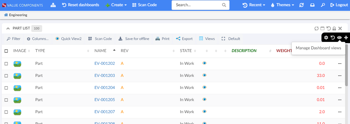
Figure 12. Customizable Dashboard, showing the customizations menu
(*) If the dashboard is presented in stacked mode, for instance if the user is on a mobile device in portrait mode, the menu is hidden. Customizations only apply to normal dashboard mode.
Dashboard Views
The end user can create and manage multiple dashboard views within a single dashboard, allowing the user to create customized dashboards to better fit their workflow.
From the dashboard menu, the end user can open a sidepanel where it is possible to create and manage multiple dashboard views and easily copy, delete or reset any customization they have done on a dashboard view.
Customization maximum cap
If there are performance concerns, the max size of the customizations object can be controlled by the property:
tvc.core.customization.maxContentSize
default value: 100000 Characters
Widget
The <Widget> element references widget instance via the ref attribute. For example <Widget ref="tvc:widget:helium/MaterialCategoryWidget.xml"/>
It also specifies where an widget should be rendered on the dashboard and what size the widget should have.
For sizes and placements of widgets, keep in mind that TVC Helium is based on a so called grid system, where a dashboard is generally divided into 12 columns. A Widget that should cover the entire browser window width should therefore specify its width to 12, two widgets side-by-side should each specify 6, and so on.
The <Widget> element supports the following child elements.
| Name | Description | Example | ||||||
|---|---|---|---|---|---|---|---|---|
Id |
The identifier of the widget. Should be unique.
|
|
||||||
Locked |
Whether the widget should be locked or not. A locked widget can not be customized. Valid values |
|
||||||
Width |
The width of the widget. Valid value: Positive integer between 1 and 12. It supports the following attributes:
|
|
||||||
Height |
The height of the widget. Valid value: Positive integer. It supports the following attributes:
|
|
||||||
X |
Specifies where on the X axis the widget should be placed. Valid value: Positive integer. |
|
||||||
Y |
Specifies where on the Y axis the widget should be placed. Valid value: Positive integer. |
|
||||||
Template |
Specifies which template the widget should be rendered with.
If omitted a default template will be used. Useful if you would like to design your own widget frame template with full path from project root, or render
a widget without a header. The latter is accomplished by setting the element text
to |
or |
||||||
Badge |
This element is used to render a small |
|
8.7.3. Example
<?xml version="1.0" encoding="UTF-8"?>
<Dashboard xmlns="http://technia.com/helium/Dashboard">
<Locked>false</Locked>
<Floating>true</Floating>
<Widgets>
<Widget id="dt1" width="6" height="10" x="0" y="0" locked="false"
badge="true" ref="tvc:widget:helium/TableWidget.xml" />
<Widget ref="tvc:widget:helium/MaterialCategoryWidget.xml">
<Id>materialcategory</Id>
<Width minWidth="2" maxWidth="5">3</Width>
<Height>5</Height>
<X>6</X>
<Y>0</Y>
<Badge>true</Badge>
</Widget>
<Widget ref="tvc:widget:helium/RevisionLineWidget.xml">
<Id>revision-line</Id>
<Width>3</Width>
<Height minHeight="3" maxHeight="7">5</Height>
<X>9</X>
<Y>0</Y>
</Widget>
<Widget ref="tvc:widget:helium/StateWidget.xml">
<Id>state</Id>
<Width minWidth="2" maxWidth="5">3</Width>
<Height minHeight="3" maxHeight="7">5</Height>
<X>6</X>
<Y>5</Y>
</Widget>
<Widget ref="tvc:widget:helium/RevisionDonutWidget.xml">
<Id>revision-donut</Id>
<Width>3</Width>
<Height>5</Height>
<X>9</X>
<Y>5</Y>
</Widget>
</Widgets>
</Dashboard>8.7.4. Widget Customization
Just like for dashboards, an end user can do certain customizations on widget level. Exact customizations available will depend on the type of widget. For example, in a Table widget the end user can customize the pagination size, column visibilities, etc.
Customization on widget level is enabled by default, for dashboards where customization is enabled.
Customization actions
For the normal widget template, a Reset icon is available in the widget header. The user can reset widget level customizations from there. If you use your custom widget template, you can still use the JavaScript API .resetCustomizations(). After deleting a widget customization, the widget will refresh.
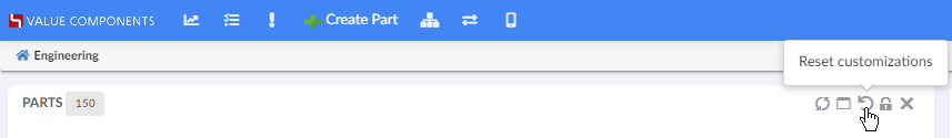
Figure 13. Resetting widget customizations
8.7.5. Open in Sidepanel
JavaScript API, App.page.sidepanel.openDashboard() can be used to open a dashboard in page’s sidepanel, e.g. App.page.sidepanel.openDashboard("tvc:dashboard:hex:engineering/PartInfoSidePanel.xml", "1.2.3.4");
This could be used for e.g. to quickly see contextual information about an object without navigating back and forth.
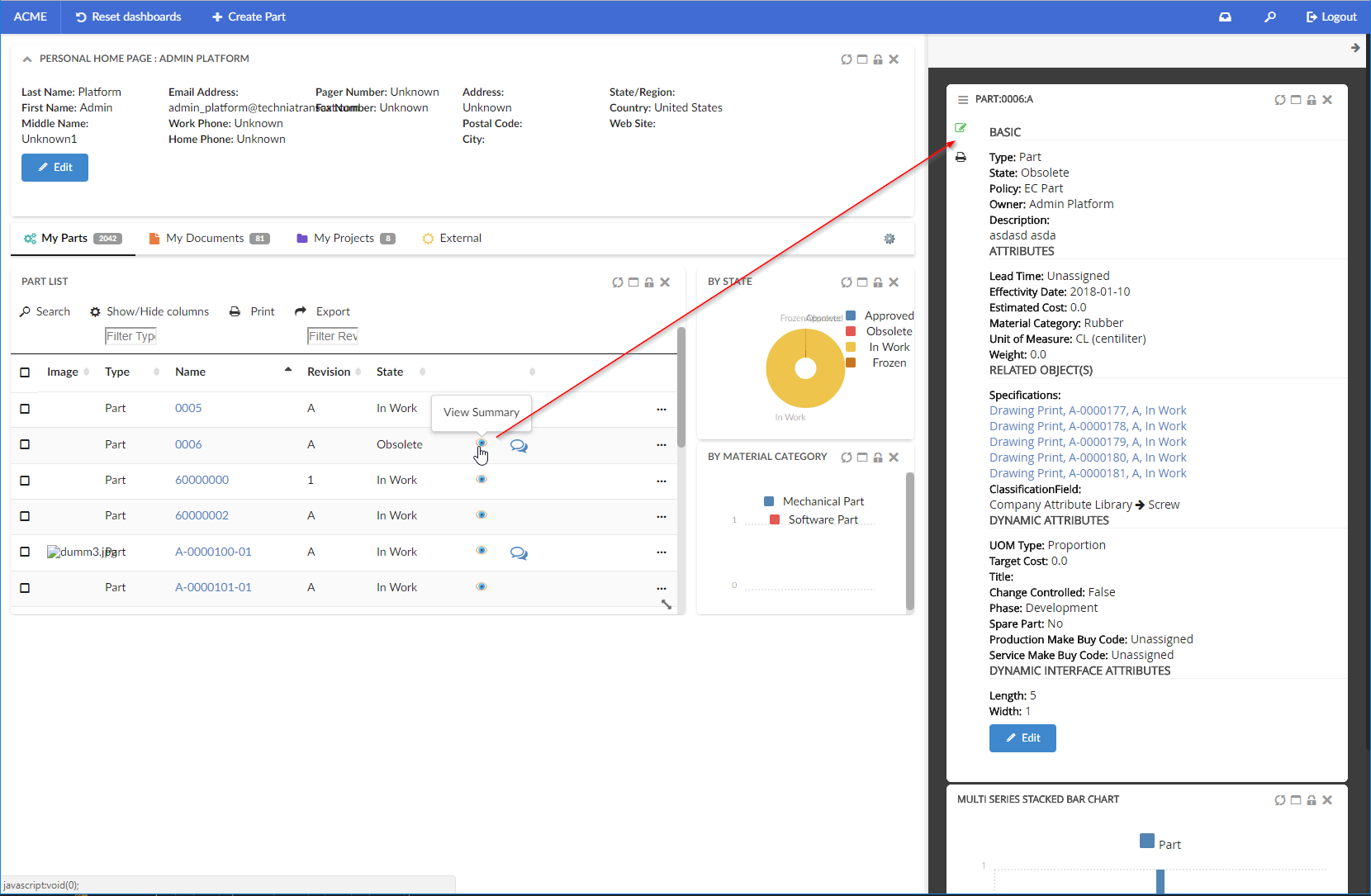
Figure 14. Dashboard in Sidepanel
8.7.6. Load Related Widgets
JavaScript API, .updateWidgets() is added to Dashboard instance. This API can be used to reload related widgets within the dashboard with different context ids. If the widget is initially hidden, it’ll be made visible.
| You need to have access to the dashboard instance to invoke this method. If you instead have access to Widget instance, see this |
For an implementation example, refer PartDetailActions.xml Column and Menu definitions available as part of HEX distribution.
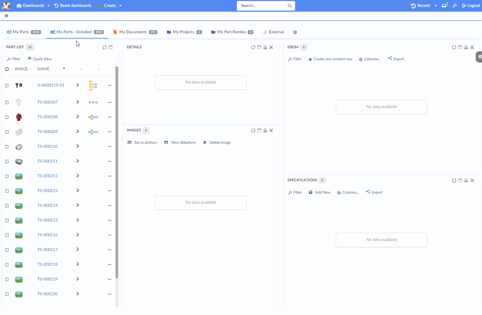
Figure 15. Load Related Widgets
8.7.7. Widget lock unlock icon
The lock unlock icons can be configured for two different scenarios as given below:
Widget lock and unlock icon reflecting the action available to user. For ex :
-
If widget is locked it would show unlock icon.
-
If widget is unlocked it would show lock icon.
This is the default behaviour.
Widget lock and unlock icon reflecting the current state of widget.For ex :
-
If widget is locked, show lock icon.
-
If widget is unlocked, show unlock icon.
This can be enabled globally as init param tvc.helium.widget.lock.showAlternateIcon = true
8.8. Widget
All widgets (DataTable, Form, Charts) or any custom widget as described in the widget tutorial, share the following configuration options.
8.8.1. Configuration
| Name | Description | Example | ||
|---|---|---|---|---|
Title |
The title of the widget. Supports macros if a context object exists, e.g. |
|
||
OnInit |
Javascript function that creates the widget.
|
|
||
OnInitOption |
Additional options that is to be passed to the OnInit function. |
|
||
PostRender |
A javascript function that will be executed when the content of the widget has been rendered.
|
|
||
HeaderActions |
By providing a reference to a menu XML file, it is possible to add custom actions to the widget header. |
|
||
ShowActionTooltip |
Whether the header actions tooltip should be visible or not. Default value is true. |
|
||
Html |
HTML that should be rendered inside of the widget container |
|
||
Toolbar |
Describes the toolbar of the widget. For more information, see the Toolbar chapter. |
|
||
Sidepanel |
Describes an optional sidepanel in the widget. For more information see the Sidepanel chapter |
|
||
Access |
Defines access rules. |
See Access Control |
Replace/Toggle widgets
To toggle/replace a widget with another (switching views) you can do the following.
-
Create the initial widget as described in the Dashboard chapter.
-
Also add the other widget (that you want to toggle to) in the same Dashboard but add the element:
<Hidden>true</Hidden>. Make sure theX,Y,WidthandHeightelements have the same values as the initial widget.<ToggleWidget> <Label>Label for the command</Label> <FontIcon>he-some-font-icon</FontIcon> <To>the-id-of-the-widget-to-toggle-to</To> <Access>access-rules-for-this-action</Access> </ToggleWidget>The
<To>element must point to the id of the widget to toggle to. To toggle back to the initial widget create the same command as above but change the<Id>to point to the initial widget. This means that the relationships will most likely be symmetrical in your configurations.For
<Access>definition, see Access Control
8.8.2. Conditionally evaluate dataset on drilldown
In some cases, the user might want to evaluate a different dataset for a widget on a drilldown dashboard. This is possible by configuring the widget you want to evaluate with:
<OnInitOption name="evaluateWithDataSet" value="true" />Example widget configuration:
<ChartWidget>
<Title>Multi Series Stacked Bar Chart</Title>
<OnInitOption name="evaluateWithDataSet" value="true" />
<ChartConfig namespace="hex:engineering">EBOMMultiSeriesStackedBarChart.xml</ChartConfig>
</ChartWidget>8.8.3. Load Related Widgets
JavaScript API, .loadRelatedWidgets() is added to Widget instance. This API can be used to reload related widgets within the dashboard with different context ids. If any related widget is initially hidden, it’ll be made visible.
| You need to have access to the widget instance to invoke this method. If you instead have access to Dashboard instance, see this |
8.9. Widget Sidepanel
A sidepanel is a container element where additional content within a widget can be placed. It can be either any HTML content, or a menu containing commands. The visibility of this sidepanel container is toggled by clicking it.
Each widget supports defining a sidepanel which can be revealed (slided in) either from the left or the right side. When the widget is first loaded, the initial state of the sidepanel will be closed.
The <Sidepanel> element supports the position and width attribute. Valid values for position is "left" or "right".
Valid value for width is a positive integer.
| Currently widgets only supports one sidepanel each, either to the right or to the left. |
The <Sidepanel> element supports the following child elements.
| Name | Description | Example | ||
|---|---|---|---|---|
Label |
The label of the sidepanel. If omitted no label will be rendered. If the value is an existing i18n key internationalisation will be performed |
|
||
Html |
Custom html to be rendered in the widget |
|
||
Closable |
Whether sidepanel will be closed when clicking inside the same widget. Default is false. |
|
||
Toolbar |
A Toolbar definition. It is encouraged to supply the toolbar definition with the
|
|
8.9.1. Javascript API
The sidepanel can be opened, closed and toggled via javascript using the following syntax:
var widget = App.page.getWidgetById('widget-id');
widget.openSidepanel() // opens sidepanel
widget.closeSidepanel() // close sidepanel
widget.toggleSidepanel() // toggles the sidepanel visibility state8.9.2. Example
<Sidepanel width="100" position="left">
<Label>Sidepanel</Label>
<!--<Html><![CDATA[<div>test</div>]]></Html>-->
<Toolbar vertical="true">
<Command>
<Label>Toggle Edit Mode</Label>
<FontIcon>he-pencil</FontIcon>
<OnClick>App.custom.toggleEditMode</OnClick>
<OnClickParams>{"foo": "bar"}</OnClickParams>
</Command>
</Toolbar>
</Sidepanel>8.10. Search
Helium comes with basic search functionality, configurable in a number of ways. Search can be configured to appear in the global topbar by pointing out a search configuration file in Helium.xml:
<Search>tvc:search:helium/TopBarSearch.xml</Search> This will render a magnifying glass icon on which you click to launch the search GUI overlay.
You can also choose to render an input field inside the topbar, so that you can type a query directly into it. The configuration is similar to that of the Topbar Icon <Search> command. A full example can be found in the TopBar chapter.
Please note that for topbar inline search, only <Search version="2"> search configuration is supported, and that you will initiate the search by either hitting enter key or clicking the icon.
Figure 16. Top Bar
8.10.1. Search
The <Search> format supports the following child elements.
| Name | Description | Example | ||
|---|---|---|---|---|
Limit |
The maximum number of search results returned. |
|
||
Types |
Show only results of the listed types. |
|
||
Selects |
The statements listed within this element are fetched and returned to the browser for client-side use (for example, to show them in the search result template). NOTE: By default search result provide type, name, revision and description. |
|
||
Where |
A Where clause, following MQL syntax. Use %s to indicate where to inject the criteria entered by the user performing the search. |
|
||
HitOnClick |
Name of a JavaScript function to execute when clicking on a search result item. The argument passed will be the object ID. |
|
||
HitTemplate |
Customize design of search result by either specifying a template formatting the layout of single search result. Currently it’s only possible to specify templates which are located within the helium/template folder. |
|
||
ResultRenderCallback |
Customize complete search result. Great flexibility but requires custom implementation to handle onclick events, responsiveness etc. |
|
||
SearchProvider |
Search Provider to be used for this search config. If none is specified global Search Provider will used as default.
|
|
8.10.2. Example
<?xml version="1.0" encoding="UTF-8"?>
<Search>
<Limit>100</Limit>
<!-- Restrict to only search object of specified types -->
<Types>
<Type>type_Part</Type>
<Type>type_Document</Type>
</Types>
<!-- Fetch additional select statements which can be used for rendering -->
<Selects>
<Select>current</Select>
<Select><![CDATA[$<attribute[attribute_Originator]>]]></Select>
</Selects>
<!-- Where clause. Use %s to indicate where to inject the criteria entered by the user -->
<!-- <Where>name ~~ '*%s*'</Where> -->
<!-- Javascript callback when clicking search hits -->
<!-- <HitOnClick>App.custom.openSearchHit</HitOnClick> -->
<!-- Customize design of search result by either specifying a template formatting the layout of single search result. Currently it's only possible to specify templates which are located within the helium/template folder. -->
<!-- <HitTemplate>search/result-hit-test</HitTemplate> -->
<!-- Customize complete search result. Great flexibility but requires custom implementation to handle onclick events, responsiveness etc -->
<!-- <ResultRenderCallback>App.custom.renderSearchResult</ResultRenderCallback> -->
<!-- Custom Search Provider for this search config, if none is specified global Search Provider will used -->
<!-- <SearchProvider>com.acme.search.PartSearchProvider</SearchProvider> -->
</Search>8.11. New Search Experience
8.11.1. Quick Search
The quick search allows users a way to easily find objects of interest. It can be used for various use cases, for example by clicking the magnifying glass in the topbar or when locating a person when editing a Part.
When the quick search is launched it opens as an overlay and the user enters a search term. The search result matching the term is presented and by clicking the search hits the user can open the corresponding object.
In more advanced use cases a search form, displayed on the left hand side, is used to further filter down the search result. The user can for instance specify that only Parts in state Released is of interest.
Quick search supports usage of Search Providers. This means that ENOVIA, EXALEAD or other data source can be used to find relevant information.
Figure 17. Quick Search
Figure 18. With Search Form
Configuration Format
To use this configuration format the version must be set to 2. This is done by setting the version attribute on the Search element to 2. Example: <Search version="2">
|
Quick search can be configured in two ways, by using specialized Search element or generic Command element.
Using Search
Search has predefined configurations with default icon, label and javascript callback function to load search.
Sample configuration using Search
<Search version="2">tvc:search:hex:common/TopBarSearchV2.xml</Search>Using Command
Command gives flexibility of define icon, label and javascript callback function within the URL element.
Sample configuration using Command
<Command>
<Label>Search</Label>
<FontIcon>ti-f ti-finder-f</FontIcon>
<URL href="javascript:App.searchV2.startSearch({options: {'config': 'tvc:search:hex:common/TopBarSearchV2.xml'}});" />
</Command>The quick search configuration files are placed in the folder search.
The root element of the configuration is <Search> and the following child elements are supported:
| Name | Description | Example | ||||
|---|---|---|---|---|---|---|
Limit |
The maximum number of search results returned. |
|
||||
upperSearchLimitValue |
The maximum number of search results allowed to be displayed.
|
|
||||
DataFields |
The data to include for the search result. For example, type, name, revision and current state. |
|
||||
Sections |
The search result is divided into sections. For example, parts is displayed in one section, documents in another and so on. See Sections for more details. |
|||||
SearchForm |
Search form which allows the user to further filter down the search result. See Search Form for more details. |
|
||||
InitialHitsCount |
The number of hits to display in each section. A "Show more" link is supplied to view more hits. |
|
||||
ShowMoreHitsCount |
The number of additional hits to add to the result when "show more" is clicked. |
|
||||
SearchOnCriteriaUpdate |
Controls if the search is submitted when the search criteria is updated. For example, after the user has selected state "Released" in the search form or search for "00230" in the term field a search is submitted and the search result is displayed. This setting is useful when using indexing engine as search provider. The search is throttled to 400ms. |
|
||||
Settings |
Additional settings for the search. These settings are accessible in |
|
||||
Server |
Triggers executed server-side at different steps during the life-cycle of a search operation. See Server-Side Triggers for more details |
|
||||
Client |
Callbacks triggered on the client at specific points. See Client-Side Callbacks for more details. |
Example how to register a callback executed when the search is rendered and ready: |
||||
UIs |
It defines UI elements for rendering search result in a section. See Section UIs for more details. |
|
||||
OpenOnLoad |
Controls if the search panel should be opened by default on load. Default value is false.
|
|
Specify the search provider to use in the attribute provider on the <Search> element. See Search Providers for more details and a list of available providers. Example configuring using the EXALEAD search provider :
<Search provider="exalead" />| The search provider’s callsign name is used when selecting which provider to use (instead of the qualified name of the java class) |
| The ENOVIA search provider is used by default |
Sections
Search results can be rendered in sections. For example sections can be used to divide search result based on type, parts is displayed in one section, documents in another and so on. Different sections can have different views to show different set of information/attributes in different format.
The root element of the configuration is <Sections> and following child elements are supported by built-in SectionProvider:
| Name | Description | Example | ||
|---|---|---|---|---|
Section |
Root element for defining a Section. See Section for detailed configuration. |
|
||
FallbackSection |
Root element for fallback section. When a search result hit matches none of the defined sections, it is put into fallback section. See Built-in Section Provider for detailed configuration. |
|
Figure 19. Sections
See Custom Section Provider for details on custom section provider.
Built-in Section Provider
Built in SectionProvider supports configuration of multiple sections. Each section defines a filter condition, which is evaluated against each search result hit and if hit matches filter condition, hit is kept in this section. Section also support different UIs or views for showing search result. For example it can used to show different attributes for parts and documents.
| Name | Description | Example | ||
|---|---|---|---|---|
Filter |
Filter is condition based on which search result will be sectionized. It must contains a DataField against which search hit will be evaluated and a Value that will be matched. |
|
||
Label |
Label can be used to specify title. |
|
||
UIs |
Each section can have multiple UIs elements to render search result. See Section UIs for more details. |
|
Section UIs
SectionUIs or UIs are used to render search result under each section. Multiple UIs can be configured for a section and user can navigate from one UI to another. It is possible to configure UIs in Search and refer into section. SectionUI is referred using ìd attribute on elemenet UI. It is possible to refer and override SectionUI configuration in Section.
The root element of the configuration is <UIs> containing multiple <UI> and the following child elements are supported in <UI>:
| Name | Description | Example | ||
|---|---|---|---|---|
Type |
Type of view.
|
|
||
Icon |
Icon of UI to be shown for selecting UI. |
|
||
ResultTemplate |
Template for showing search results in section. For built-in template see Built-in Tile Templates |
|
||
TileHitTemplate |
Template to rendering each search hit and applies only to |
|
||
Table |
Table configuration for adding columns and applies only to |
|
||
Settings |
Additional settings. |
|
Following attribute can be defined on root element SectionUI.
| Name | Description | Example |
|---|---|---|
id |
Defines id of SectionUI. This is useful when SectionUIs are defined in Search and can be referred in Section using id. |
|
default |
In context of Search, it defines whether SectionUI should act as default for when no SectionUI is defined in Section. And in context of Section, it defines whether SectionUI should be rendered by default. |
|
Context Menu
Context menu can be configured to show actions on search result tiles. Context menu is defined inside a Section by using element ContextMenu with reference to menu using attribute ref.
<Section>
.
.
.
<ContextMenu ref="tvc:menu:acme:common/SearchActions.xml"/>
</Section>| Context menu is not applicable for table view and sub menus are not supported in a context menu. |
Following menu elements are utilized on context menu.
| Name | Description | Example |
|---|---|---|
FontIcon |
Icon to be showed for context menu. |
|
Command |
Command in the context menu. |
|
Following Command settings are utilized in rendering of context menu.
| Setting Name | Description | Example |
|---|---|---|
OnClick |
Javascript function to be called on click of command |
|
OnClickParams |
Additional parameters to passed into command on click. |
|
Sample context menu defined in a section -
<Section>
.
.
.
<ContextMenu ref="tvc:menu:acme:common/SearchActions.xml"/>
</Section>Sample context menu definition -
<Menu>
<Command>
<Label>Open History</Label>
<FontIcon>ti-f ti-menu-f</FontIcon>
<Setting name="OnClick">App.acme.openObject</Setting>
<Setting name="OnClickParams">{
"options": {
"tab": "#history"
}
}</Setting>
</Command>
<Command>
<Label>Open Charts</Label>
<Href>javascript:App.hex.openObject</Href>
<FontIcon>ti-f ti-piechart-f</FontIcon>
<Setting name="OnClickParams">{
"options": {
"tab": "#charts"
}
}</Setting>
</Command>
<Command>
<Label>Open Lifecycle</Label>
<FontIcon>ti-f ti-lifecycle-f</FontIcon>
<Setting name="OnClick">App.acme.openObject</Setting>
<Setting name="OnClickParams">{
"options": {
"tab": "#lifecycle"
}
}</Setting>
</Command>
<Command>
<Label>Promote</Label>
<FontIcon>ti-f ti-promote-f</FontIcon>
<Setting name="OnClick">App.acme.promoteObject</Setting>
</Command>
<Command>
<Label>Demote</Label>
<FontIcon>ti-f ti-demote-f</FontIcon>
<AccessExpression>context.user === 'admin_platform'</AccessExpression>
<Setting name="OnClick">App.acme.demoteObject</Setting>
</Command>
<Setting name="showOnHover" value="false"/>
</Menu>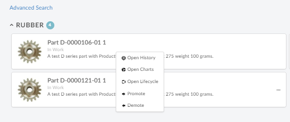
Figure 20. Context Menu
Custom Section Provider
Custom section provider can be implemented to sectionize search result. It can be specified using attribute className on element Sections.
Interface to implement:
com.technia.tvc.search.api.section.SectionProvider
Example configuration:
<Search provider="enovia" version="2">
.
.
<Sections className="com.acme.MySectionProvider" />
</Search>Built-in Tile Templates
Template are used to display search result hit in tile mode. Following are the built-in tile hit templates:
Single tile takes up the whole width of section. Useful for displaying document with large description text. Tile also shows primary image of the object in left side. It also displays Type, Name, Revision, Description, State and Last Modified of the object.
Result Template path:
helium/templates/search/v2/row-result
Hit Template path:
helium/templates/search/v2/row-result-hit
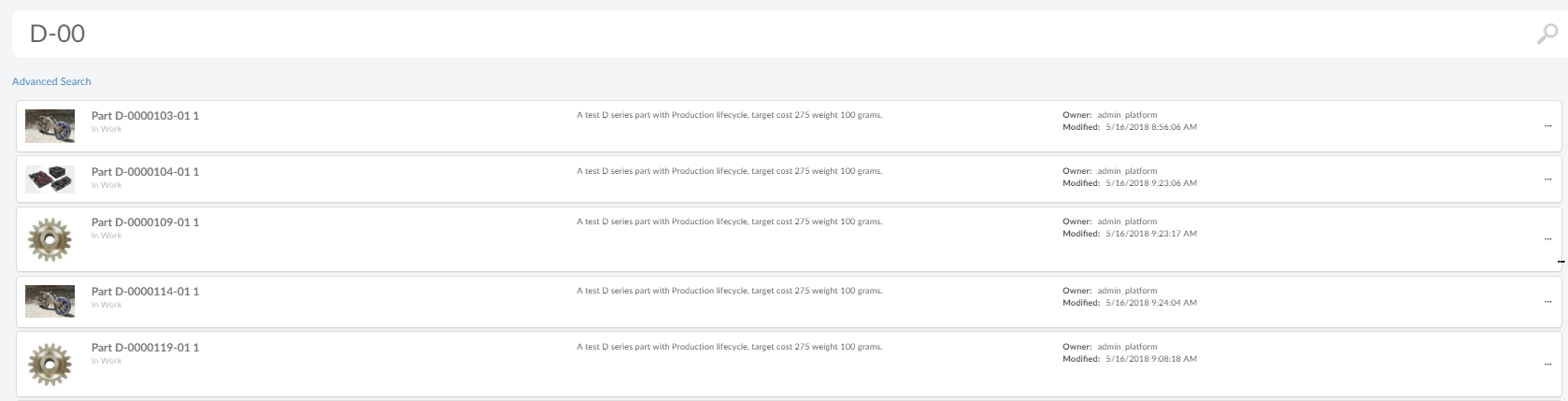
Figure 21. Single Row
Three tiles are displayed in each row. Tile also shows primary image of the object in left side. It also displays Type, Name, Revision and Description of the object.
Result Template path:
helium/templates/search/v2/primaryimage-result
Hit Template path:
helium/templates/search/v2/primaryimage-result-hit
Three tiles are displayed in each row. Tile also shows count if present in search hit data on like a bubble of right top corner. It also displays Type, Name, Revision of the object along with all the additional data present in the search result hit.
Result Template path:
helium/templates/search/v2/result
Hit Template path:
helium/templates/search/v2/result-hit
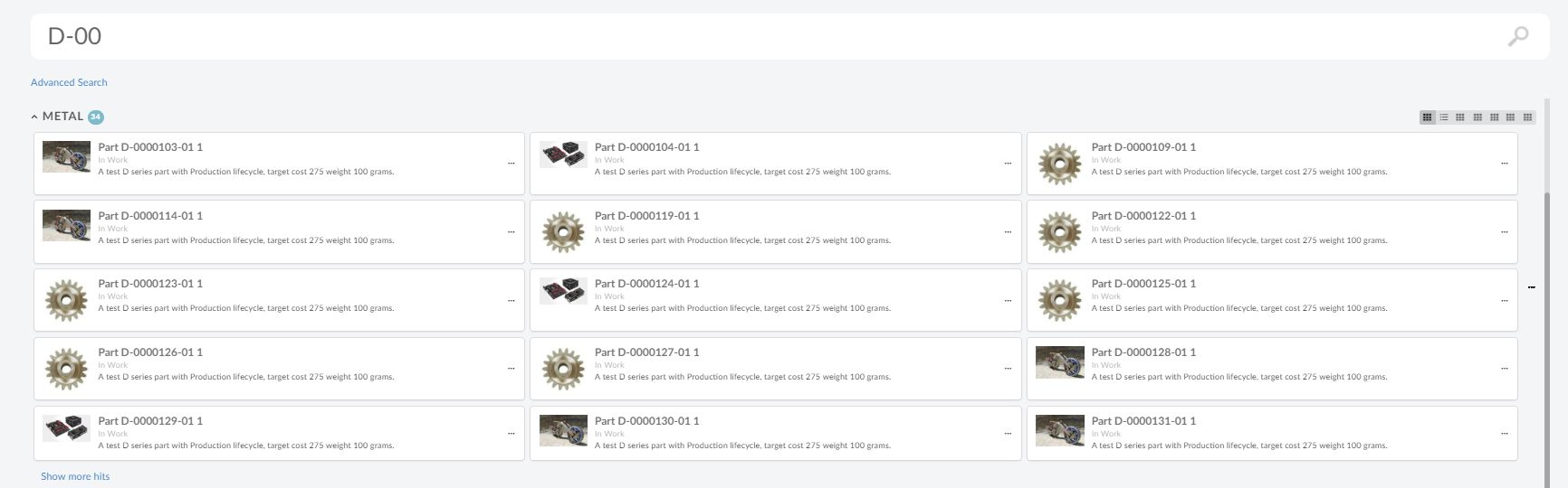
Figure 22. Three Tiles
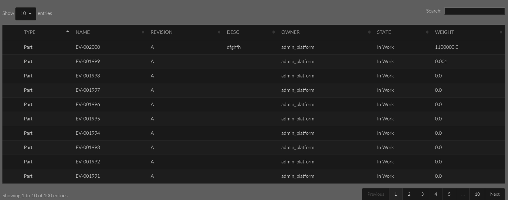
Server-Side Triggers
Server-side triggers are used to accomplish advanced use cases. For example a presearch trigger can be used to validate the search criteria and a postsearch trigger can be used to ensure that the user has access to view all the search hits.
Client-Side Callbacks
ready
Callback function when search is ready. Example configuration:
<Client ready="App.custom.searchReady"/>onHitClick
Callback function when search result hit tile is clicked. By default search window is closed and object is opened. Example configuration:
<Client onHitClick="App.custom.openObject"/>onRenderResult
Callback function to create search result renderer object. This function should return javascript object implementing method render, which will be responsible for rendering search result. SectionRenderer is built in implementation for rendering search result in sections.
Example configuration:
<Client onRenderResult="App.custon.createSectionRenderer"/>Javascript API
Quick Search
Methods
| Method | Description |
|---|---|
open |
Opens the search |
close |
Closes the search |
isOpen |
Is the search open |
search |
Performs a search |
getQuery |
Gets the search criteria |
searchPanel |
Get API for searchpanel, if any available |
result |
Get API for result |
on |
Register to an event |
off |
Deregisters an event |
Events
| Event Name | Description |
|---|---|
open |
Called after the quick search overlay is opened |
close |
Called after the quick search overlay is closed |
preSearch |
Called before the search is executed |
postSearch |
Called after the search is executed |
destroy |
Called when component is destroyed |
Search Panel
Methods
| Method | Description |
|---|---|
open |
Opens the search panel |
close |
Closes the search panel |
isOpen |
Is the search panel open |
toggleVisibility |
Toggles the search panel |
getSearchForm |
Returns UIP search form instance |
destroy |
destroys the search panel and performs clean up |
searchPanel |
Get API for searchpanel, if any available |
updateSearchFormFields |
Updates the search form fields |
Result
Result is responsible for rendering search result. Result calls render method on resultRenderer for rendering search result.
Methods
| Method | Description |
|---|---|
clear |
Clears the search result |
isRendered |
Return whether results are rendered |
on |
Register to an event |
off |
Deregister to an event |
destroy |
Destroys the result element |
resultRenderer |
returns resultRenderer object associated with this result object. |
Events
| Event Name | Description |
|---|---|
renderBefore |
Called before rendering search result. |
render |
Called when search result is about to be rendered. Search query and search result is passed as arguments. |
renderAfter |
Called after rendering search result. |
destroy |
Called when result is destroyed. |
Section Renderer
Section renderer is built-in and default result renderer, which renders result in sections
Methods
| Method | Description |
|---|---|
clear |
Clears the search result |
getSections |
Return list of sections |
render |
renders result sections. This called from result when search result is received. |
destroy |
Destroys the result component. |
Example Configuration
<?xml version="1.0" encoding="UTF-8"?>
<Search provider="enovia" version="2">
<Limit>200</Limit>
<SearchForm
ref="tvc:searchformv2:helium/TopBarSearchForm.xml" />
<Sections>
<Section>
<Filter>
<DataField>attribute[Material Category]</DataField>
<Value>Rubber</Value>
</Filter>
<Label>Rubber</Label>
<UIs>
<UI id="id0" />
<UI id="id1" />
<UI id="id2" default="true"/>
</UIs>
</Section>
<Section>
<Filter>
<DataField>attribute[Material Category]</DataField>
<Value>Metal</Value>
</Filter>
<Label>Metal</Label>
<UIs>
<UI id="id1" default="true"/>
<UI id="id2" />
<UI id="id3" />
</UIs>
</Section>
<Section>
<Filter>
<DataField>attribute[Material Category]</DataField>
<Value>Concrete</Value>
</Filter>
<Label>Concrete</Label>
</Section>
<FallbackSection>
<Label>searchv2.section.defaultTitle</Label>
</FallbackSection>
</Sections>
<UIs>
<UI id="id0" default="true">
<Type>tile</Type>
<TileHitTemplate>helium/templates/search/v2/primaryimage-result-hit</TileHitTemplate>
<ResultTemplate>helium/templates/search/v2/primaryimage-result</ResultTemplate>
<Icon>ti-f ti-menu-f</Icon>
<Settings>
<Setting name="title" value="Primary Image" />
</Settings>
</UI>
<UI id="id1">
<Type>tile</Type>
<TileHitTemplate>helium/templates/search/v2/row-result-hit</TileHitTemplate>
<ResultTemplate>helium/templates/search/v2/row-result</ResultTemplate>
<Icon>ti-f ti-table-f</Icon>
<Settings>
<Setting name="title" value="Single Row Result" />
</Settings>
</UI>
<UI id="id2">
<Type>tile</Type>
<TileHitTemplate>helium/templates/search/v2/result-hit</TileHitTemplate>
<ResultTemplate>helium/templates/search/v2/result</ResultTemplate>
<Icon>ti-f ti-menu2-f</Icon>
<Settings>
<Setting name="title" value="Three Tile Result" />
</Settings>
</UI>
<UI id="id3">
<Type>tile</Type>
<TileHitTemplate>helium/templates/search/v2/result-hit</TileHitTemplate>
<ResultTemplate>helium/templates/search/v2/result</ResultTemplate>
<Icon>ti-f ti-menu2-f</Icon>
</UI>
</UIs>
<DataFields>
<DataField>type</DataField>
<DataField>name</DataField>
<DataField>revision</DataField>
<DataField>description</DataField>
<DataField>primaryimage</DataField>
<DataField>${attribute[attribute_EndItem]}</DataField>
</DataFields>
<Settings>
<Setting name="termWhere" value="name ~~ '*%s*' OR description ~~ '*%s*' OR current ~~ '*%s*'" />
</Settings>
<Client ready="App.custom.searchReady"
onRenderResult="App.searchV2.createSectionRenderer" />
</Search>8.11.2. Search Side Panel
With search side panel, search can be configured within a page. Similar to quick search, search side panel allows users a way to easily find objects of interest related to context objects and load search result into page dashboard. When configured search side panel opens on left side with a search form.
When search is performed dashboards in the page can be reloaded with search result, it is possible to configure which dashboards should be reloaded. It may desired that only one dashboard is reloaded with search result and rest are left unaffected. It is also possible to customize this behaviour using javascript callback function and take complete control on what should happen when search is performed, see Client-Side Callbacks for more details.
Like quick search, search panel supports usage of Search Providers. This means that ENOVIA, EXALEAD or other data source can be used to find relevant information.
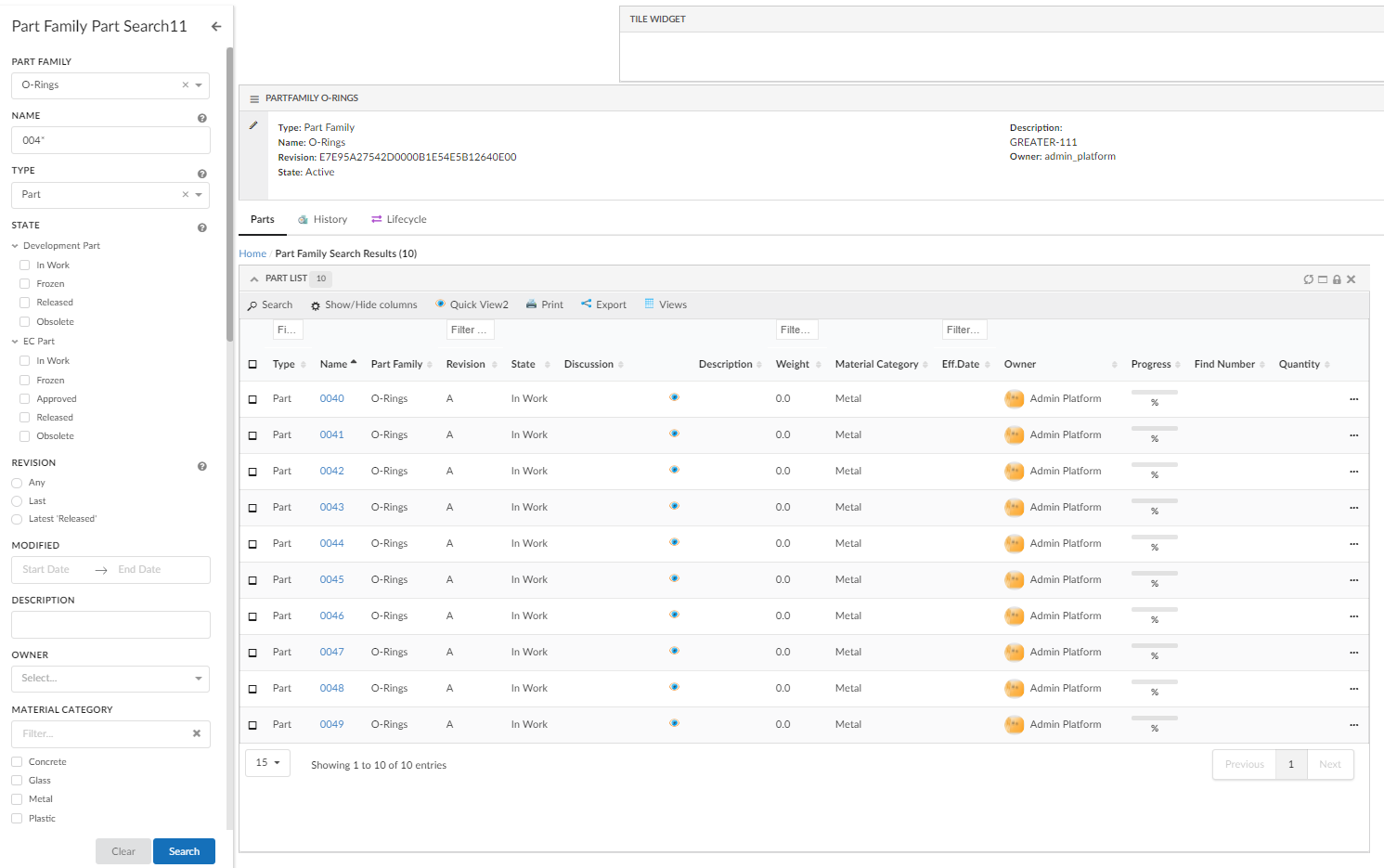
Figure 24. Search Side Panel
Configuration Format
SearchPanel configuration files are placed in folder searchpanel.
The root element of the configuration file is <SearchPanel>.
| Name | Description | Example |
|---|---|---|
Limit |
The maximum number of search results to be returned. |
|
DataFields |
The data to include for the search result. For example, type, name, revision and current state. |
|
SearchOnCriteriaUpdate |
Controls if the search is submitted when the search criteria is updated. For example, after the user has selected state "Released" in the search form or search for "00230" in the term field a search is submitted and the search result is displayed. This setting is useful when using indexing engine as search provider. The search is throttled to 400ms. |
|
SearchIcon |
Search Icon for collapsed search panel. |
|
SearchTitle |
Title for collapsed search panel |
|
ResultTitle |
Title for drilldown of search results |
|
Settings |
Additional settings for the search. These settings are accessible in |
|
Server |
Triggers executed server-side at different steps during the life-cycle of a search operation. See Server-Side Triggers for more details |
|
Client |
Callbacks triggered on the client at specific points. See Client-Side Callbacks for more details. |
Example how to register a callback executed when the search is rendered and ready: |
HomePage |
Defines page that should be loaded in background, when search is launched via direct or exported URL. See Export Search for more details. |
|
Client-Side Callbacks
ready
Callback function when search panel is ready. Example configuration:
<Client ready="App.custom.searchPanelReady"/>js
Callback function to render search panel. This allows user to take complete control over search panel rendering and behaviour. This function should return javascript object implementing method render. Default function is App.searchV2.defaultSearchPanel.
Example configuration:
<Client js="App.custom.mySearchPanel"/>Configuration In Page
Search panel is configured in page using element <SearchPanel> with reference to search panel configuration resource using attribute ref. See Configuration Format for search panel configuration.
Example -
<Page>
.
.
.
<SearchPanel ref="tvc:searchpanel:acem:common/PSearchPanel.xml">
<OnSearchResult>
<ReloadDashboards>
<Dashboard ns="hex:engineering" name="PartFamilyParts.xml" />
</ReloadDashboards>
</OnSearchResult>
<SearchOnLoad>true</SearchOnLoad>
<OpenOnLoad>true</OpenOnLoad>
</SearchPanel>
</Page>It is possible to use same searchpanel configuration as reference in different page configurations. Following configurations can be done in a searchpanel at page level:
| Name | Description | Default | Example |
|---|---|---|---|
OpenOnLoad |
Whether to open search panel when page is loaded. |
true |
|
SearchOnLoad |
Whether to perform search when page is loaded. |
false |
|
OnSearchResult |
Defines what should happen on load of search result. See On Search Result |
|
On Search Result
Defines what should happen on load of search result. It supports both client side and server side loading of search result. On search result can be configured in search panel using element <OnSearchResult>. See Search Panel Configuration for search panel configuration.
The search result can be loaded client side or server side. When loaded client side, search result are sent to the client and loaded back into configured dashboards as context objects using dashboard drilldown. When loaded server side, search results are directly loaded in the configured widget at the server side. This also enables page wise search if index-based search provider is present.
Following sub elements can be defined under <OnSearchResult>:
| Name | Description | Default | Example | ||
|---|---|---|---|---|---|
ReloadDashboards |
Dashboards that should be reloaded with search results when a search is performed. It is possible to configure more than one dashboard for reloading.
|
|
|||
LoadServerSide |
Sub element of |
false |
|
||
Dashboard |
Sub element of
|
|
|||
WidgetId |
Sub element of
|
|
Paginated Search Result
Index based search providers, like Exalead may provide a capability to load search result page wise. New search can leverage this capability of index based search providers and search result pages can be retrieved as user navigates through pages on table widget.
When client side loading in enabled, search results are loaded into dashboard as drilldown feature and dashboard will reload to reflect new context objects. In contrast, when server side loading is enabled, search results are directly added into table widget bean at server side. As user navigates through pages, search provider is called to fetch result for current page.
| Only one table widget can be enabled for loading search result at the server side. |
Paginated Search Result
SearchBasedLoader
Table widget should have <SearchBasedLoader> as data loader for paginated search result and server side search result loading enabled in page configuration. It is also possible to have a custom SearchBasedLoader by using attribute className on tag <SearchBasedLoader> as shown below.
<SearchBasedLoader className="com.acme.AcmeSearchLoader"/>Interface the Java class needs to implement:
com.technia.tvc.structurebrowser.search.loader.SearchBasedTableLoader
Example configuraton
In below example, searchpanel is defined in the page. On search, the result should be loaded at server-side into widget myParts present within the dashboard AcmePartDashboard.xml in acme:common namespace. It is possible to configure multiple dashboards and multiple widgets per dashboard, however, that will result in each individual widget performing search and loading itself separately. The most common use case will be to have a single widget configured for loading the search result.
Page configuration on which search panel should be present.
<Page>
...
<SearchPanel ref="tvc:searchpanel:acme:common/AcmePartSearchPanel.xml">
...
<ReloadDashboards>
<Dashboard ns="acme:common" name="AcmePartDashboard.xml">
<WidgetId>myParts</WidgetId>
</Dashboard>
</ReloadDashboards>
</SearchPanel>
</Page>See On Search Result for configuration details.
TableConfig which will be used to display search result should have <SearchBasedLoader> as DataLoader. SearchBasedLoader ensures that search results are loaded at server side and on page navigation, a new search is performed to retrieve result for the changed page.
<TableConfig>
<Title></Title>
<DataLoader>
<SearchBasedLoader/>
</DataLoader>
<Table namespace="acme:common">AcmeParts.xml</Table>
<DisplayMode>flat</DisplayMode>
<RowSelect>multi</RowSelect>
<Pagination size="15" disabled="false" />
<ClientSideProcessing enabled="false" threshold="10000" />
</TableConfig>Javascript API
Methods
| Method | Description |
|---|---|
open |
Opens the search panel |
close |
Closes the search panel |
isOpen |
Is the search panel open |
search |
Performs a search |
getPage |
Returns the context page object |
getOptions |
Returns the options this search instance |
getQuery |
Gets the search criteria |
searchPanel |
Get API for searchpanel |
destroy |
Destroys and cleans up the search instance |
on |
Register to an event |
off |
Deregister to an event |
Events
| Event Name | Description |
|---|---|
ready |
Called after search panel is ready |
open |
Called after the quick search overlay is opened |
close |
Called after the quick search overlay is closed |
search |
Called before the search is executed. Query is passed as argument. |
result |
Called after the search is executed. Search result is passed as argument. |
destroy |
Called when component is destroyed |
Example Configuration
Page
<?xml version="1.0" encoding="UTF-8"?>
<Page>
<Title>${TYPE}, ${NAME}:${REVISION}</Title>
<Dashboard namespace="hex:engineering" name="PartFamilyTopPanel.xml"/>
<Tabs>
<Settings>
<Theme>material</Theme>
<IconTheme>material</IconTheme>
<Orientation>horizontal</Orientation>
<TabDrop>true</TabDrop>
<UserRearrange>true</UserRearrange>
<UserOrientationSwitch>true</UserOrientationSwitch>
<UserHide>true</UserHide>
</Settings>
<Tab id="Parts">
<Label>Parts</Label>
<Dashboard ns="hex:engineering" name="PartFamilyParts.xml" />
</Tab>
<Tab id="history">
<Label>History</Label>
<Dashboard namespace="hex:common" name="History.xml" />
<IconClass>ti-c ti-large ti-history2</IconClass>
</Tab>
<Tab id="lifecycle">
<Label>Lifecycle</Label>
<Dashboard namespace="hex:common" name="Lifecycle.xml" />
<IconClass>purple exchange alternate icon</IconClass>
</Tab>
</Tabs>
<SearchPanel ref="tvc:searchpanel:hex:common/PartFamilySearchPanel.xml">
<OnSearchResult>
<ReloadDashboards>
<Dashboard ns="hex:engineering" name="PartFamilyParts.xml">
<Widget id="myParts"/>
</Dashboard>
</ReloadDashboards>
</OnSearchResult>
<SearchOnLoad>true</SearchOnLoad>
</SearchPanel>
</Page>Search Panel
<?xml version="1.0" encoding="UTF-8"?>
<SearchPanel provider="enovia">
<Limit>500</Limit>
<SearchIcon>icon find</SearchIcon>
<SearchTitle>Part Family Search</SearchTitle>
<ResultTitle>Part Family Search Results</ResultTitle>
<SearchForm
ref="tvc:searchformv2:hex:common/PartFamilySearchForm.xml"/>
<DataFields>
<DataField>type</DataField>
<DataField>name</DataField>
<DataField>revision</DataField>
<DataField>description</DataField>
<DataField>modified</DataField>
<DataField>primaryimage</DataField>
</DataFields>
<Client ready='App.hex.partFamilySearchReady'></Client>
</SearchPanel>Apply filter on structure node expand
The search side panel is used to load objects in the table widget and it might be needed to apply the same search criteria on expanding the node. For example, once the user performs a search to load parts specific to RDO, it might be needed that on expanding part only parts belonging to that RDO should be shown. This can be achieved by keeping one on one mapping between columns in the table and search field.
This feature can be enabled at table configuration level by using below setting in table config:
<ApplySearchFilterOnExpand>true</ApplySearchFilterOnExpand>
<TableConfig>
...
<ApplySearchFilterOnExpand>true</ApplySearchFilterOnExpand>
</TableConfig>Additional setting is needed on searchform field to indicate the field should be considered for applying filter on expanded node.
| Setting Name | Description | Example |
|---|---|---|
applyOnTableExpand |
Whether the field should be considered for applying filter on expanded node |
|
tableExpandKey |
Special case when field |
|
It is mandatory that search form field DataField or setting tableExpandKey should match exacty with table column expression. See example below:
Search feld for Material Category
<Field attribute="attribute_MaterialCategory"
id="material_category" sectionId="others">
<Label>Material Category</Label>
<DataField>attribute[Material Category]</DataField>
<Values attribute="attribute_MaterialCategory" />
<Settings>
<Setting name="showFilter" value="true" />
<Setting name="showRangeAmount" value="10" />
<Setting name="applyOnTableExpand" value="true" />
</Settings>
</Field>Table column for Material Category
<Column>
<Name>Material Category</Name>
<Expression>attribute[Material Category]</Expression>
<Label>emxFramework.Attribute.Material_Category</Label>
<RegisteredSuite>Framework</RegisteredSuite>
<AllowShowMore>TRUE</AllowShowMore>
<Editable>TRUE</Editable>
<InputType>combobox</InputType>
<SortType>string</SortType>
</Column>| This feature works at client side without additional server call to reduce performance impact, therefore this feature is limited to direct text match and will not work with Revision and Type field. |
There is a workaround for type field by adding an additional hidden column with kindof and mapping it to searchform type field.
Kindof table column
<Column>
<Name>KindOf</Name>
<Expression>type.kindof</Expression>
<Label>KindOf</Label>
<Editable>false</Editable>
<Visible>false</Visible>
</Column>Searchform field
<TypeField id="type" sectionId="basic">
<Values>
<Value value="Part" default="true" />
</Values>
<SearchableTypes>
<Type>type_Part</Type>
<Type>type_DOCUMENTS</Type>
</SearchableTypes>
<Tooltip>
<Title>customer.search.type.tooltip.title</Title>
<Content>customer.search.type.tooltip.content</Content>
</Tooltip>
<Settings>
<Setting name="casesensitive" value="true" />
<Setting name="applyOnTableExpand" value="true" />
<Setting name="tableExpandKey" value="type.kindof" />
</Settings>
</TypeField>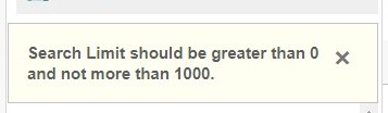
8.11.3. Search Form
Form Configuration Format
The searchform configuration files are placed in the folder searchformv2.
The root element of the configuration file is <SearchForm> and the following child elements are supported:
| Name | Description | Example |
|---|---|---|
Title |
Title of the search Form. Displayed above the fields. |
|
Fields |
Available fields in the search form. See Field Configuration Format for details on how to configure each field. |
|
Sections |
Group fields into collapsible sections in the search form. See Section Configuration Format for details on how to configure a section. |
|
Toolbar |
Add custom toolbar to include commands and menus in the search form. See Toolbar Configuration Format for details on how to configure a section. |
|
OnCreate |
Trigger executed when the search form has been created. Useful to manipulate the search form, e.g. updating field values or changing order of fields, before it’s sent to the client. Specify the Java class name containing the custom logic using the attribute com.technia.tvc.search.searchform.OnCreateSearchForm |
|
Field Configuration Format
Field can be configured inline within a searchform or it can be configured in a separate file. The field configuration files are placed in the folder searchformfield. If configured in a separate file, it can be referred within searchform using attribute ref as below -
<Fields>
<Field ref="tvc:searchformfield:acme:common/Name.xml"/>
<Field ref="tvc:searchformfield:acme:common/Modified.xml"/>
</Fields>The root element is <Field> and the following child elements are supported:
| Name | Description | Example |
|---|---|---|
Label |
The label for the field. If the value is an existing i18n key internationalisation will be performed. |
|
Tooltip |
Tooltip for the field. Displayed when hovering the label.If the value is an existing i18n key internaionalisation will be performed. |
|
Required |
Specifies that a value is required for the field in order for the form to be valid. Whether term field is mandatory for performing the search. Note: In case of "SearchOnCriteriaUpdate", search would be blocked but user would not be shown any alert message. |
|
DataField |
The data to search among. The search provider might use this in different ways. See specific Search Providers for details about it. For example the ENOVIA Search Provider users standard statement as |
ENOVIA example: EXALEAD example: |
DataType |
Type of data to be searched. Valid values:
|
|
UIType |
Kind of user interface user presented to the user. For example, autocomplete, ranges and text. See UI Types for more details. |
|
Visible |
Defines visibility of field in search form. It allows configuration to make field visible or hidden based on selection on another field. By default field is visible. |
|
Values |
Values available for the field. For example, when ranges for an ENOVIA attribute is displayed each of the ranges is represented by one value. It also controls the default selected value. See Values for more details. |
Use ranges on attribute Material Category as values: Part is the default value: |
Dimensions |
Dimensions available for the field when searchWithUnit is true. For example, when dimensions for an ENOVIA attribute is displayed each of the dimensions is represented by one value. See Dimensions for more details. |
Use dimensions on attribute Weight as below: Part is the default value: |
Settings |
Settings to further configure the field. Look at each UI Type for details on supported settings. |
Enabling the search box above the values when using |
casesensitive |
case sensitivity for the input value. Default value is false |
|
ConditionalFields |
Additional fields which should be added to search form based on value selected for this field. See Conditional Fields for details. |
|
The ENOVIA attribute can be specified on the <Field> element using the attribute attribute. This specifies that the field is searching in that specific attribute and sets sensible default values for the field, e.g. it picks <UIType>date</UIType> and sets <DataType>date</DataType> in case the attribute stores a date.
Example:
<Field attribute="attribute_MaterialCategory" />| Specifying the attribute is useful when searching for with for example EXALEAD. The attribute is used to get the correct UI Type etc. |
Values
Values are used for two purposes:
-
To define the values the user can search by
-
To define which value that is selected by default
There are a number of ways to control the available values:
-
Configure a predefined list of values, see below for configuration format
-
Specify an attribute using the attribute
attribute. Example:<Values attribute="attribute_MaterialCategory" />
-
Write a ValueProvider and configure it using the attribute
className, Example:<Values className="com.acme.MyValueProvider" />
Value Configuration Format
The <Values> and <Value> element is used when configuring a predefined list or specifying default values for a field.
| Attribute Name | Description | Example |
|---|---|---|
value |
The value. It’s mandatory to specify it. |
|
label |
Text presented to the user. If none is provided the value is displayed. Label also supports localization. |
|
type |
Type of the value, if it is Enovia specific value like type, attribute range, state. For example if value is attribute range, its type should be |
|
default |
Controls if the value is selected by default. |
|
Dimensions
Dimensions are used to allow search with different units for numeric fields.
There are a number of ways to control the available dimensions:
-
Configure a predefined list of dimensions, see below for configuration format
-
Specify an attribute using the attribute
attribute. Example:<Dimensions attribute="attribute_MaterialCategory" />
-
Write a DimensionProvider and configure it using the attribute
className, Example:<Dimensions className="com.acme.MyDimensionProvider" />
Dimensions Configuration Format
The <Dimensions> and <Dimension> element is used when configuring a predefined list or specifying default dimensions for a field.
| Attribute Name | Description | Example |
|---|---|---|
Dimension |
It’s mandatory to specify name, label and multiplier. Label also supports localization. |
|
Conditional Fields
Additional fields can be added to search form based on value selected on this field. For example it may be desired for type field to add additional fields when Part is selected as type.
Conditional Fields can be implemented by implementing a interface com.technia.tvc.search.searchform.conditionalfields.ConditionalFieldsProvider and configure it using the attribute className, Example:
<ConditionalFields className="com.acme.MyConditionalFieldsProvider" />
| API | Description |
|---|---|
createConditionalFields |
Returns set of additional fields to be added to searchform |
Field Visibility
Field can be shown or hidden based on selection made on another field. It can be useful to configure use case when different attributes or fields are enabled for searching based on type selected. For example when type is selected as 'Part', part attributes like 'Weight' can be shown.
| When field is not visible it will not be considered as search criteria. |
The <Visible> element within <Field> is used for configuring visibility rules for the field. Following attribute and sub elements can be used for configuration.
| Name | Element / Attribute | Description | Example |
|---|---|---|---|
hidden |
attribute |
Defines whether field should be hidden by default. |
|
ifField |
attribute |
Defines id of field on which visibility of this field depends. For example if 'Weight' field is to be shown when 'Type' field has value Part. |
|
HasValues |
element |
Defines discrete list of values, on which field will be visible. |
|
jsFunction |
attribute on <HasValues> |
Javascript function returning true/false. Arguments passed to function are field id and criteria selected on field. |
|
includeWhenHidden |
attribute |
Defines whether field should be considered in search criteria, when field is not visible. |
|
Examples-
Example configuration to show part states when type selected is Part.
<Field id="partstates">
<Values>
<Value value="Review" default="true"/>
<Value value="Preliminary"/>
</Values>
<Label>Part States</Label>
<DataField>current</DataField>
<Visible ifField="enovia_type">
<HasValues>
<Value>Part</Value>
</HasValues>
</Visible>
</Field>Example configuration to show weight when javascript function App.hex.isTypePart returns true.
<Field attribute="attribute_Weight">
<Label>Weight</Label>
<Visible ifField="enovia_type">
<HasValues jsFunction="App.hex.isTypePart" />
</Visible>
</Field>Custom Fields
Custom field definition can also be used to implement a field. It can be specified using attribute className on element Field.
Interface to implement:
com.technia.tvc.search.searchform.FieldDef
<Field className="com.acme.search.CustomField"/>Built-in ENOVIA Fields
TypeField
Field designed to select an ENOVIA type. The field uses autocomplete. Available types to search among is configurable using the SearchableTypes element.
Example configuration of a TypeField where the user can select any type in either Parts or Document hierarchy. The default value is set to 'Part':
<TypeField>
<Values>
<Value value="Part" default="true" />
</Values>
<SearchableTypes>
<Type>type_Part</Type>
<Type>type_DOCUMENTS</Type>
</SearchableTypes>
</TypeField>RevisionField
Field designed to select an ENOVIA revision. The field uses radio button type. Available values to search among is configurable using provided tags.
Example configuration of a RevisionField where the user can select any revision in either Parts or Document hierarchy. The default value is set using selected="true" attribute:
<RevisionField sectionId="basic">
<AnyRevision />
<FirstRevision />
<LastRevision />
<LatestInState policy="EC Part" state="Release" />
<LastAndLatestInState policy="EC Part" state="Release" />
</RevisionField>| Field | Description |
|---|---|
AnyRevision |
Shows all the revisions |
FirstRevision |
Shows only first revision |
LastRevision |
Shows only last revision |
LatestInState |
Shows latest revision with passed in state value |
LastAndLatestInState |
Shows the combination of |
NameField
This field uses a text input field and looks in the name field in ENOVIA.
Example:
<NameField />PersonField
Field used to select a person. The field uses autocomplete.
Example:
<PersonField>
<Label>Owner</Label>
<DataField>owner</DataField>
</PersonField>StateField
Field used to select one or more states. The available states to choose from is configured by specifying one or more policies.
It’s mandatory to specify at least one policy.
Example where the user can select states from the EC Part and / or Development Part policy:
<StateField>
<Policies>
<Policy name="EC Part" />
<Policy name="Development Part" />
</Policies>
</StateField>The states are by default grouped by policy. The groups are expanded / collapsed when clicked. Clicking the label of the field expands / collapses all groups.
Tip: Use the setting expandGroups to control if the polices should be expanded / collapsed when the search form is loaded.
The StateField uses the UI type ranges. The settings described in the settings table of the UI type ranges is available for the StateField. For example, it’s possible to add the filter feature and control if the groups should be expanded when the search form is loaded. Two settings are not available: showAllRanges and showRangeAmount. All ranges are shown for the StateField.
Settings:
| Attribute Name | Description | Default | Example |
|---|---|---|---|
groupByState |
Groups the states into their corresponding policies. |
true |
|
valueSeparator |
The separator to use in the value to separate the policy and state name. For example, the value of state Preliminary for policy EC Part is |
|
|
ClassificationField
ClassificationField is a Enovia built-in field designed as preconfigured field to support Enovia classification hierarchy. In Enovia, classification is maintained as hierarchy where Library objects acts as root objects. There can be single or multiple root Library objects, beneath a Library there are Family or Classification objects. There can be single or multiple Family or Classification objects below each Library object. There can be more Family or Classification objects (also known as Sub Family) beneath a Family or Classification object forming a hierarchy. At the end of hierarchy classified items will be present.
ClassificationField has a built in autocomplete handler which allow navigation through Library, Family and Sub Family or Classification objects. Handler also allows configurations on root Library and Family objects, more details can be found here Built-in Autocomplete Handler.
Once user selects a Family or Classification, built-in ConditionalFields loads attributes dynamically into searchform, see Built-in Conditional Fields for details.
Example:
<ClassificationField>
<Label>Part Family</Label>
<DataField>to[Classified Item].from.id</DataField>
<ConditionalFields></ConditionalFields>
<Settings>
<Setting name="defaultsToContextObject" value="true" />
<Setting name="autocompletehandler">
{
"name": "classification",
"rootTypePattern": "type_Libraries",
"rootVaultPattern": "vault_eServiceProduction",
"rootWhereClause": "current === Active",
"expandTypePattern": "type_PartFamily",
"relPattern": "relationship_Subclass",
"expandWhereClause": "current === Active",
"queryType": "expandWithTerm",
"displayMacro":"${name} ${current}"
}
</Setting>
<Setting name="defaultMinInteger" value="0" />
<Setting name="defaultMaxInteger" value="1000" />
<Setting name="defaultMinReal" value="0.0" />
<Setting name="defaultMaxReal" value="100.0" />
</Settings>
</ClassificationField>Settings:
| Setting Name | Description | Example |
|---|---|---|
defaultsToContextObject |
Context object is set as default selected in field. Useful when search panel is open in object context and it expected to default to context object. Default is false. |
|
defaultMinInteger |
Minimum value for integer type attribute when added dynamically via Classification Field. |
|
defaultMaxInteger |
Maximum value for integer type attribute when added dynamically via Classification Field. |
|
defaultMinReal |
Minimum value for a real type attribute when added dynamically via Classification Field. |
|
defaultMaxReal |
Maximum value for real type attribute when added dynamically via Classification Field. |
|
Classification built-in handler retrieves Family objects in two steps -
-
Query Library objects
-
Expand Library objects to retrieve Family objects
Example:
<Setting name="autocompletehandler">
{
"name": "classification",
"rootTypePattern": "type_Libraries",
"rootVaultPattern": "vault_eServiceProduction",
"rootWhereClause": "current === Active",
"expandTypePattern": "type_PartFamily",
"relPattern": "relationship_Subclass",
"expandWhereClause": "current === Active",
"queryType": "expandWithTerm",
"displayMacro":"${name} ${current}"
}
</Setting>Following arguments provides flexibility in retrieving Library and Family or Classification objects.
| Argument | Description | Default | Example |
|---|---|---|---|
rootTypePattern |
TypePattern of top level Library. |
|
|
rootNamePattern |
NamePattern of top level Library. |
|
|
rootRevPattern |
RevisionPattern of top level Library. |
|
|
rootVaultPattern |
VaultPattern of top level Library. |
|
|
rootWhereClause |
Where clause for querying Library objects. |
|
|
relPattern |
Relationship pattern for expanding Library objects |
|
|
expandTypePattern |
Type pattern for Family or Classification objects. |
|
|
expandWhereClause |
Where clause for expanding Family or Classification objects. |
|
|
queryType |
Following four options are supported:
|
query |
|
searchType |
Defines how user input should be used in finding Family objects. Valid values are:
|
startswith |
|
Auto setting default value on field
The New Search Experience (NSX) in TVC allows user to find objects of interest by configuring the search within a page. NSX comes with side panel for search and the results are displayed in a flat table. NSX supports search providers - Enovia, Exalead or other data source.
When NSX form gets loaded, the fields can be pre-populated with their default values.
However, it might be needed that these default values are not pre-selected but can be added with a single click.
As an example for a person field, the default value could be the logged in user; but the user may want to set the value on click of an icon instead of prefilling it. We have now added a new feature of setting the default value by clicking an icon This feature is only applicable for an auto-complete field. This can be enabled by using the below settings :
<Settings>
<Setting name="currentUserDefault" value="true" />
<Setting name="setToDefaultOnIconClick" value="true" />
<Setting name="populateDefaultValueIcon" value="ti-c ti-person-c" />
<Setting name="populateDefaultValueIconTooltip" value="Click to set context user" />
</Settings>The icon and its tool tip are configurable. The tooltip also supports localization.
Figure 26. Icon to set default value
Classification built-in conditional field add interface attributes from selected Classification/Family object to searchform.
Example:
<ClassificationField>
.
.
<ConditionalFields></ConditionalFields>
.
</ClassificationField>It is also possible to use custom conditionals field, see Conditional Fields for details.
UI Types
For each field a UI type is configured. It defines what kind of user interface that is presented to the user. Is it a simple text input field, datepicker, autocomplete field where data is fetched from the server or some other kind of UI.
| If no UI type is configured for a field a (hopefully) sensible decision is done |
Text
A simple input field where a user can enter a text.
Suitable for example when searching in name and description in ENOVIA.
Autocomplete
Autocomplete field aiding the user to select a value. As the user enters a value the available values are presented in a dropdown.
There are two ways to specify the values the user can choose from:
-
Predefined list of values. Configure the available values using the Values element. The values are sent to the client when the search form is rendered and no later requests to the server is required.
-
AutoCompleteHandler. Specify which AutoCompleteHandler which should provide values, e.g.
typeorperson. When the user enters a search term a request is sent to server for evaluating suitable values.
Configure which AutoCompleteHandler to use and other settings using a <Setting> with the name set to autocompletehandler.
Example configuring a field to use the type AutoCompeleteHandler:
<Field>
<Label>Type</Label>
<DataField>type</DataField>
<UIType>autocomplete</UIType>
<Settings>
<Setting name="autocompletehandler">
{
"name": "type",
"rootTypes": [ "Part" ]
}
</Setting>
</Settings>
</Field>| This is quite close to what is done behind the scenes when using the Built-in TypeField |
More information about AutoCompleteHandlers is found in the TVC Classic Core documentation.
The react-select component is used to provide the autocomplete feature. Settings available in the documentation is possible to configure using the <Setting value="reactselect"> element.
Example:
<Setting name="reactselect">
{
getOptionValue: (option) { return option.id; },
getOptionLabel: (option) { return option.login; }
}
</Setting>React select supports selection of multiple values, to enable isMulti setting should be set to true using the <Setting name="reactselect"> element as shown below.
<Setting name="reactselect">
{
"isMulti": "true"
}
</Setting>React-Select has undergone significant changes in version 2. The main change, from a search form perspective, is that the valueKey and labelKey no longer are supported. Instead the methods getOptionValue(option) and getOptionLabel(option) are used, see example above. More details is found in the upgrade guide. Helium 2018.6.0+ is using React-Select version 2.
Ranges
Presents a fixed number of ranges to the user. This could for example be the ranges of an ENOVIA attribute or a number of states.
The available ranges to choose from is specifid using the Values element.
Example displaying ranges for the Material Category attribute:
<Field>
<Label>Material Category</Label>
<DataField>ATTRIBUTE_MATERIAL_CATEGORY</DataField>
<UIType>ranges</UIType>
<Values attribute="attribute_MaterialCategory" />
</Field>Settings:
| Attribute Name | Description | Default | Example |
|---|---|---|---|
showFilter |
Show input field above ranges used to filter visible ranges. |
false |
|
showAllRanges |
If all ranges should be shown. User will need to scroll in case this setting is false. |
false |
|
showRangeAmount |
Number of ranges to show in case showAllRanges is false. |
5 |
|
expandGroups |
Controls if the groups should be expanded when the search form is loaded. Useful in case there are a large amount of groups / ranges. |
true |
|
hideRangesWithZeroCount |
Controls if ranges with count zero should be hidden. |
false |
|
termFieldRequired |
It’s possible that the user will want to make the term field mandatory. By specifying it as a search config level, it can be used. / ranges. |
false |
|
| The count for each range is displayed in case that information is available in the provided values |
| Try exchanging the UIType to autocomplete to see if it fits better for your needs |
Date Picker
The user can select a date range to search within. If only start / end is selected all objects after / before the date is displayed.
Example:
<Field>
<Label>Modified</Label>
<DataField>modified</DataField>
<UIType>datepicker</UIType>
</Field>| The UI type is redundant in the example above. As modified is specified on the field element sensible default values for the field are applied. For example, the UIType is set to datepicker as modified has the data type date. |
The react-daterange-picker component is used to provide the datepicker feature.
Settings available in their documentation is possible to configure by adding a <Setting> with the name reactdates.
Example configuring react-dates to display three months in the picker and remove the clear button:
<Field>
<Label>Modified</Label>
<DataField>modified</DataField>
<UIType>datepicker</UIType>
<Settings>
<Setting name="reactdates">
{
"numberOfMonths": 3,
"showClearDates": false
}
</Setting>
</Settings>
</Field>Settings:
| Attribute Name | Description | Default | Example |
|---|---|---|---|
valuesInclusive |
Includes the specified ‘from’ and ‘to’ values |
true |
|
dateDisplayFormat |
Date Format to be used for this field. Input format based on Unicode Technical Standard. Supported values are: y, M, MM, MMM, MMMM, d, dd. |
'd-M-y' |
|
useOldDatePicker |
Displays older date picker for selection (depreciated) |
false |
|
| The old date picker using the setting useOldDatePicker is depreciated and might get removed in future releases. |
Slider
Used to define a number range to search within. Useful when searching for instance of Parts with weight between 12 and 30 grams.
Dimensions can be added using Dimensions tag.
A slider is displayed to allow the user to easily adjust the range.
Example configuration:
<Field attribute="attribute_Weight">
<Label>Weight</Label>
<UIType>Slider</UIType>
<Settings>
<Setting name="unit" value="g" />
<Setting name="min" value="0" />
<Setting name="max" value="100" />
</Settings>
</Field>Example configuration with dimensions:
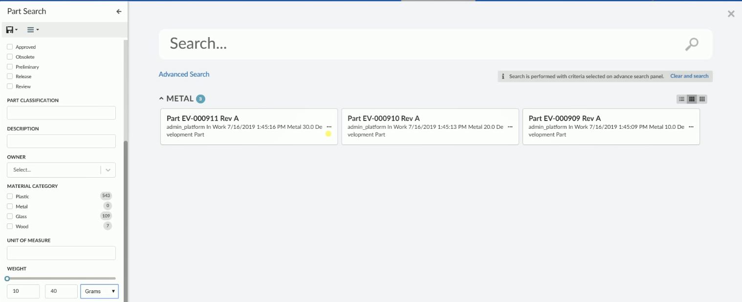
Figure 27. Search With Dimensions
<Field attribute="attribute_Weight">
<Label>Weight</Label>
<UIType>Slider</UIType>
<Settings>
<Setting name="searchWithUnit" value="true" />
<Setting name="min" value="0" />
<Setting name="max" value="100" />
</Settings>
</Field>| The UI type is redundant in the example above. As the attribute weight is specified on the field element sensible default values for the field are applied. For example, the UIType is set to slider as weight contains numeric values. |
Settings:
| Attribute Name | Description | Default | Example |
|---|---|---|---|
showSlider |
Should the slider be displayed |
true |
|
min |
The minimum value that is selectable. This setting is mandatory in case the slider is displayed. |
|
|
max |
The maximum value that is selectable. This setting is mandatory in case the slider is displayed. |
|
|
unit |
A unit to display next to the input fields, e.g. $ and g. |
|
|
searchWithUnit |
should the field allow search with available dimensions for numeric types. |
false |
|
step |
Increments when changing the value using the slider. |
1 |
|
precision |
Decimal precision for the field. |
1 |
|
valuesInclusive |
Includes the specified ‘from’ and ‘to’ values |
true |
|
Tree Field
Treefield can be used to create a tree-like structure with nodes and each node can be expanded or selected. It is useful for selecting values from classification and sub-classification like type hierarchy.
There are three ways to specify the values/nodes the user can select from:
-
Predefined list of values. Configure the available values/nodes using the Values element. The values/nodes are sent to the client when the search form is rendered and no further request to the server is required.
-
TreeHandler. Specify which TreeHandler should provide values/nodes, e.g.
typeorbusinessobject. When the user expands a node a request is sent to the server for fetching child nodes. Child nodes are added to expanded node and child nodes can further be expanded. -
Combination of both. Configure the available values/nodes using the Values element and specify which TreeHandler which should provide values/nodes on expanding the preconfigured nodes. The predefined values/nodes are sent to the client when the search form is rendered. When the user expands a node a request is sent to the server for evaluating and fetching child values/nodes. Combination of both us useful to define the root node, which can be further expanded.
Type Hierarchy
Following settings are supported by Treefield:
| Setting Name | Description | Default | Example | ||
|---|---|---|---|---|---|
showValueCount |
Whether to show count against the node if provided by TreeHandler. |
true |
|
||
selectChildren |
Whether child nodes should be auto selected on selecting parent node.
|
false |
|
||
submitOnlyParent |
Whether to submit only parent node when child nodes are auto selected.
|
false |
|
||
showAllNodes |
Whether to show all nodes or show limited number of nodes with scroll. |
false |
|
||
showNodesCount |
How many node should be visible, after which scroll will be shown. |
5 |
|
||
loadOptions |
A JSON configuration object used to define TreeHandler and other sub settings needed by TreeHandler. See Tree Handlers for more detail. |
|
Predefined Values
Predefined values can be specified using Values element. Attribute parent can be used to build a node hierarchy for predefined values.
Example:
<Field id="type" sectionId="basic">
<UIType>tree</UIType>
<Label>Type</Label>
<DataField>TYPE</DataField>
<Values>
<Value value="Part">Part</Value>
<Value value="Software Part" parent="Part">Software Part</Value>
<Value value="Hardware Part" parent="Part">Hardware Part</Value>
<Value value="Mechanical Part" parent="Hardware Part">Mechanical Part</Value>
<Value value="Electrical Part" parent="Hardware Part">Electrical Part</Value>
</Values>
</Field>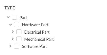
Figure 28. Predefined Tree Nodes
| Predefined values can be used to load root nodes when used together with a TreeHandler. |
Tree Handlers
A TreeHandler is used to expand a node. When a node is expanded an ajax request is sent to the server with the expanded node as input, the TreeHandler processes this input and prepares a list of child nodes, which are sent back to the client. Child nodes are added to the expanded node and node is marked as expanded.
Tree handler is a java class and must implement following interface com.technia.tvc.search.ui.tree.handler.TreeHandler.
Tree handler can be configured using a <Setting> called loadOptions with the handler name set to treehandler.
Example configuring a field to use the type TreeHandler:
<Field id="type2" sectionId="basic">
<UIType>tree</UIType>
<Label>Type</Label>
<DataField>TYPE</DataField>
<Values>
<Value value="Part" default="true" disableSelection="false">Part</Value>
</Values>
<Settings>
<Setting name="casesensitive" value="true" />
<Setting name="showValueCount" value="true" />
<Setting name="selectChildren" value="true" />
<Setting name="submitOnlyParent" value="false" />
<Setting name="loadOptions">
{
"handler": {
"name": "com.acme.CustomTreeHandler"
},
"valueKey": "value",
"labelKey": "label"
}
</Setting>
</Settings>
</Field>Following sub settings are supported by loadOptions:
| Setting Name | Description | Default | Example |
|---|---|---|---|
forceNodeFetchOnExpand |
Whether a new server request should be made when an already expanded node is collapsed and expanded again. This setting should be set to |
false |
|
valueKey |
Key which should be used to retrieve value from added child node. |
value |
|
labelKey |
Key which should be used to retrieve label from added child node. |
label |
|
Built in Tree Handlers
There are two built in TreeHandlers:
type TreeHandler is used to create a tree field based on Enovia type hierarchy. Each node represents a type in Enovia and on expanding its subtypes are fetched and added as child nodes. It can be configured using shorthand type as shown below -
<Field id="type2" sectionId="basic">
<Values>
<Value value="Part" default="true" disableSelection="false">Part</Value>
</Values>
...
<Settings>
<Setting name="loadOptions">
{
"handler": {
"name": "type"
},
"valueKey": "value",
"labelKey": "label"
}
</Setting>
</Settings>
</Field>businessobject TreeHandler is used to create a tree field by expanding the business object. To start a root node or nodes must be configured. The root node can be configured as a static node via predefined values and value must be root which acts as a starting node. On expanding the starting node, businessobject adds real root nodes under the starting node via Enovia MQL query as configured in handler settings. When the root node or nodes are expanded, Enovia MQL expand is used to add child nodes under the root node.
Root node configured as predefined value is dummy node and lets TreeHandler businessobject know that root nodes should be added via Enovia MQL query. On each node expansion thereafter Enovia MQL expand is performed.
Business object handler can be configured using short hand TreeHandler businessobject.
Following sub settings are supported by businessobject TreeHandler:
| Setting Name | Description | Example |
|---|---|---|
rootTypePattern |
Type pattern to quering the root nodes. |
|
rootNamePattern |
Name pattern to quering the root nodes. |
|
rootRevPattern |
Revision pattern to quering the root nodes. |
|
rootVaultPattern |
Vault pattern to quering the root nodes. |
|
rootWhereClause |
Where clause that should be applied while quering the root nodes. |
|
disableRoots |
Whether root nodes should be disabled for selection. |
|
typePattern |
Type pattern for expanding root and other nodes. |
|
relPattern |
Relationship pattern for expanding root and other nodes. |
|
relWhereClause |
Relationship where clause for expanding root and other nodes. |
|
objectWhereClause |
Object where clause for expanding root and other nodes. |
|
displayMacro |
displayMacro for showing lable of expanded child nodes. |
|
Example businessobject handler configuration for the scenario where can select a part family classification. In Enovia part families are connected with libraries and part families can have subpart families. In the configuration below on expanding dummy start node, part libraries are queried using root config settings and part library and part family are further expanded using type and rel patterns.
<Field sectionId="related">
<Label>Classification Tree</Label>
<DataField>to[Classified Item].from.id</DataField>
<ConditionalFields></ConditionalFields>
<UIType>tree</UIType>
<Values>
<Value value="root" disableSelection="true">Start...</Value>>
</Values>
<Settings>
<Setting name="loadOptions">
{
"handler": {
"name": "businessobject", // handler name
"rootTypePattern": "type_Libraries", // Root type pattern
"rootNamePattern": "*", // Root name pattern
"rootRevPattern": "-", // Root revision pattern
"rootVaultPattern": "vault_eServiceProduction", // Root vault pattern
"rootWhereClause": "current == Active", // Root where clause
"disableRoots": "true", // If part library should be disabled for selection
"typePattern": "type_PartFamily", // Type pattern for part family. Supports more than one comma separated values.
"relPattern": "relationship_Subclass", // Relation between library and part family and between part family and
// sub part families. Supports more than one comma separated values.
"objectWhereClause": "current == Active", // Relation where clause
"displayMacro":"${name} ${current}" // Display marco
},
"valueKey": "value",
"labelKey": "label"
}
</Setting>
<Setting name="submitOnlyParent" value="true" />
</Settings>
</Field>Part Classification Tree Field
In this example we are adding a dummy start node in the begining and on expanding dummy start node, root nodes are added as child to dummy nodes. It is possible to use combination of predefined values and businessobject TreeHandler to laod root nodes directly as searchform is loaded.
|
Combination of Predefined Values and TreeHandler
A root node or nodes in the tree field are the starting point tree expansion. It is important to configure root nodes properly for the intuitive end-user experience. For example when using a built-in TreeHandler type, the root node can be configured using a predefined value :
<Field id="type2" sectionId="basic">
<Values>
<Value value="Part" default="true" disableSelection="false">Part</Value>
</Values>
...
<Settings>
<Setting name="loadOptions">
{
"handler": {
"name": "type"
},
"valueKey": "value",
"labelKey": "label"
}
</Setting>
</Settings>
</Field>or in case of businessobject handler root nodes can be added using root node configuration. However, it is possible to use a custom java class to load root nodes and allow businessobject handler to only handle the expansion of nodes. See Values for more details.
<Field sectionId="related">
<Label>Classification Tree</Label>
<DataField>to[Classified Item].from.id</DataField>
<ConditionalFields></ConditionalFields>
<UIType>tree</UIType>
<Values className="com.acme.RootNodeProvider" />
<Settings>
<Setting name="loadOptions">
{
"handler": {
"name": "businessobject", // handler name
"typePattern": "type_PartFamily", // Type pattern for part family
"relPattern": "relationship_Subclass", // Relation between library and part family and between part family
// and sub part families.
"objectWhereClause": "current == Active", // Relation where clause
"displayMacro":"${name} ${current}" // Display marco
},
"valueKey": "value",
"labelKey": "label"
}
</Setting>
</Settings>
</Field>Term Field
Term field is special field designed to be used for search overlay. Implementing Search Provider can decide on how to interpret term field and use for performing search. See Enovia Provider Settings for details on how built-in ENOVIA Search Provider uses term field. Term field can be identified by property FieldType as term on field.
Section Configuration Format
The root element is <Section> and the following child elements and attributes are supported:
| Name | Description | Example | ||
|---|---|---|---|---|
id |
Attribute on
|
|
||
Label |
The label for the section. I18n is supported through string resources file. |
|
||
Tooltip |
Tooltip for the field. Displayed when hovering the label. |
|
||
Expanded |
Whether section should be expanded on load of searchform. Default value is true. |
|
Sections can be used to divide fields into collapsible group or sections. Each field configuration should specify its section using attribute sectionId on <Field> tag, which should match with id on corresponding <Section>. See example configuration below -
<SearchForm>
<Title>Part Search</Title>
<Sections>
<Section id="basic">
<Label>com.technia.tvc.search.form.name.label</Label>
<Tooltip>
<Title>Basic Fields</Title>
<Content>This is a section for basic fields.</Content>
</Tooltip>
<Expanded>true</Expanded>
</Section>
<Section id="classification">
<Label>Classification</Label>
<Tooltip>
<Title>Classification Fields</Title>
<Content>This is a section for classification fields.</Content>
</Tooltip>
<Expanded>false</Expanded>
</Section>
<Section id="others">
<Label>Other</Label>
<Tooltip>
<Title>Other Fields</Title>
<Content>This is a section for other fields.</Content>
</Tooltip>
<Expanded>false</Expanded>
</Section>
</Sections>
<Fields>
<NameField sectionId="basic">
<Settings>
<Setting name="casesensitive" value="true" />
</Settings>
</NameField>
<TypeField id="type" sectionId="basic">
...
</TypeField>
<StateField sectionId="basic">
...
</StateField>
<RevisionField sectionId="basic">
...
</RevisionField>
<ClassificationField sectionId="classification">
...
</ClassificationField>
<Field sectionId="others">
...
</Field>
<PersonField sectionId="others">
....
</PersonField>
<Field attribute="attribute_MaterialCategory" id="material_category" sectionId="classification">
...
</Field>
</Fields>
</SearchForm>Save Search
Search criteria can be saved using saved search functionality. Saved searches can be loaded to fill search criteria on the search form. User can also directly launch a search by clicking on find icon.
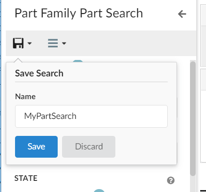
Figure 29. Save Search
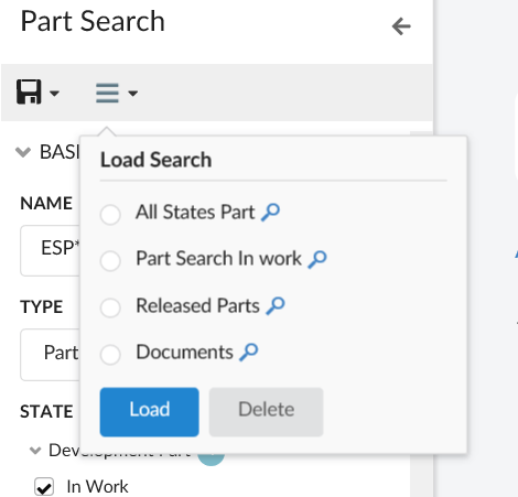
Figure 30. Load Search
Export Search
Search criteria present on search form can be exported as URL, which can be shared as copied text. Exported URL can then be directly be used to launch search in overlay mode. When a search is launched via URL, a default empty homepage is shown in the background to avoid loading heavy homepage impacting performance. However, it is possible to load a custom homepage via configuration tag <HomePage> on search config. <HomePage> should have the page reference that needs to be loaded in the background.
Example:
<Search provider="enovia" version="2">
...
<HomePage>
<Page namespace="helium" name="SearchPage.xml"/>
</HomePage>
</Search>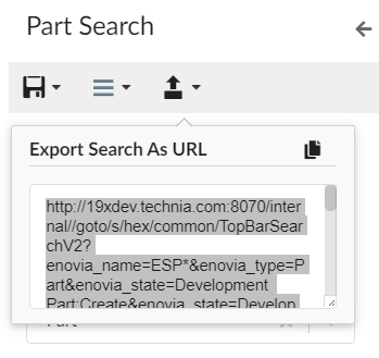
Figure 31. Export Search
User settings
Search On Criteria Update
User Setting to enable/disable Search On Criteria Update for Search.
User can now control whether the search is submitted when the search criteria is updated. Earlier this feature was limited to search config and it was not possible to enable or disable for a specific user.
A built-in command SaveSearchUserSettings is added to allow users to enable or disable search on criteria updates. This built-in command needs to be added to the search form toolbar.
For detailed information on search on criteria update, please refer Search On Criteria Update
Search On Load
User Setting to enable/disable Search On Load for Search. Search config setting SearchOnLoad can be used to perform the initial search as search form loads.
User can now control whether the search should be initiated when the search form loads. Earlier this feature was limited to search config and it was not possible to enable or disable for a specific user.
A built-in command is added to allow users to enable or disable search on load feature. This built-in command needs to be added to the search form toolbar.
For detailed information on search on load, please refer Search On Load
<Toolbar>
<SaveSearchUserSettings />
</Toolbar>
SaveSearchUserSettings command is used to club both the user settings ie Search On Criteria Update and Search On Load
|
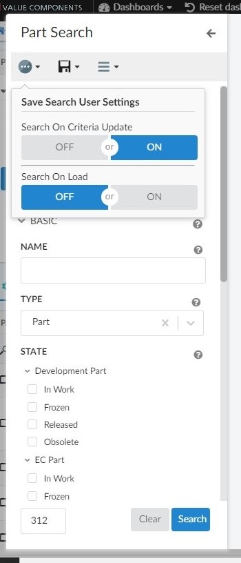
Figure 32. Usersetting for search on criteria update & search on load
Javascript API
Methods
| Method | Description |
|---|---|
setCriteria |
Sets the criteria on search form |
getCriteria |
Gets the search criteria |
updateFieldsVisibility |
Updates visibility of fields on searchform |
getState |
Current fields of search form. State of searchform represents all the fields within searchform. |
setFieldValues |
Sets the field values on search form. |
setFields |
Sets the fields on search form. It is used when search result returns search form fields. |
updateFieldValueCounts |
Updates count on searchform fields. |
on |
Register to an event |
off |
Deregister to an event |
Events
| Event Name | Description |
|---|---|
search |
Called when search button is clicked. |
close |
Called when searchform is closed |
resetFields |
Called when fields are reset. |
criteriaUpdate |
Called when search criteria is updated. |
Example Configuration
<?xml version="1.0" encoding="UTF-8"?>
<SearchForm>
<Title>Part Search</Title>
<Fields>
<NameField />
<TypeField>
<Values>
<Value value="Part" default="true" />
</Values>
<SearchableTypes>
<Type>type_Part</Type>
<Type>type_DOCUMENTS</Type>
</SearchableTypes>
<Tooltip>
<Title>customer.search.type.tooltip.title</Title>
<Content>customer.search.type.tooltip.content</Content>
</Tooltip>
</TypeField>
<Field>
<Label>Material Category</Label>
<DataField>MATERIAL_CATEGORY</DataField>
<Values attribute="attribute_MaterialCategory" />
<Settings>
<Setting name="showFilter" value="true" />
<Setting name="showRangeAmount" value="10" />
</Settings>
</Field>
</Fields>
</SearchForm>Toolbar Configuration Format
Toolbar can be configured inline within a searchform. Command/Menu can be configured in a separate file and added to the toolbar element.
Figure 33. SearchForm Toolbar
The command configuration files are placed in the folder command and menu configuration files are placed in the folder menu. If configured in a separate file, it can be referred within searchform using attribute ref as below -
<Toolbar>
<Command ref="tvc:command:helium/mail.xml"/>
<Menu ref="tvc:menu:helium/mymenu.xml"/>
</Toolbar>Command Configuration Format
The root element is <Command> and the following child elements are supported:
| Name | Description | Example |
|---|---|---|
Label |
The label for the command. I18n is supported through string resources file. |
|
Alt |
Tooltip for the command. Displayed when hovering the label. |
|
FontIcon |
Icon for the command. Displayed left of the label. |
|
Setting |
Setting with name and value can be passed to include onClick and other required information. |
|
Menu Configuration Format
The root element is <Menu> and the following child elements are supported:
| Name | Description | Example |
|---|---|---|
Label |
The label for the command. I18n is supported through string resources file. |
|
Alt |
Tooltip for the menu. Displayed when hovering the label. |
|
FontIcon |
Icon for the menu. Displayed left to the label. |
|
Command |
Commands for this menu visible as dropdown elements on clicking the menu. |
|
In-built Commands:
The in-built search commands can also be configured and only icon,label and tooltip can be modified.
<SaveSearch>
<Label>save</Label>
<FontIcon>ti-f ti-save-f</FontIcon>
<Alt>Save Search</Alt>
</SaveSearch>
<LoadSearch>
<Label>load</Label>
<FontIcon>ti-f ti-menu-f</FontIcon>
<Alt>Load Search</Alt>
</LoadSearch>| If toolbar is not defined in the searchForm, a default toolbar with in-built commands takes its place. If toolbar is configured, these inbuilt commands are needed to be included if required. |
8.11.4. Search Providers
ENOVIA Search Provider
Built-in ENOVIA Search Provider can be used to perform search in ENOVIA. It can be used with enovia callsign name in Search Configuration.
<Search provider="enovia" />Settings
ENOVIA Search Provider supports following settings, which are defined in Search Configuration. See Configuration Format for details on how to configure settings.
| Setting Name | Description | Default | Example |
|---|---|---|---|
vault |
Enovia vaults where search should be performed. Multiple comma separated vaults can be configured. |
eService Production |
|
where |
A custom where clause can be passed to search provider. For example it can be used to search only non-obsolete parts. |
none |
|
termWhere |
termWhere is applicable for term search. It defines where clause, into which user search term is to be injected while performing Enovia search. For example, if user entered term search as |
|
|
EXALEAD Search Provider
Built-in EXALEAD Search Provider can be used to perform search in Exalead. It can be used with exalead callsign name in Search Configuration.
<Search provider="exalead" />Settings
EXALEAD Search Provider supports following settings, which are defined in Search Configuration. See Configuration Format for details on how to configure settings.
| Setting Name | Description | Default | Example |
|---|---|---|---|
xl:termFields |
Fields against which term search should be evaluated. |
Term search is by default queried as against all indexed fields |
|
xl:sortField |
Field on which search should be sorted. |
none |
|
xl:sortOrder |
Sort order of search result. |
ascending |
|
xl:enableWildcardSearch |
Whether to add wildcard to term search. |
false |
|
xl:inlcudeFacets |
Whether to include facets or field counts. |
true |
|
RevisionField
In case of exalead search provider, RevisionField can be configured in search form like below
<RevisionField sectionId="basic">
<AnyRevision />
<FirstRevision />
<LastRevision />
<LatestInState policy="EC Part" state="Release" />
<LastAndLatestInRelease />
<Settings>
<Setting name="xl:lastRevision" value="LASTREVISION"></Setting>
<Setting name="xl:firstRevision" value="FIRSTREVISION"></Setting>
<Setting name="xl:latestRevision" value="LATESTREVISION"></Setting>
<Setting name="xl:lastAndLatestRevision" value="LASTANDLATESTREVISION"></Setting>
</Settings>
</RevisionField>Following Exalead settings can be defined on search form fields. See Field Configuration Format for details on how to configure settings.
| Setting Name | Description | Default | Example |
|---|---|---|---|
xl:firstRevision |
Exalead key for first revision.
|
FIRSTREVISION |
|
xl:lastRevision |
Exalead key for last revision.
|
LASTREVISION |
|
xl:latestRevision |
Exalead key for latest revision.
|
LATESTREVISION |
|
xl:lastAndLatestRevision |
Exalead key for lastAndLatestRevision revision.
|
LASTANDLATESTREVISION |
|
xl:showZeroCount |
Whether '0' should be shown when Exalead count for a field value is 0. |
false |
|
Custom Search Provider
Custom Search Provider can be used to perform search. Custom Search Provider should implement interface com.technia.tvc.search.api.SearchProvider and provide implementation to method search(SearchContext context). SearchContext object provide access to following api to perform search.
| API | Description |
|---|---|
getCriteria |
Search criteria supplied by the client. Typically what the user enters in the search form including term search. |
getSearchForm |
Instance of |
getDataFields |
|
getSettings |
Custom |
getSectionProvider |
Section Provider to be used for sectionizing search results. Refer Built-in Section Provider for default implementation. |
getSearchForm |
Instance of |
8.12. Internationalisation
Helium supports both server-side and client-side internationalization.
The server-side internationalization is achieved by defining a set of string resource files inside <webapp-root>/WEB-INF/classes directory of the web application.
<Column>
<Label>emxFramework.Common.Name</Label>
</Column>The client-side internationalization is achieved by defining a set of language files in JSON format inside <webapp-root>/helium/lang or <webapp-root>/helium/custom/lang directory.
To decide which language to load, Helium will look at the current browser language (navigator.language), but if no
suitable file is found a default one will be used.
<Column>
<Label>column.common.name</Label>
</Column>|
For |
8.12.1. File format
Each file should be given a name based on the locale they are to support. For instance, a file containing US English should
be named en_us.json and a file containing Swedish should be named sv.json.
The files are simple JSON objects, with a key and a string as value, like the one below:
{
"test": "My test message"
}Where the key is test and the message is My test message. The keys can be nested arbitrarily deep in a nested object. For example the file below will
create the keys form.createNew.title and form.createNew.message.
{
"form" : {
"createNew" : {
"title" : "New Object",
"message" : "The object {objectId} was successfully created."
}
}The value for the key form.createNew.message contains a placeholder ({objectId}) which will be populated with the actual value by the
framework. For an example see the JavaScript API.
8.12.2. Resolving files
The language files are located in <webapp-root>/helium/lang or <webapp-root>/helium/custom/lang.
The internationalisation framework will first look for files inside <webapp-root>/helium/custom/lang, if no suitable file is
found, it will fall back to files defined in <webapp-root>/helium/lang and if still no file is found, it will default to a file named default.json
8.12.3. Javascript API
The above described keys can be accessed through javascript with the following syntax:
// Will return "My test message"
App.i18n.t('test')It is possible to pass arguments to the App.i18n.t function that will be interpolated. See example below.
// Will return "The obejct 1.2.3.4 was successfully created."
App.i18n.t('form.createNew.message', {objectId: '1.2.3.4'})Handlebars helper
In Helium, there is a Handlebars helper for easy access to the internationalisation API. It is invoked by using the i18n helper.
{{i18n myTranslationKey}}This will internally call the App.i18n.t function with the passed in key as its argument. The i18n helper of course also supports passing
in arguments, like so:
{{i18n myTranslationKey myObjectContainingVariables}8.13. Toaster
Helium use toaster message to provide user notification. These messgae can be shown using javascript api.
The default options use to show toaster notification can be changed through javascript as shown below :
(function () {
App.toaster.defaultOpts = {
"closeButton": true,
"newestOnTop": true,
"progressBar": true,
"positionClass": "toast-bottom-full-width",
"preventDuplicates": false,
"onclick": null,
"showDuration": "300",
"hideDuration": "1000",
"timeOut": "15000",
"extendedTimeOut": "1000",
"showEasing": "swing",
"hideEasing": "linear",
"showMethod": "fadeIn",
"hideMethod": "fadeOut"
}
})();The above javascript can be placed in webapps/helium/custom folder.
The toaster message are shown for 8 seconds by default, but user might want to see it for longer duration. This can be achieved by adding below configuration in tvc.properties:
tvc.helium.toaster.timeout = 25000 // default is 8000
8.14. Access Control
Helium has a common way of configuring access control that is shared among the different components (except table columns) that has this support (page, tab, commands etc.).
Access Control for table columns can be defined similar to TVC Classic. Please click here for more details.
The access restriction for components (other than table columns) can be defined based upon following:
-
Role Assignment
-
Group Assignment
-
Person (A named user)
-
Access Mask (Access mask for the current object)
-
Access Program (A JPO that evaluates the access rights)
-
Access Expression (MQL expression that evaluates the access)
The example below illustrates how you can construct the access restriction:
<Access>
<Role>role_FirstRole</Role>
<Role>role_SecondRole</Role>
<Group>group_SomeGroup</Group>
<Mask>modify,checkout</Mask>
</Access>Or use an access program:
<Access>
<Program name="MyJPO" method="checkAccess"/>
</Access>Or use an access expression:
<Access>
<Expression><![CDATA[owner == context.user]]></Expression>
</Access>For Topbar Search command :
<Search ref="tvc:search:helium/TopBarSearch.xml">
<Access>
<Group>group_SomeGroup</Group>
</Access>
</Search>For Topbar Myspace and Logout command :
<Myspace>
<Access>
<Group>group_SomeGroup</Group>
</Access>
</Myspace>8.15. Loader
A loader alerts a user to wait for an activity to complete.
Figure 34. Loader
It can contain message also. This message appears just below the animation.
One can enable this feature by defining key-value pair like below in translation JSON files
"loader": {
"message": "Loading..."
}By defining this key/ value pair, all loading animations in the application will automatically display this value. No further configuration is needed.
It is also possible to define custom messages for different loading animations, e.g.
new App.Loader($element,{"message":'loader.customMessage'})Or
new App.Loader($element,{"message":'Loading...'})A mix of the above, i.e. default message and custom message is also possible.
Also we can add loader over any particular element on the UI, for ex a table row
new App.Loader(element, { rowLoader: true }JavaScript API, Loader.
Figure 35. Loader with message(Loading…).
8.16. Dimmable Modal
It would be helpful for users to have dim and non-reactive backgrounds while working on modal or fullscreen views.
This feature can be enabled by configuring tvc.helium.widget.overlay.dimmable= true // default is false in tvc.properties.
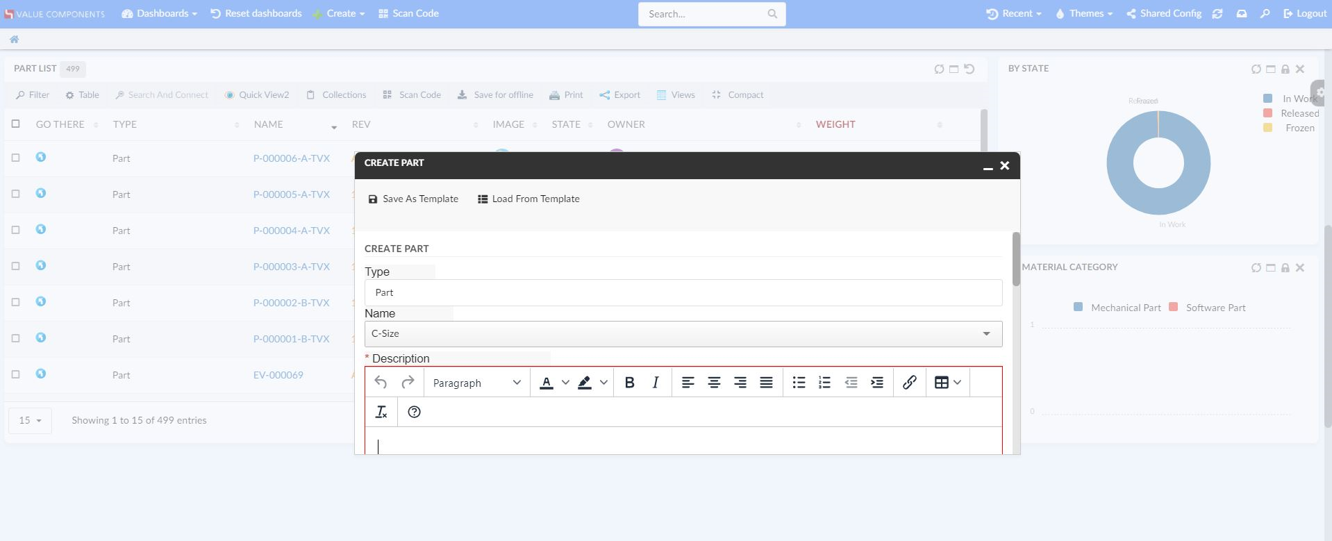
Figure 36. Dim and Non-reactive Background
9. Embedding in other Components
9.1. TVC Classic
Embedding can be done in two ways. Either:
-
Embed a Helium Widget. Useful when you want to embed a single widget.
-
Embed a Helium Page. Useful when you want to display a dashboard with multiple widgets.
9.1.1. Embed Widget
To embed Helium widget into a TVC Classic tab, create a Command with the following content:
<?xml version="1.0" encoding="UTF-8"?>
<Command xmlns="http://technia.com/TVC/Menu" xmlns:xsi="http://www.w3.org/2001/XMLSchema-instance" xsi:schemaLocation="http://technia.com/TVC/Menu http://products.technia.com/tvc/schema/latest/Command.xsd">
<Label>Helium</Label>
<URL href="/goto/w/helium/NameOfWidget" /> (1)
</Command>| 1 | The href attribute points to the Helium widget you want to embed. |
Passing the current object id to Helium works in the same manner as for pages.
The Helium topbar will not be displayed and the widget is rendered in headerless mode.
See Route to Widget for more details.
9.1.2. Embed Page
To embed Helium page into a TVC Classic tab, create a Command with the following content:
<?xml version="1.0" encoding="UTF-8"?>
<Command xmlns="http://technia.com/TVC/Menu" xmlns:xsi="http://www.w3.org/2001/XMLSchema-instance" xsi:schemaLocation="http://technia.com/TVC/Menu http://products.technia.com/tvc/schema/latest/Command.xsd">
<Label>Helium</Label>
<URL href="/goto/p/helium/Page"> (1)
<Param name="embed" value="true" /> (2)
</URL>
</Command>| 1 | The href attribute points to the Helium page you want to embed. |
| 2 | The param embed with value true will make the helium page render without the topbar menu. |
If you want to pass along the current object id to Helium, simply add the submit attribute to your command as in the example below:
<?xml version="1.0" encoding="UTF-8"?>
<Command xmlns="http://technia.com/TVC/Menu" xmlns:xsi="http://www.w3.org/2001/XMLSchema-instance" xsi:schemaLocation="http://technia.com/TVC/Menu http://products.technia.com/tvc/schema/latest/Command.xsd">
<Label>Helium</Label>
<URL submit="true" href="/goto/p/helium/Page"> (1)
<Param name="embed" value="true" />
</URL>
</Command>| 1 | submit attribute set to true results in the current objectId being passed to Helium |
See Route to Page for more details.
9.1.3. Embed Dashboard
To embed Helium dashboard into a TVC Classic tab, create a Command with the following content:
<?xml version="1.0" encoding="UTF-8"?>
<Command xmlns="http://technia.com/TVC/Menu" xmlns:xsi="http://www.w3.org/2001/XMLSchema-instance" xsi:schemaLocation="http://technia.com/TVC/Menu http://products.technia.com/tvc/schema/latest/Command.xsd">
<Label>Helium</Label>
<URL href="/goto/d/NameOfDashboard"> (1)
</URL>
</Command>| 1 | The href attribute points to the Helium dashboard you want to embed. |
9.1.4. Embedded Tips
When running in embedded mode you might want to disable the headers of the
different widgets. This is achieved by setting the <Template> element
to headerless in your widget definition. See example below:
<Widget namespace="helium" name="TableWidget.xml">
<Id>dt1</Id>
<Width>6</Width>
<Height>10</Height>
<X>0</X>
<Y>0</Y>
<Template>headerless</Template>
</Widget>
It is recommended to explicity pass embed=false parameter to non embedded command so that topbar is always visible when switching from embedded mode to normal mode.
|
Verical stack mode for widgets is by default disabled in embeded. To enable this behavior,
use tvc.helium.embedded.disableMobileMode=false in tvc.properties. The default value is true.
|
Breadcrumb in embeded mode can be enabled by defining tvc.helium.embedded.showBreadcrumb in tvc.properties.
The default value is true.
:toc: macro
:toc-title: Table of Contents
:toc-placement: preamble
|
9.2. 3DDashboard
Helium can run as a true widget inside 3DDashboard. Unlike TVC widget, it run directly inside 3DDashboard widget iframe. True widget can be configured through the widget preferences in the administrators dashboard. As configurations are listed automatically in preferences UI admin is responsible for setting up and distributing proper/working configurations.
After a dashboard has been configured the administrator can share this to the users.
Configure a dashbaord:
-
Login with administration access.
-
Go to 3DDashboard.
Figure 37. Launch 3D Dashboard
-
Go to Platform Management.
Figure 38. Go to Platform Management
-
Go to Members tab.
-
scroll down.
-
Click on Create Additional app.
Figure 39. Add Additional app
-
Fill the following details and click save button.
-
Short Name.
-
Long Name(Appears in tooltip).
-
Compass Quadrant.
-
Type.
-
Source Code URL (Is widget path in webapps folder as shown in below image).
-
Configuration file URL (Optional and required only when adding preconfigured JSON based widget).
-
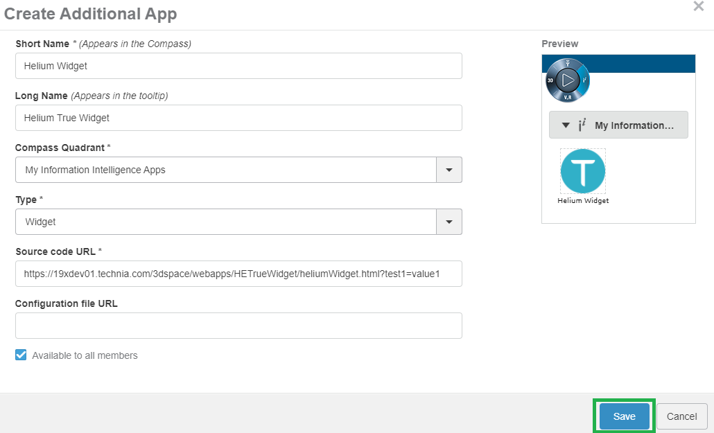
Figure 40. Create new widget.
The available Widget Type in widget preferences are as below:
| Property | Description | Path |
|---|---|---|
Helium Chart |
When selecting page a list of helium widget configs for chart will be available for the user to choose from |
/goto/w |
Helium Dashboard |
When selecting dashboard a list of helium widget configs for dashboard will be available for the user to choose from |
/goto/d |
Helium Page |
When selecting page a list of helium page configs will be available for the user to choose from |
/goto/p |
Helium Table |
When selecting page a list of helium page configs for table will be available for the user to choose from |
/goto/w |
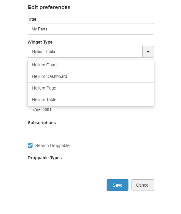
Figure 41. All available Widget Type
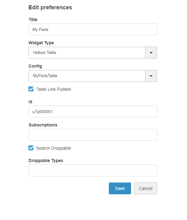
Figure 42. Widget Conf
After selecting the MyPartsTable configuration in preferences widget will load the helium table with selected configuration. as shown below.
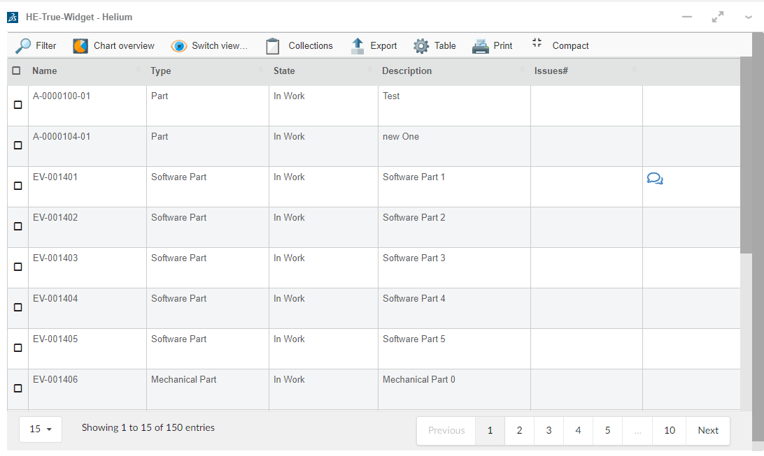
Figure 43. My Parts Table
9.2.1. Supported features.
Features supported by true widgets like Search in current dashbaord, 6WTags are as follows.
Search in Current Dashboard
Helium widgets embedded in 3DDashboard, will now be targeted by 3DEXPERIENCE "Search in Current Dashboard".
i.e If we have widgets with table data then we can filter the data in all tables using Search in current dashboard.
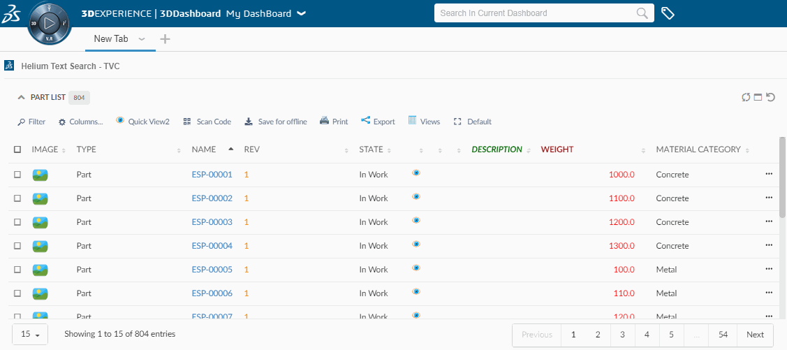
Figure 44. Highlights Search result in 3DDashboard
Support for 6WTags
Once table data is loaded in a widget all visible columns get added into preferences.
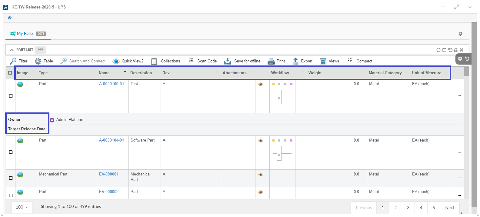
Figure 45. Visible Columns
User can select the column and its category from preferences which needs to be shown under 6WTags.
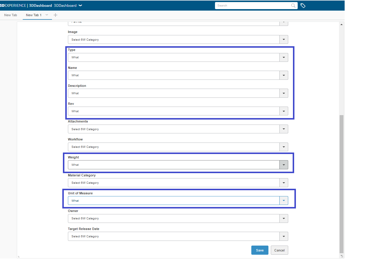
Figure 46. Selected Column Preferences
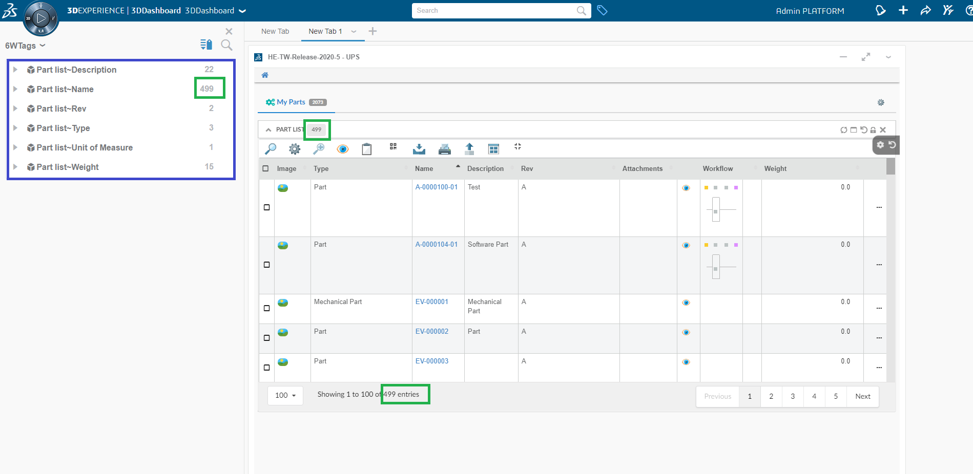
Figure 47. 6W Tags Creation
Table data in the widgets can now be filtered on the basis of selected tags.
Figure 48. Filtered Data using 6WTags
Support for creating 6WTags from multiple widgets
When the user has multiple widgets within a tab, the user can choose a widget from the preferences menu and respective columns of the chosen widget will be displayed in the preferences.
Figure 49. Multiple widgets within Tab
Figure 50. Widget option in preferences
Figure 51. Respective columns on widget selctions
On the selection of the column, the column name & data will be added to 6wTags for Tag creation.Table data in the widgets can now be filtered on the basis of selected tags.
Support for drag and drop functionality for embedded Helium or True widget in 3DDashboard.
When the Helium or true widget is embedded in 3DDashbaord, an object from the Helium or true widget can be dragged and dropped into TVC / OOTB widgets and vice versa.
To achieve this the below configuration need to be provided in the helium table column.
<Draggable>true</Draggable>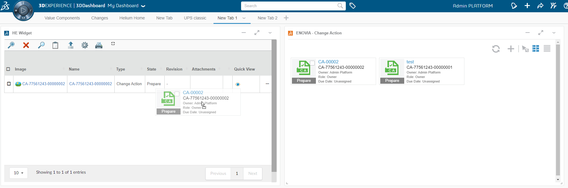
Figure 52. Drag and Drop in Helium
10. Widgets
10.1. Chart
Visualizes data in charts. Available type of charts:
-
Line
-
Bar
-
Pie
-
Donut
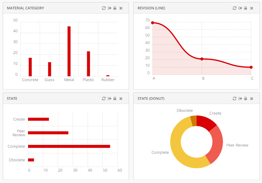
The chart solution is based on Chartist.js
A dataloader can be configured at dashboard level. The data loaded at dashboard level is available to all the chart widgets defined in the dashboard.
In this case, the data will not be cached by the service worker.
|
10.1.1. Widget
To create a chart widget you must first create an xml with the following contents:
<ChartWidget>
<Title>State</Title>
<ChartConfig namespace="helium">StateChart.xml</ChartConfig>
</ChartWidget>The <ChartWidget> element supports the following child elements.
| Name | Description | Example |
|---|---|---|
Title |
The title of the chart widget |
|
ChartConfig |
Specifies the chart config file |
|
UseVersion2 |
If set to true the new chart library ApexCharts will be used else the older one Chartist |
|
10.1.2. Chart configuration
The <ChartConfig> element can have the following children. Full example.
| Name | Description | Example |
|---|---|---|
DataSeries |
Defines the data to display in the chart. More details |
|
Sort |
Controls sorting of the data. Sorts by default on label. More details |
|
Tooltip |
Controls if tooltips are displayed. |
|
Top |
The number of entries to display in the chart. The ones with highest values are displayed and others are grouped together in the "other" section. Useful when there are lots of entries and the chart feels crowded. |
|
DrillDown |
Reference to dashboard to use when performing drilldowns. Use either |
|
OnClick |
Reference to javascript function which is invoked when user clicks on chart elements. Example |
|
Legend |
Controls if legend are displayed. For multi series, it is automatically enabled. |
|
Stack |
To show multi series bar chart as a stacked bar chart. Defaults to |
|
Options |
Options for the chart. For example you can control offsets/paddings of the chart, labels and layout. The full list of the available options is available in the Chartist documentation. Note that the options varies depends on the type of chart (bar, line etc). Option for legend : |
|
ResponsiveOptions |
Responsive options are used to adapt the chart to look good across different devices. Responsive options controls the layout based on media queries. The full list of the available options is available in the Chartist documentation. |
Example displaying only first character of the month (J, F, M, A …) on small screens: |
DataType |
Controls the type of data to display in the chart. By default it uses the data type |
|
AnimateOnLoad |
Reference to a JavaScript function which registers a chart animation. One included example for line charts is available via example.js as App.custom.registerLineChartAnimation. For more examples and details, please refer to Chartist - Examples. |
|
Sorting
Controls how to sort the data in the chart.
| Name | Description | Example | ||
|---|---|---|---|---|
Label |
Sort on the label. Supports |
|
||
Value |
Sort on the value. Supports
|
|
||
LabelFixed |
Sort on label with a fixed order. Useful when display states. |
Value |
DataSeries
Defines the data to display in the chart. There is pre-built support for multiple data series but the default data type 'group' supports only one serie. Multiple data series can be utilized when writing custom data type example.
| Name | Description | Example |
|---|---|---|
DataLoader |
Optional. Data loader to use across all series in the chart. Use this setting in case all data series uses same set of objects. |
|
Serie |
Respresents one serie of data serie in the chart. More Details |
| For multi series chart DataSeries may contain multiple Serie and ChartType for all serie must be same. |
Serie
Represents one serie of data in the chart.
| Name | Description | Example | ||
|---|---|---|---|---|
DataLoader |
Defines which data to use in data serie. Optional in case specified on |
|
||
Name |
Legend label for bar and line chart. |
|
||
Expression |
Data to select. Used to group data by default.
|
If user want to show chart based on EBOM relationship on relationship attribute |
||
Expressions |
Supports multiple Expression elements which can be used to select data. By default, the first expression in the list will be used to group chart data. In this example data will be grouped by Material Category. |
|
||
SeriesExpression |
Data used to create multi series chart. SeriesExpression value becomes legend label and Name setting ignored. For multiple Serie it will be ignored.
|
If user want to show multi series chart based on EBOM relationship on relationship attribute |
||
ChartType |
Type of chart. Available kind of charts:
|
|
Example configuration
<?xml version="1.0" encoding="UTF-8"?>
<Chart>
<Sort>
<Value ascending="false" />
</Sort>
<Tooltip>true</Tooltip>
<Top>5</Top>
<DrillDown>tvc:dashboard:helium/PartDrillDown.xml</DrillDown>
<DataSeries>
<Serie>
<DataLoader>
<DataSet>tvc:dataset:helium/MyParts.xml</DataSet>
</DataLoader>
<Expression><![CDATA[$<attribute[attribute_MaterialCategory]>]]></Expression>
<ChartType>bar</ChartType>
</Serie>
</DataSeries>
</Chart>Multi Series Chart Example configuration
Multi Series Bar Chart
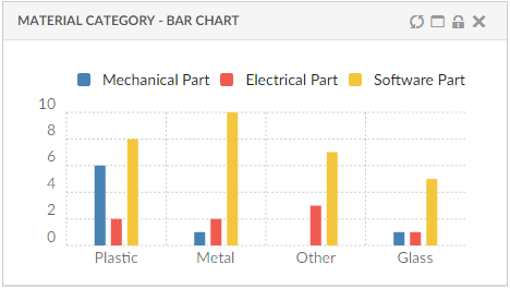
<?xml version="1.0" encoding="UTF-8"?>
<Chart>
<Sort>
<Value ascending="false" />
</Sort>
<Options>{
"legendPosition": "top"
}</Options>
<Tooltip>true</Tooltip>
<Legend>true</Legend>
<Top>3</Top>
<DrillDown>tvc:dashboard:helium/PartDrillDown.xml</DrillDown>
<DataSeries>
<Serie>
<DataLoader>
<DataSet>tvc:dataset:hex:engineering:homepage/MySoftwareParts.xml</DataSet>
</DataLoader>
<Expression><![CDATA[$<attribute[attribute_MaterialCategory]>]]></Expression>
<ChartType>bar</ChartType>
<Name>Software Part</Name>
</Serie>
<Serie>
<DataLoader>
<DataSet>tvc:dataset:hex:engineering:homepage/MyElectricalParts.xml</DataSet>
</DataLoader>
<Expression><![CDATA[$<attribute[attribute_MaterialCategory]>]]></Expression>
<ChartType>bar</ChartType>
<Name>Electrical Part</Name>
</Serie>
<Serie>
<DataLoader>
<DataSet>tvc:dataset:hex:engineering:homepage/MyMechanicalParts.xml</DataSet>
</DataLoader>
<Expression><![CDATA[$<attribute[attribute_MaterialCategory]>]]></Expression>
<ChartType>bar</ChartType>
<Name>Mechanical Part</Name>
</Serie>
</DataSeries>
</Chart>Multi Series Stacked Bar Chart
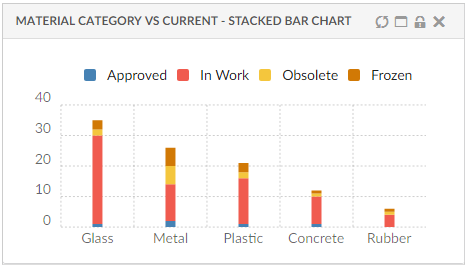
<?xml version="1.0" encoding="UTF-8"?>
<Chart>
<Sort>
<Value ascending="false" />
</Sort>
<Options>{
"legendPosition": "top"
}</Options>
<Tooltip>true</Tooltip>
<Legend>true</Legend>
<Top>3</Top>
<Stack>true</Stack>
<DrillDown>tvc:dashboard:helium/PartDrillDown.xml</DrillDown>
<DataSeries>
<Serie>
<DataLoader>
<DataSet>tvc:dataset:hex:engineering:homepage/MyParts.xml</DataSet>
</DataLoader>
<Expression><![CDATA[$<attribute[attribute_MaterialCategory]>]]></Expression>
<SeriesExpression>current</SeriesExpression>
<ChartType>bar</ChartType>
<Name>Software Part</Name>
</Serie>
</DataSeries>
</Chart>Example custom onClick
The <OnClick> configuration can be used to perform custom action when the user clicks in the chart. This enables the possibility to do drill down, exchange information in tables or something else. In the configuration you specify the JavaScript function to invoke upon user clicks.
Configuration:
<OnClick>App.custom.chartOnClick</OnClick>JavaScript:
var App = App || {};
var App.custom ={
chartOnClick: function(data) {
console.log('Clicking in chart');
console.log(' Clicked data=', data);
console.log(' Chart reference=', this);
// Code performing something nifty
}
};
Use either DrillDown OR OnClick.
|
The javascript function will be executed with this set to the chart.
|
10.1.3. Data Type
The data type controls how the data series in the chart are calculated. The input to the data type processing is the configurations done in the chart configuration file along with information about which objects that are displayed in the chart.
Output format:
{
'labels': ['<label>', '<another-label>', ...],
'series': [{
'name': '<name>',
'data': [{
'value': <value>
'objectIds': [
'<object-id>',
'<another-object-id>',
...
]
},{
...
}]
},{
...
}]
}Example output:
{
'labels': ['W34', 'W35', 'W36'],
'series': [{
'name': 'Created',
'data': [{
'value': 1
'objectIds': [
'1.2.3.4'
]
}, {
'value': 0
'objectIds': []
}, {
'value': 3
'objectIds': [
'2.3.4.5',
'5.6.7.8',
'9.8.7.6'
]
}]
}, {
'name': 'Resolved',
'data': [{
'value': 0
'objectIds': []
}, {
'value': 1
'objectIds': [
'1.2.3.4'
]
}, {
'value': 2
'objectIds': [
'5.6.7.8',
'9.8.7.6'
]
}]
}]
}Charts comes with a built-in data type strategy, but it also possible to write a custom data type.
Data Type: Group
The objects are grouped by a configured expression, e.g. type or state. Each unique value gets one label and the amount of objects is the data value. It expects there to be exactly one dataserie in the configuration.
Example custom data type
Configuration:
<DataType>App.custom.timeDataType</DataType>JavaScript:
var App = App || {};
var App.custom = {
timeDataType: function(config) {
var getObjectDataValues = function(expression, objectId, relId) {
if (expression.usesBusinessObject) {
return App.ObjectStore.get(objectId).data[expression.name].values;
}
return App.ObjectStore.getRelationship(relId).data[expression.name].values;
}
// Check each label how many values there are per serie
// - 2015-06-24 5 created 3 solved issues
// - 2015-06-25 1 created 0 solved issues
// - 2015-06-26 3 created 2 solved issues
var labels = ['2015-06-24', '2015-06-25', '2015-06-26'];
var series = [];
config.series.forEach(function(serie) {
var expr = serie.expression;
var result = {
'name': expr.name
'data': []
};
serie.objectIds.forEach(function(objectId, index) {
let relId = serie.relIds[index];
let values = getObjectDataValues(expr, objectId, relId);
values.forEach(function(value) {
// Logic calculating amount of objects which have been created/resolved
var dataPoint = {
'value': 1,
'objectIds': ['1.2.3.4'],
'relIds': ['5.6.7.8']
};
result.data.push(dataPoint);
});
});
series.push(result);
});
return {
'labels': labels,
'series': series
};
}
};Example custom data type with support for multi-value attributes
Configuration:
<DataType>App.custom.customChartValues</DataType>JavaScript:
var App = App || {};
var App.custom = {
customChartValues: function(config) {
var setLabelData = function(labelPoints, value, objectId, relId) {
labelPoints[value].value += 1;
labelPoints[value].objectIds.push(objectId);
labelPoints[value].relIds.push(relId);
}
var getObjectDataValues = function(expression, objectId, relId) {
if (expression.usesBusinessObject) {
return App.ObjectStore.get(objectId).data[expression.name].values;
}
return App.ObjectStore.getRelationship(relId).data[expression.name].values;
}
var labels = config.options.labels;
var series = [];
config.series.forEach(function(serie) {
var points = [];
var expr = serie.expression;
var labelPoints = {};
var legendLabel = serie.name || '';
labels.forEach(function(label) {
var dataPoint = {
value: 0,
objectIds: [],
relIds: []
};
labelPoints[label] = dataPoint;
});
serie.objectIds.forEach(function(objectId, index) {
var relId = serie.relIds[index];
var values = getObjectDataValues(expr, objectId, relId);
var filteredValues = values.map(function(v) {return v.value;}).filter(function(v) {return labels.includes(v)});
filteredValues.forEach(function(value) {
setLabelData(labelPoints, value, objectId);
});
if (filteredValues.length > 1) {
setLabelData(labelPoints, labels[2], objectId);
};
});
labels.forEach(function(label) {
points.push(labelPoints[label]);
});
series.push({
name: legendLabel,
data: points
});
});
return {
labels,
series
};
}
};
Figure 53. Chart displaying custom data type with multi-values
Image is showing:
-
DataSet is an inquiry that returns 33 objects based on attribute[Material Category]
-
29 of these objects have the attribute value ‘Glass’
-
10 of them have the attribute value ‘Plastic’
-
6 of them have both attribute values ‘Glass’ and ‘Plastic’
10.1.4. API
The chart javascript api can be found here
10.1.5. Path Support
In 3dexperince, more and more of the data model is moving towards path-based. Change Process is one good example and there is a need to be able to visualize the path-based data model by config only.
Now the path related object/relationship information can be used to generate charts. This can be done using the path query dataset in chart config.
Below example generates a chart based on the attribute Severity of Change Orders related to context part EBOM structure. In this case, the loader must point to Path Query which will return change order id’s and the Expression should point to selects on those change order id’s, in this case, attribute 'Severity'.
<?xml version="1.0" encoding="UTF-8"?>
<Chart>
<DataSeries>
<Serie>
<DataLoader>
<DataSet>tvc:dataset:hex:engineering/ChangeObjects.xml</DataSet>
</DataLoader>
<Expression><![CDATA[$<attribute[attribute_Severity]>]]></Expression>
<ChartType>donut</ChartType>
</Serie>
</DataSeries>
</Chart>Below is the loader definition used in the above example.
<?xml version="1.0" encoding="UTF-8"?>
<PathQuery>
<PathType>Proposed Activity.Where</PathType>
<PathSelect>owner.to[Proposed Activities].from.to[Change Action].from.id</PathSelect>
<Expand>
<From>true</From>
<To>false</To>
<Depth>1</Depth>
<RelationshipPattern>
<Relationship>relationship_EBOM</Relationship>
</RelationshipPattern>
</Expand>
</PathQuery>
Figure 54. Path Support in Charts
Read the Path Support chapter for more details.
10.1.6. Combination Charts
Combination charts let you display different types of data in different ways on the same chart. You may display columns, lines, areas, and steps all on the same combination chart. Use them to visually highlight the differences between different sets of data.
There could be multiple combinations like line and bar or line, bar and area with different dataseries representing different chart type. One of the serie should have chart type as line.
This can be configured as below :
<ChartWidget>
<Title>Multi Series Combo Charts</Title>
<ChartConfig namespace="hex:engineering:homepage">CombinationCharts.xml</ChartConfig>
<UseVersion2>true</UseVersion2>
</ChartWidget><Chart>
<DataSeries>
<Serie>
<Name>bar</Name>
<DataLoader>
<DataSet>tvc:dataset:hex:engineering:homepage/Dataset3.xml</DataSet>
</DataLoader>
<Expression>current</Expression>
<ChartType>line</ChartType>
</Serie>
<Serie>
<Name>area</Name>
<DataLoader>
<DataSet>tvc:dataset:hex:engineering:homepage/Dataset1.xml</DataSet>
</DataLoader>
<Expression>current</Expression>
<ChartType>area</ChartType>
</Serie>
<Serie>
<Name>line</Name>
<DataLoader>
<DataSet>tvc:dataset:hex:engineering:homepage/MyParts.xml</DataSet>
</DataLoader>
<Expression>current</Expression>
<ChartType>line</ChartType>
</Serie>
<Serie>
<Name>column</Name>
<DataLoader>
<DataSet>tvc:dataset:hex:engineering:homepage/Dataset1.xml</D
ataSet>
</DataLoader>
<Expression>current</Expression>
<ChartType>bar</ChartType>
</Serie>
</DataSeries>
</Chart>
Figure 55. Combination Charts
10.1.7. Other Chart types
Now all the chart types available in Apex Charts are supported in helium, they can be configured by using below config :
<ChartWidget>
<Title>EBOM Start Eff date to End Effectivity Date</Title>
<ChartConfig namespace="hex:engineering">TimelineChart.xml</ChartConfig>
<UseVersion2>true</UseVersion2>
</ChartWidget>
<Chart>
<DrillDown>tvc:dashboard:hex:engineering:homepage/MyDocumentsDrillDown.xml</DrillDown>
<Tooltip>true</Tooltip>
<Legend>true</Legend>
<Tooltip>true</Tooltip>
<Stack>false</Stack>
<DataType>App.custom.getTimelineChartData</DataType>
<DataSeries>
<Serie>
<Name>Drawing Prints</Name>
<DataLoader>
<DataSet>tvc:dataset:hex:engineering/EBOM.xml</DataSet>
</DataLoader>
<Expressions>
<Expression>${attribute[attribute_StartEffectivityDate]}</Expression>
<Expression>${attribute[attribute_EndEffectivityDate]}</Expression>
<Expression>${name}</Expression>
</Expressions>
<ChartType>rangeBar</ChartType>
</Serie>
</DataSeries>
<Options>{
"xaxis": {
"type": "datetime"
},
"plotOptions": {
"bar": {
"horizontal": true
}
}
}</Options>
</Chart>Since every chart types expects data in different format so a js method can be passed in DataType which returns the data in the required format, refer below example.
var getTimelineChartData = function(config) {
var objectIds = config.series[0].objectIds;
var chartData = []
var data = App.ObjectStore.getByIds(config.series[0].objectIds);
objectIds.forEach(function(objectId){
var objectData = data[objectId];
var startDate = objectData.data['attribute[Start Effectivity Date]'].values[0].value;
var endDate = objectData.data['attribute[End Effectivity Date]'].values[0].value;
if(startDate ){
endDate = endDate ? endDate : new Date();
chartData.push({
"x" : objectData.data['name'].values[0].value,
"y" : [
new Date(startDate).getTime(),
new Date(endDate).getTime()
]
})
}
})
return {
'dataType' : "version2",
'series': [{"data" : chartData}]
};
}
Figure 56. TimelineChart
10.2. Datatable
The datatable widget presents data in a table. It is possible to interact with data in multiple ways. Some of the things the table supports are.
-
Filtering/Searching
-
Sorting
-
Pagination
-
Inline editing of cells
-
Exporting to PDF, CSV and Excel
-
Custom rendering of cells via either CSS or by applying a Handlebars template
Find the possible configuration options for a table below
10.2.1. Widget
To create a data table widget you must first create an xml with the following contents:
<DataTable>
<Title>Data Table</Title>
<TableConfig namespace="helium">TableConfig.xml</TableConfig>
</DataTable>The <DataTable> element supports the following child elements.
| Name | Description | Example | ||||
|---|---|---|---|---|---|---|
Title |
The title of the data table.
|
|
||||
TableConfig |
Specifies the data table config file |
|
||||
Responsive |
Specifies whether the table should be responsive, i.e adjust it self to small screens. If this element is set to |
|
||||
|
This setting is deprecated and will no longer be supported from Helium release 2019.1.0 onward. The pagination setting provided in table configuration will be used for enabling/ disabling pagination. |
|
||||
Sortable |
Specifies whether the table should support sorting or not. Defaults to |
|
||||
FixedHeader |
Specifies whether the table headers should be fixed or not. Defaults to This can also be enabled at the global level for all the tables by using the key |
|
||||
PersistentExpandState |
Specifies whether the structure will be expanded the same way the next time the same object view is loaded.
|
|
||||
HotKeysNavigation |
Enables user to use arrow keys for navigating from one cell to another while editing, Defaults to
|
or globally
|
10.2.2. Table Configuration
The <TableConfig> element can have the following children. Full example.
| Name | Description | Example | ||||
|---|---|---|---|---|---|---|
Title |
The title of the table.
|
|
||||
DataLoader |
References to the dataset to be loaded into the table via the child element
|
|
||||
Table |
References to table configuration file that defines the columns |
|
||||
DisplayMode |
Valid options are |
|
||||
ExpandSettings |
Mandatory element for
|
|
||||
ForceReload |
Whether the table is forced to load data from the server each time widget is refreshed. Valid value is either |
|
||||
RowSelect |
Whether the rows in the table should be selectable or not. Valid values |
|
||||
Pagination |
Whether the table should support pagination or not. The element supports the following attributes:
|
|
||||
ClientSideProcessing |
Whether sorting, filtering and pagination should be handled on the client or on the server. The element supports the following attributes:
|
|
||||
EvalCurrentPage |
Whether table columns should be evaluated page wise. It can also be defined globally via structure browser setting
|
|
||||
StructureGUI |
Whether the expand button should be rendered in its own column or in the first configured column.
|
|
||||
ResizeColumns |
Allow table columns to resize from UI. Valid value is either Resize columns feature can also be enabled at the global level for all the tables by using the key While resizing the column if column header or data is truncated, then tooltip automatically enabled on column header and data. This feature can be disabled at the global level for all the tables by using the key |
|
||||
FixedColumns |
Allowing the specified number of left most non reponsive table columns to fix while horizontally scrolling. |
|
Example
<TableConfig>
<!-- This is the title element -->
<Title>This is the default title</Title>
<Title>Table title</Title>
<DataLoader>
<DataSet>tvc:dataset:helium/MyParts.xml</DataSet>
</DataLoader>
<Table>tvc:table:helium/BasicInfo.xml</Table>
<DisplayMode>flat</DisplayMode>
<StructureGUI>default</StructureGUI>
<RowSelect>multi</RowSelect>
<Pagination size="15" disabled="false" />
<ClientSideProcessing enabled="false" threshold="100" />
</TableConfig>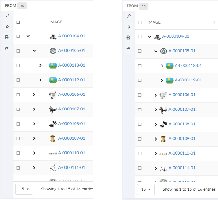
10.2.3. Column configuration
How to configure columns is described below. This is the file that is referenced above in the Table configuration
The <Table> element supports the following child elements.
| Name | Description | Example | ||
|---|---|---|---|---|
DisplayName |
The display name of the table.
|
|
||
Column |
Creates a column in the table |
See Column specific details below |
Column
The <Column> element describes the properties of a data table column.
The <Column> element supports the following child elements.
| Name | Description | Example | ||
|---|---|---|---|---|
ColumnType |
It is possible to add specific column types. The current supported values are: |
|
||
Description |
The brief details of the column that is rendered as a column header tooltip. |
|
||
Alt |
This setting renders brief details of the column as a column header tooltip. This setting is an alternative to the
|
|
||
Editable |
Whether the cells in the column should be editable or not.
|
|
||
Expression |
The expression that fetches the data from the backend. |
|
||
InputType |
If the column is editable, what input element should be rendered. Allowed values are:
If no input type is given the cell will default to an |
|
||
Label |
The name of the column that is rendered as a table header. |
|
||
Name |
The name of the column
|
|
||
NoWrap |
This setting defines whether the column’s values will be wrapped or not. True False |
|
||
Setting |
Column specific setting. The supported attributes are:
If the ColumnType is set to If the name of the setting is If the name of the setting is If the name of the setting is |
|
||
AlternateOIDExpression |
This setting can be used to control to which object the user should be routed when the column’s data is displayed as a hyperlink.
|
|
||
Sortable |
Specifies whether the column should be sortable or not. Valid values: |
|
||
SortDirection |
Specifies the sort direction. Valid values: |
|
||
SortOrder |
Specifies what column to make the initial sort on.
Valid values: A positive integer (zero based). For example if
you want the initial sorting to be based on the second column
you would add the value |
|
||
SortType |
Specifies the sort type, i.e |
|
||
TextLength |
Defines number of characters to be displayed before truncation. The rest will be displayed in a tooltip. |
|
||
TruncateDirection |
Defines truncate direction on column, If the number of characters in a cell text exceeds the text length. Valid values:
|
|
||
Rows |
Defines number of rows to be displayed before truncation. The rest will be displayed in a tooltip. |
|
||
usesBusinessObject |
This attribute value on column tag defines if column is for relationship. true false |
|
||
Visible |
This setting defines whether a column should be visible or not. The user is able to define his/her own set of visible columns. |
True False |
||
TargetLocation |
This setting can be used when we are opening routing to emxTree.jsp in 3dspace. |
Content Popup |
||
Href |
Defines the Href |
<Href>/${ROOT_DIR}/SomePage.jsp</Href> |
||
AllowMultipleEdit |
Specifies whether the column should be mass update or not. Valid values: |
|
||
GroupHeader |
Defines a group header for the column. Typically, a group header is used to group several columns together, with a common label. The setting need to be defined on all columns that are part of the group. |
|
Column template
The default rendering of a column cell can be overridden with a handlebars template.
{{!--
Sample Handlebars template that can be applied to columns in a datatable.
<Column>
...
<Setting name="template" value="/path/to/this/template/test" />
</Column>
<Setting name="template" value="helium/templates/table/object-link" />
<!-- If same table column is used in embeded mode, standalone mode and 3dashboard -->
<Setting name="template" value="helium\templates\table\object-link-with-alternate-oid" />
<!-- For the column which has AlternateOIDExpression or columntype path, same table column is used in embeded mode, standalone mode and 3dashboard -->
Available variables are:
- object
- row
- cell
To inspect what the content of the variables are, run {{debug variable}} and check your console
--}}
<a href="javascript:App.routing.open('{{objectId}}');">{{value}}</a>Configurable column CSS classes
It is possible to add configurable CSS classes to columns in the column XML, use <Setting> with class as the name and the custom class names as value, separated by spaces
<Setting name="class" value="col-weight col-bold col-red col-small" />Then in your custom css, you can target column level styling, e.g.
Some selectors require higher specificity or the use of !important rule.
|
.col-bold {
font-weight: bold !important;
}
.col-red {
color: red;
}
.col-small {
width: 50px;
}You can also specifically target a column’s header or body with th/td, e.g.
th.col-weight {
font-weight: bold !important;
color: darkred !important;
}
th.col-description {
font-style: italic;
color: darkgreen !important;
}
td.col-revision {
color: darkorange;
}Client side validation
It is possible to provide a javascript function that performs client side validation. This is achieved by applying the following element to an column:
<Setting name="options">{
"validator": "App.custom.someJavascriptFunction",
"validatorMsg": "Error message, either an message or a i18n key"
}</Setting>The javascript function will be executed when the cell is blurred and with the value of the field passed in. The function must return a boolean,
true if the value is valid and false otherwise.
Column filter
It is possible to add a filter to either the footer or the header of a column by specifying the following setting. Valid values
for position is "footer" and "header". Default value is "footer".
<Setting name="options">{
"filter": {
"position": "footer"
}
}</Setting>This will render an input field in the column footer, where the user can filter out rows based on the values in that column. User can use multiple queries by using "|" as delimeter in between query.
| It is not supported to have filters in both the header and the footer in the same table. |
Column filter with row filter
It is possible to add a row filter to a column filter by specifying the setting rowFilter. The value should be
a css class that matches the a row that the filter should be applied to. For example to apply the filter to only a certain level
of a structure table add the value ".row-level-n" where n is the level the filter should be applied to.
<Setting name="options">{
"filter": {
"position": "footer",
"rowFilter": ".row-level-1"
}
}</Setting>If the filter is applied on a row in a structure table and that row is expanded the child rows will not be affected of the filter.
On Edit
It is possible to configure different behavior on edit of a cell. This can be configured as below :
<Column>
...
<Setting name="onEdit" value="refresh-parents" />
...
</Column>Possible values are refresh-parents, refresh-table, or some custom javascript function.
If onEdit is not configured than only the current row will get refreshed.
In custom js function it will have context of datatable and row jquery element and column instance as arguments.
onColumnEdit : function($rowElement,column) {
App.toaster.success("column edit successfully")
},| Name | Description |
|---|---|
refresh-parents |
It will refresh the parent rows of the edited cell. |
refresh-table |
It will refresh the table. |
some custom js function |
It will call the js function passed in the value once the cell is edited. |
headerNoTruncate
ResizeColumns allow table columns to resize from UI. This will allow user to truncate the column below the actual content of the header. This behavior can be controlled using the headerNoTruncate setting i.e. user can not resize the column below the actaul content of the header. This can be configured as below :
<Column>
...
Setting name="headerNoTruncate" value="true" />
...
</Column>Possible values are true, or false. The default value is false.
Autocomplete
All columns which renders an select field have basic autocomplete support. With the options outlined below the behavior can be customized to great extent.
For autocomplete to work the <InputType> element must be set to combobox
|
To customize autocomplete provide the following setting:
<Setting name="options"><![CDATA[
{
"autocomplete": {
"template": "...",
"selectize": { ... },
"handler" : { ... }
}
}
]]>
</Setting>Each block, template, selectize and handler is described below.
| template |
Provide an path to an template to customize the dropdown. Example of template: |
| selectize |
The client utilizes Selectize and all options described in the docs can be used here. |
| handler |
All settings that are described in the core admin guide can be used in the handler block including all predefined handlers. If you wan’t to create a custom autocomplete handler, follow the admin guide and pass the java class as the value for the name key. |
Full example:
<Setting name="options"><![CDATA[
{
"autocomplete": {
"template": "/helium/templates/form/autocomplete",
"selectize": {
"preload": true,
"maxItems": null,
"labelField": "name",
"searchField": ["name"]
},
"handler" : {
"name": "dataset",
"dataset": "tvc:dataset:helium/MyParts.xml",
"select": ["name", "current"]
}
}
}
]]>
</Setting>Highlight updated row cross-widget
Datatable rows that have their data updated via another widget will be highlighted to show the changes.
Showing cross-widget object update highlight
| There is a API for highlighting any jQeury element here |
Access Control
The access restriction for table column in Helium can be defined similar to TVC Classic based upon following settings:
-
AccessMask (Access mask for the current object)
-
AccessProgram and AccessFunction (A JPO and a function that evaluates the access rights)
-
AccessExpression (MQL expression that evaluates the access)
The example below illustrates how you can construct the access restriction:
<AccessMask>checkout,modify</AccessMask>Or use an access program and access function:
<AccessProgram>MyAccessProgram</AccessProgram>
<AccessFunction>checkAccess</AccessFunction>Or use an access expression:
<AccessExpression>policy == 'EC Part'</AccessExpression>Please refer following links of TVC documentation for more details
Example
<Table xmlns="http://technia.com/TVC/Table" xmlns:xsi="http://www.w3.org/2001/XMLSchema-instance" xsi:schemaLocation="http://technia.com/TVC/Table http://products.technia.com/tvc/schema/latest/Table.xsd">
<DisplayName>Basic Information</DisplayName>
<Column>
<Name>Type</Name>
<Expression>type</Expression>
<Label>Type</Label>
<Fixed>TRUE</Fixed>
<ShowTypeIcon>True</ShowTypeIcon>
<NoWrap>true</NoWrap>
</Column>
<Column>
<Name>Name</Name>
<Expression>name</Expression>
<Label>Name</Label>
<Fixed>TRUE</Fixed>
<SortDirection>ascending</SortDirection>
<SortOrder>1</SortOrder>
<Setting name="template" value="helium/templates/table/test" />
</Column>
<Column>
<Name>Revision</Name>
<Expression>revision</Expression>
<Label>Revision</Label>
<Fixed>TRUE</Fixed>
<Editable>TRUE</Editable>
</Column>
<Column>
<Name>Material Category</Name>
<Expression>attribute[Material Category]</Expression>
<Label>Material Category</Label>
<AllowShowMore>TRUE</AllowShowMore>
<Editable>TRUE</Editable>
<InputType>combobox</InputType>
<SortType>string</SortType>
<AccessExpression>policy == 'EC Part'</AccessExpression>
</Column>
<Column>
<Name>Desc</Name>
<Expression>description</Expression>
<Label>Description</Label>
<Description>Describes this object in detail.</Description>
<AllowShowMore>TRUE</AllowShowMore>
<Editable>TRUE</Editable>
<Columns>45</Columns>
<Rows>5</Rows>
<InputType>textarea</InputType>
<SortType>string</SortType>
<TextLength>40</TextLength>
</Column>
<Column>
<Name>Owner</Name>
<Expression>owner</Expression>
<Label>Owner</Label>
</Column>
<Column>
<Name>Weight</Name>
<Label>Weight</Label>
<Expression>attribute[Weight]</Expression>
<Editable>TRUE</Editable>
<SortDirection>ascending</SortDirection>
<Setting name="class" value="col-weight col-bold col-red col-small" />
<AccessMask>checkout,modify</AccessMask>
</Column>
</Table>| For Autocomplete functionality with Inquiry Dataset, USERQUERY macro can be used to pass user input to inquiry. |
Example:
<Setting name="options"><![CDATA[
{
"autocomplete": {
"handler" : {
"name": "dataset",
"dataset": "tvc:dataset:helium/MyParts.xml",
}
}
}
]]>
</Setting>and Dataset Inquiry is:
<Inquiry>
<Code>temp query bus Part '*${USERQUERY}*' * where "owner == '${USER}'" limit 100 select id dump |</Code>
<Format>${OID}</Format>
<Pattern>*|*|*|${OID}</Pattern>
</Inquiry>Cell content in modal instead of tooltip
The data in the cell content can be huge and it will be better to such data in the modal as it provides the ability to scroll and makes more user friendly while ready such content.
This can be achieved by adding following configuration.
<Column>
...
<TextLength>25</TextLength>
<Rows>5</Rows>
<TruncateDirection>right</TruncateDirection>
<Setting name="class" value="he-tooltip-as-modal" />
...
</Column>In some cases user might not want to see the close icon that could be achieved by below configuration.
<Column>
...
<UseVersion2>true</UseVersion2>
<TextLength>25</TextLength>
<Rows>5</Rows>
<TruncateDirection>right</TruncateDirection>
<Setting name="class" value="he-tooltip-as-modal he-without-close" />
...
</Column>By default a close icon will be shown on modal, to close the modal. If user doesn’t to see the close icon and wants the modal to close if he clicks anywhere outside the modal. this can be achieved with below config.
<Column>
...
<Setting name="class" value="he-tooltip-as-modal he-without-close" />
...
</Column>10.2.4. Progress Column
 The progress column will render a progress bar based on the value.
Unlike the progress column in TVC Classic this column is only responsible for rendering the value.
By default it will also show the percentage as text and in tooltip.
This can be controlled with the options setting.
The progress column will render a progress bar based on the value.
Unlike the progress column in TVC Classic this column is only responsible for rendering the value.
By default it will also show the percentage as text and in tooltip.
This can be controlled with the options setting.
<Setting name="options">
{
"showText" : false,
"showTooltip" : false
}
</Setting><Column>
<Name>progress</Name>
<Label>Progress</Label>
<ColumnType>helium-progress</ColumnType>
<Expression>${attribute[attribute_PercentComplete]}</Expression>
<Setting name="options">
{
"showText" : false,
"showTooltip" : false
}
</Setting>
</Column>10.2.5. Files Column
| This feature requires the TVC File Manager license. |
In a table displayed in Helium, you may have a column containing links to files related to objects in ENOVIA. There is a built-in column type that simplifies configuring this.
<Table>
<Column>
<Label>emxComponents.Common.Actions</Label>
<RegisteredSuite>Components</RegisteredSuite>
<ColumnType>helium-files</ColumnType> (1)
</Column>
</Table>| 1 | Column type set to helium-files |
This column inherts behaviour from the TVC File Manager component regarding configuration and others.
See this page for more details on how to configure the File Manager.
The screenshot below illustrates the file column
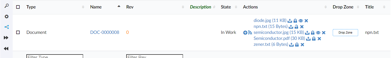
Figure 58. Files Column
Also, It is possible to reverse the lock icon to match the file lock status. Ex. When the file is locked, show the lock icon and similarly, when the file is unlocked, show the unlock icon.
This can be achieved by using below system property in tvc.properties.
| Property | Description | Default Value |
|---|---|---|
tvc.core.fileActions.reverseLockIcon |
Reverse the lock icon |
false |
<Expression> tag support for Column type set to helium-files
A column set to Column type helium-files along with <Expression> tag as shown below, will display the file from related object found through the expression value.
And file column with expression will always be non-editable.
<Table>
<Column>
<Label>Related Files</Label>
<RegisteredSuite>Components</RegisteredSuite>
<ColumnType>helium-files</ColumnType>
<Expression>${from[relationship_ReferenceDocument].to}</Expression> (2)
</Column>
</Table>As an example in below screen, a part object displays the file from its related object found traversing through relationship "Reference Document"
|
All the files from all object found through the expression value will be displayed. For example, out of given expression if 3 objects are found, all files from all 3 objects will be displayed. |
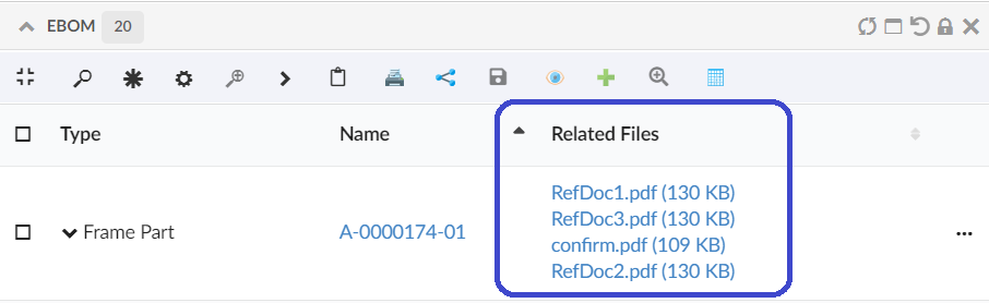
Figure 59. Files Column with Expression
10.2.6. Drop Zone Column
| This feature requires the TVC File Manager license. |
In a table displayed in Helium, you may have a column containing a drop zone were the user may drag’n’drop files to be checked into ENOVIA™. Helium contains a built-in column type that simplifies configuring this.
<Table>
<Column>
<Alt>Drop Zone</Alt>
<ColumnType>helium-dropzone</ColumnType> (1)
</Column>
</Table>| 1 | Column type set to helium-dropzone to enable this feature. |
You may include a file-dropzone in many places, as long as you have configured the column regarding what to do with the file depending on what object it is being dropped for. In some cases, you should create a new Document object, connect it with a certain relationship and then check-in the file.
Here is a complete example of how to configure a helium dropzone:
<Column>
<Name>Dropzone</Name>
<Label>Dropzone</Label>
<ColumnType>helium-dropzone</ColumnType>
<Setting name="dropzone:type_Part">
relationship=relationship_ReferenceDocument,
direction=from,
type=type_Document,
policy=policy_Document,
vault=vault_eServiceProduction,
format=generic,
oneobjectperfile=true,
refresh=refresh,
selectformat=false
</Setting>
</Column>Please see file manager chapter for more details on how to configure a Drop Zone using TVC.
10.2.7. Primary Image Column
Showing a table column with thumbnails of an object’s primary image, is often helpful for identifying a particular object or to get an overview. Helium features a built-in columntype for this.

The tablecolumn uses lazy-loading to only request images that are within the visible area of the web browser, in order to not waste bandwidth. Images that come into the visible screen area after scrolling will be automatically fetched at that time.
<Table>
<Column>
<Name>PrimaryImage</Name>
<Label>Image</Label>
<ColumnType>helium-primaryimage</ColumnType>
</Column>
</Table>| 1 | Column type set to helium-primaryimage to enable this feature. |
10.2.8. User Column
Inbuilt ColumnType for showing an avatar/profile picture in a table cell. Useful for indicating who owns, created, or is assigned to an object. Needs a valid <Expression> to identify the User.

The tablecolumn uses lazy-loading to only request images that are within the visible area of the web browser, in order to not waste bandwidth. Images that come into the visible screen area after scrolling will be automatically fetched at that time.
<Table>
<Column>
<Name>owner</Name>
<Expression>owner</Expression>
<Label>Owner</Label>
<Editable>false</Editable>
<ColumnType>helium-user</ColumnType>
</Column>
</Table>| 1 | Column type set to helium-user to enable this feature. |
10.2.9. Attachments Column
Showing a column with an attachments icon and clicking on the icon will open all the attachments related to that row in a modal. This can be configured as
<Column>
<ColumnType>helium-attachment</ColumnType>
<Setting name="Relationship" value="relationship_ReferenceDocument"/>
<Setting name="Direction" value="From"/>
</Column>Default value for Relationship is "Reference Document,Part Specification" and is defined on`tvc.office.server.attachmentRelationships` and for direction is "From".
10.2.10. Version Actions
This can be used to show the actions available on a particular version objects like download a file, check in, check out e.t.c

10.2.11. Go There
Shows navigate icon which allows to navigate to a widget. The basic use case can be to show properties or structure of any object. This can be configured as below:
<Column>
<Label>column.label.goThere</Label>
<ColumnType>helium-go-there</ColumnType>
<Setting name="widgetRef" value="tvc:widget:hex:engineering/EBOM.xml" />
</Column>10.2.12. Add To Clipboard
Shows add to clipboard icon, which enables user to add an object to clipboard. This can be configured as below:
<Column>
<Label>Add To Clipboard</Label>
<ColumnType>helium-addToClipboard</ColumnType>
<Alt>Add to Clipboard</Alt>
</Column>10.2.13. Create and connect row command
In a structure table it is possible to create and insert a new row at a chosen depth. Select a row and click the "Create and connect row" command to add a child row to the selected parent row.
10.2.14. Upload File Command
| This feature requires the TVC File Manager license. |
This feature is similar to the "Dropzone above table" in the file manager chapter. Creates a row/new rows when a file is uploaded. The row will not be created until the file is uploaded successfully.
Currently supports the following options:
The table below shows and explains what parameters that you can use:
| Parameter | Value | Notes / Description |
|---|---|---|
createSettings |
String or Object |
The id of a predefined createSettings or the createSettings can be defined inline here. See the following createSettings: parameters. |
createSettings:type |
String type |
The type of object that will be created. Can be a symbolic name or real name |
createSettings:policy |
String policy |
The name of the policy to be used for the object that will be created. Can be a symbolic name or real name |
oneFilePerObject |
True or False |
Whether or not to create one document object per file that is dropped. E.g. if the user drops three files, if this setting is set to true, three document objects will be created. Default is false. |
badChars |
String/JS function |
Chars that are not allowed in the file name. [1] |
validFileExtensions |
Array of Strings/JS function |
Valid file extensions. [1] |
maximumFileSize |
Number/JS function |
The maximum allowed file size in bytes. [1] |
preProcessor |
JS function |
JS function executed before any table row is created. |
postProcessor |
JS function |
JS function executed after all table rows are created. when not configured, table is reloaded. custom postProcessor can take care of reloading the table or return true to reload. |
-
Can either be a value, or the name of a JS function returning a value
Example:
<Command>
<Label>Save file</Label>
<FontIcon>he-save</FontIcon>
<OnClick>App.file.uploadFileCommand</OnClick>
<OnClickParams><![CDATA[{
"oneFilePerObject": true,
"createSettings": {
"type": "type_CADDrawing",
"policy": "policy_CADDrawing"
},
"badChars": "App.custom.noSpaceOrComma",
"validFileExtensions": [".png", ".jpg", ".jpeg", ".bmp", "gif", ".psd"],
"maximumFileSize": "App.custom.fiveMegaBytes",
"preProcessor" : "App.custom.validateFileSize",
"postProcessor" : "App.custom.returnTrue"
}]]></OnClickParams>
</Command>10.2.15. Promote and Demote Command
In order to promote and demote business object(s) from a table widget, the promote and demote methods of App.table.BusinessObject JS API can be used. The API requires a data table reference as the mandatory first argument. After the action is performed, an optional status message can be displayed in the UI, informing whether action was successful or not. To display such message, an optional second argument containing a Toaster instance should be passed..
Example:
new App.table.BusinessObject(this).promote();
new App.table.BusinessObject(this, windows.App.toaster).promote();
new App.table.BusinessObject(this).demote();
new App.table.BusinessObject(this, windows.App.toaster).demote();Inbuilt promote and demote command.
App.table.action.promote
App.table.action.demoteExample:
<Command>
<Label>Promote</Label>
<FontIcon>fa-forward</FontIcon>
<OnClick>App.table.action.promote</OnClick>
</Command>
<Command>
<Label>Demote</Label>
<FontIcon>fa-backward</FontIcon>
<OnClick>App.table.action.demote</OnClick>
</Command>10.2.16. Print Command
To print the content of widget, the print method of App.Widget JS API can be used. Command can be used either in widget toolbar or header actions. In responsive table only visible content can be printed.
| This feature is supported only in View mode. |
Example:
In Widget Toolbar
<Command>
<Label>Print</Label>
<OnClick>App.Widget.print</OnClick>
</Command>In HeaderActions
<Command>
<Label>Print</Label>
<Setting name="OnClick" value="App.Widget.print" />
</Command>10.2.17. Display Density Command
A built-in command <DisplayDensity /> can be added to a toolbar in a Table widget. This command allows decreasing height between rows resulting in more rows to be visible. User preference is preserved across sessions.
| The user preference will be saved only for the Table widget where this command is used. |
Change Display Density
10.2.18. Table Configurator Command
A built-in command <TableConfigurator /> can be added to a toolbar in a Table widget. This command allows adding,updating and removing user defined tables and maintaining End User Defined Columns for different tables.
| The addition of new columns can only be done for end user tables and not the default file based table defined for a widget. |
In datatable toolbar :
<TableConfigurator default="columns" excludeInterfacePrefix="true" />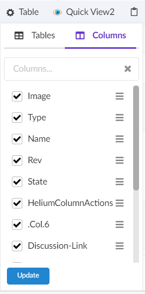
Figure 60. Table Configurator Menu Columns View
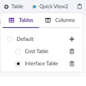
Figure 61. Table Configurator Menu Tables View
The table below shows and explains the available attributes for <TableConfigurator /> command:
| Field | Value | Notes / Description |
|---|---|---|
default |
columns or tables |
The default attribute defines which tab is active by default in menu. Default selected tab is columns. |
excludeInterfacePrefix |
True or False |
Whether the interface attributes should show interface name prefix in available columns' list. Default value is true. |
| It is recommended not to add <ToggleColumnVisibility /> command if <TableConfigurator /> is used as it would be redundant to have both together in a toolbar. |
Table Configurator
10.2.19. Search And Connect Command
A built-in command <SearchAndConnect></SearchAndConnect> can be added to a toolbar in a Table widget. This command opens a search modal configured with given searchform and relationships and user can select search results and connect to selected object.
In datatable toolbar :
<SearchAndConnect >
<Relationships >
<Relationship default="true">
relationship_EBOM
</Relationship>
<Relationship direction="to">
relationship_PartSpecification
</Relationship>
</Relationships >
<SearchConfig>tvc:search:hex:common/SearchAndConnect.xml</SearchConfig>
<ExpandRow>true</ExpandRow>
</SearchAndConnect>The table below shows and explains the available tags for SearchAndConnect` command:
| Field | Value | Notes / Description |
|---|---|---|
Relationships |
Relationship[] |
The list of relationships available for connection in search modal. |
Relationship |
string |
Name of the relationship to be added.It has two attributes default (sets the relationship as default selected for connection) and direction(the relationship direction to be used for connection) Default value for direction is false. Default value for default is false. |
SearchConfig |
string |
The search config path for the search modal.For further details see New Search Experience |
ExpandRow |
boolean |
Whether context object in table should be expanded after new objects are connected from the modal. |
OnSubmit |
The |
<OnSubmit>App.hex.doConnections</OnSubmit>. |
SubmitButtonLabel |
This will overide submit button label. Default value is |
<SubmitButtonLabel>Add To Collection</SubmitButtonLabel> |
Connect |
Want to perform custom action which is not dependent on relationship, then this tag can be set |
<Connect>false</Connect> |
SelectionCriteria |
To enable/disable command based on row selection. Valid values are |
<SelectionCriteria>none</SelectionCriteria> |
Search And Connect Objects
10.2.20. Data Group Command
The data grouping function can be used to group data, based upon column values, into different groups.This function is available from any table page (flat list or structure), and operates on the data within a table/structure.
The data grouping function is launched via a built-in command <DataGroup/>, that can be added to a toolbar in a Table widget.
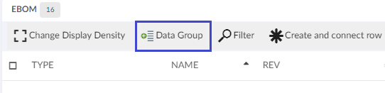
Figure 62. Data Grouping Button
As an example, assume that you have a structure like in the screenshot below.
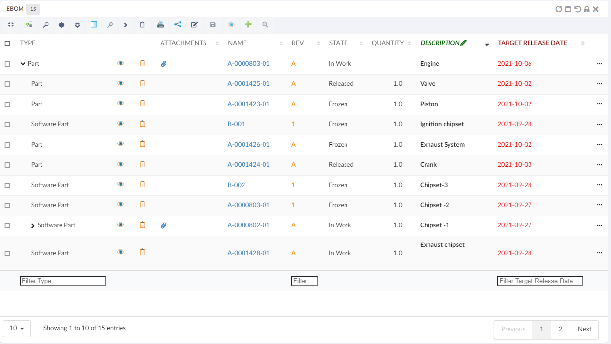
Launching the data grouping function and define two groups: type + current state, would give a result like the screenshot below.
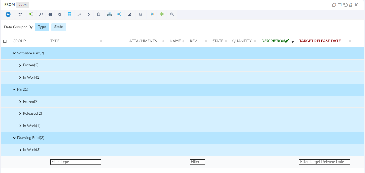
The different groups have different colours, and above the table there is a legend where the colour is mapped to the group. The first column after the structure shows the value (label) and the number of rows that mapped the group.
A group can be expanded in order to see the content of a particular group.
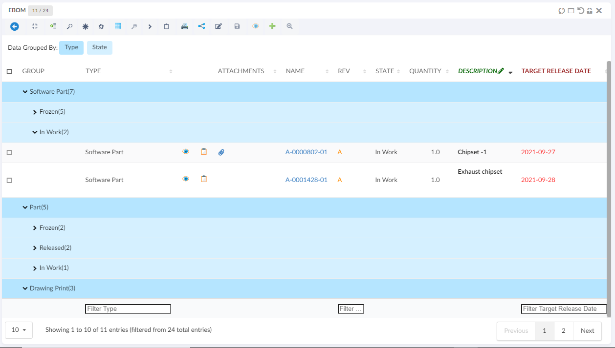
Light Mode Data Group
This enable user to open a data grouping form inline where user can select the column and apply the grouping even user can cancel the grouping.
This can enable by passing an attribute lightMode value as a true in exiting data group commnad.
<DataGroup lightMode="true"/>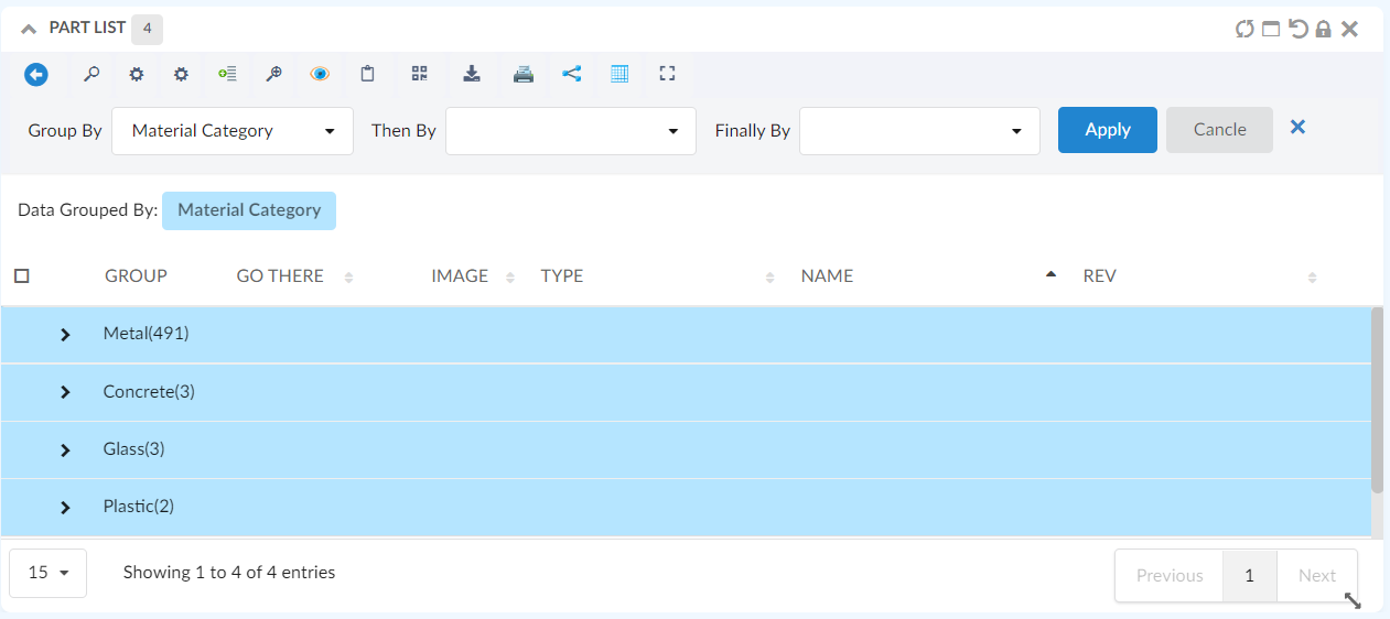
Figure 63. Light Mode Data Group Form
10.2.21. Pre configure Data Group
For some tables user might want to see the preconfigured datagroups, the data can be grouped when the tabe is loaded initially loaded by providing simple configurations in the table config as follows :
<DataGroup>
<GroupBy>
<Name>Material Category</Name>
<Group condition="match" value="Glass" />
</GroupBy>
<ThenBy>
<Name>owner</Name>
</ThenBy>
<FinallyBy>
<Name>State</Name>
<Group condition="match" value="In Work" />
</FinallyBy>
<GoBackAllowed>true</GoBackAllowed>
</DataGroup>10.2.22. Internationalisation
The data table widget supports internationalization. If a translation key is given to an <Label> element
the translation for that key will be rendered. If no value is found for that key the actual value of the <Label> element
will be rendered.
Customize messages
The following messages is defined in the default.json language file.
{
"dataTable": {
"messages": {
"decimal": "",
"emptyTable": "No data available in table",
"info": "Showing _START_ to _END_ of _TOTAL_ entries",
"infoEmpty": "Showing 0 to 0 of 0 entries",
"infoFiltered": "(filtered from _MAX_ total entries)",
"infoPostFix": "",
"thousands": ",",
"lengthMenu": "_MENU_",
"loadingRecords": "Loading...",
"processing": "Processing...",
"search": "Search:",
"zeroRecords": "No matching records found",
"paginate": {
"first": "First",
"last": "Last",
"next": "Next",
"previous": "Previous"
},
"aria": {
"sortAscending": ": activate to sort column ascending",
"sortDescending": ": activate to sort column descending"
}
},
"editor": {
"messages": {
"create": {
"button": "New",
"title": "Create new entry",
"submit": "Create"
},
"edit": {
"button": "Edit",
"title": "Edit entry",
"submit": "Update"
},
"remove": {
"button": "Delete",
"title": "Delete",
"submit": "Delete",
"confirm": {
"_": "Are you sure you wish to delete %d rows?",
"1": "Are you sure you wish to delete 1 row?"
}
},
"error": {
"system": "A system error has occurred (More information)"
},
"multi": {
"title": "Multiple values",
"info": "The selected items contain different values for this input. To edit and set all items for this input to the same value, click or tap here, otherwise they will retain their individual values.",
"restore": "Undo changes"
}
}
}
}
}It is possible to override the each message in your own language file by providing a key that matches one of the above. For
example to override the dataTable.messages.emptyTable key you would add the following to your language files.
{
"dataTable": {
"messages": {
"emptyTable": "Currently no rows"
}
}
}Many translations for the tables can be found on here
10.2.23. API
The table javascript api can be found here
10.2.24. Mass Update
When <AllowMultipleEdit> has been set to true on a table column, the column is editable, and the
user has access to edit at least one cell in the column, an icon will appear on the column header
that the user can click in order to edit multiple cells in a single column to the same value.
Figure 64. Mass Update icon
The mass update form is shown in modal. If there is more than one column allowed for mass updating, the user can easily change the working column from the drop down list showing the column. The user can choose whether to edit the selected rows or all rows.
User can check "Keep Selection" to retain selection for further mass updating other columns.
By default "Keep Selection" is unchecked.

Figure 65. Mass Update form
10.2.25. Customization
The end user can change certain settings of a TableWidget, and automatically persist those customizations. Settings that are customizable include:
-
Column visibility (hide/show)
-
Data grouping (show/hide)
-
Column order (reorder the initial order from configuration)
-
Pagination length (number of table rows displayed per page)
-
Last sorted column (The column based on which the table should be sorted. Overrides the default/configured sort order)
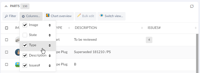
Figure 66. Checkbox indicates column visibility. Drag-and-drop to reorder.
Figure 67. Pagination
Changes to the above settings are stored per TableWidget, and remembered across page changes and browser sessions, as long as the Dashboard Customization property is enabled.
To reset any customizations for a TableWidget, you can use the Widget Customization reset icon.
10.2.26. Styling / CSS
Offline available table rows
If dynamic caching of object pages has been enabled, the TableWidget now automatically applies a CSS class .offline-available on every <tr> element that has a cached entry.
This opens up for conditional styling, that helps the user understand which objects are cached and thereby possible to open while offline.
Below example is achieved with CSS:
tr.offline-available {
background-color: #9fd39f !important;
}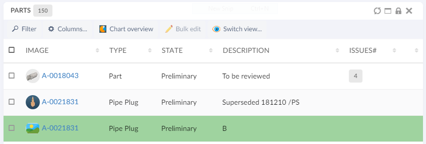
Figure 68. Specific styling of offline-available objects
10.2.27. End User Defined Columns
Users can add, remove and update columns in a table from the existing list of attributes based on objects present in table including the unified type and interface attributes.
It is also possible to exclude some attributes from the addable list by adding following init-param in web.xml:
tvc.core.attributes.excludedAttributesIt accepts comma-separated attribute names to be excluded. Furthermore, attribute labels support localization through framework properties.
In datatable toolbar :
<TableConfigurator />Figure 69. Columns menu
There are two ways of adding a new column to the existing table. User can simply check one/more columns from the existing list or use Add Advanced Column icon to add column with more custom settings.
The table below shows and explains the available settings in advanced mode:
| Field | Value | Notes / Description |
|---|---|---|
Name |
String |
The name appears as table column header |
Description |
String |
The description acts as tooltip for column header. |
Expression |
String |
The expression field provides a list of attributes to select from for the column data. |
Is Editable |
True or False |
Whether the column should be editable or not. Default is false. |
InputType |
String |
List of input types to select from in case of editable field. E.g. If the attribute is of date format, you can select date as input type which will present a date picker to choose from in edit mode. |
No Wrap |
True or False |
Whether the content of column should be wrapped. Default is true. |
Filter |
True or False |
Whether column should have its own column filter. Default is false. |
Sortable |
True or False |
Whether column should be sortable or not. Default is true. |
Figure 70. Add Advanced Column form
After addition user can delete the column by unselecting it and update by using the pencil icon next to column item in the menu. Edit form provides same properties as add advanced form.
10.2.28. CDM document details widget
We can view the versions of the document object by configuring the columntype helium-go-there as given below:
<Column>
<Label>Go There</Label>
<ColumnType>helium-go-there</ColumnType>
<Setting name="widgetRef" value="tvc:widget:helium:cdm/CDMDocumentVersions.xml" />
</Column>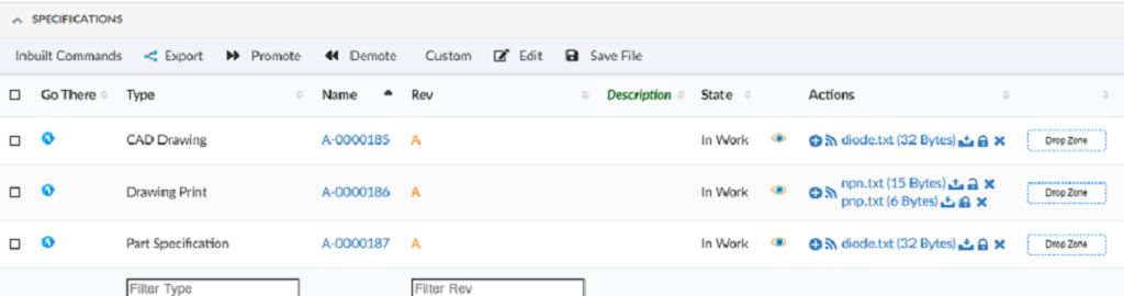
If a document object would have several files checked in, you will first see the active version objects for each file checked in.
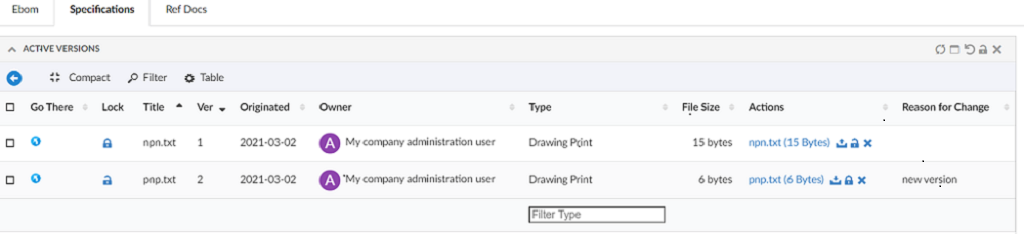
By simply clicking the go-there again for a particular file, you will then see all the versions of that file.
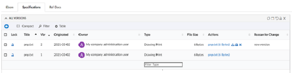
10.2.29. Limitations of the date format table columns
When ClientSideProcessing is disabled, then the search performed using the column filter on date format columns will not give expected results if the date format specified with the tag DateFormat in Helium.xml is identified as invalid by the standard java class java.text.SimpleDateFormat.
For example, if the date format specified with the tag DateFormat in Helium.xml is MMMM Do YYYY, then the SimpleDateFormat Class consider this as an illegal pattern by logging error Illegal pattern character 'o'. In this case, the search results won’t be accurate.
10.3. Form
The form component is responsible for editing, creating or displaying object data.
A form can be configured to either be rendered inside of a widget or in standalone fullscreen mode.
The form component can be initialized in the following five modes.
- VIEW
-
the fields of the form is shown in 'view' mode. No editing controls are displayed.
- EDIT
-
the form is shown in edit mode with the form controls prepopulated with the values from the given object. The object to be edited is given by passing an
objectIdas an option in the constructor or if the form is rendered as a widget it can be configured to work with the current contextobject - CREATE
-
renders a form that creates a new object
- CREATE_AND_CONNECT
-
renders a form that creates an object and connects it to an existing object
- CREATE_WITH_CONNECTIONS
-
renders a form that creates an object and connects the created object to multiple existing objects
The Edit Toggle button will not be displayed in the form unless the user owns modify access to any of the fields. In this case, if the form is opened in edit mode, the Toggle Edit Mode toolbar command can be used to toggle the modes.
There is factory functions for each mode described in the App.form API.
The form widget supports multiple languages, see i18n for more information.
10.3.1. Widget
To create a form widget create an widget definition XML with the following content:
<FormWidget>
<FormConfig namespace="helium">Form1.xml</FormConfig>
<ResolveContextId>page</ResolveContextId>
<!--
<FormMode>edit</FormMode>
-->
</FormWidget>The <FormWidget> element supports the following child elements.
| Name | Description | Example |
|---|---|---|
FormConfig |
Reference to the XML file that configures the form. See [Configuration](#FormConfig) for further information. |
|
ResolveContextId |
If the form should use the current context object. Valid value |
|
FormMode |
What mode should the form render in. Defaults to |
|
ShowToggleButton |
Whether the button that toggles between 'EDIT' and 'VIEW' mode should be visible. Defaults to |
|
10.3.2. Configuration
A form consists of sections and fields. Each section holds one or more fields.
The root element of a form configuration is <Form>. It supports the following child elements.
| Name | Description | Example |
|---|---|---|
Title |
The title of the form. |
|
Description |
The description of the form |
|
SourceObjectResolver |
When the form is used for editing or viewing, a dataset can be used to load the source object for the form. If already in context of an object, that object can be used when for example an Expansion is necessary |
|
Layout |
Describes how the fields in form should be positioned. For further information see Layout |
|
SubmitStrategy |
Choose between submit strategies (Empty = default submit button, AUTO = Submit form on each field change) |
|
AlwaysShowEditButton |
Always shows the Edit toggle button in the view mode and View/Submit button in the edit mode irrespective of the user access.
Default value is |
|
Section |
Used to divide form fields in different collapsible sections. A form must have at least one |
For further information see the section chapter |
Section
The <Section> element groups different form fields together. A form must have at least one <Section>.
The <Section> element supports the following child elements.
| Name | Description | Example |
|---|---|---|
Label |
The label of the section. This will be rendered as a header for the current section. |
|
Field |
The field element describes the properties of an form field |
For further information see the field chapter |
RelatedObject |
A field used for showing / editing of related objects |
See this chapter for more info. |
Help messages
To configure a help message for a section specify the helperMessage setting.
Tooltip can be configured by passing the settings listed in Semantic Popup Settings into the tooltipConfig attribute.
A help message when configured is indicated by a 'question mark' next to the section label. On hovering over the icon, tooltip is shown. Tooltip icon (Default : question circle) and icon position (Default : right) can be changed as needed. Icons Link
<Setting name="options"><![CDATA[
{
"helperMessage": "Help message for this section. May contain html such as <a href='http://example.com'>a link</a> or an i18n key",
"iconClass":"red question circle outline",
"iconPosition":"left",
"tooltipConfig": {
"delay": {
"show": 300,
"hide": 800
},
"hoverable": true,
"offset": 10
}
}
]]>
</Setting>Or
<Options>
<![CDATA[{
"helperMessage": "Help message for this field. May contain html such as <a href='http://example.com'>a link</a> or an i18n key",
"iconClass":"red question circle outline",
"iconPosition":"left",
"tooltipConfig": {
"delay": {
"show": 300,
"hide": 800
},
"hoverable": true,
"offset": 10
}
}]]>
</Options>Field
The <Field> element describes the properties of a single field in a form.
It is possible to use the ref or namespace and name attributes to point to an external xml file. Example:
<Field namespace="helium" name="Policy.xml" />
<Field ref="tvc:formfield:helium/Policy.xml" />| If user does not have modify access then field is rendered in non-editable mode. |
The <Field> element supports the following child elements.
| Name | Description | Example | ||||
|---|---|---|---|---|---|---|
Label |
The label of the field. This will be rendered as an |
|
||||
Expression |
The expression that is used to fetch the data for the field |
|
||||
Editable |
Whether the field is editable or not. Valid values
|
|
||||
DataType |
What datatype is the field. For instance |
|
||||
FieldType |
What field type is the field. For instance |
|
||||
Defaults |
What default values should the field contain. The element supports the following attributes:
If none of the attributes are present the default values should be given as a list of
|
|
||||
Validation |
What client side validation rules should be applied to the field. The following child elements are supported
Or Globally configured in tvc.properties `tvc.helium.form.badCharacters = #@)~`. with following xml |
|
||||
Template |
A path to an handlebars template that is responsible for rendering the field. Custom field templates only work in 'VIEW' form mode currently. |
|
||||
Delimiter |
Defines a custom delimiter used internally to split/join the range value.
The default value is
|
|
Rich Text editor support
Especially multi line attributes that otherwise render as textareas, can sometimes benefit from allowing Rich Text (layouted text/HTML) input as well.
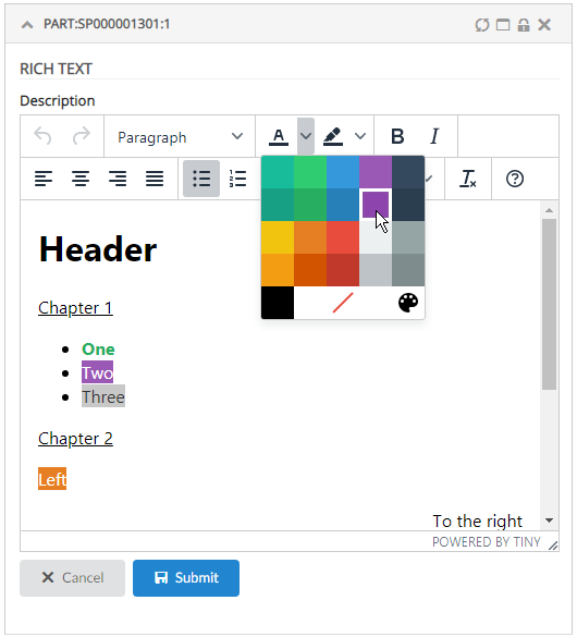
Figure 71. Rich Text editor
This can be easily configured by setting the <FieldType>richtext</FieldType> tag. Example:
<Field>
<Label>Description</Label>
<Expression>description</Expression>
<Editable>true</Editable>
<FieldType>richtext</FieldType>
</Field>Hint: you may want to disable Table In-Cell-Editing for attributes containing HTML, and instead launch a Form, as showcased in the video above.
| All characters will be stored in non-entity form except these XML default entities: & ( stored as &), < ( stored as <), > ( stored as >). |
Autocomplete
All select fields have basic autocomplete support. With the options outlined below the behavior can be customized to great extent.
To customize autocomplete provide the following setting:
<Setting name="options"><![CDATA[
{
"autocomplete": {
"template": "...",
"selectize": { ... },
"handler" : { ... }
}
}
]]>
</Setting>Each block, template, selectize and handler is described below.
| template |
Provide an path to an template to customize the dropdown. Example of template: |
| selectize |
The client utilizes Selectize and all options described in the docs can be used here. |
| handler |
All settings that are described in the core admin guide can be used in the handler block including all predefined handlers. If you wan’t to create a custom autocomplete handler, follow the admin guide and pass the java class as the value for the name key. |
Full example:
<Setting name="options"><![CDATA[
{
"autocomplete": {
"template": "/helium/templates/form/autocomplete",
"selectize": {
"preload": true,
"maxItems": null,
"labelField": "name",
"searchField": ["name"]
},
"handler" : {
"name": "dataset",
"dataset": "tvc:dataset:helium/MyParts.xml",
"select": ["name", "current"]
}
}
}
]]>
</Setting>Custom client side validation
In addition to the validation rules described above in the <Validation> element,
it is possible to provide an javascript function that performs validation.
The function will be executed when the field is blurred and the value of the field
will be passed to the function. The function must return a boolean, true
if the value is valid and false if the value is invalid.
This is configured by providing the following setting:
<Setting name="options">{
"validator": "App.custom.someJavascriptFunction",
"validatorMsg": "Error message, either an messeage or a i18n key"
}</Setting>Consolidated Error Message
In form by default errors are displayed at two places. One below respective field and one as consolidated error message near submit button. This is useful when form is big and consolidated message can give overall idea. However, in some cases it might be needed to disable consolidated error. This can be done using the key helium.form.error.consolidatedErrormessgae in tvc.properties. The valid value is either true or false and the default value is true.
Initial focus on a field
To set the focus on a field in edit/create mode add the focus option to the field.
| If more than one fields have the focus option set to true, then the last form field is given priority and set to focus. It is recommended to have only one field with focus true. |
<Setting name="options"><![CDATA[
{
"focus": true
}
]]>
</Setting>datePicker settings
The following settings are supported by date picker.
| Name | Description |
|---|---|
minDate |
The custom java script function which returns valid minimum selectable date. |
maxDate |
The custom java script function which returns valid maximum selectable date. |
showWeekNumber |
Boolean(true/false). Show the ISO week number at the head of the row. |
defaultDate |
The custom java script function which returns valid selectable date. This is the initial date to view when first opened. |
setDefaultDate |
Boolean (true/false). Make the defaultDate the initial selected value. |
disableWeekends |
Boolean(true/false). Disallow selection of Saturdays or Sundays. |
firstDay |
First day of the week (0: Sunday, 1: Monday, etc). |
yearRange |
Number of years either side (e.g. 10) or array of upper/lower range (e.g. [200,2030]). |
numberOfMonths |
Number of visible calendars. |
disableDayFn |
Callback function that gets passed a Date object for each day in view. Should return true to disable selection of that day. |
<Setting name="options">{
"datePicker":{
"minDate": "App.hex.todayOrLater",
"maxDate": "App.hex.endOfProjectDate",
"showWeekNumber": true,
"yearRange": [2000, 2030],
"disableDayFn": "App.hex.disableDayFn",
"firstDay": 2,
"yearRange": [2000, 2030],
"defaultDate": "App.hex.defaultDate",
"setDefaultDate": true,
"numberOfMonths": 2
}
}</Setting>
The below setting format is deprecated and will no longer be supported from Helium release 2019.2.0 onward. Please move it into subobject datePicker as shown above.
|
<Setting name="options">{
"minDate": "App.hex.todayOrLater",
"maxDate": "App.hex.endOfProjectDate"
}</Setting>Conditional dependencies
It is possible to make fields dependent on values of other fields. This is achieved by
adding the dependsOn and dependsOnValue attributes to the dependent field element.
Example:
<Field dependsOn="someOtherFieldExpressionOrId" dependsOnValue="someValue">Given the example above, the field will only be visible if the field "someOtherFieldExpressionOrId" has the value "someValue". It is also possible to supply a list of comma separated values, if one of those values is equal to the value of the field "someOtherFieldExpressionOrId" the dependent field will be visible. Note: if the values contains commas you will need to create a custom javascript function as described below.
It is also possible to give an reference to a javascript function as the dependsOnValue value. In that case the
supplied function will be executed with the value of the dependsOn field as an parameter. The function must return a boolean
value. If the returned value is true the field will be shown otherwise it will be hidden.
For cross section dependencies
<Field crossSectionDependsOn="someOtherFieldExpressionOrId" crossSectionDependsOnValue="someValue">It is also possible to make sections dependent on value of some field. This can be achieved by adding the dependsOn and dependsOnValue attributes to the dependent section element.
Example:
<Section dependsOn="someFieldExpressionOrId" dependsOnValue="someValue">In above example, the section will only be visible if the field "someOtherFieldExpressionOrId" has the value "someValue". It is also possible to supply a list of comma separated values, if one of those values is equal to the value of the field "someFieldExpressionOrId" the dependent section will be visible.
It is also possible to give an reference to a javascript function as the dependsOnValue value. In that case the
supplied function will be executed with the value of the dependsOn field as an parameter. The function must return a boolean
value. If the returned value is true the field will be shown otherwise it will be hidden.
Loading custom ranges based on other field values
Specify the dependsOn attribute and also add the element <Defaults> with the attribute functionName set.
The functionName must point to an existing javascript function. That function will be executed every time the dependsOn
field changes passing the value of the field to the function.
The configured function must return either an array containing javascript objects with value and label properties or
a Promise that resolves to
an array containing objects with value and label properties.
Example of valid array:
[
{"label": "Label 1", "value": "Value 1"},
{"label": "Label 2", "value": "Value 2"}
]Help messages
To configure a help message for a field specify the helperMessage setting.
Tooltip can be configured by passing the settings listed in Semantic Popup Settings into the tooltipConfig attribute.
A help message when configured is indicated by a 'question mark' next to the section label. On hovering over the icon, tooltip is shown. Tooltip icon (Default : question circle) and icon position (Default : right) can be changed as needed. Icons Link
<Setting name="options"><![CDATA[
{
"helperMessage": "Help message for this field. May contain html such as <a href='http://example.com'>a link</a> or an i18n key",
"iconClass":"red question circle outline",
"iconPosition":"left",
"tooltipConfig": {
"delay": {
"show": 300,
"hide": 800
},
"hoverable": true,
"offset": 10
}
}
]]>
</Setting>Preserve Output
Whether to preserve the values retrieved from the database or not. Preserve in this case means that HTML sensitive characters will not be escaped when displayed in the field, e.g., when an attribute contains HTML markup that should be displayed as such. Note that this setting will only be effective for textarea type field.
true |
The HTML sensitive characters in the output will not be escaped. This is the default value. |
false |
The HTML sensitive characters will be escaped. |
<Setting name="options"><![CDATA[
{
"preserveOutput": false,
}
]]>
</Setting>Files Field
In a Helium form, you can have a field that enables form to checkin files to the main form object(s). Example:
<FilesField>
<Label>Files</Label>
<Format>generic</Format>
<UseCDM>true</UseCDM>
<Editable>true</Editable>
<Store>store</Store>
</FilesField>|
By default the filesfield is editable as shown in below image. In order to make the filefield non-editable, need to specifically include |
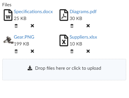
Figure 72. Files Field
you can easily upload a file by using drag and drop.
There are two delete buttons for cdm enabled field, one for delete latest version and other for delete all versions. For CDM disabled field, there is only one delete button.
FilesField can also be used to display files from related objects.
For example, tag <Expression>${from[relationship_ReferenceDocument].to}</Expression> can be included in <FilesField> to display all the files from all objects found through expression value .
Expression tag will make the FilesField non-editable and displays the files from related objects found through the expression value alone.
|
All the files from all object found through the expression value will be displayed in files field. For example, out of given expression if 3 objects are found, all files from all 3 objects will be displayed in files field. |
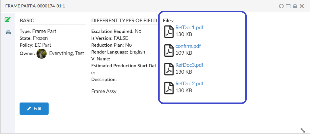
Figure 73. Files section with Expression
These are the sub-elements that are specific to a Files Field element:
| Name | Description | Example |
|---|---|---|
Label |
The label of field |
<Label>Files</Label> |
Format |
Specifies the format to use when checking in the file |
<Format>generic</Format> |
UseCDM |
It specifies if the "Common Document Model" functionality will be enabled for the field or not |
<UseCDM>true</UseCDM> |
Store |
Name of store |
<Store>store</Store> |
Editable |
Whether the field is editable or not. Valid values |
<Editable>true</Editable> |
Validation |
What client side validation rules should be applied to the field. The following child elements are supported
|
|
Template |
A path to an handlebars template that is responsible for rendering the field. |
|
OptionTemplate |
A path to an handlebars template that is responsible for rendering the selected field option. |
|
Expression |
displays the files from connected objects found through the expression |
<Expression>${from[relationship_ReferenceDocument].to}</Expression> |
Related Object
A <RelatedObject> element is used to place a field in a form for showing/editing of related object information.
The following child elements are inherited from the Field element:
-
Label
-
Editable
In addition, the table below shows RelatedObject specific configuration elements:
| Name | Description | Example | ||
|---|---|---|---|---|
Relationship |
Specifies the relationship and direction to use as basis for this field. Allowed attributes on the
|
Examples: |
||
Display |
May be used to specify an ENOVIA select expression to be applied on the related object(s). Note that you may define multiple display selectables. |
|
||
Options |
A JSON configuration object that mainly is used to configure Auto Complete settings. If you enable editing of the RelatedObject, you must configure Auto Complete settings. For additional information regarding Auto Complete, see this chapter.
|
|
Dynamic Attribute Field
Dynamic Attribute Field can be used to render multiple fields for an object, either from object type or classification interface. Dynamic Attribute Field is supported only on edit form.
<DynamicAttributeField> element is used to place a field in a form for showing/editing objects dynamic attributes.
The following child elements are inherited from the Field element:
-
Label
-
Editable
- Note
-
By default attribute fields added dynamically are non editable.
Table below shows the DynamicAttributeField specific configuration elements:
| Name | Description | Example |
|---|---|---|
Filter |
Specifies Exclude elements to exclude attributes. It supports both symbolic and actual attribute name. |
|
ForClassification |
Specifies whether DynamicAttributeField is to be used for ClassificationField. Valid values true or false Supports below attributes -
|
|
FromInterface |
Specifies whether DynamicAttributeField is to be used for Interface. Valid values true or false. Default is false. Supports below attributes -
|
|
Classification Field
Classification Field is designed based on Enovia Library Central classifications with flexibility to configure classification relationship. It works in correlation with DynamicAttributeField, which renders attributes from interface as defined on classification object. Classification Field is supported only on edit form.
A <ClassificationField> element is used to place a field in a form for showing/editing object classification information.
The following child elements are inherited from the Field element:
-
Label
-
Editable
- Note
-
By default Classification Field is non editable.
In addition, the table below shows ClassificationField specific configuration elements:
| Name | Description | Example | ||
|---|---|---|---|---|
ClassificationRelationship |
Specifies the relationship and direction to be used for classification field. By default Classified Item is used as relationship. Allowed attribute on the
|
|
||
LibraryLoader |
References to the dataset to load libraries for this classification field, via the child element <DateSet>. These libraries are passed as argument "libraryIds" to auto complete handler. In default auto complete handler, these libraries are expanded to show families beneath for user selection.
|
|
||
MultipleClassification |
Whether to allow multiple classifications. When enabled user can select more than one classification for same object. By default MultipleClassification is disabled and previous classifications are removed. |
|
||
DisplayExpression |
May be used to specify an ENOVIA select expression to be applied on the related object(s). |
|
||
LinksWith |
When DynamicAttributeField is intended to be used to display attributes corresponding to this ClassificationField, this element should point to DynamicAttribute field id.
|
|
||
Options |
A JSON configuration object that mainly is used to configure Auto Complete settings. If you enable editing of the ClassificationRelationship, you can configure Auto Complete settings. If no autocomplete handler is specified, a default autocomplete handler is used to retrive Classification objects. For additional information regarding Auto Complete, see this chapter.
|
|
Default Classfication Auto Complete Handler
There is a in built auto complete handler for Classification field, it expands libraries loaded from Library Loader on relationship Subclass. In built handler allows following configurations
| Name | Description | Example |
|---|---|---|
typePattern |
Type pattern to expand Library object |
|
relPattern |
Relationship pattern on which Library object should be expanded. Default is Subclass |
|
whereClause |
Object Where clause. |
|
searchType |
How the search criteria will operate. Available values:
Default is startsWith |
|
showClassificationPath |
Whether to show classification path in drop down. By default, it is true and classication path from library is shown. |
|
It is allowed to configure custom auto complete handler using standard Options and auto complete handler settings.
Layout
The <Layout> element is responsible for how the sections and fields in the form should be positioned. If the <Layout> element
is omitted all sections and fields will be rendered from top to bottom.
The <Layout> element supports the following child elements.
| Name | Description | Example |
|---|---|---|
Columns |
The number of columns the form should consist of. Each |
|
Template |
A path to an handlebars template that is responsible for rendering the form. If the |
|
TableTemplate |
In-built template for showing labels and values separated in a table-like, column based template view. For more information regarding TableTemplate see TableTemplate |
|
TableTemplate
Using TableTemplate, form can be rendered in table-like, column based template view.
Example:
<Form>
<Layout>
<TableTemplate/>
</Layout>
<Section>
<!-- Lots of field elements -->
</Section>
<Section>
<!-- More field elements -->
</Section>
</Form>It can also be combined with <Columns> setting.
Example:
<Form>
<Layout>
<TableTemplate/>
<Columns>3</Columns>
</Layout>
<Section>
<!-- Lots of field elements -->
</Section>
<Section>
<!-- More field elements -->
</Section>
</Form>NOTE : While using table template with <Columns> setting, choose the number of columns according to the width of field labels for proper layout.
Layout template
By configuring a form to use a layout template it is possible to specify exactly where the different <Section> elements
should be rendered. This is accomplished by given each <Section> an dom-id attribute. The attribute value
should match an id in your template.
Consider the example configuration below:
<Form>
<Layout>
<Template>/path/to/my/template.handlebars</Template>
</Layout>
<Section dom-id="left">
<!-- Lots of field elements -->
</Section>
<Section dom-id="right">
<!-- More field elements -->
</Section>
</Form>And the following handlebars template (/path/to/my/template.handlebars):
<div class="form-template-example">
<div id="left"></div>
<div id="right"></div>
</div>This will render the <Section> with dom-id="left" in the div with id="left" and the <Section> with dom-id="right"
in the div with id="right".
Form in modal
A form can be rendered in a modal via a custom command. This is achieved by passing in the fullscreen: true parameter when
the form is created. Example of such a command:
<Command>
<Label>Create Part</Label>
<FontIcon>plus</FontIcon>
<OnClick>App.form.createNew</OnClick>
<OnClickParams>{
"formConfigName": "tvc:form:helium/CreatePart.xml",
"fullscreen": true
}</OnClickParams>
</Command>It is possible to configure the size, position, resize and drag properties of the modal by the following modal property:
<Command>
<Label>Create Part</Label>
<FontIcon>plus</FontIcon>
<OnClick>App.form.createNew</OnClick>
<OnClickParams>{
"formConfigName": "tvc:form:helium/CreatePart.xml",
"fullscreen": true,
"modal": {
"position": {
"top": "20%",
"bottom": "20%",
"left": "20%",
"right": "20%"
},
"resizable": false,
"draggable": false
}
}</OnClickParams>
</Command>Resizable and draggable properties are by default true.
Valid values for the position is either the string auto which will try to center the modal in the middle of the screen
or you could pass in an object containing the properties top, bottom, left and right as the example above.
To toggle the controls that are visible in the header pass in the controls object. See example below:
<Command>
<Label>Create Part</Label>
<FontIcon>plus</FontIcon>
<OnClick>App.form.createNew</OnClick>
<OnClickParams>{
"formConfigName": "tvc:form:helium/CreatePart.xml",
"fullscreen": true,
"modal": {
"position": {
"top": "20%",
"bottom": "20%",
"left": "20%",
"right": "20%"
},
"controls": {
"dock": true,
"expand": true,
"close": true
}
}
}</OnClickParams>
</Command>resizableHandles property is used to enable resize from different positions like right(e), left(w), bottom(s), left bottom(sw) or right bottom(se) of the modal. Default value is se.
Examples:
<Command>
<Label>Create Part</Label>
<FontIcon>icon plus</FontIcon>
<URL href="javascript:App.form.createNew({options: {'formConfigName': 'tvc:form:helium/CreatePart.xml', 'fullscreen': true, modal: {resizableHandles: {autoHide: true, handles:'e, se, s, sw, w'}} }});" />
</Command><Command>
<Label>Create Part123</Label>
<FontIcon>plus</FontIcon>
<OnClick>App.form.createNew</OnClick>
<OnClickParams>{
"formConfigName": "tvc:form:helium/CreatePart.xml",
"fullscreen": true,
"modal": {
"resizableHandles": {
"autoHide": true,
"handles": "e, se, s, sw, w"
}
}
}</OnClickParams>
</Command>Example
<Form>
<Title>Test Form</Title>
<Description>Foo</Description>
<Layout>
<!--<Template>helium/templates/form/form</Template>-->
<Columns>2</Columns> <!-- If columns is set it will override the template -->
</Layout>
<Section dom-id="left"> <!-- If a template is set the dom-id attribute will determine where the section should be rendered -->
<Label>Section 1</Label>
<Field>
<Label>Type</Label>
<Expression>type</Expression>
<Editable>false</Editable>
</Field>
<Field>
<Label>Name</Label>
<Expression>name</Expression>
<Editable>false</Editable>
</Field>
<Field>
<Label>Revision</Label>
<Expression>revision</Expression>
<Editable>true</Editable>
</Field>
</Section>
<Section dom-id="right">
<Label>Section 2</Label>
<Field>
<Label>Beskrivning</Label>
<Expression>description</Expression>
<Editable>true</Editable>
<Validation> <!-- Validation rules which are sent to the client -->
<Required>true</Required>
<MinLength>3</MinLength>
<MaxLength>30</MaxLength>
<Pattern>^(Hello|Goodbye)\sworld$</Pattern>
</Validation>
<!--<Template>helium/templates/form/description_field</Template>-->
</Field>
<Field>
<Label>Owner</Label>
<Expression>owner</Expression>
<DataType>user</DataType>
<Editable>true</Editable>
<FieldType>select</FieldType>
<Defaults> <!-- Defaults supports attributes className='java.class' and functionName='javascriptFunctionName' -->
<Value value="Test Everything">
<Label locale="en">Everything, Test</Label>
<Label locale="sv">Testar</Label>
</Value>
<Value value="Ove">
<Label locale="en">Ove</Label>
<Label locale="sv">Ove</Label>
</Value>
<Value value="Patrik">
<Label locale="en">Patrik</Label>
<Label locale="sv">Patrik</Label>
</Value>
</Defaults>
</Field>
<!--<Field>-->
<!--<Label>Originated</Label>-->
<!--<Expression>originated</Expression>-->
<!--<DataType>date</DataType>-->
<!--<Editable>true</Editable>-->
<!--</Field>-->
<Field>
<Label>Vikt</Label>
<Expression>${attribute[attribute_Weight]}</Expression>
<Editable>true</Editable>
</Field>
<Field>
<Label>Material</Label>
<Expression>${attribute[attribute_MaterialCategory]}</Expression>
<Editable>true</Editable>
<FieldType>select</FieldType>
</Field>
</Section>
</Form>10.3.3. Templates
Create Forms have built-in functionality for users to save form data as templates that be used for later.
As shown below, the form data can be saved as templates and same saved template can be used to load data on the new form.
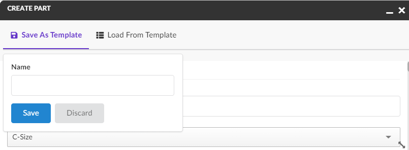
Figure 74. Save Form Templates
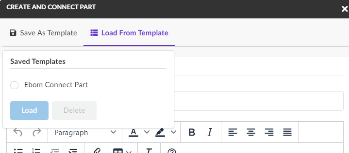
Figure 75. Load Form Templates
Please note that the templates that are saved on one form can only be loaded on the same form type. Templates are saved per user, meaning they cannot be shared to other users.
Templates can be enabled/disabled on individual forms using a configuration:
<Form>
<AllowTemplates>true</AllowTemplates>
</Form>| Templates are currently available on forms in Create mode. |
10.3.4. i18n
The form widget supports multiple languages via the i18n framework. To make your form multilingual use translation keys in your configuration instead of hardcoded names.
For example instead of configure your form like this, where the <Label> is hardcoded to always show Weight:
<Field>
<Label>Weight</Label>
<!-- more elements -->
</Field>Use a translation key that is defined in your language files instead. For example:
<Field>
<Label>form.fields.labels.weight</Label> <!-- a key that points to a translation -->
<!-- more elements -->
</Field>If the translation key can’t be resolved the actual value of key will be rendered, in this case form.fields.labels.weight.
Form messages
The following form messages is defined in the default translation file (default.json). By looking at the key names it should
be pretty self explanatory when they will be rendered in the form.
{
"form: {
"messages": {
"invalidPattern": "This field should have pattern {0}",
"stringTooShort": "This field should contain at least {0} numbers or characters",
"stringTooLong": "This field should contain at most {0} numbers or characters",
"invalidTime": "Invalid time",
"invalidEmail": "Invalid Email address",
"invalidIPv4": "Invalid IPv4 address, e.g. 192.168.0.1",
"invalidPassword": "Invalid Password",
"invalidURLFormat": "The URL provided is not a valid web address.",
"wordLimitExceeded": "The maximum word limit of {0} has been exceeded.",
"invalidZipcodeFormatFive": "Invalid Five-Digit Zipcode (#####)",
"invalidZipcodeFormatNine": "Invalid Nine-Digit Zipcode (#####-####)",
"keyNotUnique": "Keys of map field are not unique.",
"keyMissing": "Map contains an empty key.",
"stringNotAnInteger": "This value is not an integer.",
"invalidDate": "Invalid date for format {0}",
"stringNotAJSON": "This value is not a valid JSON string.",
"editorAnnotationsExist": "The editor has errors in it that must be corrected",
"noneLabel": "None",
"stringValueTooSmall": "The minimum value for this field is {0}",
"stringValueTooLarge": "The maximum value for this field is {0}",
"stringValueTooSmallExclusive": "Value of this field must be greater than {0}",
"stringValueTooLargeExclusive": "Value of this field must be less than {0}",
"stringDivisibleBy": "The value must be divisible by {0}",
"stringNotANumber": "This value is not a number.",
"stringValueNotMultipleOf": "This value is not a multiple of {0}",
"invalidValueOfEnum": "This field should have one of the values in {0}. Current value is: {1}",
"notEnoughItems": "The minimum number of items is {0}",
"tooManyItems": "The maximum number of items is {0}",
"valueNotUnique": "Values are not unique",
"notAnArray": "This value is not an Array",
"addItemButtonLabel": "Add New Item",
"addButtonLabel": "Add",
"removeButtonLabel": "Remove",
"upButtonLabel": "Up",
"downButtonLabel": "Down",
"chooseFile": "Choose file...",
"chooseFiles": "Choose files...",
"dropZoneSingle": "Click the Choose button or Drag and Drop a file here to upload...",
"dropZoneMultiple": "Click the Choose button or Drag and Drop files here to upload...",
"disallowValue": "{0} are disallowed values.",
"notOptional": "This field is not optional.",
"tooManyProperties": "The maximum number of properties ({0}) has been exceeded.",
"tooFewProperties": "There are not enough properties ({0} are required)"
}
}
}It is of course possible to override all of these messages in your custom language files, for example to override the stringTooShort
key you would add the following to your language files.
{
"form": {
"messages": {
"stringTooShort": "The string you provided is to short. It should contain at least {0} letters"
}
}
}10.3.5. API
The javascript API is described here
10.4. Lifecycle
The lifecycle widget can be used to display the lifecycle of an object you are in context of. It will render all of the states horizontally and has functionality for simple promoting and demoting.

| Currently the lifecycle widget is not able to render signatures. |
Below is an example of how this widget is configured:
<LifecycleWidget>
<Title>Lifecycle</Title>
</LifecycleWidget>10.5. History
The history widget can be used to display the history of an object you are in context of. It will render all of the history entries in a table with the ability to filter on it. Also it supports sorting and initial sort will be on basis of date in ascending order.

Below is an example of how this widget is configured:
<HistoryWidget>
<Title>History</Title>
<OnInitOption name="sortDirection" value="asc" />
<OnInitOption name="sortColumn" value="when" />
</HistoryWidget>10.6. Count
The count widget executes a dataset and renders the number of hits.

10.6.1. Options
| Name | Description | Required |
|---|---|---|
dataset |
Reference to a dataset to load |
true |
color |
The text color (#FFF) |
false |
background |
The widgets background color (#34495e) |
false |
iconClass |
What icon to show (could be icons from semantic-ui.com) |
false |
iconColor |
The icon color (#FFF) |
false |
iconAlignment |
Possible values: right, left, center |
false |
template |
Your own handlebars template |
false |
drillDown |
Reference to a dashboard used for drilldown |
false |
onclick |
A function that is executed when the widget is clicked |
false |
maxCount |
If the result contains more hits than maxCount a + sign will be added (99+) |
false |
Below is an example of how this widget is configured:
<CountWidget xmlns="http://technia.com/helium/Widget">
<!-- Title will be used in drilldowns -->
<Title>Documents</Title>
<!-- Required -->
<DataSet>tvc:dataset:main:common/MyDocs.xml"</DataSet>
<!-- Optional -->
<OnInitOption name="background" value="#34495e" />
<OnInitOption name="color" value="#fff" />
<OnInitOption name="iconColor" value="#fff" />
<OnInitOption name="iconClass" value="icon file" />
<OnInitOption name="iconAlignment" value="right" />
<OnInitOption name="maxCount" value="999" />
<!-- You can specify dashboard to drilldown to -->
<OnInitOption name="drillDown" value="tvc:dashboard:helium:main:projectspace/ProjectDrillDown.xml" />
<!-- Or execute a Javascript function-->
<OnInitOption name="onclick" value="App.custom.yourCustomFunction" />
</CountWidget>10.7. Tile
The tile widget can be used to display a table, rendered in another way. It still uses a TableConfig for defining and retrieving its data, but using a Handlebars template the objects can be rendered in a fully custom way. There is also a default tile template provided.

10.7.1. Options
| Name | Description | Required |
|---|---|---|
tableConfig |
Reference to a tableConfig to load |
true |
selection |
Enable selection of objects, for performing actions. Default is false. |
false |
template |
Your own handlebars template |
false |
onClick |
A function that is executed when the tile is clicked. Default is to navigate to the object. |
false |

Below is an example of how a TileWidget is configured:
<TileWidget>
<Title>Tile widget</Title>
<TableConfig>tvc:tableconfig:folder/MyTableConfig.xml</TableConfig>
<!-- Optional parameters below -->
<OnInitOption name="selection" value="true" />
<OnInitOption name="onClick" value="App.routing.open" />
<OnInitOption name="template" value="helium/custom/hex/templates/common/widget/images-tile" />
</TileWidget>10.7.2. Built-in commands
Tile Widget supports local search (filtering) in the same way as a TableWidget. To enable it, configure the <Search/> command as described here

10.8. Recent Objects Widget
The recent widget can be used to display a list of objects that the user has recently visited. The built-in widget uses TableConfig for defining and retrieving its data and a handlebars template to display the data. Both of them can be overridden if needed, for e.g. to fetch and display information in a different way.
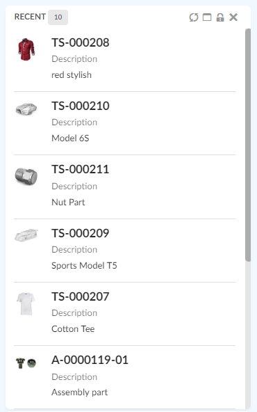
Figure 76. Recent Objects Widget
10.8.1. Options
| Name | Description | Required |
|---|---|---|
Title |
Title for widget, default, 'Recent' or value returned by i18n key, |
false |
tableConfig |
Reference to a |
false |
template |
Your own handlebars template |
false |
By default, 20 latest visited objects are stored/ displayed. A TVC property, tvc.core.recentobject.limit can be used to define different limit, e.g.
tvc.core.recentobject.limit = 30
Below is an example of how a RecentObject Widget is configured:
<RecentObjectWidget />If you’d like to use your own table for loading data and template for rendering, a sample configuration could be:
<RecentObjectWidget>
<Title>acme.label.last.viewed</Title> <!-- i18n key -->
<OnInitOption name="tableConfig" value="tvc:tableconfig:acme/LastViewedObjects.xml" />
<OnInitOption name="template" value="helium/custom/templates/common/widget/last-viewed" />
<OnInitOption name="selection" value="false" />
<OnInitOption name="onClick" value="App.custom.openObject" />
</RecentObjectWidget>In addition, the com.technia.tvc.core.recentobject.RecentObjectHandlerManager Java class has APIs that can be used to get, save, and clear recently visited objects.
See TVC Core Admin guide for more information of configuring recent objects.
| Looking to configure recent objects within a menu in Topbar instead? See Recent Object Menu for more information. |
10.9. Clipboard Widget
The clipboard widget can be used to show objects, selected by the user. The content of the clipboard is maintained between sessions. The built-in widget uses TableConfig for defining and retrieving its data and a handlebars template to display the data. Both of them can be overridden if needed, for e.g. to fetch and display information in a different way.
Clipboard objects can be removed by clicking on minus circle icon.
| Clipboard widget is not supported with offline pages. |
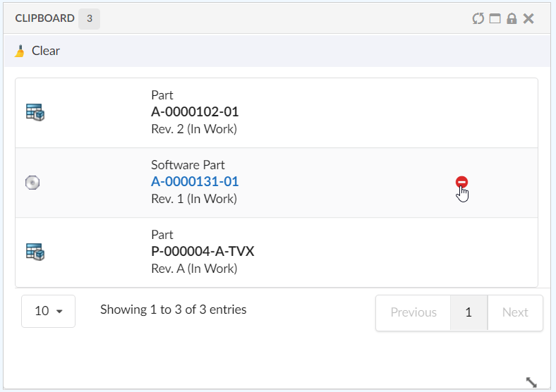
Figure 77. Clipboard Widget
10.9.1. Options
| Name | Description | Required |
|---|---|---|
Title |
Title for widget, default, 'Clipboard' or value returned by i18n key, |
false |
tableConfig |
Reference to a |
false |
template |
Your own handlebars template |
false |
Below is an example of how a Clipboard Widget is configured:
<ClipboardWidget />If you’d like to use your own table for loading data and template for rendering, a sample configuration could be:
<ClipboardWidget>
<Title>acme.label.clipboard.items</Title> <!-- i18n key -->
<OnInitOption name="tableConfig" value="tvc:tableconfig:acme/ClipboardItems.xml" />
<OnInitOption name="template" value="helium/custom/templates/common/widget/clipboard-items" />
<OnInitOption name="selection" value="false" />
<OnInitOption name="onClick" value="App.custom.openObject" />
</ClipboardWidget>| User can defined at most one clipboard widget per page. |
10.10. Clipboard Store
The content of the clipboard is by default stored into a set in the database.
This set is saved with the name mxClipboardCollections, if the ENOVIA
version is V6R2009 of later. For earlier versions, this name is
.clipboard.
It is however, possible to change this name through the following init-parameter (the name must not be longer than 127 characters, and might only contain characters that are valid for ENOVIA sets):
<init-param>
<param-name>tvc.structurebrowser.clipboard.name</param-name>
<param-value>My Clipboard</param-value>
</init-param>10.11. Clear Clipboard
To clear the content of the clipboard, the clear method of App.clipboard JS API can be used. The command can be used in Clipboard widget toolbar.
Example:
In Clipboard Widget Toolbar
<ClipboardWidget>
<Toolbar>
<Command>
<Label>Clear</Label>
<Alt>Clear Clipboard</Alt>
<FontIcon>ti-c ti-broom</FontIcon>
<OnClick>App.clipboard.clear</OnClick>
</Command>
</Toolbar>
</ClipboardWidget>10.12. Collections
Helium contains functionality allowing the user to work with collections. A collection is used to store arbitrary business objects.
10.12.1. Configure Collection:
Collections can be enabled from widget toolbars.
Adding <collection/> elements in toolbar, will enable a collection menu with 4 default commands.
-
Add to Clipboard
-
View Clipboard
-
Add to Collection
-
View Collection
Collection default menu will appear in UI as shown in below image.

Add to Collection command
This command opens a 'Add to Collection' widget in sidepanel and allows the user to add the selected objects from datatable to an existing or new collection. New collection can added by selecting the Add New Collection option in the select input field.
Add new Collection option can be internationalized by key helium.collection.addToCollection.addNewCollection using String Resource properties file.


10.12.2. Manage collections:
User can manage the collections and its content from collection widget. Below 6 default toolbar commands in Collection widget enables users to manage their collection objects.
-
Filter
-
Create Collection
-
Clear collections
-
Delete collections
-
Distribute selected collection(s)
-
Merge selected collections


10.12.3. Manage collection
User can manage the individual collection widget content by using default toolbar commands:-
-
Search and Add
-
Remove
-
Clear Collection


10.12.6. Customize Collection
Commands:
Collection default commands can be customized to change the label, font Icon, alt and visibility as shown in below xml.
<Collection>
<Label>Favourites</Label>
<FontIcon>Collection Icon</FontIcon>
<AddToClipboard />
<ViewClipboard />
<AddToCollection>
<!-- 1 . Add to Collection label changed to My Collections -->
<Label>My Collections</Label>
<!-- 2. default Font Icon changed to 'Favourite Icon' -->
<FontIcon>Favorite Icon</FontIcon>
<!-- 3. Default Alt changed -->
<Alt>Add your favourite object</Alt>
<Label>My Collection</Label>
<FontIcon>Collection Icon</FontIcon>
</AddToCollection>
<!-- 4. visible='false' will hide "View Collection" command -->
<ViewCollection visible='false'>
<Label>Display Collection</Label>
<FontIcon>Collection Icon</FontIcon>
</ViewCollection>
</Collection>Widgets:
Collection widget is configured to open in a sidepanel by default. But it can be customized to include in your required dashboards.
In order to configure in required dashboard, two widgets need to be included in the required dashboard as shown in below sample XML. The first widget (Collections.xml) is for viewing all collection objects, and the second widget(Collection.xml) is required for opening the individual collection object. Hence both the widgets should be included in the required dashboard.
Ideally no element values in the below widgets are suggested to change, except the positioning values.
<Dashboard">
<Locked>false</Locked>
<Floating>true</Floating>
<Widgets>
<Widget namespace="helium:collections" name="Collections.xml">
<Id>collections</Id>
<Width>12</Width>
<Height>10</Height>
<X>0</X>
<Y>0</Y>
<Locked>false</Locked>
<Badge>true</Badge>
</Widget>
<Widget namespace="helium:collections" name="Collection.xml">
<Id>collection</Id>
<Width>12</Width>
<Height>10</Height>
<X>0</X>
<Y>0</Y>
<Locked>false</Locked>
<Badge>true</Badge>
<Hidden>true</Hidden>
</Widget>
</Widgets>
</Dashboard>10.13. IframeWidget
While Helium is designed as a JSON-driven Single-Page Application, and we generally discourage the use of legacy iframes, sometimes embedding web pages from other applications or even servers can be necessary.
Another useful scenario of when to use an <IframeWidget> is if you want to reuse a JSP based tvc-action from the TVC Classic component family. Because the IframeWidget will receive the context objectId as a parameter, this enables using Helium for its standalone mode, while embedding TVC views that normally are seen inside 3DExperience.
The below example shows how you can embed the Gantt Chart view from TVC Graphic Reporting. Note that the Page’s objectId is passed into the <IframeWidget> automatically.

10.13.1. Options
| Name | Description | Required |
|---|---|---|
Title |
Widget title, seen in header |
false |
Src |
The URL to embed within the IframeWidget, to which ?objectId={objectId} will be appended |
true |
Options |
A way to pass CSS classes and styling, see below |
false |
Full example, showing the configuration for above Gantt Chart scenario.
<IframeWidget>
<Title>Gantt Chart</Title>
<!-- Wrap the URL in a CDATA section to avoid issues with ampersands and other special characters -->
<!-- Some ${macro} variables can be used within the Src element: ${CONTEXT_URL}, ${ROOT_DIR}, ${TVC_ACTION} -->
<Src><![CDATA[${TVC_ACTION}/ganttChart?name=Sample&subHeader=TVC Graphic Reporting Sample&suiteKey=ProgramCentral&suiteKey=ProgramCentral&emxSuiteDirectory=programcentral&emxSuiteDirectory=programcentral&StringResourceFileId=emxProgramCentralStringResource&StringResourceFileId=emxProgramCentralStringResource&mode=replace&valueIndex=0&colName=Name&targetLocation=content]]></Src>
<!--<Options>{-->
<!--"id": "hidden-iframe",-->
<!--"template": "some/other/template",-->
<!--"classes": "additional classes separated with space",-->
<!--"width": "100%",-->
<!--"height": "100%"-->
<!--}-->
<!--</Options>-->
</IframeWidget>11. Styling and Icons
Helium is using a third party framework called Semantic UI (https://semantic-ui.com/) for internal styling on many of the components. Helium also uses many of the icons included in that framework.
In the same way Helium is using this framework internally it is also possible (and preferred) to use this for custom functionality in Helium that needs a UI or Icons. The following section describes this in more detail.
11.1. Semantic UI Styling
The CSS and JS files for Semantic UI are automatically included in Helium so it is possible to use the different components in Semantic UI for custom functionality. Available components and the markup/scripts needed are available on the Semantic UI web page https://semantic-ui.com/
11.2. Semantic UI Icons
Semantic UI includes a complete port of the font icon toolkit called fontawesome (that we used to include in Helium but no longer do). Available icons and how they are used can be found on https://semantic-ui.com/elements/icon.html.
An example usage is <i class="alarm outline icon"></i>. When using in configurations that support font icons only the classes are used, in the previous example that would then be "alarm outline icon".
12. TVC Collaboration Integration
TVC Collaboration Components like Myspace and Panel are rendered in Helium standalone and Helium embedded using configurations.
Note: When TVC Classic with collaboration embeds Helium configured with Panel, then there would be two side panels. one within embedded Helium and one for the TVC Classic.
12.1. Myspace
Myspace inbox command is configured in Helium’s Topbar Right side command.
<Application xmlns="http://technia.com/helium/Application">
<Name>ACME</Name>
<!-- other configurations. refer chapter Helium.xml -->
<TopBar>
<!-- Left -->
<Right>
<Myspace />
<Search />
<Logout />
</Right>
</TopBar>
</Application>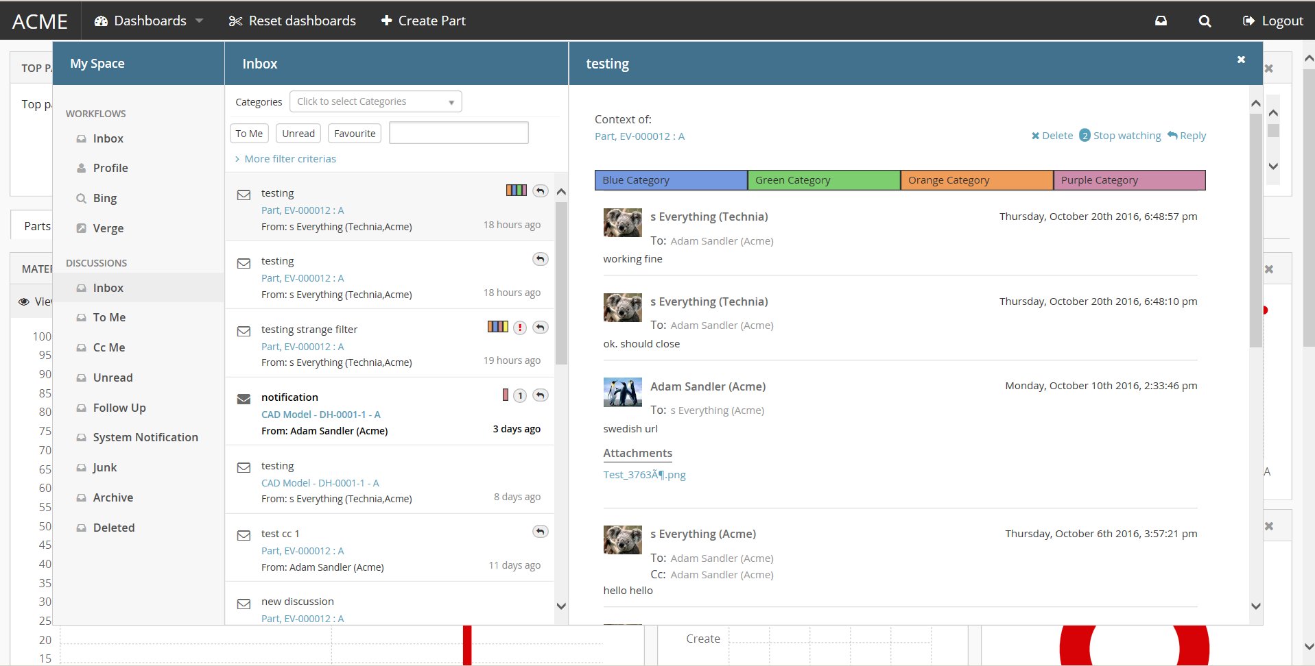
Figure 78. Collaboration Myspace
12.2. Panel
Collaboration’s Panel component can be rendered inside Helium’s container component Page Sidepanel using configuration.
<Page>
<!-- other configurations. refer chapter Page.xml -->
<Sidepanel width="500" position="right">
<Label>Collaboration</Label>
<OnInit>App.Collaboration.Panel.instance</OnInit>
<OnInitOption name="key" value="true" />
</Sidepanel>
</Page>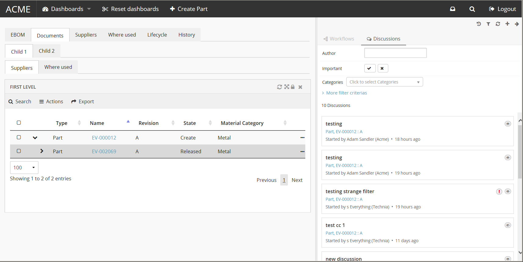
Figure 79. Collaboration Panel
12.3. Widget
Collaboration’s Panel component can be rendered inside Helium’s container component Widget using configuration.
<Widget xmlns="http://technia.com/helium/Widget">
<Title>Collaboration</Title>
<OnInit>App.Collaboration.Panel.load</OnInit>
<OnInitOption name="key"
    value="value" />
</Widget>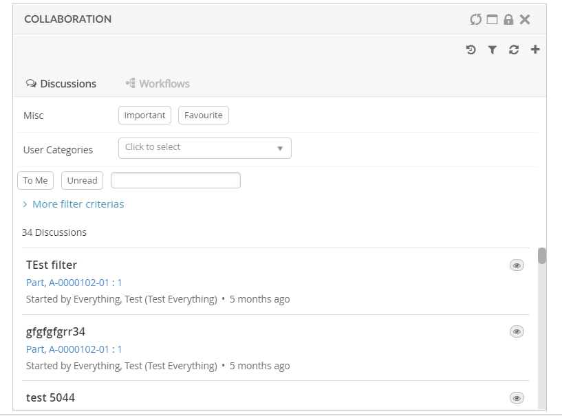
Figure 80. Collaboration Widget
12.4. Link to Discussion
In Helium table, you can add a column that will show an icon when a discussion exists for the object. Clicking on the icon brings up the discussion panel similar to Classic Collaboration.
To enable this column in your table, add a column like shown below:
<Table>
...
<Column>
<Name>discussion-link</Name>
<ColumnType>discussion-link</ColumnType>
<!-- an optional helium specific Template to have icon over image and rich tooltip -->
<Setting name="Template" value="helium/templates/collaboration/discussion-link" />
</Column>
</Table>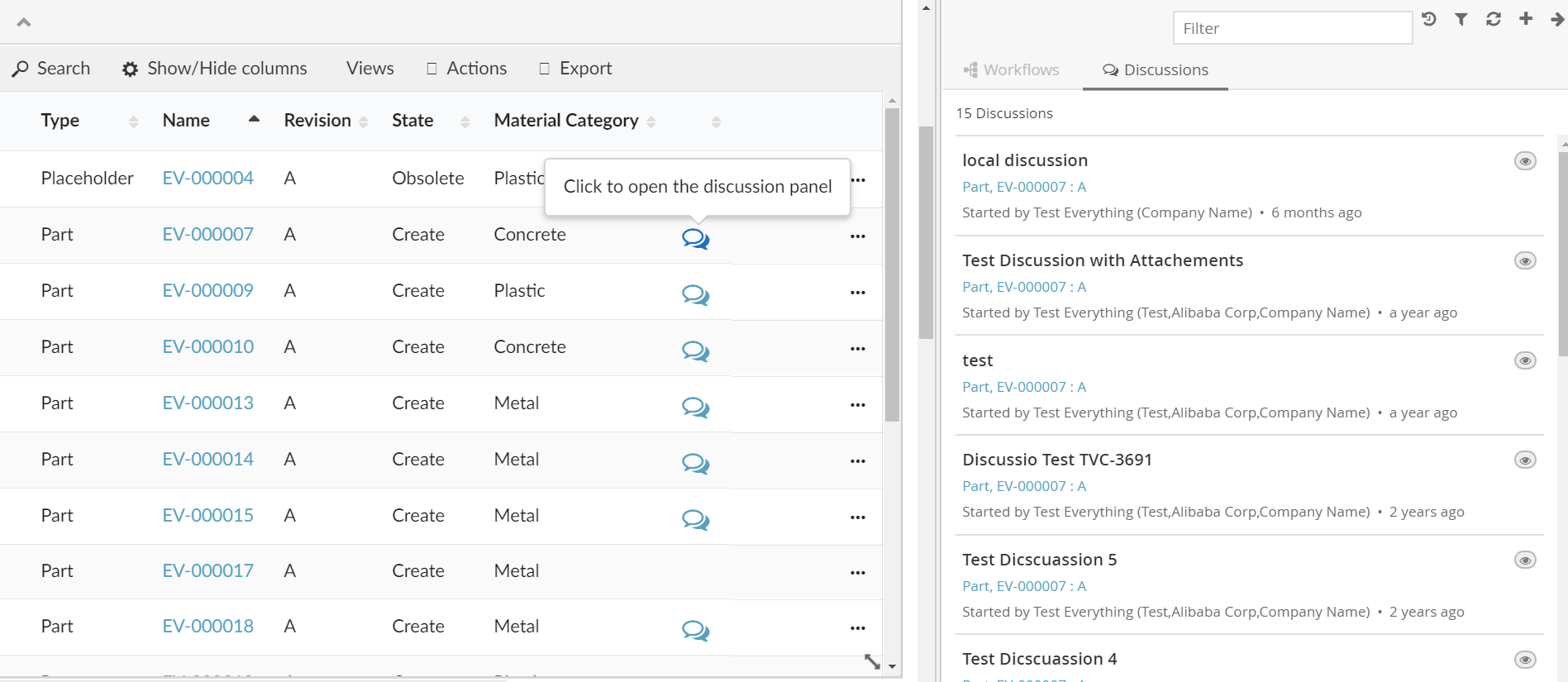
Figure 81. Link to discussion
12.5. Link to Workflow
In Helium table, you can add a column that will show workflow chart or an icon when a workflow exists for the object. Clicking on the icon brings up the workflow panel similar to Classic Collaboration.
| When multiple workflows are defined on context object, the last modified workflow would be shown in Workflow Chart column. |
To enable this column in your table, add a column like shown below:
<Table>
...
<Column>
<Name>workflow-chart</Name>
<Label>workflow-chart</Label>
<ColumnType>helium-workflow-chart</ColumnType>
<!-- an optional helium specific iconOnly setting, to have static icon over dynamic workflow rendering -->
<Setting name="iconOnly" value="true" />
</Column>
</Table>'iconOnly' setting is by default false.
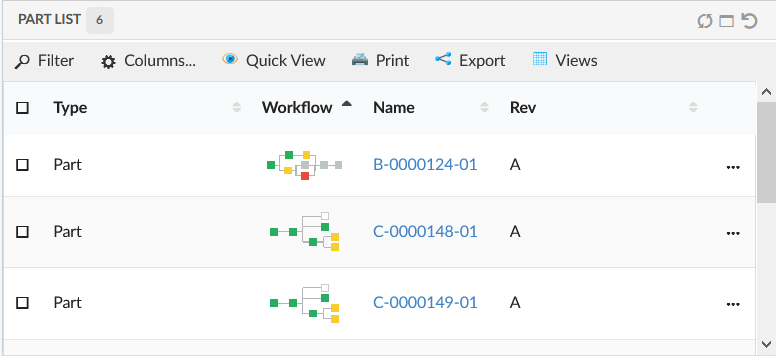
Figure 82. Link to workflow(Chart)
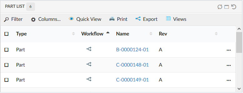
Figure 83. Link to workflow(Icon)
13. In-App Designer
| 'In-App Designer' (previously know as End User definition \ End User UI ) was released as an experimental feature in 2020.5.0 release . |
In-App Designer (previously known as End User Definition/ End User UI) is a concept that brings the idea of creating, editing and sharing configurations using the built-in admin user interface. These configurations can be used to define Helium dashboards, widgets, tables, charts, etc. Built-in Admin UI is provided to create, modify and share these configurations. In-App Designer can be used from Helium standalone or Helium widget in 3DDashboard. Once an admin has created and shared the config with end user, end user can use a built-in chooser UI to select and apply the configuration to his page, dashboard, or widget.
13.1. Admin user
Admin user can create, edit, validate and share config definitions. While creating and editing config definitions user can validate that definition against defined xsds. He is the owner of the admin UI.
Admin user is a person having TVC Config Admin role.
|
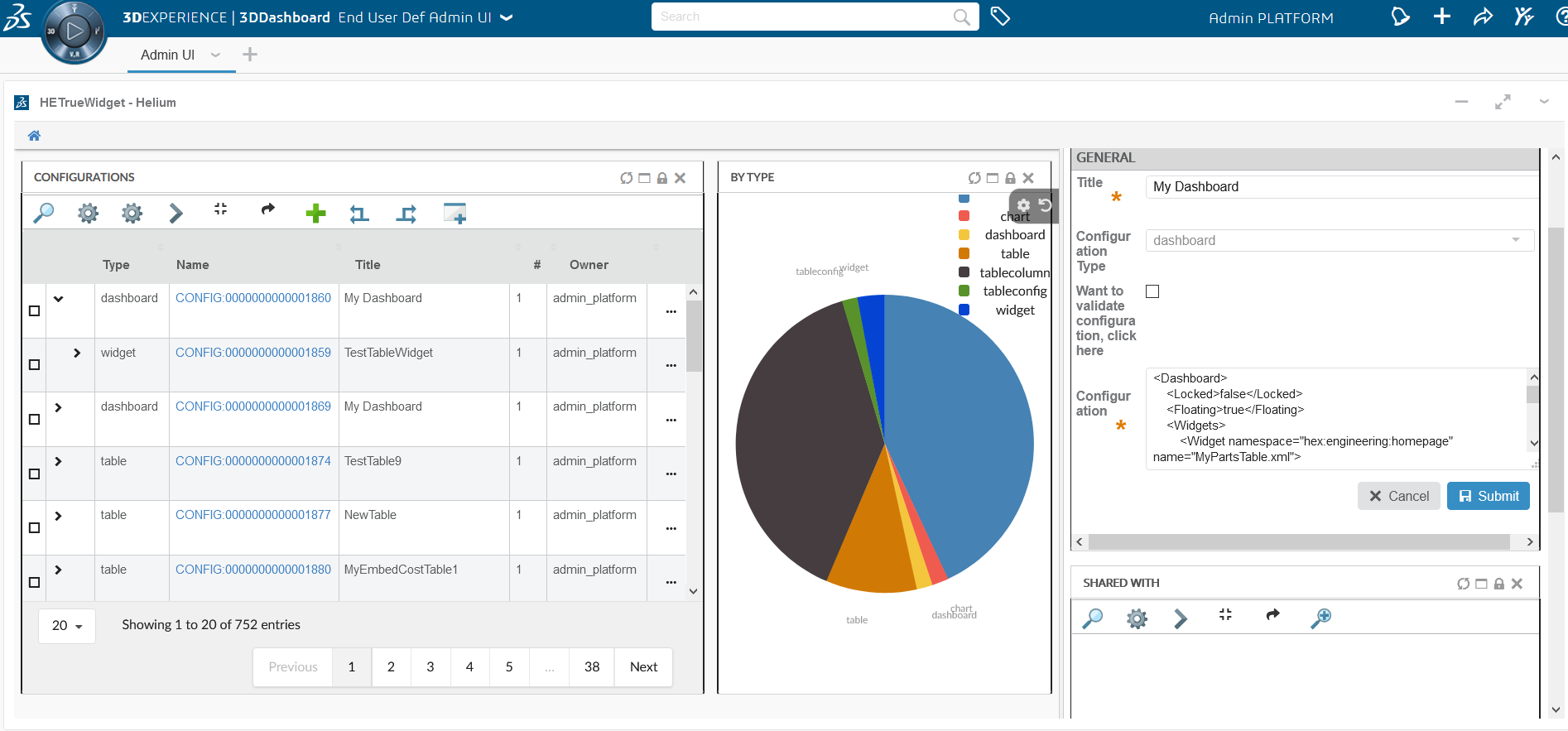
Figure 84. Admin UI in Helium widget in 3DDashboard
13.1.1. Configuration Admin UI
In Standalone helium page, Configuration Admin UI can be accessed through the command "Configuration Admin". This command should be configured in Helium.xml file as shown below.
<?xml version="1.0" encoding="UTF-8"?>
<Application xmlns="http://technia.com/helium/Application">
...
<TopBar>
...
<Command>tvc:command:helium:admin/ConfigAdminUI.xml</Command>
...
</TopBar>
<Application/>13.1.2. Configuration Admin UI in 3DDashboard
In-App designer related apps can be configured easily in 3DDashboard by using Helium True Widget.
Configuration for adding TrueWidget App for "Config Admin UI" page:
Configuration file URL: https://domain-name/app-name/webapps/HETrueWidget/configadmin/configAdminUI.json
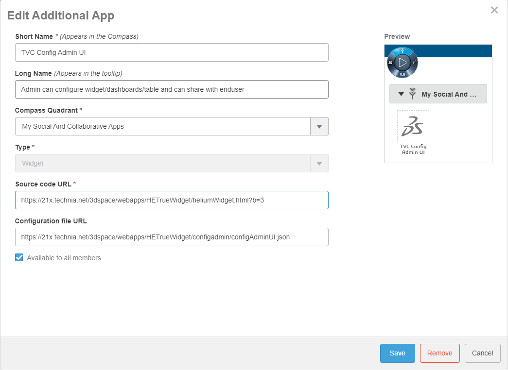
Figure 85. Configure Admin UI in Truewidget App
13.1.3. Create, edit, validate user defined definitions
Please refer below screens for create and edit config definitions.
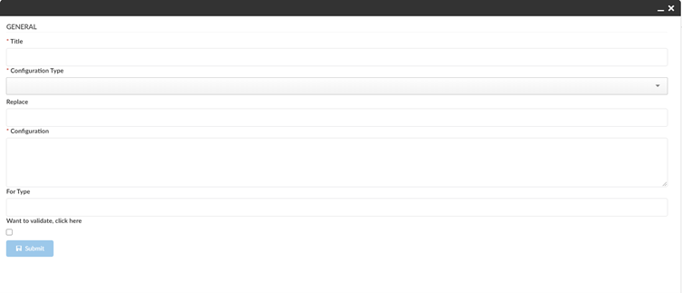
Figure 86. Create config with validation
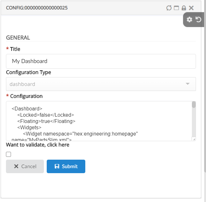
Figure 87. Edit config with validation
Dataset
Depending on how it is designed Dataset query can cause performance issues. For example a query like temp query bus Part * * will likely cause system failure as it tries to query all parts in system, which can be in million for some companies. Therefore, we have by default restricted access to create Dataset to only system or business admin.
This can be disable using the key tvc.enduser.dataset.limitToAdmin in tvc.properties. The valid value is either true or false and the default value is true.
In Inquiry and Query dataset, type as a wildcard i.e * is not allowed, but this can be disabled using the key tvc.enduser.dataset.disallowWildcardInType in tvc.properties. The valid value is either true or false and the default value is true.
Expression
Admin can create expression by choosing selectexpression as a Configuration Type and any valid expression in Configuration.
Currently table column can be created with direct attributes on table objects like 'Material Category' for Parts, however it may be needed to add coumn to show related object data like state of connected part specification. User can create such expression and that expression can be used to create column to show the related object state.
These expressions can also be used to create charts in create chart wizard.
Expression example:
<Expression>from[Part Specification].to.name</Expression>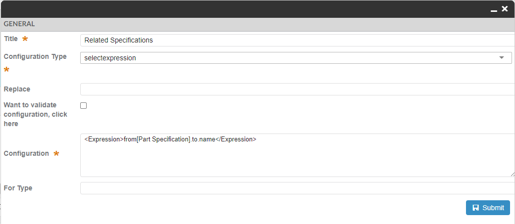
Figure 88. Expression Create Config
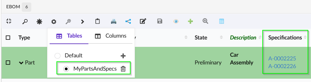
Figure 89. Add Select Expression Column
13.1.4. Share/Unshare definitions with end users and teams
Admin user can share created config definitions with end users and teams. To perform this, user can select the configuration from Configurations table and click on the Share command in toolbar. This will open Shared With widget in the sidepanel to allow admin to share/unshare configuration with end users and teams.
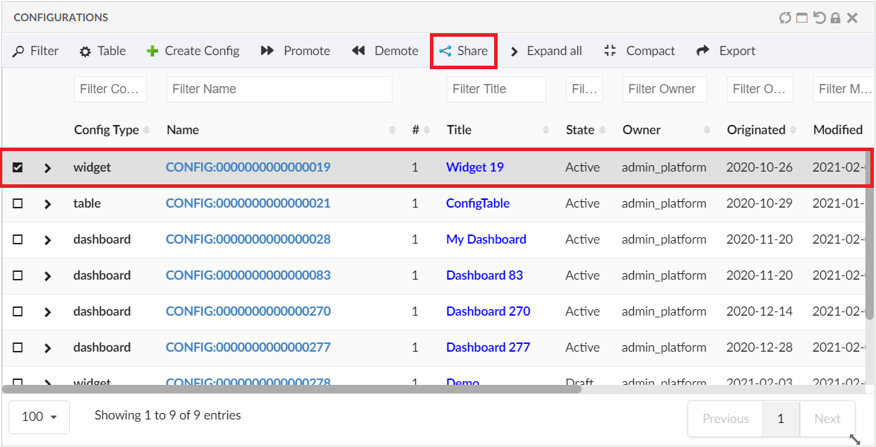
Figure 90. Configuration List
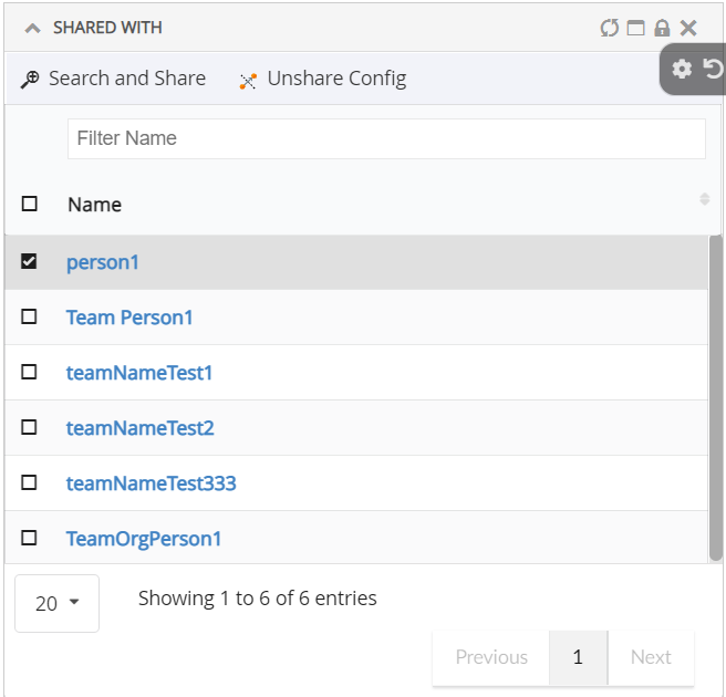
Figure 91. Share with widget
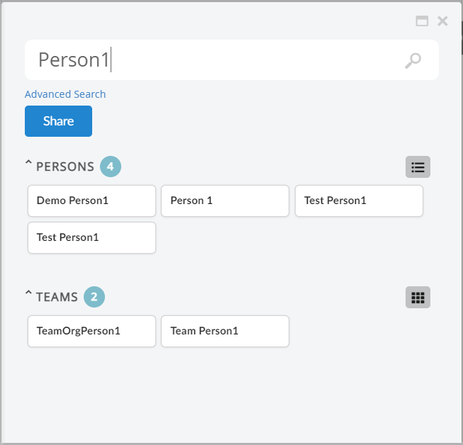
Figure 92. Search and share config with end user and team
13.1.5. Notifications
The Email notification will be sent to the user when an admin share or unshare the configurations and Also, on activation of a new revision of configuration which is already shared.
Email Notification requires the MX_SMTP_HOST is configured and users have valid email address.
Email Notification Handler uses templates configured in string resources.
Following are the default template property keys used for workflow email notifications.
tvc.inappdesigner.email.share.to.user.message =
tvc.inappdesigner.email.share.to.user.subject =
tvc.inappdesigner.email.unshare.to.user.message =
tvc.inappdesigner.email.unshare.to.user.subject =
tvc.inappdesigner.email.revision.active.to.user.message =
tvc.inappdesigner.email.revision.active.to.user.subject =
tvc.inappdesigner.email.share.to.team.message =Following are the MACROs that can be used as $(MACRO) in the email templates.
TITLE
CONFIG_TYPE
CONTEXT_USER
TO_USER
DATEExample:
tvc.inappdesigner.email.share.to.user.message = <p>Hello $(TO_USER),</p> \
<p>The Configuration "<strong>$(TITLE)</strong>" of type "$(CONFIG_TYPE)" has been shared with you by "<strong>$(CONTEXT_USER)</strong>" on $(DATE).</p> \
<p> </p> \
<p>Please accept "<strong>$(TITLE)</strong>" to use in your dashboards</p> \
<p> </p> \
<pre><em><sub>This message is system generated and sent by Administrator.</sub></em></pre>
tvc.inappdesigner.email.share.to.user.subject = New Config "$(TITLE)" is Shared13.1.6. Revise config definitions
Admin can revise the shared config objects which are already shared to enduser.
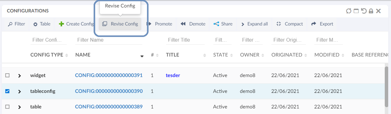
Figure 93. revise shared config
Admin can update the configuration changes on the created new revision and promote it to active state. Once the new revision is promoted to active state, the previous revision which is shared to end user will be auto-replace by new active revision. And the previous revision will be auto-promoted to obsolete state.
13.1.7. Delete Draft Configs
Config-Admin can choose to delete the draft configs if it is no more required.
| Only the draft configs are allowed to delete. |
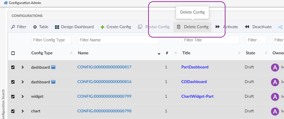
Figure 94. Delete Config
13.1.8. Autopromote Child Configs
When the Dashboard is activated, all its child components like widgets, tables, tablecolumns, and datasets will be auto promoted to an active state.
13.1.9. Preview dashboard
Admin can preview the configured dashboard before sharing with end users. From release 2021.4.0, admin can preview the Draft dashboards also. This is to facilitate admin to make changes on draft dashboard as required before promoting to active and share with end user.
13.1.10. Configure TableWidget on Draft Dashboard
Config-Admin can configure table widget by selecting dataset and table from UI itself. Config-Admin can create a draft dashboard and add a table widget on the dashboard by selecting an existing table or by choosing to create a new table. And then, columns can be added to the table using table configurator.
| Whenever the admin adds a widget to the draft dashboard or changes the position of widgets, the respective changes will be captured in the dashboard’s config object. Also, admin can preview the changes made on the dashboard and choose to share them with the end-user. |
13.2. End user
End users definitions enables the end users to customize how the content/information should displayed in the application.
End users can accept and apply the configurations shared by Admin, and enables further customizations at user end as well.
13.2.1. Shared Config Page:
Configuration that are shared by Configuration Admin will be listed under "Shared Config" page. In Standalone Helium UI, "Shared Config" page can be accessed from the toolbar command as shown in image.
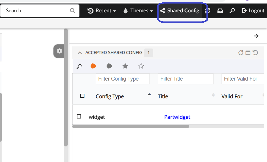
Figure 95. Shared config command and Page
Configuration for adding TrueWidget app for "Shared Config" page:
Configuration file URL: https://domain-name/app-name/webapps/HETrueWidget/configuser/sharedConfigsUI.json
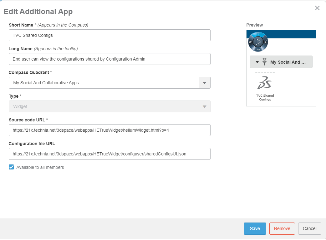
Figure 96. Configure Shared config UI in Truewidget App
13.2.2. Accept or Reject shared configurations
There is shared config widget which will be displayed, when user clicks on the configurable Shared Config command present in helium topbar. There are 3 tabs in this widget to display pending, accepted and rejected configurations. User will see all shared configurations in pending tab. Once it is accepted or rejected that will move to accepted or rejected tab.
| All configurations shared with end user’s team are by default in accepted mode. |
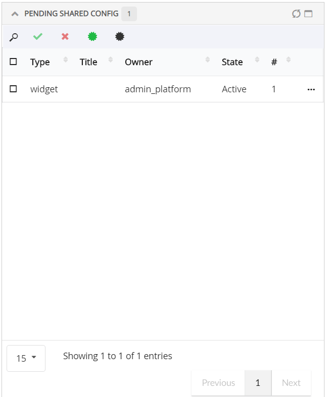
Figure 97. Shared configs with end user and team
13.2.3. Apply accepted user definitions using table and dashboard chooser in their dashboard
User can apply shared dashboard or table using widget wizard and table configurator. Please find below scenarios where user configurations can be applied.
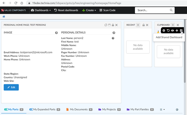
Figure 98. Add Shared Dashboard
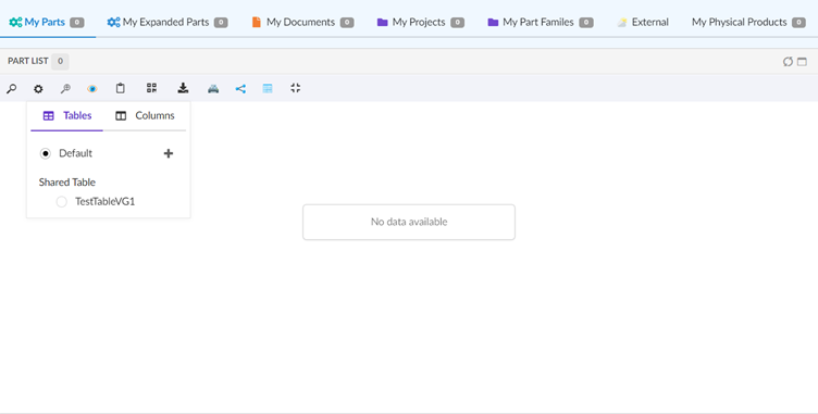
Figure 99. Add Shared Table
13.2.4. View Dashboard
Accepted shared dashboards can be accessed directly from a dynamic menu known as My Dashboard. Under Accepted shared config tab, add and remove dashboard command are introduced to manage My Dashboard menu. This dynamic menu can be added in topbar as shown below
In Helium.xml,
<?xml version="1.0" encoding="UTF-8"?>
<Application xmlns="http://technia.com/helium/Application">
...
<TopBar>
...
<Menu>tvc:menu:helium:myconfigdashboard/MyConfigDashboards.xml</Menu>
...
</TopBar>
<Application/>13.2.5. Viewing accepted user definitions in Helium True widget in 3DDashboard
Following image of 3DDashboard widget preference shows that user can view their 'Accepted Shared Config' from Helium. Currently configurations of Helium Dashboard, Helium Chart Widget and Helium Table Widget are listed in preferences of TVC widget. This functionality needs to be activated by setting tvc.3ddashboard.showEndUserConfigObjects property to true in TVC.properties or web.xml file.
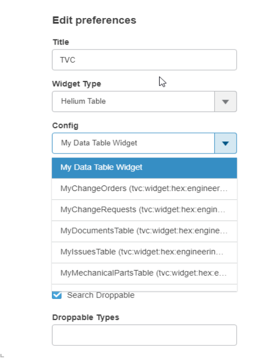
Figure 100. Accepted Shared Data Table widget in preferences
13.2.6. Viewing Admin Configs in Helium True Widget in 3DDashboard
Along with viewing Accepted Shared User Definitions, users who have 'TVC Config Admin' role, can view all the Admin Configs in 3DDashboard Widget. This functionality is by default enabled provided that we enable tvc.3ddashboard.showEndUserConfigObjects setting. To disable this feature, please set tvc.3ddashboard.showAdminEndUserConfigObjects property to false in tvc.properties or web.xml file.
13.2.7. Widgets
Create and customize widgets.
Create widgets
A user can add new widgets to a dashboard by using the + sign in the dashboard settings menu. This will open a form at the top in the corresponding dashboard, where you can create your widget/specify things about the widget you want to create, like the name of the widget, what data to be displayed and more.
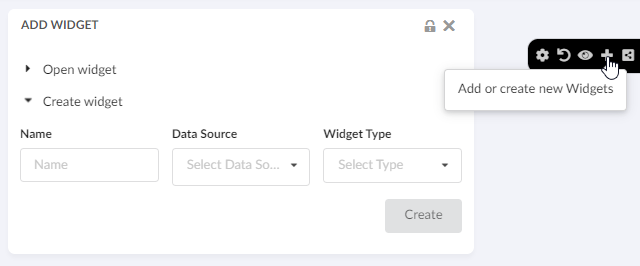
Figure 101. Create widget
User can also open this create widget form at the bottom of the corresponding dashboard by using the key tvc.helium.enduser.createWidget.placeHolder.bottomPosition in tvc.properties. The default value of this is false and valid value is either true or false.
There are two types of widgets one can create, a chart widget or a table widget.
Charts
Create different type of charts. In the "Chart Type" field you can choose how you want the data to be displayed. You can choose from all the different chart types, e.g. Bar, Line, Pie or Donut. In the "Data Source" field you select what set of objects you want to base the chart on. The list is populated by the datasets cached in your application. In the "Chart Expression" field you choose what information you want to be displayed in the chart. You can choose from the basics and attributes of the objects from the dataset selected in the "Data Scource" field.
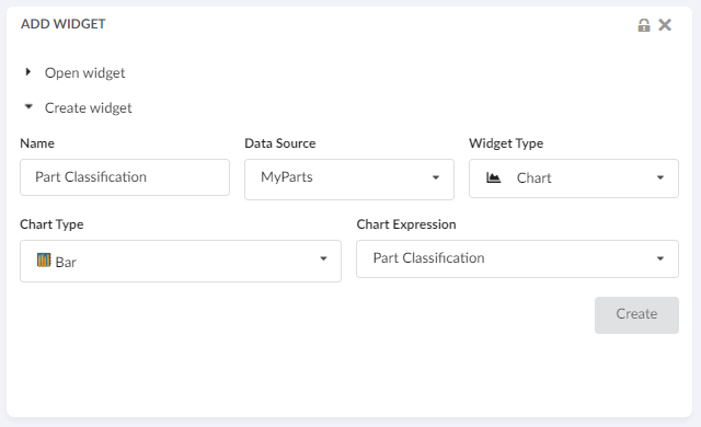
Figure 102. Create chart
For more information about charts in general, it can be found in the Chart chapter.
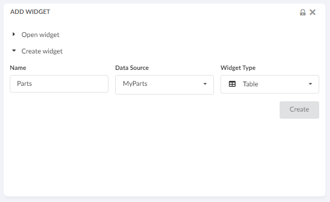
Edit Widgets
A user can edit their own chart/table widgets by using the edit icon in the widget. This will take the user to the edit form where you can make changes and save your edited widget.
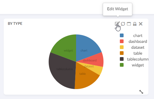
Figure 104. Editable end user chart widget
Create Widget with existing table
Now, end-users can create a table widget by pointing to an existing table. This will allow the end-user to reuse any previously created table. For example, if the end-user has already created a table for Parts, the same table can be used to create a different widget that can list the Released Parts or My InWork Parts, etc. This will only require changing the dataset.
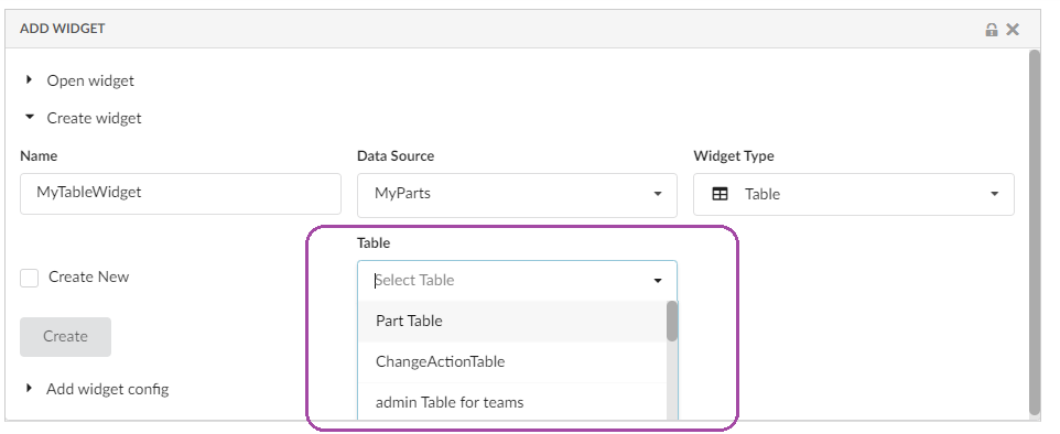
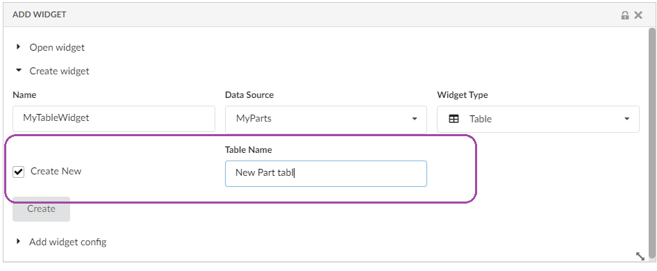
Expression support in advanced column
Now end-users can write an expression in the advanced column. This feature will facilitate end-user to write their expression to display the related object information in a table column. This can be enabled by adding the property tvc.helium.tableconfigurator.writeExpression.enabled = true in TVC.properties file. The default value for this property is false.
| This feature needs to be enabled with caution and it is expected that the user knows the concept of Enovia MQL selects to use this feature. |
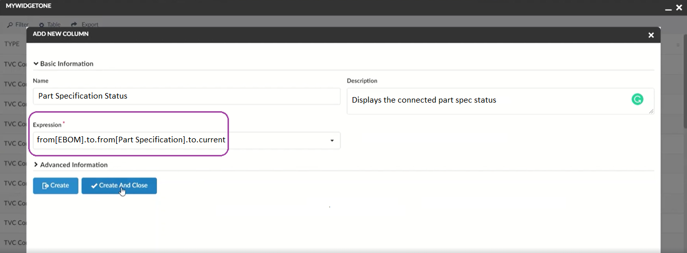
Figure 107. Write expression for Column
Add accepted shared widget
End users can extend any dashboard to create a personalized dashboard. In this dashboard, they can add a new widget. From this release, end users can also add any shared widget to the dashboard.
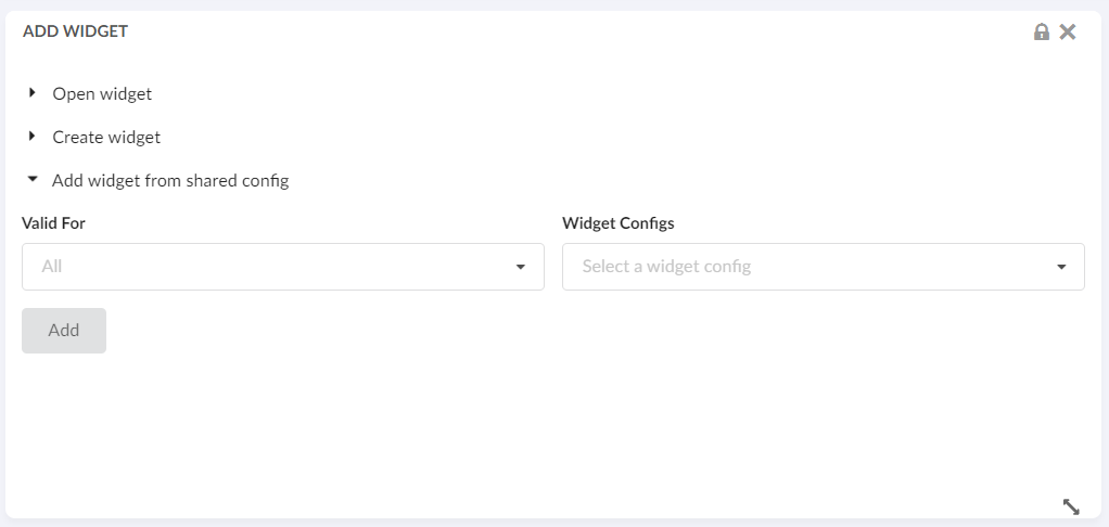
Figure 108. Add accepted shared widget
Using Add widget from shared config it is possible to add accepted shared widgets.
-
'Valid For' field: Lists all the business types from accepted shared widgets
-
'Widget Configs' field: Lists all accepted widgets based on 'Valid For' field selection
13.3. Teams Management widget
Team can be a logical group of people, of same or different department within organization. Admin can share UI configs to teams. This will be useful as admin will not have to share the configuration to individual users. Once a user is added to team, he/she will have access to all the configurations shared with that team. If user is removed from team, he/she will no longer have access to team shared configuration
Once admin user has created a configuration as per the request from end user or team of end users. Admin needs to define a team, and he will use this widget to create and manage a team. For managing teams a new widget called 'Teams' is added to Helium admin page with below functionalities.
-
Create a Team
-
Promote a Team
-
Demote a team
-
Connect with team members to a team
-
Disconnect team members from a team
Please refer the below video for more details on Teams widget functions.