 TVC Helium 2022.1.0
TVC Helium 2018.4.0 Release Information
28 August 2018
1. New Search Experience
New search is being introduced in this release. It supports freetext search like current helium search and form based parametric search. It also allows flexibility in rendering search results, allows configuring context menu to perform actions on search results. Search panel can also be configured within a helium page, allowing user to manipulate page contents based on search result.
1.1. Quick Search
The quick search allows users a way to easily find objects of interest. When the quick search is launched it opens as an overlay and the user enters a search term. The search results matching the term are presented and by clicking the search hits the user can open the corresponding object.
Figure 1. Quick Search
For more information, see Quick Search
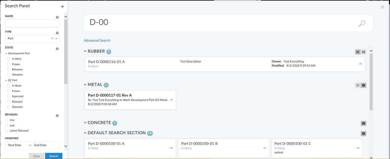
1.2. Search Side Panel
With search side panel, search can be configured within a page. Similar to quick search, search side panel allows users a way to easily find objects of interest related to context objects and load search result into page dashboard. When configured search side panel opens on left side with a search form.
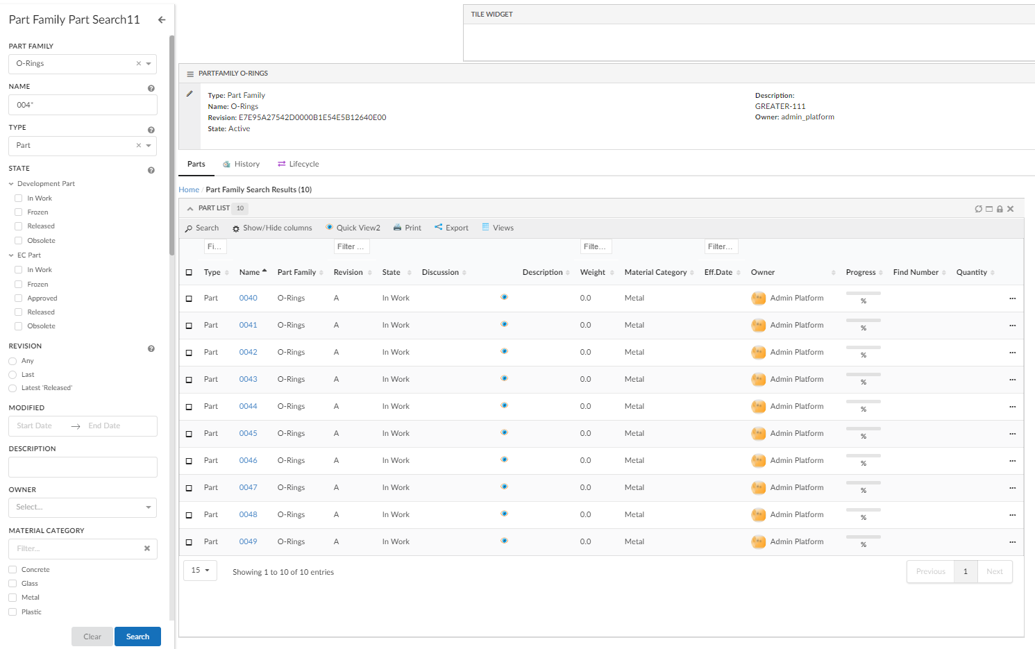
Figure 2. Search Side Panel
For more information, see Search Side Panel
1.3. Topbar Inline Search
You can now choose to render an input field inside the topbar, so that you can type a query directly into it. The configuration is similar to that of the Topbar Icon <Search> command. A full example can be found in the Top Bar chapter.

Figure 3. Top Bar
2. More built-in Components
2.1. Breadcrumb
New component to keep track of user navigation. For more information, see Breadcrumb
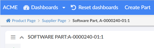
Figure 4. Breadcrumb
2.2. Recent Objects Topbar Menu
A new built-in menu, RecentlyViewed.xml has been added that can be used to display a list of objects that the user has recently visited.
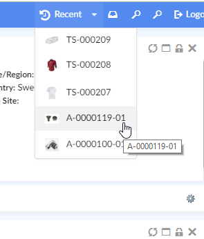
Figure 5. Recent Objects Menu
See Recent Object Menu for more information.
2.3. Recent Objects Widget
A new built-in widget, <RecentObjectWidget /> has been added that can be used to display a list of objects that the user has recently visited.
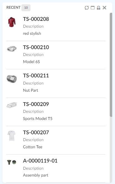
Figure 6. Recent Objects Widget
See Recent Object Widget Configuration for more information.
3. Page
3.1. Page Settings
A new element, <Settings> is added that allows passing simple key-value pairs for a page. See Page Configuration for more information.
If a setting named class is provided, the value will be added to the Page’s DOM element. This can be used to style individual pages, e.g. whole page or targeted components within a page (e.g. dashboard headers etc.), e.g.
<Page>
    ...
    <Settings>
        <Setting name="class" value="projects-page" />
        <Setting name="foo">bar</Setting>
    </Settings>
<Page>
Then in your custom css, you can target page level styling, e.g.
.projects-page {
    background-color: violet;
}
OR page specific dashboard headers, e.g.
.projects-page .widget-content > header {
    background-color: #1eabe3;
    color: #fff;
}

.projects-page  .widget-content > header i {
    color: #fff !important;
}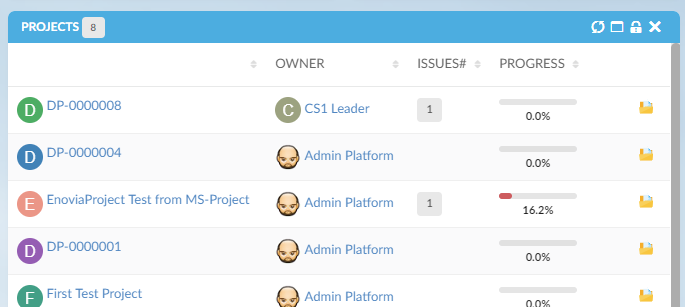
Figure 7. Styling page specific dashboard headers
4. File Management
4.1. Native File Manager Support
Helium now supports the Native File Manager.
If the user have installed this application, the file operations will be invoked via this application instead of letting the browser perform file download and upload operations.
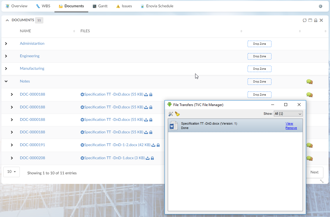
Figure 8. File Manager window as launched from Helium files column
4.2. Files Column in Tables
The files column now have a new icon that allows the user to add new files into document objects, if the user have checkin access.
4.3. Behavior Change on Download/Open
In order to increase user experience and operability between different browsers, the way files are opened when doing a checkout has changed.
Earlier, window.location was replaced with the download URL but now we use window.open instead.
In some cases, the browser may block this call due to popup blockers being active. The user will need to disable popup blockers for the Helium application.
5. History Widget
History Widget now supports sorting and initial sort will be on basis of date in ascending order.
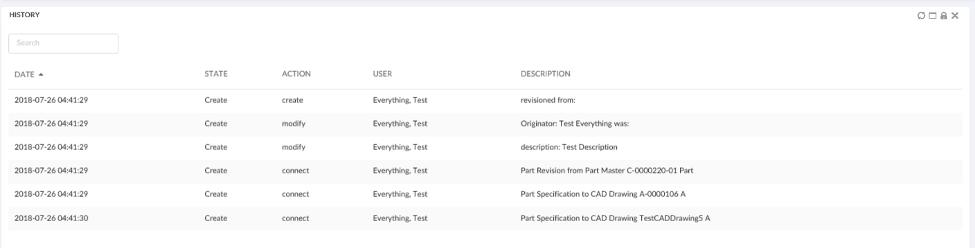
Figure 9. History Widget with sorting
6. Form
6.1. Field
minDate and maxDate
To set the custom java script function which returns valid minimum/maximum selectable date for date field.
<Field>
    <Label>Effectivity Date</Label>
    <Expression><![CDATA[$<attribute[attribute_EffectivityDate].value>]]></Expression>
    <Editable>true</Editable>
    <Setting name="options">{
        "minDate": "App.hex.todayOrLater",
        "maxDate": "App.hex.endOfProjectDate"
    }</Setting>
</Field>7. Tables
Filtering is now supported when server side processing is explicitly enabled or is enabled due to threshold reach.