 TVC Helium 2022.1.0
Charts
05 May 2016
1. Chart
Visualizes data in charts. Available type of charts:
-
Line
-
Bar
-
Pie
-
Donut
The chart solution is based on Chartist.js
A dataloader can be configured at dashboard level. The data loaded at dashboard level is available to all the chart widgets defined in the dashboard.
In this case, the data will not be cached by the service worker.
|
1.1. Widget
To create a chart widget you must first create an xml with the following contents:
<ChartWidget>
    <Title>State</Title>
    <ChartConfig namespace="helium">StateChart.xml</ChartConfig>
</ChartWidget>
The <ChartWidget> element supports the following child elements.
| Name | Description | Example |
|---|---|---|
Title |
The title of the chart widget |
|
ChartConfig |
Specifies the chart config file |
|
UseVersion2 |
If set to true the new chart library ApexCharts will be used else the older one Chartist |
|
1.2. Chart configuration
The <ChartConfig> element can have the following children. Full example.
| Name | Description | Example |
|---|---|---|
DataSeries |
Defines the data to display in the chart. More details |
|
Sort |
Controls sorting of the data. Sorts by default on label. More details |
|
Tooltip |
Controls if tooltips are displayed. |
|
Top |
The number of entries to display in the chart. The ones with highest values are displayed and others are grouped together in the "other" section. Useful when there are lots of entries and the chart feels crowded. |
|
DrillDown |
Reference to dashboard to use when performing drilldowns. Use either |
|
OnClick |
Reference to javascript function which is invoked when user clicks on chart elements. Example |
|
Legend |
Controls if legend are displayed. For multi series, it is automatically enabled. |
|
Stack |
To show multi series bar chart as a stacked bar chart. Defaults to |
|
Options |
Options for the chart. For example you can control offsets/paddings of the chart, labels and layout. The full list of the available options is available in the Chartist documentation. Note that the options varies depends on the type of chart (bar, line etc). Option for legend : |
|
ResponsiveOptions |
Responsive options are used to adapt the chart to look good across different devices. Responsive options controls the layout based on media queries. The full list of the available options is available in the Chartist documentation. |
Example displaying only first character of the month (J, F, M, A …) on small screens: |
DataType |
Controls the type of data to display in the chart. By default it uses the data type |
|
AnimateOnLoad |
Reference to a JavaScript function which registers a chart animation. One included example for line charts is available via example.js as App.custom.registerLineChartAnimation. For more examples and details, please refer to Chartist - Examples. |
|
1.2.1. Sorting
Controls how to sort the data in the chart.
| Name | Description | Example | ||
|---|---|---|---|---|
Label |
Sort on the label. Supports |
|
||
Value |
Sort on the value. Supports
|
|
||
LabelFixed |
Sort on label with a fixed order. Useful when display states. |
Value |
1.2.2. DataSeries
Defines the data to display in the chart. There is pre-built support for multiple data series but the default data type 'group' supports only one serie. Multiple data series can be utilized when writing custom data type example.
| Name | Description | Example |
|---|---|---|
DataLoader |
Optional. Data loader to use across all series in the chart. Use this setting in case all data series uses same set of objects. |
|
Serie |
Respresents one serie of data serie in the chart. More Details |
| For multi series chart DataSeries may contain multiple Serie and ChartType for all serie must be same. |
1.2.3. Serie
Represents one serie of data in the chart.
| Name | Description | Example | ||
|---|---|---|---|---|
DataLoader |
Defines which data to use in data serie. Optional in case specified on |
|
||
Name |
Legend label for bar and line chart. |
|
||
Expression |
Data to select. Used to group data by default.
|
If user want to show chart based on EBOM relationship on relationship attribute |
||
Expressions |
Supports multiple Expression elements which can be used to select data. By default, the first expression in the list will be used to group chart data. In this example data will be grouped by Material Category. |
|
||
SeriesExpression |
Data used to create multi series chart. SeriesExpression value becomes legend label and Name setting ignored. For multiple Serie it will be ignored.
|
If user want to show multi series chart based on EBOM relationship on relationship attribute |
||
ChartType |
Type of chart. Available kind of charts:
|
|
1.2.4. Example configuration
<?xml version="1.0" encoding="UTF-8"?>
<Chart>
    <Sort>
        <Value ascending="false" />
    </Sort>
    <Tooltip>true</Tooltip>
    <Top>5</Top>
    <DrillDown>tvc:dashboard:helium/PartDrillDown.xml</DrillDown>
    <DataSeries>
        <Serie>
            <DataLoader>
                <DataSet>tvc:dataset:helium/MyParts.xml</DataSet>
            </DataLoader>
            <Expression><![CDATA[$<attribute[attribute_MaterialCategory]>]]></Expression>
            <ChartType>bar</ChartType>
        </Serie>
    </DataSeries>
</Chart>
1.2.5. Multi Series Chart Example configuration
Multi Series Bar Chart
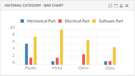
<?xml version="1.0" encoding="UTF-8"?>
<Chart>
    <Sort>
        <Value ascending="false" />
    </Sort>
    <Options>{
  		"legendPosition": "top"
	}</Options>
    <Tooltip>true</Tooltip>
    <Legend>true</Legend>
    <Top>3</Top>
    <DrillDown>tvc:dashboard:helium/PartDrillDown.xml</DrillDown>
    <DataSeries>
        <Serie>
            <DataLoader>
                <DataSet>tvc:dataset:hex:engineering:homepage/MySoftwareParts.xml</DataSet>
            </DataLoader>
            <Expression><![CDATA[$<attribute[attribute_MaterialCategory]>]]></Expression>
            <ChartType>bar</ChartType>
            <Name>Software Part</Name>
        </Serie>
        <Serie>
            <DataLoader>
                <DataSet>tvc:dataset:hex:engineering:homepage/MyElectricalParts.xml</DataSet>
            </DataLoader>
            <Expression><![CDATA[$<attribute[attribute_MaterialCategory]>]]></Expression>
            <ChartType>bar</ChartType>
            <Name>Electrical Part</Name>
        </Serie>
         <Serie>
            <DataLoader>
                <DataSet>tvc:dataset:hex:engineering:homepage/MyMechanicalParts.xml</DataSet>
            </DataLoader>
            <Expression><![CDATA[$<attribute[attribute_MaterialCategory]>]]></Expression>
            <ChartType>bar</ChartType>
            <Name>Mechanical Part</Name>
        </Serie>
    </DataSeries>
</Chart>
Multi Series Stacked Bar Chart
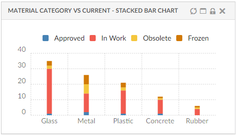
<?xml version="1.0" encoding="UTF-8"?>
<Chart>
    <Sort>
        <Value ascending="false" />
    </Sort>
    <Options>{
  		"legendPosition": "top"
	}</Options>
    <Tooltip>true</Tooltip>
    <Legend>true</Legend>
    <Top>3</Top>
    <Stack>true</Stack>
    <DrillDown>tvc:dashboard:helium/PartDrillDown.xml</DrillDown>
    <DataSeries>
        <Serie>
            <DataLoader>
                <DataSet>tvc:dataset:hex:engineering:homepage/MyParts.xml</DataSet>
            </DataLoader>
            <Expression><![CDATA[$<attribute[attribute_MaterialCategory]>]]></Expression>
            <SeriesExpression>current</SeriesExpression>
            <ChartType>bar</ChartType>
            <Name>Software Part</Name>
        </Serie>
    </DataSeries>
</Chart>
1.2.6. Example custom onClick
The <OnClick> configuration can be used to perform custom action when the user clicks in the chart. This enables the possibility to do drill down, exchange information in tables or something else. In the configuration you specify the JavaScript function to invoke upon user clicks.
Configuration:
<OnClick>App.custom.chartOnClick</OnClick>JavaScript:
var App = App || {};
var App.custom ={
    chartOnClick: function(data) {
        console.log('Clicking in chart');
        console.log('  Clicked data=', data);
        console.log('  Chart reference=', this);

        // Code performing something nifty
    }
};
Use either DrillDown OR OnClick.
|
The javascript function will be executed with this set to the chart.
|
1.3. Data Type
The data type controls how the data series in the chart are calculated. The input to the data type processing is the configurations done in the chart configuration file along with information about which objects that are displayed in the chart.
Output format:
{
    'labels': ['<label>', '<another-label>', ...],
    'series': [{
        'name': '<name>',
        'data': [{
            'value': <value>
            'objectIds': [
                '<object-id>',
                '<another-object-id>',
                ...
            ]
        },{
            ...
        }]
     },{
        ...
    }]
}
Example output:
{
    'labels': ['W34', 'W35', 'W36'],
    'series': [{
        'name': 'Created',
        'data': [{
            'value': 1
            'objectIds': [
                '1.2.3.4'
            ]
        }, {
            'value': 0
            'objectIds': []
        }, {
            'value': 3
            'objectIds': [
                '2.3.4.5',
                '5.6.7.8',
                '9.8.7.6'
            ]
        }]
     }, {
         'name': 'Resolved',
         'data': [{
             'value': 0
             'objectIds': []
         }, {
             'value': 1
             'objectIds': [
                 '1.2.3.4'
             ]
         }, {
             'value': 2
             'objectIds': [
                 '5.6.7.8',
                 '9.8.7.6'
             ]
         }]
      }]
}
Charts comes with a built-in data type strategy, but it also possible to write a custom data type.
1.3.1. Data Type: Group
The objects are grouped by a configured expression, e.g. type or state. Each unique value gets one label and the amount of objects is the data value. It expects there to be exactly one dataserie in the configuration.
1.3.2. Example custom data type
Configuration:
<DataType>App.custom.timeDataType</DataType>JavaScript:
var App = App || {};
var App.custom = {
    timeDataType: function(config) {

        var getObjectDataValues = function(expression, objectId, relId) {
            if (expression.usesBusinessObject) {
                return App.ObjectStore.get(objectId).data[expression.name].values;
            }
            return App.ObjectStore.getRelationship(relId).data[expression.name].values;
        }


        // Check each label how many values there are per serie
        //    - 2015-06-24 5 created 3 solved issues
        //    - 2015-06-25 1 created 0 solved issues
        //    - 2015-06-26 3 created 2 solved issues

        var labels = ['2015-06-24', '2015-06-25', '2015-06-26'];
        var series = [];

        config.series.forEach(function(serie) {
            var expr = serie.expression;
            var result = {
                'name': expr.name
                'data': []
            };


            serie.objectIds.forEach(function(objectId, index) {
                let relId = serie.relIds[index];
                let values = getObjectDataValues(expr, objectId, relId);
                values.forEach(function(value) {

                    // Logic calculating amount of objects which have been created/resolved

                    var dataPoint = {
                        'value': 1,
                        'objectIds': ['1.2.3.4'],
                        'relIds': ['5.6.7.8']
                    };
                    result.data.push(dataPoint);
                });
            });

            series.push(result);
        });

        return {
            'labels': labels,
            'series': series
        };
    }
};
1.3.3. Example custom data type with support for multi-value attributes
Configuration:
<DataType>App.custom.customChartValues</DataType>JavaScript:
var App = App || {};
var App.custom = {
    customChartValues: function(config) {

        var setLabelData = function(labelPoints, value, objectId, relId) {
            labelPoints[value].value += 1;
            labelPoints[value].objectIds.push(objectId);
            labelPoints[value].relIds.push(relId);
        }

        var getObjectDataValues = function(expression, objectId, relId) {
            if (expression.usesBusinessObject) {
                return App.ObjectStore.get(objectId).data[expression.name].values;
            }
            return App.ObjectStore.getRelationship(relId).data[expression.name].values;
        }

        var labels = config.options.labels;
        var series = [];

        config.series.forEach(function(serie) {
            var points = [];
            var expr = serie.expression;
            var labelPoints = {};
            var legendLabel = serie.name || '';

            labels.forEach(function(label) {
                var dataPoint = {
                    value: 0,
                    objectIds: [],
                     relIds: []
                };
                labelPoints[label] = dataPoint;
            });

            serie.objectIds.forEach(function(objectId, index) {
                var relId = serie.relIds[index];
                var values = getObjectDataValues(expr, objectId, relId);
                var filteredValues = values.map(function(v) {return v.value;}).filter(function(v) {return labels.includes(v)});

                filteredValues.forEach(function(value) {
                    setLabelData(labelPoints, value, objectId);
                });
                if (filteredValues.length > 1) {
                    setLabelData(labelPoints, labels[2], objectId);
                };
            });

            labels.forEach(function(label) {
                points.push(labelPoints[label]);
            });

            series.push({
                name: legendLabel,
                data: points
            });
        });

        return {
            labels,
            series
        };
    }
};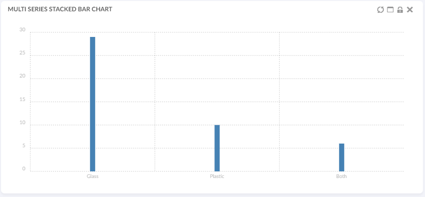
Figure 1. Chart displaying custom data type with multi-values
Image is showing:
-
DataSet is an inquiry that returns 33 objects based on attribute[Material Category]
-
29 of these objects have the attribute value ‘Glass’
-
10 of them have the attribute value ‘Plastic’
-
6 of them have both attribute values ‘Glass’ and ‘Plastic’
1.4. API
The chart javascript api can be found here
1.5. Path Support
In 3dexperince, more and more of the data model is moving towards path-based. Change Process is one good example and there is a need to be able to visualize the path-based data model by config only.
Now the path related object/relationship information can be used to generate charts. This can be done using the path query dataset in chart config.
Below example generates a chart based on the attribute Severity of Change Orders related to context part EBOM structure. In this case, the loader must point to Path Query which will return change order id’s and the Expression should point to selects on those change order id’s, in this case, attribute 'Severity'.
<?xml version="1.0" encoding="UTF-8"?>
<Chart>
	<DataSeries>
		<Serie>
			<DataLoader>
				<DataSet>tvc:dataset:hex:engineering/ChangeObjects.xml</DataSet>
			</DataLoader>
			<Expression><![CDATA[$<attribute[attribute_Severity]>]]></Expression>
			<ChartType>donut</ChartType>
		</Serie>
	</DataSeries>
</Chart>
Below is the loader definition used in the above example.
<?xml version="1.0" encoding="UTF-8"?>
<PathQuery>
	<PathType>Proposed Activity.Where</PathType>
	<PathSelect>owner.to[Proposed Activities].from.to[Change Action].from.id</PathSelect>
	<Expand>
		<From>true</From>
		<To>false</To>
		<Depth>1</Depth>
		<RelationshipPattern>
			<Relationship>relationship_EBOM</Relationship>
		</RelationshipPattern>
	</Expand>
</PathQuery>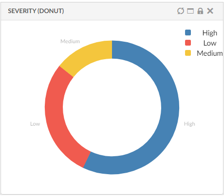
Figure 2. Path Support in Charts
Read the Path Support chapter for more details.
1.6. Combination Charts
Combination charts let you display different types of data in different ways on the same chart. You may display columns, lines, areas, and steps all on the same combination chart. Use them to visually highlight the differences between different sets of data.
There could be multiple combinations like line and bar or line, bar and area with different dataseries representing different chart type. One of the serie should have chart type as line.
This can be configured as below :
<ChartWidget>
	<Title>Multi Series Combo Charts</Title>
	<ChartConfig namespace="hex:engineering:homepage">CombinationCharts.xml</ChartConfig>
	<UseVersion2>true</UseVersion2>
</ChartWidget>
<Chart>
<DataSeries>
<Serie>
<Name>bar</Name>
<DataLoader>
<DataSet>tvc:dataset:hex:engineering:homepage/Dataset3.xml</DataSet>
</DataLoader>
<Expression>current</Expression>
<ChartType>line</ChartType>
</Serie>
<Serie>
<Name>area</Name>
<DataLoader>
<DataSet>tvc:dataset:hex:engineering:homepage/Dataset1.xml</DataSet>
</DataLoader>
<Expression>current</Expression>
<ChartType>area</ChartType>
</Serie>
<Serie>
<Name>line</Name>
<DataLoader>
<DataSet>tvc:dataset:hex:engineering:homepage/MyParts.xml</DataSet>
</DataLoader>
<Expression>current</Expression>
<ChartType>line</ChartType>
</Serie>
<Serie>
<Name>column</Name>
<DataLoader>
<DataSet>tvc:dataset:hex:engineering:homepage/Dataset1.xml</D
ataSet>
</DataLoader>
<Expression>current</Expression>
<ChartType>bar</ChartType>
</Serie>
</DataSeries>
</Chart>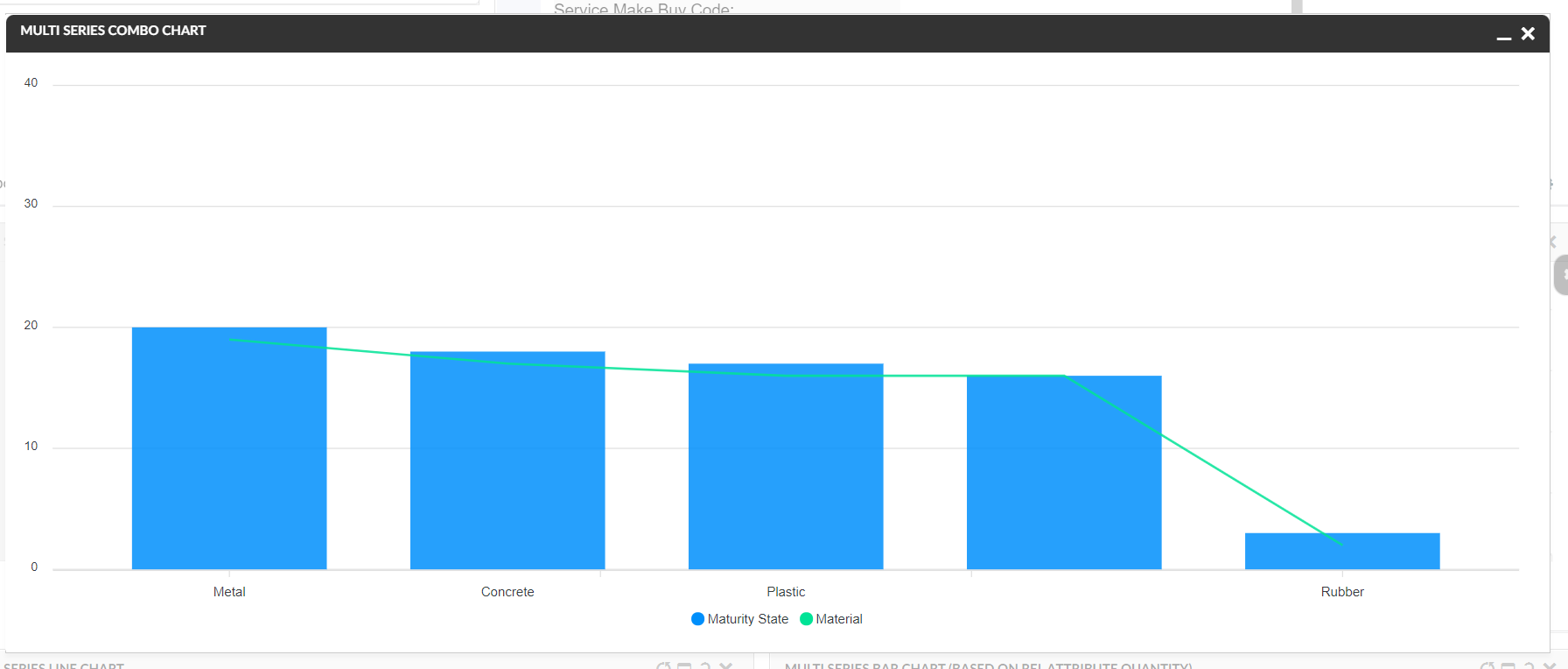
Figure 3. Combination Charts
1.7. Other Chart types
Now all the chart types available in Apex Charts are supported in helium, they can be configured by using below config :
<ChartWidget>
	<Title>EBOM Start Eff date to End Effectivity Date</Title>
	<ChartConfig namespace="hex:engineering">TimelineChart.xml</ChartConfig>
	<UseVersion2>true</UseVersion2>
</ChartWidget>

<Chart>
    <DrillDown>tvc:dashboard:hex:engineering:homepage/MyDocumentsDrillDown.xml</DrillDown>
    <Tooltip>true</Tooltip>
    <Legend>true</Legend>
    <Tooltip>true</Tooltip>
    <Stack>false</Stack>
    <DataType>App.custom.getTimelineChartData</DataType>
    <DataSeries>
        <Serie>
            <Name>Drawing Prints</Name>
            <DataLoader>
                <DataSet>tvc:dataset:hex:engineering/EBOM.xml</DataSet>
            </DataLoader>

            <Expressions>
            	<Expression>${attribute[attribute_StartEffectivityDate]}</Expression>
                <Expression>${attribute[attribute_EndEffectivityDate]}</Expression>
                <Expression>${name}</Expression>
            </Expressions>
            <ChartType>rangeBar</ChartType>
        </Serie>
    </DataSeries>
    <Options>{
    	"xaxis": {
          "type": "datetime"
        },
        "plotOptions": {
          "bar": {
            "horizontal": true
          }
        }
    }</Options>
</Chart>
Since every chart types expects data in different format so a js method can be passed in DataType which returns the data in the required format, refer below example.
var getTimelineChartData = function(config) {
		var objectIds = config.series[0].objectIds;
		var chartData = []
		var data = App.ObjectStore.getByIds(config.series[0].objectIds);
		objectIds.forEach(function(objectId){
			var objectData = data[objectId];
			var startDate = objectData.data['attribute[Start Effectivity Date]'].values[0].value;
			var endDate = objectData.data['attribute[End Effectivity Date]'].values[0].value;
			if(startDate ){
				endDate = endDate ? endDate : new Date();
				chartData.push({
				"x" : objectData.data['name'].values[0].value,
				"y" : [
					new Date(startDate).getTime(),
					new Date(endDate).getTime()
				]
			})
			}


		})
        return {
        	'dataType' : "version2",
            'series': [{"data" : chartData}]

        };
    }
Figure 4. TimelineChart