 TVC Helium 2022.1.0
New Search Experience
11 April 2018
1. New Search Experience
1.1. Quick Search
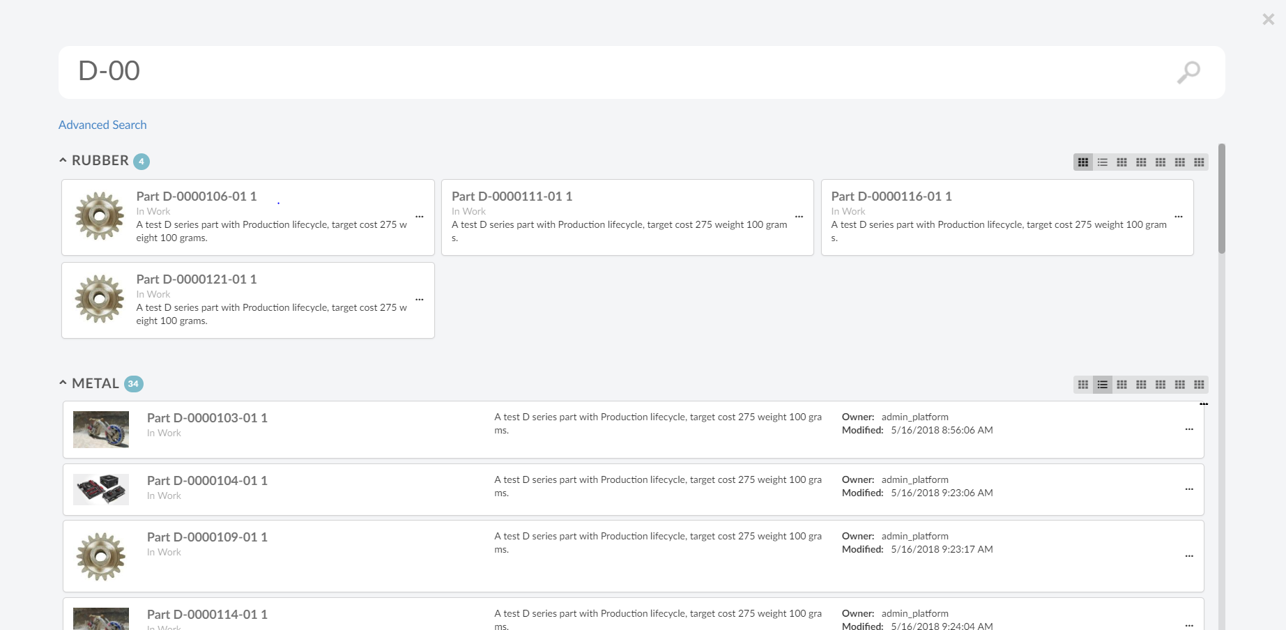
The quick search allows users a way to easily find objects of interest. It can be used for various use cases, for example by clicking the magnifying glass in the topbar or when locating a person when editing a Part.
When the quick search is launched it opens as an overlay and the user enters a search term. The search result matching the term is presented and by clicking the search hits the user can open the corresponding object.
In more advanced use cases a search form, displayed on the left hand side, is used to further filter down the search result. The user can for instance specify that only Parts in state Released is of interest.
Quick search supports usage of Search Providers. This means that ENOVIA, EXALEAD or other data source can be used to find relevant information.
Figure 1. Quick Search
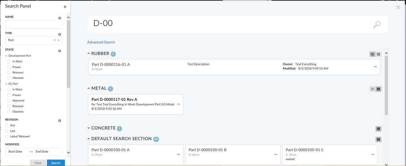
Figure 2. With Search Form
1.1.1. Configuration Format
To use this configuration format the version must be set to 2. This is done by setting the version attribute on the Search element to 2. Example: <Search version="2">
|
Quick search can be configured in two ways, by using specialized Search element or generic Command element.
Using Search
Search has predefined configurations with default icon, label and javascript callback function to load search.
Sample configuration using Search
<Search version="2">tvc:search:hex:common/TopBarSearchV2.xml</Search>Using Command
Command gives flexibility of define icon, label and javascript callback function within the URL element.
Sample configuration using Command
<Command>
    <Label>Search</Label>
    <FontIcon>ti-f ti-finder-f</FontIcon>
    <URL href="javascript:App.searchV2.startSearch({options: {'config': 'tvc:search:hex:common/TopBarSearchV2.xml'}});" />
</Command>
The quick search configuration files are placed in the folder search.
The root element of the configuration is <Search> and the following child elements are supported:
| Name | Description | Example | ||||
|---|---|---|---|---|---|---|
Limit |
The maximum number of search results returned. |
|
||||
upperSearchLimitValue |
The maximum number of search results allowed to be displayed.
|
|
||||
DataFields |
The data to include for the search result. For example, type, name, revision and current state. |
|
||||
Sections |
The search result is divided into sections. For example, parts is displayed in one section, documents in another and so on. See Sections for more details. |
|||||
SearchForm |
Search form which allows the user to further filter down the search result. See Search Form for more details. |
|
||||
InitialHitsCount |
The number of hits to display in each section. A "Show more" link is supplied to view more hits. |
|
||||
ShowMoreHitsCount |
The number of additional hits to add to the result when "show more" is clicked. |
|
||||
SearchOnCriteriaUpdate |
Controls if the search is submitted when the search criteria is updated. For example, after the user has selected state "Released" in the search form or search for "00230" in the term field a search is submitted and the search result is displayed. This setting is useful when using indexing engine as search provider. The search is throttled to 400ms. |
|
||||
Settings |
Additional settings for the search. These settings are accessible in |
|
||||
Server |
Triggers executed server-side at different steps during the life-cycle of a search operation. See Server-Side Triggers for more details |
|
||||
Client |
Callbacks triggered on the client at specific points. See Client-Side Callbacks for more details. |
Example how to register a callback executed when the search is rendered and ready: |
||||
UIs |
It defines UI elements for rendering search result in a section. See Section UIs for more details. |
|
||||
OpenOnLoad |
Controls if the search panel should be opened by default on load. Default value is false.
|
|
Specify the search provider to use in the attribute provider on the <Search> element. See Search Providers for more details and a list of available providers. Example configuring using the EXALEAD search provider :
<Search provider="exalead" />| The search provider’s callsign name is used when selecting which provider to use (instead of the qualified name of the java class) |
| The ENOVIA search provider is used by default |
1.1.2. Sections
Search results can be rendered in sections. For example sections can be used to divide search result based on type, parts is displayed in one section, documents in another and so on. Different sections can have different views to show different set of information/attributes in different format.
The root element of the configuration is <Sections> and following child elements are supported by built-in SectionProvider:
| Name | Description | Example | ||
|---|---|---|---|---|
Section |
Root element for defining a Section. See [Section] for detailed configuration. |
|
||
FallbackSection |
Root element for fallback section. When a search result hit matches none of the defined sections, it is put into fallback section. See Built-in Section Provider for detailed configuration. |
|
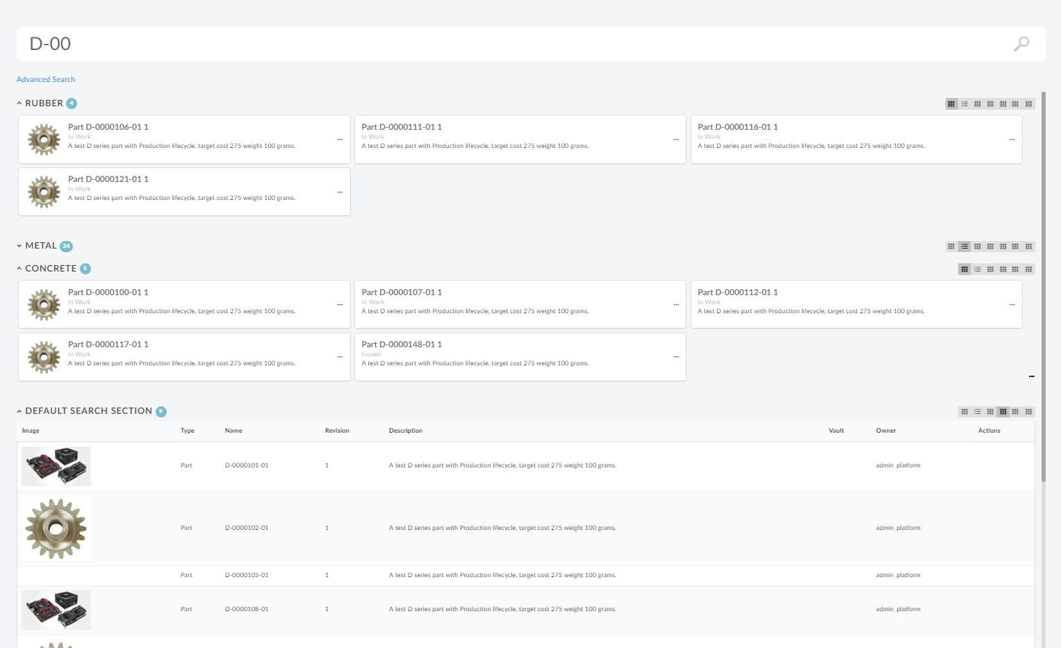
Figure 3. Sections
See Custom Section Provider for details on custom section provider.
Built-in Section Provider
Built in SectionProvider supports configuration of multiple sections. Each section defines a filter condition, which is evaluated against each search result hit and if hit matches filter condition, hit is kept in this section. Section also support different UIs or views for showing search result. For example it can used to show different attributes for parts and documents.
| Name | Description | Example | ||
|---|---|---|---|---|
Filter |
Filter is condition based on which search result will be sectionized. It must contains a DataField against which search hit will be evaluated and a Value that will be matched. |
|
||
Label |
Label can be used to specify title. |
|
||
UIs |
Each section can have multiple UIs elements to render search result. See Section UIs for more details. |
|
Section UIs
SectionUIs or UIs are used to render search result under each section. Multiple UIs can be configured for a section and user can navigate from one UI to another. It is possible to configure UIs in Search and refer into section. SectionUI is referred using ìd attribute on elemenet UI. It is possible to refer and override SectionUI configuration in Section.
The root element of the configuration is <UIs> containing multiple <UI> and the following child elements are supported in <UI>:
| Name | Description | Example | ||
|---|---|---|---|---|
Type |
Type of view.
|
|
||
Icon |
Icon of UI to be shown for selecting UI. |
|
||
ResultTemplate |
Template for showing search results in section. For built-in template see Built-in Tile Templates |
|
||
TileHitTemplate |
Template to rendering each search hit and applies only to |
|
||
Table |
Table configuration for adding columns and applies only to |
|
||
Settings |
Additional settings. |
|
Following attribute can be defined on root element SectionUI.
| Name | Description | Example |
|---|---|---|
id |
Defines id of SectionUI. This is useful when SectionUIs are defined in Search and can be referred in Section using id. |
|
default |
In context of Search, it defines whether SectionUI should act as default for when no SectionUI is defined in Section. And in context of Section, it defines whether SectionUI should be rendered by default. |
|
Context Menu
Context menu can be configured to show actions on search result tiles. Context menu is defined inside a Section by using element ContextMenu with reference to menu using attribute ref.
<Section>
.
.
.
<ContextMenu ref="tvc:menu:acme:common/SearchActions.xml"/>
</Section>| Context menu is not applicable for table view and sub menus are not supported in a context menu. |
Following menu elements are utilized on context menu.
| Name | Description | Example |
|---|---|---|
FontIcon |
Icon to be showed for context menu. |
|
Command |
Command in the context menu. |
|
Following Command settings are utilized in rendering of context menu.
| Setting Name | Description | Example |
|---|---|---|
OnClick |
Javascript function to be called on click of command |
|
OnClickParams |
Additional parameters to passed into command on click. |
|
Sample context menu defined in a section -
<Section>
.
.
.
<ContextMenu ref="tvc:menu:acme:common/SearchActions.xml"/>
</Section>Sample context menu definition -
<Menu>
<Command>
<Label>Open History</Label>
<FontIcon>ti-f ti-menu-f</FontIcon>
<Setting name="OnClick">App.acme.openObject</Setting>
<Setting name="OnClickParams">{
"options": {
"tab": "#history"
}
}</Setting>
</Command>
<Command>
<Label>Open Charts</Label>
<Href>javascript:App.hex.openObject</Href>
<FontIcon>ti-f ti-piechart-f</FontIcon>
<Setting name="OnClickParams">{
"options": {
"tab": "#charts"
}
}</Setting>
</Command>
<Command>
<Label>Open Lifecycle</Label>
<FontIcon>ti-f ti-lifecycle-f</FontIcon>
<Setting name="OnClick">App.acme.openObject</Setting>
<Setting name="OnClickParams">{
"options": {
"tab": "#lifecycle"
}
}</Setting>
</Command>
<Command>
<Label>Promote</Label>
<FontIcon>ti-f ti-promote-f</FontIcon>
<Setting name="OnClick">App.acme.promoteObject</Setting>
</Command>
<Command>
<Label>Demote</Label>
<FontIcon>ti-f ti-demote-f</FontIcon>
<AccessExpression>context.user === 'admin_platform'</AccessExpression>
<Setting name="OnClick">App.acme.demoteObject</Setting>
</Command>
<Setting name="showOnHover" value="false"/>
</Menu>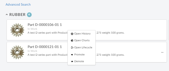
Figure 4. Context Menu
Custom Section Provider
Custom section provider can be implemented to sectionize search result. It can be specified using attribute className on element Sections.
Interface to implement:
com.technia.tvc.search.api.section.SectionProvider
Example configuration:
<Search provider="enovia" version="2">
.
.
<Sections className="com.acme.MySectionProvider" />
</Search>Built-in Tile Templates
Template are used to display search result hit in tile mode. Following are the built-in tile hit templates:
Single Row
Single tile takes up the whole width of section. Useful for displaying document with large description text. Tile also shows primary image of the object in left side. It also displays Type, Name, Revision, Description, State and Last Modified of the object.
Result Template path:
helium/templates/search/v2/row-result
Hit Template path:
helium/templates/search/v2/row-result-hit
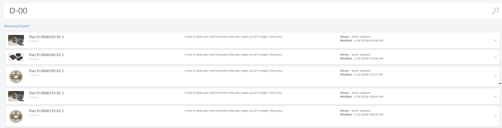
Figure 5. Single Row
Primary Image
Three tiles are displayed in each row. Tile also shows primary image of the object in left side. It also displays Type, Name, Revision and Description of the object.
Result Template path:
helium/templates/search/v2/primaryimage-result
Hit Template path:
helium/templates/search/v2/primaryimage-result-hit
Three Tiles
Three tiles are displayed in each row. Tile also shows count if present in search hit data on like a bubble of right top corner. It also displays Type, Name, Revision of the object along with all the additional data present in the search result hit.
Result Template path:
helium/templates/search/v2/result
Hit Template path:
helium/templates/search/v2/result-hit
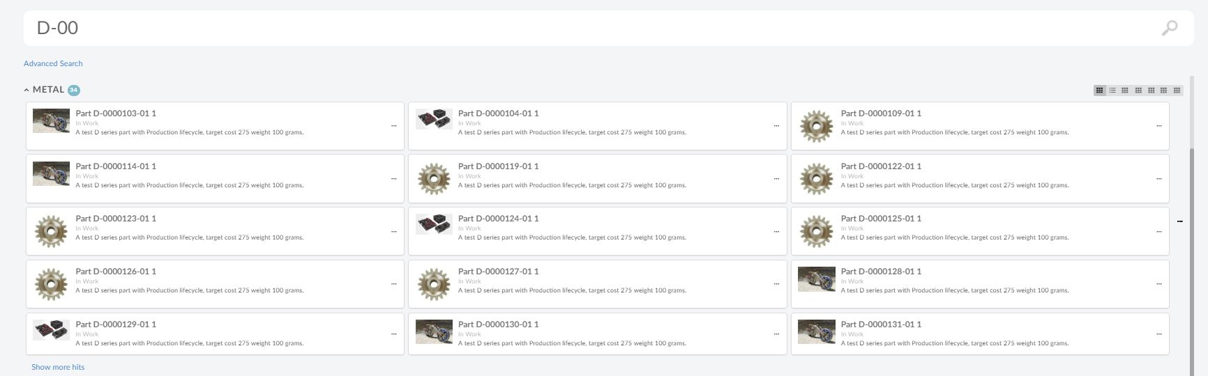
Figure 6. Three Tiles
1.1.3. Server-Side Triggers
Server-side triggers are used to accomplish advanced use cases. For example a presearch trigger can be used to validate the search criteria and a postsearch trigger can be used to ensure that the user has access to view all the search hits.
1.1.4. Client-Side Callbacks
ready
Callback function when search is ready. Example configuration:
<Client ready="App.custom.searchReady"/>onHitClick
Callback function when search result hit tile is clicked. By default search window is closed and object is opened. Example configuration:
<Client onHitClick="App.custom.openObject"/>onRenderResult
Callback function to create search result renderer object. This function should return javascript object implementing method render, which will be responsible for rendering search result. SectionRenderer is built in implementation for rendering search result in sections.
Example configuration:
<Client onRenderResult="App.custon.createSectionRenderer"/>1.1.5. Javascript API
Quick Search
Methods
| Method | Description |
|---|---|
open |
Opens the search |
close |
Closes the search |
isOpen |
Is the search open |
search |
Performs a search |
getQuery |
Gets the search criteria |
searchPanel |
Get API for searchpanel, if any available |
result |
Get API for result |
on |
Register to an event |
off |
Deregisters an event |
Events
| Event Name | Description |
|---|---|
open |
Called after the quick search overlay is opened |
close |
Called after the quick search overlay is closed |
preSearch |
Called before the search is executed |
postSearch |
Called after the search is executed |
destroy |
Called when component is destroyed |
Search Panel
Methods
| Method | Description |
|---|---|
open |
Opens the search panel |
close |
Closes the search panel |
isOpen |
Is the search panel open |
toggleVisibility |
Toggles the search panel |
getSearchForm |
Returns UIP search form instance |
destroy |
destroys the search panel and performs clean up |
searchPanel |
Get API for searchpanel, if any available |
updateSearchFormFields |
Updates the search form fields |
Result
Result is responsible for rendering search result. Result calls render method on resultRenderer for rendering search result.
Methods
| Method | Description |
|---|---|
clear |
Clears the search result |
isRendered |
Return whether results are rendered |
on |
Register to an event |
off |
Deregister to an event |
destroy |
Destroys the result element |
resultRenderer |
returns resultRenderer object associated with this result object. |
Events
| Event Name | Description |
|---|---|
renderBefore |
Called before rendering search result. |
render |
Called when search result is about to be rendered. Search query and search result is passed as arguments. |
renderAfter |
Called after rendering search result. |
destroy |
Called when result is destroyed. |
Section Renderer
Section renderer is built-in and default result renderer, which renders result in sections
Methods
| Method | Description |
|---|---|
clear |
Clears the search result |
getSections |
Return list of sections |
render |
renders result sections. This called from result when search result is received. |
destroy |
Destroys the result component. |
1.1.6. Example Configuration
<?xml version="1.0" encoding="UTF-8"?>
<Search provider="enovia" version="2">
<Limit>200</Limit>
<SearchForm
ref="tvc:searchformv2:helium/TopBarSearchForm.xml" />
<Sections>
<Section>
<Filter>
    <DataField>attribute[Material Category]</DataField>
    <Value>Rubber</Value>
</Filter>
<Label>Rubber</Label>
<UIs>
<UI id="id0" />
<UI id="id1" />
<UI id="id2" default="true"/>
</UIs>
</Section>
<Section>
<Filter>
<DataField>attribute[Material Category]</DataField>
<Value>Metal</Value>
</Filter>
<Label>Metal</Label>
<UIs>
<UI id="id1" default="true"/>
<UI id="id2" />
<UI id="id3" />
</UIs>
</Section>
<Section>
<Filter>
<DataField>attribute[Material Category]</DataField>
<Value>Concrete</Value>
</Filter>
<Label>Concrete</Label>
</Section>
<FallbackSection>
<Label>searchv2.section.defaultTitle</Label>
</FallbackSection>
</Sections>
<UIs>
<UI id="id0" default="true">
    <Type>tile</Type>
    <TileHitTemplate>helium/templates/search/v2/primaryimage-result-hit</TileHitTemplate>
    <ResultTemplate>helium/templates/search/v2/primaryimage-result</ResultTemplate>
    <Icon>ti-f ti-menu-f</Icon>
    <Settings>
        <Setting name="title" value="Primary Image" />
    </Settings>
</UI>
<UI id="id1">
<Type>tile</Type>
<TileHitTemplate>helium/templates/search/v2/row-result-hit</TileHitTemplate>
<ResultTemplate>helium/templates/search/v2/row-result</ResultTemplate>
<Icon>ti-f ti-table-f</Icon>
<Settings>
    <Setting name="title" value="Single Row Result" />
</Settings>
</UI>
<UI id="id2">
<Type>tile</Type>
<TileHitTemplate>helium/templates/search/v2/result-hit</TileHitTemplate>
<ResultTemplate>helium/templates/search/v2/result</ResultTemplate>
<Icon>ti-f ti-menu2-f</Icon>
<Settings>
<Setting name="title" value="Three Tile Result" />
</Settings>
</UI>
<UI id="id3">
<Type>tile</Type>
<TileHitTemplate>helium/templates/search/v2/result-hit</TileHitTemplate>
<ResultTemplate>helium/templates/search/v2/result</ResultTemplate>
<Icon>ti-f ti-menu2-f</Icon>
</UI>
</UIs>
<DataFields>
<DataField>type</DataField>
<DataField>name</DataField>
<DataField>revision</DataField>
<DataField>description</DataField>
<DataField>primaryimage</DataField>
<DataField>${attribute[attribute_EndItem]}</DataField>
</DataFields>
<Settings>
<Setting name="termWhere" value="name ~~ '*%s*' OR description ~~ '*%s*' OR current ~~ '*%s*'" />
</Settings>
<Client ready="App.custom.searchReady"
onRenderResult="App.searchV2.createSectionRenderer" />
</Search>1.2. Search Side Panel
With search side panel, search can be configured within a page. Similar to quick search, search side panel allows users a way to easily find objects of interest related to context objects and load search result into page dashboard. When configured search side panel opens on left side with a search form.
When search is performed dashboards in the page can be reloaded with search result, it is possible to configure which dashboards should be reloaded. It may desired that only one dashboard is reloaded with search result and rest are left unaffected. It is also possible to customize this behaviour using javascript callback function and take complete control on what should happen when search is performed, see Client-Side Callbacks for more details.
Like quick search, search panel supports usage of Search Providers. This means that ENOVIA, EXALEAD or other data source can be used to find relevant information.
Figure 8. Search Side Panel
1.2.1. Configuration Format
SearchPanel configuration files are placed in folder searchpanel.
The root element of the configuration file is <SearchPanel>.
| Name | Description | Example |
|---|---|---|
Limit |
The maximum number of search results to be returned. |
|
DataFields |
The data to include for the search result. For example, type, name, revision and current state. |
|
SearchOnCriteriaUpdate |
Controls if the search is submitted when the search criteria is updated. For example, after the user has selected state "Released" in the search form or search for "00230" in the term field a search is submitted and the search result is displayed. This setting is useful when using indexing engine as search provider. The search is throttled to 400ms. |
|
SearchIcon |
Search Icon for collapsed search panel. |
|
SearchTitle |
Title for collapsed search panel |
|
ResultTitle |
Title for drilldown of search results |
|
Settings |
Additional settings for the search. These settings are accessible in |
|
Server |
Triggers executed server-side at different steps during the life-cycle of a search operation. See Server-Side Triggers for more details |
|
Client |
Callbacks triggered on the client at specific points. See Client-Side Callbacks for more details. |
Example how to register a callback executed when the search is rendered and ready: |
HomePage |
Defines page that should be loaded in background, when search is launched via direct or exported URL. See Export Search for more details. |
|
1.2.2. Client-Side Callbacks
ready
Callback function when search panel is ready. Example configuration:
<Client ready="App.custom.searchPanelReady"/>js
Callback function to render search panel. This allows user to take complete control over search panel rendering and behaviour. This function should return javascript object implementing method render. Default function is App.searchV2.defaultSearchPanel.
Example configuration:
<Client js="App.custom.mySearchPanel"/>1.2.3. Configuration In Page
Search panel is configured in page using element <SearchPanel> with reference to search panel configuration resource using attribute ref. See Configuration Format for search panel configuration.
Example -
<Page>
    .
    .
    .
	<SearchPanel ref="tvc:searchpanel:acem:common/PSearchPanel.xml">
	<OnSearchResult>
    	<ReloadDashboards>
    		<Dashboard ns="hex:engineering" name="PartFamilyParts.xml" />
    	</ReloadDashboards>
	</OnSearchResult>
	<SearchOnLoad>true</SearchOnLoad>
	<OpenOnLoad>true</OpenOnLoad>
    </SearchPanel>
</Page>
It is possible to use same searchpanel configuration as reference in different page configurations. Following configurations can be done in a searchpanel at page level:
| Name | Description | Default | Example |
|---|---|---|---|
OpenOnLoad |
Whether to open search panel when page is loaded. |
true |
|
SearchOnLoad |
Whether to perform search when page is loaded. |
false |
|
OnSearchResult |
Defines what should happen on load of search result. See On Search Result |
|
1.2.4. On Search Result
Defines what should happen on load of search result. It supports both client side and server side loading of search result. On search result can be configured in search panel using element <OnSearchResult>. See Search Panel Configuration for search panel configuration.
The search result can be loaded client side or server side. When loaded client side, search result are sent to the client and loaded back into configured dashboards as context objects using dashboard drilldown. When loaded server side, search results are directly loaded in the configured widget at the server side. This also enables page wise search if index-based search provider is present.
Following sub elements can be defined under <OnSearchResult>:
| Name | Description | Default | Example | ||
|---|---|---|---|---|---|
ReloadDashboards |
Dashboards that should be reloaded with search results when a search is performed. It is possible to configure more than one dashboard for reloading.
|
|
|||
LoadServerSide |
Sub element of |
false |
|
||
Dashboard |
Sub element of
|
|
|||
WidgetId |
Sub element of
|
|
1.2.5. Paginated Search Result
Index based search providers, like Exalead may provide a capability to load search result page wise. New search can leverage this capability of index based search providers and search result pages can be retrieved as user navigates through pages on table widget.
When client side loading in enabled, search results are loaded into dashboard as drilldown feature and dashboard will reload to reflect new context objects. In contrast, when server side loading is enabled, search results are directly added into table widget bean at server side. As user navigates through pages, search provider is called to fetch result for current page.
| Only one table widget can be enabled for loading search result at the server side. |
Paginated Search Result
1.2.6. SearchBasedLoader
Table widget should have <SearchBasedLoader> as data loader for paginated search result and server side search result loading enabled in page configuration. It is also possible to have a custom SearchBasedLoader by using attribute className on tag <SearchBasedLoader> as shown below.
<SearchBasedLoader className="com.acme.AcmeSearchLoader"/>Interface the Java class needs to implement:
com.technia.tvc.structurebrowser.search.loader.SearchBasedTableLoader
Example configuraton
In below example, searchpanel is defined in the page. On search, the result should be loaded at server-side into widget myParts present within the dashboard AcmePartDashboard.xml in acme:common namespace. It is possible to configure multiple dashboards and multiple widgets per dashboard, however, that will result in each individual widget performing search and loading itself separately. The most common use case will be to have a single widget configured for loading the search result.
Page configuration on which search panel should be present.
<Page>
...
<SearchPanel ref="tvc:searchpanel:acme:common/AcmePartSearchPanel.xml">
...
<ReloadDashboards>
	<Dashboard ns="acme:common" name="AcmePartDashboard.xml">
	    <WidgetId>myParts</WidgetId>
	</Dashboard>
</ReloadDashboards>
</SearchPanel>
</Page>See On Search Result for configuration details.
TableConfig which will be used to display search result should have <SearchBasedLoader> as DataLoader. SearchBasedLoader ensures that search results are loaded at server side and on page navigation, a new search is performed to retrieve result for the changed page.
<TableConfig>
	<Title></Title>
	<DataLoader>
		<SearchBasedLoader/>
	</DataLoader>
	<Table namespace="acme:common">AcmeParts.xml</Table>
	<DisplayMode>flat</DisplayMode>
	<RowSelect>multi</RowSelect>
	<Pagination size="15" disabled="false" />
	<ClientSideProcessing enabled="false" threshold="10000" />
</TableConfig>1.2.7. Javascript API
Methods
| Method | Description |
|---|---|
open |
Opens the search panel |
close |
Closes the search panel |
isOpen |
Is the search panel open |
search |
Performs a search |
getPage |
Returns the context page object |
getOptions |
Returns the options this search instance |
getQuery |
Gets the search criteria |
searchPanel |
Get API for searchpanel |
destroy |
Destroys and cleans up the search instance |
on |
Register to an event |
off |
Deregister to an event |
Events
| Event Name | Description |
|---|---|
ready |
Called after search panel is ready |
open |
Called after the quick search overlay is opened |
close |
Called after the quick search overlay is closed |
search |
Called before the search is executed. Query is passed as argument. |
result |
Called after the search is executed. Search result is passed as argument. |
destroy |
Called when component is destroyed |
1.2.8. Example Configuration
Page
<?xml version="1.0" encoding="UTF-8"?>
<Page>
	<Title>${TYPE}, ${NAME}:${REVISION}</Title>
	<Dashboard namespace="hex:engineering" name="PartFamilyTopPanel.xml"/>
	<Tabs>
		<Settings>
			<Theme>material</Theme>
			<IconTheme>material</IconTheme>
			<Orientation>horizontal</Orientation>
			<TabDrop>true</TabDrop>
			<UserRearrange>true</UserRearrange>
			<UserOrientationSwitch>true</UserOrientationSwitch>
			<UserHide>true</UserHide>
		</Settings>
		<Tab id="Parts">
			<Label>Parts</Label>
			<Dashboard ns="hex:engineering" name="PartFamilyParts.xml" />
		</Tab>
		<Tab id="history">
			<Label>History</Label>
			<Dashboard namespace="hex:common" name="History.xml" />
			<IconClass>ti-c ti-large ti-history2</IconClass>
		</Tab>
		<Tab id="lifecycle">
			<Label>Lifecycle</Label>
			<Dashboard namespace="hex:common" name="Lifecycle.xml" />
			<IconClass>purple exchange alternate icon</IconClass>
		</Tab>
	</Tabs>
	<SearchPanel ref="tvc:searchpanel:hex:common/PartFamilySearchPanel.xml">
	    <OnSearchResult>
    		<ReloadDashboards>
    			<Dashboard ns="hex:engineering" name="PartFamilyParts.xml">
    			    <Widget id="myParts"/>
    			</Dashboard>
    		</ReloadDashboards>
		</OnSearchResult>
		<SearchOnLoad>true</SearchOnLoad>
	</SearchPanel>
</Page>
Search Panel
<?xml version="1.0" encoding="UTF-8"?>
<SearchPanel provider="enovia">
    <Limit>500</Limit>
    <SearchIcon>icon find</SearchIcon>
    <SearchTitle>Part Family Search</SearchTitle>
    <ResultTitle>Part Family Search Results</ResultTitle>
    <SearchForm
        ref="tvc:searchformv2:hex:common/PartFamilySearchForm.xml"/>
    <DataFields>
        <DataField>type</DataField>
        <DataField>name</DataField>
        <DataField>revision</DataField>
        <DataField>description</DataField>
        <DataField>modified</DataField>
        <DataField>primaryimage</DataField>
    </DataFields>
    <Client ready='App.hex.partFamilySearchReady'></Client>
</SearchPanel>
1.2.9. Apply filter on structure node expand
The search side panel is used to load objects in the table widget and it might be needed to apply the same search criteria on expanding the node. For example, once the user performs a search to load parts specific to RDO, it might be needed that on expanding part only parts belonging to that RDO should be shown. This can be achieved by keeping one on one mapping between columns in the table and search field.
This feature can be enabled at table configuration level by using below setting in table config:
<ApplySearchFilterOnExpand>true</ApplySearchFilterOnExpand>
<TableConfig>
...
    <ApplySearchFilterOnExpand>true</ApplySearchFilterOnExpand>
</TableConfig>
Additional setting is needed on searchform field to indicate the field should be considered for applying filter on expanded node.
| Setting Name | Description | Example |
|---|---|---|
applyOnTableExpand |
Whether the field should be considered for applying filter on expanded node |
|
tableExpandKey |
Special case when field |
|
It is mandatory that search form field DataField or setting tableExpandKey should match exacty with table column expression. See example below:
Search feld for Material Category
<Field attribute="attribute_MaterialCategory"
	id="material_category" sectionId="others">
	<Label>Material Category</Label>
	<DataField>attribute[Material Category]</DataField>
	<Values attribute="attribute_MaterialCategory" />
	<Settings>
		<Setting name="showFilter" value="true" />
		<Setting name="showRangeAmount" value="10" />
		<Setting name="applyOnTableExpand" value="true" />
	</Settings>
</Field>
Table column for Material Category
<Column>
	<Name>Material Category</Name>
	<Expression>attribute[Material Category]</Expression>
	<Label>emxFramework.Attribute.Material_Category</Label>
	<RegisteredSuite>Framework</RegisteredSuite>
	<AllowShowMore>TRUE</AllowShowMore>
	<Editable>TRUE</Editable>
	<InputType>combobox</InputType>
	<SortType>string</SortType>
</Column>| This feature works at client side without additional server call to reduce performance impact, therefore this feature is limited to direct text match and will not work with Revision and Type field. |
There is a workaround for type field by adding an additional hidden column with kindof and mapping it to searchform type field.
Kindof table column
<Column>
	<Name>KindOf</Name>
	<Expression>type.kindof</Expression>
	<Label>KindOf</Label>
	<Editable>false</Editable>
	<Visible>false</Visible>
</Column>
Searchform field
<TypeField id="type" sectionId="basic">
	<Values>
		<Value value="Part" default="true" />
	</Values>
	<SearchableTypes>
		<Type>type_Part</Type>
		<Type>type_DOCUMENTS</Type>
	</SearchableTypes>
	<Tooltip>
		<Title>customer.search.type.tooltip.title</Title>
		<Content>customer.search.type.tooltip.content</Content>
	</Tooltip>
	<Settings>
		<Setting name="casesensitive" value="true" />
		<Setting name="applyOnTableExpand" value="true" />
		<Setting name="tableExpandKey" value="type.kindof" />
	</Settings>
</TypeField>
1.3. Search Form
1.3.1. Form Configuration Format
The searchform configuration files are placed in the folder searchformv2.
The root element of the configuration file is <SearchForm> and the following child elements are supported:
| Name | Description | Example |
|---|---|---|
Title |
Title of the search Form. Displayed above the fields. |
|
Fields |
Available fields in the search form. See Field Configuration Format for details on how to configure each field. |
|
Sections |
Group fields into collapsible sections in the search form. See Section Configuration Format for details on how to configure a section. |
|
Toolbar |
Add custom toolbar to include commands and menus in the search form. See Toolbar Configuration Format for details on how to configure a section. |
|
OnCreate |
Trigger executed when the search form has been created. Useful to manipulate the search form, e.g. updating field values or changing order of fields, before it’s sent to the client. Specify the Java class name containing the custom logic using the attribute com.technia.tvc.search.searchform.OnCreateSearchForm |
|
1.3.2. Field Configuration Format
Field can be configured inline within a searchform or it can be configured in a separate file. The field configuration files are placed in the folder searchformfield. If configured in a separate file, it can be referred within searchform using attribute ref as below -
<Fields>
    <Field ref="tvc:searchformfield:acme:common/Name.xml"/>
    <Field ref="tvc:searchformfield:acme:common/Modified.xml"/>
</Fields>
The root element is <Field> and the following child elements are supported:
| Name | Description | Example |
|---|---|---|
Label |
The label for the field. If the value is an existing i18n key internationalisation will be performed. |
|
Tooltip |
Tooltip for the field. Displayed when hovering the label.If the value is an existing i18n key internaionalisation will be performed. |
|
Required |
Specifies that a value is required for the field in order for the form to be valid. Whether term field is mandatory for performing the search. Note: In case of "SearchOnCriteriaUpdate", search would be blocked but user would not be shown any alert message. |
|
DataField |
The data to search among. The search provider might use this in different ways. See specific Search Providers for details about it. For example the ENOVIA Search Provider users standard statement as |
ENOVIA example: EXALEAD example: |
DataType |
Type of data to be searched. Valid values:
|
|
UIType |
Kind of user interface user presented to the user. For example, autocomplete, ranges and text. See UI Types for more details. |
|
Visible |
Defines visibility of field in search form. It allows configuration to make field visible or hidden based on selection on another field. By default field is visible. |
|
Values |
Values available for the field. For example, when ranges for an ENOVIA attribute is displayed each of the ranges is represented by one value. It also controls the default selected value. See Values for more details. |
Use ranges on attribute Material Category as values: Part is the default value: |
Dimensions |
Dimensions available for the field when searchWithUnit is true. For example, when dimensions for an ENOVIA attribute is displayed each of the dimensions is represented by one value. See Dimensions for more details. |
Use dimensions on attribute Weight as below: Part is the default value: |
Settings |
Settings to further configure the field. Look at each UI Type for details on supported settings. |
Enabling the search box above the values when using |
casesensitive |
case sensitivity for the input value. Default value is false |
|
ConditionalFields |
Additional fields which should be added to search form based on value selected for this field. See Conditional Fields for details. |
|
The ENOVIA attribute can be specified on the <Field> element using the attribute attribute. This specifies that the field is searching in that specific attribute and sets sensible default values for the field, e.g. it picks <UIType>date</UIType> and sets <DataType>date</DataType> in case the attribute stores a date.
Example:
<Field attribute="attribute_MaterialCategory" />| Specifying the attribute is useful when searching for with for example EXALEAD. The attribute is used to get the correct UI Type etc. |
1.3.3. Values
Values are used for two purposes:
-
To define the values the user can search by
-
To define which value that is selected by default
There are a number of ways to control the available values:
-
Configure a predefined list of values, see below for configuration format
-
Specify an attribute using the attribute
attribute. Example:<Values attribute="attribute_MaterialCategory" />
-
Write a ValueProvider and configure it using the attribute
className, Example:<Values className="com.acme.MyValueProvider" />
Value Configuration Format
The <Values> and <Value> element is used when configuring a predefined list or specifying default values for a field.
| Attribute Name | Description | Example |
|---|---|---|
value |
The value. It’s mandatory to specify it. |
|
label |
Text presented to the user. If none is provided the value is displayed. Label also supports localization. |
|
type |
Type of the value, if it is Enovia specific value like type, attribute range, state. For example if value is attribute range, its type should be |
|
default |
Controls if the value is selected by default. |
|
1.3.4. Dimensions
Dimensions are used to allow search with different units for numeric fields.
There are a number of ways to control the available dimensions:
-
Configure a predefined list of dimensions, see below for configuration format
-
Specify an attribute using the attribute
attribute. Example:<Dimensions attribute="attribute_MaterialCategory" />
-
Write a DimensionProvider and configure it using the attribute
className, Example:<Dimensions className="com.acme.MyDimensionProvider" />
Dimensions Configuration Format
The <Dimensions> and <Dimension> element is used when configuring a predefined list or specifying default dimensions for a field.
| Attribute Name | Description | Example |
|---|---|---|
Dimension |
It’s mandatory to specify name, label and multiplier. Label also supports localization. |
|
1.3.5. Conditional Fields
Additional fields can be added to search form based on value selected on this field. For example it may be desired for type field to add additional fields when Part is selected as type.
Conditional Fields can be implemented by implementing a interface com.technia.tvc.search.searchform.conditionalfields.ConditionalFieldsProvider and configure it using the attribute className, Example:
<ConditionalFields className="com.acme.MyConditionalFieldsProvider" />
| API | Description |
|---|---|
createConditionalFields |
Returns set of additional fields to be added to searchform |
1.3.6. Field Visibility
Field can be shown or hidden based on selection made on another field. It can be useful to configure use case when different attributes or fields are enabled for searching based on type selected. For example when type is selected as 'Part', part attributes like 'Weight' can be shown.
| When field is not visible it will not be considered as search criteria. |
The <Visible> element within <Field> is used for configuring visibility rules for the field. Following attribute and sub elements can be used for configuration.
| Name | Element / Attribute | Description | Example |
|---|---|---|---|
hidden |
attribute |
Defines whether field should be hidden by default. |
|
ifField |
attribute |
Defines id of field on which visibility of this field depends. For example if 'Weight' field is to be shown when 'Type' field has value Part. |
|
HasValues |
element |
Defines discrete list of values, on which field will be visible. |
|
jsFunction |
attribute on <HasValues> |
Javascript function returning true/false. Arguments passed to function are field id and criteria selected on field. |
|
includeWhenHidden |
attribute |
Defines whether field should be considered in search criteria, when field is not visible. |
|
Examples-
Example configuration to show part states when type selected is Part.
<Field id="partstates">
<Values>
<Value value="Review" default="true"/>
<Value value="Preliminary"/>
</Values>
<Label>Part States</Label>
<DataField>current</DataField>
<Visible ifField="enovia_type">
    <HasValues>
        <Value>Part</Value>
    </HasValues>
</Visible>
</Field>Example configuration to show weight when javascript function App.hex.isTypePart returns true.
<Field attribute="attribute_Weight">
<Label>Weight</Label>
<Visible ifField="enovia_type">
<HasValues jsFunction="App.hex.isTypePart" />
</Visible>
</Field>1.3.7. Custom Fields
Custom field definition can also be used to implement a field. It can be specified using attribute className on element Field.
Interface to implement:
com.technia.tvc.search.searchform.FieldDef
<Field className="com.acme.search.CustomField"/>1.3.8. Built-in ENOVIA Fields
TypeField
Field designed to select an ENOVIA type. The field uses autocomplete. Available types to search among is configurable using the SearchableTypes element.
Example configuration of a TypeField where the user can select any type in either Parts or Document hierarchy. The default value is set to 'Part':
<TypeField>
<Values>
<Value value="Part" default="true" />
</Values>
<SearchableTypes>
<Type>type_Part</Type>
<Type>type_DOCUMENTS</Type>
</SearchableTypes>
</TypeField>RevisionField
Field designed to select an ENOVIA revision. The field uses radio button type. Available values to search among is configurable using provided tags.
Example configuration of a RevisionField where the user can select any revision in either Parts or Document hierarchy. The default value is set using selected="true" attribute:
<RevisionField sectionId="basic">
<AnyRevision />
<FirstRevision />
<LastRevision />
<LatestInState policy="EC Part" state="Release" />
<LastAndLatestInState policy="EC Part" state="Release" />
</RevisionField>| Field | Description |
|---|---|
AnyRevision |
Shows all the revisions |
FirstRevision |
Shows only first revision |
LastRevision |
Shows only last revision |
LatestInState |
Shows latest revision with passed in state value |
LastAndLatestInState |
Shows the combination of |
NameField
This field uses a text input field and looks in the name field in ENOVIA.
Example:
<NameField />PersonField
Field used to select a person. The field uses autocomplete.
Example:
<PersonField>
<Label>Owner</Label>
<DataField>owner</DataField>
</PersonField>StateField
Field used to select one or more states. The available states to choose from is configured by specifying one or more policies.
It’s mandatory to specify at least one policy.
Example where the user can select states from the EC Part and / or Development Part policy:
<StateField>
<Policies>
<Policy name="EC Part" />
<Policy name="Development Part" />
</Policies>
</StateField>The states are by default grouped by policy. The groups are expanded / collapsed when clicked. Clicking the label of the field expands / collapses all groups.
Tip: Use the setting expandGroups to control if the polices should be expanded / collapsed when the search form is loaded.
The StateField uses the UI type ranges. The settings described in the settings table of the UI type ranges is available for the StateField. For example, it’s possible to add the filter feature and control if the groups should be expanded when the search form is loaded. Two settings are not available: showAllRanges and showRangeAmount. All ranges are shown for the StateField.
Settings:
| Attribute Name | Description | Default | Example |
|---|---|---|---|
groupByState |
Groups the states into their corresponding policies. |
true |
|
valueSeparator |
The separator to use in the value to separate the policy and state name. For example, the value of state Preliminary for policy EC Part is |
|
|
ClassificationField
ClassificationField is a Enovia built-in field designed as preconfigured field to support Enovia classification hierarchy. In Enovia, classification is maintained as hierarchy where Library objects acts as root objects. There can be single or multiple root Library objects, beneath a Library there are Family or Classification objects. There can be single or multiple Family or Classification objects below each Library object. There can be more Family or Classification objects (also known as Sub Family) beneath a Family or Classification object forming a hierarchy. At the end of hierarchy classified items will be present.
ClassificationField has a built in autocomplete handler which allow navigation through Library, Family and Sub Family or Classification objects. Handler also allows configurations on root Library and Family objects, more details can be found here Built-in Autocomplete Handler.
Once user selects a Family or Classification, built-in ConditionalFields loads attributes dynamically into searchform, see Built-in Conditional Fields for details.
Example:
<ClassificationField>
<Label>Part Family</Label>
<DataField>to[Classified Item].from.id</DataField>
<ConditionalFields></ConditionalFields>
<Settings>
<Setting name="defaultsToContextObject" value="true" />
<Setting name="autocompletehandler">
{
"name": "classification",
"rootTypePattern": "type_Libraries",
"rootVaultPattern": "vault_eServiceProduction",
"rootWhereClause": "current === Active",
"expandTypePattern": "type_PartFamily",
"relPattern": "relationship_Subclass",
"expandWhereClause": "current === Active",
"queryType": "expandWithTerm",
"displayMacro":"${name} ${current}"
}
</Setting>
<Setting name="defaultMinInteger" value="0" />
<Setting name="defaultMaxInteger" value="1000" />
<Setting name="defaultMinReal" value="0.0" />
<Setting name="defaultMaxReal" value="100.0" />
</Settings>
</ClassificationField>Settings:
| Setting Name | Description | Example |
|---|---|---|
defaultsToContextObject |
Context object is set as default selected in field. Useful when search panel is open in object context and it expected to default to context object. Default is false. |
|
defaultMinInteger |
Minimum value for integer type attribute when added dynamically via Classification Field. |
|
defaultMaxInteger |
Maximum value for integer type attribute when added dynamically via Classification Field. |
|
defaultMinReal |
Minimum value for a real type attribute when added dynamically via Classification Field. |
|
defaultMaxReal |
Maximum value for real type attribute when added dynamically via Classification Field. |
|
Built-in Autocomplete Handler
Classification built-in handler retrieves Family objects in two steps -
-
Query Library objects
-
Expand Library objects to retrieve Family objects
Example:
<Setting name="autocompletehandler">
{
"name": "classification",
"rootTypePattern": "type_Libraries",
"rootVaultPattern": "vault_eServiceProduction",
"rootWhereClause": "current === Active",
"expandTypePattern": "type_PartFamily",
"relPattern": "relationship_Subclass",
"expandWhereClause": "current === Active",
"queryType": "expandWithTerm",
"displayMacro":"${name} ${current}"
}
</Setting>Following arguments provides flexibility in retrieving Library and Family or Classification objects.
| Argument | Description | Default | Example |
|---|---|---|---|
rootTypePattern |
TypePattern of top level Library. |
|
|
rootNamePattern |
NamePattern of top level Library. |
|
|
rootRevPattern |
RevisionPattern of top level Library. |
|
|
rootVaultPattern |
VaultPattern of top level Library. |
|
|
rootWhereClause |
Where clause for querying Library objects. |
|
|
relPattern |
Relationship pattern for expanding Library objects |
|
|
expandTypePattern |
Type pattern for Family or Classification objects. |
|
|
expandWhereClause |
Where clause for expanding Family or Classification objects. |
|
|
queryType |
Following four options are supported:
|
query |
|
searchType |
Defines how user input should be used in finding Family objects. Valid values are:
|
startswith |
|
Auto setting default value on field
The New Search Experience (NSX) in TVC allows user to find objects of interest by configuring the search within a page. NSX comes with side panel for search and the results are displayed in a flat table. NSX supports search providers - Enovia, Exalead or other data source.
When NSX form gets loaded, the fields can be pre-populated with their default values.
However, it might be needed that these default values are not pre-selected but can be added with a single click.
As an example for a person field, the default value could be the logged in user; but the user may want to set the value on click of an icon instead of prefilling it. We have now added a new feature of setting the default value by clicking an icon This feature is only applicable for an auto-complete field. This can be enabled by using the below settings :
<Settings>
<Setting name="currentUserDefault" value="true" />
<Setting name="setToDefaultOnIconClick" value="true" />
<Setting name="populateDefaultValueIcon" value="ti-c ti-person-c" />
<Setting name="populateDefaultValueIconTooltip" value="Click to set context user" />
</Settings>The icon and its tool tip are configurable. The tooltip also supports localization.

Figure 10. Icon to set default value
Built-in Conditional Fields
Classification built-in conditional field add interface attributes from selected Classification/Family object to searchform.
Example:
<ClassificationField>
.
.
<ConditionalFields></ConditionalFields>
.
</ClassificationField>It is also possible to use custom conditionals field, see Conditional Fields for details.
1.3.9. UI Types
For each field a UI type is configured. It defines what kind of user interface that is presented to the user. Is it a simple text input field, datepicker, autocomplete field where data is fetched from the server or some other kind of UI.
| If no UI type is configured for a field a (hopefully) sensible decision is done |
Text
A simple input field where a user can enter a text.
Suitable for example when searching in name and description in ENOVIA.
Autocomplete
Autocomplete field aiding the user to select a value. As the user enters a value the available values are presented in a dropdown.
There are two ways to specify the values the user can choose from:
-
Predefined list of values. Configure the available values using the Values element. The values are sent to the client when the search form is rendered and no later requests to the server is required.
-
AutoCompleteHandler. Specify which AutoCompleteHandler which should provide values, e.g.
typeorperson. When the user enters a search term a request is sent to server for evaluating suitable values.
Configure which AutoCompleteHandler to use and other settings using a <Setting> with the name set to autocompletehandler.
Example configuring a field to use the type AutoCompeleteHandler:
<Field>
<Label>Type</Label>
<DataField>type</DataField>
<UIType>autocomplete</UIType>
<Settings>
<Setting name="autocompletehandler">
{
"name": "type",
"rootTypes": [ "Part" ]
}
</Setting>
</Settings>
</Field>| This is quite close to what is done behind the scenes when using the Built-in TypeField |
More information about AutoCompleteHandlers is found in the TVC Classic Core documentation.
The react-select component is used to provide the autocomplete feature. Settings available in the documentation is possible to configure using the <Setting value="reactselect"> element.
Example:
<Setting name="reactselect">
{
getOptionValue: (option) { return option.id; },
getOptionLabel: (option) { return option.login; }
}
</Setting>Multi Value Selection
React select supports selection of multiple values, to enable isMulti setting should be set to true using the <Setting name="reactselect"> element as shown below.
<Setting name="reactselect">
{
"isMulti": "true"
}
</Setting>React-Select has undergone significant changes in version 2. The main change, from a search form perspective, is that the valueKey and labelKey no longer are supported. Instead the methods getOptionValue(option) and getOptionLabel(option) are used, see example above. More details is found in the upgrade guide. Helium 2018.6.0+ is using React-Select version 2.
Ranges
Presents a fixed number of ranges to the user. This could for example be the ranges of an ENOVIA attribute or a number of states.
The available ranges to choose from is specifid using the Values element.
Example displaying ranges for the Material Category attribute:
<Field>
<Label>Material Category</Label>
<DataField>ATTRIBUTE_MATERIAL_CATEGORY</DataField>
<UIType>ranges</UIType>
<Values attribute="attribute_MaterialCategory" />
</Field>Settings:
| Attribute Name | Description | Default | Example |
|---|---|---|---|
showFilter |
Show input field above ranges used to filter visible ranges. |
false |
|
showAllRanges |
If all ranges should be shown. User will need to scroll in case this setting is false. |
false |
|
showRangeAmount |
Number of ranges to show in case showAllRanges is false. |
5 |
|
expandGroups |
Controls if the groups should be expanded when the search form is loaded. Useful in case there are a large amount of groups / ranges. |
true |
|
hideRangesWithZeroCount |
Controls if ranges with count zero should be hidden. |
false |
|
termFieldRequired |
It’s possible that the user will want to make the term field mandatory. By specifying it as a search config level, it can be used. / ranges. |
false |
|
| The count for each range is displayed in case that information is available in the provided values |
| Try exchanging the UIType to autocomplete to see if it fits better for your needs |
Date Picker
The user can select a date range to search within. If only start / end is selected all objects after / before the date is displayed.
Example:
<Field>
<Label>Modified</Label>
<DataField>modified</DataField>
<UIType>datepicker</UIType>
</Field>| The UI type is redundant in the example above. As modified is specified on the field element sensible default values for the field are applied. For example, the UIType is set to datepicker as modified has the data type date. |
The react-daterange-picker component is used to provide the datepicker feature.
Settings available in their documentation is possible to configure by adding a <Setting> with the name reactdates.
Example configuring react-dates to display three months in the picker and remove the clear button:
<Field>
<Label>Modified</Label>
<DataField>modified</DataField>
<UIType>datepicker</UIType>
<Settings>
<Setting name="reactdates">
{
"numberOfMonths": 3,
"showClearDates": false
}
</Setting>
</Settings>
</Field>Settings:
| Attribute Name | Description | Default | Example |
|---|---|---|---|
valuesInclusive |
Includes the specified ‘from’ and ‘to’ values |
true |
|
dateDisplayFormat |
Date Format to be used for this field. Input format based on Unicode Technical Standard. Supported values are: y, M, MM, MMM, MMMM, d, dd. |
'd-M-y' |
|
useOldDatePicker |
Displays older date picker for selection (depreciated) |
false |
|
| The old date picker using the setting useOldDatePicker is depreciated and might get removed in future releases. |
Slider
Used to define a number range to search within. Useful when searching for instance of Parts with weight between 12 and 30 grams.
Dimensions can be added using Dimensions tag.
A slider is displayed to allow the user to easily adjust the range.
Example configuration:
<Field attribute="attribute_Weight">
<Label>Weight</Label>
<UIType>Slider</UIType>
<Settings>
<Setting name="unit" value="g" />
<Setting name="min" value="0" />
<Setting name="max" value="100" />
</Settings>
</Field>Example configuration with dimensions:
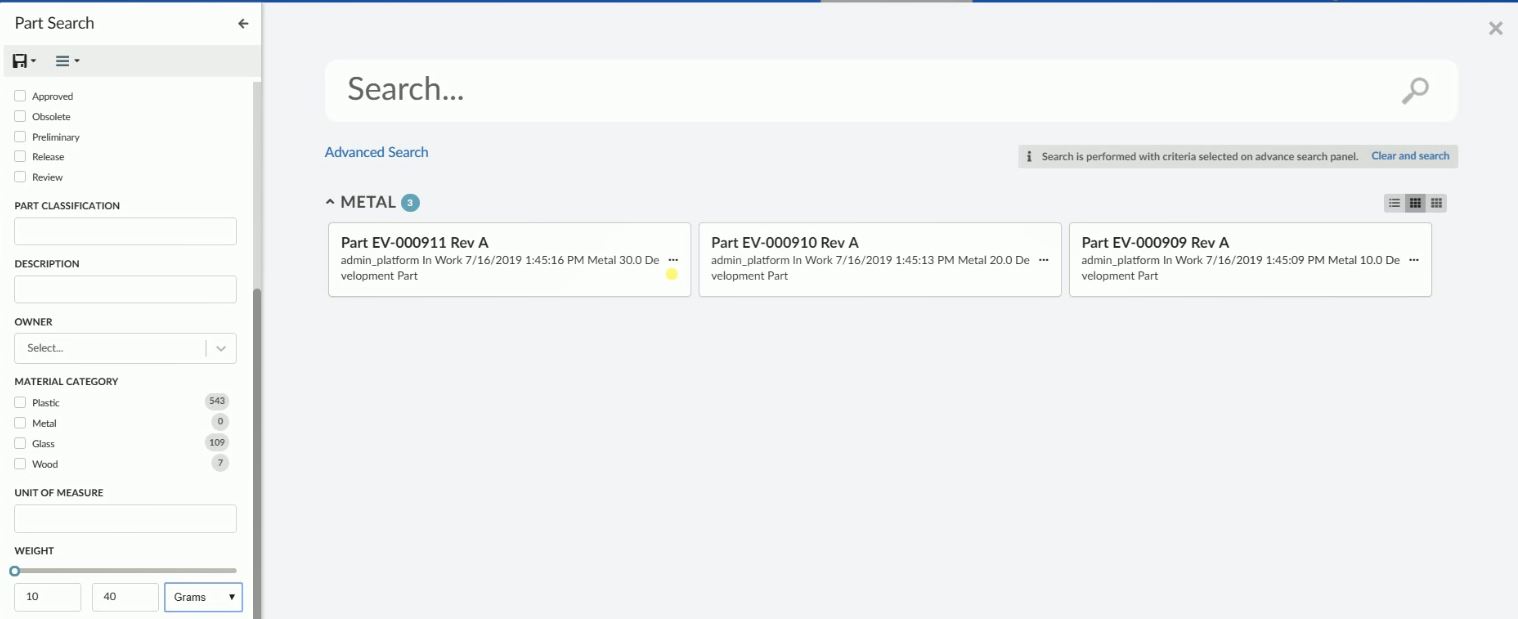
Figure 11. Search With Dimensions
<Field attribute="attribute_Weight">
<Label>Weight</Label>
<UIType>Slider</UIType>
<Settings>
<Setting name="searchWithUnit" value="true" />
<Setting name="min" value="0" />
<Setting name="max" value="100" />
</Settings>
</Field>| The UI type is redundant in the example above. As the attribute weight is specified on the field element sensible default values for the field are applied. For example, the UIType is set to slider as weight contains numeric values. |
Settings:
| Attribute Name | Description | Default | Example |
|---|---|---|---|
showSlider |
Should the slider be displayed |
true |
|
min |
The minimum value that is selectable. This setting is mandatory in case the slider is displayed. |
|
|
max |
The maximum value that is selectable. This setting is mandatory in case the slider is displayed. |
|
|
unit |
A unit to display next to the input fields, e.g. $ and g. |
|
|
searchWithUnit |
should the field allow search with available dimensions for numeric types. |
false |
|
step |
Increments when changing the value using the slider. |
1 |
|
precision |
Decimal precision for the field. |
1 |
|
valuesInclusive |
Includes the specified ‘from’ and ‘to’ values |
true |
|
Tree Field
Treefield can be used to create a tree-like structure with nodes and each node can be expanded or selected. It is useful for selecting values from classification and sub-classification like type hierarchy.
There are three ways to specify the values/nodes the user can select from:
-
Predefined list of values. Configure the available values/nodes using the Values element. The values/nodes are sent to the client when the search form is rendered and no further request to the server is required.
-
TreeHandler. Specify which TreeHandler should provide values/nodes, e.g.
typeorbusinessobject. When the user expands a node a request is sent to the server for fetching child nodes. Child nodes are added to expanded node and child nodes can further be expanded. -
Combination of both. Configure the available values/nodes using the Values element and specify which TreeHandler which should provide values/nodes on expanding the preconfigured nodes. The predefined values/nodes are sent to the client when the search form is rendered. When the user expands a node a request is sent to the server for evaluating and fetching child values/nodes. Combination of both us useful to define the root node, which can be further expanded.
Type Hierarchy
Following settings are supported by Treefield:
| Setting Name | Description | Default | Example | ||
|---|---|---|---|---|---|
showValueCount |
Whether to show count against the node if provided by TreeHandler. |
true |
|
||
selectChildren |
Whether child nodes should be auto selected on selecting parent node.
|
false |
|
||
submitOnlyParent |
Whether to submit only parent node when child nodes are auto selected.
|
false |
|
||
showAllNodes |
Whether to show all nodes or show limited number of nodes with scroll. |
false |
|
||
showNodesCount |
How many node should be visible, after which scroll will be shown. |
5 |
|
||
loadOptions |
A JSON configuration object used to define TreeHandler and other sub settings needed by TreeHandler. See Tree Handlers for more detail. |
|
Predefined Values
Predefined values can be specified using Values element. Attribute parent can be used to build a node hierarchy for predefined values.
Example:
<Field id="type" sectionId="basic">
<UIType>tree</UIType>
<Label>Type</Label>
<DataField>TYPE</DataField>
<Values>
<Value value="Part">Part</Value>
<Value value="Software Part" parent="Part">Software Part</Value>
<Value value="Hardware Part" parent="Part">Hardware Part</Value>
<Value value="Mechanical Part" parent="Hardware Part">Mechanical Part</Value>
<Value value="Electrical Part" parent="Hardware Part">Electrical Part</Value>
</Values>
</Field>
Figure 12. Predefined Tree Nodes
| Predefined values can be used to load root nodes when used together with a TreeHandler. |
Tree Handlers
A TreeHandler is used to expand a node. When a node is expanded an ajax request is sent to the server with the expanded node as input, the TreeHandler processes this input and prepares a list of child nodes, which are sent back to the client. Child nodes are added to the expanded node and node is marked as expanded.
Tree handler is a java class and must implement following interface com.technia.tvc.search.ui.tree.handler.TreeHandler.
Tree handler can be configured using a <Setting> called loadOptions with the handler name set to treehandler.
Example configuring a field to use the type TreeHandler:
<Field id="type2" sectionId="basic">
<UIType>tree</UIType>
<Label>Type</Label>
<DataField>TYPE</DataField>
<Values>
<Value value="Part" default="true" disableSelection="false">Part</Value>
</Values>
<Settings>
<Setting name="casesensitive" value="true" />
<Setting name="showValueCount" value="true" />
<Setting name="selectChildren" value="true" />
<Setting name="submitOnlyParent" value="false" />
<Setting name="loadOptions">
{
"handler": {
"name": "com.acme.CustomTreeHandler"
},
"valueKey": "value",
"labelKey": "label"
}
</Setting>
</Settings>
</Field>Following sub settings are supported by loadOptions:
| Setting Name | Description | Default | Example |
|---|---|---|---|
forceNodeFetchOnExpand |
Whether a new server request should be made when an already expanded node is collapsed and expanded again. This setting should be set to |
false |
|
valueKey |
Key which should be used to retrieve value from added child node. |
value |
|
labelKey |
Key which should be used to retrieve label from added child node. |
label |
|
Built in Tree Handlers
There are two built in TreeHandlers:
Type
type TreeHandler is used to create a tree field based on Enovia type hierarchy. Each node represents a type in Enovia and on expanding its subtypes are fetched and added as child nodes. It can be configured using shorthand type as shown below -
<Field id="type2" sectionId="basic">
<Values>
<Value value="Part" default="true" disableSelection="false">Part</Value>
</Values>
...
<Settings>
<Setting name="loadOptions">
{
"handler": {
"name": "type"
},
"valueKey": "value",
"labelKey": "label"
}
</Setting>
</Settings>
</Field>Business Object
businessobject TreeHandler is used to create a tree field by expanding the business object. To start a root node or nodes must be configured. The root node can be configured as a static node via predefined values and value must be root which acts as a starting node. On expanding the starting node, businessobject adds real root nodes under the starting node via Enovia MQL query as configured in handler settings. When the root node or nodes are expanded, Enovia MQL expand is used to add child nodes under the root node.
Root node configured as predefined value is dummy node and lets TreeHandler businessobject know that root nodes should be added via Enovia MQL query. On each node expansion thereafter Enovia MQL expand is performed.
Business object handler can be configured using short hand TreeHandler businessobject.
Following sub settings are supported by businessobject TreeHandler:
| Setting Name | Description | Example |
|---|---|---|
rootTypePattern |
Type pattern to quering the root nodes. |
|
rootNamePattern |
Name pattern to quering the root nodes. |
|
rootRevPattern |
Revision pattern to quering the root nodes. |
|
rootVaultPattern |
Vault pattern to quering the root nodes. |
|
rootWhereClause |
Where clause that should be applied while quering the root nodes. |
|
disableRoots |
Whether root nodes should be disabled for selection. |
|
typePattern |
Type pattern for expanding root and other nodes. |
|
relPattern |
Relationship pattern for expanding root and other nodes. |
|
relWhereClause |
Relationship where clause for expanding root and other nodes. |
|
objectWhereClause |
Object where clause for expanding root and other nodes. |
|
displayMacro |
displayMacro for showing lable of expanded child nodes. |
|
Example businessobject handler configuration for the scenario where can select a part family classification. In Enovia part families are connected with libraries and part families can have subpart families. In the configuration below on expanding dummy start node, part libraries are queried using root config settings and part library and part family are further expanded using type and rel patterns.
<Field sectionId="related">
<Label>Classification Tree</Label>
<DataField>to[Classified Item].from.id</DataField>
<ConditionalFields></ConditionalFields>
<UIType>tree</UIType>
<Values>
<Value value="root" disableSelection="true">Start...</Value>>
</Values>
<Settings>
<Setting name="loadOptions">
{
"handler": {
"name": "businessobject", // handler name
"rootTypePattern": "type_Libraries", // Root type pattern
"rootNamePattern": "*", // Root name pattern
"rootRevPattern": "-", // Root revision pattern
"rootVaultPattern": "vault_eServiceProduction", // Root vault pattern
"rootWhereClause": "current == Active", // Root where clause
"disableRoots": "true", // If part library should be disabled for selection
"typePattern": "type_PartFamily", // Type pattern for part family. Supports more than one comma separated values.
"relPattern": "relationship_Subclass", // Relation between library and part family and between part family and
// sub part families. Supports more than one comma separated values.
"objectWhereClause": "current == Active", // Relation where clause
"displayMacro":"${name} ${current}" // Display marco
},
"valueKey": "value",
"labelKey": "label"
}
</Setting>
<Setting name="submitOnlyParent" value="true" />
</Settings>
</Field>Part Classification Tree Field
In this example we are adding a dummy start node in the begining and on expanding dummy start node, root nodes are added as child to dummy nodes. It is possible to use combination of predefined values and businessobject TreeHandler to laod root nodes directly as searchform is loaded.
|
Combination of Predefined Values and TreeHandler
A root node or nodes in the tree field are the starting point tree expansion. It is important to configure root nodes properly for the intuitive end-user experience. For example when using a built-in TreeHandler type, the root node can be configured using a predefined value :
<Field id="type2" sectionId="basic">
<Values>
<Value value="Part" default="true" disableSelection="false">Part</Value>
</Values>
...
<Settings>
<Setting name="loadOptions">
{
"handler": {
"name": "type"
},
"valueKey": "value",
"labelKey": "label"
}
</Setting>
</Settings>
</Field>or in case of businessobject handler root nodes can be added using root node configuration. However, it is possible to use a custom java class to load root nodes and allow businessobject handler to only handle the expansion of nodes. See Values for more details.
<Field sectionId="related">
<Label>Classification Tree</Label>
<DataField>to[Classified Item].from.id</DataField>
<ConditionalFields></ConditionalFields>
<UIType>tree</UIType>
<Values className="com.acme.RootNodeProvider" />
<Settings>
<Setting name="loadOptions">
{
"handler": {
"name": "businessobject", // handler name
"typePattern": "type_PartFamily", // Type pattern for part family
"relPattern": "relationship_Subclass", // Relation between library and part family and between part family
// and sub part families.
"objectWhereClause": "current == Active", // Relation where clause
"displayMacro":"${name} ${current}" // Display marco
},
"valueKey": "value",
"labelKey": "label"
}
</Setting>
</Settings>
</Field>1.3.10. Term Field
Term field is special field designed to be used for search overlay. Implementing Search Provider can decide on how to interpret term field and use for performing search. See Enovia Provider Settings for details on how built-in ENOVIA Search Provider uses term field. Term field can be identified by property FieldType as term on field.
1.3.11. Section Configuration Format
The root element is <Section> and the following child elements and attributes are supported:
| Name | Description | Example | ||
|---|---|---|---|---|
id |
Attribute on
|
|
||
Label |
The label for the section. I18n is supported through string resources file. |
|
||
Tooltip |
Tooltip for the field. Displayed when hovering the label. |
|
||
Expanded |
Whether section should be expanded on load of searchform. Default value is true. |
|
Sections can be used to divide fields into collapsible group or sections. Each field configuration should specify its section using attribute sectionId on <Field> tag, which should match with id on corresponding <Section>. See example configuration below -
<SearchForm>
<Title>Part Search</Title>
<Sections>
<Section id="basic">
<Label>com.technia.tvc.search.form.name.label</Label>
<Tooltip>
<Title>Basic Fields</Title>
<Content>This is a section for basic fields.</Content>
</Tooltip>
<Expanded>true</Expanded>
</Section>
<Section id="classification">
<Label>Classification</Label>
<Tooltip>
<Title>Classification Fields</Title>
<Content>This is a section for classification fields.</Content>
</Tooltip>
<Expanded>false</Expanded>
</Section>
<Section id="others">
<Label>Other</Label>
<Tooltip>
<Title>Other Fields</Title>
<Content>This is a section for other fields.</Content>
</Tooltip>
<Expanded>false</Expanded>
</Section>
</Sections>
<Fields>
<NameField sectionId="basic">
<Settings>
    <Setting name="casesensitive" value="true" />
</Settings>
</NameField>
<TypeField id="type" sectionId="basic">
...
</TypeField>
<StateField sectionId="basic">
...
</StateField>
<RevisionField sectionId="basic">
...
</RevisionField>
<ClassificationField sectionId="classification">
...
</ClassificationField>
<Field sectionId="others">
...
</Field>
<PersonField sectionId="others">
....
</PersonField>
<Field attribute="attribute_MaterialCategory" id="material_category" sectionId="classification">
...
</Field>
</Fields>
</SearchForm>1.3.12. Save Search
Search criteria can be saved using saved search functionality. Saved searches can be loaded to fill search criteria on the search form. User can also directly launch a search by clicking on find icon.
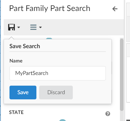
Figure 13. Save Search
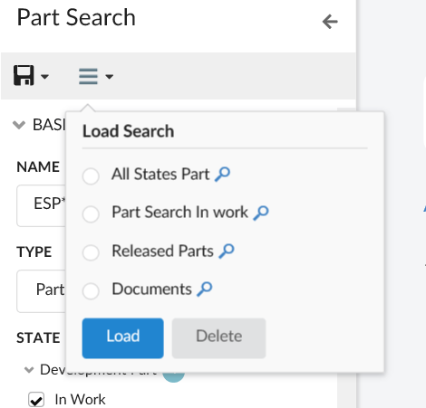
Figure 14. Load Search
1.3.13. Export Search
Search criteria present on search form can be exported as URL, which can be shared as copied text. Exported URL can then be directly be used to launch search in overlay mode. When a search is launched via URL, a default empty homepage is shown in the background to avoid loading heavy homepage impacting performance. However, it is possible to load a custom homepage via configuration tag <HomePage> on search config. <HomePage> should have the page reference that needs to be loaded in the background.
Example:
<Search provider="enovia" version="2">
...
<HomePage>
<Page namespace="helium" name="SearchPage.xml"/>
</HomePage>
</Search>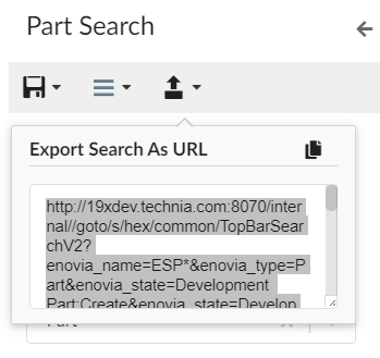
Figure 15. Export Search
1.3.14. User settings
Search On Criteria Update
User Setting to enable/disable Search On Criteria Update for Search.
User can now control whether the search is submitted when the search criteria is updated. Earlier this feature was limited to search config and it was not possible to enable or disable for a specific user.
A built-in command SaveSearchUserSettings is added to allow users to enable or disable search on criteria updates. This built-in command needs to be added to the search form toolbar.
For detailed information on search on criteria update, please refer Search On Criteria Update
Search On Load
User Setting to enable/disable Search On Load for Search. Search config setting SearchOnLoad can be used to perform the initial search as search form loads.
User can now control whether the search should be initiated when the search form loads. Earlier this feature was limited to search config and it was not possible to enable or disable for a specific user.
A built-in command is added to allow users to enable or disable search on load feature. This built-in command needs to be added to the search form toolbar.
For detailed information on search on load, please refer Search On Load
<Toolbar>
<SaveSearchUserSettings />
</Toolbar>
SaveSearchUserSettings command is used to club both the user settings ie Search On Criteria Update and Search On Load
|
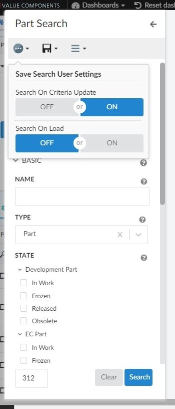
Figure 16. Usersetting for search on criteria update & search on load
1.3.15. Javascript API
Methods
| Method | Description |
|---|---|
setCriteria |
Sets the criteria on search form |
getCriteria |
Gets the search criteria |
updateFieldsVisibility |
Updates visibility of fields on searchform |
getState |
Current fields of search form. State of searchform represents all the fields within searchform. |
setFieldValues |
Sets the field values on search form. |
setFields |
Sets the fields on search form. It is used when search result returns search form fields. |
updateFieldValueCounts |
Updates count on searchform fields. |
on |
Register to an event |
off |
Deregister to an event |
Events
| Event Name | Description |
|---|---|
search |
Called when search button is clicked. |
close |
Called when searchform is closed |
resetFields |
Called when fields are reset. |
criteriaUpdate |
Called when search criteria is updated. |
1.3.16. Example Configuration
<?xml version="1.0" encoding="UTF-8"?>
<SearchForm>
<Title>Part Search</Title>
<Fields>
<NameField />
<TypeField>
<Values>
    <Value value="Part" default="true" />
</Values>
<SearchableTypes>
<Type>type_Part</Type>
<Type>type_DOCUMENTS</Type>
</SearchableTypes>
<Tooltip>
<Title>customer.search.type.tooltip.title</Title>
<Content>customer.search.type.tooltip.content</Content>
</Tooltip>
</TypeField>
<Field>
<Label>Material Category</Label>
<DataField>MATERIAL_CATEGORY</DataField>
<Values attribute="attribute_MaterialCategory" />
<Settings>
<Setting name="showFilter" value="true" />
<Setting name="showRangeAmount" value="10" />
</Settings>
</Field>
</Fields>
</SearchForm>1.3.17. Toolbar Configuration Format
Toolbar can be configured inline within a searchform. Command/Menu can be configured in a separate file and added to the toolbar element.
Figure 17. SearchForm Toolbar
The command configuration files are placed in the folder command and menu configuration files are placed in the folder menu. If configured in a separate file, it can be referred within searchform using attribute ref as below -
<Toolbar>
    <Command ref="tvc:command:helium/mail.xml"/>
    <Menu ref="tvc:menu:helium/mymenu.xml"/>
</Toolbar>
Command Configuration Format
The root element is <Command> and the following child elements are supported:
| Name | Description | Example |
|---|---|---|
Label |
The label for the command. I18n is supported through string resources file. |
|
Alt |
Tooltip for the command. Displayed when hovering the label. |
|
FontIcon |
Icon for the command. Displayed left of the label. |
|
Setting |
Setting with name and value can be passed to include onClick and other required information. |
|
Menu Configuration Format
The root element is <Menu> and the following child elements are supported:
| Name | Description | Example |
|---|---|---|
Label |
The label for the command. I18n is supported through string resources file. |
|
Alt |
Tooltip for the menu. Displayed when hovering the label. |
|
FontIcon |
Icon for the menu. Displayed left to the label. |
|
Command |
Commands for this menu visible as dropdown elements on clicking the menu. |
|
In-built Commands:
The in-built search commands can also be configured and only icon,label and tooltip can be modified.
<SaveSearch>
    <Label>save</Label>
    <FontIcon>ti-f ti-save-f</FontIcon>
    <Alt>Save Search</Alt>
</SaveSearch>
<LoadSearch>
    <Label>load</Label>
    <FontIcon>ti-f ti-menu-f</FontIcon>
    <Alt>Load Search</Alt>
</LoadSearch>| If toolbar is not defined in the searchForm, a default toolbar with in-built commands takes its place. If toolbar is configured, these inbuilt commands are needed to be included if required. |
1.4. Search Providers
1.4.1. ENOVIA Search Provider
Built-in ENOVIA Search Provider can be used to perform search in ENOVIA. It can be used with enovia callsign name in Search Configuration.
<Search provider="enovia" />Settings
ENOVIA Search Provider supports following settings, which are defined in Search Configuration. See Configuration Format for details on how to configure settings.
| Setting Name | Description | Default | Example |
|---|---|---|---|
vault |
Enovia vaults where search should be performed. Multiple comma separated vaults can be configured. |
eService Production |
|
where |
A custom where clause can be passed to search provider. For example it can be used to search only non-obsolete parts. |
none |
|
termWhere |
termWhere is applicable for term search. It defines where clause, into which user search term is to be injected while performing Enovia search. For example, if user entered term search as |
|
|
1.4.2. EXALEAD Search Provider
Built-in EXALEAD Search Provider can be used to perform search in Exalead. It can be used with exalead callsign name in Search Configuration.
<Search provider="exalead" />Settings
EXALEAD Search Provider supports following settings, which are defined in Search Configuration. See Configuration Format for details on how to configure settings.
| Setting Name | Description | Default | Example |
|---|---|---|---|
xl:termFields |
Fields against which term search should be evaluated. |
Term search is by default queried as against all indexed fields |
|
xl:sortField |
Field on which search should be sorted. |
none |
|
xl:sortOrder |
Sort order of search result. |
ascending |
|
xl:enableWildcardSearch |
Whether to add wildcard to term search. |
false |
|
xl:inlcudeFacets |
Whether to include facets or field counts. |
true |
|
1.4.3. RevisionField
In case of exalead search provider, RevisionField can be configured in search form like below
<RevisionField sectionId="basic">
    <AnyRevision />
    <FirstRevision />
    <LastRevision />
    <LatestInState policy="EC Part" state="Release" />
    <LastAndLatestInRelease />
    <Settings>
        <Setting name="xl:lastRevision" value="LASTREVISION"></Setting>
        <Setting name="xl:firstRevision" value="FIRSTREVISION"></Setting>
        <Setting name="xl:latestRevision" value="LATESTREVISION"></Setting>
        <Setting name="xl:lastAndLatestRevision" value="LASTANDLATESTREVISION"></Setting>
    </Settings>
</RevisionField>
Following Exalead settings can be defined on search form fields. See Field Configuration Format for details on how to configure settings.
| Setting Name | Description | Default | Example |
|---|---|---|---|
xl:firstRevision |
Exalead key for first revision.
|
FIRSTREVISION |
|
xl:lastRevision |
Exalead key for last revision.
|
LASTREVISION |
|
xl:latestRevision |
Exalead key for latest revision.
|
LATESTREVISION |
|
xl:lastAndLatestRevision |
Exalead key for lastAndLatestRevision revision.
|
LASTANDLATESTREVISION |
|
xl:showZeroCount |
Whether '0' should be shown when Exalead count for a field value is 0. |
false |
|
1.4.4. Custom Search Provider
Custom Search Provider can be used to perform search. Custom Search Provider should implement interface com.technia.tvc.search.api.SearchProvider and provide implementation to method search(SearchContext context). SearchContext object provide access to following api to perform search.
| API | Description |
|---|---|
getCriteria |
Search criteria supplied by the client. Typically what the user enters in the search form including term search. |
getSearchForm |
Instance of |
getDataFields |
|
getSettings |
Custom |
getSectionProvider |
Section Provider to be used for sectionizing search results. Refer Built-in Section Provider for default implementation. |
getSearchForm |
Instance of |