 TVC Helium 2022.1.0
TVC Helium 2018.3.0 Release Information
29 June 2018
1. Core
1.1. Image support for Commands and Menus
<Image> & <RegisteredSuite> tags are now supported in Commands and Menus. See Toolbar menu for more information. These can be used to render images instead of icons, e.g.
<Image>${SUITE_DIR}/images/logo.png</Image>
<RegisteredSuite>EngineeringCentral</RegisteredSuite>
For better performance, we recommend using icons (<FontIcon>) over images (<Image>) when possible
|
One such application of using an Image could be company logo in the top bar.
Figure 1. Using command to display company logo in topbar
This can be done in following way -
Modify Helium.xml as follows,
<?xml version="1.0" encoding="UTF-8"?>
<Application xmlns="http://technia.com/helium/Application">
...
    <StartPage>
        <Page namespace="hex:engineering:homepage">HomePage.xml</Page> (4)
    </StartPage>
    <TopBar>
        <ShowAppName>false</ShowAppName> (1)
        <Left>
            <Command>tvc:command:helium/AppHome.xml</Command> (2)
            <Separator/>
            ...
        </Left>
        <Right>
            <Myspace/>
            ..
        </Right>
    </TopBar>
...
</Application>
and add command AppHome.xml as
<Command>
	<URL js="App.routing.entry('tvc:page:hex:engineering:homepage/HomePage.xml');"/>  (3)
	<Image>${ROOT_DIR}/mycompany/images/logo.png</Image>
</Command>| 1 | Disable showing App name in the topbar |
| 2 | Add new command as the first command under <Left> section |
| 3 | Define js/ url that should be reached when the command is clicked. In this example, the page setting from <StartPage> is used to get the same effect as before. |
| 4 | <StartPage> section can be removed since it will no longer be used once <ShowAppName> is set to false |
1.2. Icon Bundles
Helium now ships 5 icons sets that are filled with beautiful svg icons. See Icon Bundles for more information
2. Dashboard
2.1. Resizable handle options
New tag ResizableHandles is added in Dashboard that allow to enable different optons i.e any combination of comma seperated valid value, to enable resize widget from different positions like right, left, bottom, left bottom or right bottom. Valid values are e, se, s, sw, w. Default value is se. For more information, see Dashboard
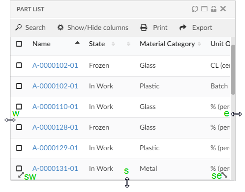
Figure 2. Resize Handle Options
Example : dashboard.xml
<?xml version="1.0" encoding="UTF-8"?>
<Dashboard xmlns="http://technia.com/helium/Dashboard">
    <Locked>false</Locked>
    <Floating>true</Floating>
    <ResizableHandles>e, se, s, sw, w</ResizableHandles>
    <Widgets>
        <Widget namespace="hex:engineering:homepage" name="MyPartsTable.xml">
            <Id>myparts</Id>
            <Width>9</Width>
            <Height>8</Height>
            <X>0</X>
            <Y>0</Y>
        </Widget>
    </Widgets>
</Dashboard>
3. Widget
3.1. Header actions tooltip
ShowActionTooltip tag can be used to configure tooltip over header actions.
Example : EBOM.xml
<DataTable>
	<Title>EBOM</Title>
	<TableConfig namespace="hex:engineering">EBOM.xml</TableConfig>
	<Responsive>true</Responsive>
	<FixedHeader>true</FixedHeader>
	<ShowActionTooltip>true</ShowActionTooltip>
</DataTable>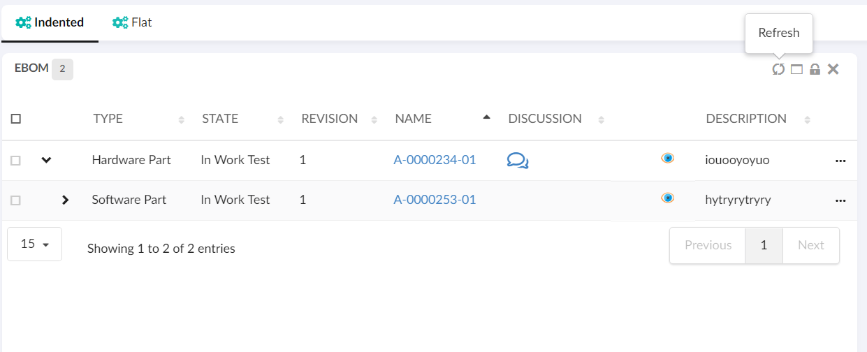
Figure 3. Header Actions Tooltip
3.2. Badge support in widget header
Badge tag is use to render a small badge in widget header on right side of the widget title that shows total object count in the widget. In case of history widget it shows number of rows. Valid value is true or false. Default value is false.
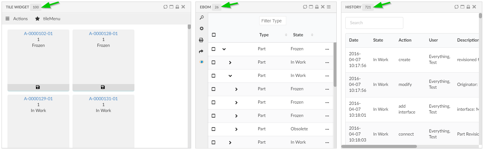
Figure 4. Badge Support
Example : dashboard.xml
<?xml version="1.0" encoding="UTF-8"?>
<Dashboard xmlns="http://technia.com/helium/Dashboard">
    <Locked>false</Locked>
    <Floating>true</Floating>
    <ResizableHandles>e, se, s, sw, w</ResizableHandles>
    <Widgets>
        <Widget namespace="hex:engineering:homepage" name="MyPartsTable.xml">
            <Id>myparts</Id>
            <Width>9</Width>
            <Height>8</Height>
            <X>0</X>
            <Y>0</Y>
            <Badge>true</Badge>
        </Widget>
    </Widgets>
</Dashboard>
3.3. Customization - Tables
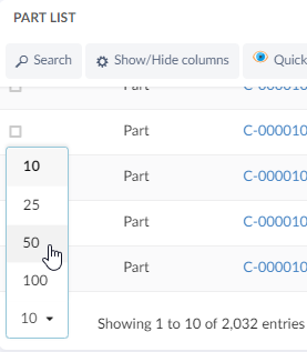
Figure 5. Pagination - Tables
Pagination changes in tables are now remembered across page changes and sessions. Refer Table Customization for more information.
4. TopBar
4.1. Topbar command tooltip
Now topbar commands can also have tooltip with support of <Alt> attribute. Command with <Alt> can be configured as below.
Example : Command.xml
<Command>
  <Label>Create Part</Label>
  <Alt>creating a new Part</Alt>
  <FontIcon>ti-c ti-plus</FontIcon>
  <URL href="javascript:App.form.createNew({options: {'formConfigName': 'tvc:form:helium/CreatePart.xml', 'fullscreen': true }});" />
</Command>
Optional settings as given in Semantic Popup Settings can be passed for tooltip.
Example : Helium.xml
<Application xmlns="http://technia.com/helium/Application">
...
  <TopBar>
    <TooltipSettings>
      <![CDATA[{
      	"variation": "inverted",
      	"hoverable": "true",
      	"position":"bottom center"
         }]]>
    </TooltipSettings>
  </TopBar>
...
</Application>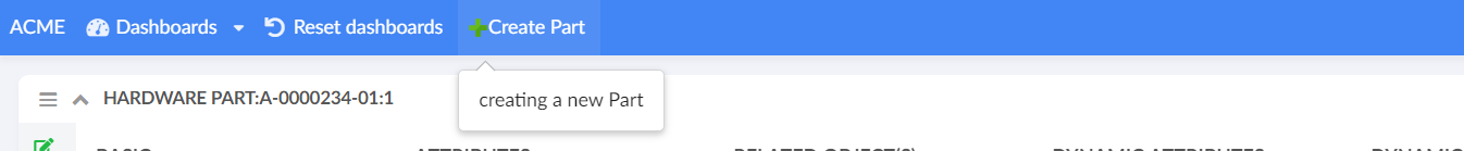
Figure 6. Topbar-command tooltip