Grid Browser - Administration Guide
01 April 2016
Table of Contents
- 1. Legal Notes
- 2. Introduction
- 3. Grid Browser Usage
- 4. Launching the Grid Browser
- 5. Loading Data into the Grid Browser
- 6. Intersection
- 7. UI Configuration
- 8. Integration with TVC Structure Browser
- 9. Configuration Details
- 9.1. Localization (i18n)
- 9.2. The Grid Browser Definition
- 9.3. Columns
- 9.4. Rows
- 9.5. DataLoader
- 9.6. Intersection
- 9.7. EditableFields
- 9.8. CellStates
- 9.9. Label (Complex)
- 9.10. Label (Simple)
- 9.11. Header
- 9.12. SubHeader
- 9.13. Rotated Column Headers
- 9.14. ToolTip
- 9.15. Cols
- 9.16. Actions
- 9.17. ElementActions
- 9.18. For-State
- 9.19. RefreshBehaviour
- 9.20. Access
- 9.21. GlobalActions
- 9.22. Form
- 9.23. DisableIf
- 9.24. UIFunctions
- 9.25. Other Elements
1. Legal Notes
© Copyright 2003-2019 by TECHNIA AB
All rights reserved.
PROPRIETARY RIGHTS NOTICE: This documentation is proprietary property of TECHNIA AB. In accordance with the terms and conditions of the Software License Agreement between the Customer and TECHNIA AB, the Customer is allowed to print as many copies as necessary of documentation copyrighted by TECHNIA relating to the software being used. This documentation shall be treated as confidential information and should be used only by employees or contractors with the Customer in accordance with the Agreement.
This product includes software developed by the Apache Software Foundation. (http://www.apache.org/).
2. Introduction
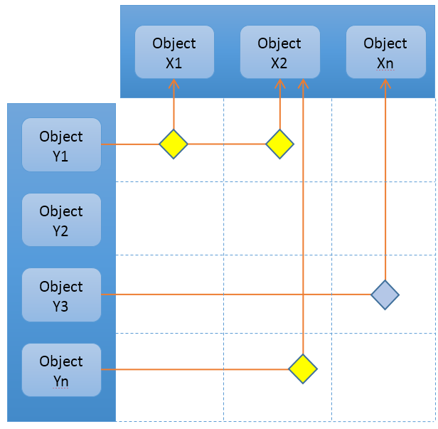
The Grid Browser can be used for viewing and/or working with the intersections/connections between objects in a grid/matrix view. Two different sets of objects are loaded and they are displayed on the Y- and X- axis (also referred to as row- and column- axis). The intersection between an object on the X axis and an object on the Y axis represents a connection between these (either directly connected, or indirectly via some intermediate object).
Note that in some special cases, you can view/work with intersections/connections from a relationship to an object or a relationship pointing to another relationship.
The main features of the Grid Browser Component are:
-
Makes complex relationships between objects understandable and visible.
-
Easy to configure – an XML file is used to configure the whole Grid Browser instance.
-
The XML file can be stored in the database as a page object OR as a file within the web-application directory.
-
-
Powerful configuration, complex relationships with several intermediate objects can be handled.
-
Connect and disconnect of relationships
-
Editing of relationship attributes.
-
Easy to perform mass-operations. Built-in functions for creating connections, deleting connections and modifying attributes exists. Extendable and allows plugging in custom functionality written in Java/JPO.
-
Built upon the Structure Browser and uses the same rendering engine. A large number of features from the Structure Browser is also visible in the Grid Browser, for example:
-
Using the standard Structure Browser UI for editing of the row and/or column objects/connections and also the intersections.
-
Excel Export, CSV Export, PDF Export
-
Clipboard/Collection available in the Grid Browser
-
Follows the same pagination settings
-
Cell Renderer / Data Handlers can also be used in the Grid Browser to create more advanced UI rendering and/or complex data retrieval.
-
Same Look & Feel.
-
2.1. System Requirements
The same system requirements as the Structure Browser defines are also applicable to the Grid Browser.
When installing the Grid Browser, you must also ensure that the Structure Browser is installed.
2.2. Structure Browser
The Structure Browser has a large number of features, but not all of them are available from within a Grid Browser view.
The following list shows features that are not supported in the Grid Browser UI:
-
Go There / Go Back
-
Data Grouping
-
Flatten (E.g. converting a structure into a flat list)
-
"Simple Mode". The rendering is done in "Standard Mode" and this cannot be changed.
-
Use of custom Table Renderer’s
-
The Grid Browser uses its own table renderer in order to be able render the complex UI of the Grid Browser.
-
-
Remembering of the column sort settings and the visible flag.
-
Changing view / table.
-
Search/Find will only match on meta-data related to the row-axis. It is not possible to filter/find based upon any data within the intersections.
3. Grid Browser Usage
The Grid Browser is based upon two sets of data, which are loaded into the column axis and the row axis. The configuration defines how this data is loaded (see this chapter for more information about this). Once the data is loaded, the intersections are calculated.
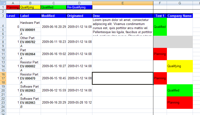
The picture below illustrates an example grid with some objects on the row- and the column- axis. Between these, some intersections are illustrated.
Figure 1. Grid Browser
The intersections are calculated based upon the rules in the configuration, such as the direction of the relationship and the relationship type.
Each intersection satisfies a state. "Connected" and "not-connected" are two examples of such state. In case when an intersection is connected, it is possible to create other kind of states that depends upon some value available on the connection. For example, the connection could have an attribute called "Importance". Depending on the value of this attribute, the intersection satisfies different states, and it can be visualized in the Grid Browser as different background colors and/or with different font-color.
In summary, a Grid Browser instance is composed of three sections, namely:
-
The row axis, which contains the objects on the left side. This can either be a list of objects (flat list), or a structure. Objects on the row axis are referred to as "row object".
-
The column axis, which contains the objects at the top. The objects on the column axis can be "grouped" together, based upon certain criteria). Objects on the column axis are referred to as "column object".
-
The intersections, which represent intersections between column objects and row objects. These can be colorized depending on certain criteria that are met. An individual intersection is referred to as an "element".
3.1. User Interface
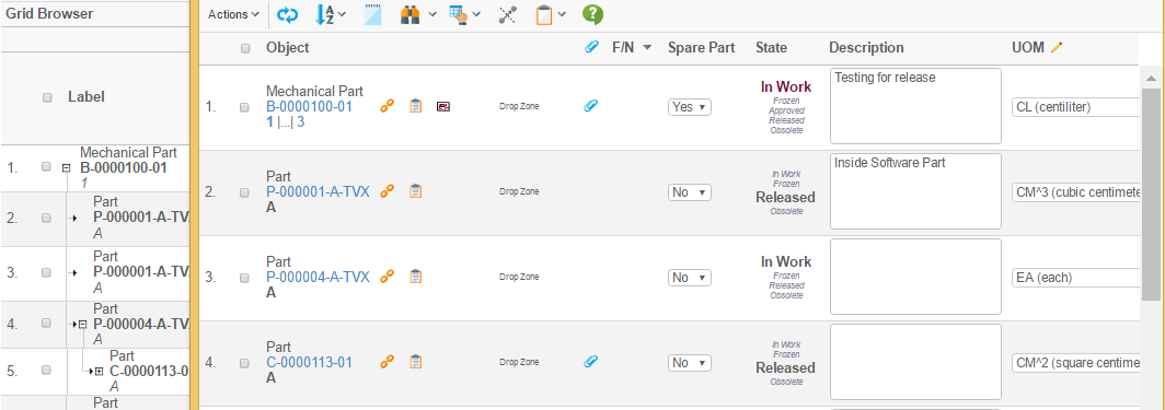
The user interface of the grid browser contains much information and a rich set of functionality. All of this differs depending on how your particular instance is configured but the picture below illustrates and describes commonly used parts.
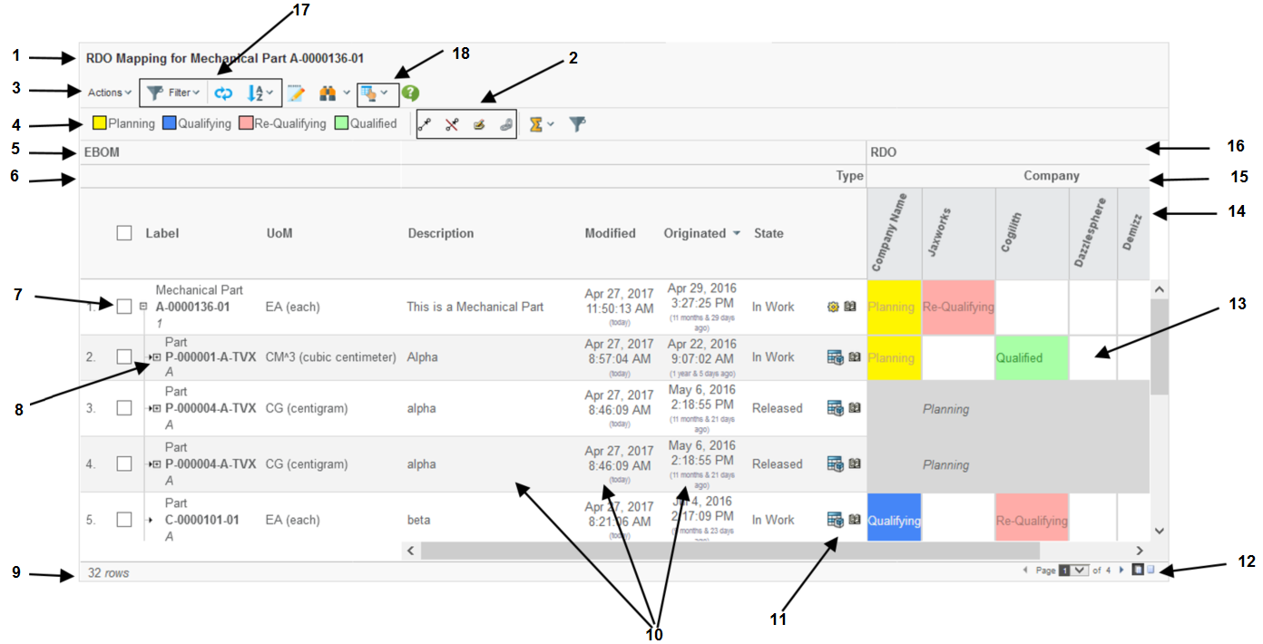
Figure 2. The Grid Browser user interface.
-
The page header and sub header.
-
The "mass functions" (actions that applies to multiple selected intersections).
-
Mass connect
-
Mass disconnect
-
Mass edit
-
-
The toolbar.
-
The legend that shows the meaning of each colour/state.
-
A label/header describing the data on the row-axis.
-
The label/header related to the hierarchy that is defined for the column axis objects (15).
-
Checkbox or Radio button used for passing selections to a custom toolbar command.
-
Navigation buttons (collapse / expand). These are visible in the case when a structure is displayed. It is possible to disable the possibility to expand/collapse also.
-
Displays the number of rows.
-
Meta-data (columns) related to the row objects. It is possible to open these fields for in-cell-edit.
-
"Row-Actions". Actions that operates on the row-object.
-
Pagination Control.
-
The intersections with or without a label and colouring.
-
The column objects
-
The column objects can be grouped in so called hierarchies. For example, objects of a certain type should be put together, or based upon the current state (or a combination).
-
A label/header describing the data on the column axis.
-
UI Functions. For example:
-
Filter Chooser (if enabled and the structure uses filters)
-
Reload
-
Column axis object filtering
-
Sorting
-
-
Context buttons. Contains the printer friendly and export functions and preferences. Other buttons that can be enabled are:
-
Promote / Demote
-
Add to collection / clipboard, manage collections.
-
Help button
-
3.2. Element Actions
The configuration declares the possible actions that can be performed on an element in a particular state. These actions are available in a menu after right clicking with the mouse over an element in the intersection area.
Depending on what state the element is in and the user’s access rights, different amount of actions can be made available.
A confirmation message can be set for element actions as well as global actions.
Examples of available built-in functions that easily can be made available are:
- Connect
-
Create a connection between the column object and the row object using a specific relationship type.
- Disconnect
-
Disconnects the connection that the intersection represents.
- Edit Attributes
-
Allows modifying attribute values on the connection.
- Set Attributes
-
In addition to Edit attributes, where the user is entering the attribute values in a form, this action will simply set the value of one or more attributes to pre-defined values.
- Open Link
-
Can be used to open an arbitrary link in a popup window. As an example could be to open the history dialog showing the history of the particular connection.
If none of the above actions solves your use-case, it is possible to plug-in a custom action written in Java / JPO.
Figure 3. Element actions popup.
An action can be made available to a user having a particular role, or is assigned to a particular group.
3.2.1. Edit Attributes
While the other actions don’t require any user interaction, the edit attributes action is associated with a form that requires the user to fill in the new attribute values. This form is opened in a popup window. The form is configured within the Grid Browser configuration.
The size of the popup window can also be configured.
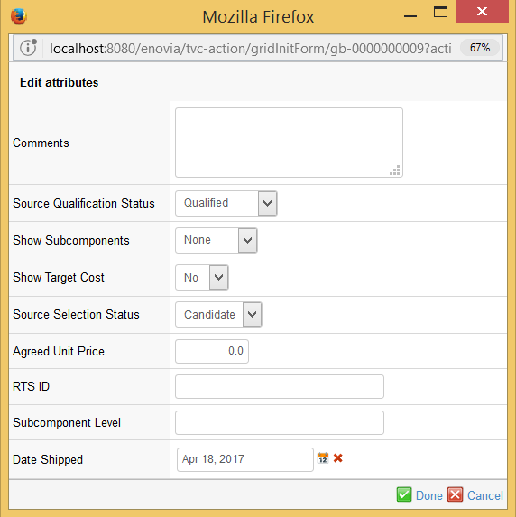
Figure 4. Attribute edit dialog.
3.3. Displaying Tooltips
The grid browser can be configured to show tooltips for the objects on both the row- and column- axis and also for the elements/intersections.
By default the tooltip is shown, if the user holds down the *shift*
key and moves the mouse pointer over one of the tooltip enabled
sections. You can turn off the need for holding shift to display
tooltips by the init parameter tvc.gridbrowser.holdShiftForTooltips
What actually is being shown within the tooltip is defined by the configuration that controls the Grid Browser instance.
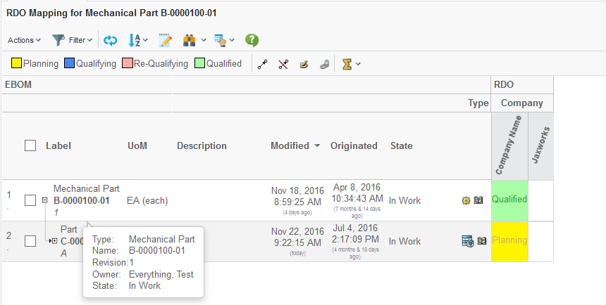
Figure 5. Tooltip display.
3.4. Open Popup
When clicking on either a row object on the left side or on a column object at the top, with the *shift* button combination, the grid can be configured to open a popup window with some content. What actually is being shown is configurable, but typically this will be that the object details page (emxTree.jsp) is opened.
The object id of the clicked item is passed to the configured href.
3.5. Mass Operations
There is a set of built-in mass operations available to use. Depending upon the configuration, these can be enabled or disabled for a particular grid browser instance.
These operations are global operations, and are shown within the toolbar as context buttons.
The built-in functions available are:
- Mass Connect
-
Creates connections for the selected elements
- Mass Disconnect
-
Disconnects the selected elements.
- Mass Edit
-
Performs mass updates of attribute(s) on the connections, which the elements represent. A form will be presented with fields where the user can select values for the attributes to be updated.
- Mass Set Attributes
-
Setting the value of one or more attributes to pre-defined values, without using a form.
| When performing a mass operation, if the transaction couldn’t be committed for all changes, everything is rolled back and no changes are made. |
A mass operation action can be configured in two different ways. For example, one can say that an action is available for all elements/intersections that are not connected, while another action is available for all elements/intersections that are connected.
The other approach is to enable an action depending on what state an element/intersection is satisfying. These two alternate setups can not be mixed. Once such action is invoked, only the selected elements that are satisfying that condition are part of the action.
A mass-action can be made available to a user having a particular role, or is assigned to a particular group.
3.5.1. Selecting Elements
In order to perform a mass operation, the user must select the elements to perform the operation against.
By using the left mouse button, the user may select an element. If the user clicks on one element, that element will be selected, and if clicking in another element the old element will be de-selected, i.e. only one element will be selected at a time, if the user does not use any of the key combinations mentioned below.
If the user wants to select more than one element at a time, s/he can use the *ctrl* key in combination with the left mouse click to select several objects. All elements that are clicked will then be added to the selection. If the user clicks on an already selected element, that element will be unselected.
It is also possible to select a range of objects, by using the *shift* key in combination with the left mouse button. The selection range will be made from the last selected element to the new selected element. If some elements within the range should not be selected, the user can then use the *ctrl* combination to deselect the desired elements.
To clear the selections made, it is possible to use the *alt* key in combination with the left mouse click to de-select all elements (note that the click must be made within the elements area).
Further on, the user may also select either all elements on a row, or all elements within a column, by either clicking on the row object (to the left) or the column object (at the top). The *ctrl* key combination with the left mouse click is also available here, if the user wants to add more rows and/or columns to the selection.
However, note that it is not possible to use the *shift* key combination at the row or column object(s) – this is because the *shift* and left mouse click combination is associated with another event (opening up a popup window, with the object id of the clicked object as argument, see this chapter).
3.5.2. Mass Edit
While the other mass-operating functions do not involve any user interaction, the mass edit requires the user to fill in a form. A dialog window will be opened in a popup window, showing the attributes that may be target for update. The attributes that are shown as editable are configured within the configuration that controls the grid instance.
An example of such dialog is shown in the screenshot below.
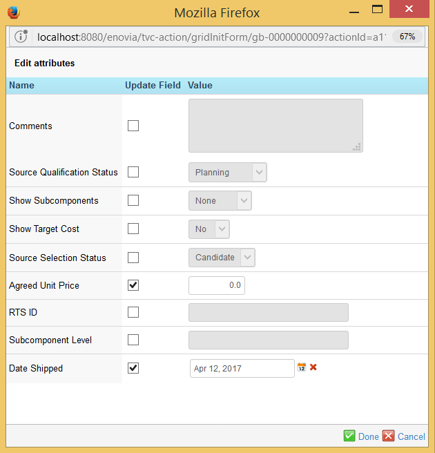
Figure 6. Form for mass editing of relationship attributes.
The attributes that should be updated must be checked, and the desired value should be defined.
If the mass edit is launched for one connection, or the form only contains one field, the checkbox will not be visible.
3.6. Printer Friendly
The Grid Browser can be exported into various printable formats that allow it to be printed. The most commonly used format is the PDF format. The printer friendly button is available within the toolbar as a context button, see screenshot below.
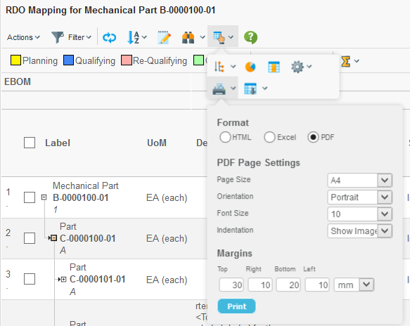
Figure 7. Printer friendly dialog.
The user will be able to select paper format, page orientation, font-size and margins in order to configure the generated PDF document.
Please note that in some situations, the amount of data/information is too large to fit on a certain paper size setup. The user will then have to change some of the settings, for example decrease the font-size, increase the paper size, change the page orientation or a combination of these.
The generated PDF document will contain following sections:
-
The row-axis data
-
The column-axis data
-
The intersections, where each intersection state defines its own section. All elements satisfying that state will be listed.
3.7. Excel™ Export
The Grid Browser can be exported into an Excel™ document. This is either done from the printer friendly button by choosing the Excel format, or via the Export button next to the printer friendly button within the toolbar.
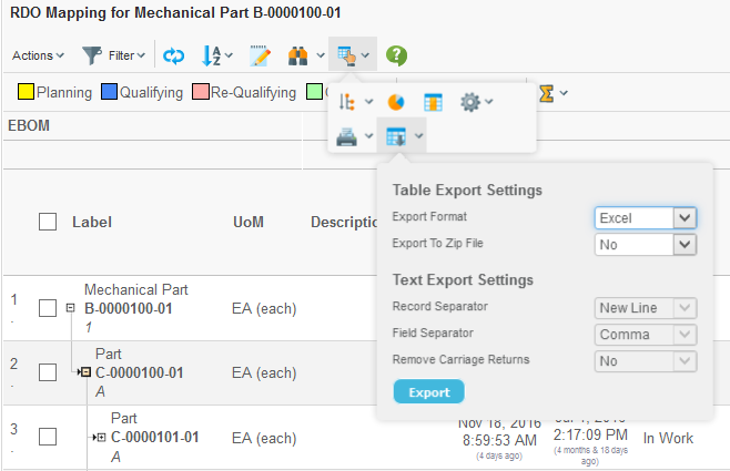
Figure 8. Export dialog.
The exported file is a HTML document with special mark-up, which is specific for Excel. An example export is shown below.
3.8. Column Object Filtering
It is possible to enable the column filtering functionality. The filter can be defined in a number of different ways and combinations, for example filter by type, current state or name. It is also possible to create several filter groups, in order to allow the user to choose.
Once enable, the dialog is opened via the button (1) shown in the picture below. The dialog is opened in the side panel (2) as shown below.
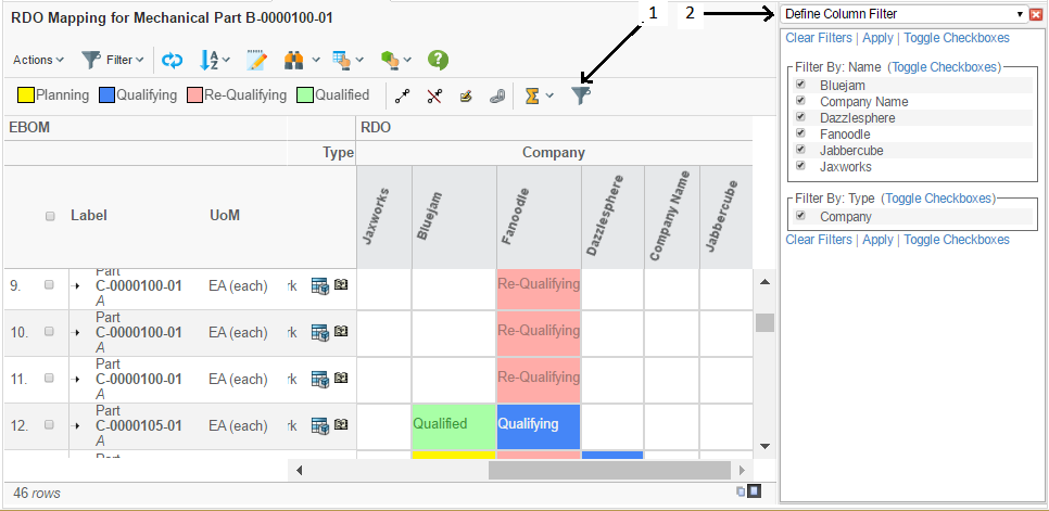
Figure 9. Column filter dialog.
Each filter group is related to a select statement that is applied on the column objects. Each unique value among the select values represents an item within the filter group.
All objects that is matching the particular filter-group-item is visible or hidden according to the selections made in the column filter dialog.
See this chapter for configuration details.
4. Launching the Grid Browser
Depending on where you intend to use the Grid Browser, the command or link that is used to open the Grid Browser must be defined as described below:
The HREF used to launch the Grid Browser can be one of the below:
${ROOT_DIR}/tvc-action/gridLoad
or
${ROOT_DIR}/tvc-action/gridInit
The only difference between these is that the first one will enable a progress-indicator that is shown while loading the Grid Browser while the latter one won’t. Typically, one will most often use the first URL, unless you are using another kind of progress indicator – this typically is the case when you show the Grid Browser within a "TVC Tabbed Page". In this case, the tabbed-page framework uses its own progress indicator.
The URL’s above requires that you pass the name of the configuration to be used. The value of this parameter is the name of the page object OR the XML resource that contains the grid browser configuration. For example:
${ROOT_DIR}/tvc-action/gridLoad?configuration=MyConfig
4.1. Sending the Object Id
In many cases, the Grid Browser needs an object as input; e.g. it is context sensitive. In that case you need to provide the id to this object, and pass it using the "objectId" parameter. If you attach the command to the "category tree" in your AEF based application, the object-id is automatically added to the HREF.
If you are launching the Grid Browser from another place, you must ensure that the object id is appended to the link.
| The Grid Browser also accepts that you pass the object-id via the "emxTableRowId" parameter, which typically is used on table pages when submitting selected row(s). However, if both the "objectId" parameter and the "emxTableRowId" parameter are present, the "objectId" parameter will be used. |
4.2. Launching from the Structure Browser
If you launch the Grid Browser from a command within the TVC Structure Browser, you must consider following:
-
Is the Grid Browser supposed to be launched with the selected row as input?
-
Is the Grid Browser supposed to be launched with the same object that was used when starting the Structure Browser instance as input?
If the first alternative is what you are looking for, then your command should have following settings:
Submit = True
Row Select = Single
If the second alternative is what you are looking for, then your command should have the following setting:
Submit OID = True
4.3. Portal Mode
If the Grid Browser instance is displayed in a "TVC Tabbed Page" or within a Portal channel, then you can enable the portal mode. This can be done in two ways.
-
Add the "portalMode=true" to the URL parameter string. For example:
${ROOT_DIR}/tvc-action/gridLoad?...&portalMode=true -
Explicitly define this within the configuration. For example:
<GridBrowser>
    <UIFunctions>
        <PortalMode>true</PortalMode>
    </UIFunctions>
</GridBrowser>
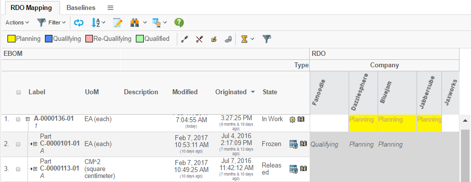
Figure 10. Grid Browser in portal mode.
In portal mode, the header and sub-header are removed.
4.4. Dialog Mode
If the Grid Browser instance is displayed in a popup window, it can have the standard popup dialog colours by enabling the "dialog mode". This can be done in two ways.
-
Add the "dialogMode=dialog" to the URL parameter string. For example:
${ROOT_DIR}/tvc-action/gridLoad?...&dialogMode=dialog -
Explicitly define this within the configuration. For example:
<GridBrowser>
    <UIFunctions>
        <DialogMode>true</DialogMode>
    </UIFunctions>
</GridBrowser>
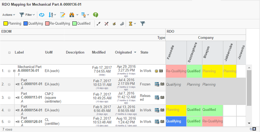
Figure 11. Grid Browser in dialog mode.
5. Loading Data into the Grid Browser
The data on the row and column axis are typically loaded via an inquiry, through a JPO or via a Java class that implements a specific interface.
In the case when you display a structure, you typically don’t load data into the row-axis – instead, the object, which the Grid Browser were launched for, will be used as root-object within the structure. The data within the row-axis is changed when the user expands or collapses the structure. There are a number of ways to configure how and what data should be returned when expanding an object. This is described in this chapter.
5.1. Configuration
Within the Grid Browser configuration, there are two sections called "Columns" and "Rows". These sections control the appearance of the column and row axis.
Within each of these sections, you will define a "DataLoader" section. The "DataLoader" defines everything regarding the initial load of each axis.
This is illustrated in the configuration snippet below:
<GridBrowser>
    <Columns>
        <DataLoader inquiry="MyInquiry" format="flat">
            <Sort by="name" ascending="true"/>
        </DataLoader>
    </Columns>
    <Rows>
        <DataLoader format="indented">
        ...
        </DataLoader>
    </Rows>
</GridBrowser>
5.2. Format
The format of the data can vary. The column axis typically shows a flat-list of objects. The row axis could show a flat-list, a structure with one root node or a structure with multiple root nodes.
The following values are accepted in the format attribute:
| Value | Description |
|---|---|
flat |
Used for flat list of objects. This is the default value if omitted. |
indented |
Used for displaying a structure with one root-node. |
indented-multi-root |
Used for displaying a structure with multiple root-nodes. |
vcc-structure |
Convenient format when navigating an object structure within the Variant Configuration Central application, where certain object instances are not relevant within the Grid Browser (shadow objects). |
5.3. Loading via a Dataset
A dataset is a powerful way to express complex data-retrieval by XML configuration, which normally would require implementing a Java class.
To use a dataset, one specifies the name of the dataset within the Data Loader as shown below:
<DataLoader format="flat" dataSet="tvc:dataset/Example.xml"/>
For additional information about data-sets, see the ”TVC Core Administration Guide”.
5.4. Loading via an Inquiry
An inquiry typically contains a MQL statement that returns a set of objects. In some cases the returned data could represent a structure.
To use an inquiry, one specifies the name of the inquiry within the Data Loader, like below:
<DataLoader inquiry="MyInquiry" format="flat">
It is also possible to pass arguments to the inquiry, this is done by:
<DataLoader ...>
    <Arg name="NamePattern" value="A*"/>
    <Arg name="VaultPattern" value="Prod"/>
</DataLoader>
Remember to specify the parameter also on the inquiry.
If the data format is set to indented, the specified inquiry will be used for loading the root nodes (unless the inquiry is constructed to return hierarchical data).
5.5. Loading via a Java Loader
It is possible to use a custom loader written in Java that populates the Grid Browser.
<DataLoader loaderClass="com.acme.gridbrowser.MyLoader"/>
The class must implement the following interface:
com.technia.tvc.gridbrowser.ext.Loader
This interface has one method that you need to implement:
public class MyLoader implements Loader {
    public void loadInto(GridBrowser grid,
                         AbstractTableBean<? extends TableData> t,
                         Map<String, String> args,
                         Format format) throws TVCException {
        /*
         * Logic goes here
         */
    }
}
5.6. Loading via a JPO
It is also possible to invoke a JPO to load the data. Just specify the name of the JPO and the method to be invoked.
<DataLoader jpo="MyJPO" method="getData" format="flat">
The method being invoked must return a "java.util.List" instance containing "java.util.Map" instances representing each row. At minimum, each Map must contain an "id" key pointing to an object-id. Additionally, the "id[connection]" key can contain a connection id.
If the data format is set to indented, the specified JPO will be used for loading the root nodes within the structure.
When the Grid Browser is installed, a program called "TVCGridBrowserSample" is installed to the database. This program contains some examples that illustrate the JPO usage.
It is also possible to provide arguments to the method being invoked. This is done by:
<DataLoader ...>
    <Arg name="firstArg" value="firstValue"/>
    <Arg name="secondArg" value="secondValue"/>
</DataLoader>
5.7. Expanding Structures
The row axis allows showing a structure and allows the user to collapse and expand the structure using the navigation buttons, unless this has been disabled (see this chapter)
What data is retrieved once the user expands a node in the structure is configured within the "Expand" element below the "DataLoader".
There exists a number of different ways to do the expansions, for example:
-
Using traditional filters. Filters are easy to construct, and by using filters, one can allow the user to change filters or combine different filters in order to get different data in the Grid Browser.
-
Specifying the relationship pattern, type pattern, object where clause, relationship where clause and directions directly within the configuration. This is the easiest way IF the user never should be able or be allowed to configure how to expand the structure.
-
Using an Inquiry that returns the next level items
-
Using a Java class that is responsible for doing the expansion
-
Using a JPO that is responsible for doing the expansion
-
Specifying a so called shadow structure.
5.7.1. Filters
The filters are specified within the Filters element below the Expand element like the example below:
<DataLoader>
    <Expand>
        <Filters combinable="true|false" role="role_GlobalUser">
            <Filter name="MyFirstFilter" active="true"/>
            <Filter name="MySecondFilter" active="true"/>
            <Filter name="MyThirdFilter" active="false"/>
        </Filters>
    </Expand>
</DataLoader>
On the "Filters" element you can specify whether or not the filters can be combined together or if they are used one-by-one.
The role attribute defines where to load the filters from (if they are stored in the database).
Each filter used is added below the "Filters" element and you must specify if the filter is active or not.
To enable the Filter chooser, see this chapter.
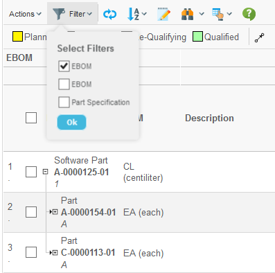
Figure 12. Filter chooser.
5.7.2. Specifying the Expand Criteria
You can specify the expansion criteria inline in the Grid Browser configuration like the example below illustrates.
<Expand>
    <RelationshipPattern>
        <Relationship>relationship_EBOM</Relationship>
        <Relationship>relationship_PartSpecification</Relationship>
    </RelationshipPattern>
    <TypePattern>
        <Type>type_Part</Type>
        <Type>type_DOCUMENTS</Type>
    </TypePattern>
    <Direction>from</Direction>
    <RelationshipWhere></RelationshipWhere>
    <ObjectWhere></ObjectWhere>
</Expand>
The direction can be any of: "from", "to" or "both".
5.7.3. Other Expansions
The other kinds of expansions that can be made are by using: Inquiries, JPOs, Java classes or by specifying a shadow structure.
This is configured by using the following syntax:
<Expand>
    <Mode>...</Mode>
</Expand>
The value you type in is a string specifying the expansion-mode. This is described in details within this document .
Some examples are show below:
<Expand>
    <Mode>jpo:MyJPO:myExpandMethod</Mode>
</Expand>
<Expand>
<Mode>java:com.acme.grid.MyExpander</Mode>
</Expand><Expand>
<Mode>shadow:type_FeatureList,type_RequirementList</Mode>
</Expand><Expand>
<Mode>shadow:type_AType,type_AnotherType:relationship_Rel1,relationship_Rel2</Mode>
</Expand><Expand>
<Mode>shadow::relationship_Rel1,relationship_Rel2</Mode>
</Expand>5.7.4. Initial Expand Mode
In the case when you display multiple root nodes, the first root node is the only one being expanded initially. To change this behaviour, apply the following to your configuration:
<Expand>
    <InitialExpandMode>none|first|all</InitialExpandMode>
</Expand>
The default value is "first".
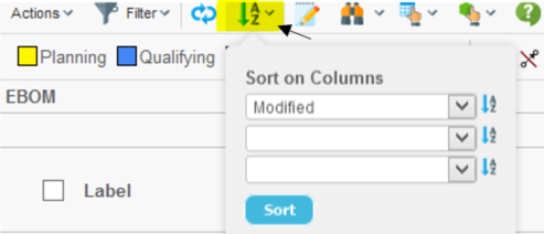
5.8. Sorting the Data
The loaded data can be sorted. Note that when you for example is displaying a structure on the row axis, or the column axis objects are grouped, the sorting behaviour is differs.
<DataLoader inquiry="MyInquiry">
    <Sort by="modified" ascending="true"/>
</DataLoader>
If you rely on the data being shown in the order they are returned from for example a JPO, or if they already are sorted, you can disable the sorting by applying the following attribute:
<DataLoader sortingDisabled="true" .../>
5.9. Grouping Column Objects
The column objects can be grouped together based upon some condition.
The example below illustrates objects being grouped into two categories:
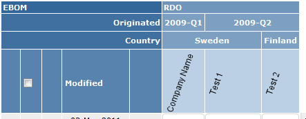
Figure 13. Column grouping.
To accomplish this, use the <Hierarchy> element within the <Columns> element, see this chapter for configuration details.
This example was created with the following configuration:
<Hierarchy>
    <Level key="originated" dateFormat="yyyy-QQQQ">
        <Label>Originated</Label>
    </Level>
    <Level key="attribute[Country]">
        <Label>Country</Label>
    </Level>
</Hierarchy>
5.10. Examples
5.10.1. Data Set Example
Data sets can be used to load data into the grid browser instance. Data sets is a feature available from TVC Core and is described more in detail in the TVC Core Administration Guide.
The example below illustrates how to define a dataset as a loader:
<DataLoader dataSet="tvc:dataset:tvx:enc/GetRDOsInEBOM.xml">
    <Sort by="Name" ascending="true"/>
</DataLoader>
The code for this data set is shown in the example below:
<DataSet>
    <RemoveDuplicates>
        <Select>
            <Statement><![CDATA[
            $<to[relationship_DesignResponsibility].from.id>
            ]]></Statement>
            <Expand>
                <From>true</From>
                <To>false</To>
                <Depth>0</Depth>
                <TypePattern>
                    <Type>type_Part</Type>
                </TypePattern>
                <RelationshipPattern>
                    <Relationship>relationship_EBOM</Relationship>
                </RelationshipPattern>
            </Expand>
        </Select>
    </RemoveDuplicates>
</DataSet>
This definition will first expand the source object (the object coming from the request) along the EBOM relationship to find all Parts. Secondly, for all Parts, select the design responsible organization. Finally, remove all duplicate objects.
5.10.2. Inquiry Loader Example
First, define an inquiry with the properties like below:
Pattern : '*|*|*|$\{OID}'
Format  : '$\{OID}'
Code    : 'temp query bus $\{TYPE} $\{NAME_PATTERN} * limit 10 select id dump |;'

Argument 1:  Name: NAME_PATTERN
            Value: dummy
Argument 2:  Name: TYPE
            Value: dummy
Define the DataLoader in the grid definition like below:
<DataLoader inquiry="MyInquiry">
    <Arg name="NAME_PATTERN" value="A-*"/>
    <Arg name="TYPE" value="type_Part"/>
</DataLoader>
Once the inquiry is evaluated, it will substitute ${TYPE} with the real
name of the type Part, and the ${NAME_PATTERN} with A-*.
For inquiries that returns structured data, the inquiry should be created as below:
Pattern : '${LEVEL}|*|${DIRECTION}|*|*|*|${OID}|${RELID}'
Format  : '${LEVEL}|${DIRECTION}|${OID}|${RELID}'
Code    : 'expand bus ${ID} recurse to all from rel EBOM select bus id select rel id dump |'

Argument 1:  Name: OID
            Value: dummy
5.10.3. JPO Loader Example
First, define a JPO that looks similar to the example below:
public class ${CLASSNAME} {
    public ${CLASSNAME}() {}

    public ${CLASSNAME}(Context ctx, String[] args) {
    }

    public List getData(Context ctx, String[] args) throws Exception {
        HashMap paramMap = (HashMap)JPO.unpackArgs(args);
        String namePattern = (String) paramMap.get("NAME_PATTERN");
        String type = (String) paramMap.get("TYPE");
        ...
    }
}
Define the DataLoader in the grid definition as below:
<DataLoader jpo="MyJPO" method="getData">
    <Arg name="NAME_PATTERN" value="A-*"/>
    <Arg name="TYPE" value="type_Part"/>
</DataLoader>
When the JPO is executed, the arguments are packed and passed to the JPO as arguments.
6. Intersection
The intersections are shown in the right area of the grid and represent the connections between the row and column object. The intersections are calculated by selecting data on the row-object or the column-object, in order to find the other object. How to get from one object to another is defined within the intersection path.
An example configuration is shown below:
<Intersection direction="row-to-col">
    <IntersectionPath>
        <Path from="relationship_PartSpecification"/>
    </IntersectionPath>
    ...
</Intersection>
The definition above would correspond to a data model like below.
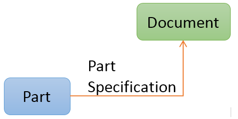
Figure 14. Intersection path illustration
6.1. Intersection Paths
An intersection path defines how to traverse from an object on the row or column axis to the object on the other axis. The path can be as simple as just one relationship between these, but can also be more complicated like having several levels or using relationship that starts from a relationship or ends on a relationship.
Below are some examples how to construct the intersection path depending on the data model.
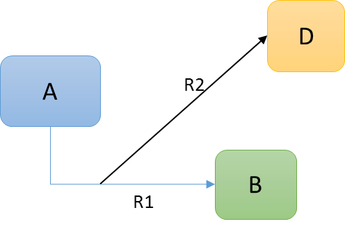
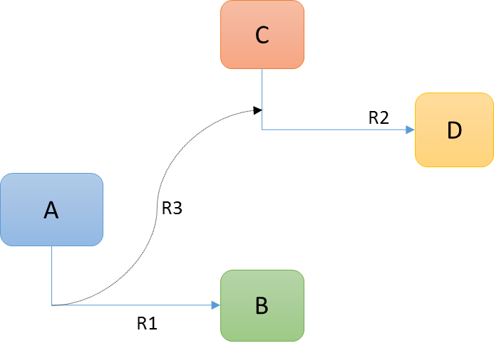
Example 1:
Assuming that object A is shown on the row axis and object C is shown on the column axis
<Intersection direction="row-to-col">
    <IntersectionPath>
        <Path from="R1"/>
        <Path to="R2"/>
    </IntersectionPath>
    ...
</Intersection>
Example 2:
Assuming that object A is shown on the row axis and object C is shown on the column axis
<Intersection direction="row-to-col">
    <IntersectionPath>
        <Path from="R1"/>
        <Path fromRel="R2"/>
    </IntersectionPath>
    ...
</Intersection>
This example illustrates how we to traverse from a relationship into another relationship that is connected from a relationship to a businessobject.
Example 3:
Assuming that object A is shown on the row axis and object C is shown on the column axis
<Intersection direction="row-to-col">
    <IntersectionPath>
        <Path **from**="R1" targetIsRel="true" targetQualifier="to"/>
    </IntersectionPath>
    ...
</Intersection>
This example illustrates how we to traverse from a relationship that points to a relationship that is connected between two business objects.
Example 4:
Assuming that object A is shown on the row axis and object C is shown on the column axis
<Intersection direction="row-to-col">
    <IntersectionPath>
        <Path from="R1" targetIsRel="true" targetQualifier="from"/>
    </IntersectionPath>
    ...
</Intersection>
This example illustrates how we to traverse from a relationship that points to a relationship that is connected between two business objects.
Example 5:
Assuming that object A and B including R1 (or only B+R1) is shown on the row axis and object D is shown on the column axis and R2 is a connection from R1 pointing to object D.
<Intersection direction="row-to-col">
    <IntersectionPath>
        <Path fromRel="R2"/>
    </IntersectionPath>
    ...
</Intersection>
This example illustrates how we to traverse from relationship R1 via relationship R2 to object D.
Example 6:
Assuming that object A and B including R1 (or only B+R1) is shown on the row axis and object D and R2 is shown on the column axis and R3 is a connection from R1 pointing to relationship R2.
<Intersection direction="row-to-col">
    <IntersectionPath>
        <Path fromRel="R3" targetIsRel="true" targetQualifier=""/>
    </IntersectionPath>
    ...
</Intersection>
This example illustrates how we to traverse from relationship R1 via relationship R3 to relationship R2.
Note the special use of the attribute "targetQualifier" here. In case we end on a relationship, this should be empty.
6.2. Cell States
Each intersection can satisfy one or more states. Each state is typically shown with a different color, and each state typically has its own set of element actions available.
You can have as many cell states as you wish, however, an intersection that satisfies more than one state will only use the last defined cell state (according to the order they are defined within the configuration).
A simple cell state definition example below:
<Intersection direction="col-to-row">
    ...
    <CellStates>
        <CellState id="s0" color="red" ifConnected="false">
            <Label>Not Connected</Label>
        </CellState>
        <CellState id="s1" color="green" ifConnected="true">
            <Label>Connected</Label>
        </CellState>
    </CellStates>
</Intersection>
6.2.1. Legend
The legend will show the possible states, and their respective color. It is however possible to exclude a particular state from the legend by setting the attribute "showInLegend" to false on the CellState element.
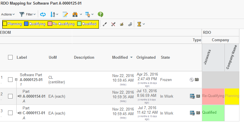
Figure 15. Legend
6.2.2. Conditions
When a cell state applies to an intersection that is being connected, e.g. there exists a connection instance between the row and column object, it is possible to construct more complex cell states that depends upon some value on the connection or from an object on either the to- or from- side of the connection.
This is accomplished by adding Conditions to a CellState element.
A CellState can have multiple Conditions, in this case- all Conditions must be satisfied in order for an element to satisfy the cell state.
The example below shows a basic example using conditions.
<CellState id="s2" ifConnected="true" color="#FFFF00">
<Condition>
<Expression>
$<attribute[attribute_SourceQualificationStatus]>
</Expression>
<Operator>==</Operator>
<Value>Qualifying</Value>
</Condition>
<Label>Qualifying</Label>
</CellState>The example below illustrates how to use more complex conditions by
using the evaluate[] feature in ENOVIA.
<CellState id="s5" ifConnected="true" color="magenta" fontColor="black">
<Condition>
<Expression>
evaluate[MX_CURRENT_TIME - attribute[Date Shipped]]
</Expression>
<Operator><</Operator>
<Value>0</Value>
<Format>real</Format>
</Condition>
<Label>Shipped</Label>
</CellState>| The data-type for the returned value above will be "date". In order to make the comparison, one needs to convert the returned value to a numeric value. This is done via the "Format" element. |
The example above can also be written as:
<CellState id="s5" ifConnected="true" color="magenta" fontColor="black">
<Condition>
<Expression>attribute[Date Shipped]</Expression>
<Operator><</Operator>
<Value>${CURRENT_DATE}</Value>
</Condition>
<Label>Shipped</Label>
</CellState>In this case, the macro ${CURRENT_DATE} has been used to substitute the
value with the current date.
Another example using multiple conditions is shown below:
<CellState id="s6" ifConnected="true" color="yellow" fontColor="red">
<Condition>
<Expression>attribute[Agreed Unit Price]</Expression>
<Operator>></Operator>
<Value>10000</Value>
</Condition>
<Condition>
<Expression>attribute[Agreed Unit Price]</Expression>
<Operator><</Operator>
<Value>20000</Value>
</Condition>
<Label>Expensive</Label>
</CellState>
6.3. Performance Consideration
The configuration defines the direction of the relationship. E.g. whether to start looking from the row object or the column object. At the bottom line, this will result in at least two select statements that are applied to either the row objects or the column objects.
Consider following example:
On the column axis, objects of type Organization are loaded. On the row axis, objects of type Part are loaded. A Part can be associated to an Organization via the relationship "Supplied By". This relationship is routed from the Part to the Organization (see picture below).
Depending on how the Grid Browser is configured, one will start on the "Organization object" and traverse in the "to" direction and find the "Part object" OR start on the "Part object" and traverse in the "from" direction and find the "Organization object".
This would be configured within the Grid Browser configuration as:
<Intersection direction="col-to-row">
    <IntersectionPath>
        <Path to="relationship_SuppliedBy"/>
    </IntersectionPath>
    ...
</Intersection>
Or:
<Intersection direction="row-to-col">
    <IntersectionPath>
        <Path from="relationship_SuppliedBy"/>
    </IntersectionPath>
    ...
</Intersection>
E.g. the first approach results in the following statements to be selected on the Organization objects:
-
to[Supplied By].id
-
to[Supplied By].from.id
The second approach results in the following statements to be selected on the Part objects.
-
from[Supplied By].id
-
from[Supplied By].to.id
The end result will be the same. The problem will become visible if/when an Organization object has a larger amount of Part objects connected; e.g. the number of connections pointing to the Organization object are large.
With the first approach, the select statements will return a larger data-set, which results in degraded performance.
The conclusion is that one should avoid traversing in a direction where the amount of possible connections is high. If you aren’t able to predict this or the number of connections is same or similar independent of the direction, you should strive to make your IntersectionPath going in the "from" direction.
6.4. In Cell Editing
As of 2011.3.0, it is possible to allow the user (in edit mode) to modify intersection information directly in the table (in cell edit).
The fields being open for edit is configured in the Grid Browser configuration and an example of how it could look like in the user interface is shown below:
Figure 16. In-cell edit
The configuration to enable editable fields in the intersection area is shown below:
<Intersection direction="col-to-row">
    ...
    <EditableFields>
        <Field>
            <Label>SQS:</Label>
            <Attribute>attribute_SourceQualificationStatus</Attribute>
            <Setting name="Update UI" value="true"/>
        </Field>
        <Field>
            <Label>Date Shipped:</Label>
            <NoWrap>true</NoWrap>
            <Attribute>attribute_DateShipped</Attribute>
            <Setting name="Editable States" value="s1,s2"/>
        </Field>
        <Field>
            <NoWrap>true</NoWrap>
            <Attribute>attribute_Comments</Attribute>
        </Field>
    </EditableFields>
The configuration details are described in this chapter.
If you are enabling edit to a field that changes the state of an intersection (see this chapter), then you can apply the setting “Update UI" with the value set to true. That will cause the field to be completely updated upon edit. The reason for not doing this by default is due to performance reasons.
Also, if you want to disable edit of fields in particular states, then you can use the setting “Editable States". The value should be a comma separated list of state-id’s, which the field is editable in.
6.5. Custom JPO as Element- or Global- Action
See the following code example for how such a JPO could be written:
import matrix.db.Context;
import matrix.db.JPO;
import com.technia.tvc.gridbrowser.util.JPOParam;
import com.technia.tvc.gridbrowser.util.ElementParam;
import com.technia.tvc.gridbrowser.util.Parameters;

public class ${CLASSNAME} {
    public ${CLASSNAME}() throws Exception {
    }

    public ${CLASSNAME}(Context ctx, String[] args) throws Exception {
    }

    public void perform(Context ctx, String[] args) throws Exception {
        JPOParam param = (JPOParam) JPO.unpackArgs(args);
        ElementParam elements = param.getElementParam();
        Parameters parameters = param.getParameters();

        for (ElementParam.Element e : elements) {
            String rowObjectId = e.getRowObjectId();
            String colObjectId = e.getColObjectId();
            String connectionId = null;
            if (e.hasConnectionId()) {
                connectionId = e.getConnectionId();
            }
            // PERFORM ACTION
        }
    }
}
In order to being able to compile such a JPO, you must ensure that
the MX_CLASSPATH contains the TVC grid browser JAR file.
|
6.5.1. Public API
The API for those classes used by a JPO, is shown below. The methods are self-describing.
The JPOParam class has the following methods:
ElementParam getElementParam()
Parameters getParameters()
The ElementParam class has the following methods
int getCount()
ElementParam.Element get(int index)
ElementParam.Element[] getElements()
The ElementParam.Element class has the following methods
String getRowObjectId()
String getRowRelId()
String getColObjectId()
boolean hasConnectionId()
String getConnectionId()
The Parameters class, has the following methods:
String[] getParamValues(String paramName)
String getParamValue(String paramName)
String getParamValue(String paramName, String defaultValue)
6.6. Disabling a Column or Row
It is possible to disable a complete row or column based upon some condition that is checked against the object on the row-axis. This could for example look like this:
Figure 17. Disabled rows / columns.
To configure this, look at the following configuration example.
<GridBrowser>
    <Rows>
        <DisableIf>current == "Create" OR current == "Preliminary"</DisableIf>
    </Rows>
    <Columns>
        <DisableIf>name == P*22</DisableIf>
    </Columns>
</GridBrowser>
These statements are evaluated per object on the axis they are defined for. Such a statement should typically return TRUE or FALSE in order to work properly. To test if an expression is valid and correct is easiest done from MQL, like this example:
<MQL> pri bus 1.2.3.4 select evaluate[current == "Create" OR current == "Preliminary"] dump;
This must return either TRUE or FALSE in order to be useful.
The select evaluate[] clause in MQL were introduced in 10.6.3
|
6.6.1. Dynamic Values
Sometimes, there is a need to be able to evaluate an expression were something depends upon the starting object (e.g. the object that the Gridbrowser were launched for/with).
It is possible to use macros within the <DisableIf> elements. A
macro is something that is replaced with a value at runtime.
<Columns>
    <DisableIf>to.from.id ~~ "${OBJECTID}"</DisableIf>
</Columns>
This macro contains the ${OBJECTID} macro, which refers to the object-id of the starting object. The macro is resolved before it is being evaluated.
Examples of other macros that would work:
-
${USER}
-
${TYPE}
-
${NAME}
-
${REVISION}
-
${CURRENT}
-
${POLICY}
-
${OBJECTID}
-
${OID}
-
${attribute[Weight]}
The expression applies by default on the object. It is possible to make it apply to the relationship associated with the column or row object. In that case, you can define the expression like:
<Columns>
    <DisableIf relationship="true">...</DisableIf>
</Columns>
7. UI Configuration
This chapter defines how to configure the user interface for the Grid Browser, such as enabling a toolbar, context menu, toolbar context buttons and other buttons.
7.1. Toolbar
A toolbar can be made available within a Grid Browser page. To add a toolbar apply this to your configuration:
<GridBrowser>
    <ToolBar>The Name of Your Menu</ToolBar>
</GridBrowser>
Any command that is invoked will, if the setting "Submit" is set to true, get all the selected rows and all selected elements/intersections available as request parameters.
7.1.1. Parameters Submitted
The selected rows are submitted as traditionally using the "emxTableRowId" parameter. All elements that are submitted will be passed with the "element" parameter. In order to parse the values of both these parameters, one can take advantage of the following classes:
| Class | Parameter |
|---|---|
com.technia.tvc.core.db.aef.misc.TableRowIdParam |
emxTableRowId |
com.technia.tvc.gridbrowser.util.ElementParamUtils |
element |
Example code:
import com.technia.tvc.core.db.aef.misc.TableRowIdParam;
import com.technia.tvc.gridbrowser.util.ElementParamUtils;
import com.technia.tvc.gridbrowser.util.ElementParam;
...
ElementParam ep = ElementParamUtils.parseFromRequest(request);
ElementParam.Element[] e = ep.getElements();
for (int i=0; i<e.length; i++) {
    e[i].getRowObjectId();
    e[i].getRowRelId();
    e[i].getColObjectId();
    e[i].getColRelId();
    e[i].getConnectionId();
}
...
TableRowIdParam trip = new TableRowIdParam(request);
int count = trip.getRowCount();
for (int i=0; i<count; i++) {
    trip.getObjectIdAt(i);
    trip.getRelationshipIdAt(i);
}
In order to allow the user to select rows within the Grid Browser, one need to enable the checkboxes or radio buttons for each row. This is accomplished by applying the following to the configuration:
<GridBrowser>
    <UIFunctions>
        <SelectionMode>none|single|multiple</SelectionMode>
    </UIFunctions>
</GridBrowser>| The commands that are used in the toolbar can not be configured to detect if and how many elements from the intersections that have been selected, it will only control if and how many rows that have been selected. The number of selected elements has to be controlled after the command has been invoked. |
7.2. Toolbar Buttons
The toolbar can contain a number of so called context buttons. These are displayed to the right of the "mass-operation" actions (if present). See screenshot below:
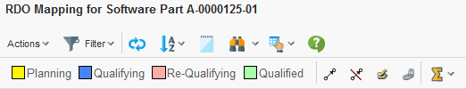
Figure 18. Toolbar buttons
7.2.1. Find / Search
The find/search functionality is enabled by:
<UIFunctions>
    <Find>true</Find>
</UIFunctions>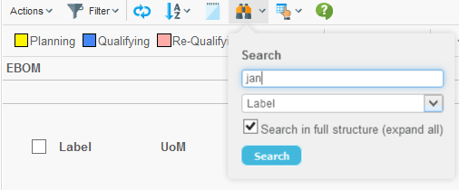
Figure 19. Find/filter.
7.2.2. Printer Friendly
The printer friendly functionality is enabled by:
<UIFunctions>
    <PrinterFriendly>true</PrinterFriendly>
</UIFunctions>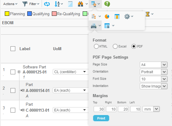
Figure 20. Printer friendly dialog
7.2.3. Export
The export functionality is enabled by:
<UIFunctions>
    <Export>true</Export>
</UIFunctions>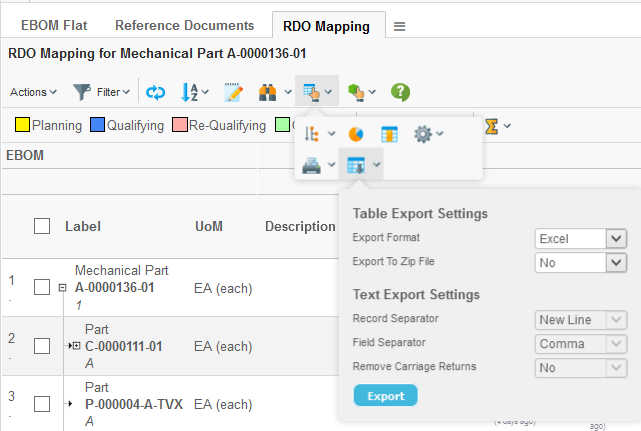
Figure 21. Export dialog
7.2.4. Preferences
The preferences functionality is enabled by:
<UIFunctions>
    <Preferences>true</Preferences>
</UIFunctions>
The preferences dialog is used to define the pagination settings.
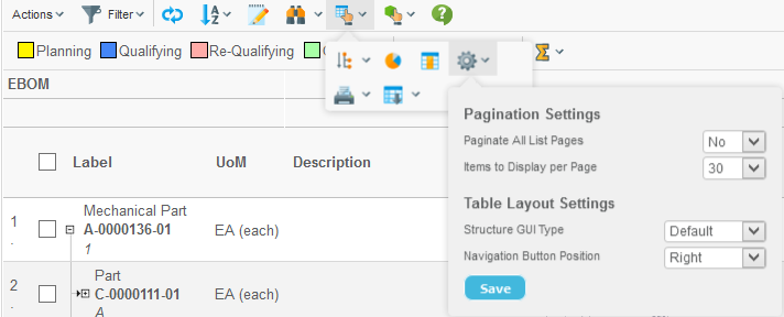
Figure 22. Preferences dialog
7.2.5. Help
A help button can be enabled within the Grid Browser. This is done by adding the help marker to the configuration, like:
<UIFunctions>
    <HelpMarker>topic-within-the-help-docs</HelpMarker>
</UIFunctions>
This requires that the "suiteKey" parameter is available in the URL that is starting the Grid Browser. If the suiteKey is not passed, you can manually define this within the configuration like:
<UIFunctions>
    <HelpMarker>topic-within-the-help-docs</HelpMarker>
    <SuiteKey>EngineeringCentral</SuiteKey>
</UIFunctions>
You can also specify your own Help URL if you are using a custom help documentation. This is done by:
<UIFunctions>
    <HelpMarker>topic-within-the-help-docs</HelpMarker>
    <HelpURL>HelpPage.html</HelpURL>
</UIFunctions>
Once the button has been enabled, it will be shown like below:
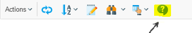
Figure 23. Help button.
7.2.6. Clipboard / Collection
The clipboard, the "add to collection" and "manage collections" functions can be made available. If all are enabled, the following will be available:
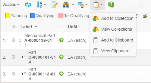
Figure 24. Clipboard and collection related functions.
<UIFunctions>
    <Clipboard>true</Clipboard>
    <AddToCollection>true</AddToCollection>
    <ManageCollections>true</ManageCollections>
</UIFunctions>
7.2.7. Promote / Demote
Promote and Demote is enabled by:
<UIFunctions>
    <Promote>true</Promote>
    <Demote>true</Demote>
</UIFunctions>
Once enabled the buttons will be shown like below:
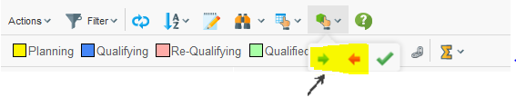
Figure 25. Promote and Demote.
7.2.8. Trigger Validation (V62009x or later)
The trigger validation button can be enabled by:
<UIFunctions>
    <TriggerValidation>true</TriggerValidation>
</UIFunctions>
Once enabled the button will be shown like below:
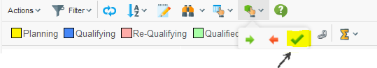
Figure 26. Trigger validation.
7.2.9. Comparison (V62009x or later)
The object comparison button can be enabled by:
<UIFunctions>
    <Compare>true</Compare>
</UIFunctions>
Once enabled the button will be shown like below:
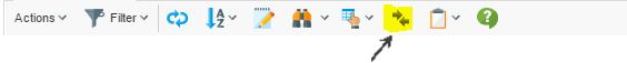
Figure 27. Object comparison.
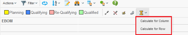
7.2.10. State Calculation
The state calculation tool allows the user to perform calculation based upon the data in the grid. When this tool has been enabled, a new button is available in the toolbar as shown below:
The calculation is performed based upon either the objects in the column- or the row- axis and will show the number of cells matching a particular state.
In the example below, there calculation was performed for the column axis (contained two objects). The columns represent the available states a cell could have, and the values are the number of objects on the row axis that fulfilled a particular state. The right most column (Total) shows the aggregated value for the columns on the current row.
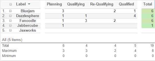
The calculation result is opened in a table above the original Grid Browser page. To go back to the Grid Browser page, simply click the go-back icon available in the top-left corner.
To enable the calculation feature, apply the following to your configuration within the UIFunctions section:
<UIFunctions>
    <StateSummary>true</StateSummary>
</UIFunctions>
7.3. Other Buttons
7.3.1. Filter Chooser
If you are displaying a structure on the row axis, and the structure is using filters for expanding the structure, you can enable the filter chooser that allows the user to choose the current active filter.
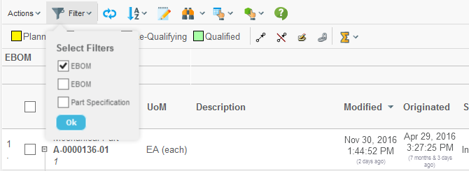
Figure 28. Filter chooser
If the filters have been configured to not allow combining different filters, the filters chooser becomes a drop-down list.
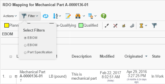
Figure 29. Filter chooser as drop-down
7.3.2. Reload
The reload button is used for refreshing the data in the Grid Browser from the database. This button is enabled by:
<UIFunctions>
    <Reload>true</Reload>
</UIFunctions>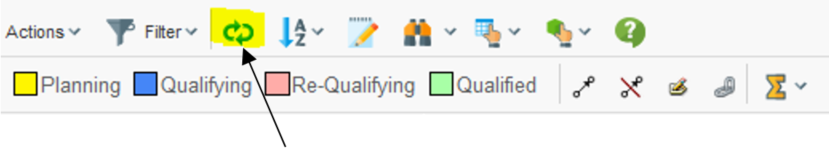
Figure 30. Reload button
| The reload button will not re-launch the data loaders used to populate the row- and column- axis. Only the data displayed inside the Grid Browser is reloaded. |
7.3.3. Expand All
If you are displaying a structure on the row-axis and the structure allows performing an expand all, the "expand all" button will be visible (if configured so).
<UIFunctions>
    <ExpandAll>true</ExpandAll>
</UIFunctions>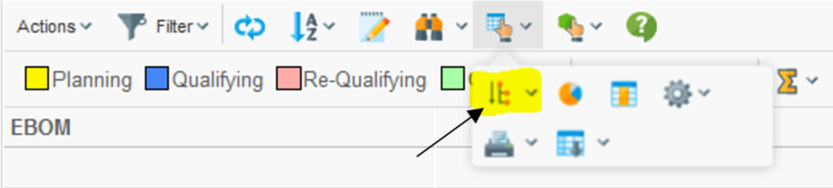
Figure 31. Expand all button
7.3.5. Toggle Edit Mode
If you have columns that are editable, you can enable the toggle-edit-mode button that allows the user to enter edit mode and perform in-cell-edit. This is enabled by:
<UIFunctions>
    <Edit>true</Edit>
</UIFunctions>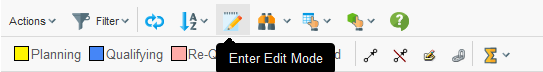
Figure 33. Toggle edit button
To configure the page to be editable directly when the page is loaded, one can add this:
<UIFunctions>
    <Edit>true</Edit>
    <InitiallyEditable>true</InitiallyEditable>
</UIFunctions>
7.3.6. Disconnect
If you are displaying a structure, you can enable the disconnect button that allows the user to disconnect items in the structure. This is enabled by:
<UIFunctions>
    <Disconnect>true</Disconnect>
</UIFunctions>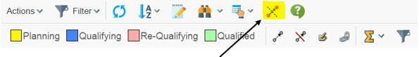
Figure 34. Disconnect button
7.3.7. Chart
This is enabled by:
<UIFunctions>
    <Chart>true</Chart>
</UIFunctions>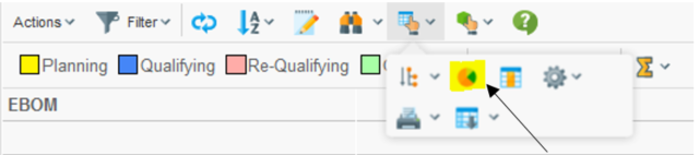
Figure 35. Chart button
7.3.8. Maximize
The maximize button can be used to extend the area, which the Grid Browser has available when displayed next to the category tree in an AEF application. This is enabled by:
<UIFunctions>
    <Maximize>true</Maximize>
</UIFunctions>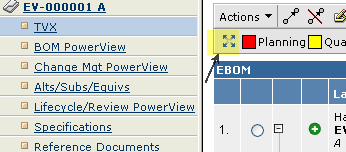
Figure 36. Maximize button
| The maximize button will only be enabled if the Grid Browser is shown in the content frame next to the category tree. |
7.4. Context Menu – Row Axis
It is possible to assign a context menu (available on right click) for the row axis objects. An example how this could look is shown below:
Figure 37. Context menu
The context menu is defined by:
<GridBrowser>
    <ContextMenu>The name of the context menu</ContextMenu>
</GridBrowser>
7.5. Table Columns – Row Axis
The objects on the row axis can contain additional columns showing meta-data related to these objects and/or connections.
These columns are defined within the "Rows" section of the Grid Browser configuration. Example:
<GridBrowser>
    <Rows>
        <Cols>
            <Col>
                <Header>Desc.</Header>
                <Expression>description</Expression>
                <AllowShowMore>true</AllowShowMore>
                <TextLength>10</TextLength>
                <Editable>true</Editable>
            </Col>
            <Col>...
            <Col>...
        </Cols>
    </Rows>
</GridBrowser>| The more columns you add, the less space is left for the intersections to the right. If the width of the left side exceeds the screen-size, the user will not be able to work with the intersections. Strive to use as few columns as possible. Some meta-data could be displayed within tooltips or you can look at this chapter, which describes how to load another structure browser instance with the objects from the row- or column- axis. |
7.5.1. Apply on Relationships
The expression defined within the column applies by default on the business object. To make it apply on the relationship, one can do this by:
<Col usesBusinessObject="false">
7.5.2. Settings
Settings can be defined by using two approaches. The example below illustrates how to set the "Text Length" setting:
<Col>
    <Setting name="Text Length" value="0"/>
    <!-- OR -->
    <Setting name="Text Length">0</Setting>
</Col>
<Col>
<TextLength>true</TextLength>
</Col>The end result is same.
For information about all the available settings, please look in the Structure Browser Administration Guide for more details.
For information about the XML elements that corresponds to a particular column setting, look into this document.
| Some of the settings are not supported. Especially the settings related to Calculations and Group Header. |
7.6. Row Actions – Row Axis
Actions that apply to the row-objects can be enabled by defining so called Row Actions.
The row actions are displayed in the last column on the left side, as the screenshot below illustrates:
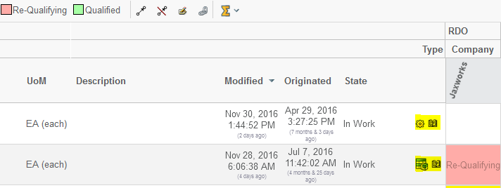
Figure 38. Row Actions
These can be used for quickly launching a particular action for the object on the row.
The configuration snippet below illustrates how to add these:
<GridBrowser>
    <Rows>
        <Actions>
            <Action>
                <IconType>smallicon</IconType>
                <Link>
                    <Href>emxTree.jsp</Href>
                    <TargetLocation>popup</TargetLocation>
                    <Modal>true</Modal>
                    <RegisteredSuite>EngineeringCentral</RegisteredSuite>
                    <WindowSize>800x600</WindowSize>
                </Link>
                <Label>Details Page</Label>
            </Action>

            <Action>
                <IconSrc>/tvc/structurebrowser/images/history.gif</IconSrc>
                <Link>
                    <Href>${ROOT_DIR}/tvc-action/showHistory</Href>
                    <TargetLocation>popup</TargetLocation>
                    <Modal>false</Modal>
                    <RegisteredSuite>EngineeringCentral</RegisteredSuite>
                    <WindowSize>600x500</WindowSize>
                </Link>
                <Label>History</Label>
            </Action>
        </Actions>
     </Rows>
</GridBrowser>
7.7. Row Counter
The counter showing the row number can be enabled or disabled through:
<UIFunctions>
    <RowCounter>true</RowCounter>
</UIFunctions>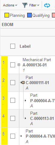
Figure 39. Row counter
7.8. Rotated Column Header
The header for the columns header can be rotated in an arbitrary angle. See screenshot below.
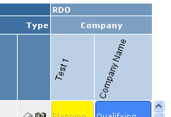
Figure 40. Rotated column headers.
This is configured on the "Columns" element, as shown below:
<Columns rotateHeader="true" headerRotationAngle="-70">
It is also possible to specify the vertical alignment of the column header. See configuration example below:
<Columns rotateHeader="true" rotatedHeaderAlignment="bottom | top | middle"/>
7.9. Custom Rendering
It is possible to customize the rendering of the Grid Browser. This is
accomplished by specifying the fully qualified class name to a class
that extends from com.technia.tvc.gridbrowser.render.GridBrowserRenderer.
This classname is registered within the configuration like shown below:
<GridBrowser>
    ...
    <Renderer>com.acme.gridbrowser.MyRenderer</Renderer>
</GridBrowser>
The capability of customize the rendering requires in many cases the need for having access to additional data from the intersections. A similar concept to datahandlers exists also in Grid Browser, however, in the Grid Browser this is called "Intersection Evaluator". To register a custom intersection evaluator, you can do so as shown below:
<GridBrowser>
    ...
    <Intersection>
    <Evaluator>com.acme.gridbrowser.MyEvaluator</Evaluator>
    ...
    </Intersection>
    ...
</GridBrowser>
The class name you register here must point to a class that extends from
com.technia.tvc.gridbrowser.model.IntersectionEvaluator.
There are several methods that can be overridden from this base class, but to solve the case when you need to select additional data from the intersection connections, you should override the following methods:
public void prepareIntersectionDataEvaluation(EvaluationInput input)
public IntersectionData getIntersectionData(EvaluatedData data)
The first method is used to specify the select statements you want to be evaluated over the connections. The latter method is used to return an object that holds these values. Note that the return value must be a class that extends the base class called "IntersectionData".
To use this data later on in your renderer, you will simply do something like shown below:
public class MyRenderer extends GridBrowserRenderer {
    ...
    protected void renderElementContent(ElementRenderContext ctx) {
        MyIntersectionData d = (MyIntersectionData)
        ctx.getElement().getIntersectionData();
        ...
    }
}
8. Integration with TVC Structure Browser
8.1. Choose Column or Row Axis Objects
Choosing the objects are done by either selecting objects from a search result, a collection, the clipboard or a combination of the previous mentioned possibilities (by using "revise query"). See screenshots further below.
Also, a filtering mechanism has been added that ensures that the selected objects aren’t illegal to use in the particular Gridbrowser use case. Use of "illegal" objects could potentially result in an inconsistent database, were objects that shouldn’t be connected to each other becomes connected etc.
Also, in order to not face a situation where the server becomes unstable due to out-of-memory errors etc, because a user selects 1000+ objects to be loaded into the grid; you can define a maximum limit.
8.1.1. Use Case Flow
A link somewhere in the UI launches the grid [1]. The grid is supposed to be shown in frame [2].
In this case, the link that launches the Gridbrowser is a command in the category tree for Parts. It could in a different use case be a tab in a tabbed page etc.
After clicking the link, a popup window is shown with the search tool available. Depending on how this has been configured (the search tool) different kinds of searches can be performed.
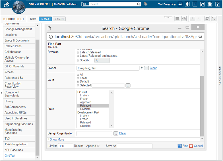
Performing the search gives the search result page, from where the user is able to select object(s).
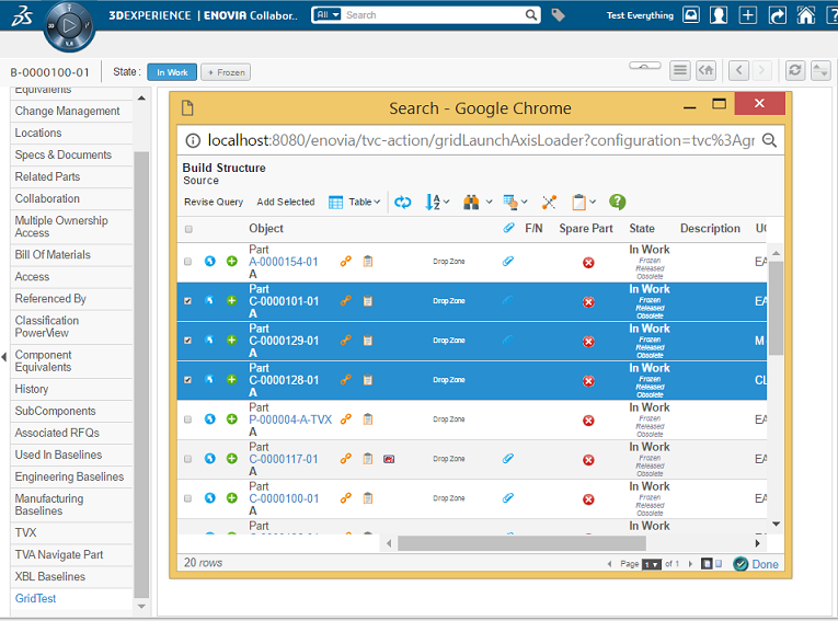
The user marks the objects and hits "Add Selected" or "Done". Using the "Add Selected" allows the user to "revise the query" and find some additional objects.
When objects have been added, the user will see so in the yellow message-area above the table.
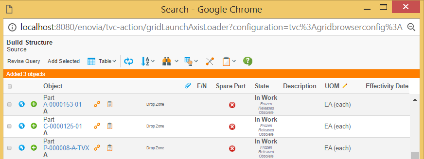
If the user adds an object that is not valid for this use case, a different message is shown.
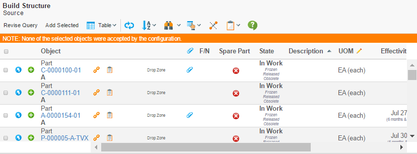
Or in case at least one was accepted but one or more were rejected:
Once all set, the user clicks the "Done" button in the lower right position in the window. This will close the window and open the grid browser. (NB: If the user hasn’t selected any object and clicks done, an error message is shown).
8.1.2. How to Launch and Configure the Integration with the "Search tool"
The use of the search tool to select objects, doesn’t affect the actual grid browser configuration.
To launch the Gridbrowser with the search tool, the URL/href should look like this:
${ROOT_DIR}/tvc-action/gridInitAxisLoader
This URL accepts/requires a couple of parameters:
| Parameter | Description | Required | Example |
|---|---|---|---|
configuration |
The name of the grid browser configuration to be used. |
Yes |
Grid1 |
searchConfig |
The name of a search configuration definition that defines how the search dialog/function operates. This configuration also points out the page-configuration definition that is used on the search result page. |
Yes |
SearchConfig1 |
axis |
Defines if the objects get loaded into the column or row axis. |
Yes |
col row |
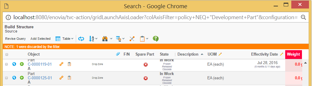
colAxisFilter |
An additional filter that can be used to determine if the selected object(s) are valid in this use case. |
No |
policy EQ "EC Part" |
rowAxisFilter |
See "colAxisFilter" |
| A search configuration is either a business object of type "TVC Search Configuration" or a XML configuration file. The details how to configure these structure browser related functions are described in more detail in other documentation. |
8.1.3. New Query / Reset Grid
In order to allow the user to reset the grid and perform a new query, it is possible by adding a command in the toolbar that looks like this example:
<Command>
    <Href>javascript:parent.parent.startOver();</Href>
    <Label>New Search</Label>
</Command>
Clicking this command is the same as re-clicking the command that launched this Gridbrowser instance originally.
8.2. Adding Objects to a Gridbrowser (Add Existing)
In some use-cases it is required to be able to add an object to the Gridbrowser. The easiest way to do this is to use the search tool from the Structure browser. Below are some descriptions how to do this.
-
A command that launches the search tool is needed in the toolbar.
<Command> <Href>${ROOT_DIR}/tvc-action/beginSearch?searchConfig=tvc:searchconfig/AddColObject.xml</Href> <TargetLocation>popup</TargetLocation> <WindowHeight>600</WindowHeight> <WindowWidth>800</WindowWidth> <Label>Add column objects</Label> </Command> -
The search configuration object defines the search criteria + the page configuration object to be used. It could for example look like this example.
<SearchConfig> <Header>Add Existing</Header> <SubHeader></SubHeader> <FindLikeTypes> <FindLikeType name="type_Part" default="true"/> </FindLikeTypes> <AllowOpenCollection>true</AllowOpenCollection> <AllowExecuteSavedQuery>true</AllowExecuteSavedQuery> <PageConfiguration>**tvc:pageconfig/AddColObject.xml**</PageConfiguration> </SearchConfig> -
The page configuration object needs to contain a couple of parameters, which all are used to grab the selected objects from the search result and add them to the Gridbrowser. See the partial page configuration section below.
<PageConfiguration>
    ...
    <Parameters>
        <Parameter name="SubmitURL" value="javascript:top.opener.parent.frames[1].addObjectsFromSB(self,true);"/>
        <Parameter name="SubmitLabel" value="tvc.structurebrowser.button.select" />
        <Parameter name="CancelButton" value="true" />
        <Parameter name="CancelURL" value="javascript:top.close();" />
        <Parameter name="CancelLabel" value="tvc.structurebrowser.button.done"/>
    </Parameters>
</PageConfiguration>
The SubmitURL calls a JavaScript function in the Gridbrowser. This JavaScript takes two arguments; the first is the "window" and the second is a Boolean parameter where true means "column-axis".
8.3. Loading Objects / Connections to a Structure Browser Instance
In order to allow modifying/working with the objects on the column-axis, the objects on the row-axis or the connections that represents the intersection between the row/column objects; a convenient action has been added that allows loading these into a structure browser instance.
${ROOT_DIR}/tvc-action/gridOpenInTable
This URL accepts/requires some parameters:
| Parameter | Description | Required | Example |
|---|---|---|---|
pageConfig |
The name of the page-configuration to be used on the page. |
Yes |
tvc:pageconfig/PC1.xml |
axis |
Tells the "action" what to load into the structurebrowser. If this parameter is omitted, only the selected elements within the request will be used to populate the table. In this case, remember to have the setting Submit set to true on that command. To control if all intersections over paginated pages should appear use the init parameter
|
No |
columns rows elements |
inplace |
Whether or not the structure browser instance should be opened "in-place" over the Grid Browser or if it is opened in a popup window. When setting this value to either true or false, you must ensure that the "Target Location" setting on the command is adjusted accordingly. If TRUE, the "Target Location" must be "tableContentFrame". If FALSE, the "Target Location" must be set to "popup". |
No |
true |
unique |
A Boolean specifying if only unique occurrences of the object/relationship combination should appear in the loaded structure browser instance. |
No |
true (default) false |
excludeObjectId |
A Boolean specifying if to exclude the object id. |
No |
True False (default) |
excludeRelationshipId |
A Boolean specifying if to exclude the relationship id |
No |
True False (default). |
For example, having a toolbar with the following commands:
<Menu>
<Menu>
<Label>Actions</Label>
<Command>
<URL action="gridOpenInTable">
<Param name="pageConfig" value="tvc:pageconfig:tvx:enc/EBOM_RDO1.xml"/>
<Param name="inplace" value="true"/>
</URL>
<SubmitForm>true</SubmitForm>
<Label>Open Selected Elements</Label>
<TargetLocation>tableContentFrame</TargetLocation>
</Command>
<Command>
<Href>${ROOT_DIR}/tvc-action/gridOpenInTable?pageConfig=tvc:pageconfig:ev/Grid.xml&axis=columns</Href>
<Label>Open Column Objects</Label>
<TargetLocation>popup</TargetLocation>
</Command>
<Command>
<Href>${ROOT_DIR}/tvc-action/gridOpenInTable?pageConfig=tvc:pageconfig:ev/Grid.xml&axis=rows</Href>
<Label>Open Row Objects</Label>
<TargetLocation>popup</TargetLocation>
</Command>
<Command>
<Href>${ROOT_DIR}/tvc-action/gridOpenInTable?pageConfig=tvc:pageconfig:ev/Grid.xml&axis=elements</Href>
<Label>Open Elements</Label>
<TargetLocation>popup</TargetLocation>
</Command>
</Menu>
</Menu>Gives a toolbar in the Gridbrowser UI that looks like this:
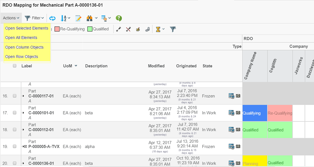
Choosing one of them opens the structure browser window in a popup window. Depending on how it has been configured, it will have different look. This example just opens a simple table that is open for edit directly.
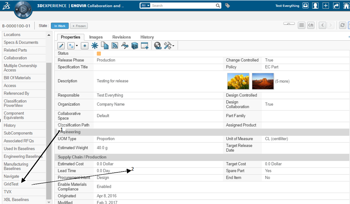
9. Configuration Details
This chapter describes the format of the configuration.
9.1. Localization (i18n)
All labels, headers, sub-headers and tooltips are locale aware, i.e. they can be configured differently for different languages. The way to do this is shown in the examples below:
<Label>This is the default label</Label>
<Label locale="de">This is a German label</Label>
<Label locale="fi">This is a Finnish label</Label>

<Header>This is the default header</Header>
<Header locale="de">
<Header locale="sv">
<Header locale="en">
All labels and headers also support localization using string resources.
9.2. The Grid Browser Definition
The Grid Browser definition contains several sections that control the Grid Browser instance. All these XML elements are described in the subchapters.
9.2.1. Example
<?xml version="1.0" encoding="UTF-8"?>
<GridBrowser xmlns="http://technia.com/TVC/GridBrowserConfig" xmlns:xsi="http://www.w3.org/2001/XMLSchema-instance" xsi:schemaLocation="http://technia.com/TVC/GridBrowserConfig http://products.technia.com/tvc/schema/latest/GridBrowserConfig.xsd">
<Columns href="common/emxTree.jsp" rotateHeader="true" headerRotationAngle="-70" rotatedHeaderAlignment="middle">
<Header>RDO</Header>
<DataLoader dataSet="tvc:dataset:tvx:enc/GetRDOsInEBOM.xml">
<Sort by="Name" ascending="true" />
</DataLoader>
<DisableIf>current != Active</DisableIf>
<ToolTip>
<Basic name="type" />
<Basic name="name" />
<Basic name="current" />
</ToolTip>
<Label>
<Line formatters="bold,nowrap,center">$<name></Line>
</Label>
<Groups>
<Group key="name">
<Label>Name</Label>
</Group>
<Group key="type">
<Label>Type</Label>
</Group>
</Groups>
<Hierarchy>
<Level key="type" show="type">
<Label>Type</Label>
</Level>
</Hierarchy>
</Columns>
<Rows href="common/emxTree.jsp">
<Header>EBOM</Header>
<DataLoader format="indented">
<Expand>
<Filters combinable="true">
<Filter name="tvc:filter:tvx:enc/EBOMFrom.xml" active="true" />
<Filter name="tvc:filter:tvx:enc/EBOMTo.xml" />
<Filter name="tvc:filter:tvx:enc/PartSpecificationFrom.xml" />
</Filters>
<InitialExpandDepth>1</InitialExpandDepth>
</Expand>
</DataLoader>
<DisableIf>(policy == 'EC Part' AND current != Preliminary) OR (policy == 'Development Part' AND current != Create)</DisableIf>
<ToolTip>
<Basic name="type" />
<Basic name="name" />
<Basic name="revision" />
<Basic name="owner" />
<Basic name="current" />
</ToolTip>
<Label>
<Line formatters="nowrap,left">$<type></Line>
<Line formatters="bold,nowrap,left">$<name></Line>
<Line formatters="italic,left">$<revision></Line>
</Label>
<Cols>
<Col>
<Header>Description</Header>
<Expression>description</Expression>
</Col>
<Col>
<Header>UoM</Header>
<Expression>$<attribute[attribute_UnitofMeasure].value></Expression>
<Setting name="editable">true</Setting>
<Setting name="AutoCompleteHandler">ranges</Setting>
<ColumnType>autocomplete</ColumnType>
</Col>
<Col>
<Header>Modified</Header>
<Expression>modified</Expression>
<ColumnType>datetime</ColumnType>
</Col>
<Col>
<Header>Originated</Header>
<Expression>originated</Expression>
<ColumnType>datetime</ColumnType>
</Col>
<Col>
<Header>State</Header>
<Expression>current</Expression>
</Col>
</Cols>
<Actions>
<Action>
<IconType>smallicon</IconType>
<Link>
<Href>../tvc/core/tvcDebugRequest.jsp</Href>
<TargetLocation>popup</TargetLocation>
<Modal>true</Modal>
<RegisteredSuite>EngineeringCentral</RegisteredSuite>
<WindowSize>800x600</WindowSize>
</Link>
<Label>Example</Label>
</Action>
<Action>
<IconSrc>/tvc/structurebrowser/images/history.gif</IconSrc>
<Link>
<Href>${ROOT_DIR}/tvc-action/showHistory</Href>
<TargetLocation>popup</TargetLocation>
<Modal>false</Modal>
<RegisteredSuite>EngineeringCentral</RegisteredSuite>
<WindowSize>600x500</WindowSize>
</Link>
<Label>History</Label>
</Action>
</Actions>
</Rows>
<Intersection direction="col-to-row">
<IntersectionPath>
<Path from="relationship_DesignResponsibility" />
</IntersectionPath>
<EditableFields>
<Field>
<Label>SQS:</Label>
<Attribute>attribute_SourceQualificationStatus</Attribute>
<Setting name="Update UI" value="true" />
</Field>
<Field>
<Label>Date Shipped:</Label>
<NoWrap>true</NoWrap>
<Attribute>attribute_DateShipped</Attribute>
<Setting name="Editable States" value="s1,s2,s3" />
</Field>
<Field>
<NoWrap>true</NoWrap>
<Attribute>attribute_Comments</Attribute>
</Field>
</EditableFields>
<CellStates>
<CellState id="s0" showInLegend="false" ifConnected="false">
<Label>Not Assigned</Label>
</CellState>
<CellState id="s1" ifConnected="true" color="#FFF500" fontColor="#CDAF6E">
<Condition>
<Expression>$<attribute[attribute_SourceQualificationStatus]></Expression>
<Operator>==</Operator>
<Value>Planning</Value>
</Condition>
<Label>Planning</Label>
</CellState>
<CellState id="s2" ifConnected="true" color="#4586F7" fontColor="#F0F0F0">
<Condition>
<Expression>$<attribute[attribute_SourceQualificationStatus]></Expression>
<Operator>==</Operator>
<Value>Qualifying</Value>
</Condition>
<Label>Qualifying</Label>
</CellState>
<CellState id="s3" ifConnected="true" color="#ffaca8" fontColor="#AC7570">
<Condition>
<Expression>$<attribute[attribute_SourceQualificationStatus]></Expression>
<Operator>==</Operator>
<Value>Re-Qualifying</Value>
</Condition>
<Label>Re-Qualifying</Label>
</CellState>
<CellState id="s4" ifConnected="true" color="#a8ffa6" fontColor="#339933">
<Condition>
<Expression>$<attribute[attribute_SourceQualificationStatus]></Expression>
<Operator>==</Operator>
<Value>Qualified</Value>
</Condition>
<Label>Qualified</Label>
</CellState>
</CellStates>
<Label>
<Line>$<attribute[attribute_RTSID]></Line>
<Line>$<attribute[attribute_SourceQualificationStatus]></Line>
</Label>
<ToolTip>
<Attribute name="attribute_Comments" />
</ToolTip>
</Intersection>
<ElementActions>
<Connect relationship="relationship_DesignResponsibility" order="0">
<For-State>s0</For-State>
<Label>Assign</Label>
<Access>
<RoleList>
<Role>role_DesignEngineer</Role>
</RoleList>
</Access>
</Connect>
<SetAttributes order="1">
<For-State>s2</For-State>
<For-State>s3</For-State>
<For-State>s4</For-State>
<Label>Set to Planning</Label>
<Attribute name="attribute_SourceQualificationStatus">Planning</Attribute>
</SetAttributes>
<SetAttributes order="2">
<For-State>s1</For-State>
<For-State>s3</For-State>
<For-State>s4</For-State>
<Label>Set to Qualifying</Label>
<Attribute name="attribute_SourceQualificationStatus">Qualifying</Attribute>
</SetAttributes>
<SetAttributes order="3">
<For-State>s1</For-State>
<For-State>s2</For-State>
<For-State>s4</For-State>
<Label>Set to Re-Qualifying</Label>
<Attribute name="attribute_SourceQualificationStatus">Re-Qualifying</Attribute>
</SetAttributes>
<SetAttributes order="4">
<For-State>s1</For-State>
<For-State>s2</For-State>
<For-State>s3</For-State>
<Label>Set to Qualified</Label>
<Attribute name="attribute_SourceQualificationStatus">Qualified</Attribute>
</SetAttributes>
<EditAttributes order="5">
<For-State>s1</For-State>
<For-State>s2</For-State>
<For-State>s3</For-State>
<For-State>s4</For-State>
<Label>Edit Attributes</Label>
<Label locale="sv">Redigera Attribut</Label>
<Form>
<WindowSize>800x600</WindowSize>
<Header>Edit attributes</Header>
<Header locale="sv">Redigera Attribut</Header>
<Field attribute="attribute_Comments" rows="3" cols="40" />
<Field attribute="attribute_SourceQualificationStatus" />
<Field attribute="attribute_ShowSubComponents" />
<Field attribute="attribute_ShowTargetCost" />
<Field attribute="attribute_SourceSelectionStatus" />
<Field attribute="attribute_AgreedUnitPrice" />
<Field attribute="attribute_RTSID" />
<Field attribute="attribute_SubComponentLevel" />
<Field attribute="attribute_DateShipped" />
</Form>
</EditAttributes>
<Disconnect order="6">
<For-State>s1</For-State>
<For-State>s2</For-State>
<For-State>s3</For-State>
<For-State>s4</For-State>
<Label>Disconnect</Label>
</Disconnect>
<OpenLink order="100">
<For-State>s1</For-State>
<For-State>s2</For-State>
<For-State>s3</For-State>
<For-State>s4</For-State>
<Link excludeObjectId="true">
<Href>${ROOT_DIR}/tvc-action/showHistory</Href>
<TargetLocation>popup</TargetLocation>
<WindowSize>800x600</WindowSize>
<RegisteredSuite>EngineeringCentral</RegisteredSuite>
</Link>
<Label>Show History</Label>
</OpenLink>
</ElementActions>
<GlobalActions>
<MultiConnect relationship="relationship_DesignResponsibility">
<For-State>s0</For-State>
<Label>Assign</Label>
<Access>
<RoleList>
<Role>role_AdministrationManager</Role>
</RoleList>
</Access>
</MultiConnect>
<MultiDisconnect>
<For-State>s1</For-State>
<For-State>s2</For-State>
<For-State>s3</For-State>
<For-State>s4</For-State>
<Label>Un-Assign</Label>
<Access>
<RoleList>
<Role>role_AdministrationManager</Role>
</RoleList>
</Access>
</MultiDisconnect>
<MultiEdit>
<For-State>s1</For-State>
<For-State>s2</For-State>
<For-State>s3</For-State>
<For-State>s4</For-State>
<Label>Edit Attributes</Label>
<Form>
<WindowSize>800x600</WindowSize>
<Header>Edit attributes</Header>
<Field attribute="attribute_Comments" rows="3" cols="40" />
<Field attribute="attribute_SourceQualificationStatus" />
<Field attribute="attribute_ShowSubComponents" />
<Field attribute="attribute_ShowTargetCost" />
<Field attribute="attribute_SourceSelectionStatus" />
<Field attribute="attribute_AgreedUnitPrice" />
<Field attribute="attribute_RTSID" />
<Field attribute="attribute_SubComponentLevel" />
<Field attribute="attribute_DateShipped" />
</Form>
</MultiEdit>
</GlobalActions>
<UIFunctions>
<FilterChooser>true</FilterChooser>
<ExpandAll>true</ExpandAll>
<RowCounter>true</RowCounter>
<Preferences>true</Preferences>
<HelpMarker>emxhelppartbom</HelpMarker>
<SuiteKey>EngineeringCentral</SuiteKey>
<SelectionMode>multiple</SelectionMode>
<Maximize>true</Maximize>
<Edit>true</Edit>
<Chart>true</Chart>
<StateSummary>true</StateSummary>
<ColumnFilter>true</ColumnFilter>
</UIFunctions>
<Header><![CDATA[RDO Mapping for $<type> $<name>]]></Header>
<ToolBar>tvc:menu:tvx:enc/EBOM_RDO.xml</ToolBar>
<ContextMenu>tvc:menu:tvx:enc/EBOMNavigatorCtxMenu.xml</ContextMenu>
</GridBrowser>9.2.2. GridBrowser
Child Elements
| Child Element | Required | Description |
|---|---|---|
Columns |
Yes |
Defines the column axis, such as how the data is loaded, tooltip, label, header and others. |
Rows |
Yes |
Defines the row axis, such as how the data is loaded, tooltip, label, header and others. |
Intersection |
Yes |
Defines the intersection |
ElementActions |
No |
Defines all the right mouse click actions available within the intersection area. |
GlobalActions |
No |
Defines the mass operations. |
Header |
No |
Defines the header for the Grid Browser page. |
SubHeader |
No |
Defines the sub-header for the Grid Browser page. |
UIFunctions |
No |
Defines the available user interface functions. |
ToolBar |
No |
Defines a custom toolbar to be used. |
ContextMenu |
No |
Defines a custom context-menu to be used for the row-axis objects. |
9.3. Columns
Attributes
| Attribute Name | Required | Description | Example |
|---|---|---|---|
href |
No |
Defines the href to the resource that is displayed when the user clicks the object while pressing the *shift* key. The href value is relative to the context root of the application. The object id of the clicked object is added to the URL, with a parameter called objectId. |
common/emxTree.jsp |
rotateHeader |
No |
Whether or not to rotate the header for the column object(s). The header can only be rotated within the standard HTML view of the Grid Browser. This setting is not handled in the Export and PDF view. Any formatting applied on the label is not supported when the header is rotated. Note that Header text will be shown in Tooltip in case of rotated header,
except when the |
rotateHeader="true" |
headerRotationAngle |
No |
The angle in degrees, which the header should be rotated. |
headerRotationAngle="-70" |
rotatedHeaderAlignment |
No |
Defines the vertical alignment of the rotated header. Possible values are:
|
rotatedHeaderAlignment="top" |
Child Elements
| Child Element | Required |
|---|---|
Header |
No |
DataLoader |
Yes |
ToolTip |
No |
Label |
No |
Groups |
No |
Hierarchy |
No |
DisableIf |
No |
9.3.1. Groups
If the column axis contains many objects, it can be useful to be able to filter out some objects based upon some criteria. It is therefore possible to define so called filter groups for the column objects.
| Child Element | Required |
|---|---|
Group |
Yes |
9.3.2. Group
Attributes:
| Attribute Name | Required | Description | Example | ||
|---|---|---|---|---|---|
key |
Yes |
Defines the expression that will be used to select the values that builds up a filter group. |
|
||
dateFormat |
No |
If the selected value corresponds to a datetime value, you can specify a custom date format pattern that will be used to display the value. The pattern must conform to the SimpleDateFormat rules from the Java API.
|
|
Child Elements:
| Child Element | Required |
|---|---|
Label |
yes |
Below is an example how the filtering groups are defined:
<Columns>
    ...
    <Groups>
        <Group key="originated" dateFormat="yyyy-QQQQ">
            <Label>Revision</Label>
        </Group>
        <Group key="current">
            <Label>Current State</Label>
        </Group>
    </Groups>
</Columns>
The example above will generate two different groups, which the user can filter by. The filtering criteria can be any select statement that could be applied on a business object. The actual statement that should be used depends on the use case for the grid browser.
9.3.3. Hierarchy
The objects on the column axis can be divided into hierarchical groups, where each group on each level will be associated with a common header.
Child Elements
| Child Element | Required |
|---|---|
Level |
Yes |
Level
Attributes
| Attribute Name | Required | Description | Example | ||
|---|---|---|---|---|---|
key |
Yes |
Defines the statement used to find the different items on the level. |
current |
||
show |
No |
A statement that will be used to select the display value. The show and key statement must return the equal amount of values. If undefined, the key will also be used for display. |
Name |
||
dateFormat |
No |
If the selected value corresponds to a datetime value, you can specify a custom date format pattern that will be used to display the value. The pattern must conform to the SimpleDateFormat rules from the Java API.
|
|
Child Elements:
| Child Element | Required |
|---|---|
Label |
No |
Below is an example how the column hierarchies are defined:
<Columns>
    ...
    <Hierarchy>
        <Level key="policy" show="policy">
            <Label>Another Level</Label>
        </Level>
        <Level key="current" show="current">
            <Label>A Level</Label>
        </Level>
    </Hierarchy>
</Columns>
9.4. Rows
Attributes:
| Attribute Name | Required | Description | Example |
|---|---|---|---|
href |
No |
Defines the href to the resource that is displayed when the user clicks the object while pressing the *shift* key. The href value is relative to the context root of the application. The object id of the clicked object is added to the URL, with a parameter called objectId. |
common/emxTree.jsp |
Child Elements:
| Child Element | Required |
|---|---|
Header |
No |
DataLoader |
Yes |
ToolTip |
No |
Label |
No |
Cols |
No |
Actions |
No |
DisableIf |
No |
9.5. DataLoader
The DataLoader element defines how to populate the specific axis with objects.
Attributes:
| Attribute Name | Required | Description | Example |
|---|---|---|---|
inquiry |
No |
The name of the inquiry that produces the data |
MyInquiry |
jpo |
No |
The name of the JPO that produces the data |
MyJPO |
method |
Yes, if the jpo attribute is specified. |
The method that is invoked on the JPO |
getData |
dataSet |
No |
The name of a data-set. See TVC Core Administration guide for details how to create data-sets. |
tvc:dataset/MyDataSet.xml |
loaderClass |
No |
The name of the class used to load the data |
com.acme.grid.MyLoader |
format |
No |
Describes the format of the data |
|
Child Elements:
| Child Element | Required |
|---|---|
Arg |
No |
Sort |
No |
9.5.1. Arg
It is possible to define arguments that are passed to the dataloader. This is accomplished by adding "Arg" elements below the "DataLoader" element.
Attributes:
| Attribute Name | Required | Description | Example |
|---|---|---|---|
name |
Yes |
The name of the argument |
type |
value |
Yes |
The value of the argument |
type_Part |
Example:
<DataLoader ...>
    <Arg name="type" value="type_Part"/>
    <Arg name="state" value="Release"/>
</DataLoader>
9.5.2. Sort
The data loaded from the database by the data-loader can be sorted. This is accomplished by adding Sort elements inside the DataLoader element.
Attributes:
| Attribute Name | Required | Description | Example |
|---|---|---|---|
by |
Yes |
The field to sort the data by |
type name revision attribute[X] |
ascending |
No |
Defines if the sorting should be done in ascending or descending order. |
False |
Example:
<DataLoader ...>
    <Sort by="type" ascending="true"/>
    <Sort by="name" ascending="false"/>
</DataLoader>
Note that the order of the sort elements defines the order how the data is sorted.
9.6. Intersection
Defines the intersection rules.
Attributes:
| Attribute Name | Required | Description | Example |
|---|---|---|---|
direction |
Yes |
Defines the direction, for how the intersections are found. The intersection could either be from the row object to the column object, or the vice-versa. It is also possible to define that the direction is either from row to column or from column to row. This attribute is dependent upon the Paths defined inside the IntersectionPath element (or vice versa). |
row-to-col col-to-row both |
Child Elements:
| IntersectionPath | Yes |
|---|---|
CellStates |
Yes |
ToolTip |
No |
Label |
No |
EditableFields |
No |
9.6.1. IntersectionPath
The intersection path element defines the paths that will be used when to find the other object. This element has no attributes, but it must have one or more Path elements beneath.
The other object is either the column object or the row object, depending on what the direction attribute on the Intersection element has been defined to.
Child Elements:
| Child Element | Required |
|---|---|
Path |
Yes |
9.6.2. Path
Defines the intersection path, e.g. how to find the intersection between the axes.
Attributes:
| Attribute Name | Required | Description | Example |
|---|---|---|---|
from |
See Note 1 |
Defines the relationship to traverse in the "from" direction. If the "direction" on the intersection element is set to "col-to-row", this means from the column object to the row object. |
from="relationship_EBOM" |
to |
See Note 1 |
See above. The difference is that this will go in the "to" direction. |
to="relationship_AnotherRel" |
fromRel |
See Note 1 |
Defines this path as being a relationship that starts from a relationship (direction = from) |
fromRel="relationship_AnotherRel" |
toRel |
See Note 1 |
Same as "fromRel", only the direction differs. |
toRel="relationship_AnotherRel" |
targetIsRel |
No |
If the path defines a relationship that ends on another relationship, you should set this attribute value to true. |
targetIsRel="true" |
targetQualifier |
No |
If you have set "targetIsRel" to true, and this is the last path within the intersection path, then you should define what direction of the last relationship to be used. Possible values are "from" or "to" |
Child Elements:
| Child Element | Required |
|---|---|
Where |
No |
Some examples of how the intersection path element could be defined are shown below:
<IntersectionPath>
    <Path from="relationship_EBOM"/>
</IntersectionPath>
<IntersectionPath>
<Path to="relationship_EBOM"/>
</IntersectionPath><IntersectionPath>
<Path from="relationship_Y"/>
<Path to="relationship_X"/>
</IntersectionPath>
The <Path> element must have either a "from", "to",
"fromRel" or "toRel" attribute defined. If multiple attributes are
defined, the behaviour is unspecified.
|
| The "from" and "to" attributes, allows having symbolic names as values. |
Where
When using ENOVIA 10.5 or higher, one can utilize the possibility to have so called "where clauses" within the select expressions. This means, that for each path element defined – one can add a where element, which contains a where expression that must be fulfilled for each path. Below are some examples how to use where clauses for a path.
<IntersectionPath>
    <Path from="relationship_X">
        <Where>attribute[An Attribute] > 3</Where>
    </Path>
    <Path from="relationship_Y">
        <Where>attribute[Another Attribute] == 2</Where>
    </Path>
</IntersectionPath>| Adding to complex "where clauses" will make the evaluation of the Grid slower. |
| The level of complexity in the where clause is somewhat limited. ENOVIA is not able to parse expressions that are too complex. Recommended is to test the expression from MQL or similar. This is done by doing: "print bus XXX select from[X|attribute[An Attribute]>3].to.from[Y|attribute[Another Attribute]==2].id"; |
9.7. EditableFields
The EditableFields element contains the Fields that is open for edit on the intersections.
Child Elements:
| Child Element | Required |
|---|---|
Field |
No |
9.7.1. Field
Child Elements:
| Child Element | Required | Description |
|---|---|---|
Label |
No |
Defines the label for the field in different locales. The label might only contain "static" strings. |
Expression |
No |
Defines the expression, for example |
Attribute |
No |
Short hand registration for an attribute expression.
The value is converted to the expression: |
Setting |
No |
Defines a custom setting that controls the behaviour. |
Setting
Defines a setting related to a field
Attributes:
| Attribute Name | Required | Description | Example |
|---|---|---|---|
name |
Yes |
The name of the setting |
No Wrap |
value |
Yes (unless the value is define within the body content of the Setting element) |
The value of the setting |
True / False |
The example below illustrates how to define a Field element.
<EditableFields>
    <Field>
        <Label>The default label</Label>
        <Label locale="en">English label</Label>
        <Label locale="sv">Swedish label</Label>
        <Expression>
            <![CDATA[$<attribute[attribute_Comments]>]]>
        </Expression>
        <!-- OR: -->
        <Attribute>attribute_Comments</Attribute>
        <Setting name="No Wrap" value="true"/>
    </Field>
    ...
</EditableFields>| If you omit the label, the label will be set to the attribute name. |
9.8. CellStates
The CellStates element contains a set of CellState elements where each CellState element define the state an element may have.
A cell state could be fulfilled by a simple condition saying that the element has a connection or not.
More sophisticated states could be defined, for example that the element relationship must have its Quantity attribute larger than 1, besides being connected, to fulfil the state requirements.
The CellStates element is just a container for CellState elements.
Child Elements:
| Child Element | Required |
|---|---|
CellState |
Yes |
9.8.1. CellState
Defines an individual state, which an element can satisfy.
Attributes:
| Attribute Name | Required | Description | Example |
|---|---|---|---|
id |
Yes |
A cell state must have an id allocated. This id must be unique across all the cell state elements within the configuration. The value of this attribute should be a string. |
State_1 State_2 State_Connected State_Disconnected |
color |
No, but recommended |
Defines the color that the elements, which satisfies this state, will have when displayed in the grid. The value could either be the hex code, for example #FFFF00, or the rgb value, for example rgb(255,255,0). |
rgb(128,128,0) #AEAEAE #00EE00 rgb(10,20,30) |
fontColor |
No |
Defines the font color. |
#ffffff #rgb(124,100,240) |
borderColor |
No |
Defines the color of the border |
#f5e11e #fefefe |
showInLegend |
No |
Defines if this state should be visualized within the legend or not. Default is that all states are shown in the legend, unless this attribute has been set to false. |
TRUE FALSE |
ifConnected |
Yes |
Defines if the connection must exist in order for the state to be fulfilled. This enables the possibility to display a state for non-connected elements. |
TRUE FALSE |
Child Elements:
| Child Element | Required |
|---|---|
Condition |
No |
Label |
Yes |
| If one element is satisfying more than one cell-state, only the last state defined will be displayed. |
Condition
The Condition element is used to define more complex conditions that an element should comply to in order to satisfy a specific cell state.
If several Conditions are defined for a cell state, the element must then satisfy all conditions that have been defined in order for the element to satisfy the cell state.
Attributes:
| Attribute Name | Required | Description | Example |
|---|---|---|---|
matchAll |
No |
The expression defined might return more than one value. By default, all values returned must match the defined value. This attribute can be set to define to say that if at least one of the values matches, this condition is satisfied. |
True/False |
separator |
No |
A character that defines how to split the values. Used together with "matchList" operator. |
, |
Child Elements:
| Child Element | Required |
|---|---|
Expression |
Yes |
Operator |
Yes |
Value |
Yes |
Format |
No |
Expression
An expression, which is evaluated against the connection in the element.
Example:
attribute[Quantity]
from.type$<attribute[attribute_Quantity]>
Operator
The operator used to compare the selected value with the value specified in the value attribute
Examples:
==
!=
>=
<=
>
<
matchList
Value
The value, which the selected value should be compared (using the specified operator) against.
Example:
A Value
20
30
Format
This can be used to define that the selected values are of a certain format.
Example:
integer
real
date
string
Boolean
Example:
<CellState>
<Condition>
<Expression>$<attribute[attribute_Qty]></Expression>
<Value>0</Value>
<Operator>></Operator>
</Condition>
<Condition>
<Expression>
evaluate[MX_CURRENT_TIME – to.state[Release].actual > 0] </Expression>
<Value>True</Value>
<Operator>==</Operator>
<Format>boolean</Format>
</Condition>
</CellState>9.9. Label (Complex)
The label element is used to define a label in many places, for example to the element, the row object and the column object.
A label can be locale aware, i.e. the value could be different depending on the users preferred browser language. It also supports localization using string resources.
Moreover, the Label element may contain a macro – which means that the label could contain data that is selected from the specific object (or connection in case of elements). The label can in some places also be divided across several lines, and each line can be formatted individually.
Attributes:
| Attribute Name | Required | Description | Example |
|---|---|---|---|
locale |
No |
The locale for which the label applies to. If this is undefined, that label will be used as the default label. |
|
Child Elements:
| Child Element | Required |
|---|---|
Line |
No |
9.9.1. Line
A label could in some places span over several lines (the row-, column-, and element-labels). This is accomplished by adding one or more Line elements within the Label element, and each Line can then contain a text.
Each line can be formatted, by using any of the built-in formatters. The formatters can also be combined.
Attributes:
| Attribute Name | Required | Description | Example |
|---|---|---|---|
formatter |
No |
Defines one formatter to be used |
|
formatters |
No |
Defines a combination of formatters to be used. |
nowrap,bold bold,italic,center |
maxChars |
No |
Specifies the maximum nr of characters on this line. If the text has more characters, the text is truncated and a "…" is appended. |
10 |
maxCharsPerLine |
No |
Defines the max nr of characters per row. E.g. if the text contains more characters than this value, a line break is added in the HTML gui. |
10 |
The examples below illustrate how to build a multi line label.
<Label>
    <Line formatter="bold">
        F/N: <![CDATA[$<attribute[attribute_FindNumber]>]]>
    </Line>
    <Line formatters="italic,nowrap">
        Qty: <![CDATA[$<attribute[attribute_Quantity]>]]>
    </Line>
</Label>| When using multiple formatters, you need to use the "formatters" attribute while in the case you only have one formatter, you can use the "formatter" attribute. |
The available formatters are listed below:
-
left
-
right
-
center
-
bold
-
italic
-
nowrap
9.10. Label (Simple)
A simple label consists of a string, containing either dynamic value(s) or not.
A label can be locale aware, i.e. the value could be different depending on the users preferred browser language. It also supports localization using string resources.
Attributes:
| Attribute Name | Required | Description | Example |
|---|---|---|---|
locale |
No |
The locale for which the label applies to. If this is undefined, that label will be used as the default label. |
|
Below are some examples.
<Label>The default label</Label>
<Label locale="en">The english label</Label>
<Label locale="sv">Swedish label</Label>
9.11. Header
The header element is used to define a header for the row object, the column object, and the page where the grid is shown.
A header could be locale aware, i.e. the value could be different depending on the users preferred browser language. It also supports localization using string resources.
Moreover, for the page header, the value may contain a macro, which means that the page header could contain data that is selected against from object, which the grid was launched from. However, this is not always the case, and varies depending on from where the grid was launched.
Attributes:
| Attribute Name | Required | Description | Example |
|---|---|---|---|
locale |
No |
The locale for which the label applies to. If this is undefined, that label will be used as the default label. |
|
The content of the Header is the text that should be displayed. Below are some examples:
<Header>The default header</Header>
<Header locale="en">The english header</Header>
<Header locale="sv">Swedish header</Header>
9.12. SubHeader
The sub header element is used to define a sub header for the page where the grid is shown, or for a form page.
Attributes:
| Attribute Name | Required | Description | Example |
|---|---|---|---|
locale |
No |
The locale for which the label applies to. If this is undefined, that label will be used as the default label. |
|
The content of the SubHeader is the text that should be displayed. Below are some examples:
<SubHeader>The default subheader</SubHeader>
<SubHeader locale="en">The english subheader</SubHeader>
<SubHeader locale="sv">Swedish subheader</SubHeader>
9.13. Rotated Column Headers
Column header rotation can now be achieved using pure CSS as opposed to the exisiting action call and generating an image. The rotated headers will render the column labels vertically. The existing method of generating rotated header using as an image can be achieved by using the below configuration in web.xml :-
<init-param>
    <param-name>tvc.gridbrowser.headerRotationLegacyMode</param-name>
    <param-value>true</param-value>
</init-param>
The default value for this setting is set to false.
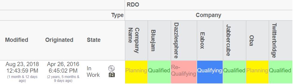
Figure 41. Rotated Column Headers
9.14. ToolTip
The ToolTip element defines what data that is to be shown when the user displays the tooltip for either an object on the row axis, an object on the column axis or an element within the intersection area.
The ToolTip element contains nested elements. These elements are:
- Basic
-
Shows a basic property, such as name, type, revision etc.
- Attribute
-
Shows an attribute value
The nested elements, either the Basic or the Attribute element, are associated with a property that could be selected from the object or relationship. The labels for each of these selected values are automatically retrieved from the string resource files in the AEF.
However, under some circumstances, this label cannot be retrieved, especially if one is selecting data from a related object (for example from.name), or if the resolved label is not suitable. In this case, a label can explicitly be defined for a particular tooltip value.
Child Elements:
| Child Element | Required |
|---|---|
Basic |
No |
Attribute |
No |
Tooltip example:
<ToolTip>
    <Basic name="type"/>
    <Basic name="to.name">
        <Label>To Name</Label>
        <Label locale="sv">Till Namn</Label>
    </Basic>
    <Basic name="from.name">
        <Label>From Name</Label>
        <Label locale="sv">Från Namn</Label>
    </Basic>
    <Basic name="id"/>
    <Attribute name="attribute_FindNumber">
        <Label>Find Number:</Label>
        <Label locale="en">F/N:</Label>
        <Label locale="sv">Pos:</Label>
    </Attribute>
</ToolTip>9.15. Cols
The Cols element can be used to declare additional column(s), for the row, that displays additional information. The Cols element is a container for Col elements
9.15.1. Col
Defines a column that is used to display additional meta-data for the row-axis objects.
Attributes:
| Attribute Name | Required | Description | Example |
|---|---|---|---|
usesBusinessObject |
No |
Whether or not the expression is for the business object, or for the relationship on the current row. |
True False |
Child Elements:
| Child Element | Required |
|---|---|
Header |
No |
Expression |
No |
Setting |
No |
Setting
Defines a setting related to a column
Attributes:
| Attribute Name | Required | Description | Example |
|---|---|---|---|
name |
Yes |
The name of the setting |
Editable |
value |
Yes (unless the value is define within the body content of the Setting element) |
The value of the setting |
10 True False … |
The example below illustrates how to define the columns element.
<Cols>
    <Col usesBusinessObject="false">
        <Header>The default header</Header>
        <Header locale="en">English header</Header>
        <Header locale="sv">Swedish header</Header>
        <Expression>
            <![CDATA[$<attribute[attribute_FindNumber]>]]>
        </Expression>
        <Setting name="Show Type Icon" value="true"/>
    </Col>
    ...
</Cols>
9.16. Actions
The Actions element contains Action elements.
9.16.1. Action
Defines custom actions that can be used on the row objects.
Attributes:
| Attribute Name | Required | Description | Example |
|---|---|---|---|
iconSrc |
Yes, unless iconType is set |
The icon source. The path is relative from the context root of your application |
common/images/Test.gif |
iconType |
See above |
Can be used to display the image associated with the object. Either it’s the smallicon, the type icon or the business object image (if this is used). |
|
iconDimension |
No |
The size of the icon. (width x height) |
16x16 |
Child Elements:
| Child Element | Required |
|---|---|
Link |
Yes |
Label |
No |
Link
Defines the behaviour for a link.
Attributes:
| Attribute Name | Required | Description | Example |
|---|---|---|---|
excludeObjectId |
No |
Can be used to force an exclusion of the object id in the generated href |
true |
excludeRelationshipId |
No |
Can be used to force an exclusion of the relationship id in the generated href |
true |
Child Elements:
| Name | Required | Description |
|---|---|---|
Href |
Yes |
The HREF to open. For example ${ROOT_DIR}/test.jsp |
Target |
Yes |
The target location value (popup, card, etc). |
WindowSize |
Yes, if target is set to "Popup". |
The size of the window. For example: 800x600. |
Modal |
No |
Whether or not the popup window is opened in modal mode. |
RegisteredSuite |
No |
The registered suite value that is appended to the URL |
CardId |
If target location is set to "Card" |
The id of the card |
CardTitle |
No |
The title of the card |
CardReloadable |
No |
If the card is reloadable. |
CardLoadScript |
No |
The load script (Java Script). |
CardWidth |
No |
The width of the sidepanel. |
9.17. ElementActions
This element defines the actions available when right-clicking the mouse on an element.
Child Elements:
| Child Element | Required |
|---|---|
Connect |
No |
Disconnect |
No |
EditAttributes |
No |
SetAttributes |
No |
OpenLink |
No |
Java |
No |
JPO |
No |
9.17.1. Connect
Used to connect the row object with the column object.
The connection is made in the same direction, as specified on the Intersection element. E.g. either from the row object to the column object, or from the column object to the row object. If the direction is set to both, the connection will be made from the row object to the column object.
Attributes:
| Attribute Name | Required | Description | Example |
|---|---|---|---|
relationship |
Yes |
The name of the relationship type, which the connections will be made with. |
relationship_EBOM EBOM Some Relationship |
order |
No |
The order, which the action will appear in the popup dialog. This should be an integer value. |
0 1 2 |
name |
No |
The name of this action |
Action1 |
next |
No |
The name of the action to be executed next. |
Action2 |
Child Elements:
| Child Element | Required |
|---|---|
Label |
No |
For-State |
Yes |
Access |
No |
RefreshBehaviour |
No |
Example:
<Connect relationship="relationship_ABC">
    <For-State>state_1</For-State>
    <For-State>state_2</For-State>
    <Label>Connect</Label>
    <Label locale="sv">Koppla</Label>
    <Label locale="fi">Yhdistää**<**/Label>
</Connect>
9.17.2. Disconnect
Used to disconnect the connection that is representing the intersection between the object and row objects.
Attributes:
| Attribute Name | Required | Description | Example |
|---|---|---|---|
order |
No |
The order, which the action will appear in the popup dialog. This should be an integer value. |
0 1 2 |
name |
No |
The name of this action |
Action1 |
next |
No |
The name of the action to be executed next. |
Action2 |
Child Elements:
| Child Element | Required |
|---|---|
Label |
No |
For-State |
Yes |
Access |
No |
RefreshBehaviour |
No |
Example:
<Disconnect>
    <For-State>state0</For-State>
    <Label>Disconnect</Label>
</Disconnect>
9.17.3. EditAttributes
Used to update relationship attributes
Attributes:
| Attribute Name | Required | Description | Example |
|---|---|---|---|
order |
No |
The order, which the action will appear in the popup dialog. This should be an integer value. |
0 1 2 |
name |
No |
The name of this action |
Action1 |
next |
No |
The name of the action to be executed next. |
Action2 |
Child Elements:
| Child Element | Required |
|---|---|
Label |
No |
Form |
Yes |
For-State |
Yes |
Access |
No |
RefreshBehaviour |
No |
Example:
<EditAttributes order="2">
    <For-State>s1</For-State>
    <For-State>s2</For-State>
    <For-State>s3</For-State>
    <For-State>s4</For-State>
    <Label>Edit Attributes</Label>
    <Form>
        <WindowSize>800x600</WindowSize>
        <Header>Edit attributes</Header>
        <SubHeader>Fill in values below</SubHeader>
        <Field attribute="attribute_Comments" rows="3" cols="40"/>
        <Field attribute="attribute_SourceQualificationStatus"/>
        <Field attribute="attribute_ShowSubComponents"/>
        <Field attribute="attribute_ShowTargetCost"/>
        <Field attribute="attribute_SourceSelectionStatus"/>
        <Field attribute="attribute_AgreedUnitPrice"/>
        <Field attribute="attribute_RTSID"/>
        <Field attribute="attribute_SubComponentLevel"/>
        <Field attribute="attribute_DateShipped"/>
    </Form>
</EditAttributes>
9.17.4. SetAttributes
Used to set relationship attributes, without using a form
Attributes:
| Attribute Name | Required | Description | Example |
|---|---|---|---|
order |
No |
The order, which the action will appear in the popup dialog. This should be an integer value. |
0 1 2 |
name |
No |
The name of this action |
Action1 |
next |
No |
The name of the action to be executed next. |
Action2 |
Child Elements:
| Child Element | Required |
|---|---|
Label |
No |
Attribute |
Yes |
For-State |
Yes |
Access |
No |
RefreshBehaviour |
No |
Example:
<SetAttributes>
    <Label>Clear Attributes</Label>
    <Attribute name="attribute_String"></Attribute>
    <Attribute name="attribute_Numeric">0</Attribute>
    <For-State>state0</For-State>
</SetAttributes>9.17.5. OpenLink
Used to open an arbitrary link for the intersection
Attributes:
| Attribute Name | Required | Description | Example |
|---|---|---|---|
order |
No |
The order, which the action will appear in the popup dialog. This should be an integer value. |
0 1 2 |
name |
No |
The name of this action |
Action1 |
next |
No |
The name of the action to be executed next. |
Action2 |
Child Elements:
| Child Element | Required |
|---|---|
Label |
No |
Link |
Yes |
For-State |
Yes |
Access |
No |
RefreshBehaviour |
No |
Example:
<OpenLink order="100">
    <For-State>s1</For-State>
    <For-State>s2</For-State>
    <For-State>s3</For-State>
    <For-State>s4</For-State>
    <Link excludeObjectId="true">
        <Href>${ROOT_DIR}/tvc-action/showHistory</Href>
        <TargetLocation>popup</TargetLocation>
        <WindowSize>800x600</WindowSize>
        <RegisteredSuite>EngineeringCentral</RegisteredSuite>
    </Link>
    <Label>Show History</Label>
</OpenLink>
9.17.6. Java
The Java element is used when there is a need to plug-in custom functionality, which is executed by a custom Java class that will be used to perform the action.
The class specified must be derived from the com.technia.tvc.gridbrowser.ext.Action class.
Attributes:
| Attribute Name | Required | Description | Example |
|---|---|---|---|
order |
No |
The order, which the action will appear in the popup dialog. This should be an integer value. |
0 1 2 |
name |
No |
The name of this action |
Action1 |
next |
No |
The name of the action to be executed next. |
Action2 |
className |
Yes |
The name of the class that extends the com.technia.tvc.gridbrowser.ext.Action class. |
com.acme.grid.MyAction |
Child Elements:
| Child Element | Required |
|---|---|
Label |
No |
For-State |
Yes |
Access |
No |
RefreshBehaviour |
No |
Parameter |
No |
The base class com.technia.tvc.gridbrowser.ext.Action is defined in the
Java DOC API available within the developer documentation. Below is the
definition of this class:
package com.technia.tvc.gridbrowser.ext;

import com.technia.tvc.gridbrowser.model.action.ExecutorContext;

public class Action {
    public void perform(ExecutorContext ctx) throws Exception {
    }
}
9.17.7. JPO
The JPOAction element is used when there is a need to plug-in custom functionality, which is executed by a JPO.
Attributes:
| Attribute Name | Required | Description | Example |
|---|---|---|---|
order |
No |
The order, which the action will appear in the popup dialog. This should be an integer value. |
0 1 2 |
name |
No |
The name of this action |
Action1 |
next |
No |
The name of the action to be executed next. |
Action2 |
jpo |
Yes |
The name of the JPO |
MyJPO |
method |
Yes |
The name of the method to invoke |
myMethod |
Child Elements:
| Child Element | Required |
|---|---|
Label |
No |
For-State |
Yes |
Access |
No |
RefreshBehaviour |
No |
Parameter |
No |
9.18. For-State
The For-State element defines the id of the states that must be satisfied before this action is displayed. One action can be applicable for several states. In this case, just add more For-State elements containing the id of the state to be satisfied.
Example:
<For-State>state0</For-State>
<For-State>state2</For-State>
<For-State>state3</For-State>
9.19. RefreshBehaviour
The refresh behaviour element defines what to refresh after an action has been performed (a right click action).
Example:
<RefreshBehaviour>row and col</RefreshBehaviour>
The possible values are (case insensitive):
-
Default
-
Row
-
Col
-
Row and Col
-
All
9.20. Access
Each action can be made available to users assigned to a certain role or group, or specific named users.
Child Elements:
| Child Element | Required |
|---|---|
UserList |
No |
RoleList |
No |
GroupList |
No |
9.20.1. UserList
Defines a list of users that have access
Child Elements:
| Child Element | Required |
|---|---|
User |
No |
9.20.2. RoleList
Defines a list of roles that have access
Child Elements:
| Child Element | Required |
|---|---|
Role |
No |
9.20.3. GroupList
Defines a list of groups that have access
Child Elements:
| Child Element | Required |
|---|---|
Group |
No |
Example:
<Access>
    <UserList>
        <User>user_1</User>
        <User>user_2</User>
    </UserList>
    <RoleList>
        <Role>role_R1</Role>
        <Role>role_R2</Role>
    </RoleList>
    <GroupList>
        <Group>group_G1</Group>
        <Group>group_G2</Group>
    </GroupList>
</Access>
9.21. GlobalActions
This element defines the global actions available as context buttons within the toolbar.
Child Elements:
| Child Element | Required |
|---|---|
Connect |
No |
Disconnect |
No |
EditAttributes |
No |
SetAttributes |
No |
Java |
No |
JPO |
No |
Attributes:
| Attribute Name | Description | Example |
|---|---|---|
selection |
Defines the selection type. |
at-least-one exactly-one none |
accepts |
Defines what kind of elements this action accepts |
connected not-connected any |
iconSrc |
Should be the context relative path, where the icon for this action is found. |
/custom/images/my_icon.gif |
9.22. Form
This element defines a form that is used when editing intersection (relationship) attributes.
Child Elements:
| Child Element | Required |
|---|---|
Header |
Yes |
SubHeader |
No |
Field |
Yes |
WindowSize |
No |
An example of how a form could be created is shown below:
<Form>
    <Header>Edit EBOM attributes</Header>
    <Header locale="sv">Redigera EBOM attribut</Header>
    <SubHeader>Enter values below</SubHeader>
    <WindowSize>1024x768</WindowSize>
    <Field dataType="integer" attribute="attribute_FindNumber">
        <Label>Find Number</Label>
        <Label locale="sv">Position</Label>
    </Field>
    <Field attribute="attribute_StartEffectivityDate"/>
    <Field attribute="attribute_EndEffectivityDate"/>
    <Field attribute="attribute_Quantity"/>
    <Field attribute="attribute_Usage"/>
</Form>
9.22.1. WindowSize
Defines the size of the window. The value is added in the body of the element.
The format is Width x Height
Example:
<WindowSize>800x600</WindowSize>
9.22.2. Field
Defines a field in a form. A field maps to an attribute.
If the default label, which is resolved from the string resource file is not suitable, this can be overridden by adding a Label elements inside the Field element.
Attributes:
| Attribute Name | Required | Description | Example |
|---|---|---|---|
dataType |
No |
The data type of this field. Can be used to override the actual data type of the attribute behind this field. |
string timestamp integer real |
attribute |
Yes |
The name of the attribute, which this field is for. |
attribute_FindNumber Quantity |
Child Elements:
| Child Element | Required |
|---|---|
Label |
No |
9.23. DisableIf
Used to define an expression that will disable a complete row or column. The content within this element is a standard Matrix expression.
| The "DisableIf" and the "DisableActionsIf" element are equal. The latter is still supported but is deprecated. |
Attributes:
| Attribute Name | Required | Description | Example |
|---|---|---|---|
relationship |
No |
Set to true if the expression should apply on the relationship. Default is to apply on the businessobject. |
true / false |
9.24. UIFunctions
There are a number of elements that affects the user interface of the Grid Browser.
Child Elements:
| Name | Required |
|---|---|
Find |
No |
Preferences |
No |
Clipboard |
No |
AddToCollection |
No |
ManageCollections |
No |
TriggerValidation |
No |
Compare |
No |
Promote |
No |
Demote |
No |
Export |
No |
PrinterFriendly |
No |
HelpMarker |
No |
SelectionMode |
No |
RowCounter |
No |
FilterChooser |
No |
ExpandAll |
No |
Edit |
No |
Reload |
No |
Disconnect |
No |
ColumnFilter |
No |
Chart |
No |
Sort |
No |
Maximize |
No |
Below is an example configuration that will enable all the different buttons and define a toolbar + context menu.
<GridBrowser>
    <UIFunctions>
        <!-- Context buttons -->
        <Find>true</Find>
        <Preferences>true</Preferences>
        <Clipboard>true</Clipboard>
        <AddToCollection>true</AddToCollection>
        <ManageCollections>true</ManageCollections>
        <TriggerValidation>true</TriggerValidation>
        <Compare>true</Compare>
        <Promote>true</Promote>
        <Demote>true</Demote>
        <Export>true</Export>
        <PrinterFriendly>true</PrinterFriendly>
        <HelpMarker>test</HelpMarker>
        <!-- The selection mode -->
        <SelectionMode>single</SelectionMode>
        <RowCounter>true</RowCounter>
        <!-- The other buttons -->
        <FilterChooser>true</FilterChooser>
        <ExpandAll>true</ExpandAll>
        <Edit>true</Edit>
        <Reload>true</Reload>
        <Disconnect>true</Disconnect>
        <ColumnFilter>true</ColumnFilter>
        <Chart>true</Chart>
        <Sort>true</Sort>
        <Maximize>true</Maximize>
    </UIFunctions>
    <ToolBar>The name of the toolbar menu</ToolBar>
    <ContextMenu>The name of the context menu</ContextMenu>
</GridBrowser>
9.25. Other Elements
There are some other elements, which control how a Grid Browser instance is displayed.
For example, the page may have a header and a sub header. See the chapters Header and SubHeader for information how to define such elements.
Moreover, the grid browser may have a toolbar attached and a context menu (for the row axis objects). This is accomplished by adding a ToolBar element, which contains the name of the menu that acts as a toolbar.
See the example below on how to define header, sub header and a toolbar for the grid browser.
<GridBrowser>
    ...
    <Header><![CDATA[Grid browser, $<type>:$<name>]]></Header>
    <Header locale="sv">
    <![CDATA[Grid Navigator, $<type>: $<name>]]>
    </Header>
    <SubHeader>Default Subheader</SubHeader>
    <SubHeader locale="en">English Subheader</SubHeader>
    <SubHeader locale="sv">Svensk Subheader</SubHeader>
    <ToolBar>TVC Grid Browser Sample Toolbar</ToolBar>
    <ContextMenu>My Ctx Menu</ContextMenu>
</GridBrowser>