<Label>This is the default label</Label>
<Label locale="de">This is a German label</Label>
<Label locale="fi">This is a Finnish label</Label>

<Header>This is the default header</Header>
<Header locale="de">
<Header locale="sv">
<Header locale="en">Grid Browser - Administration Guide : Configuration Details
21 March 2016
Table of Contents
- 1. Configuration Details
- 1.1. Localization (i18n)
- 1.2. The Grid Browser Definition
- 1.3. Columns
- 1.4. Rows
- 1.5. DataLoader
- 1.6. Intersection
- 1.7. EditableFields
- 1.8. CellStates
- 1.9. Label (Complex)
- 1.10. Label (Simple)
- 1.11. Header
- 1.12. SubHeader
- 1.13. Rotated Column Headers
- 1.14. ToolTip
- 1.15. Cols
- 1.16. Actions
- 1.17. ElementActions
- 1.18. For-State
- 1.19. RefreshBehaviour
- 1.20. Access
- 1.21. GlobalActions
- 1.22. Form
- 1.23. DisableIf
- 1.24. UIFunctions
- 1.25. Other Elements
1. Configuration Details
This chapter describes the format of the configuration.
1.1. Localization (i18n)
All labels, headers, sub-headers and tooltips are locale aware, i.e. they can be configured differently for different languages. The way to do this is shown in the examples below:
All labels and headers also support localization using string resources.
1.2. The Grid Browser Definition
The Grid Browser definition contains several sections that control the Grid Browser instance. All these XML elements are described in the subchapters.
1.2.1. Example
<?xml version="1.0" encoding="UTF-8"?>
<GridBrowser xmlns="http://technia.com/TVC/GridBrowserConfig" xmlns:xsi="http://www.w3.org/2001/XMLSchema-instance" xsi:schemaLocation="http://technia.com/TVC/GridBrowserConfig http://products.technia.com/tvc/schema/latest/GridBrowserConfig.xsd">
<Columns href="common/emxTree.jsp" rotateHeader="true" headerRotationAngle="-70" rotatedHeaderAlignment="middle">
<Header>RDO</Header>
<DataLoader dataSet="tvc:dataset:tvx:enc/GetRDOsInEBOM.xml">
<Sort by="Name" ascending="true" />
</DataLoader>
<DisableIf>current != Active</DisableIf>
<ToolTip>
<Basic name="type" />
<Basic name="name" />
<Basic name="current" />
</ToolTip>
<Label>
<Line formatters="bold,nowrap,center">$<name></Line>
</Label>
<Groups>
<Group key="name">
<Label>Name</Label>
</Group>
<Group key="type">
<Label>Type</Label>
</Group>
</Groups>
<Hierarchy>
<Level key="type" show="type">
<Label>Type</Label>
</Level>
</Hierarchy>
</Columns>
<Rows href="common/emxTree.jsp">
<Header>EBOM</Header>
<DataLoader format="indented">
<Expand>
<Filters combinable="true">
<Filter name="tvc:filter:tvx:enc/EBOMFrom.xml" active="true" />
<Filter name="tvc:filter:tvx:enc/EBOMTo.xml" />
<Filter name="tvc:filter:tvx:enc/PartSpecificationFrom.xml" />
</Filters>
<InitialExpandDepth>1</InitialExpandDepth>
</Expand>
</DataLoader>
<DisableIf>(policy == 'EC Part' AND current != Preliminary) OR (policy == 'Development Part' AND current != Create)</DisableIf>
<ToolTip>
<Basic name="type" />
<Basic name="name" />
<Basic name="revision" />
<Basic name="owner" />
<Basic name="current" />
</ToolTip>
<Label>
<Line formatters="nowrap,left">$<type></Line>
<Line formatters="bold,nowrap,left">$<name></Line>
<Line formatters="italic,left">$<revision></Line>
</Label>
<Cols>
<Col>
<Header>Description</Header>
<Expression>description</Expression>
</Col>
<Col>
<Header>UoM</Header>
<Expression>$<attribute[attribute_UnitofMeasure].value></Expression>
<Setting name="editable">true</Setting>
<Setting name="AutoCompleteHandler">ranges</Setting>
<ColumnType>autocomplete</ColumnType>
</Col>
<Col>
<Header>Modified</Header>
<Expression>modified</Expression>
<ColumnType>datetime</ColumnType>
</Col>
<Col>
<Header>Originated</Header>
<Expression>originated</Expression>
<ColumnType>datetime</ColumnType>
</Col>
<Col>
<Header>State</Header>
<Expression>current</Expression>
</Col>
</Cols>
<Actions>
<Action>
<IconType>smallicon</IconType>
<Link>
<Href>../tvc/core/tvcDebugRequest.jsp</Href>
<TargetLocation>popup</TargetLocation>
<Modal>true</Modal>
<RegisteredSuite>EngineeringCentral</RegisteredSuite>
<WindowSize>800x600</WindowSize>
</Link>
<Label>Example</Label>
</Action>
<Action>
<IconSrc>/tvc/structurebrowser/images/history.gif</IconSrc>
<Link>
<Href>${ROOT_DIR}/tvc-action/showHistory</Href>
<TargetLocation>popup</TargetLocation>
<Modal>false</Modal>
<RegisteredSuite>EngineeringCentral</RegisteredSuite>
<WindowSize>600x500</WindowSize>
</Link>
<Label>History</Label>
</Action>
</Actions>
</Rows>
<Intersection direction="col-to-row">
<IntersectionPath>
<Path from="relationship_DesignResponsibility" />
</IntersectionPath>
<EditableFields>
<Field>
<Label>SQS:</Label>
<Attribute>attribute_SourceQualificationStatus</Attribute>
<Setting name="Update UI" value="true" />
</Field>
<Field>
<Label>Date Shipped:</Label>
<NoWrap>true</NoWrap>
<Attribute>attribute_DateShipped</Attribute>
<Setting name="Editable States" value="s1,s2,s3" />
</Field>
<Field>
<NoWrap>true</NoWrap>
<Attribute>attribute_Comments</Attribute>
</Field>
</EditableFields>
<CellStates>
<CellState id="s0" showInLegend="false" ifConnected="false">
<Label>Not Assigned</Label>
</CellState>
<CellState id="s1" ifConnected="true" color="#FFF500" fontColor="#CDAF6E">
<Condition>
<Expression>$<attribute[attribute_SourceQualificationStatus]></Expression>
<Operator>==</Operator>
<Value>Planning</Value>
</Condition>
<Label>Planning</Label>
</CellState>
<CellState id="s2" ifConnected="true" color="#4586F7" fontColor="#F0F0F0">
<Condition>
<Expression>$<attribute[attribute_SourceQualificationStatus]></Expression>
<Operator>==</Operator>
<Value>Qualifying</Value>
</Condition>
<Label>Qualifying</Label>
</CellState>
<CellState id="s3" ifConnected="true" color="#ffaca8" fontColor="#AC7570">
<Condition>
<Expression>$<attribute[attribute_SourceQualificationStatus]></Expression>
<Operator>==</Operator>
<Value>Re-Qualifying</Value>
</Condition>
<Label>Re-Qualifying</Label>
</CellState>
<CellState id="s4" ifConnected="true" color="#a8ffa6" fontColor="#339933">
<Condition>
<Expression>$<attribute[attribute_SourceQualificationStatus]></Expression>
<Operator>==</Operator>
<Value>Qualified</Value>
</Condition>
<Label>Qualified</Label>
</CellState>
</CellStates>
<Label>
<Line>$<attribute[attribute_RTSID]></Line>
<Line>$<attribute[attribute_SourceQualificationStatus]></Line>
</Label>
<ToolTip>
<Attribute name="attribute_Comments" />
</ToolTip>
</Intersection>
<ElementActions>
<Connect relationship="relationship_DesignResponsibility" order="0">
<For-State>s0</For-State>
<Label>Assign</Label>
<Access>
<RoleList>
<Role>role_DesignEngineer</Role>
</RoleList>
</Access>
</Connect>
<SetAttributes order="1">
<For-State>s2</For-State>
<For-State>s3</For-State>
<For-State>s4</For-State>
<Label>Set to Planning</Label>
<Attribute name="attribute_SourceQualificationStatus">Planning</Attribute>
</SetAttributes>
<SetAttributes order="2">
<For-State>s1</For-State>
<For-State>s3</For-State>
<For-State>s4</For-State>
<Label>Set to Qualifying</Label>
<Attribute name="attribute_SourceQualificationStatus">Qualifying</Attribute>
</SetAttributes>
<SetAttributes order="3">
<For-State>s1</For-State>
<For-State>s2</For-State>
<For-State>s4</For-State>
<Label>Set to Re-Qualifying</Label>
<Attribute name="attribute_SourceQualificationStatus">Re-Qualifying</Attribute>
</SetAttributes>
<SetAttributes order="4">
<For-State>s1</For-State>
<For-State>s2</For-State>
<For-State>s3</For-State>
<Label>Set to Qualified</Label>
<Attribute name="attribute_SourceQualificationStatus">Qualified</Attribute>
</SetAttributes>
<EditAttributes order="5">
<For-State>s1</For-State>
<For-State>s2</For-State>
<For-State>s3</For-State>
<For-State>s4</For-State>
<Label>Edit Attributes</Label>
<Label locale="sv">Redigera Attribut</Label>
<Form>
<WindowSize>800x600</WindowSize>
<Header>Edit attributes</Header>
<Header locale="sv">Redigera Attribut</Header>
<Field attribute="attribute_Comments" rows="3" cols="40" />
<Field attribute="attribute_SourceQualificationStatus" />
<Field attribute="attribute_ShowSubComponents" />
<Field attribute="attribute_ShowTargetCost" />
<Field attribute="attribute_SourceSelectionStatus" />
<Field attribute="attribute_AgreedUnitPrice" />
<Field attribute="attribute_RTSID" />
<Field attribute="attribute_SubComponentLevel" />
<Field attribute="attribute_DateShipped" />
</Form>
</EditAttributes>
<Disconnect order="6">
<For-State>s1</For-State>
<For-State>s2</For-State>
<For-State>s3</For-State>
<For-State>s4</For-State>
<Label>Disconnect</Label>
</Disconnect>
<OpenLink order="100">
<For-State>s1</For-State>
<For-State>s2</For-State>
<For-State>s3</For-State>
<For-State>s4</For-State>
<Link excludeObjectId="true">
<Href>${ROOT_DIR}/tvc-action/showHistory</Href>
<TargetLocation>popup</TargetLocation>
<WindowSize>800x600</WindowSize>
<RegisteredSuite>EngineeringCentral</RegisteredSuite>
</Link>
<Label>Show History</Label>
</OpenLink>
</ElementActions>
<GlobalActions>
<MultiConnect relationship="relationship_DesignResponsibility">
<For-State>s0</For-State>
<Label>Assign</Label>
<Access>
<RoleList>
<Role>role_AdministrationManager</Role>
</RoleList>
</Access>
</MultiConnect>
<MultiDisconnect>
<For-State>s1</For-State>
<For-State>s2</For-State>
<For-State>s3</For-State>
<For-State>s4</For-State>
<Label>Un-Assign</Label>
<Access>
<RoleList>
<Role>role_AdministrationManager</Role>
</RoleList>
</Access>
</MultiDisconnect>
<MultiEdit>
<For-State>s1</For-State>
<For-State>s2</For-State>
<For-State>s3</For-State>
<For-State>s4</For-State>
<Label>Edit Attributes</Label>
<Form>
<WindowSize>800x600</WindowSize>
<Header>Edit attributes</Header>
<Field attribute="attribute_Comments" rows="3" cols="40" />
<Field attribute="attribute_SourceQualificationStatus" />
<Field attribute="attribute_ShowSubComponents" />
<Field attribute="attribute_ShowTargetCost" />
<Field attribute="attribute_SourceSelectionStatus" />
<Field attribute="attribute_AgreedUnitPrice" />
<Field attribute="attribute_RTSID" />
<Field attribute="attribute_SubComponentLevel" />
<Field attribute="attribute_DateShipped" />
</Form>
</MultiEdit>
</GlobalActions>
<UIFunctions>
<FilterChooser>true</FilterChooser>
<ExpandAll>true</ExpandAll>
<RowCounter>true</RowCounter>
<Preferences>true</Preferences>
<HelpMarker>emxhelppartbom</HelpMarker>
<SuiteKey>EngineeringCentral</SuiteKey>
<SelectionMode>multiple</SelectionMode>
<Maximize>true</Maximize>
<Edit>true</Edit>
<Chart>true</Chart>
<StateSummary>true</StateSummary>
<ColumnFilter>true</ColumnFilter>
</UIFunctions>
<Header><![CDATA[RDO Mapping for $<type> $<name>]]></Header>
<ToolBar>tvc:menu:tvx:enc/EBOM_RDO.xml</ToolBar>
<ContextMenu>tvc:menu:tvx:enc/EBOMNavigatorCtxMenu.xml</ContextMenu>
</GridBrowser>1.2.2. GridBrowser
Child Elements
| Child Element | Required | Description |
|---|---|---|
Columns |
Yes |
Defines the column axis, such as how the data is loaded, tooltip, label, header and others. |
Rows |
Yes |
Defines the row axis, such as how the data is loaded, tooltip, label, header and others. |
Intersection |
Yes |
Defines the intersection |
ElementActions |
No |
Defines all the right mouse click actions available within the intersection area. |
GlobalActions |
No |
Defines the mass operations. |
Header |
No |
Defines the header for the Grid Browser page. |
SubHeader |
No |
Defines the sub-header for the Grid Browser page. |
UIFunctions |
No |
Defines the available user interface functions. |
ToolBar |
No |
Defines a custom toolbar to be used. |
ContextMenu |
No |
Defines a custom context-menu to be used for the row-axis objects. |
1.3. Columns
Attributes
| Attribute Name | Required | Description | Example |
|---|---|---|---|
href |
No |
Defines the href to the resource that is displayed when the user clicks the object while pressing the *shift* key. The href value is relative to the context root of the application. The object id of the clicked object is added to the URL, with a parameter called objectId. |
common/emxTree.jsp |
rotateHeader |
No |
Whether or not to rotate the header for the column object(s). The header can only be rotated within the standard HTML view of the Grid Browser. This setting is not handled in the Export and PDF view. Any formatting applied on the label is not supported when the header is rotated. Note that Header text will be shown in Tooltip in case of rotated header,
except when the |
rotateHeader="true" |
headerRotationAngle |
No |
The angle in degrees, which the header should be rotated. |
headerRotationAngle="-70" |
rotatedHeaderAlignment |
No |
Defines the vertical alignment of the rotated header. Possible values are:
|
rotatedHeaderAlignment="top" |
Child Elements
| Child Element | Required |
|---|---|
Header |
No |
DataLoader |
Yes |
ToolTip |
No |
Label |
No |
Groups |
No |
Hierarchy |
No |
DisableIf |
No |
1.3.1. Groups
If the column axis contains many objects, it can be useful to be able to filter out some objects based upon some criteria. It is therefore possible to define so called filter groups for the column objects.
| Child Element | Required |
|---|---|
Group |
Yes |
1.3.2. Group
Attributes:
| Attribute Name | Required | Description | Example | ||
|---|---|---|---|---|---|
key |
Yes |
Defines the expression that will be used to select the values that builds up a filter group. |
|
||
dateFormat |
No |
If the selected value corresponds to a datetime value, you can specify a custom date format pattern that will be used to display the value. The pattern must conform to the SimpleDateFormat rules from the Java API.
|
|
Child Elements:
| Child Element | Required |
|---|---|
Label |
yes |
Below is an example how the filtering groups are defined:
<Columns>
    ...
    <Groups>
        <Group key="originated" dateFormat="yyyy-QQQQ">
            <Label>Revision</Label>
        </Group>
        <Group key="current">
            <Label>Current State</Label>
        </Group>
    </Groups>
</Columns>
The example above will generate two different groups, which the user can filter by. The filtering criteria can be any select statement that could be applied on a business object. The actual statement that should be used depends on the use case for the grid browser.
1.3.3. Hierarchy
The objects on the column axis can be divided into hierarchical groups, where each group on each level will be associated with a common header.
Child Elements
| Child Element | Required |
|---|---|
Level |
Yes |
Level
Attributes
| Attribute Name | Required | Description | Example | ||
|---|---|---|---|---|---|
key |
Yes |
Defines the statement used to find the different items on the level. |
current |
||
show |
No |
A statement that will be used to select the display value. The show and key statement must return the equal amount of values. If undefined, the key will also be used for display. |
Name |
||
dateFormat |
No |
If the selected value corresponds to a datetime value, you can specify a custom date format pattern that will be used to display the value. The pattern must conform to the SimpleDateFormat rules from the Java API.
|
|
Child Elements:
| Child Element | Required |
|---|---|
Label |
No |
Below is an example how the column hierarchies are defined:
<Columns>
    ...
    <Hierarchy>
        <Level key="policy" show="policy">
            <Label>Another Level</Label>
        </Level>
        <Level key="current" show="current">
            <Label>A Level</Label>
        </Level>
    </Hierarchy>
</Columns>
1.4. Rows
Attributes:
| Attribute Name | Required | Description | Example |
|---|---|---|---|
href |
No |
Defines the href to the resource that is displayed when the user clicks the object while pressing the *shift* key. The href value is relative to the context root of the application. The object id of the clicked object is added to the URL, with a parameter called objectId. |
common/emxTree.jsp |
Child Elements:
| Child Element | Required |
|---|---|
Header |
No |
DataLoader |
Yes |
ToolTip |
No |
Label |
No |
Cols |
No |
Actions |
No |
DisableIf |
No |
1.5. DataLoader
The DataLoader element defines how to populate the specific axis with objects.
Attributes:
| Attribute Name | Required | Description | Example |
|---|---|---|---|
inquiry |
No |
The name of the inquiry that produces the data |
MyInquiry |
jpo |
No |
The name of the JPO that produces the data |
MyJPO |
method |
Yes, if the jpo attribute is specified. |
The method that is invoked on the JPO |
getData |
dataSet |
No |
The name of a data-set. See TVC Core Administration guide for details how to create data-sets. |
tvc:dataset/MyDataSet.xml |
loaderClass |
No |
The name of the class used to load the data |
com.acme.grid.MyLoader |
format |
No |
Describes the format of the data |
|
Child Elements:
| Child Element | Required |
|---|---|
Arg |
No |
Sort |
No |
1.5.1. Arg
It is possible to define arguments that are passed to the dataloader. This is accomplished by adding "Arg" elements below the "DataLoader" element.
Attributes:
| Attribute Name | Required | Description | Example |
|---|---|---|---|
name |
Yes |
The name of the argument |
type |
value |
Yes |
The value of the argument |
type_Part |
Example:
<DataLoader ...>
    <Arg name="type" value="type_Part"/>
    <Arg name="state" value="Release"/>
</DataLoader>
1.5.2. Sort
The data loaded from the database by the data-loader can be sorted. This is accomplished by adding Sort elements inside the DataLoader element.
Attributes:
| Attribute Name | Required | Description | Example |
|---|---|---|---|
by |
Yes |
The field to sort the data by |
type name revision attribute[X] |
ascending |
No |
Defines if the sorting should be done in ascending or descending order. |
False |
Example:
<DataLoader ...>
    <Sort by="type" ascending="true"/>
    <Sort by="name" ascending="false"/>
</DataLoader>
Note that the order of the sort elements defines the order how the data is sorted.
1.6. Intersection
Defines the intersection rules.
Attributes:
| Attribute Name | Required | Description | Example |
|---|---|---|---|
direction |
Yes |
Defines the direction, for how the intersections are found. The intersection could either be from the row object to the column object, or the vice-versa. It is also possible to define that the direction is either from row to column or from column to row. This attribute is dependent upon the Paths defined inside the IntersectionPath element (or vice versa). |
row-to-col col-to-row both |
Child Elements:
| IntersectionPath | Yes |
|---|---|
CellStates |
Yes |
ToolTip |
No |
Label |
No |
EditableFields |
No |
1.6.1. IntersectionPath
The intersection path element defines the paths that will be used when to find the other object. This element has no attributes, but it must have one or more Path elements beneath.
The other object is either the column object or the row object, depending on what the direction attribute on the Intersection element has been defined to.
Child Elements:
| Child Element | Required |
|---|---|
Path |
Yes |
1.6.2. Path
Defines the intersection path, e.g. how to find the intersection between the axes.
Attributes:
| Attribute Name | Required | Description | Example |
|---|---|---|---|
from |
See Note 1 |
Defines the relationship to traverse in the "from" direction. If the "direction" on the intersection element is set to "col-to-row", this means from the column object to the row object. |
from="relationship_EBOM" |
to |
See Note 1 |
See above. The difference is that this will go in the "to" direction. |
to="relationship_AnotherRel" |
fromRel |
See Note 1 |
Defines this path as being a relationship that starts from a relationship (direction = from) |
fromRel="relationship_AnotherRel" |
toRel |
See Note 1 |
Same as "fromRel", only the direction differs. |
toRel="relationship_AnotherRel" |
targetIsRel |
No |
If the path defines a relationship that ends on another relationship, you should set this attribute value to true. |
targetIsRel="true" |
targetQualifier |
No |
If you have set "targetIsRel" to true, and this is the last path within the intersection path, then you should define what direction of the last relationship to be used. Possible values are "from" or "to" |
Child Elements:
| Child Element | Required |
|---|---|
Where |
No |
Some examples of how the intersection path element could be defined are shown below:
<IntersectionPath>
    <Path from="relationship_EBOM"/>
</IntersectionPath>
<IntersectionPath>
<Path to="relationship_EBOM"/>
</IntersectionPath><IntersectionPath>
<Path from="relationship_Y"/>
<Path to="relationship_X"/>
</IntersectionPath>
The <Path> element must have either a "from", "to",
"fromRel" or "toRel" attribute defined. If multiple attributes are
defined, the behaviour is unspecified.
|
| The "from" and "to" attributes, allows having symbolic names as values. |
Where
When using ENOVIA 10.5 or higher, one can utilize the possibility to have so called "where clauses" within the select expressions. This means, that for each path element defined – one can add a where element, which contains a where expression that must be fulfilled for each path. Below are some examples how to use where clauses for a path.
<IntersectionPath>
    <Path from="relationship_X">
        <Where>attribute[An Attribute] > 3</Where>
    </Path>
    <Path from="relationship_Y">
        <Where>attribute[Another Attribute] == 2</Where>
    </Path>
</IntersectionPath>| Adding to complex "where clauses" will make the evaluation of the Grid slower. |
| The level of complexity in the where clause is somewhat limited. ENOVIA is not able to parse expressions that are too complex. Recommended is to test the expression from MQL or similar. This is done by doing: "print bus XXX select from[X|attribute[An Attribute]>3].to.from[Y|attribute[Another Attribute]==2].id"; |
1.7. EditableFields
The EditableFields element contains the Fields that is open for edit on the intersections.
Child Elements:
| Child Element | Required |
|---|---|
Field |
No |
1.7.1. Field
Child Elements:
| Child Element | Required | Description |
|---|---|---|
Label |
No |
Defines the label for the field in different locales. The label might only contain "static" strings. |
Expression |
No |
Defines the expression, for example |
Attribute |
No |
Short hand registration for an attribute expression.
The value is converted to the expression: |
Setting |
No |
Defines a custom setting that controls the behaviour. |
Setting
Defines a setting related to a field
Attributes:
| Attribute Name | Required | Description | Example |
|---|---|---|---|
name |
Yes |
The name of the setting |
No Wrap |
value |
Yes (unless the value is define within the body content of the Setting element) |
The value of the setting |
True / False |
The example below illustrates how to define a Field element.
<EditableFields>
    <Field>
        <Label>The default label</Label>
        <Label locale="en">English label</Label>
        <Label locale="sv">Swedish label</Label>
        <Expression>
            <![CDATA[$<attribute[attribute_Comments]>]]>
        </Expression>
        <!-- OR: -->
        <Attribute>attribute_Comments</Attribute>
        <Setting name="No Wrap" value="true"/>
    </Field>
    ...
</EditableFields>| If you omit the label, the label will be set to the attribute name. |
1.8. CellStates
The CellStates element contains a set of CellState elements where each CellState element define the state an element may have.
A cell state could be fulfilled by a simple condition saying that the element has a connection or not.
More sophisticated states could be defined, for example that the element relationship must have its Quantity attribute larger than 1, besides being connected, to fulfil the state requirements.
The CellStates element is just a container for CellState elements.
Child Elements:
| Child Element | Required |
|---|---|
CellState |
Yes |
1.8.1. CellState
Defines an individual state, which an element can satisfy.
Attributes:
| Attribute Name | Required | Description | Example |
|---|---|---|---|
id |
Yes |
A cell state must have an id allocated. This id must be unique across all the cell state elements within the configuration. The value of this attribute should be a string. |
State_1 State_2 State_Connected State_Disconnected |
color |
No, but recommended |
Defines the color that the elements, which satisfies this state, will have when displayed in the grid. The value could either be the hex code, for example #FFFF00, or the rgb value, for example rgb(255,255,0). |
rgb(128,128,0) #AEAEAE #00EE00 rgb(10,20,30) |
fontColor |
No |
Defines the font color. |
#ffffff #rgb(124,100,240) |
borderColor |
No |
Defines the color of the border |
#f5e11e #fefefe |
showInLegend |
No |
Defines if this state should be visualized within the legend or not. Default is that all states are shown in the legend, unless this attribute has been set to false. |
TRUE FALSE |
ifConnected |
Yes |
Defines if the connection must exist in order for the state to be fulfilled. This enables the possibility to display a state for non-connected elements. |
TRUE FALSE |
Child Elements:
| Child Element | Required |
|---|---|
Condition |
No |
Label |
Yes |
| If one element is satisfying more than one cell-state, only the last state defined will be displayed. |
Condition
The Condition element is used to define more complex conditions that an element should comply to in order to satisfy a specific cell state.
If several Conditions are defined for a cell state, the element must then satisfy all conditions that have been defined in order for the element to satisfy the cell state.
Attributes:
| Attribute Name | Required | Description | Example |
|---|---|---|---|
matchAll |
No |
The expression defined might return more than one value. By default, all values returned must match the defined value. This attribute can be set to define to say that if at least one of the values matches, this condition is satisfied. |
True/False |
separator |
No |
A character that defines how to split the values. Used together with "matchList" operator. |
, |
Child Elements:
| Child Element | Required |
|---|---|
Expression |
Yes |
Operator |
Yes |
Value |
Yes |
Format |
No |
Expression
An expression, which is evaluated against the connection in the element.
Example:
attribute[Quantity]
from.type$<attribute[attribute_Quantity]>
Operator
The operator used to compare the selected value with the value specified in the value attribute
Examples:
==
!=
>=
<=
>
<
matchList
Value
The value, which the selected value should be compared (using the specified operator) against.
Example:
A Value
20
30
Format
This can be used to define that the selected values are of a certain format.
Example:
integer
real
date
string
Boolean
Example:
<CellState>
<Condition>
<Expression>$<attribute[attribute_Qty]></Expression>
<Value>0</Value>
<Operator>></Operator>
</Condition>
<Condition>
<Expression>
evaluate[MX_CURRENT_TIME – to.state[Release].actual > 0] </Expression>
<Value>True</Value>
<Operator>==</Operator>
<Format>boolean</Format>
</Condition>
</CellState>1.9. Label (Complex)
The label element is used to define a label in many places, for example to the element, the row object and the column object.
A label can be locale aware, i.e. the value could be different depending on the users preferred browser language. It also supports localization using string resources.
Moreover, the Label element may contain a macro – which means that the label could contain data that is selected from the specific object (or connection in case of elements). The label can in some places also be divided across several lines, and each line can be formatted individually.
Attributes:
| Attribute Name | Required | Description | Example |
|---|---|---|---|
locale |
No |
The locale for which the label applies to. If this is undefined, that label will be used as the default label. |
|
Child Elements:
| Child Element | Required |
|---|---|
Line |
No |
1.9.1. Line
A label could in some places span over several lines (the row-, column-, and element-labels). This is accomplished by adding one or more Line elements within the Label element, and each Line can then contain a text.
Each line can be formatted, by using any of the built-in formatters. The formatters can also be combined.
Attributes:
| Attribute Name | Required | Description | Example |
|---|---|---|---|
formatter |
No |
Defines one formatter to be used |
|
formatters |
No |
Defines a combination of formatters to be used. |
nowrap,bold bold,italic,center |
maxChars |
No |
Specifies the maximum nr of characters on this line. If the text has more characters, the text is truncated and a "…" is appended. |
10 |
maxCharsPerLine |
No |
Defines the max nr of characters per row. E.g. if the text contains more characters than this value, a line break is added in the HTML gui. |
10 |
The examples below illustrate how to build a multi line label.
<Label>
    <Line formatter="bold">
        F/N: <![CDATA[$<attribute[attribute_FindNumber]>]]>
    </Line>
    <Line formatters="italic,nowrap">
        Qty: <![CDATA[$<attribute[attribute_Quantity]>]]>
    </Line>
</Label>| When using multiple formatters, you need to use the "formatters" attribute while in the case you only have one formatter, you can use the "formatter" attribute. |
The available formatters are listed below:
-
left
-
right
-
center
-
bold
-
italic
-
nowrap
1.10. Label (Simple)
A simple label consists of a string, containing either dynamic value(s) or not.
A label can be locale aware, i.e. the value could be different depending on the users preferred browser language. It also supports localization using string resources.
Attributes:
| Attribute Name | Required | Description | Example |
|---|---|---|---|
locale |
No |
The locale for which the label applies to. If this is undefined, that label will be used as the default label. |
|
Below are some examples.
<Label>The default label</Label>
<Label locale="en">The english label</Label>
<Label locale="sv">Swedish label</Label>
1.11. Header
The header element is used to define a header for the row object, the column object, and the page where the grid is shown.
A header could be locale aware, i.e. the value could be different depending on the users preferred browser language. It also supports localization using string resources.
Moreover, for the page header, the value may contain a macro, which means that the page header could contain data that is selected against from object, which the grid was launched from. However, this is not always the case, and varies depending on from where the grid was launched.
Attributes:
| Attribute Name | Required | Description | Example |
|---|---|---|---|
locale |
No |
The locale for which the label applies to. If this is undefined, that label will be used as the default label. |
|
The content of the Header is the text that should be displayed. Below are some examples:
<Header>The default header</Header>
<Header locale="en">The english header</Header>
<Header locale="sv">Swedish header</Header>
1.12. SubHeader
The sub header element is used to define a sub header for the page where the grid is shown, or for a form page.
Attributes:
| Attribute Name | Required | Description | Example |
|---|---|---|---|
locale |
No |
The locale for which the label applies to. If this is undefined, that label will be used as the default label. |
|
The content of the SubHeader is the text that should be displayed. Below are some examples:
<SubHeader>The default subheader</SubHeader>
<SubHeader locale="en">The english subheader</SubHeader>
<SubHeader locale="sv">Swedish subheader</SubHeader>
1.13. Rotated Column Headers
Column header rotation can now be achieved using pure CSS as opposed to the exisiting action call and generating an image. The rotated headers will render the column labels vertically. The existing method of generating rotated header using as an image can be achieved by using the below configuration in web.xml :-
<init-param>
    <param-name>tvc.gridbrowser.headerRotationLegacyMode</param-name>
    <param-value>true</param-value>
</init-param>
The default value for this setting is set to false.
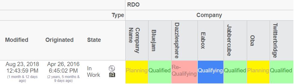
Figure 1. Rotated Column Headers
1.14. ToolTip
The ToolTip element defines what data that is to be shown when the user displays the tooltip for either an object on the row axis, an object on the column axis or an element within the intersection area.
The ToolTip element contains nested elements. These elements are:
- Basic
-
Shows a basic property, such as name, type, revision etc.
- Attribute
-
Shows an attribute value
The nested elements, either the Basic or the Attribute element, are associated with a property that could be selected from the object or relationship. The labels for each of these selected values are automatically retrieved from the string resource files in the AEF.
However, under some circumstances, this label cannot be retrieved, especially if one is selecting data from a related object (for example from.name), or if the resolved label is not suitable. In this case, a label can explicitly be defined for a particular tooltip value.
Child Elements:
| Child Element | Required |
|---|---|
Basic |
No |
Attribute |
No |
Tooltip example:
<ToolTip>
    <Basic name="type"/>
    <Basic name="to.name">
        <Label>To Name</Label>
        <Label locale="sv">Till Namn</Label>
    </Basic>
    <Basic name="from.name">
        <Label>From Name</Label>
        <Label locale="sv">Från Namn</Label>
    </Basic>
    <Basic name="id"/>
    <Attribute name="attribute_FindNumber">
        <Label>Find Number:</Label>
        <Label locale="en">F/N:</Label>
        <Label locale="sv">Pos:</Label>
    </Attribute>
</ToolTip>1.15. Cols
The Cols element can be used to declare additional column(s), for the row, that displays additional information. The Cols element is a container for Col elements
1.15.1. Col
Defines a column that is used to display additional meta-data for the row-axis objects.
Attributes:
| Attribute Name | Required | Description | Example |
|---|---|---|---|
usesBusinessObject |
No |
Whether or not the expression is for the business object, or for the relationship on the current row. |
True False |
Child Elements:
| Child Element | Required |
|---|---|
Header |
No |
Expression |
No |
Setting |
No |
Setting
Defines a setting related to a column
Attributes:
| Attribute Name | Required | Description | Example |
|---|---|---|---|
name |
Yes |
The name of the setting |
Editable |
value |
Yes (unless the value is define within the body content of the Setting element) |
The value of the setting |
10 True False … |
The example below illustrates how to define the columns element.
<Cols>
    <Col usesBusinessObject="false">
        <Header>The default header</Header>
        <Header locale="en">English header</Header>
        <Header locale="sv">Swedish header</Header>
        <Expression>
            <![CDATA[$<attribute[attribute_FindNumber]>]]>
        </Expression>
        <Setting name="Show Type Icon" value="true"/>
    </Col>
    ...
</Cols>
1.16. Actions
The Actions element contains Action elements.
1.16.1. Action
Defines custom actions that can be used on the row objects.
Attributes:
| Attribute Name | Required | Description | Example |
|---|---|---|---|
iconSrc |
Yes, unless iconType is set |
The icon source. The path is relative from the context root of your application |
common/images/Test.gif |
iconType |
See above |
Can be used to display the image associated with the object. Either it’s the smallicon, the type icon or the business object image (if this is used). |
|
iconDimension |
No |
The size of the icon. (width x height) |
16x16 |
Child Elements:
| Child Element | Required |
|---|---|
Link |
Yes |
Label |
No |
Link
Defines the behaviour for a link.
Attributes:
| Attribute Name | Required | Description | Example |
|---|---|---|---|
excludeObjectId |
No |
Can be used to force an exclusion of the object id in the generated href |
true |
excludeRelationshipId |
No |
Can be used to force an exclusion of the relationship id in the generated href |
true |
Child Elements:
| Name | Required | Description |
|---|---|---|
Href |
Yes |
The HREF to open. For example ${ROOT_DIR}/test.jsp |
Target |
Yes |
The target location value (popup, card, etc). |
WindowSize |
Yes, if target is set to "Popup". |
The size of the window. For example: 800x600. |
Modal |
No |
Whether or not the popup window is opened in modal mode. |
RegisteredSuite |
No |
The registered suite value that is appended to the URL |
CardId |
If target location is set to "Card" |
The id of the card |
CardTitle |
No |
The title of the card |
CardReloadable |
No |
If the card is reloadable. |
CardLoadScript |
No |
The load script (Java Script). |
CardWidth |
No |
The width of the sidepanel. |
1.17. ElementActions
This element defines the actions available when right-clicking the mouse on an element.
Child Elements:
| Child Element | Required |
|---|---|
Connect |
No |
Disconnect |
No |
EditAttributes |
No |
SetAttributes |
No |
OpenLink |
No |
Java |
No |
JPO |
No |
1.17.1. Connect
Used to connect the row object with the column object.
The connection is made in the same direction, as specified on the Intersection element. E.g. either from the row object to the column object, or from the column object to the row object. If the direction is set to both, the connection will be made from the row object to the column object.
Attributes:
| Attribute Name | Required | Description | Example |
|---|---|---|---|
relationship |
Yes |
The name of the relationship type, which the connections will be made with. |
relationship_EBOM EBOM Some Relationship |
order |
No |
The order, which the action will appear in the popup dialog. This should be an integer value. |
0 1 2 |
name |
No |
The name of this action |
Action1 |
next |
No |
The name of the action to be executed next. |
Action2 |
Child Elements:
| Child Element | Required |
|---|---|
Label |
No |
For-State |
Yes |
Access |
No |
RefreshBehaviour |
No |
Example:
<Connect relationship="relationship_ABC">
    <For-State>state_1</For-State>
    <For-State>state_2</For-State>
    <Label>Connect</Label>
    <Label locale="sv">Koppla</Label>
    <Label locale="fi">Yhdistää**<**/Label>
</Connect>
1.17.2. Disconnect
Used to disconnect the connection that is representing the intersection between the object and row objects.
Attributes:
| Attribute Name | Required | Description | Example |
|---|---|---|---|
order |
No |
The order, which the action will appear in the popup dialog. This should be an integer value. |
0 1 2 |
name |
No |
The name of this action |
Action1 |
next |
No |
The name of the action to be executed next. |
Action2 |
Child Elements:
| Child Element | Required |
|---|---|
Label |
No |
For-State |
Yes |
Access |
No |
RefreshBehaviour |
No |
Example:
<Disconnect>
    <For-State>state0</For-State>
    <Label>Disconnect</Label>
</Disconnect>
1.17.3. EditAttributes
Used to update relationship attributes
Attributes:
| Attribute Name | Required | Description | Example |
|---|---|---|---|
order |
No |
The order, which the action will appear in the popup dialog. This should be an integer value. |
0 1 2 |
name |
No |
The name of this action |
Action1 |
next |
No |
The name of the action to be executed next. |
Action2 |
Child Elements:
| Child Element | Required |
|---|---|
Label |
No |
Form |
Yes |
For-State |
Yes |
Access |
No |
RefreshBehaviour |
No |
Example:
<EditAttributes order="2">
    <For-State>s1</For-State>
    <For-State>s2</For-State>
    <For-State>s3</For-State>
    <For-State>s4</For-State>
    <Label>Edit Attributes</Label>
    <Form>
        <WindowSize>800x600</WindowSize>
        <Header>Edit attributes</Header>
        <SubHeader>Fill in values below</SubHeader>
        <Field attribute="attribute_Comments" rows="3" cols="40"/>
        <Field attribute="attribute_SourceQualificationStatus"/>
        <Field attribute="attribute_ShowSubComponents"/>
        <Field attribute="attribute_ShowTargetCost"/>
        <Field attribute="attribute_SourceSelectionStatus"/>
        <Field attribute="attribute_AgreedUnitPrice"/>
        <Field attribute="attribute_RTSID"/>
        <Field attribute="attribute_SubComponentLevel"/>
        <Field attribute="attribute_DateShipped"/>
    </Form>
</EditAttributes>
1.17.4. SetAttributes
Used to set relationship attributes, without using a form
Attributes:
| Attribute Name | Required | Description | Example |
|---|---|---|---|
order |
No |
The order, which the action will appear in the popup dialog. This should be an integer value. |
0 1 2 |
name |
No |
The name of this action |
Action1 |
next |
No |
The name of the action to be executed next. |
Action2 |
Child Elements:
| Child Element | Required |
|---|---|
Label |
No |
Attribute |
Yes |
For-State |
Yes |
Access |
No |
RefreshBehaviour |
No |
Example:
<SetAttributes>
    <Label>Clear Attributes</Label>
    <Attribute name="attribute_String"></Attribute>
    <Attribute name="attribute_Numeric">0</Attribute>
    <For-State>state0</For-State>
</SetAttributes>1.17.5. OpenLink
Used to open an arbitrary link for the intersection
Attributes:
| Attribute Name | Required | Description | Example |
|---|---|---|---|
order |
No |
The order, which the action will appear in the popup dialog. This should be an integer value. |
0 1 2 |
name |
No |
The name of this action |
Action1 |
next |
No |
The name of the action to be executed next. |
Action2 |
Child Elements:
| Child Element | Required |
|---|---|
Label |
No |
Link |
Yes |
For-State |
Yes |
Access |
No |
RefreshBehaviour |
No |
Example:
<OpenLink order="100">
    <For-State>s1</For-State>
    <For-State>s2</For-State>
    <For-State>s3</For-State>
    <For-State>s4</For-State>
    <Link excludeObjectId="true">
        <Href>${ROOT_DIR}/tvc-action/showHistory</Href>
        <TargetLocation>popup</TargetLocation>
        <WindowSize>800x600</WindowSize>
        <RegisteredSuite>EngineeringCentral</RegisteredSuite>
    </Link>
    <Label>Show History</Label>
</OpenLink>
1.17.6. Java
The Java element is used when there is a need to plug-in custom functionality, which is executed by a custom Java class that will be used to perform the action.
The class specified must be derived from the com.technia.tvc.gridbrowser.ext.Action class.
Attributes:
| Attribute Name | Required | Description | Example |
|---|---|---|---|
order |
No |
The order, which the action will appear in the popup dialog. This should be an integer value. |
0 1 2 |
name |
No |
The name of this action |
Action1 |
next |
No |
The name of the action to be executed next. |
Action2 |
className |
Yes |
The name of the class that extends the com.technia.tvc.gridbrowser.ext.Action class. |
com.acme.grid.MyAction |
Child Elements:
| Child Element | Required |
|---|---|
Label |
No |
For-State |
Yes |
Access |
No |
RefreshBehaviour |
No |
Parameter |
No |
The base class com.technia.tvc.gridbrowser.ext.Action is defined in the
Java DOC API available within the developer documentation. Below is the
definition of this class:
package com.technia.tvc.gridbrowser.ext;

import com.technia.tvc.gridbrowser.model.action.ExecutorContext;

public class Action {
    public void perform(ExecutorContext ctx) throws Exception {
    }
}
1.17.7. JPO
The JPOAction element is used when there is a need to plug-in custom functionality, which is executed by a JPO.
Attributes:
| Attribute Name | Required | Description | Example |
|---|---|---|---|
order |
No |
The order, which the action will appear in the popup dialog. This should be an integer value. |
0 1 2 |
name |
No |
The name of this action |
Action1 |
next |
No |
The name of the action to be executed next. |
Action2 |
jpo |
Yes |
The name of the JPO |
MyJPO |
method |
Yes |
The name of the method to invoke |
myMethod |
Child Elements:
| Child Element | Required |
|---|---|
Label |
No |
For-State |
Yes |
Access |
No |
RefreshBehaviour |
No |
Parameter |
No |
1.18. For-State
The For-State element defines the id of the states that must be satisfied before this action is displayed. One action can be applicable for several states. In this case, just add more For-State elements containing the id of the state to be satisfied.
Example:
<For-State>state0</For-State>
<For-State>state2</For-State>
<For-State>state3</For-State>
1.19. RefreshBehaviour
The refresh behaviour element defines what to refresh after an action has been performed (a right click action).
Example:
<RefreshBehaviour>row and col</RefreshBehaviour>
The possible values are (case insensitive):
-
Default
-
Row
-
Col
-
Row and Col
-
All
1.20. Access
Each action can be made available to users assigned to a certain role or group, or specific named users.
Child Elements:
| Child Element | Required |
|---|---|
UserList |
No |
RoleList |
No |
GroupList |
No |
1.20.1. UserList
Defines a list of users that have access
Child Elements:
| Child Element | Required |
|---|---|
User |
No |
1.20.2. RoleList
Defines a list of roles that have access
Child Elements:
| Child Element | Required |
|---|---|
Role |
No |
1.20.3. GroupList
Defines a list of groups that have access
Child Elements:
| Child Element | Required |
|---|---|
Group |
No |
Example:
<Access>
    <UserList>
        <User>user_1</User>
        <User>user_2</User>
    </UserList>
    <RoleList>
        <Role>role_R1</Role>
        <Role>role_R2</Role>
    </RoleList>
    <GroupList>
        <Group>group_G1</Group>
        <Group>group_G2</Group>
    </GroupList>
</Access>
1.21. GlobalActions
This element defines the global actions available as context buttons within the toolbar.
Child Elements:
| Child Element | Required |
|---|---|
Connect |
No |
Disconnect |
No |
EditAttributes |
No |
SetAttributes |
No |
Java |
No |
JPO |
No |
Attributes:
| Attribute Name | Description | Example |
|---|---|---|
selection |
Defines the selection type. |
at-least-one exactly-one none |
accepts |
Defines what kind of elements this action accepts |
connected not-connected any |
iconSrc |
Should be the context relative path, where the icon for this action is found. |
/custom/images/my_icon.gif |
1.22. Form
This element defines a form that is used when editing intersection (relationship) attributes.
Child Elements:
| Child Element | Required |
|---|---|
Header |
Yes |
SubHeader |
No |
Field |
Yes |
WindowSize |
No |
An example of how a form could be created is shown below:
<Form>
    <Header>Edit EBOM attributes</Header>
    <Header locale="sv">Redigera EBOM attribut</Header>
    <SubHeader>Enter values below</SubHeader>
    <WindowSize>1024x768</WindowSize>
    <Field dataType="integer" attribute="attribute_FindNumber">
        <Label>Find Number</Label>
        <Label locale="sv">Position</Label>
    </Field>
    <Field attribute="attribute_StartEffectivityDate"/>
    <Field attribute="attribute_EndEffectivityDate"/>
    <Field attribute="attribute_Quantity"/>
    <Field attribute="attribute_Usage"/>
</Form>
1.22.1. WindowSize
Defines the size of the window. The value is added in the body of the element.
The format is Width x Height
Example:
<WindowSize>800x600</WindowSize>
1.22.2. Field
Defines a field in a form. A field maps to an attribute.
If the default label, which is resolved from the string resource file is not suitable, this can be overridden by adding a Label elements inside the Field element.
Attributes:
| Attribute Name | Required | Description | Example |
|---|---|---|---|
dataType |
No |
The data type of this field. Can be used to override the actual data type of the attribute behind this field. |
string timestamp integer real |
attribute |
Yes |
The name of the attribute, which this field is for. |
attribute_FindNumber Quantity |
Child Elements:
| Child Element | Required |
|---|---|
Label |
No |
1.23. DisableIf
Used to define an expression that will disable a complete row or column. The content within this element is a standard Matrix expression.
| The "DisableIf" and the "DisableActionsIf" element are equal. The latter is still supported but is deprecated. |
Attributes:
| Attribute Name | Required | Description | Example |
|---|---|---|---|
relationship |
No |
Set to true if the expression should apply on the relationship. Default is to apply on the businessobject. |
true / false |
1.24. UIFunctions
There are a number of elements that affects the user interface of the Grid Browser.
Child Elements:
| Name | Required |
|---|---|
Find |
No |
Preferences |
No |
Clipboard |
No |
AddToCollection |
No |
ManageCollections |
No |
TriggerValidation |
No |
Compare |
No |
Promote |
No |
Demote |
No |
Export |
No |
PrinterFriendly |
No |
HelpMarker |
No |
SelectionMode |
No |
RowCounter |
No |
FilterChooser |
No |
ExpandAll |
No |
Edit |
No |
Reload |
No |
Disconnect |
No |
ColumnFilter |
No |
Chart |
No |
Sort |
No |
Maximize |
No |
Below is an example configuration that will enable all the different buttons and define a toolbar + context menu.
<GridBrowser>
    <UIFunctions>
        <!-- Context buttons -->
        <Find>true</Find>
        <Preferences>true</Preferences>
        <Clipboard>true</Clipboard>
        <AddToCollection>true</AddToCollection>
        <ManageCollections>true</ManageCollections>
        <TriggerValidation>true</TriggerValidation>
        <Compare>true</Compare>
        <Promote>true</Promote>
        <Demote>true</Demote>
        <Export>true</Export>
        <PrinterFriendly>true</PrinterFriendly>
        <HelpMarker>test</HelpMarker>
        <!-- The selection mode -->
        <SelectionMode>single</SelectionMode>
        <RowCounter>true</RowCounter>
        <!-- The other buttons -->
        <FilterChooser>true</FilterChooser>
        <ExpandAll>true</ExpandAll>
        <Edit>true</Edit>
        <Reload>true</Reload>
        <Disconnect>true</Disconnect>
        <ColumnFilter>true</ColumnFilter>
        <Chart>true</Chart>
        <Sort>true</Sort>
        <Maximize>true</Maximize>
    </UIFunctions>
    <ToolBar>The name of the toolbar menu</ToolBar>
    <ContextMenu>The name of the context menu</ContextMenu>
</GridBrowser>
1.25. Other Elements
There are some other elements, which control how a Grid Browser instance is displayed.
For example, the page may have a header and a sub header. See the chapters Header and SubHeader for information how to define such elements.
Moreover, the grid browser may have a toolbar attached and a context menu (for the row axis objects). This is accomplished by adding a ToolBar element, which contains the name of the menu that acts as a toolbar.
See the example below on how to define header, sub header and a toolbar for the grid browser.
<GridBrowser>
    ...
    <Header><![CDATA[Grid browser, $<type>:$<name>]]></Header>
    <Header locale="sv">
    <![CDATA[Grid Navigator, $<type>: $<name>]]>
    </Header>
    <SubHeader>Default Subheader</SubHeader>
    <SubHeader locale="en">English Subheader</SubHeader>
    <SubHeader locale="sv">Svensk Subheader</SubHeader>
    <ToolBar>TVC Grid Browser Sample Toolbar</ToolBar>
    <ContextMenu>My Ctx Menu</ContextMenu>
</GridBrowser>