Graphic Reporting - Administration Guide
30 March 2016
Table of Contents
- 1. Legal Notes
- 2. Graphic Reporting
- 3. Overview
- 4. Usage Scenarios
- 5. Configuring the Dashboard
- 6. Workflow
- 6.1. Introduction
- 6.2. Installation
- 6.3. Data Model
- 6.4. Workflows
- 6.5. Absence and Delegation
- 6.6. Notifications
- 6.7. My Space
- 6.8. Structure Browser Integration
- 6.9. JSON Validation and Configuration
- 6.10. Workflow Configuration Provider
- 6.11. Workflow Configuration Builder
- 6.12. Advanced filter (Exalead powered feature)
- 6.13. Enovia Based Filter
- 6.14. Collaboration Panel Host based Visibility
- 6.15. Workflow Multiple Context
- 6.16. Additional Configurations
- 7. Configuring the Gantt Chart
1. Legal Notes
© Copyright 2003-2019 by TECHNIA AB
All rights reserved.
PROPRIETARY RIGHTS NOTICE: This documentation is proprietary property of TECHNIA AB. In accordance with the terms and conditions of the Software License Agreement between the Customer and TECHNIA AB, the Customer is allowed to print as many copies as necessary of documentation copyrighted by TECHNIA relating to the software being used. This documentation shall be treated as confidential information and should be used only by employees or contractors with the Customer in accordance with the Agreement.
This product includes software developed by the Apache Software Foundation. (http://www.apache.org/).
2. Graphic Reporting
This section introduces the features of the Graphic Reporting component as well as presenting some common usage scenarios.
| TVC Graphic Reporting does not support charts requiring adobe flash player since Adobe no longer supports Flash Player after December 31, 2020 and has blocked Flash content from running in Flash Player beginning January 12, 2021 |
3. Overview
The Graphic Reporting Component adds graphical visualization ability within the ENOVIA applications.
3.1. Gantt Chart
The Gantt chart assists users in making more accurate project decisions in Program Central. Note that although the default configuration of the Gantt chart generates a graphical view of a Program Central Work Breakdown Structure (WBS) it is possible to generate graphical views based on custom WBS-like data structures as well.
The Gantt chart is rendered using Scalable Vector Graphics (SVG) or Portable Network Graphics (PNG).
The main features of the Gantt chart are:
-
View Project, Phases, Tasks and Milestones with dependencies in the common Gantt notation
-
Configurable time line resolution
-
Display the project critical path
-
Comparison between the current WBS and stored baselines
-
Easy access to Program Central WBS Task detailed information, directly from the Gantt chart view
3.2. Dashboard
A dashboard is a user interface that consists of gadgets. Each user can configure their dashboard by adding or removing gadgets; gadgets are added from a predefined library of gadgets that’s been made available to a particular dashboard. Any user can also rearrange the dashboard by adding gadgets, removing gadgets, moving gadgets (drag and drop), changing their colors or sizes.
3.3. Definitions
This section describes some definitions used throughout this document.
| Definition | Description |
|---|---|
Gantt Chart |
Common notation for Project Work Breakdown Structures. Handles phases, tasks and milestones with different graphical representations and also includes visualization of WBS dependencies. |
SVG |
Scalable Vector Graphics. SVG is a W3C recommendation for describing two-dimensional graphics and graphical applications in XML. |
PNG |
Portable Network Graphics. PNG is a W3C recommendation for an extensible file format for the lossless, portable, well-compressed storage of raster images. PNG images can be displayed in the most common browsers without the need for a plug-in. |
Flash |
Macromedia Flash™ is a format for presenting interactive content on web pages, such as movies and applications. Flash content is viewed using a browser plug-in that is freely available for Microsoft Internet Explorer as well as for Mozilla browsers. |
4. Usage Scenarios
This section describes some common usage scenarios for the Graphic Reporting component.
4.1. Gantt Chart
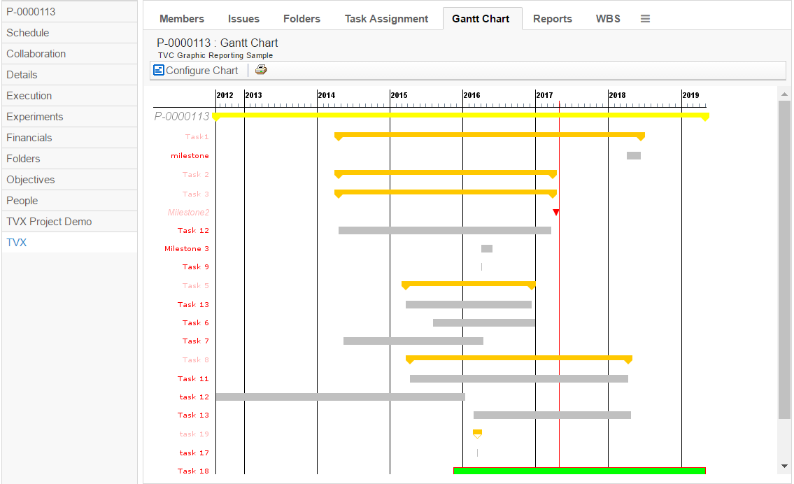
The Gantt chart is used to visualize Project Work Breakdown Structures using the common Gantt notation. Launch the Gantt chart from a Project’s, Program’s, Business goal’s or a Collection’s category menu or as a channel on a portal page.
Figure 1. Gantt chart launched from a Program tree category menu
4.2. Dashboard
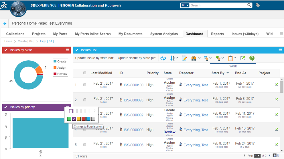
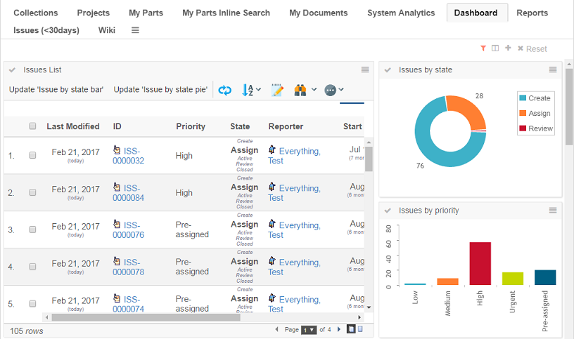
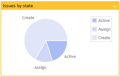
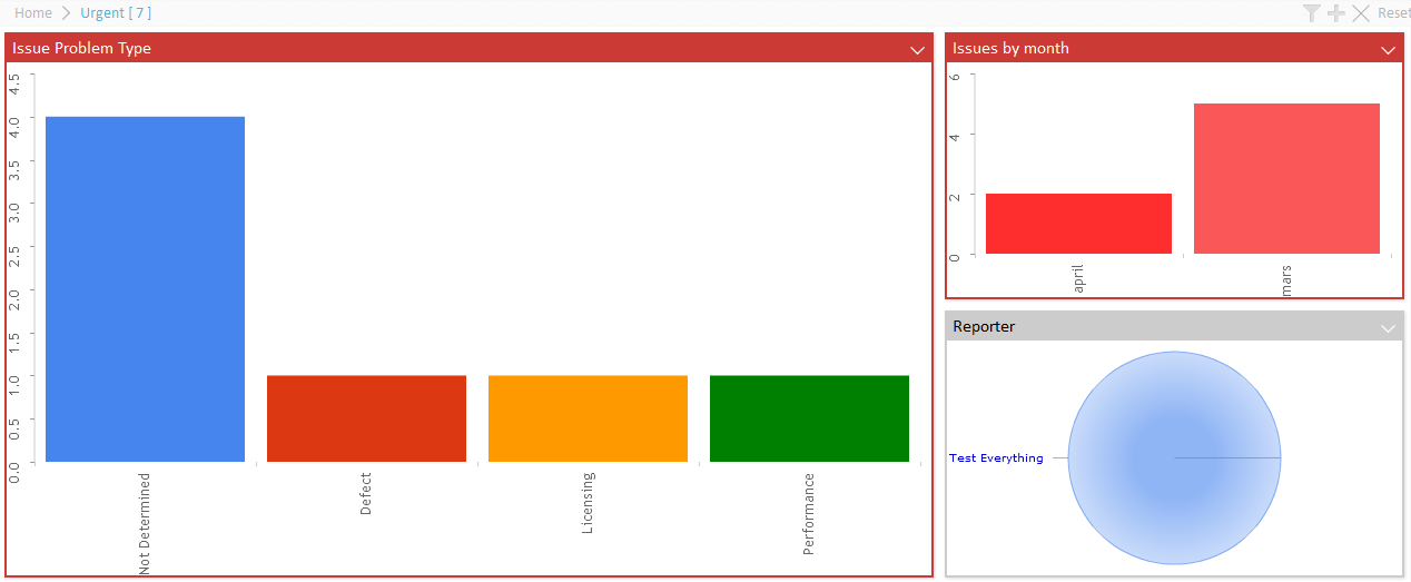
The dashboard user interface supports drill downs, i.e., a user can click on a link in a gadget (perhaps a slice in a pie chart or a link in a table or form) to zoom in on that data set. A user can also maximize gadgets temporarily so that they consume all available screen real estate.
5. Configuring the Dashboard
Dashboards consist of gadgets. There are different types of gadgets, each having their own configuration settings, as well as some standard settings that apply for all gadget types.
5.1. Commands
This section describes how to create a Command to launch a dashboard.
Commands can be created and modified with the Business Administrator and MQL thick clients; however, it is recommended that you use the Business Administrator if you are not familiar with MQL (Matrix Query Language).
The most important parameter when creating a Command to launch the dashboard is the "config" parameter, whose value must follow the standard syntax of a TVC XML resource.
${ROOT_DIR}/tvc-action/dashboard?config=tvc:dashboard/MyDashboard.xml
Or, if using an XML to define the command:
<Command>
    <Label>Dashboard</Label>
    <URL action="dashboard">
        <Param name="config" value="tvc:dashboard/MyDashboard.xml" />
        <Param name="showHelpIcon" value="true" />
    </URL>
</Command>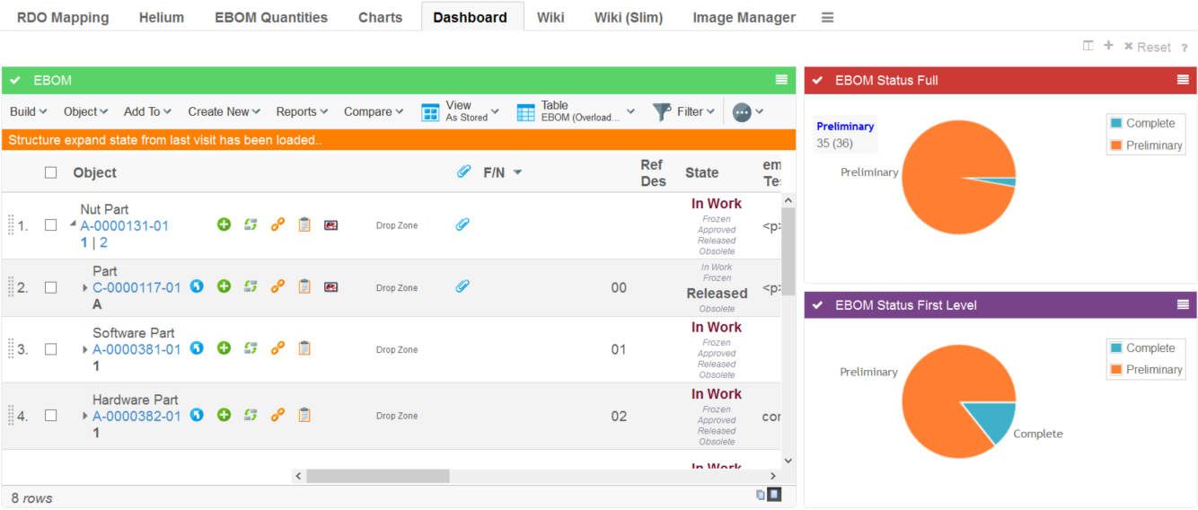
5.1.1. Parameters
| Name | Description | Example |
|---|---|---|
config |
Defines the dashboard configuration to use |
|
searchform |
Defines the search form controlling what data to display in the dashboard. If specified a search panel will be shown to the left where the user can specify the data that is of interest. For example, display only products for a specific season, show parts in a certain state or something else which can be specified using a standard search form. Read the Dashboard Search chapter for more details. |
|
searchOnLoad |
Perform a search when the dashboard is loaded with the default search criteria defined in the search form. |
|
openOnLoad |
Controls if the search panel is displayed when the dashboard is loaded. |
|
showHelpIcon |
Controls if the help icon should be displayed on the dashboard or not. By default, it is false. |
|
5.2. Configuration
The dashboard definition is stored in a directory called "dashboard" among the XML resources (somewhere under /WEB-INF/tvc in your application directory).
If you omit the domain in the resource name, the location of the dashboard definition is:
/WEB-INF/tvc/dashboard
If the dashboard definition is stored in a domain, for example acme (tvc:dashboard:acme/MyDashboard.xml) then the resource location is:
/WEB-INF/tvc/acme/dashboard
If you omit the domain in the gadget reference (see the Import element in 4.2.2.3) resource name, the location of the dashboard definition is:
/WEB-INF/tvc/gadgets
If the gadgets reference definition is stored in a domain, for example acme (tvc:gadgets:acme/MyGadgets.xml) then the resource location is:
/WEB-INF/tvc/acme/gadgets
Please look into this document for more details regarding XML configuration files and format.
5.2.1. Configuration hierarchy
The dashboard definition contains the following main areas:
- Title
-
Defines the breadcrumb value)
- Layout
-
Defines the layout of the dashboard, how many columns, and their span
- Library
-
Defines all the gadgets that should be available on the dashboard
- DefaultView
-
Defines the default view when the user has not yet personalized the dashboard. This means which gadgets are visible, in which column, and their size
5.2.2. Dashboard configuration
The dashboard is defined in XML. The root element must be <Dashboard>.
Below you find child element definitions.
Child Elements Dashboard
| Element Name | Description | Example |
|---|---|---|
Title |
Defines the breadcrumb value. Macros @{value} & @{count} are available to display the text and quantity of the drilled down section. |
|
Layout |
Contains the layout of the dashboard in the form of Column elements. |
|
Library |
Contains all the gadget definitions that should be available on the dashboard. |
|
DefaultView (Optional) |
Contains the definition of the default layout of the dashboard. Sets up which gadgets are added by default, where, and their size. This is optional. |
|
Filters |
Contains definitions of the available filters (filtering unavailable if missing) |
|
Loader |
The loader element enables one shared loader among several gadgets to retrieve the business objects or connections to base the gadgets for. Supported loader types are:
Note that you can still override the dashboard loader element with specific gadget loaders. |
Or
Or
Or
Or
Or
|
Child Elements Layout
A dashboard is built up using columns. When defining the layout of the dashboard, columns need to be added and have their weight set. The weight attribute defines how many columns the gadget should span.
| Element Name | Description | Example |
|---|---|---|
Column |
Sets the title of the dashboard |
<Column weight="1" /> |
Defining the layout of a dashboard containing 3 columns where the first column takes up half the space would for example look like this:
<Layout>
    <Column weight="2" />
    <Column weight="1" />
    <Column weight="1" />
</Layout>
And the result:
Child Elements Library
The library is where all the gadgets are defined. These will be available to be added to the dashboard by the user, or added by default as setup in the DefaultView section of the configuration.
| Element Name | Description | Example |
|---|---|---|
Table |
Contains a table gadget definition. |
|
Chart |
Contains a chart gadget definition. |
|
Frame |
Contains a frame gadget definition |
|
HTML |
Contains an html gadget definition |
|
Import |
Points out a referenced gadgets definition for reuse purposes |
|
Each gadget has some settings that apply only for the specific gadget, but there are some common settings used for all gadgets:
| Setting Name | Description | Example |
|---|---|---|
Label |
Defines the label of the gadget. If no label is defined, it is generated by default. |
|
Description |
Defines the description of the gadget. |
|
Color |
Defines the default color of the container of the gadget. This can be changed by the user for specific instances of the gadget. Gray is the default color. |
Possible Values:
Example:
|
Height |
Defines the height of the gadget in pixels. The height of the gadget can be set globally by init param.
300 is the default value. |
|
Image |
Defines the image to use when displaying the gadget in the library. |
Possible values:
Example:
|
Subscribes |
This will register a gadget with TVC Broker and listen to publish an event. Whenever publish event occurs, it will refresh the gadget with updated data. |
Example: |
Child Elements Table
The table element defines a table gadget. A table gadget displays a TVC Structure Browser table.
| Setting Name | Description | Example | ||
|---|---|---|---|---|
Action |
Defines the name of a tvc-action to be used when loading a table. We can use below predefined tvc-action’s to load contextual objects at drill down in gadgets into a TVC Structure Browser table gadget.
|
<Action>execInquiryToTable</Action> <Action>loadDashboardObjects</Action> <Action>loadDashboardObjectsNavigate</Action> |
||
PageConfig |
Defines a TVC Page configuration to be used. See this document for more information. |
|
||
Loader |
If defined, adds the request parameter "loader" with the value specified.
To use a loader, the action must be one of:
|
|
||
Inquiry |
If defined, adds the request parameter "inquiry" with the value specified. Note: This request parameter might not be used, depending on what action you load. To use a loader, the action must be one of:
|
|
Example:
<Table id="mytablegadget">
    <Label>My Table Gadget</Label>
    <Description>This is my table gadget</Description>
    <Color>Red</Color>
    <Height>500</Height>
    <Action>execCustomLoaderToTable</Action>
    <Loader>dataset:tvc:dataset/MyLoader.xml</Loader>
    <PageConfig>tvc:pageconfig:/MyPage.xml</PageConfig>
</Table>
Child Elements Chart
The chart element defines a chart gadget. This gadget displays charts.
| Element Name | Description | Example |
|---|---|---|
ChartConfig |
Defines a TVC Chart configuration. This can be used to display tvc charts. See this document for more information. |
|
DataProvider |
Defines a data provider. Data providers can create other types of charts than default tvc charts. Pointing to different ones will render different charts. Possible values can be either a custom java class, or a preconfigured chart provider. Please see this chapter for information on the pre-configured chart providers. DataProvider can also be defined by init-param
If no dataprovider is specified, the default is |
Or
|
Inquiry |
Defines a TVC Inquiry to retrieve the business objects or connections to generate the chart for. |
<Inquiry>tvc:inquiry/MyObjects.xml</Inquiry> |
Expression |
Defines a select expression used to generate the sections of the chart. Multiple expressions can be defined to support multilinedate and multiline charts Label attribute can be used to define labels for each expression. |
|
Format |
Defines the format to represent a user in chart. Supported values for format would be user, email. This formatting will apply only to the valid cases of an enovia user found in expression viz. owner, originator etc. |
|
SumExpression |
Defines a select expression used to sum the values of each section. If not defined the logic will sum the object count. |
|
ValueHandler |
Implement custom logic for section values and count. Please see this chapter for information on Value Handlers. |
|
AlternateOIDExpression |
This setting defines the object id’s to load into a chart based on a select expression over the contextual object ids. This is equal to defining a select loader. |
|
OIDExpression |
This setting is used to control which object ID to use on drill down |
|
Loader |
Defines the loader to retrieve the business objects or connections to generate the chart for. Supported loader types are:
|
Or
Or
Or
Or
Or
|
SortByComparator |
Defines a com.technia.tvc.core.chart.Value java.util.Comparator to sort the values in a chart |
|
SortByValueMapping |
Defines the sort order of values |
|
SortByValueCount |
Defines if to sort the values raising or falling by count |
Or
|
Dashboard |
Defines the dashboard configuration to use when a section in a chart is clicked and a "drill-down" is performed (Not supported by gvis) |
|
GroupOther |
Group the least frequent values as "Other" by defining the number of values to be displayed before grouping Set default count by init-param
|
|
Top |
Remove the least frequent values by defining the number of values to be displayed Set default count by init-param |
|
Example:
<Chart id="mychartgadget">
<Label>My chart gadget</Label>
<Description> This is my chart gadget</Description>
<Color>Grey</Color>
<Height>250</Height>
<Image>@PieChart</Image>
<DataProvider>com.technia.tvc.graphicreporting.dashboard.provider.GenericPieProvider</DataProvider>
<Inquiry>tvc:inquiry:tvx:dashboard/MyOpenIssues.xml</Inquiry>
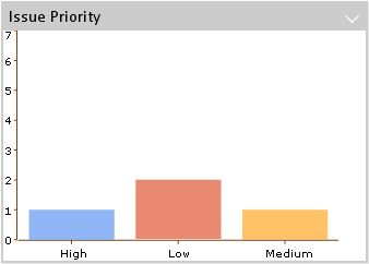
<Expression>attribute[Priority]</Expression>
<Dashboard>tvc:dashboard:tvx:dashboard/IssuesByPriority.xml</Dashboard>
</Chart>Child Elements Frame
A frame gadget can be used to contain any URL specified. This is a very generic gadget, and not all URL’s might be suitable to put in a gadget, so it should be used with caution.
| Element Name | Description | Example |
|---|---|---|
URL |
Defines the URL to populate the gadget. Needs attribute "action" or "href" to specify the url. |
Or
|
Param |
The Param element can be used inside the URL to define parameters to the URL |
|
Example showing the tvc collections page in a gadget:
<Frame id="collections">
    <Label>Collections</Label>
    <Description>My Collections</Description>
    <Color>blue</Color>
    <Height>500</Height>
    <Image>@Table</Image>
    <URL action="showCollections">
        <Param name="portalMode">true</Param>
    </URL>
</Frame>
Child Element DefaultView
The default view is an optional element that can be used to define a default layout of a dashboard. When a user first launches a dashboard, the gadgets and their location defined in this will be the active view. Users can then personalize the view by adding, removing, moving or resizing gadgets.
| Element Name | Description | Example |
|---|---|---|
Column |
The column element defines a column in the default view. The column can contain Gadget elements, or be empty |
Or |
Gadget |
The Gadget element defines the gadget to add to the column in the default view. The attribute "ref" should contain the gadget id. The attribute "span" defines the number of columns that the gadget should fill up. |
|
Example:
<DefaultView>
    <Column>
        <Gadget ref="collections" span="2" />
    </Column>
    <Column/>
    <Column>
        <Gadget ref="my-open-issues-status-pie" span="1" />
        <Gadget ref="my-open-issues-priority-pie" span="1" />
    </Column>
</DefaultView>
This will make the collections gadget span 2 columns, nothing in the middle column, and put 2 chart gadgets in the last column:
Child Element Filters
| Element Name | Description | Example |
|---|---|---|
Filter |
The filter element defines a filter group to be applied to the dashboard data. The filter must contain a label and an expression or a handler definition. |
Or |
Label |
Defines the header of the filterable values. Strings or resource keys are supported. |
OR
|
Expression |
Defines the expression to be used for dividing the data into filterable groups. |
OR
|
Handler |
Defines a filter handler to be used for full control of the filterable data groups. See this chapter for more details on filter handler implementation. |
|
Default |
Defines what filter options to be initially selected. Use either Include or Exclude elements to define the select value defaults. |
OR |
5.2.3. Chart Providers
There are three categories of providers that can be used, along with the available configuration options. They represent three different chart frameworks. Providers whose names end with "ofc" are "Open Flash" charts. Providers whose names end with "gvis" are "Google Visualization" charts. Providers whose names end with "jqplot" are "jqPlot" charts.
All providers use the inquiry and expression elements to retrieve the data.
Open Flash Chart Providers
All providers that end with "ofc" are "Open Flash" charts. These charts require the Adobe Flash Player to be installed in the browser.
Available Open Flash Chart providers
| Provider Name | Description/Configuration options | Example |
|---|---|---|
pie-ofc |
Open Flash pie chart. |
|
bar-ofc |
Open Flash bar chart. |
|
line-ofc |
Open Flash line chart. |
|
Common Open Flash Chart settings
These are the settings that works for all the different Open Flash providers
| Element Name | Description | Example |
|---|---|---|
RotateLegend |
Define if legends should be rotated. Default is false |
|
YAxisSteps |
Specify detail of Y axis values. The highest value of Y will be divided with this value to determine the steps between each value shown: |
|
DateFormat |
If the expression for the chart returns a date value, the x axis can be configured to show the date on a given format. This will also determine how detailed the data is: |
|
ColorMappings |
Define custom colors to be used for specific chart values. Each mapping is separated with a pipe "|" |
|
ColorMappingsExpressions |
Defines expressions to be used for setting custom colors to chart values. Each mapping is separated with a pipe "|" |
|
Colors |
Overrides the default color series |
|
Open Flash Pie Chart Settings
These are the extra settings that can be used for Open Flash Pie Charts
| Element Name | Description | Example |
|---|---|---|
Fade |
Enable/Disable the fade animation. |
|
Bounce |
Enable/Disable the bounce animation. |
|
GradientFill |
Enable/Disable gradient |
|
Open Flash Bar Chart Settings
These are the extra settings that can be used for Open Flash Bar Charts
| Setting Name | Description | Example |
|---|---|---|
Pop |
Enable/Disable the pop animation. |
|
Google Visualization Chart Providers
All providers that end with "gvis" are "Google Visualization" charts. These chart types does not require any browser plugin.
Available Google Visualization Chart providers
| Provider Name | Description/Configuration options | Example | ||
|---|---|---|---|---|
pie-gvis |
Google Visualization pie chart. |
|
||
bar-gvis |
Google Visualization bar chart. |
|
||
column-gvis |
Google Visualization column chart. |
|
||
line-gvis |
Google Visualization line chart. |
|
||
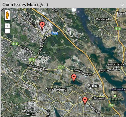
map-gvis |
Google Visualization maps.
|
|
Google Visualization Column Chart Settings
These are the extra settings that can be used for Google Visualization Column Charts
| Element Name | Description | Example |
|---|---|---|
AdditionalExpression |
The additional expression will divide a column into a stack or group of columns |
|
AdditionalReturnExpression |
The return expression is used if the return of the additional expression differs |
|
isStacked |
To control the stacked or grouped behavior use the GVis option "isStacked" (true is default) |
|
Google Visualization Line Chart Settings
These are the extra settings that can be used for Google Visualization Line Charts
| Element Name | Description | Example |
|---|---|---|
Legend |
Specifies the legend to be used. |
|
Google Visualization Map Settings
These are the extra settings that can be used for Google Visualization Line Charts
| Element Name | Description | Example |
|---|---|---|
MarkerContent |
Specifies the content of the marker tooltip. A marker is the pin being shown in a map where an object was created or modified. This content can contain macros and basic HTML. |
|
Google Visualization Extra Settings
The Google Visualization charts can be further configured using options documented for each chart type here:
- pie-gvis
-
http://code.google.com/apis/visualization/documentation/gallery/piechart.html
- bar-gvis
-
http://code.google.com/apis/visualization/documentation/gallery/barchart.html
- column-gvis
-
http://code.google.com/apis/visualization/documentation/gallery/columnchart.html
- line-gvis
-
http://code.google.com/apis/visualization/documentation/gallery/linechart.html
- map-gvis
-
http://code.google.com/apis/visualization/documentation/gallery/map.html
To use these options, add the element "GVisOptions" to the configuration. Separate multiple options using the "|" character. For example:
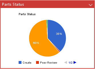
<Chart id='my-parts-status-pie-gvis'>
    <Label>Parts Status</Label>
    <Description>Part Status Pie Chart</Description>
    <Color>red</Color>
    <Height>250</Height>
    <Image>@PieChart</Image>
    <DataProvider>pie-gvis</DataProvider>
    <GVisOptions>legend=bottom|title=Part Status|pieSliceText=percentage|is3D=false</GVisOptions>
    <Inquiry>tvc:inquiry:tvx:dashboard/MyParts.xml</Inquiry>
    <Expression>current</Expression>
</Chart>
jqPlot Chart providers
All providers that end with "jqplot" are "jqPlot" charts. These chart types does not require any browser plugin.
Available jqPlot Chart providers
| Provider Name | Description/Configuration options | Example |
|---|---|---|
pie-jqplot |
jqPlot pie chart |
|
bar-jqplot |
jqPlot bar chart |
|
line-jqplot |
jqPlot line chart |
|
bubble-jqplot |
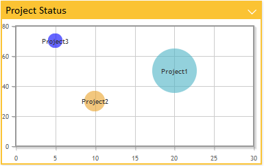
jqPlot bubble chart This chart requires two extra expressions to get values for "x" and "y" axis. For examples check bubble chart settings. |
|
stackbar-jqplot |
jqPlot stack bar chart |
|
donut-jqplot |
jqPlot donut chart |
|
date-jqplot |
jqPlot date chart. This chart requires expression to evaluate into a date or timestamp. Enovia date format is supported |
|
multilinedate-jqplot |
jqPlot multiline date chart. This chart requires expression to evaluate into a date or timestamp. Enovia date format is supported. |
|
multiline-jqplot |
jqPlot multiline chart |
|
Common jqPlot Chart settings
These are the settings that works for all the different jqPlot providers
| Element Name | Description | Example | ||
|---|---|---|---|---|
Options |
Control the options map. Note that settings specified in the options element are added to the default options for the chart type. This makes it possible to override specific options without having to control all of them in your configuration. See http://www.jqplot.com/ for more details on available options.
|
|
||
Resources |
Include jQPlot resources. Available values:
Defaults:
|
|
||
ColorMappings |
Define custom colors to be used for specific chart values. Each mapping is separated with a pipe "|" |
|
||
ColorMappingsExpressions |
Defines expressions to be used for setting custom colors to chart values. Each mapping is separated with a pipe "|" |
|
||
Colors |
Overrides the default color series |
|
||
ShowGrid |
Set to true if chart should have a "grid" as background. Default is false. |
|
||
TextLength |
Defines the maximum number of characters to appear in the legend. If the number of characters in a legend text exceeds this value then the text is truncated and a tooltip is used to display the full text.
|
|
||
Expression |
Defines a select expression used to generate the sections of the chart. Multiple expressions can be defined to support multilinedate and multiline charts Label attribute can be used to define labels for each expression. |
|
||
SeriesExpression |
Defines a select expression used in multi dimensional chart to generate series or stack within the chart. |
|
||
SeriesTop |
Defines number of series to be displayed after which less frequent series will be removed. |
|
||
SeriesGroup |
Defines number of series to be displayed before least frequent values are grouped as "Other". |
|
jqPlot Bar Chart Settings
These are the extra settings that can be used for jqPlot Pie Charts
| Element Name | Description | Example |
|---|---|---|
RotateLegend |
Define if legends should be rotated. Default is false |
|
RotateLegendAngle |
Set what angle to use when enabling "RotateLegend" |
|
BarDirection |
Defines the orientation of bar direction. Valid values are horizontal and vertical, default value is vertical |
|
jqPlot Line Chart Settings
These are the extra settings that can be used for jqPlot Line Charts
| Element Name | Description | Example |
|---|---|---|
RotateLegend |
Define if legends should be rotated. Default is false |
|
RotateLegendAngle |
Set what angle to use when enabling "RotateLegend" |
|
EnableZoom |
Enables the user to zoom parts of a chart. Default is false. |
|
jqPlot Bubble Chart Settings
| Element Name | Description | Example |
|---|---|---|
BubbleXExpression |
Expression for getting "x" axis data values. |
|
BubbleYExpression |
Expression for getting "y" axis data values. |
|
5.2.4. Value Handler
Value handlers are used to implement custom chart section values and counts. The value handler tells what to select, if it should be selected from business objects or connections and how to use the selected data to populate a value and a count.
Example listing the amount of related objects by current state:
public class QtyByType implements ValueHandler {
    private static final SymbolicName ATTR_QTY =
        new SymbolicName("attribute_Quantity");

    private static final Statement QTY =
        new StatementBuilder().attribute(ATTR_QTY).toStatement();

    private static final Statement TO_CURRENT =
        new StatementBuilder().to().current().toStatement();

    private static final Statement TO_ID =
        new StatementBuilder().to().id().toStatement();

    public void populateValue(Gadget gadget,
                              DashboardContext context,
                              ValueMap values,
                              SelectedData selectedData) {
        BigDecimal count = null;
        if (!StringUtils.isOnlyWhitespaceOrEmpty(selectedData.getSelectValue(QTY))) {
            count = new BigDecimal(selectedData.getSelectValue(QTY));
        }
        values.add(new TextValue(selectedData.getSelectValue(TO_CURRENT.getStatement())),
                selectedData.getSelectValue(TO_ID), count);
    }
    public Collection<String> selects(Gadget gadget) {
        return Arrays.asList(new String[]
            { TO_ID.getStatement(), TO_CURRENT.getStatement(), QTY.getStatement() });
    }
    public boolean isBusinessObjectSelect(Gadget gadget) {
        return false;
    }
}
5.2.5. Filter Handler
Filter handlers are used to define custom filtering logic. You could use it to group several values into one filter, make one value be part of several filter alternatives, custom data group labels or to control sorting of the filters.
To sort the filters implement the Comparator interface.
Example grouping on originated date grouped by
-
All times
-
→ Hour
-
1 hour → 1 day
-
1 day → 1 week
-
etc
public class FilterHandlerExample implements FilterHandler, Comparator<SelectValue> {
    private static final long MINUTE = 1000 * 60;
    private static final long HOUR = MINUTE * 60;
    private static final long DAY = HOUR * 24;
    private static final long WEEK = DAY * 7;
    private static final long MONTH = DAY * 30;
    private static final long YEAR = DAY * 365;
    private static final String MORE_THAN_YEAR = "1 year ->";
    private static final String LAST_MONTH_TO_YEAR = "1 month -> 1 year";
    private static final String LAST_WEEK_TO_MONTH = "1 week -> 1 month";
    private static final String LAST_DAY_TO_WEEK = "1 day -> 1 week";
    private static final String LAST_HOUR_TO_DAY = "1 hour -> 1 day";
    private static final String LAST_HOUR = "-> 1 hour";
    private static final String ALL_TIMES = "All times";
    private static final Collection<String> SELS = Arrays.asList(new String[]
        { Statement.ORIGINATED.getStatement() });
    private static final Map<String, Integer> SORT_ORDER = new HashMap<String, Integer>();

    static {
        SORT_ORDER.put(ALL_TIMES, 0);
        SORT_ORDER.put(LAST_HOUR, 1);
        SORT_ORDER.put(LAST_HOUR_TO_DAY, 2);
        SORT_ORDER.put(LAST_DAY_TO_WEEK, 3);
        SORT_ORDER.put(LAST_WEEK_TO_MONTH, 4);
        SORT_ORDER.put(LAST_MONTH_TO_YEAR, 5);
        SORT_ORDER.put(MORE_THAN_YEAR, 6);
    }

    public Collection<String> selects() {
        return SELS;
    }

    public Collection<String> filterAs(SelectedData selectedData, Locale locale) {
        List<String> filterAs = new ArrayList<String>();
        Date d = DateUtils.parse(selectedData.getSelectValue(Statement.ORIGINATED.getStatement()));
        long current = System.currentTimeMillis();
        long delta = current - d.getTime();
        if (delta <= HOUR) {
            filterAs.add(LAST_HOUR);
        } else if (delta <= DAY) {
            filterAs.add(LAST_HOUR_TO_DAY);
        } else if (DAY < delta && delta <= WEEK) {
            filterAs.add(LAST_DAY_TO_WEEK);
        } else if (WEEK < delta && delta <= MONTH) {
            filterAs.add(LAST_WEEK_TO_MONTH);
        } else if (MONTH < delta && delta <= YEAR) {
            filterAs.add(LAST_MONTH_TO_YEAR);
        } else if (YEAR < delta) {
            filterAs.add(MORE_THAN_YEAR);
        }
        // A value could be part of multiple filter alternatives
        filterAs.add(ALL_TIMES);
        return filterAs;
    }
    public int compare(SelectValue o1, SelectValue o2) {
        return SORT_ORDER.get(o1.getSelectValue()) - SORT_ORDER.get(o2.getSelectValue());
    }
}
5.2.6. Enovia tables in dashboard
To enable listing of contextual objects at drill down in gadgets when TVC Structure Browser is not available ENOVIA OOTB tables are supported by configuration.
| Type | Name | Description | ||
|---|---|---|---|---|
Action |
dashboardListOOTB |
The TVC action to call for populating contextual drill down data into an ootb table |
||
Parameter |
table |
The table name to base the table on.
|
Example configuration:
<Frame id='issues-list-ootb'>
    <Label>Issues List OOTB</Label>
    <Description>Displays a list with all context issues.</Description>
    <Color>red</Color>
    <Height>500</Height>
    <Image>@Table</Image>
    <URL action="dashboardListOOTB">
    <Param name="table">IssueList</Param>
    </URL>
</Frame>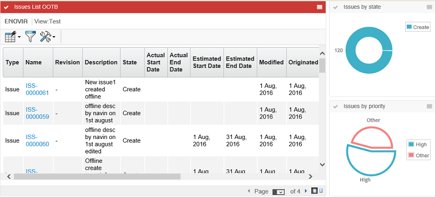
5.3. Loading drill down objects into a dashboard table gadget
When there is a dashboard configured with at least one table gadget in it. Also, there is a loader defined in the dashboard definition but not in the table gadget definition. By default, the table gadget will be loaded with the objects retrieved by the parent dashboard loader into a TVC Structure Browser table gadget in the flat mode. There might be cases the user wants to load the objects into a TVC Structure Browser table gadget in the navigation mode. In such a case, the user can make use of the predefined tvc-action loadDashboardObjectsNavigate to load objects into a TVC Structure Browser table gadget in the navigation mode.
When there is a drill-down dashboard configured with at least one table gadget in it. By default, the objects at drill down in gadgets are loaded into a TVC Structure Browser table gadget in the flat mode. There might be cases that the user wants the objects at drill down in gadgets are to be loaded into a TVC Structure Browser table gadget in the navigation mode. In such a case, the user can make use of the predefined tvc-action loadDashboardObjectsNavigate to load objects into a TVC Structure Browser table gadget in the navigation mode.
User can use below predefined tvc-action’s to load contextual objects at drill down in gadgets into a TVC Structure Browser table gadget.
-
loadDashboardObjects: Display contextual objects at drill down into a TVC Structure Browser table in the flat mode. This action is considered by default if there is no
Actionelement configured in the table gadget. -
loadDashboardObjectsNavigate: Display contextual objects at drill down into a TVC Structure Browser table in the navigation mode.
The example below illustrates how user/admin can construct the gadget restriction:
<?xml version="1.0" encoding="UTF-8"?>
<Gadgets>
    <Table id="CO-table">
        <Label>Change Order</Label>
        <Description>Change Order</Description>
        <Height>600</Height>
        <Color>Yellow</Color>
        <PageConfig>tvc:pageconfig:launchpad:changeprocess/ChangeObjects.xml</PageConfig>
        <Action>loadDashboardObjectsNavigate</Action>
    </Table>
</Gadgets>
5.4. Loading context object into dashboard tables
The loader defined on the dashboard level will be used for loading objects into a table-gadget when there is no loader definition found in the gadget. There might be cases where the user wants to show information about the source/context object by overriding the loading of objects retrieved by the dashboard loader. Through configuration, now it is possible to load context/source object into a table-gadget even when there is a loader defined on dashboard level.
User can use below predefined tvc-action(s) to load context/source object into a TVC Structure Browser table gadget.
-
loadContextObjectToDashboard : Loads context/source object into a TVC Structure Browser table in
flat mode. -
loadContextObjectToDashboardNavigate : Loads context/source object into a TVC Structure Browser table in
navigation mode.
The example below illustrates how user/admin can construct the gadget restriction:
<?xml version="1.0" encoding="UTF-8"?>
<Gadgets>
    <Table id="CO-table">
        <Label>Change Order</Label>
        <Description>Change Order</Description>
        <Height>600</Height>
        <Color>Yellow</Color>
        <PageConfig>tvc:pageconfig:launchpad:changeprocess/ChangeObjects.xml</PageConfig>
        <Action>loadContextObjectToDashboardNavigate</Action>
    </Table>
</Gadgets>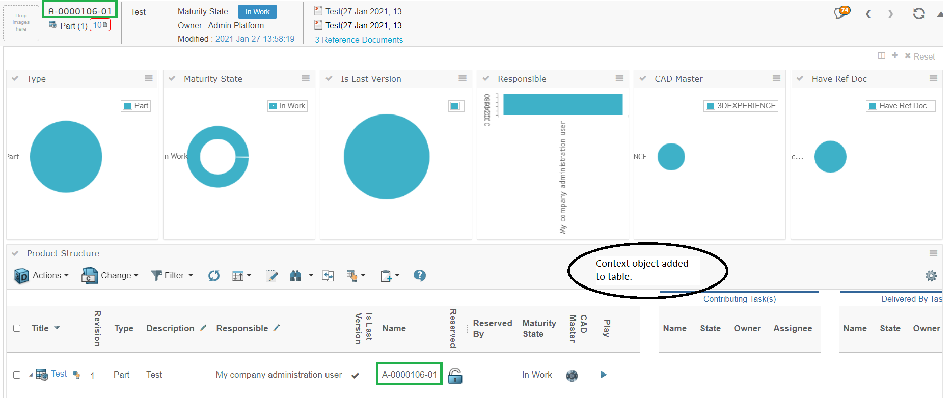
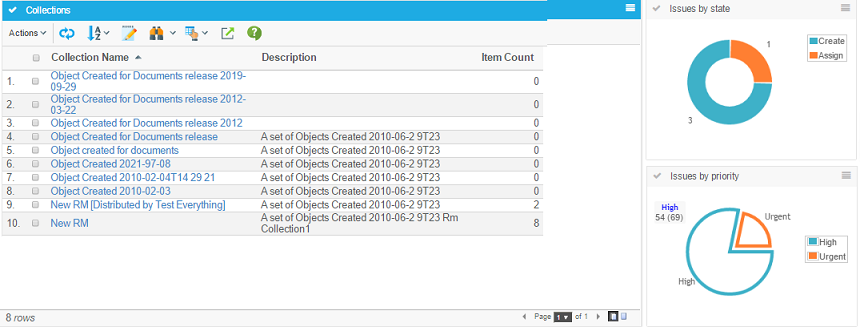
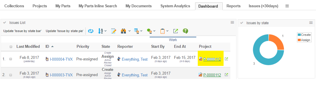
Figure 2. Loading context object into dashboard tables
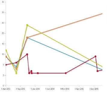
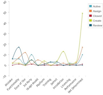
5.4.1. Multi Dimensional Chart
Multi dimensional chart can be implemented using SeriesExpression or multiple Expressions. When SeriesExpression is used, chart data elements are segregated into multiple series based on value of SeriesExpression, when multiple Expression are used each expression represents a series.
Example Configuration:
Using mutiple Expression
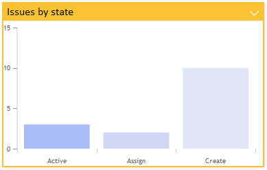
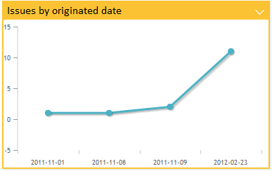
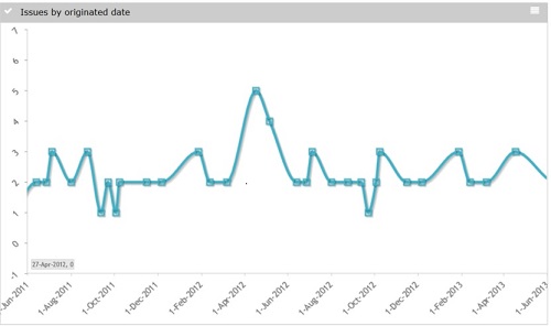
<Chart id="jqplot-issues-by-originated-line">
<Label>Issues by State dates</Label>
<Color>gray</Color>
<Height>500</Height>
<Image>@LineChart</Image>
<DataProvider>multilinedate-jqplot</DataProvider>
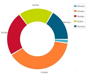
<Expression label="tvc.graphicreporting.dashboard.issue.create">state[Create].start</Expression>
<Expression label="tvc.graphicreporting.dashboard.issue.review">state[Review].start</Expression>
<Expression label="tvc.graphicreporting.dashboard.issue.active">state[Active].start</Expression>
<Expression label="tvc.graphicreporting.dashboard.issue.assign">state[Assign].start</Expression>
<RotateLegendAngle>-45</RotateLegendAngle>
<EnableZoom>true</EnableZoom>
</Chart>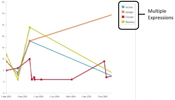
Using Series Expression
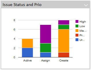
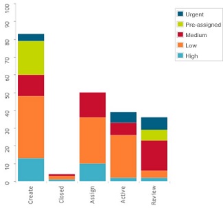
    <Chart id="jqplot-issues-by-state-stackbar">
        <Label>Issues by Priority and state</Label>
        <Description>Issues by state displayed in a bar chart</Description>
        <Height>500</Height>
        <Image>@ColumnChart</Image>
        <DataProvider>stackbar-jqplot</DataProvider>
        <Expression>current</Expression>
        <SeriesExpression>attribute[Priority]</SeriesExpression>
        <DisplayTooltip>true</DisplayTooltip>
        <RotateLegend>true</RotateLegend>
    </Chart>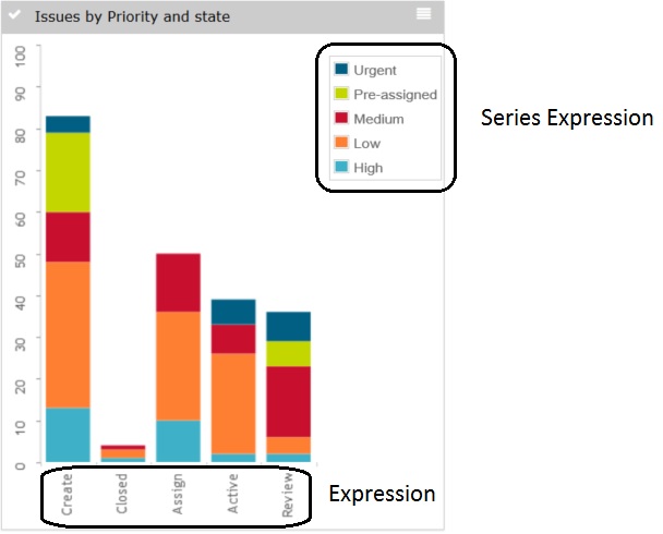
Below table lists down valid series configuration for different multidimensioanl charts
| Chart | Configuration |
|---|---|
StackBar Chart |
SeriesExpression - Series Expression can be used to define stacks in Stack Bar chart. |
MultiLine Chart |
SeriesExpression - Series Expression can be used to segregate data elements into multiple lines, each line represents unique SeriesExpression value. Multiple Expression - Multiple Expression can be defined and each expression will be treated as a series or line. |
MultiLine Date Chart |
SeriesExpression - Series Expression can be used to segregate data elements into multiple lines, each line represents unique SeriesExpression value. Multiple Expression - Multiple Expression can be defined and each expression will be treated as a series or line. Note: Expression should be of type date/timestamp. Supports Enovia date format. |
Multi Value Handler
Like Value handlers, Multi Value handlers are used to implement custom chart section values, series and counts. The multi value handler tells what to select, if it should be selected from business objects or connections and how to use the selected data to populate a value, a sreies and a count.
Example listing the amount of related objects by current state and type:
public class QtyByTypeAndState implements MultiValueHandler {
    private static final SymbolicName ATTR_QTY =
        new SymbolicName("attribute_Quantity");

    private static final Statement QTY =
        new StatementBuilder().attribute(ATTR_QTY).toStatement();

    private static final Statement TO_CURRENT =
        new StatementBuilder().to().current().toStatement();

    private static final Statement TO_TYPE =
        new StatementBuilder().to().type().toStatement();

    private static final Statement TO_ID =
        new StatementBuilder().to().id().toStatement();

    public void populateValue(Gadget gadget,
                              DashboardContext context,
                              MultiValueMap values,
                              SelectedData selectedData) {
        BigDecimal count = null;
        if (!StringUtils.isOnlyWhitespaceOrEmpty(selectedData.getSelectValue(QTY))) {
            count = new BigDecimal(selectedData.getSelectValue(QTY));
        }
        values.add(new TextValue(selectedData.getSelectValue(TO_CURRENT.getStatement())), selectedData.getSelectValue(TO_TYPE.getStatement()),
                selectedData.getSelectValue(TO_ID), count);
    }
    public Collection<String> selects(Gadget gadget) {
        return Arrays.asList(new String[]
            { TO_ID.getStatement(), TO_CURRENT.getStatement(), QTY.getStatement(), TO_TYPE.getStatement() });
    }
    public boolean isBusinessObjectSelect(Gadget gadget) {
        return false;
    }
}
5.5. Drilldowns
Drilldowns can be enabled to display another dashboard based on the objects of a clicked section of a chart or a table in a dashboard. The data in the gadgets of the dashboard drilled down into would be based on the objects of the section in the previously clicked dashboard. Drilldowns could be performed multiple times in a row. To navigate in the structure of drilldowns and to be able to return to a previous dashboard in the hierarchy breadcrumbs are available in the top left corner.
Drill downs are not supported for gvis charts.
5.5.1. Bread crumb
To enable drilldown navigation breadcrumbs are available to the top left. The breadcrumbs are configurable and macros for the drilled down section text value and quantity exist.
5.5.2. Drilldowns from Charts
To enable drilldown from a chart simply add the Dashboard element defining the dashboard configuration to be used for the drill down.
Dashboard |
Defines the dashboard configuration to use when a section in a chart is clicked and a "drill-down" is performed. |
|
5.5.3. Drill Down from Table Pages
When you load a table in a gadget, you can configure a column to support drill-down. E.g. when clicking on something in the table, you can open a nested dashboard showing some other information.
In the example below, a dashboard has been configured to display issues. Each issue has a column showing the project, which the issue is related to. Clicking the project name brings up another dashboard with information around the clicked project.
To configure a table-column to support drill down, you configure it as shown below:
<Column>
    <Name>project</Name>
    <Label>Project</Label>
    <Href>emxTree.jsp</Href>
    <TargetLocation>popup</TargetLocation>
    <Expression>from[Issue].to.name</Expression>
    <AlternateOIDExpression>from[Issue].to.id</AlternateOIDExpression>
    <AlternateTypeExpression>from[Issue].to.type</AlternateTypeExpression>
    <ShowAlternateIcon>true</ShowAlternateIcon>
    <ColumnType>dashboard</ColumnType>
    <Setting name='DashboardConfig'>tvc:dashboard:tvx:dashboard/Project.xml</Setting>
</Column>
As an alternative to specify the dashboard configuration to be used when clicking a value in this column as a setting, is to specify this on the page-config level using the syntax shown below:
<PageConfig>
    ...
    <Parameters>
        <Parameter name="dashboardconfig.project">tvc:dashboard:tvx:dashboard/Project.xml</Parameter>
    </Parameters>
</PageConfig>
E.g. using a parameter starting with "dashboardconfig." and ending with the column name.
This makes it possible to reuse the same table in different context’s, but just configure the dashboard config on the page-config level.
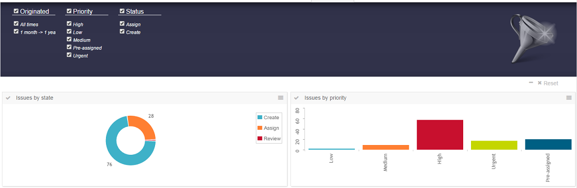
5.6. Search
Search can be enabled to make it possible for the user to specify which data to display in the dashboard. This makes it possible for the user to easily filter out the data of interest.
A standard search form is used to specify what the user is able to search on. For example, the user can specify the type of object, that the object must be in a certain state, is related to a specific ECO or some other criteria that be specified with a search form. Exalead is used the background to perform the search.
| This dashboard search requires Exalead. |
See the parameters chapter for details on how to activate the search and specify which search form to use.
Search form configuration used in the above screen shot:
<?xml version="1.0" encoding="UTF-8"?>
<SearchFormConfig
        xmlns="http://technia.com/TVC/SearchFormConfig"
        xmlns:xsi="http://www.w3.org/2001/XMLSchema-instance"
        xsi:schemaLocation="http://technia.com/TVC/SearchFormConfig http://products.technia.com/tvc/schema/latest/SearchFormConfig.xsd"
        defaultLimit="1000">
    <Fields>
        <TypeField>
            <DefaultValue>type_Part</DefaultValue>
            <SearchableType>type_Part</SearchableType>
        </TypeField>
        <NameField />
        <Field mapsTo="attribute_EffectivityDate">
            <IndexField>PART_EFFECTIVITY_DATE</IndexField>
        </Field>
        <OwnerField />
        <StateField>
            <Policy name="policy_ECPart" />
            <Policy name="policy_DevelopmentPart" defaultStates="Create" />
        </StateField>
        <Field mapsTo="attribute_UnitofMeasure">
            <IndexField>UNIT_OF_MEASURE</IndexField>
        </Field>
        <Field mapsTo="attribute_SparePart">
            <IndexField>SPARE_PART</IndexField>
        </Field>
        <Field mapsTo="attribute_MaterialCategory" editable="true">
            <IndexField>MATERIAL_CATEGORY</IndexField>
        </Field>
        <Field multipleAllowed="true">
            <Label>Design Responsibility</Label>
            <IndexField>REL_DESIGN_RESPONSIBILITY</IndexField>
            <AutoCompleteHandler>dataset</AutoCompleteHandler>
            <AutoCompleteSettings>{
                "handler" : {
                    "dataset" : "tvc:dataset:tvx:enc/Organizations.xml"
                }
            }</AutoCompleteSettings>
        </Field>
    </Fields>
</SearchFormConfig>
The <IndexField> - which is a child element to <Field> - is used to specify
where the data is indexed in Exalead. The field name specified in the element
needs to match the data you are intrested in searching. A number of fields have
sensible default values. For example, the <TypeField> searches by default in
the field TYPE. Override the default value using the <IndexField>.
| The config.xml bundled with the Exalead installation contains information about what data that is indexed and the name of each field. |
Auto complete is supported for fields in the search form. This makes it easier
for users to find a user, specify a type or find a related object to filter on.
Use the element <AutoCompleteHandler> to specify which handler to use or
<AutoCompleteSettings> to take full control of the auto complete feature.
More information about auto complete is
available in the core guide.
Make sure that no <Loader> is specified in the dashboard or gadget
configuration. It will have priority over objects found using the search.
The defaultLimit attribute on the root element is used to limit the
maximum number of objects that the search returns.
5.6.1. Field types
Supported field types:
-
Field. Typically used to search on attributes and basics. Buttons are displayed in the UI in case the attribute contains range values. Otherwise a freetext field is displayed. Use auto complete to make it easier for users to specify the relevant criteria.
-
NameField. Built-in field searching on the name of the object.
-
OwnerField. Built-in field searching for the owner of the object. Uses auto complete with the user handler by default.
-
StateField. Built-in field searching for the state of the object. Each state is presented with a button in the UI.
-
TypeField. Built-in field used to specify the type of object to search for. Uses auto complete with type handler by default.
5.6.2. Drilldowns
The objects matching the users search criteria is added to the top-most dashboard. It’s possible to drilldown in the data in the standard way for dashboards. When a new search is performed the drilldown is reset and the top-most dashboard is displayed with the search result.
| When using drill down the id of every object is sent to the client in order to keep track of what object that is related to each piece in the chart. Exalead can return you big sets of data and users might experience that it gets slower when used in combination with drilldowns. In order to mitigate the problem try to use drilldown in as few gadgets as possible and reduce the original set of objects. |
5.7. Path Support
In 3dexperince, more and more of the data model is moving towards path-based. Change Process is one good example and there is a need to be able to visualize the path-based data model by config only.
The path related object/relationship information can be used to generate charts. This can be done using the path query dataset in chart config. A path is a kind of relationship. It is a way for one object to point to another object using a virtual path.
The path query dataset requires input. It can either use the input from a loader defined as a child element OR it can use the input as provided by the caller (typically from request parameters such as "emxTableRowIdParam" passed from selected rows in a table/structure page OR the "objectId" parameter which is used to pass the object id of one or more objects).
Below example generates a chart based on the state of Change Orders related to parts owned by the user. In this case, the loader must point to Path Query which will return change order id’s and the Expression should point to selects on those change order id’s, in this case, current.
The path query loader internally calls the nested query loader. Then it will get all the parts that are created by the context user. Now the parts retrieved from query loader acts as input for path query dataset. Finally, the path query dataset fetches the Change Orders associated with the retrieved parts.
<?xml version="1.0" encoding="UTF-8"?>
<Gadgets xmlns="http://technia.com/TVC/Dashboard" xmlns:xsi="http://www.w3.org/2001/XMLSchema-instance"
	xsi:schemaLocation="http://technia.com/TVC/Dashboard http://products.technia.com/tvc/schema/latest/Gadgets.xsd">
	<Chart id="CO-State">
		<Label>CO State's</Label>
		<Description>CO State</Description>
		<Expression>current</Expression>
		<Loader>dataset:tvc:dataset:launchpad:changeprocess/ChangeObjects.xml</Loader>
		<Color>Blue</Color>
		<Dashboard>tvc:dashboard:launchpad:changeprocess/ChangeDrillDown.xml</Dashboard>
	</Chart>
</Gadgets>
Below is the loader definition used in the above example.
<PathQuery>
	<PathType>Proposed Activity.Where</PathType>
	<PathSelect>owner.to[Proposed Activities].from.to[Change Action].from.id</PathSelect>
	<Query>
		<ExpandType>true</ExpandType>
		<FindLimit>0</FindLimit>
		<TypePattern>
			<Type>type_Part</Type>
		</TypePattern>
		<VaultPattern>
			<Vault>eService Production</Vault>
		</VaultPattern>
		<Where>owner == context.user</Where>
	</Query>
</PathQuery>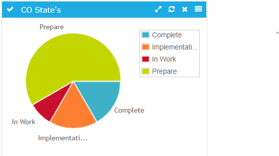
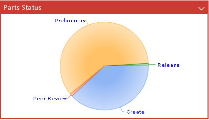
Figure 3. Pie chart showing CO’s grouped by state
Settings:
| Name | Description | Default |
|---|---|---|
PathType |
Type of Path to search for |
|
PathSelect |
expression to get the respective id |
id |
QueryKind |
how the query will operate on subpath |
containsany |
vault |
Vault to search for |
|
where |
Where clause to use |
|
ElementInquiry |
name of the inquiry to the elements for query |
The table below describes the various combinations of configuring path query with nested loaders and a short description about each. For the full range of nested loader combinations please refer to the Data Sets
| Nested Loader | Description | Example |
|---|---|---|
Expand |
Performs an expansion. The way the expansion is done, is configured through child elements. |
The below example is useful to display only the change objects associated with the level one EBOM connected children part objects. |
Query |
Performs a temp query. The query parameters are configured as child elements. |
Below example can be used to get all the |
Inquiry |
Executes an inquiry. Either the inquiry is defined "inline" in the XML, or reference of an existing inquiry. |
Below example can be used to get all the |
Select |
Performs a "select" to retrieve the desired objects. |
The below example is useful to display only the change objects associated with the level one EBOM connected children part objects. |
Java |
Defines a loader implemented in Java. |
Below example can be used to get all the |
Java Program Object |
Executes a Java Program Object. |
Below example can be used to get all the |
DataSetRef |
Includes the content from another data-set. |
|
6. Workflow
6.1. Introduction
The TVC Workflow feature adds a set of functionality that allows users to collaborate around ENOVIA™ process in various ways. Some of the features are:
-
Workflows in context of ENOVIA™ objects
-
Real time notifications on workflow events
-
Inbox to view received tasks
-
Approve or reject a task
6.1.1. System Requirements
The following is a list of the requirements for the installation of this TVC. If your system is different, consult Technia before installing. For best performance it is recommended to use the latest version of browsers and application servers.
-
Requires ENOVIA™ V6R2013 or any later version.
-
Application Server according to the ENOVIA™ core product requirements that is also in the list of supported platforms for the Atmosphere framework (see disclaimer below).
-
If you are using multiple application servers, you must read the next chapter.
-
-
For the Exalead™ powered features you need to install and setup Exalead
Disclaimer: This feature uses a framework called Atmosphere for sending notifications from the server to the clients. This framework supports a wide range of browser and app servers. We will not be able to add support for browsers and/or app servers that is outside of this frameworks support. Also we might not be able to fix issues that could appear in the usage of this framework. See following pages for a list of this frameworks supported platforms and known issues:
| Web browser IE11 in IE9 mode is not supported. |
6.1.2. Multiple Application Servers
Many environments are scaled horizontally to support a larger amount of users. When having > 1 application server you need to use a load balancer that can divide the users across these application servers somehow.
The Collaboration component uses the web socket technology for setting up persistent connections between clients and servers and this technology has a completely different analogy than the traditional request/response paradigm used in HTTP/HTTPS communication. This will have some impact on your infrastructure since your load-balancer must be able to deal with web sockets correctly.
| Technia cannot support every possible infrastructure combination. We can however share information how we have tested it, on what software’s and our configurations. To enable this feature in your own environment / setup-combination you must consult the documentation of your infrastructure components. |
6.1.3. App-to-App-Server Communication
Since users in fact are connected to different application servers, but still should be able to receive notifications from other users – there is a need for the application servers to be able to speak with each other.
There are currently two different implementations available that solves this, one of the implementation uses HTTP communication between the servers and the second implementation uses the Open Source library named Ehcache. The latter is the default communication strategy.
The choice of strategy is defined with a TVC init-parameter. The name of the parameter and the possible values are shown below:
tvc.collaboration.appServerNotificationStrategy = ehcache | http
Ehcache™
The Ehcache™ component allows us to setup caches which are replicated among all the other application servers in the same cluster. This replication is done via the RMI protocol and each application server in the cluster is joining a TCP multicast-group.
The strategy of this implementation will try to automatically setup the network communication, but, there are some init-parameters that you may want to fine-tune for some reason or other.
For example, the port that we bind to is automatically picked by selecting a random free port within a specified range. Most likely, you want to define the port manually and in some cases also the network interface to bind to. If your host has multiple network interfaces you might need to specify the host name also. By default, the host name is resolved via the Java API:
InetAddress.getLocalHost().getHostAddress()
Defining the port and host can be done either with JVM system parameters OR TVC init parameters. The parameter name is the same regardless if you define them as a JVM system parameter or as a TVC init parameter. Below is an example how to define as JVM system parameter.
-Dtvc.collaboration.cache.listener.hostName=172.16.16.100
-Dtvc.collaboration.cache.listener.port=2010
The table below shows the additional TVC init parameters that you may want to change in some cases.
| Init Parameter Name | Description | Default Value |
|---|---|---|
tvc.collaboration.cache.listener.portRangeStart |
If you have defined a port explicitly as described above, this parameter can be ignored. Defines the lowest port number that we will try to use. |
4001 |
tvc.collaboration.cache.listener.portRangeEnd |
See above. Defines the highest port number that we might use. |
41020 |
tvc.collaboration.cache.listener.socketTimeoutMillis |
The number of milli-seconds client sockets will wait when sending messages to this listener until they give up. |
2000 |
tvc.collaboration.cache.provider.multicastGroupAddress |
The multi-cast address to be used. |
230.0.0.1 |
tvc.collaboration.cache.provider.multicastGroupPort |
The multi-cast port to be used. |
446 |
tvc.collaboration.cache.provider.timeToLive |
You can control how far the multicast packets propagate by this setting. Using the multicast IP protocol, the timeToLive value indicates the scope or range in which a packet may be forwarded. By convention:
|
1 |
tvc.collaboration.exalead.cache.replicateAsynchronously |
whether replications are asynchronous (true) or synchronous (false) |
false |
HTTP Communication
When selecting the HTTP communication approach, each app-server must be able to connect to the other app server(s) in the cluster via HTTP. The implementation will try to identify the URL of the Application server automatically, but, this might in many cases fail due to the setup of load-balancers / proxies and hence you must inform each application server about their own HTTP address. This is done easiest by providing a JVM system parameter to the application server as shown below:
-Dtvc.collaboration.appServerURL=http://the-appserver-machine:8080/enovia
6.1.4. Test Scenario
Technia have during the development of the Collaboration component tested on a setup using an Apache HTTPD server acting as a load-balancer and behind having a couple of app servers running Apache Tomcat. All on a Windows 7 host.
The Apache HTTPD server has lately improved their support for web-socket tunneling, and we were using the version 2.4.10.VC11 (64 bit).
The Apache Tomcat versions were 7.0.56 (64 bit).
Below are the configurations we made. Note that we only provide these as examples and you should and might need to adjust them to your needs.
Apache HTTPD Configuration
The modules we explicitly enabled were:
-
proxy_module
-
proxy_ajp_module
-
proxy_balancer_module
-
proxy_wstunnel_module
-
lbmethod_byrequests_module
-
lbmethod_bytraffic_module
-
slotmem_shm_module
Proxy configuration
<Proxy balancer://ws>
BalancerMember ws://inv3373:8080 route=t8009
BalancerMember ws://inv3373:8081 route=t8010
ProxySet lbmethod=bytraffic
ProxySet stickysession=JSESSIONID
</Proxy>

ProxyPass /enovia/collaboration/communication balancer://ws/enovia/collaboration/communication

<Proxy balancer://ajp>
BalancerMember ajp://inv3373:8009 loadfactor=1 route=t8009
BalancerMember ajp://inv3373:8010 loadfactor=1 route=t8010
ProxySet lbmethod=bytraffic
ProxySet stickysession=JSESSIONID
</Proxy>

ProxyPass /enovia balancer://ajp/enovia
Tomcat Configuration
Each Tomcat instance were started up using a dedicated start script. Since they were all running on the same machine, we had to configure the ports per instance.
In that start script we configured a number of CATALINA_OPTS as shown
below.
set CATALINA_OPTS=-Dtvc.collaboration.appServerURL=http://localhost:8080/enovia
set CATALINA_OPTS=%CATALINA_OPTS% -Dtomcat.server.port=8005
set CATALINA_OPTS=%CATALINA_OPTS% -Dtomcat.http.port=8080
set CATALINA_OPTS=%CATALINA_OPTS% -Dtomcat.redirect.port=8443
set CATALINA_OPTS=%CATALINA_OPTS% -Dtomcat.ajp.port=8009
The Tomcat server.xml file were changed (note for readability, only changed parts included):
<Server port="${tomcat.server.port}"

<Connector port="${tomcat.http.port}" redirectPort="${tomcat.redirect.port}" />
<Connector port="${tomcat.ajp.port}" protocol="AJP/1.3" redirectPort="${tomcat.redirect.port}" />

<Engine name="Catalina" defaultHost="localhost" jvmRoute="t${tomcat.ajp.port}">
Apache HTTPD Websocket Proxy Configuration
If apache is used to proxy the request to the tomcat server, websocket request could be dropped. Websocket communication is required for collaboration myspace to work properly.
Following is the configuration done in one of the httpd.conf used in apache with ENOVIA 2017x to proxy websocket requests.
3DSpace_httpd_fragment.conf
# to be added in <VirtualHost _default_:443> section of httpd-ssl.conf
RequestHeader set X-Forwarded-Proto "https"
RequestHeader set X-Forwarded-Port "444"

# TVC Collaboration Websocket configuration Starts

LoadModule proxy_module modules/mod_proxy.so
LoadModule proxy_wstunnel_module modules/mod_proxy_wstunnel.so

RewriteEngine on
ProxyRequests Off
ProxyPreserveHost on

ProxyPass /3dspace/collaboration/communication ws://localhost:8090/3dspace/collaboration/communication
ProxyPassReverse /3dspace/collaboration/communication ws://localhost:8090/3dspace/collaboration/communication

# TVC Collaboration Websocket configuration Ends

ProxyPass /3dspace http://localhost:8090/3dspace
ProxyPassReverse /3dspace http://localhost:8090/3dspace
In Enovia versions which are higher than 2017x and using location-based httpd configuration, proxy pass entries can be added in 3DSpace_httpd_fragment.conf in following way.
# TVC Collaboration Websocket configuration Starts

<Location /3dspace/collaboration/communication>
ProxyPass ws://localhost:9080/3dspace/collaboration/communication
ProxyPassReverse ws://localhost:9080/3dspace/collaboration/communication
</Location>

# TVC Collaboration Websocket configuration Ends
6.2. Installation
After installing TVC, you must perform three tasks in order to take this feature in to use.
6.2.1. Task 1 – Modifying emxNavigator.jsp
The first task is needed in order to include some functionality within the "emxNavigator.jsp" page (resides in the common folder in your application directory). The only change needed in this file, is to add a single line of code.
Just after the "body" element tag, add the line below (shown in bold):
<body ...>
<%@include file = "/tvc/collaboration/emxNavigator.jspf" %>
...
6.2.2. Task 2 – Modifying emxNavigatorDialog.jsp
The second task is needed in order to include some functionality within the "emxNavigatorDialog.jsp" page (resides in the common folder in your application directory). The only change needed in this file, is to add a single line of code.
Just after the "body" element tag, add the line below (shown in bold):
<body ...>
<%@include file = "/tvc/collaboration/emxNavigator.jspf" %>
...
6.2.3. Task 3 – web.xml
The third task needed is the registration of the Atmosphere servlet that is used for sending notifications from the server to the client (https://github.com/Atmosphere/atmosphere). The following lines should be added to web.xml
<servlet>
    <servlet-name>AtmosphereServlet</servlet-name>
    <servlet-class>org.atmosphere.cpr.AtmosphereServlet</servlet-class>
    <async-supported>true</async-supported>
    <init-param>
        <param-name>org.atmosphere.cpr.packages</param-name>
        <param-value>com.technia.tvc.collaboration.core.io</param-value>
    </init-param>
    <init-param>
        <param-name>org.atmosphere.annotation.packages</param-name>
        <param-value>com.technia.tvc.collaboration.core.io</param-value>
    </init-param>
    <load-on-startup>5</load-on-startup>
</servlet>
<servlet-mapping>
    <servlet-name>AtmosphereServlet</servlet-name>
    <url-pattern>/collaboration/*</url-pattern>
</servlet-mapping>
6.2.4. TVC Stand-alone Pages
Collaboration panel are also rendered in stand-alone tvc pages like /launchFromPortal, /loadCategoryTopPanel, /loadTopPanel and /searchBasedTable based on configuration.
Following is the default configuration.
tvc.core.collaboration.inject.pages=launch-portal|top-panel|category-panel|search-table
If collaboration panel injection is not required on any of the supported pages, that page can be removed in the configuration.
tvc.core.collaboration.inject.pages=top-panel|category-panel
Even on the supported stand-alone pages, Collaboration panel is rendered by default only if the page is top most.(Popup or browser tab)
That behavior could be changed with the following property configuration.
tvc.core.collaboration.inject.top.only=true
This could be used in application where emxNagivator.jsp is not configured with collaboration and tvc pages only used for navigation.

Figure: Collaboration panel for /launchFromPortal

Figure: Collaboration panel for /loadTopPanel

Figure: Collaboration panel for /loadCategoryTopPanel

Figure: Collaboration panel for /searchBasedTable
6.2.5. Provider
There are three built-in providers available in Collaboration. They are "config"(default), "enovia" and "exalead". The provider value can also be a class full-name which extends "com.technia.tvc.collaboration.core.model.Provider". The provider can be configured as below.
tvc.collaboration.providerClass=config
The default "config" provider enables possibility to have Discussion and Workflow components run in different mode.
tvc.collaboration.discussion.mode=exalead
tvc.collaboration.workflow.mode=enovia
The other "enovia" or "exalead" provider makes both Discussion and Workflow run in same mode.
6.2.6. Exalead™
In order to use any of the features that requires Exalead you need to install Exalead and set it up for collaboration. To enable Exalead for Collaboration there is a TVC Init parameter that needs to be set.
tvc.collaboration.providerClass=exalead
or
tvc.collaboration.providerClass=config
tvc.collaboration.discussion.mode=exalead
tvc.collaboration.workflow.mode=exalead
In order for Exalead to know what data to index for Collaboration the following needs to be added to your Exalead index configuration file.
<BOTYPEFIELDS name="TVCCollaborationSet">
    <FIELD name="TVC_COLLAB_SET_TYPE" select="type" type="STRING" />
    <FIELD name="TVC_COLLAB_SET_ID"
        select="program[TVCCollaborationIndex -method getSetId ${OBJECTID}]"
        type="STRING" />
    <FIELD name="TVC_COLLAB_SET_OWNER" select="owner" type="STRING" />
    <FIELD name="TVC_COLLAB_SET_CONTEXT_ID"
        select="program[TVCCollaborationIndex -method getSetContextIds ${OBJECTID}]"
        type="STRING" />

    <FIELD name="TVC_COLLAB_NOTIFICATION_USER_NAME"
        select="program[TVCCollaborationIndex -method getSelectDataList ${OBJECTID} 'to[TVC Collaboration Notification].from.owner']"
        type="STRING" />
    <FIELD name="TVC_COLLAB_NOTIFICATION_USER_TAGS"
        select="program[TVCCollaborationIndex -method getNotificationUserTags ${OBJECTID}]"
        type="STRING" />
    <FIELD name="TVC_COLLAB_NOTIFICATION_CATEGORIES"
        select="program[TVCCollaborationIndex -method getNotificationCategories ${OBJECTID}]"
        type="STRING" />
    <FIELD name="TVC_COLLAB_NOTIFICATION_STATUS"
        select="program[TVCCollaborationIndex -method getNotificationStatus ${OBJECTID}]"
        type="STRING" />
    <FIELD name="TVC_COLLAB_NOTIFICATION_UNREAD_USERS"
        select="program[TVCCollaborationIndex -method getNotificationUnreadUsers ${OBJECTID}]"
        type="STRING" />
    <FIELD name="TVC_COLLAB_FOLLOWUP_USER_NAME"
        select="program[TVCCollaborationIndex -method getSelectDataList ${OBJECTID} 'to[TVC Collaboration Followup].from.owner']"
        type="STRING" />
    <FIELD name="NAME"
        select="program[TVCCollaborationIndex -method getSetSortValue ${OBJECTID}]"
        type="STRING" fastsort="true" />
</BOTYPEFIELDS>

<BOTYPE name="TVC Collaboration Thread" includes="TVCCollaborationSet,TVCCollaborationThread" />

<BOTYPEFIELDS name="TVCCollaborationThread">
    <FIELD name="TVC_COLLAB_THREAD_CLOUDS"
        select="program[TVCCollaborationIndex -method getClouds ${OBJECTID}]"
        type="STRING" />
    <FIELD name="TVC_COLLAB_THREAD_FIRST_MSG_SENT_FROM" select="from[TVC Collaboration First Message].to.owner"
        type="STRING" />
    <FIELD name="TVC_COLLAB_THREAD_FIRST_MSG_SENT_TO"
        select="program[TVCCollaborationIndex -method getSelectDataList ${OBJECTID} 'from[TVC Collaboration First Message].to.from[TVC Collaboration Sent To].to.owner']"
        type="STRING" />
    <FIELD name="TVC_COLLAB_THREAD_HAS_ATTACHMENT"
        select="from[TVC Collaboration First Message].to.format.hasfile"
        type="STRING" />
    <FIELD name="TVC_COLLAB_THREAD_IMPORTANT"
        select="from[TVC Collaboration First Message].to.attribute[TVC Collaboration Important]"
        type="STRING" />
    <FIELD name="TVC_COLLAB_THREAD_LAST_MSG_SENT_FROM" select="from[TVC Collaboration Last Message].to.owner"
        type="STRING" />
    <FIELD name="TVC_COLLAB_THREAD_LAST_MSG_SENT_TO"
        select="program[TVCCollaborationIndex -method getLastMessageSentTo ${OBJECTID}]"
        type="STRING" />
    <FIELD name="TVC_COLLAB_THREAD_LAST_MSG_SENT_CC"
        select="program[TVCCollaborationIndex -method getLastMessageSentCc ${OBJECTID}]"
        type="STRING" />
    <FIELD name="TVC_COLLAB_THREAD_PRIVATE" select="attribute[TVC Collaboration Private]"
        type="BOOLEAN" />
    <FIELD name="TVC_COLLAB_THREAD_SENT_FROM" select="from[TVC Collaboration Thread Message].to.owner"
        type="STRING" />
    <FIELD name="TVC_COLLAB_THREAD_SENT_TO"
        select="program[TVCCollaborationIndex -method getSelectDataList ${OBJECTID} 'from[TVC Collaboration Thread Message].to.from[TVC Collaboration Sent To].to.owner']"
        type="STRING" />
    <FIELD name="TVC_COLLAB_THREAD_SUBJECT" select="attribute[TVC Collaboration Subject]"
        type="STRING" />
    <FIELD name="TVC_COLLAB_THREAD_SYSTEM_TAGS"
        select="program[TVCCollaborationIndex -method getSystemTags ${OBJECTID}]"
        type="STRING" />
    <FIELD name="TVC_COLLAB_THREAD_USER_TAGS"
        select="program[TVCCollaborationIndex -method getUserTags ${OBJECTID}]"
        type="STRING" />
    <!-- Example of custom index field for a specific tag
    <FIELD name="CUSTOM_TAG_FIELD_OFFICE"
        select="program[TVCCollaborationIndex -method getIndexedSystemTag ${OBJECTID} 'office']"
        type="STRING" /> -->
</BOTYPEFIELDS>

<BOTYPE name="TVC Collaboration Workflow" includes="TVCCollaborationSet,TVCCollaborationWorkflow" />

<BOTYPEFIELDS name="TVCCollaborationWorkflow">
    <FIELD name="TVC_COLLAB_WORKFLOW_TITLE" select="attribute[TVC Collaboration Workflow Title]"
        type="STRING" />
    <FIELD name="TVC_COLLAB_WORKFLOW_STATUS" select="attribute[TVC Collaboration Workflow Status]"
        type="STRING" />
    <FIELD name="TVC_COLLAB_WORKFLOW_COMPLETION_DATE"
        select="attribute[TVC Collaboration Workflow Completion Date]" type="STRING" />
    <FIELD name="TVC_COLLAB_WORKFLOW_DUE"
        select="program[TVCCollaborationIndex -method getWorkflowDue ${OBJECTID}]"
        type="BOOLEAN" />
    <FIELD name="TVC_COLLAB_TASK_ASSIGNED"
				select="program[TVCCollaborationIndex -method getTaskAssigned ${OBJECTID}]"
				type="STRING" />
    <FIELD name="TVC_COLLAB_TASK_STATUS"
				select="program[TVCCollaborationIndex -method getSelectDataList ${OBJECTID} 'from[TVC Collaboration Item].to[*|revision==last].attribute[TVC Collaboration Task Status]']"
				type="STRING" />
</BOTYPEFIELDS>
Sorting in Exalead is only possible to do on the field called "NAME". In case you have other information you need to index and sort on you will probably already have a name field in your config.xml. This means that objects indexed by TVC Collaboration needs to coexist with other objects on what data to index in the name field.
The way forward is to make a JPO in which you determine if the object belongs to TVC Collaboration or not. In case it is a TVC Collaboration object the value to index is determined by Collaboration otherwise it is delegated to the Exalead standard indexing mechanism.
Example code snippet handling the name field:
private static final Collection<String> TVC_COLLABORATION_TYPES = Arrays.asList("TVC Collaboration Thread", "TVC Collaboration Workflow");

if (TVC_COLLABORATION_TYPES.contains(type)) {
    IndexProgram.getMessageSortValueJPO(ctx, args);
    // Or if you have access to the object id directly
    //IndexProgram.getMessageSortValue(objectId);
} else {
    // Logical handling all other type of objects
}
To optimize the indexing performance when there is no other BOTTYPE configutation other than Collaboration specific configuration, use the below:
<INDEXER>
    <LINKTARGET active="false" size="100000"/>
    <!--
     .. other configurations
    -->
</INDEXER>
Exalead Index Configurations
Below properties can be configured to alter default behaviour.
| Property | Description | Default Value |
|---|---|---|
tvc.collaboration.exalead.index.partial |
thread is pushed to partial indexing |
true |
tvc.collaboration.exalead.thread.modified |
thread modified date is updated |
true |
tvc.collaboration.search.pagesize |
Result count returned by exalead. This property will be used in case page size is not defined in Workflow find API execution |
100 |
6.3. Data Model
All data generated by the TVC Collaboration Workflow is stored as Business Objects in the ENOVIA database.
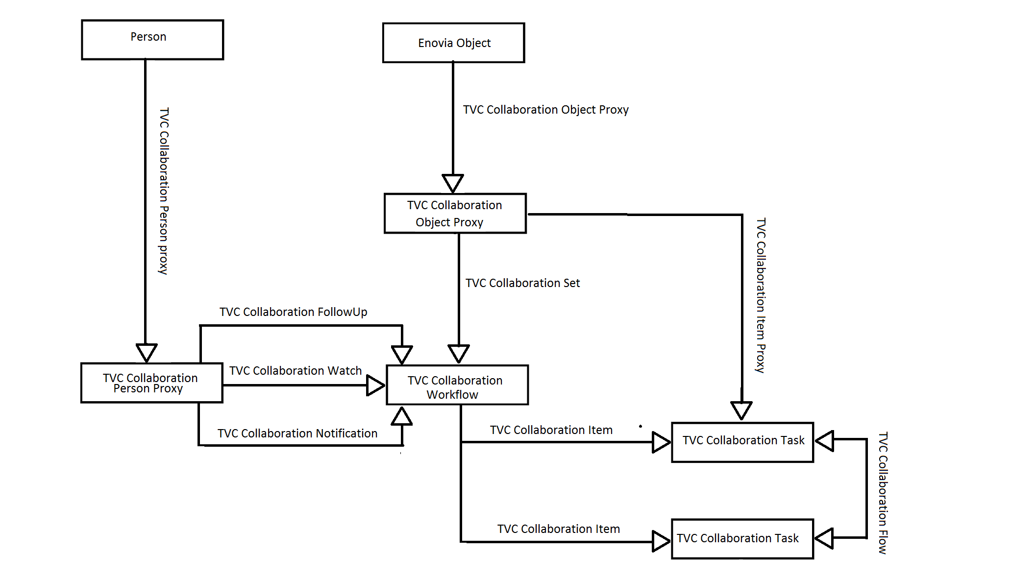
Figure 4. Workflow DataModel
6.3.1. Vault
All objects created by the TVC Collaboration Workflow component are saved in a separate vault called "TVC Collaboration"
6.3.2. Attributes
- TVC Collaboration Completion Date
-
Attribute holding the Completion Date of workflow
- TVC Collaboration Title
-
Attribute holding workflow title
- TVC Collaboration Workflow Config
-
Attribute holding the jsonconfig for workflow
- TVC Collaboration Workflow Status
-
Attribute holding workflow status
- TVC Collaboration Modification Date
-
Attribute holding the last modification Date of workflow
- TVC Collaboration Assign Access
-
Attribute holding access assignee
- TVC Collaboration Id
-
Attribute holding id of workflow
- TVC Collaboration Task Reminder
- TVC Collaboration Task Status
-
Attribute holding status of task.
- TVC Collaboration Task Title
-
Attribute holding task title
- TVC Collaboration Workflow Fields
-
Attribute holding workflow field value
- TVC Collaboration Inbox Last Read
-
Attribute holding last read workflow id
- TVC Collaboration Notification Status
-
Attribute holding notification status
- TVC Collaboration Recipient Organization
-
Attribute holding recipient organization name
- TVC Collaboration Recipient Type
-
Attribute holding recipient type
- TVC Collaboration Sender Organization
-
Attribute holding sender organization name
- TVC Collaboration Unread Count
-
Attribute holding number of unread count.
- TVC Collaboration User Server URL
-
Attribute holding user server url
- TVC Collaboration Delegator
-
Attribute holding the delegator of the task
- TVC Collaboration Activation Date
-
Attribute holding Activation Date of the task
6.3.3. Types
- TVC Collaboration Item
- TVC Collaboration Object Proxy
- TVC Collaboration Person Proxy
- TVC Collaboration Set
- TVC Collaboration Task
- TVC Collaboration Workflow
6.3.4. Relationships
- TVC Collaboration Object Proxy
-
Relationship used to connect an Enovia Object to its Proxy Object.
- TVC Collaboration Person Proxy
-
Relationship used to connect a TVC Collaboration Person to its TVC Collaboration Person Proxy Object.
- TVC Collaboration FollowUp
-
Relationship used to connect TVC Collaboration Person to TVC Collaboration Workflow.
- TVC Collaboration Watch
-
Relationship used to connect TVC Collaboration Person to TVC Collaboration Workflow.
- TVC Collaboration Notification
-
Relationship used to connect TVC Collaboration Person to TVC Collaboration Workflow.
- TVC Collaboration Set
-
Relationship used to connect TVC Collaboration Object Proxy to TVC Collaboration Workflow.
- TVC Collaboration Item
-
Relationship used to connect TVC Collaboration Workflow to TVC Collaboration Task.
- TVC Collaboration Item Proxy
-
Relationship used to connect TVC Collaboration Object Proxy to TVC Collaboration Item.
- TVC Collaboration Flow
-
Relationship used to connect TVC Collaboration Task to TVC Collaboration Task.
6.4. Workflows
The workflow functionality allows you to create custom workflow process around any type of object in ENOVIA™. The workflow functionality is located in a side panel on the right side of the page content. This allows the users to create workflows around an object while still being able to navigate around the different pages of an object.
6.4.1. Workflow panel setup
The panel that contains the workflow functionality is located in the right side of the application. It is injected on the side of the page content so it will stay visible even when navigating around the different pages of an object. The panel is collapsed by default and will be expanded on click.
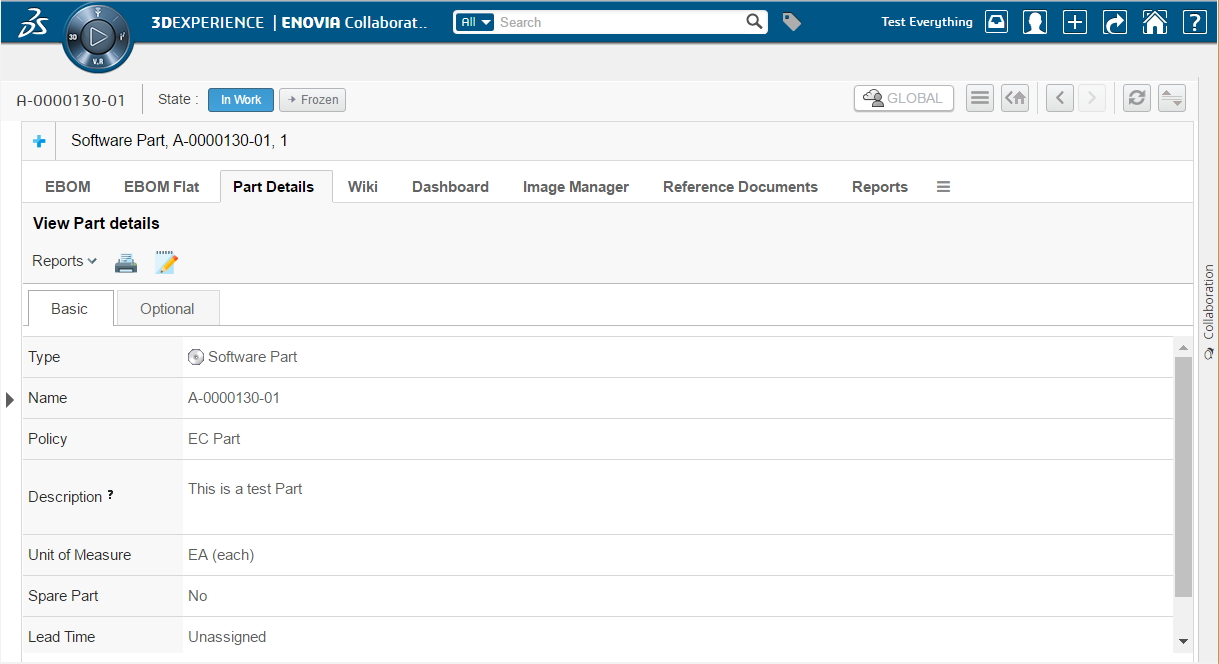
Figure 5. Collapsed workflow panel
After clicking on the panel it will be expanded towards the left side and show the workflows for the object that you are currently in context of.
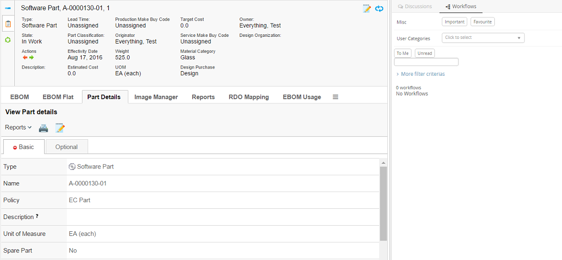
Figure 6. Expanded workflow panel
If you have not enabled the workflow functionality for some object types by configuration the panel will be greyed out and the user will not be able to expand it.
6.4.2. Single Workflow Load
If there is single set in the set list and user want to load the details of set on load of panel or on switching the panel tab then following system property need to be set as true (default:false).
| Property | Description | Default Value |
|---|---|---|
tvc.collaboration.panel.showSingleSet |
to load the details of set if there is only one in the list |
false |
In Single set load, set id priority will be in following order:
-
Passed setId in panel load option
-
Set Id If there is single set in the set list and property is true.
-
Cached working set Id in session storage
6.4.3. Viewing object workflows
When the user is standing in context of an object that has support enabled for workflows it will be possible to expand the discussion panel in order to view and/or create workflows. The default view of the panel will show a toolbar in the top and below that a list of all the workflows that has been started around the context object.
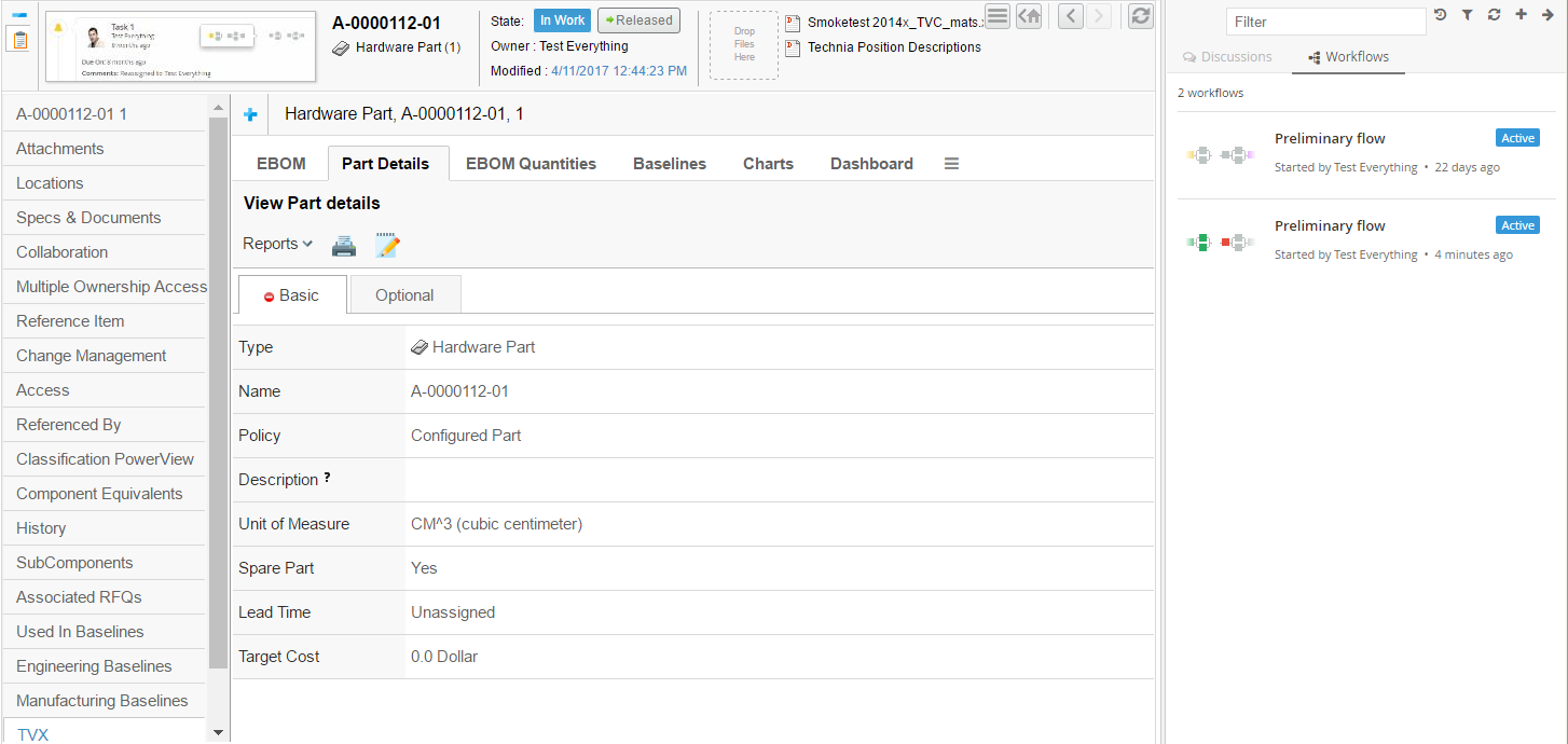
Figure 7. Listing context object workflows
Each workflow in the list is clickable. The entire workflow will be loaded when a user clicks on it. See next chapter for more details on that.
6.4.4. Viewing a workflow
When a workflow in the list has been clicked it will load the entire workflow in the panel. In this view the user will be able to see all the tasks in the workflow and also have the ability to assign or reassign or approve or complete or reject task. If the task’s context is the current contextual object then it is highlighted with a blue shadow in the workflow graph.
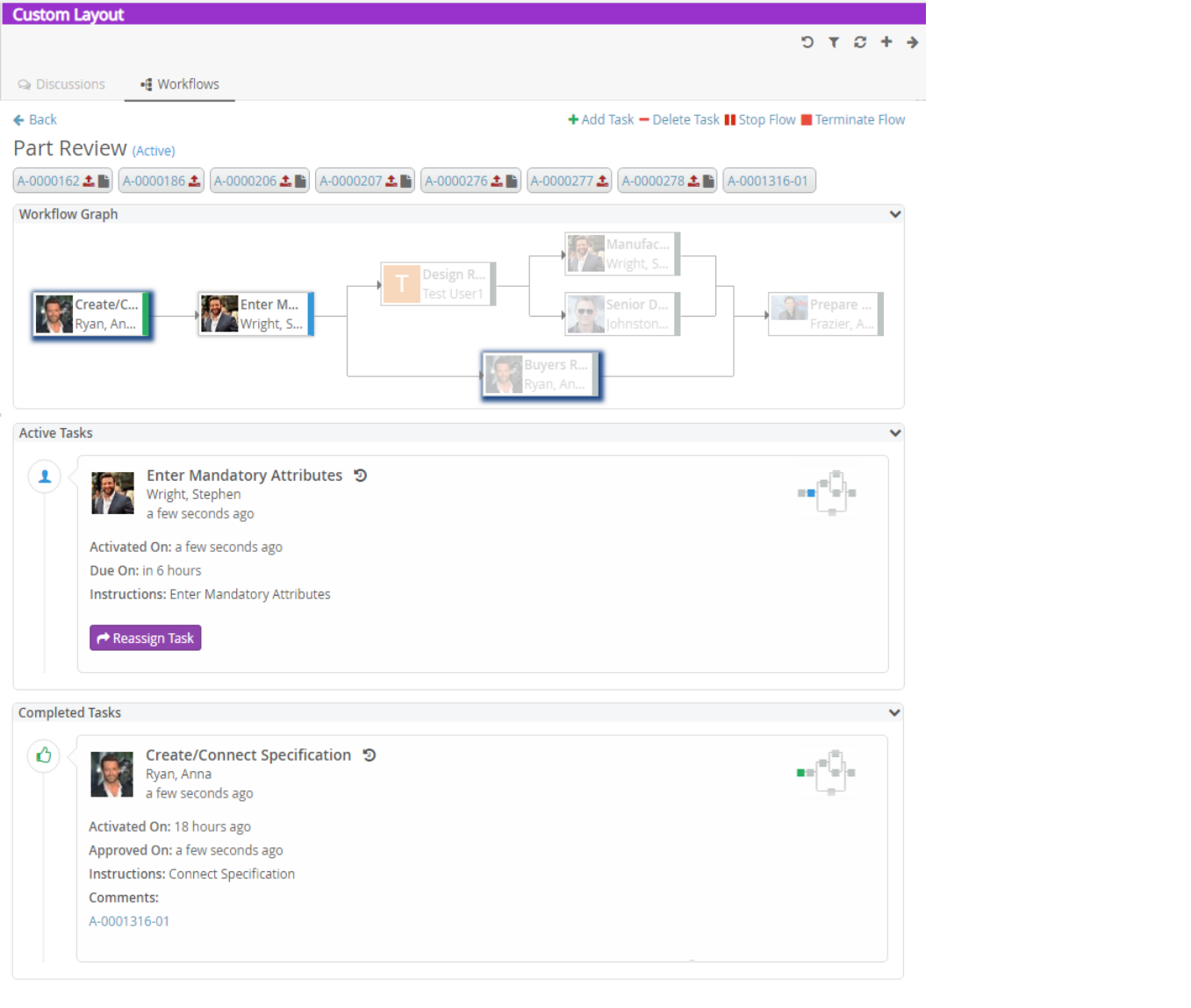
Figure 8. Showing a workflow
Task Status |
Colour Code |
Colour |
Active |
#3498db |
Blue |
Approved |
#27ae60 |
Green |
Reassigned |
#9b59b6 |
Deep Purple |
Complete |
#27ae60 |
Green |
Pending |
#7f8c8d |
Grey |
Due |
#facc2e |
Yellow |
Rejected |
#e74c3c |
Cinnabar |
Unassigned |
#de8eff |
Light Purple |
Active and Unassigned |
#3498db |
Blue |
Active and Due |
#facc2e |
Yellow |
To navigate to the task details through the workflow graph, the user can click on a task node in the workflow graph. The respective task thread will be highlighted in a popup as shown below.
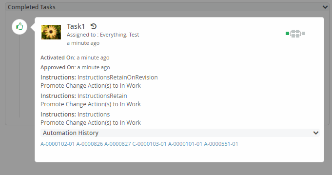
Figure 9. Highlight a task
6.4.5. Creating a new workflow
In order to create a new workflow you use the action in the top toolbar (plus sign). That will launch a form that allows you enter the data needed to create a new workflow. When there are multiple configurations matching for the context object, chooser will be shown to choose a configuration.
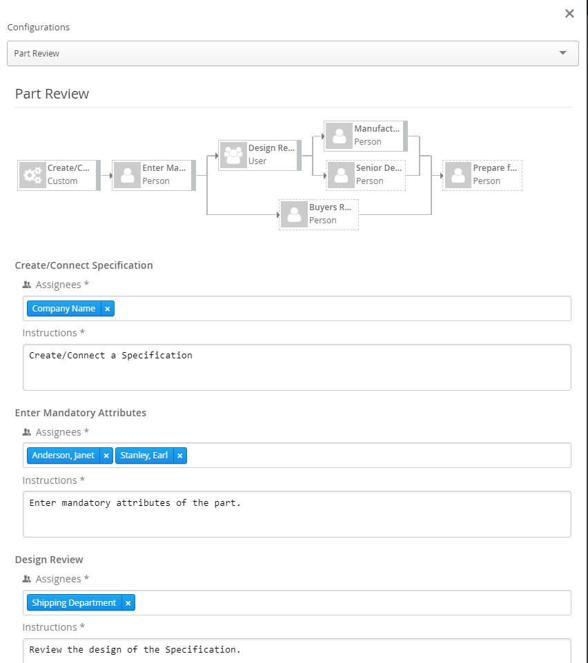
Figure 10. Creating a new workflow
The following data can be entered based on configuration:
-
Assignee for Tasks (Person or Role or Group or Custom Assignee)
-
Field values for Tasks if configured (e.g. Instructions)
6.4.6. Stopping a workflow
An active workflow can be stopped using "Stop Flow" workflow operation by the workflow owner. When a workflow is stopped all the ongoing task operations are disabled.
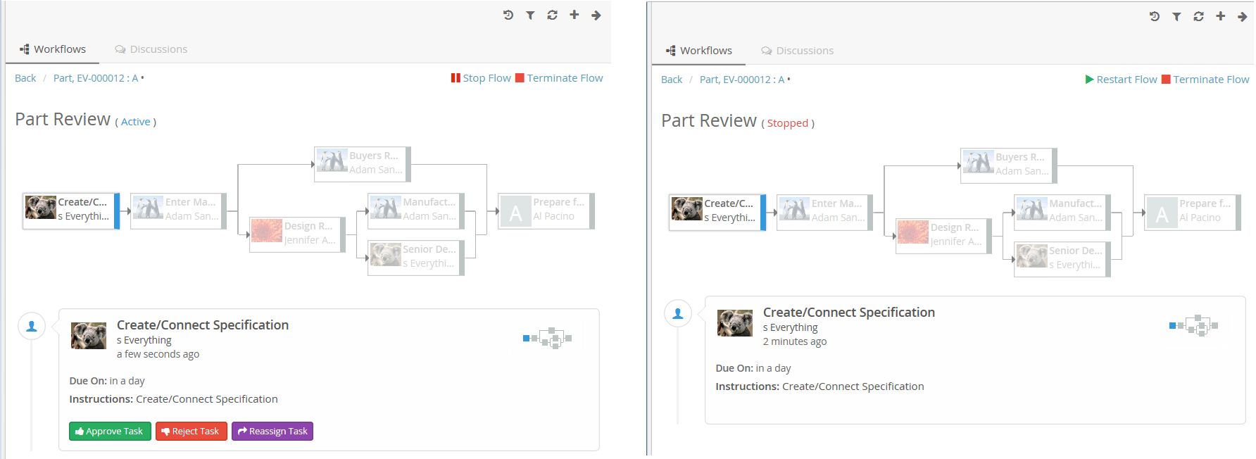
Figure 11. Stopping a workflow
6.4.7. Adding Task in Workflow
An adhoc task can be added in active workflow by using "Add Task" workflow operation by the workflow owner. When add task operation is executed, it is displaying the + icon on appropriate nodes and branches in workflow graph where task can be added. Through node’s add task operation, parallel tasks are created while thorugh branch serial tasks are created.
With the default behavior, complete, approved, excluded task statuses are considered to activate the next level tasks and the task could not be added for previous level tasks. With the extensive and configurable behavior of workflow, another task status could also be used for task completion and move to the next level of tasks such as rejected. In such a scenario, the complete-statuses configuration could be used to define the list of completed statuses to block the add task icon for tasks.
"workflow":{
	  .....
      "operations":[
        {
          "operation": "add",
          "config": {
                "complete-statuses": ["Complete", "Approved", "Rejected"]
            }
        }
      ],
	  .....
   }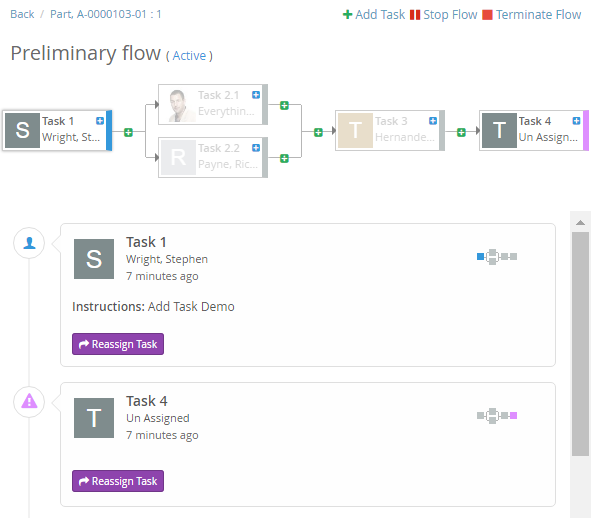
Figure 12. Adding Task in workflow
On clicking the + icon, Add Task form is opened with the task configurations which are having adhoc property as true(default). Any configuration can be choosen to create the adhoc task.
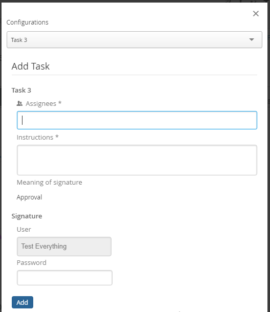
Figure 13. Add Task Form
6.4.8. Deleting Task in Workflow
A task which is not active or completed, can be deleted by using "Delete Task" workflow operation by the workflow owner. When delete task operation is executed, "-" icon is displayed on appropriate task nodes to delete the task.
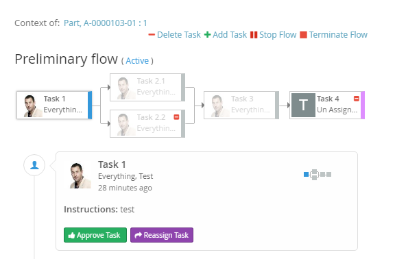
Figure 14. Deleting Task in workflow
On clicking the - icon, Delete Task form is opened with warning (if warning field is configured for task). On clicking delete, task is deleted and workflow is updated accordingly.
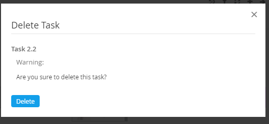
Figure 15. Delete Task Warning
Configurations:
"workflow":{
	  .....
      "operations":[
         "delete"
      ],
	  .....
   }
With the default behavior, active tasks are not allowed to delete by this operation.For allowing to Delete Active Tasks, the allow-active configuration needs to add under the config section as below.
"workflow":{
	  .....
      "operations":[
        {
          "operation": "delete",
          "config": {
                "allow-active": "true"
            }
        }
      ],
	  .....
   }
6.4.9. Restarting a workflow
A stopped workflow can be restarted using "Restart Flow" workflow operation by the workflow owner.
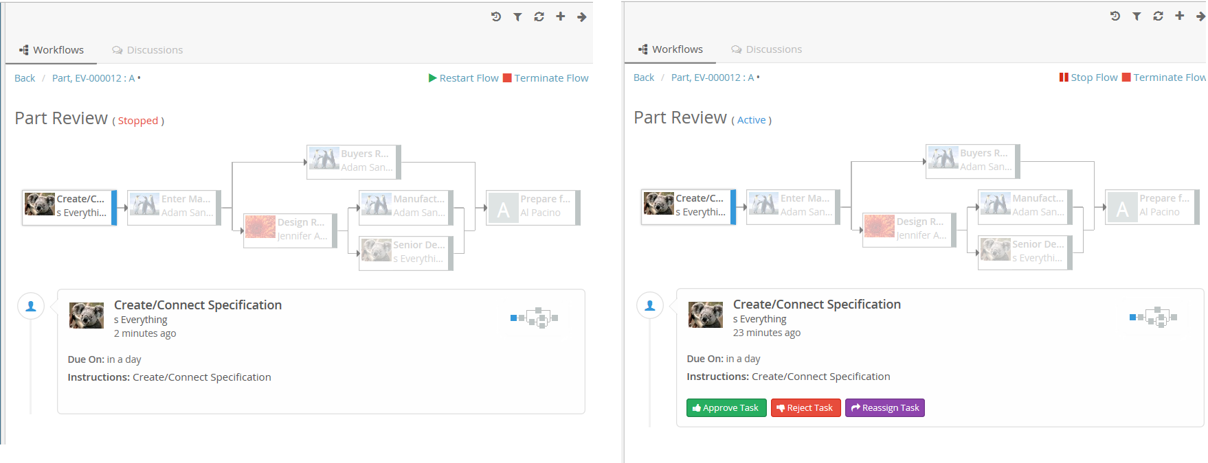
Figure 16. Restarting a workflow
6.4.10. Terminating a workflow
Active or stopped workflow can be terminated using "Terminate Flow" workflow operation by the workflow owner. When a workflow is terminated all the ongoing task operations are disabled. Terminated workflow can not be restarted.
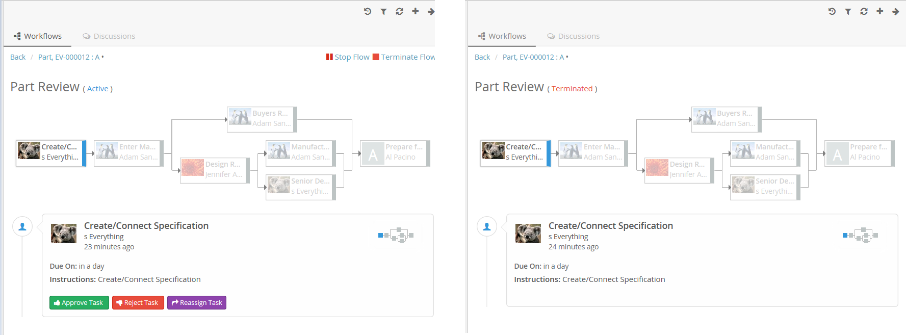
Figure 17. Terminating a workflow
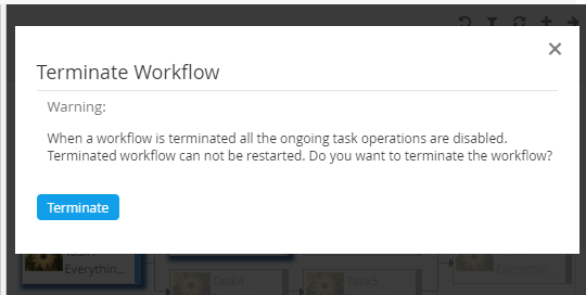
Figure 18. Terminate Confirmation
By default confirmation message will be shown, but it can be disabled by using the below config in operation.
"config":{
      "confirmation":false,
      "confirmation-message": "tvc.collaboration.workflow.terminate.confirm.message"
      }
It is also possible to customize the confirmation message by defining a custom operation that extends to com.technia.tvc.collaboration.workflow.cfg.operation.impl.builtin.TerminateOperation.
Alternatively, the default confirmation message can be modified by changing the below property in tvc.properties.
tvc.collaboration.workflow.terminate.confirm.message6.4.11. Reassigning tasks
A user having access to this operation can reassign all the tasks or set of tasks using ReassignTasks operation located at the top of the workflow.
Note: Default access is only to Workflow Owner.
Configuration
e.g. Case 1 : Reassign all the non-completed tasks using in-built operation.
"workflow":{
      .....
	  .....
      "operations":[
         "reassigntasks",
         "add",
         "delete",
         "stop",
         "restart",
         "terminate"
      ],
	  .....
	  .....
   }
Case 2 : Reassign specific tasks using custom operation.
"workflow":{
      .....
	  .....
    "operations":[
        {
        "base": null,
        "id": "operation-reassigntasks",
        "operation": "reassigntasks",
        "label": "ReassignTasks",
        "config": {
        "task-list": [
        "createspecification",
        "designreview"
        ]
        },
        },
         "add",
         "delete",
         "stop",
         "restart",
         "terminate"
      ],
	  .....
	  .....
 }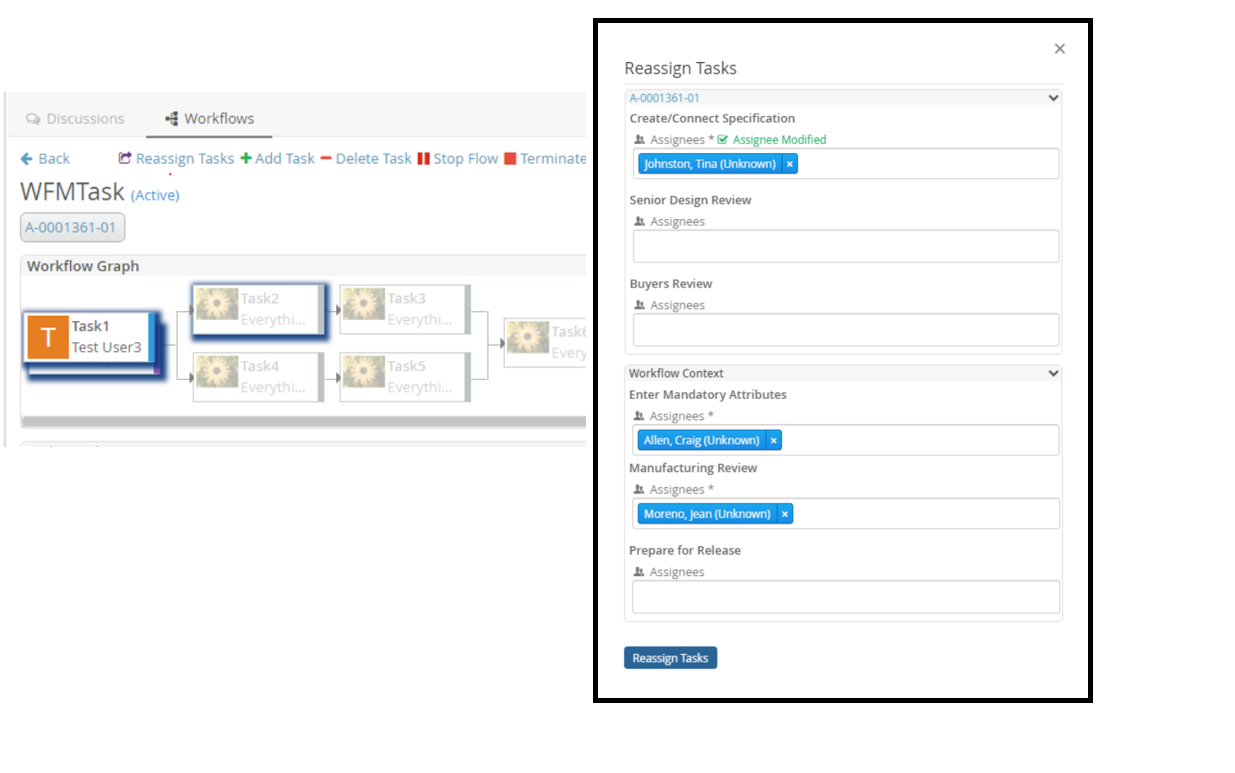
Figure 19. ReassignTasks
6.4.12. Reassigning a task
The task owner or one of the assignees can reassign the task to another user using the Reassign command located at the bottom of the task. The Reassign form will have an assignee field and optional custom fields if configured (e.g. comments)
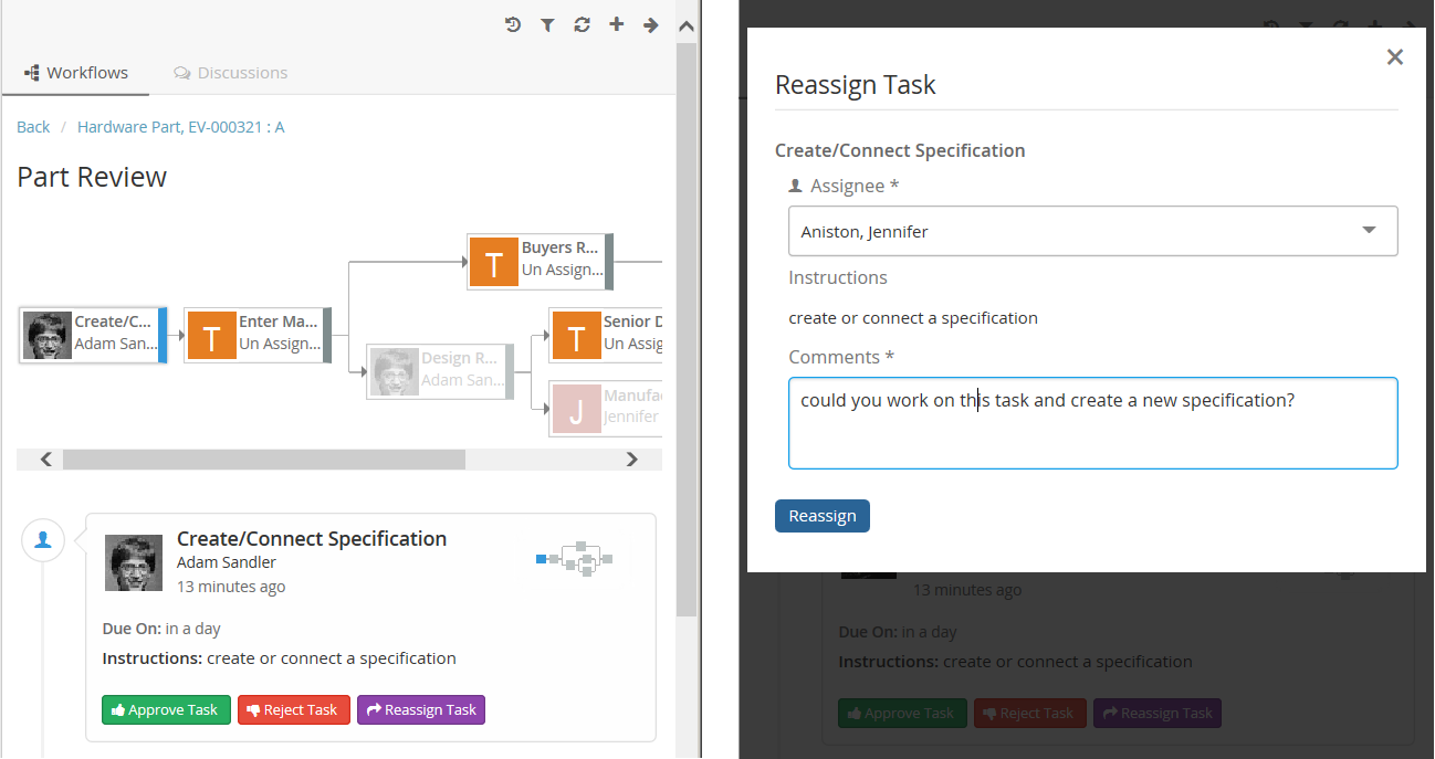
Figure 20. Reassigning a task
6.4.13. Approving a task
A task owner can approve the task when that task is active using Approve command located at the bottom of the task. The Approve form can have optional custom fields if configured (e.g. comments)
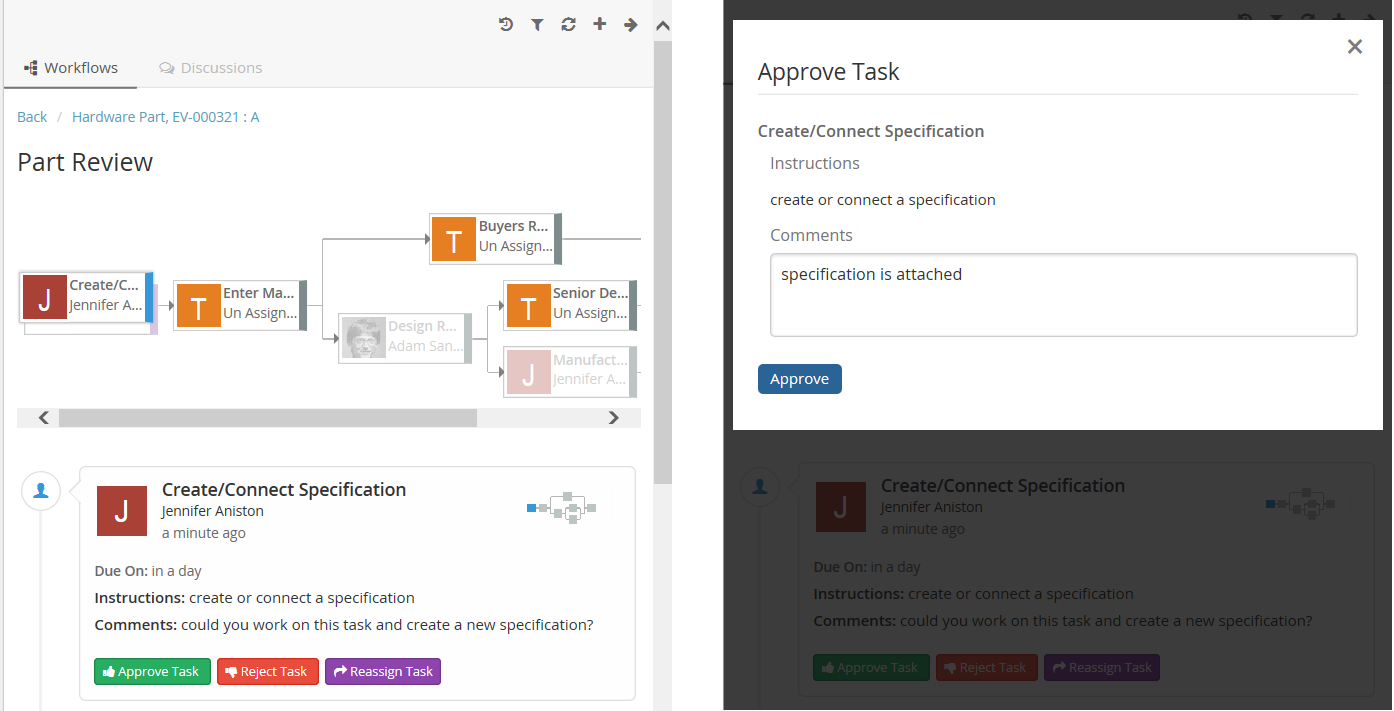
Figure 21. Approving a task
6.4.14. Assigning a task
A task assignee can assign the task to him/her-self using Assign command located at the bottom of the task.
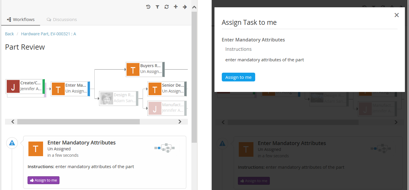
Figure 22. Assigning a task
6.4.15. Set Due Date for task
A user having access to this operation can set due date using Set Due Date command located at the bottom of the task.
User may also clear due date by setting it to blank via this operation.
Note: Default Access is only to Workflow Owner.
Configuration
e.g. Case 1 : Using inbuilt Operation and inbuilt field
{
    ...
"tasks": [
    {
      "id": "tpmApproval",
      "label": "TPM Approval",
      "multiple": true,
      "fields": ["comments", "instructions", "warning", "dueDate"],
      "operations": [
        "complete",
        "reject",
        "approve",
        "operation-Approve",
        "assign",
        "reassign",
        "setduedate"
      ]
    }

    ]
     ...
    }
Case 2: Using Custom Operation and Custom Field
{
    ...
    "fields": [
    {
        "id": "Custom_due_date_field",
        "label": "Custom:DueDate_Handler",
        "type": "date",
        "handler": "com.technia.tvc.collaboration.discussion.model.dao.enovia.example.fieldvaluehandler.DueDateFieldValueHandler",
        "appearance": {
            "create": "hidden",
            "reject": "hidden",
            "thread": "hidden",
            "reassign": "hidden",
            "approve": "hidden",
            "complete": "hidden",
            "due": "editable"
        }
    }
],
"operations": [
    {
        "base": null,
        "id": "operation-setduedate",
        "where": "(attribute[TVC Collaboration Task Title].value != 'TPM Date Approval')",
        "operation": "setduedate",
        "label": "Custom:SetDueDate2_Where"
    }
],
"tasks": [
    {
        "id": "tpmApproval",
        "label": "TPM Approval",
        "fields": [
            "Custom_due_date_field"
        ],
        "operations": [
            "operation-setduedate"
        ]
    }
]

    ...
}
Note: To Prepopulate value of due date in custom due date field, DueDateFieldValueHandler is necessary.
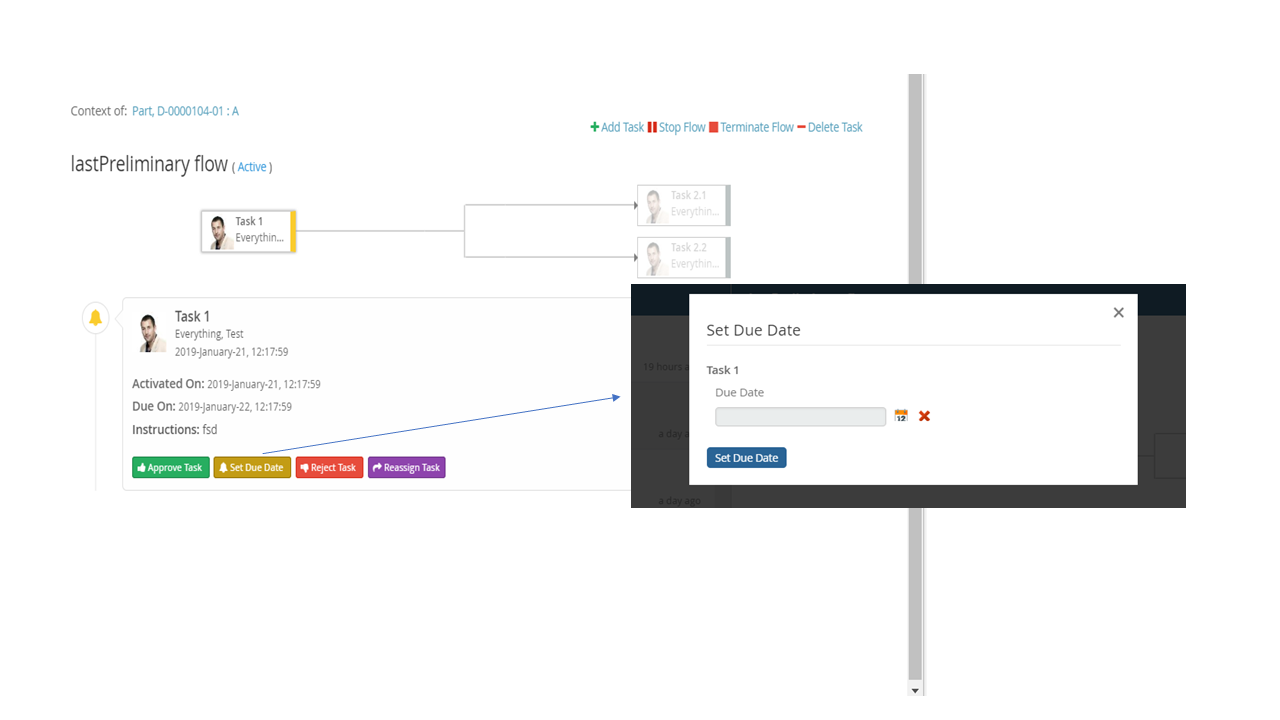
Figure 23. Set Due Date for a task
6.4.16. Rejecting a task
A task owner can reject the task when that task is active using Reject command located at the bottom of the task. The Reject form can have optional custom fields if configured (e.g. comments).
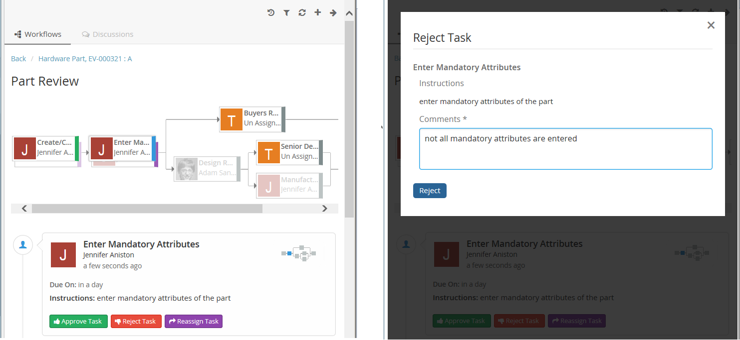
Figure 24. Rejecting a task
User can configure rejectTo field which will show the list of completed tasks. User can select the specific task to be revised and activated after the reject operation.
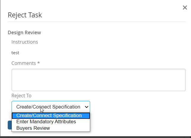
Figure 25. Rejecting a task to specific task
6.5. Absence and Delegation
Users can updated their Absence dates and Delegatee to be assigned for any future active Workflow tasks during that period can be configured in Myspace’s Profile Action page.

Figure 26. Absence and Delegation Configuration
On selection of absent person for To, CC or assignee field, it will be reflected in red and tooltip will provide the absence related information.

Figure 27. Absent Person Selection
Property |
Description |
Default |
tvc.collaboration.person.showAbsenceMessage |
To show the absent person selection in red and tooltip for absence details |
true |
tvc.collaboration.person.profile.startDateInputTime |
to add the start day input time on selected date |
00:00:00 |
tvc.collaboration.person.profile.endDateInputTime |
to add the end day input time on selected date |
23:59:59 |
In Absence and Delegation, only when the tasks are about to be activated the delegatee is assigned to the task.
The Delegator name will be shown for the delegated tasks in task list view.
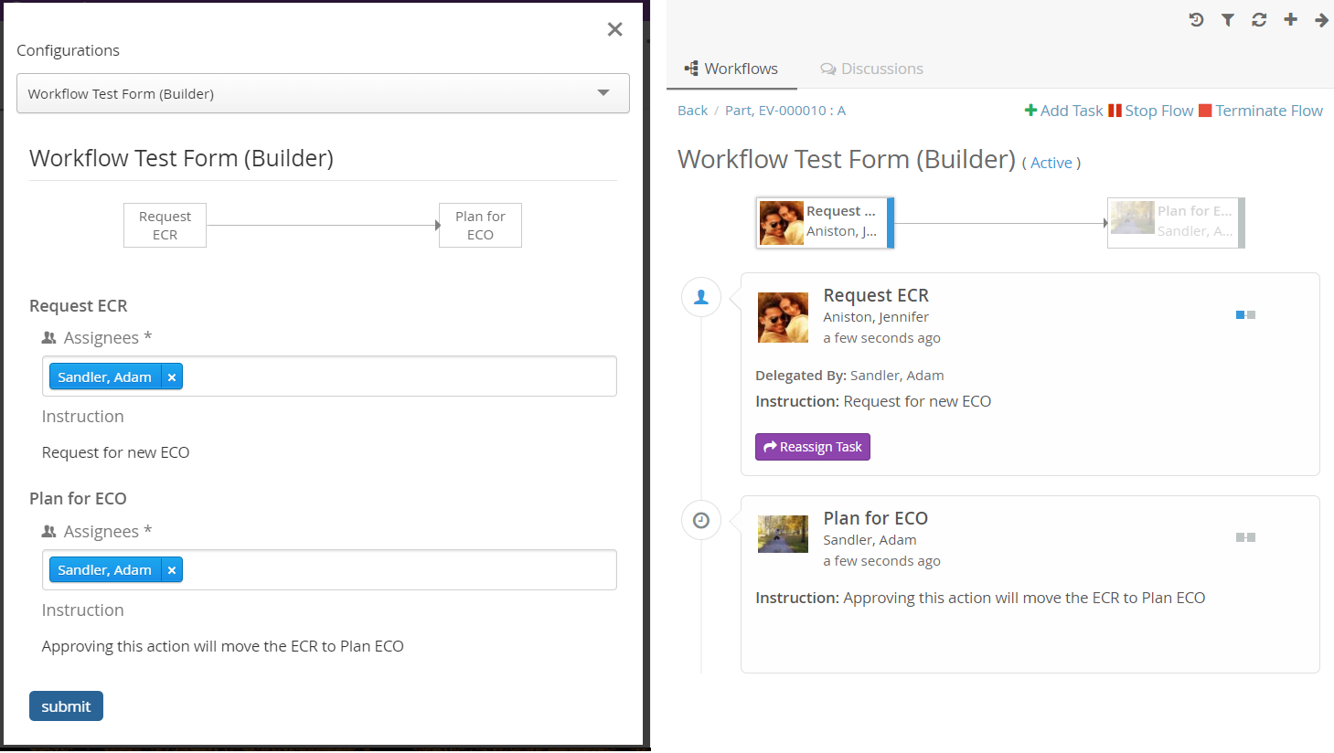
Figure 28. Auto Active Task Delegation
6.5.1. Configuration
The ability to have workflow around objects can be configured on the server.
This is done in a file called TVCWorkflowConfig.xml that is placed in
/WEB-INF/classes/TVCWorkflowConfig.xml. If you skip to have this
configuration file the users will not be able to have workflow around ANY object
in ENOVIA™ with default settings.
Below is an example configuration file that shows the supported elements and their location.
<WorkflowConfigs>
<TabOrder>1</TabOrder>
<ConfiguredTypes>
<Type derived="false" status="disabled">type_MechanicalPart</Type>
<Type derived="false" status="disabled">type_SoftwarePart</Type>
<Type derived="false" status="expand" if="$<context.user.isassigned[role_Designer]>">type_HardwarePart</Type>
<Type derived="false" status="disabled">type_HardwarePart</Type>
<Type derived="false" status="enabled" className="com.technia.tvc.collaboration.workflow.model.dao.enovia.config.builtin.WorkflowConfigType">type_NutPart</Type>
</ConfiguredTypes>
<WorkflowConfig for="type_Part" if="current=='Review' singleActive="true" ">
<JsonConfig
ref="tvc:workflowconfig:tvx:collaboration/PartReview.json" />
</WorkflowConfig>
<WorkflowConfig for="type_CAD Model" if="current=='Review' or current=='Approved'">
<ContextInfoResolver>
<Macro>${TYPE}, ${NAME} : ${REVISION}</Macro>
<URL>/common/emxNavigator.jsp?workflow-sk=document&objectId=${OBJECTID}</URL>
<FileInfoResolver className="com.technia.tvc.collaboration.core.test.TestFileInfoResolver">
<Settings>
<Setting name="Always Show File Name">false</Setting>
<Setting name="Show Subscription">false</Setting>
<Setting name="Show Checkin">false</Setting>
<Setting name="Filename Length">25</Setting>
</Settings>
</FileInfoResolver>
</ContextInfoResolver>
<JsonConfig ref="tvc:workflowconfig:slb:collaboration/ECR_PR_SUBMIT.json" />
</WorkflowConfig>
<ObjectIdResolver/>
<OrganizationResolver/>
<ContextInfoResolver/>
<WorkflowConfigProvider className="com.technia.tvc.collaboration.workflow.cfg.provider.impl.RouteWorkflowConfigProvider"/>
<WorkflowConfigSorter className="com.technia.tvc.collaboration.workflow.test.ReverseWorkflowConfigSorter" />
<WorkflowEngine className="com.technia.tvc.collaboration.workflow.DefaultWorkflowEngine" />
</WorkflowConfigs>TabOrder
This element defines the component position in sidepanel and myspace. The text value should be integer and Components are arranged in ascending order.
Tab Persistence
To open the collaboration panel for a context object with previously active component tab or set, browser storage is used.
This behavior could be controlled by using different type of storage which is handled by following property.
| Property Key | values | Description |
|---|---|---|
tvc.collaboration.panel.storage.preference |
memory(default) |
persist only for panel instance |
local |
persist until the user manually clears the browser cache or until your web app clears the data |
|
session |
persist until the window or tab is closed. |
ConfiguredTypes
The <ConfiguredTypes> tag allows configuration of component’s visibility for different types in the system.
The child elements for this are <Type>
Type
This element allows you to control the collaboration behavior for a specific type. Following are the supported attributes for Type element.
| Attribute | Description | Default Value |
|---|---|---|
status |
enabled, disabled, hidden, expand (enabled and automatically opened side panel) or none |
none |
derived |
whether status applicable to derived types |
true |
if |
whether configuration is applicable |
|
className |
class extending com.technia.tvc.collaboration.core.model.dao.enovia.config.panel.DefaultConfigType for custom logic |
Default panel status for non-configured type is "disabled".
Following property can be used to change the behaviour.
| Property | Description | Default Value |
|---|---|---|
tvc.collaboration.workflow.panel.status |
hidden |
disabled |
WorkflowConfig
The <WorkflowConfig> element is used if you want to configure the workflow behavior for a type of object. You can have any amount of this element in your configuration.
Following are the supported attributes for WorkflowConfig element.
| Attribute | Description | Default Value |
|---|---|---|
singleActive |
true, false (workflow creation is not allowed if there is an active workflow existed) |
false |
Disable Unassigned Task
Inactive unassiged tasks are enabled in task list panel and graph to change the assignee by owner or any privileged user. Following property can be used to disable the inactive unassiged tasks.
| Property | Ranges | Default Value |
|---|---|---|
tvc.workflow.disable.unassigned.task |
true/false |
false |
Enable Excluded Task
Excluded tasks are disabled in task list panel and graph Following property can be used to enable excluded tasks.
| Property | Ranges | Default Value |
|---|---|---|
tvc.workflow.enable.excluded.task |
true/false |
false |
JsonConfig
The <JsonConfig> element allows you to point out a json file that will have the configuration for workflow tasks. The complete path of the file to use is added to the attribute called "ref". That file path follows TVC path pattern.
ContextInfoResolver
This element is applicable to a single CollaborationConfig (i.e DiscussionConfig or WorkflowConfig) and also to all CollaborationConfigs. This element can be used to configure custom settings for the context information related to an object (used to display a link to the context object for a discussion/workflow).
The child element <Macro> is used to configure the "display name" and
the <URL> element is used to configure the URL to the context object.
The child element <FileInfoResolver> is used to configure the File Actions displayed in the inbox if the context object holds files.
If TVC Office component is available, the actions behave similar to column type "actions".
Default implementation resolves display name from <Macro> ${type},
${name} : ${revision}</Macro> and context URL from <URL>
/common/emxNavigator.jsp?objectId=${OBJECTID}</URL>.
The complete name of the class to use is added to the attribute called
"className". That class has to implement the interface
com.technia.tvc.collaboration.core.model.context.ContextInfoResolver.
Following properties can be used to configure the behavior of context path.
| Property | Description | Default Value |
|---|---|---|
tvc.collaboration.contextpath.popup |
Whether context path should be opened popup |
false |
tvc.collaboration.contextpath.popup.width |
Width of context path popup window in pixel |
900 |
tvc.collaboration.contextpath.popup.height |
Height of context path popup window in pixel |
700 |
tvc.collaboration.helium.route |
Whether to use helium route when running in Helium |
true |
ObjectIdResolver
This element is required only when custom parameters instead of objectId passed to load discussions. Allows you to point out a class that will have the logic for returning objectId from the parameters.
Default implementation resolves objectId based on type, name, revision
and vault values separated by &. (type=Part&name=10001&revision=1&vault=Production).
The complete name of the class to use is added to the attribute called
"className". That class has to implement the interface
com.technia.tvc.collaboration.core.model.dao.enovia.config.ObjectIdResolver.
OrganizationResolver
This element allows to return the Organization of the user, which can be used to show along with user name is Collaboration component. When there are multiple Organizations returned for the user, multiple entries will be shown in the autocomplete for the given user each for each organization.
Default implementation resolves Organizations based on Member relationship to Organization by "Organization Name" attribute value.
The complete name of the class to use is added to the attribute called
"className". That class has to implement the interface
com.technia.tvc.collaboration.core.model.dao.enovia.config.OrganizationResolver.
This element also supports an attribute called "select" which can be selectable to get Organization value.
<OrganizationResolver select="attribute[Organization Name]"/>.
From/Sender user organization is resolved using the implementation of OrganizationResolver’s getSenderOrganizations.
This property has to be enabled for Organization
tvc.collaboration.showOrganization=true.
Following properties can be used to tune autocomplete field.
| Property | Description | Default Value |
|---|---|---|
tvc.collaboration.showOrganization |
To enable Organizations inside collaboration component |
false |
tvc.collaboration.autocomplete.startWith |
Whether search criteria should match starting instead of contains |
false |
tvc.collaboration.autocomplete.minLength |
No. of characters after autocomplete initiated |
2 |
tvc.collaboration.autocomplete.loadThrottle |
No. of milliseconds after autocomplete initiated |
400 |
tvc.collaboration.autocomplete.caseSensitive |
Whether search criteria should be case sensitive |
false |
tvc.collaboration.autocomplete.clear.client.cache |
Whether to clear existing cached search result |
false |
tvc.collaboration.autocomplete.loadOnFocus |
To preload and open the assignee list on focus |
false |
public class TestOrganizationResolver extends DefaultOrganizationResolver {

    @Override
    public List<Organization> getOrganizations(String user) throws TVCException {
        return super.getOrganizations(user);
    }

    @Override
    public List<Organization> getSenderOrganizations(OrganizationContext context) throws TVCException {
        //context contains Message, previously resolved Organizations, contextIds and Env
        return super.getSenderOrganizations(context);
    }
}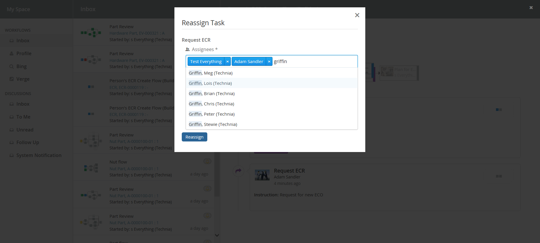
PersonSuggestionsResolver
This element is applicable to a single CollaborationConfig (i.e DiscussionConfig or WorkflowConfig) and also to all CollaborationConfigs.
This element is used to get the user Suggestions for auto complete field along with the recently selected users.
The attribute select is used to configure expression which will be executed for context ids to get the person suggestions.
<PersonSuggestionsResolver className="tvc.collaboration.person.suggestions.TestPersonSuggestionsResolver" select="context.user"/>
The complete name of the class to use is added to the attribute called
"className". That class has to implement the interface
com.technia.tvc.collaboration.core.model.person.suggestions.PersonSuggestionsResolver.
This property can be used for disabling the saving and displaying the suggestions. It is true by default.
tvc.collaboration.autocomplete.suggestions.enabled=true.
Following properties can be used to tune suggestions for autocomplete field.
| Property | Description | Default Value |
|---|---|---|
tvc.collaboration.autocomplete.suggestions.count |
Max number of suggestions to be displayed |
5 |
tvc.collaboration.autocomplete.search.fields |
search criteria should based on the field of the search result. value is comma separated field list such as "label,value" |
label |
public class TestPersonSuggestionsResolver extends DefaultPersonSuggestionsResolver {

    @Override
    public List<Organization> getSuggestions(PersonSuggestionsData data){
        return super.getOrganizations(data);
    }

}
TVCWorkflowConfig.xml
<WorkflowConfigs>
...
    <WorkflowConfig for="type_Part">
        <PersonSuggestionsResolver select="owner"/>
    </WorkflowConfig>

    <PersonSuggestionsResolver className="tvc.collaboration.person.suggestions.TestPersonSuggestionsResolver" select="context.user"/>
...
</WorkflowConfigs>
ContextInfoResolver
This element is applicable to a single CollaborationConfig (i.e DiscussionConfig or WorkflowConfig) and also to all CollaborationConfigs. This element can be used to configure custom settings for the context information related to an object (used to display a link to the context object for a discussion/workflow).
The child element <Macro> is used to configure the "display name" and
the <URL> element is used to configure the URL to the context object.
The child element <FileInfoResolver> is used to configure the File Actions displayed in the inbox if the context object holds files.
If TVC Office component is available, the actions behave similar to column type "actions".
Default implementation resolves display name from <Macro> ${type},
${name} : ${revision}</Macro> and context URL from <URL>
/common/emxNavigator.jsp?objectId=${OBJECTID}</URL>.
The complete name of the class to use is added to the attribute called
"className". That class has to implement the interface
com.technia.tvc.collaboration.core.model.context.ContextInfoResolver.
Following properties can be used to configure the behavior of context path.
| Property | Description | Default Value |
|---|---|---|
tvc.collaboration.contextpath.popup |
Whether context path should be opened popup |
false |
tvc.collaboration.contextpath.popup.width |
Width of context path popup window in pixel |
900 |
tvc.collaboration.contextpath.popup.height |
Height of context path popup window in pixel |
700 |
tvc.collaboration.helium.route |
Whether to use helium route when running in Helium |
true |
WorkflowConfigSorter
This element allows configuration of custom sort program for WorkflowConfigs.
The complete name of the class to use is added to the attribute called
"className". That class has to implement the interface
com.technia.tvc.collaboration.workflow.model.dao.enovia.config.WorkflowConfigSorter.
WorkflowConfigProvider
More details at WorkflowConfigProvider.
Workflow Engine
The <WorkflowEngine> element allows posibility to provide custom workflow engine to be used in the application.
The full name of the class which implements the interface "com.technia.tvc.collaboration.workflow.WorkflowEngine" is configured in attribute "className". Default implementation is available in "com.technia.tvc.collaboration.workflow.DefaultWorkflowEngine".
e.g.
public class CustomWorkflowEngine extends DefaultWorkflowEngine implements WorkflowEngine {


    @Override
    public EngineResult start(WorkflowContext wctx) throws TVCException {
		EngineResult result = super.start(wctx);

		// custom processing

		return result;
	}

    ....
}
6.6. Notifications
6.6.1. Receiving a notification
At some events that occur in the workflow functionality there are "notifications" sent out to users that are involved in a workflow/task in one or more ways. If someone starts a workflow/task around an object then the owner/assignees of that active task will get a notification. Users will also get notifications when another user rejected a task that user approved.
There are some system properties which could control the notification behavior. Please find the details as below:
| Property | Description | Default Value |
|---|---|---|
tvc.collaboration.workflow.watcher.includeOwner |
By default, the workflow owner is added to the watcher list so that workflow could be observed by the owner through notification. Set false for excluding the workflow owner from the watcher list. |
true |
tvc.collaboration.workflow.notification.sender |
User name of a person to set the default “from” address for notification to be sent from a system user |
EMPTY/NULL |
tvc.collaboration.workflow.task.assignees.notify |
By default, all the task assignees are notified of the task operation along with the task owner. Set false for excluding the assignees to be notified |
true |
These notifications are sent to the user instantly when an event is occurring. We have two ways of notifying the users, one called "Inline notifications" and one called "Web notifications". These work in the same way but are displayed in different ways.
Inline notification (default)
Inline notifications are rendered in the top right corner of the browser window when an event occurs.
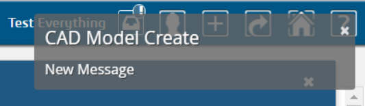 Inline notification
Web notification
Web notifications are displayed on the computer desktop, outside of the browser window. The benefit of this is that you will notice it even if your browser window is minimized. This is currently not supported in Internet Explorer and really old versions of the other browsers. Clicking the notification will show the browser window and open My Space.
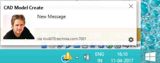 Web notification
6.6.2. Notification Handler
Notification Handler can be used to enable other type of notifications like Email, Log or custom implementations. Default is Web notification which is used to send real-time notification to browsers.
Notification Handler is supported in both Collaboration Configs. (DiscussionConfigs or WorkflowConfigs).
It can be built-in handlers like <Web/>, <Email> or <Log/> or class implementing interface "com.technia.tvc.collaboration.core.model.dao.enovia.config.NotificationHandler"
NotificationHandler contains isValidNotification method which needs to be overridden to avoid the notification for a specific condition.
|
<WorkflowConfigs> or <DiscussionConfigs>
...
    <Notification>
        <Web />
        <Email />
        <Log />
        <Handler className="com.technia.tvc.collaboration.core.model.dao.enovia.config.notification.LogNotificationHandler" />
    </Notification>
</WorkflowConfigs> or </DiscussionConfigs>
Email Notification Handler
When Email Notification Handler is enabled, notifications will also be sent out to the recipients and watchers via Emails. The email notifications will not be sent to the context person and it can be controlled by the following property.
| Property | Description | Default Value |
|---|---|---|
tvc.collaboration.notification.email.to.context_user |
Set |
false |
User Preference for Email Notification
Users can enable and disable the Email notification through the profile in Myspace. See Myspace Profile Section for details.
On enabling/disabling the Email Notification, it sets the preference_NotificationEmail property on the person admin object.
|
Email Templates
Email Notification requires the MX_SMTP_HOST is configured and users have valid email address.
Email Notification Handler uses templates configured in string resources.
Following are the default template property keys used for workflow email notifications.
tvc.collaboration.workflow.email.template =

tvc.collaboration.workflow.active.email.template =

tvc.collaboration.workflow.pending.email.template =

tvc.collaboration.workflow.complete.email.template =

tvc.collaboration.workflow.stopped.email.template =

tvc.collaboration.workflow.terminated.email.template =

tvc.collaboration.task.active.email.template =

tvc.collaboration.task.pending.email.template =

tvc.collaboration.task.rejected.email.template =

tvc.collaboration.task.approved.email.template =

tvc.collaboration.task.active-and-unassigned.email.template =
Following are the MACROs that can be used as $(MACRO) in the email templates.
CONTEXT_USER
CONTEXT_EMAIL
FROM_USER
FROM_EMAIL
TO_USER
TO_EMAIL
DATE
MESSAGE
CONTEXT_INFO

WORKFLOW_TITLE
WORKFLOW_OWNER
WORKFLOW_STATUS
WORKFLOW_TASKS_COUNT
WORKFLOW_CREATED_DATE
WORKFLOW_MODIFIED_DATE
WORKFLOW_COMPLETED_DATE
WORKFLOW_TERMINATED_DATE
WORKFLOW_STOPPED_DATE
WORKFLOW_COMPLETION_DATE

TASK_LABEL
TASK_FIELDS
TASK_OWNER
TASK_STATUS
TASK_DUE_DATE
TASK_APPROVED_DATE
TASK_REJECTED_DATE
TASK_COMPLETED_DATE
TASK_COMPLETION_DATE
TASK_CREATED_DATE
TASK_MODIFIED_DATE
TASK_DELEGATOR
Example:
tvc.collaboration.task.approved.email.template = <p>Hello $(TO_USER),</p> \
<p>The task "<strong>$(TASK_LABEL)</strong>" in workflow "<em>$(WORKFLOW_TITLE)</em>" is "<span style="color: #008000;"><strong>$(TASK_STATUS)</strong></span>" by "<strong>$(FROM_USER)</strong>" on <em>$(TASK_APPROVED_DATE)</em>.</p> \
<p> </p> \
<p>Workflow is currently "<strong>$(WORKFLOW_STATUS)</strong>" at $(CONTEXT_INFO)</p> \
<p> </p> \
<p><span style="text-decoration: underline;"><strong>Task Fields</strong></span>:</p> \
$(TASK_FIELDS) \
<p> </p> \
<pre><em><sub>This message is system generated and sent by TVC Workflow.</sub></em></pre>Email Based on Status
Email can be configured based on the task and workflow status.
To send the email for the specific task/workflow status, the following configuration could be used.
<WorkflowConfigs>
...
    <Notification>
        <Email>
            <WorkflowStatus>Complete</WorkflowStatus>
            <TaskStatus>Active, Approved</TaskStatus>
        </Email>
    </Notification>
</WorkflowConfigs>
In the absence of any one of the TaskStatus and WorkflowStatus tag, an email will be sent to all status as the default behavior.
|
6.7. My Space
When clicking on the icon in the global toolbar it will open something called "My Space" as a big overlay in the browser window. "My Space" contains a set of different functionality related to the user and the TVC Collaboration feature. Inbox and Profile are the default preconfigured "My Space" Actions. The functionality that is displayed on first load is called "Inbox" and is described in the next chapter. First load "My Space" Action can be rearranged TVCWorkflowConfig.xml.
6.7.1. Inbox
The inbox is a functionality used for displaying all notifications that a user has received. It has a layout that is similar to a mail application.

Figure: Inbox displaying notifications
Configuration
When MySpaceConfig is modified to include other "My Space" Actions. It is mandatory to include default Actions as well. Actions can be reordered. All Inbox derived actions can be repeated with different configuration but with unique action id. Actions can also be grouped under different labels.
<MySpaceConfig>
    <!-- short form -->
    <!-- <WorkflowAction/> -->
    <!-- custom inbox with custom id -->
    <!-- <WorkflowAction id="some-unique-action-id"/> -->
    <InboxAction></InboxAction>
    <InboxAction>
        <Font>fa-inbox</Font>
        <Label>Inbox</Label>
        <Label locale="de">Posteingang</Label>
        <Label locale="sv">inkorg</Label>
        <Header>Inbox</Header>
        <Header locale="de">Posteingang</Header>
        <Header locale="sv">inkorg</Header>
    </InboxAction>
</MySpaceConfig>
6.7.2. Deleted
"DeletedAction" is a predefined custom Inbox Actions that can used in "My Space". This action shows the inbox items which are deleted using delete context command by the context user.

6.7.3. Unread (Exalead powered feature)
"UnreadAction" is a predefined custom Inbox Actions that can be used in "My Space". The Performance of this inbox action would be better with the Exalead mode. This action shows the inbox items which are not read by the context user.

6.7.4. Profile
The profile page has functionality for doing various types of actions related to the user. It is used for uploading an avatar image that will be displayed in discussions and for controlling user preferences.

Figure: Profile Page
6.7.5. External
"ExternalAction" is a predefined custom Inbox Actions which can used in "My Space". This action can be used to host External web application inside iframe of Collaboration component.
Bing.com as MySpace Action:

Configuration
<MySpaceConfig>
    <ExternalAction id="bing">
        <Label>Bing</Label>
        <Font>fa-search</Font>
        <Header>Bing</Header>
        <Href>http://bing.com</Href>
    </ExternalAction>
    <ExternalAction id="verge">
        <Label>Verge</Label>
        <Header>The Verge</Header>
        <Href>http://www.theverge.com/</Href>
    </ExternalAction>
</MySpaceConfig>
6.8. Structure Browser Integration
6.8.1. Link to Workflow
From a table page, you can add a column that will show an icon when a workflow exists for the object. Clicking on the icon brings up the workflow panel.
| When multiple workflows are defined on context object, the last modified workflow would be shown in Workflow Chart column. |
To enable this column in your table, add a column like shown below:
<Table>
    ...
    <Column>
        <Name>workflow-chart</Name>
        <ColumnType>workflow-chart</ColumnType>
    </Column>
</Table>
If the table is defined as a system table, use the setting "Column Type" to achieve the same.
Below a screenshot illustrating the clickable table miniature. It will appear when there is a related workflow.
6.8.2. CellShowableExpression setting support in workflow-chart column
Since 2017.3.0 release we can use Configurable CellShowableExpression setting in workflow-chart column like below to show or not show value of cell.
<Table>
    ...
    <Column>
        <Name>workflow-chart</Name>
        <ColumnType>workflow-chart</ColumnType>
        <CellShowableExpression>type.kindOf[Software Part]</CellShowableExpression>
    </Column>
</Table>
In above example Workflow will be visible only for Software Part in workflow-chart column of table.
6.8.3. Workflow chart column for Workflow Task Objects
Structure Browser table can be configured to list the Workflow task objects with workflow chart column.
Clicking on the icon brings up the workflow with the highlighted task in the panel.
Below a screenshot illustrating the clickable table miniature behavior for the Workflow Task objects table.
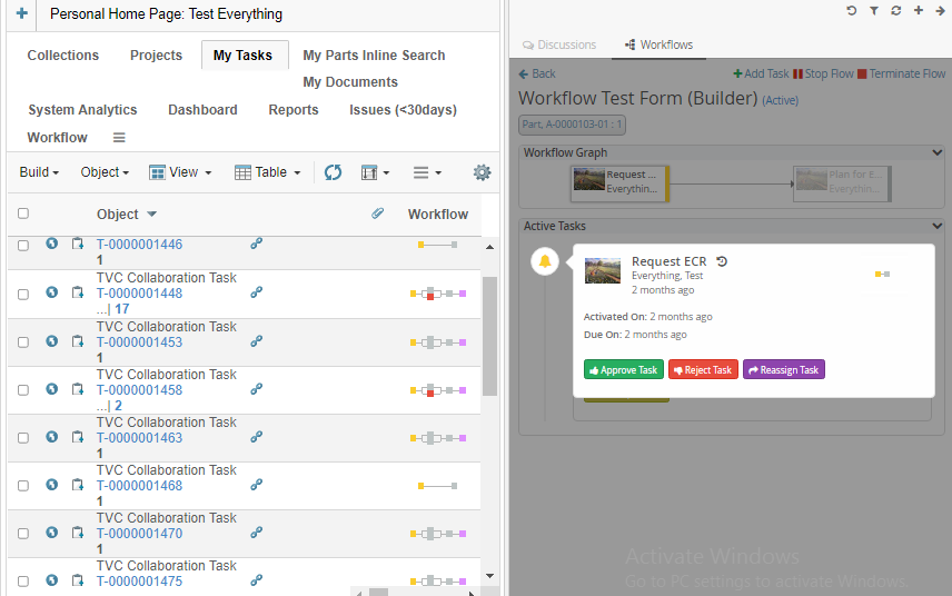
Figure 29. Workflow chart behavior for task object list.
6.9. JSON Validation and Configuration
6.9.1. Validation
Now users can validate all collaboration json files with help of "WorkflowConfig.schema.json"
Three ways to validate using above schema:-
Using 3rd Party Tool
Tool: Using VS Code Editor
Steps:
Step 1: Download VS CODE https://code.visualstudio.com/
Step 2: Open any collaboration json file e.g PartPreliminary.json
Step 3: Link schema with json as follows.
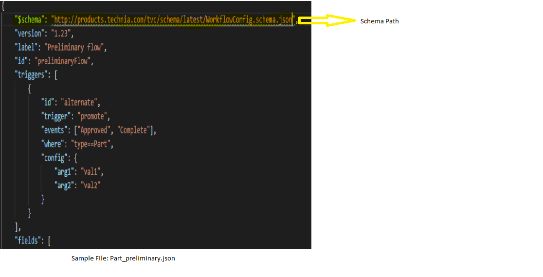
Figure 30. Json Validation
Output: Editor will highlight key value pair in green to notify user about any warning due to missing property or wrong spelling.
Using task runner called grunt and validation library called ajv.
Requirements: Node should be installed and Grunt should be configured.
Steps:
Step 1: Type: npm install grunt-jsonschema-ajv --save-dev in cmd.
Step 2: Sample package.json
{
  "name": "json-validator",
  "version": "1.0.0",
  "description": "",
  "main": "index.js",
  "scripts": {
    "test": "echo \"Error: no test specified\" && exit 1"
  },
  "keywords": [],
  "author": "",
  "license": "ISC",
  "dependencies": {
    "ajv": "^6.10.0",
    "grunt": "^1.0.4"
  },
  "devDependencies": {
    "grunt-jsonschema-ajv": "^0.1.0"
  }
}
Step 3: Sample GruntFile.js
module.exports = function(grunt) {
  grunt.loadNpmTasks("grunt-jsonschema-ajv");

  grunt.initConfig({
    jsonschema: {
      tests: {
        files: {
          "tests_schema.json": "tests/*.json"
        }
      }
    }
  });
};
Step 4: Arrange json and its schema files according to below reference.
Note: Both schema and corresponding json files need to be present locally in the system.
Figure 31. Json Validation folder structure
Step 5: Run node jsonschema
Output: It will show error/warning if any in the console.
6.9.2. Type Definition
Note: Below configuration is not a valid JSON document. it represents the Workflow JSON configuration keys and it is associated types.
{
    "id": Id,
    "label": Label,
    "version": Version,

    "default": Default,

    "dues": Array<Due>,
    "accesses": Array<Accesse>,
    "fields": Array<Field>,
    "operations": Array<Operation>,
    "contexts": Array<Context>,
    "assignees": Array<Assignee>,
    "triggers": Array<Trigger>,
    "tasks": Array<Task>,

    "workflow": Workflow
}
Following is a sample workflow configuration.
e.g.
{
"id": "sample-builder",
"label": "Sample Workflow",
"version": 1,
"default": {
"due": {
"id": "default",
"days": 4,
"activation": "task-activated"
},
"field": {
"id": "default",
"multiline": true,
"appearance": {
"reject": "readable",
"thread": "hidden",
"reassign": "readable",
"approve": "readable",
"complete": "readable"
}
},
"access": {
"id": "default",
"include": [
"Adam Sandler",
"Jennifer Aniston",
"Software Quality Engineering"
],
"exclude": [
"Test Everything",
"Software Quality Engineer"
],
"config": {
"inverse":true
}
},
"operation": {
"id": "default",
"status": {
"task": [
"approved",
"rejected"
],
"flow": [
"active"
]
},
"users": [
"participant",
"assignee"
],
"where":"context.user == 'creator'",
"access":{
"include":[
"Adam Sandler",
"Jennifer Aniston",
"Software Quality Engineering"
],
"exclude": [
"Test Everything",
"Software Quality Engineer"
],
"config": {
"inverse": true
}
}
},
"trigger": {
"id": "default",
"where": "(context.user == 'creator')",
"events": [
]
},
"assignee": {
"id": "default",
"type": "user",
"values": [
"Test Everything"
],
"appearance": {
"reject": "readable",
"thread": "hidden",
"reassign": "readable",
"approve": "readable",
"complete": "readable"
},
"autocomplete": "user",
"config": {
"key": "value"
}
},
"task": {
"id": "default",
"label": "Task",
"signature": false,
"mandatory": false,
"repeatable": false,
"multiple": true,
"where": "context.user == 'Test Everything'",
"appearance": "visible",
"operations": [
"approve",
"reject",
"reassign",
"assign"
],
"actions": [
"history"
],
"fields": [
"instructions",
"comments"
],
"due": {
"days": 2,
"activation": "task-activated"
}
}
},
"dues": [
{
"base": null,
"id": "due-task-1",
"days": 1,
"activation": "workflow-started"
}
],
"accesses": [
{
"base": null,
"id": "access-inverse",
"access": "com.technia.tvc.collaboration.discussion.model.dao.enovia.example.access.CustomAccess",
"config": {
"inverse": true
},
"include": [
"Jennifer Aniston",
"Will Smith"
],
"exclude": [
"Test Everything",
"Adam Sandler"
]
}
],
"fields": [
{
"base": null,
"id": "field-mos",
"label": "Meaning of signature",
"multiline": null,
"value": "this is Approval",
"handler": null,
"values": null,
"appearance": null
},
{
"base": null,
"id": "field-custom-value",
"label": "Custom Value",
"multiline": null,
"value": "sample custom value field",
"handler": null,
"values": null,
"appearance": null
},
{
"base": null,
"id": "field-context-name",
"label": "Context Object Name",
"multiline": null,
"value": null,
"handler": "com.technia.tvc.collaboration.discussion.model.dao.enovia.example.fieldvaluehandler.NameFieldValueHandler",
"values": null,
"appearance": null
}
],
"operations": [
{
"base": null,
"id": "operation-reassign-task",
"where": null,
"operation": "reassign",
"config": {
"key": "value"
},
"access": "access-inverse",
"users": [
"assignee",
"owner",
"participant"
],
"statuses": [
"approved"
]
}
],
"assignees": [
{
"base": null,
"id": "assignee-task-1",
"type": "role",
"values": [
"Software Quality Engineer"
],
"handler": null,
"autocomplete": "role",
"values": null,
"appearance": {
"create": "readable"
}
},
{
"base": null,
"id": "assignee-task-2.1",
"type": "com.technia.tvc.collaboration.discussion.model.dao.enovia.example.assignee.CustomAssignee",
"values": [],
"handler": {
"name": "com.technia.tvc.collaboration.discussion.model.dao.enovia.example.assignee.CustomAssigneeHandler",
"config": null
},
"autocomplete": "com.technia.tvc.collaboration.discussion.model.dao.enovia.example.assignee.CustomAssigneeAutocompleteHandler",
"values": null,
"appearance": null
},
{
"base": null,
"id": "assignee-task-2.2",
"type": "person",
"values": null,
"config": null,
"handler": null,
"autocomplete": {
"handler": "person",
"config": {
"roles": [
"Design Engineer",
"role_LibraryUser",
"role_Employee"
]
}
},
"values": null,
"appearance": null
},
{
"base": null,
"id": "assignee-task-3",
"type": "user",
"values": null,
"config": null,
"handler": null,
"autocomplete": "user",
"values": [
"Adam Sandler",
"Software Quality Engineering",
"Will Smith"
],
"appearance": null
}
],
"triggers": [
{
"base": null,
"id": "action-flow-complete",
"description":"Action Flow Complete",
"where": null,
"events": [
"approved"
],
"trigger": "flowstatus",
"config": {
"status": "complete"
}
},
{
"base": null,
"id": "action-any-rejected",
"description":"Action Rejected",
"where": null,
"events": [
"rejected"
],
"trigger": "demote",
"config": {
"privileged": false
}
},
{
"base": null,
"id": "action-custom-history",
"description":"Sample custom history",
"where": null,
"events": [
"approved"
],
"trigger": "history",
"config": {
"value": "custom history info",
"privileged": false
}
}
],
"tasks": [
{
"base": null,
"id": "task-1",
"label": "Task 1 (role)",
"where": null,
"contentURL": null,
"multiple": null,
"mandatory": null,
"signature": null,
"repeatable": true,
"appearance": "visible",
"due": "due-task-1",
"assignee": "assignee-task-1",
"fields": [
"comments",
"instructions"
],
"checks": null,
"actions": [
"history"
],
"operations": [
"complete",
"reassign",
"assign"
]
},
{
"base": null,
"id": "task-2.1",
"label": "Task 2.1 (custom)",
"where": null,
"contentURL": null,
"multiple": null,
"mandatory": null,
"signature": null,
"repeatable": null,
"appearance": null,
"due": null,
"assignee": "assignee-task-2.1",
"context": {
"context": "expression",
"config": {
"expressions": [
"id",
"from[EBOM].to.id"
],
"privileged": true
}
},
"fields": [
"instructions"
],
"checks": null,
"actions": [
"history"
],
"operations": [
"complete",
"reassign",
"assign"
]
},
{
"base": null,
"id": "task-2.2",
"label": "Task 2.2 (person-in-role)",
"where": null,
"contentURL": null,
"multiple": null,
"mandatory": null,
"signature": true,
"repeatable": null,
"appearance": null,
"due": null,
"assignee": "assignee-task-2.2",
"fields": [
"comments",
"field-mos",
"field-context-name",
"field-custom-value",
"instructions"
],
"checks": null,
"actions": [
"history"
],
"operations": [
"complete",
"reassign",
"assign"
]
},
{
"base": null,
"id": "task-3",
"label": "Task 3 (user)",
"where": null,
"contentURL": null,
"multiple": true,
"mandatory": null,
"signature": true,
"repeatable": true,
"appearance": null,
"due": null,
"assignee": "assignee-task-3",
"fields": [
"comments"
],
"checks": null,
"actions": [
"history"
],
"operations": [
"complete",
"assign"
]
}
],
"groups":[
{
"id":"g1",
"tasks": [
"task-2.1",
"task-2.2"
],
"actions":[
"promote"
]
}
],
"workflow": {
"flow": [
[
"task-1",
[
"task-2.1",
"task-2.2"
],
"task-3"
]
],
"actions": [
"history",
{
"events": [
"Started",
"Stopped",
"Terminated"
],
"trigger": "promote",
"config": {
"privileged": true
}
}
],
"context": {
"context": "expression",
"config": {
"expressions": [
"id",
"from[EBOM].to.id"
],
"privileged": true
}
},
"watcher": {
"id": "watcher-flow",
"type": "person",
"values": null,
"config": null,
"handler": {
"name": "com.technia.tvc.collaboration.discussion.model.dao.enovia.example.watcher.EverythingWatcher",
"config": {
"key": "value"
}
},
"values": [
"Adam Sandler",
"Jennifer Aniston"
]
},
"operations": [
"add",
"delete",
"stop",
"restart",
"terminate"
]
}
}6.9.3. Id
Type: String
unique id for the workflow configuration.
e.g.
{
    "id": "global-sample-builder",

    ...
}
6.9.4. Label
Type: String
label for the workflow configuration.
e.g.
{
    ...

    "label": "Global Sample Workflow",

    ...
}
6.9.5. Version
Type: Number
version for the workflow configuration.
e.g.
{
    ...

    "version": 0.1,

    ...
}
6.9.6. Default
Type: DefaultCfg
Schema
{
    "due": DefaultDue,
    "field": DefaultField,
    "access": DefaultAccess,
    "operation": DefaultOperation,
    "trigger": DefaultTrigger,
    "assignee": DefaultAssignee,
    "task": DefaultTask
}
Represents a Default, that can be referred by Workflow.
e.g.
{
    ...

    "default": {
        "due": {
            "id": "default",
            "days": 4,
            "activation": "task-activated"
        },
        "field": {
            "id": "default",
            "multiline": true,
            "appearance": {
                "reject": "readable",
                "thread": "hidden",
                "reassign": "readable",
                "approve": "readable",
                "complete": "readable"
            }
        },
        "access": {
            "id": "default",
            "include": [
                "Adam Sandler",
                "Jennifer Aniston",
                "Software Quality Engineering"
            ],
            "exclude": [
                "Test Everything",
                "Software Quality Engineer"
            ],
            "config": {
                "inverse":true
            }
        },
        "operation": {
            "id": "default",
            "status": {
                "task": [
                    "approved",
                    "rejected"
                ],
                "flow": [
                    "active"
                ]
            },
            "users": [
                "participant",
                "assignee"
            ],
            "where":"context.user == 'creator'",
            "access":{
                "include":[
                    "Adam Sandler",
                    "Jennifer Aniston",
                    "Software Quality Engineering"
                ],
                "exclude": [
                    "Test Everything",
                    "Software Quality Engineer"
                ],
                "config": {
                    "inverse": true
                }
            }
        },
        "trigger": {
            "id": "default",
            "where": "(context.user == 'creator')",
            "events": [
            ]
        },
		"context": {
            "context": "expression",
            "config": {
				"expressions": [
					"id",
					"from[EBOM].to.id"
				],
                "privileged": true
            }
        },
        "assignee": {
            "id": "default",
            "type": "user",
            "values": [
                "Test Everything"
            ],
            "appearance": {
                "reject": "readable",
                "thread": "hidden",
                "reassign": "readable",
                "approve": "readable",
                "complete": "readable"
            },
            "autocomplete": "user",
            "config": {
                "key": "value"
            }
        },
        "task": {
            "id": "default",
            "label": "Task",
            "signature": false,
            "mandatory": false,
            "repeatable": false,
            "multiple": true,
            "where": "context.user == 'Test Everything'",
            "appearance": "visible",
            "operations": [
                "approve",
                "reject",
                "reassign",
                "assign"
            ],
            "actions": [
                "history"
            ],
            "fields": [
                "instructions",
                "comments"
            ],
            "due": {
                "days": 2,
                "activation": "task-activated"
            }
        }
    }

    ...
}
DefaultDue
Type: DueCfg
refers an inline DueCfg.
e.g.
{
    ...

    "default": {

        ...

        "due": {
            "id": "default",
            "days": 4,
            "activation": "task-activated",
            "handler":{
                "name":"com.technia.tvx.collaboration.workflow.cfg.dueHandler.CustomDueDateHandler",
                "config":{
                }
            }
        }

        ...
    }

    ...
}
DefaultField
Type: FieldCfg
refers an inline FieldCfg.
e.g.
{
    ...

    "default": {

        ...

        "field": {
            "id": "default",
            "multiline": true,
            "appearance": {
                "reject": "readable",
                "thread": "hidden",
                "reassign": "readable",
                "approve": "readable",
                "complete": "readable"
            }
        }

        ...
    }

    ...
}
DefaultAccess
Type: AccessCfg
refers an inline AccessCfg.
e.g.
{
    ...

    "default": {

        ...

        "access": {
            "id": "default",
            "include": [
                "Adam Sandler",
                "Jennifer Aniston",
                "Software Quality Engineering"
            ],
            "exclude": [
                "Test Everything",
                "Software Quality Engineer"
            ],
            "config": {
                "inverse": true
            }
        }

        ...
    }

    ...
}
DefaultOperation
Type: OperationCfg
refers an inline OperationCfg.
e.g.
{
    ...

    "default": {

        ...

        "operation": {
            "id": "default",
            "status": {
                "task": [
                    "approved",
                    "rejected"
                ],
                "flow": [
                    "active"
                ]
            },
            "users": [
                "participant",
                "assignee"
            ],
            "where": "context.user == 'creator'",
            "access": {
                "include": [
                    "Adam Sandler",
                    "Jennifer Aniston",
                    "Software Quality Engineering"
                ],
                "exclude": [
                    "Test Everything",
                    "Software Quality Engineer"
                ],
                "config": {
                    "inverse":true
                }
            }
        }

        ...
    }

    ...
}
DefaultTrigger
Type: TriggerCfg
refers an inline TriggerCfg.
e.g.
{
    ...

    "default": {

        ...

        "trigger": {
            "id": "default",
            "where": "(context.user == 'creator')",
            "events":[
            ]
        }

        ...
    }

    ...
}
DefaultContext
Type: ContextCfg
refers an inline ContextCfg.
e.g.
{
    ...

    "default": {

        ...

        "context": {
            "context": "expression",
            "config": {
                "expressions": [
                    "id",
                    "from[EBOM].to.id"
                ],
                "privileged": true
            }
        }

        ...
    }

    ...
}
DefaultAssignee
Type: AssigneeCfg
refers an inline AssigneeCfg.
e.g.
{
    ...

    "default": {

        ...

        "assignee": {
            "id": "default",
            "type": "user",
            "values": [
                "Test Everything"
            ],
            "appearance": {
                "reject": "readable",
                "thread": "hidden",
                "reassign": "readable",
                "approve": "readable",
                "complete": "readable"
            },
            "autocomplete": "user",
            "config": {
                "key": "value"
            }
        }

        ...
    }

    ...
}
DefaultTask
Type: TaskCfg
refers an inline TaskCfg.
e.g.
{
    ...

    "default": {

        ...

        "task": {
            "id": "default",
            "history":false,
            "label": "Task",
            "signature": false,
            "mandatory": false,
            "repeatable": false,
            "multiple": true,
            "where": "context.user == 'Test Everything'",
            "appearance": "visible",
            "operations": [
                "approve",
                "reject",
                "reassign",
                "assign"
            ],
            "actions": [
                "history"
            ],
            "fields": [
                "instructions",
                "comments"
            ],
            "due": {
                "days": 2,
                "activation": "task-activated"
            }

        }

        ...
    }

    ...
}
6.9.7. Due
Type: DueCfg
Schema
{
    "base": DueBase,
    "id": DueId,
    "days": DueDays,
    "activation":  DueActivation,
     "handler":{
                "name":"com.technia.tvx.collaboration.workflow.cfg.dueHandler.CustomDueDateHandler",
                "config":{
                }
            }
}
Represents a Due, that can be referred by Tasks.
e.g.
{
    ...

    "task:" {

        ...

        "due": {
            "base": null,
            "id": "default",
            "days": 1,
            "activation": "task-activated",
            "handler":"com.technia.tvx.collaboration.workflow.cfg.dueHandler.CustomDueDateHandler"
        }

        ...
    }

    ...
}
DueBase
Type: String
refers a existing configured DueCfg’s DueId. This inherits configurations from the base, that can be overriden locally.
e.g.
{
    "base": "due-urgent",
    "id": "due-asap"

    ...
}DueActivation
Type: String
fixed value. options are,
-
"workflow-started"
-
"task-activated"
e.g.
{
    "activation": "task-activated",

    ...
}
DueHandler
To use the custom logic to set the due date for task.
Type: String/Object
refers a class’s full name which implements com.technia.tvc.collaboration.workflow.model.dao.enovia.config.DueHandler
e.g.
{
    "handler":"com.technia.tvx.collaboration.workflow.cfg.dueHandler.CustomDueDateHandler",

    ...
}
To pass some config parameters, we could define the handler with following property:
-
name : refers a class’s full name which implements com.technia.tvc.collaboration.workflow.model.dao.enovia.config.DueHandler
-
config : additional parameter
{
     "handler":{
                "name":"com.technia.tvx.collaboration.workflow.cfg.dueHandler.CustomDueDateHandler",
                "config":{
                }
            },


    ...
}
6.9.8. Access
Type: AccessCfg
Schema
{
    "base": AccessBase,
    "id": AccessId,
    "access":  AccessHandler,
    "config": AccessConfig,
    "include": AccessIncludeAssignees,
    "exclude": AccessExcludeAssignees
}
Represents a Access, that can be referred by Tasks.
e.g.
{
    ...

    "accesses": [
        {
            "base": null,
            "id": "access-inverse",
            "access": "com.technia.tvc.collaboration.discussion.model.dao.enovia.example.access.CustomAccess",
            "config": {
                "inverse": true
            },
            "include": [
                "Jennifer Aniston",
                "Will Smith"
            ],
            "exclude": [
                "Test Everything",
                "Adam Sandler"
            ]
        }
    ],

    ...
}
AccessBase
Type: String
refers a existing configured AccessCfg’s AccessId. This inherits configurations from the base, that can be overridden locally.
e.g.
{
    "base": "access-user",
    "id": "access-super-user"

    ...
}AccessHandler
Type: String
refers a class’s full name which implements com.technia.tvc.collaboration.workflow.model.access.Access.
e.g.
{
    ...

    "access": "com.technia.tvc.collaboration.discussion.model.dao.enovia.example.access.CustomAccess",

    ...
}
AccessConfig
Type: Map<Object,Object>
any custom configuration values.
e.g.
{
    ...

    "config": {
        "inverse": true
    }

    ...
}6.9.9. Field
Type: FieldCfg
Schema
{
    "base": FieldBase,
    "id": FieldId,
    "label": FieldLabel,
    "type": FieldType,
    "multiline": FieldMultiline,
    "retain": FieldRetain,
    "value": FieldValue,
    "handler": FieldHandler,
    "values": Array<FieldValue>,
    "appearance": FieldAppearance,
    "type": FieldType
}
Represents a Field, that can be referred by Tasks.
There are following built-in fields which are,
-
"instructions"
-
"comments"
-
"warning" : warning message during delete task operation
-
"dueDate"
-
"automationDetails" : It shows the descriptions of actions which will be performed after completion of task operation, in task operation form.
e.g.
{
    ...

    "fields": [
        {
            "base": null,
            "id": "field-context-name",
            "label": "Context Object Name",
            "multiline": false,
            "list":"ordered",
            "value": "<context object name>",
            "handler": "com.technia.tvc.collaboration.discussion.model.dao.enovia.example.fieldvaluehandler.NameFieldValueHandler",
            "values": null,
            "appearance": {
                "create": "readable",
                "reassign": "editable",
                "thread": "hidden",
                "approve": "readable",
                "complete": "readable",
                "reject": "readable",
                "assign": "readable"
            }
        }
    ],

    ...
}
FieldBase
Type: String
refers a existing configured FieldCfg’s FieldId. This inherits configurations from the base, that can be overriden locally.
e.g.
{
    "base": "field-common",
    "id": "field-steps"

    ...
}FieldLabel
Type: String
The label that will be displyed on the Workflow Forms for the field.
e.g.
{
    ...

    "label": "Context Object Name",

    ...
}
FieldMultiline
Type: Boolean
Whether to show multiline input control for the field.
e.g.
{
    ...

    "multiline": true,

    ...
}
FieldList
Type: String
To show the values of field in ordered or unordered list
e.g.
{
    ...

    "list": "ordered/unordered",

    ...
}
view
 . Field Value 1
 . Field Value 2
FieldRetain
Type: Boolean
Whether to retain the field value for reassign and assign operations. The default value is true. For builtin field "comments" is false.
e.g.
{
    ...

    "retain": true,

    ...
}
Replicate
Type: Boolean
Whether to replicate the field value for reassign and assign operations on both the current and the new revisions. The default value is false. When replicate is true, both the latest revision and previous revision gets updated with the field value.
e.g.
{
    ...

    "replicate": true,

    ...
}
For the reassign and assign operations, if the field setting replicate is false, then the field value is copied only to the new revision.
FieldValue
Type: FieldValue
Schema
{
    "value": String,
    "display": String,
    "selected": Boolean
}
Represents a field value.
e.g.
{
    ...

    "values" : [
        {
            "value": "actual value",
            "display": "display value",
            "selected": true
        }
    ]

    ...
}
FieldValue could also be a string resource property key for internationalization.
Sample configuration
{
    ...
    "values" : [
       "tvc.workflow.task.field.value1",
       "tvc.workflow.task.field.value2",
       "tvc.workflow.task.field.value3"
    ],


    ...
}
Corresponding properties can be defined in the string resource property file as shown below.
e.g.
tvc.workflow.task.field.value1 = Set Change Order Approval ListFieldHandler
Type: String
refers a class’s full name which implements com.technia.tvc.collaboration.workflow.model.dao.enovia.config.FieldHandler.
FieldHandler is used to return multiple values.
| Built-In Handler | Description |
|---|---|
AutomationDetailsFieldValueHandler |
It captures description of trigger and push it to automationDetails field. |
DueDateFieldValueHandler |
It populates due date value in dueDate field. |
NameFieldValueHandler |
Statement based field value handler |
DescriptionFieldValueHandler |
Statement based field value handler |
WarningFieldValueHandler |
It populates value inside warning field. |
e.g.
{
    ...

    "handler": "com.technia.tvc.collaboration.discussion.model.dao.enovia.example.fieldvaluehandler.NameFieldValueHandler",

    ...
}
FieldAppearance
Type: Map<Component, Appearance>
Component
Type: Component
fixed value. options are,
-
"create"
-
"reassign"
-
"thread"
-
"approve"
-
"complete"
-
"reject"
-
"assign"
Appearance
Type: Appearance
fixed value. options are,
-
"readable"
-
"hidden"
-
"mandatory"
-
"editable"
-
"text"
-
"visible"
Represents a component and appearance mapping.
e.g.
{
    ...

    "appearance": {
        "create": "readable",
        "reassign": "editable",
        "thread": "hidden",
        "approve": "readable",
        "complete": "readable",
        "reject": "readable",
        "assign": "readable"
    }

    ...
}
FieldType
Type: String
Current Supported types are date and select.
-
date : value should be passed in "YYYY-MM-DD" format only.
e.g.
{
    ...

    "type": "date",
    "value": "2019-01-23"

    ...
}

*  select : to select a value from the list of values.


*e.g.*

```json

{
    ...

    "type": "select",
    "values": [Follow Instruction1, Follow Instruction2, Follow Instruction3]

    ...
}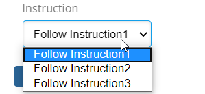
Figure 32. selecting a value from list of values
FieldStatusAppearance
Type: Map<TaskStatus, Appearance>
Represents a Task Status and appearance mapping. Based on this mapping, field will be displayed in task details based on task status. Default value is visible.
e.g.
{
    ...

    "status": {
        "active": "visible",
        "rejected": "hidden",
        "unassigned": "hidden",
        "approved": "visible",
        "complete": "hidden",
        "pending": "hidden"
    }

    ...
}
6.9.10. Operation
Type: OperationCfg
Schema
{
    "base": OperationBase,
    "id": OperationId,
    "label": OperationLabel,
    "where": OperationWhere,
    "operation": OperationHandler,
    "config": OperationConfig,
    "access": OperationAccess,
    "users": OperationUser,
    "statuses": OperationStatuses
}
Represents a Operation, that can be referred by Tasks.
There are following built-in operations that are,
-
"complete"
-
"approve"
-
"reject"
-
"assign"
-
"reassign"
e.g.
{
    ...

    "operations": [
        {
            "base": null,
            "id": "operation-reassign-task",
            "label": null,
            "where": null,
            "operation": "reassign",
            "config": {
                "key": "value"
            },
            "access": "access-inverse",
            "users": [
                "assignee",
                "owner",
                "participant"
            ],
            "statuses": [
                "approved"
            ]
        }
    ],

    ...
}
OperationBase
Type: String
refers a existing configured OperationCfg’s OperationId. This inherits configurations from the base, that can be overriden locally.
e.g.
{
    "base": "operation-common",
    "id": "operation-reassign-task"

    ...
}OperationLabel
Type: String
Custom label for the operation. label can be a property key.
e.g.
{
    ...

    "base": "complete",
    "label": "Done Task",

    ...
}
OperationWhere
Type: String
Whether the operation can be executed.
e.g.
{
    ...

    "where": "(context.user == 'Test Everything')",

    ...
}
OperationHandler
Type: String
refers a class’s full name which implements com.technia.tvc.collaboration.workflow.model.operation.Operation.
e.g.
{
    ...

    "operation": "com.technia.tvc.collaboration.discussion.model.dao.enovia.example.operation.CustomOperation",

    ...
}
OperationConfig
Type: Map<Object,Object>
custom configuration values in key value pair.
Following are pre-defined configs which could be used for operation definition.
| Name | Details |
|---|---|
form-title |
String value or String resource property key for operation form custom title. |
form-submit-label |
String value or String resource property key for operation form custom submit label. |
e.g.
{
    ...

    "config": {
        "inverse": true,
        "form-title":"Forwarding the Task",
        "form-submit-label":"forward"
    }

    ...
}
OperationAccess
Type: String
refers a existing configured AccessCfg’s AccessId. This inherits configurations from the base, that can be overriden locally.
e.g.
{
    ...

    "access": "access-librarian"

    ...
}
OperationUser
Type: Array<User>
User
Type: User
fixed value. options are,
| Option | Description |
|---|---|
assignee |
Assignee of the Task. |
owner |
Creator of the workflow. |
recipient |
Persons in Group/Role when Task is assigned to Group/Role. |
watcher |
Watchers on the Workflow. |
all |
All users. |
Types of user for whom the operation is available.
e.g.
{
    ...

    "users": [
        "assignee",
        "owner",
        "recipient"
    ],

    ...
}
OperationStatuses
Type: Array<Status>
Status
Type: Status
fixed value. options are,
-
"Rejected"
-
"Approved"
-
"Reassigned"
-
"Complete"
-
"Pending"
-
"Active"
-
"Unassigned"
-
"Excluded"
-
"Assigned"
-
"Active and Unassigned"
-
"Started"
-
"Stopped"
-
"Restarted"
-
"Terminated"
Types of task status at which operation is enabled.
e.g.
{
    ...

    "statuses": [
        "approved",
        "complete"
    ],

    ...
}
6.9.11. Context
Type: ContextCfg
Schema
{
    "base": ContextBase,
    "id": ContextId,
    "context": Context,
    "config": ContextConfig
}
Represents a Context, that can be referred by Tasks/ Workflow.
There is a built-in contexts that is,
-
expression
| if "expression" context returns no contexts, then current context would be connected. To include current contexts along with expression contexts use "id" selectable in "expressions" config. |
-
repeatable
| if there are multiple context for task then task will be splitted into multiple task each per context. single context will be connected to each splitted task. |
e.g.
{
    ...

    "contexts": [
        {
            "base": null,
            "id": "context-from-ebom",
            "context": "expression",
            "repeatable": true,
            "config": {
                "expressions": [
                    "id",
                    "from[EBOM].to.id"
                ],
                "privileged": true
            }
        }

        ...
    ],

    ...
}
ContextBase
Type: String
refers a existing configured ContextCfg’s ContextId. This inherits configurations from the base, that can be overriden locally.
e.g.
{
    "base": "context-promote",
    "id": "context-selective-promote"

    ...
}ContextHandler
Type: String
refers a class’s full name which implements com.technia.tvc.collaboration.workflow.model.context.Context.
e.g.
{
    ...

    "context": "com.technia.tvc.collaboration.workflow.cfg.context.impl.builtin.ExampleContext",

    ...
}
ContextConfig
Type: Map<Object,Object>
any custom configuration values.
e.g.
{
    ...

    {
        ...

        "context": "expression",
        "config": {
            "expressions": [
				"id",
				"from[EBOM].to.id"
			]
        }

        ...

    }

    ...
}
Context Edit Widget
Support for editing the context object through the helium widget.
It will help to avoid navigating to multiple windows to edit the context object which requires to complete a task.
The user could define a form widget with the required fields for the specific task.
editWidget: Helium based Widget to edit the context object.
editTarget: inline or popup. In inline mode, the widget is open inside the task thread. default is a popup mode which open as a modal dialog.
{
    ...

    {
        ...

        "context": "expression",
        "config": {
            ...,
            "editWidget":"/hex/engineering/ChangeProcess",
            "editTarget":"inline"
        }

        ...

    }

    ...
}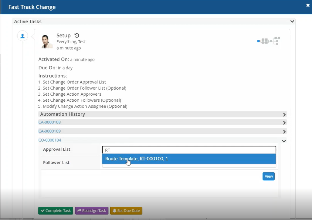
Figure 33. Edit task context in inline mode
6.9.12. Assignee
Type: AssigneeCfg
Schema
{
    "base": AssigneeBase,
    "id": AssigneeId,
    "type": AssigneeType,
    "config": AssigneeConfig,
    "handler": AssigneeHandlerCfg,
    "autocomplete": AssigneeAutocompleteCfg,
    "values": Array<AssigneeValue>,
    "appearance": AssigneeAppearance
}
Represents a Assignee, that can be referred by Tasks.
e.g.
{
    ...

    "assignees": [
        {
            "base": null,
            "id": "assignee-person-within-role",
            "type": "person",
            "values": null,
            "handler": null,
            "autocomplete": {
                "handler": "person",
                "config": {
                    "roles": [
                        "Design Engineer",
                        "role_LibraryUser",
                        "role_Employee"
                    ]
                }
            },
            "values": null,
            "appearance": null
        },
         {
            "base": null,
            "id": "assignee-custom",
            "type": "com.technia.tvc.collaboration.discussion.model.dao.enovia.example.assignee.CustomAssignee",
            "handler": "com.technia.tvc.collaboration.discussion.model.dao.enovia.example.assignee.CustomAssigneeHandler",
            "autocomplete": "com.technia.tvc.collaboration.discussion.model.dao.enovia.example.assignee.CustomAssigneeAutocompleteHandler",
            "values": null,
            "appearance": null
        }
    ],

    ...
}
AssigneeBase
Type: String
refers a existing configured AssigneeCfg’s AssigneeId. This inherits configurations from the base, that can be overriden locally.
e.g.
{
    "base": "assignee-task-common",
    "id": "assignee-task-review"

    ...
}AssigneeType
Type: AssigneeType
fixed or custom value. options are,
-
"person"
-
"role"
-
"group"
-
"user"
or any class implementing "com.technia.tvc.collaboration.core.model.Assignee"
e.g.
{
    ...

    "assignees" : [
        {
            ...

            "type": "role",

            ...
        },
        {
            ...

            "type": "com.technia.tvc.collaboration.discussion.model.dao.enovia.example.assignee.CustomAssignee",

            ...
        }
    ]

    ...
}
AssigneeValue
Type: String
Assignee name that can match the Assignee-Type configured.
e.g.
{
    ...

    "assignees" : [
        {
            ...

            "type": "user",
            "values": [
                "Adam Sandler",
                "Software Quality Engineering",
                "Will Smith"
            ],

            ...
        }
    ]

    ...
}
AssigneeHandlerCfg
Type: AssigneeHandler | AssigneeHandlerCfg
Type: AssigneeHandlerCfg
Schema
{
	"name": AssigneeHandler,
	"config": AssigneeHandlerConfig
}
Represents a AssigneeHandler, that is used in Assignee.
e.g.
{
    ...

    "assignees": [
        {
            ...

            "handler": "com.technia.tvc.collaboration.discussion.model.dao.enovia.example.assignee.CustomAssigneeHandler",

            ...
        },
         {
            ...

            "handler": {
                "name": "com.technia.tvc.collaboration.discussion.model.dao.enovia.example.assignee.CustomAssigneeHandler",
                "config": {
                    "key": "value"
                }
            }

            ...
        }
    ],

    ...
}
AssigneeHandler
Type: String
refers a class’s full name which implements com.technia.tvc.collaboration.workflow.model.dao.enovia.config.AssigneeHandler.
e.g.
{
    ...

    "assignees": [
        {
            ...

            "handler": "com.technia.tvc.collaboration.discussion.model.dao.enovia.example.assignee.CustomAssigneeHandler",

            ...
        },
         {
            ...

            "handler": {
                "name": "com.technia.tvc.collaboration.discussion.model.dao.enovia.example.assignee.CustomAssigneeHandler",
            }

            ...
        }
    ],

    ...
}
AssigneeHandlerConfig
Type: Map<Object,Object>
any custom configuration values. This configuration will be available for AssigneeHandler.
e.g.
{
    ...

    "assignees": [
        {
            ...

            "handler": {
                "name": "com.technia.tvc.collaboration.discussion.model.dao.enovia.example.assignee.CustomAssigneeHandler",
                "config": {
                    "key": "value"
                }
            }

            ...
        }
    ],

    ...
}
AssigneeAutocompleteCfg
Type: String | AssigneeAutocompleteCfg
fixed or custom complex value. options are,
-
"person"
-
"role"
-
"group"
-
"user"
Schema
{
	"handler": AssigneeAutocompleteHandler,
	"config": AssigneeAutocompleteConfig
}
AssigneeAutocompleteHandler
Type: String
refers a class’s full name which implements com.technia.tvc.collaboration.workflow.model.operation.Operation.
e.g.
{
    ...

    "assignees": [
        {
            ...

            "autocomplete":  "com.technia.tvc.collaboration.discussion.model.dao.enovia.example.assignee.CustomAssigneeAutocompleteHandler"

            ...
        },
        {
            ...

            "autocomplete": {
                "handler": "com.technia.tvc.collaboration.discussion.model.dao.enovia.example.assignee.CustomAssigneeAutocompleteHandler",
                "config": {
                    "key": "value"
                }
            }

            ...
        },
    ],

    ...
}
AssigneeAutocompleteConfig
Type: Map<Object,Object>
any custom configuration values. This configuration will be available for AssigneeAutocompleteHandler.
e.g.
{
    ...

    "config": {
        "key": "value"
    }

    ...
}
AssigneeAppearance
Type: Map<Component, Appearance>
Component
Type: Component
fixed value. options are,
-
"create"
-
"reassign"
-
"thread"
-
"approve"
-
"complete"
-
"reject"
-
"assign"
Appearance
Type: Appearance
fixed value. options are,
-
"readable"
-
"hidden"
-
"mandatory"
-
"editable"
-
"text"
-
"visible"
Represents a component and appearance mapping.
e.g.
{
    ...

    "appearance": {
        "create": "readable",
        "reassign": "editable",
        "thread": "hidden",
        "approve": "readable",
        "complete": "readable",
        "reject": "readable",
        "assign": "readable"
    }

    ...
}
AssigneePretext
Type: String / String Resource Property
The pretext that will be displayed on task list page before task assignee.
e.g.
{
    ...

    "pretext": "Assigned to group : ",

    ...
}


{
    ...

    "pretext": "tvc.collaboration.workflow.task.assignee.pretext ",

    ...
}
AssigneeConfig
Type: Map<Object,Object>
any custom configuration values.
e.g.
{
    ...

    {
        ...

        "type": "person",
        "config": {
            "preload": true,
            "openOnFocus": true
        }

        ...

    }

    ...
}
The following config can be used to tune the assignee autocomplete field.
preload: to load the assignee options on a load of field.
openOnFocus: To open the assignee list on focus.
These configuration properties would override the behavior of following TVC system property.
| Property | Description | Default Value |
|---|---|---|
tvc.collaboration.autocomplete.loadOnFocus |
To preload and open the assignee list on focus |
false |
Refer OrganizationResolver chapter for more details.
6.9.13. Trigger
Type: TriggerCfg
Schema
{
    "base": TriggerBase,
    "id": TriggerId,
    "descriptions": TriggerDescriptions,
    "where": TriggerWhere,
    "events": TriggerEvents,
    "trigger": Trigger,
    "config": TriggerConfig
}
Represents a Trigger, that can be referred by Tasks.
There are following built-in triggers that are,
-
"promote"
-
"demote"
-
"history"
-
"setstate"
-
"sign"
-
"jpo"
-
"flowstatus"
-
"script"
-
"copy"
| copy built-in trigger does only support owner and description basic properties and all attribute to update in context object. |
-
"workflowhistory"
| workflowhistory built-in trigger is used to add the custom history of task operations in workflow. |
e.g.
{
    ...

    "triggers": [
        {
            "base": null,
            "id": "action-custom-history",
            "descriptions":["custom history"],
            "where": null,
            "events": [
                "approved",
                "complete",
                "rejected"
            ],
            "trigger": "history",
            "config": {
                "value": "custom history info",
                "privileged": true,
                "context": "both",
                "alternate-ids-expression" : "from[EBOM].to.id",
                "sort-ids-expression": "from[EBOM].to.id"
            }
        },
        {
            "base": null,
            "id": "copy-trigger",
            "descriptions": ["copy context object"],
            "where": null,
            "events": [
                "approved",
                "complete"
            ],
            "trigger": "copy",
            "config": {
                "copy": {
                   "owner": ["description", "attribute_Notes"],
                   "modified": "attribute_Notes",
                   "attribute_TVCCollaborationTitle": "attribute_Notes"
                },
                "privileged": true,
                "context": "task"
            }
        }

        ...
    ],

    ...
}
TriggerBase
Type: String
refers a existing configured TriggerCfg’s TriggerId. This inherits configurations from the base, that can be overriden locally.
e.g.
{
    "base": "trigger-promote",
    "id": "trigger-selective-promote"

    ...
}TriggerDescriptions
Type: Array<String>
descriptions for trigger.
You can also change description of built in trigger directly using below properties in TVCStringResources.properties file.
| Trigger Key | Default Value |
|---|---|
tvc.collaboration.workflow.trigger.promote.description |
Promote Context Object |
tvc.collaboration.workflow.trigger.demote.description |
Demote Context Object |
tvc.collaboration.workflow.trigger.copy.description |
Copy the task attributes on context object attributes |
tvc.collaboration.workflow.trigger.history.description |
Adding the task operation into context object history log |
e.g.
{
    "tasks": [

    {

    "fields": ["automationDetails","instructions"],

    "actions": ["copy-trigger", "history"]

    }

    ],

    "triggers": [
    {
      "id": "copy-trigger",
      "descriptions": ["tvc.collaboration.label.sent"]
    }

    ]

    ...
}
TriggerWhere
Type: String
Whether the trigger can be executed.
e.g.
{
    ...

    "where": "(context.user == 'Test Everything')",

    ...
}
TriggerHandler
Type: String
refers a class’s full name which implements com.technia.tvc.collaboration.workflow.model.trigger.Trigger.
e.g.
{
    ...

    "trigger": "com.technia.tvc.collaboration.workflow.cfg.trigger.impl.builtin.ExampleTrigger",

    ...
}
If TriggerHandler returns an error without error message, the default error message 'Error From Trigger : TRIGGER_NAME' will be shown. It can be configurable by changing value for the property key tvc.collaboration.workflow.trigger.failure.alert in TVCStringResources.properties file as shown below.
tvc.collaboration.workflow.trigger.failure.alert = Error From Trigger : {0}TriggerConfig
Type: Map<Object,Object>
Following are specific configs used by respective builtin triggers.
| Name | Default Value | Details |
|---|---|---|
alternate-ids-expression |
null |
Expression to evaluate alternate ids |
sort-ids-expression |
null |
Expression to sorts physical id’s to be promoted in specific order. |
privileged |
null |
boolean to execute the trigger on privileged context. |
context |
either |
enum of 'workflow', 'task', 'both', 'either' to execute the trigger in context of task/workflow. |
e.g.
{
    ...
    {
         ...

        "trigger": "promote",
        "config": {
        	"alternate-ids-expression" : "from[Proposed Activities].to.paths.path[Where].element[0].physicalid"
        }
        ...
    },

    {
        ...

        "trigger": "flowstatus",
        "config": {
            "status": "complete",
            "context": "workflow"
        }

        ...

    },
    {
        ...

        "trigger": "jpo",
        "config": {
            "program": "emxCustomProgram",
            "method": "logEvent",
            "context": "task"
        }

        ...

    },
    {
        ...

        "trigger": "setstate",
        "config": {
            "state": "Review",
            "privileged": true,
            "context": "either"
        }

        ...

    },
    {
        ...

        "trigger": "sign",
        "config": {
            "signature": "Design Reviewer",
            "action": "approve",
            "comment": "approving the design",
            "privileged": true,
            "context": "both"
        }

        ...

    },
    {
        ...

        "trigger": "script",
        "config":{
            "modules": [
                "panel",
                "myspace"
            ],
            "script":"(function(){top.refreshTablePage();}())"
        }

        ...

    }

    ...
}
TriggerEvents
Type: Array<Event>
Event
Type: Event
fixed value. options are,
-
"Rejected"
-
"Approved"
-
"Reassigned"
-
"Complete"
-
"Pending"
-
"Active"
-
"Unassigned"
-
"Excluded"
-
"Assigned"
-
"Active and Unassigned"
-
"Started"
-
"Stopped"
-
"Restarted"
-
"Terminated"
Types of task events at which trigger is enabled.
e.g.
{
    ...

    "events": [
        "approved",
        "complete",
        "stopped"
    ],

    ...
}
6.9.14. Task
Type: TaskCfg
Schema
{
    "base": TaskBase,
    "id": TaskId,
    "label": TaskLabel,
    "where": TaskWhere,
    "multiple": TaskMultiple,
    "mandatory": TaskMandatory,
    "signature": TaskSignature,
    "repeatable": TaskRepeatable,
    "appearance": TaskAppearance,
    "due": TaskDue,
    "assignee": TaskAssignee,
    "context": TaskContext,
    "fields": Array<TaskField>,
    "checks": Array<TaskTrigger>,
    "actions": Array<TaskTrigger>,
    "operations": Array<TaskOperation>,
    "history": TaskHistory,
    "automationHistory" : TaskAutomationHistory
}
Represents a Task, that can be referred by Workflow.
e.g.
{
    ...

    "tasks": [
        {
            "base": null,
            "id": "task-review",
            "label": "Part Review",
            "where": null,
            "multiple": true,
            "mandatory": null,
            "signature": true,
            "repeatable": false,
            "appearance": null,
            "due": null,
            "assignee": "assignee-task-review",
            "context": {
                "context": "expression",
                "config": {
                    "expressions": [
                        "id",
                        "from[EBOM].to.id"
                    ],
                    "privileged": true
                }
            },
            "fields": [
                "comments"
                "field-context-name",
                "instructions",
                "automationDetails"
            ],
            "checks": null,
            "actions": [
                "history",
                "action-super-promote",
            ],
            "operations": [
                "reassign",
                "assign",
                "operation-review"
            ],
            "history":true,
            "automationHistory":true
        }

        ...
    ],

    ...
}
TaskBase
Type: String
refers a existing configured TaskCfg’s TaskId. This inherits configurations from the base, that can be overriden locally.
e.g.
{
    "base": "task-review",
    "id": "task-manager-review"

    ...
}TaskLabel
Type: String
The label of the task.
e.g.
{
    ...

    "label": "Buyers Review",

    ...
}
TaskLabel could also be a string resource property key for internationalization.
Sample configuration
{
    ...
    "id":"setup",
    "label":"tvc.collaboration.workflow.task.label.setup",
    "signature":false,
    ...
}
Corresponding properties can be defined in the string resource property file as shown below.
e.g.
tvc.collaboration.workflow.task.label.setup = setupTaskWhere
Type: String
Whether the task can be included.
e.g.
{
    ...

    "where": "(context.user == 'Test Everything')",

    ...
}
TaskMultiple
Type: Boolean
Whether to allow selection of multiple assignee for the task.
e.g.
{
    ...

    "multiple": true,

    ...
}
TaskMandatory
Type: Boolean
Whether selection of assignee for the task is mandatory.
e.g.
{
    ...

    "mandatory": true,

    ...
}
TaskSignature
Type: Boolean
Whether the task approval or rejection requires re-entry of user credential. Core Authenticator would be used to authenticate the user credential.
e.g.
{
    ...

    "signature": true,

    ...
}
TaskRepeatable
Type: Boolean
Whether the task will be repeated if multiple assignees selected or the assignee types resolves to multiple users.
e.g.
{
    ...

    "repeatable": true,

    ...
}
TaskAdhoc
Type: Boolean | AdhocCfg
Defines the add task operation behavior for context task. Default behavior is true.
It defines following behavior.
-
Whether the task configuration should be used for Add Task workflow operation.
-
Whether + icon will be displayed to add the parallel and serial task.
e.g.
{
    ...

    "adhoc": true,

    ...
}
{
...
"adhoc": {
"add" : true,
"serial" : true,
"parallel" : true
},
...
}TaskAdhocAdd
Whether the task configuration should be used for Add Task workflow operation. If false then task configuration will not be displayed in configuration list in add task form.
{
    ...

    "adhoc": {
       "add" : false,
    },

    ...
}
TaskAdhocParallel
Whether the task should have + icon for adding parallel task. + icon will not be displayed on task with false value.
{
    ...

    "adhoc": {
       "parallel" : false,
    },

    ...
}
TaskAdhocSerial
Whether the task branch should have + icon for adding serial task. + icon will not be displayed on task branches which are in forward direction with false value.
{
    ...

    "adhoc": {
       "serial" : false,
    },

    ...
}TaskAppearance
Type: Map<Component, Appearance>
Component
Type: Component
fixed value. options are,
-
"create"
-
"reassign"
-
"thread"
-
"approve"
-
"complete"
-
"reject"
-
"assign"
Appearance
Type: Appearance
fixed value. options are,
-
"hidden"
-
"visible"
Represents a component and appearance mapping.
e.g.
{
    ...

    "appearance": {
        "create": "hidden",
        "reassign": "visible",
        "thread": "hidden",
        "approve": "visible",
        "complete": "visible",
        "reject": "visible",
        "assign": "visible"
    }

    ...
}
TaskDue
Type: String | DueCfg
e.g.
{
    ...

    "tasks": [
        {
            ...

            "due": "due-urgent"

            ...
        },
        {
            ...

            "due": {
                "days": 1,
                "activation": "task-activated"
            }

            ...
        }
    ]

    ...
}
TaskAssignee
Type: String | AssigneeCfg
refers a AssigneeId (recommended as it enables reuse) or inline AssigneeCfg.
e.g.
{
    ...

    "tasks": [
        {
            ...

            "assignee": "assignee-person-within-role"

            ...
        },
        {
            ...

            "assignee": {
                "type": "person",
                "autocomplete": {
                    "handler": "person",
                    "config": {
                        "roles": [
                            "Design Engineer",
                            "role_LibraryUser",
                            "role_Employee"
                        ]
                    }
                }
            }

            ...
        }
    ]

    ...
}
TaskContext
Type: String | ContextCfg
refers a ContextId (recommended as it enables reuse) or inline ContextCfg.
-
repeatable
| if there are multiple context for task then task will be splitted into multiple task each per context. single context will be connected to each splitted task. |
e.g.
{
    ...

    "tasks": [
        {
            ...

            "context": {
                "context": "expression",
                "repeatable": true,
                "config": {
                    "expressions": [
                        "id",
                        "from[EBOM].to.id"
                    ],
                    "privileged": true
                }
            }
            ...
        }
    ]

    ...
}
TaskField
Type: String | FieldCfg
e.g.
{
    ...

    "tasks": [
        {
            ...

            "fields": [
                "instruction",
                "field-context-name",
                "automationDetails",
                {
                    "label": "Meaning of signature",
                    "multiline": false,
                    "value": "This is Approval",
                    "appearance": {
                        "create": "readable",
                        "reassign": "editable"
                    }
                }
            ]

            ...
        }
    ]

    ...
}
TaskTrigger
Type: String | TriggerCfg
refers a TriggerId (recommended as it enables reuse) or inline TriggerCfg.
e.g.
{
    ...

    "tasks": [
        {
            ...

            "checks": [
                "check-valid-state"
            ],
            "actions": [
                "action-promote-connected",
                {
                    "events": [
                        "approved",
                        "complete",
                        "rejected"
                    ],
                    "trigger": "history",
                    "config": {
                        "privileged": true
                    }
                }
            ]

            ...
        }
    ]

    ...
}
TaskOperation
Type: String | OperationCfg
refers a OperationId (recommended as it enables reuse) or inline OperationCfg.
e.g.
{
    ...

    "tasks": [
        {
            ...

            "operations": [
                "complete",
                "reassign",
                "assign",
                {
                    "operation": "reassign",
                    "access": "access-inverse",
                    "users": [
                        "assignee",
                        "owner",
                        "participant"
                    ],
                    "statuses": [
                        "approved"
                    ]
                }
            ]

            ...
        }
    ]

    ...
}
TaskHistory
Type: Boolean
refers to task history icon Default Value: true
Note: This property will be used only if user set tvc.collaboration.workflow.task.history=true inside tvc.properties file.
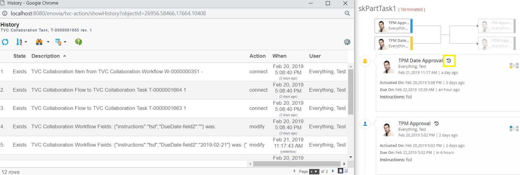
Figure 34. Task History Icon
e.g.
{
    "history": false

    ...
}
Task Automation History
Type: Boolean
Display the Automation which are executed on task in task thread including task activation (Default value: false).
For Example:
if task is completed then show the task completions and activation(if only activated) automation details in thread.
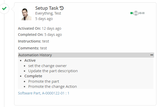
Figure 35. Task Automation History
e.g.
{
    "automationHistory": true

    ...
}
TaskClassMapping
Type: Map<TaskStatus, String>
Represents a Task Status and custom css class mapping. Custom class will be added into the class list of graph node and other elements of task UI.
Additional css resources can be added in TVCWorkflowConfig.xml to define custom classes. (refer Additional Resources in Workflow admin guide)
e.g.
{
...
"css-class-mapping": {
"reassigned": "forwarded",
"approved": "done",
"rejected": "absconded",
}
...
}TaskStatusMapping
Type: Map<TaskStatus, String>
Represents a Task Status and custom display status mapping. Custom display status will be displayed in tooltip and other UI instances in place of original status.
custom display status could also be a String resource property key for internationalization.
e.g.
{
...
"status-mapping": {
"reassigned": "forwarded",
"approved": "tvc.workflow.approved.customstatus",
"rejected": "absconded",
}
...
}6.9.15. Group
Type: GroupCfg
Schema
{
"base": GroupBase,
"id": GroupId,
"tasks": [
Task-Id1,
Task-Id2],
"actions": [
GroupAction
],
"context":GroupContext
}Allows you to configure the group of task to acheive the following grouped behavior:
-
An action to execute after a combination of tasks has been completed. This is achieved by adding the tasks in a group. The action is then assigned to the group. The action will be executed once when all tasks in a group fulfills the action event.
e.g.
...
"groups:" [
{
"base": null,
"id": "group1",
"tasks": [
"Task1"
],
"actions": [
"promote"
]
},
{
"base": null,
"id": "group2",
"tasks": [
"Task2.1",
"Task2.2"
],
"actions": [
"demote"
]
},
]
...-
To split the group of tasks if there are multiple group context. Group of tasks will be splitted into multiple groups each per context and will be arranged in separate parallel flow. e.g.
...
"groups:" [
{
"base": null,
"id": "group1",
"tasks": [
"B","C"
],
"context": {
"context": "expression",
"repeatable": true,
"config": {
"expressions": [
"from[Change Action].to.id"
]
}
}
}
]
...A - - B - - C - - DAbove flow is arranged in following flow if group is having 2 context for the group.
- B1 - - C1 -
A - | | - D
- B2 - - C2 -GroupBase
Type: String
Refers a existing configured GroupCfg’s GroupId. This inherits configurations from the base, that can be overriden locally.
e.g.
{
"base": "group1",
"id": "group2"
...
}GroupTasks
Type: Array
List of task config id to be grouped.
e.g.
{
"tasks": [
"Task2.1",
"Task2.2"
],
...
}GroupActions
Type: Array
List of actions which need to be executed on group of tasks.
e.g.
{
"actions": [
"custom-trigger",
"promote"
],
...
}GroupContext
Type: String | ContextCfg
refers a ContextId (recommended as it enables reuse) or inline ContextCfg.
-
repeatable
| if there are multiple context for group then group will be splitted into multiple group each per context. Group will be arranged in separate parallel flow. |
e.g.
{
...
"groups": [
{
...
"context": {
"context": "expression",
"repeatable": true,
"config": {
"expressions": [
"id",
"from[Change Action].to.id"
],
"privileged": true
}
}
...
}
]
...
}6.9.16. Workflow
Type: WorkflowCfg
Schema
{
"flow": WorkflowFlow,
"watcher": WorkflowWatcher,
"context": WorkflowContext,
"operations": Array<WorkflowOperation>,
"actions": Array<WorkflowActions>
}Represents Workflow, that layouts Tasks and workflow level operations.
e.g.
{
...
"workflow": {
"flow": [
[
"task-1",
[
"task-2.1",
"task-2.2"
],
"task-3"
]
],
"actions": [
"custom-trigger",
{
"events": [
"Started",
"Stopped",
"Terminated"
],
"trigger": "promote",
"config": {
"privileged": true
}
}
],
"context": {
"context": "expression",
"config": {
"expressions": [
"id",
"from[EBOM].to.id"
],
"privileged": true
}
},
"watcher": {
"type": "person",
"values": [
"Adam Sandler",
"Jennifer Aniston"
],
"handler": {
"name": "com.technia.tvc.collaboration.discussion.model.dao.enovia.example.watcher.EverythingWatcher",
"config": {
"key": "value"
},
}
},
"operations": [
"add",
"delete",
"stop",
"restart",
"terminate"
]
}
...
}WorkflowFlow
Type: String | Array
defines the structure/flow of the workflow using configured TaskId's
e.g.
{
...
"workflow": [
[
"task-1",
[
"task-2.1",
"task-2.2"
],
"task-3"
]
]
...
}WorkflowContext
Type: String | ContextCfg
refers a ContextId (recommended as it enables reuse) or inline ContextCfg.
e.g.
{
...
"workflow": {
...
"context": {
"context": "expression",
"config": {
"expressions": [
"id",
"from[EBOM].to.id"
],
"privileged": true
}
}
...
}
...
}WorkflowWatcher
Type: WatcherCfg
Schema
{
"type": WatcherType,
"values": Array<WatcherValue>,
"handler": WatcherHandlerCfg
}Represents a Watcher configuration, which can result into multiple watchers who watch the workflow.
e.g.
e.g.
{
...
"workflow": {
...
"watcher": {
"type": "person",
"values": [
"Adam Sandler",
"Jennifer Aniston"
],
"handler": {
"name": "com.technia.tvc.collaboration.discussion.model.dao.enovia.example.watcher.EverythingWatcher",
"config": {
"key": "value"
},
}
},
...
}
...
}WatcherType
Type: AssigneeType
fixed or custom value. options are,
-
"person"
-
"role"
-
"group"
-
"user"
or any class implementing "com.technia.tvc.collaboration.core.model.Assignee"
e.g.
{
...
"assignees" : [
{
...
"type": "role",
...
},
{
...
"type": "com.technia.tvc.collaboration.discussion.model.dao.enovia.example.assignee.CustomAssignee",
...
}
]
...
}WatcherValue
Type: String
Watcher name that can match the WatcherType configured.
e.g.
{
...
"watcher" : {
...
"type": "user",
"values": [
"Adam Sandler",
"Software Quality Engineering",
"Will Smith"
],
...
}
...
}WatcherHandlerCfg
Type: WatcherHandler | WatcherHandlerCfg
Type: WatcherHandlerCfg
Schema
{
"name": WatcherHandler,
"config": WatcherHandlerConfig
}Represents a WatcherHandler, that is used in Watcher.
e.g.
{
...
"handler": "com.technia.tvc.collaboration.discussion.model.dao.enovia.example.watcher.EverythingWatcher",
...
}
or
{
...
"handler": {
"name": "com.technia.tvc.collaboration.discussion.model.dao.enovia.example.watcher.EverythingWatcher",
"config": {
"key": "value"
}
}
...
}Type: String
refers a class’s full name which implements com.technia.tvc.collaboration.workflow.model.dao.enovia.config.WatcherHandler.
e.g.
{
...
"handler": "com.technia.tvc.collaboration.discussion.model.dao.enovia.example.watcher.EverythingWatcher",
...
}
or
{
...
"handler": {
"name": "com.technia.tvc.collaboration.discussion.model.dao.enovia.example.watcher.EverythingWatcher",
}
...
}Type: Map<Object,Object>
any custom configuration values. This configuration will be available for WatcherHandler.
e.g.
{
...
"handler": {
"name": "com.technia.tvc.collaboration.discussion.model.dao.enovia.example.watcher.EverythingWatcher",
"config": {
"key": "value"
}
}
...
}WorkflowOperation
Type: String | OperationCfg
refers a OperationId (recommended as it enables reuse) or inline OperationCfg.
e.g.
{
...
"workflow": {
...
"operations": [
"add",
"delete",
"stop",
"restart",
"terminate"
]
...
}
...
}WorkflowActions
Type: Array
List of actions which need to be executed on workflow.
e.g.
{
...
"actions": [
"custom-trigger",
{
"events": [
"Started",
"Stopped",
"Terminated"
],
"trigger": "promote",
"config": {
"privileged": true
}
}
],
...
}WorkflowNotification
Type: Boolean
All the task assignee get the notification on workflow creation by default. The following configuration could be used to control this behaviour and send the notification only to the initially activated task assignee.
e.g.
{
...
"notifyAllOnStart": false,
...
}Following TVC property can be used to control this behavior at global level.
| Property | Description | Default Value |
|---|---|---|
tvc.collaboration.workflow.notifyAllOnStart |
To control the notification send on workflow creation to all task assignee or only active task assignee |
true |
WorkflowHistory
Type: Boolean
Refers to workflow history icon to show the workflow history. The default value is true.
tvc.collaboration.workflow.history TVC property can be used to control the display of workflow history icon at the system level. The default value is true.
|
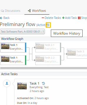
Figure 36. Workflow History Icon
e.g.
{
...
"history": false,
...
}With the use of workflowhistory built-in trigger task operation’s custom history could be added under workflow.
"tasks":[{
...
"actions":["workflowhistory"],
...
}]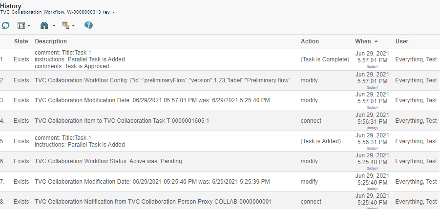
Figure 37. Workflow History along with the Task operations
6.10. Workflow Configuration Provider
The <WorkflowConfigProvider> element allows to provide dynamic Workflow Configuration for the context object.
The full name of the class which implements the interface "com.technia.tvc.collaboration.workflow.cfg.WorkflowConfigProvider" is configured in attribute "className".
e.g.
A basic Route Template based provider is part of the installation. RouteWorkflowConfigProvider finds the available "Route Templates" in ENOVIA and converts them as TVC WorkflowConfigs.
package com.technia.tvc.collaboration.workflow.cfg.provider.impl;
public class RouteWorkflowConfigProvider implements WorkflowConfigProvider {
@Override
public String getId() {
return "Example Route Based Template Config Provider";
}
@Override
public Collection<WorkflowConfig> getConfigs(ConfigContext ctx, boolean best) throws TVCException {
if (ctx.isEvaluateContextInfo()) {
return CollectionUtils.EMPTY_COLLECTION; // or return the EMPTY config with custom Context info resolver based on requirement
} else {
return getRouteConfigs();
}
}
....
}| Workflow configs could be returned based on the condition through the isEvaluateContextInfo method of ConfigContext which is true when the config is fetched to find the ContextInfoResolver. An Empty list or blank config with context info resolver if any could be returned when the flag is true to improve the performance where multiple lines of code or DB calls are executed to get the workflow configs. |
6.11. Workflow Configuration Builder
Apart from WorkflowConfig and [JSONConfig], a Java based Builder API is available to create the Workflow Config JSON using Java.
e.g.
...
public WorkflowConfig createConfig() throws TVCException {
try {
JsonConfigValue json = new JsonConfigValue.Builder().setVersion(1.0f)
.setLabel("Global Sample Workflow (Builder)")
.setId("global-sample-builder")
.setDefault(new DefaultCfgValue.Builder()
.setDue(new DueCfgValue.Builder("default").setDays(1)
.setActivation(Activation.TASK_ACTIVATED)
.build())
.setField(new FieldCfgValue.Builder("default").setLabel("default")
.setMultiline(false)
.setAppearance(Component.CREATE, Appearance.READABLE)
.setAppearance(Component.REASSIGN, Appearance.EDITABLE)
.setAppearance(Component.THREAD, Appearance.HIDDEN)
.setAppearance(Component.APPROVE, Appearance.READABLE)
.setAppearance(Component.COMPLETE, Appearance.READABLE)
.setAppearance(Component.REJECT, Appearance.READABLE)
.setAppearance(Component.ASSIGN, Appearance.READABLE)
.build())
.setTask(
new TaskCfgValue.Builder("default").setSignature(false)
.setMandatory(true)
.setMultiple(true)
// .setRepeatable(false)
.setFields("comments")
.setOperations("approve", "reject", "assign")
.build())
.build())
.addDue(new DueCfgValue.Builder("due-task-1").setDays(1)
.setActivation(Activation.WORKFLOW_STARTED)
.build())
.addOperation(new OperationCfgValue.Builder("operation-reassign-task")
.setAccess(new AccessCfgValue.Builder("access-inverse")
.setConfig(new StructBuilder().set(CustomAccess.INVERSE, true).build())
.setExcludes("Test Everything", "Adam Sandler")
.setIncludes("Jennifer Aniston", "Will Smith")
.setAccess(CustomAccess.class)
.build())
.setConfig(new StructBuilder().set("key", "value").build())
.setOperation("reassign")
.setUsers(User.ASSIGNEE, User.OWNER, User.PARTICIPANT)
.setWhere(null)
.setTaskStatuses(TaskStatus.APPROVED)
.build())
.addField(new FieldCfgValue.Builder("field-mos").setLabel("Meaning of signature")
.setValue("this is Approval")
.build())
.addField(new FieldCfgValue.Builder("field-custom-value").setLabel("Custom Value")
.setValue("sample custom value field")
.build())
.addField(new FieldCfgValue.Builder("field-context-name").setLabel("Context Object Name")
.setHandler(new FieldValueHandlerCfgValue.Builder(NameFieldValueHandler.class, null).build())
.build())
.addAssignee(new AssigneeCfgValue.Builder("assignee-task-1").setAssigneeType(AssigneeType.PERSON)
.setValues("Will Smith")
.setAutocomplete("person")
.setAppearance(Component.CREATE, Appearance.READABLE)
.build())
.addAssignee(new AssigneeCfgValue.Builder("assignee-task-2.1").setAssigneeType(CustomAssignee.class)
.setHandler(CustomAssigneeHandler.class)
.setAutocomplete(CustomAssigneeAutocompleteHandler.class)
.build())
.addAssignee(new AssigneeCfgValue.Builder("assignee-task-2.2").setAssigneeType(AssigneeType.PERSON)
.setAutocomplete(new AssigneeAutocompleteCfgValue.Builder("person").setConfig(new StructBuilder()
.set("roles", new ArrayBuilder().item("Design Engineer", "role_LibraryUser").build())
.build()).build())
.build())
.addAssignee(new AssigneeCfgValue.Builder("assignee-task-3").setAssigneeType(AssigneeType.USER)
.setAutocomplete("user")
.setValues("Adam Sandler", "Software Quality Engineering", "Will Smith")
.build())
.addTrigger(new TriggerCfgValue.Builder("action-flow-complete")
.setEvents(Arrays.asList(TaskStatus.APPROVED))
.setTrigger("flowstatus")
.setConfig(new StructBuilder().set("status", "complete").build())
.build())
.addTrigger(new TriggerCfgValue.Builder("action-any-rejected")
.setEvents(Arrays.asList(TaskStatus.REJECTED))
.setTrigger("demote")
.setConfig(new StructBuilder().set("privileged", false).build())
.build())
.addTrigger(new TriggerCfgValue.Builder("action-custom-history")
.setEvents(Arrays.asList(TaskStatus.APPROVED))
.setTrigger("history")
.setConfig(new StructBuilder().set("privileged", false).set("value", "custom history info").build())
.build())
.addTrigger(new TriggerCfgValue.Builder("action-panel-table-refresh")
.setEvents(Arrays.asList(TaskStatus.APPROVED, TaskStatus.COMPLETE, TaskStatus.REJECTED))
.setTrigger("script")
.setConfig(new StructBuilder().set("script", "(function(){ top.refreshTablePage(); }())")
.set("modules", new ArrayBuilder().item("panel", "myspace", "collaboration").build())
.build())
.build())
.addTask(new TaskCfgValue.Builder("task-1").setLabel("Task 1 (role)")
.setSignature(true)
.setAppearance(Appearance.VISIBLE)
.setActions("history", "action-panel-table-refresh")
.setFields("comments", "instructions")
.setOperations("complete", "reassign", "assign")
.setDue("due-task-1")
.setRepeatable(true)
.setAssignee("assignee-task-1")
.build())
.addTask(new TaskCfgValue.Builder("task-2.1").setLabel("Task 2.1 (custom)")
.setActions("history", "action-panel-table-refresh")
.setFields("instructions")
.setOperations("complete", "reassign", "assign")
.setAssignee("assignee-task-2.1")
.build())
.addTask(
new TaskCfgValue.Builder("task-2.2").setLabel("Task 2.2 (person-in-role)")
.setSignature(true)
.setActions("history", "action-panel-table-refresh")
.setFields("comments", "field-mos", "field-context-name", "field-custom-value",
"instructions")
.setOperations("complete", "reassign", "assign")
.setAssignee("assignee-task-2.2")
.build())
.addTask(new TaskCfgValue.Builder("task-3").setLabel("Task 3 (user)")
.setSignature(true)
.setMultiple(true)
.setActions("history", "action-panel-table-refresh")
.setFields("comments")
.setRepeatable(true)
.setOperations("complete", "assign")
.setAssignee("assignee-task-3")
.build())
.setWorkflow(
new WorkflowCfgValue.Builder()
.setFlow(new Flow(new Flow(new TaskCfgValue.Builder("task-1").build(),
new Flow(new TaskCfgValue.Builder("task-2.1").build(),
new TaskCfgValue.Builder("task-2.2").build()),
new TaskCfgValue.Builder("task-3").build())))
.addTrigger(new TriggerCfgValue.Builder("action-custom-promote")
.setEvents(Arrays.asList(WorkflowStatus.COMPLETE))
.setTrigger("promote")
.setConfig(new StructBuilder().set("privileged", true).build())
.build())
.setWatcher(new WatcherCfgValue.Builder("watcher-flow").setValues("Jennifer Aniston")
.setHandler(new WatcherHandlerCfgValue.Builder().setName(EverythingWatcher.class)
.setConfig(new StructBuilder().set("key", "value").build())
.build())
.build())
.build())
.build();
WorkflowConfig config = new WorkflowConfig.Builder(json).setUIEnabled(true).build();
return config;
} catch (Exception ex) {
throw new TVCException(ex);
}
}
...6.12. Advanced filter (Exalead powered feature)
It is possible to configure something called advanced filter in order to control the data loaded for this component. This type of filtering is able to load and filter on data that has been indexed by Exalead. This can be used to filter out both notifications in the inbox and workflows in the side panel. These filters can be hidden or visible so that the user can change values in the UI.

6.12.1. Filter configuration
In order to enable a filter you can reference a filter configuration in your TVCWorkflowConfig.xml file like this.
<Filter ref="tvc:collaborationfilter:tvx:collaboration/Product.xml" />
<Filter> element
The base element for the actual filter configuration is the <Filter> element. That one has a number of attributes that can be used to control some behavior for the entire filter.
<Filter showOnLoad="true" visibleRowCount="3" visible="true">| Attribute | Description | Default Value |
|---|---|---|
showOnLoad |
Show filter on load or not (if set to false the user will have to click the filter icon to show the filter |
true |
visibleRowCount |
How many filter rows (rows described later) that will be showed on load. Visibility of rest can be toggled by the user. |
|
visible |
Whether the filter should be shown or be hidden |
true |
<Row> element
Each filter can have any amount of rows. A row corresponds to a row in the filter user interface. Each row can have a label set and that will then be rendered to the far left. Each row can then have a single or multiple filter items. A row can be hidden using the "visible" attribute.
<Row visible="true">
<Label>Anything</Label>
<FilterItem>..</FilterItem>
<FilterItem>..</FilterItem>
</Row><FilterItem>
A <FilterItem> represents an element that can be used to filter data
(textfield, dropdown, button etc.). Each filteritem maps against one or
multiple values that has been indexed by Exalead. Below is a complete
example of a filteritem. Each element described after the example
<FilterItem>
<Label>Workflow Status</Label>
<Operator>EQUAL</Operator>
<LogicalOperator>OR</LogicalOperator>
<MapsTo>
<Field>
<Name>TVC_COLLAB_WORKFLOW_STATUS</Name>
</Field>
</MapsTo>
<Values>
<Value selected="true">
<SubmitValue>Active</SubmitValue>
<DisplayValue>Active</DisplayValue>
</Value>
<Value>
<SubmitValue>Pending</SubmitValue>
<DisplayValue>Pending</DisplayValue>
</Value>
<Value>
<SubmitValue>Complete</SubmitValue>
<DisplayValue>Complete</DisplayValue>
</Value>
<Value>
<SubmitValue>Stopped</SubmitValue>
<DisplayValue>Stopped</DisplayValue>
</Value>
</Values>
<UIControl>textbutton</UIControl>
</FilterItem><Operator>
Can be used to control what operator to use for this field item. It is not mandatory to specify this.
-
EQUAL (default)
-
NOT_EQUAL
-
LESS_THAN
-
GREATER_THAN
<LogicalOperator>
Can be used to control what logical operator to use for this field item. Not mandatory to set this.
-
OR (default)
-
AND
<MapsTo>
This element is used to map this field against either tags or indexed fields in Exalead. In order to filter on tags one or more <Tag> elements are used and in order to filter on fields one or more <Field> elements are used.
<MapsTo>
<Tag>
<Name>category</Name>
</Tag>
<Field>
<Name>TVC_COLLAB_WORKFLOW_STATUS</Name>
</Field>
</MapsTo><UIControl>
This element is used to control what type of UI control to use for this field. Supported values are:
- DROPDOWN
-
Dropdown list with possibility to select ONE value.
- MULTISELECTDROPDOWN
-
Dropdown list with possibility to select MULTIPLE values.
- TEXT
-
Text field where user can enter any text
- BOOLEANBUTTON
-
Yes/No buttons
- TEXTBUTTON
-
Buttons containing custom values. (Each value renders as a button)
Some of these elements require you to configure the values that can be used. See next section
<Values>
This element is used to configure the allowed values for a <UIControl>.
All UI controls except BOOLEANBUTTON and TEXT requires one or more
values. Each value has a submit-value that is sent to the server and a
display-value that is rendered for the user. A value can be configured
to be default selected with the attribute "selected"
<Values>
<Value>
<SubmitValue>MHK</SubmitValue>
<DisplayValue>MHK</DisplayValue>
</Value>
<Value selected="true">Values can also be loaded through Java code like this.
<Values valueHandler="com.technia.tvc.example.valuehandler.ObjectIdValueHandler"/>
The value handler class needs to implement the
com.technia.tvc.collaboration.core.model.dao.enovia.config.ValueHandler
(deprecated) interface.
ValueHandler interface has been deprecated in favour of
com.technia.tvc.collaboration.core.model.dao.enovia.config.FilterValueHandler.
Mine FilterItem Configuration
<FilterItem>
<Label>Categories</Label>
<Operator>EQUAL</Operator>
<LogicalOperator>AND</LogicalOperator>
<Type>mine</Type>
<UIControl>textbutton</UIControl>
</FilterItem>Due FilterItem Configuration
<FilterItem>
<Label>Categories</Label>
<Operator>EQUAL</Operator>
<LogicalOperator>AND</LogicalOperator>
<Type>due</Type>
<UIControl>textbutton</UIControl>
</FilterItem>Assigned FilterItem Configuration
Filter workflows based on Active tasks which are assigned to context user.
<FilterItem>
<Operator>EQUAL</Operator>
<LogicalOperator>AND</LogicalOperator>
<Type>assigned</Type>
<Value>
<SubmitValue>Assigned</SubmitValue>
<DisplayValue>Assigned</DisplayValue>
</Value>
<UIControl>textbutton</UIControl>
</FilterItem>6.13. Enovia Based Filter
It is possible to enable Exalead powered feature and filter in enovia mode by setting the following system property key:
tvc.collaboration.enovia.filter=true
We could have performamce issue in comparision of exalead mode as searching mechanism is different in case of enovia and exlead mode.
6.13.1. Filter configuration
In Enovia mode, the same configurations which are defined for Exalead Powered feature need to be done to use the filter and features such as Unread, Archive, To ME, CC Me, Followup etc…
6.13.2. Index File configuration
Following fields must be added in Exalead Indexed Configuration file.
<BOTYPEFIELDS name="TVCCollaborationMXCriteria">
<FIELD name="TVC_COLLAB_MX_NOTIFICATION_USER_NAME"
select="to[TVC Collaboration Notification].from.owner"
type="STRING" />
<FIELD name="TVC_COLLAB_MX_WORKFLOW_CONTEXT_ID"
select="to[TVC Collaboration Set].from.to[TVC Collaboration Object Proxy].from.id"
type="STRING" />
<FIELD name="TVC_COLLAB_MX_THREAD_CONTEXT_ID"
select="to[TVC Collaboration Discussion].from.to[TVC Collaboration Discussion Container].from.id"
type="STRING" />
<FIELD name="TVC_COLLAB_MX_WORKFLOW_CONTEXT_PHYSICAL_ID"
select="to[TVC Collaboration Set].from.to[TVC Collaboration Object Proxy].from.physicalid"
type="STRING" />
<FIELD name="TVC_COLLAB_MX_THREAD_CONTEXT_PHYSICAL_ID"
select="to[TVC Collaboration Discussion].from.to[TVC Collaboration Discussion Container].from.physicalid"
type="STRING" />
<FIELD name="TVC_COLLAB_MX_THREAD_SENT_TO"
select="from[TVC Collaboration Thread Message].to.from[TVC Collaboration Sent To].to.owner"
type="STRING" />
<FIELD name="TVC_COLLAB_MX_NOTIFICATION_UNREAD_USERS"
select="to[TVC Collaboration Notification|attribute\[TVC Collaboration Unread Count\]>0].from.owner"
type="STRING" />
<FIELD name="TVC_COLLAB_MX_THREAD_LAST_MSG_SENT_TO"
select="from[TVC Collaboration Last Message].to.from[TVC Collaboration Sent To|attribute\[TVC Collaboration Recipient Type\]==0].to.owner"
type="STRING" />
<FIELD name="TVC_COLLAB_MX_THREAD_LAST_MSG_SENT_CC"
select="from[TVC Collaboration Last Message].to.from[TVC Collaboration Sent To|attribute\[TVC Collaboration Recipient Type\]==1].to.owner"
type="STRING" />
<FIELD name="TVC_COLLAB_MX_FOLLOWUP_USER_NAME"
select="to[TVC Collaboration Followup].from.owner"
type="STRING" />
<FIELD name="TVC_COLLAB_MX_THREAD_FIRST_MSG_SENT_TO"
select="from[TVC Collaboration First Message].to.from[TVC Collaboration Sent To].to.owner"
type="STRING" />
<FIELD name="TVC_COLLAB_MX_TASK_ASSIGNED"
select="from[TVC Collaboration Item].to[|attribute\[TVC Collaboration Task Status\]==Active].owner"
type="STRING" />
<FIELD name="TVC_COLLAB_MX_TASK_STATUS"
select="from[TVC Collaboration Item].to[*|revision==last].attribute[TVC Collaboration Task Status]"
type="STRING" />
</BOTYPEFIELDS>Multiple JPOs have been configured for mutiple filters for Exalead mode. These fields has been introduced to improve the performance on some extent by avoiding these JPO invocation.
6.14. Collaboration Panel Host based Visibility
Collaboration Panel can be used in variety of mode. ex: standalone, embedded, cross-domain. When using Helium in embedded mode, there could be double side panels. To avoid such situation and also to control which mode Collaboration Panel is enabled, following configurations can be used.
| Property | Description | Default Value |
|---|---|---|
tvc.collaboration.panel.classic.standalone |
Enabling classic collaboration panel in standalone (using tvcCollaborationPanelContent.jsp directly) |
true |
tvc.collaboration.panel.classic.embedded |
Enabling classic collaboration panel in embedded (default collaboration setup in ENOVIA or using tvcCollaborationPanelContent.jsp in iframes) |
true |
tvc.collaboration.panel.classic.crossdomain |
Enabling classic collaboration panel in cross-domain (using tvcCollaborationPanelContent.jsp in cross-domain iframe) |
true |
tvc.collaboration.panel.helium.standalone |
Enabling helium collaboration panel in standalone (default collaboration setup in Helium) |
true |
tvc.collaboration.panel.helium.embedded |
Enabling helium collaboration panel in embedded (using Helium in ENOVIA embedded mode) |
false |
tvc.collaboration.panel.helium.crossdomain |
Enabling helium collaboration panel in cross-domain (using Helium in ENOVIA cross domain embedded mode) |
true |
6.15. Workflow Multiple Context
Workflow can be created in context of multiple objects using collaboration javascript API.
e.g.
Following javascript can be called from command to launch the create dialog of workflow in context of multiple objects.
top.getCollaborator().openCollaborationPanel(['14668.27509.6640.55228', '14668.27509.6641.7837', '14668.27509.36080.39209'], { component: 'workflow', launchCreate: true });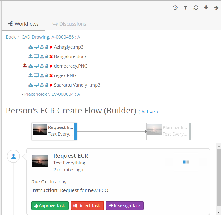
Figure 38. Workflow multiple context
6.16. Additional Configurations
6.16.1. Date Format Configurations
Date formats inside collaboration user interface can be configured to display custom date format.
Collaboration component uses moment.js version 2.4.0 (http://momentjs.com/) for date/time display. So supporting formats documented here http://momentjs.com/docs/#/displaying/format/ and also a custom format "fromNow" equivalent to moment.js’s "fromNow" functionality.
Below properties can be configured to format the date used in sections of the collaboration component.
| Property | Description | Default Value |
|---|---|---|
tvc.collaboration.date.convert.userPreferenceTimeZone |
Format the date depending on user preference timezone. Refer Figure 24. |
true |
tvc.collaboration.workflow.task.dateFormat |
Date format used in Workflow task |
fromNow |
tvc.collaboration.workflow.list.dateFormat |
Date format used in Workflows List |
fromNow |
Use | operator to pass multiple date formats as shown below.
tvc.collaboration.workflow.task.dateFormat="YYYY-MM-DD, HH:mm:ss | fromNow"

Figure 39. User Preference TimeZone
6.16.2. Miscellaneous Configurations
Additional property configurations for Collaboration
| Property | Description | Default Value |
|---|---|---|
tvc.collaboration.toastr.timeout |
How long the toast alert will display (in Millisecond) |
5000 (set 0 to stay indefinitely until closed) |
6.16.3. Additional Resources
Additional resources like JavaScript, CSS, AjaxService and Custom Template can be included in workflow component.
<JavaScript>, <StyleSheet>, <AjaxService> and <Template> element can be repeated to support multiple resource inclusion.
<Resources> configuration can be under configuration elements like <MySpaceConfig>, <MySpaceAction>, <TopbarConfig>, <WorkflowConfigs>, <WorkflowConfig>.
<WorkflowConfigs>
<Resources>
<StyleSheet src="/tvx/collaboration/layout-styles.css"/>
<Template id="panel/layout" src="/tvx/collaboration/panel-layout.hbs"/>
</Resources>
<WorkflowConfig for="type_Part">
<Resources>
<JavaScript src="/tvx/js/custom.js" />
<AjaxService service="messages" />
</Resources>
</WorkflowConfig>
<TopbarConfig>
<Resources>
<StyleSheet src="/tvx/css/custom.css" />
<Template id="customTemplate" src="/tvx/template/custom.jsp" />
</Resources>
</TopbarConfig>
<MySpaceConfig>
<Resources>
<StyleSheet src="/tvx/collaboration/layout-styles.css"/>
<Template id="myspace/layout" src="/tvx/collaboration/myspace-layout.hbs"/>
</Resources>
<WorkflowAction>
<Resources>
<AjaxService service="tvxCollaborationService"/>
<AjaxService service="jsontest"/>
<JavaScript src="/tvx/collaboration/inboxCustomScript.js"/>
<StyleSheet src="/tvx/collaboration/inboxCustomStyles.css"/>
</Resources>
<ContextMenu ref="tvc:menu:tvx:collaboration/InboxContextMenu.xml"/>
</WorkflowAction>
<ProfileAction>
<Resources>
<StyleSheet src="/tvx/css/custom.css"/>
</Resources>
</ProfileAction>
</MySpaceConfig>
</WorkflowConfigs>Ex: inboxCustomScript.js
tvc.define('script.tvx', [ 'collaborator.ready!', 'ajax.tvxCollaborationService' ],
function($collaborator, tvxCollaborationService) {
var tvx = {
fakeDelete : function($event, $notification, $command, $inbox) {
tvxCollaborationService.fakeDeletePromise().then(function(result) {
$notification.addClass('fake-deleted');
alert(result);
});
}
};
return tvx;
});Ex: InboxContextMenu.xml
...
<Command>
<Label>Fake delete (ajax example)</Label>
<Href><![CDATA[
javascript:(function($event, $notification, $command, $inbox) {
tvc.require(['script.tvx'], function(tvx) {
tvx.fakeDelete($event, $notification, $command, $inbox);
});
}($event, $notification, $command, $inbox));
]]></Href>
</Command>
...7. Configuring the Gantt Chart
This section describes how to configure the Gantt chart component. This includes how to create a Command that can be added to the tree category menu of a Project, Program, Business Goal or a Collection in ENOVIA’s Program Central and how to create configuration business objects that describe how the Gantt chart should be rendered.
Note that it is also possible to dynamically configure the rendering of a Gantt chart by clicking on the "Configure Chart" link in the toolbar displayed on the Gantt chart web page.
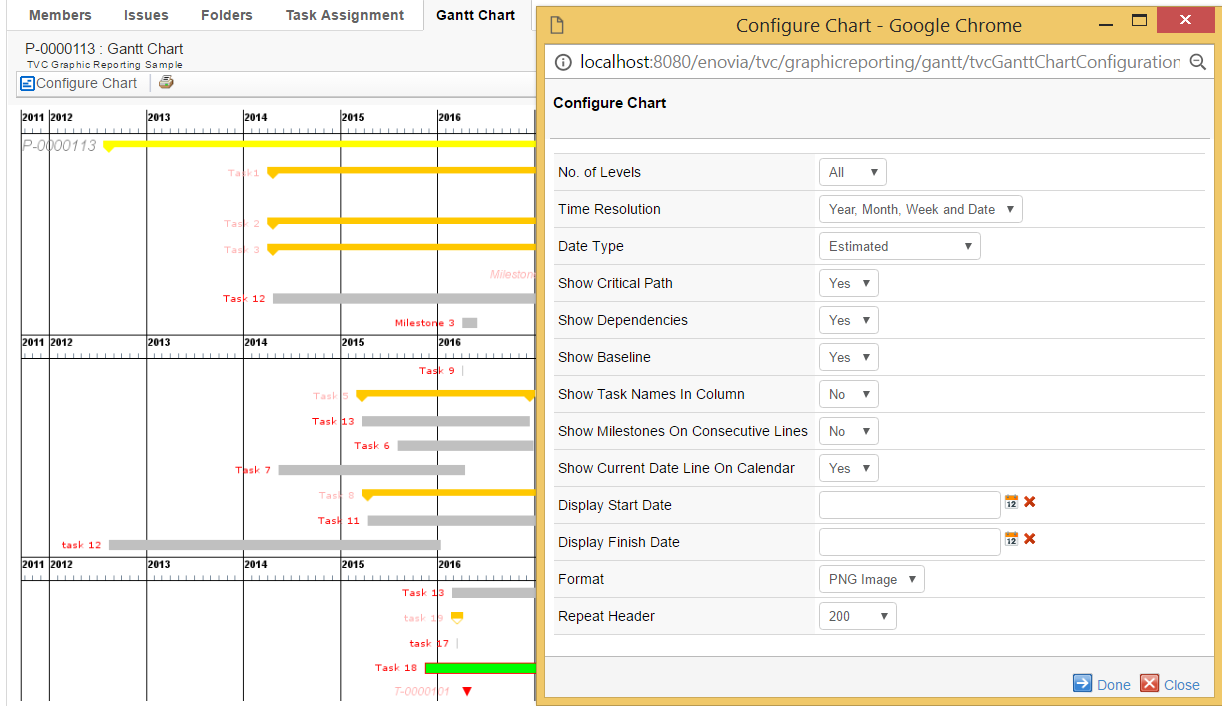
Figure 40. Dynamic configuration of the Gantt chart
7.1. Commands
This section describes how to create a Command to launch the Gantt chart from the tree category menu of a Project, Program, Business Goal or a Collection in ENOVIA’s Program Central.
Commands can be created and modified with the Business Administrator and MQL thick clients; however, it is recommended that you use the Business Administrator if you are not familiar with MQL (Matrix Query Language).
The most important parameter when creating a Command to launch the Gantt chart is the "Href" parameter, whose value must be the following URL.
${ROOT_DIR}/tvc-action/ganttChart
The URL may contain parameters to configure the behavior of the Gantt chart. See URL Parameters for more information. Moreover, there are a few settings that need to be defined on the Command in order for it to behave as expected. See Settings for more information.
7.1.1. URL Parameters
This section describes the URL parameters that can be used to configure the behavior of the Gantt chart. The URL parameters are appended to the URL on the "Href" parameter of a Command.
Query string parameters appended to a URL consist of name-value pairs separated by an ampersand (&), while the entire query string is separated from the rest of the URL using a question mark (?). The following table describes parameters that can be used to configure the Gantt chart.
| URL Parameter | Description | Examples |
|---|---|---|
name |
The name of the TVC Gantt Chart configuration object. This is used to identify which configuration object to use for this particular instance of the Gantt Chart. See Configurations for more information. |
name=My Config |
header subHeader |
These parameters define the header and sub header that will be displayed on the Gantt Chart page. The values of these parameters can be either plain text or a string resource file ID. Note that when using a string resource file ID it is required that the "Registered Suite" setting has been defined on the command. The values can also contain select expression macros that will be evaluated on the current business object. The current business object refers to the objectId parameter that is sent with the URL. Note that you normally don’t add the objectId parameter yourself as it will be added automatically by the system, for instance, when executing a command on a business objects tree menu. |
header=Gantt Chart for Project $<name> or header=Gantt Chart&subHeader=Project $<name>, $<revision> |
objectId |
The object ID of the object the Gantt chart will be made for (the ENOVIA object ID of the Project Space object). This parameter is added automatically when this command is used in a Menu category tree but needs to be added if the command is used on a stand-alone PowerView page. |
objectId=12345.12345.12345.12345 |
useFreeSpace |
This parameter controls if the Gantt chart layout should re use vertical space as long as the graph being placed does not collide with any other graphs |
useFreeSpace=true |
autoSize |
This parameter controls if the Gantt chart layout should automatically determinate the preferred size from the current window size so that the graph will fill the page content. When this parameter is enabled Maximum Width and Preferred Width settings are ignored. |
autoSize=true |
escapeHeader escapeSubHeader |
These settings can be used to control over displaying Header and Sub Header. See Configurations for more information. |
escapeHeader=true |
skipFilter |
This setting will apply filter automatically on page load. |
skipFilter=true |
7.1.2. Settings
The following table describes the settings and values that should be set on a Command that is used to launch the Gantt chart from a tree category menu.
| Setting | Description | Required Value |
|---|---|---|
Target Location |
This setting defines the target frame when executing the command. The value should be set to "content" to ensure that the Gantt Chart is loaded in the correct frame. |
content |
Registered Suite |
This setting defines which application the command belongs to. |
ProgramCentral |
7.2. Configurations
7.2.1. Gantt Chart Config
Example
<GanttChart>
<TimeResolution>Year, Month, Week and Date</TimeResolution>
<DateType>Estimated</DateType>
<ImageFormat>PNG</ImageFormat>
<Levels>All</Levels>
<ShowCriticalPath>true</ShowCriticalPath>
<ShowDependencies>true</ShowDependencies>
<ShowBaseline>true</ShowBaseline>
<ShowTaskNamesInColumn>true</ShowTaskNamesInColumn>
<ShowMilestonesOnConsecutiveLines>true</ShowMilestonesOnConsecutiveLines>
<PreferredWidth>800</PreferredWidth>
<MaximumWidth>2400</MaximumWidth>
<TooltipTable>tvc:table/GanttChartSampleTooltip.xml</TooltipTable>
<Model>
<Name>Foo</Name>
<Method>Bar</Method>
<Params>
<Param name="test1" value="value1"/>
<Param name="test2">value2</Param>
<Param name="test3">value3</Param>
<Param name="test4" value="value4"/>
</Params>
</Model>
<FontSchema ref="tvc:ganttchartfonts/MyFontConfig.xml"/>
<ColorSchema ref="tvc:ganttchartcolors/MyColorConfig.xml"/>
</GanttChart>7.2.2. XML Format
The following table describes the attributes that that can be configured on a configuration business object.
| Element | Description |
|---|---|
DateType |
It is possible to have different dates control the generation of the Gantt chart. Valid values are:
|
Levels |
Defines the initial number of levels that will be displayed on the chart. |
ShowTaskNamesInColumn |
Defines whether the task names should be displayed in a separate column on the left or to the very left of the corresponding task. Note that this setting is incompatible with useFreeSpace parameter and will be ignored when useFreeSpace is enabled. Valid values are:
|
ShowMilestonesOnConsecutiveLines |
Defines whether to show milestones on consecutive lines below the top or on their actual position in the chart. Valid values are:
|
ShowCurrentDateLineOnCalendar |
Defines whether to show current date as vertical line on calendar. Valid values are:
Default value is FALSE. Default color of date line is RED. It can be changed by ColorConfig.xml <CalendarCurrentDate>rgb(0,25,0)</CalendarCurrentDate> |
ShowBaseline |
Defines whether the baseline dates will be displayed. The baseline of a task, phase or milestone is rendered as a light-gray shadow-like figure. Valid values are:
|
ShowDependencies |
Defines whether dependencies between task, phases and milestones will be displayed (arrows connecting the elements) or not. All standard Gantt dependencies are supported - Start-to-Finish, Start-to-Start, Finish-to-Finish and Finish-to-Start. Lag time is also properly handled by the ENOVIA Program Central functionality. Valid values are:
|
ShowCriticalPath |
Defines whether the view will highlight the critical path in the project (i.e. the tasks that together define the total duration of the project). This is displayed by showing a dashed border around the tasks and phases in the critical path. Valid values are:
|
TimeResolution |
The level of time resolution to display in the time axis on top of the Gantt chart. NB! If the project displayed in Gantt notation is very long, the component will adjust accordingly and might not display days, weeks or months if the available graphic area prohibits that. Valid values are:
|
PreferredWidth |
Defines the preferred width of the generated chart in pixels. If the project displayed is very long and contains many tasks, etc, the width of the chart might increase in order to provide a clear graphical representation. However, note that the chart will never grow beyond its maximum width. |
MaximumWidth |
Defines the maximum width of the generated chart in pixels. |
ImageFormat |
Defines the image format of the generated chart. Valid values are:
|
TooltipTable |
Defines which custom system table to use for tooltips. If no custom system table is used to configure the tooltips a default tooltip will be generated. |
|
Defines the name of the custom JPO (Java Program Object) that will be invoked to generate the chart. Note that you don’t need to specify a custom JPO if you want the chart to render a WBS structure of a Program or a Project in ENOVIA Program Central. Hence, the purpose of a custom JPO generator is to be able to generate Gantt charts of custom object structures (WBS or other) from within ENOVIA. |
|
Defines the name of the method that will be called on the custom JPO Gantt chart generator. |
|
Defines parameters that the user can input and which are submitted to the custom JPO Gantt chart generator. |
Privileged |
Defines if the chart should be generated using privileged user access |
Sectionized |
|
GraphHandlerClass |
|
FontSchema |
Defines the font configuration to be used |
ColorSchema |
Defines the color configuration to be used |
RepeatHeader |
Defines number of pixels after which header should be repeated on Gantt Chart. Value should be an integer greater than 200. 0, -1 and -2 are also valid values with usage as defined below.
|
7.2.3. Custom Colors
This section describes how you can configure the colors used when rendering the Gantt chart. For example, you may wish to display milestones as green diamonds instead of black.
To customize the colors of a Gantt chart create an XML configuration file of type "ganttchartcolors" and reference that from your Gant Chartt config. Example:
<ColorSchema ref="tvc:ganttchartcolors/MyColorConfig.xml" />
Example configuration:
<ColorSchema>
<Task>rgb(0,0,1)</Task>
<TaskProgress>rgb(0,0,2)</TaskProgress>
<TaskLabel>rgb(0,0,3)</TaskLabel>
<TaskBaseline>rgb(0,0,4)</TaskBaseline>
<TaskSlipDays>rgb(0,0,5)</TaskSlipDays>
<Project>rgb(0,0,6)</Project>
<ProjectBaseline>rgb(0,0,7)</ProjectBaseline>
<ProjectSlipDays>rgb(0,0,8)</ProjectSlipDays>
<Phase>rgb(0,0,9)</Phase>
<PhaseLabel>rgb(0,0,10)</PhaseLabel>
<PhaseBaseline>rgb(0,0,11)</PhaseBaseline>
<PhaseSlipDays>rgb(0,0,12)</PhaseSlipDays>
<Milestone>rgb(0,0,13)</Milestone>
<MilestoneLabel>rgb(0,0,14)</MilestoneLabel>
<MilestoneBaseline>rgb(0,0,15)</MilestoneBaseline>
<MilestoneSlipDays>rgb(0,0,16)</MilestoneSlipDays>
<CriticalPath>rgb(0,0,17)</CriticalPath>
<CriticalPathLabel>rgb(0,0,18)</CriticalPathLabel>
<Timeline1>rgb(0,0,19)</Timeline1>
<Timeline2>rgb(0,0,20)</Timeline2>
<Timeline3>rgb(0,0,21)</Timeline3>
<Timeline4>rgb(0,0,22)</Timeline4>
<CalendarCurrentDate>(0,0,23)</CalendarCurrentDate>
</ColorSchema>The values of the different colors can be one of the following:
-
Empty. If the value of an attribute is empty the default color will be used when rendering.
-
rgb(<red>,<green>,<blue>). This syntax allows you to define the red, green and blue color values using decimal notation (0-255). For example: rgb(0,0,0) is black and rgb(255,0,0) is red.
-
#<red><green><blue>. With this syntax you define the red, green and blue color values using hexadecimal notation (00-FF). For example #000000 is black and #FF0000 is red.
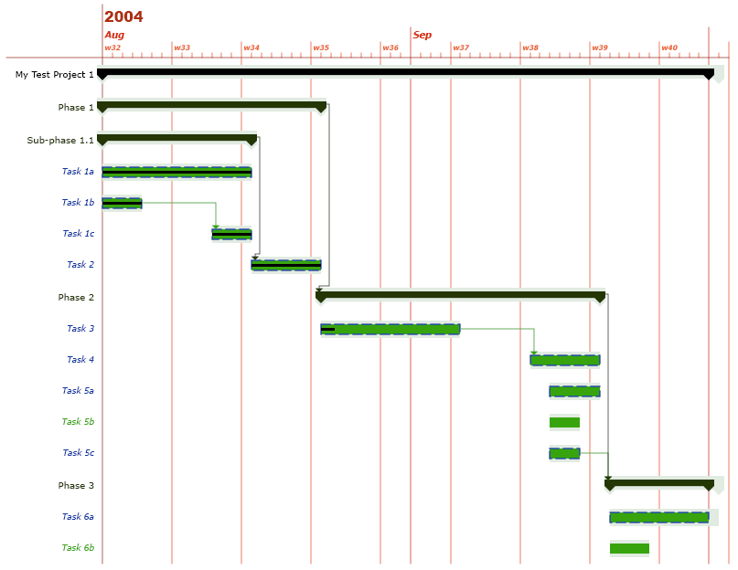
Figure 41. Custom colors example
7.2.4. Custom Fonts
This section describes how you configure the fonts used when rendering labels on the Gantt chart. For example, you may want to display Task labels using Arial instead of Verdana.
Configuring the fonts of a Gantt chart is similar to how you configure its colors. What you need to do is to create a new business object of the type "TVC Gantt Chart Fonts" and connect it to the general "TVC Gantt Chart" business object. The name of the relationship is "TVC Gantt Chart Fonts" (same as the business type name).
<FontSchema>
<Task>arial,bold,12</Task>
<Project>courier,plain,10</Project>
<Phase>verdana,bold,12</Phase>
<Milestone>arial,bold+italic,20</Milestone>
<Timeline1>tahoma,plain,20</Timeline1>
<Timeline2>tahoma,bold,14</Timeline2>
<Timeline3>tahoma,italic,12</Timeline3>
<Timeline4>tahoma,italic+bold,10</Timeline4>
</FontSchema>The values of the fonts must conform to the following syntax:
-
Empty. If the value is empty the default font will be used.
-
<font_name>,<font_style>,<font_size>. Where the name of the font is specified using an actual font name (e.g., Verdana, Arial, Tahoma, Times New Roman) or a logical font name (i.e., Dialog, DialogInput, Monospaced, Serif, SansSerif, or Symbol). The font style can be either plain, bold, italic, or bold+italic. The size of the font must be an integer. For example, arial,bold,12 or serif,plain,11.
7.2.5. Margins
This section describes how you configure the margins between the graphs.
The margin can be controlled with the following setting in xml
configuration file, where the default value is 8,7,7,7
<Margin>8,7,7,7</Margin>
We are using Insets(int top, int left, int bottom, int right), so values (all integer) in Margin tag must follow the sequence -
<Margin>top,left,bottom,right</Margin>
7.2.6. Grouping of Sections
This section describes how you configure the grouping of sections.
Use following setting in GanttChartConfig.xml to control grouping of phase in GanttChart :-
<Sectionized>true</Sectionized>
Default value will be false.
SectionGraph is actually extending ProjectGraph, so PhaseGraph and ProjectGraph settings will work for their respective SectionGraphs.
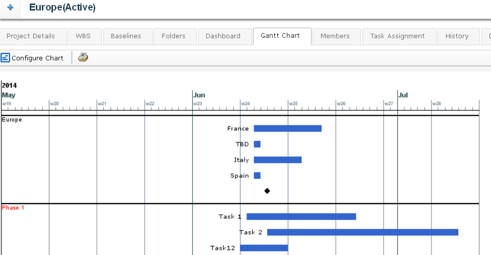
Figure 42. Section example
7.2.7. GanttChartHandler
This section describes how you configure the color and font through a custom GanttChartHandler.
Write a class which must implement GanttChartHandler interface.
Define this class in GanttChartConfig.xml
<GraphHandlerClass>com.technia.example.MyGanttChartHandler</GraphHandlerClass>Here is the example of one custom Gantt Chart handler class.
public class MyGanttHandler implements GanttChartHandler {
private void applyColor(GanttChartNode node, NodeGraph graph) {
String current = node.getObjectData().getSelectData(Statement.CURRENT.getStatement());
if ("Create".equals(current) || "Assign".equals(current)) {
graph.setColor(Color.LIGHT_GRAY);
graph.setLabelColor(Color.LIGHT_GRAY);
} else if ("Active".equals(current)) {
graph.setColor(Color.GRAY);
graph.setLabelColor(Color.GRAY);
} else if ("Complete".equals(current) || "Review".equals(current)) {
graph.setColor(Color.GREEN);
} else {
graph.setColor(Color.BLACK);
graph.setLabelColor(Color.BLACK);
}
}
@Override
public void populateMilestones(GanttChartNode node, MilestoneGraph graph) {
graph.setColor(Color.RED);
}
@Override
public void populatePhases(GanttChartNode node, PhaseGraph graph) {
// applyColor(node, graph);
}
@Override
public void populateProject(GanttChartNode node, ProjectGraph graph) {
// applyColor(node, graph);
}
@Override
public void populateTasks(GanttChartNode node, TaskGraph graph) {
applyColor(node, graph);
}
@Override
public void prepareEvaluation(Input input) {
input.addObjectSelect(Statement.CURRENT.getStatement());
}
}Context of addObjectSelect is the node and addRelationshipSelect is the subtask relationship with which the current object is connected to its parent node. This is why, node.getRelationshipData() is not available for nodetye Project.
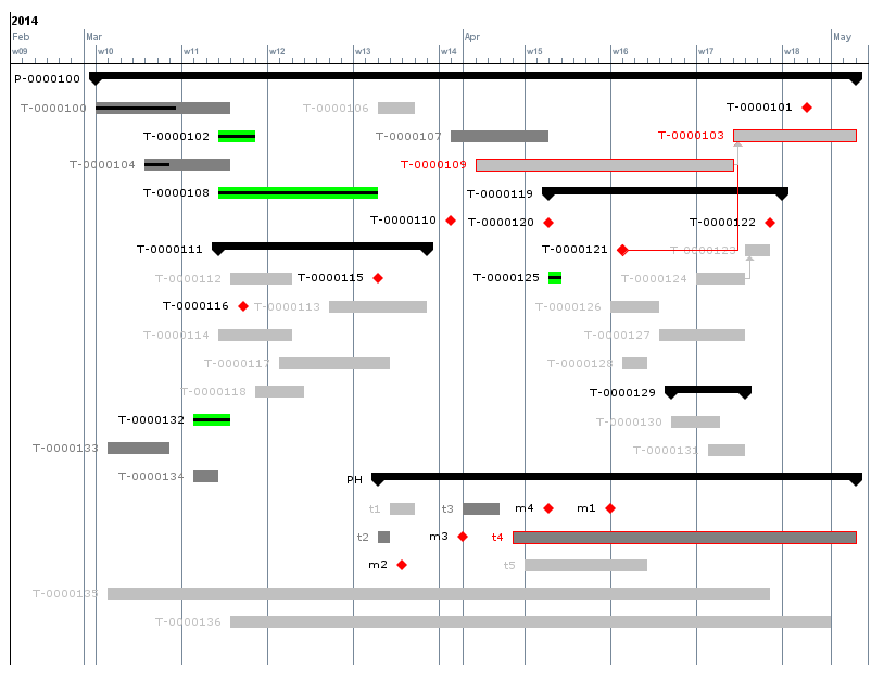
Figure 43. Colors set by handler
7.2.8. Milestone Icons
There are 5 supported Milestone Icon Types which you can set through custom Gantt Chart handler.
-
Diamond
-
Square
-
Triangle
-
Inverted Triangle
-
Hourglass
7.2.9. Privileged access
To generate the chart using privileged user access use the Privileged xml element or the TVC Privileged attribute
<Privileged>true</Privileged>
7.2.10. Repeat Header
When length of a Gantt Chart goes beyond the size of a single screen and user scroll down, it becomes difficult to keep track of header and columns. To resolve the problem vertical header repetition or freeze header can be enabled through a setting. The setting controls how often the header should be repeated or whether header should not scroll and stay fixed.
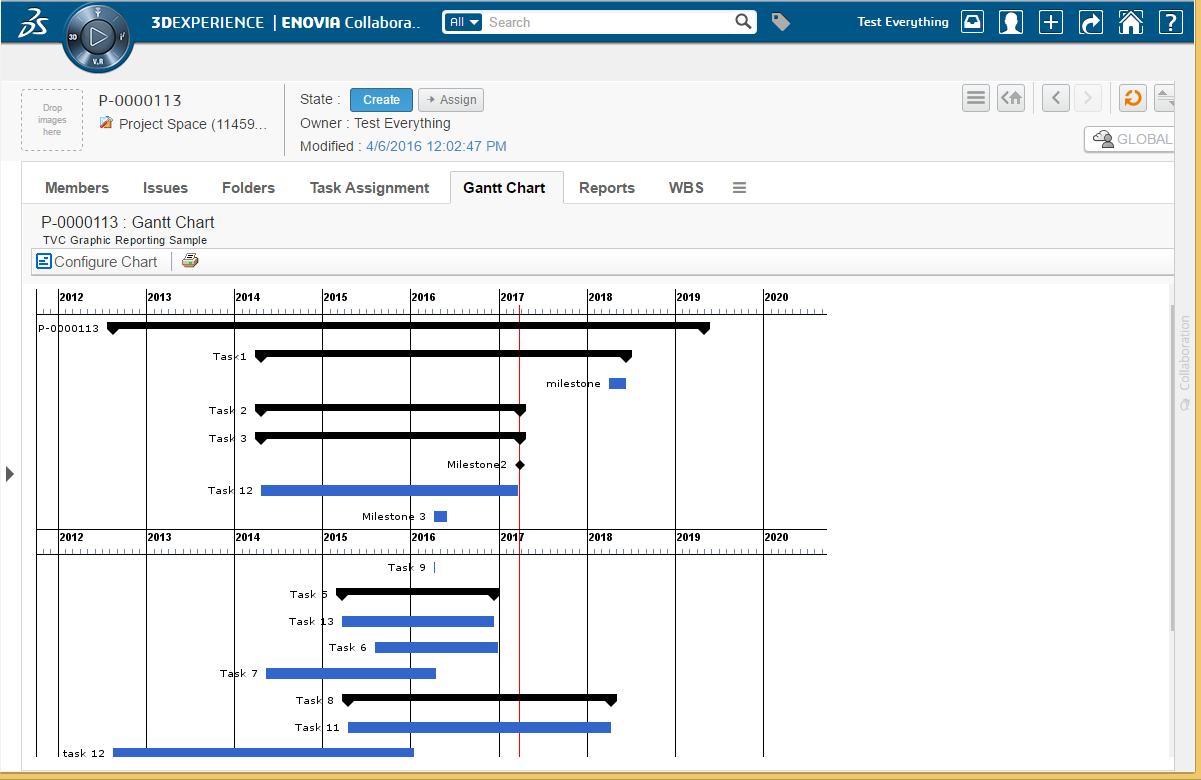
To repeat header in chart use the RepeatHeader xml element or the TVC Repeat Header Gantt Chart.
<RepeatHeader>600</RepeatHeader>
Value should be an integer greater than 200. 0, -1 and -2 are also valid values with usage as defined below.
- 0
-
Header will not be repeated.
- -1
-
Number of pixels will be calculated as per user screen size and resolution.
- -2
-
Header will not scroll and stay fixed.
7.3. Using JPOs to Generate Gantt Charts
A custom JPO can be used to generate a Gantt chart based on any business object structure of your choice. The JPO can also accept custom defined parameters that a user enters in his/her browser.
Figure 44. Overview
When a user requests a Gantt chart that is generated by a JPO and if custom parameters have been defined, the user has a chance to edit these parameters before the chart is rendered. However, the chart will be rendered immediately if no custom parameters have been defined.
7.3.1. Implementing the JPO
This section describes how to implement a JPO that generates Gantt charts. The name of the JPO and the method that should be invoked on the JPO is defined on the configuration business object. See Configurations for more information on how to create and use these.
The input parameter that is sent to the JPO is a java.util.Map that contains information about the root business object and the values of the custom parameters. The contents of the Map are described below:
| Key Name | Data Type | Description |
|---|---|---|
objectId |
java.lang.String |
The ID of the root business object. |
Custom Parameter |
Each custom defined parameter within the "TVC JPO Generator Params" attribute is sent to the JPO. The name of the parameter is the same as the key-name in the Map. The data type of the parameter decides which Java type is sent to the JPO. See Defining Custom Parameters for more information on how to define custom parameters. |
The JPO should then return a java.lang.String containing an XML that defines the structure of the Gantt chart. The returned XML should comply with the following DTD.
<!-- The "gantt-chart" element is the document
element. It contains zero or more "graph"
elements. -->
<!ELEMENT gantt-chart (graph*)>
<!-- The "graph" element defines a graph on the
Gantt chart. There are four types of graphs,
i.e., task, phase, milestone and project.
type Defines the type of the graph.
Accepted values are task, phase,
milestone and project.
object-id The ID of the business object
that the graph represents.
id The ID of the actual graph. The
ID of the graph is used when
resolving graph dependencies.
The id attribute can be left out
when not applicable (e.g., when
no dependencies are used).
NB! Two graphs should NOT have the
same ID or otherwise the dependencies
might not be resolved correctly.
Used in: gantt-chart
-->
<!ELEMENT graph (name, estimated-start, estimated-finish, actual-start?,
actual-finish?, baseline-initial-start?, baseline-initial-end?,
baseline-current-start?,
baseline-current-end?, tooltip?, percent-complete?, graph*,
dependency*)>
<!ATTLIST graph
type (phase|task|milestone|project) #REQUIRED
object-id CDATA #IMPLIED
id ID #IMPLIED
>
<!-- The "name" element defines the name of a graph.
Used in: graph
-->
<!ELEMENT name (#PCDATA)>
<!-- The "estimated-start" element defines the estimated
start date of a graph. Its value should comply with
the same format as date values inside the ENOVIA
database, or to the explicit format specified in the
format attribute when used.
format The date format used within the body
of the element. The date format will
default to the one used inside the
ENOVIA database when this attribute
is not defined.
Used in: graph
-->
<!ELEMENT estimated-start (#PCDATA)>
<!ATTLIST estimated-start
format CDATA #IMPLIED
>
<!-- The "estimated-finish" element defines the estimated
finish date of a graph. Its value should comply with
the same format as date values inside the ENOVIA
database, or to the explicit format specified in the
format attribute when used.
format The date format used within the body
of the element. The date format will
default to the one used inside the
ENOVIA database when this attribute
is not defined.
Used in: graph
-->
<!ELEMENT estimated-finish (#PCDATA)>
<!ATTLIST estimated-finish
format CDATA #IMPLIED
>
<!-- The "actual-start" element defines the actual
start date of a graph. Its value should comply with
the same format as date values inside the ENOVIA
database, or to the explicit format specified in the
format attribute when used.
format The date format used within the body
of the element. The date format will
default to the one used inside the
ENOVIA database when this attribute
is not defined.
Used in: graph
-->
<!ELEMENT actual-start (#PCDATA)>
<!ATTLIST actual-start
format CDATA #IMPLIED
>
<!-- The "actual-finish" element defines the actual
finish date of a graph. Its value should comply with
the same format as date values inside the ENOVIA
database, or to the explicit format specified in the
format attribute when used.
format The date format used within the body
of the element. The date format will
default to the one used inside the
ENOVIA database when this attribute
is not defined.
Used in: graph
-->
<!ELEMENT actual-finish (#PCDATA)>
<!ATTLIST actual-finish
format CDATA #IMPLIED
>
<!-- The "baseline-initial-start" element defines the initial
baseline start date of a graph. Its value should comply with
the same format as date values inside the ENOVIA
database, or to the explicit format specified in the
format attribute when used.
format The date format used within the body
of the element. The date format will
default to the one used inside the
ENOVIA database when this attribute
is not defined.
Used in: graph
-->
<!ELEMENT baseline-initial-start (#PCDATA)>
<!ATTLIST baseline-initial-start
format CDATA #IMPLIED
>
<!-- The "baseline-initial-start" element defines the initial
baseline end date of a graph. Its value should comply with
the same format as date values inside the ENOVIA
database, or to the explicit format specified in the
format attribute when used.
format The date format used within the body
of the element. The date format will
default to the one used inside the
ENOVIA database when this attribute
is not defined.
Used in: graph
-->
<!ELEMENT baseline-initial-end (#PCDATA)>
<!ATTLIST baseline-initial-end
format CDATA #IMPLIED
>
<!-- The "baseline-current-start" element defines the current
baseline start date of a graph. Its value should comply with
the same format as date values inside the ENOVIA
database, or to the explicit format specified in the
format attribute when used.
format The date format used within the body
of the element. The date format will
default to the one used inside the
ENOVIA database when this attribute
is not defined.
Used in: graph
-->
<!ELEMENT baseline-current-start (#PCDATA)>
<!ATTLIST baseline-current-start
format CDATA #IMPLIED
>
<!-- The "baseline-current-end" element defines the current
baseline end date of a graph. Its value should comply with
the same format as date values inside the ENOVIA
database, or to the explicit format specified in the
format attribute when used.
format The date format used within the body
of the element. The date format will
default to the one used inside the
ENOVIA database when this attribute
is not defined.
Used in: graph
-->
<!ELEMENT baseline-current-end (#PCDATA)>
<!ATTLIST baseline-current-end
format CDATA #IMPLIED
>
<!-- The "tooltip" element defines the tooltip that will be
displayed when the mouse pointer hoover above the graph
or the graphs label.
Used in: graph
-->
<!ELEMENT tooltip (#PCDATA)>
<!-- The "percent-complete" element defines how many
percent of the graph have been completed. Its value
should be an integer between 0 and 100 inclusive.
Used in: graph
-->
<!ELEMENT percent-complete (#PCDATA)>
<!-- The "dependency" element defines a dependency for a graph.
type The type of dependency. Accepted
values are SS, SF, FS and FF. These
acronyms expand to Start-to-Start,
Start-to-Finish, Finish-to-Start
and Finish-to-Finish.
id-ref The ID of the graph that the current
graph depend on. E.g., if graph A
depends on graph B, graph A should
have a "dependency" element whose
id-ref attribute contains the ID of
graph B.
Used in: graph
-->
<!ELEMENT dependency EMPTY>
<!ATTLIST dependency
type (SS|SF|FS|FF) #REQUIRED
id-ref IDREF #REQUIRED
>7.3.2. Defining Custom Parameters
Custom parameters are defined on the attribute "TVC JPO Generator Params" on the configuration business object. This section describes the format in which custom parameters are defined. See Configurations for more information on how to create and use configurations.
The syntax for defining custom parameters is as follows:
param.<name>=<label> param.<name>.type=(string|integer|real|boolean|datetime|chooser|dropdown)
Where <name> is the name of the parameter when retrieved from the JPO
and <label> is the label displayed on the JSP page. The type of the
parameter can be string, integer, real, boolean or datetime. If no type
has been explicitly defined for a parameter it will default to string.
Additionally for dropdown, we have to specify value as per following syntax:
param.<name>.value=value1:displayValue1,value2:displayValue2,value3:displayValue3
If displayValue is not given, value is displayed as display value.
And for chooser this value should be a pageconfig:
param.<name>.value=tvc:pageconfig:tvx:enc/AddToPartFamily.xml
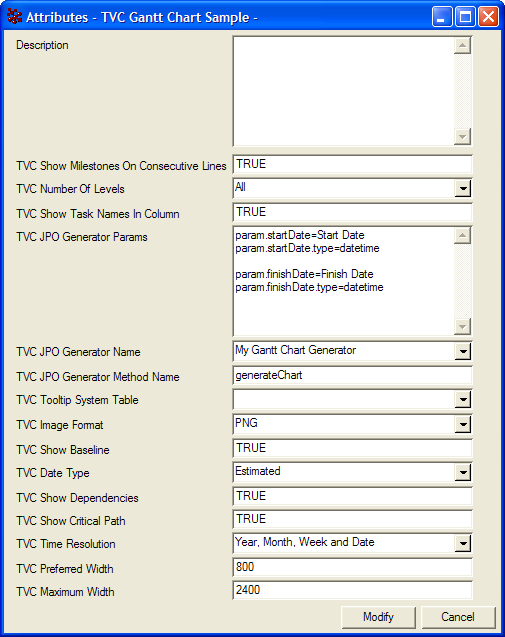
Figure 45. Defining custom parameters
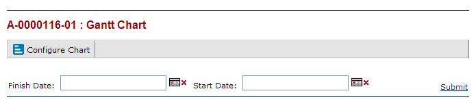
Figure 46. Custom parameters on JSP page
7.3.3. JPO Template
This section contains a template that can be used when implementing a JPO that generates Gantt charts.
/*
* JPO Gantt Chart Generator Template
*/
import matrix.db.*;
import java.util.*;
/**
* This is a simple template that you can use
* when creating a JPO that generate Gantt charts.
* If you want more tips and tricks you can also
* check the program TVCGanttChartUtils that is
* installed with the database schema for the
* TVC Graphic Reporting component.
*/
public class ${CLASSNAME} {
/**
* Implement this method to return the XML
* that defines the Gantt chart.
*/
public String generate(Context ctx,
String[] args)
throws Exception{
// Unpack the arguments
Map params = (Map) JPO.unpackArgs(args);
// Get the ID of the root business object
String objectId = (String) params.get("objectId");
// It is wise to use a StringBuffer
// when concatenating large strings
StringBuilder xml = new StringBuilder();
xml.append("<gantt-chart>");
// TODO: Add graph definitions to the xml
xml.append("</gantt-chart>");
return xml.toString();
}
/**
* Constructor.
*/
public ${CLASSNAME}(Context ctx, String[] args) {}
}7.4. Legacy Configuration Formats
It is possible to create business objects that configure how the Gantt chart is rendered when launched.
The type used for the configurations is called "TVC Gantt Chart" and it is derived from the abstract type "TVC". To be able to modify Gantt Chart configurations, the users need to have the role assignment "TVC Gantt Chart Manager". It is also possible to disable a configuration by promoting its life cycle state to "Inactive".
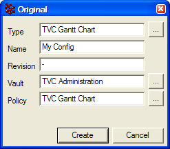
Figure 47. Creating a configuration
7.4.1. Attributes
The following table describes the attributes that that can be configured on a configuration business object.
| Attribute | Description |
|---|---|
TVC Date Type |
It is possible to have different dates control the generation of the Gantt chart. Valid values are:
|
TVC Number Of Levels |
Defines the initial number of levels that will be displayed on the chart. |
TVC Show Task Names In Column |
Defines whether the task names should be displayed in a separate column on the left or to the very left of the corresponding task. Note that this setting is incompatible with useFreeSpace parameter and will be ignored when useFreeSpace is enabled. Valid values are:
|
TVC Show Milestones On Consecutive Lines |
Defines whether to show milestones on consecutive lines below the top or on their actual position in the chart. Valid values are:
|
TVC Show Current Date Line On Calendar |
Defines whether to show current date as vertical line on calendar. Valid values are:
Default value is FALSE. Default color of date line is RED. It can be changed by ColorConfig.xml <CalendarCurrentDate>rgb(0,25,0)</CalendarCurrentDate> |
TVC Show Baseline |
Defines whether the baseline dates will be displayed. The baseline of a task, phase or milestone is rendered as a light-gray shadow-like figure. Valid values are:
|
TVC Show Dependencies |
Defines whether dependencies between task, phases and milestones will be displayed (arrows connecting the elements) or not. All standard Gantt dependencies are supported - Start-to-Finish, Start-to-Start, Finish-to-Finish and Finish-to-Start. Lag time is also properly handled by the ENOVIA Program Central functionality. Valid values are:
|
TVC Show Critical Path |
Defines whether the view will highlight the critical path in the project (i.e. the tasks that together define the total duration of the project). This is displayed by showing a dashed border around the tasks and phases in the critical path. Valid values are:
|
TVC Time Resolution |
The level of time resolution to display in the time axis on top of the Gantt chart. NB! If the project displayed in Gantt notation is very long, the component will adjust accordingly and might not display days, weeks or months if the available graphic area prohibits that. Valid values are:
|
TVC Preferred Width |
Defines the preferred width of the generated chart in pixels. If the project displayed is very long and contains many tasks, etc, the width of the chart might increase in order to provide a clear graphical representation. However, note that the chart will never grow beyond its maximum width. |
TVC Maximum Width |
Defines the maximum width of the generated chart in pixels. |
TVC Image Format |
Defines the image format of the generated chart. Valid values are: * SVG * PNG |
TVC Tooltip System Table |
Defines which custom system table to use for tooltips. If no custom system table is used to configure the tooltips a default tooltip will be generated. |
TVC JPO Generator Name |
Defines the name of the custom JPO (Java Program Object) that will be invoked to generate the chart. Note that you don’t need to specify a custom JPO if you want the chart to render a WBS structure of a Program or a Project in ENOVIA Program Central. Hence, the purpose of a custom JPO generator is to be able to generate Gantt charts of custom object structures (WBS or other) from within ENOVIA. See Error! Reference source not found. for more information on how to generate Gantt charts from a JPO. |
TVC JPO Generator Method Name |
Defines the name of the method that will be called on the custom JPO Gantt chart generator. |
TVC JPO Generator Params |
Defines parameters that the user can input and which are submitted to the custom JPO Gantt chart generator. |
TVC Privileged |
Defines if the chart should be generated using privileged user access |
TVC Repeat Header Gantt Chart |
Defines number of pixels after which header should be repeated on Gantt Chart. Value should be an integer greater than 200. 0, -1 and -2 are also valid values with usage as defined below. 0:: Header will not be repeated. -1:: Number of pixels will be calculated as per user screen size and resolution. -2:: Header will be fixed |
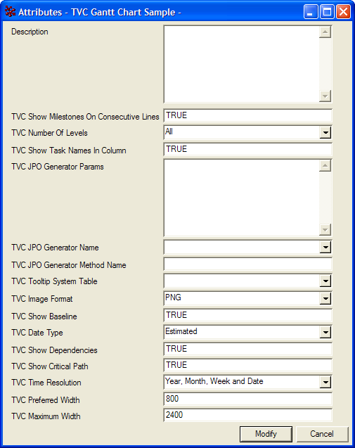
Figure 48. Configurable attributes
7.4.2. Custom Colors
To customize the colors of a Gantt chart you’ll first have to create a Gantt chart configuration business object as described above. The next step is to create another business object and connect it to the general configuration object. The type of the new business object should be "TVC Gantt Chart Colors" and the type of the relationship is "TVC Gantt Chart Colors".
Figure 49. Create a colors configuration object
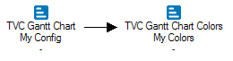
Figure 50. Connect with general configuration object
The "TVC Gantt Chart Colors" business object has many different attributes, each configuring the color of a certain item displayed on the Gantt chart. The values of these attributes can be one of the following:
-
Empty. If the value of an attribute is empty the default color will be used when rendering.
-
rgb(<red>,<green>,<blue>). This syntax allows you to define the red, green and blue color values using decimal notation (0-255). For example: rgb(0,0,0) is black and rgb(255,0,0) is red.
-
#<red><green><blue>. With this syntax you define the red, green and blue color values using hexadecimal notation (00-FF). For example #000000 is black and #FF0000 is red.
Figure 51. Custom colors example
7.4.3. Custom Fonts
This section describes how you configure the fonts used when rendering labels on the Gantt chart. For example, you may want to display Task labels using Arial instead of Verdana.
Configuring the fonts of a Gantt chart is similar to how you configure its colors. What you need to do is to create a new business object of the type "TVC Gantt Chart Fonts" and connect it to the general "TVC Gantt Chart" business object. The name of the relationship is "TVC Gantt Chart Fonts" (same as the business type name).
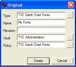
Figure 52. Create a fonts configuration object
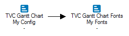
Figure 53. Connect with general configuration object
The "TVC Gantt Chart Fonts" business object has many attributes that configures the fonts used when rendering the Gantt chart. The values of the attributes must conform to the following syntax:
-
Empty. If the value is empty the default font will be used.
-
<font_name>,<font_style>,<font_size>. Where the name of the font is specified using an actual font name (e.g., Verdana, Arial, Tahoma, Times New Roman) or a logical font name (i.e., Dialog, DialogInput, Monospaced, Serif, SansSerif, or Symbol). The font style can be either plain, bold, italic, or bold+italic. The size of the font must be an integer. For example, arial,bold,12 or serif,plain,11.
Figure 54. Custom font’s example