${ROOT_DIR}/tvc-action/beginSearch
Structure Browser - Administration Guide : Search Tool
21 March 2016
1. Using the Search Function
In the Structure Browser, there is a built-in search function. This function can be re-used in many different use cases.
The search function contains functionality to define search forms, render the search form, perform the query and display the search result. Depending on the use-case, there is a need to add functionality that should be available from the search result page.
When launching the search functionality in the structure-browser, one way to configure the behaviour is to use request parameters. A more convenient way is to use a so-called Search Configuration, described below.
The search forms used by the search tool, are also described more detailed below.
1.1. Launching the Search Function
When creating a Command to launch the search dialog you will need to edit its "Href" parameter to a specific URL, you will also have to add settings on the Command to make it behave as expected. The URL to the search dialog is:
You will also have to add additional parameters that control the behaviour of the search function. These parameters are:
- pageConfig
-
Defines the page configuration instance that will be used to control the search result page.
- searchForm
-
Defines which search form that should be used. (Note that this parameter can be added inside the TVC Custom Attribute for the used Page Configuration object)
- availableSearchForms
-
Defines the collection of available search forms. (Note that this parameter can be added inside the TVC Custom Attribute for the used Page Configuration object)
- findLikeType
-
Defines the types, for which there will be find-like forms available.
- defaultFindLikeType
-
Defines the default find like type. E.g. the find like form for this type will be the form that initially is displayed, unless a searchForm has been specified.
- searchHeader
-
The header that will appear in the search form
- searchSubHeader
-
The sub-header that will appear in the search form
- allowOpenCollection
-
If to allow opening a collection
- allowExecSavedQuery
-
If to allow executing a saved query.
- allowOpenClipboard
-
If to allow opening the clipboard
An alternative and better way of how to manage these parameters is to use a search
configuration object. By doing so, you just have to supply one
parameter, called searchConfig. This parameter should be the name of
a configuration object of type "Search Configuration". E.g.
${ROOT_DIR}/tvc-action/beginSearch?searchConfig=tvc:searchconfig/FindParts.xml
You are also required to add settings on the Command to make it behave as expected. The available settings are described in the section Command Settings. However, the most important settings are:
- Row Select
-
Configures whether the user has to select any rows to be able to execute the action. The value must be single, as the search dialog requires that exactly one row has been selected in the Structure Browser.
- Submit
-
Configures whether to submit the current row selections to the URL entered in the "Href" parameter. The value of this setting must be true as the search dialog for the built-in connect function depends on the current row selection.
- Target Location
-
Configures where to load the connect function. The value of this setting should be either popup or sidepanel, defining if the search page should be displayed in its own popup window, or in a sidepanel.
Below is an example command configuration showing an example launch of the search tool.
<Command>
    <Label>Add Document</Label>
    <URL action="beginSearch" target="popup">
        <Param name="searchConfig" value="tvc:searchconfig/AddDocument.xml" />
    </URL>
    <RowSelectType>single</RowSelectType>
    <WindowHeight>600</WindowHeight>
    <WindowWidth>800</WindowWidth>
</Command>
1.2. Search Configuration
Below is an example Search Configuration.
See also this document for more details regarding XML configuration files.
<?xml version="1.0" encoding="UTF-8"?>
<SearchConfig xmlns="http://technia.com/TVC/SearchConfig"
              xmlns:xsi="http://www.w3.org/2001/XMLSchema-instance"
              xsi:schemaLocation="http://technia.com/TVC/SearchConfig http://products.technia.com/tvc/schema/latest/SearchConfig.xsd">

    (1)
    <Header>Add Existing</Header>
    <SubHeader></SubHeader>

    <PageConfiguration>tvc:pageconfig:tvx:enc/BuildEBOM.xml</PageConfiguration> (2)

    (3)
    <AllowOpenCollection>TRUE</AllowOpenCollection>
    <AllowExecuteSavedQuery>TRUE</AllowExecuteSavedQuery>
    <AllowOpenClipboard>TRUE</AllowOpenClipboard>

    (4)
    <SearchForms>
        <SearchForm default="true" name="tvc:searchform:tvx:enc/FindParts.xml" />
        <SearchForm name="tvc:searchform:tvx:enc/FindDocs.xml" />
        <SearchForm name="tvc:searchform:tvx:enc/FindECO.xml" />
        <SearchForm name="tvc:searchform:tvx:enc/FindECR.xml" />
    </SearchForms>

    (5)
    <FindLikeTypes>
        <FindLikeType name="type_Part" />
        <FindLikeType name="type_DOCUMENTS" />
        <FindLikeType name="type_ECO" />
        <FindLikeType name="type_ECR" />
    </FindLikeTypes>
</SearchConfig>| 1 | Defines the header and sub-header on the search tool page. The header and sub-header as presented on the search result page is defined via the page configuration used. |
| 2 | Defines the page configuration that defines the search result page |
| 3 | Defines if the user may open objects from a collection / saved query / clipboard |
| 4 | Defines available search forms |
| 5 | Defines available find-like-type´s. Instead of defining a search form, you may use the find-like concept for simplicity. |
1.3. Configuring Search Forms
The search form is an XML configuration that defines the search fields allowing the user to enter search criteria.
The XML document has a simple syntax, where you just specify the fields you want to make searchable. A field typically corresponds to an attribute on an object, or a basic property. The search forms have been designed with the intent to make it very easy to add new kind of search forms without the need to do any extra programming. A search form does not only control how the form is displayed for the user, it also defines how the actual query is built up when the user performs his/her query.
There are some built-in fields, which handle more complex fields - for example the type-, revision-, and vault fields. In coming releases, there will be more built-in fields in order to support the same query possibilities as in AEF. The example below, illustrates how a search form typically is defined.
1.3.1. Sample Form
Below is a complete search form configuration. The next coming chapters will describe the details of it.
<?xml version="1.0" encoding="ISO-8859-1" standalone="yes"?>
<SearchFormConfig defaultLimit="150" viewName="My View">
    <DisplayName>Find Parts</DisplayName>
    <DisplayName locale="sv">Sök Artiklar</DisplayName>
    <DisplayName locale="de">Teile Suchen</DisplayName>
    <Fields>
        <TypeField>
            <DefaultValue>type_Part</DefaultValue>
            <SearchableType>type_Part</SearchableType>
            <Label>Type</Label>
            <Label locale="sv">Typ</Label>
        </TypeField>
        <NameField/>
        <RevisionField>
        <AnyRevision/>
        <LastRevision selected="true"/>
            <FirstRevision/>
            <LatestRevision policy="policy_ECPart" state="Release"/>
            <SpecificRevision value="A"/>
        </RevisionField>
        <OwnerField/>
        <VaultField/>
        <StateField>
            <Policy name="policy_ECPart" defaultStates="state_Release"/>
            <Policy name="policy_DevelopmentPart"/>
        </StateField>
        <More>
            <Field mapsTo="attribute_EstimatedCost" ignoreRanges="true"/>
            <Field mapsTo="attribute_EffectivityDate"/>
            <Field mapsTo="attribute_LeadTime"/>
            <Field mapsTo="attribute_Originator"/>
            <Field mapsTo="attribute_ProductionMakeBuyCode"/>
            <Field mapsTo="attribute_ServiceMakeBuyCode"/>
            <Field mapsTo="attribute_SparePart"/>
            <Field mapsTo="attribute_TargetCost"/>
            <Field mapsTo="attribute_UnitofMeasure"/>
            <Field mapsTo="attribute_Weight"/>
            <Field mapsTo="originated"/>
        </More>
    </Fields>
</SearchFormConfig>
1.3.2. Search Forms Elements
The root element within a search form is called "SearchFormConfig".
The attributes that can be used on this element are:
| Name | Description | Example | ||
|---|---|---|---|---|
viewName |
Defines the name of the "View" configuration that should be applied, when displaying the result of the query when using this form. May be used to explicitly force a particular view to be used when displaying the result for this form. |
My View |
||
saveQueryAllowed |
Defines if it should be possible to save the query for further use or not.
|
True (default) / False |
||
defaultLimit |
The default limit for the query. (Can later be changed by the user). |
A positive integer value |
||
useQueryTrigger |
Defines if a so-called query trigger should be used or not. |
True / False (default) |
||
discardHiddenTypes |
Defines if the query should return business objects, which type is marked as hidden. Setting this attribute to true, means that objects which type is hidden will be found as well. |
True / False (default) |
The sub-elements that are allowed inside the root element are
| Element Name | Description | Cardinality |
|---|---|---|
DisplayName |
Defines the name of the form in different languages (locales) |
At least one |
Script |
Can be used to declare custom JavaScript code that is inserted on the page that displays this form. This is useful for example, if custom JS code is used when to validate form field values etc. |
Zero or One |
Property |
Defines custom properties for the form. Currently, this feature is not used. |
Zero or more |
Where |
Declares a where clause that is always applied when performing the query, independent of what other criteria the user defines. |
Zero or One |
Fields |
This element is a container for the fields that is defined in the form |
Exactly one |
1.3.3. Form Fields
This section will explain the different fields that can be used inside a form, what kind of attributes each field supports and what kind of sub-elements that can be used inside each element.
TypeField
The type field is used to display the field containing what type(s) to base the query around. This field can also display a button, which opens up the type-chooser. The field will handle localized variants of the type names, when the field is not set to be manually editable.
The type field will populate the type pattern in the query.

Figure 1. the type field
The table below lists those attributes specific for the TypeField element.
| Name | Description | Example |
|---|---|---|
typeChooserEnabled |
A flag that indicates the visibility of the type chooser. |
True (default) / False |
displayHiddenTypes |
Defines if the type chooser should display hidden types or not. |
True / False (default) |
editable |
Indicates if the field is editable, or if the field is changeable only through selecting a type within the type chooser. In case of setting this value to true, the type field will not be able to handle localized names. |
True (default) / False |
expandableTypeTree |
Defines if the type chooser should be expandable or not. |
True (default) / False |
typeTreeExpansionDepth |
Defines the initial expand depth of the type chooser. This setting will be ignored, if the expandableTypeTree setting is set to false. |
1 (default) 2 3 4 |
typeTreeMaxExpandDepth |
Defines the maximum expand depth of the tree |
-1 (default, implies unlimited) 1 2 3 |
canSelectAbstractTypes |
If abstract types can be selected in the type tree. |
True (Default) / False |
The sub-elements that are allowed inside the TypeField element are
| Element Name | Description | Cardinality |
|---|---|---|
DefaultValue |
Defines the default-selected types. There should be one element per type. The type is entered between the start and end tag and can be a symbolic name. |
Zero or more |
SearchableType |
Defines what types that can be used for the query. There should be one element per type. The type is entered between the start and end tag and can be a symbolic name. |
One or more |
Label |
Defines the label for this field. See this chapter for details. |
Zero or more |
NameField
The name field is used to display the field where the user can enter a name pattern.
Figure 2. the name field
The entered value of this field will populate the name pattern of the query.
The sub-elements that are allowed inside the NameField element are
| Element Name | Description | Cardinality |
|---|---|---|
DefaultValue |
Defines the default-value for this field. There should be one element per value. The value is entered between the start and end. If this element is left out, the default value is an asterisk (*). |
Zero or more |
Label |
Defines the label for this field. See this chapter for details. |
Zero or more |
PasteArea |
Defines if the paste area should be enabled or not. This can be disabled globally if needed. |
Max one |
When the paste area is enabled, once clicked a popup is opened where content can be pasted from another application. Newlines are replaced with comma character.
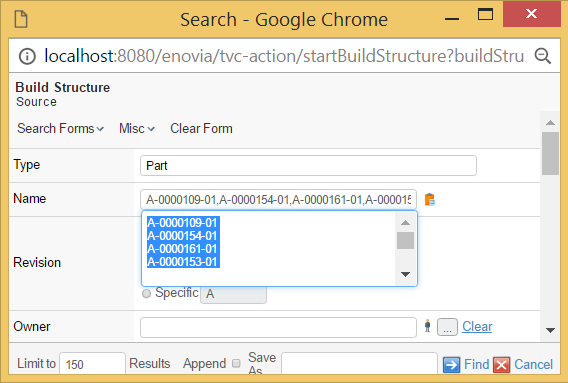
Figure 3. Paste area for the name field
Namefield is by default case sensitive while searching for results. It is possible to configure
this field to be case insensitive by setting tvc.structurebrowser.search.namepattern.caseinsensitive
to true in tvc.properties file.
|
Performance of TVC Structure Browser search is better when name field is case sensitive. |
RevisionField
The RevisionField will generate a field that allows the user to control the revision pattern in the query. The revision field has several sub-options that can be enabled/disabled.

Figure 4. Revision field
| Element Name | Description | Cardinality |
|---|---|---|
AnyRevision |
If present, the "Any" option will be available. |
Zero or One |
LastRevision |
If present, the "Last Only" option will be available. |
Zero or One |
FirstRevision |
If present, the "First Only" option will be available. |
Zero or One |
LatestRevision |
If present, the "Latest xxx" option will be available. This element requires the attributes "policy" and "state" to be defined. |
Zero or One |
LatestAndNextRevision |
If present, the option "Latest + Next revision" option will be available. This element requires the attributes "policy" and "state" to be available. |
Zero or One |
SpecificRevision |
If present, the option to specify a specific revision will be available. This element can have an attribute called value present, which contains the default value. |
Zero or One |
Label |
Defines a custom label for this field. See this chapter for details. |
Zero or more |
The AnyRevision, LastRevision, FirstRevision, LatestRevision,
LatestAndNextRevision and SpecificRevision elements all accepts the
attribute "selected" that denotes if the option is initially selected or
not.
|
OwnerField
The OwnerField will generate a field that allows the user to control the owner pattern in the query. The field is a text field where the user can define the owner. The icon to the right of the field can be used to populate the field with the name of the logged-in user.

Figure 5. the owner field
The sub-elements that are allowed inside the OwnerField element are:
| Element Name | Description | Cardinality |
|---|---|---|
DefaultValue |
Defines the default-value for this field. There should be one element per value. The value is entered between the start and end. If this element is left out, the default value is an asterisk (*). |
Zero or more |
Label |
Defines the label for this field. See this chapter for details. |
Zero or more |
| To make the default value equal to the name of the user currently logged in, the following attribute can be applied on the element: |
<OwnerField currentUserDefault="true"/>
OriginatorField
The originator field is similar to the owner field, excepts that it will base the query on the "Originator" attribute.
VaultField
The VaultField element will result in a field where the user can define the vault criteria for the query. The vault chooser is AEF compliant, e.g. it follows the same rules as the AEF vault chooser does.
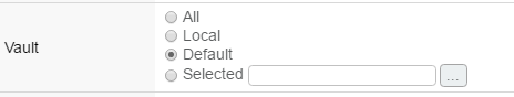
Figure 6. the vault field
The vault field does not have any attributes that control the behaviour. The only nested element that is allowed inside this field is a Label element. The label element can be used to change the "Vault" text.
StateField
The state field controls what state and what policy the objects to be found has. The state field will, for each defined policy, show the available states, from which the user can make selection(s).
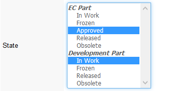
Figure 7. the state field
The sub-elements that are allowed inside the StateField element are:
| Element Name | Description | Cardinality |
|---|---|---|
Policy |
Defines a policy, which the field should work with. The Policy element must have a name attribute, which could either be the real- or symbolic- name of a policy. The element can also have an optional attribute called defaultStates, which contains a comma-separated list of the states, which are default selected (the names of the states can be symbolic names). |
One or more |
Label |
Defines the label for this field. See this chapter for details. |
Zero or more |
TextField
You can use the TextField in conjunction with the other fields in the form to return those business objects that contain the files that meet your criteria. The business objects must also meet any conditions set in the other field(s).
In the TextField, you can enter an exact string to search for, or you can use wildcards to select the information you are seeking. For example, enter "A String" to find objects with files that include this string
| Use of the TextField to perform a file search has additional setup requirements and limitations. Consult your System and/or Business Administrator to be sure that you can use this functionality. |
The table below lists those attributes specific for the TypeField element.
| Name | Description | Example |
|---|---|---|
format |
The format to base the search on. This can be left empty. |
Generic DOC |
The sub-element that are allowed inside the TextField element is:
| Element Name | Description | Cardinality |
|---|---|---|
Label |
Defines the label for this field. See this chapter for details. |
Zero or more |
RDOField
The RDO field will allow the user to find objects based upon design responsibility. Once this field has been defined and enabled, a read- only field with a chooser button will appear in the user interface. The user will, when clicking the chooser button, be allowed to find either an organization, such as a business unit, company or department, or a project to be used as input for the query.
This field has no attributes or sub-elements. The field will look like:
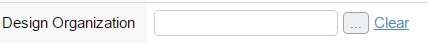
WhereField
The where-field allow the users to enter a custom where criteria. This field is only useful for users that have a good understanding of ENOVIA Queries and its syntax. When this field is in use, it will display a text area, whose size is configurable through the attributes: cols and rows.
| Name | Description | Example |
|---|---|---|
cols |
The number of columns within the text area. |
10 30 |
rows |
The number of rows within the text area. |
3 4 5 |
Search for Related Objects
A common use case is to limit the query and search for objects that is either directly related to another object, or indirectly (connected to an object, which is found in the structure of another object).
Let’s assume that you need to have a way to find business objects of type Documents, which only exists within the folder structure of a certain Project. Typically, if this kind of query is done using MQL; you would first expand the project and through that result find the document. The image below illustrates how the different entities are related.
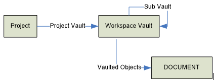
Figure 8. Project and folder data model
To configure the search tool to support this use case, you need to use
the "built-in field" called RelatedWithField as the example below
illustrates.
<!-- ======================================================== -->
<!-- This field allows the user to only search for a document -->
<!-- within the folder structure of a selected Project -->
<!-- ======================================================== -->
<RelatedWithField relationship="relationship_VaultedDocumentsRev2" direction="to">
    <!-- =========================================================== -->
    <!-- The project folder structure needs to be expanded among the -->
    <!-- following relationships. Recurse is to end -->
    <!-- =========================================================== -->
    <Structure expandDepth="0" direction="from">
        <Relationship>relationship_ProjectVaults</Relationship>
        <Relationship>relationship_SubVaults</Relationship>
    </Structure>
    <FindRelated>
        <!-- =================================================== -->
        <!-- Display name defines the property to display in the -->
        <!-- field. The value is taken from the selected project -->
        <!-- =================================================== -->
        <Display><![CDATA[$<name>]]></Display>
        <!-- ================================================== -->
        <!-- You need a page configuration that defines how the -->
        <!-- query result is presented -->
        <!-- ================================================== -->
        <PageConfig>the name of the page configuration object</PageConfig>
        <!-- ============================================ -->
        <!-- Either let the user fill in a search form... -->
        <!-- ============================================ -->
        <Search allowOpenCollection="false" allowExecuteSavedQuery="false">
            <Form default="true">name of search form</Form>
            <Form>name of another search form</Form>
            <Type>type_ProjectSpace</Type>
        </Search>
        <!-- ============================================ -->
        <!-- or use the inquiry below, to simply load the -->
        <!-- project objects -->
        <!-- ============================================ -->
        <!--
        <Loader inquiry="tvc:inquiry:sb:search/GetProjects.xml"/>
        -->
    </FindRelated>
    <Label>In Project</Label>
</RelatedWithField>
The required attributes on the element RelatedWithField are relationship and
direction. These define how the object(s) being found are related to
the other object. The relationship attribute can either refer to a
relationship through its symbolic name or its real names. The
relationship attribute can be set to an asterisk (*).The direction
attribute is either "from" or "to". From means that the "related objects
found" is connected .
You may also use the optional attribute multipleAllowed to allow specifying
multiple related objects.
The element Structure defines how the related object should be
expanded (if it should be). The expandDepth and direction attributes
specified the expansion behaviour, together with the nested
Relationship elements.
The FindRelated element is used to define how the related object
should be found as well how those are displayed for the user. The
related object can either be found by using a nested search screen, or
you can load the objects directly through a data set, an inquiry or a JPO.
This is accomplished by either configure the Search element as in the
example below, or use a Loader element.
The element PageConfig defines the page configuration object, which
defines the behaviour of the page showing the query result.
The table below shows the requirements for the elements:
| Element Name | Attribute | Required | Sub Element | Required |
|---|---|---|---|---|
RelatedWithField |
relationship |
Yes |
FindRelated |
Yes |
direction |
Yes |
|||
multipleAllowed |
No (Default is false) |
|||
Structure |
expandDepth |
Yes |
Relationship |
Yes |
direction |
Yes |
|||
FindRelated |
Display |
Yes |
||
PageConfig |
Yes |
|||
"Search" OR "Loader" |
Yes |
|||
Search |
"Form" OR "Type" |
Yes |
||
Loader |
One of
|
Yes |
Field
The generic Field element is used for all other fields, which is used to populate the where-expression part of the query. These fields typically maps to a basic property or an attribute.
The generic Field element accepts following attributes.
| Name | Description | Example | ||
|---|---|---|---|---|
editable |
Boolean that indicates if the field is editable or not. |
True False |
||
hidden |
Boolean that indicates if the field is visible or not |
True False |
||
fieldSize |
Defines the size of the field. If the field is a text field, this will become the width of the field. If the field has range values, this will control the number of visible options visible default. |
20 30 40 |
||
maxLength |
Defines the maximum length of the entered value |
130 130 |
||
dataType |
Defines the data type, which the entered value to this field should be compatible with. |
string timestamp real integer boolean |
||
mapsTo |
Defines what the field maps to. This could be an attribute, or a basic field. If pointing to an attribute, symbolic names are allowed. |
attribute_AnAttribute My Attribute modified current |
||
multipleAllowed |
Indicates if the user may enter several values as input. (Currently, this is only applicable to range values.). |
True False |
||
defaultOperator |
Defines the default operator that should be selected initially. |
Name of operator See this chapter for more info. |
||
sortRangeValues |
A Boolean that indicates if we should sort the range values initially. |
True (Default) False |
||
operatorChooserVisible |
This flag indicates if the operator chooser should be visible or not. Note that if the operator should be invisible, a defaultOperator must have been defined explicitly. |
True (Default) False |
||
chooserURL |
Defines the (page context relative) URL of the page that displays any choosable values. |
/custom/MyPage.jsp |
||
ignoreRanges |
A boolean that could be used to force using range values that is defined on attributes. |
True False (Default) |
||
onVerifyField |
Defines a JavaScript function that should be invoked when the field is validated. The default behaviour is that the entered value is validated against the field’s data type.
|
|
||
FocusFirst |
Field which needs to be focused on tab load. It will work on Tab basis, so one tab should have only one field with FocusFirst. If there is not any field have, first input field will be focused automatically. |
True / False (Default) |
||
TooltipLabel |
This specifies the label for the tooltip. If specified the tooltip will be displayed with a title header. |
|
||
TooltipContent |
This specifies the content of the tooltip. This can be text or html for more advanced formatting. Please note that to use HTML, the CDATA tag needs to be used. |
Or with HTML content: |
Field with Custom Range Values
A Field that is mapped to an attribute with range values will get those ranges by default from the attribute definition (unless the element-attribute ignoreRanges is set to true).
However, often it is desired to have the opposite behaviour - e.g. when the attribute does not have any range values, but you might want to force the user to select a specific value in the search form dialog.
This can be accomplished by having nested Range elements. The example below illustrates how to use such a Range element.
<Field mapsTo="vault">
    <RangeValue suiteKey="Framework"
                value="eService Production"
                labelKey="emxFramework.Vault.eService_Production"
                selected="true"/>
    <RangeValue symbolicName="true"
                value="vault_TVCAdministration">
        <Label>TVC Vault</Label>
    </RangeValue>
</Field>1.3.4. Label
This element defines a localized label. The label could be defined in different languages, by using the attribute "locale" to define which locale the label is valid for.
The locale argument is a valid ISO Language Code. These codes are the lower-case, two-letter codes as defined by ISO-639. You can find a full list of these codes at a number of sites, such as:
Examples of label definitions
<Label>This is the default label<Label>
<Label locale="sv">This would be the label in Swedish</Label>
<Label locale="de">This would be the labe in German</Label>
...
Access Control
User access can be controlled for every field in a form, or any form itself. Only fields or forms that a user has access to will be shown in the user interface.
User access is defined within the AccessList element:
<?xml version="1.0" encoding="UTF-8"?>
<SearchFormConfig>
    <AccessList> (1)
        <Role name="role_Arole"/>
        <Group name="group_Name"/>
        <Person name="Test Everything"/>
    </AccessList>
    <Fields>
        <Field ...>
            <AccessList> (2)
                <Role name="..."/>
                <Group name="..."/>
                <Person name="..."/>
            </AccessList>
        </Field>
    </Fields>
</SearchFormConfig>| 1 | Access definition on form level |
| 2 | Access definition on field level |
When combining different types of access control, all users
that are either explicitly added to the Person element, OR are
assigned to any of the roles added to the Role element, OR are
assigned to any of the groups added to the Group element, will have
access.
|
If the AccessList element is left out, all users will have access to
the field or the form.
Operator Names
When you configure a default operator on a field, you should preferably use the operator name instead of the operator itself (even though the latter is possible). Specifying the operator might in some cases cause the query to become different than expected; this is due to that the same operator are used for different purposes.
For example matching the beginning of a string, ending of a string or contains uses all the same operator (~~ or ~=). See the table below for the operator names that is supported:
| Data Type | Operator Name | Query Operator |
|---|---|---|
Range |
RANGE_IS |
== |
RANGE_IS_NOT |
!= |
|
String |
STRING_ENDS_WITH |
~~ |
STRING_BEGINS_WITH |
~~ |
|
STRING_CONTAINS |
~~ |
|
STRING_NOT_CONTAINS |
!~~ |
|
STRING_ENDS_WITH_MATCH_CASE |
~= |
|
STRING_BEGINS_WITH_MATCH_CASE |
~= |
|
STRING_CONTAINS_MATCH_CASE |
~= |
|
STRING_NOT_CONTAINS_MATCH_CASE |
!~= |
|
STRING_IS_EXACTLY |
== |
|
STRING_IS_NOT |
!= |
|
Integer |
INTEGER_AT_LEAST |
>= |
INTEGER_AT_MOST |
⇐ |
|
INTEGER_NOT_EQUAL |
!= |
|
INTEGER_EQUAL |
== |
|
INTEGER_LESS_THAN |
< |
|
INTEGER_MORE_THAN |
> |
|
INTEGER_BETWEEN |
⇐ & ⇒ |
|
Decimal |
REAL_AT_LEAST |
>= |
REAL_AT_MOST |
⇐ |
|
REAL_NOT_EQUAL |
!= |
|
REAL_EQUAL |
== |
|
REAL_LESS_THAN |
< |
|
REAL_MORE_THAN |
> |
|
REAL_BETWEEN |
⇐ |
|
Date |
DATE_ON |
== |
DATE_ON_OR_AFTER |
>= |
|
DATE_ON_OR_BEFORE |
⇐ |
|
DATE_BETWEEN |
⇐ & ⇒ |
|
Boolean |
BOOLEAN_IS |
== |
BOOLEAN_IS_NOT |
!= |
Example:
<Field mapsTo="attribute_MarketingName"
       defaultOperator="STRING_CONTAINS"
       operatorChooserVisible="false"/>
Operators (String Fields)
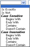
The used operators for string fields can be configured. The screen shot below shows the list of all possible operators.
This can be changed through a TVC init parameter, as shown below:
<init-param>
    <param-name>tvc.structurebrowser.search.stringOperators</param-name>
    <param-value>
        case-insensitive
        <!--case-sensitive-->
        <!--all-->
    </param-value>
</init-param>
1.3.5. More
The "More" element can be used to group fields that can be used to specify the query more detailed.
The example below illustrates how to use the More element.
<SearchFormConfig ...>
    ...
    <Fields>
    ...
        <More defaultEnabled="false|true"> (1)
            <Field .../>
            <Field .../>
        </More>
    </Fields>
</SearchFormConfig>| 1 | Default is FALSE |
You can also specify whether or not the more fields should be displayed default when the form is loaded, by setting the attribute "defaultEnabled" on the "More" element to "true".
| You can only have one "More" section declared for each form defined. |
1.3.6. Type Specific Fields
A field in a form can be enabled for certain types only. For example, a form can be made quite generic, and when the user selects a different type - some fields might be enabled and some might be disabled depending on the selected type.
To specify this in the Search Form, just follow the example below:
<SearchFormConfig ...>
    ...
    <Fields>
        <Field mapsTo="attribute_Weight">
            <EnabledForType>type_Part</EnabledForType>
            <EnabledForType>type_AnotherTypeWithWeightAttribute</EnabledForType>
        </Field>
        <Field mapsTo="attribute_Title">
            <EnabledForType>type_DOCUMENTS</EnabledForType>
        </Field>
    </Fields>
</SearchFormConfig>
1.3.7. Configuring Find Like
When the Find Like functionality is used, the form that is created for a particular type is created dynamically based upon the available attributes for the type.
The search tool will be based upon this information create an XML file, following the same format as when a search form is defined. The search tool allows to plug-in so-called XSLT stylesheets that can be used to transform the generated XML before it is parsed into a form.
To define such a stylesheet, you need to configure a system parameter, according to this format:
<init-param>
    <param-name>tvc.structurebrowser.findlike.stylesheet.__SymbolicTypeName__</param-name>
    <param-value>__TheNameOfTheStylesheet__</param-value>
</init-param>
As an example, this could look like:
<init-param>
    <param-name>tvc.structurebrowser.findlike.stylesheet.type_Part</param-name>
    <param-value>type_Part.xsl</param-value>
</init-param>
<init-param>
    <param-name>tvc.structurebrowser.findlike.stylesheet.type_DOCUMENTS</param-name>
    <param-value>type_DOCUMENTS.xsl</param-value>
</init-param>
Then you need to make those files (type_Part.xsl and type_DOCUMENTS.xsl) available in the classpath, typically by putting them into the WEB-INF/classes folder of the application or into some JAR file.
For reference, below is an example stylesheet applicable for the Part type. This stylesheet will modify the revision field, add a state field the RDO field and a field that enabled querying for the description.
<?xml version="1.0" encoding="ISO-8859-1"?>
<xsl:stylesheet xmlns:xsl="http://www.w3.org/1999/XSL/Transform" version="1.0">
    <xsl:template match="@*|node()">
        <xsl:copy>
            <xsl:apply-templates select="@*|node()"/>
        </xsl:copy>
    </xsl:template>
    <xsl:template match="RevisionField">
        <RevisionField>
            <AnyRevision/>
            <LastRevision selected="true"/>
            <FirstRevision/>
            <LatestRevision policy="policy_ECPart" state="Release"/>
            <SpecificRevision value="A"/>
        </RevisionField>
        <StateField>
            <Policy name="policy_ECPart"/>
            <Policy name="policy_DevelopmentPart"/>
        </StateField>
        <RDOField/>
        <Field mapsTo="description"/>
    </xsl:template>
</xsl:stylesheet>
The fields within a find-like form are rendered in the following order:
-
Fields applying to basic fields (sorted according to their labels)
-
Fields applying to attributes (sorted according to their labels)
1.3.8. Search Result with Dynamic Columns
Normally when a search is performed, the result is displayed in the table as configured via the configurations made (page configuration and view). In some cases, the user might perform a search on a field that is not part of the table used to display the search result.
There are some configuration options available that can be used to enable dynamically generated search result tables. This can either be configured on a global basis and/or per use case.
Configure via Init Parameters
A number of new so-called TVC init parameters were added in order to control the behavior of this.
-
To enable the dynamically appending of columns globally, the following init parameter must be set to true (default is FALSE).
<init-param> <param-name>tvc.structurebrowser.search.appendQueryFieldsToTable</param-name> <param-value>true</param-value> </init-param> -
If you want to add fields that map to attributes only or if you want to add columns for all fields, you should set the following parameter to either true or false (default is TRUE).
<init-param> <param-name>tvc.structurebrowser.search.appendAttributeFieldsOnly</param-name> <param-value>true</param-value> </init-param> -
If you want to use a table that contains a set of columns that always should be shown (or no table at all, which might be the case if you add all query parameters as columns in the table) you should modify this parameter:
<init-param>
    <param-name>tvc.structurebrowser.search.defaultDynamicResultTable</param-name>
    <param-value>name of table</param-value>
</init-param>
The default value of this parameter is:
tvc:table//com/technia/tvc/structurebrowser/search/form/res/DynamicSearchResultTable.xml
You should not manipulate this built-in table; instead, point to your own custom table that defines your own columns.
The table can be an XML table or a System Table.
Setting this parameter to an empty string is OK if you don’t want to use a "template" and only base the result table on the used fields.
Configure per Form / Field
You can also per search form and per field within a form do additional fine-tuning.
-
To disable the dynamic append for one particular form (or enable if it has been disabled globally), you can in the XML definition do:
<SearchFormConfig appendQueryFieldsToTable="true"> ... </SearchFormConfig> -
To use a different "base/template table" when using a particular form, you can in the XML definition do:
<SearchFormConfig tableName="tvc:table:namespace/MySpecialTable.xml"> ... </SearchFormConfig> -
In case you want to prevent that a particular field is added as a table column, you can in the XML definition do:
<SearchFormConfig ...>
    ...
<Fields>
    <Field mapsTo="attribute_ABC"
           addFieldToResultTable="false">...</Field>
        ...
    </Fields>
</SearchFormConfig>
1.4. Auto Complete
The search tool takes advantage of the auto-completion capabilities. This is by default used for the following types of fields:
-
Type Field
-
Owner Field
-
Selecting the Design Organization (RDO)
The auto-completion feature can be disabled globally for all users, by applying the following init parameter:
<init-param>
    <param-name>tvc.structurebrowser.search.autoCompleteEnabled</param-name>
    <param-value>false</param-value>
</init-param>
Or, you can disable this on a field that supports auto-completion by doing:
<TypeField autoCompleteEnabled="false">
1.5. Configuring Dynamic Attributes
Dynamic attributes are on Interfaces which are applied to Business Object. When user want to search the Business Object on basis of dynamic attribute, below configuration should be used in the search form configuration.
<Interfaces>
    <Interface name="Material Compliance" enabledFor="type_Part"/>
    <Interface name="Part Family Reference" enabledFor="type_Part"/>
    <Interface name="Reported Part" enabledFor="type_Part"/>
    <Interface name="Change Information" enabledFor="type_ChangeOrder"/>
</Interfaces>