Grid Browser - Administration Guide : Usage
21 March 2016
1. Grid Browser Usage
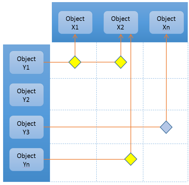
The Grid Browser is based upon two sets of data, which are loaded into the column axis and the row axis. The configuration defines how this data is loaded (see this chapter for more information about this). Once the data is loaded, the intersections are calculated.
The picture below illustrates an example grid with some objects on the row- and the column- axis. Between these, some intersections are illustrated.
Figure 1. Grid Browser
The intersections are calculated based upon the rules in the configuration, such as the direction of the relationship and the relationship type.
Each intersection satisfies a state. "Connected" and "not-connected" are two examples of such state. In case when an intersection is connected, it is possible to create other kind of states that depends upon some value available on the connection. For example, the connection could have an attribute called "Importance". Depending on the value of this attribute, the intersection satisfies different states, and it can be visualized in the Grid Browser as different background colors and/or with different font-color.
In summary, a Grid Browser instance is composed of three sections, namely:
-
The row axis, which contains the objects on the left side. This can either be a list of objects (flat list), or a structure. Objects on the row axis are referred to as "row object".
-
The column axis, which contains the objects at the top. The objects on the column axis can be "grouped" together, based upon certain criteria). Objects on the column axis are referred to as "column object".
-
The intersections, which represent intersections between column objects and row objects. These can be colorized depending on certain criteria that are met. An individual intersection is referred to as an "element".
1.1. User Interface
The user interface of the grid browser contains much information and a rich set of functionality. All of this differs depending on how your particular instance is configured but the picture below illustrates and describes commonly used parts.
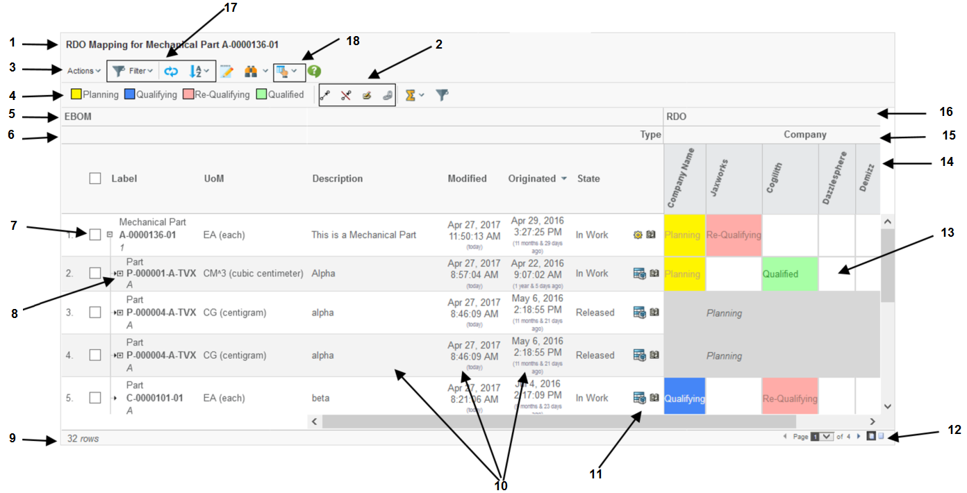
Figure 2. The Grid Browser user interface.
-
The page header and sub header.
-
The "mass functions" (actions that applies to multiple selected intersections).
-
Mass connect
-
Mass disconnect
-
Mass edit
-
-
The toolbar.
-
The legend that shows the meaning of each colour/state.
-
A label/header describing the data on the row-axis.
-
The label/header related to the hierarchy that is defined for the column axis objects (15).
-
Checkbox or Radio button used for passing selections to a custom toolbar command.
-
Navigation buttons (collapse / expand). These are visible in the case when a structure is displayed. It is possible to disable the possibility to expand/collapse also.
-
Displays the number of rows.
-
Meta-data (columns) related to the row objects. It is possible to open these fields for in-cell-edit.
-
"Row-Actions". Actions that operates on the row-object.
-
Pagination Control.
-
The intersections with or without a label and colouring.
-
The column objects
-
The column objects can be grouped in so called hierarchies. For example, objects of a certain type should be put together, or based upon the current state (or a combination).
-
A label/header describing the data on the column axis.
-
UI Functions. For example:
-
Filter Chooser (if enabled and the structure uses filters)
-
Reload
-
Column axis object filtering
-
Sorting
-
-
Context buttons. Contains the printer friendly and export functions and preferences. Other buttons that can be enabled are:
-
Promote / Demote
-
Add to collection / clipboard, manage collections.
-
Help button
-
1.2. Element Actions
The configuration declares the possible actions that can be performed on an element in a particular state. These actions are available in a menu after right clicking with the mouse over an element in the intersection area.
Depending on what state the element is in and the user’s access rights, different amount of actions can be made available.
A confirmation message can be set for element actions as well as global actions.
Examples of available built-in functions that easily can be made available are:
- Connect
-
Create a connection between the column object and the row object using a specific relationship type.
- Disconnect
-
Disconnects the connection that the intersection represents.
- Edit Attributes
-
Allows modifying attribute values on the connection.
- Set Attributes
-
In addition to Edit attributes, where the user is entering the attribute values in a form, this action will simply set the value of one or more attributes to pre-defined values.
- Open Link
-
Can be used to open an arbitrary link in a popup window. As an example could be to open the history dialog showing the history of the particular connection.
If none of the above actions solves your use-case, it is possible to plug-in a custom action written in Java / JPO.
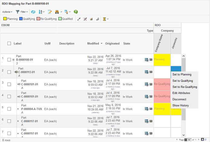
Figure 3. Element actions popup.
An action can be made available to a user having a particular role, or is assigned to a particular group.
1.2.1. Edit Attributes
While the other actions don’t require any user interaction, the edit attributes action is associated with a form that requires the user to fill in the new attribute values. This form is opened in a popup window. The form is configured within the Grid Browser configuration.
The size of the popup window can also be configured.
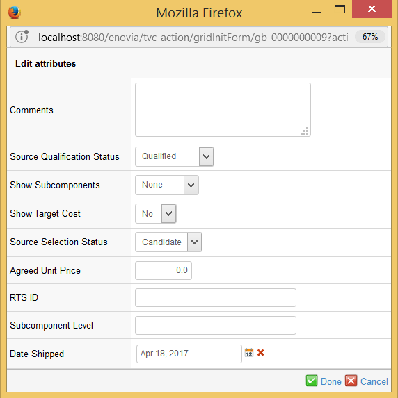
Figure 4. Attribute edit dialog.
1.3. Displaying Tooltips
The grid browser can be configured to show tooltips for the objects on both the row- and column- axis and also for the elements/intersections.
By default the tooltip is shown, if the user holds down the *shift*
key and moves the mouse pointer over one of the tooltip enabled
sections. You can turn off the need for holding shift to display
tooltips by the init parameter tvc.gridbrowser.holdShiftForTooltips
What actually is being shown within the tooltip is defined by the configuration that controls the Grid Browser instance.
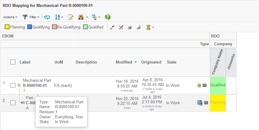
Figure 5. Tooltip display.
1.4. Open Popup
When clicking on either a row object on the left side or on a column object at the top, with the *shift* button combination, the grid can be configured to open a popup window with some content. What actually is being shown is configurable, but typically this will be that the object details page (emxTree.jsp) is opened.
The object id of the clicked item is passed to the configured href.
1.5. Mass Operations
There is a set of built-in mass operations available to use. Depending upon the configuration, these can be enabled or disabled for a particular grid browser instance.
These operations are global operations, and are shown within the toolbar as context buttons.
The built-in functions available are:
- Mass Connect
-
Creates connections for the selected elements
- Mass Disconnect
-
Disconnects the selected elements.
- Mass Edit
-
Performs mass updates of attribute(s) on the connections, which the elements represent. A form will be presented with fields where the user can select values for the attributes to be updated.
- Mass Set Attributes
-
Setting the value of one or more attributes to pre-defined values, without using a form.
| When performing a mass operation, if the transaction couldn’t be committed for all changes, everything is rolled back and no changes are made. |
A mass operation action can be configured in two different ways. For example, one can say that an action is available for all elements/intersections that are not connected, while another action is available for all elements/intersections that are connected.
The other approach is to enable an action depending on what state an element/intersection is satisfying. These two alternate setups can not be mixed. Once such action is invoked, only the selected elements that are satisfying that condition are part of the action.
A mass-action can be made available to a user having a particular role, or is assigned to a particular group.
1.5.1. Selecting Elements
In order to perform a mass operation, the user must select the elements to perform the operation against.
By using the left mouse button, the user may select an element. If the user clicks on one element, that element will be selected, and if clicking in another element the old element will be de-selected, i.e. only one element will be selected at a time, if the user does not use any of the key combinations mentioned below.
If the user wants to select more than one element at a time, s/he can use the *ctrl* key in combination with the left mouse click to select several objects. All elements that are clicked will then be added to the selection. If the user clicks on an already selected element, that element will be unselected.
It is also possible to select a range of objects, by using the *shift* key in combination with the left mouse button. The selection range will be made from the last selected element to the new selected element. If some elements within the range should not be selected, the user can then use the *ctrl* combination to deselect the desired elements.
To clear the selections made, it is possible to use the *alt* key in combination with the left mouse click to de-select all elements (note that the click must be made within the elements area).
Further on, the user may also select either all elements on a row, or all elements within a column, by either clicking on the row object (to the left) or the column object (at the top). The *ctrl* key combination with the left mouse click is also available here, if the user wants to add more rows and/or columns to the selection.
However, note that it is not possible to use the *shift* key combination at the row or column object(s) – this is because the *shift* and left mouse click combination is associated with another event (opening up a popup window, with the object id of the clicked object as argument, see this chapter).
1.5.2. Mass Edit
While the other mass-operating functions do not involve any user interaction, the mass edit requires the user to fill in a form. A dialog window will be opened in a popup window, showing the attributes that may be target for update. The attributes that are shown as editable are configured within the configuration that controls the grid instance.
An example of such dialog is shown in the screenshot below.
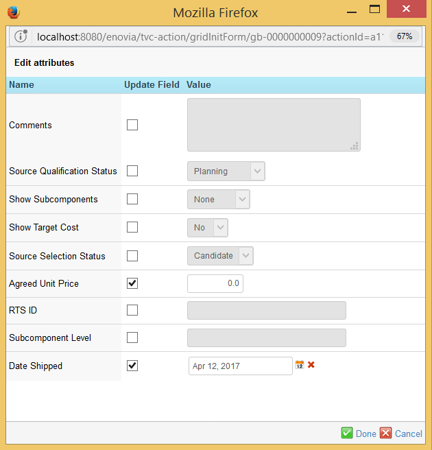
Figure 6. Form for mass editing of relationship attributes.
The attributes that should be updated must be checked, and the desired value should be defined.
If the mass edit is launched for one connection, or the form only contains one field, the checkbox will not be visible.
1.6. Printer Friendly
The Grid Browser can be exported into various printable formats that allow it to be printed. The most commonly used format is the PDF format. The printer friendly button is available within the toolbar as a context button, see screenshot below.
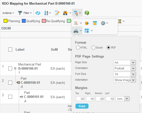
Figure 7. Printer friendly dialog.
The user will be able to select paper format, page orientation, font-size and margins in order to configure the generated PDF document.
Please note that in some situations, the amount of data/information is too large to fit on a certain paper size setup. The user will then have to change some of the settings, for example decrease the font-size, increase the paper size, change the page orientation or a combination of these.
The generated PDF document will contain following sections:
-
The row-axis data
-
The column-axis data
-
The intersections, where each intersection state defines its own section. All elements satisfying that state will be listed.
1.7. Excel™ Export
The Grid Browser can be exported into an Excel™ document. This is either done from the printer friendly button by choosing the Excel format, or via the Export button next to the printer friendly button within the toolbar.
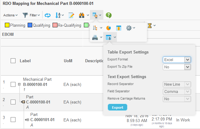
Figure 8. Export dialog.
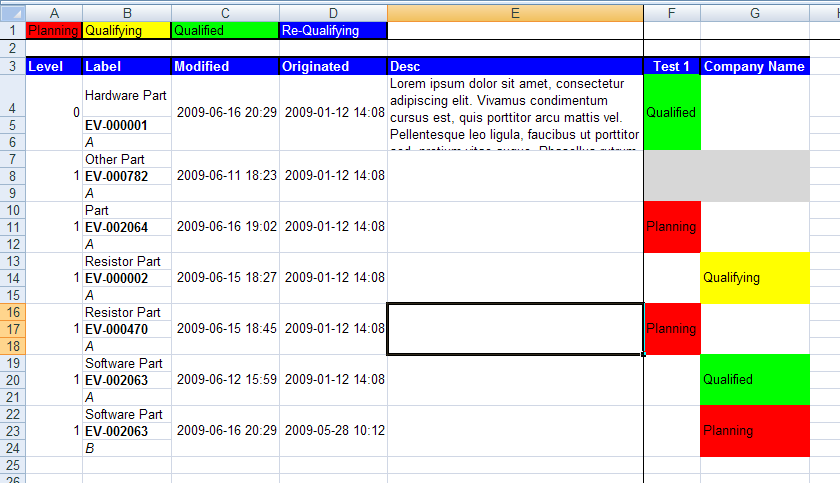
The exported file is a HTML document with special mark-up, which is specific for Excel. An example export is shown below.
1.8. Column Object Filtering
It is possible to enable the column filtering functionality. The filter can be defined in a number of different ways and combinations, for example filter by type, current state or name. It is also possible to create several filter groups, in order to allow the user to choose.
Once enable, the dialog is opened via the button (1) shown in the picture below. The dialog is opened in the side panel (2) as shown below.
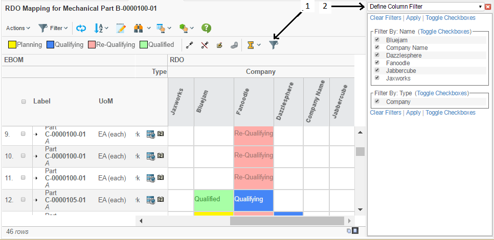
Figure 9. Column filter dialog.
Each filter group is related to a select statement that is applied on the column objects. Each unique value among the select values represents an item within the filter group.
All objects that is matching the particular filter-group-item is visible or hidden according to the selections made in the column filter dialog.
See this chapter for configuration details.