TriggerResult.Builder(TriggerStatus.SUCCESS).addMessage("Part is Successfully Promoted!!!").build();TVC 2021.4.0 Release Information
01 October 2021
1. Collaboration
1.1. Workflow
1.1.1. Workflow Trigger Alerts
Workflow Trigger Alert for Success
Users can configure the success message by using the addMessage/addMessages method on TriggerResult which will be displayed as a success message in green as below.
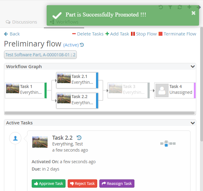
Figure 1. Trigger Success Alert.
Also the warning message will be displayed as yellow toast message.
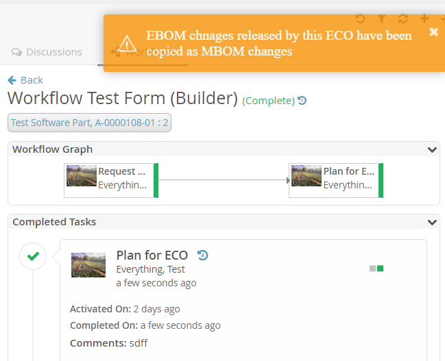
Figure 2. Trigger warning Alert.
1.1.2. Workflow Notification
There could be requirements where notification to be sent from a predefined system user or avoiding sending the notification to workflow owner by default. For these use cases, the following system properties are introduced to control the notification behavior.
| Property | Description | Default Value |
|---|---|---|
tvc.collaboration.workflow.watcher.includeOwner |
By default, the workflow owner is added to the watcher list so that workflow could be observed by the owner through notification. Set false for excluding the workflow owner from the watcher list. |
true |
tvc.collaboration.workflow.notification.sender |
User name of a person to set the default "from" address for notification to be sent from a system user |
EMPTY/NULL |
Read the Workflow Notifications chapter for more details.
1.2. Discussion
1.2.1. Open/Close/Print/Delete Discussion
There are some requirements where the user may need to close the discussion for some time and reopen it later to continue. The user may need to print the complete discussion that happened in a particular context. The user may also need to delete the discussion when it is no longer required or created by mistake.
To support these requirements, four built-in commands (Open, Close, Print and Delete) are introduced in the discussion.
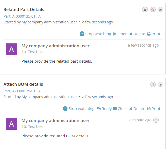
Figure 3. Built-in commands in Discussion
By default, these commands are accessible to the owner of the discussion.
If more customization is required to control access restrictions or addition of new custom commands in the discussion, it is possible to use JAVA code to achieve this. This is done by adding an attribute called className to ThreadActions element in TVCDiscussionConfig.xml as mentioned below.
<DiscussionPanelThreadActions className="com.technia.tvc.collaboration.core.test.TestDPGlobalThreadActionsProvider"> tvc:menu:tvx:collaboration/CustomMenu.xml </DiscussionPanelThreadActions>Read the Global Configuration chapter for more details.
You can also add new custom commands through TVC XML menu configuration as mentioned below.
<Menu>
    <Command>
        <Label>Custom Close</Label>
        <FontIcon>fa fa-pause</FontIcon>
        <Alt>Custom Close</Alt>
        <Href>
            <![CDATA[javascript:$context.closeDiscussion($event);]]>
        </Href>
		<AccessExpression><![CDATA['TestUser1' == context.user]]></AccessExpression>
		<Setting name="Status"> Active </Setting>
    </Command>
</Menu>
Read the Configuration Element Details chapter for more details.
The following system properties are introduced to control commands behaviour.
| Property | Description | Default Value |
|---|---|---|
tvc.collaboration.discussion.command.delete |
Delete discussion command |
false |
tvc.collaboration.discussion.command.open |
Open discussion command |
false |
tvc.collaboration.discussion.command.close |
Close discussion command |
false |
tvc.collaboration.discussion.command.print |
Print discussion command |
true |
Users can configure the discussion behaviour by changing the below properties in the string resource file.
| Property | Description | Default Value |
|---|---|---|
tvc.collaboration.thread.status.active |
Active discussion status |
Active |
tvc.collaboration.thread.status.inactive |
Inactive discussion status |
Inactive |
tvc.collaboration.discussion.toaster.delete.success |
Delete success message |
Discussion is deleted successfully |
tvc.collaboration.discussion.toaster.close.success |
Close success message |
Discussion is closed successfully |
tvc.collaboration.discussion.toaster.open.success |
Open success message |
Discussion is reopened successfully |
Read the Discussion Commands chapter for more details.
2. Search
2.1. Conditional fields on criteria update
NSX search field supports conditional fields with which additional fields can be added to searchform based on the value selected on the dependent search field. For example, it might be desired to load part related attributes when type selected in Part and for the classification field, additional classification attributes needs to be loaded. However, conditional fields are loaded only after a search is performed. With this release, it is now possible to load conditional fields searchform without performing a search. This feature is applicable only for fields having conditional fields defined. This feature can be enabled by configuring the below setting in the search config.
<Settings>
	<Setting name="retrieveFieldsOnCriteriaUpdate" value="true" />
</Settings>
When SearchOnCriteriaUpdate is set to true this setting will be ignored and search form will be updated after search is performed.
|
Read the Search Configurations chapter for more configuration details. Also read Conditional Fields for more details on Conditional Fields.
2.2. Total Result Count
When the search is performed against index based search engine like Exalead, search results are returned in terms of total hits and hits displayed on the page. Total hit count can now be seen on the top search result in Structure Browser. This can be useful for the user to get an idea of how many records search criteria match.
Following string resource key can be used to customize the message. The first argument is page count and the second argument is the total count. Please go through Locallization (i18n) to know about how a resource file can be configured.
tvc.search.result.resultCount = Showing {} of total result {}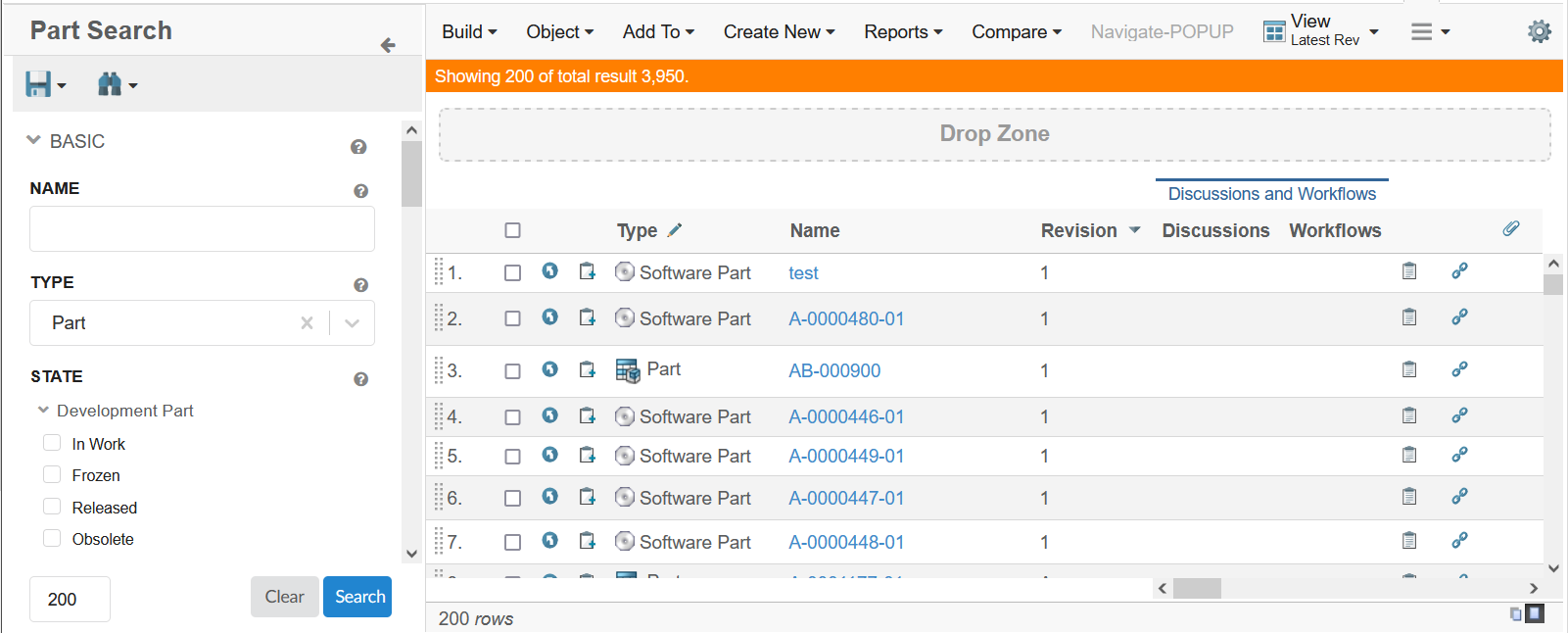
Figure 4. Total Result Count
2.3. New datepicker
NSX datefield now has a new datepicker which provides more features and better user experience.
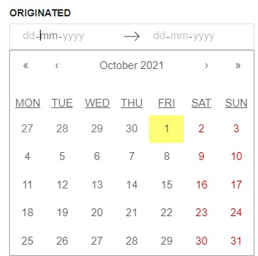
Figure 5. New Date Picker
The users can still use the old datepicker by configuring "useOldDatePicker" setting at column level.
<Settings>
    <Setting name="useOldDatePicker" value="true" />
</Settings>
For more details see here Date Picker
| The old date picker using the setting useOldDatePicker is deprecated and might get removed in future releases. |
2.4. Auto setting default value on field
The New Search Experience (NSX) in TVC allows user to find objects of interest by configuring the search within a page. The NSX comes with side panel for search and the results are displayed in a flat table. The NSX supports search providers - Enovia, Exalead or other data source.
When the NSX form gets loaded, the fields can be pre-populated with default values.
However, it might be needed that these default values are not pre-selected but can be set with a single click. As an example, for a person field, the default value can be context user and the user may want to set it on click of an icon instead of prefilling it.
This can be achieved by using the below settings :
<Settings>
    <Setting name="currentUserDefault" value="true" />
    <Setting name="setToDefaultOnIconClick" value="true" />
</Settings>
The icon and its tooltip are configurable. The tooltip also supports localization.
<Settings> <Setting name="populateDefaultValueIcon" value="hand point left outline" /> <Setting name="populateDefaultValueIconTooltip" value="tvc.tooltip.owner.default" /> </Settings>
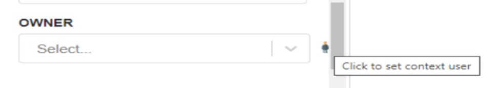
Figure 6. NSX-Icon to set default value
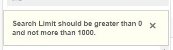
2.5. Upper Search Limit
When the user enters a large value in the search limit input box, it takes more time to get the result and the application becomes non-responsive.
To handle this situation, we have introduced a configurable setting upperSearchLimitValue to set the upper search limit. In case if the user tries to input a larger number than the defined upperSearchLimitValue the search does not get initialized and system throws an error message.
<Settings>
	<Setting name="upperSearchLimitValue" value="1000" />
</Settings>
upperSearchLimitValue can be used to limit the maximum search results. The default upper limit is 1000.
|
| For Index based searches like Exalead, search limit becomes page size and hence upper search limit will become maximum page size. |
3. 3DDashboard
3.1. Selective Classic and Helium Dashboards in TVC Widget
We are now adding feature which allows to load selective TVC and Helium Dashboards in TVC Widget. To avail the feature,
you would need to use tvc.3ddashboard.classic.dashboard.directories and
tvc.3ddashboard.helium.dashboard.directories properties in tvc.properties file. Value of these properties are comma separated directory names which are present in TVC Path of dashboard configuration.
E.g. there are some TVC Dashboard configurations present in WEB-INF/tvc/mcadoptimizer-ups/classic/dashboard/
directory. Resolved path or TVC Path for one of the configuration would be
tvc:dashboard:mcadoptimizer-ups:classic/UPSContextProduct.xml. If we want to see dashboard configurations
from this directory, we can choose a directory name or pattern which can be identified in the path. e.g. mcadoptimizer-ups
or mcadoptimizer-ups:classic. The property accepts multiple directory names in comma separated fashion. So if there is
another set of Dashboard configurations, another unique directory name can be identified and added to the property.
Please see example as below.
tvc.3ddashboard.classic.dashboard.directories = mcadoptimizer-ups,tvx,dashboard:launchpad
tvc.3ddashboard.helium.dashboard.directories = hex,helium
Please note that we have two different properties for Classic Dashboard and Helium Dashboard. It is in order to differentiate two types of Dashboard configurations. If a directory name pattern happens to be common in Classic and Helium Dashboards path, the configuration will show up in configuration list of both Classic and Helium Dashboard widget type.
In case the properties are not configured, below values are considered by default.
tvc.3ddashboard.classic.dashboard.directories = tvx,dashboard:launchpad
tvc.3ddashboard.helium.dashboard.directories = hex,helium
If TVX, Launchpad and Hex are not installed on the system, you won’t be able to find any configuration for Classic Dashboard widget type until the property is configured correctly to show custom configurations.
3.2. Ability to retain context
Previously when user used to select a Config from preferences which required context object to load in TVC Widget like (AddAffectedItem, AddDocument, AddExisting, etc..) or in HETrueWidget like (PartPage, ProjectPage, etc..), once the widget was loaded user needed to drag and drop a context object to load. Once the widget was loaded, if user switches to new Config which requires context, the widget used to use the same context which was set in earlier case, even though user does not want to load the previous context.
For example, if user has selected AddDocument Config initially and initialized it with a Document object. Later the user switches to EBOMByType Config, the widget would still show previously selected Document object.
Now we have provided the ability to the user to retain the previously set context object to load in new Config or not. If user does not want to load the previous context object, user can uncheck the check box Persist Context Object in preferences and save the preferences. By default Persist Context Object is checked.
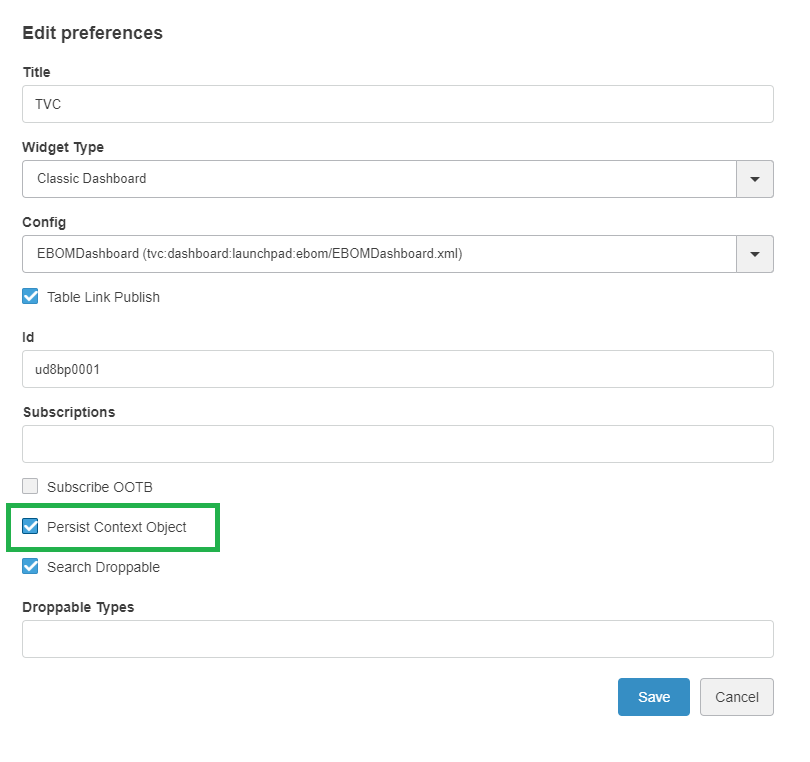
Figure 8. Persist Context Object
3.3. Tabbed Page
Previously user could configure tvcWidget to load Table(Structure), Table(Flat), Classic Dashboard etc. But user was not able to configure tvcWidget to load menuBasedTabPage configurations.
Now a new widget type Tab Page is added. User can use this widget type to load existing menuBasedTabPage configurations into the 3DDashboard widget.
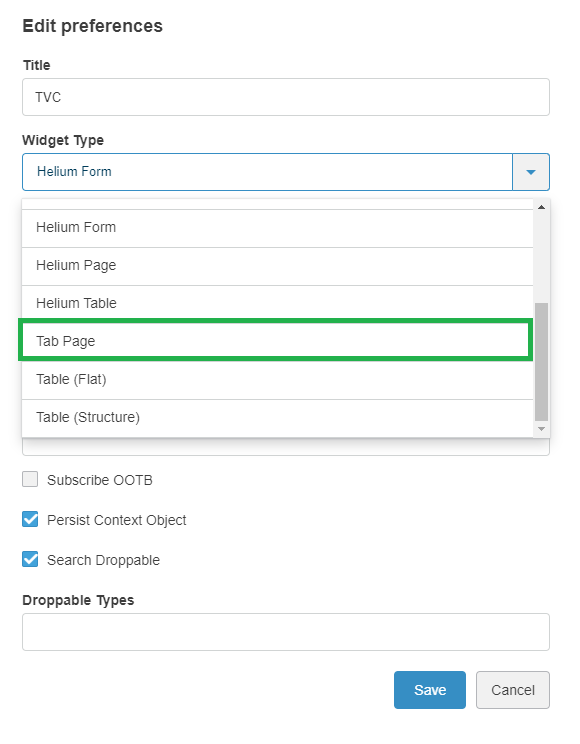
Figure 9. Tab Page
To load the menuBasedTabPage configurations user need to use tvc.3ddashboard.classic.tab.pages property in tvc.properties file. Value of the property is comma separated directory names which are present in TVC Path of menu configuration.
In case the properties are not configured, below values are considered by default.
|
tvc.3ddashboard.classic.tab.pages = tvx,menu:launchpad| Place menuBasedTabPage under menu directory only. If toolbar menu, context menu are placed inside menu directory, it will be shown in the Config list. This is a technical restriction as toolbar menu and menuBasedTabPage have same XML configuration. |
3.4. Search Based Table
A new widget type Search Based Table is introduced to support search based table. A search based table has two components a left search panel and a search result table on right.
With widget type Search user can select pageconfig and searchconfig to load the searchbasedtable.
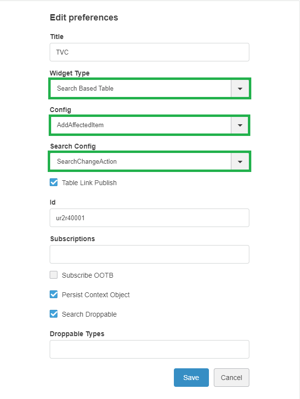
Figure 10. Search Based Table
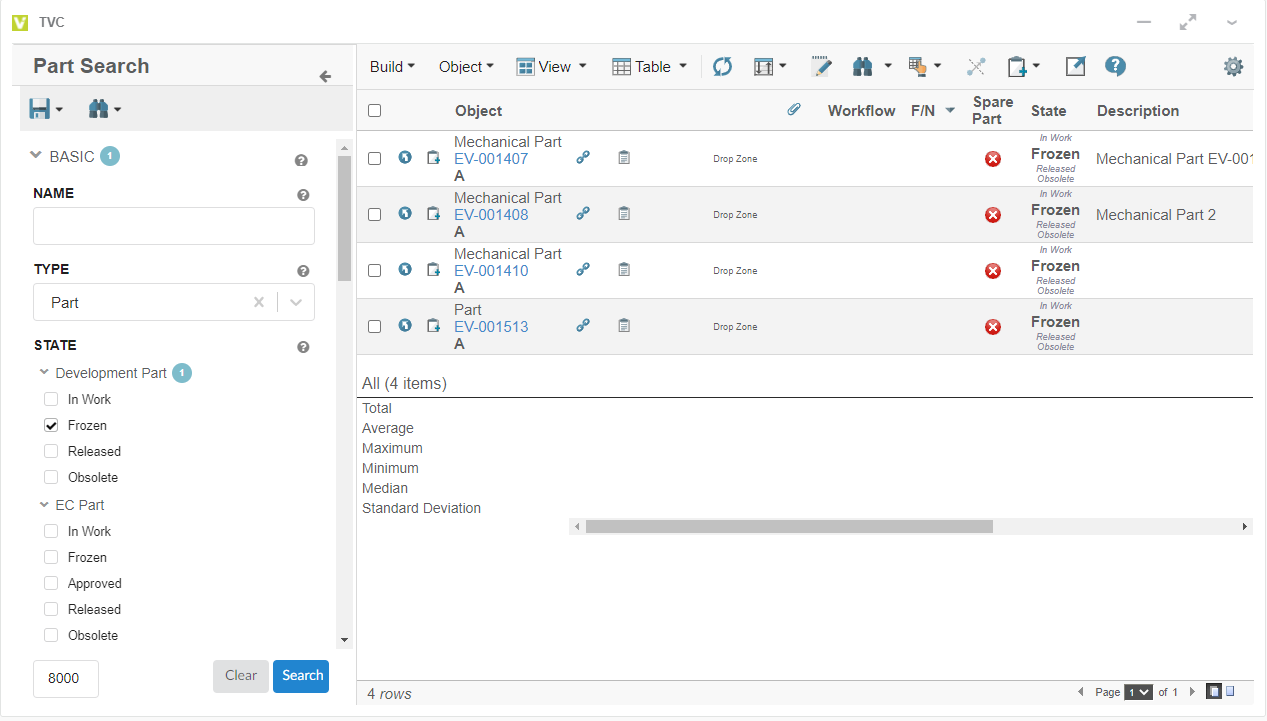
Figure 11. Search Based Table
3.5. More Apps in Context Menu
More Apps support is added to context menu. Using More Apps command in context menu it would be possible to open an object in desired app available in compass.
More Apps functionality in OOTB Widget
More Apps functionality in TVC Widget.
More Apps command in context menu can be made available through inbuilt OpenWith menu.
<Menu>
      <Label>OpenWith</Label>
      <OpenWith>true</OpenWith>
</Menu>
3.6. File Manager Support for Helium Configurations
As we know, the users can launch various Helium Configurations such as Helium Page, Helium Dashboard, Helium Table and Form Widgets etc. in TVC Widget. These Configurations support helium-files actions. These actions support file related operations.
It was not possible for users to use TVC File Manager in these configurations. In this release, we are now supporting these file actions through TVC File Manager as well. This feature is controlled by tvc.3ddashboard.settings.useNativeFileManager property in tvc.properties file. The default value is true. If the users do not intend to use TVC File Manager for Helium Configurations in TVC Widget, please set value of this property to false.
4. Structure Browser
4.1. Case Insensitive Name Pattern in Search
In the Structure Browser, there is a built-in search function. This function can be re-used in many different use cases.
The search function contains functionality to define search forms, render the search form, perform the query and display the search result. When launching the search functionality in the structure-browser, we usually use Search Configuration. Please go through Search Configuration to know more about Search Configuration in Structure Browser.
Namefield is one of the most important fields in Search Configuration which determines search result. It denotes the name pattern of the objects which user want to see in search result. This field has been case sensitive by default while searching for results. It is now possible to configure this field to be case insensitive by setting tvc.structurebrowser.search.namepattern.caseinsensitive to true in tvc.properties file. Please note that default value of this property is false.
|
Performance of TVC Structure Browser search is better when name field is case sensitive. |
5. Category Top Panel
5.1. Forward and Back buttons on popup
TVC Category Top Panel can be enabled and used to show category tree menu instead of OOTB tree/category menu. On enabling TVC Category Top Panel, category menu is rendered using TVC tabs. It is also possible to show a different category top panel for the specific type. Earlier, forward and back buttons were available on TVC Category Top Panel only for content pages. Now forward and back buttons are also functional on TVC Category Top Panel in popup mode for Enovia versions 2019x or higher.
Figure 12. Category Top Panel - Popup mode
6. File Manager
6.1. Web extension published to edge store
File Manager web extension is published on Microsoft Edge store. Earlier, Microsoft Edge was using extension from Google Chrome web store. This extension can also be side loaded into Microsoft Edge browser. Alternatively, TVC File Manager extension can be added by opening Microsoft Edge and navigating to the below URL:
6.2. File Package Download
6.2.1. Support empty folder
TVC File Package Download (fpd) provides the feature to package & download multiple files.
Earlier fpd used to skip empty folders (folders without files) in the downloaded package. However, in some cases, users may want to see the empty folder structure even without any files. This can be achieved by using an optional setting or attribute addEmptyPackageName.
See this chapter for more information.
For e.g; Software Part, leaf node in the below screenshot can be included as an empty folder in the downloaded package by setting the attribute addEmptyPackageName.
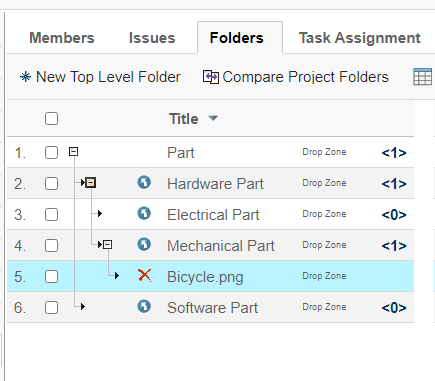
Figure 13. File Package Download - Support empty folder
6.3. Reversible Lock Icon for File action columns
As per the existing design, the file actions column shows actions that can be performed. So, for a locked file unlock action is shown and for unlocked file lock action is shown. However, this can be confusing to some users as they expect to see the state of the file.
Now it is possible to reverse icons on Action columns so that it shows the state of the file/object i.e. lock icon when a file is already locked and unlock icon when a file is already unlocked.
This can be done using below setting.
| Property | Description | Default Value |
|---|---|---|
tvc.core.fileActions.reverseLockIcon |
Reverse the lock icon |
false |
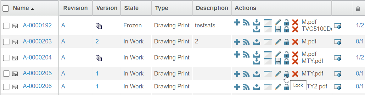
Figure 14. Reversed Lock Icon
See this chapter for more information.