Structure Browser - Administration Guide : Rendering
21 March 2016
1. Rendering
This chapter contains information how to render/display the data in some different ways.
Information about exporting data is also part of this chapter.
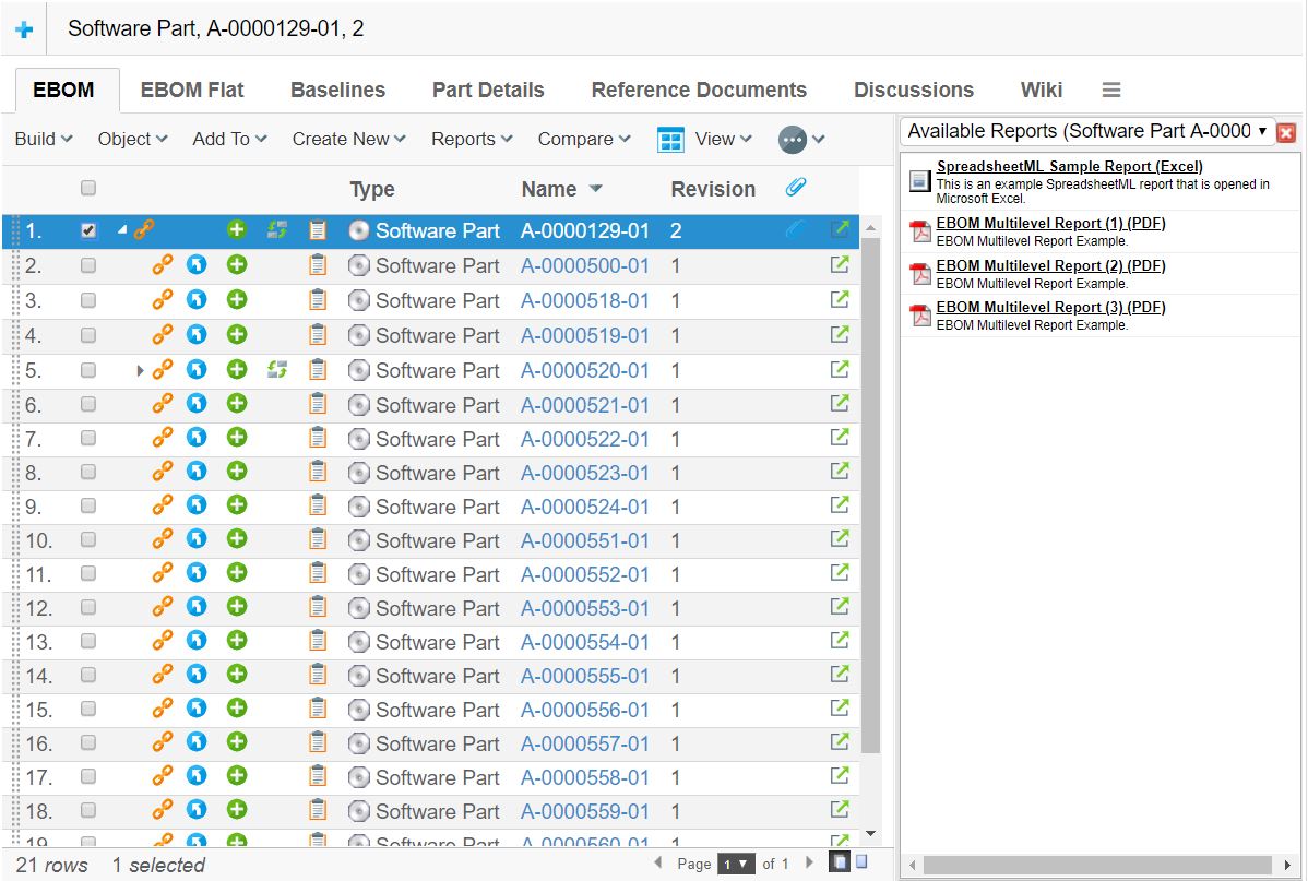
1.1. Side Panel
As of TVC 6.0, a new UI feature called "Side Panel" was introduced. The side panel can be used in the Structure Browser view right to the table content to display arbitrary content generated by custom JSP pages. The idea behind the side panel is to reduce the need of having too much information inside the tables and also reduce the need of creating advanced cell content but also to reduce the need of opening up popup windows. I.e. increasing usability and reducing the time needed to create the table cells.
The side panel itself contains so called "cards", which in turn contains the content (JSP/HTML). The side panel can be used to display several cards, one at a time, and the user can switch between previously loaded cards through the drop down list. The screen shot below illustrates an example of how the side panel can be used.
Figure 1. Side Panel in Action
The side panel can be brought up either by clicking on a command within the toolbar, or by clicking on a link inside a table cell. In either of these cases, there are a couple of settings that must be set in order to use the side panel.
These settings are:
- Href
-
The resource to be loaded. This is specified under the "link" tab for the command or table column within "business".
- Target Location
-
The target location setting of the command or table column must be set to either "card" or "sidepanel", which will indicate for TVC that the Href is about to be displayed inside the side panel.
The difference between setting the value to "card" vs. "sidepanel" is that the "card" value will add the loaded page to the card-history (e.g. the user will be able to select a previous page loaded into the sidepanel from the card-dropdown-list). The sidepanel value will disable this feature and will not make it possible for the user to switch to that page later on.
- Card ID
-
This setting specifies the identifier of the card. If the identifier is set to "new" (which is the default value), a new card will always be opened up even if the same link has been invoked earlier. By setting the identifier, one can force TVC to reuse a particular Card when a card-link with the same id is clicked multiple times.
- Card Title
-
Defines the title of the Card as it will appear in the card selector (drop down list). If the value of this setting is set to "auto", then the title of the generated HTML page will be used as Card Title.
If the side panel is invoked through a link inside a table cell, one can use macros to define the Card Title. I.e. as card title, you can for example have:
Details of $<type>, $<name> rev: $<revision>, which then will be resolved once the link is clicked. - Card Load Script
-
Defines an arbitrary Java Script that should be launched when the card has been loaded. The Card Load Script must refer to a script available inside the loaded page.
If the side panel is invoked through a link inside a table cell, one can use special macros for adding special values such as "object-id", "relationship-id" etc. To use such a macro, look at the following example:
addObject(‘${OBJECTID}’, ‘${RELID}’); - Card Reloadable
-
This setting defines if the resource should be reloaded or not when a specific card is subsequently loaded. I.e. if this setting is set to false, the resource will not be reloaded BUT the "Card Load Script" will be executed only.
- Card Width
-
Defines the width of the card inside the side panel. Each card can have its own preferred width, and when the user toggles between cards through the card selector - the width of the side panel is adjusted according to the Card Width of the current displayed card.
1.1.1. Implementing Custom Cards
Typically when implementing cards inside the side panel, one will load a HTML page generated through a JSP page. Even though you can display any HTML page within a card, you should avoid loading too heavy pages inside the card, this because the size of the card is limited and also due to performance (card pages are intended to be "light weighted").
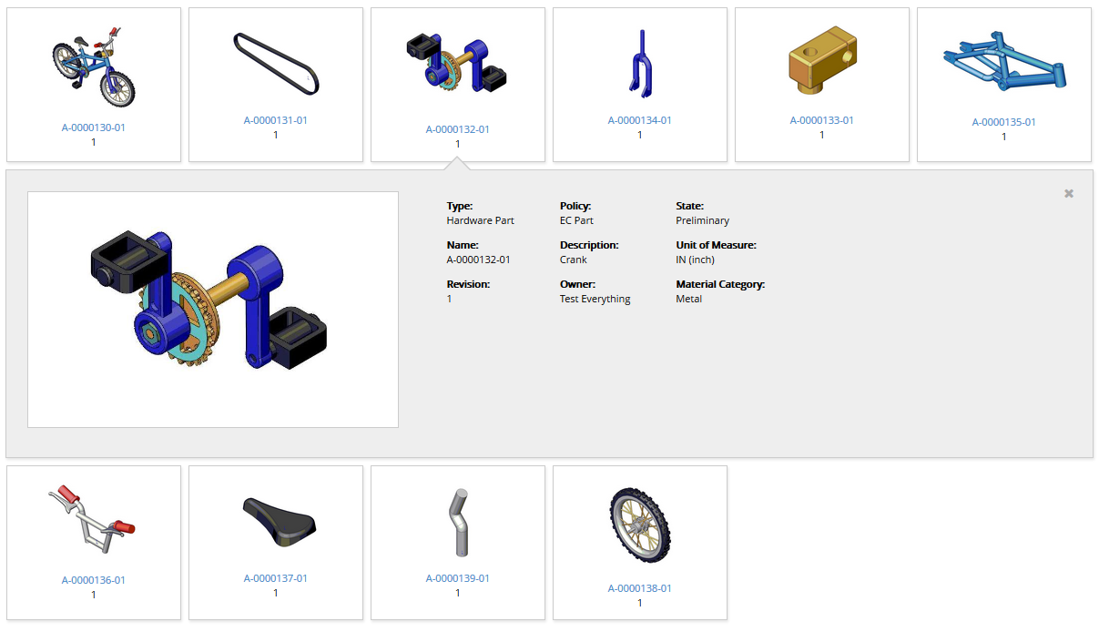
1.2. Display Mode: Tiled
The tiled mode that were introduced in TVC 2010.2.0, allows presenting the data in a different way. See screenshot below:
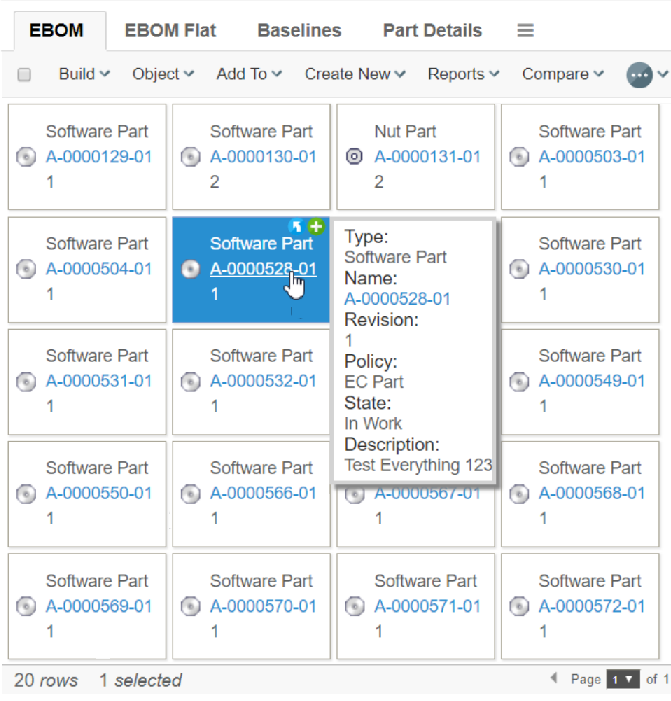
Figure 2. Tiled display mode
Even though this mode can be used independent on what kind of data you display, the most typical usage scenario is to use the tiled mode when the data represents a list of objects (aka. Flat object list), as the structure relation between the objects are not visualized.
Each object is placed in a separate "box" and the boxes are drawn in a "flow" next to each other, and when there’s no more room for the next box to fit the screen it will be floated to a new row; e.g. there will not be a need for horizontal scrolling.
The data for each box is driven by a system-table (or XML table) as normal; the difference is that there are some more configuration possibilities on the table being used (and some restrictions, as a box shouldn’t contain too much information as that will make the tiled mode less user friendly), which allows specifying what information that is included in the box it-self and what information that should go into the tooltip etc.
Another feature with the tiled mode is that each box typically is related to an image, which can be placed either left, above or right to the meta-data. Exactly what image that you will display is defined by the system-table being used; however, in the example above, the image being used is the type-icon as the system-table used in this example doesn’t provide any graphical information. Please see below regarding table configuration specifics.
To use the tiled display mode, modify the "Display Mode" value on the view being used:
Example 1:
<DisplayMode>tiled</DisplayMode>
Example 2: (changing the image position)
<DisplayMode>tiled:ImagePosition=top</DisplayMode>
Accepted values for the image-position are:
- Left
-
Places the image left to the meta-data (default placement).
- Right
-
Places the image right to the meta-data
- Top
-
Places the image top to the meta-data
- None
-
Will result in that the image is omitted
If you use business object defined views, the syntax of the
display mode is the same as if defined in an XML defined view (Remember
to omit the <DisplayMode> tag).
|
1.2.1. Table
The tables (system tables or XML tables) being used should be designed for tiled pages. For example reduce the number of columns that is used as well as review how the data for a column is displayed. It will for example not be very user friendly to use columns whose column type is set to "tnr" or "lifecycle" as these will render information that looks bad in this mode.
A single box contains a number of different sections. You can define your table in the way that you draw different information within these different sections. The screenshot below illustrates the different sections:
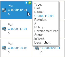
Figure 3. Sections of a tiled box.
To define into what section the content of the cell goes, you need to apply settings on the table-column(s). The table below illustrates these settings.
| Setting | Value | Description | ||
|---|---|---|---|---|
Image |
True | False |
One column in the table can have this setting set to "true". The content of the cell in that column will generate the "image" related to the object. If you don’t have a column with the setting "Image" set to true, then the type-icon for the objects will be used, unless the "image-position" has been set to none. |
||
Property |
True | False |
Defines if the content of the cells in this column will be shown inside the box. You must have at least one column in the table, whose "Property" setting is true.
|
||
Tooltip |
True | False |
Defines if the content of the cells in this column will be shown inside the tooltip. The tooltip is shown after a short interval after the mouse is over a "box". |
||
BreadCrumb |
True | False |
Defines if the content of the cell will be part of the so called bread crumb. The bread crumb is shown above the content, if the user has performed a so called go-there. The bread crumb allows the user to visually see where in the structure he currently is, and allows him to go back to a certain object. |
||
Action |
True | False |
Defines if the column renders an icon that is suitable for being a part of the "actions" section. Note that the column should only render a small image containing a link, without any text etc. |
Table Example
Below is an example table that is designed for being used in a tiled view. It illustrates how you can use the settings to divide the information into the different sections.
<?xml version="1.0" encoding="UTF-8"?>
<Table>
    <Column>
        <Name>type</Name>
        <Expression>type</Expression>
        <Label>emxFramework.Basic.Type</Label>
        <RegisteredSuite>Framework</RegisteredSuite>
        <ShowTypeIcon>FALSE</ShowTypeIcon>
        <Setting name="ToolTip" value="true"/>
        <Setting name="BreadCrumb" value="true"/>
    </Column>
    <Column>
        <Name>name</Name>
        <Expression>name</Expression>
        <Label>emxFramework.Basic.Name</Label>
        <Href>${COMMON_DIR}/emxTree.jsp</Href>
        <RegisteredSuite>Framework</RegisteredSuite>
        <Setting name="ToolTip" value="true"/>
        <Setting name="BreadCrumb" value="true"/>
    </Column>
    <Column>
        <Name>rev</Name>
        <Expression>revision</Expression>
        <Label>emxFramework.Basic.Revision</Label>
        <RegisteredSuite>Framework</RegisteredSuite>
        <Setting name="ToolTip" value="true"/>
        <Setting name="BreadCrumb" value="true"/>
    </Column>
    <Column>
        <Name>policy</Name>
        <Expression>policy</Expression>
        <Label>emxFramework.Basic.Policy</Label>
        <RegisteredSuite>Framework</RegisteredSuite>
        <Setting name="ToolTip" value="true"/>
        <Setting name="Property" value="false"/>
    </Column>
    <Column>
        <Name>current</Name>
        <Expression>current</Expression>
        <Label>emxFramework.Basic.Current</Label>
        <RegisteredSuite>Framework</RegisteredSuite>
        <Setting name="ToolTip" value="true"/>
    </Column>
    <Column>
        <Name>descr</Name>
        <Expression>description</Expression>
        <Label>emxFramework.Basic.Description</Label>
        <RegisteredSuite>Framework</RegisteredSuite>
        <Setting name="ToolTip" value="true"/>
        <Setting name="Property" value="false"/>
    </Column>
    <Column>
        <ColumnType>file</ColumnType>
        <Setting name="Action" value="true"/>
        <Setting name="Property" value="false"/>
    </Column>
</Table>
1.2.2. Selecting Objects
In tiled mode, the selection behaviour is slightly different than in normal table-pages. The main difference is that you will not have a checkbox (or radio button) field to click; instead, you click on the box itself. Once it’s being selected, it will get a bluish color indicating so. Simply clicking another box will de-select any previously selected boxes and select the new one.
In order to support selecting multiple boxes, the user needs to hold down the CTRL key.
To select all objects, use the check-box available in the upper-left corner (not available if the selection mode is single).
1.2.3. Data Grouping
The data grouping result page looks slightly different in tile mode compared to standard mode. Since the tiled view doesn’t show the structure hierarchy, it is rendered differently. See screenshot below for an example.
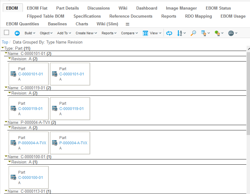
Figure 4. Data grouping result in a tiled view
To expand or collapse a group, the user can simply click on the group label.
1.2.4. Limitations
A number of limitations/restrictions apply to the tiled mode; some of them are:
-
Be careful with what data you display in the box as the space for each box should be kept to a minimum. Use the tooltip and/or the side panel to display additional information.
-
Shift-click to select a range of objects is not supported in this mode
-
Structure hierarchy is not displayed
-
Export / Printer Friendly will not be displayed in a tiled way
-
Except if the Printer Friendly format is HTML.
-
-
Arrow Key Navigation doesn’t work as expected (In edit mode).
-
Group Header information is not shown.
1.3. Display Mode: Tiled 2
A second Tiled mode called "Tiled 2" was added in TVC 2013.3.0. This is similar to the previous tile mode but with some new features added and some removed. It is recommended to first read the previous chapter about the old tiled mode since that describes the basics of the tiled mode.
The main differences between this mode and the previous tiled mode are how images and tooltips work and also the added ability to open a "details pane" for a tile.
Tiled 2 mode with an expanded "details pane" for a tile
To use the tiled 2 display mode, modify the "Display Mode" value on the view being used:
<DisplayMode>tiled2</DisplayMode>
1.3.1. Table
The tables (system tables or XML tables) being used should be designed for tiled pages. Each tile contains a number of different sections. You can define your table in the way that you draw different information within these different sections. The screenshots below illustrates the different sections:
Figure 5. Tile content
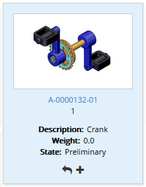
Figure 6. Tile tooltip
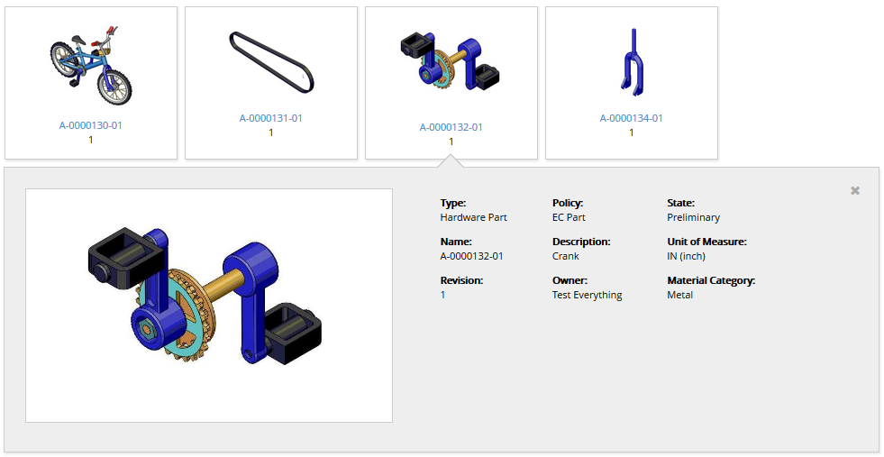
Figure 7. Tile details pane
Table Column Configuration
To define into what section the content of the cell goes, you need to apply settings on the table-column(s). The table below illustrates these settings.
| Setting | Value | Description |
|---|---|---|
Property |
True | False |
Defines if the content of the cells in this column will be shown inside the tile. You must have at least one column in the table, whose "Property" setting is true. |
Tooltip |
True | False |
Defines if the content of the cells in this column will be shown inside the expanded area that is shown on "mouse over". |
BreadCrumb |
True | False |
Defines if the content of the cell will be part of the so called bread crumb. The bread crumb is shown above the content, if the user has performed a so called go-there. The bread crumb allows the user to visually see where in the structure he currently is, and allows him to go back to a certain object. |
Action |
True | False |
Defines if the column renders an icon that is suitable for being a part of the "actions" section. Note that the column should only render a small image containing a link, without any text etc. |
Details |
True | False |
Defines if a column should be rendered in the details pane that is displayed when a tile is clicked. Columns that are a part of the details pane also needs a setting called "Section" (See below) |
Section |
1….. |
A number (starting with 1) that defines what horizontal section of the details pane to render the column in. So if you want four sections like in the screenshot in the previous chapter you add the number 1, 2, 3, or 4 as a value for your columns. |
Table Example
Below are some example columns that are designed for being used in a tiled view. It illustrates how you can use the settings to divide the information into the different sections. (There are example configurations called Tiled2 in the TVX package).
A column rendered in the tile content and also used as a part of the Bread Crumb:
<Column>
    <Name>name</Name>
    <Expression>name</Expression>
    <Label>Name</Label>
    <Href>${COMMON_DIR}/emxTree.jsp</Href>
    <RegisteredSuite>Framework</RegisteredSuite>
    <Setting name="Property" value="true"/>
    <Setting name="BreadCrumb" value="true"/>
</Column>
A column rendered in the Tool Tip area:
<Column>
<Name>weight</Name>
<Expression>$<attribute[attribute_Weight]></Expression>
<Label>Weight</Label>
<RegisteredSuite>Framework</RegisteredSuite>
<Setting name="ToolTip" value="true"/>
<Setting name="ShowLabel" value="true"/>
</Column>A column rendered in the first section of the Details Pane:
<Column>
    <Name>Type</Name>
    <Expression>type</Expression>
    <Label>Type</Label>
    <Setting name="Details" value="true"/>
    <Setting name="Section" value="1"/>
</Column>
Action column:
<Column>
    <ColumnType>file</ColumnType>
    <Setting name="Action" value="true"/>
</Column>
1.3.2. Height and Width settings
By default the tile will be as wide as needed in order to fit the content and the details pane will always expand to the bottom of the page. So in order to control the tile and details pane size there are a couple of settings that can be applied to your view configuration on the <DipslayMode> element.
| Setting | Value | Description |
|---|---|---|
TileMinWidth |
Integer (pixels) |
Defines the minimum width that a tile must have. |
TileMaxWidth |
Integer (pixels) |
Defines the maximum width that a tile can have. |
DetailsMinHeight |
Integer (pixels) |
Defines the minimum height of the details pane. |
DetailsMaxHeight |
Integer (pixels) |
Defines the maximum height of the details pane. |
Example:
<DisplayMode>tiled2:TileMinWidth=100|TileMaxWidth=170|DetailsMinHeight=250|DetailsMaxHeight=275</DisplayMode>1.3.3. Column Labels
The column label can be displayed in all parts of the tiled view. It is by default hidden in the Property area and in the ToolTip area but can be enabled with the following column setting:
<Setting name="ShowLabel" value="true"/>
The Details area will by default show the column labels but it can be turned off with the above setting.
1.3.4. Images
This display mode is lacking the settings for displaying images that you
can use with the previous tiled mode. So in order to show images that
are uploaded to an object you have to either create your own Data
Handler and/or Cell Renderer or use the column type called
<PrimaryImage> that is a part of TVC Structure Browser.
The <PrimaryImage> column will render the "Primary Image" of the object
(using FCS if possible). It has some settings for what Enovia format to
get the image from and some settings to control the width and/or height
of the image.
Below are some examples from TVX (the exact configurations used for the screenshots for this functionality).
Showing the image inside the tile content (Property area)
<Column>
    <Name>Image1</Name>
    <Label>Primary Image</Label>
    <ColumnType>primaryimage</ColumnType>
    <Setting name="Property" value="true"/>
    <Setting name="Height" value="100px"/>
    <Setting name="ImageFlow" value="false"/>
    <Setting name="Format" value="mxImage"/>
</Column>
Showing the image in the first section of the details pane
<Column>
    <Name>Image2</Name>
    <Label>Primary Image</Label>
    <ColumnType>primaryimage</ColumnType>
    <Setting name="Details" value="true"/>
    <Setting name="Section" value="1"/>
    <Setting name="Width" value="400px"/>
    <Setting name="ImageFlow" value="false"/>
    <Setting name="Format" value="mxImage"/>
    <Setting name="ShowLabel" value="false"/>
</Column>
The 3DX image manager can be used instead of the TVC Image Flow component.
Set the setting ImageManager to true to activate it.
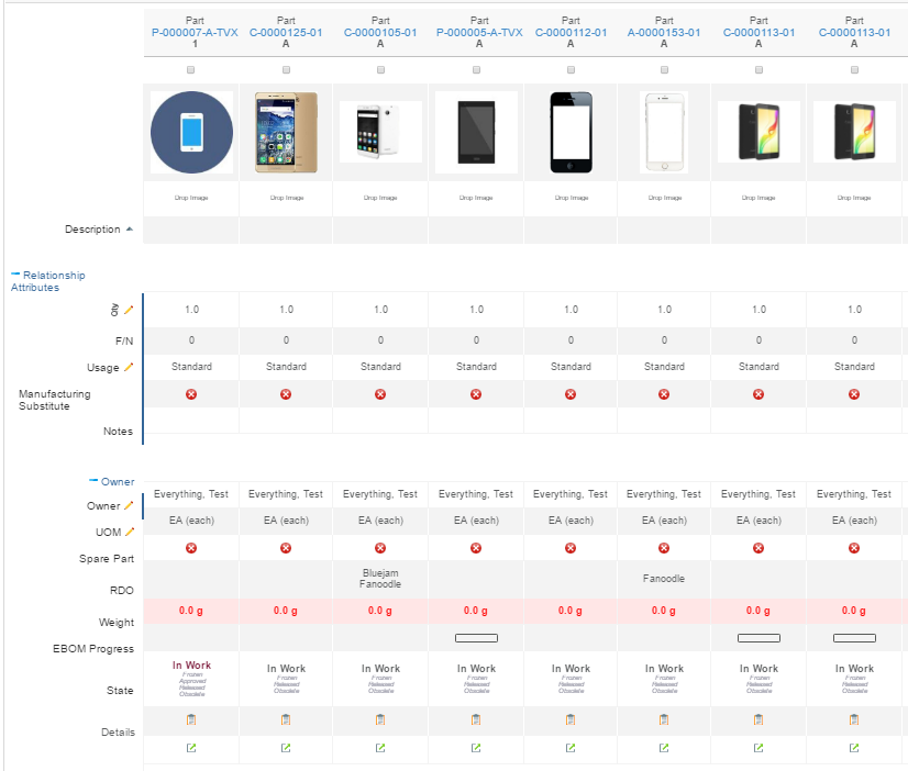
1.4. Display Mode: Flipped
In various product comparison web pages the product information is displayed vertically instead of horizontally. This is especially common when the amount of products is lower than the amount of properties compared.
Displaying table data vertically is also possible in structure browser tables using a display mode called flipped table.
1.4.1. Configuration
To use the flipped display mode, modify the Display Mode value on the
view being used:
Example 1:
<DisplayMode>flipped</DisplayMode>Example 2: (explicitly define column width)
<DisplayMode>fipped:Widths=150</DisplayMode>1.4.2. Known limitations
-
Action icons are not grouped
-
Table calculations are not rendered
-
Context menus are not rendered
-
Data grouping is not available
-
Freeze pane is for first column only
-
Export is not available
-
Printer friendly is not available
-
Scroll state is not stored
-
Collapsed group headers is not remembered
-
Header right clicks are not available
1.5. Display Mode: Hierarchy
PLM users often benefit from graphical overviews of structures as it makes it easier for the eye to understand how things keep together. Printing large handmade maps to put on the wall is quite common.
Displaying table data in a graphical hierarchy and / or indented way is a built in structure browser feature and is easily enabled through a view level setting. The hierarchy rendering mode uses the same table column, filter and other configurations as usual enabling re use. Table column configurations controls the node content and the freeze pane controls columns to be show on mouse over only. Edit, search, data group, selects, action icons and most of the normal functionality is also supported in hierarchy mode.
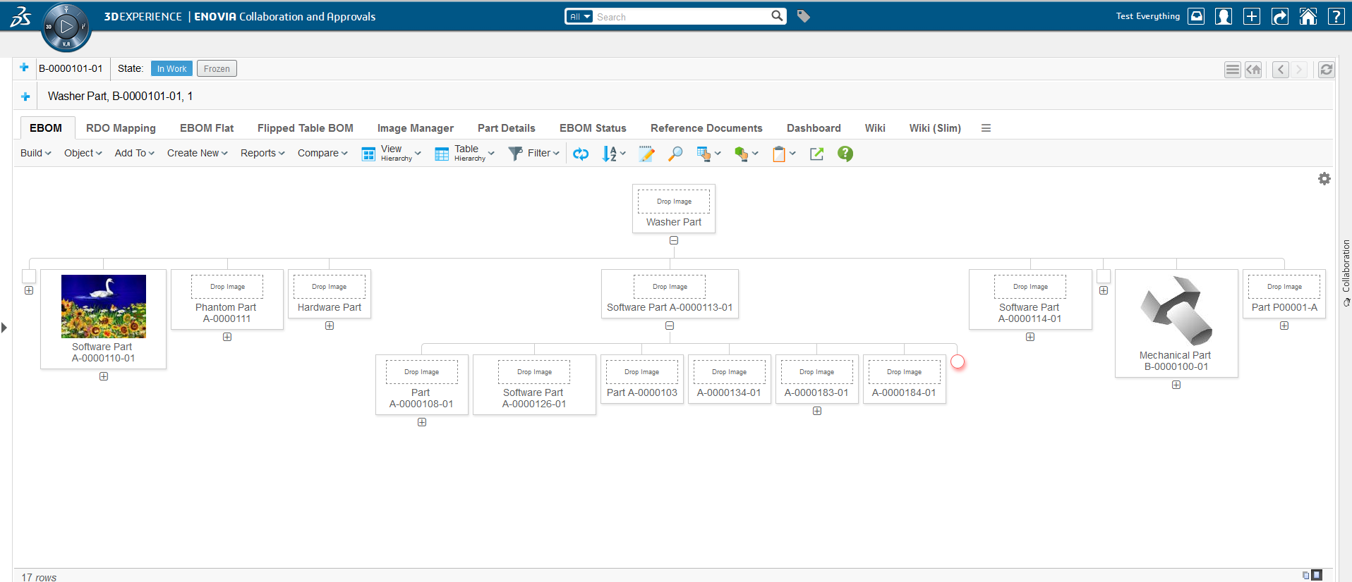
Figure 8. Hierarchy example without indentation
Figure 9. Hierarchy example with images, indentation level 2, collapsed nodes above level 4 and in cell edit
1.5.1. Configuration
To use the hierarchy display mode, modify the Display Mode value on
the view being used:
Basic configuration on the view:
<DisplayMode>hierarchy</DisplayMode>Controlling hierarchy options using JSON:
<DisplayMode>hierarchy:settings={
    "compressed" : {
        "enabled" : true,
        "level" : 3
    },
    "indented" : {
        "enabled" : true,
        "level" : 2
    },
    "controls" : {
        "enabled" : true,
        "expanded" : false,
        "compressed" : true,
        "showAll" : true,
        "more" : true,
        "zoom" : true,
        "selectAll" : true,
        "labels" : {
            "controls" : localized.pluginresource.acme.hierarchy.controls,
            "compressed" : "Toggle compressed",
            "more" : "More / less",
            "zoomIn" : "Zoom in",
            "zoomOut" : "Zoom out",
            "selectAll" : "Select all"
        }
    }
}</DisplayMode>| Controls | Value | Description | ||
|---|---|---|---|---|
enabled |
True | False |
Provides the controls to the user over the cells to add / remove features like compressed, zoom etc. |
||
expanded |
True | False |
Defines if the content of the cells should be expanded by default
|
||
compressed |
True | False |
It is used to toggle between compressed mode |
||
showAll |
True | False |
Defines if the content of the cells should load with more details by default
|
||
more |
True | False |
It gives the controls to the user to toggle the cells with more/less details |
||
zoom |
True | False |
It gives the controls to the user to zoom-in/ zoom-out cells |
||
selectAll |
True | False |
It gives the controls to the user to select all the cells |
Special table column setting hiding labels in structure
<Setting name="Display Label">false</Setting>1.6. Row Actions Menu
As of TVC 2012.1, you can configure the Structure Browser to display common functionality that applies to a row into a row actions menu.
By default, the row actions are rendered in separate columns as shown in the screenshot below:
Figure 10. Row functionality
All these icons occupy a large part of the screen real estate and there is now a possibility to combine the functionality into one "column". The screen shot below shows the row actions menu:
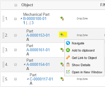
Figure 11. Row actions menu
The row-actions menu is by default disabled, but can be enabled either globally for all Structure Browser instances and/or configured individually per Structure browser instance via page-config parameter.
The TVC init parameter that controls the default value is defined in web.xml as shown below:
<init-param>
    <param-name>tvc.structurebrowser.render.tableRowActionsCombined</param-name>
    <param-value>TRUE</param-value>
</init-param>
The page configuration parameter that can be used to override the global setting is shown below:
renderTableRowActionsCombined=true
The default (built-in) row-actions that are shown in the row-actions menu are:
-
Go There (Navigate) (if enabled in the page-configuration)
-
Add To Clipboard (if enabled in the page-configuration)
-
Rearrange Child Elements (if enabled in the page-configuration)
Moreover, you can also move some columns into this menu by applying a setting on the columns that can be moved. This column setting is called "Render as Row Action" (default value for this setting is False).
Note: You can only a column, which Column Type is set to "Icon" OR any of the columns that has the column type listed below:
-
xbl-baselines (Column type from the TVC XBOM Component)
-
formlink (Column type from the TVC Structure Browser component)
-
objectlink (Column type from the TVC Structure Browser component)
-
whereused (Column type from the TVC Structure Browser component)
-
file (or attachment) (Column type from the TVC File Manager component)
1.6.1. Disable Mouseover
If row-actions menu is enabled as mentioned above, by default row-actions menu will show up on mouse over. This behaviour can be changed to show row-actions menu on click of row-actions icon instead of mouse over.
This can be configured either globally for all Structure Browser instances and/or configured individually per Structure browser instance via page-config parameter.
The TVC init parameter that controls the default value is defined in web.xml as shown below:
<init-param>
    <param-name>tvc.structurebrowser.tableRowActionsCombined.mouseoverEnabled</param-name>
    <param-value>FALSE</param-value>
</init-param>
The page configuration parameter that can be used to override the global setting is shown below:
tableRowActionsCombinedMouseoverEnabled=false
1.7. Display Mode: SVG
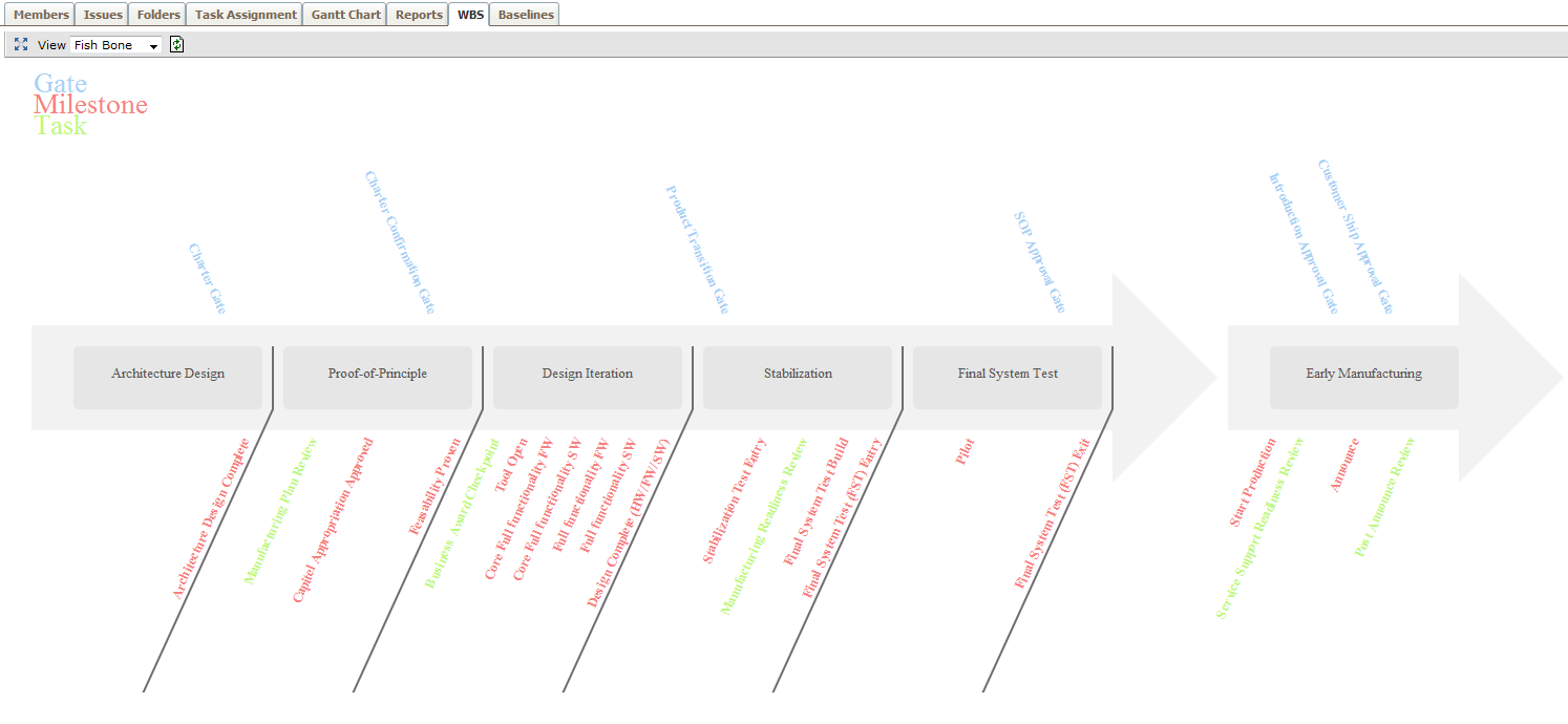
There is some basic support for displaying Structure Browser data using SVG. This means that you can define a view that renders an object structure with a completely different look and feel. E.g. render WBS as flow-chart. Below is an example of what can be done.
1.7.1. Defining Display Mode
You need to define the display mode on the view, and specify what SVG implementation that will be used.
Example view definition:
<DisplayMode>svg:com.mycompany.MySVGRenderer</DisplayMode>
This will use the com.mycompany.MySVGRenderer as the SVG provider for
the view.
The class specified typically implements the interface
com.technia.tvc.structurebrowser.render.display.svg.SVGRenderer.
However, it is possible to specify a class that is derived from the
com.technia.tvc.structurebrowser.render.display.svg.SVGTableRenderer
also.
If the latter is the case, then you need to implement the method that
will return the SVGRenderer to be used. Creating a SVG renderer requires
programming knowledge. More info about how to do it can be found in the
Developer Documentation .
1.8. Exporting Data
The data in a table can be exported into a couple of different formats such as CSV, Text and Excel™.
The export tool is found in the toolbar. From this place, the user can select the format and also define if the generated file should be ZIP’ped. In case of selecting the text format, some other alternatives will be available for defining record separator, field separator and if to remove carriage returns.
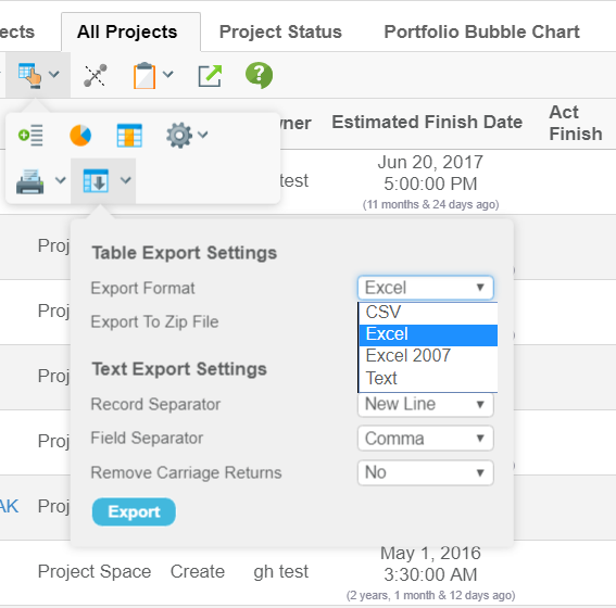
Figure 12. Export dialog
1.8.1. New Excel Format (Native Excel)
In releases before TVC 2010.3.0, the Excel format generated an HTML page containing special markup for Excel. This format is as of this release deprecated, and a new format that generates native Excel files has been added. There were many issues with the HTML format versus different Excel versions as well as Excel also generated warnings when opening up the HTML file.
| Columns that contain HTML content, ie column type programHTMLOutput, will be excluded if using the new format. |
To revert using the old HTML approach, one can define an init parameter in web.xml as below:
<init-param>
    <param-name>tvc.structurebrowser.export.nativeExcel</param-name>
    <param-value>FALSE</param-value>
</init-param>
The old format will not be maintained and might be removed in a future release, so using it should be done sparsely.
The new Excel format will include the group headers and table calculations (if present).
There are also some new methods that can be overridden in a
TableCellRenderer to customize the formatting and presentation of the
data in the Excel file.
Some additional settings have been added to control the data for the native Excel format:
| Setting Name | XML Element | Description |
|---|---|---|
No Wrap on Export |
|
True or False to wrap the text |
Header No Wrap on Export |
|
True or False to wrap the header. |
Excel Data Format |
|
Defines the format of the data in Excel. Example: |
If your table contains a column that has the column type set to
primaryimage, these images will also be exported (only PNG and JPEG
images can be exported).
|
1.8.2. Excel 2007 Format (xlsx)
From release TVC 2018.3.0 onwards, Excel 2007 format (xlsx) exporting is supported along with the existing Excel 97 format export.
To make Excel 2007 format as default Excel format, following setting can be used.
<init-param>
    <param-name>tvc.structurebrowser.export.excel2007.preferred</param-name>
    <param-value>TRUE</param-value>
</init-param>
1.8.3. Sanitize CSV Exports
From release TVC 2019.1.0 onwards, users can configure CSV exports for sanitization. By default TVC would check each cell of the csv to be exported for ("=", "+", "-", "@") and trim all their leading occurrences in the cell to avoid any security issues.
The character set can be configured as a comma separated list via an init param also.
<init-param>
    <param-name>tvc.structurebrowser.export.csv.IllegalCharacters</param-name>
    <param-value>"=", "+", "-", "@"</param-value>
</init-param>
1.8.4. Enable download on popup window:
User can configure to download the export file in popup window, or inline in the browser.
Adding the below init-param setting will enable the download in popup mode. By default, this setting is false.
<init-param>
	<param-name>tvc.structurebrowser.export.inPopupMode</param-name>
	<param-value>true</param-value>
</init-param>
when tvc.structurebrowser.export.setContentDisposition is set to true, tvc.structurebrowser.export.inPopupMode setting will be ignored and the download file will dispaly inline in the browser.
|
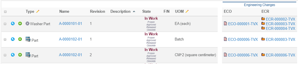
1.9. Group Header
A group header is specified through the column-setting, called "Group Header". If you are using tables defined in XML format, this would be defined like:
<Table>
    <Column>
        <GroupHeader>the value</GroupHeader>
        <GroupHeader locale="de">Value in German language</GroupHeader>
        ...
The value of the group header can either be a plain text value, or it could refer to a string resource from the corresponding string resource file when the "Registered Suite" setting is defined.
For XML tables, the localized values can be entered directly in the table definition, as the example above illustrates.
The screenshot below illustrates how a table with group headers are rendered. Group headers will only be rendered in the standard HTML view, not in PDF-, Excel-, CSV- or Text exports.
The usage of group headers also affects the behaviour of the column configuration tool.
1.9.1. Disabling the Group Headers
The group header functionality can be disabled globally, or per structure browser instance.
Disabling it globally is done by adding the following init parameter:
<init-param>
    <param-name>tvc.structurebrowser.groupHeaders.enabled</param-name>
    <param-value>FALSE</param-value>
</init-param>
Disabling the group headers per structure browser instance, is done by adding the following parameter to the page configuration object:
<Parameter name="groupHeadersEnabled" value="false" />