Structure Browser - Administration Guide : Built'in Features
30 March 2016
Table of Contents
- 1. Built’in Features
- 1.1. Data Grouping
- 1.2. Generate Charts
- 1.3. Clipboard
- 1.4. Using Collections
- 1.5. Email Notification
- 1.6. Mass Promote / Demote
- 1.7. Mass Update
- 1.8. Searching inside a Table/Structure
- 1.9. Storing User Selections
- 1.10. Table Calculations
- 1.11. Table Configuration (Column Configuration)
- 1.12. User Preferences
- 1.13. Arrow Key Navigation
- 1.14. User Help
- 1.15. Structure Compare
- 1.16. Wrap Content
- 1.17. Inline Compare
1. Built’in Features
This chapter describes the built’in features of the Structure Browser. Some of them may be configurable and some may not be enabled by default.
1.1. Data Grouping
The data grouping function can be used to group data, based upon column values, into different groups.
This function is available from any table page (flat list or structure), and operates on the data within a table/structure.
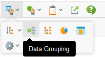
The data grouping function is launched via this button:
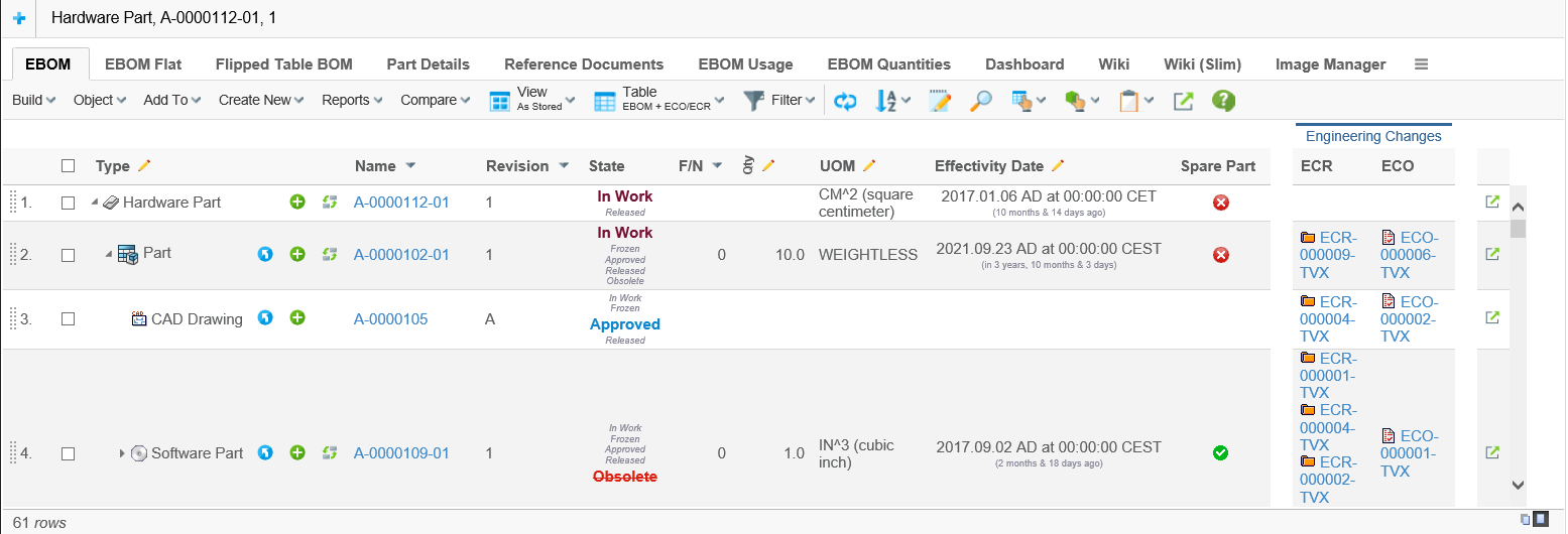
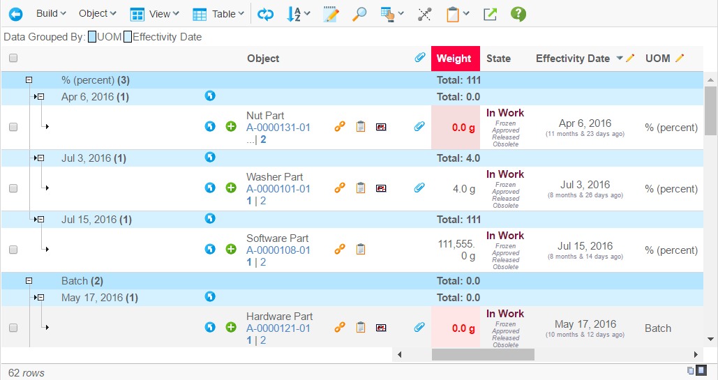
As an example, assume that you have a structure like in the screenshot below.
Launching the data grouping function and define two groups: type + current state, would give a result like the screenshot below.
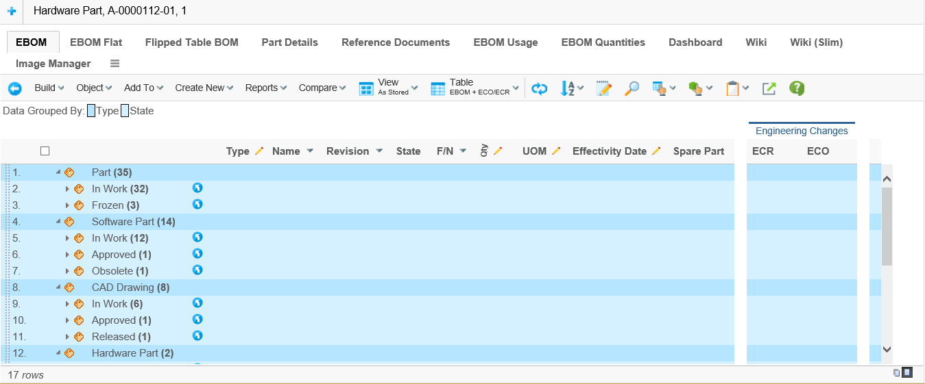
The different groups have different colours, and above the table there is a legend where the colour is mapped to the group. The first column after the structure shows the value (label) and the number of rows that mapped the group.
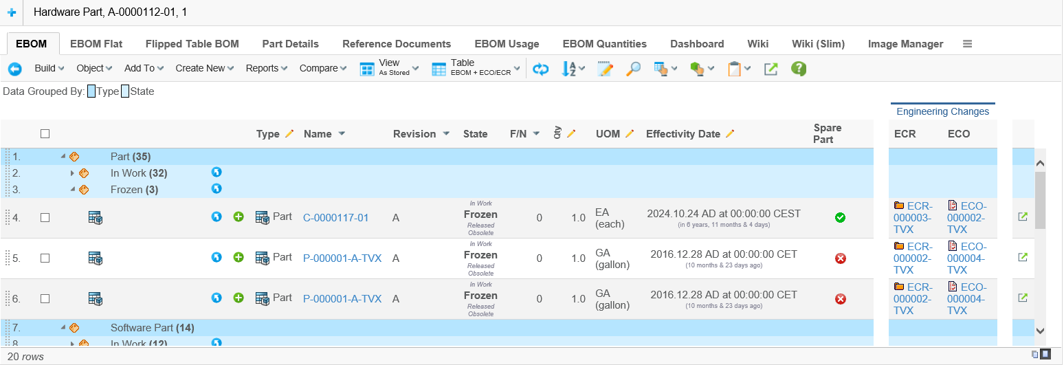
A group can be expanded in order to see the content of a particular group.
| A column can be configured to not being groupable by applying the setting "Groupable" to false. The default value for this setting is same as the "Allowed in Charts". |
1.1.1. Remember data grouping
Column based data grouping is by default remembered over time and can be
turned off by setting the init parameter tvc.structurebrowser.persistentDataGrouping
to "false".
Complex data grouping using operators is not remembered over time.
1.1.2. Initially Grouping of the Data
The data can be grouped when it’s being loaded initially. This is done by using the post-processing feature.
Grouping instructions are defined within the parameters section of the page configuration object being used. Example below.
postProcess=group
groupBy=%state#ED{year-quarter}#UOM
The first row specifies that the group-post-processor should be used.
The second row defines the grouping criteria. The syntax of the "groupBy" property is
groupBy            := group [ "#"<group> ] [ "#"<group> ]
group              := <built-in-field> | <column-ref>[ "{" <group-spec> "}"]
built-in-field     := "%"<built-in-field-ref>
built-in-field-ref := "type" | "name" | "revision" | "state" | "policy" | "reltype"
column-ref         := name of the column within the table
group-spec         := depends upon data-type for column
Up-to three different groups can be specified, each group is separated with a "#" character.
When the data is grouped initially, the grouping can be done on some properties that don’t need to be specified as columns within the table (built-in-field). These properties are, and are referred to as:
-
object type %type
-
object name %name
-
object revision %revision
-
object state %state OR %current
-
object policy %policy
-
relationship type %reltype OR %relationshiptype OR %rel
If you group date attributes, you can supply additional instructions how the group should be created. For example:
-
ED{year-month} → Group effectivity date column by year and month
-
ED{year-quarter} → Group effectivity date column by year and quarter
-
ED{year-week} → Group effectivity date column by year and week
-
ED{week-day} → Group effectivity date column by week and day
The examples shown above are just a subset of the possible combinations.
For numeric fields, the instructions can be created like the following example:
-
FN{0⇐⇐10,⇐10} → two groups
-
FN(==0,0<<10,==10,⇐11} → four groups
-
FN{<0,==0,⇐0} → three groups
By default, the grouped data structure will replace the original table. I.e. the user can not use the go-back to see the data as it was loaded. However, by adding a property to the "TVC Custom Parameters" attribute this can be enabled:
group.keepOld=true
1.1.3. Data Group Sorting
Precedence of sort order
-
Custom group node comparator
-
Sort by Size or Name
-
CellComparator if cell value
-
Alphabetically fallback if no cell value
Custom group node comparator
This comparator is defined in pageconfig. This comparator must extends GroupNodeComparator.
<PageConfig>
    <Views>
        <View default="true" name="tvc:view:tvx:enc/AsStored.xml" />
    </Views>
    <Parameters>
        <Parameter name="dataGroupComparator" value="com.technia.tvx.common.comparator.UomComparator"/>
    </Parameters>
    <ToolBar>tvc:menu:tvx:misc/MyParts.xml</ToolBar>
</PageConfig>
Comparator example:
public class UomComparator extends GroupNodeComparator {

    public UomComparator(Comparator<? super StructureBeanNode> comparator) {
        super(comparator);
    }

    @Override
    public int compare(StructureBeanNode o1, StructureBeanNode o2) {
        int level = o1.getLevel();
        GroupNode g1;
        GroupNode g2;
        int i = 0;
        if (o1 instanceof GroupNode && o2 instanceof GroupNode) {
            g1 = (GroupNode) o1;
            g2 = (GroupNode) o2;
            if (level == 0) {
                i = g1.getGroupID().getLabel().length() > g2.getGroupID().getLabel().length() ? 1 : -1;
            } else {
                i = g1.getGroupSize() > g2.getGroupSize() ? -1 : 1;
            }
        }
        return i;
    }
}
Sort by Size or Name
The example
<PageConfig>
    <Views>
        <View default="true" name="tvc:view:tvx:enc/AsStored.xml" />
    </Views>
    <Parameters>
        <Parameter name="group.sortByName" value="false" />
    </Parameters>
    <ToolBar>tvc:menu:tvx:misc/MyParts.xml</ToolBar>
</PageConfig>
If group.sortByName parameter is not defined, the sorting will be by
size.
To use the cell comparator, you need to set the value of group.sortByName to true.
1.2. Generate Charts
The definition of a chart allows you to choose which content in the table displayed by the Structure Browser that will become input to the generated chart. You can also define rules to replace or group values in the table for more informative and intuitive charts. Grouping is described at the end of this section.
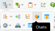
Figure 1. click on the Chart button to start
The following sections shows examples on how to create nine different types of charts, namely:
-
Pie charts
-
Multiple pie charts
-
Ring charts
-
Bar charts
-
Stacked bar charts
-
Area charts
-
Stacked area charts
-
Timeline charts
-
Bubble charts
The first eight types of charts work similarly. They visualize the number of occurrences of values in the first column for the selected objects in the underlying Structure Browser table. When available, if a second column is chosen the data is grouped in categories from that column. The Bubble chart works differently, see chapter below.
1.2.1. Pie Chart
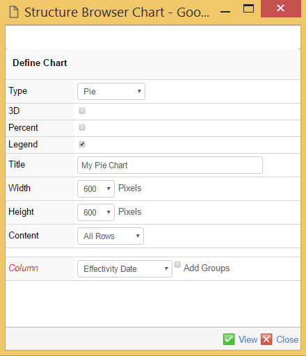
Figure 2. defining a Pie Chart
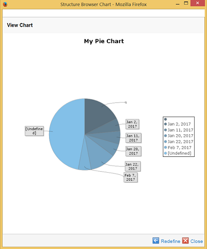
Figure 3. generated Pie Chart
The resulting Pie chart shows the distribution of values from the chosen attribute, for the selected objects.
1.2.2. Ring Chart
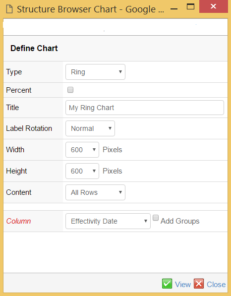
Figure 4. defining a Ring Chart
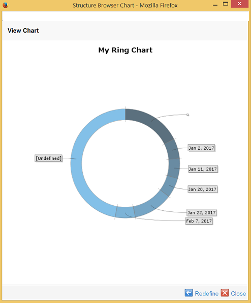
Figure 5. generated Ring Chart
The resulting Ring chart shows the distribution of values from the chosen attribute, for the selected objects.
1.2.3. Multiple Pie Chart
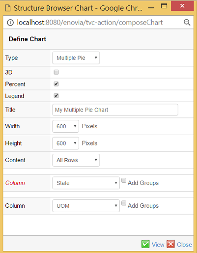
Figure 6. defining a Multiple Pie Chart
When defining a Multiple Pie Chart the data is collected from two columns in the underlying Structure Browser table.
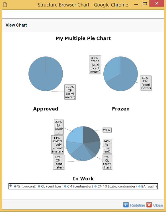
Figure 7. generated Multiple Pie Chart
The resulting chart shows the distribution of values from the two chosen columns, for the selected objects. The first column generates one pie chart per unique value. The second is shown in each pie chart in the same way as in the Pie Chart case.
1.2.4. Bar Chart
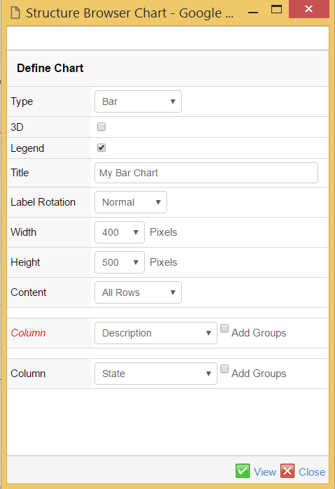
Figure 8. defining a Bar Chart
When defining a Bar Chart the data is collected from one or two columns in the underlying Structure Browser table.
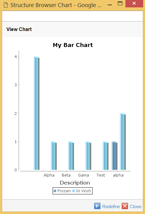
Figure 9. generated Bar Chart
The resulting chart shows the distribution of values from the two chosen columns, for the selected objects. The first column generates one individual "bar chart group" per unique value. The values of the second column are represented as one bar per value.
1.2.5. Stacked Bar Chart
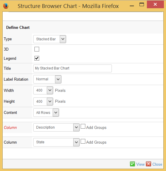
Figure 10. defining a Stacked Bar Chart
When defining a Stacked Bar Chart the data is collected from two columns in the underlying Structure Browser table.
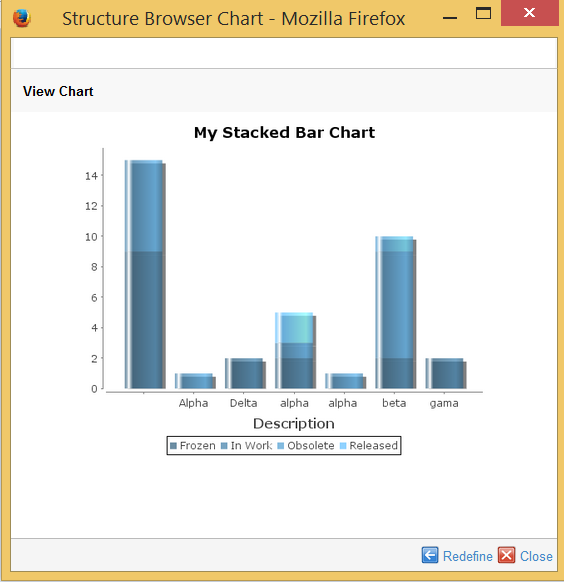
Figure 11. generated Stacked Bar Chart
The resulting chart shows the distribution of values from the two chosen columns, for the selected objects. The first column generates one bar per unique value. Each bar is divided into one section per unique value of the second column.
1.2.6. Area Chart
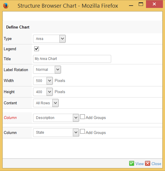
Figure 12. Defining an Area Chart
When defining an Area Chart the data is collected from one or two columns in the underlying Structure Browser table.
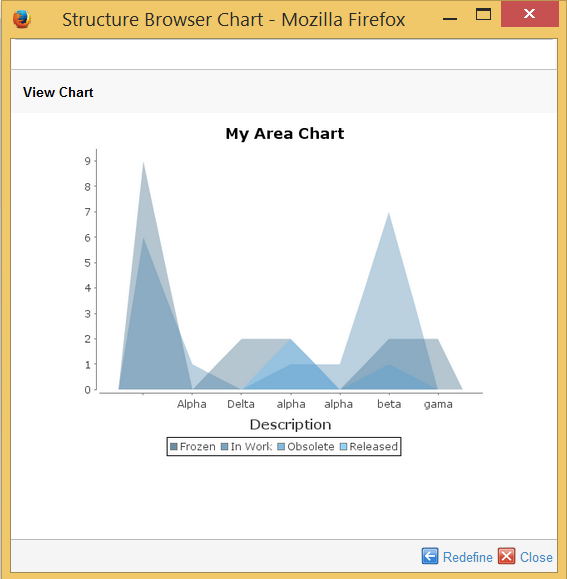
Figure 13. Generated Area Chart
The resulting chart shows the distribution of values from the two chosen columns, for the selected objects. The first column generates one position per unique value on the horizontal (x) axis. The values from second column are used to create an area where the values are used as end points that sets the bounds of the area, on the vertical (y) axis.
1.2.7. Stacked Area Chart
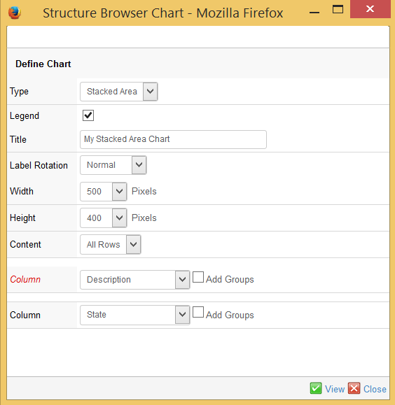
Figure 14. Defining a Stacked Area Chart
When defining a Stacked Area Chart the data is collected from two columns in the underlying Structure Browser table.
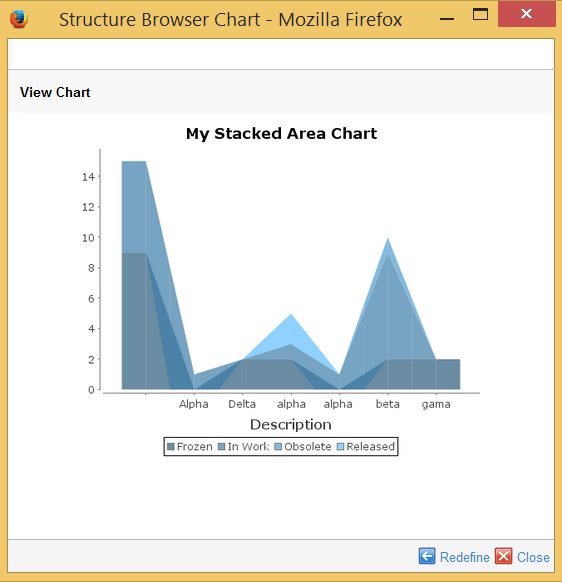
Figure 15. Generated Stacked Area Chart
The resulting chart shows the distribution of values from the two chosen columns, for the selected objects. The first column generates one position per unique value on the horizontal (x) axis. The values from second column are used to create an area where the values are used as end points that sets the bounds of the area, on the vertical (y) axis. The difference compared to the Area Chart is that the values on the vertical axis are accumulated.
1.2.8. Timeline Chart
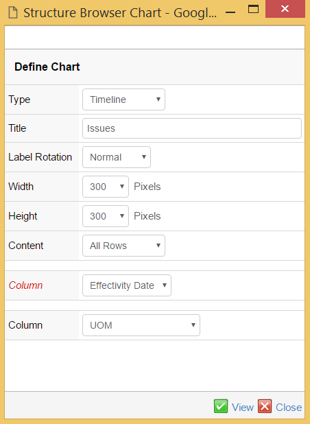
Figure 16. Defining a Timeline Chart
With the Timeline chart you need to specify one or two columns as input. Column one only accepts date columns as input and is plotted on the horizontal (x) axis. The second column defines the different series of data and for each unique value a timeline is created. The different series are displayed in different colors. This example counts the number of issues per project that the issues are reported against.
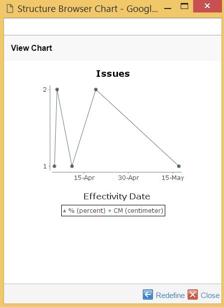
Figure 17. Generated Timeline Chart
The generated Timeline chart example displays the number of Issues created per day. In the example the number of issues for project "Power Supply" is plotted per start date. The example shows that one issue was created on the 1st of July, two on the 8th and so forth.
1.2.9. Bubble chart
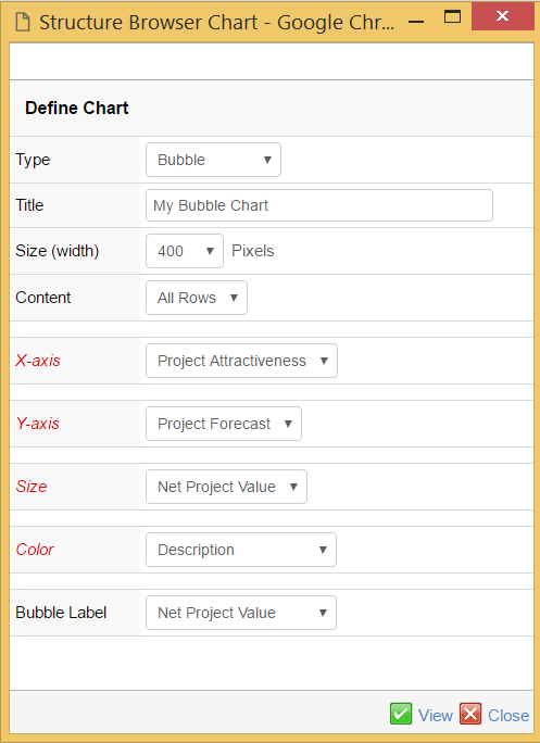
Figure 18. Defining a Bubble Chart
With the Bubble chart you need to specify four or five columns as input. Column one is used to determine where a bubble is placed on the horizontal (x) axis. Data from the second column defines where on the vertical (y) axis the bubble is placed. The third sets the size of the bubble and the fourth is used to group the bubbles. The fifth and optional input column is used to put a label on each bubble. The first three columns require numerical data; therefore only columns with numerical data are shown.
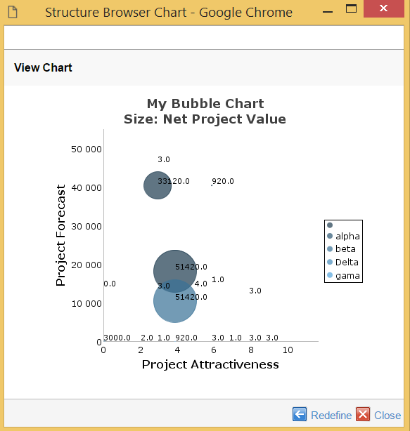
Figure 19. Generated Bubble Chart
The generated Bubble chart displays one bubble per row in the underlying Structure Browser table.
1.2.10. Grouping
When defining a chart you have the possibility to group values, with the exception of Bubble charts where the grouping option is not available. You use the grouping option when you want to group values from the same column together and use a descriptive text for the group instead of the actual attribute value of the column.
The following example shows first a chart without grouping selected and then with grouping.
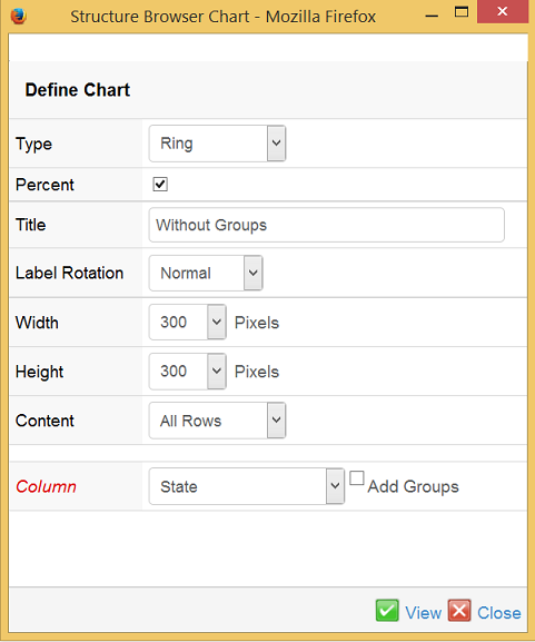
Figure 20. Defining a chart without grouping
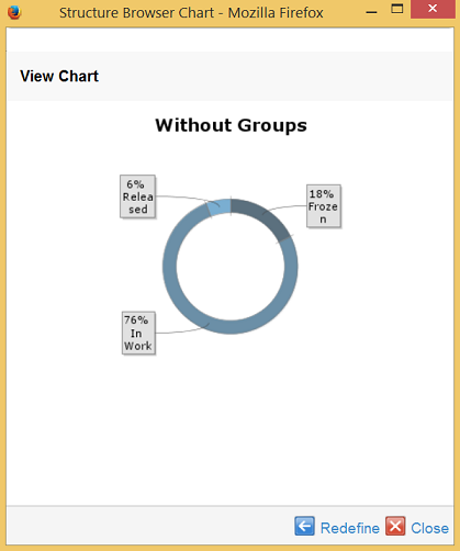
Figure 21. Generated chart without grouping
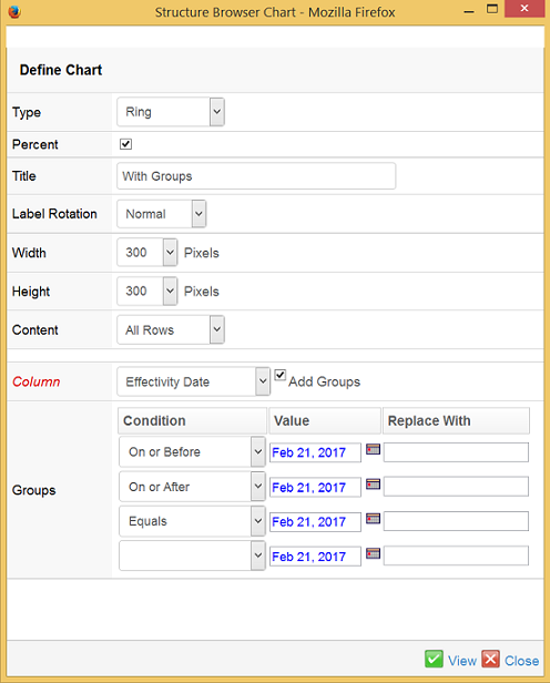
Figure 22. Defining the same chart with grouping
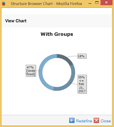
Figure 23. Generated chart with grouping
1.3. Clipboard
A new built-in feature called Clipboard was added in version 6.0 of the Structure Browser. The clipboard can be used to hold objects, selected by the user. The clipboard is opened inside the side panel and the content of the clipboard is remained between sessions. The clipboard can also be used in the search tool, if configured so. The screenshot below illustrates the clipboard functionality.
Figure 24. Clipboard
On each entry in the clipboard, the user can choose to either remove the entry or navigate the entry – i.e. performing a go-there operation on the object representing the entry.
To enable or disable the clipboard on a structure browser page, one has
to set the <Visible clipboard="true" /> in the page configuration
object that is controlling the structure browser instance.
To completely disable the clipboard functionality for all structure
browser pages, one can set the system property of TVC called
tvc.structurebrowser.clipboard.enabled to FALSE.
To enable the clipboard from the search function, there is a configurable option within the search configuration or build structure configuration object that controls that.
1.3.1. Navigate Object in Clipboard
It is possible to configure the clipboard to allow the user to navigate an object within the clipboard; e.g. making the selected object from the clipboard the root object in the current structure. This was is by default disabled since it is might allow the user to navigate an object within the wrong context (e.g. using wrong filters → user could see connections that aren’t supposed to be shown).
This feature can be enabled (it will be disabled default) through setting an init parameter:
<init-param>
    <param-name>tvc.structurebrowser.clipboard.goThere</param-name>
    <param-value>true | false</param-value>
</init-param>
1.3.2. Clipboard Store
The content of the clipboard is by default stored into a set in the database. Previous versions had other alternatives for this; however these have been removed as of the 2009.1 release.
This set is saved with the name mxClipboardCollections, if the ENOVIA
version is V6R2009 of later. For earlier versions, this name is
.clipboard.
It is however, possible to change this name through the following init-parameter (the name must not be longer than 127 characters, and might only contain characters that are valid for ENOVIA sets):
<init-param>
    <param-name>tvc.structurebrowser.clipboard.name</param-name>
    <param-value>My Clipboard</param-value>
</init-param>
1.4. Using Collections
TVC contains functionality allowing the user to work with collections. A collection is used to store arbitrary business objects.
The structure browser can be configured to allow the user to do so or not do so, by setting the page config settings "Add To Collection" and/or "Manage Collections" to true or false. Example:
<PageConfig>
    <Visible clipboard="true" />
    ...
    <AddToCollection>TRUE</AddToCollection>
    <ManageCollections>TRUE</ManageCollections>
    ...
</PageConfig>
The buttons for either adding objects to a collection, or manage collections, are available via the context button in the toolbar as shown in the screenshot below.
Figure 25. Add to collection and manage collections buttons
1.4.1. Adding Object(s) to a Collection
The "add to collection" function allows the user to add all the objects within the table or the selected objects (if selections has been made), or all objects except the selected objects (if selections has been made) to a new collection or to an existing collection if there are any existing collections.
It is possible to add "add to collection" function in the context menu by adding command AddToCollectionFromMenu.
Below is an example on how to configure this:
<Menu>
    <Command ref="tvc:command:sb:collection/AddToCollectionFromMenu.xml"/>
</Menu>
AddToCollectionFromMenu command in context menu required the page config parameter rememberSelectedRow or init-parameter tvc.structurebrowser.rememberSelectedRow (default false) should be true.
|
If adding to an existing collection, the user may also select if to either append the new objects, or to replace the old objects within the selected collection.
The screenshot below illustrates how this dialog may appear for the user.
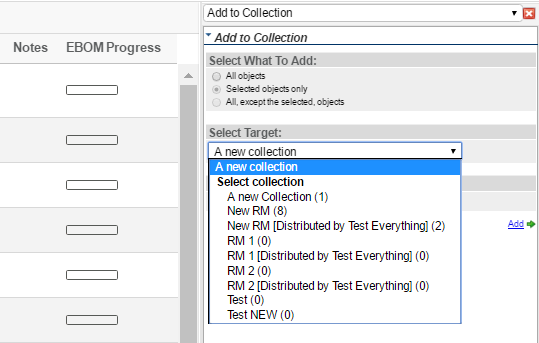
Figure 26. Adding objects to a collection
1.4.2. Manage Collection(s)
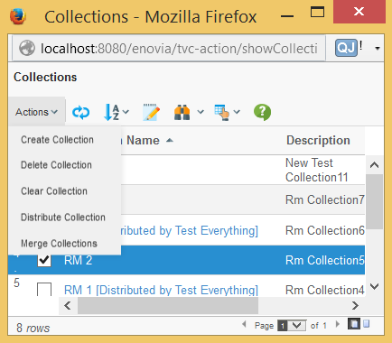
The manage collection(s) function, allows the user to perform different operations on his/her collections.
The operations that can be made are:
-
Create a new empty collection
-
Delete an existing collection
-
Edit a collection
-
Distribute a collection to another user within the same company as the user
-
Change name or edit the description of a collection
-
Merge one or more collections into another collection
The screenshot below illustrates these operations.
When clicking on the collection name, the content of the collection is opened inside a flat table.
The user can from there easily add/remove items from the collection, or click an object inside the collection in order to start working with that object.
This function can also be used, for example as the home page for a user. Simply assign the command "TVC Show Collections" to the menu called "My Desk".
While distributing collections, user can notify other users with whom he/she is distributing a collection by using the following configuration. The default setting is true.
This can be disabled at the global level by using the following setting:
in tvc.properties setting:
tvc.structurebrowser.collections.distribute.notify = false
Or as init-parameter:
<init-param>
    <param-name>tvc.structurebrowser.collections.distribute.notify</param-name>
    <param-value>false</param-value>
</init-param>
Title and content of mail can be controlled through string resource property file, below is the key of title and content:
tvc.structurebrowser.collections.notify.content = User {0} has shared a collection {1} with you.
tvc.structurebrowser.collections.notify.title = Shared Collection {0}
1.5. Email Notification
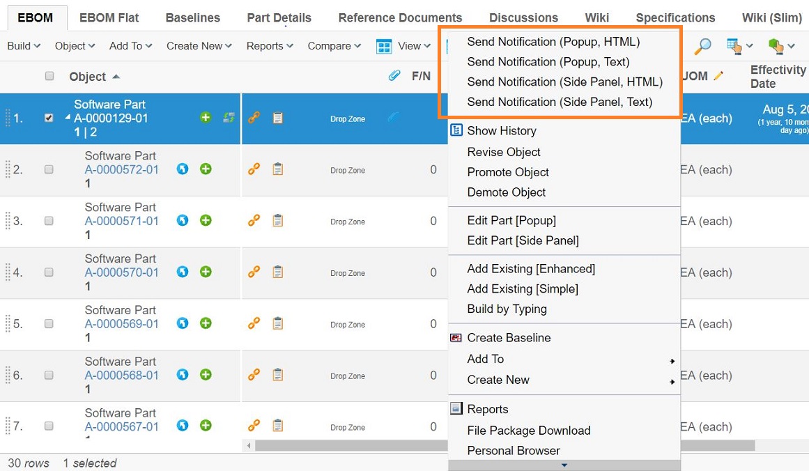
The structure browser has a built-in feature that allows the user to select one or more objects and add these to an email that can be sent to one or more users. The email notification feature requires you to configure the system so that the MX_SMTP_HOST variable is set.
The email notification dialog can be opened in a popup window or in the side panel, with or without the possibility to use the editor that allows the user to format the emails using HTML markup.
The screenshot below illustrates how a command that launches the email notification dialog can be a attached to the context menu.
The send notification dialog in the side panel with the HTML editor is shown below.
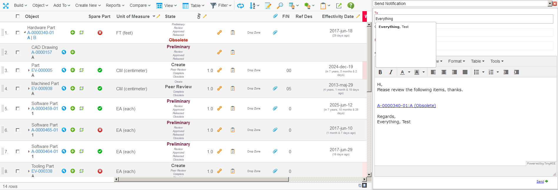
The notification dialog has the following features:
-
Auto completion when selecting the user(s) to send the notification too.
-
The message can be configured through the URL request parameters, such as subject and message and allows having macros.
-
Using HTML formatted messages or plain text messages.
-
Show in side panel or in a popup window.
-
Sending multiple objects in the same mail.
The URL used to open the email notification dialog is shown below
${ROOT_DIR}/tvc-action/sendNotification
This URL accepts a number of request parameters that can be used to control the behaviour of the dialog:
| Parameter | Description | Example | ||
|---|---|---|---|---|
popup |
A Boolean value that defines if the dialog is opened in the side panel or within a popup dialog. (see below for additional info regarding this parameter). |
True / False |
||
html |
Defines if to use HTML formatted messages. |
True / False |
||
subject |
Defines a pre-defined subject for the message. |
Please check the following ${COUNT} item(s) |
||
msgHeader |
A text that appears at the top of the message
|
|||
msgFooter |
A text that appears at the bottom of the message
|
|||
macro |
The macro to be used when formatting the label for each object.
|
${NAME}:${REVISION} (${STATE}) |
| The command must be configured correctly, e.g. if the popup parameter is set to true, the target location of the command must be popup. If set to false, the target location must be "card" and some other settings such as "Card Width" must be set. |
An example command, defined in XML, is shown below.
<Command>
    <Label>Send Notification (Side Panel, HTML)</Label>
    <URL action="/sendNotification">
        <Param name="subject" value="Please check the following ${COUNT} item(s)"/>
        <Param name="msgHeader" value="Hi,"/>
        <Param name="msgHeader" value="Please review the following items, thanks"/>
        <Param name="msgFooter" value="Regards,"/>
        <Param name="msgFooter" value="${FROM_USER}"/>
        <Param name="macro" value="${NAME}:${REVISION} (${STATE})"/>
    </URL>
    <SubmitForm>true</SubmitForm>
    <RowSelectType>multiple</RowSelectType>
    <TargetLocation>card</TargetLocation>
    <CardID>notification</CardID>
    <CardWidth>636</CardWidth>
</Command>
1.6. Mass Promote / Demote
Promoting or demoting the selected objects can be done by enabling the promote/demote buttons through the page configuration object. Once enabled, two new buttons are added to the toolbar among the context buttons as shown below.
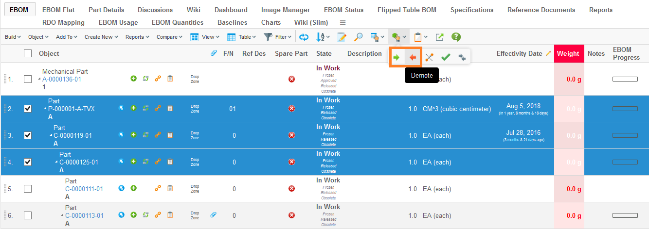
There is an init-param, named
tvc.structurebrowser.lifecycle.changestate.enableSmartSorting default
true, which will control the way of mass promoting. If it is true,
selected objects in a structure for promote start promoting selected
leaf nodes first, then their selected parents and so on all way up to
the root(s).
1.7. Mass Update
When the setting "Allow Multiple Edit" has been set to true on a system table column, the column is editable, and the user has access to edit at least one cell in the column, an icon will appear on the column header that the user can click in order to edit multiple cells in a single column to the same value.
Note however that only cells that the user has access to edit will be edited. Moreover, if the select expression on the column doesn’t apply to the business object or relationship on a specific row, the cell on that row will not be edited either. For example, if the select expression selects a certain attribute that some business objects displayed in the Structure Browser don’t have, these cells will not be edited. In short, only cells that would otherwise be editable when the Structure Browser is displayed in edit mode will be editable through the multiple cell editing function.
Figure 27. Mass updating
If one or more rows have been selected, and the user is allowed to edit the cell in at least one of these rows, the user can choose whether to edit the selected rows or all rows. If no valid selections has been made all rows will be edited automatically. Note that a confirm dialog will appear whenever the user choose to edit all rows to avoid unintended modifications.
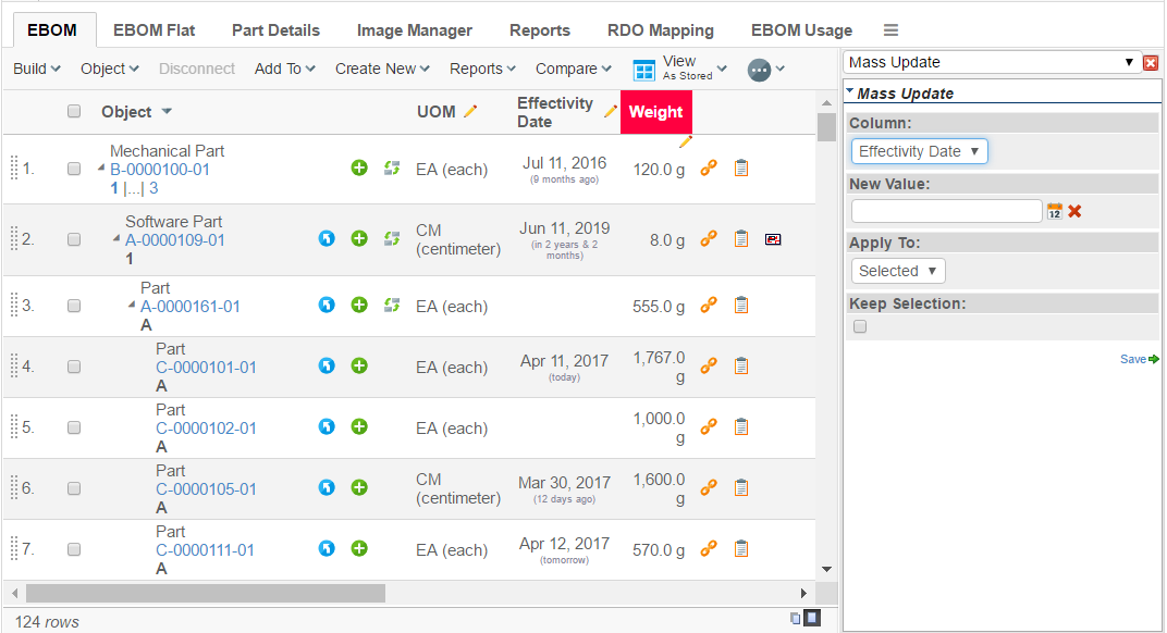
Figure 28. Mass update dialog
The mass update dialog is shown within the side-panel. If there is more than one column allowed for mass updating, the user can easily change the working column from the drop down list showing the column.
User can check "Keep Selection" to retain selection for further mass updating other columns.
By default "Keep Selection" is unchecked.
The administration can override the default behaviour using following tvc property setting for application level.
tvc.structurebrowser.massupdate.keepSelection=true
On per structure browser instance level also behaviour can be overridden. (Configuration is done within the page-configuration).
To do so, add parameters to the page configuration object:
<PageConfig>
    ...
    <Parameters>
        <Parameter name="massupdate:keepSelection" value="true"/>
    </Parameters>
    ...
</PageConfig>| If a chart is dependent on the mass update column, the user can subscribe to it.To refresh the chart with new data, the user must publish the subscribe id in the column of mass update. |
1.7.1. Partial Mass Update
While doing mass update if validation fails for some objects and pass for other objects, it is possible to update objects for which validation is passed successfully.
This can enabled at global level using following setting
in tvc.properties setting
tvc.core.massupdate.partial=true
Or as init-parameter:
<init-param>
    <param-name>tvc.core.massupdate.partial</param-name>
    <param-value>true</param-value>
</init-param>
By default it is disabled.
It can be enabled as column level by adding following setting :-
<Column>
    ...
        <Setting name="Partial Update">true</Setting>
    ...
</Column>
and return false from update function for unmatched condition.
| Setting defined as column level takes precedence over global setting. |
1.8. Searching inside a Table/Structure
The search button in the toolbar allows users to find or filter data inside a table or structure based on their input. To enable this function at least one of the page configuration attributes "TVC Visible Structure Search" and "TVC Visible Advanded Filter" has to be true. By pressing the arrow on the left side of the search button you can quickly search for rows in a table or structure that contains a certain text.
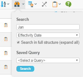
Figure 29. Quick search
The list of searchable columns shown in search dropdown can be sorted alphabetically. It can be enabled for a specific page through the pageconfig using parameter as below
<PageConfig>
    ...
    <Parameters>
    <Parameter name="sortSearchableColumns" value="true"/>
    </Parameters>
    ...
</PageConfig>
Or globally by applying the following init parameter.
<init-param>
    <param-name>tvc.structurebrowser.table.search.sortSearchableColumns</param-name>
    <param-value>true</param-value>
</init-param>
Default value for this setting is false.
In the result of Quick Search, Structure Browser will display an area above the table showing what parameters you’ve searched on. Also, the column headers and search hits will be highlighted with different background colors.
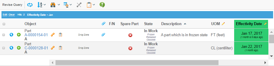
Figure 30. Search result
If you click on the "Edit" link in the search area above the table, or if you click on the search button on the toolbar, you can create complex queries in the search side panel. You are can also to save and load your queries.
If the table you’re searching in is a structure, the search side panel will contain a few more options. You can select if you want to search in the full structure, if the result should be displayed in a flat list, and if the query must match on every level in the structure (i.e., as a filter).
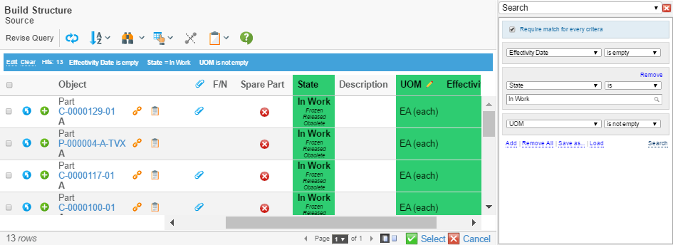
Figure 31. Searching inside a structure
By default "Any Field" is added in search-In forms. It can be controlled for a specific page through the pageconfig using parameter as below
<PageConfig>
    ...
    <Parameters>
    <Parameter name="searchIn:anyField" value="false"/>
    </Parameters>
    ...
</PageConfig>
Or globally by applying the following init parameter.
<init-param>
    <param-name>tvc.structurebrowser.searchIn.anyField</param-name>
    <param-value>false</param-value>
</init-param>
By default searches are remembered the next time the user visits the page. This can be inactivated either for a specific page through the pageconfig using parameter searchInStructurePersistent or globally by applying the following init parameter:
<init-param>
    <param-name>tvc.structurebrowser.find.persistent</param-name>
    <param-value>false</param-value>
</init-param>
This setting also applies for the finder.
We’ve introduce a new Property that is used to set the default value of the operator.
The below configuration needs to be used
| Property | Value |
|---|---|
tvc.structurebrowser.tableFinder.defaultSequence |
CONTAINS or EQUAL or NOT_EMPTY |
1.8.1. Finder
The finder is used to find objects in a table. A search form is displayed above the table where the user can enter search criteria.
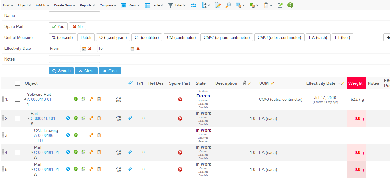
Figure 32. finder search form
The finder is activated in the pageconfig. When activated a magnifier icon is displayed in the toolbar. Clicking the button opens/closes the search form. It is possible to configure that the search form should be displayed when the page is loaded.
Sometimes the user wants to search for a value across all columns. This can be achieved with the "Any field" functionality. The user enters a criteria and the every column is evaluated if it has a matching value. All data in the table needs to be loaded so use this feature with care.
Example of a pageconfig:
<PageConfig>
    ...
    <Parameters>
        <Parameter name="finder" value="true"/>
        <Parameter name="finder:openOnLoad" value="true"/>
        <Parameter name="finder:anyField" value="true"/>
    </Parameters>
    ...
</PageConfig>
In the column configuration you define if the column should be searchable. It is also possible to specify the name, tooltip, order and type of the search field. The name and tooltip is displayed in the left hand side of the search form. In what order the columns are displayed in the search form is determined by the order setting. It is a numeric value where the column with lowest number is displayed at the top.
Each column has a search type. It effects how the user enters the search criteria. Currently four types are supported:
-
Freetext. In an input field the user can enter a text. Any value containing this text is considered to be a match.
-
Boolean. Yes and no buttons are displayed.
-
Range. For each range value a button is displayed. The user can select one or more of the values. The available values are fetched from the column. This means you can implement your own Range Handler to control what buttons that should be available.
-
Date. User can enter from and/or to dates.
In case the type setting is omitted the most suitable type for the column is used.
Example configuration of table column:
<Column>
    <Name>Name</Name>
    <Expression>name</Expression>
    <Label>Object Name</Label>
    <Setting name="Finder" value="true"/>
    <Setting name="Finder Label" value="My label"/>
    <Setting name="Finder Type" value="freetext"/>
    <Setting name="Finder Order" value="1"/>
</Column>
In the background the Search in Structure functionality (described in previous chapter) is used by the finder. There are some differences in the implementations which prevents them from being used at the same time. If the finder is enabled the search in structure is disabled.
To activate the finder across the
The finder feature is disabled by default and can either by activated per pageconfig or globally. It is enabled globally by applying the following init parameter:
<init-param>
    <param-name>tvc.structurebrowser.finder</param-name>
    <param-value>true</param-value>
</init-param>
1.9. Storing User Selections
The selections made regarding view, table, filters and last sorted columns are by default stored between the usages of a structure instance. The selections are coupled together with the actual page configuration instance that was used to initialize the structure instance.
If no such object is used, but the structure browser instance is configured via URL parameters – then the user selections can/will not be stored.
The selections are stored persistently between sessions, i.e. the user will get his/her last selections even after logging in again to the application.
There are some system parameters related to this, which can be used to configure the behaviour.
| Parameter | Description | ||
|---|---|---|---|
tvc.structurebrowser.rememberSelections |
A Boolean flag that indicates if to remember the selections or not. Default is TRUE. |
||
tvc.structurebrowser.persistentSelectionStorage |
This Boolean flag indicates whether or not the storage should be made persistently or not. Default is TRUE. |
||
tvc.structurebrowser.persistentSelectionStorageType |
Defines the strategy how to store the selections, the value could either be "file" , "db" or "dataobject". Dataobject storage is only available as of version 10.7 of ENOVIA. By default, the system will try to use dataobject as default storage mechanism, if that isn’t available, "db" will be the second approach. If none of these are valid, "file" will be used.
|
To control selection tracking for a specific page configuration use the parameter "selectionTracking" (true/false).
| The user preferences function can be used to clear the stored used selections. |
The selections can be cleared by invoking the following URL:
${ROOT_DIR}/tvc-action/clearSelections?clearAll=TRUE|FALSE
If the "clearAll" flag is set to FALSE, then the command must be submitted from the structure browser in order to clear the selections for the current table only.
1.10. Table Calculations
It is possible to perform calculations on the cells within a column. The calculations that can be performed are "Sum", "Max", "Min", "Average", "Median" and "Standard Deviation". A column can have multiple calculations at the same time. The results of the calculations are shown below the data within the table, as illustrated in the picture below.
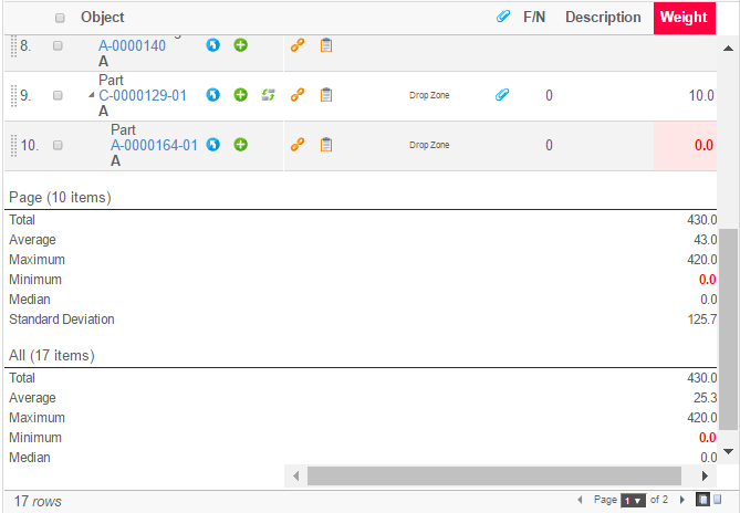
Figure 33. Table Calculation Example
If the table is paginated, the calculations are made both for the items on the current page as well as for all the items.
To enable table calculations, use the settings "Calculate Sum", "Calculate Average", "Calculate Median", "Calculate Standard Deviation", "Calculate Maximum" and "Calculate Minimum". The values for these settings are Booleans (true / false).
The decimal precision being used in the calculations are by default taken from the AEF system properties. It is possible to override this by adding the setting "Calculation Decimal Precision" to the column. The value of this setting is an integer value defining the number of fraction digits to display.
If you are using TVC in a non-AEF environment, you can use the following init-parameter to define the default decimal precision:
<init-param>
    <param-name>tvc.core.tableCalculations.decimalPrecision</param-name>
    <param-value>2</param-value>
</init-param>| the calculations are not shown in exports or on the PDF printer friendly page. |
A calculation filter can be applied to the page to only calculate based on root or leaf nodes. Set parameter is "tableCalculationFilter" and the possible values are "roots" and "leafs".
<Parameters>
    <Parameter name="tableCalculationFilter" value="roots"/>
</Parameters>
1.10.1. Group Calculations
It is possible to display group calculations in the same way it is working for table calculations.
Group Calculation Example
It is working in tile view also.
Here is the configuration required:
<GroupCalculation>Sum,Average,StdDev,Minimum,Maximum,Median</GroupCalculation>
Note that the order defined here will be preserved while displaying.
1.11. Table Configuration (Column Configuration)
The table configuration tool can be used to personalize a certain table.
The tool allows the user to change the visibility of the columns, as well as changing the order of the columns and the position of the separator between fixed / scrollable columns.
| A column can be defined as always being visible; e.g. the user is not allowed to hide such a column. That is accomplished by applying the Column Setting called "Always Visible". |
| A column can be defined to be locked; e.g. the user cannot re-arrange/change visibility of such column. That is accomplished by applying the Column Setting called "Locked". |
The icon to launch the table configuration tool is located inside the Table Actions menu as seen in the screenshot below. If the table-chooser is configured to not being displayed, the button is placed in a different position.
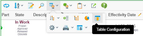
Figure 34. Open the Table Configuration tool
When the table configuration tool is launched, a dialog is opened inside the side panel where the available columns are shown. The user may select or de-select the columns to be displayed, or rearrange the columns via drag and drop.
The selections are stored persistently in the same way as the last used combination of view/table/filters.
As of 6.3.0, columns can divided into groups using a common group header. A column inside such a group cannot be moved outside the group. However, the columns inside a group can be rearranged among each other. The group itself can also be re-arranged, but the columns inside a group will always be kept together.
Moreover, the user can create different personalized versions of a table and associate such a table profile with a name. When the user has defined one or more custom profiles, those will be available in the table-chooser.
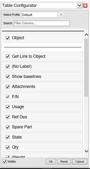
Figure 35. Column Configuration Dialog
If the user has created a custom profile, those profiles will be shown in the table chooser as illustrated in the screen shot below:
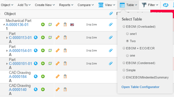
Figure 36. Table chooser with table profiles
1.11.1. End User Defined Columns
Users can add new columns to a table profile based on the attributes of objects present in the table. Once added, these columns are persisted against the table profile and are loaded when the profile is selected. These attributes also include unified typing and interface attributes of objects present in the table.
This feature can be enabled globally using tvc.structurebrowser.table.enableAddColumn.
Example using tvc.properties:
tvc.structurebrowser.table.enableAddColumn = true
Example using web.xml:
<init-param>
  <param-name>tvc.structurebrowser.table.enableAddColumn</param-name>
  <param-value>true</param-value>
</init-param>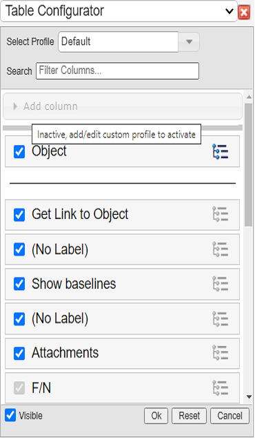
Figure 37. End User Defined Table Configurator (Default profile)
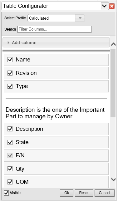
Figure 38. End User Defined Table Configurator
As of TVC 2021.5.0, group headers on the table configurator can be expanded / collapsed. All the columns under the group header can be selected / deselected with a single click. The columns can also be selected / deselected individually.
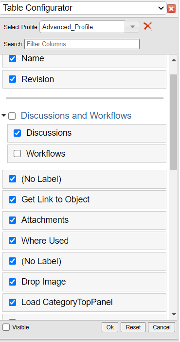
Figure 39. Table Configurator - Group Header
| Only XML based tables can be extended to add new columns. The user-defined columns cannot be added to the default profile. |
There are two ways of adding a user defined column to the existing table.
-
Users can select one or more columns from the Add Column section list. Once selected, column will be added and moved to below list of columns present in table profile.
-
User can click the Add Advanced Column link within the Add Column section to open the advanced column form. Once created, column will be added and moved to below list of columns present in table profile.
The table below explains the available field in advanced column form:
| Field | Description | Accepted Value |
|---|---|---|
Name |
The name of the column definition |
The value can be any plain text Example: Weight |
Description |
This field defines a tooltip text for the column header. |
The value can be any plain text Example: This column has the value of weight. |
Expression |
The expression field provides a list of attributes to select from, for the column data |
|
Editable |
Specifies whether the column should be editable or not. |
True/False Default is false. |
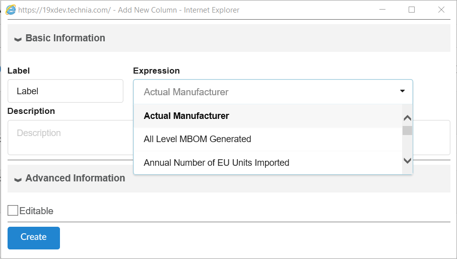
Figure 40. End User Defined Table Column Add Form
Editing/Hiding columns
-
User can hide the column by unselecting it from the table configurator
-
User can click on the pencil icon next to the column name in the table configurator to update the basic information, viz. Name, Description, Editable.
Figure 41. End User Defined Table Column
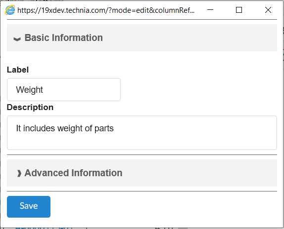
Figure 42. End User Defined Table Column Edit Form
1.12. User Preferences
The pagination and table layout preferences are found via the preferences button in the toolbar, as seen below. This button can be made hidden via the page configuration settings.
| As of 2011.1.0, the pagination settings are configured per instance of the structure browser and not a global setting as in earlier releases. See this chapter for details how to override the user settings. |
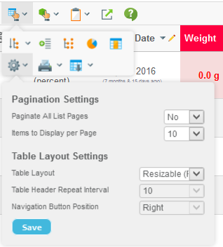
-
Pagination settings
-
Paginate all pages or not (note: if the number of rows in the table exceeds the internal threshold, then pagination cannot be turned off.).
-
Items to display per page
-
-
Table layout settings
-
Standard / Optimized mode
-
Table header repeat interval (for optimized mode)
-
Look and feel of structure column
-
Position of expand/collapse buttons (left or right)
-
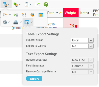
Preferences regarding table data export are found via the export button in the toolbar as shown below. The visibility of this button is specified via the page configuration settings.
1.12.1. Rules for determine the L&F of the Structure Browser
There are a couple of different ways how to configure the look and feel of the structure browser, for example via the user-preferences, the page-config object and via system default settings. The rules to determine the settings are defined below:
-
If any of the parameters in the table below are defined within the page-config object, then the user preferences are NOT loaded unless there is another parameter that really defines that the user preference can replace the default setting.
Parameter Parameter to force allow tableLayout
allowTableLayoutChange=true
structureGUI
allowGUIChange=true
navigationButtonPosition
allowNavigationButtonPositionChange=true
headerRepeatInterval
allowHeaderRepeatChange=true
-
If nothing is defined within the page configuration object, the user preferences are used.
-
If nothing is defined within the page configuration object, and the user has NOT set any preferred values, then the system defaults are used.
The system default values are controlled via these system-parameters (set in WEB.XML).
Parameter System Setting Name Default Value tableLayout
tvc.structurebrowser.tabelLayoutType
Standard
structureGUI
tvc.structurebrowser.structureGUI
Default
navigationButtonPosition
tvc.structurebrowser.structureGUI.navigationButtonPosition
Right
headerRepeatInterval
tvc.structurebrowser.structureGUI.headerRepeatInterval
12
1.12.2. Table Layout
The table layout that has been used in TVC since 3.0 has the freeze-pane functionality, e.g. the headers are fixed while scrolling vertically, and the left columns are fixed while scrolling horizontally.
This layout has the drawback that it needs some Java Script code to synchronize the tables, regarding column widths and row heights, after the data has been loaded to the browser.
Due to this, another table layout that lacks the freeze-pane functionality was added in TVC 5.2.0.
This table layout is now called "simple" or "optimized" layout, while the original layout is called "standard" layout. The selection of a layout is configurable, either by the user himself by using the preferences function, or configured by the configuration that controls a particular TVC browser instance (page-configuration object).
There is another setting for the simple/optimized table layout that controls the repeat interval of the headers.
1.12.3. Structure Column - Look & Feel
The column that displays the structure information can appear in a couple of different ways, which way is controlled via the user preferences dialog and/or configured by the administrator.
These different "modes" are usually something the end-user configures by himself, however, there are some ways to override these settings.
-
In the page configuration, add a parameter called "structureGUI".
Example:
<Parameter name="structureGUI" value="caret"/> -
Specify a system default type via an init parameter called
tvc.structurebrowser.structureGUI-
The default structureGUI is the "default" across the application.
-
-
The possible values are "default", "wide", "wider", "widest", "high-contrast" and "caret".
Also, for some of the modes the expand/collapse button can be placed differently. The following settings controls this:
-
In the page configuration, add a parameter called "navigationButtonPosition". Example:
<Parameter name="navigationButtonPosition" value="left"/> -
Specify a system default type via an init parameter called
tvc.structurebrowser.structureGUI.navigationButtonPosition. (default is right).
Arrows of Different Styles
There are a couple of different modes, which all are using arrows to display the structure information. The table below illustrates the different configuration combinations.
| Structure GUI Type (structureGUI) | Navigation Button Position (navigationButtonPosition) | |
|---|---|---|
Left |
Right |
|
default |
|
|
high-contrast |
|
|
wide |
|
|
wider |
|
|


Caret Navigation
In many modern applications structural information is presented in a really clean and simple way using only small triangles instead of lines and arrows. A presentation mode similar to Windows 8 Explorer has been added as of 2014.4.0 called "caret" navigation.
Below is an example screenshot illustrating this mode.
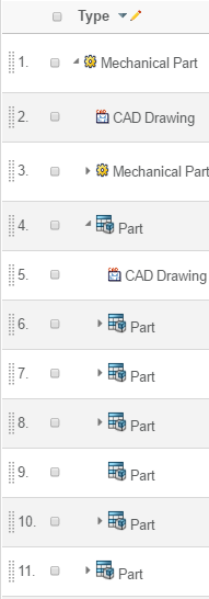
Figure 43. Caret Navigation
Type Image Size
If the type images are shown in the structure column, e.g. the navigation button position is left; the type images cannot be higher than 24 pixels.
If any images are higher than 24 pixels, a system setting must be set in
order to use a slightly different approach when rendering the structure.
This system setting is called tvc.structurebrowser.structureGUI.allowLargeTypeImages,
which value should be true. When this setting is true, the layout will be
slightly different than the picture above is showing.
If any type image is wider than 20px - which is the default max width,
then one must configure this system setting to declare the widest width
of such an image. This system setting is called tvc.structurebrowser.structureGUI.maxTypeIconWidth, which value should
be an integer specifying the maximum width of the type-icon.
Configuring the Type Image
If the navigation buttons are placed on the left side, the type image is shown on the right side. These images could be configured to have a custom link, and if desired the link could have a custom target.
The parameters structure.typeImage.href and structure.typeImage.target
controls this behaviour. These parameters
are typically defined within the "TVC Custom Parameters" attribute on
the "Page Configuration" object that is controlling the structure
browser instance.
1.13. Arrow Key Navigation
In edit mode, the way to navigate through the editable fields has traditionally been done by using the TAB key or SHIFT+TAB key for moving in the opposite direction. However, the TAB key doesn’t allow the user to choose moving focus up/down and left/right.
In addition to this, it is now also possible to use the arrow keys to navigate through the editable fields. Moving focus with the arrow keys is only enabled for "text fields", and it is only possible to move from one "text field" to another "text field". If there are drop-down fields these will be skipped when navigating with the arrow keys. The image below illustrates how the usage of the arrow keys will move focus.
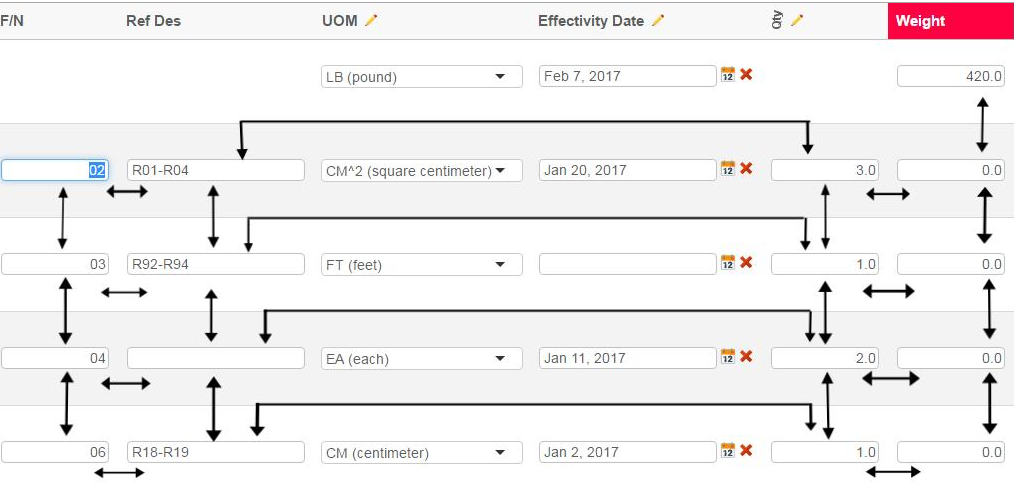
Figure 44. Arrow key navigation
When the arrow key navigation has been enabled, the only way to move the cursor inside a field is to hit the F2 key. Hitting the F2 key will temporarily disable the arrow key navigation within the current field. This is indicated by the colored border. To exit this mode, the user can click the escape button.
Figure 45. F2 Focus
Also, when arrow key navigation is enabled, you can use the ENTER/RETURN key to update the value without leaving the cell.
Arrow key navigation is enabled per page-configuration. Within the attribute "TVC Custom Parameters", add following
arrowKeyNavigation=true
The default value is false; however, to make the default value to TRUE, add the following init parameter.
<init-param>
    <param-name>tvc.structurebrowser.navigateWithArrowKeys</param-name>
    <param-value>true</param-value>
</init-param>
1.14. User Help
The TVC Structure Browser includes a built-in user help page. Unless you have configured the TVC Structure Browser to use another help page (using the HelpMarker parameter), the internal TVC help page will be displayed.
The internal help page contains general information on how to use the TVC Structure Browser features.
The help page is found from the icon shown below:

If you have defined the HelpMarker parameter, this will take precedence over the internal user help. If the HelpMarker is not set, TVC Structure Browser will show the help button and link to the internal help. This can however be disabled in two ways:
-
Globally through an init parameter
<init-param> <param-name>tvc.structurebrowser.internalHelpEnabled</param-name> <param-value>true | false</param-value> </init-param> -
Per Structure Browser instance (the value of the global parameter defines the default value) through a
custom parametershowInternalHelp=true|false
1.14.1. Customizing the Help Pages
First of all, do not modify the existing help pages that exists in the folder "/tvc/structurebrowser/help". A better alternative is described below.
Basically, there are two types of customizations one might want to do:
-
Translating the existing help pages to another language
-
Add custom content to the existing help pages
If you only want to translate the pages, then you can add files in the
/tvc/structurebrowser/help using the following name convention:
-
tvcHelp_en.jsp
-
tvcHelp_sv.jsp
-
tvcHelp_de.jsp
E.g. what you do is adding the locale to the file name, before the suffix.
| The existences of available locale specific pages are cached in TVC, so if you add a page at runtime - clear the TVC cache. (This is just needed first time the page is added, no need to clear the cache if you modify the existing file). |
If you want to change the page completely, then you should apply a system parameter (in web.xml) that points out a different JSP page. Add the below to the tvc-servlet definition:
<init-param>
    <param-name>tvc.structurebrowser.helpPage</param-name>
    <param-value>/path/to/HelpPage.jsp</param-value>
</init-param>| Your custom page can still include the pages that are used by the original help page. |
1.15. Structure Compare
Comparing structures is a common requirement in different product lifecycle stages. There is also a common need to be able to visualize the comparison results in a graphical manner and share this information effectively.
The Structure Compare is a configurable tool that incorporates the functionality needed for comparing large structures in a user-friendly manner.
The main features of the Structure Compare are:
-
Two pane navigation view of source and target structures with synchronized scrolling & expansion/collapse.
-
Visual indicators to indicate differences in the structure such as additions, removals, modifications & presence of different child objects.
-
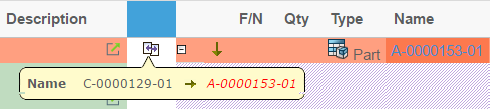
Differences between two objects can be visualized in either quick preview through tooltip or a more detailed view.
-
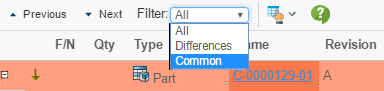
Possible to filter the comparison results to present different views such as only different elements, only common elements or the complete structure.
-
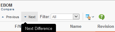
Easy inspection and navigation through the structural differences with buttons as well as keyboard shortcuts.
-
Export of comparison results into Excel with the visual indicators.
1.15.1. Usage Scenarios
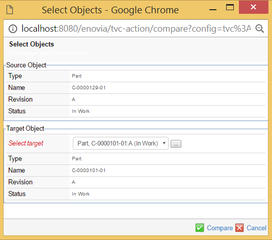
Select Source and Target structures for comparison
The compare is launched in context of the source object. The source object is either selected in a table or implicitly defined by the contextual object.
A search form configuration will be used to find and select the target object. Revisions of the source object will automatically be populated to the target object select list.
Compare result view
The comparison result is shown in a two pane view with the source structure on the left and the target structure on the right.
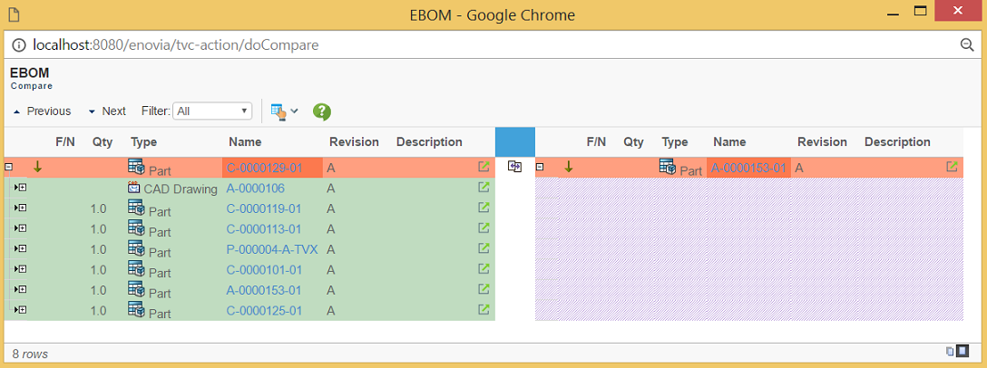
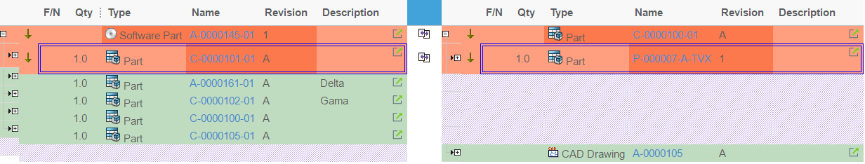
Visual indicators for showing differences
Object added
When an object occurs in the target structure but not in the source structure it is displayed with green background in the right pane. The corresponding row in the source pane is left empty.
An object added is determined by a no match of a row in the target structure defined by statements defined in the key element.

Object removed
When an object occurs in the source structure but not in the target structure it is displayed with green background in the left pane. The corresponding row in the target pane is left empty.
An object removed is determined by a no match of a row in the source structure defined by statements defined in the key element.

Object difference
When an object occurs in both the source and target structures it is displayed with a red background in both panes.
An object difference is determined by a match of an object from source and target structures defined by statements defined in the key element when there is a mismatch of the comparison selects for the objects defined by the table element.


Visualization of object difference information
1.15.2. Configuring and Extending the Structure Compare
The URL to initiate the Structure Compare is
${ROOT_DIR}/tvc-action/compare
The above URL accepts the following parameter(s).
| URL Parameter | Description | Examples |
|---|---|---|
config |
Name of the Structure Compare Configuration XML file. See details on using the structure compare configuration XML below for more information |
config=tvc:compare:tvx:enc/EBOM.xml |
searchConfig |
Name of the search configuration to use for finding and selecting the target object. |
searchConfig=tvc:searchconfig:tvx:enc/AddPart.xml |
1.15.3. Structure Compare Configuration XML
The comparison configuration is as mentioned above stored in an XML resource. This file defines how the comparison should be done and how the result is displayed.
The example table below illustrates how to define the XML based configuration.
<?xml version="1.0" encoding="UTF-8"?>
<Compare>
    <Header>EBOM</Header>
    <SubHeader>Compare</SubHeader>
    <Filter>All</Filter>
    <Sources>
        <Enovia>
            <Table>tvc:table:tvx:enc/compare/EBOM.xml</Table>
            <Level>0</Level>
	    <From />
            <Type>type_Part</Type>
            <Type>type_DOCUMENTS</Type>
            <Relationship>relationship_EBOM</Relationship>
            <Relationship>relationship_PartSpecification</Relationship>
            <Relationship>relationship_ReferenceDocument</Relationship>
        </Enovia>
        <Enovia>
            <Table>tvc:table:tvx:enc/compare/EBOM.xml</Table>
            <Level>0</Level>
	     <To />
            <Type>type_Part</Type>
            <Type>type_DOCUMENTS</Type>
            <Relationship>relationship_EBOM</Relationship>
            <Relationship>relationship_PartSpecification</Relationship>
            <Relationship>relationship_ReferenceDocument</Relationship>
        </Enovia>
    </Sources>
    <Keys>
        <Key relationship="relationship_EBOM">
            <Field appliesToRel="true"><![CDATA[$<attribute[attribute_FindNumber].value>]]></Field>
        </Key>
        <Key relationship="*">
            <Field appliesToRel="false">type></Field>
            <Field appliesToRel="false">name</Field>
            <Field appliesToRel="false">revision</Field>
            <Field appliesToRel="true">type</Field>
        </Key>
    </Keys>
    <Tables>
        <Table>tvc:table:tvx:enc/compare/Comparison.xml</Table>
    </Tables>
    <EnoviaDetailedComparisonProvider />
</Compare>Filter
<Filter>All</Filter>Set the default filter to be used for the compare result. Valid values for this setting are:
-
All (shows the entire structure)
-
Common (shows common rows)
-
Differences (shows rows with differences)
Sources
<Sources>
    <Enovia>
        <Table>tvc:table:tvx:enc/compare/EBOM.xml</Table>
        <Level>0</Level>
        <Type>type_Part</Type>
        <Type>type_DOCUMENTS</Type>
        <Relationship>relationship_EBOM</Relationship>
        <Relationship>relationship_PartSpecification</Relationship>
        <Relationship>relationship_ReferenceDocument</Relationship>
    </Enovia>
</Sources>
Defines how the comparison result will be shown. The first <Enovia> element defines the source structure and the second <Enovia> element defines the target structure.
-
The <Table> element defines what table definition to be used to display the structure
-
<Level> defines how many levels down to expand the root node. 0 = Infinite
-
<From /> defines if the expansion is made in the from direction. Default is false.
-
<To /> defines if the expansion is made in the to direction. Default is false.
-
<Type> defines what types to show
-
<Relationship> defines what relationships to use for expanding the structures
Keys
<Keys>
    <Key relationship="relationship_EBOM">
        <Field appliesToRel="true"><![CDATA[$<attribute[attribute_FindNumber].value>]]></Field>
    </Key>
    <Key relationship="*">
        <Field appliesToRel="false">type></Field>
        <Field appliesToRel="false">name</Field>
        <Field appliesToRel="false">revision</Field>
        <Field appliesToRel="true">type</Field>
    </Key>
</Keys>
The <Key> elements are used for indentifying and matching rows during
the compare. It will compare all nodes in the two structures and try to
match them based on the defined keys. You can have several keys that
compare different relationships and different values, <Field>. If two
objects are found that matches a key and its fields those objects will
be considered as a "match" in the compare. If no match is found, defined
by key for an object, it will be displayed as either "Removed" or
"Added".
Tables
The table element defines what table to be used for the actual object compare when a match is found. The compare will use all the column expressions in this table to compare the differences between two matched objects.
<Tables>
    <Table>tvc:table:tvx:enc/compare/Comparison.xml</Table>
</Tables>
Below is an example of how a compare table can be defined in XML. With this example the compare will mark two objects as modified if one or more of below expressions return different values for the compared objects.
<?xml version="1.0" encoding="UTF-8"?>
<Table>
<Column usesBusinessObject="false">
<Expression>$<attribute[attribute_Quantity].value></Expression>
</Column>
<Column>
<Expression>type</Expression>
</Column>
<Column>
<Expression>name</Expression>
</Column>
<Column>
<Expression>revision</Expression>
</Column>
<Column>
<Expression>description</Expression>
</Column>
</Table>1.16. Wrap Content
The Wrap Content feature can be used to wrap or unwrap table content. This can be enabled globally using init-param tvc.structurebrowser.visible.wrap. By default it is disabled.
<init-param>
    <param-name>tvc.structurebrowser.visible.wrap</param-name>
    <param-value>true</param-value>
</init-param>
Alternatively, it can be enabled at page config level by using visible setting as shown below -
<PageConfig>
.
.
.
<Visible wrap="true" />
.
</PageConfig>
There are two separate buttons to toggle between wrap or unwrap table content, only one is visible at a time depending on whether contents are wrapped or unwrapped. When table contents are wrapped, unwrap button is visible and when table contents are unwrapped, wrap button is visible.
Contents are unwrapped:
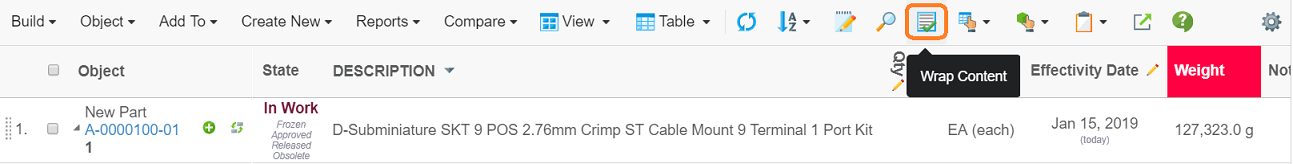
Contents are wrapped:
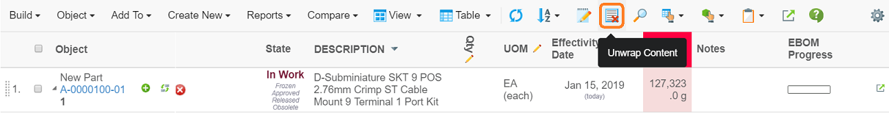
User selection is remembered for each table. By default contents are wrapped.
- Note
-
When table column width is resized and unwrap is selected, text is truncated with ellipses to fit column size available.
1.17. Inline Compare
It is now possible to do an inline comparison between two table structure, as selected by the user. It will allow the user to see changes in the same table without having to launch a new comparison window. Changes will be highlighted.
The main features of the inline compare are:
-
Difference will be shown within same table.
-
Visual indicators to indicate differences in the compare such as additions, removals & presence of different child objects.
-
Possible to filter the comparison results to present different views such as only different elements, only common elements or the complete structure.
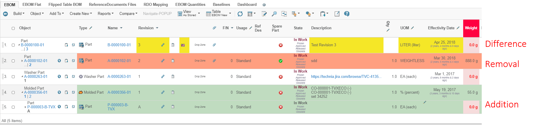
Figure 46. Changes highlight in structure
1.17.1. Configuration for usage
Inline compare icon can be enabled by adding below Parameter in page config.
<PageConfig>
 <Parameters>
  <Parameter name="inlinecompare" value="true"/>
 </Parameters>
</PageConfig>
Figure 47. Inline Compare Icon
On clicking this icon, User Interface gets visible to choose the target structure.
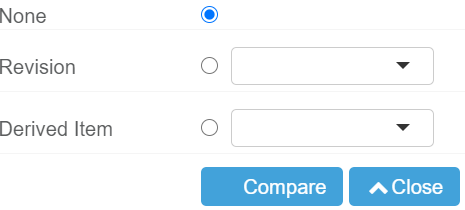
Figure 48. User Interface for selecting Revision
To configure this User Interface, add parameter in page configuration.
<PageConfig>
 <Parameters>
  <Parameter name="inlinecompare:Targets" value="Label|Dataset|Display"/>
 </Parameters>
</PageConfig>Label: Visible User Interface label
Dataset: Any dataset which fetches the object Ids
Display: Expression or DataHandler are allowed which will get evaluted on object ids fetched from data set
i.e
<PageConfig>
 <Parameters>
  <Parameter name="inlinecompare:Targets" value="tvc.structurebrowser.label.revisions|tvc:dataset:tvx:enc/Revisions.xml|revision"/>
 </Parameters>
</PageConfig>
For inline comparison, comparison key is mandatory to provide. Keys can be add to xml in below format. Reference of this XML is provided in the parameters of page configuration.
<Compare>
    <Keys>
        <Key relationship="relationship_EBOM">
            <Field appliesToRel="true">
            <![CDATA[$<attribute[attribute_FindNumber].value>]]>
            </Field>
        </Key>
        <Key relationship="*">
            <Field appliesToRel="false">
            type</Field>
            <Field appliesToRel="false">name</Field>
            <Field appliesToRel="false">revision</Field>
            <Field appliesToRel="true">type</Field>
        </Key>
    </Keys>
</Compare>
Reference
<PageConfig>
 <Parameters>
  <Parameter name="inlineCompareConfig" value="tvc:compare:tvx:enc/inlineConfig.xml"/>
 </Parameters>
</PageConfig>
Example:
<?xml version="1.0" encoding="UTF-8"?>
<PageConfig>
<Views>
<View name="tvc:view:tvx:enc/AsStored.xml" default="true" />
</Views>
<Parameters>
<Parameter name="structureGUI" value="caret" />
<Parameter name="inlinecompare" value="true" />
<Parameter name="inlineCompareConfig" value="tvc:compare:tvx:enc/inlineConfig.xml" />
<Parameter name="inlinecompare:Targets" value="tvc.structurebrowser.label.revisions|tvc:dataset:tvx:enc/Revisions.xml|revision" />
<Parameter name="inlinecompare:Targets" value="tvc.structurebrowser.inlinecompare.label.DerivedItem|tvc:dataset:tvx:enc/Revisions.xml|dataHandler:com.technia.tvc.structurebrowser.examples.TNRDataHandler" />
</Parameters>
<Header>$<type>, $<name> rev. $<revision></Header>
<SubHeader>EBOM</SubHeader>
</PageConfig>|
Tiled, Tiled2, Hierarchy views are not supported in inline compare |