Graphic Reporting - Administration Guide : Gantt Chart
30 March 2016
1. Configuring the Gantt Chart
This section describes how to configure the Gantt chart component. This includes how to create a Command that can be added to the tree category menu of a Project, Program, Business Goal or a Collection in ENOVIA’s Program Central and how to create configuration business objects that describe how the Gantt chart should be rendered.
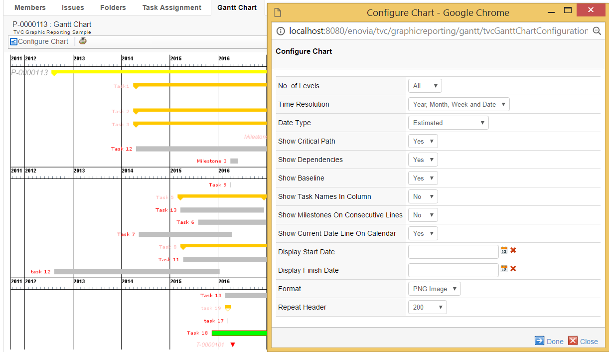
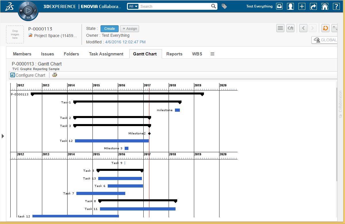
Note that it is also possible to dynamically configure the rendering of a Gantt chart by clicking on the "Configure Chart" link in the toolbar displayed on the Gantt chart web page.
Figure 1. Dynamic configuration of the Gantt chart
1.1. Commands
This section describes how to create a Command to launch the Gantt chart from the tree category menu of a Project, Program, Business Goal or a Collection in ENOVIA’s Program Central.
Commands can be created and modified with the Business Administrator and MQL thick clients; however, it is recommended that you use the Business Administrator if you are not familiar with MQL (Matrix Query Language).
The most important parameter when creating a Command to launch the Gantt chart is the "Href" parameter, whose value must be the following URL.
${ROOT_DIR}/tvc-action/ganttChart
The URL may contain parameters to configure the behavior of the Gantt chart. See URL Parameters for more information. Moreover, there are a few settings that need to be defined on the Command in order for it to behave as expected. See Settings for more information.
1.1.1. URL Parameters
This section describes the URL parameters that can be used to configure the behavior of the Gantt chart. The URL parameters are appended to the URL on the "Href" parameter of a Command.
Query string parameters appended to a URL consist of name-value pairs separated by an ampersand (&), while the entire query string is separated from the rest of the URL using a question mark (?). The following table describes parameters that can be used to configure the Gantt chart.
| URL Parameter | Description | Examples |
|---|---|---|
name |
The name of the TVC Gantt Chart configuration object. This is used to identify which configuration object to use for this particular instance of the Gantt Chart. See Configurations for more information. |
name=My Config |
header subHeader |
These parameters define the header and sub header that will be displayed on the Gantt Chart page. The values of these parameters can be either plain text or a string resource file ID. Note that when using a string resource file ID it is required that the "Registered Suite" setting has been defined on the command. The values can also contain select expression macros that will be evaluated on the current business object. The current business object refers to the objectId parameter that is sent with the URL. Note that you normally don’t add the objectId parameter yourself as it will be added automatically by the system, for instance, when executing a command on a business objects tree menu. |
header=Gantt Chart for Project $<name> or header=Gantt Chart&subHeader=Project $<name>, $<revision> |
objectId |
The object ID of the object the Gantt chart will be made for (the ENOVIA object ID of the Project Space object). This parameter is added automatically when this command is used in a Menu category tree but needs to be added if the command is used on a stand-alone PowerView page. |
objectId=12345.12345.12345.12345 |
useFreeSpace |
This parameter controls if the Gantt chart layout should re use vertical space as long as the graph being placed does not collide with any other graphs |
useFreeSpace=true |
autoSize |
This parameter controls if the Gantt chart layout should automatically determinate the preferred size from the current window size so that the graph will fill the page content. When this parameter is enabled Maximum Width and Preferred Width settings are ignored. |
autoSize=true |
escapeHeader escapeSubHeader |
These settings can be used to control over displaying Header and Sub Header. See Configurations for more information. |
escapeHeader=true |
skipFilter |
This setting will apply filter automatically on page load. |
skipFilter=true |
1.1.2. Settings
The following table describes the settings and values that should be set on a Command that is used to launch the Gantt chart from a tree category menu.
| Setting | Description | Required Value |
|---|---|---|
Target Location |
This setting defines the target frame when executing the command. The value should be set to "content" to ensure that the Gantt Chart is loaded in the correct frame. |
content |
Registered Suite |
This setting defines which application the command belongs to. |
ProgramCentral |
1.2. Configurations
1.2.1. Gantt Chart Config
Example
<GanttChart>
    <TimeResolution>Year, Month, Week and Date</TimeResolution>
    <DateType>Estimated</DateType>
    <ImageFormat>PNG</ImageFormat>
    <Levels>All</Levels>
    <ShowCriticalPath>true</ShowCriticalPath>
    <ShowDependencies>true</ShowDependencies>
    <ShowBaseline>true</ShowBaseline>
    <ShowTaskNamesInColumn>true</ShowTaskNamesInColumn>
    <ShowMilestonesOnConsecutiveLines>true</ShowMilestonesOnConsecutiveLines>
    <PreferredWidth>800</PreferredWidth>
    <MaximumWidth>2400</MaximumWidth>
    <TooltipTable>tvc:table/GanttChartSampleTooltip.xml</TooltipTable>
    <Model>
        <Name>Foo</Name>
        <Method>Bar</Method>
        <Params>
            <Param name="test1" value="value1"/>
            <Param name="test2">value2</Param>
            <Param name="test3">value3</Param>
            <Param name="test4" value="value4"/>
        </Params>
    </Model>
    <FontSchema ref="tvc:ganttchartfonts/MyFontConfig.xml"/>
    <ColorSchema ref="tvc:ganttchartcolors/MyColorConfig.xml"/>
</GanttChart>
1.2.2. XML Format
The following table describes the attributes that that can be configured on a configuration business object.
| Element | Description |
|---|---|
DateType |
It is possible to have different dates control the generation of the Gantt chart. Valid values are:
|
Levels |
Defines the initial number of levels that will be displayed on the chart. |
ShowTaskNamesInColumn |
Defines whether the task names should be displayed in a separate column on the left or to the very left of the corresponding task. Note that this setting is incompatible with useFreeSpace parameter and will be ignored when useFreeSpace is enabled. Valid values are:
|
ShowMilestonesOnConsecutiveLines |
Defines whether to show milestones on consecutive lines below the top or on their actual position in the chart. Valid values are:
|
ShowCurrentDateLineOnCalendar |
Defines whether to show current date as vertical line on calendar. Valid values are:
Default value is FALSE. Default color of date line is RED. It can be changed by ColorConfig.xml <CalendarCurrentDate>rgb(0,25,0)</CalendarCurrentDate> |
ShowBaseline |
Defines whether the baseline dates will be displayed. The baseline of a task, phase or milestone is rendered as a light-gray shadow-like figure. Valid values are:
|
ShowDependencies |
Defines whether dependencies between task, phases and milestones will be displayed (arrows connecting the elements) or not. All standard Gantt dependencies are supported - Start-to-Finish, Start-to-Start, Finish-to-Finish and Finish-to-Start. Lag time is also properly handled by the ENOVIA Program Central functionality. Valid values are:
|
ShowCriticalPath |
Defines whether the view will highlight the critical path in the project (i.e. the tasks that together define the total duration of the project). This is displayed by showing a dashed border around the tasks and phases in the critical path. Valid values are:
|
TimeResolution |
The level of time resolution to display in the time axis on top of the Gantt chart. NB! If the project displayed in Gantt notation is very long, the component will adjust accordingly and might not display days, weeks or months if the available graphic area prohibits that. Valid values are:
|
PreferredWidth |
Defines the preferred width of the generated chart in pixels. If the project displayed is very long and contains many tasks, etc, the width of the chart might increase in order to provide a clear graphical representation. However, note that the chart will never grow beyond its maximum width. |
MaximumWidth |
Defines the maximum width of the generated chart in pixels. |
ImageFormat |
Defines the image format of the generated chart. Valid values are:
|
TooltipTable |
Defines which custom system table to use for tooltips. If no custom system table is used to configure the tooltips a default tooltip will be generated. |
|
Defines the name of the custom JPO (Java Program Object) that will be invoked to generate the chart. Note that you don’t need to specify a custom JPO if you want the chart to render a WBS structure of a Program or a Project in ENOVIA Program Central. Hence, the purpose of a custom JPO generator is to be able to generate Gantt charts of custom object structures (WBS or other) from within ENOVIA. |
|
Defines the name of the method that will be called on the custom JPO Gantt chart generator. |
|
Defines parameters that the user can input and which are submitted to the custom JPO Gantt chart generator. |
Privileged |
Defines if the chart should be generated using privileged user access |
Sectionized |
|
GraphHandlerClass |
|
FontSchema |
Defines the font configuration to be used |
ColorSchema |
Defines the color configuration to be used |
RepeatHeader |
Defines number of pixels after which header should be repeated on Gantt Chart. Value should be an integer greater than 200. 0, -1 and -2 are also valid values with usage as defined below.
|
1.2.3. Custom Colors
This section describes how you can configure the colors used when rendering the Gantt chart. For example, you may wish to display milestones as green diamonds instead of black.
To customize the colors of a Gantt chart create an XML configuration file of type "ganttchartcolors" and reference that from your Gant Chartt config. Example:
<ColorSchema ref="tvc:ganttchartcolors/MyColorConfig.xml" />
Example configuration:
<ColorSchema>
    <Task>rgb(0,0,1)</Task>
    <TaskProgress>rgb(0,0,2)</TaskProgress>
    <TaskLabel>rgb(0,0,3)</TaskLabel>
    <TaskBaseline>rgb(0,0,4)</TaskBaseline>
    <TaskSlipDays>rgb(0,0,5)</TaskSlipDays>
    <Project>rgb(0,0,6)</Project>
    <ProjectBaseline>rgb(0,0,7)</ProjectBaseline>
    <ProjectSlipDays>rgb(0,0,8)</ProjectSlipDays>
    <Phase>rgb(0,0,9)</Phase>
    <PhaseLabel>rgb(0,0,10)</PhaseLabel>
    <PhaseBaseline>rgb(0,0,11)</PhaseBaseline>
    <PhaseSlipDays>rgb(0,0,12)</PhaseSlipDays>
    <Milestone>rgb(0,0,13)</Milestone>
    <MilestoneLabel>rgb(0,0,14)</MilestoneLabel>
    <MilestoneBaseline>rgb(0,0,15)</MilestoneBaseline>
    <MilestoneSlipDays>rgb(0,0,16)</MilestoneSlipDays>
    <CriticalPath>rgb(0,0,17)</CriticalPath>
    <CriticalPathLabel>rgb(0,0,18)</CriticalPathLabel>
    <Timeline1>rgb(0,0,19)</Timeline1>
    <Timeline2>rgb(0,0,20)</Timeline2>
    <Timeline3>rgb(0,0,21)</Timeline3>
    <Timeline4>rgb(0,0,22)</Timeline4>
    <CalendarCurrentDate>(0,0,23)</CalendarCurrentDate>
</ColorSchema>
The values of the different colors can be one of the following:
-
Empty. If the value of an attribute is empty the default color will be used when rendering.
-
rgb(<red>,<green>,<blue>). This syntax allows you to define the red, green and blue color values using decimal notation (0-255). For example: rgb(0,0,0) is black and rgb(255,0,0) is red.
-
#<red><green><blue>. With this syntax you define the red, green and blue color values using hexadecimal notation (00-FF). For example #000000 is black and #FF0000 is red.
Figure 2. Custom colors example
1.2.4. Custom Fonts
This section describes how you configure the fonts used when rendering labels on the Gantt chart. For example, you may want to display Task labels using Arial instead of Verdana.
Configuring the fonts of a Gantt chart is similar to how you configure its colors. What you need to do is to create a new business object of the type "TVC Gantt Chart Fonts" and connect it to the general "TVC Gantt Chart" business object. The name of the relationship is "TVC Gantt Chart Fonts" (same as the business type name).
<FontSchema>
    <Task>arial,bold,12</Task>
    <Project>courier,plain,10</Project>
    <Phase>verdana,bold,12</Phase>
    <Milestone>arial,bold+italic,20</Milestone>
    <Timeline1>tahoma,plain,20</Timeline1>
    <Timeline2>tahoma,bold,14</Timeline2>
    <Timeline3>tahoma,italic,12</Timeline3>
    <Timeline4>tahoma,italic+bold,10</Timeline4>
</FontSchema>
The values of the fonts must conform to the following syntax:
-
Empty. If the value is empty the default font will be used.
-
<font_name>,<font_style>,<font_size>. Where the name of the font is specified using an actual font name (e.g., Verdana, Arial, Tahoma, Times New Roman) or a logical font name (i.e., Dialog, DialogInput, Monospaced, Serif, SansSerif, or Symbol). The font style can be either plain, bold, italic, or bold+italic. The size of the font must be an integer. For example, arial,bold,12 or serif,plain,11.
1.2.5. Margins
This section describes how you configure the margins between the graphs.
The margin can be controlled with the following setting in xml
configuration file, where the default value is 8,7,7,7
<Margin>8,7,7,7</Margin>
We are using Insets(int top, int left, int bottom, int right), so values (all integer) in Margin tag must follow the sequence -
<Margin>top,left,bottom,right</Margin>
1.2.6. Grouping of Sections
This section describes how you configure the grouping of sections.
Use following setting in GanttChartConfig.xml to control grouping of phase in GanttChart :-
<Sectionized>true</Sectionized>
Default value will be false.
SectionGraph is actually extending ProjectGraph, so PhaseGraph and ProjectGraph settings will work for their respective SectionGraphs.
Figure 3. Section example
1.2.7. GanttChartHandler
This section describes how you configure the color and font through a custom GanttChartHandler.
Write a class which must implement GanttChartHandler interface.
Define this class in GanttChartConfig.xml
<GraphHandlerClass>com.technia.example.MyGanttChartHandler</GraphHandlerClass>Here is the example of one custom Gantt Chart handler class.
public class MyGanttHandler implements GanttChartHandler {

    private void applyColor(GanttChartNode node, NodeGraph graph) {
        String current = node.getObjectData().getSelectData(Statement.CURRENT.getStatement());
        if ("Create".equals(current) || "Assign".equals(current)) {
            graph.setColor(Color.LIGHT_GRAY);
            graph.setLabelColor(Color.LIGHT_GRAY);
        } else if ("Active".equals(current)) {
            graph.setColor(Color.GRAY);
            graph.setLabelColor(Color.GRAY);
        } else if ("Complete".equals(current) || "Review".equals(current)) {
            graph.setColor(Color.GREEN);
        } else {
            graph.setColor(Color.BLACK);
            graph.setLabelColor(Color.BLACK);
        }
    }

    @Override
    public void populateMilestones(GanttChartNode node, MilestoneGraph graph) {
        graph.setColor(Color.RED);
    }

    @Override
    public void populatePhases(GanttChartNode node, PhaseGraph graph) {
        // applyColor(node, graph);
    }

    @Override
    public void populateProject(GanttChartNode node, ProjectGraph graph) {
        // applyColor(node, graph);
    }

    @Override
    public void populateTasks(GanttChartNode node, TaskGraph graph) {
        applyColor(node, graph);
    }

    @Override
    public void prepareEvaluation(Input input) {
        input.addObjectSelect(Statement.CURRENT.getStatement());
    }
}
Context of addObjectSelect is the node and addRelationshipSelect is the subtask relationship with which the current object is connected to its parent node. This is why, node.getRelationshipData() is not available for nodetye Project.
Figure 4. Colors set by handler
1.2.8. Milestone Icons
There are 5 supported Milestone Icon Types which you can set through custom Gantt Chart handler.
-
Diamond
-
Square
-
Triangle
-
Inverted Triangle
-
Hourglass
1.2.9. Privileged access
To generate the chart using privileged user access use the Privileged xml element or the TVC Privileged attribute
<Privileged>true</Privileged>
1.2.10. Repeat Header
When length of a Gantt Chart goes beyond the size of a single screen and user scroll down, it becomes difficult to keep track of header and columns. To resolve the problem vertical header repetition or freeze header can be enabled through a setting. The setting controls how often the header should be repeated or whether header should not scroll and stay fixed.
To repeat header in chart use the RepeatHeader xml element or the TVC Repeat Header Gantt Chart.
<RepeatHeader>600</RepeatHeader>
Value should be an integer greater than 200. 0, -1 and -2 are also valid values with usage as defined below.
- 0
-
Header will not be repeated.
- -1
-
Number of pixels will be calculated as per user screen size and resolution.
- -2
-
Header will not scroll and stay fixed.
1.3. Using JPOs to Generate Gantt Charts
A custom JPO can be used to generate a Gantt chart based on any business object structure of your choice. The JPO can also accept custom defined parameters that a user enters in his/her browser.
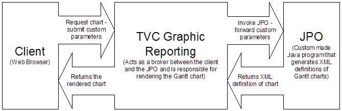
Figure 5. Overview
When a user requests a Gantt chart that is generated by a JPO and if custom parameters have been defined, the user has a chance to edit these parameters before the chart is rendered. However, the chart will be rendered immediately if no custom parameters have been defined.
1.3.1. Implementing the JPO
This section describes how to implement a JPO that generates Gantt charts. The name of the JPO and the method that should be invoked on the JPO is defined on the configuration business object. See Configurations for more information on how to create and use these.
The input parameter that is sent to the JPO is a java.util.Map that contains information about the root business object and the values of the custom parameters. The contents of the Map are described below:
| Key Name | Data Type | Description |
|---|---|---|
objectId |
java.lang.String |
The ID of the root business object. |
Custom Parameter |
Each custom defined parameter within the "TVC JPO Generator Params" attribute is sent to the JPO. The name of the parameter is the same as the key-name in the Map. The data type of the parameter decides which Java type is sent to the JPO. See Defining Custom Parameters for more information on how to define custom parameters. |
The JPO should then return a java.lang.String containing an XML that defines the structure of the Gantt chart. The returned XML should comply with the following DTD.
<!-- The "gantt-chart" element is the document
     element. It contains zero or more "graph"
     elements. -->
<!ELEMENT gantt-chart (graph*)>

<!-- The "graph" element defines a graph on the
Gantt chart. There are four types of graphs,
i.e., task, phase, milestone and project.

type Defines the type of the graph.
Accepted values are task, phase,
milestone and project.

object-id The ID of the business object
that the graph represents.

id The ID of the actual graph. The
ID of the graph is used when
resolving graph dependencies.
The id attribute can be left out
when not applicable (e.g., when
no dependencies are used).

NB! Two graphs should NOT have the
same ID or otherwise the dependencies
might not be resolved correctly.

Used in: gantt-chart
-->
<!ELEMENT graph (name, estimated-start, estimated-finish, actual-start?,
actual-finish?, baseline-initial-start?, baseline-initial-end?,
baseline-current-start?,
baseline-current-end?, tooltip?, percent-complete?, graph*,
dependency*)>
<!ATTLIST graph
type (phase|task|milestone|project) #REQUIRED
object-id CDATA #IMPLIED
id ID #IMPLIED
>


<!-- The "name" element defines the name of a graph.

Used in: graph
-->
<!ELEMENT name (#PCDATA)>


<!-- The "estimated-start" element defines the estimated
start date of a graph. Its value should comply with
the same format as date values inside the ENOVIA
database, or to the explicit format specified in the
format attribute when used.

format The date format used within the body
of the element. The date format will
default to the one used inside the
ENOVIA database when this attribute
is not defined.

Used in: graph
-->
<!ELEMENT estimated-start (#PCDATA)>
<!ATTLIST estimated-start
format CDATA #IMPLIED
>


<!-- The "estimated-finish" element defines the estimated
finish date of a graph. Its value should comply with
the same format as date values inside the ENOVIA
database, or to the explicit format specified in the
format attribute when used.

format The date format used within the body
of the element. The date format will
default to the one used inside the
ENOVIA database when this attribute
is not defined.

Used in: graph
-->
<!ELEMENT estimated-finish (#PCDATA)>
<!ATTLIST estimated-finish
format CDATA #IMPLIED
>


<!-- The "actual-start" element defines the actual
start date of a graph. Its value should comply with

the same format as date values inside the ENOVIA
database, or to the explicit format specified in the
format attribute when used.

format The date format used within the body
of the element. The date format will
default to the one used inside the
ENOVIA database when this attribute
is not defined.

Used in: graph
-->
<!ELEMENT actual-start (#PCDATA)>
<!ATTLIST actual-start
format CDATA #IMPLIED
>


<!-- The "actual-finish" element defines the actual
finish date of a graph. Its value should comply with
the same format as date values inside the ENOVIA
database, or to the explicit format specified in the
format attribute when used.

format The date format used within the body
of the element. The date format will
default to the one used inside the
ENOVIA database when this attribute
is not defined.

Used in: graph
-->
<!ELEMENT actual-finish (#PCDATA)>
<!ATTLIST actual-finish
format CDATA #IMPLIED
>


<!-- The "baseline-initial-start" element defines the initial
baseline start date of a graph. Its value should comply with
the same format as date values inside the ENOVIA
database, or to the explicit format specified in the
format attribute when used.

format The date format used within the body
of the element. The date format will
default to the one used inside the
ENOVIA database when this attribute
is not defined.

Used in: graph
-->
<!ELEMENT baseline-initial-start (#PCDATA)>
<!ATTLIST baseline-initial-start
format CDATA #IMPLIED
>


<!-- The "baseline-initial-start" element defines the initial
baseline end date of a graph. Its value should comply with
the same format as date values inside the ENOVIA
database, or to the explicit format specified in the
format attribute when used.

format The date format used within the body
of the element. The date format will
default to the one used inside the
ENOVIA database when this attribute
is not defined.

Used in: graph
-->
<!ELEMENT baseline-initial-end (#PCDATA)>
<!ATTLIST baseline-initial-end
format CDATA #IMPLIED
>


<!-- The "baseline-current-start" element defines the current
baseline start date of a graph. Its value should comply with
the same format as date values inside the ENOVIA
database, or to the explicit format specified in the
format attribute when used.

format The date format used within the body
of the element. The date format will
default to the one used inside the
ENOVIA database when this attribute
is not defined.

Used in: graph
-->
<!ELEMENT baseline-current-start (#PCDATA)>
<!ATTLIST baseline-current-start
format CDATA #IMPLIED
>


<!-- The "baseline-current-end" element defines the current
baseline end date of a graph. Its value should comply with
the same format as date values inside the ENOVIA
database, or to the explicit format specified in the
format attribute when used.

format The date format used within the body
of the element. The date format will
default to the one used inside the
ENOVIA database when this attribute
is not defined.

Used in: graph
-->
<!ELEMENT baseline-current-end (#PCDATA)>
<!ATTLIST baseline-current-end
format CDATA #IMPLIED
>


<!-- The "tooltip" element defines the tooltip that will be
displayed when the mouse pointer hoover above the graph
or the graphs label.

Used in: graph
-->
<!ELEMENT tooltip (#PCDATA)>

<!-- The "percent-complete" element defines how many
percent of the graph have been completed. Its value
should be an integer between 0 and 100 inclusive.

Used in: graph
-->
<!ELEMENT percent-complete (#PCDATA)>


<!-- The "dependency" element defines a dependency for a graph.

type The type of dependency. Accepted
values are SS, SF, FS and FF. These

acronyms expand to Start-to-Start,
Start-to-Finish, Finish-to-Start
and Finish-to-Finish.

id-ref The ID of the graph that the current
graph depend on. E.g., if graph A
depends on graph B, graph A should
have a "dependency" element whose
id-ref attribute contains the ID of
graph B.

Used in: graph
-->
<!ELEMENT dependency EMPTY>
<!ATTLIST dependency
type (SS|SF|FS|FF) #REQUIRED
id-ref IDREF #REQUIRED
>
1.3.2. Defining Custom Parameters
Custom parameters are defined on the attribute "TVC JPO Generator Params" on the configuration business object. This section describes the format in which custom parameters are defined. See Configurations for more information on how to create and use configurations.
The syntax for defining custom parameters is as follows:
param.<name>=<label>
param.<name>.type=(string|integer|real|boolean|datetime|chooser|dropdown)
Where <name> is the name of the parameter when retrieved from the JPO
and <label> is the label displayed on the JSP page. The type of the
parameter can be string, integer, real, boolean or datetime. If no type
has been explicitly defined for a parameter it will default to string.
Additionally for dropdown, we have to specify value as per following syntax:
param.<name>.value=value1:displayValue1,value2:displayValue2,value3:displayValue3
If displayValue is not given, value is displayed as display value.
And for chooser this value should be a pageconfig:
param.<name>.value=tvc:pageconfig:tvx:enc/AddToPartFamily.xml
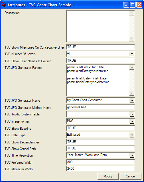
Figure 6. Defining custom parameters
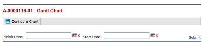
Figure 7. Custom parameters on JSP page
1.3.3. JPO Template
This section contains a template that can be used when implementing a JPO that generates Gantt charts.
/*
 * JPO Gantt Chart Generator Template
 */
import matrix.db.*;
import java.util.*;

/**
 * This is a simple template that you can use
 * when creating a JPO that generate Gantt charts.
 * If you want more tips and tricks you can also
 * check the program TVCGanttChartUtils that is
 * installed with the database schema for the
 * TVC Graphic Reporting component.
 */
public class ${CLASSNAME} {

    /**
     * Implement this method to return the XML
     * that defines the Gantt chart.
     */
    public String generate(Context ctx,
                           String[] args)
                    throws Exception{

        // Unpack the arguments
        Map params = (Map) JPO.unpackArgs(args);

        // Get the ID of the root business object
        String objectId = (String) params.get("objectId");

        // It is wise to use a StringBuffer
        // when concatenating large strings
        StringBuilder xml = new StringBuilder();
        xml.append("<gantt-chart>");

        // TODO: Add graph definitions to the xml

        xml.append("</gantt-chart>");
        return xml.toString();
    }

    /**
     * Constructor.
     */
    public ${CLASSNAME}(Context ctx, String[] args) {}
}
1.4. Legacy Configuration Formats
It is possible to create business objects that configure how the Gantt chart is rendered when launched.
The type used for the configurations is called "TVC Gantt Chart" and it is derived from the abstract type "TVC". To be able to modify Gantt Chart configurations, the users need to have the role assignment "TVC Gantt Chart Manager". It is also possible to disable a configuration by promoting its life cycle state to "Inactive".
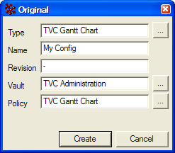
Figure 8. Creating a configuration
1.4.1. Attributes
The following table describes the attributes that that can be configured on a configuration business object.
| Attribute | Description |
|---|---|
TVC Date Type |
It is possible to have different dates control the generation of the Gantt chart. Valid values are:
|
TVC Number Of Levels |
Defines the initial number of levels that will be displayed on the chart. |
TVC Show Task Names In Column |
Defines whether the task names should be displayed in a separate column on the left or to the very left of the corresponding task. Note that this setting is incompatible with useFreeSpace parameter and will be ignored when useFreeSpace is enabled. Valid values are:
|
TVC Show Milestones On Consecutive Lines |
Defines whether to show milestones on consecutive lines below the top or on their actual position in the chart. Valid values are:
|
TVC Show Current Date Line On Calendar |
Defines whether to show current date as vertical line on calendar. Valid values are:
Default value is FALSE. Default color of date line is RED. It can be changed by ColorConfig.xml <CalendarCurrentDate>rgb(0,25,0)</CalendarCurrentDate> |
TVC Show Baseline |
Defines whether the baseline dates will be displayed. The baseline of a task, phase or milestone is rendered as a light-gray shadow-like figure. Valid values are:
|
TVC Show Dependencies |
Defines whether dependencies between task, phases and milestones will be displayed (arrows connecting the elements) or not. All standard Gantt dependencies are supported - Start-to-Finish, Start-to-Start, Finish-to-Finish and Finish-to-Start. Lag time is also properly handled by the ENOVIA Program Central functionality. Valid values are:
|
TVC Show Critical Path |
Defines whether the view will highlight the critical path in the project (i.e. the tasks that together define the total duration of the project). This is displayed by showing a dashed border around the tasks and phases in the critical path. Valid values are:
|
TVC Time Resolution |
The level of time resolution to display in the time axis on top of the Gantt chart. NB! If the project displayed in Gantt notation is very long, the component will adjust accordingly and might not display days, weeks or months if the available graphic area prohibits that. Valid values are:
|
TVC Preferred Width |
Defines the preferred width of the generated chart in pixels. If the project displayed is very long and contains many tasks, etc, the width of the chart might increase in order to provide a clear graphical representation. However, note that the chart will never grow beyond its maximum width. |
TVC Maximum Width |
Defines the maximum width of the generated chart in pixels. |
TVC Image Format |
Defines the image format of the generated chart. Valid values are: * SVG * PNG |
TVC Tooltip System Table |
Defines which custom system table to use for tooltips. If no custom system table is used to configure the tooltips a default tooltip will be generated. |
TVC JPO Generator Name |
Defines the name of the custom JPO (Java Program Object) that will be invoked to generate the chart. Note that you don’t need to specify a custom JPO if you want the chart to render a WBS structure of a Program or a Project in ENOVIA Program Central. Hence, the purpose of a custom JPO generator is to be able to generate Gantt charts of custom object structures (WBS or other) from within ENOVIA. See Error! Reference source not found. for more information on how to generate Gantt charts from a JPO. |
TVC JPO Generator Method Name |
Defines the name of the method that will be called on the custom JPO Gantt chart generator. |
TVC JPO Generator Params |
Defines parameters that the user can input and which are submitted to the custom JPO Gantt chart generator. |
TVC Privileged |
Defines if the chart should be generated using privileged user access |
TVC Repeat Header Gantt Chart |
Defines number of pixels after which header should be repeated on Gantt Chart. Value should be an integer greater than 200. 0, -1 and -2 are also valid values with usage as defined below. 0:: Header will not be repeated. -1:: Number of pixels will be calculated as per user screen size and resolution. -2:: Header will be fixed |
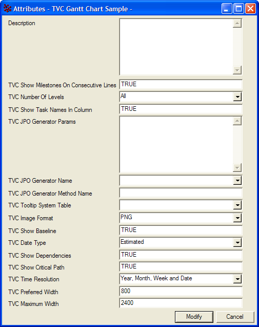
Figure 9. Configurable attributes
1.4.2. Custom Colors
To customize the colors of a Gantt chart you’ll first have to create a Gantt chart configuration business object as described above. The next step is to create another business object and connect it to the general configuration object. The type of the new business object should be "TVC Gantt Chart Colors" and the type of the relationship is "TVC Gantt Chart Colors".
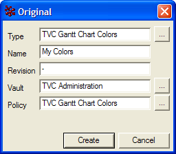
Figure 10. Create a colors configuration object
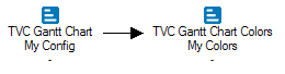
Figure 11. Connect with general configuration object
The "TVC Gantt Chart Colors" business object has many different attributes, each configuring the color of a certain item displayed on the Gantt chart. The values of these attributes can be one of the following:
-
Empty. If the value of an attribute is empty the default color will be used when rendering.
-
rgb(<red>,<green>,<blue>). This syntax allows you to define the red, green and blue color values using decimal notation (0-255). For example: rgb(0,0,0) is black and rgb(255,0,0) is red.
-
#<red><green><blue>. With this syntax you define the red, green and blue color values using hexadecimal notation (00-FF). For example #000000 is black and #FF0000 is red.
Figure 12. Custom colors example
1.4.3. Custom Fonts
This section describes how you configure the fonts used when rendering labels on the Gantt chart. For example, you may want to display Task labels using Arial instead of Verdana.
Configuring the fonts of a Gantt chart is similar to how you configure its colors. What you need to do is to create a new business object of the type "TVC Gantt Chart Fonts" and connect it to the general "TVC Gantt Chart" business object. The name of the relationship is "TVC Gantt Chart Fonts" (same as the business type name).
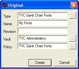
Figure 13. Create a fonts configuration object
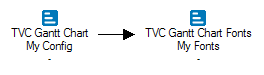
Figure 14. Connect with general configuration object
The "TVC Gantt Chart Fonts" business object has many attributes that configures the fonts used when rendering the Gantt chart. The values of the attributes must conform to the following syntax:
-
Empty. If the value is empty the default font will be used.
-
<font_name>,<font_style>,<font_size>. Where the name of the font is specified using an actual font name (e.g., Verdana, Arial, Tahoma, Times New Roman) or a logical font name (i.e., Dialog, DialogInput, Monospaced, Serif, SansSerif, or Symbol). The font style can be either plain, bold, italic, or bold+italic. The size of the font must be an integer. For example, arial,bold,12 or serif,plain,11.
Figure 15. Custom font’s example