${ROOT_DIR}/tvc-action/loadTopPanel?panel=tvc:toppanel/Panel.xmlCore - Administration Guide : Top Panel
21 March 2016
Table of Contents
- 1. Top Panel
- 1.1. Top-panel usage
- 1.2. Top Panel Configuration
- 1.3. Top Panel Form Configuration
- 1.3.1. Child Elements - Form
- 1.3.2. Child Elements - Section
- 1.3.3. Child Elements - Field
- 1.3.4. Child Elements – Settings
- 1.3.5. Auto Completion
- 1.3.6. Access Control
- 1.3.7. Built-in datahandlers
- 1.3.8. Top-panel configuration example
- 1.3.9. Top-panel title form configuration example
- 1.3.10. Top-panel form configuration example
- 2. Category Top Panel
1. Top Panel
As of release 2010.2, a new feature called Top Panel was added.
The Top Panel is used to display a configurable frame at the top a tabbed pages definition. The content of the top panel is configured through an XML file.
The screenshot below shows a top panel example, and a short description of the areas within the top panel and what they are called.
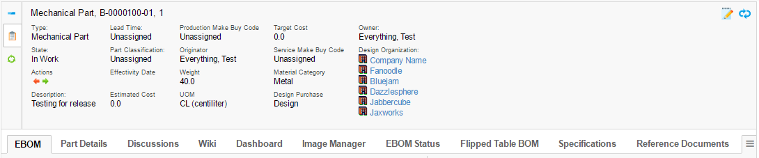
The top panel defines/contains the following areas:
-
Title Form (Shown when the top panel is minimized).
-
Control(s)
-
One control can link to a so-called top-panel form.
-
A control can be used to link other pages using a HREF.
-
-
A form contains:
-
Section(s) where each section can have a number of Fields
-
A form can be switched between view and edit mode.
-
-
Tab Menu (name of a menu)
-
Below the top-panel, a tabbed page is shown.
-
1.1. Top-panel usage
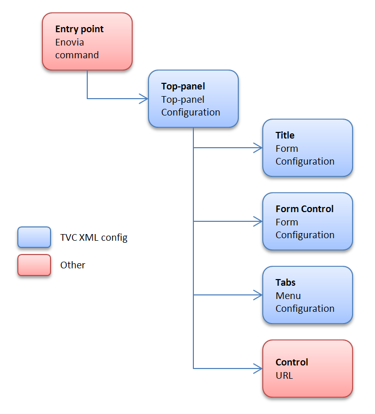
To use the top-panel create a command that has the HREF property set to call the action "loadTopPanel" and pass the name your top-panel configuration through the parameter "panel". See example below:
The top panel definition is stored in a directory called "toppanel" among the XML resources (somewhere under /WEB-INF/tvc in your application directory).
If you omit the domain in the resource name, the location of the top panel definition is:
/WEB-INF/tvc/toppanel
If the top panel definition is stored in a domain, for example acme (tvc:toppanel:acme/Panel.xml) then the resource location is:
/WEB-INF/tvc/acme/toppanel
1.2. Top Panel Configuration
You define your top panel in XML. The root element must be <TopPanel>. Below you find child element definitions.
1.2.1. Child elements TopPanel
| Element Name | Description | Example |
|---|---|---|
Controls |
Container element to FormControl and Control |
- |
TabMenu |
Carries the tab menu definition |
<TabMenu>tvc:menu/tabs/TabMenu.xml</TabMenu> |
Title |
Defines the Form to carry the title definition |
<Form>tvc:toppanelform/Title.xml</Form> |
1.2.2. Child elements FormControl
| Element Name | Description | Example |
|---|---|---|
Form |
Defines the Form XML definition |
<Form>tvc:toppanelform/Form.xml</Form> |
Icon |
Points out the icon for the control. Use either |
<Icon>${COMMON_DIR}/images/iconSmallDescription.gif</Icon> |
IconClass |
Defines the CSS class(es) for the font icon for the control. Font awesome is included by default. Use either |
<IconClass>fa fa-tags</IconClass> |
Label |
Carries the tooltip definition for the control |
<Label>View/EditDetails</Label> |
Access |
Defines access rules for the control. |
|
1.2.3. Child elements Control
| Element Name | Description | Example |
|---|---|---|
Height |
Defines a specific height for the control |
<Height>300</Height> |
Href |
Defines a href to display in the control |
<Href>${COMMON_DIR}/emxLifecycle.jsp</Href> |
Icon |
Points out the icon for the control. Use either |
<Icon>${COMMON_DIR}/iconStatus.gif</Icon> |
IconClass |
Defines the CSS class(es) for the font icon for the control. Font awesome is included by default. Use either |
<IconClass>fa fa-tags</IconClass> |
Label |
Carries the tooltip definition for the control |
<Label>Lifecycle</Label> |
Popup |
Defines that the control should open in a popup window. |
<Popup width="800" height="600"/> |
Access |
Defines access rules for the section. |
|
1.3. Top Panel Form Configuration
You define your top panel form in XML. The root element must be <Form>.
Below you find child element definitions.
1.3.1. Child Elements - Form
| Element Name | Description | Example |
|---|---|---|
Section |
Container element for Filed elements. Defines the horizontal field sections in a form |
- |
1.3.2. Child Elements - Section
| Element Name | Description | Example |
|---|---|---|
Field |
Defines a form field |
- |
Separator |
Defines a field that acts as a "separator" in the section. |
<Separator/> |
Access |
Defines access rules for the section. |
|
1.3.3. Child Elements - Field
| Element Name | Description | Example |
|---|---|---|
DataHandler |
Point out a class used to retrieve more complex data from
matrix. The class must implement the interface
|
|
Editable |
Defines if the field should be editable or not |
|
Expression |
Defines an mql expression of the data to retrieve from matrix |
|
FieldCellRenderer |
Used to specify alternative rendering for the field.
The class must implement the interface
|
|
Label |
Defines the field label |
|
RangeHandler |
Defines a range handler class that must implement
|
- |
Settings |
Container element for settings |
- |
Access |
Defines access rules for the section. |
|
AutoCompleteHandler |
An autocomplete handler type:
See Autocomplete chapter for more details. |
|
AutoCompleteSettings |
Settings for autocomplete. Should it be case sensitive, what types to choose from, limits, which dataset to use and other. The settings vary for each kind of autocomplete handler. See Autocomplete chapter for more details. |
|
1.3.4. Child Elements – Settings
| Element Name | Description | Example |
|---|---|---|
Columns |
Used with InputType textarea to define columns |
|
InputType |
Specifies the type of input |
|
InputWidth |
Defines the width of the input |
|
Required |
Defines if an editable field should be required or not |
|
Rows |
Used with InputType textarea to define rows |
|
Setting |
Define custom settings |
|
SortRangeValues |
Defines if to sort range values |
|
SearchConfig |
Connect a search to a field |
|
RegisteredSuite |
Defines the registered suite. This can be used for localization of labels, where the value of the key is stored in a particular suite string resource file. |
|
Separator |
Only valid on a field in a Top panel title. Defines text to be put at the right hand side of a field, used for separating multiple fields. If you specify an empty Separator element then one space will be used. Values starting and ending with a single quote or double quote will be un-quoted, in order to be able to specify space characters. |
|
MaxLength |
Specifies the max length of an editable input field. |
|
MaxRows |
Specifies the max number of rows to display of the text. |
|
ValueIfEmpty |
Specifies the value to be used if the actual value is an empty string. By default, the " " replacement is used. |
|
BadChars |
Specifies characters that are treated as "bad" and if the value contains any such character, the user will not be able to modify the value. |
|
ValidationJavaScript |
Can be used to declare custom validation JavaScript code that is inserted on the page that displays this form. |
|
LinkedWith |
Can be used if other fields are updated in the background. On a Refresh these fields will be updated as well. Format: COLUMN:FIELD Separate multiple fields using a comma. |
|
UseTransactionOnEdit |
Can be used to get an update-transaction surrounding the modification of the field. Default is FALSE. |
|
1.3.5. Auto Completion
The fields can take advantage of auto-completion. If you have a field that applies to "type" and is editable, the way to configure such field to take advantage of autocomplete is slightly different. See example below:
<Field>
    <Label>Type:</Label>
    <Expression><![CDATA[$<type>]]></Expression>
    <Editable />
    <AutoCompleteHandler>type</AutoCompleteHandler>
    <AutoCompleteSettings>{
        'handler' : {
            'rootTypes' : ['type_HardwarePart', 'type_SoftwarePart']
        }
    }</AutoCompleteSettings>
</Field>
E.g. you use the setting "Type" to specify the "root" type for the object.
If you want to enable autocompletion for users, then you can enable that through the following configuration:
<Field>
    <Label>Owner:</Label>
    <Editable />
    <Expression><![CDATA[$<owner>]]></Expression>
    <DataHandler>com.technia.tvc.core.gui.toppanel.form.builtin.UserNameHandler</DataHandler>
    <AutoCompleteHandler>user</AutoCompletHandler>
</Field>
Autocomplete Settings
Settings are configured in JSON format in the AutoCompleteSettings element.
Example setting limit to 50, case sensitive, disable localization and only matching values starting with the searched value:
<AutoCompleteSettings>{
    'handler' : {
        'limit' : 50,
        'caseSensitive' : false,
        'localize' : false,
        'contains' : false
    }
}</AutoCompleteSettings>
See the Autocomplete chapter for more details.
1.3.6. Access Control
Both on control, section level as well as per field level, one can restrict access to the control/section/field.
The access restriction can be defined based on following:
-
Role Assignment
-
Group Assignment
-
Person (A named user)
-
Access Mask (Access mask for the current object)
-
Access Program (A JPO that evaluates the access rights)
The example below illustrates how you can construct the access restriction:
<Field> <!-- Or Section -->
    <Access>
        <Role>role_FirstRole</Role>
        <Role>role_SecondRole</Role>
        <Group>group_SomeGroup</Group>
        <Mask>modify,checkout</Mask>
    </Access>
</Field>
Or use an access program:
<Field> <!-- Or Section -->
    <Access>
        <Program name="MyJPO" method="checkAccess"/>
    </Access>
</Field>
1.3.7. Built-in datahandlers
RelatedObjectHandler
This datahandler can be used for modifying related objects, e.g. connecting and disconnecting them.
<Field>
    <Label>Design Organization:</Label>
    <Editable />
    <DataHandler>com.technia.tvc.core.gui.toppanel.form.builtin.RelatedObjectHandler</DataHandler>
    <FieldCellRenderer>com.technia.tvc.core.gui.toppanel.form.builtin.RelatedObjectRenderer</FieldCellRenderer>
    <AutoCompleteHandler>organization</AutoCompleteHandler>
    <Settings>
        <Setting name="Relationship">relationship_DesignResponsibility</Setting>
        <Setting name="Direction">to</Setting>
        <Setting name="Display Property">name</Setting>
        <Setting name="OpenInPopup">true</Setting>
        <Setting name="Show Type Icon">true</Setting>
        <Setting name="Show Link">true</Setting>
    </Settings>
</Field>| Setting | Description | Example |
|---|---|---|
Relationship |
The symbolic name of the relationship to use. |
relationship_DesignResponsibility |
Direction |
The direction of the connection |
|
Display Property |
What to select and display from the connected object(s) |
Name |
OpenInPopup |
Optional parameter to determine the link target. |
|
Show Link |
This setting defines whether to show a link or not on a current business object. |
|
Show Type Icon |
This setting defines whether to show the current business object type icon or not. |
|
UserNameHandler
This datahandler is used for handling user names. Auto-completion can be configured as well.
<Field>
    <Label>Owner:</Label>
    <Editable />
    <Expression><![CDATA[$<owner>]]></Expression>
    <DataHandler>com.technia.tvc.core.gui.toppanel.form.builtin.UserNameHandler</DataHandler>
    <AutoCompleteHandler>user</AutoCompleteHandler>
</Field>
Examples
1.3.8. Top-panel configuration example
<TopPanel>
    <Title>
        <Form>tvc:toppanelform/Title.xml</Form>
    </Title>
    <Controls>
        <FormControl>
            <Label>View/Edit Details</Label>
            <Icon>${COMMON_DIR}/images/iconSmallDescription.gif</Icon>
            <Form>tvc:toppanelform/Form.xml</Form>
        </FormControl>
        <Control>
            <Label>Lifecycle</Label>
            <Icon>${COMMON_DIR}/images/iconStatus.gif</Icon>
            <Href>${COMMON_DIR}/emxLifecycle.jsp</Href>
        </Control>
    </Controls>
    <TabMenu>tvc:menu/tabs/TabMenu.xml</TabMenu>
</TopPanel>
1.3.9. Top-panel title form configuration example
<Form>
    <Section>
        <Field>
            <Expression><![CDATA[$<type>]]></Expression>
        </Field>
        <Field>
            <Expression><![CDATA[$<attribute[attribute_Title]>]]></Expression>
            <Settings>
                <Separator>: </Separator>
            </Settings>
        </Field>
    </Section>
</Form>
1.3.10. Top-panel form configuration example
<Form>
    <Section>
        <Field>
            <Label>Style #:</Label>
            <Expression><![CDATA[$<attribute[attribute_StyleNumber].value>
            ]]></Expression>
            <Editable />
            <Settings>
                <InputType>textbox</InputType>
                <InputWidth>120</InputWidth>
                <Required>true</Required>
            </Settings>
        </Field>
        <Field>
            <Label>Selected Sizes:</Label>
            <Expression>dummy</Expression>
            <RegisteredSuite>ApparelAccelerator</RegisteredSuite>
            <DataHandler>com.technia.acme.SelectedSizesDataHandler</DataHandler>
        </Field>
        <Field>
            <Label></Label>
            <RegisteredSuite>ApparelAccelerator</RegisteredSuite>
        </Field>
        <Field>
            <Label>Comments:</Label>
            <Expression><![CDATA[$<attribute[attribute_Comment]>]]></Expression>
            <Editable />
            <Settings>
                <InputType>textarea</InputType>
                <Columns>25</Columns>
                <Rows>2</Rows>
                <Setting name="Text Length">200</Setting>
            </Settings>
        </Field>
    </Section>
    <Section>
        <Field>
            <Label>Marketing Name:</Label>
            <Expression><![CDATA[$<attribute[attribute_MarketingName].value>]]></Expression>
            <Editable />
            <Settings>
                <InputType>textbox</InputType>
                <InputWidth>120</InputWidth>
                <Required>true</Required>
            </Settings>
        </Field>
    </Section>
    <Section>
        <Field>
            <Label>Season:</Label>
            <Expression><![CDATA[$<to[relationship_ProductMeasurement].from.revision>]]></Expression>
            <Settings>
                <InputType>textbox</InputType>
                <InputWidth>120</InputWidth>
                <Required>true</Required>
            </Settings>
        </Field>
        <Field>
            <Label>M-Chart Revision:</Label>
            <Expression><![CDATA[$<revision>]]></Expression>
            <Settings>
                <InputType>textbox</InputType>
                <InputWidth>120</InputWidth>
                <Required>true</Required>
            </Settings>
        </Field>
    </Section>
    <Section>
        <Field>
            <Label>Supplier:</Label>
            <Expression><![CDATA[$<to[relationship_ProductMeasurement].from.to[relationship_ManufacturingResponsibility].from.name>]]></Expression>
            <Settings>
                <InputType>textbox</InputType>
                <InputWidth>120</InputWidth>
                <Required>true</Required>
            </Settings>
        </Field>
        <Field>
            <Label>Copied From:</Label>
            <Expression>dummy</Expression>
            <DataHandler>com.technia.acme.datahandler.CopiedFromDataHandler</DataHandler>
            <FieldCellRenderer>com.technia.acme.render.toppanel.CopiedFromRenderer</FieldCellRenderer>
            <Settings>
                <InputType>textbox</InputType>
                <InputWidth>120</InputWidth>
                <Required>true</Required>
            </Settings>
        </Field>
    </Section>
    <Section>
        <Field>
            <Label>State:</Label>
            <Expression><![CDATA[$<current>]]></Expression>
            <Settings>
                <InputType>textbox</InputType>
                <InputWidth>120</InputWidth>
                <Required>true</Required>
            </Settings>
        </Field>
        <Field>
            <Label>Template Revision:</Label>
            <Expression><![CDATA[$<from.revision>]]></Expression>
            <Settings>
                <InputType>textbox</InputType>
                <InputWidth>120</InputWidth>
                <Required>true</Required>
            </Settings>
        </Field>
    </Section>
</Form>
2. Category Top Panel
As of release 2016.3, a new feature called Category Top Panel was added. Category Top Panel utilizes TVC top panel to show category tree menu. When enabled OOTB tree or category menu is replaced with TVC default category top panel and category menu is rendered using TVC tabs. This provides all the capabilities of TVC tabs like rearranging and hiding tabs. Category Top Panel is flexible and allows configuration / extension to default form. It is also possible to show a different category top panel for the specific type. These configurations are explained in below sections.
The screenshot below shows a default category top panel and a short description of the section within the top panel form.
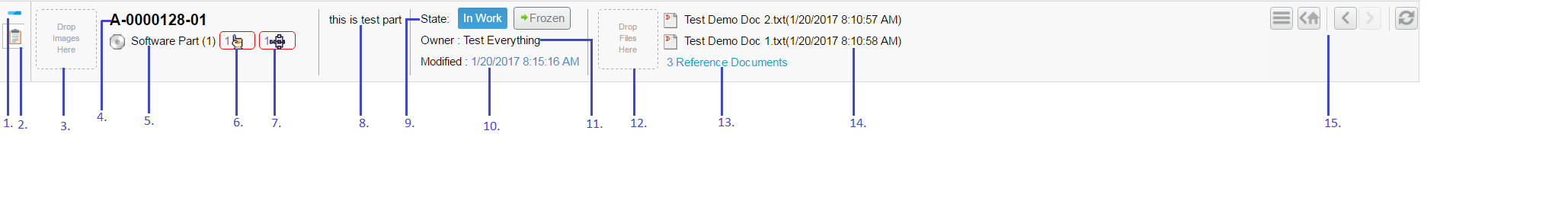
Figure 1. Default Category Toppanel Form
-
Maximize and minimize toggle.
-
Form Control
-
Image drop zone
-
Name of context object
-
Type of context object, with the link to higher revision if it exists.
-
Direct link to pending issues for this context object, shows a table if there are more than one object or else issue object is opened.
-
Direct link to in-process routes for this context object, shows a table if there are more than one object or else route object is opened.
-
Description
-
Previous, current and next state of an object, with links to promote and demote object.
-
Last modified date with the history of the context object.
-
Owner of the context object.
-
Reference document drop zone. On file drop, a new document object is created and connected to a context object.
-
Direct link to reference document tab when there are more than 2 reference documents connected.
-
Reference Document with a link to download file. The zip file is generated when there is more than one file checked in.
-
Enovia actions command to show home page, back, forward and refresh the page.
| Category Top Panel App Menu closes only on click of App Menu button. The vertical menus does not support tab cache behavior. |
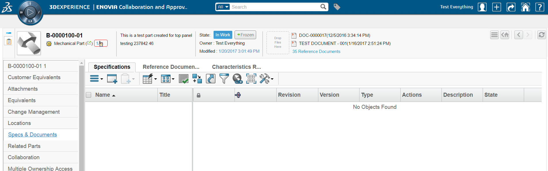
Figure 2. Default Category Toppanel
2.1. Usage
Category Top Panel can be enabled for all objects by adding a filter in web.xml as shown below.
<filter>
    <filter-name>TVCCategoryFilter</filter-name>
    <filter-class>com.technia.tvc.core.gui.category.filter.TVCCategoryFilter</filter-class>
    <init-param>
        <param-name>tvc.category.namespace</param-name>
        <param-value>acme:common</param-value>
    </init-param>
    <init-param>
        <param-name>tvc.category.defaultPanel</param-name>
        <param-value>tvc:toppanel:acme:common/DefaultPanel.xml</param-value>
    </init-param>
    <init-param>
        <param-name>tvc.category.showTVCCategory</param-name>
        <param-value>true</param-value>
    </init-param>
 </filter>
 <filter-mapping>
    <filter-name>TVCCategoryFilter</filter-name>
    <url-pattern>/common/emxTree.jsp</url-pattern>
 </filter-mapping>
The table below describes the supported init parameters:
| Filter Init Param | Description |
|---|---|
|
This filter param defines the namespace to use for looking up category top panel configured for specific types. |
|
Default top panel for all types. |
|
This parameter can have the value true or false. If set to true, default TVC category top panel is enabled for all types. If set to false, only types which have category menu explicitly defined will have TVC category enabled as per category menu. |
2.2. Default Category Top Panel
A default category top panel tvc:toppanel:core:common/DefaultPanel.xml with
built-in form fields and sections is available and pre-configured. It is possible
to extend this and configure what should be shown in default category top panel
form. The filter param tvc.category.defaultPanel can be used to point to default panel.
2.2.1. Default Panel
<TopPanel>
<Title>
<Form>tvc:toppanelform:core:common/DefaultTitle.xml</Form>
</Title>
<Controls>
<Control>
<Label>View/Edit Details</Label>
<IconClass>ti-c ti-details-c</IconClass>
<Href>${TVC_ACTION}/showTopPanelForm?form=tvc:toppanelform:core:common/DefaultForm.xml&compactMode=true</Href>
<Height>80</Height>
</Control>
</Controls>
</TopPanel>| Configuration | Description | ||
|---|---|---|---|
Title |
This is similar to title in standard top panel, but title is not displayed when top Panel is rendered in compact mode. This also support java fields similar to top panel form when form is rendered in compact mode.
|
||
compactMode |
Used to rendered top panel form in compact mode. By default it is false. When compactMode is false, standard top panel form is rendered. |
||
Height |
Height can be specified if form should be rendered in certain size. |
2.2.2. Default Form
<Form>
	<Section>
		<Field>
			<DataHandler>com.technia.tvc.core.gui.toppanel.form.builtin.DefaultImageHandler</DataHandler>
			<FieldCellRenderer>com.technia.tvc.core.gui.toppanel.form.builtin.DefaultImageRenderer</FieldCellRenderer>
		</Field>
	</Section>
	<Section>
		<Field>
			<DataHandler>com.technia.tvc.core.gui.toppanel.form.builtin.TypeRevisionHandler</DataHandler>
			<FieldCellRenderer>com.technia.tvc.core.gui.toppanel.form.builtin.TypeRevisionRenderer</FieldCellRenderer>
		</Field>
	</Section>
	<Section>
		<Field>
			<Expression>description</Expression>
			<FieldCellRenderer>com.technia.tvc.core.gui.toppanel.form.builtin.TopPanelDescriptionRenderer</FieldCellRenderer>
		</Field>
	</Section>
	<Section>
		<Field>
			<DataHandler>com.technia.tvc.core.gui.toppanel.form.builtin.DefaultStateHandler</DataHandler>
			<FieldCellRenderer>com.technia.tvc.core.gui.toppanel.form.builtin.DefaultStateRenderer</FieldCellRenderer>
		</Field>
	</Section>
	<Section>
		<Field>
			<DataHandler>com.technia.tvc.core.gui.toppanel.form.builtin.TopPanelReferenceDocumentHandler</DataHandler>
			<FieldCellRenderer>com.technia.tvc.core.gui.toppanel.form.builtin.TopPanelReferenceDocumentRenderer</FieldCellRenderer>
		</Field>
	</Section>
</Form>
Default form has five sections each having one built-in field, it provides functionality and behaviour similar to Enovia OOTB top panel. Built-in handlers are explained in below sections.
2.2.3. Default Title
<Form>
	<Section>
		<Field>
			<Expression>name</Expression>
		</Field>
	</Section>
	<Section>
		<Field>
			<DataHandler>com.technia.tvc.core.gui.toppanel.form.builtin.DefaultTitleStateHandler</DataHandler>
			<FieldCellRenderer>com.technia.tvc.core.gui.toppanel.form.builtin.DefaultTitleStateRenderer</FieldCellRenderer>
		</Field>
	</Section>
</Form>| Editable element is not supported in the title form field. |
2.2.4. Built in Handlers
Type Revision Handler
This handler is used for showing following details of objects -
-
Name
-
Revision
-
Link to higher revision if exists
-
Pending issues to the context object.
-
Pending changes to the context object.
-
In process routes on the context object.
<Field>
  <DataHandler>com.technia.tvc.core.gui.toppanel.form.builtin.TypeRevisionHandler</DataHandler>
  <Settings>
    <Setting name="showPendingIssue">true</Setting>
    <Setting name="showPendingChanges">true</Setting>
    <Setting name="showInProcessRoutes">true</Setting>
  </Settings>
  <FieldCellRenderer>com.technia.tvc.core.gui.toppanel.form.builtin.TypeRevisionRenderer</FieldCellRenderer>
</Field>| Setting | Description | Example |
|---|---|---|
showPendingIssue |
whether pending issues should be shown. |
true |
showPendingChanges |
whether pending changes should be shown. |
true |
showInProcessRoutes |
whether in process routes on objects should be shown. |
true |
Default Image Handler
This handler is used to render and update the image of an object. Drag and drop are used to uploaded image. When first image is uploaded, it is by default set as primary image. Once image is set as primary, subsequent images are just uploaded. Image editor can be opened by clicking on the image and the new image can be set as primary.
<Field>
  <DataHandler>com.technia.tvc.core.gui.toppanel.form.builtin.DefaultImageHandler</DataHandler>
  <FieldCellRenderer>com.technia.tvc.core.gui.toppanel.form.builtin.DefaultImageRenderer</FieldCellRenderer>
</Field>| Setting | Description | Example |
|---|---|---|
ExlcudeFileTypes |
The symbolic name of the types for which should be excluded from image drop zone rendering. |
type_Project,type_ProjectSpace,type_BusinessSkill,type_ProjectTemplate,type_ProjectConcept |
Reference Document Handler
This handler is used to show and upload reference documents. Drag and drop can be used to create a new document. Name of the file uploaded is set as a title of the document object. First two documents are shown in the field and a link to reference document tab is also shown if there more than two reference documents.
<Field>
  <DataHandler>com.technia.tvc.core.gui.toppanel.form.builtin.TopPanelReferenceDocumentHandler</DataHandler>
  <Settings>
    <Setting name="ExlcudeFileKindof">type_Route,type_RouteTemplate,type_Project</Setting>
    <Setting name="ExlcudeFileTypes">type_Project,type_ProjectSpace,type_BusinessSkill,type_ProjectTemplate,type_ProjectConcept</Setting>
  </Settings>
  <Setting name="ShowOnlyIcon">true</Setting>
  <Setting name="ShowOnlyTitle">true</Setting>
  <FieldCellRenderer>com.technia.tvc.core.gui.toppanel.form.builtin.TopPanelReferenceDocumentRenderer</FieldCellRenderer>
</Field>
Preventing Bad Characters in file names
Files that contain bad characters in its name can be prevented from being uploaded, by defining the set of bad characters using the following setting:
In tvc.properties:
tvc.core.toppanel.badFileNameChars = '#$@&%
Or in TVC init-parameter:
<init-param>
    <param-name>tvc.core.toppanel.badFileNameChars</param-name>
    <param-value>'#$@&%</param-value>
</init-param>| Setting | Description | Example |
|---|---|---|
ExlcudeFileKindof |
The symbolic name of the type kindof for which upload file should not be shown. |
type_Route,type_RouteTemplate,type_Project |
ExlcudeFileTypes |
The symbolic name of the types for which upload file should not be shown. |
type_Project,type_ProjectSpace,type_BusinessSkill,type_ProjectTemplate,type_ProjectConcept |
ShowOnlyIcon |
Only reference document icon will be shown if ShowOnlyIcon is set to true. Default value is false. When both ShowOnlyIcon and ShowOnlyTitle are set to false, Document icon, title and modified date is shown. This is also default behavior. |
true |
ShowOnlyTitle |
Reference document icon and title will be shown if ShowOnlyTitle is set to true. Default value is false. |
true |
RelationshipName |
Symbolic name of the relationship through which reference document will be connected with context object. |
relationship_ReferenceDocument |
Document |
Symbolic name of the document type which should be created. |
type_Document |
Vault |
Symbolic name of the vault in which document should be created. |
vault_eServiceProduction |
Format |
Symbolic name of the file format to be used for checkin of file. |
format_generic |
Policy |
Symbolic name of the policy to be used for reference document creation. |
policy_Document |
ReferenceDocumentCommand |
Name of reference document command in category tree menu. It is possible to give different command names for category tree of different type. Default will be used if specific type is not given. |
type_Part:ENCSpecAndReferenceDoc, type_Document:APPDocumentFiles, default:ReferenceDocumentsTreeCategory |
2.2.5. Default Category
TVC Category Top Panel also supports Enovia Default Category setting. This can be enabled using the following TVC init parameter.
<init-param>
    <param-name>tvc.core.categoryMenu.showDefaultCategory</param-name>
    <param-value>true</param-value>
</init-param>
Default value is False.
2.3. Popup mode
Earlier, the forward and back buttons were available on TVC category top panel for content pages only. As of release 2021.4.0, these buttons are also functional when TVC category top panel is opened in popup mode for Enovia versions 2019x or higher.
2.4. Configurations
2.4.1. Type Specific Category Top Panel
It is possible to define a separate category top panel for any specific type. This can be configured by using category definition defined in namespace as specified in web.xml filter
<filter>
    <filter-name>TVCCategoryFilter</filter-name>
    <filter-class>com.technia.tvc.core.gui.category.filter.TVCCategoryFilter</filter-class> <init-param>
    <param-name>tvc.category.namespace</param-name>
    <param-value>acme:common</param-value>
</init-param>
Category definition follow Enovia type hierarchy and if a category definition exists for type, it is used to load category top panel. If no category definition is found for a type, default category top panel is used.
Sample category top panel configuration
<Category>
    <Action>loadCategoryTopPanel</Action>
    <Param name="panel" value="tvc:toppanel:acme:common/PartPanel.xml" />
</Category>
Action should be loadCategoryTopPanel.
2.4.2. Top Panel Form
It is possible to configure standard top panel form in the default category top panel. This allows to utilize all the capabilities of standard top panel form and still load vertical tab menus. compactMode must be set to false to load standard top panel form. For details on standard top panel form see Top Panel Form Configuration.
Sample Configuration
<TopPanel>
<Title>
<Form>tvc:toppanelform:acme:common/Title.xml</Form>
</Title>
<Controls>
<Control>
<Label>View/Edit Details</Label>
<IconClass>ti-c ti-details-c</IconClass>
<Href>${TVC_ACTION}/showTopPanelForm?form=tvc:toppanelform:acme:common/Form.xml&compactMode=false</Href>
<Height>200</Height>
</Control>
</Controls>
</TopPanel>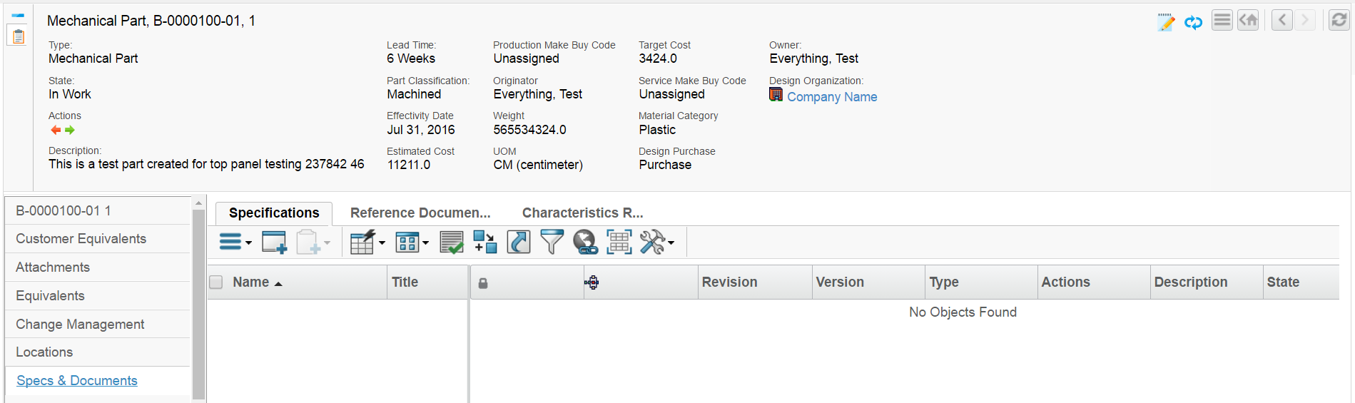
Figure 3. Toppanel Form
2.4.3. Alternate Category Menu
Enovia allows defining alternate category menus for a type based on registered suite in suite/central property file as shown below.
eServiceSuiteProgramCentral.emxTreeAlternateMenuName.type_Project=PMCtype_Project
eServiceSuiteProgramCentral.emxTreeAlternateMenuName.type_ProjectVault=PMCtype_ProjectVault
This feature is by default disabled and can be enabled via init param tvc.core.categoryMenu.enableAlternateCategoryMenu
<init-param>
    <param-name>tvc.core.categoryMenu.enableAlternateCategoryMenu</param-name>
    <param-value>true</param-value>
</init-param>
If present, the category top panel will first try to load the alternate category menu defined for the registered suite and type in suite/central property file. It further navigates the type hierarchy to find the alternate category menu defined for any of parent types. If an alternate category menu is not found, the standard category menu for type will be loaded.