
TVC 2013.1.0 Release Information
21 March 2013
2. Core
2.2. Reply-To in generated e-mails
The Reply-To field of generated e-mails can now be set…
<init-param>
    <param-name>tvc.structurebrowser.sendNotification.fromAddress
    <param-value>enovia@acme.com

<!-- next is optional -->
<init-param>
    <param-name>tvc.structurebrowser.sendNotification.fromName
<param-value>ENOVIA PLM SYSTEM3. Structure Browser
3.1. Evaluate Expandable Nodes
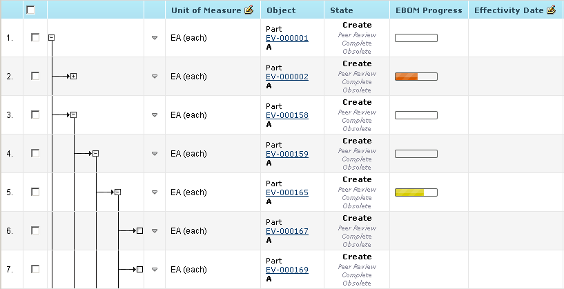
Structure Browser can be configured to evaluate if a node is a leaf node and if it is make it non expandable. This will improve usability as leaf nodes are indicated without expand symbol (plus sign) and it is clear to the end user what nodes are expandable. The evaluation will affect performance (often very little) and is default off.
Expandable node evaluation is controlled through the parameter
evaluateExpandableNodes=true/false or globally through the init-param
tvc.core.structure.evaluate.expandable.node (default false).
Expandable node evaluation will only work with the default mql
based expander (tvc.core.structure.expandWithMQL=true).
|
3.2. Navigation Column
A new feature called "Navigation Column" has been added. This allows you to have any table column appear in the column that has the functionality to navigate a structure.

3.3. Persistent Expand-state
The expand state of an object view can be configured to be persistent i.e. the structure will be expanded the same way the next time the same object view is loaded.
It is controlled through the parameter
persistentExpandState=true/false or globally through the init-param
tvc.structurebrowser.persistentExpandState (default false).
3.4. Cell Renderer Format Improvements
Support for adding custom CSS styling to a table cell through configuration has been added. You can also apply different styling based on the cell value(s) with the help of JavaScript.

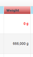
You can also define a custom decimal format to use for the display values of numerical cells.
<DecimalFormat>#,###.# g</DecimalFormat>
<DecimalFormatScale>3</DecimalFormatScale
3.5. Forms
3.5.1. Multi-select Field
A field can be configured to display range values in a list where multiple values can be selected and stored on a regular attribute, separated by a specified character
3.5.2. Type Field Default Empty
A Type field can now be set to empty by default.
<TypeField>
    <DefaultValue>empty</DefaultValue>
</TypeField>
3.5.3. Select Field
In cases where there is a need to display values that are not present on the object that is currently viewed (or relationship), there is the option to use a select field. This type of field can use an expression that is evaluated against the context object to display information.
<SelectField>
    <Label>Related EBOM description</Label>
    <Expression><![CDATA[from[$<relationship_EBOM>].to.description]]></Expression>
</SelectField>
These are the sub-elements that are specific to a SelectField element:
| Element Name | Description | Cardinality | Example |
|---|---|---|---|
Expression |
Specifies an expression that will be evaluated against the context object. |
One Required |
<Expression> <![CDATA[from[$<relationship_EBOM>].to.description]]> </Expression> |
3.5.4. Javascript Validation
You can now define custom javascript functions for validating a form upon submit. The validation can be performed on a field or on the entire form.
<Field>
    <Validation>
        <JSFunction>checkSomething</JSFunction>
    </Validation>
</Field>
function checkSomething(fieldId) \{
var value = $("#" + fieldId).val();
if (value.indexOf("Can I pass?") !== -1) {
alert("You shall not pass!!");
return false;
}
return true;
}4. Graphic Reporting
4.3. Loader improvements
Loaders can be applied at dashboard level and can from now on be shared among several gadgets to retrieve the business objects or connections to base the gadgets for. This will lower the amount of DB calls required to load data into the different gadgets of a dashboard.
Note that the dashboard level loader could still be overridden by gadget specific loaders.
4.3.1. API Changes
The loader improvements have unfortunately required an API change on the Loader interface. If you have implemented a custom java Loader it will no longer compile after upgrade and you will have to apply some small changes.
The interface has been moved to core and have been changed to support both gadget contextual and dashboard level Loaders. The context is used to pass contextual data (such as the contextual gadget) to the loader. New future getters can be added to the context without affecting existing loader implementations.
public interface Loader {

    Collection<String> getIds(DashboardLoaderContext ctx) throws TVCException;
}5. Mobile Access
5.1. Clipboard
Clipboard functionality has been added for mobile devices. It allows you to enable the ability to add objects to the clipboard from a table.
5.2. Context Menu
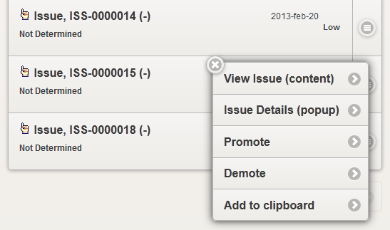
Support for context menu has been added. It is enabled from the pageconfig and will render an icon to the far right of the table row. When clicking this icon it will load the context menu.
5.3. Split Button
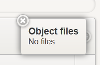
A new table column has been added and it is called "Split Button". This column allows you to render a cell in a "popup" that is launched from a button located to the right in the table. This uses the same space in the table as the context menu so only one of these can be used in a table.
7. File Manager
8. MCAD Optimizer
8.1. Designer Central
8.1.1. Derived Output Column
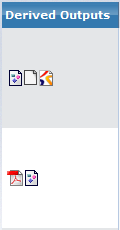
Derived Output is added as a column to the MCAD Navigator and to My MCAD Objects. Via the Derived Output column the user gets easy access to any derived files generated at checkin, for example PDF or STEP. View is the only available action for the files.
8.1.2. MCADInteg-CreateDerivedOutputObject support
Storing the derived output files in separate objects is now supported by the TVC MCAD Optimizer.
8.1.4. Lock and Unlock
Lock and Unlock References and Instances have been added to the "My Catia Objects" and "Catia Navigator" pages. Can be access both from the Actions toolbar or as context menu on each row.
 TVC Classic - 2022.3.0