 TVC Classic - 2022.3.0
tvc.collaboration.appServerNotificationStrategy = ehcache | http
Core - Administration Guide
21 March 2016
Table of Contents
- 1. Legal Notes
- 2. Introduction
- 3. Collaboration - Discussion
- 3.1. Introduction
- 3.2. Installation
- 3.3. Discussions
- 3.4. Notifications
- 3.5. My Space
- 3.6. Structure Browser Integration
- 3.7. External Web Application Integration
- 3.8. Toolbar and Thread Actions
- 3.9. Advanced filter (Exalead powered feature)
- 3.10. Enovia Based Filter
- 3.11. Collaboration Panel Host based Visibility
- 3.12. Additional Configurations
- 4. Wiki
- 5. Tabbed Pages
- 6. Top Panel
- 7. Category Top Panel
- 8. Image Manager
- 9. Image Flow
- 10. Charts
- 11. Data Sets
- 12. Theme Support
- 13. Autocomplete
- 14. Date Picker
- 15. Administrative Functions
- 16. Additional Notes
- 17. 3DDashboard Support
- 18. Other
1. Legal Notes
© Copyright 2003-2019 by TECHNIA AB
All rights reserved.
PROPRIETARY RIGHTS NOTICE: This documentation is proprietary property of TECHNIA AB. In accordance with the terms and conditions of the Software License Agreement between the Customer and TECHNIA AB, the Customer is allowed to print as many copies as necessary of documentation copyrighted by TECHNIA relating to the software being used. This documentation shall be treated as confidential information and should be used only by employees or contractors with the Customer in accordance with the Agreement.
This product includes software developed by the Apache Software Foundation. (http://www.apache.org/).
2. Introduction
The TVC Core is the base component for all the components within the TVC suite. TVC Core provides a framework with a large number of features and services that are used by the TVC components. There are also some parts in TVC core that can be used stand-alone, without the presence of any other TVC component. This document describes those features.
The Developer Documentation contains additional information such as descriptions on how to use the TVC Core framework (MVC, Ajax, TVC plugins etc) and how to use classes from TVC Core. This document will focus on the features that are configurable.
3. Collaboration - Discussion
3.1. Introduction
The TVC Collaboration feature adds a set of functionality that allows users to collaborate around ENOVIA™ data in various ways. Some of the features are:
-
Discussions in context of ENOVIA™ objects
-
Real time notifications on discussion events
-
Inbox to view received notifications
-
Profile page with settings and ability to upload an avatar
3.1.1. System Requirements
The following is a list of the requirements for the installation of this TVC. If your system is different, consult Technia before installing. For best performance it is recommended to use the latest version of browsers and application servers.
-
Requires ENOVIA™ V6R2013 or any later version.
-
Application Server according to the ENOVIA™ core product requirements that is also in the list of supported platforms for the Atmosphere framework (see disclaimer below).
-
If you are using multiple application servers, you must read the next chapter.
-
-
For the Exalead™ powered features you need to install and setup Exalead
Disclaimer: This feature uses a framework called Atmosphere for sending notifications from the server to the clients. This framework supports a wide range of browser and app servers. We will not be able to add support for browsers and/or app servers that is outside of this frameworks support. Also we might not be able to fix issues that could appear in the usage of this framework. See following pages for a list of this frameworks supported platforms and known issues:
| Web browser IE11 in IE9 mode is not supported. |
3.1.2. Multiple Application Servers
Many environments are scaled horizontally to support a larger amount of users. When having > 1 application server you need to use a load balancer that can divide the users across these application servers somehow.
The Collaboration component uses the web socket technology for setting up persistent connections between clients and servers and this technology has a completely different analogy than the traditional request/response paradigm used in HTTP/HTTPS communication. This will have some impact on your infrastructure since your load-balancer must be able to deal with web sockets correctly.
| Technia cannot support every possible infrastructure combination. We can however share information how we have tested it, on what software’s and our configurations. To enable this feature in your own environment / setup-combination you must consult the documentation of your infrastructure components. |
3.1.3. App-to-App-Server Communication
Since users in fact are connected to different application servers, but still should be able to receive notifications from other users – there is a need for the application servers to be able to speak with each other.
There are currently two different implementations available that solves this, one of the implementation uses HTTP communication between the servers and the second implementation uses the Open Source library named Ehcache. The latter is the default communication strategy.
The choice of strategy is defined with a TVC init-parameter. The name of the parameter and the possible values are shown below:
Ehcache™
The Ehcache™ component allows us to setup caches which are replicated among all the other application servers in the same cluster. This replication is done via the RMI protocol and each application server in the cluster is joining a TCP multicast-group.
The strategy of this implementation will try to automatically setup the network communication, but, there are some init-parameters that you may want to fine-tune for some reason or other.
For example, the port that we bind to is automatically picked by selecting a random free port within a specified range. Most likely, you want to define the port manually and in some cases also the network interface to bind to. If your host has multiple network interfaces you might need to specify the host name also. By default, the host name is resolved via the Java API:
InetAddress.getLocalHost().getHostAddress()
Defining the port and host can be done either with JVM system parameters OR TVC init parameters. The parameter name is the same regardless if you define them as a JVM system parameter or as a TVC init parameter. Below is an example how to define as JVM system parameter.
-Dtvc.collaboration.cache.listener.hostName=172.16.16.100
-Dtvc.collaboration.cache.listener.port=2010
The table below shows the additional TVC init parameters that you may want to change in some cases.
| Init Parameter Name | Description | Default Value |
|---|---|---|
tvc.collaboration.cache.listener.portRangeStart |
If you have defined a port explicitly as described above, this parameter can be ignored. Defines the lowest port number that we will try to use. |
4001 |
tvc.collaboration.cache.listener.portRangeEnd |
See above. Defines the highest port number that we might use. |
41020 |
tvc.collaboration.cache.listener.socketTimeoutMillis |
The number of milli-seconds client sockets will wait when sending messages to this listener until they give up. |
2000 |
tvc.collaboration.cache.provider.multicastGroupAddress |
The multi-cast address to be used. |
230.0.0.1 |
tvc.collaboration.cache.provider.multicastGroupPort |
The multi-cast port to be used. |
446 |
tvc.collaboration.cache.provider.timeToLive |
You can control how far the multicast packets propagate by this setting. Using the multicast IP protocol, the timeToLive value indicates the scope or range in which a packet may be forwarded. By convention:
|
1 |
tvc.collaboration.exalead.cache.replicateAsynchronously |
whether replications are asynchronous (true) or synchronous (false) |
false |
HTTP Communication
When selecting the HTTP communication approach, each app-server must be able to connect to the other app server(s) in the cluster via HTTP. The implementation will try to identify the URL of the Application server automatically, but, this might in many cases fail due to the setup of load-balancers / proxies and hence you must inform each application server about their own HTTP address. This is done easiest by providing a JVM system parameter to the application server as shown below:
-Dtvc.collaboration.appServerURL=http://the-appserver-machine:8080/enovia
3.1.4. Test Scenario
Technia have during the development of the Collaboration component tested on a setup using an Apache HTTPD server acting as a load-balancer and behind having a couple of app servers running Apache Tomcat. All on a Windows 7 host.
The Apache HTTPD server has lately improved their support for web-socket tunneling, and we were using the version 2.4.10.VC11 (64 bit).
The Apache Tomcat versions were 7.0.56 (64 bit).
Below are the configurations we made. Note that we only provide these as examples and you should and might need to adjust them to your needs.
Apache HTTPD Configuration
The modules we explicitly enabled were:
-
proxy_module
-
proxy_ajp_module
-
proxy_balancer_module
-
proxy_wstunnel_module
-
lbmethod_byrequests_module
-
lbmethod_bytraffic_module
-
slotmem_shm_module
Proxy configuration
<Proxy balancer://ws>
BalancerMember ws://inv3373:8080 route=t8009
BalancerMember ws://inv3373:8081 route=t8010
ProxySet lbmethod=bytraffic
ProxySet stickysession=JSESSIONID
</Proxy>

ProxyPass /enovia/collaboration/communication balancer://ws/enovia/collaboration/communication

<Proxy balancer://ajp>
BalancerMember ajp://inv3373:8009 loadfactor=1 route=t8009
BalancerMember ajp://inv3373:8010 loadfactor=1 route=t8010
ProxySet lbmethod=bytraffic
ProxySet stickysession=JSESSIONID
</Proxy>

ProxyPass /enovia balancer://ajp/enovia
Tomcat Configuration
Each Tomcat instance were started up using a dedicated start script. Since they were all running on the same machine, we had to configure the ports per instance.
In that start script we configured a number of CATALINA_OPTS as shown
below.
set CATALINA_OPTS=-Dtvc.collaboration.appServerURL=http://localhost:8080/enovia
set CATALINA_OPTS=%CATALINA_OPTS% -Dtomcat.server.port=8005
set CATALINA_OPTS=%CATALINA_OPTS% -Dtomcat.http.port=8080
set CATALINA_OPTS=%CATALINA_OPTS% -Dtomcat.redirect.port=8443
set CATALINA_OPTS=%CATALINA_OPTS% -Dtomcat.ajp.port=8009
The Tomcat server.xml file were changed (note for readability, only changed parts included):
<Server port="${tomcat.server.port}"

<Connector port="${tomcat.http.port}" redirectPort="${tomcat.redirect.port}" />
<Connector port="${tomcat.ajp.port}" protocol="AJP/1.3" redirectPort="${tomcat.redirect.port}" />

<Engine name="Catalina" defaultHost="localhost" jvmRoute="t${tomcat.ajp.port}">
Apache HTTPD Websocket Proxy Configuration
If apache is used to proxy the request to the tomcat server, websocket request could be dropped. Websocket communication is required for collaboration myspace to work properly.
Following is the configuration done in one of the httpd.conf used in apache with ENOVIA 2017x to proxy websocket requests.
3DSpace_httpd_fragment.conf
# to be added in <VirtualHost _default_:443> section of httpd-ssl.conf
RequestHeader set X-Forwarded-Proto "https"
RequestHeader set X-Forwarded-Port "444"

# TVC Collaboration Websocket configuration Starts

LoadModule proxy_module modules/mod_proxy.so
LoadModule proxy_wstunnel_module modules/mod_proxy_wstunnel.so

RewriteEngine on
ProxyRequests Off
ProxyPreserveHost on

ProxyPass /3dspace/collaboration/communication ws://localhost:8090/3dspace/collaboration/communication
ProxyPassReverse /3dspace/collaboration/communication ws://localhost:8090/3dspace/collaboration/communication

# TVC Collaboration Websocket configuration Ends

ProxyPass /3dspace http://localhost:8090/3dspace
ProxyPassReverse /3dspace http://localhost:8090/3dspace
In Enovia versions which are higher than 2017x and using location-based httpd configuration, proxy pass entries can be added in 3DSpace_httpd_fragment.conf in following way.
# TVC Collaboration Websocket configuration Starts

<Location /3dspace/collaboration/communication>
ProxyPass ws://localhost:9080/3dspace/collaboration/communication
ProxyPassReverse ws://localhost:9080/3dspace/collaboration/communication
</Location>

# TVC Collaboration Websocket configuration Ends
3.2. Installation
After installing TVC, you must perform three tasks in order to take this feature in to use.
3.2.1. Task 1 – Modifying emxNavigator.jsp
The first task is needed in order to include some functionality within the "emxNavigator.jsp" page (resides in the common folder in your application directory). The only change needed in this file, is to add a single line of code.
Just after the "body" element tag, add the line below (shown in bold):
<body ...>
<%@include file = "/tvc/collaboration/emxNavigator.jspf" %>
...
3.2.2. Task 2 – Modifying emxNavigatorDialog.jsp
The second task is needed in order to include some functionality within the "emxNavigatorDialog.jsp" page (resides in the common folder in your application directory). The only change needed in this file, is to add a single line of code.
Just after the "body" element tag, add the line below (shown in bold):
<body ...>
<%@include file = "/tvc/collaboration/emxNavigator.jspf" %>
...
3.2.3. Task 3 – web.xml
The third task needed is the registration of the Atmosphere servlet that is used for sending notifications from the server to the client (https://github.com/Atmosphere/atmosphere). The following lines should be added to web.xml
<servlet>
    <servlet-name>AtmosphereServlet</servlet-name>
    <servlet-class>org.atmosphere.cpr.AtmosphereServlet</servlet-class>
    <async-supported>true</async-supported>
    <init-param>
        <param-name>org.atmosphere.cpr.packages</param-name>
        <param-value>com.technia.tvc.collaboration.core.io</param-value>
    </init-param>
    <init-param>
        <param-name>org.atmosphere.annotation.packages</param-name>
        <param-value>com.technia.tvc.collaboration.core.io</param-value>
    </init-param>
    <load-on-startup>5</load-on-startup>
</servlet>
<servlet-mapping>
    <servlet-name>AtmosphereServlet</servlet-name>
    <url-pattern>/collaboration/*</url-pattern>
</servlet-mapping>
3.2.4. TVC Stand-alone Pages
Collaboration panel are also rendered in stand-alone tvc pages like /launchFromPortal, /loadCategoryTopPanel, /loadTopPanel and /searchBasedTable based on configuration.
Following is the default configuration.
tvc.core.collaboration.inject.pages=launch-portal|top-panel|category-panel|search-table
If collaboration panel injection is not required on any of the supported pages, that page can be removed in the configuration.
tvc.core.collaboration.inject.pages=top-panel|category-panel
Even on the supported stand-alone pages, Collaboration panel is rendered by default only if the page is top most.(Popup or browser tab)
That behavior could be changed with the following property configuration.
tvc.core.collaboration.inject.top.only=true
This could be used in application where emxNagivator.jsp is not configured with collaboration and tvc pages only used for navigation.

Figure: Collaboration panel for /launchFromPortal

Figure: Collaboration panel for /loadTopPanel

Figure: Collaboration panel for /loadCategoryTopPanel

Figure: Collaboration panel for /searchBasedTable
3.2.5. Provider
There are three built-in providers available in Collaboration. They are "config"(default), "enovia" and "exalead". The provider value can also be a class full-name which extends "com.technia.tvc.collaboration.core.model.Provider". The provider can be configured as below.
tvc.collaboration.providerClass=config
The default "config" provider enables possibility to have Discussion and Workflow components run in different mode.
tvc.collaboration.discussion.mode=exalead
tvc.collaboration.workflow.mode=enovia
The other "enovia" or "exalead" provider makes both Discussion and Workflow run in same mode.
3.2.6. Exalead™
In order to use any of the features that requires Exalead you need to install Exalead and set it up for collaboration. To enable Exalead for Collaboration there is a TVC Init parameter that needs to be set.
tvc.collaboration.providerClass=exalead
or
tvc.collaboration.providerClass=config
tvc.collaboration.discussion.mode=exalead
tvc.collaboration.workflow.mode=exalead
In order for Exalead to know what data to index for Collaboration the following needs to be added to your Exalead index configuration file.
<BOTYPEFIELDS name="TVCCollaborationSet">
    <FIELD name="TVC_COLLAB_SET_TYPE" select="type" type="STRING" />
    <FIELD name="TVC_COLLAB_SET_ID"
        select="program[TVCCollaborationIndex -method getSetId ${OBJECTID}]"
        type="STRING" />
    <FIELD name="TVC_COLLAB_SET_OWNER" select="owner" type="STRING" />
    <FIELD name="TVC_COLLAB_SET_CONTEXT_ID"
        select="program[TVCCollaborationIndex -method getSetContextIds ${OBJECTID}]"
        type="STRING" />

    <FIELD name="TVC_COLLAB_NOTIFICATION_USER_NAME"
        select="program[TVCCollaborationIndex -method getSelectDataList ${OBJECTID} 'to[TVC Collaboration Notification].from.owner']"
        type="STRING" />
    <FIELD name="TVC_COLLAB_NOTIFICATION_USER_TAGS"
        select="program[TVCCollaborationIndex -method getNotificationUserTags ${OBJECTID}]"
        type="STRING" />
    <FIELD name="TVC_COLLAB_NOTIFICATION_CATEGORIES"
        select="program[TVCCollaborationIndex -method getNotificationCategories ${OBJECTID}]"
        type="STRING" />
    <FIELD name="TVC_COLLAB_NOTIFICATION_STATUS"
        select="program[TVCCollaborationIndex -method getNotificationStatus ${OBJECTID}]"
        type="STRING" />
    <FIELD name="TVC_COLLAB_NOTIFICATION_UNREAD_USERS"
        select="program[TVCCollaborationIndex -method getNotificationUnreadUsers ${OBJECTID}]"
        type="STRING" />
    <FIELD name="TVC_COLLAB_FOLLOWUP_USER_NAME"
        select="program[TVCCollaborationIndex -method getSelectDataList ${OBJECTID} 'to[TVC Collaboration Followup].from.owner']"
        type="STRING" />
    <FIELD name="NAME"
        select="program[TVCCollaborationIndex -method getSetSortValue ${OBJECTID}]"
        type="STRING" fastsort="true" />
</BOTYPEFIELDS>

<BOTYPE name="TVC Collaboration Thread" includes="TVCCollaborationSet,TVCCollaborationThread" />

<BOTYPEFIELDS name="TVCCollaborationThread">
    <FIELD name="TVC_COLLAB_THREAD_CLOUDS"
        select="program[TVCCollaborationIndex -method getClouds ${OBJECTID}]"
        type="STRING" />
    <FIELD name="TVC_COLLAB_THREAD_FIRST_MSG_SENT_FROM" select="from[TVC Collaboration First Message].to.owner"
        type="STRING" />
    <FIELD name="TVC_COLLAB_THREAD_FIRST_MSG_SENT_TO"
        select="program[TVCCollaborationIndex -method getSelectDataList ${OBJECTID} 'from[TVC Collaboration First Message].to.from[TVC Collaboration Sent To].to.owner']"
        type="STRING" />
    <FIELD name="TVC_COLLAB_THREAD_HAS_ATTACHMENT"
        select="from[TVC Collaboration First Message].to.format.hasfile"
        type="STRING" />
    <FIELD name="TVC_COLLAB_THREAD_IMPORTANT"
        select="from[TVC Collaboration First Message].to.attribute[TVC Collaboration Important]"
        type="STRING" />
    <FIELD name="TVC_COLLAB_THREAD_LAST_MSG_SENT_FROM" select="from[TVC Collaboration Last Message].to.owner"
        type="STRING" />
    <FIELD name="TVC_COLLAB_THREAD_LAST_MSG_SENT_TO"
        select="program[TVCCollaborationIndex -method getLastMessageSentTo ${OBJECTID}]"
        type="STRING" />
    <FIELD name="TVC_COLLAB_THREAD_LAST_MSG_SENT_CC"
        select="program[TVCCollaborationIndex -method getLastMessageSentCc ${OBJECTID}]"
        type="STRING" />
    <FIELD name="TVC_COLLAB_THREAD_PRIVATE" select="attribute[TVC Collaboration Private]"
        type="BOOLEAN" />
    <FIELD name="TVC_COLLAB_THREAD_SENT_FROM" select="from[TVC Collaboration Thread Message].to.owner"
        type="STRING" />
    <FIELD name="TVC_COLLAB_THREAD_SENT_TO"
        select="program[TVCCollaborationIndex -method getSelectDataList ${OBJECTID} 'from[TVC Collaboration Thread Message].to.from[TVC Collaboration Sent To].to.owner']"
        type="STRING" />
    <FIELD name="TVC_COLLAB_THREAD_SUBJECT" select="attribute[TVC Collaboration Subject]"
        type="STRING" />
    <FIELD name="TVC_COLLAB_THREAD_SYSTEM_TAGS"
        select="program[TVCCollaborationIndex -method getSystemTags ${OBJECTID}]"
        type="STRING" />
    <FIELD name="TVC_COLLAB_THREAD_USER_TAGS"
        select="program[TVCCollaborationIndex -method getUserTags ${OBJECTID}]"
        type="STRING" />
    <!-- Example of custom index field for a specific tag
    <FIELD name="CUSTOM_TAG_FIELD_OFFICE"
        select="program[TVCCollaborationIndex -method getIndexedSystemTag ${OBJECTID} 'office']"
        type="STRING" /> -->
</BOTYPEFIELDS>

<BOTYPE name="TVC Collaboration Workflow" includes="TVCCollaborationSet,TVCCollaborationWorkflow" />

<BOTYPEFIELDS name="TVCCollaborationWorkflow">
    <FIELD name="TVC_COLLAB_WORKFLOW_TITLE" select="attribute[TVC Collaboration Workflow Title]"
        type="STRING" />
    <FIELD name="TVC_COLLAB_WORKFLOW_STATUS" select="attribute[TVC Collaboration Workflow Status]"
        type="STRING" />
    <FIELD name="TVC_COLLAB_WORKFLOW_COMPLETION_DATE"
        select="attribute[TVC Collaboration Workflow Completion Date]" type="STRING" />
    <FIELD name="TVC_COLLAB_WORKFLOW_DUE"
        select="program[TVCCollaborationIndex -method getWorkflowDue ${OBJECTID}]"
        type="BOOLEAN" />
    <FIELD name="TVC_COLLAB_TASK_ASSIGNED"
				select="program[TVCCollaborationIndex -method getTaskAssigned ${OBJECTID}]"
				type="STRING" />
    <FIELD name="TVC_COLLAB_TASK_STATUS"
				select="program[TVCCollaborationIndex -method getSelectDataList ${OBJECTID} 'from[TVC Collaboration Item].to[*|revision==last].attribute[TVC Collaboration Task Status]']"
				type="STRING" />
</BOTYPEFIELDS>
Sorting in Exalead is only possible to do on the field called "NAME". In case you have other information you need to index and sort on you will probably already have a name field in your config.xml. This means that objects indexed by TVC Collaboration needs to coexist with other objects on what data to index in the name field.
The way forward is to make a JPO in which you determine if the object belongs to TVC Collaboration or not. In case it is a TVC Collaboration object the value to index is determined by Collaboration otherwise it is delegated to the Exalead standard indexing mechanism.
Example code snippet handling the name field:
private static final Collection<String> TVC_COLLABORATION_TYPES = Arrays.asList("TVC Collaboration Thread", "TVC Collaboration Workflow");

if (TVC_COLLABORATION_TYPES.contains(type)) {
    IndexProgram.getMessageSortValueJPO(ctx, args);
    // Or if you have access to the object id directly
    //IndexProgram.getMessageSortValue(objectId);
} else {
    // Logical handling all other type of objects
}
To optimize the indexing performance when there is no other BOTTYPE configutation other than Collaboration specific configuration, use the below:
<INDEXER>
    <LINKTARGET active="false" size="100000"/>
    <!--
     .. other configurations
    -->
</INDEXER>
Exalead Index Configurations
Below properties can be configured to alter default behaviour.
| Property | Description | Default Value |
|---|---|---|
tvc.collaboration.exalead.index.partial |
thread is pushed to partial indexing |
true |
tvc.collaboration.exalead.thread.modified |
thread modified date is updated |
true |
tvc.collaboration.search.pagesize |
Result count returned by exalead. This property will be used in case page size is not defined in Workflow find API execution |
100 |
3.2.7. Elasticsearch™
In order to use any of the features that requires Elasticsearch you need to install Elasticsearch and set it up for collaboration. We have tested it for version 7.1.1 and it should work for later versions as well. It is only supported for discussions at the moment and not for workflows. To enable Elasticsearch for Collaboration there is a TVC Init parameter that needs to be set.
tvc.collaboration.providerClass=elastic
or
tvc.collaboration.providerClass=config
tvc.collaboration.discussion.mode=elastic
tvc.collaboration.workflow.mode=enovia|exalead
In order to control certain aspects of Elasticsearch, following configuration possibilities exists.
| Property Key | values | Description |
|---|---|---|
tvc.collaboration.elasticSearch.hosts |
http://localhost:9200 (default) |
specify the location of elasticsearch instance |
tvc.collaboration.elasticSearch.number_of_shards |
1 (default) |
specify number of shards to be setup |
tvc.collaboration.elasticSearch.number_of_replicas |
1 (default) |
specify number of replicas to be setup. This is for fail-over/high availability in case some node crashes |
tvc.collaboration.elasticSearch.max_result_window |
1000 (default) |
specify max number of results to be returned when querying elasticsearch |
| Requires Java 1.8 or any later version. |
Elasticsearch configurations
Move the required jar
Move the tvc-elastic-dependency.jar from ../<webapp-name>/WEB-INF/collaboration to ../<webapp-name>/WEB-INF/lib directory.
Configurations in TVCDiscussionConfig.xml
In order for Elasticsearch to know what data to index for Collaboration the following needs to be added to your TVCDiscussionConfig.xml file.
<ElasticSearch>
		<Endpoint>/tvc_collaboration_discussion</Endpoint>
		<Method>PUT</Method>
		<Schema><![CDATA[{
			"properties" : {
				"_mxid" : {
					"type" : "keyword",
					"expression" : "id"
				},
				"_physicalid" : {
					"type" : "keyword",
					"expression" : "physicalid"
				},
				"TVC_COLLAB_SET_NAME" : {
					"type" : "keyword",
					"expression" : "name"
				},
				"TVC_COLLAB_SET_TYPE" : {
					"type" : "keyword",
					"expression" : "type"
				},
				"TVC_COLLAB_SET_ID" : {
					"type" : "keyword",
					"expression" : "id"
				},
				"TVC_COLLAB_SET_OWNER" : {
					"type" : "keyword",
					"expression" : "owner"
				},
				"TVC_COLLAB_SET_CONTEXT_ID" : {
					"type" : "text",
					"expression" : "to[TVC Collaboration Discussion].from.to[TVC Collaboration Discussion Container].from.id"
				},
				"TVC_COLLAB_NOTIFICATION_USER_NAME" : {
					"type" : "text",
					"expression" : "to[TVC Collaboration Notification].from.owner"
				},
				"TVC_COLLAB_NOTIFICATION_USER_TAGS" : {
					"type" : "text",
					"className" : "com.technia.tvc.collaboration.discussion.elasticsearch.impl.NotificationUserTagsDataHandler"
				},
				"TVC_COLLAB_NOTIFICATION_CATEGORIES" : {
					"type" : "text",
					"className" : "com.technia.tvc.collaboration.discussion.elasticsearch.impl.NotificationCategoriesDataHandler"
				},
				"TVC_COLLAB_NOTIFICATION_STATUS" : {
					"type" : "text",
					"className" : "com.technia.tvc.collaboration.discussion.elasticsearch.impl.NotificationStatusDataHandler"
				},
				"TVC_COLLAB_NOTIFICATION_UNREAD_USERS" : {
					"type" : "text",
					"className" : "com.technia.tvc.collaboration.discussion.elasticsearch.impl.NotificationUnreadUsersDataHandler"
				},
				"TVC_COLLAB_FOLLOWUP_USER_NAME" : {
					"type" : "text",
					"expression" : "to[TVC Collaboration Followup].from.owner"
				},
				"TVC_COLLAB_THREAD_CLOUDS" : {
					"type" : "text",
					"className" : "com.technia.tvc.collaboration.discussion.elasticsearch.impl.CloudDataHandler"
				},
				"TVC_COLLAB_THREAD_FIRST_MSG_SENT_FROM" : {
					"type" : "keyword",
					"expression" : "from[TVC Collaboration First Message].to.owner"
				},
				"TVC_COLLAB_THREAD_FIRST_MSG_SENT_TO" : {
					"type" : "text",
					"expression" : "from[TVC Collaboration First Message].to.from[TVC Collaboration Sent To].to.owner"
				},
				"TVC_COLLAB_THREAD_HAS_ATTACHMENT" : {
					"type" : "boolean",
					"expression" : "from[TVC Collaboration First Message].to.format.hasfile"
				},
				"TVC_COLLAB_THREAD_IMPORTANT" : {
					"type" : "boolean",
					"expression" : "from[TVC Collaboration First Message].to.attribute[TVC Collaboration Important]"
				},
				"TVC_COLLAB_THREAD_LAST_MSG_SENT_FROM" : {
					"type" : "keyword",
					"expression" : "from[TVC Collaboration Last Message].to.owner"
				},
				"TVC_COLLAB_THREAD_LAST_MSG_SENT_TO" : {
					"type" : "text",
					"className" : "com.technia.tvc.collaboration.discussion.elasticsearch.impl.LastMessageSentToDataHandler"
				},
				"TVC_COLLAB_THREAD_LAST_MSG_SENT_CC" : {
					"type" : "text",
					"className" : "com.technia.tvc.collaboration.discussion.elasticsearch.impl.LastMessageSentCcDataHandler"
				},
				"TVC_COLLAB_THREAD_PRIVATE" : {
					"type" : "boolean",
					"expression" : "attribute[TVC Collaboration Private]"
				},
				"TVC_COLLAB_THREAD_SENT_FROM" : {
					"type" : "keyword",
					"expression" : "from[TVC Collaboration Thread Message].to.owner"
				},
				"TVC_COLLAB_THREAD_SENT_TO" : {
					"type" : "text",
					"expression" : "from[TVC Collaboration Thread Message].to.from[TVC Collaboration Sent To].to.owner"
				},
				"TVC_COLLAB_THREAD_SUBJECT" : {
					"type" : "keyword",
					"expression" : "attribute[TVC Collaboration Subject]"
				},
				"TVC_COLLAB_THREAD_SYSTEM_TAGS" : {
					"type" : "text",
					"className" : "com.technia.tvc.collaboration.discussion.elasticsearch.impl.SystemTagsDataHandler"
				}
			}
		}]]>
		</Schema>
	</ElasticSearch>
In order to specify the name of the index, <Endpoint> tag is used. Elasticsearch supports only lowercase characters.
<Endpoint>/tvc_collaboration_discussion</Endpoint>Configurations for adding an additional custom field
In order to add custom fields, simply add them to the <Schema>..</Schema> json above and define a "type" and "className" or "expression". A custom class for a custom field should implement the following interface,
com.technia.tvc.collaboration.discussion.elasticsearch.ESDataHandler
For indexing a specific system tag, you need to implement the following abstract class and implement the method getKey() to specify the Tag that needs to be indexed.
com.technia.tvc.collaboration.discussion.elasticsearch.impl.IndexedSystemTagDataHandler
| It’s important to restart the Application Server and Sync Service, if you delete the Index in ElasticSearch manually, otherwise the schema will not be set correctly. |
Backup Sync Service
The call to index an object in elastic search is made as soon as the transaction is committed. However, there could be scenarios where the index fails due to network issues etc. So in order to cover those scenarios, there is a possibility to setup a backup sync service which will look for objects which are not indexed and will try to index them. Follow these steps to setup the service as a windows service.
-
Copy the batch files from ../3dspace/WEB-INF/collaboration to your preferred local folder like C:/temp/ESSyncService
-
Download NSSM (64 bit) and copy the .exe to the same folder above (C:/temp/ESSyncService)
-
Rename the nssm.exe to TVC-ES-Indexing-Application.exe.
-
Modify the setup.bat file with the correct path etc. and remove what is not applicable for your setup.
-
Modify InstallEsIndexing.bat with the correct paths etc. The default service name is "TVC-ES-Indexing-Application-localhost" which can be changed as desirable.
-
Now run the InstallEsIndexing.bat as administrator and the service will be installed.
In order to control certain aspects of the sync service, you need to create "indexing.properties" file in the same folder specified above (C:/temp/ESSyncService) with all the following properties.
| Property Key | values | Description |
|---|---|---|
tvc.esindexing.resourceRootDirectory |
C:/webapp/3dspace/WEB-INF/tvc |
specify the location of tvc |
tvc.esindexing.threadpoolsize |
5 |
specify the number of threads to be used for indexing |
tvc.esindexing.thread.findlimit |
5000 |
specify the number of non-indexed objects to search for at a time. If the threadpoolsize is 5 and findLimit is 5000 then each thread will index 1000 objects |
tvc.esindexing.monitor.rate |
5 |
specify (in secs.) the rate at which the service should look for non-indexed objects in the database |
tvc.esindexing.user |
creator |
specify the context user |
tvc.esindexing.password |
specify the context user password |
|
tvc.esindexing.forcereindex |
true or false |
if TRUE then the service will re-index already indexed objects as well, otherwise only non-indexed objects will be indexed |
| The server where the sync service needs to be setup should have a 64-bit JDK. It will not work with a 32-bit JDK. |
In order to control logging, you need to create "logging.properties" file with something like this. Also update the location where the log file should be created.
# Configure root logger
log4j.rootLogger=ERROR

log4j.logger.com.technia.tvc = INFO, TVC_APPENDER, TVC_CONSOLE_APPENDER

log4j.appender.TVC_CONSOLE_APPENDER=com.technia.tvc.log4j.ConsoleAppender
log4j.appender.TVC_CONSOLE_APPENDER.layout=com.technia.tvc.log4j.PatternLayout
log4j.appender.TVC_CONSOLE_APPENDER.layout.ConversionPattern=[TVC-ESINDEXING] [%t]%x %5p %d{ISO8601} (%F:%L) - %m%n

# Configure TVC_APPENDER
log4j.appender.TVC_APPENDER=com.technia.tvc.log4j.DailyRollingFileAppender
log4j.appender.TVC_APPENDER.File=C:/Temp/syncService/logs/TVC-Esindexing456.log
log4j.appender.file.MaxFileSize=10MB
log4j.appender.TVC_APPENDER.layout=com.technia.tvc.log4j.PatternLayout
log4j.appender.TVC_APPENDER.layout.ConversionPattern=[TVC-ESINDEXING] [%t]%x %5p %d{ISO8601} (%F:%L) - %m%n
Delete Use Case
Today, deletion of "TVC Collaboration Threads" is not available as part of the standard product. However, there could be use cases where you would like to delete old (older than 90 days) thread objects to get rid of old data like using a cron job. ElasticSearch indexing supports this use case and in order to remove/delete the objects from elastic search index, you need to call the elastic search in the following way. This should be called after the objects are successfully deleted from the database i.e after the transaction is committed in the databse. Also, if the deletion request to elastic search fails due to network issue, the request will be persisted in the database and the backup sync service will try to remove those objects from elastic search index again until successful.
ElasticSearch.getInstance().indexer().remove(Identifier physicalId);
ElasticSearch.getInstance().indexer().removeAll(List<Identifier> physicalIds);
3.2.8. 3DDashboard Widgets
Collaboration True widgets can be configured through the widget preferences in the administrator’s dashboard. It runs directly inside the 3DDashboard widget iframe. The following widgets URL can be used to configure myspace and panel as a custom Application in 3DDashboard.
-
Myspace :
<server-url>/webapps/tvc/collaboration/tvcCollaborationMyspaceWidget.html

-
Panel :
<server-url>/webapps/tvc/collaboration/tvcCollaborationPanelWidget.html

Refer 3DDashboard chapter for configuring the widget app.
Drag and drop support in panel widget
The collaboration panel needs a context object to show the related sets. If there is no context object, the panel widget will show the message to drop an object.
Drop messages can be changed and internationalized through the widget string resource file which exists under the <webapps>\tvc\collaboration\asset\nls location.
Users can drag an object from TVC Widget, Helium True Widget, and DS OOTB widgets and drop it over the TVC Collaboration Panel widget to refresh the panel with the dropped object as context.

Collaboration Widget Publish/Subscribe
TVC collaboration panel widget can be subscribed for other widgets to refresh the panel widget by clicking the other widget’s table link.
Users need to add the comma separate widget ids in the Widget to Subscribe field on the Edit preferences page.
It can also be published for other widgets, so on clicking the context object link in collaboration widgets, respected widgets will be refreshed. For such a case, the user needs to add the widget id of the panel widget into the Widget to Subscribe field in the Edit preferences page of other widgets.

3.3. Discussions
The discussion functionality allows you to discuss around any type of object in Enovia. The discussion functionality is located in a side panel on the right side of the page content. This allows the users to discuss around an object while still being able to navigate around the different pages of an object.
3.3.1. Discussion panel setup
The panel that contains the discussion functionality is located in the right side of the application. It is injected on the side of the page content so It will stay visible even when navigating around the different pages of an object. The panel is collapsed by default and will be expanded on click.

After clicking on the panel it will be expanded towards the left side and show the discussions for the object that you are currently in context of.

If you disabled the discussion functionality for some object types by configuration the panel will be greyed out and the user will not be able to expand it.
3.3.2. Single Discussion Load
If there is single set in the set list and user want to load the details of set on load of panel or on switching the panel tab then following system property need to be set as true (default:false).
| Property | Description | Default Value |
|---|---|---|
tvc.collaboration.panel.showSingleSet |
to load the details of set if there is only one in the list |
false |
In Single set load, set id priority will be in following order:
-
Passed setId in panel load option
-
Set Id If there is single set in the set list and property is true.
-
Cached working set Id in session storage
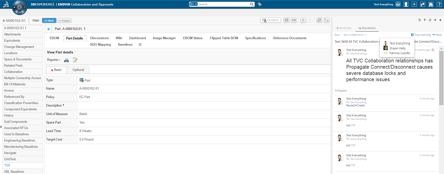
3.3.3. Viewing object discussions
When the user is standing in context of an object that has support enabled for discussions it will be possible to expand the discussion panel in order to view and/or create discussions. The default view of the panel will show a toolbar in the top and below that a list of all the discussions that has been started around the context object.
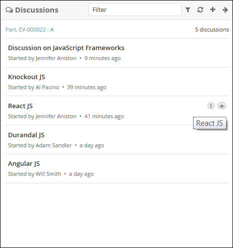
Figure 1. Listing context object discussions
Each discussion in the list is clickable. The entire discussion will be loaded when a user clicks on it. See next chapter for more details on that.
3.3.4. Viewing a discussion
When a discussion in the list has been clicked it will load the entire discussion in the panel. In this view the user will be able to see all the messages in the discussion and also have the ability to reply to it.
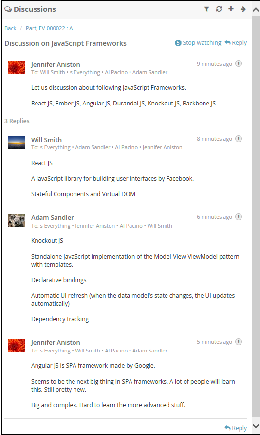
Figure 2. Showing a discussion
3.3.5. Discussion Command
Command like ShowWatchers, ToggleWatch, Reply and customize command are configurabale. possible command position are HEADER, FOOTER , BOTH. By defalut command, Reply position are BOTH.
public class DiscussionReply extends Command {
	...
    public DiscussionReply(MenuContext ctx) {
		...
        this.setPosition(Position.BOTH);
		...
    }
	...
}
3.3.6. Creating a new discussion
In order to create a new discussion you use the action in the top toolbar (plus sign). That will launch a form that allows you enter the data needed to create a new discussion.
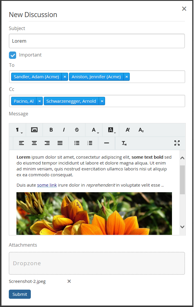
Figure 3. Creating a new discussion
The following data can be entered:
-
The subject of the discussion
-
A flag that indicates if the discussion is important or not (visual indication)
-
A list of recipients. If this is set then the message will be "private" and only visible to these users. Otherwise it will be public and visible to everyone that has access to this object.
-
A set of user "tags". Currently this is only used for display but in coming releases it could be used for loading discussions based on tags.
-
Message content (rich text or plain text)
-
Attachments
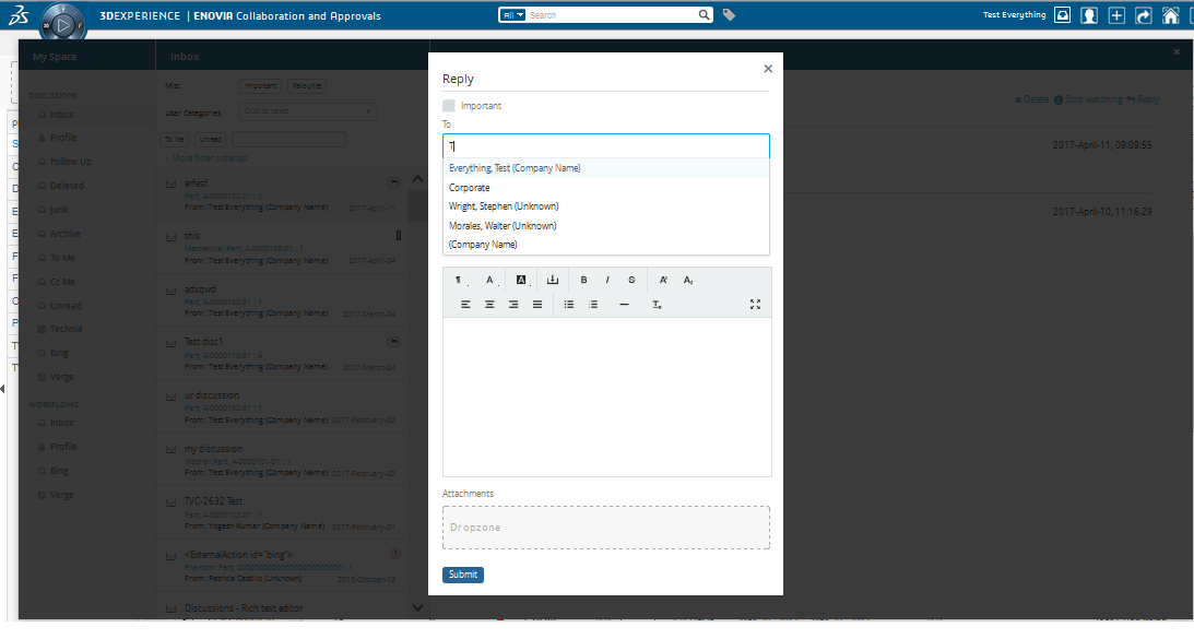
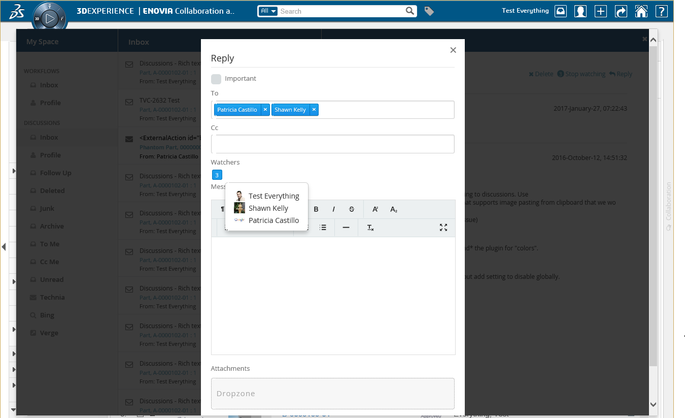
3.3.7. Replying to a discussion
A user can reply to a discussion using the reply button located at the top or bottom of the discussion. The reply form is the same as the one you use when you create a new discussion but you are not able to set a subject (see chapter above on creating a new discussion)
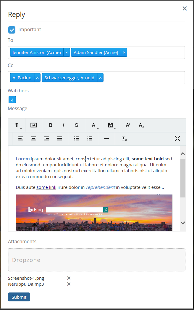
Figure 4. Replying to a discussion
3.3.8. Closing a discussion
When a discussion is no longer required to continue, the user can close the discussion using the close button located at the top of the discussion. Once the discussion is closed, replying to a discussion is not possible. By default, only the owner of the discussion can access the close discussion command.
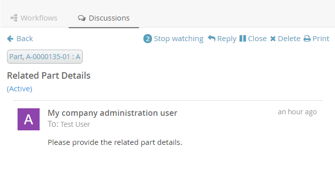
Figure 5. Closing a discussion
3.3.9. Opening a discussion
In some cases, the user may need to reopen the discussion. In those cases, the user can reopen the discussion using the open button located at the top of the discussion. By default, only the owner of the discussion can access the open discussion command.
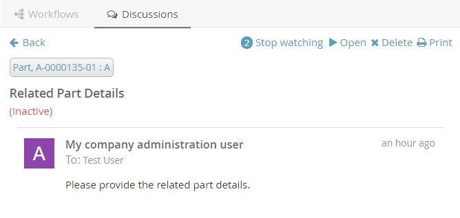
Figure 6. Opening a discussion
3.3.10. Printing a discussion
To print a discussion that happened in any context, the user can use the print button located at the top of the discussion.
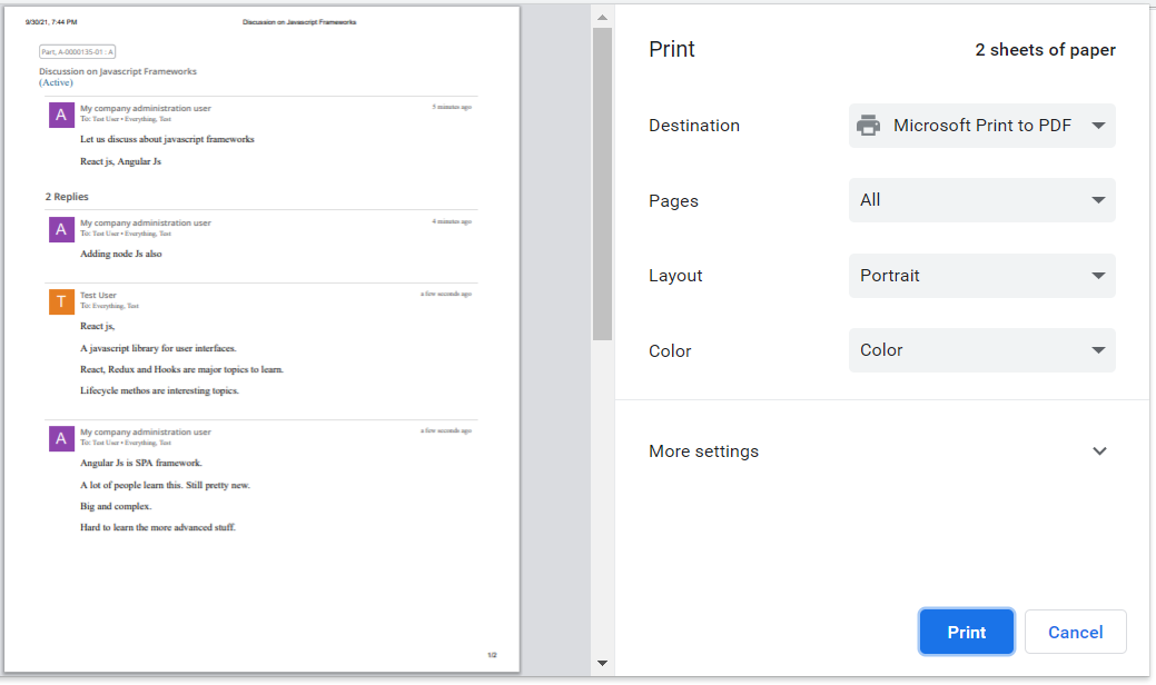
Figure 7. Printing a discussion
3.3.11. Deleting a discussion
When a discussion is no longer required, the user can delete the discussion using the delete button located at the top of the discussion.
Once the discussion is deleted, undo is not possible. By default, the only owner of the discussion can access the delete discussion command.
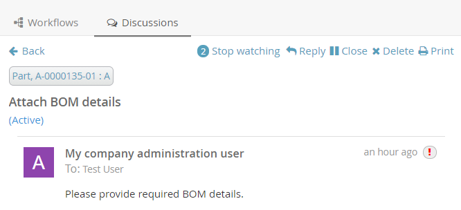
Figure 8. Deleting a discussion
3.3.12. Discussion Commands Configuration
Users can configure the discussion behaviour by changing the below properties in the string resource file.
| Property | Description | Default Value |
|---|---|---|
tvc.collaboration.thread.status.active |
Active discussion status |
Active |
tvc.collaboration.thread.status.inactive |
Inactive discussion status |
Inactive |
tvc.collaboration.discussion.toaster.delete.success |
Delete success message |
Discussion is deleted successfully |
tvc.collaboration.discussion.toaster.close.success |
Close success message |
Discussion is closed successfully |
tvc.collaboration.discussion.toaster.open.success |
Open success message |
Discussion is reopened successfully |
The following system properties are introduced to control commands behaviour.
| Property | Description | Default Value |
|---|---|---|
tvc.collaboration.discussion.command.delete |
Delete discussion command |
false |
tvc.collaboration.discussion.command.open |
Open discussion command |
false |
tvc.collaboration.discussion.command.close |
Close discussion command |
false |
tvc.collaboration.discussion.command.print |
Print discussion command |
true |
3.3.13. Create/Reply Discussion Form Configuration
Using tvc.properties create/reply discussion form fields can be configured to be hidden except Subject and Message fields.
| Property | Description | Default Value |
|---|---|---|
tvc.collaboration.showPrivate |
To show Private Filed |
false |
tvc.collaboration.showImportant |
To show Important Filed |
true |
tvc.collaboration.showToRecipient |
To show To Recipient Filed |
true |
tvc.collaboration.showCcRecipient |
To show Cc Recipient Filed |
true |
tvc.collaboration.showWatcher |
To show Watcher Filed |
true |
tvc.collaboration.showUserTags |
To show User Tags Filed |
false |
tvc.collaboration.showContextObjects |
To show Context Objects Filed (shown for multiple context objects) |
true |
tvc.collaboration.showDropzone |
To show Dropzone Filed |
true |
tvc.collaboration.focus.message.reply |
To focus message field on reply |
false |
3.3.14. Configuration
The ability to discuss around objects can be configured on the server.
This is done in a file called TVCDiscussionConfig.xml that is placed in
/WEB-INF/classes/TVCDiscussionConfig.xml. If you skip to have this
configuration file the users will be able to discuss around ANY object
in Enovia with default settings.
Below is an example configuration file that shows the supported elements and their location.
<DiscussionConfigs>
<TabOrder>1</TabOrder>
<ConfiguredTypes>
<Type derived="false" status="disabled">type_MechanicalPart</Type>
<Type derived="false" status="expand" if="$<context.user.isassigned[role_Designer]>">type_HardwarePart</Type>
<Type derived="false" status="disabled">type_HardwarePart</Type>
<Type derived="false" status="enabled">type_NutPart</Type>
<Type derived="false" status="enabled" className="com.technia.tvc.collaboration.discussion.model.dao.enovia.config.builtin.DiscussionConfigType">type_NutPart</Type>
</ConfiguredTypes>
<DiscussionConfig for="Part" if="attribute[Usage] != Abc">
<TagHandler className="..."/>
<Tags>
<Object>
<Tag select="type" key="kind"/>
<Tag select="name" key="identifier"/>
<Tag select="revision" key="revision"/>
<Tag select="current" key="state"/>
</Object>
<User>
<!-- user specific tag. used for custom context action and filter. -->
<Tag key="xfav" value="false" />
</User>
</Tags>
<ContextInfoResolver>
<Macro>${TYPE}, ${NAME} : ${REVISION}</Macro>
<URL>/common/emxNavigator.jsp?objectId=${OBJECTID}</URL>
</ContextInfoResolver>
<Cloud>true</Cloud>
<Toolbar>tvc:menu:tvx:collaboration/CustomToolbar.xml</Toolbar>
<Filter ref="tvc:collaborationfilter:tvx:collaboration/Product.xml" />
</DiscussionConfig>
<ObjectIdResolver/>
<OrganizationResolver/>
<ContextInfoResolver/>
<DiscussionConfigSorter className="com.technia.tvc.collaboration.discussion.model.dao.enovia.config.DefaultDiscussionConfigSorter" />
<DiscussionPanelThreadActions>tvc:menu:tvx:collaboration/CustomMenu.xml</DiscussionPanelThreadActions>
<InboxThreadActions>tvc:menu:tvx:collaboration/CustomMenu.xml</InboxThreadActions>
<TagIndexFieldMapping>
  <Tag key="office" fieldName="CUSTOM_TAG_FIELD_OFFICE" />
</TagIndexFieldMapping>
</DiscussionConfigs>TabOrder
This element defines the component position in sidepanel and myspace. The text value should be integer and Components are arranged in ascending order.
Tab Persistence
To open the collaboration panel for a context object with previously active component tab or set, browser storage is used.
This behavior could be controlled by using different type of storage which is handled by following property.
| Property Key | values | Description |
|---|---|---|
tvc.collaboration.panel.storage.preference |
memory(default) |
persist only for panel instance |
local |
persist until the user manually clears the browser cache or until your web app clears the data |
|
session |
persist until the window or tab is closed. |
ConfiguredTypes
The <ConfiguredTypes> tag allows configuration of component’s visibility for different types in the system.
The child elements for this are <Type>
Type
This element allows you to control the collaboration behavior for a specific type. Following are the supported attributes for Type element.
| Attribute | Description | Default Value |
|---|---|---|
status |
enabled, disabled, hidden, expand (enabled and automatically opened side panel) or none |
none |
derived |
whether status applicable to derived types |
true |
if |
whether configuration is applicable |
|
className |
class extending com.technia.tvc.collaboration.core.model.dao.enovia.config.panel.DefaultConfigType for custom logic |
Status Persistence
Following system property can be used to persist the panel status of a context object type for a user.
| Proeprty | Description | Default Value |
|---|---|---|
tvc.collaboration.panel.status.persist |
Persist the status through the data object of a person |
false |
Default panel status for non-configured type is "disabled".
Following property can be used to change the behaviour.
| Property | Description | Default Value |
|---|---|---|
tvc.collaboration.discussion.panel.status |
hidden |
disabled |
DiscussionConfig
The <DiscussionConfig> element is used if you want to configure the discussion behavior for a type of object. You can have any amount of this element in your configuration. This is currently used in order to configure system generated tags that are saved on each discussion.
TagHandler
Allows you to point out a class that will have the logic for writing
system generated tags on discussions. The complete name of the class to
use is added to the attribute called "className". That class has to
implement the interface com.technia.tvc.collaboration.core.model.tag.TagHandler.
Tags
This element allows you to generate system tags added to discussions. You can add any amount of child elements with the name <Tag>. On that element the "select" attribute is used for adding a select expression for fetching values to save and the "key" element specifies the key to save it on. All tags are saved together as a JSON string in an attribute.
ContextInfoResolver
This element is applicable to a single CollaborationConfig (i.e DiscussionConfig or WorkflowConfig) and also to all CollaborationConfigs. This element can be used to configure custom settings for the context information related to an object (used to display a link to the context object for a discussion/workflow).
The child element <Macro> is used to configure the "display name" and
the <URL> element is used to configure the URL to the context object.
The child element <FileInfoResolver> is used to configure the File Actions displayed in the inbox if the context object holds files.
If TVC Office component is available, the actions behave similar to column type "actions".
Default implementation resolves display name from <Macro> ${type},
${name} : ${revision}</Macro> and context URL from <URL>
/common/emxNavigator.jsp?objectId=${OBJECTID}</URL>.
The complete name of the class to use is added to the attribute called
"className". That class has to implement the interface
com.technia.tvc.collaboration.core.model.context.ContextInfoResolver.
Following properties can be used to configure the behavior of context path.
| Property | Description | Default Value |
|---|---|---|
tvc.collaboration.contextpath.popup |
Whether context path should be opened popup |
false |
tvc.collaboration.contextpath.popup.width |
Width of context path popup window in pixel |
900 |
tvc.collaboration.contextpath.popup.height |
Height of context path popup window in pixel |
700 |
tvc.collaboration.helium.route |
Whether to use helium route when running in Helium |
true |
TagIndexFieldMapping
This element makes it possible to map a specific tag against a field that is indexed in Exalead. This feature is optional but should be used when you have advanced filters against tags since the performance is improved.
<TagIndexFieldMapping>
<Tag key="office" fieldName="CUSTOM_TAG_FIELD_OFFICE" />
</TagIndexFieldMapping>To get Exalead to index this field you also have to add the following to your exalead index configuration next to the other fields that are indexed for threads.
<FIELD name="CUSTOM_TAG_FIELD_OFFICE"
	   select="program[TVCCollaborationIndex -method getIndexedSystemTag ${OBJECTID} 'office']"
	   type="STRING" />
Cloud
Configures if clouds should be generated. Clouds are used to label messages with one or more entities (other than the context object). Read more about Clouds in later chapters.
ObjectIdResolver
This element is required only when custom parameters instead of objectId passed to load discussions. Allows you to point out a class that will have the logic for returning objectId from the parameters.
Default implementation resolves objectId based on type, name, revision
and vault values separated by &. (type=Part&name=10001&revision=1&vault=Production).
The complete name of the class to use is added to the attribute called
"className". That class has to implement the interface
com.technia.tvc.collaboration.core.model.dao.enovia.config.ObjectIdResolver.
OrganizationResolver
This element allows to return the Organization of the user, which can be used to show along with user name is Collaboration component. When there are multiple Organizations returned for the user, multiple entries will be shown in the autocomplete for the given user each for each organization.
Default implementation resolves Organizations based on Member relationship to Organization by "Organization Name" attribute value.
The complete name of the class to use is added to the attribute called
"className". That class has to implement the interface
com.technia.tvc.collaboration.core.model.dao.enovia.config.OrganizationResolver.
This element also supports an attribute called "select" which can be selectable to get Organization value.
<OrganizationResolver select="attribute[Organization Name]"/>.
From/Sender user organization is resolved using the implementation of OrganizationResolver’s getSenderOrganizations.
This property has to be enabled for Organization
tvc.collaboration.showOrganization=true.
Following properties can be used to tune autocomplete field.
| Property | Description | Default Value |
|---|---|---|
tvc.collaboration.showOrganization |
To enable Organizations inside collaboration component |
false |
tvc.collaboration.autocomplete.startWith |
Whether search criteria should match starting instead of contains |
false |
tvc.collaboration.autocomplete.minLength |
No. of characters after autocomplete initiated |
2 |
tvc.collaboration.autocomplete.loadThrottle |
No. of milliseconds after autocomplete initiated |
400 |
tvc.collaboration.autocomplete.caseSensitive |
Whether search criteria should be case sensitive |
false |
tvc.collaboration.autocomplete.clear.client.cache |
Whether to clear existing cached search result |
false |
tvc.collaboration.autocomplete.loadOnFocus |
To preload and open the assignee list on focus |
false |
public class TestOrganizationResolver extends DefaultOrganizationResolver {

    @Override
    public List<Organization> getOrganizations(String user) throws TVCException {
        return super.getOrganizations(user);
    }

    @Override
    public List<Organization> getSenderOrganizations(OrganizationContext context) throws TVCException {
        //context contains Message, previously resolved Organizations, contextIds and Env
        return super.getSenderOrganizations(context);
    }
}
PersonSuggestionsResolver
This element is applicable to a single CollaborationConfig (i.e DiscussionConfig or WorkflowConfig) and also to all CollaborationConfigs.
This element is used to get the user Suggestions for auto complete field along with the recently selected users.
The attribute select is used to configure expression which will be executed for context ids to get the person suggestions.
<PersonSuggestionsResolver className="tvc.collaboration.person.suggestions.TestPersonSuggestionsResolver" select="context.user"/>
The complete name of the class to use is added to the attribute called
"className". That class has to implement the interface
com.technia.tvc.collaboration.core.model.person.suggestions.PersonSuggestionsResolver.
This property can be used for disabling the saving and displaying the suggestions. It is true by default.
tvc.collaboration.autocomplete.suggestions.enabled=true.
Following properties can be used to tune suggestions for autocomplete field.
| Property | Description | Default Value |
|---|---|---|
tvc.collaboration.autocomplete.suggestions.count |
Max number of suggestions to be displayed |
5 |
tvc.collaboration.autocomplete.search.fields |
search criteria should based on the field of the search result. value is comma separated field list such as "label,value" |
label |
public class TestPersonSuggestionsResolver extends DefaultPersonSuggestionsResolver {

    @Override
    public List<Organization> getSuggestions(PersonSuggestionsData data){
        return super.getOrganizations(data);
    }

}
TVCDiscussionConfig.xml
<DiscussionConfigs>
...
    <DiscussionConfig for="type_Part">
        <PersonSuggestionsResolver select="owner"/>
    </DiscussionConfig>

    <PersonSuggestionsResolver select="context.user"/>
...
</DiscussionConfigs>
ContextInfoResolver
This element is applicable to a single CollaborationConfig (i.e DiscussionConfig or WorkflowConfig) and also to all CollaborationConfigs. This element can be used to configure custom settings for the context information related to an object (used to display a link to the context object for a discussion/workflow).
The child element <Macro> is used to configure the "display name" and
the <URL> element is used to configure the URL to the context object.
The child element <FileInfoResolver> is used to configure the File Actions displayed in the inbox if the context object holds files.
If TVC Office component is available, the actions behave similar to column type "actions".
Default implementation resolves display name from <Macro> ${type},
${name} : ${revision}</Macro> and context URL from <URL>
/common/emxNavigator.jsp?objectId=${OBJECTID}</URL>.
The complete name of the class to use is added to the attribute called
"className". That class has to implement the interface
com.technia.tvc.collaboration.core.model.context.ContextInfoResolver.
Following properties can be used to configure the behavior of context path.
| Property | Description | Default Value |
|---|---|---|
tvc.collaboration.contextpath.popup |
Whether context path should be opened popup |
false |
tvc.collaboration.contextpath.popup.width |
Width of context path popup window in pixel |
900 |
tvc.collaboration.contextpath.popup.height |
Height of context path popup window in pixel |
700 |
tvc.collaboration.helium.route |
Whether to use helium route when running in Helium |
true |
DiscussionConfigSorter
This element allows configuration of custom sort program for DiscussionConfigs.
The complete name of the class to use is added to the attribute called
"className". That class has to implement the interface
com.technia.tvc.collaboration.discussion.model.dao.enovia.config.DiscussionConfigSorter.
Rich Text Editor
A Rich Text Editor can be enabled instead of the standard message field when creating or replying to discussions. This editor allows the user to write messages using "rich text", enabling more advanced formatting.
The editor is enabled globally in the TVCDiscussionConfig.xml file. The default and preferred editor is called TinyMCE (https://www.tinymce.com/) but there is also legacy support for the editor called Trumbowyg (https://alex-d.github.io/Trumbowyg/)
When using the TinyMCE editor it is also possible to configure it by passing custom init settings. This is done using the optional <EditorSettings> element. Check the TinyMCE web page for documentation on valid settings.
|
i. The settings has to be valid JSON. See example below
ii. Rich Text Editor tinymce/trumbowyg is supported on Internet Explorer with Ver:11 and above iii. TinyMCE V5.10.5 is used for tinymce editor. |
<DiscussionConfigs>
...
    <RichTextEditor>
        <Editor>tinymce</Editor>
        <!-- <Editor>trumbowyg</Editor> -->
        <EditorSettings><![CDATA[{
          "height": 500,
          "menubar": false,
          "plugins": [
            "advlist autolink lists link image charmap print preview anchor",
            "searchreplace visualblocks code fullscreen",
            "insertdatetime media table contextmenu paste code"
          ],
          "toolbar": "undo redo | insert | styleselect | bold italic | alignleft aligncenter alignright alignjustify | bullist numlist outdent indent | link image",
          "content_css": "//www.tinymce.com/css/codepen.min.css"
        }]]></EditorSettings>
    </RichTextEditor>
</DiscussionConfigs>
3.3.15. Cloud (Exalead powered feature)
Messages are often created in context of an object. It can later on be found when navigating to that particular object and then opening the discussion panel. The cloud concept allows labelling of messages with other entities. It can be other objects or fictive clouds.
Example: Let’s presume we are in the apparel industry. We are working with seasons and each season we launch a number of products which in turn consists of parts. When a message is created on a product it should be labelled with the season cloud. Messages created on a part should be included in both the product and season cloud. Once users navigate to the product or season they can see discussions related to the product/season cloud.
Cloud Locator
The Cloud Locator is used to define the cloud(s) a particular object is part of. It locates the clouds based on object ids.
The locator is used when creating new messages that have clouds enabled (done in the DiscussionConfig). For searching it also used when the "searchBase" is set to cloud. A Clouds Locator is required to be implemented and registered if using the cloud concept.
Cloud Locator interface:
public interface CloudLocator {
    Collection<Cloud> getClouds(Collection<Identifier> ids);
}
Note that the method takes a collection of ids. Messages can be created in context of several objects, hence the collection. The clouds returned should consider all the ids.
Example implementation:
public class ExampleCloudLocator implements CloudLocator {

    private static final Logger logger = Logger.getLogger(ExampleCloudLocator.class);

    @Override
    public Collection<Cloud> getClouds(Collection<Identifier> ids) {
        Collection<Cloud> clouds = new ArrayList<Cloud>();
        try {
            DataExtractor extractor = new DataExtractor()
                .addId(EnoviaIds.asList(ids))
                .addStatement(Statement.ID, Statement.TYPE, Statement.NAME);
            Result result = extractor.perform();
            Iterator<SelectedData> itr = result.iterator();
            while (itr.hasNext()) {
                SelectedData data = itr.next();

                String id = data.getSelectValue(Statement.ID);
                String type = data.getSelectValue(Statement.TYPE);
                String name = data.getSelectValue(Statement.NAME);

                if ("Product".equals(type)) {
                    clouds.add(Cloud.getIntance(id, String.format("Product %s", name)));
                } else if ("Part".equals(type)) {
                    clouds.add(Cloud.getIntance(id, String.format("Part %s", name)));

                    // Add to product cloud
                    Product product = getProduct(id);
                    if (product != null) {
                        clouds.add(Cloud.getIntance(product.getId(),
                                String.format("Product %s", product.getName())));
                    }
                }
            }

        } catch (TVCException e) {
            logger.error(e, e);
        }
        return clouds;
    }

    private Product getProduct(String partId) throws TVCException {
        // Code omitted
    }
}
Register the locator when application server starts in your TVC Plugin class:
public final class AcmePlugin extends TVCComponentBase {

    @Override
    public void init() {
        CloudService.setLocator(new ExampleCloudLocator());
    }
}
3.3.16. Subscriptions
When a discussion is created and sent to some users all of them are automatically subscribed (started watching) to the thread. Any reply to the thread is notified to all the subscribers/watchers of the thread.
Any time user can unsubscribe or stop watching the thread clicking the stop watching. Any time use can start watching the thread by clicking start watching.
Start watching / Stop watching action can be performed in inbox as well.
When a thread is replied number of watchers to the thread is shown. Clicking the watcher count will show all users watching the thread.
3.3.17. Single page mode
By default the reply form is opened in "popups". This is good for visibility since the form gets all focus. However this prevents the users from reading the previous replies while doing a new reply. So if it is more important to be able to see the entire discussion while gruntreplying we have added a new rendering mode called "single page mode". This will do the following two changes to the UI:
-
The reply form will not be opened in "popups". It is instead rendered directly in the top of the discussion you are replying to (both inbox and side panel).
-
All discussions are expanded/viewed directly in the same "page" when you click on them. (Instead of reloading the whole page with the clicked discussion)
This mode is enabled by setting the following parameter to true.
| Property | Description | Default Value |
|---|---|---|
tvc.collaboration.discussionpanel.mode.singlePage |
Enable single page mode |
false |
3.3.18. Page Size
By default all notifications and collaboration objects are displayed under myspace and panel but we can limit the page size to limit the objects count on initial load by using following property:
| Property | Description | Default Value | Range |
|---|---|---|---|
tvc.collaboration.inbox.pagesize |
limit objects on initial load in myspace |
100 |
10 to 500 |
tvc.collaboration.discussionpanel.pagesize |
limit objects on initial load in panel |
50 |
10 to 500 |
If there is more objects than the page size exist in system then on scroll next set of page is displayed.
3.3.19. Absence and Delegation
Users can updated their Absence dates and Delegatee to be assigned for any future active Workflow tasks during that period can be configured in Myspace’s Profile Action page.

Figure 9. Absence and Delegation Configuration
On selection of absent person for To, CC or assignee field, it will be reflected in red and tooltip will provide the absence related information.

Figure 10. Absent Person Selection
Property |
Description |
Default |
tvc.collaboration.person.showAbsenceMessage |
To show the absent person selection in red and tooltip for absence details |
true |
tvc.collaboration.person.profile.startDateInputTime |
to add the start day input time on selected date |
00:00:00 |
tvc.collaboration.person.profile.endDateInputTime |
to add the end day input time on selected date |
23:59:59 |
tvc.collaboration.person.delegation.cache |
to use java object cache to fetch the person delegation information |
true |
3.4. Notifications
3.4.1. Receiving a notification
At some events that occur in the discussion functionality there are "notifications" sent out to users that are involved in a discussion in one or more ways. If someone starts a discussion around an object then the owner of that object will get a notification. Users will also get notifications when another user is replying to a discussion or message that user started.
These notifications are sent to the user instantly when an event is occurring. We have two ways of notifying the users, one called "Inline notifications" and one called "Web notifications". These work in the same way but are displayed in different ways.
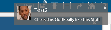
Inline notification (default)
Inline notifications are rendered in the top right corner of the browser window when an event occurs.
 Inline notification
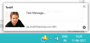
Web notification
Web notifications are displayed on the computer desktop, outside of the browser window. The benefit of this is that you will notice it even if your browser window is minimized. This is currently not supported in Internet Explorer and really old versions of the other browsers. Clicking the notification will show the browser window and open My Space.
 Web notification
3.4.2. Notification Handler
Notification Handler can be used to enable other type of notifications like Email, Log or custom implementations. Default is Web notification which is used to send real-time notification to browsers.
Notification Handler is supported in both Collaboration Configs. (DiscussionConfigs or WorkflowConfigs).
It can be built-in handlers like <Web/>, <Email> or <Log/> or class implementing interface "com.technia.tvc.collaboration.core.model.dao.enovia.config.NotificationHandler"
NotificationHandler contains isValidNotification method which needs to be overridden to avoid the notification for a specific condition.
|
<WorkflowConfigs> or <DiscussionConfigs>
...
    <Notification>
        <Web />
        <Email />
        <Log />
        <Handler className="com.technia.tvc.collaboration.core.model.dao.enovia.config.notification.LogNotificationHandler" />
    </Notification>
</WorkflowConfigs> or </DiscussionConfigs>
Email Notification Handler
When Email Notification Handler is enabled, notifications will also be sent out to the recipients and watchers via Emails. The email notifications will not be sent to the context person and it can be controlled by the following property.
| Property | Description | Default Value |
|---|---|---|
tvc.collaboration.notification.email.to.context_user |
Set |
false |
User Preference for Email Notification
Users can enable and disable the Email notification through the profile in Myspace. See Myspace Profile Section for details.
On enabling/disabling the Email Notification, it sets the preference_NotificationEmail property on the person admin object.
|
Email Templates
Email Notification requires the MX_SMTP_HOST is configured and users have valid email address.
Email Notification Handler uses templates configured in string resources.
Following is the default template property key used for discussion email notifications.
tvc.collaboration.discussion.email.templateFollowing are the MACROs that can be used as $(MACRO) in the email templates.
FROM_USER
FROM_EMAIL
TO_USER
TO_EMAIL
DATE
MESSAGE
CONTEXT_INFO
Example:
tvc.collaboration.discussion.email.template = <p>Hello $(TO_USER),</p><p>Following message created by $(FROM_USER)<$(FROM_EMAIL)> at $(CONTEXT_INFO)</p> \
<blockquote>$(MESSAGE)</blockquote> \
<pre><em><sub>This message is system generated and sent by TVC Discussion.</sub></em></pre>3.5. My Space
When clicking on the icon in the global toolbar it will open something called "My Space" as a big overlay in the browser window. "My Space" contains a set of different functionality related to the user and the TVC Collaboration feature. Inbox and Profile are the default preconfigured "My Space" Actions. The functionality that is displayed on first load is called "Inbox" and is described in the next chapter. First load "My Space" Action can be rearranged TVCDiscussionConfig.xml.
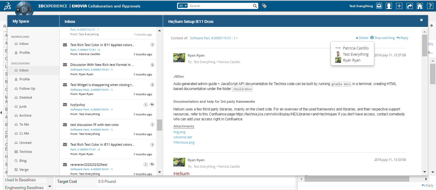
3.5.1. Inbox
The inbox is a functionality used for displaying all notifications that a user has received. It has a layout that is similar to a mail application.

Figure: Inbox displaying notifications
Configuration
When MySpaceConfig is modified to include other "My Space" Actions. It is mandatory to include default Actions as well. Actions can be reordered. All Inbox derived actions can be repeated with different configuration but with unique action id. Actions can also be grouped under different labels.
<MySpaceConfig>
    <!-- short form -->
    <!-- <InboxAction/> -->
    <!-- custom inbox with custom id -->
    <!-- <InboxAction id="some-unique-action-id"/> -->
    <InboxAction>
        <Font>fa-inbox</Font>
        <Label>Inbox</Label>
        <Label locale="de">Posteingang</Label>
        <Label locale="sv">inkorg</Label>
        <Header>Inbox</Header>
        <Header locale="de">Posteingang</Header>
        <Header locale="sv">inkorg</Header>
        <GroupLabel>Other</GroupLabel>

        <!-- optional advanced feature configurations. more details below. -->
        <ThreadActions className="com.technia.tvc.collaboration.core.test.TestDPLocalThreadActionsProvider">tvc:menu:tvx:collaboration/CustomMenu.xml</ThreadActions>
        <Filter ref="tvc:collaborationfilter:tvx:collaboration/Inbox.xml"></Filter>
        <ContextMenu ref="tvc:menu:tvx:collaboration/CustomMenu.xml"></ContextMenu>
        <Resources>
            <JavaScript src="/tvx/js/custom.js"></JavaScript>
            <StyleSheet src="/tvx/css/custom.css"></StyleSheet>
            <AjaxService service="customService"></AjaxService>
            <Template id="customTemplate" src="/tvx/template/custom.jsp"></Template>
        </Resources>
    </InboxAction>
</MySpaceConfig>
3.5.2. ToMe (Exalead powered feature)
"ToMeAction" is a predefined custom Inbox Actions which depends on Exalead that can used in "My Space". This action shows the inbox items sent to the context user as "To" Recipient.

3.5.3. CcMe (Exalead powered feature)
"CcMeAction" is a predefined custom Inbox Actions which depends on Exalead that can used in "My Space". This action shows the inbox items sent to the context user as "Cc" Recipient.

3.5.4. Unread (Exalead powered feature)
"UnreadAction" is a predefined custom Inbox Actions which depends on Exalead that can used in "My Space". This action shows the inbox items which are not read by the context user.

3.5.5. System Notification (Exalead powered feature)
"SystemNotificationAction" is a predefined custom Inbox Actions which depends on Exalead that can used in "My Space". This action shows the inbox items which are system generated. System generated Inbox items are identified using System Tags. Refer the consecutive chapters for configuration.

Creating Message using API
Other than user generated, messages can be created in result of system event or trigger actions.
DiscussionDAOFactory factory = DAOFactory.getInstance().getDiscussionFactory();
DiscussionConfigDAO configDAO = factory.getConfigDAO();
MessageDAO messageDAO = factory.getItemDAO();

Message message = new Message();
message.addContextId(configDAO.resolveId("14668.27509.6640.54321"));
message.setFrom(factory.getPersonDAO().read("Adam Sandler"));
message.setImportant(true);
message.setSubject("Fastener Part-EV-0000020-A released");
message.setMessage("Fastener Part-EV-0000020-A released using ECO Eco-00003");
message.setRepliable(false);

//sample tag to denote system notification
message.addSystemTag(Tag.getIntance("event", "trigger"));
//message.addSystemTag(Tag.getIntance("Event", "system"));

message.addRecipient(new Recipient(RecipientType.TO, new Person("Jennifer Aniston")));

Environment env = RequestUtils.newEnv(request);
env.put(Message.SANITIZE_HTML, false); //default is true

messageDAO.create(message, env);
Collection<Notification> notifications = messageDAO.getNotifications(message.getId(), env);
factory.getSetDAO().notify(new NotificationContext.Builder(ctx).setNotifications(notifications).build());
Configuration
SystemNotficationAction should be configured with Filter (see this chapter) with invisible FilterItem which matches the above generated System tag to filter System Notifications.
Other Inbox Actions as well should be configured with Filter which excludes System Notifications.
<MySpaceConfig>
    <SystemNotificationAction>
       <Filter applyOnLoad="true" showOnLoad="true" visibleRowCount="1">
           <Row visible="false">
               <FilterItem>
                   <Operator>EQUAL</Operator>
                   <LogicalOperator>OR</LogicalOperator>
                   <MapsTo>
                      <Tag>
                        <Name>event</Name>
                      </Tag>
                   </MapsTo>
                   <Values>
                       <Value selected="true">
                          <SubmitValue>trigger</SubmitValue>
                          <DisplayValue>trigger</DisplayValue>
                       </Value>
             </Values>
                   <UIControl>text</UIControl>
               </FilterItem>
           </Row>
       </Filter>
   </SystemNotificationAction>

   <!-- System Notifications to be excluded in other Inbox Actions -->
   <InboxAction>
       <Filter applyOnLoad="true" showOnLoad="true" visibleRowCount="1">
           <Row visible="false">
              <FilterItem>
                 <Operator>NOT_EQUAL</Operator>
                 <LogicalOperator>AND</LogicalOperator>
                 <MapsTo>
                     <Field>
                        <Name>TVC_COLLAB_THREAD_SYSTEM_TAGS</Name>
                     </Field>
                 </MapsTo>
                 <Values>
                     <Value selected="true">
                         <SubmitValue>event</SubmitValue>
                         <DisplayValue>event</DisplayValue>
                     </Value>
                 </Values>
                 <UIControl>text</UIControl>
             </FilterItem>
          </Row>
       </Filter>
    </InboxAction>
</MySpaceConfig>
3.5.6. Followup (Exalead powered feature)
"FollowupAction" is a predefined custom Inbox Actions which depends on Exalead that can used in "My Space". This action shows the inbox items which are followed by the context user.
Following Inbox items using Context Menu:

Followup showing followed item by the context user:

3.5.7. Deleted (Exalead powered feature)
"DeletedAction" is a predefined custom Inbox Actions which depends on Exalead that can used in "My Space". This action shows the inbox items which are deleted using delete context command by the context user.

3.5.8. Sent (Exalead powered feature)
"SentAction" is a predefined custom Inbox Actions which depends on Exalead that can used in "My Space". This action shows the inbox items which are sent by the context user.

3.5.9. Junk (Exalead powered feature)
"JunkAction" is a predefined custom Inbox Actions which depends on Exalead that can used in "My Space". This action shows the inbox items which are marked junk using junk context command by the context user.

3.5.10. Archive (Exalead powered feature)
"ArchiveAction" is a predefined custom Inbox Actions which depends on Exalead that can used in "My Space". This action shows the inbox items which are marked archive using archive context command by the context user.

3.5.11. Profile
The profile page has functionality for doing various types of actions related to the user. It is used for uploading an avatar image that will be displayed in discussions and for controlling user preferences.

Figure: Profile Page
3.5.12. External
"ExternalAction" is a predefined custom Inbox Actions which can used in "My Space". This action can be used to host External web application inside iframe of Collaboration component.
Bing.com as MySpace Action:

Configuration
<MySpaceConfig>
    <ExternalAction id="bing">
        <Label>Bing</Label>
        <Font>fa-search</Font>
        <Header>Bing</Header>
        <Href>http://bing.com</Href>
    </ExternalAction>
    <ExternalAction id="verge">
        <Label>Verge</Label>
        <Header>The Verge</Header>
        <Href>http://www.theverge.com/</Href>
    </ExternalAction>
</MySpaceConfig>
3.5.13. Inbox Context Actions
Inbox will have following context actions which can be applied on multiple selected Inbox items.
| Action | Description |
|---|---|
Mark as Read |
Marks the context selected Inbox item as read |
Mark as unread |
Marks the context selected Inbox item as not read |
Follow up |
Marks the context selected Inbox item as being followed |
Unfollow up |
Removes the context selected Inbox item being followed |
Categorize |
Contains sub actions to add categories and clear categories for the selected inbox item |
Delete |
Moves the context selected Inbox item to deleted inbox |
Junk |
Moves the context selected Inbox item to junk inbox |
Archive |
Moves the context selected Inbox item to archive inbox |
Move to Inbox |
Moves the context selected item to inbox again |
Below properties can be configured to show the context actions like Delete, Archive, Junk and Move to Inbox
| Property | Description | Default Value |
|---|---|---|
tvc.collaboration.inbox.context.command.delete |
Whether to show Delete context command |
false or true when <DeleteAction> configured |
tvc.collaboration.inbox.context.command.junk |
Whether to show Junk context command |
false or true when <JunkAction> configured |
tvc.collaboration.inbox.context.command.archive |
Whether to show Archive context command |
false or true when <ArchiveAction> configured |
tvc.collaboration.inbox.context.command.moveToInbox |
Whether to show Move To Inbox context command |
false or true when <DeleteAction> or <JunkAction> or <ArchiveAction> configured |

Category’s label can be changed using "All Categories…" context action.

Custom Context Action configuration
It is possible to add additional context action commands to Inbox Context Menu. This customization can be done with xml configuration.
The additional context actions for the specific inbox can be configured like this (placed inside a
<InboxAction> or something that is derived from that).
<MySpaceConfig>
    <InboxAction>
        <ContextMenu ref="tvc:menu:tvx:collaboration/CustomContextMenu.xml"></ContextMenu>
  </InboxAction>
</MySpaceConfig>
Configuration element details
All the different configuration elements share the same abilities of configuration. You can ADD commands using a TVC XML menu configuration.
By adding a reference to a TVC XML menu configuration it is possible to add one or more actions. This uses the same menu configuration as other TVC (not everything supported though). Below is an example configuration:
<Menu>
    <Command>
        <Label>Welcome</Label>
        <Href>
            <![CDATA[
            javascript:alert('Hello!');
            ]]>
        </Href>
    </Command>
    <Command>
        <Label>Favourite</Label>
        <Href>
            <![CDATA[
            javascript:$inbox.updateUserTag($notification, 'xfav', 'true', false);
            ]]>
        </Href>
        <Setting name="enablerScript">
           <![CDATA[
            (function(notifications, name, value){
				return notifications.map(function(notification) {
                    var tag = notification.userTags.filter(function(tag) {
                    return tag.name === name;
                  });
                  return tag.length == 0 || tag[0].value== 'false';
                }).indexOf(true) > -1
            })(notification, 'xfav');
            ]]>
        </Setting>
        <Setting name="visibilityScript">
            <![CDATA[
            (function($inbox, id){
                return $inbox.getActionId() !== id;
            })($inbox, 'favourite-inbox');
            ]]>
        </Setting>
    </Command>
    <Command>
        <Label>Unfavourite</Label>
        <Href>
            <![CDATA[
            javascript:$inbox.updateUserTag($notification, 'xfav', 'false', $inbox.getActionId() === 'favourite-inbox');
            ]]>
        </Href>
        <Setting name="enablerScript">
            <![CDATA[
            $inbox.tagEnablerScript(notification, 'xfav', 'true');
            ]]>
        </Setting>
    </Command>
    <Command>
        <Label>Close</Label>
        <FontIcon>fa fa-pause</FontIcon>
        <Alt>Custom Close</Alt>
        <Href>
            <![CDATA[javascript:$context.closeDiscussion($event);]]>
        </Href>
		<AccessExpression><![CDATA['Test Everything' == context.user]]></AccessExpression>
		<Setting name="Status"> Active </Setting>
    </Command>
        <Command>
        <Label>Open</Label>
        <FontIcon>fa fa-play</FontIcon>
        <Href>
            <![CDATA[javascript:$context.openDiscussion($event);]]>
        </Href>
		<Setting name="Status"> Inactive </Setting>
    </Command>
    <Command>
        <Label>Delete</Label>
        <FontIcon>fa fa-times</FontIcon>
        <Href>
            <![CDATA[javascript:$context.deleteDiscussion($event);]]>
        </Href>
    </Command>
</Menu>
Use the <Image> element to control the action
icon. Action command’s JavaScript executed on command click. Use the
<Label> element for adding a text to the action.
AccessExpression
The setting is to control command visibility based on condition. Also, settings like AccessProgram and AccessFunction are supported.
Status
The setting to show a custom command based on discussion thread status. ex. If status is Active, the custom command is only visible when discussion thread status is Active.
Href
Here $inbox', '$notification' are script objects in scope when action command executes. other scope objects are '$event', 'notification', '$command'.
updateUserTag is method available on $inbox object.
-
first parameter is $notification (selected items)
-
second parameter is custom tag. it can be any valid tag name.
-
third parameter is custom tag value. it can be any valid tag value.
-
fourth parameter is boolean. 'true' will remove the selected item from view. 'false' does nothing.
-
ex: $inbox.getActionId() === 'favourite-inbox' evaluates to true or false. when true, selected item is removed from view. when current inbox is "favourite-inbox" and unfavouriting a item will remove the item from view.
-
<Command>
   <Href>
   <![CDATA[
    javascript:$inbox.updateUserTag($notification, 'xfav', 'true', false);
   ]]>
   </Href>
</Command>

<!-- or -->

<Command>
   <Href>
   <![CDATA[
    javascript:$inbox.updateUserTag($notification, 'xfav', 'true', $inbox.getActionId() === 'favourite-inbox');
   ]]>
   </Href>
</Command>
enablerScript
setting to a custom script function to show the command 'enabled' or 'disabled'. The function can use builtin scope objects like '$notification', 'notification', '$component' and '$inbox'.
tagEnablerScript is method available on $inbox object. returns true if any selected notifications contains the given tag and value.
| TVC-2018.4.0 onwards, selection of multiple message has been supported for context action. So the first parameter will be an array of notification object and enabler script must be modified accordingly for proper behavior. Please refer the sample script. |
-
first parameter is notification (selected items data which is an Array)
-
second parameter is custom tag. it can be any valid tag name.
-
third parameter is custom tag value. it can be any valid tag value.
<Command>
    <Setting name="enablerScript">
        <![CDATA[
            (function(notifications, name, value){
				return notifications.map(function(notification) {
                    var tag = notification.userTags.filter(function(tag) {
                    return tag.name === name;
                  });
                  return tag.length == 0 || tag[0].value== 'false';
                }).indexOf(true) > -1
            })(notification, 'xfav');
        ]]>
	</Setting>
</Command>

<!-- or -->

<Command>
    <Setting name="enablerScript">
    <![CDATA[
    $inbox.tagEnablerScript(notification, 'xfav', 'true');
    ]]>
    </Setting>
</Command>
visibilityScript
setting to a custom script function to change the visibility of the command. The function can use buitin scope objects like '$notification', 'notification', '$component' and '$inbox'.
below favourite command is visible for all inboxes except inbox named 'favourite-inbox'
<Command>
    <Setting name="visibilityScript">
    <![CDATA[
    (function($inbox, id){
       return $inbox.getActionId() !== id;
    })($inbox, 'favourite-inbox');
    ]]>
    </Setting>
</Command>
3.6. Structure Browser Integration
3.6.1. Link to Discussion
From a table page, you can add a column that will show an icon when a discussion exists for the object. Clicking on the icon brings up the discussion panel.
To enable this column in your table, add a column like shown below:
<Table>
    ...
    <Column>
        <Name>discussion-link</Name>
        <ColumnType>discussion-link</ColumnType>
    </Column>
</Table>
If the table is defined as a system table, use the setting "Column Type" to achieve the same. This "Column Type" can be used in Helium as well.
Below is a screenshot illustrating how the icon will appear in case there are discussions available.
3.7. External Web Application Integration
Just like in ENOVIA, Collaboration can be configured in external web applications:
3.7.1. Task 1 – Referring TVC Endpoint in Script tag
Web App should reference following TVC endpoint in Script tag
<html>
....
<body>
.....
<script data-collaboration="path/integration.js" type="text/javascript"
src="http://<server>/enovia/tvc/collaboration/tvcCollaborator.jsp"></script>
</body>
</html>
TVC Collaboration Integration URL:
tvc/collaboration/tvcCollaborator.jsp
Attribute data-collaboration="path/integration.js" points to hosting web application’s integration scripts.
3.7.2. Task 2 – Custom Collaboration Configurations
Web App invokes Collaboration script with configuration details.
//integration.js

// toolbarId: element id where notification icon injected
// contentId: element id where discussion panel injected as sibling
// env: optional custom information. can be obtained in server side custom code.

var collaboration = window.getCollaboration();
collaboration.config({ toolbarId: 'toolbar', contentId: 'main-content', env: { 'name': 'sk', 'external': 'skclusive' } });
3.7.3. Task 3 – Registering for Collaboration Ready Event
Web App registers for collaboration ready event which is passed with collaborator interface.
//integration.js
collaboration.ready(function ($collaborator) {
    console.log("collaboration is ready to be executed");

    $("#open-discussion").click(function () {
        var type = $("#type").val();
        var name = $("#name").val();
        var revision = $("#revision").val();
        var params   = "type=" + type + "&name=" + name + "&revision=" + revision;
        $collaborator.openCollaborationPanel([params]).then(function (value) {
			console.log("Discussion Panel is " + (!value ? "not " : "") + "opened for '" + params + "'");
        });
    });

   $("#close-discussion").click(function () {
	   $collaborator.closeCollaborationPanel().then(function () {
		console.log("closeDiscussionPanel successfully");
	   });
   });

   $("#open-myspace").click(function () {
	  $collaborator.openMySpace().then(function () {
		console.log("openMySpace successfully");
	  });
   });


   $("#close-myspace").click(function () {
	  $collaborator.closeMySpace().then(function () {
		console.log("closeMySpace successfully");
	  });
    });
});
3.8. Toolbar and Thread Actions
It is possible to add and remove action commands from both the discussion panel top toolbar and the actions that is related to the discussion thread (inbox and side panel). This can be done globally but also depending on the discussion context. This customization can be done with xml configuration AND/OR in JAVA code.
3.8.1. Global configuration
Thread actions can be configured globally and is done using the
following elements (placed directly under the <DiscussionConfigs>
element). This will then be used for ALL discussion configurations.
<DiscussionPanelThreadActions className="com.technia.tvc.collaboration.core.test.TestDPGlobalThreadActionsProvider">tvc:menu:tvx:collaboration/CustomMenu.xml</DiscussionPanelThreadActions>

<InboxThreadActions className="com.technia.tvc.collaboration.core.test.TestIBGlobalThreadActionsProvider">tvc:menu:tvx:collaboration/CustomMenu.xml</InboxThreadActions>
The first one will change the thread actions in the inbox and the second one for the side panel. See more details later in this document.
3.8.2. Local configuration
Thread actions and top toolbar actions can also be configured for different discussion configurations. This means you can have different actions depending on what configuration is used. You can also configure actions for the different My Space inboxes.
The top toolbar for the side panel is configured like this (placed
inside a <DiscussionConfig> element).
<Toolbar className="com.technia.tvc.collaboration.core.test.TestToolbarProvider">tvc:menu:tvx:collaboration/CustomToolbar.xml</Toolbar>Thread actions for side panel are configured like this: (placed inside a <DiscussionConfig> element)
<ThreadActions className="com.technia.tvc.collaboration.core.test.TestDPLocalThreadActionsProvider">tvc:menu:tvx:collaboration/CustomMenu.xml</ThreadActions>Thread actions for an inbox are configured like this: (placed inside a
<InboxAction> or something that is derived from that)
<ThreadActions className="com.technia.tvc.collaboration.core.test.TestDPLocalThreadActionsProvider">tvc:menu:tvx:collaboration/CustomMenu.xml</ThreadActions>3.8.3. Configuration element details
All the different configuration elements share the same abilities of configuration. You can ADD commands using a TVC XML menu configuration AND/OR add or remove commands using Java code.
By adding a reference to a TVC XML menu configuration it is possible to add one or more actions. This uses the same menu configuration as other TVC (not everything supported though). Below is an example configuration:
<Menu>
    <Command>
        <Href>http://www.technia.com</Href>
        <Image>${ROOT_DIR}/xbom/xbl/images/create.gif</Image>
        <FontIcon>fa fa-thumbs-up</FontIcon>
        <Alt>tooltip here</Alt>
        <WindowHeight>400</WindowHeight>
        <WindowWidth>600</WindowWidth>
    </Command>
    <Command>
        <Href>javascript:alert('Clicked!');</Href>
        <FontIcon>fa fa-beer</FontIcon>
        <Label></Label>
        <Alt>tooltip here</Alt>
    </Command>
    <Command>
        <Label>Close</Label>
        <FontIcon>fa fa-pause</FontIcon>
        <Alt>Custom Close</Alt>
        <Href>
            <![CDATA[javascript:$context.closeDiscussion($event);]]>
        </Href>
		<AccessExpression><![CDATA['Test Everything' == context.user]]></AccessExpression>
		<Setting name="Status"> Active </Setting>
    </Command>
    <Command>
        <Label>Open</Label>
        <FontIcon>fa fa-play</FontIcon>
        <Href>
            <![CDATA[javascript:$context.openDiscussion($event);]]>
        </Href>
		<Setting name="Status"> Inactive </Setting>
    </Command>
    <Command>
        <Label>Delete</Label>
        <FontIcon>fa fa-times</FontIcon>
        <Href>
            <![CDATA[javascript:$context.deleteDiscussion($event);]]>
        </Href>
    </Command>
</Menu>
Use either the <Image> or <FontIcon> element to control the action
icon. Action commands are by default opened as a popup but it is also
possible to specify a JavaScript to be executed on click. Use the
<Label> element for adding a text to the action (not used for top
toolbar).
AccessExpression
The setting is to control command visibility based on condition. Also, settings like AccessProgram and AccessFunction are supported.
Status
The setting to show a custom command based on discussion thread status. ex. If status is Active, the custom command is only visible when discussion thread status is Active.
If more complex logic is needed to control what actions to show it is possible to use JAVA code to achieve this. It is done by adding an attribute called className that points to a custom JAVA class that extends one of the following classes:
com.technia.tvc.collaboration.core.model.dao.enovia.menu.DefaultToolbarProvider
com.technia.tvc.collaboration.core.model.dao.enovia.menu.DefaultDiscussionPanelThreadProvider
com.technia.tvc.collaboration.core.model.dao.enovia.menu.DefaultInboxThreadProvider
In the custom Java class it is possible to override the following method:
public Menu getMenu(MenuContext ctx)
That method will allow you to return the menu to use. By calling the super class method it is possible to get the default menu. The MenuContext object contains information like user, thread and context.
3.9. Advanced filter (Exalead powered feature)
It is possible to configure something called advanced filter in order to control the data loaded for this component. This type of filtering is able to load and filter on data that has been indexed by Exalead. This can be used to filter out both notifications in the inbox and discussion threads in the side panel. These filters can be hidden or visible so that the user can change values in the UI.

3.9.1. Filter configuration
In order to enable a filter you can reference a filter configuration in your TVCDiscussionConfig.xml file like this.
<Filter ref="tvc:collaborationfilter:tvx:collaboration/Product.xml" />
<Filter> element
The base element for the actual filter configuration is the <Filter> element. That one has a number of attributes that can be used to control some behavior for the entire filter.
<Filter showOnLoad="true" visibleRowCount="3" searchBase="cloud"
visible="true">| Attribute | Description | Default Value |
|---|---|---|
showOnLoad |
Show filter on load or not (if set to false the user will have to click the filter icon to show the filter |
true |
visibleRowCount |
How many filter rows (rows described later) that will be showed on load. Visibility of rest can be toggled by the user. |
|
searchBase |
See chapter about Cloud |
|
visible |
Whether the filter should be shown or be hidden |
true |
<Row> element
Each filter can have any amount of rows. A row corresponds to a row in the filter user interface. Each row can have a label set and that will then be rendered to the far left. Each row can then have a single or multiple filter items. A row can be hidden using the "visible" attribute.
<Row visible="true">
    <Label>Anything</Label>
    <FilterItem>..</FilterItem>
    <FilterItem>..</FilterItem>
</Row>
<FilterItem>
A <FilterItem> represents an element that can be used to filter data
(textfield, dropdown, button etc.). Each filteritem maps against one or
multiple values that has been indexed by Exalead. Below is a complete
example of a filteritem. Each element described after the example
<FilterItem>
    <Label>Test_label</Label>
    <Operator>NOT_EQUAL</Operator>
    <LogicalOperator>AND</LogicalOperator>
    <MapsTo>
        <Tag>
            <Name>category</Name>
        </Tag>
        <Field>
            <Name>THREAD_FIRST_MSG_SENT_FROM</Name>
        </Field>
    </MapsTo>
    <Values>
        <Value>
            <SubmitValue />
            <DisplayValue />
        </Value>
        <Value selected="true">
            <SubmitValue>production</SubmitValue>
            <DisplayValue>Production</DisplayValue>
        </Value>
        <Value>
            <SubmitValue>development</SubmitValue>
            <DisplayValue>Development</DisplayValue>
        </Value>
    </Values>
    <UIControl>dropdown</UIControl>
</FilterItem><Operator>
Can be used to control what operator to use for this field item. It is not mandatory to specify this.
-
EQUAL (default)
-
NOT_EQUAL
-
LESS_THAN
-
GREATER_THAN
<LogicalOperator>
Can be used to control what logical operator to use for this field item. Not mandatory to set this.
-
OR (default)
-
AND
<MapsTo>
This element is used to map this field against either tags or indexed fields in Exalead. In order to filter on tags one or more <Tag> elements are used and in order to filter on fields one or more <Field> elements are used.
<MapsTo>
    <Tag>
        <Name>category</Name>
    </Tag>
    <Field>
        <Name>THREAD_FIRST_MSG_SENT_FROM</Name>
    </Field>
</MapsTo>
user specific custom tag filter
<FilterItem>
    <Operator>EQUAL</Operator>
    <LogicalOperator>AND</LogicalOperator>
    <MapsTo>
        <Tag user="true">
            <Name>xfav</Name>
        </Tag>
    </MapsTo>
    <Values>
        <Value selected="true">
            <SubmitValue>true</SubmitValue>
            <DisplayValue>Favourite</DisplayValue>
        </Value>
    </Values>
    <UIControl>textbutton</UIControl>
</FilterItem>
<UIControl>
This element is used to control what type of UI control to use for this field. Supported values are:
- DROPDOWN
-
Dropdown list with possibility to select ONE value.
- MULTISELECTDROPDOWN
-
Dropdown list with possibility to select MULTIPLE values.
- TEXT
-
Text field where user can enter any text
- BOOLEANBUTTON
-
Yes/No buttons
- TEXTBUTTON
-
Buttons containing custom values. (Each value renders as a button)
Some of these elements require you to configure the values that can be used. See next section
<Values>
This element is used to configure the allowed values for a <UIControl>.
All UI controls except BOOLEANBUTTON and TEXT requires one or more
values. Each value has a submit-value that is sent to the server and a
display-value that is rendered for the user. A value can be configured
to be default selected with the attribute "selected"
<Values>
    <Value>
        <SubmitValue>MHK</SubmitValue>
        <DisplayValue>MHK</DisplayValue>
    </Value>
    <Value selected="true">
Values can also be loaded through Java code like this.
<Values valueHandler="com.technia.tvc.example.valuehandler.ObjectIdValueHandler"/>
The value handler class needs to implement the
com.technia.tvc.collaboration.core.model.dao.enovia.config.ValueHandler
(deprecated) interface.
ValueHandler interface has been deprecated in favour of
com.technia.tvc.collaboration.core.model.dao.enovia.config.FilterValueHandler.
Categories FilterItem Configuration
<FilterItem>
     <Label>Categories</Label>
     <Operator>EQUAL</Operator>
     <LogicalOperator>AND</LogicalOperator>
     <Type>category</Type>
     <UIControl>multiselectdropdown</UIControl>
</FilterItem>
3.10. Enovia Based Filter
It is possible to enable Exalead powered feature and filter in enovia mode by setting the following system property key:
tvc.collaboration.enovia.filter=true
We could have performamce issue in comparision of exalead mode as searching mechanism is different in case of enovia and exlead mode.
3.10.1. Filter configuration
In Enovia mode, the same configurations which are defined for Exalead Powered feature need to be done to use the filter and features such as Unread, Archive, To ME, CC Me, Followup etc…
3.10.2. Index File configuration
Following fields must be added in Exalead Indexed Configuration file.
<BOTYPEFIELDS name="TVCCollaborationMXCriteria">
			<FIELD name="TVC_COLLAB_MX_NOTIFICATION_USER_NAME"
				select="to[TVC Collaboration Notification].from.owner"
				type="STRING" />
			<FIELD name="TVC_COLLAB_MX_WORKFLOW_CONTEXT_ID"
				select="to[TVC Collaboration Set].from.to[TVC Collaboration Object Proxy].from.id"
				type="STRING" />
			<FIELD name="TVC_COLLAB_MX_THREAD_CONTEXT_ID"
				select="to[TVC Collaboration Discussion].from.to[TVC Collaboration Discussion  Container].from.id"
				type="STRING" />
			<FIELD name="TVC_COLLAB_MX_WORKFLOW_CONTEXT_PHYSICAL_ID"
				select="to[TVC Collaboration Set].from.to[TVC Collaboration Object Proxy].from.physicalid"
				type="STRING" />
			<FIELD name="TVC_COLLAB_MX_THREAD_CONTEXT_PHYSICAL_ID"
				select="to[TVC Collaboration Discussion].from.to[TVC Collaboration Discussion Container].from.physicalid"
				type="STRING" />
			<FIELD name="TVC_COLLAB_MX_THREAD_SENT_TO"
				select="from[TVC Collaboration Thread Message].to.from[TVC Collaboration Sent To].to.owner"
				type="STRING" />
			<FIELD name="TVC_COLLAB_MX_NOTIFICATION_UNREAD_USERS"
				select="to[TVC Collaboration Notification|attribute\[TVC Collaboration Unread Count\]>0].from.owner"
				type="STRING" />
			<FIELD name="TVC_COLLAB_MX_THREAD_LAST_MSG_SENT_TO"
				select="from[TVC Collaboration Last Message].to.from[TVC Collaboration Sent To|attribute\[TVC Collaboration Recipient Type\]==0].to.owner"
				type="STRING" />
			<FIELD name="TVC_COLLAB_MX_THREAD_LAST_MSG_SENT_CC"
				select="from[TVC Collaboration Last Message].to.from[TVC Collaboration Sent To|attribute\[TVC Collaboration Recipient Type\]==1].to.owner"
				type="STRING" />
			<FIELD name="TVC_COLLAB_MX_FOLLOWUP_USER_NAME"
				select="to[TVC Collaboration Followup].from.owner"
				type="STRING" />
			<FIELD name="TVC_COLLAB_MX_THREAD_FIRST_MSG_SENT_TO"
				select="from[TVC Collaboration First Message].to.from[TVC Collaboration Sent To].to.owner"
				type="STRING" />
			<FIELD name="TVC_COLLAB_MX_TASK_ASSIGNED"
				select="from[TVC Collaboration Item].to[|attribute\[TVC Collaboration Task Status\]==Active].owner"
				type="STRING" />
			<FIELD name="TVC_COLLAB_MX_TASK_STATUS"
				select="from[TVC Collaboration Item].to[*|revision==last].attribute[TVC Collaboration Task Status]"
				type="STRING" />
		</BOTYPEFIELDS>
Multiple JPOs have been configured for mutiple filters for Exalead mode. These fields has been introduced to improve the performance on some extent by avoiding these JPO invocation.
3.11. Collaboration Panel Host based Visibility
Collaboration Panel can be used in variety of mode. ex: standalone, embedded, cross-domain. When using Helium in embedded mode, there could be double side panels. To avoid such situation and also to control which mode Collaboration Panel is enabled, following configurations can be used.
| Property | Description | Default Value |
|---|---|---|
tvc.collaboration.panel.classic.standalone |
Enabling classic collaboration panel in standalone (using tvcCollaborationPanelContent.jsp directly) |
true |
tvc.collaboration.panel.classic.embedded |
Enabling classic collaboration panel in embedded (default collaboration setup in ENOVIA or using tvcCollaborationPanelContent.jsp in iframes) |
true |
tvc.collaboration.panel.classic.crossdomain |
Enabling classic collaboration panel in cross-domain (using tvcCollaborationPanelContent.jsp in cross-domain iframe) |
true |
tvc.collaboration.panel.helium.standalone |
Enabling helium collaboration panel in standalone (default collaboration setup in Helium) |
true |
tvc.collaboration.panel.helium.embedded |
Enabling helium collaboration panel in embedded (using Helium in ENOVIA embedded mode) |
false |
tvc.collaboration.panel.helium.crossdomain |
Enabling helium collaboration panel in cross-domain (using Helium in ENOVIA cross domain embedded mode) |
true |
3.12. Additional Configurations
3.12.1. Date Format Configurations
Date formats inside collaboration user interface can be configured to display custom date format.
Collaboration component uses moment.js version 2.4.0 (http://momentjs.com/) for date/time display. So supporting formats documented here http://momentjs.com/docs/#/displaying/format/ and also a custom format "fromNow" equivalent to moment.js’s "fromNow" functionality.
Below properties can be configured to format the date used in sections of the collaboration component.
| Property | Description | Default Value |
|---|---|---|
tvc.collaboration.date.convert.userPreferenceTimeZone |
Format the date depending on user preference timezone. Refer Figure 5. |
true |
tvc.collaboration.inbox.list.dateFormat |
Date format used in Inbox items view |
fromNow |
tvc.collaboration.inbox.detail.dateFormat |
Date format used in Inbox preview/detail view |
YYYY-MMMM-DD, HH:mm:ss |
tvc.collaboration.discussion.list.dateFormat |
Date format used in sidepanel threads view |
fromNow |
tvc.collaboration.discussion.detail.dateFormat |
Date format used in sidepanel thread detail view |
fromNow |

Figure 11. User Preference TimeZone
3.12.2. Miscellaneous Configurations
Additional property configurations for Collaboration
| Property | Description | Default Value |
|---|---|---|
tvc.collaboration.discussion.important.latest |
Whether to show thread level important flag from latest message. (inbox and side panel) By default, important flag of first message is shown. |
false |
tvc.collaboration.configured.locales |
comma separated locales configured for collaboration string resources to avoid dual languages in view because of momentJS Ex: en,sv,fr |
en |
tvc.collaboration.fallback.locale |
Fallback locale If user’s preferred language is not within configured locales. This is to avoid dual languages in view because of momentJS. Ex: sv |
en |
tvc.collaboration.initialavatar |
Default user avatars that are based on the letter of their first name and last name and a random color. If disabled all users will instead have the same default avatar that is a static image. |
true |
tvc.collaboration.user.initial.char_count |
To Display more than one character for default user avatars that are based on the first name and last name. |
1 |
3.12.3. Additional Resources
Additional resources like JavaScript, CSS, AjaxService and Custom Template can be included in discussion component.
<JavaScript>, <StyleSheet>, <AjaxService> and <Template> element can be repeated to support multiple resource inclusion.
<Resources> configuration can be under configuration elements like <MySpaceConfig>, <MySpaceAction>, <TopbarConfig>, <DiscussionConfigs>, <DiscussionConfig>.
<DiscussionConfigs>

    <Resources>
        <StyleSheet src="/tvx/collaboration/layout-styles.css"/>
        <Template id="panel/layout" src="/tvx/collaboration/panel-layout.hbs"/>
    </Resources>

    <DiscussionConfig for="Part">
        <Resources>
            <JavaScript src="/tvx/js/custom.js" />
            <AjaxService service="messages" />
        </Resources>
    </DiscussionConfig>

    <TopbarConfig>
        <Resources>
            <StyleSheet src="/tvx/css/custom.css" />
            <Template id="customTemplate" src="/tvx/template/custom.jsp" />
        </Resources>
    </TopbarConfig>

    <MySpaceConfig>

        <Resources>
            <StyleSheet src="/tvx/collaboration/layout-styles.css"/>
            <Template id="myspace/layout" src="/tvx/collaboration/myspace-layout.hbs"/>
        </Resources>

        <InboxAction>
            <Resources>
                <AjaxService service="tvxCollaborationService"/>
                <AjaxService service="jsontest"/>
                <JavaScript src="/tvx/collaboration/inboxCustomScript.js"/>
                <StyleSheet src="/tvx/collaboration/inboxCustomStyles.css"/>
            </Resources>
            <ContextMenu ref="tvc:menu:tvx:collaboration/InboxContextMenu.xml"/>
        </InboxAction>

        <ProfileAction>
            <Resources>
                <StyleSheet src="/tvx/css/custom.css"/>
            </Resources>
        </ProfileAction>

    </MySpaceConfig>

</DiscussionConfigs>
Ex: inboxCustomScript.js
tvc.define('script.tvx', [ 'collaborator.ready!', 'ajax.tvxCollaborationService' ],

function($collaborator, tvxCollaborationService) {
	var tvx = {
        fakeDelete : function($event, $notification, $command, $inbox) {
            tvxCollaborationService.fakeDeletePromise().then(function(result) {
                $notification.addClass('fake-deleted');
                alert(result);
            });
        }
    };
    return tvx;
});
Ex: InboxContextMenu.xml
...

<Command>
	<Label>Fake delete (ajax example)</Label>
	<Href><![CDATA[
		javascript:(function($event, $notification, $command, $inbox) {
			tvc.require(['script.tvx'], function(tvx) {
			   tvx.fakeDelete($event, $notification, $command, $inbox);
			});
		}($event, $notification, $command, $inbox));
	]]></Href>
</Command>

...
4. Wiki
4.1. Wiki
The TVC Wiki component adds the ability to create and edit any number of interlinked pages in ENOVIA using a simplified markup language or a Rich Text editor that presents the user with at "what-you-see-is-what-you-get" editing area. The main features of the Wiki are:
-
Create and edit wiki pages
-
Markup editor
-
Rich Text editor
-
Interlinking between pages
-
Linking to external web pages
-
Linking to ENOVIA objects
-
Adding attachments
-
Adding Reference Objects (ENOVIA objects)
-
Displaying image attachments on a page
-
Page versioning
-
Page history
-
Sub pages
-
Free text search of wiki page content
-
Commenting pages
-
Dynamic menu tree
-
Breadcrumbs
-
Multiple wikis
-
Global wiki
-
Context wikis (connected to ENOVIA objects)
-
Wiki Administration
| When installing the Wiki, you must ensure that the File Manager is installed. |
Please add the following entry to emxFrameworkStringResource.properties to fix the missing key for "Wiki Page Attachment" issue in 3dspace.
emxFramework.Type.TVC_Wiki_Page_Attachment = Wiki Page Attachment
|
4.1.1. Usage scenarios
The wiki can be used in different contexts. You can have a "global" Wiki that is accessible from the global toolbar and you can also add the ability to get a separate "context" wiki for each ENOVIA object instance of configured types (Projects, Workspace, Parts…).
Global Wiki
The global wiki is launched from a command in the global toolbar. There can only be one global wiki in the system and it is not related to any specific ENOVIA object instance.
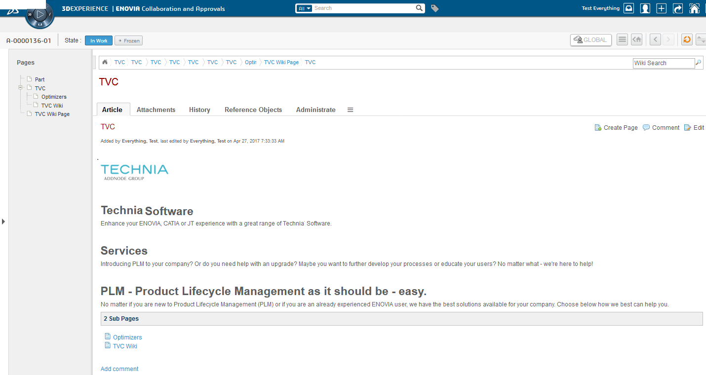
Figure 12. Global Wiki
Context Wiki
By adding the TVC Wiki command to any ENOVIA type menu or tab you enable the ability to have a separate Wiki connected to each instance of that object type.
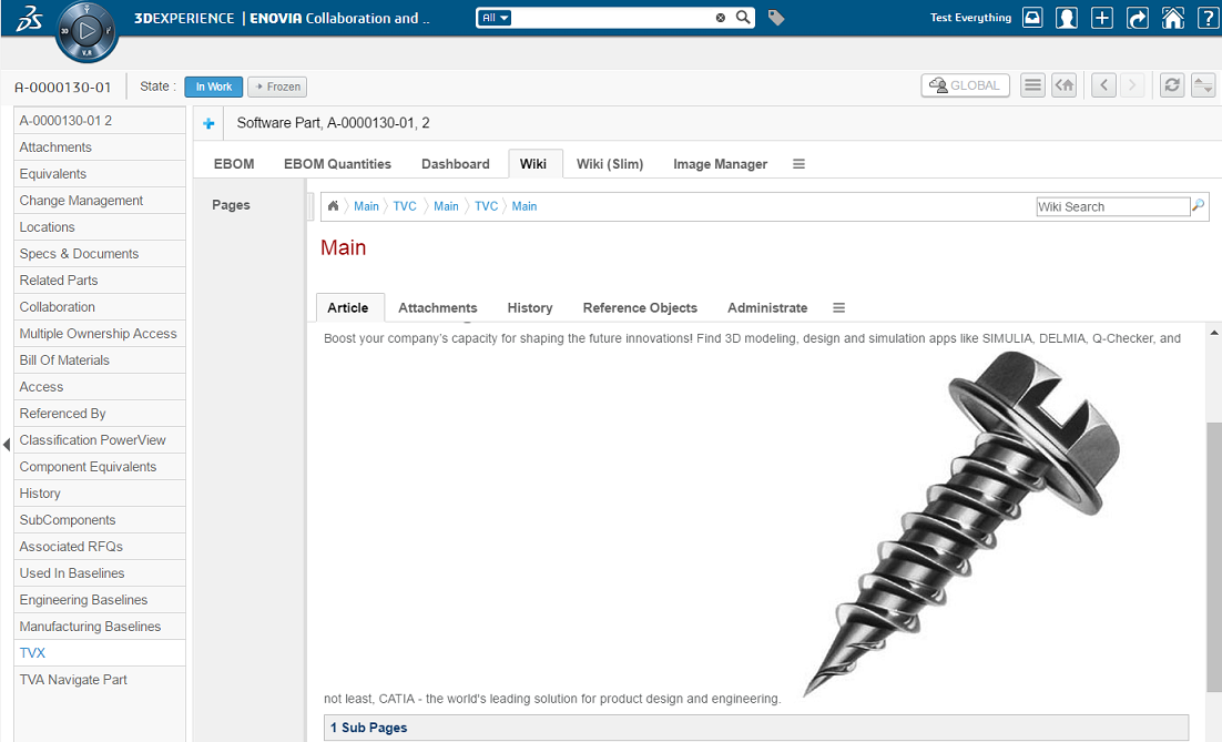
Figure 13. Context Wiki
Context Wiki in "slim" mode
You can also use the context wiki in a "slim" mode. When using this mode some of the features are stripped away. You will only be able to have ONE page in each wiki so the left menu tree is removed. Some of the tabs and commands are also removed in this mode.
So basically you get a very slimmed wiki with only one page that has attachment and comment functionality.
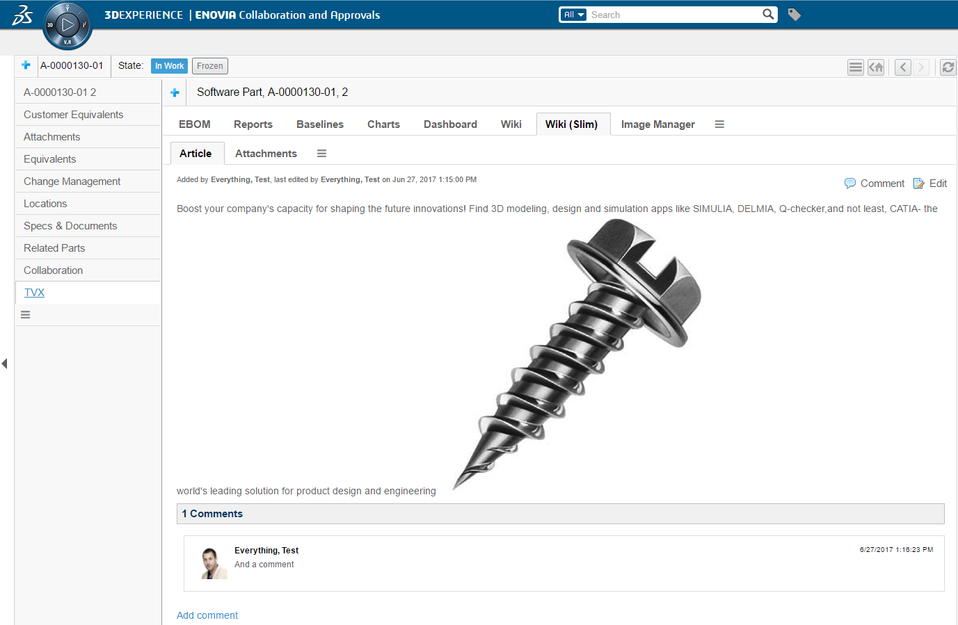
Figure 14. Context Wiki in slim mode
4.2. Launching the Wiki
4.2.1. Adding the Wiki command
The database schema includes a Command that can be used to access the Wiki. This command is called "TVC Wiki". If this command is added to the global toolbar it will enable the Global Wiki. If it is added in context of an ENOVIA type (in type menu or as a TVC Tab) it will enable the Wiki for that type. If you want to use the "slim" version of the wiki as a context wiki you use the command called "TVC Wiki Slim".
4.2.2. User access
In order to enable users to start using the Wiki functionality there are three different roles that can be assigned depending on what access level should be given.
| Role | Description |
|---|---|
TVC Wiki Viewer |
Is allowed to view and comment on wiki pages |
TVC Wiki Author |
Same access as TVC Wiki Viewer but can also create and edit wiki pages |
TVC Wiki Administrator |
Same access as TVC Wiki Author but can also delete wiki pages and comments |
This access is set in several xml configurations (commands) for the component so they can easily be changed by overriding these files with custom access roles or expressions.
4.3. Data Model
All data generated by the Wiki is stored as Business Objects in the ENOVIA database.
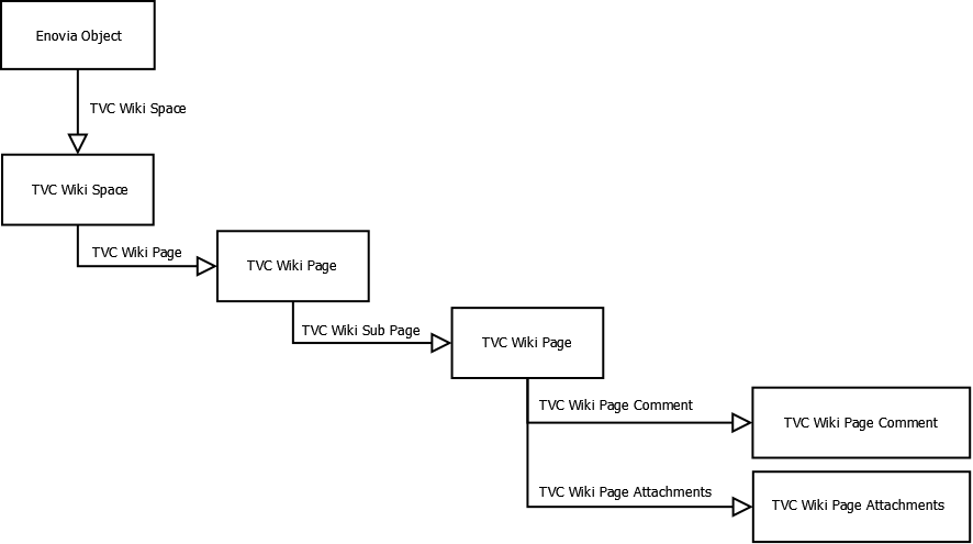
4.3.1. Vault
All objects created by the Wiki component are saved in a separate vault called "TVC Wiki"
4.3.2. Commands
- TVC Wiki
-
Command for showing the TVC Wiki. Can either be added globally in the toolbar or in context of an object type (type menu or as TVC tab).
4.3.3. Attributes
- TVC Wiki Markup
-
Attribute holding the Wiki markup for either a page or a comment.
- TVC Wiki Plain Text
-
Attribute holding the markup for a page converted to plain text. This is only used for searching Wiki pages.
- TVC Wiki Title
-
Attribute holding the "name" of the Wiki page
4.3.4. Types
- TVC Wiki Space
-
Holder for all pages in a specific Wiki. If the Wiki is global the Wiki Space is not connected to any object. If the Wiki is in a context the Wiki Space is connected to an ENOVIA object instance.
- TVC Wiki Page
-
Represents a wiki page and its information.
- TVC Wiki Page Attachment
-
Holds all the attachments for a Wiki page. Uses CDM (Common Document Model) to store all files and file versions.
- TVC Wiki Page Comment
-
Represents a comment made to a Wiki page.
4.3.5. Relationships
- TVC Wiki Page
-
Relationship used to connect a Wiki Page to its Wiki Space.
- TVC Wiki Page Attachment
-
Relationship used to connect a Wiki Page to its Wiki Page Attachments object.
- TVC Wiki Page Comment
-
Relationship used to connect a Wiki Page Comment to a Wiki Page.
- TVC Wiki Space
-
Relationship used to connect a TVC Wiki Space to its context (ENOVIA object instance).
- TVC Wiki Sub Page
-
Relationship used to connect a Wiki Page to its parent Wiki Page making it a "Sub Page".
- TVC Wiki Page Reference Object
-
Relationship used to connect Reference Objects to a Wiki Page
4.3.6. Policies
- TVC Wiki Page
-
Policy for Wiki Pages
- TVC Wiki Page Attachment
-
Policy for Wiki Page Attachments
- TVC Wiki Page Comment
-
Policy for Wiki Page Comments
- TVC Wiki Space
-
Policy for Wiki Space
4.4. Using the Wiki
4.4.1. Viewing and navigating the Wiki
Left menu
Each Wiki contains a menu that is placed on the left side of the Wiki. This menu dynamically loads all the pages in the current wiki and renders them in a tree layout for navigation. The "Main" page will not be shown in this menu.
This menu will NOT be automatically updated when a new page is created but you can force a menu update by clicking on the menu header.
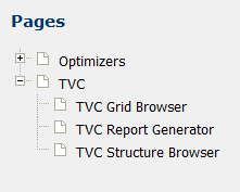
Breadcrumbs
At the top of the Wiki a breadcrumb is rendered giving the user the ability to see and navigate to previously visited pages. The breadcrumb is showing the history for the current user in the current Wiki. The "home" button rendered to the left points to the current Wiki’s main page.
Tabs
Below the breadcrumbs and the current wiki page name a number of TVC Tabs are rendered. These tabs allow you to view the content, attachments, history, reference objects and administration for the current Wiki page. The tabs is configured through TVC XML Configurations (tvc:menu:wiki/tabs/WikiContentTabs.xml)
4.4.2. Creating and editing pages
There are two ways of creating a new wiki page.
-
Create a new page connected to an existing page (Create Page)
-
Create a "Missing Page" (Create Missing Page)
The page created must be given a unique name that is not used by another page in the current Wiki. When a page is created it will be "blank" and have no content.
Create new page
If you want to create a new Wiki page this is done in the context of an existing page and the command is located in the top right corner of the current wiki page content. The page will be created and added as a sub page to the page you are currently at.

Clicking this command will allow you to enter a page name and create that page.
Create missing page
If you click on a link to a Wiki page and that page is missing in the current wiki you will be given the ability to quickly create that page by clicking on the create link.

Edit page
If you want to edit an existing page in the Wiki or a page you just created you can do this by clicking the "Edit" button located in the top right corner of the page.

This will give you two new TVC tabs allowing you to choose between the Rich Text editor and the Markup editor.
Rich Text editor
The Rich Text editor is a "what-you-see-is-what-you-get" editor that allows you to edit the page content in the exact same way it appears when viewing the page. The editor has a toolbar at the top that gives you all the actions needed to edit the content and insert new content. Some commands are also available on right click.
Rich Text editor buttons described in order:
-
Bold text
-
Italic text
-
Underlined text
-
Strikethrough text
-
Add text formatting
-
Insert unordered list
-
Insert ordered list
-
Insert new table
-
Insert link to an ENOVIA object instance
-
Insert link to a page Reference Object
-
Create link (page or URL) for selected text
-
Remove link for selected text
-
Insert image from page attachments
-
Add color styling to selected text
-
Undo last
-
Redo last
-
Clear formatting
-
Print page
-
Save page
Markup Editor
The markup editor allows you to see and edit the page markup. The editor has a toolbar at the top that gives you all the actions needed to insert markup instead of typing it yourself.
Markup editor buttons described in order:
-
Make selected text "Header 1"
-
Make selected text "Header 2"
-
Make selected text "Header 3"
-
Make selected text "Header 4"
-
Make selected text "Header 5"
-
Bold text
-
Italic text
-
Strikethrough text
-
Insert unordered list
-
Insert ordered list
-
Insert link to an ENOVIA object instance
-
Insert image from page attachments
-
Insert page link
-
Insert URL
-
Insert new table
-
Preview changes
-
Save page
4.4.3. Page comments
A Wiki page can have any number of comments to it added by the users. These comments are shown at the bottom of each page.
Viewing comments
All comments to a Wiki page are shown in the bottom of the page content. If a user has a primary image uploaded it will be shown together with the user name. If a primary image is missing it will use a default image. Comments can be made with the Rich Text editor or with the Markup editor and has the exact same styling abilities as a wiki page.
Create new comment
As a user you can create a comment to a Wiki page by first clicking on the "Comment" command in the top right corner of the Wiki page.

Clicking this command will take you to the bottom of the page showing any previous comments. If you want to add a new comment you click on the "Add comment" link.

You have the ability to add the comment using either the Rich Text editor or the Markup editor in the same way as when editing a Wiki page (see 4.2.4 for more information).
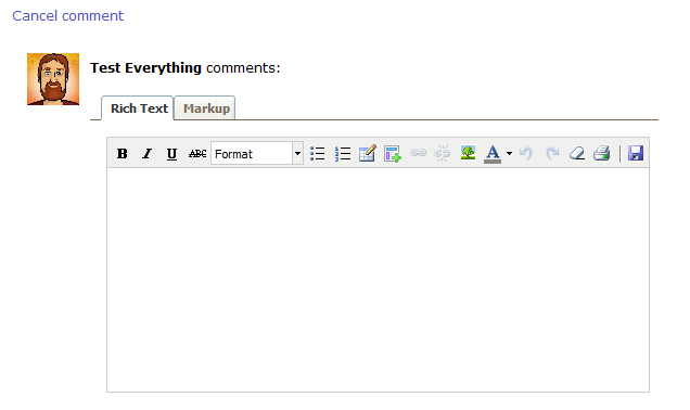
4.4.4. Page attachments
From the Wiki page attachments tab you can upload attachments to the page. Image attachments can then be inserted in to the Wiki page from one of the editors. All attachments can also be downloaded from this page. If you have TVC File Manager installed you will also see the field for drag n drop upload.
4.4.5. Page history
On the Wiki page history tab you can see all versions of this page. A new version of the page is created each time a user makes an edit. In the table you can see all versions, when they were created and by who. The "view" columns allow you to see the content of a specific version, either as Rich Text or as markup.
4.4.6. Reference Objects
If you also have the TVC Structure Browser component installed in your system you are able to use the "Reference Objects" tab. This tab gives you the ability to use a TVC Search to find any ENOVIA object in the system and connect that to the current wiki page. You can then very easily refer to these objects with links inside your page content.
4.4.7. Administration
If you also have the TVC Structure Browser component installed in your system you are able to use the "Administrate" tab. From this tab you can do some various administrative tasks like deleting, removing and adding pages/comments. When a user deletes a page, the page is deleted from the database. When a user removes a page, the page is just disconnected and is not deleted from the database. The user can connect the page back using the 'Add Existing Page' command.
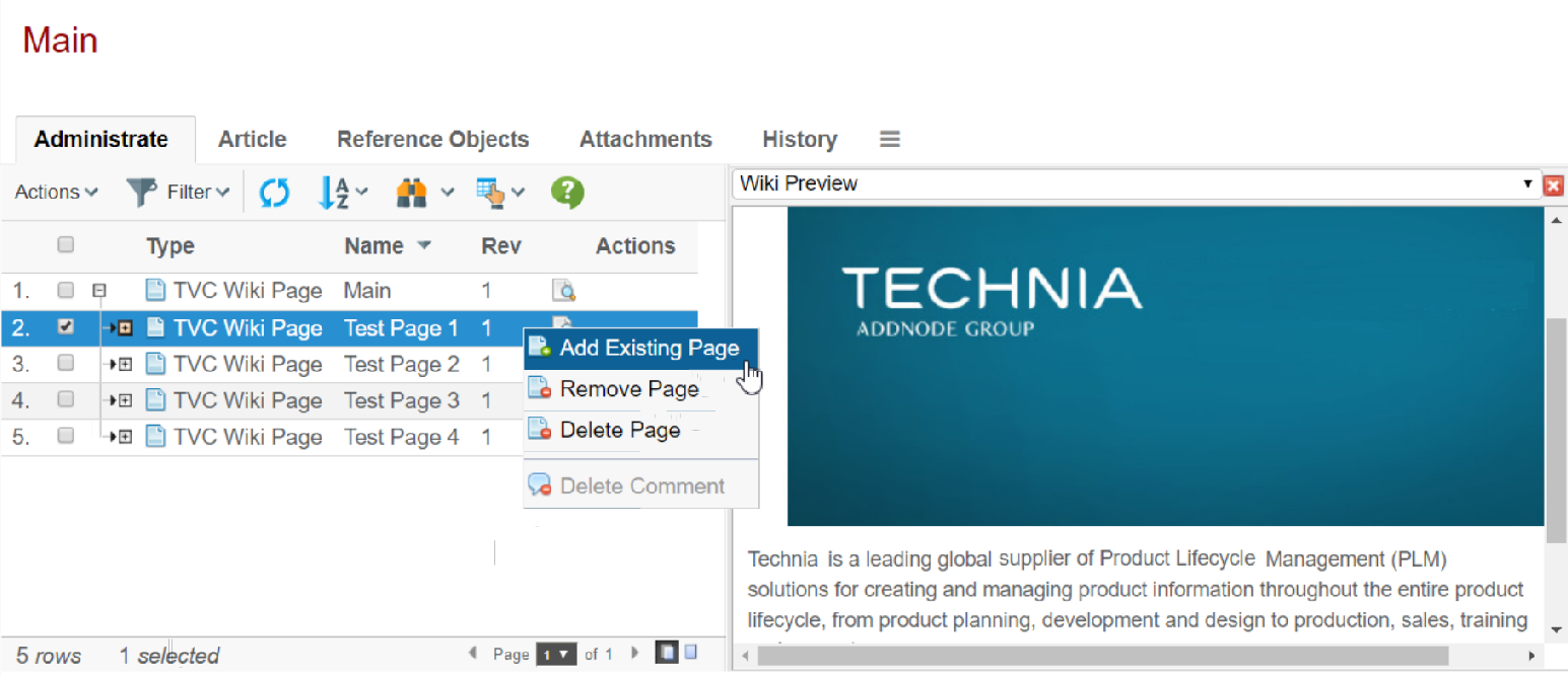
Delete Multiple Pages
Wiki page/pages can be deleted using the action 'Delete Pages' present under 'Actions' in the 'Administrate' tab of Wiki. When a page containing sub-pages is deleted, the sub-pages are also deleted.
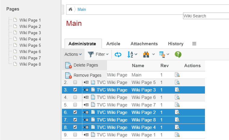
| In the multiple pages selected by the user, if the selection contains the main/root page, the delete action will be aborted and the user will have to perform the action again after de-selecting the main/root page. |
Remove Multiple Pages
Wiki page/pages can be removed using the action 'Remove Pages' present under 'Actions' in the 'Administrate' tab of Wiki. When a page containing sub-pages is removed, the sub-pages are also removed.
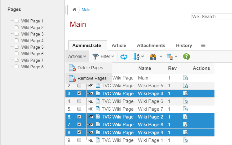
| In the multiple pages selected by the user, if the selection contains the main/root page, the remove action will be aborted and the user will have to perform the action again after de-selecting the main/root page. |
4.4.8. Wiki search
In the top right corner of the Wiki you have a free text search field. This allows the user to make a free text search that searches all pages in the current Wiki. The search is configured to check both page names and page content. In order to get a search result you have to enter at least three letters in the search box and you will then be presented a list of matching pages. Each time you enter another letter a new result will be shown. This search is currently using ENOVIA queries to fetch the search result.
4.4.9. Markup specification
The TVC Wiki uses the same markup language as MediaWiki (software used in Wikipedia and other wikis). The complete MediaWiki markup language is currently not supported (only the basics) and there is also some extra markup added that is unique to the TVC Wiki.
Supported Markup
| Description | You type | You get |
|---|---|---|
Italic text |
|
italic |
Bold text |
|
bold |
Bold and italic |
|
*bold & italic * |
Underlined |
|
under |
Strike |
or
|
text |
Headings of different levels |
|
Level 1 Level 2 Level 3 Level 4 Level 5 |
Bullet list |
|
|
Numbered list |
|
|
Internal link |
|
Main Page |
Piped internal link |
|
sometext |
External link |
|
|
External link with different label |
|
Technia |
ENOVIA object link |
|
10001 |
Image |
|

|
Image with width |
|
|
Table with headers |
|
a table with two columns and one row |
5. Tabbed Pages
Tabs are generally used to split content into multiple different pages, which the user easily can switch between, to increase usability. TVC Core contains a feature that allows defining such a tabbed page in a variety of ways.
For an example of how a tabbed page could look like; see the screenshot below:

The tabbed page is very configurable and the features are summarized below:
-
The tabs can be driven by a menu (stored inside the database, or defined as an XML resource), where each item in the menu will appear as a tab in the user interface.
-
If the item in the menu is a "sub-menu" that will in turn result in a "nested" tabbed page to be displayed.
-
If you launch the tabbed page in the context of a business-object (the objectId parameter is passed), then you can choose to either point out a menu explicitly; or you can create a file where you map a business-type to a certain menu.
-
You can through request parameters define a custom JSP page that will render some information above the actual tabs
-
Access rights according to the commands/menus defined in the menu will be considered, when the tabs are generated
-
The last visited tab will be remembered by default
-
The user can personalize a tab page, by re-arranging tabs and hiding tabs.
-
Tabs that don’t fit on the row will automatically be "dropped" meaning they get hidden and can only be accessible from the tab configuration drop down menu. This is to prevent the tabs from taking up a lot of space when browser resolution or window is small.
-
It is also possible to build a tabbed page GUI manually in a JSP page, by using the JSP tags provided by TVC core.
This allows you to create a more complex user interface, for example generating the tabs dynamically, provide custom content above the tabs or even define multiple tab-sections on the same page.
All the details on how to build tabbed-pages are explained within the "TVC Developer Documentation".
5.1. Disabling Features of a Tabbed Page
To disable the feature of remembering the last visited tab, you can either do so globally or per each tab-page instance:
<init-param>
    <param-name>tvc.core.gui.tabPage.rememberSelection</param-name>
    <param-value>true | false</param-value>
</init-param>
Or through the request parameter:
rememberSelectedTab=true | false
To disable the possibility to close a tab, this can be done globally:
<init-param>
    <param-name>tvc.core.gui.tabPage.enableCloseButton</param-name>
    <param-value>true | false</param-value>
</init-param>
and locally (default is false):
<Command>
    ...
    <Fixed>true</Fixed>
</Command>
To disable the possibility to personalize the order/visibility of a tab-page, this can be done globally:
<init-param>
    <param-name>tvc.core.gui.tabPage.enableTabCfg</param-name>
    <param-value>true | false</param-value>
</init-param>| If the tab configuration has been disabled, the close button will also be disabled. Otherwise the user won’t have a chance to re-open a closed tab. |
To disable the "tab drop" functionality that hides tabs that doesn’t fit on the row, this can be done globally:
<init-param>
    <param-name>tvc.core.gui.tabPage.enableTabDrop</param-name>
    <param-value>true | false</param-value>
</init-param>| If the tab configuration has been disabled, the tab drop functionality will also be disabled. Otherwise the user won’t have a chance to open "dropped" tabs. |
5.2. Styling
Individual tabs can be styled using a custom theme. Use the "style" setting to add custom class to a tab. Read more on custom themes in this Chapter.
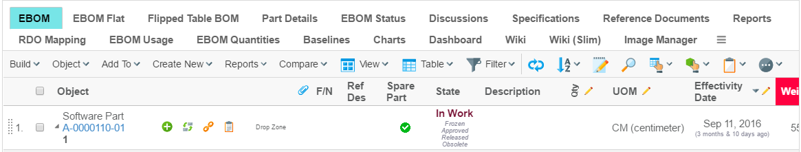
Example:
<Command>
    <Label>...</Label>
    <URL action="...">
        <Param name="..." value="..." />
    </URL>
    <Fixed>false</Fixed>
    <Setting name="class" value="test" />
</Command>
5.3. Cache Tab Content
To improve perceived performance and raise acceptance when working with tabs the tab content can be cached and even pre-loaded. This way the tab content is instantly shown when tab is clicked. To reload a cached tab simple click the tab once more when already active.
To enable single tab cache behaviour use the cacheBehavior setting
<Command>
    ...
    <Setting name="cacheBehavior">disabled | cache | preload</Setting>
</Command>
To control global tab cache behaviour use the tvc.core.gui.tabPage.cacheBehavior init-param
<init-param>
    <param-name>tvc.core.gui.tabPage.cacheBehavior</param-name>
    <param-value>disabled | cache | preload</param-value>
</init-param>
5.4. Initially Hidden Tabs
To provide tabs which are initially hidden, one can use the following settings or init-param. Once the tab is added through tab configuration, it will be saved in dataobject.
To enable single tab initially hidden behaviour use the visible setting
<Command>
    ...
    <Setting name="Visible">true | false</Setting>
</Command>
To control global tab initially hidden behaviour use the tvc.core.gui.tabPage.visible init-param
<init-param>
    <param-name>tvc.core.gui.tabpage.visible</param-name>
    <param-value>true | false</param-value>
</init-param>
5.5. Tab Orientation
Tabs can be displayed in vertical or horizontal orientation. The default orientation of the tabs can either be configured globally or per use case.
Users can, by default, rotate the tabs. The rotate command is found in the settings menu found to the far right (or bottom when tabs are displayed vertically).

See chapter UIP Tabs for details on how to configure orientation.
| This feature requires UIP Tabs |
5.6. Tab Icon
Each tab may have an icon configured. This makes it easier for the user to identify tab of interest.
Use the <FontIcon> element inside the <Command> element to specify
which icon to display. Example:
<Command>
    <Label>Discussions</Label>
    <URL action="navigate">
        <Param name="pageConfig" value="tvc:pageconfig:tvx:common/Discussion.xml" />
        <Param name="portalMode" value="true" />
    </URL>
    <FontIcon>fa fa-comment-o</FontIcon>
</Command>| Font Awesome 4.3.0 is included by default on most places where tabs are displayed. Make sure to include other icon library in case you want to use other icons. |
| This feature required UIP Tabs |
5.7. UIP Tabs
UIP Tabs is a rewrite of tabs which uses more modern technologies. It brings a number of benefits to the table. For example, less data needs to be transferred as rendering is done at the client.
UIP Tabs is activated globally with the setting tvc.core.tabs.uip.
Example using tvc.properties:
tvc.core.tabs.uip=trueExample using web.xml:
<init-param>
    <param-name>tvc.core.tabs.uip</param-name>
    <param-value>true</param-value>
</init-param>
UIP Tabs can be configured to enable / disabled each feature. For example users should be able to hide tabs, but not switch orientation.

Configurations are specified on two levels: (1) global, and (2) per tab instance. Any configurations done on a tab instance has precedence over global ones.
Global configurations are either done in tvc.properties or
web.xml. Instance specific configurations are, in most cases,
done in the Menu configuration file using the <Setting name="…" value=".." />
element.
Configurations:
| Global | Instance | Description | Default Value |
|---|---|---|---|
tvc.core.tabs.orientation |
orientation |
In what orientation the tabs are rendered by default. Possible values: horizontal vertical |
horizontal (if not menu is used with the category toppanel as it is rendered vertically by default) |
tvc.core.gui.tabPage.enableOrientationSwitch |
userOrientationSwitch |
Whether or not user should be able to switch the orientation. |
true |
tvc.core.gui.tabPage.enableTabCfg |
userRearrange |
Whether or not user should be able to rearrange the order of tabs. |
true |
tvc.core.gui.tabPage.enableTabCfg |
userHide |
Whether or not user should be able to hide tabs. |
true |
tvc.core.gui.tabPage.enableReset |
userReset |
Whether or not user should be able to reset the tabs. |
true |
Example to globally disable possibility to switch orientation
using tvc.properties:
tvc.core.gui.tabPage.enableOrientationSwitch=falseExample configuring an instance of tabs in the application to be rendered vertically and disable possibility for user to switch orientation:
<Menu>
    ...
    <Setting name="orientation" value="vertical"/>
    <Setting name="userOrientationSwitch" value="false"/>
</Menu>
Non-supported Features
These features are not supported when using UIP Tabs:
-
The close button next to each tab is not available. Users can still hide tabs using the customization feature.
-
No loading icon is displayed next to each tab when it’s loading.
-
Specifying a CSS class on a command (using
<Setting name="class" value="test" />)
6. Top Panel
As of release 2010.2, a new feature called Top Panel was added.
The Top Panel is used to display a configurable frame at the top a tabbed pages definition. The content of the top panel is configured through an XML file.
The screenshot below shows a top panel example, and a short description of the areas within the top panel and what they are called.
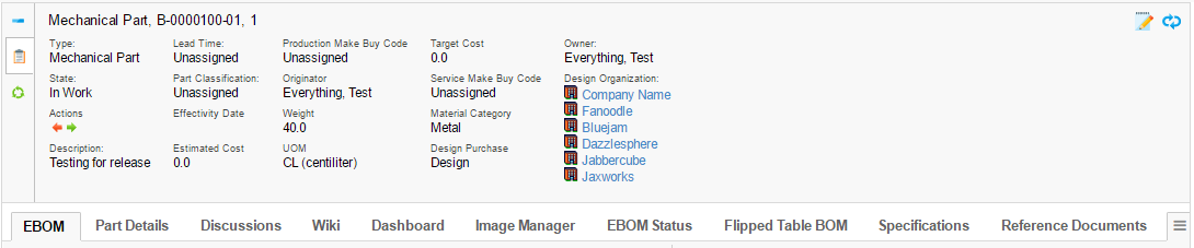
The top panel defines/contains the following areas:
-
Title Form (Shown when the top panel is minimized).
-
Control(s)
-
One control can link to a so-called top-panel form.
-
A control can be used to link other pages using a HREF.
-
-
A form contains:
-
Section(s) where each section can have a number of Fields
-
A form can be switched between view and edit mode.
-
-
Tab Menu (name of a menu)
-
Below the top-panel, a tabbed page is shown.
-
6.1. Top-panel usage
To use the top-panel create a command that has the HREF property set to call the action "loadTopPanel" and pass the name your top-panel configuration through the parameter "panel". See example below:
${ROOT_DIR}/tvc-action/loadTopPanel?panel=tvc:toppanel/Panel.xmlThe top panel definition is stored in a directory called "toppanel" among the XML resources (somewhere under /WEB-INF/tvc in your application directory).
If you omit the domain in the resource name, the location of the top panel definition is:
/WEB-INF/tvc/toppanel
If the top panel definition is stored in a domain, for example acme (tvc:toppanel:acme/Panel.xml) then the resource location is:
/WEB-INF/tvc/acme/toppanel
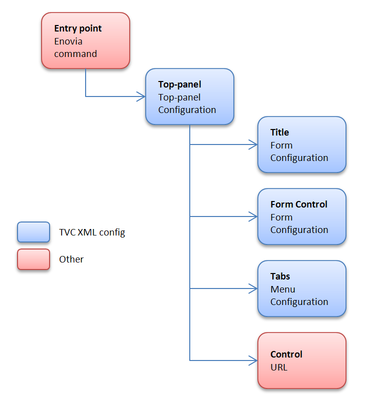
6.2. Top Panel Configuration
You define your top panel in XML. The root element must be <TopPanel>. Below you find child element definitions.
6.2.1. Child elements TopPanel
| Element Name | Description | Example |
|---|---|---|
Controls |
Container element to FormControl and Control |
- |
TabMenu |
Carries the tab menu definition |
<TabMenu>tvc:menu/tabs/TabMenu.xml</TabMenu> |
Title |
Defines the Form to carry the title definition |
<Form>tvc:toppanelform/Title.xml</Form> |
6.2.2. Child elements FormControl
| Element Name | Description | Example |
|---|---|---|
Form |
Defines the Form XML definition |
<Form>tvc:toppanelform/Form.xml</Form> |
Icon |
Points out the icon for the control. Use either |
<Icon>${COMMON_DIR}/images/iconSmallDescription.gif</Icon> |
IconClass |
Defines the CSS class(es) for the font icon for the control. Font awesome is included by default. Use either |
<IconClass>fa fa-tags</IconClass> |
Label |
Carries the tooltip definition for the control |
<Label>View/EditDetails</Label> |
Access |
Defines access rules for the control. |
|
6.2.3. Child elements Control
| Element Name | Description | Example |
|---|---|---|
Height |
Defines a specific height for the control |
<Height>300</Height> |
Href |
Defines a href to display in the control |
<Href>${COMMON_DIR}/emxLifecycle.jsp</Href> |
Icon |
Points out the icon for the control. Use either |
<Icon>${COMMON_DIR}/iconStatus.gif</Icon> |
IconClass |
Defines the CSS class(es) for the font icon for the control. Font awesome is included by default. Use either |
<IconClass>fa fa-tags</IconClass> |
Label |
Carries the tooltip definition for the control |
<Label>Lifecycle</Label> |
Popup |
Defines that the control should open in a popup window. |
<Popup width="800" height="600"/> |
Access |
Defines access rules for the section. |
|
6.3. Top Panel Form Configuration
You define your top panel form in XML. The root element must be <Form>.
Below you find child element definitions.
6.3.1. Child Elements - Form
| Element Name | Description | Example |
|---|---|---|
Section |
Container element for Filed elements. Defines the horizontal field sections in a form |
- |
6.3.2. Child Elements - Section
| Element Name | Description | Example |
|---|---|---|
Field |
Defines a form field |
- |
Separator |
Defines a field that acts as a "separator" in the section. |
<Separator/> |
Access |
Defines access rules for the section. |
|
6.3.3. Child Elements - Field
| Element Name | Description | Example |
|---|---|---|
DataHandler |
Point out a class used to retrieve more complex data from
matrix. The class must implement the interface
|
|
Editable |
Defines if the field should be editable or not |
|
Expression |
Defines an mql expression of the data to retrieve from matrix |
|
FieldCellRenderer |
Used to specify alternative rendering for the field.
The class must implement the interface
|
|
Label |
Defines the field label |
|
RangeHandler |
Defines a range handler class that must implement
|
- |
Settings |
Container element for settings |
- |
Access |
Defines access rules for the section. |
|
AutoCompleteHandler |
An autocomplete handler type:
See Autocomplete chapter for more details. |
|
AutoCompleteSettings |
Settings for autocomplete. Should it be case sensitive, what types to choose from, limits, which dataset to use and other. The settings vary for each kind of autocomplete handler. See Autocomplete chapter for more details. |
|
6.3.4. Child Elements – Settings
| Element Name | Description | Example |
|---|---|---|
Columns |
Used with InputType textarea to define columns |
|
InputType |
Specifies the type of input |
|
InputWidth |
Defines the width of the input |
|
Required |
Defines if an editable field should be required or not |
|
Rows |
Used with InputType textarea to define rows |
|
Setting |
Define custom settings |
|
SortRangeValues |
Defines if to sort range values |
|
SearchConfig |
Connect a search to a field |
|
RegisteredSuite |
Defines the registered suite. This can be used for localization of labels, where the value of the key is stored in a particular suite string resource file. |
|
Separator |
Only valid on a field in a Top panel title. Defines text to be put at the right hand side of a field, used for separating multiple fields. If you specify an empty Separator element then one space will be used. Values starting and ending with a single quote or double quote will be un-quoted, in order to be able to specify space characters. |
|
MaxLength |
Specifies the max length of an editable input field. |
|
MaxRows |
Specifies the max number of rows to display of the text. |
|
ValueIfEmpty |
Specifies the value to be used if the actual value is an empty string. By default, the " " replacement is used. |
|
BadChars |
Specifies characters that are treated as "bad" and if the value contains any such character, the user will not be able to modify the value. |
|
ValidationJavaScript |
Can be used to declare custom validation JavaScript code that is inserted on the page that displays this form. |
|
LinkedWith |
Can be used if other fields are updated in the background. On a Refresh these fields will be updated as well. Format: COLUMN:FIELD Separate multiple fields using a comma. |
|
UseTransactionOnEdit |
Can be used to get an update-transaction surrounding the modification of the field. Default is FALSE. |
|
6.3.5. Auto Completion
The fields can take advantage of auto-completion. If you have a field that applies to "type" and is editable, the way to configure such field to take advantage of autocomplete is slightly different. See example below:
<Field>
    <Label>Type:</Label>
    <Expression><![CDATA[$<type>]]></Expression>
    <Editable />
    <AutoCompleteHandler>type</AutoCompleteHandler>
    <AutoCompleteSettings>{
        'handler' : {
            'rootTypes' : ['type_HardwarePart', 'type_SoftwarePart']
        }
    }</AutoCompleteSettings>
</Field>
E.g. you use the setting "Type" to specify the "root" type for the object.
If you want to enable autocompletion for users, then you can enable that through the following configuration:
<Field>
    <Label>Owner:</Label>
    <Editable />
    <Expression><![CDATA[$<owner>]]></Expression>
    <DataHandler>com.technia.tvc.core.gui.toppanel.form.builtin.UserNameHandler</DataHandler>
    <AutoCompleteHandler>user</AutoCompletHandler>
</Field>
Autocomplete Settings
Settings are configured in JSON format in the AutoCompleteSettings element.
Example setting limit to 50, case sensitive, disable localization and only matching values starting with the searched value:
<AutoCompleteSettings>{
    'handler' : {
        'limit' : 50,
        'caseSensitive' : false,
        'localize' : false,
        'contains' : false
    }
}</AutoCompleteSettings>
See the Autocomplete chapter for more details.
6.3.6. Access Control
Both on control, section level as well as per field level, one can restrict access to the control/section/field.
The access restriction can be defined based on following:
-
Role Assignment
-
Group Assignment
-
Person (A named user)
-
Access Mask (Access mask for the current object)
-
Access Program (A JPO that evaluates the access rights)
The example below illustrates how you can construct the access restriction:
<Field> <!-- Or Section -->
    <Access>
        <Role>role_FirstRole</Role>
        <Role>role_SecondRole</Role>
        <Group>group_SomeGroup</Group>
        <Mask>modify,checkout</Mask>
    </Access>
</Field>
Or use an access program:
<Field> <!-- Or Section -->
    <Access>
        <Program name="MyJPO" method="checkAccess"/>
    </Access>
</Field>
6.3.7. Built-in datahandlers
RelatedObjectHandler
This datahandler can be used for modifying related objects, e.g. connecting and disconnecting them.
<Field>
    <Label>Design Organization:</Label>
    <Editable />
    <DataHandler>com.technia.tvc.core.gui.toppanel.form.builtin.RelatedObjectHandler</DataHandler>
    <FieldCellRenderer>com.technia.tvc.core.gui.toppanel.form.builtin.RelatedObjectRenderer</FieldCellRenderer>
    <AutoCompleteHandler>organization</AutoCompleteHandler>
    <Settings>
        <Setting name="Relationship">relationship_DesignResponsibility</Setting>
        <Setting name="Direction">to</Setting>
        <Setting name="Display Property">name</Setting>
        <Setting name="OpenInPopup">true</Setting>
        <Setting name="Show Type Icon">true</Setting>
        <Setting name="Show Link">true</Setting>
    </Settings>
</Field>| Setting | Description | Example |
|---|---|---|
Relationship |
The symbolic name of the relationship to use. |
relationship_DesignResponsibility |
Direction |
The direction of the connection |
|
Display Property |
What to select and display from the connected object(s) |
Name |
OpenInPopup |
Optional parameter to determine the link target. |
|
Show Link |
This setting defines whether to show a link or not on a current business object. |
|
Show Type Icon |
This setting defines whether to show the current business object type icon or not. |
|
UserNameHandler
This datahandler is used for handling user names. Auto-completion can be configured as well.
<Field>
    <Label>Owner:</Label>
    <Editable />
    <Expression><![CDATA[$<owner>]]></Expression>
    <DataHandler>com.technia.tvc.core.gui.toppanel.form.builtin.UserNameHandler</DataHandler>
    <AutoCompleteHandler>user</AutoCompleteHandler>
</Field>
Examples
6.3.8. Top-panel configuration example
<TopPanel>
    <Title>
        <Form>tvc:toppanelform/Title.xml</Form>
    </Title>
    <Controls>
        <FormControl>
            <Label>View/Edit Details</Label>
            <Icon>${COMMON_DIR}/images/iconSmallDescription.gif</Icon>
            <Form>tvc:toppanelform/Form.xml</Form>
        </FormControl>
        <Control>
            <Label>Lifecycle</Label>
            <Icon>${COMMON_DIR}/images/iconStatus.gif</Icon>
            <Href>${COMMON_DIR}/emxLifecycle.jsp</Href>
        </Control>
    </Controls>
    <TabMenu>tvc:menu/tabs/TabMenu.xml</TabMenu>
</TopPanel>
6.3.9. Top-panel title form configuration example
<Form>
    <Section>
        <Field>
            <Expression><![CDATA[$<type>]]></Expression>
        </Field>
        <Field>
            <Expression><![CDATA[$<attribute[attribute_Title]>]]></Expression>
            <Settings>
                <Separator>: </Separator>
            </Settings>
        </Field>
    </Section>
</Form>
6.3.10. Top-panel form configuration example
<Form>
    <Section>
        <Field>
            <Label>Style #:</Label>
            <Expression><![CDATA[$<attribute[attribute_StyleNumber].value>
            ]]></Expression>
            <Editable />
            <Settings>
                <InputType>textbox</InputType>
                <InputWidth>120</InputWidth>
                <Required>true</Required>
            </Settings>
        </Field>
        <Field>
            <Label>Selected Sizes:</Label>
            <Expression>dummy</Expression>
            <RegisteredSuite>ApparelAccelerator</RegisteredSuite>
            <DataHandler>com.technia.acme.SelectedSizesDataHandler</DataHandler>
        </Field>
        <Field>
            <Label></Label>
            <RegisteredSuite>ApparelAccelerator</RegisteredSuite>
        </Field>
        <Field>
            <Label>Comments:</Label>
            <Expression><![CDATA[$<attribute[attribute_Comment]>]]></Expression>
            <Editable />
            <Settings>
                <InputType>textarea</InputType>
                <Columns>25</Columns>
                <Rows>2</Rows>
                <Setting name="Text Length">200</Setting>
            </Settings>
        </Field>
    </Section>
    <Section>
        <Field>
            <Label>Marketing Name:</Label>
            <Expression><![CDATA[$<attribute[attribute_MarketingName].value>]]></Expression>
            <Editable />
            <Settings>
                <InputType>textbox</InputType>
                <InputWidth>120</InputWidth>
                <Required>true</Required>
            </Settings>
        </Field>
    </Section>
    <Section>
        <Field>
            <Label>Season:</Label>
            <Expression><![CDATA[$<to[relationship_ProductMeasurement].from.revision>]]></Expression>
            <Settings>
                <InputType>textbox</InputType>
                <InputWidth>120</InputWidth>
                <Required>true</Required>
            </Settings>
        </Field>
        <Field>
            <Label>M-Chart Revision:</Label>
            <Expression><![CDATA[$<revision>]]></Expression>
            <Settings>
                <InputType>textbox</InputType>
                <InputWidth>120</InputWidth>
                <Required>true</Required>
            </Settings>
        </Field>
    </Section>
    <Section>
        <Field>
            <Label>Supplier:</Label>
            <Expression><![CDATA[$<to[relationship_ProductMeasurement].from.to[relationship_ManufacturingResponsibility].from.name>]]></Expression>
            <Settings>
                <InputType>textbox</InputType>
                <InputWidth>120</InputWidth>
                <Required>true</Required>
            </Settings>
        </Field>
        <Field>
            <Label>Copied From:</Label>
            <Expression>dummy</Expression>
            <DataHandler>com.technia.acme.datahandler.CopiedFromDataHandler</DataHandler>
            <FieldCellRenderer>com.technia.acme.render.toppanel.CopiedFromRenderer</FieldCellRenderer>
            <Settings>
                <InputType>textbox</InputType>
                <InputWidth>120</InputWidth>
                <Required>true</Required>
            </Settings>
        </Field>
    </Section>
    <Section>
        <Field>
            <Label>State:</Label>
            <Expression><![CDATA[$<current>]]></Expression>
            <Settings>
                <InputType>textbox</InputType>
                <InputWidth>120</InputWidth>
                <Required>true</Required>
            </Settings>
        </Field>
        <Field>
            <Label>Template Revision:</Label>
            <Expression><![CDATA[$<from.revision>]]></Expression>
            <Settings>
                <InputType>textbox</InputType>
                <InputWidth>120</InputWidth>
                <Required>true</Required>
            </Settings>
        </Field>
    </Section>
</Form>
7. Category Top Panel
As of release 2016.3, a new feature called Category Top Panel was added. Category Top Panel utilizes TVC top panel to show category tree menu. When enabled OOTB tree or category menu is replaced with TVC default category top panel and category menu is rendered using TVC tabs. This provides all the capabilities of TVC tabs like rearranging and hiding tabs. Category Top Panel is flexible and allows configuration / extension to default form. It is also possible to show a different category top panel for the specific type. These configurations are explained in below sections.
The screenshot below shows a default category top panel and a short description of the section within the top panel form.
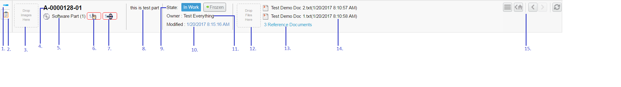
Figure 15. Default Category Toppanel Form
-
Maximize and minimize toggle.
-
Form Control
-
Image drop zone
-
Name of context object
-
Type of context object, with the link to higher revision if it exists.
-
Direct link to pending issues for this context object, shows a table if there are more than one object or else issue object is opened.
-
Direct link to in-process routes for this context object, shows a table if there are more than one object or else route object is opened.
-
Description
-
Previous, current and next state of an object, with links to promote and demote object.
-
Last modified date with the history of the context object.
-
Owner of the context object.
-
Reference document drop zone. On file drop, a new document object is created and connected to a context object.
-
Direct link to reference document tab when there are more than 2 reference documents connected.
-
Reference Document with a link to download file. The zip file is generated when there is more than one file checked in.
-
Enovia actions command to show home page, back, forward and refresh the page.
| Category Top Panel App Menu closes only on click of App Menu button. The vertical menus does not support tab cache behavior. |
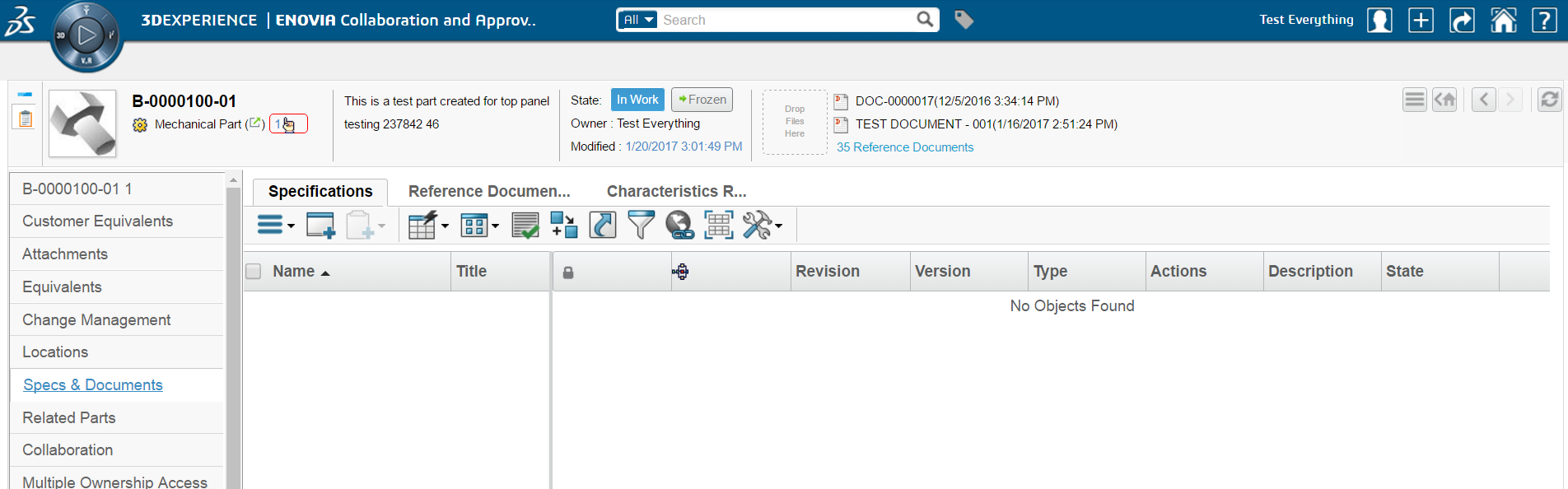
Figure 16. Default Category Toppanel
7.1. Usage
Category Top Panel can be enabled for all objects by adding a filter in web.xml as shown below.
<filter>
    <filter-name>TVCCategoryFilter</filter-name>
    <filter-class>com.technia.tvc.core.gui.category.filter.TVCCategoryFilter</filter-class>
    <init-param>
        <param-name>tvc.category.namespace</param-name>
        <param-value>acme:common</param-value>
    </init-param>
    <init-param>
        <param-name>tvc.category.defaultPanel</param-name>
        <param-value>tvc:toppanel:acme:common/DefaultPanel.xml</param-value>
    </init-param>
    <init-param>
        <param-name>tvc.category.showTVCCategory</param-name>
        <param-value>true</param-value>
    </init-param>
 </filter>
 <filter-mapping>
    <filter-name>TVCCategoryFilter</filter-name>
    <url-pattern>/common/emxTree.jsp</url-pattern>
 </filter-mapping>
The table below describes the supported init parameters:
| Filter Init Param | Description |
|---|---|
|
This filter param defines the namespace to use for looking up category top panel configured for specific types. |
|
Default top panel for all types. |
|
This parameter can have the value true or false. If set to true, default TVC category top panel is enabled for all types. If set to false, only types which have category menu explicitly defined will have TVC category enabled as per category menu. |
7.2. Default Category Top Panel
A default category top panel tvc:toppanel:core:common/DefaultPanel.xml with
built-in form fields and sections is available and pre-configured. It is possible
to extend this and configure what should be shown in default category top panel
form. The filter param tvc.category.defaultPanel can be used to point to default panel.
7.2.1. Default Panel
<TopPanel>
<Title>
<Form>tvc:toppanelform:core:common/DefaultTitle.xml</Form>
</Title>
<Controls>
<Control>
<Label>View/Edit Details</Label>
<IconClass>ti-c ti-details-c</IconClass>
<Href>${TVC_ACTION}/showTopPanelForm?form=tvc:toppanelform:core:common/DefaultForm.xml&compactMode=true</Href>
<Height>80</Height>
</Control>
</Controls>
</TopPanel>| Configuration | Description | ||
|---|---|---|---|
Title |
This is similar to title in standard top panel, but title is not displayed when top Panel is rendered in compact mode. This also support java fields similar to top panel form when form is rendered in compact mode.
|
||
compactMode |
Used to rendered top panel form in compact mode. By default it is false. When compactMode is false, standard top panel form is rendered. |
||
Height |
Height can be specified if form should be rendered in certain size. |
7.2.2. Default Form
<Form>
	<Section>
		<Field>
			<DataHandler>com.technia.tvc.core.gui.toppanel.form.builtin.DefaultImageHandler</DataHandler>
			<FieldCellRenderer>com.technia.tvc.core.gui.toppanel.form.builtin.DefaultImageRenderer</FieldCellRenderer>
		</Field>
	</Section>
	<Section>
		<Field>
			<DataHandler>com.technia.tvc.core.gui.toppanel.form.builtin.TypeRevisionHandler</DataHandler>
			<FieldCellRenderer>com.technia.tvc.core.gui.toppanel.form.builtin.TypeRevisionRenderer</FieldCellRenderer>
		</Field>
	</Section>
	<Section>
		<Field>
			<Expression>description</Expression>
			<FieldCellRenderer>com.technia.tvc.core.gui.toppanel.form.builtin.TopPanelDescriptionRenderer</FieldCellRenderer>
		</Field>
	</Section>
	<Section>
		<Field>
			<DataHandler>com.technia.tvc.core.gui.toppanel.form.builtin.DefaultStateHandler</DataHandler>
			<FieldCellRenderer>com.technia.tvc.core.gui.toppanel.form.builtin.DefaultStateRenderer</FieldCellRenderer>
		</Field>
	</Section>
	<Section>
		<Field>
			<DataHandler>com.technia.tvc.core.gui.toppanel.form.builtin.TopPanelReferenceDocumentHandler</DataHandler>
			<FieldCellRenderer>com.technia.tvc.core.gui.toppanel.form.builtin.TopPanelReferenceDocumentRenderer</FieldCellRenderer>
		</Field>
	</Section>
</Form>
Default form has five sections each having one built-in field, it provides functionality and behaviour similar to Enovia OOTB top panel. Built-in handlers are explained in below sections.
7.2.3. Default Title
<Form>
	<Section>
		<Field>
			<Expression>name</Expression>
		</Field>
	</Section>
	<Section>
		<Field>
			<DataHandler>com.technia.tvc.core.gui.toppanel.form.builtin.DefaultTitleStateHandler</DataHandler>
			<FieldCellRenderer>com.technia.tvc.core.gui.toppanel.form.builtin.DefaultTitleStateRenderer</FieldCellRenderer>
		</Field>
	</Section>
</Form>| Editable element is not supported in the title form field. |
7.2.4. Built in Handlers
Type Revision Handler
This handler is used for showing following details of objects -
-
Name
-
Revision
-
Link to higher revision if exists
-
Pending issues to the context object.
-
Pending changes to the context object.
-
In process routes on the context object.
<Field>
  <DataHandler>com.technia.tvc.core.gui.toppanel.form.builtin.TypeRevisionHandler</DataHandler>
  <Settings>
    <Setting name="showPendingIssue">true</Setting>
    <Setting name="showPendingChanges">true</Setting>
    <Setting name="showInProcessRoutes">true</Setting>
  </Settings>
  <FieldCellRenderer>com.technia.tvc.core.gui.toppanel.form.builtin.TypeRevisionRenderer</FieldCellRenderer>
</Field>| Setting | Description | Example |
|---|---|---|
showPendingIssue |
whether pending issues should be shown. |
true |
showPendingChanges |
whether pending changes should be shown. |
true |
showInProcessRoutes |
whether in process routes on objects should be shown. |
true |
Default Image Handler
This handler is used to render and update the image of an object. Drag and drop are used to uploaded image. When first image is uploaded, it is by default set as primary image. Once image is set as primary, subsequent images are just uploaded. Image editor can be opened by clicking on the image and the new image can be set as primary.
<Field>
  <DataHandler>com.technia.tvc.core.gui.toppanel.form.builtin.DefaultImageHandler</DataHandler>
  <FieldCellRenderer>com.technia.tvc.core.gui.toppanel.form.builtin.DefaultImageRenderer</FieldCellRenderer>
</Field>| Setting | Description | Example |
|---|---|---|
ExlcudeFileTypes |
The symbolic name of the types for which should be excluded from image drop zone rendering. |
type_Project,type_ProjectSpace,type_BusinessSkill,type_ProjectTemplate,type_ProjectConcept |
Reference Document Handler
This handler is used to show and upload reference documents. Drag and drop can be used to create a new document. Name of the file uploaded is set as a title of the document object. First two documents are shown in the field and a link to reference document tab is also shown if there more than two reference documents.
<Field>
  <DataHandler>com.technia.tvc.core.gui.toppanel.form.builtin.TopPanelReferenceDocumentHandler</DataHandler>
  <Settings>
    <Setting name="ExlcudeFileKindof">type_Route,type_RouteTemplate,type_Project</Setting>
    <Setting name="ExlcudeFileTypes">type_Project,type_ProjectSpace,type_BusinessSkill,type_ProjectTemplate,type_ProjectConcept</Setting>
  </Settings>
  <Setting name="ShowOnlyIcon">true</Setting>
  <Setting name="ShowOnlyTitle">true</Setting>
  <FieldCellRenderer>com.technia.tvc.core.gui.toppanel.form.builtin.TopPanelReferenceDocumentRenderer</FieldCellRenderer>
</Field>
Preventing Bad Characters in file names
Files that contain bad characters in its name can be prevented from being uploaded, by defining the set of bad characters using the following setting:
In tvc.properties:
tvc.core.toppanel.badFileNameChars = '#$@&%
Or in TVC init-parameter:
<init-param>
    <param-name>tvc.core.toppanel.badFileNameChars</param-name>
    <param-value>'#$@&%</param-value>
</init-param>| Setting | Description | Example |
|---|---|---|
ExlcudeFileKindof |
The symbolic name of the type kindof for which upload file should not be shown. |
type_Route,type_RouteTemplate,type_Project |
ExlcudeFileTypes |
The symbolic name of the types for which upload file should not be shown. |
type_Project,type_ProjectSpace,type_BusinessSkill,type_ProjectTemplate,type_ProjectConcept |
ShowOnlyIcon |
Only reference document icon will be shown if ShowOnlyIcon is set to true. Default value is false. When both ShowOnlyIcon and ShowOnlyTitle are set to false, Document icon, title and modified date is shown. This is also default behavior. |
true |
ShowOnlyTitle |
Reference document icon and title will be shown if ShowOnlyTitle is set to true. Default value is false. |
true |
RelationshipName |
Symbolic name of the relationship through which reference document will be connected with context object. |
relationship_ReferenceDocument |
Document |
Symbolic name of the document type which should be created. |
type_Document |
Vault |
Symbolic name of the vault in which document should be created. |
vault_eServiceProduction |
Format |
Symbolic name of the file format to be used for checkin of file. |
format_generic |
Policy |
Symbolic name of the policy to be used for reference document creation. |
policy_Document |
ReferenceDocumentCommand |
Name of reference document command in category tree menu. It is possible to give different command names for category tree of different type. Default will be used if specific type is not given. |
type_Part:ENCSpecAndReferenceDoc, type_Document:APPDocumentFiles, default:ReferenceDocumentsTreeCategory |
7.2.5. Default Category
TVC Category Top Panel also supports Enovia Default Category setting. This can be enabled using the following TVC init parameter.
<init-param>
    <param-name>tvc.core.categoryMenu.showDefaultCategory</param-name>
    <param-value>true</param-value>
</init-param>
Default value is False.
7.3. Popup mode
Earlier, the forward and back buttons were available on TVC category top panel for content pages only. As of release 2021.4.0, these buttons are also functional when TVC category top panel is opened in popup mode for Enovia versions 2019x or higher.
7.4. Configurations
7.4.1. Type Specific Category Top Panel
It is possible to define a separate category top panel for any specific type. This can be configured by using category definition defined in namespace as specified in web.xml filter
<filter>
    <filter-name>TVCCategoryFilter</filter-name>
    <filter-class>com.technia.tvc.core.gui.category.filter.TVCCategoryFilter</filter-class> <init-param>
    <param-name>tvc.category.namespace</param-name>
    <param-value>acme:common</param-value>
</init-param>
Category definition follow Enovia type hierarchy and if a category definition exists for type, it is used to load category top panel. If no category definition is found for a type, default category top panel is used.
Sample category top panel configuration
<Category>
    <Action>loadCategoryTopPanel</Action>
    <Param name="panel" value="tvc:toppanel:acme:common/PartPanel.xml" />
</Category>
Action should be loadCategoryTopPanel.
7.4.2. Top Panel Form
It is possible to configure standard top panel form in the default category top panel. This allows to utilize all the capabilities of standard top panel form and still load vertical tab menus. compactMode must be set to false to load standard top panel form. For details on standard top panel form see Top Panel Form Configuration.
Sample Configuration
<TopPanel>
<Title>
<Form>tvc:toppanelform:acme:common/Title.xml</Form>
</Title>
<Controls>
<Control>
<Label>View/Edit Details</Label>
<IconClass>ti-c ti-details-c</IconClass>
<Href>${TVC_ACTION}/showTopPanelForm?form=tvc:toppanelform:acme:common/Form.xml&compactMode=false</Href>
<Height>200</Height>
</Control>
</Controls>
</TopPanel>
Figure 17. Toppanel Form
7.4.3. Alternate Category Menu
Enovia allows defining alternate category menus for a type based on registered suite in suite/central property file as shown below.
eServiceSuiteProgramCentral.emxTreeAlternateMenuName.type_Project=PMCtype_Project
eServiceSuiteProgramCentral.emxTreeAlternateMenuName.type_ProjectVault=PMCtype_ProjectVault
This feature is by default disabled and can be enabled via init param tvc.core.categoryMenu.enableAlternateCategoryMenu
<init-param>
    <param-name>tvc.core.categoryMenu.enableAlternateCategoryMenu</param-name>
    <param-value>true</param-value>
</init-param>
If present, the category top panel will first try to load the alternate category menu defined for the registered suite and type in suite/central property file. It further navigates the type hierarchy to find the alternate category menu defined for any of parent types. If an alternate category menu is not found, the standard category menu for type will be loaded.
8. Image Manager
As of release 2012.3, a new feature called "Image Manager" was added. This functionality adds a number of tools allowing the user to upload, browse and edit images uploaded to any Enovia object.
The complete Image Manager can be added with the command called "TVC Image Manager" or with the following href.
${ROOT_DIR}/tvc-action/menuBasedTabPage/foo.jsp?menu=tvc:menu:core:imagemanager/ImageManagerTabs.xml
This will add the three tabs "Upload", "Browse" and "Edit".
You can also use each part of the Image Manager separately, see next chapter.
| If any of the image manager actions is launched outside of an Enovia object context you need to pass the objectId parameter. |
8.1. Configuration
The Image Manager consists of a number of different parts, each can be used individually with its corresponding TVC action.
8.1.1. Image Upload
The upload page can be launched with the following action.
${ROOT_DIR}/tvc-action/imageManagerUpload
This will launch a page that allows you to upload new images to the object you are in context of. Any previously uploaded images will also be displayed.

If you have the TVC File Manager installed this page will include a drop zone allowing you to drag and drop files from your computer (Note: This does not use the standard applet based drop zone from the TVC file manager so it cannot be configured with drop zone handlers etc.) Since this drop zone is html5 based it will only work in browsers that supports this, see Browser Requirements below for more information.
There is also a button allowing you to open a standard file browser to select images from your computer.
The images will be uploaded to a connected "Image Holder" object, see this section for more information.
8.1.2. Image Browsing
The image browsing page can be launched with the following action.
${ROOT_DIR}/tvc-action/imageManagerSlideShow
This will launch a "gallery" with thumbnails of all the images currently uploaded to the object. This gallery allows you to browse/view all images in various ways.

There are a number of request parameters you can use to configure the gallery when launching this action. NOTE: All string values needs to be inside apostrophes.
| Parameter Name | Description | Default | Values |
|---|---|---|---|
transition |
Defines what transition to use when browsing to the next/previous image. |
‘fade’ |
‘fade’, ‘flash’, ‘pulse’, ‘slide’, ‘fadeslide’ |
responsive |
Sets if gallery should be responsive to browser window size or not. |
true |
true, false |
imageCrop |
Defines how the main image will be cropped inside its container. By default all images will be scaled to fill the stage, centered and cropped. |
true |
true, false, ‘height’, ‘width’, ‘landscape’, ‘portrait’ |
maxScaleRatio |
Defines how much an image can be scaled. |
3 |
Any number |
height |
Sets the gallery height, either fixed or relative. The default value 0.5625 will set a 16/9 ratio. Setting it to 400 will set the height to 400 pixels. |
0.5625 |
Any number |
width |
Sets the gallery width. By default the width will be fetched from the containing element. You can use a number to set it to a fixed width. |
‘auto’ |
‘auto’ or any number |
showCounter |
Toggles the counter. |
true |
true, false |
lightbox |
Attach a lightbox (to zoom in) when users clicks an image. |
true |
true, false |
| This gallery also works on most new smart phones and tablets. If used from TVC mobile it needs to be launched into a new browser tab. Se TVX for an example. |
8.1.3. Image Editing
The image editing page can be launched with the following action.
${ROOT_DIR}/tvc-action/imageManagerEdit
This will launch a page displaying all uploaded images with a menu containing some image editing commands.

The "Set as primary" command will set the selected image as "primary".
The "Delete Image" command will delete the selected image.
The "Annotate" command will launch the image annotation page for the selected image. See next chapter for more detailed information about this.
8.1.4. Image Annotation
The image annotation page can be loaded directly for an image with the following action.
${ROOT_DIR}/tvc-action/imageManagerAnnotate
This action needs the following parameters when loaded
| Parameter Name | Description |
|---|---|
objectId |
Enovia Object ID for the object containing the image |
imageName |
File name of the image to annotate. (Object can contain multiple images) |
This will launch the image together with a toolbar of commands that allows you to annotate the image with text and different shapes. The annotation will be saved in the database (both annotation data and as a flattened image) so you can load an existing annotation for later editing/viewing. For detailed information on how the annotations are saved, see this chapter.

| The annotation also page works on most new smart phones and tablets. If used from TVC mobile it needs to be launched into a new browser tab. Se TVX for an example. |
As of release 2016.3.0 user can add curved line, dashline as well as double headed arrow on the image.
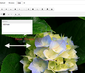
8.1.5. Multiple objects/image holders
The Image Browsing and Image Editing pages can be loaded with images from several objects at the same time. You can do this in two different ways, either by sending several object ids as request parameters or by using a related object expression to load the other objects.
| Parameters | Example | Description |
|---|---|---|
objectId |
|
Will load images from all objects passed as request parameters. |
relatedImageExpression |
|
Will use the expression to find objects to load images for. |
8.2. Images and annotations data model
The TVC Image Manager uses the Enovia data model for uploading images to a related object of the type "Image Holder". Each image that is uploaded will be checked in to this related object together with several resized smaller versions of the image.
If one of these images is annotated and saved an object of the type "TVC Image Annotation" will be connected to the Image holder. This is connected with the relationship "TVC Image Annotation" containing an attribute "TVC Annotated Image" that specifies the name of the annotated image. The annotation object will have an attribute containing the annotation data so it can be loaded and edited again. It will also contain a checked in file that is a flattened jpg of the annotated image for use in reports and other places.
So the image original that is being annotated will be kept unchanged and not modified.
By default the annotated image is displayed in view annotation mode only. To preview annotation in upload, browse and edit tabs of Image Manager following tvc property setting has to be configured.
tvc.core.imageManager.previewAnnotation=true
URL parameter previewAnnotation=false can be passed in "Image Upload", "Image Browse" and "Image Editing" tabs if preview annotation is not required in any of them.
URL parameter previewAnnotation’s default value is true and it is obeyed only when global annotation property setting is enabled.
9. Image Flow
As of release 2010.2, a new feature called Image Flow was added.
The Image Flow allows the user to browse through a set of images. The images are typically the primary images associated to a set of objects, but it is possible to launch the image flow and show all images associated to an object.
Moreover, the image flow can be configured to launch an URL below the image. When the image is shown, the object associated with the image will be passed along to the specified URL and the page is loaded.
The example screenshot below illustrates an example use case of an image flow.

The image flow is configured via an XML file, and to launch the image flow you should use the URL below:
${ROOT_DIR}/tvc-action/imageflow?config=tvc:imageflow/MyImageFlow.xml
The config parameter can be omitted, in that case the image flow will only display the images associated with the object provided in the request. However, typically is that you use a configuration for the image flow. The sub chapter describes the configuration in detail.
9.1. Configuration
The Image Flow component is configured via an XML resource. The XML configuration is of type "imageflow" hence it must be stored inside a directory under the WEB-INF/tvc folder called "imageflow". If you use namespaces (domains), the folder is slightly different.
9.1.1. Example
<ImageFlow>(1)
<Height>50%</Height>(2)
<Images>(3)
<ImageFormat>large</ImageFormat>(4)
<TitlePattern>$<attribute[attribute_MarketingName]></TitlePattern>(5)
<Loader>(6)
<Query type="type_Model" vault="vault_eServiceProduction"/>
</Loader>
</Images>
<View>
<URL action="navigate">(7)
<Param name="pageConfig">tvc:pageconfig:tvx:vcc/Products.xml</Param>
<Param name="inquiry">tvc:inquiry:tvx:vcc/ProductsFromModel.xml</Param>
<Param name="portalMode">true</Param>
</URL>
</View>
</ImageFlow>| 1 | The root tag is always <ImageFlow>. |
| 2 | The <Height> tag specifies the height of the Image Flow itself; you can
either use percentage or pixels. |
| 3 | Within the <Images> element you configure what’s displayed in the Image
Flow component. |
| 4 | The <ImageFormat> designates which format to use. The accepted values
are ‘thumbnail’, ‘small’, ‘medium’ and ‘large’. |
| 5 | The <TitlePattern> element defines a pattern that will be evaluated to
extract the title to use for each object/image. You’re allowed to use
business object select macros within this pattern to get data from each
object. |
| 6 | The <Loader> element configures how to find the objects whose images
will be displayed in the Image Flow. Apart from <Query/>, you can also
use <Expansion type=’’ relationship=’’ from=’*’ />, <Inquiry
inquiry=’’ /> and <JPO program=’’ function=’’ /> within this element.
See next chapter for further details. |
| 7 | Lastly, the <URL> element defines which URL to be used below the Image
Flow. |
9.1.2. Loader Types
The data can be loaded using a couple of different alternatives:
-
Expansion
-
Query
-
Inquiry
-
JPO
-
Data Set
To use an expansion, the image flow must be launched in the context of an object, while the latter doesn’t require so.
Query
The example below shows the attributes that you can use to control a query
<Query type="type_Part,type_AnotherType"
    name="A*"
    revision="*"
    vault="vault_eServiceProduction"
    where=""
    owner=""
    limit="1000"
    expand="true"/>
Expansion
The example below shows the attributes that you can use to control an expansion.
<Expansion type="type_Part,type_AnotherType"
    relationship="relationship_EBOM,relationship_AnotherRel"
    objectWhere=""
    relationshipWhere=""
    recurseToLevel="2"
    from="true"
    to="false" />
Inquiry
The example below shows the attributes that you can use to control an inquiry.
<Inquiry inquiry="name of inquiry"/>
9.2. Images
The images that are taken from the objects loaded are either the Image connected with the "Primary Image" relationship, or the primary image specified on the "Image Holder" object connected. E.g. the image flow supports the two different alternate image concepts that exist in the ENOVIA Centrals.
You can also use a custom so called Image finder, which evaluates what images to be included.
To do so, you need to specify the following within the configuration:
<ImageFlow>
    <Images>
        <Finder>value</Finder>
The value can either be "primary", "objectimage" or a class name of a class that implements the interface shown below:
package com.technia.tvc.core.gui.imageflow.model.finder;

import com.technia.tvc.core.gui.imageflow.model.Image;
import com.technia.tvc.core.TVCException;
import com.technia.tvc.core.db.aef.env.Environment;

public interface ImageFinder {
    Image[] getImages(Environment env) throws TVCException;
}
If omitting the finder from the definition, the primary images are loaded (same as saying "primary"). If you instead want to load all images available from the object(s) loaded, then you use the "objectimage" string instead.
And as mentioned, if you need to load the images in a custom way, implement your own ImageFinder.
10. Charts
It is possible to create charts that are predefined with an XML configuration file. The chart is then accessed from an ordinary command, which contains the reference to the XML file that defines/configures the chart.
The chart is based upon data based upon applying a system table (or XML table) upon objects/connections loaded via an inquiry, JPO or through another mechanism.
10.1. Command
To create a Command that displays the chart you set the Href parameter as shown below. The TVC action is named "chart" and takes one parameter, "chartConfig". The value of "chartConfig" should be the name of the xml file defining the chart.
Example:
${ROOT_DIR}/tvc-action/chart?chartConfig=<name of configuration>

10.2. XML Definition
The example below illustrates how to define a chart with xml.
<Chart>
    <ChartType>BAR</ChartType>
    <Columns>
        <Column>Name</Column>
        <Column>Weight</Column>
    </Columns>
    <DataProvider>inquiry:tvc:inquiry:tvx:enc/Heaviest10Parts.xml</DataProvider>
    <TableName>tvc:table:tvx:enc/PartInfo.xml</TableName>
    <Title>Default title</Title>
    <Title locale="sv_SE">Localized title</Title>
    <XaxisTitle>Default x-axis title</XaxisTitle>
    <XaxisTitle locale="sv_SE">Localized x-axis title</XaxisTitle>
    <YaxisTitle>Default y-axis title</YaxisTitle>
    <YaxisTitle locale="sv_SE">Localized y-axis title</YaxisTitle>
    <Width>800</Width>
    <Height>400</Height>
    <Render3D>false</Render3D>
    <ShowLegend>false</ShowLegend>
    <ShowPercent>false</ShowPercent>
    <ShowNumberLabel>true</ShowNumberLabel>
    <ShowNameLabel>true</ShowNameLabel>
    <CountOccurrences>false</CountOccurrences>
    <BaseColor>rgb(55, 85, 15)</BaseColor>
    <ChartColors>
        <Color>rgb(76, 164, 173)</Color>
        <Color>rgb(131, 224, 235)</Color>
        <Color>rgb(123, 143, 186)</Color>
        <Color>rgb(83, 99, 150)</Color>
        <Color>rgb(91, 56, 140)</Color>
    </ChartColors>
</Chart>
10.2.1. Child elements of Chart
| Element Name | Description | Mandatory | Values |
|---|---|---|---|
ChartType |
The type of chart to be displayed |
Yes |
See below |
Columns |
List of column names with one or more "<Column>" elements. |
Yes |
Any names that is available in the custom java class or in the Structure Browser if the chart is created from a structure browser. |
DataProvider |
The data provider. More about data providers. |
Yes |
See below |
TableName |
Name of the table to apply on the data from the Inquiry. |
Yes, if an Inquiry is used. |
Table name. |
Title |
The chart title text |
No |
Chart title text. Can be localized using the attribute "locale". |
XaxisTitle |
Title text for the X axis |
No |
X axis title text. Can be localized using the attribute "locale". |
YaxisTitle |
Title text for the Y axis |
No |
Y axis title text. Can be localized using the attribute "locale". |
Width |
Sets the width of the chart. |
No |
Numeric value. Default is 600. |
Height |
Sets the height of the chart. |
No |
Numeric value. Default is 600. |
CountOccurrences |
If set to true the Y axis will show the number of occurrences of each value of the supplied column. If false the Y axis will show each value of the column which then must contain a numerical value. |
No |
True/false. True is default. |
Render3D |
Determines whether the chart is shown in 3D. Exceptions listed in below. |
No |
True/false. False is default. |
ShowLegend |
Determines whether the legend is shown. Exceptions listed in below. |
No |
True/false. False is default. |
ShowPercent |
Determines whether the percent value is shown. Exceptions listed in below. |
No |
True/false. False is default. |
ShowNumberLabel |
Determines whether a label with the value number is shown. Exceptions listed below. |
No |
True/false. False is default. |
ShowNameLabel |
Determines whether a label with the name of the data series is shown. Only available for Chart type Bar and Stacked_Bar. |
No |
True/false. False is default. |
BaseColor |
Used to set the base color of the chart. The given color is the darkest used, together with the required number of lighter shades of the same color. If "ChartColors" are supplied, "BaseColor" is not used. |
No |
Text containing an rgb value on the format "rgb(rVal, gVal, bVal)". Default is a shade of blue. |
ChartColors |
List of color with one or more "<ChartColor>" elements. If not enough colors are in the list, they will be reused. |
No |
Ex: <ChartColor>rgb(45, 65, 185)</ChartColor> |
10.2.2. Chart types
Here is a brief description of which settings are available for tweaking your charts, per chart type.
Pie Chart
-
ChartType id "PIE".
-
Needs one column with input data.
-
Labels are always visible.
-
"ShowPercent", "ShowLegend" and "Render3D" are available.
Multiple Pie Chart
-
ChartType id "MULTIPLE_PIE".
-
Needs two columns with input data.
-
Labels are always visible.
-
"ShowPercent", "ShowLegend" and "Render3D" are available.
Ring Chart
-
ChartType id "RING".
-
Needs one column with input data.
-
Labels are always visible.
-
"ShowPercent" is available.
-
"Render3D" and "ShowLegend" are unavailable.
Bar Chart
-
ChartType id "BAR"
-
Needs one or two columns with input data
-
"Render3D" and "ShowLegend" are available
-
"ShowPercent" is unavailable
Stacked Bar Chart
-
ChartType id "STACKED_BAR"
-
Needs two columns with input data
-
"Render3D" and "ShowLegend" are available
-
"ShowPercent" is unavailable
Area Chart
-
ChartType id "AREA"
-
Needs two columns with input data
-
"ShowLegend" is available
-
"ShowPercent" and "Render3D" are unavailable
Stacked Area Chart
-
ChartType id "STACKED_AREA"
-
Needs two columns with input data
-
"ShowLegend" is available
-
"ShowPercent" and "Render3D" are unavailable
Timeline Chart
-
ChartType id "TIMELINE"
-
Needs one, two or three columns
-
Column 1 – must be a date, which is mapped to the X axis.
-
Column 2 – if "CountOccurrences" is set to true then this will the category column. If "CountOccurrences" is set to false then this column will be used as a numeric value mapped to the Y axis. If two objects have the same date those values will be accumulated.
-
Column 3 – this is the category column when "CountOccurrences" is set to false.
-
-
"ShowLegend" is available
-
"ShowPercent" and "Render3D" are unavailable
Bubble Chart
-
ChartType id "BUBBLE"
-
Needs four columns with input data and can take one optional fifth column. They are used in top-down order as follows
-
Column 1 is the x-axis
-
Column 2 is the y-axis
-
Column 3 is the size of the bubbles
-
Column 4 is the colour of the bubbles
-
Column 5 is optional and defines the data for the labels on the bubbles
-
-
"ShowPercent" and "Render3D" are unavailable
-
"ShowLegend" cannot be turned off
10.2.3. Data Provider
The data provider element defines how the data that drives the chart is being loaded. Depending on how the data is being loaded, the format of the data provider value is different. The purpose of a dataloader is to provide the objects (and optionally connections) that is being a part of the chart.
The list below illustrates the different data providers that are supported, and the format:
| Type | Example | Description |
|---|---|---|
Inquiry |
|
Will use the specified inquiry to load the data. |
JPO |
|
Will use the specified JPO/method to load the data. |
Java |
|
Will use a custom data provider, which is implemented in a Java class. The Java class must implement the interface:
This interface has one method that is required to be implemented. That
method returns the data as a |
10.3. Chart Font Configuration
The default font used in the generated charts is Verdana. To change this font, one can apply the following init-parameter:
<init-param>
    <param-name>tvc.core.chart.baseFont</param-name>
    <param-value>MS Mincho</param-value>
</init-param>
Note that multi-byte characters might not be rendered correctly when using Java 1.5 or previous versions. To correct this, copy the font files into the JAVA_HOME/jre/lib/fonts directory on the application server.
It is also possible to configure the sizes of the fonts used in the different places.
This is done through init-parameters; listed below:
tvc.core.chart.font.titleFont
tvc.core.chart.font.legendFont
tvc.core.chart.font.labelFont
tvc.core.chart.font.pieTitleFont
tvc.core.chart.font.bubbleTitleFont
tvc.core.chart.font.bubbleLabelFont
tvc.core.chart.font.numberAxisLabelFont
tvc.core.chart.font.numberAxisTickLabelFont
The value for these init-parameters should be a value that is accepted by the java.awt.Font.decode(String) method, example: "arial-plain-12".
It’s also possible to configure some colors used;
tvc.core.chart.color.labelBackgroundColor
tvc.core.chart.color.labelOutlineColor
tvc.core.chart.color.labelLinkColor
tvc.core.chart.color.pieTitleColor
tvc.core.chart.color.bubbleTitleColor
The values for the colors should be according to this syntax:
-
RGB: rgb(55,100,99)
-
HEX: #FFACDA
-
Named Color: White, LightGray, LightYellow, Indigo, … (the list is too long…)
Another alternative is to modify these upon startup; e.g. in your plugin, add some code within your "init()" method that initializes the look and feel of the generated charts.
Example:
import com.technia.tvc.core.chart.ChartLookAndFeel;
    ...
    public void init() {
        ChartLookAndFeel lf = ChartLookAndFeel.getInstance();
        lf.setTitleFont(new Font(...));
        lf.setLegendFont(new Font(...));
        ...
    }
    ...
It’s however important that you do this once and not try to change this when the application is up and running, since the chart factory will use the values from the ChartLookAndFeel instance when the charts are being created.
11. Data Sets
Data sets allows an administrator to define complex data retrievals within XML format. This feature was initially developed for use in the report generator but due to its power and flexibility, the support for using data-sets has increased into most of the TVC Components nowadays.
A data set can either be a structure consisting of objects and connections or a "flat" list of objects (each row in a flat list can also be associated with a connection).
A data set can typically be used to load data in several places across the TVC components. Some examples of use are:
-
Loading data into a Structure Browser
-
Loading data into a Grid Browser
-
Loading data within the image flow
-
Loading data into a chart / dashboard.
-
Loading data into a Report
A data set is defined in XML and is stored as a "resource" below the
/WEB-INF/tvc folder within the ENOVIA web-application. The type of
this resource is called "dataset". Below is a table showing some
examples of the paths and their corresponding resource name to a
particular data set.
| File System Path (Relative from the root dir of your application) | Resource Name |
|---|---|
/WEB-INF/tvc/dataset/MyDataSet.xml |
tvc:dataset/MyDataSet.xml |
/WEB-INF/tvc/tvx/enc/dataset/MyDataSet.xml |
tvc:dataset:tvx:enc/MyDataSet.xml |
/WEB-INF/tvc/dataset/test/MyDataSet.xml |
tvc:dataset/test/MyDataSet.xml |
/WEB-INF/tvc/tvx/enc/dataset/test/MyDataSet.xml |
tvc.dataset:tvx:enc/test/MyDataSet.xml |
11.1. XML Format
The root element of the XML data structure is <DataSet>.
Below the root element, you will declare a so called loader.
There exist a number of different loaders, some of them require "input", which either comes from the "caller" such as object-ids provided in request parameters or from a "child" loader, while some loaders doesn’t require input.
The table below describes the built-in loaders together with a short description and reference to the chapter where they are described in more detail.
| Loader | XML Element | Description | Requires Input |
|---|---|---|---|
Expand |
<Expand> |
Performs an expansion. The way the expansion is done, is configured through child elements. |
Yes |
Inquiry |
<Inquiry> |
Executes an inquiry. Either the inquiry is defined "inline" in the XML, or you reference an existing inquiry. |
No |
Query |
<Query> |
Performs a temp query. The query parameters are configured as child elements. |
No |
Java Program Object |
<JPO> |
Executes a Java Program Object. |
No |
Select |
<Select> |
Performs a "select" to retrieve the desired objects. |
Yes |
Flatten |
<Flatten> |
Converts a structure into a flat list. E.g. removes all hierarchy information |
Yes |
End Items |
<EndItems> |
Removes all nodes except the leafs from a structure. |
Yes |
Remove Duplicate Objects |
<RemoveDuplicates> |
Ensures that each object only appears once. |
Yes |
Filter |
<Filter> |
Performs a filtering of the rows based upon an expression. |
Yes |
Java |
<Java> |
Defines a loader implemented in Java |
No |
Source |
<Source> |
Explicitly obtains the objects provided by the client; typically the values either from the "emxTableRowId" parameter or the "objectId" parameter. |
No |
PersonObject |
<PersonObject> |
Gives the object-id of the person object associated with the current user. |
No |
CompanyObject |
<CompanyObject> |
Gives the object-id of the company object associated with the current user. |
No |
RemoveRoots |
<RemoveRoots> |
Removes the root nodes from a structure. |
Yes |
DataSetRef |
<DataSetRef> |
Includes the content from another data-set |
No |
Structure |
<Structure> |
Converts a flat list of objects into a structure, where the root nodes of the structure originate from the rows in the flat list. |
Yes |
Union |
<Union> |
Combines the result from several loaders into one flat list OR one structure. |
Yes |
Intersection |
<Intersection> |
Takes the id’s that are present in all child loaders. |
Yes |
Complement |
<Complement> |
Loads data from one or more child loaders, and exclude data by defining other child loaders that defines what to exclude. |
Yes |
DoPrivileged |
<DoProvileged> |
Runs the child loaders with system privileges |
Yes |
LatestInState |
<LatestInState> |
Finds the latest revision of the object in a particular state. |
Yes |
ExaleadQuery |
<ExaleadQuery> |
Performs a query against Exalead. The query parameters are configured as child elements. |
No |
SecurityContext |
<SecurityContext> |
Obtains the security context for the current user |
No |
ConditionallyInclude |
<ConditionallyInclude> |
Conditionally includes the child loader based upon the presence or non-presence of a parameter |
Yes |
PathQuery |
<PathQuery> |
Performs a query on path. The path query parameters are configured as child elements. |
No |
Label |
<Label> |
Label for dataset. |
No |
11.1.1. Nesting of Loaders
A loader might require input, while some don’t. The loaders that requires input can either use input from a loader defined as a child element OR it can use the input as provided by the caller (typically from request parameters such as "emxTableRowIdParam" passed from selected rows in a table/structure page OR the "objectId" parameter that also is used to pass the id of one or more objects).
Below is an example how to "nest" the loaders:
<DataSet>
    <RemoveDuplicates>(5)
        <Filter usesBusinessObject="true">(4)
            <Expression>attribute[Unit of Measure] == kg</Expression>
            <EndItems>(3)
                <Expand>(2)
                    <Inquiry>(1)
                        <Name>tvc:inquiry/MyInquiry</Name>
                    </Inquiry>
                </Expand>
            </EndItems>
        </Filter>
    </RemoveDuplicates>
</DataSet>
Note that this example is not complete; some configuration details has been left out for readability purpose.
What this example actually does is:
| 1 | Use an inquiry to load some objects |
| 2 | The objects loaded from the inquiry is expanded according to the Expand definition |
| 3 | All rows except the end items within the structure is removed |
| 4 | A filter is applied to the objects, which will remove all objects that doesn’t fulfil the filter-expression |
| 5 | Finally, all objects appearing more than once are removed. |
This illustrates how to accomplish a quite complex data-retrieval just by using a combination of different loaders. If you would have implemented this code as for example a JPO, you would typically need to implement +100 rows of Java code.
11.1.2. Expansion
A complete definition how to expand a structure is shown below. Note that some elements are optional.
<DataSet>
    <Expand>
        <From>true</From>
        <To>false</To>
        <Depth>1</Depth>
        <TypePattern>
            <Type>type_Part</Type>
            <Type>...</Type>
        </TypePattern>
        <RelationshipPattern>
            <Relationship>relationship_SparePart</Relationship>
            <Relationship>...</Relationship>
        </RelationshipPattern>
        <ObjectWhere>...expression...</ObjectWhere>
        <RelWhere>...expression...</RelWhere>
        <LoadRootInquiry>name of inquiry that provides the root objects</LoadRootInquiry>
    </Expand>
</DataSet>
Setting the depth to 0, you will expand as deep as possible. This can only be done in one direction.
| The "LoadRootInquiry" element can be used to specify an inquiry that loads the root nodes. This would be the same as doing: |
<Expand>
    <Inquiry>
        <Name>name of inquiry</Name>
    </Inquiry>
</Expand>
The difference is that the first approach will execute slightly more efficient.
11.1.3. Inquiry
Executing an inquiry can be done in two different ways. Either you will reference an existing inquiry by its name, or you can define the inquiry inline. Below are two examples illustrating both ways.
<Inquiry>
    <Name>name of inquiry to run</Name>
</Inquiry>
Alternatively, you can also say:
<Inquiry name="name of inquiry"/>Or by defining the inquiry inline:
<Inquiry>
    <Code>temp query bus Part * * limit 100</Code>
    <Pattern>*|*|*|${OID}</Pattern>
    <Format>${OID}</Format>
</Inquiry>
11.1.4. Query
A complete definition how to perform a query is shown below. Note that some elements are optional.
<Query>
<ExpandType>true</ExpandType> <!-- whether or not to find sub-types -->
<FindLimit>0</FindLimit> <!-- the find limit -->
<TypePattern>
<Type>type_Part</Type>
<Type>type_AnotherType</Type>
</TypePattern>
<NamePattern>
<Name>A*</Name>
<Name>B*</Name>
</NamePattern>
<RevisionPattern>
<Revision>A</Revision>
<Revision>B</Revision>
<Revision>C</Revision>
</RevisionPattern>
<OwnerPattern>
<Owner>A user</Owner>
</OwnerPattern>
<VaultPattern>
<Vault>A vault</Vault>
<Vault>Another vault</Vault>
</VaultPattern>
<Where>$<attribute[attribute_Weight]< > 100</Where>
</Query>11.1.5. JPO
The JPO loader can be used to invoke a JPO. The example below illustrates how to configure such loader.
<JPO>
    <Name>MyJPO</Name>
    <Method>myMethod</Method>
</JPO>
Alternatively, you can also say:
<JPO name="MyJPO" method="myMethod"/>The JPO method must return a MapList where each Map in the list contains the "id" and optionally the "id[connection]" key.
11.1.6. Select
The select loader selects id’s based upon the input to the select loader. Below is an example how to do so:
<Select>
    <Statement>from[Documents].to.revisions.id</Statement>
    <Statement>from[Specs].to.revisions.id</Statement>
</Select>
By default, the select loader assumes that you select on business objects, and the select returns other business object id’s. If you select on relationships, or your select clause returns connection id’s, see below for details.
Note 1: In this case, the select is done upon the implicit input objects as provided by the client. You can use a child-loader also; in that case, the select is based upon the objects provided by that loader.
Note 2: it is possible to have several statements. Each statement must of course return object-ids.
If you have select statements that operates on connection id’s; then you can specify so as shown below:
<Select selectFromConnections="true">
    <Statement>to.id</Statement>
</Select>
If your select statement would return connection id’s instead of object id’s, then you can specify so as shown below:
<Select selectReturnsConnections="true">
    <Statement>to.id</Statement>
</Select>
If you only have one select statement, this can be written as:
<Select statement="from[Documents].to.id"/>11.1.7. Flatten
The flatten loader doesn’t have any configuration options. The only requirement is that the input to this loader is a structure; if not, nothing will be done by this loader.
Example:
<Flatten>
    <Expand>
    ...
    </Expand>
</Flatten>
11.1.8. End Items / Leafs
The end items loader doesn’t have any configuration options. The only requirement is that the input to this loader is a structure; if not, nothing will be done by this loader.
Example:
<EndItems>
    <Expand>
    ...
    </Expand>
</EndItems>
11.1.9. Remove Duplicates
The remove duplicates loader requires input, either a structure or a flat list. In case of a structure, the removal of duplicates is only made on the root-nodes in the structure.
Example:
<RemoveDuplicates>
    <EndItems>
        <Expand>
            ...
        </Expand>
    </EndItems>
</RemoveDuplicates>
If you need to retain occurrences of the same object if the connection id differs, specify so using the attribute "ignoreConnectId" as shown below:
<RemoveDuplicates ignoreConnectId="false">
    <EndItems>
        <Expand>
            ...
        </Expand>
    </EndItems>
</RemoveDuplicates>
11.1.10. Filter
The filter loader can be used to filter out objects based upon an expression. This loader requires input. The example below expands a structure, makes it flat, then applies the filter and removes all the rows not matching this filter.
<Filter>
<Expression>$<attribute[attribute_Classification]> == ABC</Expression>
<Flatten>
<Expand>
...
</Expand>
</Flatten>
</Filter>Alternatively, you can also say:
<Filter expression="$<attribute[attribute_ABC]> == 'DEF'"/>NOTE 1: The expression is evaluated using the ENOVIA select statement "evaluate[${EXPRESSION}]". All rows returning TRUE will be accepted, others will be filtered out.
NOTE 2: If you need to combine criteria using AND/OR operators; you might in some cases need to use the AND or OR key words instead of using the && and || operators. This is due to a bug/behaviour of ENOVIA.
For example the expression shown below:
<Expression>attribute[Attribute 1] == Value1 || attribute[Attribute 2] == Value2</Expression>Might need to be rewritten as shown below:
<Expression>attribute[Attribute 1] == Value1 *OR* attribute[Attribute 2] == Value2</Expression>E.g. the operators || and && could be changed to OR and AND.
To verify your expressions, you can from MQL do:
<MQL> pri bus T N R select evaluate[attribute[Attribute 1] == Value1];NOTE 3: If your expression should be evaluated against the connections instead of over the business objects, which is the default, then you can say so as shown below:
<Filter usesBusinessObject="false" ...>11.1.11. Java
To use a custom loader within a data-set that is implemented in Java, this can be done through the example below:
<Java className="com.acme.MyDataLoader"/>The class specified must implement one of the interfaces below:
-
com.technia.tvc.core.db.dataset.loader.DataLoader
-
com.technia.tvc.core.db.dataset.loader.DataLoaderWithInput
If your custom Java class supports load by a child loader, you need to implement the DataLoaderWithInput interface.
11.1.12. Source
The source objects as provided by the client through for example request parameters will be used by the data-loaders that require input, but doesn’t have any input configured in the data-set XML file through any child loaders, implicitly.
To explicitly define that you will use the source objects, then you can define this in the Data set XML file like shown below:
<Filter>
    <Expression>...</Expression>
    <Source/>
</Filter>
If any other parameter needs to used in place of objectId then useParameter attribute could be used to pass the parameter name for source input.
<Source useParameter="parentOID"/>In some use cases, physical id is used as input which would not give a proper result with the combination of other datasets such as Complement, Intersection, Union, etc… In such a scenario, checkPhysicalId attribute could be used with a boolean value to check the use of physical id and convert the source inputs into object ids and connection-ids.
<Source checkPhysicalId="true"/>11.1.13. Person Object
The id of the person object associated with the current user can in some cases be useful to start from when for example expanding a structure. Below is an example how to use it:
<EndItems>
    <Expand>
        ...
        <PersonObject/>
    </Expand>
</EndItems>
This example will expand the person object and finally filter out all rows in the structure except for the "end items".
11.1.14. Company Object
The id of the company object associated with the current user can in some cases be useful to start from when for example expanding a structure. Below is an example how to use it:
<EndItems>
    <Expand>
        ...
        <CompanyObject/>
    </Expand>
</EndItems>
This example will expand the company object and finally filter out all rows in the structure except for the "end items".
11.1.15. Remove Roots
In some cases when you have expanded a structure, you only want to remove the root nodes. This can be accomplished as shown below:
<RemoveRoots>
    <Expand>
        ...
    </Expand>
</RemoveRoots>
The "RemoveRoots" element doesn’t have any configuration options.
11.1.16. Dataset Reference
A dataset might use the outcome from another dataset. This can be accomplished as shown below:
<DataSetRef name="tvc:dataset/MyDataSet.xml">11.1.17. Structure
In conjunction with the Flatten loader, which converts a structure into a flat list, you can use the Structure loader to convert a flat list into a structure.
Each row in the flat list used as input to this loader will be set as root node in the returned structure.
Note that if the input to this loader is a structure, no change is made.
You can configure this loader with some additional attributes:
| Attribute | Description |
|---|---|
ignoreRelIds |
A Boolean specifying if to exclude any relationship information as provided by the child loader. Default is false. |
Example:
<Structure ignoreRelIds="false">
    <Query>
        ...
    </Query>
</Structure>
11.1.18. Union
To combine the result from several loaders, you can use the "Union" loader. This can be accomplished as shown below:
<DataSet>
    <Union>
        <DataSetRef name="tvc:dataset/Example.xml"/>
        <Query>
            <TypePattern>
                <Type>type_SomeType</Type>
            </TypePattern>
            <FindLimit>10</FindLimit>
            <Where>current == Obsolete</Where>
        </Query>
        <Query>
            <TypePattern>
                <Type>type_AnotherType</Type>
            </TypePattern>
            <FindLimit>10</FindLimit>
            <Where>current == Create</Where>
        </Query>
        <Query>
            <TypePattern>
                <Type>type_ThirdType</Type>
            </TypePattern>
            <Where>current == Release</Where>
            <FindLimit>10</FindLimit>
        </Query>
    </Union>
</DataSet>
In this example, we combine the result from three queries and the result from a referenced data-set.
If any of the loaders contains structural data, the outcome of this loader becomes a structure.
To force flat list, you can use the attribute "forceFlat" on the <Union>
element and set the value to true. E.g.
<DataSet>
    <Union forceFlat="true">
11.1.19. Intersection
This loader will return the ID’s that are part of all child loaders. Example:
<DataSet>
    <Intersection>
        <DataSetRef name="tvc:dataset/First.xml"/>
        <DataSetRef name="tvc:dataset/Second.xml"/>
    </Intersection>
</DataSet>
The result from the example below will contain the objects that are in both the results from the specified data-sets.
By default, this loader uses the object-id’s. However, you can configure it to use the relationship id’s instead. This is accomplished as shown below:
<DataSet>
    <Intersection useRelationship="true">
11.1.20. Complement
To exclude data from a loader, you can use the Complement-loader. It allows you to define nested loaders, which defines the maximum objects/connections to be included. From this maximum set, you can exclude objects/connections.
See the example below which queries the system for all Person objects, but excludes the one representing the current user.
<Complement>
    <Include>
        <Query>
            <TypePattern>
                <Type>type_Person</Type>
            </TypePattern>
        </Query>
    </Include>
    <Exclude>
        <PersonObject/>
    </Exclude>
</Complement>
Both the <Include> and <Exclude> elements accepts multiple loaders.
11.1.21. DoPrivileged
By default, any data loader within a data set is run with the same context (credentials) as the user who is logged in. In some cases, you might want to run a query as a super user in order to by-pass any access checks that are expensive to evaluate. To do so, you can accomplish this as shown below:
<DataSet>
    <DoPrivileged>
        <Query>
            ...
        </Query>
    </DoPrivileged>
</DataSet>
11.1.22. Latest in State
This loader is used to get only the latest revision of the object which is in the specific state. For example this can be used to only get the latest "Released" revision of a part. Example of this scenario:
<DataSet>
    <LatestInState>
        <State>Released</State> (1)
        <Query>
            <TypePattern>
                <Type>Part</Type>
            </TypePattern>
            ...
        </Query>
    </LatestInState>
</DataSet>| 1 | State definition |
11.1.23. Exalead
Uses the criteria specified in the configuration to find the objects of interest.
The criteria consists of one or more criterions. Each criterion specifies:
-
The field which defines what to search on. The field name must match the exact name in the config.xml for Exalead.
-
The operator to use. The equal operator is used by default.
-
The value to search.
Criterion example:
<Criterion field="TYPES" operator="equal">Part</Criterion>The search uses AND logical operator when combining the criterions. This means that objects must match every criterion in order to be considered a match.
A complete definition searching for Parts in state Review / Released, marked as spare part, originating from 2015 and so on.
<DataSet>
    <ExaleadQuery>
        <PageSize>1000</PageSize>
        <Criteria>
            <Criterion field="TYPE">Part</Criterion>
            <Criterion field="SPARE_PART">true</Criterion>
            <Criterion field="CURRENT" operator="in">
                <Value>Review</Value>
                <Value>Released</Value>
            </Criterion>
            <Criterion field="ORIGINATED" operator="between">
                <From>2015-01-01 00:00:00 AM</From>
                <To>2016-01-01 00:00:00 AM</To>
            </Criterion>
            <Criterion field="OWNER">Test Everything</Criterion>
            <Criterion field="DESCRIPTION">*ohm</Criterion>
        </Criteria>
    </ExaleadQuery>
</DataSet>
Operators:
| Name | Description |
|---|---|
equal |
The objects value must equals the searched value. Supports wild card searches to match parts of the value. This is the default operator. |
not-equal |
The objects values must not equal the searched value. |
greater-than |
The objects value must be greater than the searched value. |
less-than |
The objects value must be less than the searched value. |
between |
The objects value must be in a range. Use sub element |
in |
The objects value must be any of the specified values. Use |
This loader requires that you have Exalead installed and that your data is correctly indexed.
Dates
The date to search on needs to:
-
Follow the configured format in ENOVIA
-
Include both date and time
Examples:
8/1/2016 10:00:00 AM
8/31/2016 11:59:59 PM| Searching for only the date (without the time) works for some fields, but not all. The time is by default set to midnight making the search result sometimes unpredictable from a user perspective. |
11.1.24. Security Context
To get the organization business object and/or project business object representing the current user’s security context, use this element.
Example:
<DataSet>
    <SecurityContext project="true" organization="false" />
</DataSet>
11.1.25. Conditionally Inclusion
Parameters are made available to a data-set in different ways depending on how it is being used and invoked.
One can based upon the presence or absence of a parameter, conditionally include the content from the child loader’s.
Example:
<DataSet>
    <ConditionallyInclude if="param1">
          <Query ...>
          </Query>
    </ConditionallyInclude>
    <ConditionallyInclude unless="param1">
        <Expand ...>
          ...
        </Expand>
    </ConditionallyInclude>
</DataSet>
There is an additional attribute called trimWhitespace, which if set to true will treat empty parameter values as null/not-present.
The default value for this parameter is true. Example below:
|
    <ConditionallyInclude if="param1" trimWhitespace="false">
    ...
    </ConditionallyInclude>
11.1.26. Path Query
Search for Path objects using a path query.
Example: list all COs by Parts which are in work state and owned by logged in user
<PathQuery>
    <PathType>Proposed Activity.Where</PathType>
    <PathSelect>owner.to[Proposed Activities].from.to[Change Action].from.id</PathSelect>
    <Query>
        <TypePattern>
            <Type>type_Part</Type>
        </TypePattern>
        <Where>owner==context.user AND current=='In Work'</Where>
    </Query>
    <!--<ElementInquiry>PartQuery</ElementInquiry>-->
</PathQuery>
Settings:
| Name | Description | Default |
|---|---|---|
PathType |
Type of Path to search for |
|
PathSelect |
expression to get the respective id |
id |
QueryKind |
how the query will operate on subpath |
containsany |
vault |
Vault to search for |
|
where |
Where clause to use |
|
ElementInquiry |
name of the inquiry to the elements for query |
11.2. Parametrization
As of TVC 2015.3.0, support for parameterize values in a data set has been added. This feature can be used to let end users affect the result of a dataset, for example specify different type pattern in a query or change something in a where expression. Depending on how the data-set is being used, these parameters are resolved differently but typically in the web-environment these parameters originates from a request parameter.
By default, all data-sets are allowed to be parameterized. This behavior can be changed via a so called TVC init parameter. The name of this parameter is shown below and its default value is "TRUE".
tvc.core.dataSet.defaultParameterizable
The support for parametrization can be defined on a per-dataset basis also. See example below how to configure it.
<DataSet parameterizable="true | false">The default value is controlled via the global parameter.
11.2.1. Parameter Syntax
The syntax of a parameter is:
$(paramName,options)
Options is a comma separated list of options. An option consists of a key and value separated with the equals character. The available options are listed below:
| Option | Description | Example |
|---|---|---|
type |
Specifies the datatype of the value. Supported types are:
Note 1: date is used to convert a ISO8601 date to a ENOVIA date Node 2: The type value accepts symbolic names |
type=integer |
default |
Specifies the default value to be used if omitted or value is empty and empty is "false" |
default=type_Part |
derivedFrom |
If type is either type or relationship, this option may be used to specify that the value must represent a type that is derived from this type. |
type=type,derivedFrom=type_ECO |
empty |
Defines if the empty string is allowed or not. Default is FALSE. |
empty=true |
multiple |
Defines if multiple values are allowed. Default is FALSE |
multiple=true |
separator |
If multiple values are allowed and there are multiple values present, these values are concatenated with a separator string. Default value is the comma character. |
multiple=true,separator= |
escape |
If set to true, the resolved value will be searched for MQL sensitive chars to be escaped. The chars that are escaped are quote, double-quote and back-slash characters. Default is false. |
|
escape=true |
min |
For integers or numbers: provided value must not be lower than min value For strings: Length of string must be longer or equal to min. |
min=1 |
max |
For integers or numbers: provided value must not be greater than the max value. For strings: Length of string must be shorter or equal as the max value. |
max=5 |
allowWildcard |
If set to true and type is string, the input string is considered invalid if it contains either a ? or * character. |
11.2.2. Examples
Below are some examples of how the parameterized values can be used.
Example where the expand properties are parameterized.
<DataSet parameterizable="true">
    <Expand>
        <From>$(param.expandFrom,type=boolean,default=false)</From>
        <To>$(param.expandTo,type=boolean,default=false)</To>
        <Depth>$(param.depth,type=int,default=3)</Depth>
        <TypePattern>
            <Type>$(param.type,multiple=true,default=type_Part,type=type,derivedFrom=type_Part)</Type>
        </TypePattern>
        <RelationshipPattern>
            <Relationship>$(param.rel,multiple=true,default=relationship_EBOM)</Relationship>
        </RelationshipPattern>
    </Expand>
</DataSet>
Another example using an inquiry.
<DataSet parameterizable="true">
    <Inquiry>
        <Code>temp query bus "$(typePattern,default=*,multiple=true)" * * limit 100 select id dump |</Code>
        <Pattern>*|*|*|${OID}</Pattern>
        <Format>${OID}</Format>
    </Inquiry>
</DataSet>
11.2.3. Support for Parametrization
Most but not all configuration parameters within the DataSet XML definition allows specifying parametrization macros. The table below shows the supported places.
| Element | Property |
|---|---|
<DataSetRef> |
Referenced data-set |
<Expand> |
|
<Filter> |
Filter expression |
<Inquiry> |
|
<JPO> |
|
<LatestInState> |
State value |
<MQL> |
Code |
<Query> |
|
<ExaleadQuery> |
|
11.2.4. Escaping
Since the DataSet’s now may contain special macro references using $()
keywords, you may in rare situations need to escape such keywords if you
don’t intend to resolve it as a macro.
Fortunately you can either disable parametrization completely on that particular DataSet or escape these sensitive characters using the backslash key.
For example:
<DataSet>
    <MQL>
    <Code>\$(something)</Code>
Note that if you today are using backslashes, these are now treated as escape chars and hence you would need to escape the backslash also. So be aware of the following
-
Presence of
$( -
Use of backslash
12. Theme Support
TVC will as of the 2011.2.0 version adopt the UI to be closer to the UI as of V6R2012 if TVC is used together with this ENOVIA version. If TVC is used with an older version of ENOVIA, the standard look and feel of TVC is used.
E.g. TVC will adjust look and feel depending on ENOVIA version used.
To support this, we have added support for so called themes within TVC. Currently, we support the following themes within TVC:
-
classic
-
v6r2012
-
v6r2013x
-
v6r2014x
-
v6r2015x
-
v6r2015xOOTB
In future releases of TVC, we plan to develop other themes as well.
Unless a specific theme has been configured to be used, the theme-manager within TVC will decide what theme it will use by default by checking the ENOVIA version.
To explicitly specify what theme to be used, one can apply the following init-parameter to the TVC servlet in WEB.XML:
<init-param>
    <param-name>tvc.core.theme.current</param-name>
    <param-value>classic</param-value>
</init-param>
NOTE: You can configure TVC to use the V6R2012 theme even if you aren’t using this ENOVIA version. However, this should not be done, since the CSS files within the V6R2012 theme is referring to images that is provided by ENOVIA V6R2012.
| The support for TVC to use the 2015xOOTB theme has resulted in that all icon used across TVC component has look and feel more like OOTB when this theme is selected. |
It is also possibly to switch theme at runtime. A person with administration privileges can execute the following URL to do so:
${ROOT_DIR}/tvc-action/changeTheme
Calling this URL will give a screen allowing the administrator to change the theme among the available themes.
| The support for different themes has resulted in that all style sheets (CSS files) used across all TVC components has been renamed, moved and divided into several files. If you for some reason have used our CSS files, the HREF’s to those CSS files will as of this release be broken. |
12.1. Referencing a Stylesheet
If you want to use a stylesheet in TVC, you should never do that by the path to the file. Instead, one should use the "id" of the stylesheet as defined in the theme configuration files within TVC.
To reference a stylesheet from a JSP page, one will do as shown below:
<%@ taglib uri="/WEB-INF/tvc-core.tld" prefix="core" %>
...
<core:themeArtifact id="id-of-artifact"/>
<core:themeArtifact id="id-of-another-artifact"/>
To reference a stylesheet from a renderer (java class), one typically do:
import com.technia.tvc.core.gui.resource.Resource;
import com.technia.tvc.core.gui.resource.ThemeArtifact;
...
Resource resource = new ThemeArtifact("id-of-artifact");
Note that a theme artifact associated with an ID, might refer to one or several different files at the end. This might also vary depending on the current theme. E.g. the same artifact ID might result in three CSS files for theme A, while for theme B, it might result in two CSS files.
Below is a compressed list of common CSS files with their path used from the previous release of TVC and their new "artifact id" reference to be used as of 2011.2.0.
| Old Path (Before 2011.2.0) | Reference ID (as of 2011.2.0) |
|---|---|
/tvc/core/styles/tvcUIDefault.css |
tvc-ui-default |
/tvc/core/styles/tvcForm.css |
tvc-form |
/tvc/structurebrowser/styles/tvcTablePreferences.css |
table-preferences |
| If you have referenced another CSS file not in the list, please consult Technia for information how to reference it correctly as of 2011.2.0. |
13. Autocomplete
The autocomplete makes it easier to enter values in fields. It can be used for example when specifying what kind of Part the user wants to create, enter the Responsible Design Organization (related object) for a part or select units of measure for a part (ranges of attribute).
On server side the AutoCompleteHandler (handler) is responsible for providing available values for a field. The value consist of the actual value that is stored in the database, ex. object id, and a display value which the user is presented with. TVC comes with a number of built-in handlers.
Selectize is used on client side to render the field where user can enter values along with the dropdown containing available options. The plugin has a high level of configurability making it possible to set for instance how many options that should be presented, how to render them, ordering of options and much more.
This autocomplete documentation applies to Top Panel, Structure Browser tables and Create/Edit Forms.
13.1. Settings
There are two categories of settings:
-
Selectize. These controls the behavior of the Selectize plugin. See the Selectize usage page for a full reference.
-
AutoCompleteHandler. Defines settings for the handler. Handler settings are wrapped in a handler object to don’t collide with Selectize settings. These settings are described in detail in the following chapters.
13.2. Built-in handlers
Use lowercase name of handler when specifying handler to use.
Common settings for all handlers:
| Name | Description | Default |
|---|---|---|
name |
Defines the AutoCompleteHandler to use. Enter the name of a built-in handler or specify the qualified name of your java class. |
user |
caseSensitive |
Defines if searches are case sensitive. |
false |
contains |
Must the value start with the search criteria. |
true |
limit |
Maximum amount of results that is returned from server. |
50 |
localize |
13.2.1. User
| Name | Description | Default |
|---|---|---|
assignments |
Users must be assigned the role/group to be displayed. |
|
returnOid |
Returns the object id instead user name as value. |
false |
13.2.2. Type
| Name | Description | Default |
|---|---|---|
rootTypes |
Defines types to be searched. All sub types are also searched |
All types |
returnAbstractTypes |
Defines if abstract types should be searched. |
false |
13.2.3. DataSet
Uses a dataset to define available search options. If the field is in context of an object, e.g. in a top panel, the object id will be available in the dataset. This makes it possible to do operations which requires input, e.g. expansions.
| Name | Description | Default |
|---|---|---|
dataset |
Name of the dataset to use. The settings is mandatory. Example:
|
|
value |
Select expression selecting the value |
id |
label |
Defines what data to use as label. Supports macros. Examples:
|
|
select |
Defines additional data to fetch and return to the UI. Add one or more select expressions. Supports macros. The selected data can be used to make more advanced option rendering at the client using the Selectize settings rendering. Examples:
|
Example using dataset handler in Forms:
<ConnectField>
    <Label>Part Family</Label>
    <Relationship>
        <Name>relationship_ClassifiedItem</Name>
        <Direction>to</Direction>
    </Relationship>
    <AutoCompleteHandler>dataset</AutoCompleteHandler>
    <AutoCompleteSettings><![CDATA[{
        handler : {
            dataset : 'tvc:dataset:tvx:enc/PartFamilies.xml',
            value : 'id',
            label : '$<name>'
        }
    }]]></AutoCompleteSettings>
</ConnectField>13.2.6. BusinessObject
Searches for business objects using a query. Most often you enter some criteria to limit the search result, for example you will add a typePattern and whereClause to only get the first revision of parts.
| Name | Description | Default |
|---|---|---|
typePattern |
Type pattern to search for. |
|
namePattern |
Name pattern to search for. |
|
revisionPattern |
Revision pattern to search for. |
|
vaultPattern |
Vault pattern to search for. |
|
whereClause |
Where clause to use. |
|
matchOn |
||
expandType |
True |
|
displayMacro |
||
searchType |
How the search criteria will operate. Available values: * contains * startsWith * endsWith |
13.3. Examples
Custom rendering of options using dataset handler in Forms:
<ConnectField>
    <Label>ECO to release</Label>
    <Relationship>
        <Name>relationship_AffectedItem</Name>
        <Direction>to</Direction>
    </Relationship>
    <AutoCompleteHandler>dataset</AutoCompleteHandler>
    <AutoCompleteSettings><![CDATA[{
        'handler' : {
            'dataset' : 'tvc:dataset:tvx:enc/ECOs.xml',
            'value' : 'id',
            'select' : ['$<name>', '$<attribute[attribute_Severity]>', '$<attribute[attribute_Priority]>']
        },
        'labelField' : 'name',
        'searchField' : ['name', 'select_2', 'select_3'],
        'render' : {
            'option' : function(item, escape) {
                var option = [];
                option.push('<div style="border-bottom: 1px solid #ccc;">');
                option.push(escape(item.name)
                    + "<br/><b>Severity:</b> "
                    + escape(item.select_2)
                    + "<br/><b>Priority:</b> "
                    + escape(item.select_3));
                option.push('</div>');
                return option.join('');
            }
        }
    }]]></AutoCompleteSettings>
</ConnectField>| Select statements are replaced with select_1, select_2 and so on. This is done because complex select statements doesn’t comply with JSON naming standards. |
14. Date Picker
The date picker is used across all TVC components when a date / date range needs to be specified. The language / locale specified in the user’s browser determines on what format the date is displayed.
Clicking the year / month in the date picker shows a dropdown with available values.
Init-param settings:
| Name | Description | Default |
|---|---|---|
tvc.core.datepicker.showWeekNumber |
Show the week number |
false |
tvc.core.datepicker.firstDay |
First day of week (-1: User’s locale determines first day, 0: Sunday, 1: Monday, etc) |
-1 |
tvc.core.datepicker.yearRange |
Number of years either side (e.g. 10) or array of upper/lower range (e.g. [1900,2015]) |
10 |
15. Administrative Functions
15.1. Verbose Logging from TVC
The TVC components can produce log output that can be useful for debugging purposes.
TVC uses Log4J internally to handle the logging. It is possible to define how much logging you want, by defining a so called log-level, this can be set for either all TVC Components or just for a particular component (this can be done on class-level as well).
TVC will configure Log4j to write all logs into a log file called "tvc.log" and in addition also write the logs to the console. Note that depending on your application server setup, either standard out/err are redirected to separate log files or directly to the console.
15.1.1. Configure Logging in "web.xml"
The logging output from TVC could be configured. Default, only problems that are fatal are displayed within the log files.
The init-parameter that controls the log output for all TVC Components is defined as below:
<init-param>
    <param-name>tvc.core.logLevel</param-name>
    <param-value>DEBUG</param-value>
</init-param>
This will enable DEBUG output from all components (and generate a lot of output).
Following examples illustrates how to define different log levels for different components:
Enable debug output for TVC Core:
<init-param>
    <param-name>tvc.core.logLevel.com.technia.tvc.core</param-name>
    <param-value>DEBUG</param-value>
</init-param>
Enable debug output for the Structure Browser:
<init-param>
    <param-name>tvc.core.logLevel.com.technia.tvc.structurebrowser</param-name>
    <param-value>DEBUG</param-value>
</init-param>
Enable debug output for the Report Generator:
<init-param>
    <param-name>tvc.core.logLevel.com.technia.tvc.reportgenerator</param-name>
    <param-value>DEBUG</param-value>
</init-param>
15.1.2. Enabling Logging Runtime
The log-level can be changed meanwhile the application server is running. This is done by entering an URL in the browser (note that you must be logged on as a user with administration possibilities).
http(s)://server:port/ematrix/tvc-action/setLogLevel?logLevel=DEBUG
Optionally, the parameter logDomain could be added to explicitly define a specific component (same as for the web.xml configuration).
The possible values for the log levels are:
-
ALL
-
DEBUG,
-
INFO
-
ERROR (default)
-
FATAL
-
WARN
-
OFF
| Remember that extensive logging will slow down the TVC functionality dramatically; verbose logging should only be used for problem solving. |
Example:
/tvc-action/setLogLevel?logLevel=DEBUG&logDomain=com.technia.tvc.core
15.1.3. Extended Logging
The logging output can be extended to contain user name (the Matrix user name) and the IP address of the user. This feature is by default disabled, and can be enabled by:
Adding an init parameter to the servlet like below:
<init-param>
    <param-name>tvc.core.logUser</param-name>
    <param-value>TRUE</param-value>
</init-param>
15.2. Status Monitor
TVC has a built in status monitor, which could be used to show information about the system you are running, and information about all the components that have been installed.
The status monitor is reached by requesting the following URL from your browser:
http(s)://server:port/ematrix/tvc-action/monitorStatus
The URL is only available for a person logged in having either system- or business- privileges, or is a member of the AEF role "Administration Manager".
15.3. Collecting Log Files
A convenient command exists in the UI (found under the Admin Tools menu), which can be used to collect the server log files within a ZIP file (including system settings and TVC settings).
This feature will collect as many log files as possible; e.g. if running in RIP mode, also the Matrix log files are included.
To include a custom directory (or custom directories), add the following init-parameter (value is a pipe separated list of directory names):
<init-param>
    <param-name>tvc.core.collectLogFiles.customDirectories</param-name>
    <param-value>c:/logs|d:/logs</param-value>
</init-param>
15.4. Invalid XML Char Filtering for TVC AJAX
TVC Ajax framework uses XML also as data transport format. Sometime if the text is copied from source like PowerPoint might contains chars which are invalid according to XML specification might break the TVC Ajax operation.
TVC supports filtering such invalid XML chars. This feature is by default disabled, and can be enabled by adding an init parameter to the servlet like below:
<init-param>
    <param-name>tvc.core.xml.ajax.filterInvalidXMLChars</param-name>
    <param-value>TRUE</param-value>
</init-param>
15.5. Core Authenticator
Authenticator enables possibility to authenticate the user while performing certain actions. Example: workflow task which requires signature on approval or reject uses core authenticator.
There are three built-in authenticators available in Core. They are "context" (default), "ldap" and "passport". The authenticator value can also be a class full-name which implements "com.technia.tvc.core.auth.Authenticator". The authenticator can be configured as below.
<init-param>
    <param-name>tvc.core.authenticator</param-name>
    <param-value>passport</param-value>
</init-param>
16. Additional Notes
16.1. V6R2012
As of the 2011.2.0 release, TVC has been qualified for ENOVIA V6R2012. The look and feel of TVC has also been adapted to the new standards as of V6R2012.
If you are using or planning to upgrade to V6R2012, you should pay attention to some flaws with this release of ENOVIA discussed in the sub-chapters below.
16.1.1. Category Tree – Parameters Passed
The category tree has been replaced with a toolbar menu. Commands that previously were shown in the left-hand category tree now appear in a toolbar menu.
There is a bug with the ENVOIA toolbar implementation that results in that the ID of the object is not passed correctly to all toolbar-commands. When you have commands in this menu whose HREF doesn’t contain a reference to a JSP page (like the example below), then the parameters are not added to the HREF as it should.
${ROOT_DIR}/tvc-action/someAction?param=value&anotherParam=value
The work around for this bug is to add a bogus page reference to the HREF as shown below:
${ROOT_DIR}/tvc-action/someAction/abc.jsp?param=value&anotherParam=value
                                 ^^^^^^^^
E.g. adding something ending with .jsp will cause the ENOVIA toolbar to add the required parameters. Note that you need an additional slash character before the actual "jsp page" name.
This doesn’t have any impact on TVC itself, since the only important token is what appears after the "tvc-action/" string up to the next slash. The added JSP page is ignored.
NOTE: Commands in the category menu calling TVC should not have the setting "Submit" set to TRUE. This will cause other irrelevant parameters to be passed into TVC possibly overloading parameters typically defined in configuration objects used by the different TVC components (for example page-configurations, grid browser configurations etc.). This setting were not used previously when the left-hand category tree were used, so all commands needs to be reviewed to ensure that they don’t have this setting applied.
16.1.2. Support for Category Menu (ENOVIA 2012 and later)
As of ENOVIA 2012 and later, the user interface does not have the left hand tree containing the functions available for a particular object. Instead, these functions have been moved into a category menu.
TVC has now support for the category menu in the following places.
-
Core
-
Top Panel
-
Tabbed Pages
-
-
Wiki
-
Grid Browser
-
Structure Browser
-
Structure pages
-
Flat table pages
-
Forms in Content Mode
-
-
Report Generator
-
Graphic Reporting
-
Dashboard
-
Gantt Chart
-
Below are some example screenshots showing how the category menu appears in different pages.
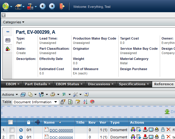 Top panel with category menu
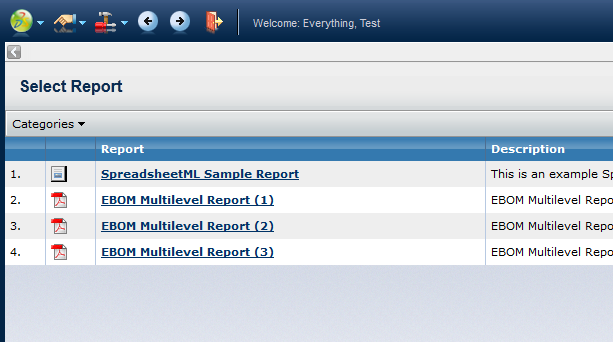 Report Generator List Page with Category Menu
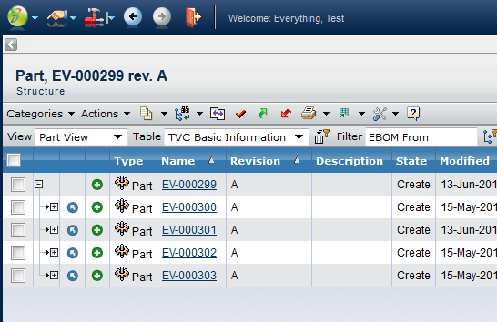 Structure Browser with Category Menu
16.1.3. Disabling the Category Menu
The category menu will appear if the request parameter called "categoryTreeName" is available in the request (passed by default by ENOVIA). There are two options available for disabling the category menu even though it is being passed.
-
Per request: Add another request parameter called "disableCategoryMenu" and set this to true.
-
Globally: Add an init-parameter in TVC called
tvc.core.db.aef.useCategoryMenuand set this to either true or false. Default is "auto-detect", meaning that TVC will query theemxSystem.propertiesfile for the propertyemxFramework.LegacyUI.
16.2. Non-Modal Popup window close behaviour
When a Non-Modal page is opened from a page (parent) (Ex: add existing), the page is registered to the parent page to get closed when the parent is closed or reloaded. This is done to avoid hanging dependent pages whose source page is not available. Ex. Add existing cannot be completed if the opener page is no more.
But not all the pages opened from a page is dependent pages. There are many independent pages whose behaviour does not depend on the parent page. Ex: emxTree.jsp or emxNavigator.jsp or /loadTopPanel etc.
So If a page is identified as generic or independent page it is registered to the top most page (Ex: emxNavigator.jsp) to get closed upon log off or browser close.
Currently all pages starting with "/emx" are considered independent pages. This behavior can be controlled via a URL parameter named "independent=false" or "independent=true". With "independent" URL parameter any custom or existing page close behavior can be controlled.
17. 3DDashboard Support
TVC can run inside a widget in 3DDashboards. As an administrator you can login to 3DDashboards and add a custom widget, the widget can then be configured through the widget preferences in the administrators dashboard or through json configuration file. As configurations are listed automatically in preferences UI admin is responsible for setting up and distributing proper/working configurations. After a dashboard has been configured the administrator can share this to the users.
17.1. Configuration
Configure a dashbaord:
-
Login with administration access.
-
Go to 3DDashboard.
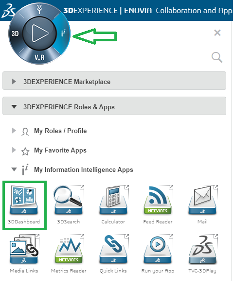
Figure 18. Launch 3D Dashboard
-
Go to Platform Management.
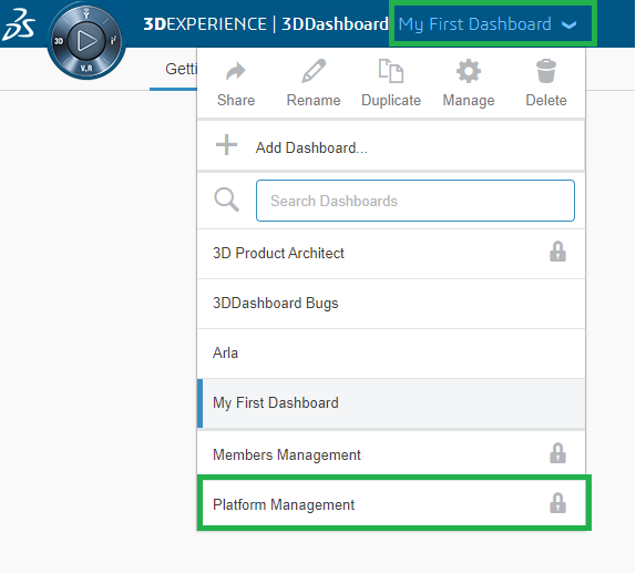
Figure 19. Go to Platform Management
-
Go to Members tab.
-
scroll down.
-
Click on Create Additional app.
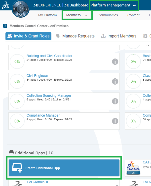
Figure 20. Add Additional app
-
Fill the following details and click save button.
-
Short Name.
-
Long Name(Appears in tooltip).
-
Compass Quadrant.
-
Type.
-
Source Code URL (Is widget path in webapps folder as shown in below image).
-
Configuration file URL (Optional and required only when adding preconfigured JSON based widget).
-
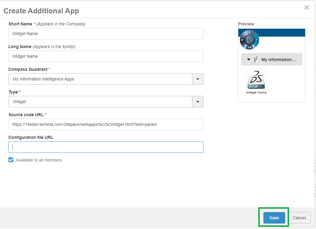
Figure 21. Create new widget.
17.1.1. Configurations in Widget Preferences
Configurations for the selected preference can be done by adding filter pattern to tvc.properties. Keep the required configurations under the folder instead of using all the configuration. If filter pattern is not mention in tvc.properties then all configurations will be used.
tvc.3ddashboard.configurations.filter.domain = acme17.1.2. Preconfigured Widgets JSON configuration.
The widget preferences can also be configured through the server side json configuration file.
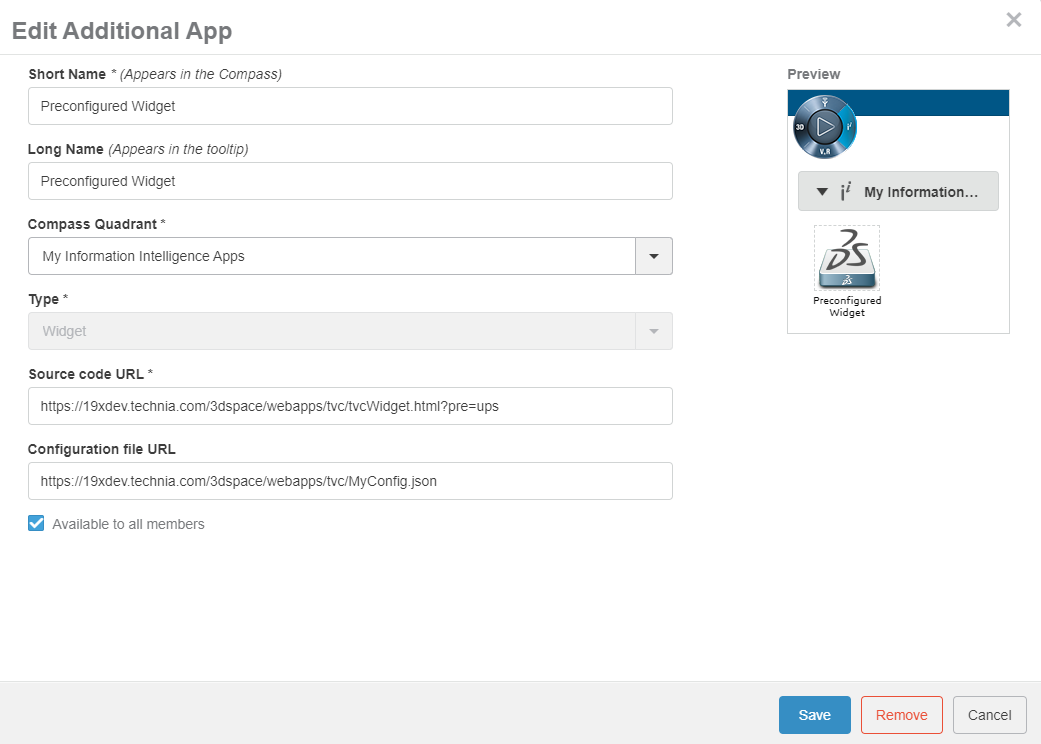
Figure 22. Dashboard Conf
| Property | Description | Default Value | Mandatory |
|---|---|---|---|
title |
Title of the widget |
TVC |
Yes |
path |
The path used in context of 3dspace |
Yes |
|
parameters |
Additional parameters appended to the url |
Yes |
|
custom |
Stating that this widget is custom configured through the json file |
false |
Yes |
id |
id used by widget |
Uniquely generated |
NO |
subscriptions |
Comma separated list of widget ids that the widget is subscribing to |
NO |
|
customDropConfig |
What type configuration should be loaded after droppng an object on the basis of type. |
NO |
A basic configuration could look like this
-
JSON configuration for UPS Widget.
{
    "id": "ups-classic",
    "title": "UPS",
    "path": "/tvc-action/navigate",
    "parameters": "pageConfig=tvc:pageconfig:ups:classic:18x/UPS.xml",
    "custom": "true"
}-
JSON configuration for Document page with custom drop configuration.
{
	"title": "Document Page",
	"path": "/goto/p/",
	"custom": "true",
	"parameters": "tvc:page:helium:launchpad:common/DocumentPage.xml&embed=true",
	"customDropConfig": {
		"VPMReference": "tvc:page:ups:helium:18x/UPS.xml&embed=true",
		"Part": "tvc:page:hex:engineering/PartPage.xml&embed=true"
	}
}
17.1.3. 3DDashboard widget in external location
-
Add the Widget Folder as a service
-
Add a VirtualHost on a port that will be used only internally on the server (eg :- port 9999)
-
Adjust the below example to your server configuration
-
In case of doubt, ask to your server administrator.
-
#Start BT Widgets Added by
Listen 9999

### Main virtual host configuration, update port in not using the default 443
<VirtualHost *:9999>
	DocumentRoot "<3D Exp Installation Dir>/V6R2019x/WidgetsCusto/"

	### Server name and alias
	ServerName  19xdev.technia.com
	ServerAlias *.technia.com

	ProxyRequests Off
	SSLEngine on

	SSLCertificateFile		conf/ssl/star_technia_com.crt
	SSLCertificateKeyFile	conf/ssl/star_technia_com.key
	SSLCACertificateFile    conf/ssl/DigiCertCA.crt

	<Directory "<3D Exp Installation Dir>/V6R2019x/WidgetsCusto/">
		Options MultiViews FollowSymLinks
		AllowOverride all
		Require all granted
	</Directory>
</VirtualHost>-
Add a reverse proxy redirection
-
In the https definition block
-
Listen 443
<VirtualHost *:443>-
Add the definition of the redirection :
-
If the SSLProxyEngine option is already defined, check that it’s set to "on"
-
Adjust with the name of your server.
-
SSLProxyEngine on
ProxyPass /Widgets https://19xdev.technia.com:9999 retry=0
ProxyPassReverse /Widgets https://19xdev.technia.com:9999-
Once the configuration file is saved, restart the reverse proxy.
-
If everything is working well, with this example of configuration, you can:
-
Put the widgets code and its dependanceis in.
-
<3D Exp Installation Dir>/V6R2019x/WidgetsCusto/-
Call the url to access the widget:
https://19xdev.technia.com/Widgets/MyWidget/widget.html17.1.4. Widget Internationalisation support
Widget preferences are used by TVCWidget and HeTrueWidgets to save / load various configurations, like config to load, drag and drop support, etc.
For widget preferences, internationalisation is now supported.
To enable internationalisation, the admin must place a translation file in the webapps/tvc/asset/nls folder with the format TVC_3DDTranslation_lang.json.
Sample file for German language. TVC_3DDTranslation_de.json
{
    "Title": "Titel",
    "Search And Drop": "Suchen und ablegen",
    "Search Droppable": "Droppable suchen",
    "Widget Type": "Widget-Typ",
    "Persist Context Object": "Persistenz-Kontextobjekt",
    "Subscribe OOTB": "Abonnieren Sie OOTB",
    "Table Link Publish": "Tabellenlink veröffentlichen",
    "Config": "Konfig",
    "Search Config": "Konfig suchen",
    "Type To Drop": "Geben Sie zum Ablegen ein",
    "Please select a Type To Drop": "Bitte wählen Sie einen zu löschenden Typ aus",
    "Please select a Config": "Bitte wählen Sie eine Konfig",
    "Widget List": "Widget-Liste",
    "Select 6W Category": "Wählen Sie die 6W-Kategorie",
    "Subscriptions": "Widgets zum Abonnieren",
    "Type not allowed": "Typ nicht erlaubt",
    "Drop Zone": "Abwurfgebiet",
    "Widget ID": "Widget-ID",
    "preference.config.notFound": "Keine Konfiguration gefunden",
    "preference.configFilter.label": "Schlüsselwort zum Filtern von Konfigurationsoptionen",
    "preference.config.loading": "Wird geladen..."
}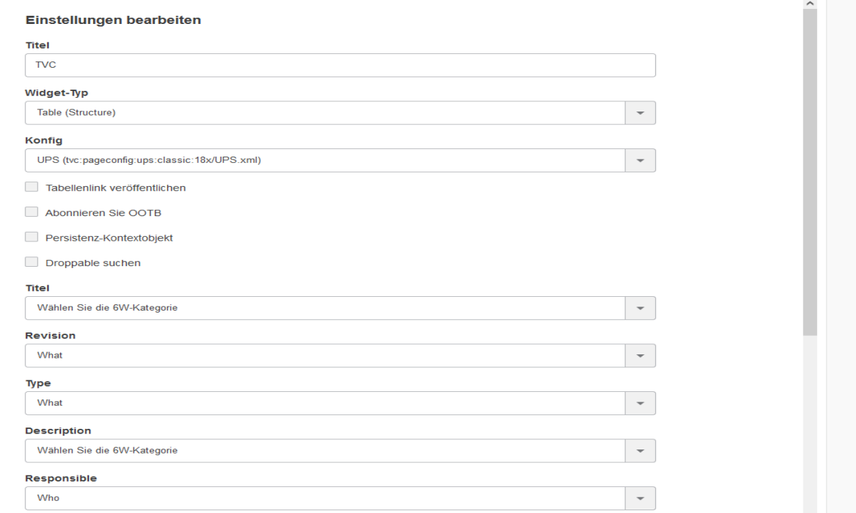
Figure 23. Widget Preferences in German
17.1.5. Custom Resources
If the user wants to add any custom resources (JavaScript and CSS) files in HETrueWidget/TVCWidget then the user can define a custom resource folder containing custom (JavaScript and CSS) files, using configurable properties like below :
tvc.3ddashboard.heTrueWidget.custom.resources = /webapps/HETrueWidget/helium/custom/launchpad | /webapps/HETrueWidget/helium/custom/hex
tvc.3ddashboard.tvcWidget.custom.resources = /webapps/tvc/custom
17.1.6. Classic and Helium Dashboards in TVC Widget
It is possible to load custom TVC and Helium Dashboards in TVC Widget. To avail the feature,
you’d need to use tvc.3ddashboard.classic.dashboard.directories and
tvc.3ddashboard.helium.dashboard.directories properties in tvc.properties file. Value of the properties
are comma separated directory names which are present in TVC Path of dashboard configuration.
E.g. there are some TVC Dashboard configurations present in WEB-INF/tvc/mcadoptimizer-ups/classic/dashboard/
directory. Resolved path or TVC Path for one of the configuration would be
tvc:dashboard:mcadoptimizer-ups:classic/UPSContextProduct.xml. If we want to see dashboard configurations
from this directory, we can choose a directory name or pattern which can be identified in the path. e.g. mcadoptimizer-ups
or mcadoptimizer-ups:classic. The property accepts multiple directory names in comma separated fashion. So if there is
another set of Dashboard configurations, another unique directory name can be identified and added to the property.
Please see example as below.
tvc.3ddashboard.classic.dashboard.directories = mcadoptimizer-ups,tvx,dashboard:launchpad
tvc.3ddashboard.helium.dashboard.directories = hex,launchpad
Please note that we have two different properties for Classic Dashboard and Helium Dashboard. It is in order to differentiate two types of Dashboard configurations. If a directory name pattern happens to be common in Classic and Helium Dashboards path, the configuration will show up in configuration list of both Classic and Helium Dashboard widget type.
In case the properties are not configured, below values are considered by default.
tvc.3ddashboard.classic.dashboard.directories = tvx,dashboard:launchpad
tvc.3ddashboard.helium.dashboard.directories = hex,helium
If TVX, Launchpad and Hex are not installed on the system, you won’t be able to find any configuration for Classic Dashboard widget type until the property is configured correctly to show custom configurations.
17.2. Widget Preferences
The available Widget Type in widget preferences are as below:
| Preference | Description | Default Value | Title |
|---|---|---|---|
Title of the widget |
TVC |
Widget Type |
The path used in context of 3dspace |
Widget ID |
id used by widget |
Uniquely generated |
|
Keyword To Filter Config Options |
To filter config list |
Widgets To Subscribe |
|
Comma separated list of widget ids that the widget is subscribing to |
Subscribe OOTB |
Subscribe to OOTB widget |
|
false |
Persist Context Object |
Retain the context object for the widget which requires to load |
true |
Search Droppable |
Whether or not it should be possible to drop from search on widget |
true |
Droppable Types |
| Property | Description | Path |
|---|---|---|
Dashboard |
When selecting dashboard a list of dahsboardconfigs will be available for the user to choose from |
/tvc-action/dashboard |
Discussion & Workflow |
When selecting Discussion & Workflow need to subscribe to other tvcwidget no pageconfig is required.(Deprecated) |
/tvc/collaboration/tvcCollaborationPanelContent.jsp |
Grid |
When selecting grid a list of gridbrowserconfigs will be available for the user to choose from |
/tvc-action/gridLoad |
Helium Chart |
When selecting page a list of helium widget configs for chart will be available for the user to choose from |
/goto/w |
Helium Dashboard |
When selecting dashboard a list of helium widget configs for dashboard will be available for the user to choose from |
/goto/d |
Helium Page |
When selecting page a list of helium page configs will be available for the user to choose from |
/goto/p |
Helium Table |
When selecting page a list of helium page configs for table will be available for the user to choose from |
/goto/w |
Table(Structure) |
When selecting structure a list of pageconfigs will be available for the user to choose from |
/tvc-action/oi-navigate |
Table(Flat) |
When selecting flat a list of pageconfigs will be available for the user to choose from |
/tvc-action/oi-execCustomLoaderToTable |
| Support for Helium actions would be removed from TVC Widget in near future. It is recommended to use Helium True Widget for Helium actions. |
| Support for Discussion & Workflow would be removed from TVC Widget in near future. It is recommended to use TVC Collaboration Panel Widget. |
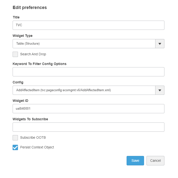
Figure 24. Widget Preferences
| In widget preferences Widget Type will be listed based on components/plugins installed. |
| To load the menuBasedTabPage user need to use tvc.3ddashboard.classic.tab.pages property in tvc.properties file. Value of the property is comma separated directory names which are present in TVC Path of menu configuration. In case the properties are not configured, below values are considered by default. |
tvc.3ddashboard.classic.tab.pages = tvx,menu:launchpad| Place menuBasedTabPage under menu directory only. if toolbar menu, context menu are placed inside menu directory, it will be shown in the config list. This is a technical restrictions as toolbar menu and menuBasedTabPage have same XML configuration. |
| certain pageconfigs that is available might be intended for contextual view and does not have a loader defined in the pageconfig parameters. These can throw error when the widget is loaded. |
17.2.1. Search and Drop
The list of Configurations in Widget Preferences can be huge and it can be cumbersome for users to select desired configuration. 'Valid For' feature helps users to select required configuration quickly and easily.
When this feature is enabled and correct 'valid for' configuration is provided, it adds new preferences in Widget Preference list. Users will see 'Search and Drop' checkbox. Once this checkbox is enabled, a new Preference called 'Type To Drop' will be visible. It will list types which are mentioned in the configuration. Once user selects the type, 'Config' preference will list out configs which are present in 'valid for' configuration. The 'Config' preference lists out every valid preference available in the the system when 'Search and Drop' is unselected.
To enable this feature, set tvc.3ddashboard.searchanddrop.enable = true in tvc.properties. The configuration needs to be in file TVC_3DDConfig.json file in WEB-INF\classes directory.
The format of the configuration is as below
{
	"TYPE NAME 1": {
		"WIDGET TYPE 1": [
			{
				"label": "CONFIG LABEL",
				"value": "TVC PATH OF THE CONFIG"
			},
			{
				"label": "CONFIG LABEL",
				"value": "TVC PATH OF THE CONFIG"
			}
		],
		"WIDGET TYPE 2": [
			{
				"label": "CONFIG LABEL",
				"value": "TVC PATH OF THE CONFIG"
			},
			{
				"label": "CONFIG LABEL",
				"value": "TVC PATH OF THE CONFIG"
			}
		],
	},
	"TYPE NAME 2": {
		"WIDGET TYPE 1": [
			{
				"label": "CONFIG LABEL",
				"value": "TVC PATH OF THE CONFIG"
			},
			{
				"label": "CONFIG LABEL",
				"value": "TVC PATH OF THE CONFIG"
			}
		],
		"WIDGET TYPE 2": [
			{
				"label": "CONFIG LABEL",
				"value": "TVC PATH OF THE CONFIG"
			},
			{
				"label": "CONFIG LABEL",
				"value": "TVC PATH OF THE CONFIG"
			}
		],
	}
}
For example, sample config can be defined as below
{
	"Part": {
		"Table (Structure)": [
			{
				"label": "MyParts Launchpad",
				"value": "tvc:pageconfig:launchpad:ebom/MyParts.xml"
			},
			{
				"label": "MyParts TVX",
				"value": "tvc:pageconfig:tvx:dashboard/MyParts.xml"
			}
		],
		"Classic Dashboard": [
			{
				"label": "MyParts Dashboard",
				"value": "tvc:dashboard:launchpad:ebom/MyParts.xml"
			},
			{
				"label": "MyPartsDrillDown Dashboard",
				"value": "tvc:dashboard:launchpad:ebom/MyPartsDrillDown.xml"
			}
		]
	},
	"Document": {
		"Table (Structure)": [
			{
				"label": "MyDocs",
				"value": "tvc:pageconfig:tvx:dashboard/MyDocs.xml"
			},
			{
				"label": "MyDocs TVX",
				"value": "tvc:pageconfig:tvx:misc/MyDocs.xml"
			}
		],
		"Classic Dashboard": [
			{
				"label": "DocumentsDashboard",
				"value": "tvc:dashboard:launchpad:document/DocumentsDashboard.xml"
			},
			{
				"label": "DocumentsDrillDown Dashboard",
				"value": "tvc:dashboard:launchpad:document/DocumentsDrillDown.xml"
			}
		]
	}
}
As shown, TYPE NAME is the name of the type users would see in Type To Drop preference. WIDGET TYPE is the text we see in Widget Type preference. Inside Widget Type list, the label can have any text which users can identify the configuration with. The value has to be a valid TVC path to the resource.
This feature supports 'InApp Designer' or formarly known as 'End user Configurations' as well. To enable this feature, please set tvc.3ddashboard.showEndUserConfigObjects to true. Once it is done, 'Type to Drop' preference will fetch relevant types for the specific Widget Type based on the accepted 'User Defined Definitions'. Once the type is selected, user can see all the relevant Accepted Shared Configurations in the Config preference.
Below video explains how this feature helps users.
| Pre-configured JSON based widgets have default value of the configuration and it doesn’t change. Hence this feature is not supported for pre-configured JSON based widgets. |
17.3. Publish Subscribe
After selecting config, the Widget Id and Widgets to Subscribe field will be displayed. To set the context from publisher widget by clicking context links to subscriber widget, user needs to copy/paste the Widget Id values (comma separated) of publisher widgets in Widgets to Subscribe text box of the subscriber widget.
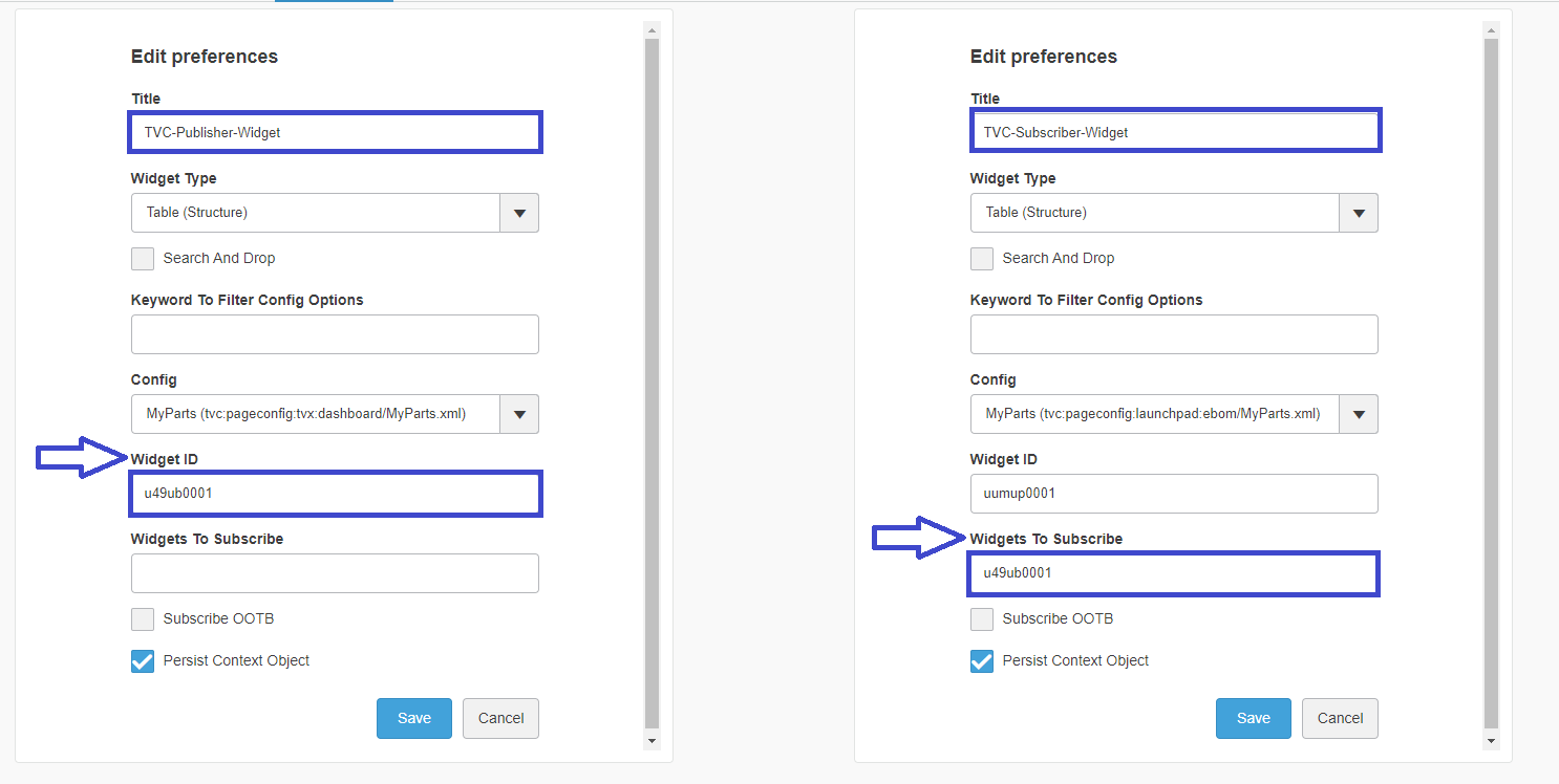
Figure 25. Publish / Subscribe
17.3.1. Publish-Subscribe data to/from OOTB widget:
Built-in OOTB publishes/subscribe functionality can be reused to publish/subscribe data to/from OOTB widgets like Product Structure Editor, Product Explorer, Requirements, etc. to tvcWidget. This can be done by selecting "Subscribe OOTB" checkbox on the preference page of the widget, On unchecking the "Subscribe OOTB" checkbox tvcWidget will stop publishing/receiving the data to/from the OOTB widget.
17.4. Drag and Drop Support
Using 3DSearch, an object can be dragged and dropped on TVC Widget to populate the context of the widget.
| To enable this functionality either Search and Drop or Search Droppable preference should be enabled. |
| For multi FQDN setup drag and drop feature using object link is currently supported for only Firefox browser. |
17.5. Search Support
All widgets in TVC supports the 3DDashboard search.
Table data in the widgets can be filtered in based on search in the current dashboard/tab.
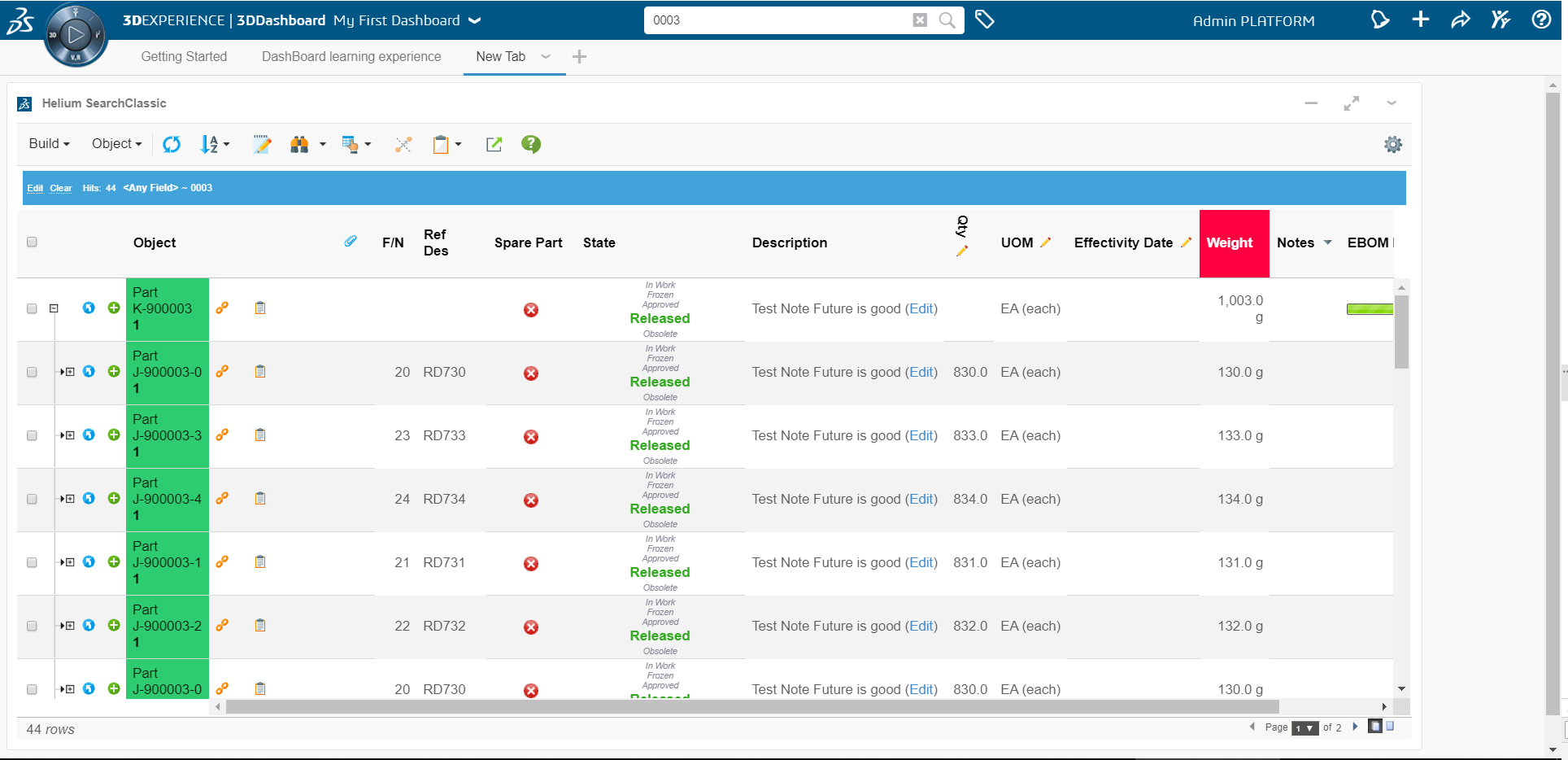
Figure 26. Result after search in 3dDashboard
17.6. 6WTags Filtering support
-
Once table data is loaded in a widget all visible columns get added into preferences.
-
User can select the column and its category from preferences which needs to be shown under 6WTags.
-
Table data in the widgets can be filtered on the basis of selected tag.
6WTags would be updated on following conditions:
-
Table Change
-
Change pagination size from table preferences.
-
Change column visibility from table configurator.
-
InCellEdit
17.6.1. Default column selection for 6WTags.
Configure following property in tvc.properties for default column selection for 6WTags. By default type, name and revision columns are selected if nothing is mentioned. Value contains the column expression which is pipe(|) separated as shown below.
tvc.3ddashboard.defaultTag.preferences = description=what|type=what|attribute[Quantity].value=what|attribute[Unit of Measure].value=what| All above features of 6Wtags are also supported for multiple widgets. |
17.7. Open With Support
The 3DExperience widget in 3DDashboard offers the ability to open object in different widgets. We have added this feature to the TVC widget so that users can now directly open object in different widgets. This feature will be useful in scenario where user can view and also pin the object details in any other widget/app for later use.
To enable this feature, configure Open With in context menu as shown below.
Configuration
<Menu>
      <Label>tvc.ups.physicalproduct.openwith</Label>
      <OpenWith>true</OpenWith>
</Menu>| This feature is only available for the context menu of structure browser. |
With More Apps, the user can decide which app widget should load the context object. We added more application support when the TVC widget is open or when the TVC widget is used to load context from OOTB.
Load Context Object From OOTB Widget
Load Context Object From TVC Widget
| More Apps feature is currently supported for "adminuser" only. |
17.8. Enable custom apps in context menu.
Users can set up the custom apps in the structure browser context menu configuration.
To configure the custom app, the user must add the value of the short name of the app under the label and <OpenCustomApp>True</OpenCustomApp> field under command configuration as shown below.
<Menu>
	<Label>Custom Apps (Value Components)</Label>
	<Command>
		<Label>Wrapper TVCWidget</Label>
		<RowSelectType>single</RowSelectType>
		<OpenCustomApp>True</OpenCustomApp>
	</Command>
	<Command>
		<Label>JSON TVC MyDocs App</Label>
		<RowSelectType>single</RowSelectType>
		<OpenCustomApp>True</OpenCustomApp>
	</Command>
	<Command>
		<Label>TVC Collaboration Panel App</Label>
		<RowSelectType>single</RowSelectType>
		<OpenCustomApp>True</OpenCustomApp>
	</Command>
	<Command>
		<Label>Helium TrueWidget</Label>
		<RowSelectType>single</RowSelectType>
		<OpenCustomApp>True</OpenCustomApp>
	</Command>
	<Command>
		<Label>JSON Helium AdminUI App</Label>
		<RowSelectType>single</RowSelectType>
		<OpenCustomApp>True</OpenCustomApp>
	</Command>

</Menu>
18. Other
18.1. ENOVIA 2015x+ - Load Page Into Content
In ENOVIA 2015x and above, it can be problematic to load a page into the "content" frame and at the same time hide some of the user interface related to page headers etc.
Example shown in screenshot below.
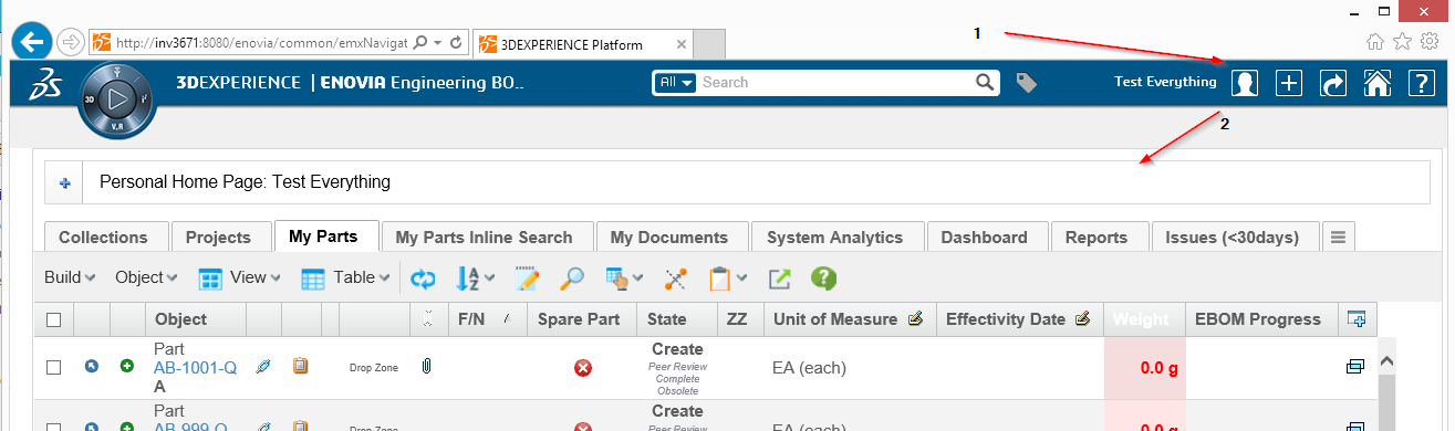
Figure 27. Load page example
For example if you have loaded an object specific page, you might have the categories to the left and some extended page header area above. This is exemplified in the screenshot below.
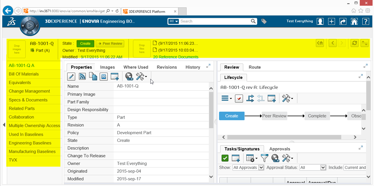
Figure 28. Object page
Simply having the Target Location setting on the command set to content will not result in that the extra area highlighted above is made hidden.
TVC contains a JSP page that will help to work around this problem. Instead of calling your page directly, you can do as shown in the example below:
MQL<1>pri command TVXHomePage;
command TVXHomePage
  description
  label 'TVX Home Page'
  href '${ROOT_DIR}/tvc/core/enovia/LoadContentPage.jsp?page=tvc-action/tvxPersonalTopPanel/foo.jsp?panel=tvc:toppanel:tvx:common:toppanel:personal/PersonalHomePage.xml'
  setting Target Location value content
  user all
  nothidden
  created 4/26/2016 3:18:57 PM
  modified 4/27/2016 10:02:42 AM
E.g. you can load the page ${ROOT_DIR}/tvc/core/enovia/LoadContentPage.jsp
that first will reset the view before loading the page as provided via the page parameter.
18.2. Dialog window behavior
In Enovia 2015x OOTB , emxNavigator.jsp?isPopup=true is used to open popup windows.
From TVC - 2018.4.0 onwards, the requests for opening popup windows are redirected to
emxNavigatorDialog.jsp
In 2015x some FP versions work fine with new method of redirection to emxNavigatorDialog.jsp, while some FP versions work fine with old method of emxNavigator.jsp
If for a specific enovia version the new method is not required then below
configuration can be used to go back to the old method.
The old method of opening dialog windows can be activated globally
by setting tvc.core.dialog.forward to NAVIGATOR.
tvc.core.dialog.forward accepts following values:
| Value | Description |
|---|---|
NAVIGATOR |
It uses the emxNavigator.jsp to open popup windows. |
DIALOG |
It uses emxNavigatorDialog.jsp to open popup windows. |
URL |
It opens the URL in the popup directly without navigating through emxNavigatorDialog.jsp or emxNavigator.jsp |
Example using tvc.properties:
tvc.core.dialog.forward=NAVIGATORExample using web.xml:
<init-param>
    <param-name>tvc.core.dialog.forward</param-name>
    <param-value>NAVIGATOR</param-value>
</init-param>
18.3. User cache (com.technia.tvc.core.db.UserUtils)
The user cache is caching the roles and groups available with the default settings below if a role or group is not found in the cache it will be added incrementally There are a couple of properties to control the behavior of the user cache listed below.
| Property | Description | Default Value |
|---|---|---|
tvc.core.cache.user.mode |
Cache is loaded during tvc initialization |
onStart |
tvc.core.cache.user.enabled |
Use cache or always query database for role or group |
true |
tvc.core.cache.user.role.filter.name |
Name pattern to filter what roles are initially cached on start up |
* |
tvc.core.cache.user.role.filter.where |
Where clause to filter what roles are initially cached on start up |
name nmatch ctx* && name nmatch *PRJ |
tvc.core.cache.user.group.filter.name |
Name pattern to filter what groups are initially cached on start up |
* |
tvc.core.cache.user.group.filter.where |
Where clause to filter what groups are initially cached on start up |
18.4. Recent objects
Recent objects is a filter that can be used to store recently visited objects. It is configured via servlet filter in the web.xml
<filter>
	<filter-name>RecentObjectFilter</filter-name>
    <filter-class>com.technia.tvc.core.gui.recentobject.http.RecentObjectFilter</filter-class>
</filter>
<filter-mapping>
	<filter-name>RecentObjectFilter</filter-name>
	<url-pattern>/common/emxTree.jsp</url-pattern>
</filter-mapping>
There are some settings to control the recent objects below:
| Property | Description | Default Value |
|---|---|---|
tvc.core.recentobject.handler |
What handler to use to store recent objects. There are two built in handlers, dataobject and set |
dataobject |
tvc.core.recentobject.limit |
The limit of how many recent objects should be stored |
20 |
tvc.core.recentobject.handler.set.name |
When using the set handler the name of the set to be stored |
Recent Objects |
tvc.core.recentobject.handler.class |
Defining a custom RecentObjectHandler by implementing com.technia.tvc.core.gui.recentobject.RecentObjectHandler |
There is a built in loader defined that can be used to populate a structure browser table with recent objects com.technia.tvc.structurebrowser.recentobject.loader.RecentObjectLoader