TVC 2012.3.0 Release Information
16 November 2012
1. Core
1.1. Image Manager
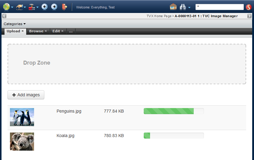
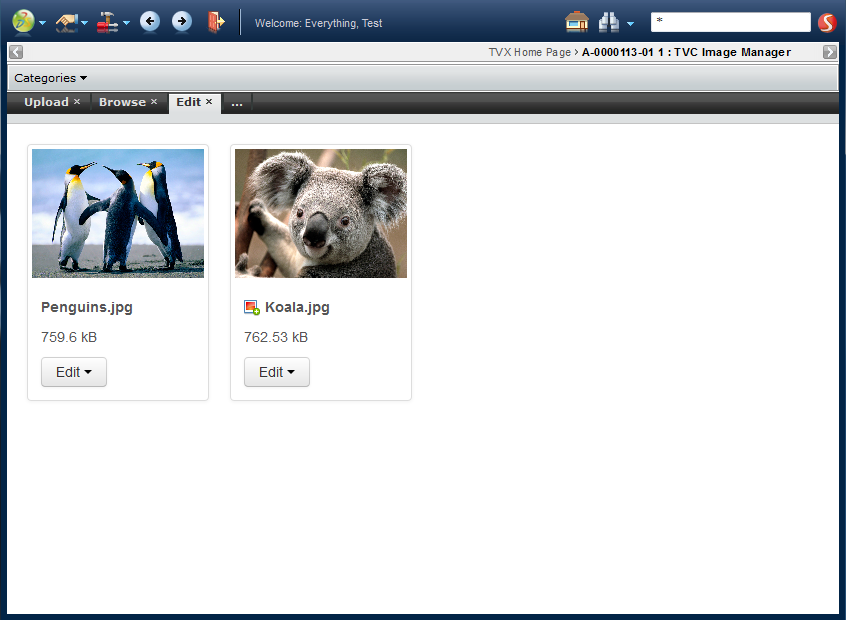
A new set of functionality that allows working with images has been added to TVC Core. It consists of three parts – Uploading, Browsing and Editing.
1.1.1. Upload
This is a page allowing you to upload images to any object in ENOVIA. This functionality uses the ENOVIA data model for "Image Holders" allowing you to upload multiple images and get multiple versions of them in different sizes. If TVC File manager is installed you will also get a "drop zone" for uploading.

1.1.2. Browse
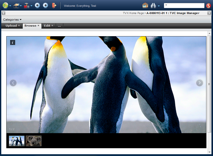
This is an "Image Gallery" allowing you to browse a set of images uploaded to an ENOVIA object. It has features like thumbnails, image zooming, responsive resizing, overlay viewing, swipe support and more. This also works on mobile devices launched from TVC Mobile Access.
1.1.3. Editing
The edit page allows you to perform a number of actions on images uploaded with the Image Manager. The available actions is "Set as primary", "Delete" and "Annotate".
1.1.4. Annotations
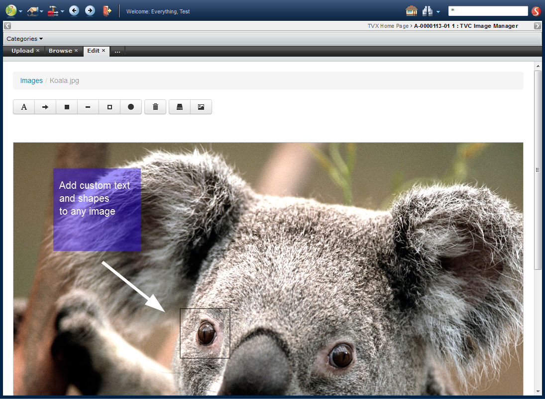
Launching the "Annotate" command allows you to annotate an image by adding different kinds of shapes and text. All shapes and text can be positioned freely over the image and you can change rotation, colour, size and transparency. The annotation is saved both as "annotation data" in the database and as a flattened JPG image. The annotation saved in the database allows you to open an existing annotation to make changes and the flattened jpg image can be used for reports or in other places. This also works on mobile devices launched from TVC Mobile Access.
1.2. Data Set Enhancements
A number of enhancements within the data set feature have been made. They are listed below:
-
Being able to reuse a separate data-set definition into another data-set. For example, use another data-set to load the root nodes before an expand is performed:
<DataSet>
    <Expand>
        <DataSetRef name="tvc:dataset/MyDataSet.xml">
        ...
    </Expand>
</DataSet>-
Combining result from several different "loaders"; e.g. performing a union.
For example, perform three different queries and merge the result from these.
<DataSet> <Union> <Query> <TypePattern> <Type>type_SomeType</Type> </TypePattern> <Where>current == Obsolete</Where> </Query> <Query> <TypePattern> <Type>type_AnotherType</Type> </TypePattern> <Where>current == Release</Where> </Query> </Union> </DataSet> -
Performing an "intersection", e.g. include only those objects that appears in the result from all child loaders.
<DataSet> <Intersection> <DataSetRef name="tvc:dataset/First.xml"/> <DataSetRef name="tvc:dataset/Second.xml"/> </Intersection> </DataSet> -
Running a loader within a data-set with super-user privileges, in order to by-pass access check during for example a query or expand.
<DataSet>
    <DoPrivileged>
        <Query>
            ...
        </Query>
    </DoPrivileged>
</DataSet>
1.3. Custom emxFramework.properties
If you are using the feature in ENOVIA of pointing out a custom "emxFramework.properties" file, this is now also supported in TVC.
1.4. Macros in Select Statements
When you define select statements within for example a table column expression containing symbolic names, these are typically written as:
$<from[relationship_EBOM].to.attribute[attribute_EffectivityDate]>
However, in cases you have to enter such expression within an XML file, you always have to escape characters such as "<" and ">" (among others) like this:
<Expression>
$<from[relationship_EBOM].to.attribute[attribute_EffectivityDate]>
</Expression>OR
<Expression><![CDATA[
$<from[relationship_EBOM].to.attribute[attribute_EffectivityDate]>
]]></Expression>
As of this release, you can use ${…} instead of $<…> to avoid
the escaping need. The above example can now be written as:
<Expression>${from[relationship_EBOM].to.attribute[attribute_EffectivityDate]}</Expression>1.5. Range Value Order
The order of the range values are now preserved by default as they are defined on the attribute definition within ENOVIA.
1.6. Behaviour Change: Parsing of Header and Subheader in Structures
In structures (used by TVC Structure Browser and TVC Grid Browser mainly), the header and sub header where previously parsed based upon the root object in the structure.
This behaviour has been changed, and now the header and subheader is parsed against the object-id that were used to launch the Structure. In many cases, the root object id and the sent object-id are equal, but in some cases they are not.
The new behaviour is more correct, but you can revert to the old behaviour if required.
To do so, you can pass the parameter "useRootNodeIdForHeader" with value equal to true.
In for example the Structure Browser, this parameter can either be set on the command (or HREF) launching the Structure Browser or within the page configuration object that configures the Structure Browser instance.
2. Structure Browser
2.1. Configurable Column Enhancements
The column supporting more complex logic without the need for implementing custom data handler and cell renderers that were introduced in the previous release has been slightly improved by supporting the use of "conditions" within iterations.
The example below illustrates this capability:
<Column>
<ColumnType>configurable</ColumnType>
<Expression><![CDATA[
<type is="Part">
<table>
<iterate>
<if test="from[EBOM].to.evaluate[attribute[Effectivity Date] != '']">
<row>
<col nowrap="true" colspan="6">
<style bold="false" underline="false" italic="false">
<text>ED: </text>
</style>
<style bold="false" underline="false" italic="true">
<select statement="from[EBOM].to.attribute[Effectivity Date]"/>
</style>
</col>
<col>
<link js="parent.parent.tvc.inlineFrame.load('new', '../tvc-action/initForm?renderMode=card&allowEdit=true&formMode=view&formName=tvc:form:tvx:enc/PartDetails.xml&objectId=${OBJECTID}',475,'Related Parts', null, true)" objectId="from[EBOM].to.id">
<text>(</text>
<select statement="from[EBOM].to.name"/>
<text>)</text>
</link>
</col>
</row>
</if>
</iterate>
</table>
</type>
<type is="Document">
<text>a document...</text>
</type>
<else>
<text>Not a part nor a document...</text>
</else>
]]></Expression>
</Column>E.g. what’s new here is the possibility to use the <if> together with a
more complex expression to be evaluated within the iteration tag.
2.2. Local Attributes in Tables
ENOVIA V6R2012 introduced a feature called "local attribute".
The support for local attributes has been added into the TVC Structure Browser so that you can display and edit local attributes within tables.
2.3. Forms
2.3.1. Separate Admin Guide
The documentation regarding TVC Forms has been moved to its own separate admin guide.
2.3.2. Access Check on Edit Button
The access for the edit button in forms is now more configurable, either by using any standard evaluate expression, or by using a custom java class.


Here are a few examples:
<Editable>false</Editable>
<Editable>type == "Screw Part"</Editable>
<Editable>java:com.acme.handler.MyAccessHandler</Editable>
2.3.3. Show and Edit Access on a Field
The "Visible" and "Editable" elements on fields is now more configurable, allowing for not only true or false, but also evaluate expressions and, if even more advanced logic is needed, the possibility to specify a java class containing the logic. Here are a few examples:
<Editable>false</Editable>
<Editable>current != "Release"</Editable>
<Editable>java:com.acme.handler.MyAccessHandler</Editable>2.3.5. Custom Validation
The validation of fields upon submitting a form can now use a custom java class that performs custom validation logic. Previously this could only be done by implementing a custom field. To use this, there is a new sub element available for the Validation element on forms:
<Validation>
    <MinChars>3</MinChars>
    <MaxChars>25</MaxChars>
    <InvalidValue>test</InvalidValue>
    <Java>com.technia.acme.MyValidation</Java>
</Validation>
2.3.6. Custom Popup URL
It is now possible to specify a custom URL for a field, that will result in a button being rendered that launches the URL in a popup window. This allows for implementing custom popup choosers.
2.3.7. Field Size for Select Fields
Fields that have ranges, and as a result are rendered as select lists:
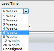
Can now be configured to be rendered as multi select boxes, by setting the "Size" element:
<Field>
    <Label>Lead Time</Label>
    <MapsTo>attribute_LeadTime</MapsTo>
    <Size>5</Size>
</Field>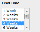
2.3.8. Tooltips
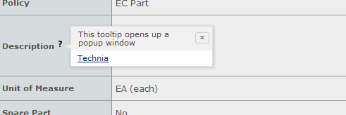
Fields can now be configured to have tooltips. It is possible to for each field specify a label and content for a tooltip. Tooltips will appear for users when the question mark is hovered over:
Configure by adding these 2 elements to a field configuration:
<TooltipLabel>This tooltip opens up a popup window</TooltipLabel>
<TooltipContent><![CDATA[
<a href="http://www.technia.com" target="_blank">Technia</a>
]]></TooltipContent>
3. Graphic Reporting
3.1. jqPlot Options in Configuration
Possibility to define/override the exact definition of the options map used in jqPlot charts has been added. This allows you to be more flexible and use the full jqPlot library.
See http://www.jqplot.com/ for more details on supported options.
Example:
<Chart>
..
<Options><![CDATA[{
        "seriesDefaults": {
        "renderer": "jQuery.jqplot.PieRenderer",
        "rendererOptions": {
            "fill": false,
            "showDataLabels": true,
            "sliceMargin": 4,
            "lineWidth": 5
        }
    },
    "legend": {
        "show": true,
        "location": "w"
    },
    "grid":{
        "background":"#ffffff",
        "drawBorder": false,
        "drawGridlines": false,
        "shadow": false
    }
}]]></Options>
..
</Chart>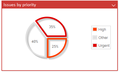
3.2. Grouping Values as "Other"
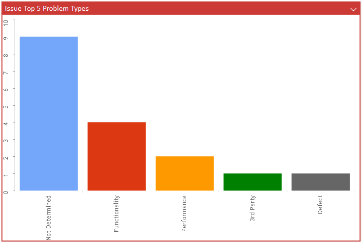
Display only the top N values and group the remaining as "Other".
Example:
<Chart>
    ...
    <GroupOther>5</GroupOther>
    ...
</Chart>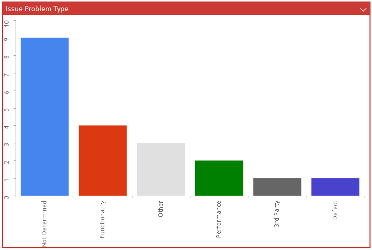
4. Mobile Access
4.1. More Flexible Column Configuration
Previously you could only have three table columns in the centre part of the table and they were always rendered in the same order (Header, Sub Header, and Paragraph).
There is now a possibility to have multiple of the above columns and they will be rendered in the order they are placed in the table configuration (top down).
4.3. Dashboard Drilldown – Scroll to Top
When performing a drilldown in a dashboard chart the page is now scrolled to the top
4.4. Search Forms
The ability to add multiple search forms to a search configuration has been added. The user can switch between them when a search is launched.

4.5. Form with Image Upload
Support for using the <CheckinField> in mobile has been added. This allows you to capture and upload images from your mobile device.

4.6. Footer
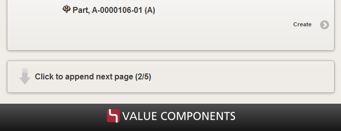
You can now configure your mobile application to always show a page footer containing either a logotype or a text.
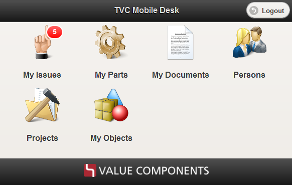
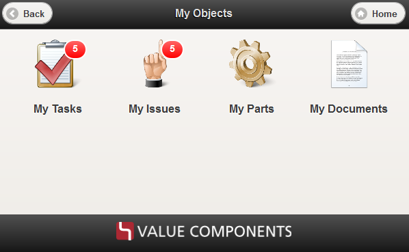
4.7. Sub Desks
Previously you could only configure a desk to have a number of commands. You can now add another menu with commands to your desk and that will then produce a "Sub Desk".
5. Grid Browser
5.1. Intersection Path – Relationship to Relationship
The intersection path can now be constructed to support a data model that is using the rel-to-rel feature in ENOVIA.
For example, having a data model like this, can be defined in the intersection path as shown below.
<Intersection direction="row-to-col">
    <IntersectionPath>
        <Path from="R1"/>
        <Path fromRel="R2"/>
    </IntersectionPath>
    ...
</Intersection>
5.2. Line Breaks in Header
Rotated headers within the Grid Browser now supports labels with multiple lines.
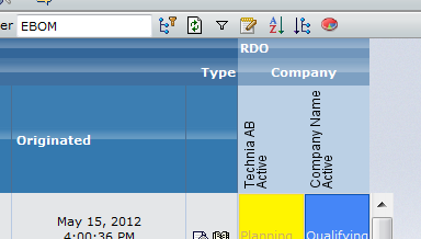
Example configuration:
<Columns href="common/emxTree.jsp"
         rotateHeader="true"
         headerRotationAngle="-90"
         rotatedHeaderAlignment="bottom">
    ...
    <Label>
        <Line>${name}</Line>
        <Line>${current}</Line>
    </Label>
5.3. Refresh after Action Invoke
Possibility to configure refresh behaviour after a right click operation has been performed. For example, refresh the whole grid, only the row or column, or the row and column.
5.4. Custom Rendering / Custom Data Handling
Support for customize the rendering of the intersections have now been added to the Grid Browser.
Together with this possibility, it is also possible to plug-in a custom evaluator that works in a similar way as a data-handler in TVC Structure Browser tables, in order to be able to define and select additional data from the intersections.
6. Report Generator
6.1. Mail Output Handler
The mail output handler that can be used to send the generated report via mail, now has an option to skip this delivery if the generated report exceeds a configured size (size in bytes).
This can be used in conjunction with the FTP handler that has some new options to not deliver the report to an FTP destination unless the size of a report is greater than a configured size.
6.2. FTP Handler
As mentioned previously, the FTP handler can be configured to do the FTP transfer only if the size of the report (in bytes) exceeds a configured value.
Also, the FTP handler now sends a mail to the user that created the report when the FTP transfer completes. This option can be disabled if wanted.
7. File Manager
7.1. Image Conversion
Images that are checked in to objects of type "Image Holder" or "Image" will be converted into various sizes by default via a built-in trigger in the File Manager. The generated images will be checked in to the different formats called "mx Thumbnail", "mx Small Image", "mx Medium Image" and "mx Large Image".
This is particularly useful in the Image Drop Zone that allows the user to drop image files directly into ENOVIA.
You can disable this built-in trigger via configuration (see the File Manager Administration Guide for details).
7.2. Support for Final / Protected Documents
Microsoft Office files that have been marked as Final and/or Protected previously caused the TVC File Manager to crash. This problem has been addressed as of this release.
7.3. Support for 64bit Mac OSX
The native code that is part of the File Manager applet on OSX, has been compiled into a 64-bit version meaning that you now can use the TVC File Manager on Mac OSX with 64-bit Java.
7.4. Configuring Default Folder
The possibility to restrict the client to use a dedicated folder for files being checked out on the user’s local machine now supports environment variables. See the example below:
<OfficeIntegration>
    <Client>
    <DefaultWorkFolder>$\{TEMP}/mxfiles</DefaultWorkFolder>
    </Client>
</OfficeIntegration>
The example above will use the directory as specified via the environment variable called TEMP.
Note that the way to refer to environment variables is via the macro
${…} on both Windows, OSX and Linux.
8. Personal Browser
8.1. Password Protect ZIP Package
It is now possible to configure the Personal Browser to let the user specify a password that is required when opening the ZIP file.
8.2. Password Protect PDF Files within a Personal Browser ZIP
It is also possible to configure the Personal Browser to password protect any PDF file that is part of the Personal Browser package.
Enabling this, requires anyone trying to open a PDF file from such package to enter the password in order to view the content.
9. MCAD Optimizer
9.1. 3DLive Examine and 3DLive Examine Light
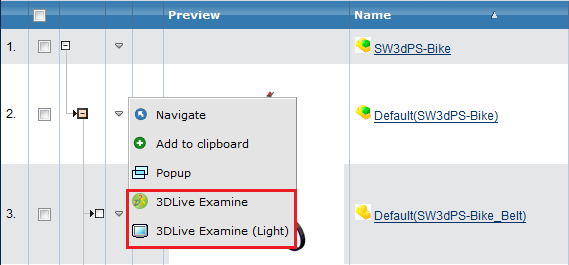
3DLive Examine has been added as row action in regular MCAD Optimizer.
A lighter version of 3DLive Examine has been added as row action to both regular MCAD Optimizer and MCAD Optimizer for CATIA V6. The 3DLive Examine Light load the file much faster but has very limited functionality, for example no annotation possibilities and no expand of the cad structure.
For the regular MCAD Optimizer 3DLive Examine availability is controlled via a servlet init parameter. If no CGR is generated as Derived Output the viewer can be disabled.
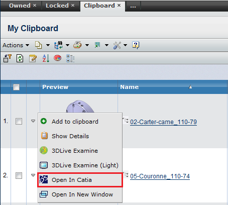
9.2. Open in CATIA as row action
In MCAD Optimizer For CATIA V6 Open in CATIA V6 has been added as row action. When using this action the selected CATIA object is presented in the current CATIA V6 session as a search result.
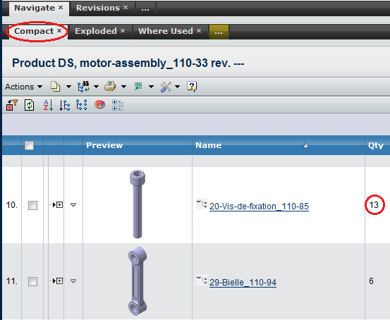
9.3. Quantity View Added to CATIA V6 Optimizer
Compact tab in MCAD Optimizer for CATIA V6 has been modified to show quantity in the assembly structure instead of every instance as a separate row. This gives a better overview in big assemblies.
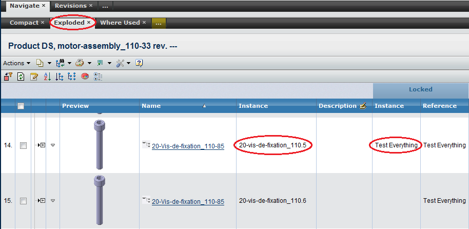
9.4. Instance information in MCAD Optimizer for CATIA V6
When expanding the structure in Exploded mode instance name and instance locker has been added to the table information.
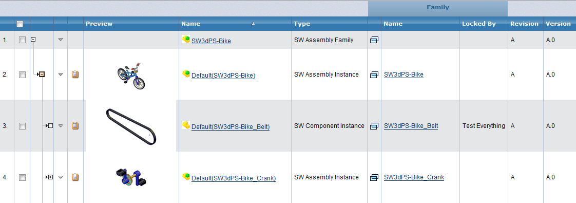
9.5. Enhance Support for Family/Instance Data Model
Support for the Family/Instance data model, used for example in the new SolidWorks integration, has been enhanced.
-
Instances can be viewed and expanded directly from the family object
-
"My Locked Objects" uses the family object (which is the one that is locked)
-
File information and actions removed from Instance rows
-
Family object information displayed in instance tables
-
Servlet init parameter added to turn Family/Instance data model on or off
 TVC Classic - 2022.3.0

