TVC 2010.2.0 Release Information
18 June 2010
1. General
1.1. API Changes
1.1.1. Classes Moved from Structure Browser to Core
All classes that previously were in the package
com.technia.tvc.structurebrowser.render.resource, has as of this
release been moved to the com.technia.tvc.core.gui.resource package.
The reason for this change is that there was a need for using the functionality these classes provided in other places than in the Structure Browser.
Note that this will affect custom code related to rendering of the Structure Browser, which means that you prior to upgrading must change the import statements within your custom classes and re-compile them against the 2010.2 JAR files.
This change only requires you to modify the import statements in the code, nothing else is needed as the methods and constructors have the same signatures as previously.
1.2. New Admin Guide
A new administration guide for TVC Core has been added. A couple of new features have been added as of this release into TVC Core, which resulted in a need for having a separate administration guide for TVC Core.
Due to this, some information that previously was in the installation guide has been moved to this document.
2. Core
2.1. Top Panel
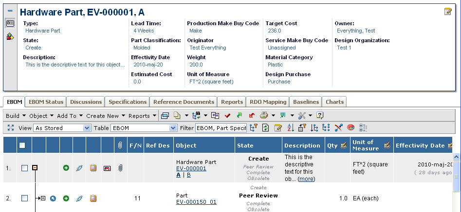
A new configurable feature called Top Panel has been added to TVC Core. This means that this feature is available through all TVC Components.
The Top Panel is used to display a configurable frame at the top of a tabbed pages definition. The content of the top panel is configured through an XML file. The screenshot below shows a top panel example.

The top panel typically contains one or more forms, which the user, if configured, can toggle into edit mode. Such form is defined in XML, and defines the layout of the fields (sections, fields).
Moreover, the top-panel can contain other controls than forms, which shows other kind of information.
The top panel can also be minimized by the user in order to increase space for the tabs below the top panel.
The TVX module contains examples of top-panel usage.
2.2. Image Flow
A new configurable feature called Image Flow has been added to TVC Core.
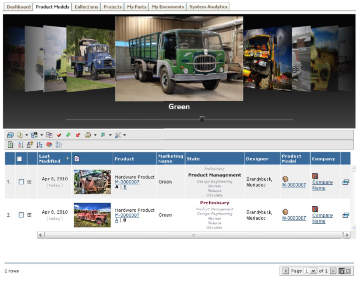
The Image Flow itself is a Silver Light component that allows the user to browse through a set of images. The Image Flow component is driven by a configuration that defines how to load the images, and optionally one can configure the Image Flow to load a custom URL below the image, which is displayed when an image is shown.
The screenshot below illustrates the image flow feature:
| The client viewer for the Image Flow requires Microsoft Silverlight 3 Runtime (Browser Plug-in). |
3. Structure Browser
3.1. Tiled Rendering Mode
A new rendering mode has been added to the Structure Browser. This mode will display the information within the table in tiled mode. See screenshot below for an example:
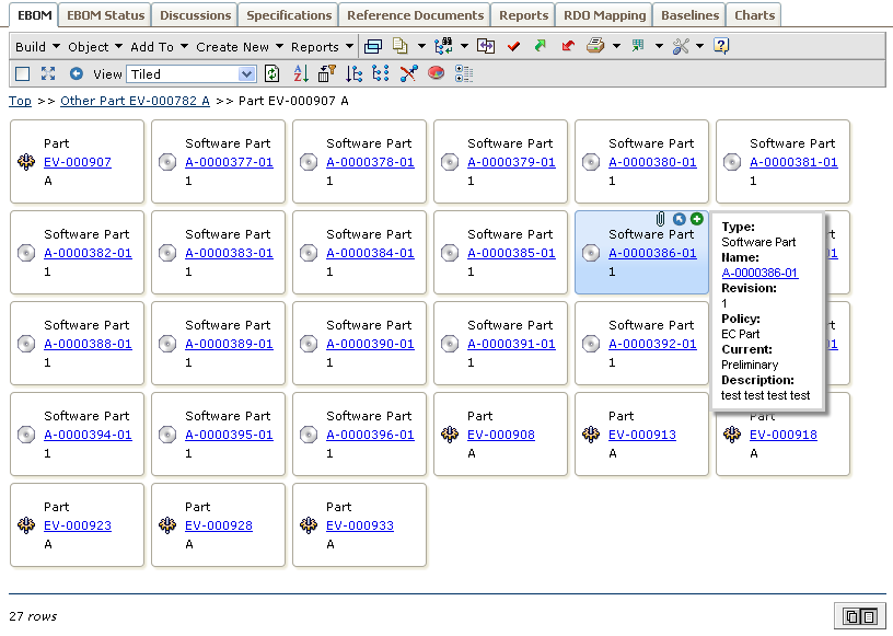
A new setting/attribute has been added on the View, which allows defining the Display Mode. E.g. if the user changes the view, the view can be configured to show the data in tiled mode.
Even though the tiled mode can be used when displaying structures, it is better suited for flat objects lists, as the tiled mode will not show the structure hierarchy.
The system-tables (or XML tables) used in tiled mode supports a number of new column settings, which allows defining what data that should be shown in the "box" and what information that goes into the tooltip and actions-icon list. It is also possible to turn the tiled page into edit mode. However, please note that the "boxes" should not contain too much information, as that will make the page less user friendly. For more information about the tiled mode, please look into the Structure Browser administration guide.
3.2. Forms
3.2.1. View / Edit
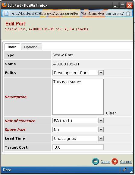
A new view mode has been added, with the ability to switch to edit mode, if allowed.
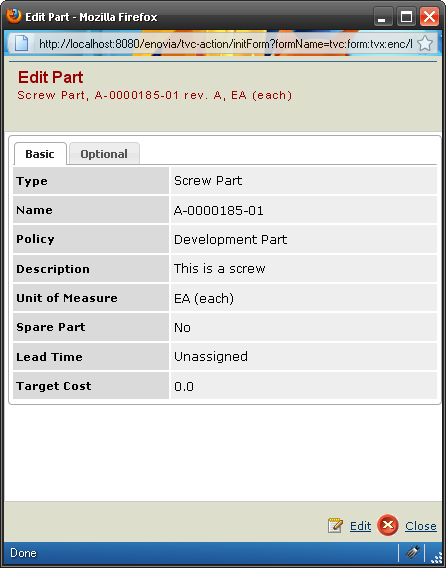
3.2.2. Sidepanel
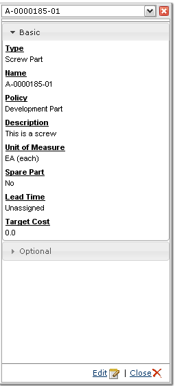
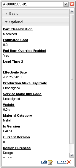
Sidepanel support has been added. This enables forms to be used in a sidepanel using the same xml configuration as before. The rendering of the forms differ, but the functionality is the same. Because of sidepanels usually having less horizontal space, the tabs are changed into an accordion when displayed in a sidepanel. The general look & feel is also changed to suit the sidepanel context better:
3.2.3. Open Form from Table
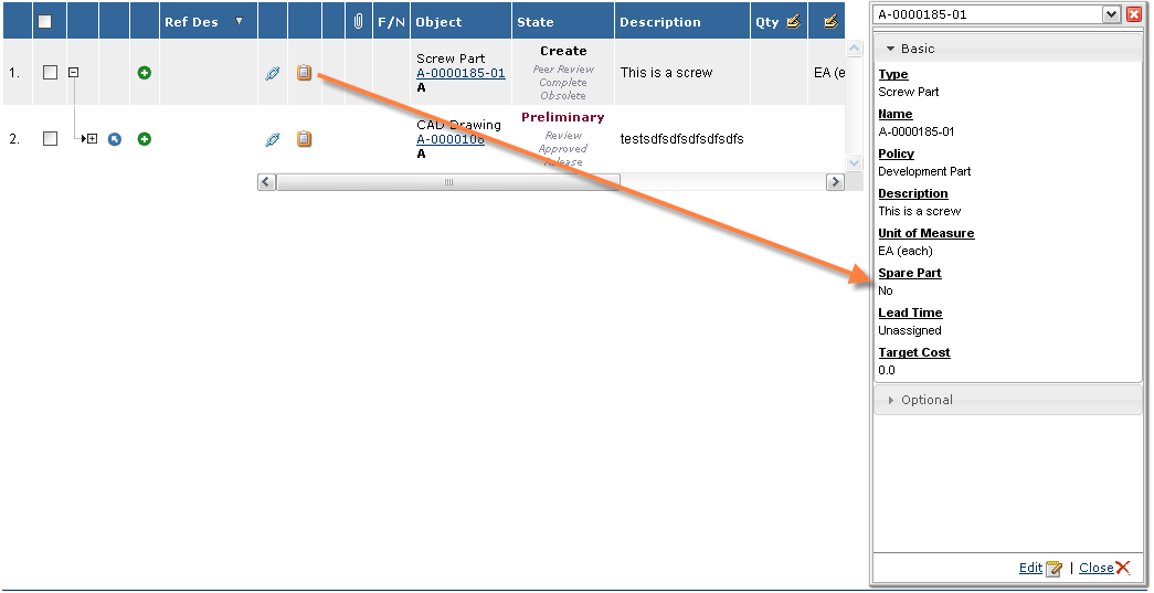
There is a new column type called formlink, which can be used in structure browser tables. This renders a link to a given form, which can be opened in sidepanel or as a popup (depending on the Target Location setting). This column can be configured to open different forms, depending on the type of object.
3.3. Context Menu – Positioning
The logic behind the positioning of the context menu has been changed. Previously, the top edge of the context menu was aligned with the row, which the context menu were opened for. However, if the context menu was opened close to the bottom edge, the user had to scroll within the context menu.
As of this release, the context menu will be positioned in a way were the least amount of scrolling is needed.
3.4. Auto Complete – Multiple Selections
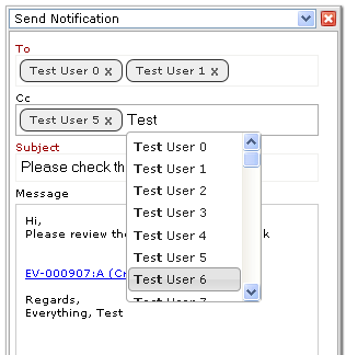
The auto complete feature has been enhanced to handle multiple selections better. This affects the search tool as well as the send-notification feature. When the field allows selecting multiple values, the selected values will be shown in separate boxes, see screenshot below:

 TVC Classic - 2022.3.0