<servlet>
    <servlet-name>tvcaction</servlet-name>
    <servlet-class>com.technia.tvc.core.TVCServlet</servlet-class>
    <init-param>
        <param-name>tvc.core.login.mainPage.mobile</param-name>
        <param-value>/tvc-action/mobileInitDesk?menu=tvc:menu:tvx:mobile:common/desk/Desk.xml</param-value>
    </init-param>
    ...
</servlet>Mobile Access - Administration Guide : Configuring
04 April 2016
1. Configuring TVC Mobile Access
1.1. General notes on configuration
TVC Mobile Access reuses some of the existing TVC Components like Structure Browser and Graphical Reporting and its configurations. Most parts of the configurations are the same when configuring for Mobile Access but there are settings that are not supported and some settings that differ slightly. Please read the sections in this guide to see exactly how a configuration should look for Mobile Access.
1.2. Login Page
1.2.1. Mobile Browser Configuration
Before you can use TVC Mobile access you have to define an entry point for it. This is done in your application web.xml file by adding an init parameter to the tvcaction Servlet. The normal entry point to use is the tvc-action called mobileInitDesk. You can read about configuring that one in the next section.
1.2.2. Desktop Browser Configuration
If you need to reach the mobile interface through a desktop browser some further configuration is needed. Add the following init-param section below the init-param described above.
<init-param>
    <param-name>tvc.core.login.mainPage</param-name>
    <param-value>/tvc-action/mobileInitDesk?menu=tvc:menu:tvx:mobile:common/desk/Desk.xml</param-value>
</init-param>
1.2.3. Login URL
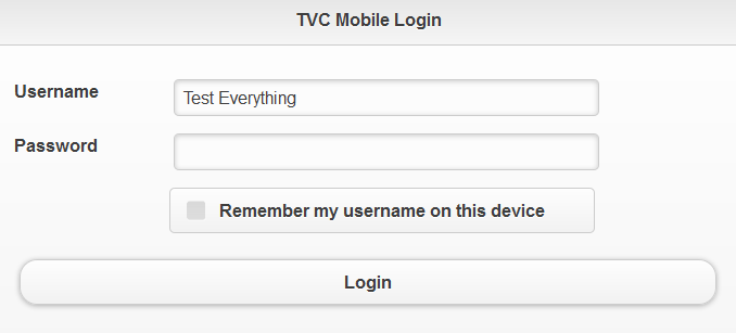
When this section has been added to your web.xml and your application server has been restarted you can login to it with one of the following URL’s:
-
/tvc/core/tvcLogin.jsp
-
/tvc/mobile/tvcLogin.jsp
The first URL will redirect to the URL below if the user is reaching the page from a mobile device.
1.2.4. Security Context
TVC Mobile Access has support for setting Security Context upon login (on 3D Experience versions that supports Security Context).
The following init parameters can be used to enabled the functionality:
<!-- Enable setting default context -->
<init-param>
    <param-name>tvc.core.login.useSecurityContext</param-name>
    <param-value>true</param-value>
</init-param>
<!-- Enable user selection of context -->
<init-param>
    <param-name>tvc.core.login.showSecurityContextChooser</param-name>
    <param-value>true</param-value>
</init-param>
1.2.5. 3DPassport
In order to use 3Dpassport for login and logout to TVC Mobile you need to configure the path to the 3DPassport logout page. This is done with the following init parameter.
<init-param>
    <param-name>tvc.core.login.logoutPage.mobile</param-name>
    <param-value>https://3dx.vs.com:444/3dpassport/logout</param-value>
</init-param>
1.3. Desk
The normal entry point to use when logging in to TVC Mobile Access is called Desk. The Desk is a grid that fills the screen with commands that link to different parts of the mobile application.
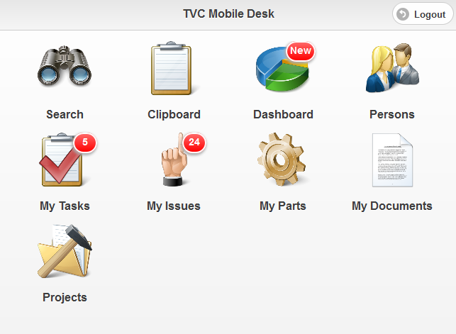
The tvc-action that loads the desk is called mobileInitDesk and has a parameter called menu. This parameter is mandatory and points to a menu XML definition that holds all the commands that should be on the Desk. Read more about configuring Menus and Commands in the TVC Core Admin Guide.
/tvc-action/mobileInitDesk?menu=tvc:menu:tvx:mobile:common/desk/Desk.xml
Each command in the desk menu has support for the following elements:
| Element | Description | Example |
|---|---|---|
Label |
The label to be shown below the command |
<Label>My Parts</Label> |
Image |
Url to the image file to be used for this command. It is recommended to use a high resolution png image with a transparent background for best visual appearance. |
|
Url |
Url that command should launch on click. |
|
Settings:
| Setting | Description | Example |
|---|---|---|
Count Bubble |
This setting can be used to populate a small "count bubble" in the top right corner of each command. There is currently three ways of populating a value using different providers:
|
|
The desk menu configuration can also point out another menu to create a "Sub Desk" containing a new set of commands. The sub desk menu must have the following settings:
| Element | Description | Example |
|---|---|---|
Label |
The label to be shown below the sub desk |
|
Image |
Url to the image file to be used for this sub desk. It is recommended to use a high resolution png image with a transparent background for best visual appearance. |
|
1.4. Top Panel
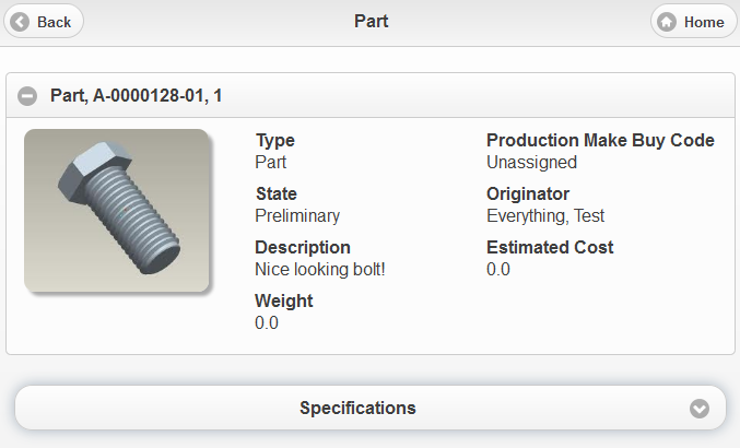
TVC Mobile Access has a version of the Top Panel that you can use to display object data at the top of a page. This version of the Top Panel has support for configuring your own Top Panel Form with support for Data Handlers and Cell Renderers for displaying the data. Below the Top Panel you configure a "Tab Menu" allowing you to switch to different sub pages while keeping the Top Panel in the top of the screen. Information on how to configure the Top Panel is found in the Admin Guide for TVC Core.
| Support for editing fields and custom controls is not available in the Mobile version of the Top Panel. |
1.5. Tab Menu
TVC Mobile Access has a version of the TVC Tabs. These works like the normal tabs allowing you to switch between different sub pages. Since the device screen can be very narrow it is rendered as a drop down menu instead. You can read more about configuring Tabs in the Admin Guide for TVC Core.


1.6. Table
If you have the TVC Structure Browser component installed in your application you can use it to display objects and object data in a Mobile version of a Table. These tables use many of the features from the normal versions of tables like the ability to have columns with support for data handlers and cell renderers.
1.6.1. Flat Mode
To load a table in Flat Mode you can use one of the following actions. These actions works like the normal versions that you can read more details about in the TVC Structure Browser Admin Guide. That guide also has information on how to use pageconfigs, views, tables and menus.
| Action Name | Description |
|---|---|
/mobileExecInquiryToTable |
Used to load a table with data from an inquiry |
/mobileExecCustomLoaderToTable |
Used to load a table with data from a custom java loader |
/mobileTableWithModel |
Used to load a table with data that is not business objects |
/mobileLoadClipboardIntoTable |
Used to load a table with data from the clipboard collection |
Example command for loading a table in flat mode:
<Command>
    <Label>My Parts</Label>
    <URL action="/mobileExecInquiryToTable">
        <Param name="pageConfig" value="tvc:pageconfig:tvx:mobile:enc/MyParts.xml"/>
    </URL>
    <Image>${ROOT_DIR}/tvc/mobile/images/desk/part.png</Image>
</Command>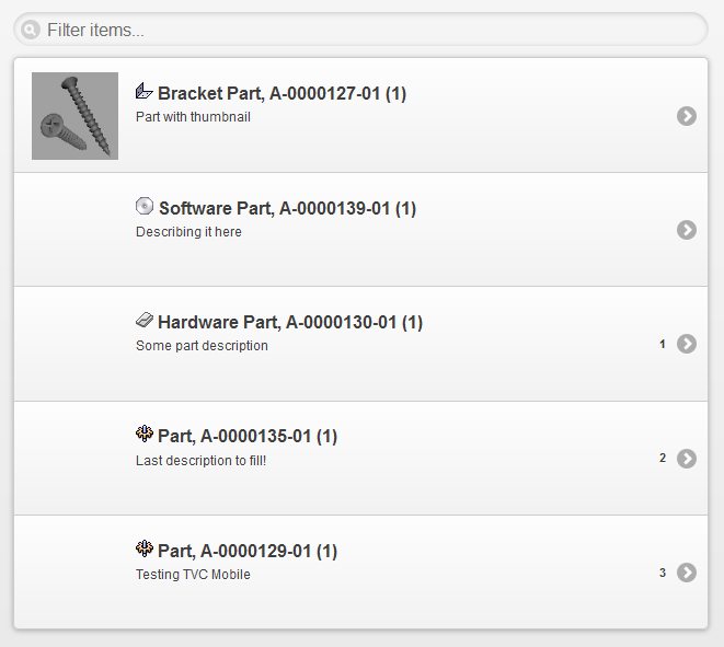
1.6.2. Navigate Mode
To load a table in Navigate mode you have to use the following action. This will load a table in a mobile version of Navigate mode with the ability to expand/collapse the structure.
| Action Name | Description |
|---|---|
/mobileNavigate |
Used to load a table in Navigate mode |
/mobileNavigateShadowStructure |
Used to load a table in navigate shadow structure mode |
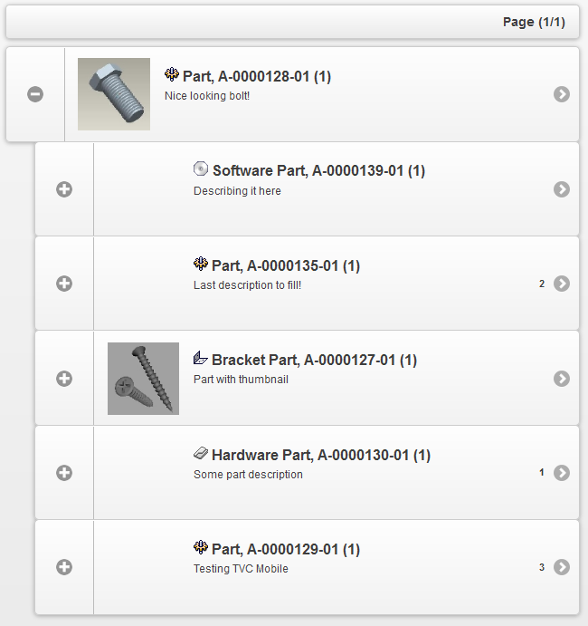
1.6.3. Table configurations
The key difference in the Mobile version of table configurations is that you don’t have a dynamic amount of columns that is rendered from left to right. In the Mobile version you have 8 pre defined columns that you can use for rendering your data. In order to use these "columns" for rendering you need a specific name on each column in your configuration. You are free to choose which columns you want to use for rendering in a table.

The columns you can use in your table are:
| Name | Description | Example | ||
|---|---|---|---|---|
Thumbnail |
This column allows you to render a thumbnail in the space to the left on the table row. |
|
||
Header |
This is one of the columns in the table row center part. Text will be rendered bold and with a bigger font size as default. You can have any amount of columns with this name and they will be rendered in the order they are specified in the table configuration. |
|
||
SubHeader |
This is one of the columns in the table row center part. Text will be rendered bold as default. You can have any amount of columns with this name and they will be rendered in the order they are specified in the table configuration. |
|
||
Paragraph |
This is one of the columns in the table row center part. Text will be rendered without any styling as default. You can have any amount of columns with this name and they will be rendered in the order they are specified in the table configuration. |
|
||
ASide |
This is text rendered in the top right corner of the table row |
|
||
CountBubble |
This column allows you to render text in the "Count Bubble" to the right |
|
||
SplitButton |
This column allows you to render a cell in a "popup" that is launched from a button located to the right in the table. This column can only be used when you also have the "href" column.
|
|
||
Href |
This column is used only for setting the href to be used when clicking on a table row. Nothing visual will be rendered in this column. |
|
1.6.4. Table Toolbar
In your pageconfig you can specify a menu to be used as a toolbar. The commands of this menu will then be rendered as buttons above the table.
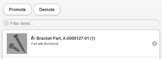
Example of a toolbar definition in a page-config file:
<ToolBar>tvc:menu:tvx:mobile:enc/toolbar/PartActions.xml</ToolBar>
A command in a toolbar has support for five different "TargetLocations":
| Name | Description | Example |
|---|---|---|
"no target location specified" |
If you don’t specify a |
|
tableHiddenFrame |
Executes your action in a hidden frame |
|
popup |
Will execute your action in a dialog window. |
|
content |
Executes the action in the current content window. |
|
newWindow |
Executes the action in a new browser window. |
|
1.6.5. Table context menu
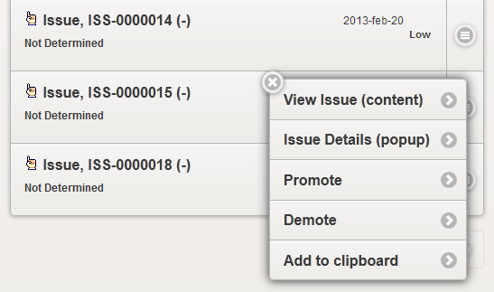
You can enable the table "context menu" in your pageconfig just like you do in the normal version of TVC. This will be rendered as a clickable button to the right in each table row. When clicking this button it will launch the context menu for that row. The menu definition used for the context menu supports the same "TargetLocation" values as the table toolbar.
<ContextMenu>tvc:menu:tvx:mobile:common/context/IssueActions.xml</ContextMenu>
| The context menu cannot be used together with the "SplitButton" table column since they are both rendered in the same space. |
1.6.6. Table pagination
There are two types of pagination modes used in TVC Mobile Access tables, "append" and "replace". The append pagination is default for flat tables and replace pagination is default in navigate mode. (Navigate mode cannot have append pagination)
Append pagination
The append pagination mode gives you the ability to append the next page of objects in the bottom of the table while keeping the previous page(s) visible as well.

Replace pagination
The replace mode replaces the current page with the next/previous page. If you want to use the replace mode instead of default append mode for flat tables you can add a parameter to your pageconfig:
<Parameters>
    <Parameter name="mobilePaginationMode" value="replace"/>
</Parameters>
1.7. Search
You can configure and use a TVC Structure Browser search in TVC Mobile access. A search is launched in mobile mode by using the following action provided with a "Search Config". Read more about configuring a search in the admin guide for TVC Structure Browser.
| Action Name | Description |
|---|---|
/mobileBeginSearch |
Used to launch a TVC Structure Browser search in mobile mode |
You use the same configurations for search forms as you normally do in TVC Structure Browser but you have to specify a mobile renderer for each field. The renderers supported are:
| Name | Description | Example |
|---|---|---|
TypeFieldRenderer |
Used for rendering a type field |
|
RevisionFieldRenderer |
Used for rendering a revision field |
|
TextFieldRenderer |
Used for rendering plain text input fields. Can be used for mapping a field to an attribute or a basic. |
|
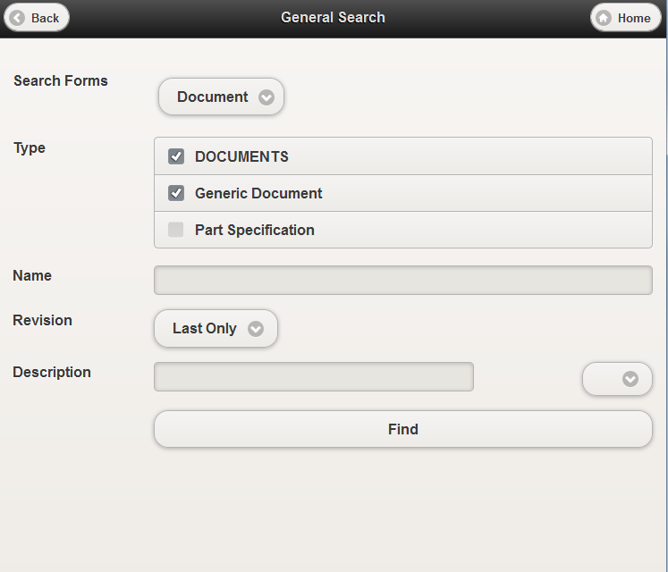
The mobile search configuration also supports having multiple search forms allowing the user to switch between them on the search page.
1.8. Forms
Create/View/Edit forms can be used in TVC Mobile Access. They can be used in the same way they are used normally in TVC Structure Browser (Viewing / Editing objects, or creating objects).
Configuration is done in the same way as in TVC Structure Browser. The exception is that the render mode needs to be specified on the action that launches the form. So to launch a form, one needs to add the "renderMode" parameter to the action.
Example command for adding a command creating an object:
<Command>
    <Label>Create New Issue</Label>
    <URL href="${ROOT_DIR}/tvc-action/initForm" submit="true">
        <Param name="formName" value="tvc:form:tvx:mobile:common/CreateNewIssue.xml"/>
        <Param name="renderMode" value="mobile"/>
    </URL>
    <TargetLocation>popup</TargetLocation>
</Command>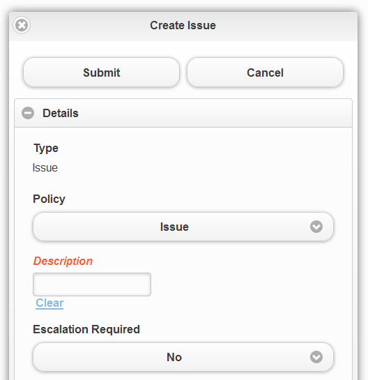
1.8.1. Check in Field
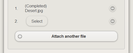
If you have a device with a browser that supports access to your camera you can use the <CheckinField> in your form configuration to upload files when creating/editing an object from a mobile device.
1.8.2. Limitations
| There are some limitations on which fields can currently be used. In general, only the basic fields and attribute fields are available, while those requiring more interaction and feedback from the user are not (For example, fields containing popup dialogs). The following fields are not yet fully supported, but will be added in coming releases: |
-
TypeField (Can be used, but only with a predetermined type, not editable)
-
ConnectField (Not Supported)
-
DynamicAttributesField (Not Supported)
-
OwnerField (Not Supported)
-
ClassificationField (Not Supported)
-
PersonField (Not Supported)
1.9. Dashboard / Charts
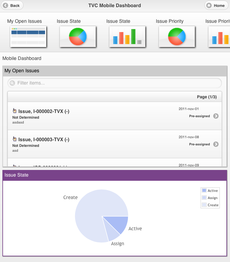
The dashboard / charts feature used in TVC Graphic Reporting can also be used in TVC Mobile Access. They are essentially the same; however it is not recommended to use any other gadgets than chart or table gadgets, since other gadgets may not be optimized for mobile use. Read more about configuring a dashboard and its gadgets in the TVC Graphic Reporting Admin Guide.
| An issue with touch events (on iOS devices) and the jQplot framework causes drill downs to stop working on charts that have tooltips enabled. So make sure to not use tooltips if you have users with iOS devices. |
There are a few differences in the mobile version of dashboard:
-
The gadget library is always visible, and can be scrolled by swiping left / right
-
The gadgets are added by tapping them
-
Gadgets can be removed from the dashboard by swiping them to the right
| Action Name | Description |
|---|---|
/mobileDashboard |
Used to launch a TVC Dashboard in mobile mode |
1.10. Themes
TVC Mobile access contains three different themes that you can use to style the application, light (default), contrast and dark.
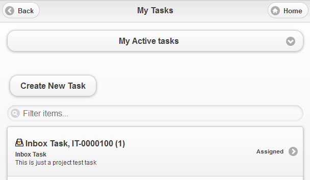
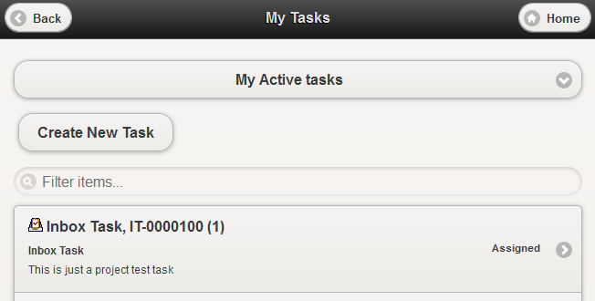
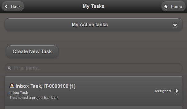
In order to change the default theme there is an init parameter called
tvc.mobile.themes.default that can be used to set the theme. The
following keys are used for the different themes:
tvc.mobile.themes.light
tvc.mobile.themes.dark
If you need a custom theme to match your corporate colors you can contact TECHNIA for help on creating and implementing that.
1.10.1. Footer
There are two TVC init parameters that you can use to add a static footer to your TVC Mobile Access application.

One parameter allows you to add a custom image and another parameter allows you to add a custom text in the footer.
tvc.mobile.footer.imageurl
tvc.mobile.footer.text
Example:
<init-param>
    <param-name>tvc.mobile.footer.imageurl</param-name>
    <param-value>/tvc/mobile/images/valuecomponents.png</param-value>
</init-param>
1.11. XML Baselines (XBL)
If you have XML Baselines (XBL’s) from the TVC XBOM Manager you can display them in mobile tables using a set of provided actions.
| Action Name | Description |
|---|---|
/mobileXblShowBaselines |
Lists all baselines for the context object in a flat table. |
/mobileXblShowBaseline |
Lists a single baseline in a structured table. |
/mobileShowBaselineDocumentsAction |
Lists all documents of a baseline in a flat table. |
All these actions load the objects in a table so you need to pass a pageconfig as a parameter to the action. Example configurations can be found in TVX (EBOM XBL’s).
 TVC Classic - 2022.3.0