<init-param>
    <param-name>tvc.core.gui.tabPage.rememberSelection</param-name>
    <param-value>true | false</param-value>
</init-param>Core - Administration Guide : Tabbed Pages
21 March 2016
1. Tabbed Pages
Tabs are generally used to split content into multiple different pages, which the user easily can switch between, to increase usability. TVC Core contains a feature that allows defining such a tabbed page in a variety of ways.
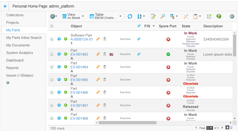
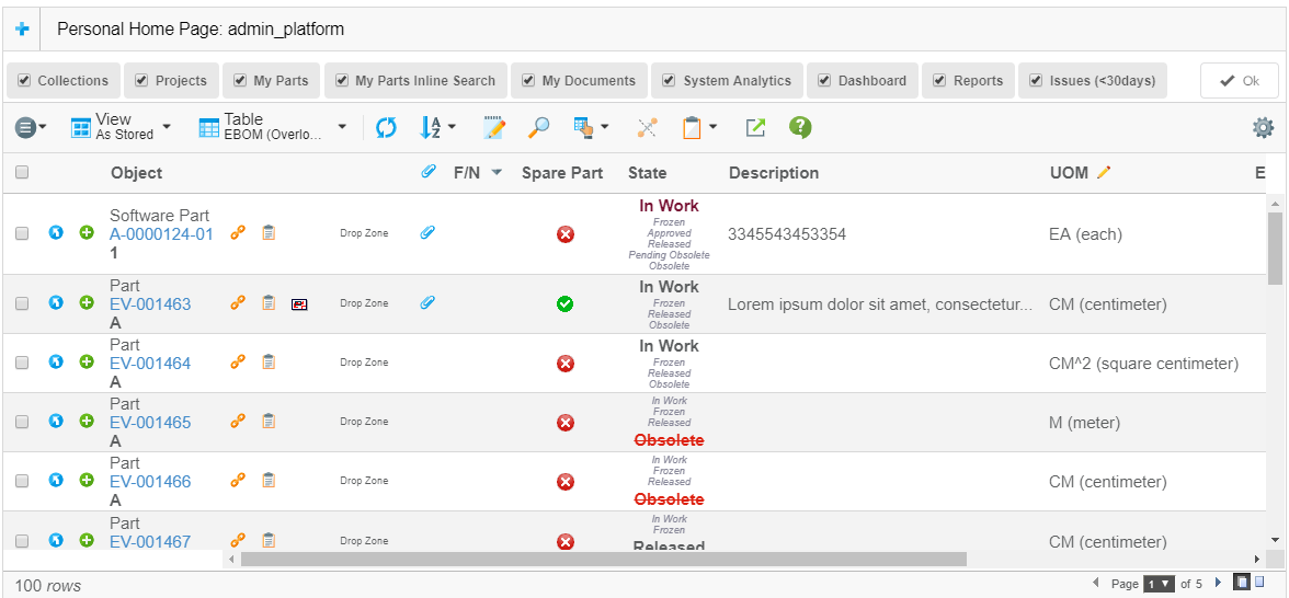
For an example of how a tabbed page could look like; see the screenshot below:

The tabbed page is very configurable and the features are summarized below:
-
The tabs can be driven by a menu (stored inside the database, or defined as an XML resource), where each item in the menu will appear as a tab in the user interface.
-
If the item in the menu is a "sub-menu" that will in turn result in a "nested" tabbed page to be displayed.
-
If you launch the tabbed page in the context of a business-object (the objectId parameter is passed), then you can choose to either point out a menu explicitly; or you can create a file where you map a business-type to a certain menu.
-
You can through request parameters define a custom JSP page that will render some information above the actual tabs
-
Access rights according to the commands/menus defined in the menu will be considered, when the tabs are generated
-
The last visited tab will be remembered by default
-
The user can personalize a tab page, by re-arranging tabs and hiding tabs.
-
Tabs that don’t fit on the row will automatically be "dropped" meaning they get hidden and can only be accessible from the tab configuration drop down menu. This is to prevent the tabs from taking up a lot of space when browser resolution or window is small.
-
It is also possible to build a tabbed page GUI manually in a JSP page, by using the JSP tags provided by TVC core.
This allows you to create a more complex user interface, for example generating the tabs dynamically, provide custom content above the tabs or even define multiple tab-sections on the same page.
All the details on how to build tabbed-pages are explained within the "TVC Developer Documentation".
1.1. Disabling Features of a Tabbed Page
To disable the feature of remembering the last visited tab, you can either do so globally or per each tab-page instance:
Or through the request parameter:
rememberSelectedTab=true | false
To disable the possibility to close a tab, this can be done globally:
<init-param>
    <param-name>tvc.core.gui.tabPage.enableCloseButton</param-name>
    <param-value>true | false</param-value>
</init-param>
and locally (default is false):
<Command>
    ...
    <Fixed>true</Fixed>
</Command>
To disable the possibility to personalize the order/visibility of a tab-page, this can be done globally:
<init-param>
    <param-name>tvc.core.gui.tabPage.enableTabCfg</param-name>
    <param-value>true | false</param-value>
</init-param>| If the tab configuration has been disabled, the close button will also be disabled. Otherwise the user won’t have a chance to re-open a closed tab. |
To disable the "tab drop" functionality that hides tabs that doesn’t fit on the row, this can be done globally:
<init-param>
    <param-name>tvc.core.gui.tabPage.enableTabDrop</param-name>
    <param-value>true | false</param-value>
</init-param>| If the tab configuration has been disabled, the tab drop functionality will also be disabled. Otherwise the user won’t have a chance to open "dropped" tabs. |
1.2. Styling
Individual tabs can be styled using a custom theme. Use the "style" setting to add custom class to a tab. Read more on custom themes in this Chapter.

Example:
<Command>
    <Label>...</Label>
    <URL action="...">
        <Param name="..." value="..." />
    </URL>
    <Fixed>false</Fixed>
    <Setting name="class" value="test" />
</Command>
1.3. Cache Tab Content
To improve perceived performance and raise acceptance when working with tabs the tab content can be cached and even pre-loaded. This way the tab content is instantly shown when tab is clicked. To reload a cached tab simple click the tab once more when already active.
To enable single tab cache behaviour use the cacheBehavior setting
<Command>
    ...
    <Setting name="cacheBehavior">disabled | cache | preload</Setting>
</Command>
To control global tab cache behaviour use the tvc.core.gui.tabPage.cacheBehavior init-param
<init-param>
    <param-name>tvc.core.gui.tabPage.cacheBehavior</param-name>
    <param-value>disabled | cache | preload</param-value>
</init-param>
1.4. Initially Hidden Tabs
To provide tabs which are initially hidden, one can use the following settings or init-param. Once the tab is added through tab configuration, it will be saved in dataobject.
To enable single tab initially hidden behaviour use the visible setting
<Command>
    ...
    <Setting name="Visible">true | false</Setting>
</Command>
To control global tab initially hidden behaviour use the tvc.core.gui.tabPage.visible init-param
<init-param>
    <param-name>tvc.core.gui.tabpage.visible</param-name>
    <param-value>true | false</param-value>
</init-param>
1.5. Tab Orientation
Tabs can be displayed in vertical or horizontal orientation. The default orientation of the tabs can either be configured globally or per use case.
Users can, by default, rotate the tabs. The rotate command is found in the settings menu found to the far right (or bottom when tabs are displayed vertically).

See chapter UIP Tabs for details on how to configure orientation.
| This feature requires UIP Tabs |
1.6. Tab Icon
Each tab may have an icon configured. This makes it easier for the user to identify tab of interest.
![]()
Use the <FontIcon> element inside the <Command> element to specify
which icon to display. Example:
<Command>
    <Label>Discussions</Label>
    <URL action="navigate">
        <Param name="pageConfig" value="tvc:pageconfig:tvx:common/Discussion.xml" />
        <Param name="portalMode" value="true" />
    </URL>
    <FontIcon>fa fa-comment-o</FontIcon>
</Command>| Font Awesome 4.3.0 is included by default on most places where tabs are displayed. Make sure to include other icon library in case you want to use other icons. |
| This feature required UIP Tabs |
1.7. UIP Tabs
UIP Tabs is a rewrite of tabs which uses more modern technologies. It brings a number of benefits to the table. For example, less data needs to be transferred as rendering is done at the client.
UIP Tabs is activated globally with the setting tvc.core.tabs.uip.
Example using tvc.properties:
tvc.core.tabs.uip=trueExample using web.xml:
<init-param>
    <param-name>tvc.core.tabs.uip</param-name>
    <param-value>true</param-value>
</init-param>
UIP Tabs can be configured to enable / disabled each feature. For example users should be able to hide tabs, but not switch orientation.

Configurations are specified on two levels: (1) global, and (2) per tab instance. Any configurations done on a tab instance has precedence over global ones.
Global configurations are either done in tvc.properties or
web.xml. Instance specific configurations are, in most cases,
done in the Menu configuration file using the <Setting name="…" value=".." />
element.
Configurations:
| Global | Instance | Description | Default Value |
|---|---|---|---|
tvc.core.tabs.orientation |
orientation |
In what orientation the tabs are rendered by default. Possible values: horizontal vertical |
horizontal (if not menu is used with the category toppanel as it is rendered vertically by default) |
tvc.core.gui.tabPage.enableOrientationSwitch |
userOrientationSwitch |
Whether or not user should be able to switch the orientation. |
true |
tvc.core.gui.tabPage.enableTabCfg |
userRearrange |
Whether or not user should be able to rearrange the order of tabs. |
true |
tvc.core.gui.tabPage.enableTabCfg |
userHide |
Whether or not user should be able to hide tabs. |
true |
tvc.core.gui.tabPage.enableReset |
userReset |
Whether or not user should be able to reset the tabs. |
true |
Example to globally disable possibility to switch orientation
using tvc.properties:
tvc.core.gui.tabPage.enableOrientationSwitch=falseExample configuring an instance of tabs in the application to be rendered vertically and disable possibility for user to switch orientation:
<Menu>
    ...
    <Setting name="orientation" value="vertical"/>
    <Setting name="userOrientationSwitch" value="false"/>
</Menu>
Non-supported Features
These features are not supported when using UIP Tabs:
-
The close button next to each tab is not available. Users can still hide tabs using the customization feature.
-
No loading icon is displayed next to each tab when it’s loading.
-
Specifying a CSS class on a command (using
<Setting name="class" value="test" />)
 TVC Classic - 2022.3.0