<Filter ref="tvc:collaborationfilter:tvx:collaboration/Product.xml" />
Collaboration - Administration Guide : Advanced filter
21 March 2016
1. Advanced filter (Exalead powered feature)
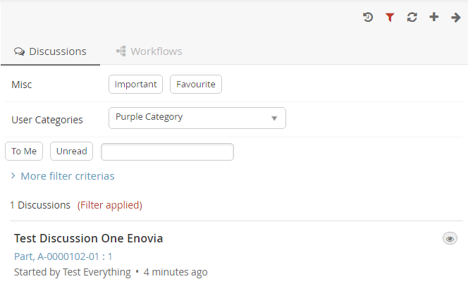
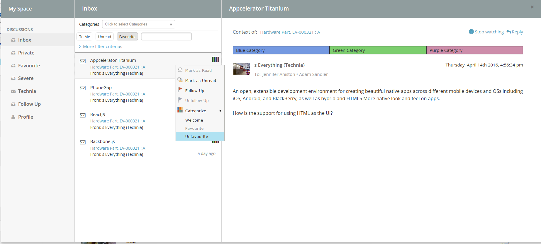
It is possible to configure something called advanced filter in order to control the data loaded for this component. This type of filtering is able to load and filter on data that has been indexed by Exalead. This can be used to filter out both notifications in the inbox and discussion threads in the side panel. These filters can be hidden or visible so that the user can change values in the UI.

1.1. Filter configuration
In order to enable a filter you can reference a filter configuration in your TVCDiscussionConfig.xml file like this.
1.1.1. <Filter> element
The base element for the actual filter configuration is the <Filter> element. That one has a number of attributes that can be used to control some behavior for the entire filter.
<Filter showOnLoad="true" visibleRowCount="3" searchBase="cloud"
visible="true">| Attribute | Description | Default Value |
|---|---|---|
showOnLoad |
Show filter on load or not (if set to false the user will have to click the filter icon to show the filter |
true |
visibleRowCount |
How many filter rows (rows described later) that will be showed on load. Visibility of rest can be toggled by the user. |
|
searchBase |
See chapter about Cloud |
|
visible |
Whether the filter should be shown or be hidden |
true |
1.1.2. <Row> element
Each filter can have any amount of rows. A row corresponds to a row in the filter user interface. Each row can have a label set and that will then be rendered to the far left. Each row can then have a single or multiple filter items. A row can be hidden using the "visible" attribute.
<Row visible="true">
    <Label>Anything</Label>
    <FilterItem>..</FilterItem>
    <FilterItem>..</FilterItem>
</Row>
1.1.3. <FilterItem>
A <FilterItem> represents an element that can be used to filter data
(textfield, dropdown, button etc.). Each filteritem maps against one or
multiple values that has been indexed by Exalead. Below is a complete
example of a filteritem. Each element described after the example
<FilterItem>
    <Label>Test_label</Label>
    <Operator>NOT_EQUAL</Operator>
    <LogicalOperator>AND</LogicalOperator>
    <MapsTo>
        <Tag>
            <Name>category</Name>
        </Tag>
        <Field>
            <Name>THREAD_FIRST_MSG_SENT_FROM</Name>
        </Field>
    </MapsTo>
    <Values>
        <Value>
            <SubmitValue />
            <DisplayValue />
        </Value>
        <Value selected="true">
            <SubmitValue>production</SubmitValue>
            <DisplayValue>Production</DisplayValue>
        </Value>
        <Value>
            <SubmitValue>development</SubmitValue>
            <DisplayValue>Development</DisplayValue>
        </Value>
    </Values>
    <UIControl>dropdown</UIControl>
</FilterItem><Operator>
Can be used to control what operator to use for this field item. It is not mandatory to specify this.
-
EQUAL (default)
-
NOT_EQUAL
-
LESS_THAN
-
GREATER_THAN
<LogicalOperator>
Can be used to control what logical operator to use for this field item. Not mandatory to set this.
-
OR (default)
-
AND
<MapsTo>
This element is used to map this field against either tags or indexed fields in Exalead. In order to filter on tags one or more <Tag> elements are used and in order to filter on fields one or more <Field> elements are used.
<MapsTo>
    <Tag>
        <Name>category</Name>
    </Tag>
    <Field>
        <Name>THREAD_FIRST_MSG_SENT_FROM</Name>
    </Field>
</MapsTo>
user specific custom tag filter
<FilterItem>
    <Operator>EQUAL</Operator>
    <LogicalOperator>AND</LogicalOperator>
    <MapsTo>
        <Tag user="true">
            <Name>xfav</Name>
        </Tag>
    </MapsTo>
    <Values>
        <Value selected="true">
            <SubmitValue>true</SubmitValue>
            <DisplayValue>Favourite</DisplayValue>
        </Value>
    </Values>
    <UIControl>textbutton</UIControl>
</FilterItem>
<UIControl>
This element is used to control what type of UI control to use for this field. Supported values are:
- DROPDOWN
-
Dropdown list with possibility to select ONE value.
- MULTISELECTDROPDOWN
-
Dropdown list with possibility to select MULTIPLE values.
- TEXT
-
Text field where user can enter any text
- BOOLEANBUTTON
-
Yes/No buttons
- TEXTBUTTON
-
Buttons containing custom values. (Each value renders as a button)
Some of these elements require you to configure the values that can be used. See next section
<Values>
This element is used to configure the allowed values for a <UIControl>.
All UI controls except BOOLEANBUTTON and TEXT requires one or more
values. Each value has a submit-value that is sent to the server and a
display-value that is rendered for the user. A value can be configured
to be default selected with the attribute "selected"
<Values>
    <Value>
        <SubmitValue>MHK</SubmitValue>
        <DisplayValue>MHK</DisplayValue>
    </Value>
    <Value selected="true">
Values can also be loaded through Java code like this.
<Values valueHandler="com.technia.tvc.example.valuehandler.ObjectIdValueHandler"/>
The value handler class needs to implement the
com.technia.tvc.collaboration.core.model.dao.enovia.config.ValueHandler
(deprecated) interface.
ValueHandler interface has been deprecated in favour of
com.technia.tvc.collaboration.core.model.dao.enovia.config.FilterValueHandler.
Categories FilterItem Configuration
<FilterItem>
     <Label>Categories</Label>
     <Operator>EQUAL</Operator>
     <LogicalOperator>AND</LogicalOperator>
     <Type>category</Type>
     <UIControl>multiselectdropdown</UIControl>
</FilterItem> TVC Classic - 2022.3.0