 TVC Helium 2024.3.0
TVC Helium 2023.1.0 Release Information
20 January 2023
Table of Contents
1. Core
1.1. Auto Coloring
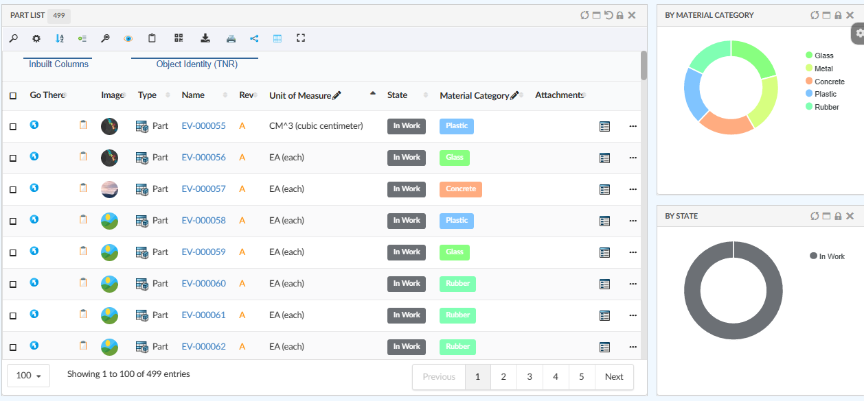
Coloring gives better visual identity than plain text. Helium supports auto coloring for table columns and chart. This will help in maintaining consistency in color for a given text within the application.
This auto coloring by default enable for charts and for table columns it can be configured.
For more detailed information please refer Auto Coloring
Figure 1. Auto Coloring
2. In-App Designer
In-App Designer is a concept that brings the idea of creating, editing, and sharing configurations using the built-in admin user interface. These configurations can be used to define Helium dashboards, widgets, tables, charts, etc. Built-in Admin UI is provided to create, modify and share these configurations. In-App Designer can be used from Helium standalone or Helium widget in 3DDashboard. Once the config-admin is created and shared the configuration with the end-user, then the end-user receives the configuration to accept it. Once accepted, he can select and apply the configuration to his page, dashboard, or widget from UI. For detailed information, please refer In-App Designer.
In this release, we have enhanced this feature further as stated below.
2.1. Create dataset and filter within create widget
To configure the widgets in a dashboard, it is a prerequisite to have the datasets and filters ready before creating the widgets. From this release, it is not mandatory to have the preconfigured datasets and filters. Instead, config-admin can choose to create the dataset and filter from within the create widget screen as shown in the image.
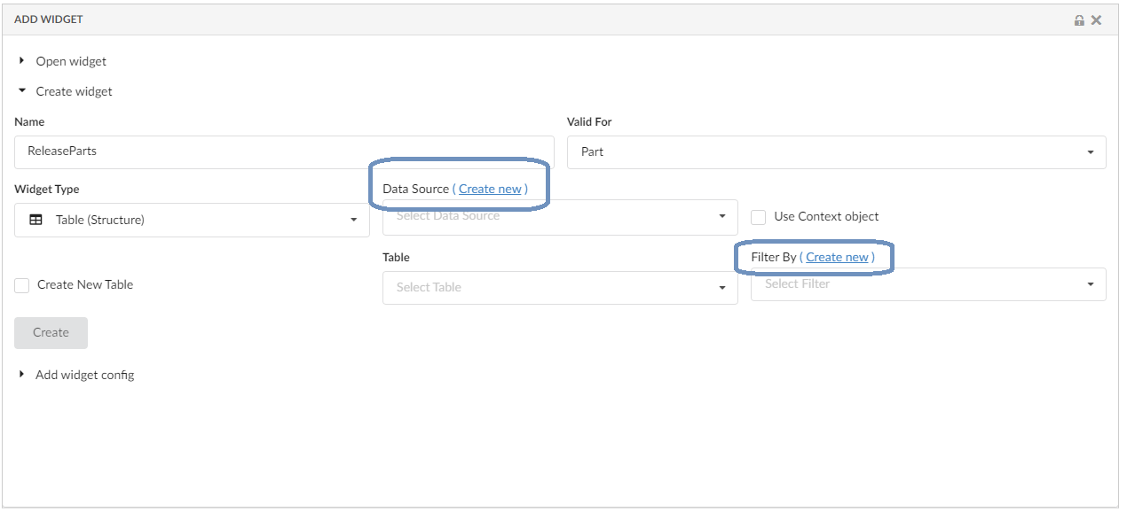
Figure 2. Inline Create Dataset and Filter
Refer the video where the dataset and filter are created and edited from the create widget screen.
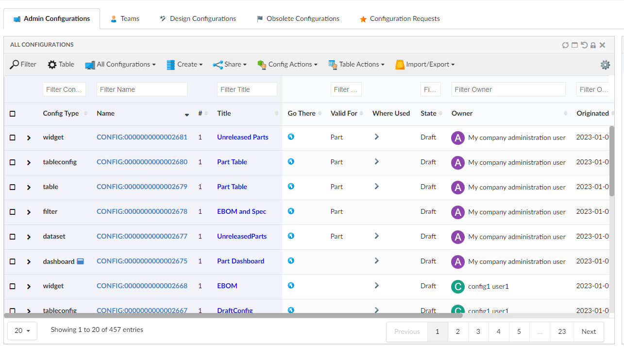
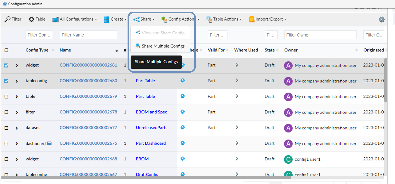
2.2. Configure toolbar commands
Config-admin can now add the built-in toolbar commands to the widgets that is being configured. The toolbar menu will appear only in the draft state for the config-admin. Config-admin can choose the command for the configuring widget and share it with the end-users. The end-user can use these commands on the selected BusinessObjects.
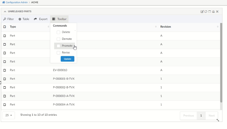
2.2.2. Built-in commands for Structure Table:
The structure table will have "ExpandAll" and "CollapseAll" commands in addition.
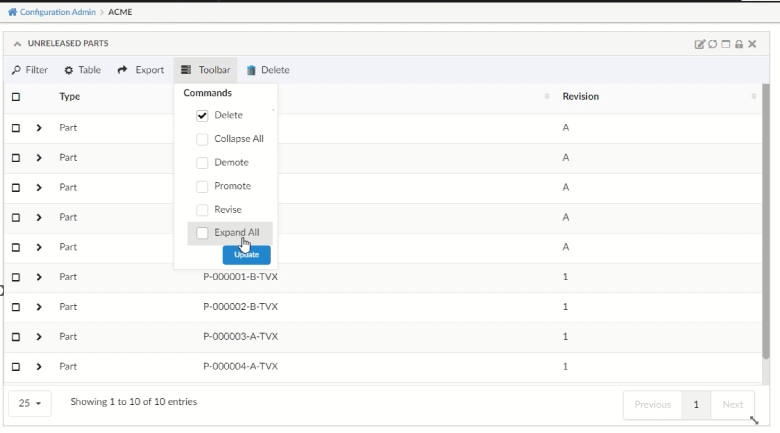
Figure 4. In-built toolbar commands for Structure Table
These built-in toolbar commands are mapped in TVC_InAppConfigurations.json.
Config-admin can also include new commands to this JSON file and make it available in the configuring widgets.
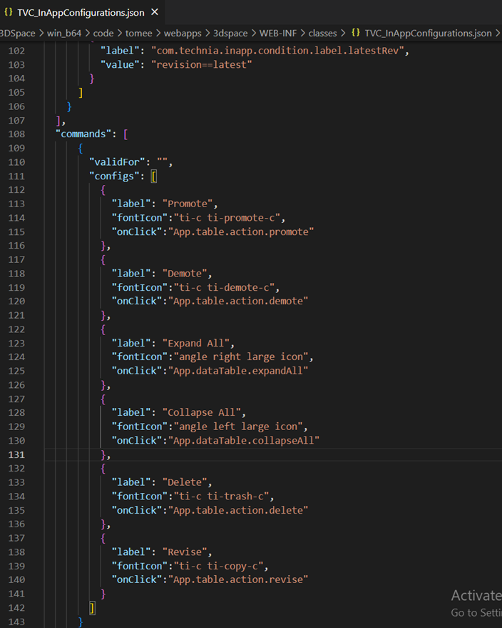
Figure 5. In-built Toolbar commands mapped in JSON
2.3. Column Configuration with inline script:
Introducing in new column type helium-script to write a script in the column’s expression tag.
This feature reduces the developer’s effort in writing the java based data handlers for simple data manipulation.
For example, consider a scenario where you want to have a table column named "No. of Child Parts" to display the number of child parts available for assembly and the consolidated EBOM quantity.
In the column’s expression tag, you can add a selectable and javascript logic to perform such data manipulation.
For our example scenario, the column configuration with expression tag can be,
 <Column usesBusinessObject="false">
    <Name> No. of Child Parts </Name>
    <Label> No. of Child Parts </Label>
    <ColumnType>helium-script</ColumnType>
    <Expression><![CDATA[
                <BusSelect varName="childnames" iteratable="true" >from[EBOM].to.name</BusSelect>
                <BusSelect varName="qtys" iteratable="true">from[EBOM].attribute[Quantity]</BusSelect>
                <RelSelect varName="relName">name</RelSelect>
                <Script>
                    var childCnt = 0;
                    while (childnames.hasNext()) {
                    childnames.next();
                    childCnt++;
                    }
                    var totalQty = 0;
                    while(qtys.hasNext()) {
                    var qty = parseInt(qtys.next());
                    totalQty = qty + totalQty ;
                    }
                    write(childCnt+ " ("+relName+") Childs with total Qty "+totalQty);
                </Script>
        ]]></Expression>
    </Column>
For more details on the tags used in expression, refer expression tag components section in admin guide.
3. 3DDASHBOARD
3.1. Drag and drop multiple objects to the same widget
Helium True Widget table can load multiple objects as root object. Earlier drag and drop feature supported setting only the context object of widget. Once context is set to an object if another object dragged and dropped to same widget it used to reset the context to new object object.
With this release it is possible to add additional object as root object using drag and drop from OOTB Search and any other helium table widget.
3.2. Custom drop config feature improvement
The custom drop config feature allows the user to load config based on the type of object that the user has dropped on the widget. Previously custom drop config feature only supports the parent type of an object to load when dragging and dropping an object on HETrueWidget. Now custom drop config feature loads a sub-type of the object when dragging and dropping an object from HETrueWidget.
For more detailed information please refer Preconfigured Widgets JSON configuration
3.3. Helium true widget look and feel improvement.
Improved Helium True Widget table look and feel.
-
Expand Icons
-
Header size
-
Color contrast between rows
-
Checkbox and checkbox column color
-
Fontsize
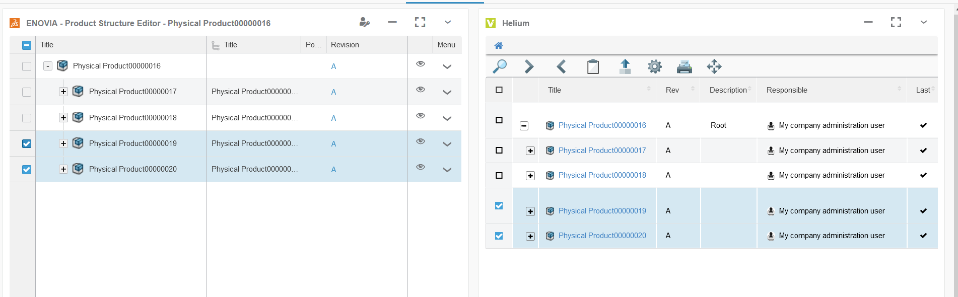
Figure 8. Helium true widget look and feel
3.4. Drag and Drop rows in helium
In addition to setting context of widgets, drag and drop can also be used to create relationship between the rows. For example, this feature can be used to add Proposed Items to Change Action. It is also possible to call 3DExperience service to perform any specific action on drop of row.
This feature can be enabled by configuring below in tableconfig:
For enabling drag
<RowDragAllowed>true</RowDragAllowed>For enabling drop
    <DropConfigs>
		<DropConfig>
			<AllowedDropType>Part</AllowedDropType>
			<ValidRowType>Part</ValidRowType>
			<RelationshipType>EBOM</RelationshipType>
			<RelationshipDirection>to</RelationshipDirection>
			<PostAction>refresh</PostAction>
		</DropConfig>
	</DropConfigs>
if you want to invoke 3DExperience web service
    <DropConfigs>
		<DropConfig>
			<AllowedDropType>Physical Product</AllowedDropType>
			<ValidRowType>Physical Product</ValidRowType>
			<RequestMethod>POST</RequestMethod>
			<PostAction>expand</PostAction>
			<InvokeServiceUrl>resources/v1/modeler/dseng/dseng:EngItem/{objectId}/dseng:EngInstance</InvokeServiceUrl>
			<Payload>
			    {
			        "instances": [
			            {
			                "referencedObject": {
			                "id": "{droppedObject}"
			                }
			             }
			         ]
			     }
			 </Payload>
		</DropConfig>
	</DropConfigs>
Please refer link for more info on How to configure drag and drop
4. Form
4.1. Primary Image Field
Images gives visual identification to enovia objects like Part or Assembly. Helium forms can now show primary image mapped to business object. A new field PrimaryImageField is introduced to render the "Primary Image" of the object. This field also allow user to set, change and delete primary image.
Following is example configuration :-
<PrimaryImageField>
	<Label>Image</Label>
	<Editable>true</Editable>
    <Format>generic</Format>
</PrimaryImageField>
For more detailed information please refer Primary Image Field
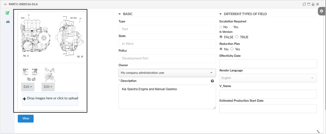
Figure 9. Primary Image
5. Datatable
5.1. Global setting support for HeaderNoTruncate
HeaderNoTruncate is useful to preserve column header width while working with resizable columns. Earlier this was only column level setting, in addition to that a global setting with a key tvc.helium.datatable.headerNoTruncate.enabled is introduced. This will benefit customers to use one global setting rather than doing it at each of the columns. Accepted value are true|false with default as false.
For more detailed information please refer HeaderNoTruncate
6. Toolbar
6.1. Confirm Message
Sometime, user might click on object action commands like delete by mistake, resulting in unwanted action or data loss. To avoid such situation a confirm message has been introduced for toolbar commands in helium. When the command is clicked, confirm message modal will be opened with two options Confirm or Cancel along with a message. Once Confirm is clicked command is executed and exceution will be skipped in case Cancel is clicked. Confirm message can be declared as part of OnClickParams JSON object as shown below.
<OnClickParams>{
    ...
    "confirmMessage" : "Are you sure to delete selected object(s)?"
    ...
}</OnClickParams>
Value of confirmMessage can be either plain text or custom translation entry in JSON file CustomTranslations.
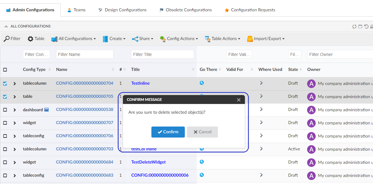
Figure 10. Confirm Message