 TVC Helium 2024.3.0
<?xml version="1.0" encoding="UTF-8"?>
<Application xmlns="http://technia.com/helium/Application">
   ...
    <TopBar>
      	...
      <Command>tvc:command:helium:admin/ConfigAdminUI.xml</Command>
   	...
    </TopBar>
<Application/>Clipboard
03 December 2020
Table of Contents
- 1. In-App Designer
- 1.1. Introduction
- 1.2. Admin Configuration UI
- 1.3. Configuration Request
- 1.4. Create and Share Dashboard
- 1.5. Revise Shared Dashboard
- 1.6. Create and Share Widget
- 1.7. Configure Form Widget
- 1.8. Dataset
- 1.9. Configure Chart Widget with Expand Dataset
- 1.10. Expression
- 1.11. Column Configurator
- 1.12. File based Configurations in JSON
- 1.13. Configure toolbar commands
- 1.14. Choose template to a Column
- 1.15. Preselected Valid-For in Add Widget
- 1.16. Manage Admin Configs
- 1.17. Validate XML against XSD
- 1.18. Notifications
- 1.19. List Accepted Configs in 3DDASHBOARD Widget Preference
- 1.20. List Admin Configs in 3DDASHBOARD Widget Preference
- 1.21. Export/Import Configurations
- 1.22. Page Config for classic tabs
- 1.23. EndUser
- 1.24. Configure EndUser UI
- 1.25. Accept Shared Configurations
- 1.26. View Accepted Dashboard
- 1.27. User Configurations
- 1.28. Create Dashboard By Enduser
- 1.29. Widgets
- 1.30. Teams Management widget
1. In-App Designer
1.1. Introduction
In-App Designer (previously known as End User Definition/ End User UI) is a concept that brings the idea of creating, editing, and sharing configurations using the built-in admin user interface. These configurations can be used to define Helium dashboards, widgets, tables, charts, etc. Built-in Admin UI is provided to create, modify and share these configurations. In-App-Designer can be used from Helium standalone or Helium widget in 3DDASHBOARD. Once an admin has created and shared the config with the end-user, the end-user can use a built-in chooser UI to select and apply the configuration to his page, dashboard, or widget.
1.2. Admin Configuration UI
Using the built-in admin user interface, config-admin can design a new configuration like dashboard, widget, table, etc., and share the configurations with end-user.
Admin Configuration UI can be configured in both 3DDASHBOARD and standalone helium application.
Config-Admin or admin user is a person having TVC Config Admin role. And Admin Configuration UI can only by accessed by Config-Admin.
|
1.2.1. Configure Admin UI in StandAlone Helium Page
In standalone helium page, Admin Configuration UI can be accessed through the command Configuration Admin. Add this command in Helium.xml file as shown below.
In Helium UI, you can see the "Configuration Admin" command in the topbar as shown in the image.
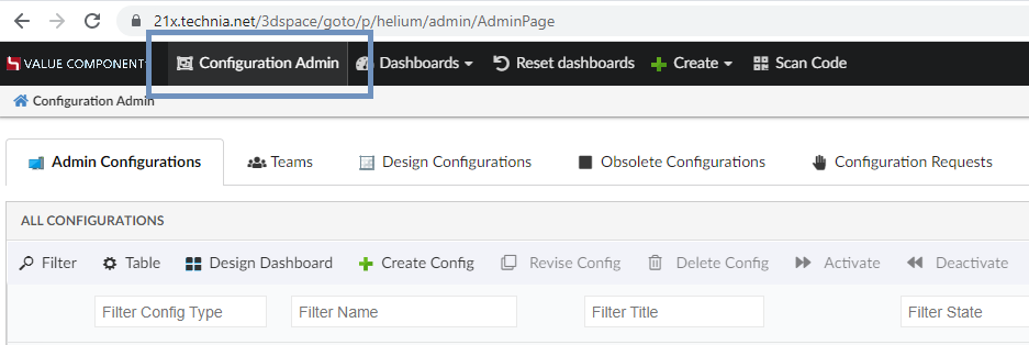
Figure 1. Command for Config Admin UI
1.2.2. Configure Admin UI in 3DDASHBOARD
In 3DDASHBOARD, create App for Admin UI from the "Additional Apps" UI as shown in the image.
Source code URL: https://domain-name/app-name/webapps/HETrueWidget/heliumWidget.html?
Configuration file URL: https://domain-name/app-name/webapps/HETrueWidget/configadmin/configAdminUI.json
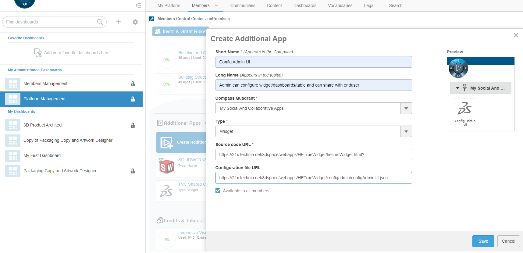
Figure 2. App for Config Admin UI
Config-Admin can also add 3DDASHBOARD widget for Admin UI by choosing "AdminPage(tvc:page:helium:admin/AdminPage.xml)" in 3DDASHBOARD widget preference as shown in the image.
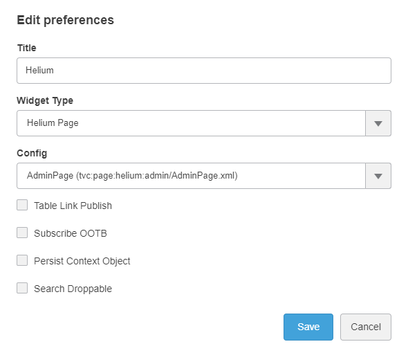
Figure 3. 3dd widget for Config Admin UI
1.3. Configuration Request
In-App-Designer process starts with end-user requesting for a new configuration like dashboard, widget, table, tablecolumn or expression, etc. from config-admin.
1.3.1. EndUser Requests
End-user can create a config request from the Request tab in Shared Config UI as shown in image. In the create form, end-user can write a detailed description about the new configuration requirement and can submit by clicking the Notify Config Admin button.
Once the request is created, config-admin will be notified about the new config request.
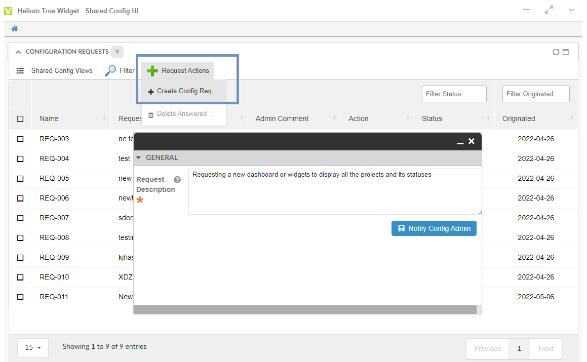
Figure 4. Create Config Request
1.3.2. ConfigAdmin - Request Tab
All the config requests created by end-user will be listed in the Configuration Requests tab of config-admin-UI as shown in image.
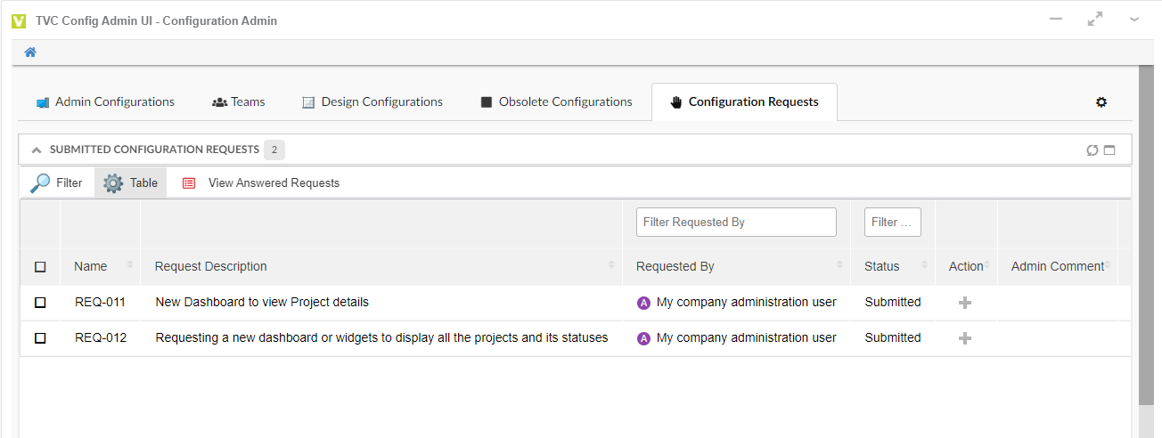
Figure 5. List of Configuration requests created by endusers
Config-Admin will create a new configuration based on the description in the config request, and share with the requested end-user. Once the configuration is created and shared with the end-user, config-admin can update the request object by adding the admin comment.
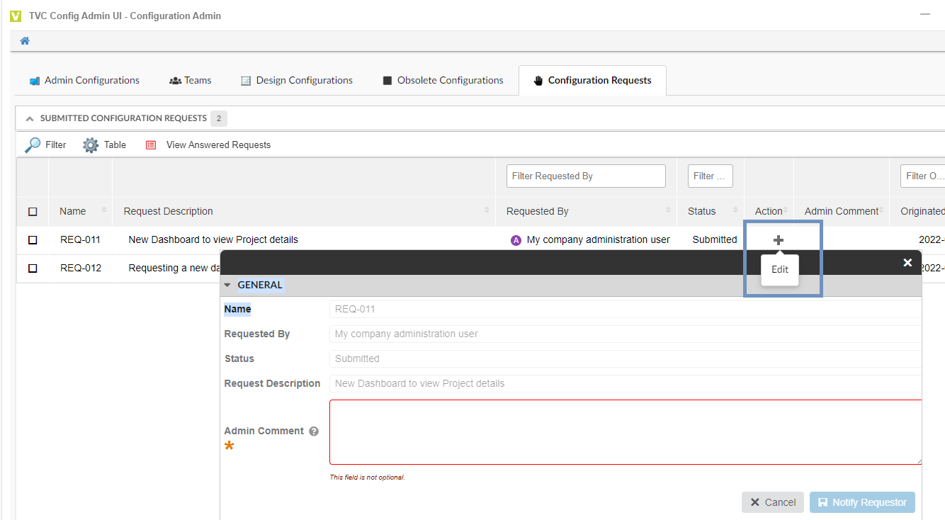
Figure 6. Add Admin comment
1.4. Create and Share Dashboard
Consider a scenario where the end-user has requested for a project dashboard with 3 widgets.
-
Issue Tablewidget
-
Task Tablewidget
-
Issue priority Chartwidget
It involves 4 major steps to create and share the dashboard with the end-user.
-
Create dataset
-
Create dashboard
-
Configure widgets and Update table columns
-
Activate and Share dashboard with end-user
1.4.1. Step 1/4 - Create dataset
This scenario needs 2 datasets to list the issue and task objects. Refer the below configuration to create the dataset config.
For more information about datasets, refer to Dataset section.
| From release 2023.1.0, it is not mandatory to have the preconfigured datasets and filters. Instead config-admin can choose to create the dataset and filters from within the create widget screen. Refer to Create dataset and filter inline widget section. |
Dataset Configurations for Issues:
<?xml version="1.0" encoding="UTF-8"?>
<DataSet>
	<Inquiry>
		<Code>temp query bus Issue * * where "owner == context.user" limit 25 select id dump |</Code>
		<Format>${OID}</Format>
		<Pattern>*|*|*|${OID}</Pattern>
	</Inquiry>
</DataSet>
Dataset Configurations for Tasks:
<?xml version="1.0" encoding="UTF-8"?>
<DataSet>
	<Inquiry>
		<Code>temp query bus Task * * where "owner == context.user" limit 25 select id dump |</Code>
		<Format>${OID}</Format>
		<Pattern>*|*|*|${OID}</Pattern>
	</Inquiry>
</DataSet>
Create 2 new datasets with above configurations as shown in image
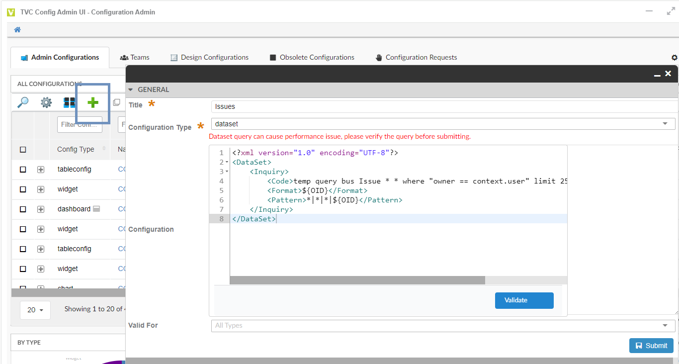
Figure 7. Create dataset configuration
Validate configuration using Validate option. Refer Validate XML against XSD section.
1.4.2. Step 2/4 - Create and Preview dashboard
Create a new dashboard by clicking the command Design Dashboard and name the dashboard "Project Dashboard"
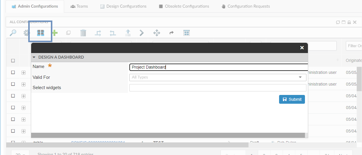
Figure 8. Design Dashboard Screen
Once the dashboard is created, launch the dashboard using the preview icon. A new empty dashboard will open with options to create new widgets as shown in the images below.
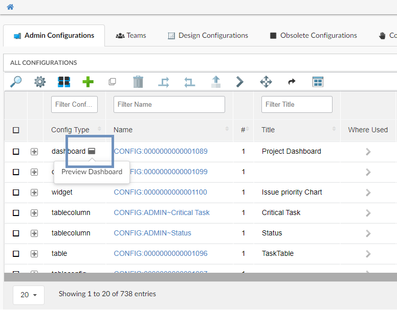
Figure 9. Preview dashboard
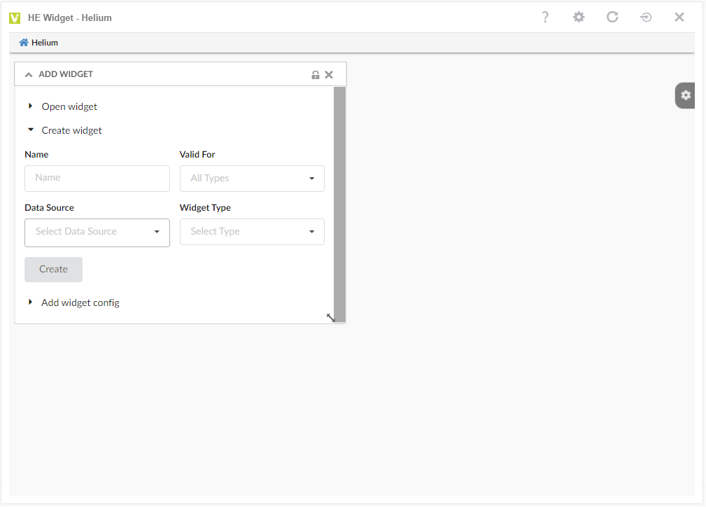
Figure 10. Empty dashboard with Create widget options
1.4.3. Step 3/4 - Create widgets and Configure Table Columns
As per the scenario, create 3 new widgets by selecting the issue/task dataset and a new table
Widget 1: Create Issue TableWidget:
| Form Field Name | Description |
|---|---|
Name field |
Name of the tablewidget |
Valid For Field |
This field is mainly for filtering out the huge list in data source and table fields. This field lists only the business type for which datasets or tables are created already. |
Datasource Field |
Select the data source from the dropdown. This field lists all the accepeted datasets which shared by config-admin and also the one created from saved search. Refer create dataset from saved search section. |
Widget Type field |
List options to create a table or chart widget. |
CreateNew Checkbox |
Enables you to create a new table or lists existing tables for your selection. |
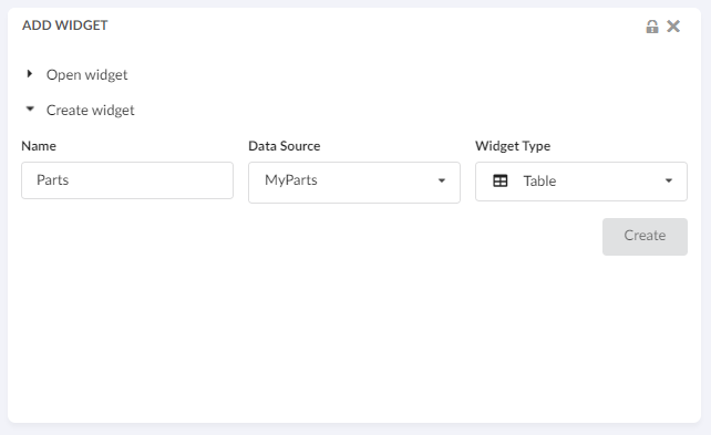
For our scenario, choose the Issue data source and new table, and create a new tablewidget for displaying the Issue objects The new table will be created with a basic columns.
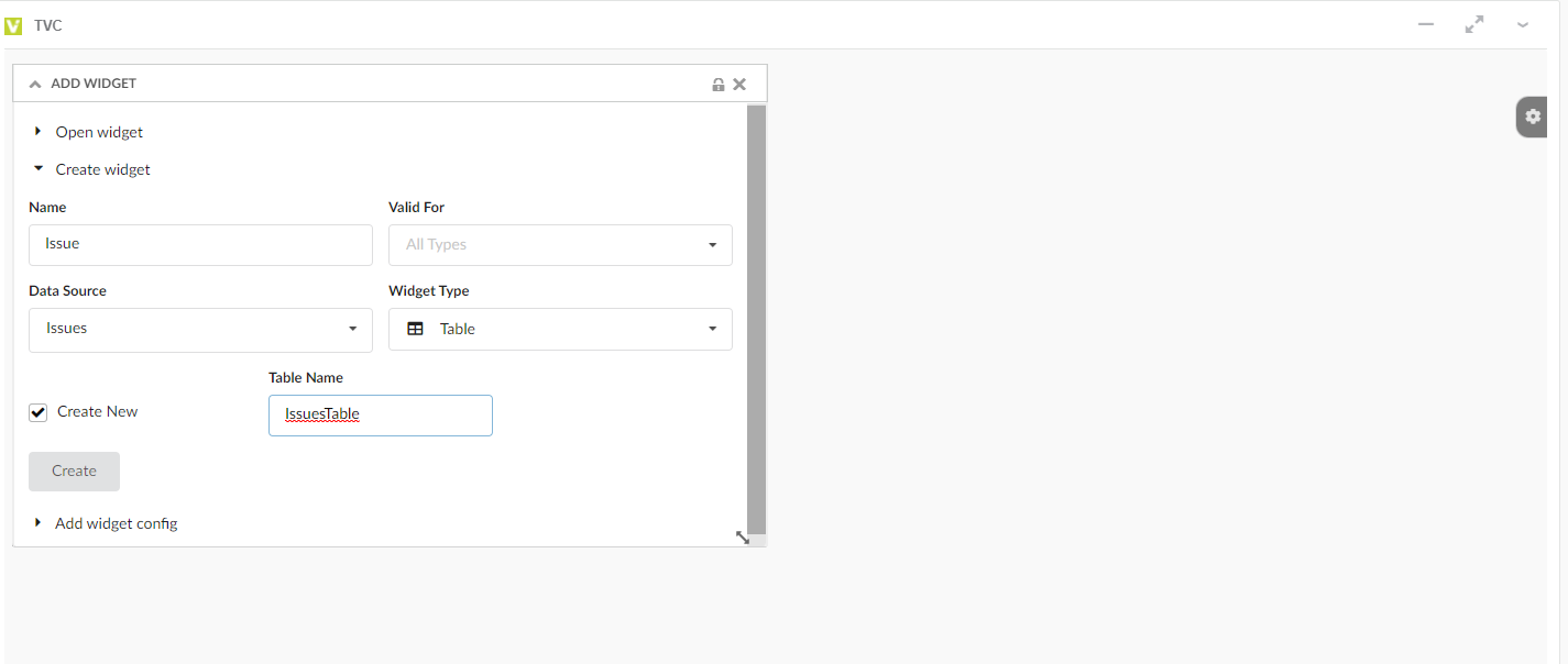
Figure 11. Create Issue Table Widget screen
The created tablewidget will have the basic columns like type, name and revision. Config-Admin can now add new columns to this table.
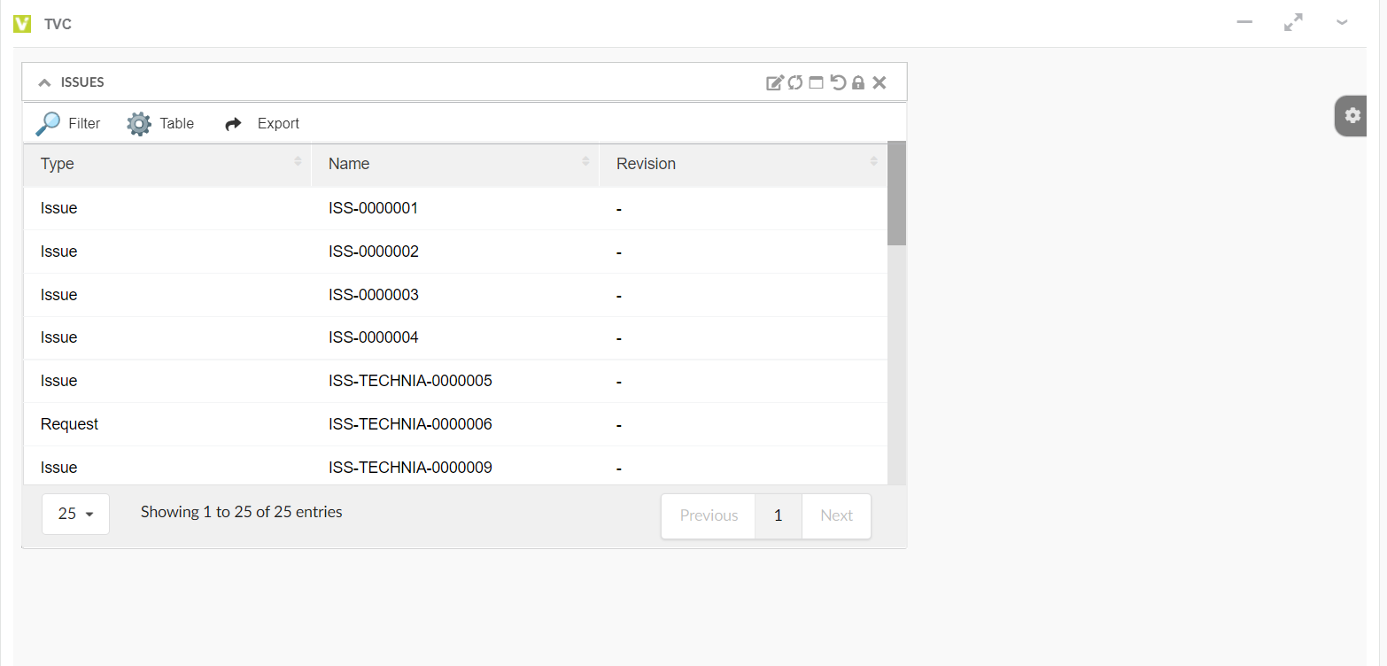
Figure 12. Issue TableWidget With basic columns
Update Table with columns:
Config-Admin can update the table with required columns using the Table Configurator.
Consider below 3 columns are required in the newly created tablewidget.
-
Issue Status,
-
Related Tasks, and
-
Related Tasks Status
Using the Table Configurator, you can select the required tablecolumn from the existing list of columns, or you can create a new column by providing your expression as shown in the image.
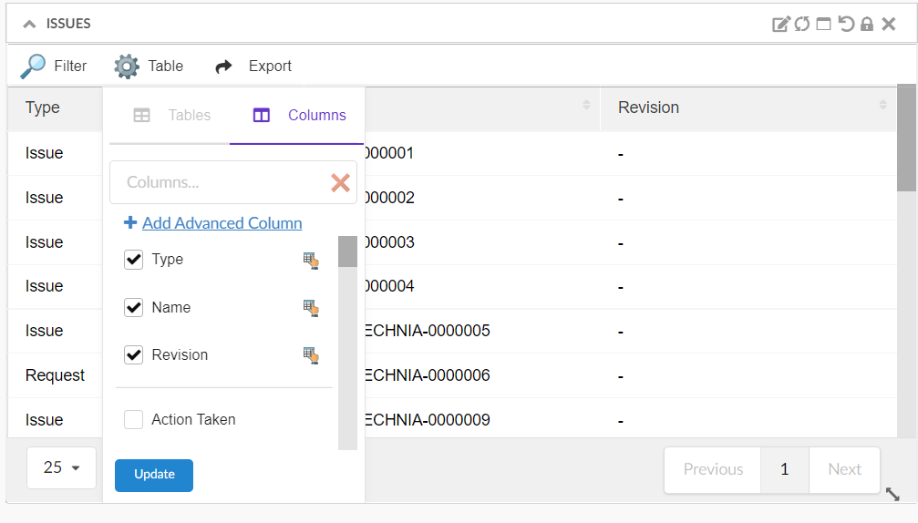
Figure 13. Table Configurator to Add Columns
You can choose the predefined columns by searching with the text, or you can click on 'Add Advanced Column' to create new column with expression as shown in images.
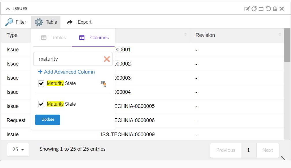
Figure 14. Choose 'Maturity Status' from existing column list
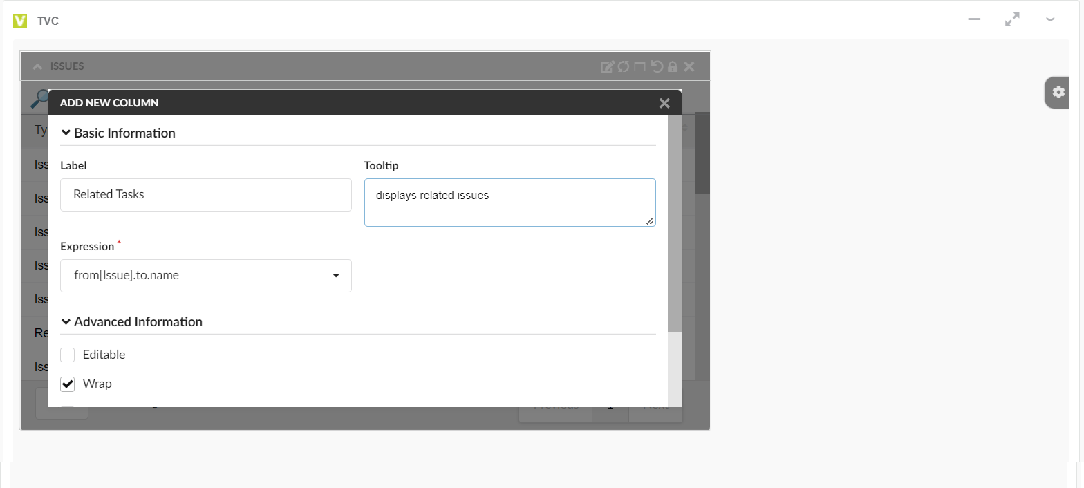
Figure 15. Create new Column from Add advance column
Refer the below image where Issue tablewidget with new columns are configured.
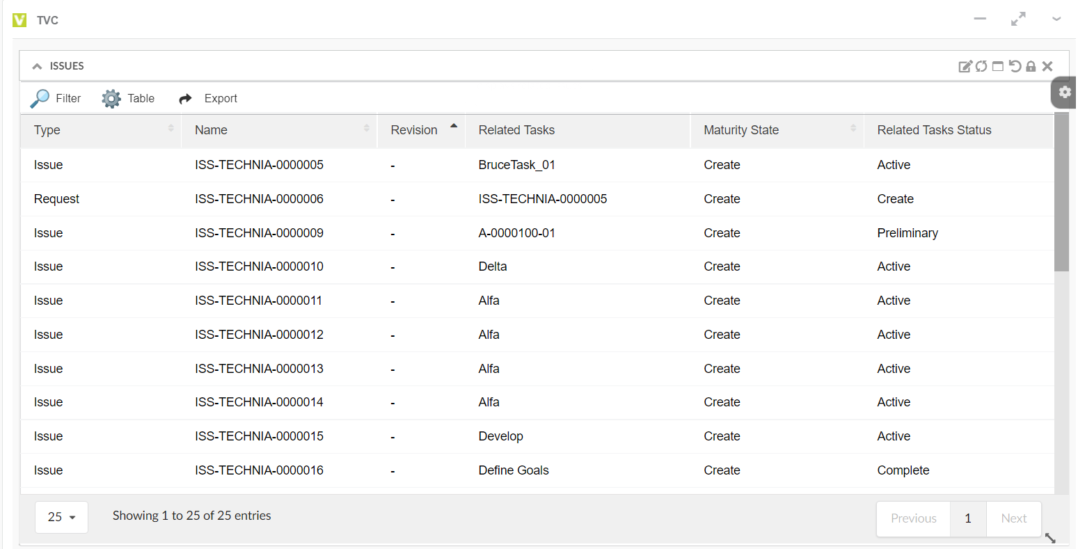
Figure 16. New TableWidget created for Issue
Widget 2: Create Task TableWidget
Similar to the Issue tablewidget, create a tablewidget for "Tasks" by choosing the "Task" as datasource and the Create New table option enabled.
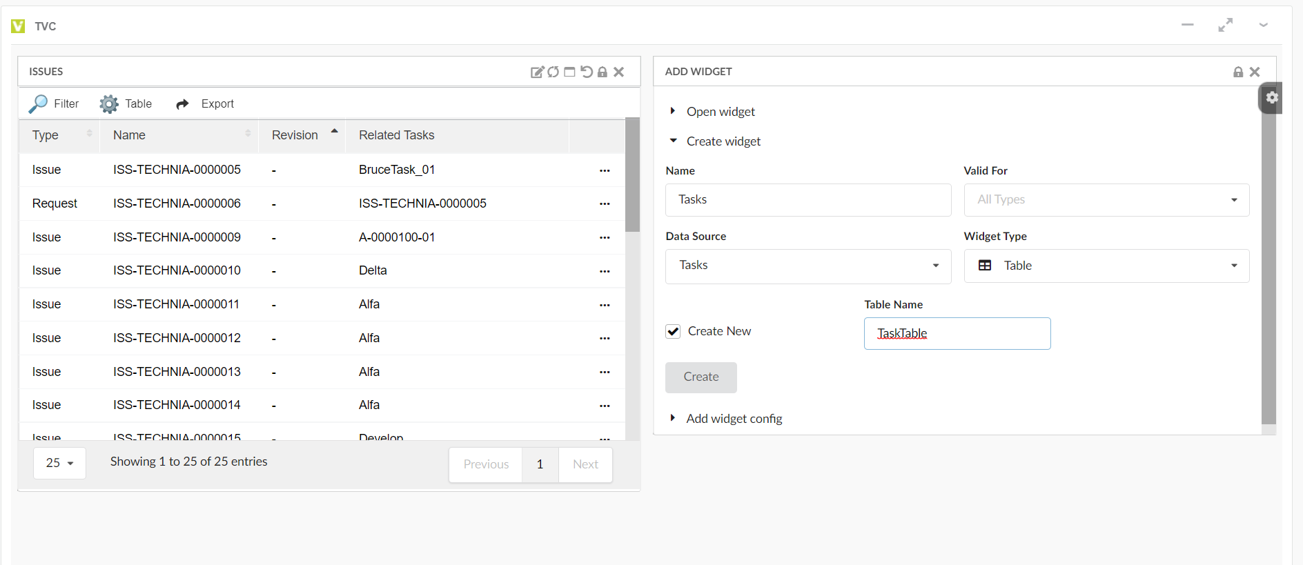
Figure 17. Create Task TableWidget
Choose the datasource as Tasks and create a new tablewidget for "Task"
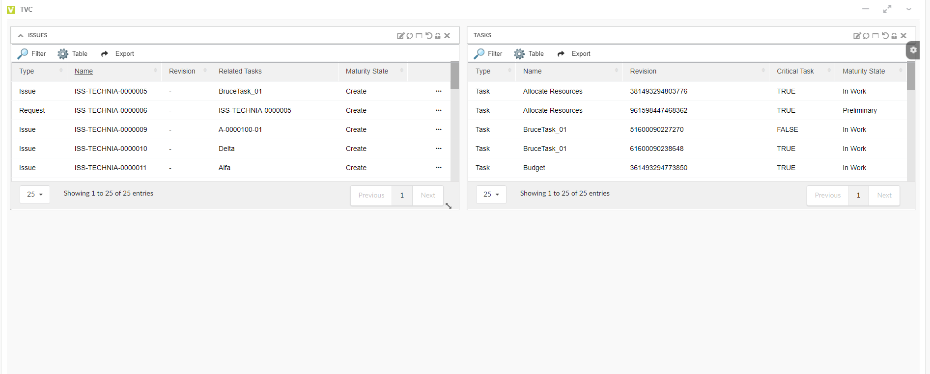
Figure 18. Task TableWidget
Widget 3: Create Issue priority ChartWidget
Add a new chartwidget by selecting the widget type as "Chart" in create widget screen.
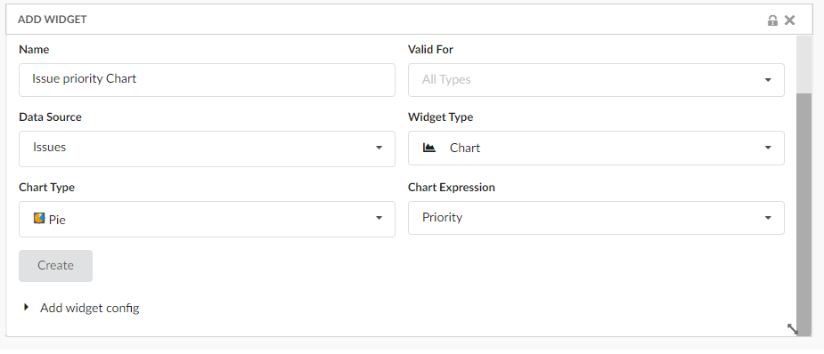
Figure 19. Create Chart Widget
Now, the "Project Dashboard" is created in the DRAFT state with 3 widgets in it. And it is ready to promote to an active state and share with end-user
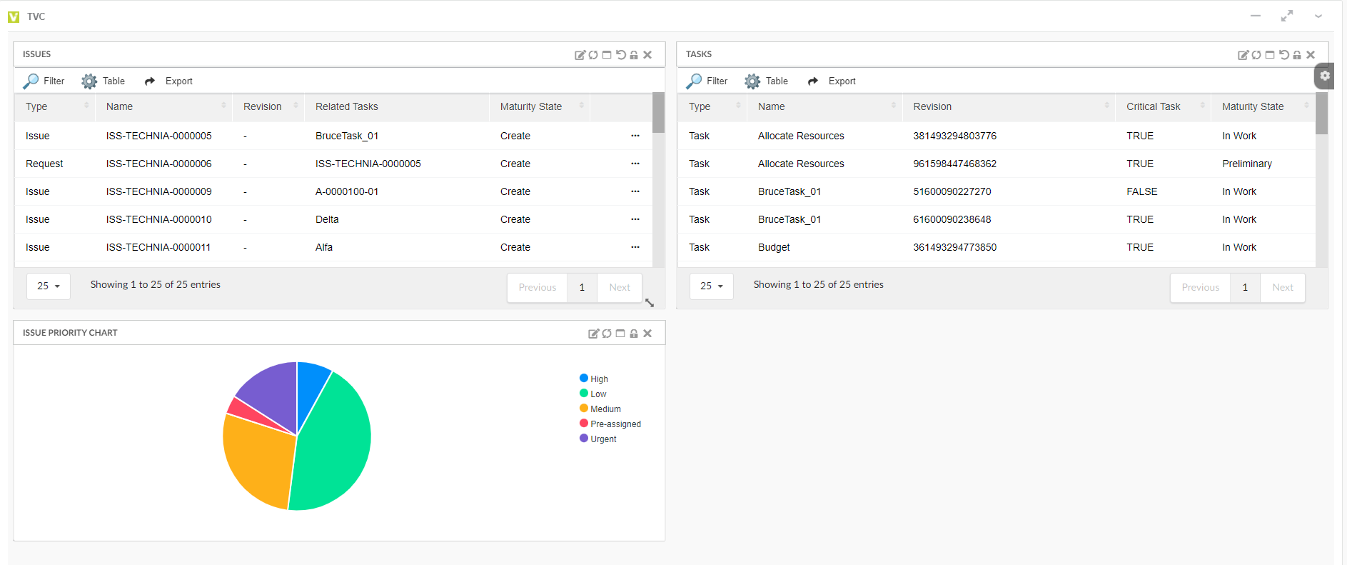
Figure 20. Draft Project Dashboard
1.4.4. Step 4/4 - Activate and Share dashboard with end-user
Promote the created dashboard to an active state and share it with end-user
By default, the configured "Project Dashboard" will be in the draft state. Before we share it with the end-user, promote it to the active state. while Promoting the "Project Dashboard" config, all the related configuration objects (such as Widget, Table, Tablecolumn, and Dataset objects) will be auto promoted to active state
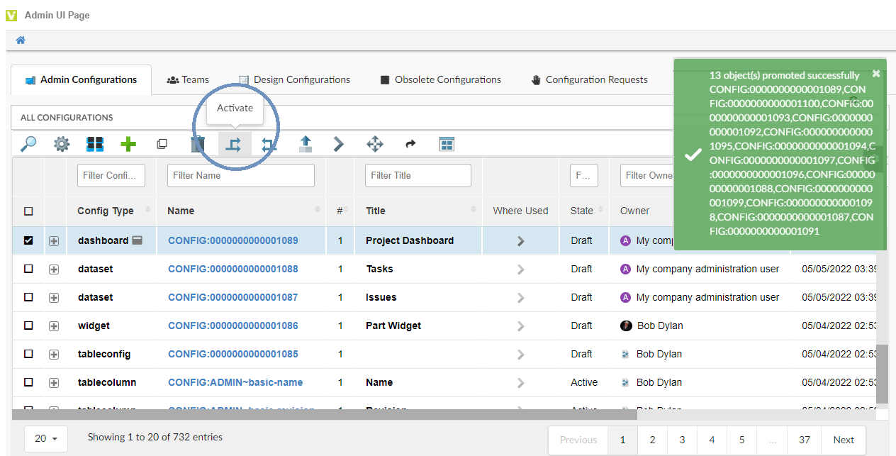
Figure 21. Promote the Draft Dashboard
Share the "Project Dashboard" configuration which is in an active state with the end-user using the Share Command. Once it is shared, end-user will be notified about the new configuration shared. See EndUser - Shared Configurations to know how the shared dashboard is accepted and used by enduser.
If config-admin need to make any further changes to the shared dashboard, the configuration object has to be revised.
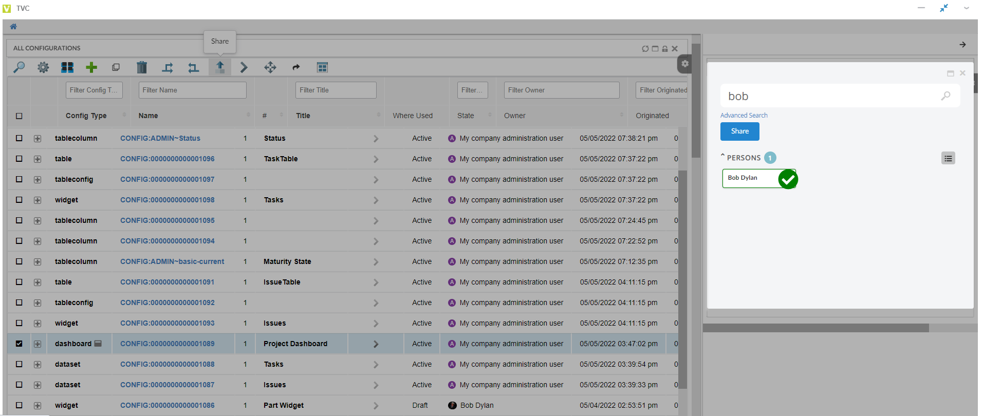
Figure 22. Share the Project Dashboard
1.5. Revise Shared Dashboard
Once the configuration object is shared with the end-user, the admin cannot make any further changes to the shared configuration object. To make any changes, the configuration object has to be revised.
Consider a scenario where the end-user has requested to include one more tablewidget "Risk" in the shared project dashboard. For such a scenario, the admin can revise the project dashboard’s configuration object and add a new tablewidget for displaying the risk objects. It involves 4 major steps like
-
Revise project dashboard
-
Create a new dataset for listing "Risk" objects
-
Create a new tablewidget "Risk" on the revised dashboard
-
Promote the revised dashboard to active state.
1.5.1. Step 1/4: Revise project dashboard
Revise the "Project Dashboard" config using the revise command in Admin UI.
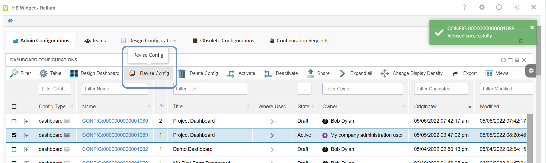
Figure 23. Revise the Project Dashboard
Once the revised object is created, launch the revised dashboard using the preview icon, or open it from the 3DD widget preference page by choosing the revised project dashboard object.
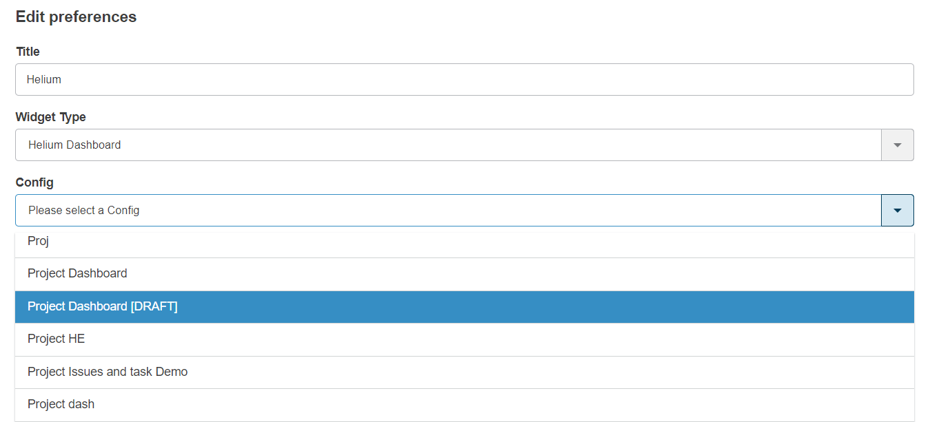
Figure 24. Choose revised Project Dashboard
On the revised "Project Dashboard", config-admin can add new widgets as per the user requirement.
1.5.2. Step 2/4: Create new dataset "Risk"
To create a "Risk" tablewidget, a new dataset is required to list "Risk" objects. Use the below configuration and create the dataset with name "Risks".
<?xml version="1.0" encoding="UTF-8"?>
<DataSet>
	<Inquiry>
		<Code>temp query bus Risk * * where "owner == context.user" limit 25 select id dump |</Code>
		<Format>${OID}</Format>
		<Pattern>*|*|*|${OID}</Pattern>
	</Inquiry>
</DataSet>
1.5.3. Step 3/4: Create new tablewidget "Risk"
Open the revised project dashboard which is in the draft state from the 3DD widget preference page or using the launch icon and create new widget "Risks" by choosing the already created dataset "Risks"
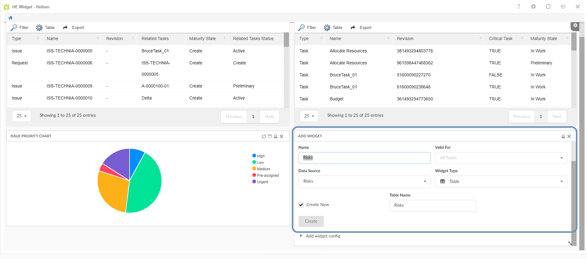
Figure 25. Add Risk Widget on revised Project Dashboard
Config-Admin can choose to re-arrange the widgets as per the need on the "Revised Dashboard". Once the Risk widget is added, "Revised Dashboard" is ready to promote. Please refer the below image for the final view of the Revised Dashboard.

Figure 26. Revised Project Dashboard with Risk tablewidget
1.5.4. Step 4/4: Promote Revised dashboard
Promote the revised object from Admin UI.
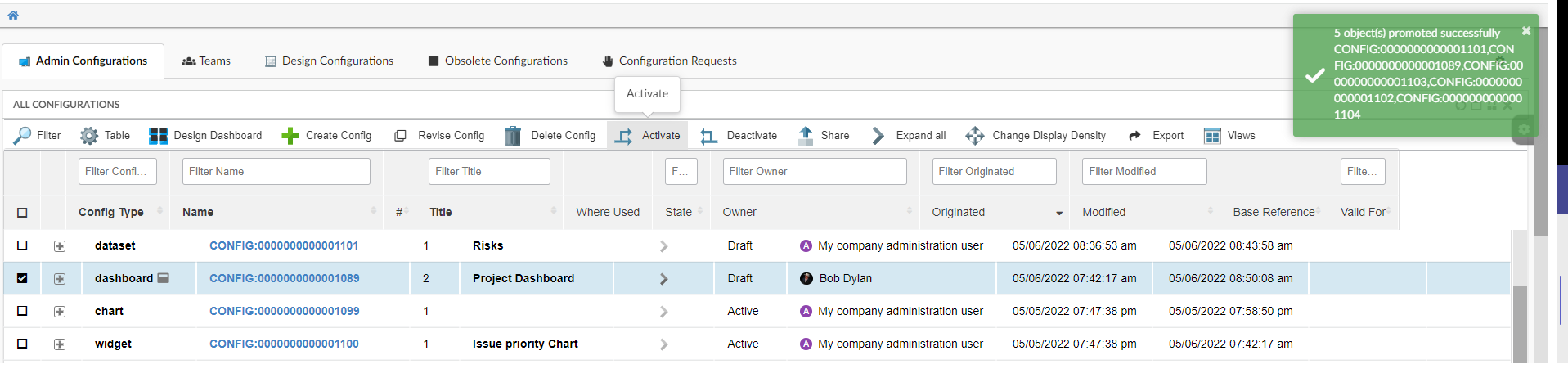
Figure 27. Revised Project Dashboard with Risk tablewidget
Once the revised object is promoted to the active state, the previous revision will be auto promoted to the obsolete state. End-user will be intimated about the revised "Project Dashboard". And the revised dashboard will reflect in the end-user UI automatically without end-user’s intervention.
1.6. Create and Share Widget
Consider a scenario where the end-user has requested for a "Issue" tablewidget to add in his dashboard.
Config-Admin can start with creating new dataset for listing the "Issue" dataset
1.6.1. Step 1: Create dataset
Create a "Issues" dataset with below configuration as shown in image.
<?xml version="1.0" encoding="UTF-8"?>
<DataSet>
	<Inquiry>
		<Code>temp query bus Issue * * where "owner == context.user" limit 25 select id dump |</Code>
		<Format>${OID}</Format>
		<Pattern>*|*|*|${OID}</Pattern>
	</Inquiry>
</DataSet>
Figure 28. Create dataset configuration
Validate configuration using Validate option. Refer Validate XML against XSD section.
1.6.2. Step 2: Create Widget
Create new or launch an existing empty dashboard. See Create and Preview dashboard section.
In the opened dashboard, add tablewidget to list "Issue" objects. Refer Create Issue TableWidget section to create a Issue tablewidget and configure new columns to the tablewidget.
1.7. Configure Form Widget
Config admin can create Form Widget and add to the helium dashboards as like the Table Widget and Chart Widget.
To configure a formwidget, config admin needs two config objects namely Form Config and Widget Config.
These configs can be created through the command "Create Config" in Config Admin UI page.
1.7.1. Create Form
As a first step, create the form config object with a form XML configuration as shown in the image.
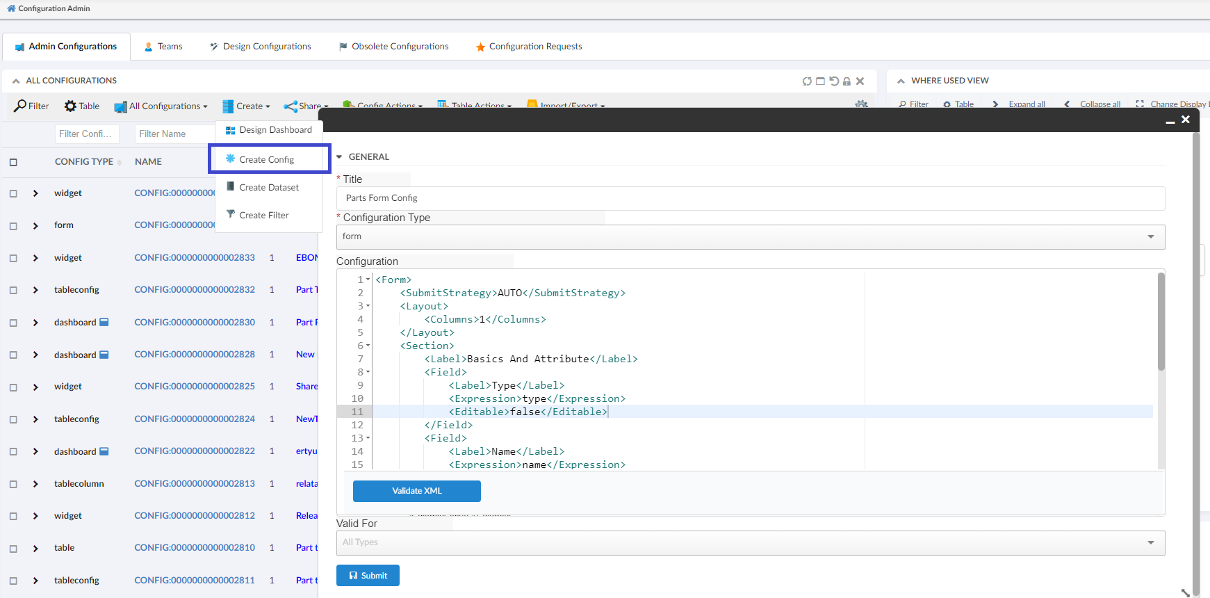
Figure 30. Create Form config with form XML configuration
Sample form XML configuration
<Form>
<SubmitStrategy>AUTO</SubmitStrategy>
<Layout>
<Columns>1</Columns>
</Layout>
<Section>
<Label>Basics And Attribute</Label>
<Field>
<Label>Type</Label>
<Expression>type</Expression>
<Editable>false</Editable>
</Field>
<Field>
<Label>Name</Label>
<Expression>name</Expression>
<Editable>false</Editable>
</Field>
<Field>
<Label>Revision</Label>
<Expression>revision</Expression>
<Editable>false</Editable>
</Field>
<Field>
<Label>State</Label>
<Expression>current</Expression>
<Editable>false</Editable>
</Field>
<Field namespace="hex:engineering" name="EstimatedCost.xml" />
</Section>
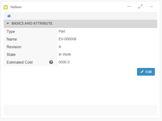
</Form>1.7.2. Create FormWidget
As a second step, config admin can create widget config by pointing to the form config create at the first step.
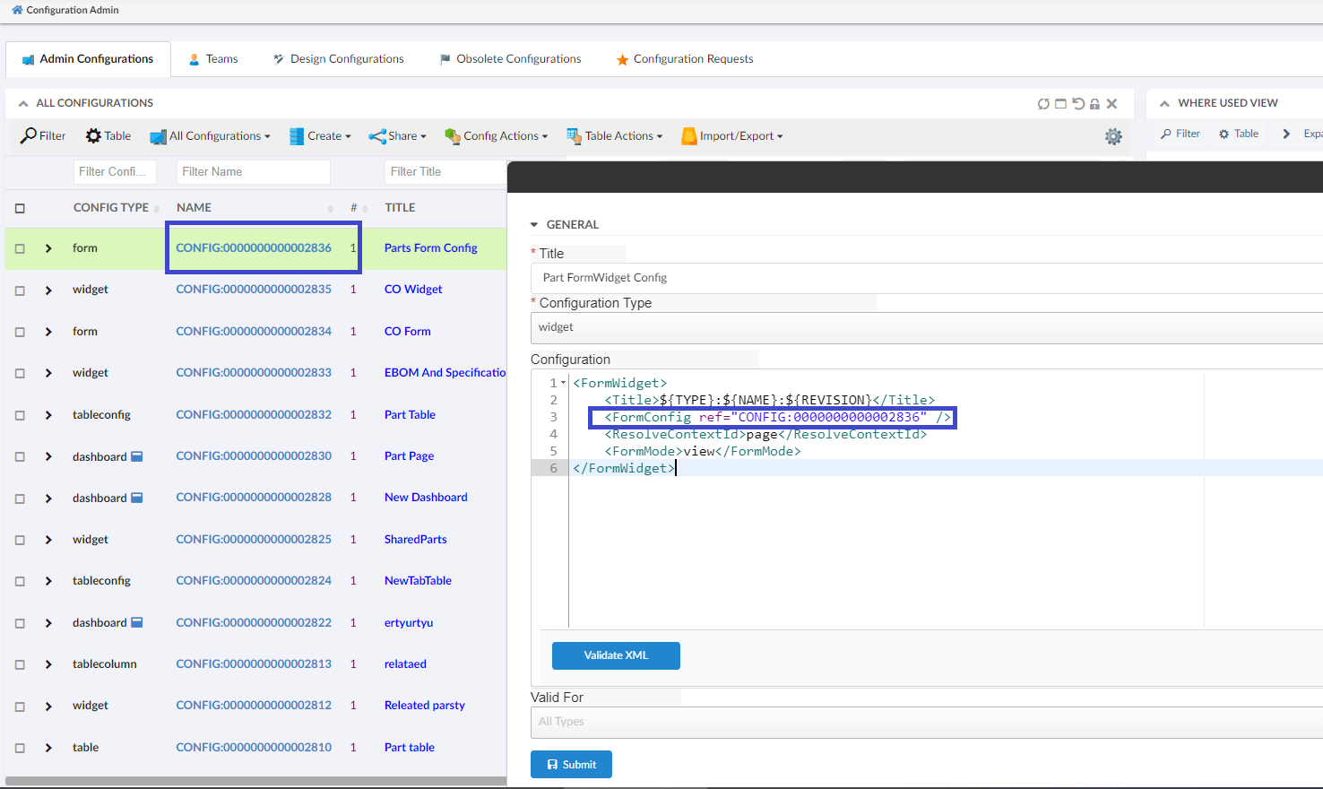
Figure 31. Create formwidget pointing the created formconfig
Sample FormWidget XML configuration
<FormWidget>
<Title>${TYPE}:${NAME}:${REVISION}</Title>
<FormConfig ref="CONFIG:00000000000" />
<ResolveContextId>page</ResolveContextId>
<FormMode>view</FormMode>
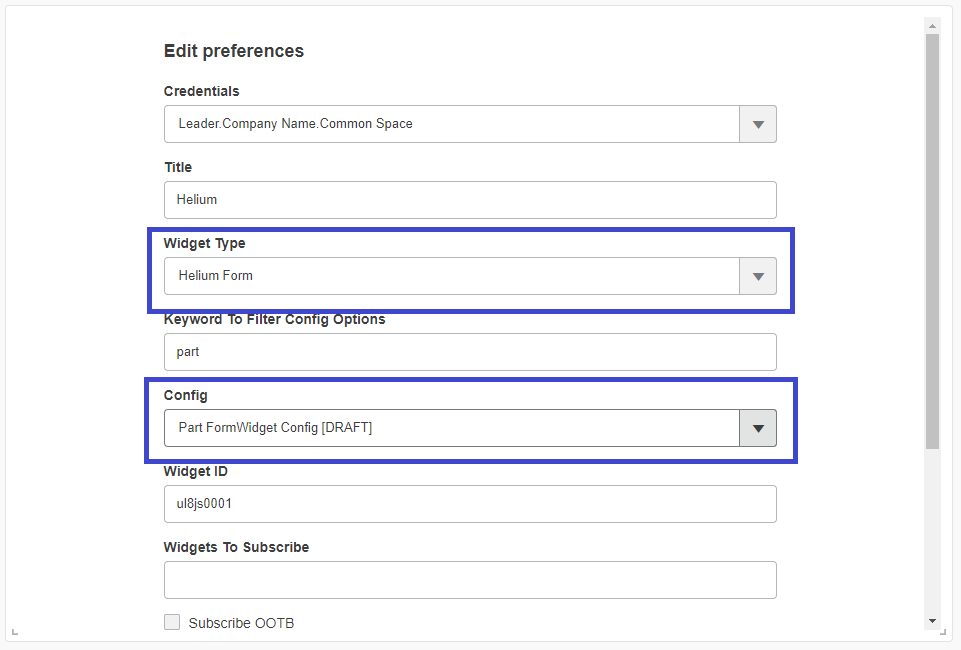
</FormWidget>1.7.3. Add FormWidget to helium dashboard
The formwidget can be added to the helium dashboard as like the table widget and then the Helium dashboard can be viewed from 3DD widgets.
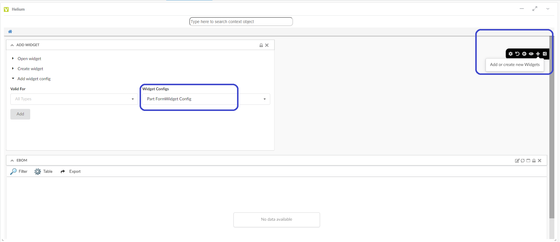
Figure 32. Add FormWidget to existing dashboard
Once the formwidget is added and the context object is set to 3DD Widget, the complete dashboard with formwidget can be viewed from 3DDashboard.
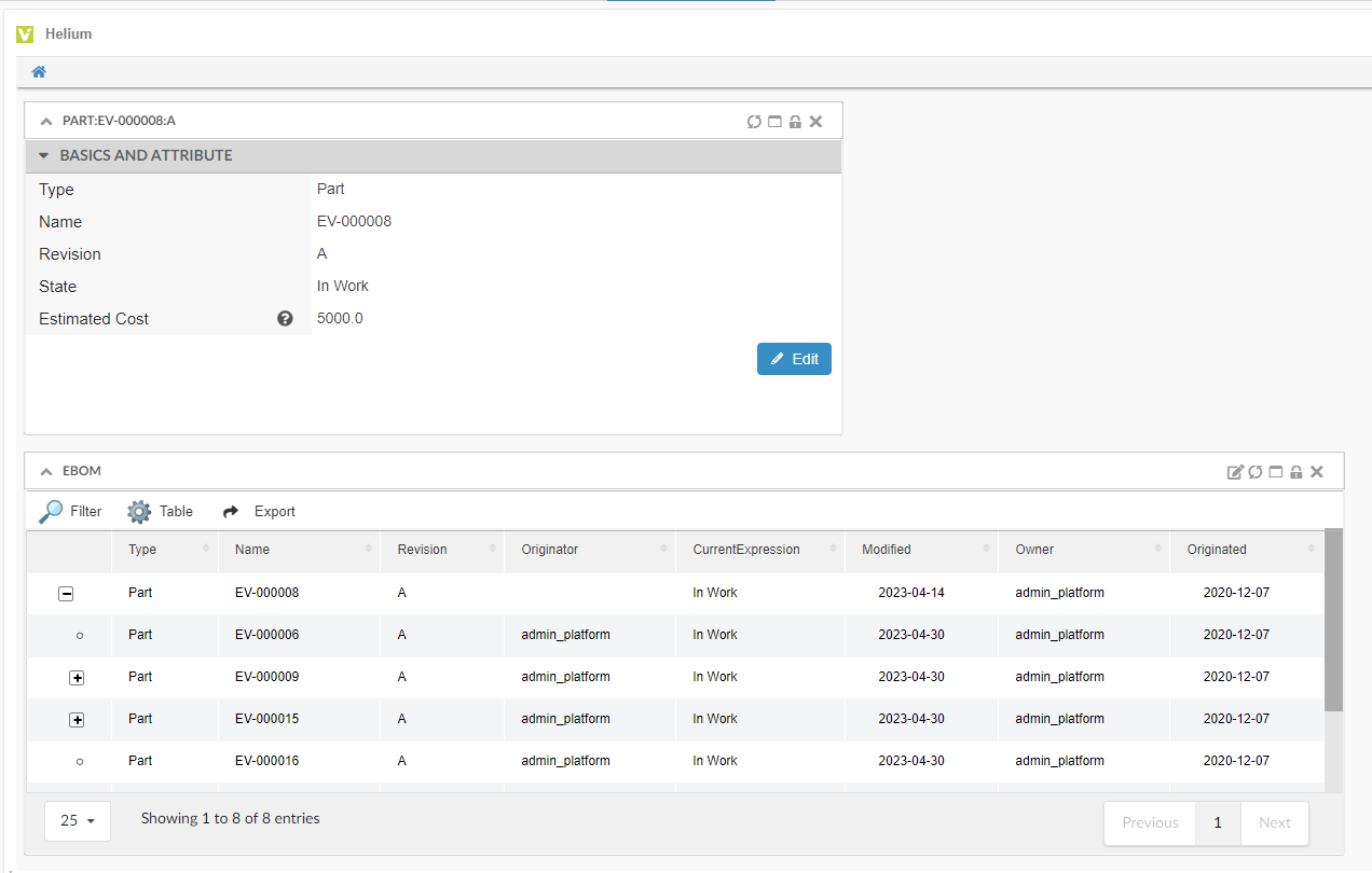
Figure 33. Add FormWidget to existing dashboard
1.8. Dataset
Datasets are used to retrieve data for the table and chart widgets. In-App-Designer supports all the existing tags and configuration of Dataset.
Depending on how it is designed Dataset query can cause performance issues. For example a query like temp query bus Part * * will likely cause system failure as it tries to query all parts in system, which can be in million for some companies. Therefore, we have by default restricted access to create Dataset to only system or business admin.
This can be disable using the key tvc.enduser.dataset.limitToAdmin in tvc.properties. The valid value is either true or false and the default value is true.
In Inquiry and Query dataset, type as a wildcard i.e * is not allowed, but this can be disabled using the key tvc.enduser.dataset.disallowWildcardInType in tvc.properties. The valid value is either true or false and the default value is true.
1.8.1. Save Search Criteria as Admin/End-user Dataset
NSX search form provides an easy way in UI to define a dataset. This allows end-users to directly use search/search results as datasets.
There are three options to save the search/search result.
-
Save Search
-
Save As Datasource
-
Save As Admin Datasource (only admin can access)
Save As Datasource : User can save the search/search result as dataset and use in create widget form.
Save As Admin Datasource: Admin can save the search/search result as dataset and can be shared with other users.
Also, admin can create admin dataset configs which can be used for designing the widget in draft state.
1.8.2. Create dataset and filter inline create widget screen
| This feature is introduced from 2023.1.0 release. |
To configure the widgets in a dashboard, it is a prerequisite to have the datasets and filters ready before creating the widgets. From release 2023.1.0, it is not mandatory to have the preconfigured datasets and filters. Instead, config-admin can choose to create the dataset and filters from within the create widget screen as shown in the image.
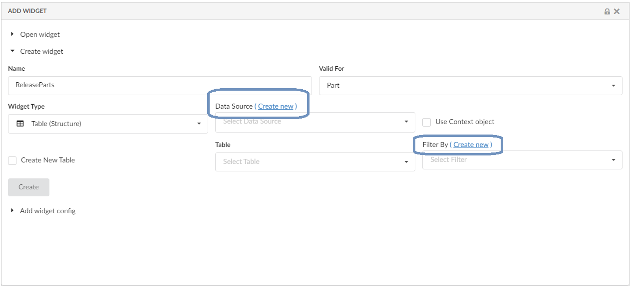
Figure 36. Inline Create Dataset and Filter
Refer the video where the dataset and filter are created and edited from the create widget screen.
Validate Inquiry-based dataset
The config-admin can set up the dataset by using the "Create Config" and "Create Dataset" commands from the admin-UI. We have introduced a "Validate Inquiry" button in the create/edit forms of dataset configs, to verify the query performance used in the dataset.
To measure the performance, Config-admin can set a time limit by which the query is expected to execute.
If a query is taking more than the defined time limit, it will be flagged as bad performing query.
By default the time limit is set as 2 seconds. It can be modfied by setting a property tvc.core.inappdesigner.validateInquiry.timeLimitInSeconds in tvc.properies file.
This feature enables the config-admin to assess the performance of a widget when it is loaded with the validated dataset. And by optimizing the query, the config-admin can ensure the best possible performance.
Create Dataset screen with Query performance
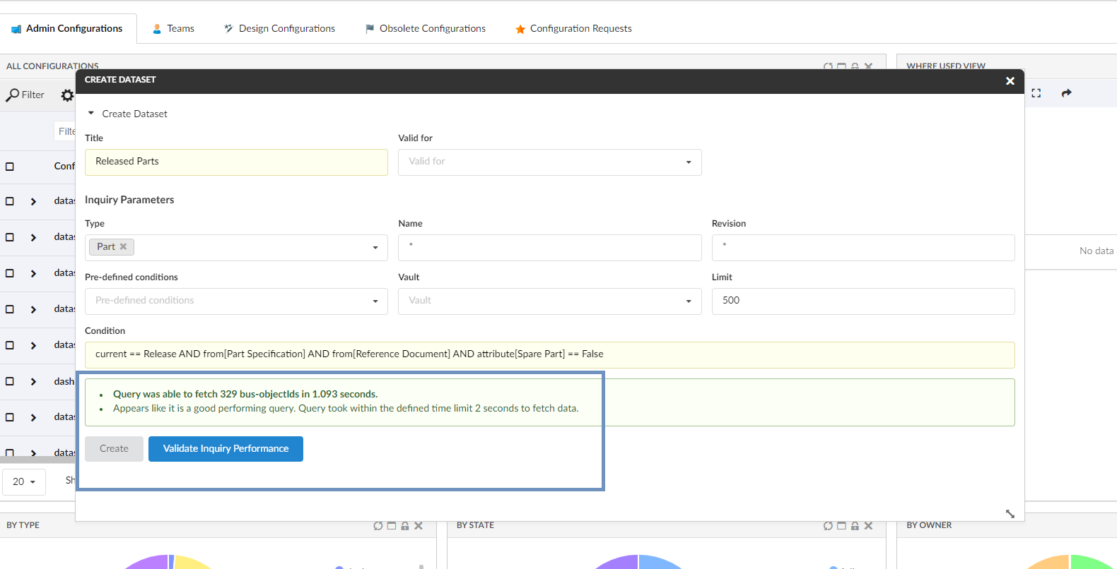
Figure 37. Query performance within defined time limit
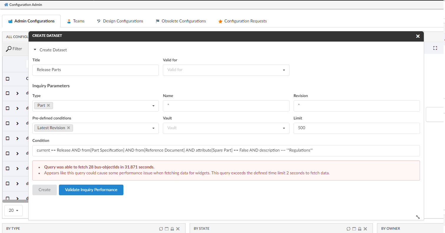
Figure 38. Query that exceed defined time limit
Edit Dataset screen with Query performance
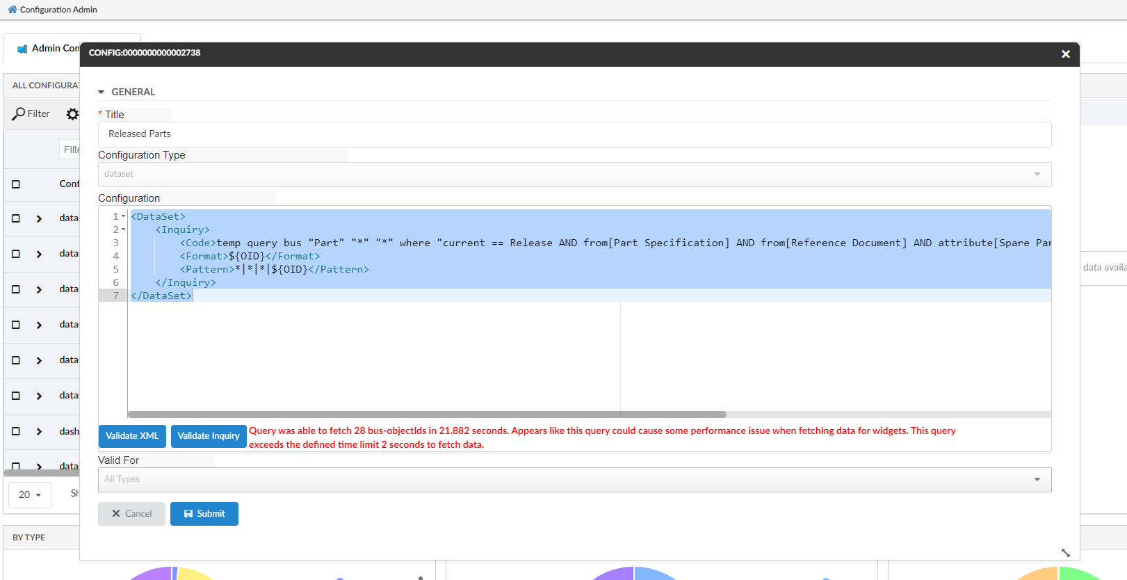
Figure 39. Edit Dataset - Query that exceed defined time limit
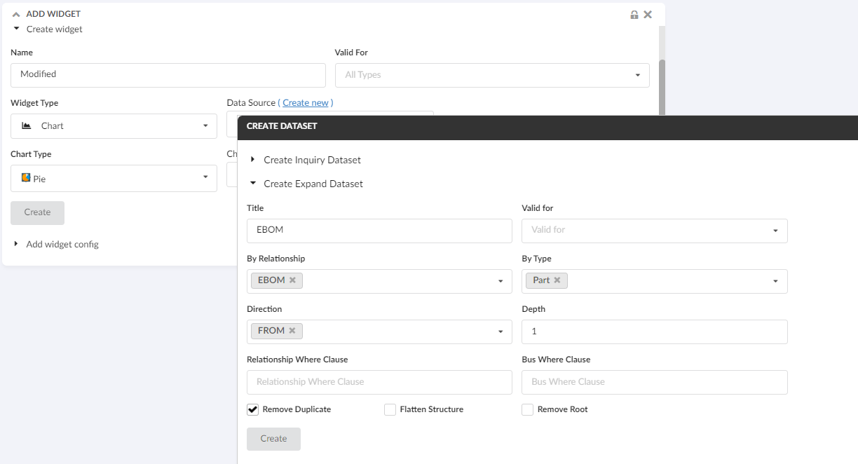
1.9. Configure Chart Widget with Expand Dataset
With the support of expand dataset and create expression links on the create widget screen, it is made easy to configure a chart widget based on objects related to the context object.
The linked video illustrates a scenario in which the context part is expanded via the EBOM relationship and a PIE chart is generated using the 'material category' attribute of the child parts.
1.10. Expression
Admin can create expression by choosing selectexpression as a Configuration Type and any valid expression in Configuration.
Currently table column can be created with direct attributes on table objects like 'Material Category' for Parts, however it may be needed to add coumn to show related object data like state of connected part specification. User can create such expression and that expression can be used to create column to show the related object state.
These expressions can also be used to create charts in create chart wizard.
Expression example:
<Expression>from[Part Specification].to.name</Expression>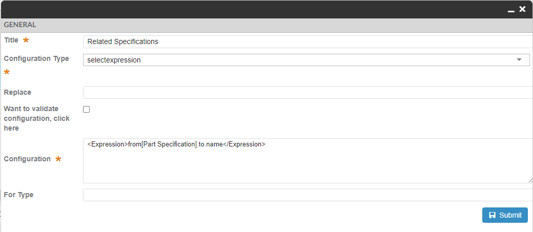
Figure 41. Expression Create Config
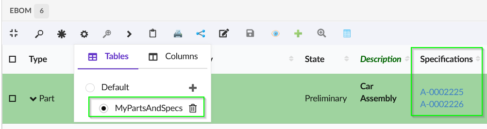
Figure 42. Add Select Expression Column
1.11. Column Configurator
The Column configurator menu is responsible for selecting or removing columns from the table structure.
Config-admin can add, remove and update columns in a table from the existing list of attributes based on objects present in table including the unified type and interface attributes.
It is also possible to exclude some attributes from the addable list by adding following init-param in web.xml:
tvc.core.attributes.excludedAttributesIt accepts comma-separated attribute names to be excluded. Furthermore, attribute labels support localization through framework properties.
In datatable toolbar :
<TableConfigurator />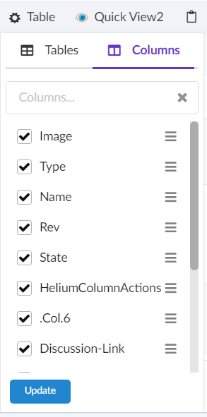
Figure 43. Columns menu
There are two ways of adding a new column to the existing table. Config-admin can simply check one/more columns from the existing list or use Add Advanced Column icon to add column with more custom settings.
The table below shows and explains the available settings in advanced mode:
| Field | Value | Notes / Description |
|---|---|---|
Name |
String |
The name appears as table column header |
Description |
String |
The description acts as tooltip for column header. |
Expression |
String |
The expression field provides a list of attributes to select from for the column data. |
Template |
String |
The list of templates if configured. Refer Choose template to a Column section. |
Is Relationship Select Expression |
True or False |
whether the select expression pertains to the business-object itself or to its relationships. |
Valid For |
String |
The list of types to specify the column belongs to which type. |
Is Editable |
True or False |
Whether the column should be editable or not. Default is false. |
InputType |
String |
List of input types to select from in case of editable field. E.g. If the attribute is of date format, you can select date as input type which will present a date picker to choose from in edit mode. |
No Wrap |
True or False |
Whether the content of column should be wrapped. Default is true. |
Filter |
True or False |
Whether column should have its own column filter. Default is false. |
Sortable |
True or False |
Whether column should be sortable or not. Default is true. |
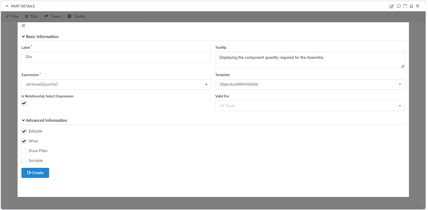
Figure 44. Add Advanced Column form
After addition user can delete the column by unselecting it and update by using the pencil icon next to column item in the menu. Edit form provides same properties as add advanced form.
1.11.1. Add more column link
More columns can be added using property tvc.helium.tableconfigurator.showMoreColumnsLink which can be set as true or false as per requirement. The default value is true thus making the Add more columns link visible inside the table-configurator menu. It is also visible for config-admin when the table is in draft state.
| Add more columns link is not visible for default table |
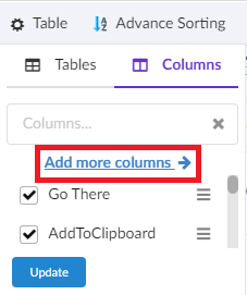
Figure 45. Add more columns link
1.11.2. Expression support in advanced column
Now end-users can write an expression in the advanced column. This feature will facilitate end-user to write their expression to display the related object information in a table column. This can be enabled by adding the property tvc.helium.tableconfigurator.writeExpression.enabled = true in TVC.properties file. The default value for this property is false.
| This feature needs to be enabled with caution and it is expected that the user knows the concept of Enovia MQL selects to use this feature. |
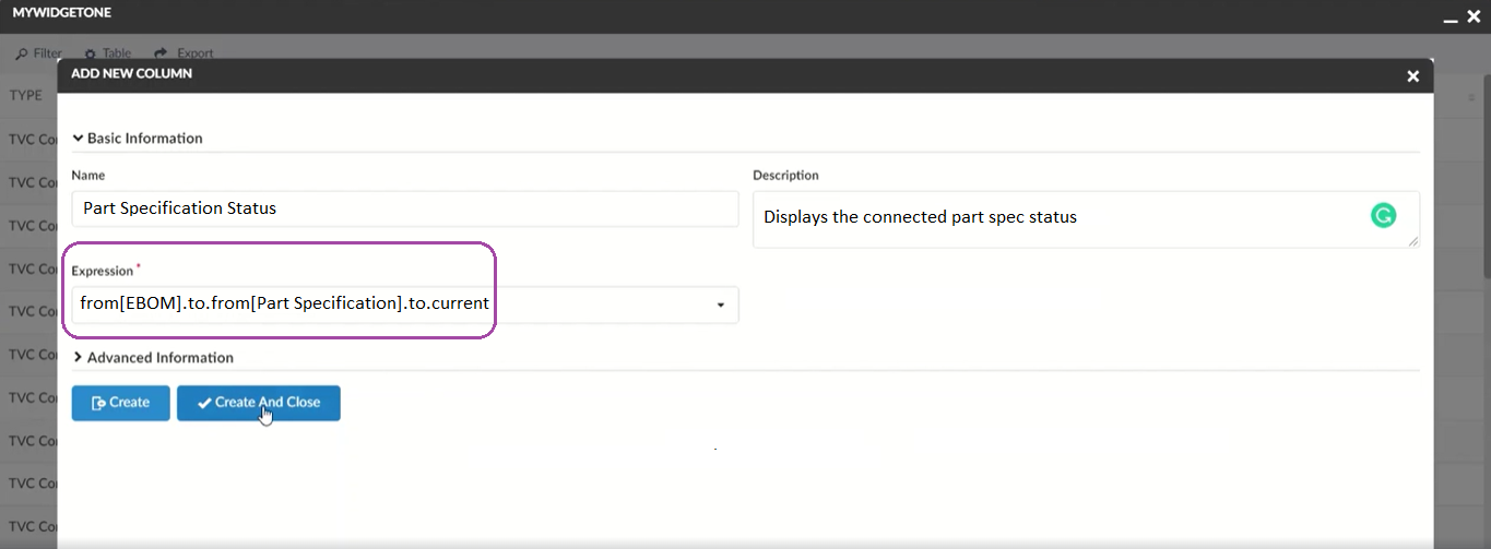
Figure 46. Write expression for Column
1.11.3. Expression and Attributes as column
In-app designer enables config-admins and end-users to select the business-object and relationship attributes. Additionally config-admin can create expression using the advanced column link in the table configurator.
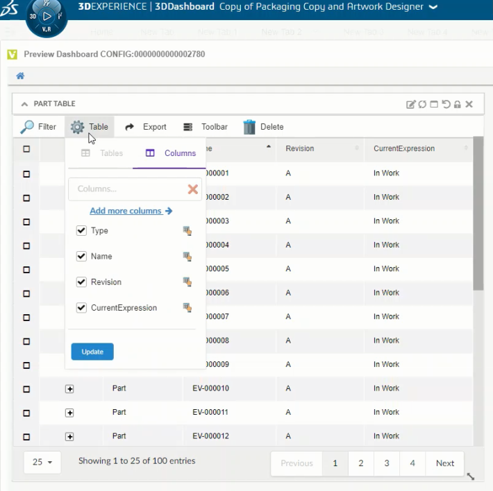
Figure 47. Advanced Columns
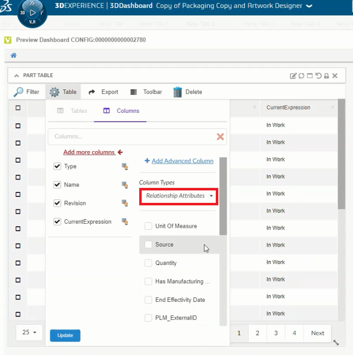
Figure 48. Relationship Attributes
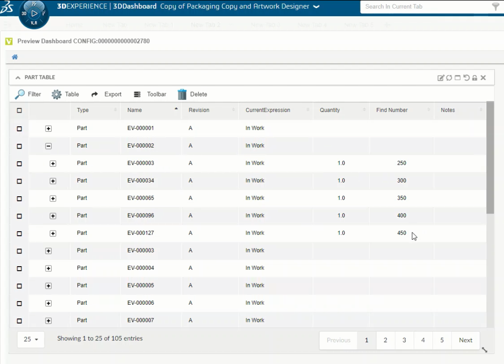
Figure 49. Relationship Attribute as columns
If any relationship attribute is selected, its value can be seen upon expanding the parent business object. We are enabling to add relationship attributes as columns as well. For example user can now add EBOM relationship attributes like - Find Number, Quantity when using a structure table.
1.11.4. Column configuration with inline script
| This feature is introduced from 2023.1.0 release. |
Introducing in new column type helium-script to write a script in the column’s expression tag.
This feature reduces the developer’s effort in writing the java based data handlers for simple data manipulation.
For example, consider a scenario where you want to have a table column named "No. of Child Parts" to display the number of child parts available for assembly and the consolidated EBOM quantity.
In the column’s expression tag, you can add a selectable and javascript logic to perform such data manipulation.
For our example scenario, the column configuration with expression tag can be,
 <Column usesBusinessObject="false">
    <Name> No. of Child Parts </Name>
    <Label> No. of Child Parts </Label>
    <ColumnType>helium-script</ColumnType>
    <Expression><![CDATA[
                <BusSelect varName="childnames" iteratable="true" >from[EBOM].to.name</BusSelect>
                <BusSelect varName="qtys" iteratable="true">from[EBOM].attribute[Quantity]</BusSelect>
                <RelSelect varName="relName">name</RelSelect>
                <Script>
                    var childCnt = 0;
                    while (childnames.hasNext()) {
                    childnames.next();
                    childCnt++;
                    }
                    var totalQty = 0;
                    while(qtys.hasNext()) {
                    var qty = parseInt(qtys.next());
                    totalQty = qty + totalQty ;
                    }
                    write(childCnt+ " ("+relName+") Childs with total Qty "+totalQty);
                </Script>
        ]]></Expression>
    </Column>
1.11.5. Expression tag components
| This feature is introduced from 2023.1.0 release. |
| XML Tags | Description |
|---|---|
|
Specifies the businessobject selectables.
|
|
Specifies the relationship selectables. The XML attributes are similar to BusSelect tag. |
|
Under Script tag, javascript logic can be added using the "varName" assigned in BusSelect and RelSelect tag.
The in-built method |
1.12. File based Configurations in JSON
Config-admin can configure the file based configurations to list under create widget form using the TVC_InAppConfigurations.json file
If the json file (with name TVC_InAppConfigurations.json) is not configured, a few pre-built file based configurations will be displayed in the create widget form as shown below. To add or remove the file-based configs from the create widget dropdown, config-admin can create and configure them in TVC_InAppConfigurations.json in WEB-INF/classes/.
| TVC_InAppConfigurations.json.sample file with the built-in file-based configurations, is available in WEB-INF/classes/ folder. Config-admin can rename the sample JSON file and add more or remove existing file-based configs. |
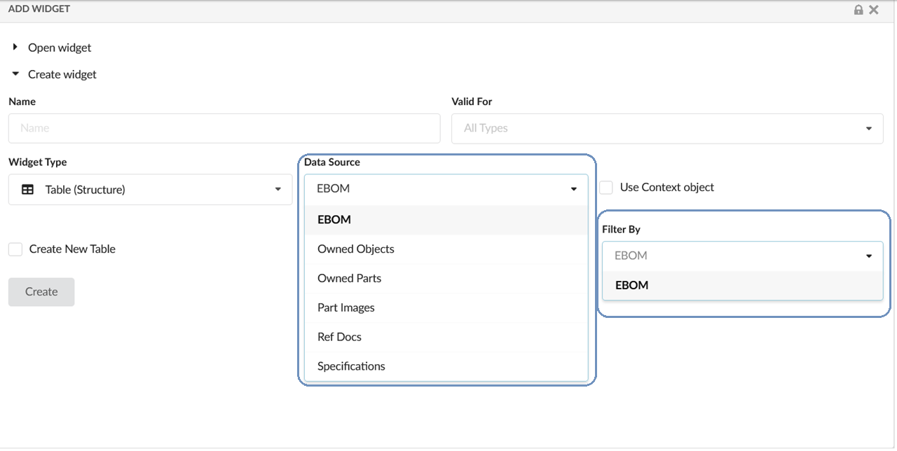
Figure 50. Pre-built Configs if TVC_InAppConfigurations.json is not configured
Also Valid For can be defined as mapping for XML-based configs in a TVC_InAppConfigurations.json file. This allows the admin to decide which all XML-based configs can be used as In-App configs and also makes it easier to filter using the valid for at UI level.
Sample configurations: you can find the TVC_InAppConfigurations.json.sample file in WEB-INF\classes
//TVC_InAppConfigurations.json
{
  "datasets": {
    "Part": [
      {
        "label": "com.technia.inapp.dataset.label.ebom",
        "value": "tvc:dataset:hex:engineering/EBOM.xml"
      }
    ],
    "Document": [
      {
        "label": "com.technia.inapp.dataset.label.specifications",
        "value": "tvc:dataset:hex:engineering/Specifications.xml"
      }
    ]
  },
  "templates": [
    {
      "label": "ObjectLink",
      "value": "helium/templates/table/object-link"
    },
    {
      "label": "ObjectLinkWithAltOid",
      "value": "helium/templates/table/object-link-with-alternate-oid"
    }
  ]
}| Config Name | Description | Example |
|---|---|---|
datasets |
The json config which contains datasets specific to a particular valid for type to show in datasource field in create/edit widget form. |
|
templates |
The list of column templates to show in create/edit form of the advanced column. refer End User Defined Columns section. |
|
Internationalization Support: In the config file, the label could also be a string resource property key for internationalization.
The concept of Valid For is extended to datasets. Using JSON mapping, the file-based dataset can be listed in the Create Widget form.
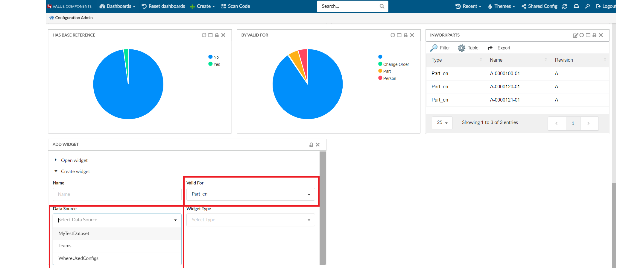
Figure 51. Dataset Results based on validFor
1.13. Configure toolbar commands
| This feature is introduced from 2023.1.0 release. |
Config-admin can now add the built-in toolbar commands to the widgets that is being configured. The toolbar menu will appear only in the draft state for the config-admin. Config-admin can choose the command for the configuring widget and share it with the end-users. The end-user can use these commands on the selected BusinessObjects.
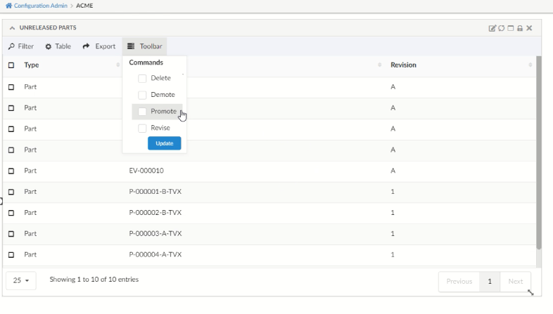
1.13.2. Built-in commands for Structure Table:
The Structure table will have "ExpandAll" and "CollapseAll" in addition.
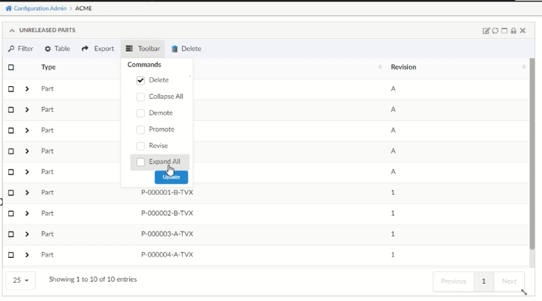
Figure 53. In-built toolbar commands for Structure Table
These built-in toolbar commands are mapped in TVC_InAppConfigurations.json.
Config-admin can also include new commands to this JSON file and make it available in the configuring widgets.
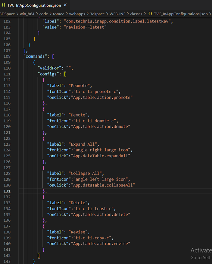
Figure 54. In-built Toolbar commands mapped in JSON
1.14. Choose template to a Column
By applying the template to a column, the user can change the look and feel of a column.
There are some situations where the user likes to see column data more effectively.
-
Identify all the approved tasks by colour.
-
Differentiate the priority of an object using the appropriate colour.
-
On clicking on the column value, Open the connected object.
-
Show an icon when a part is connected to a specification.
-
Open the side panel and show object information in a dashboard.
Users can address all these situations by applying templates to a column.
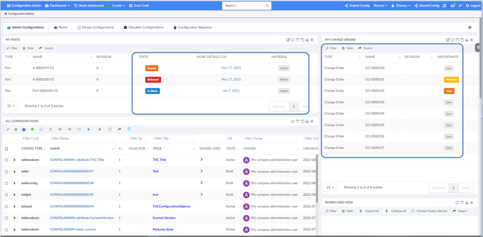
Figure 55. Choose Template To Column
A new template field is introduced in advanced column form to choose a template.
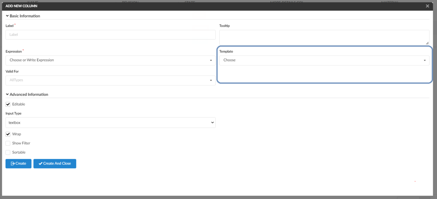
Figure 56. New Template Field
Template Creation: Admin can create any handlebar template and configure in TVC_InAppConfigurations.json file.
Refer InApp Configurations with Valid-For Support section for more details.
{{!--
  Sample Handlebars template that can be applied to columns in a datatable.

  Available variables are:
  - object
  - row
  - cell

--}}
    <a href="javascript:App.routing.open('{{row.objectId}}');">{{cell.value}}</a>
1.15. Preselected Valid-For in Add Widget
For context pages like Part or Product, the widget will show related information. Therefore, it is good to pre-populate valid for with the context object type.
When the user is in the context of any object, the valid For field is preselected with context object type.
It is also possible to change Valid For to any other value.
This helps to eliminates the unrelated configs from the config list.
1.16. Manage Admin Configs
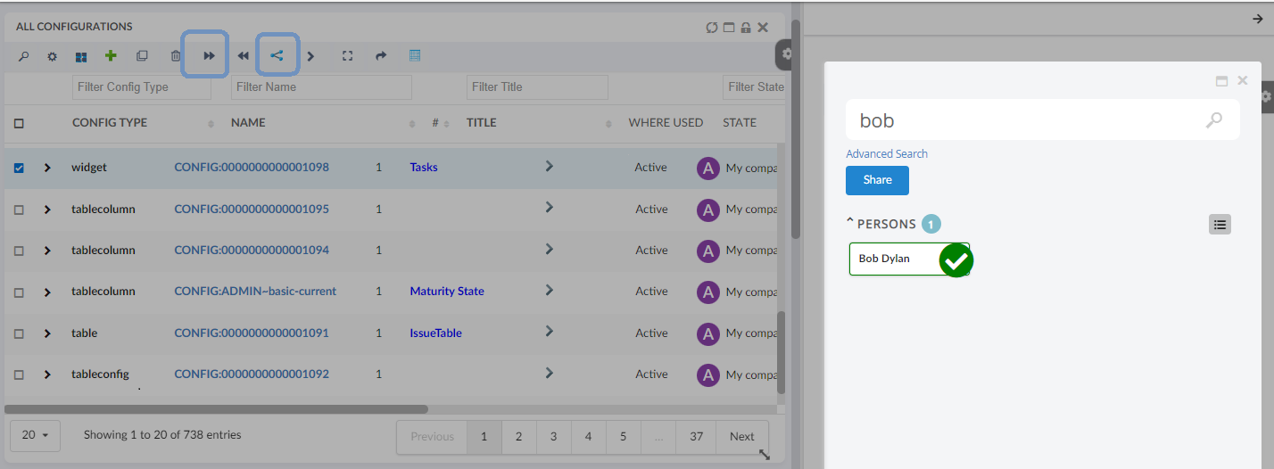
1.16.1. Share/Unshare configs with end-user and teams
Admin user can share created config definitions with end users and teams. To perform this, user can select the configuration from Configurations table and click on the Share command in toolbar. This will open Shared With widget in the sidepanel to allow admin to share/unshare configuration with end users and teams.
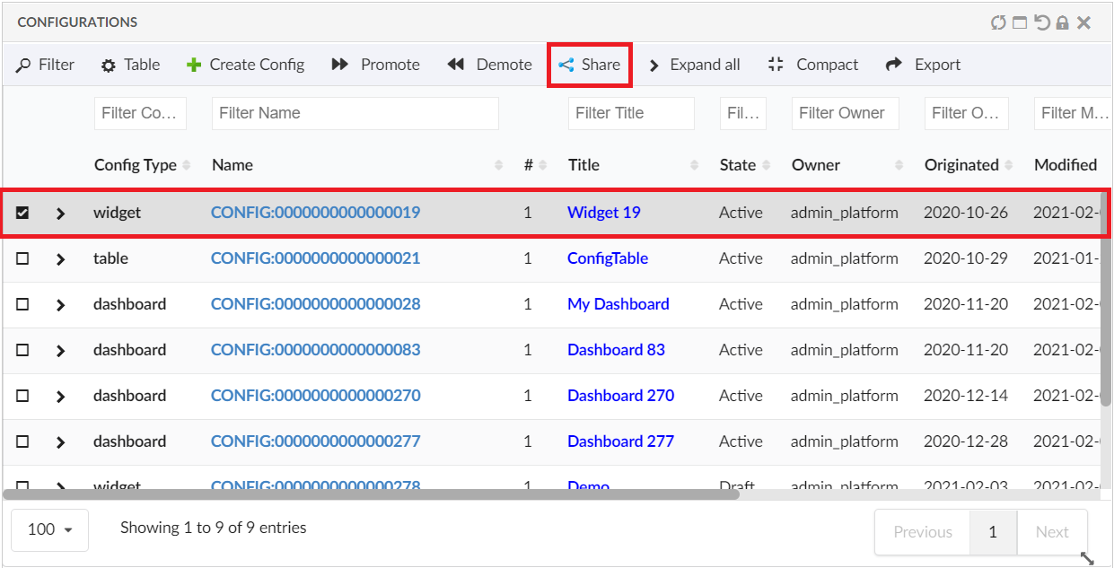
Figure 57. Configuration List
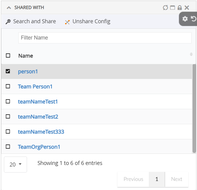
Figure 58. Share with widget
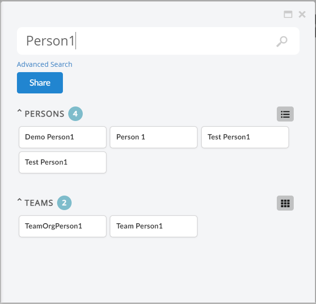
Figure 59. Search and share config with end user and team
1.16.2. Revise configs
Admin can revise the shared config objects which are already shared to enduser.
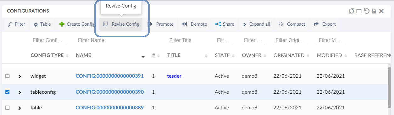
Figure 60. revise shared config
Admin can update the configuration changes on the created new revision and promote it to active state. Once the new revision is promoted to active state, the previous revision which is shared to end user will be auto-replace by new active revision. And the previous revision will be auto-promoted to obsolete state.
1.16.3. Delete Draft Configs
Config-Admin can choose to delete the draft configs if it is no more required.
| Only the draft configs are allowed to delete. |
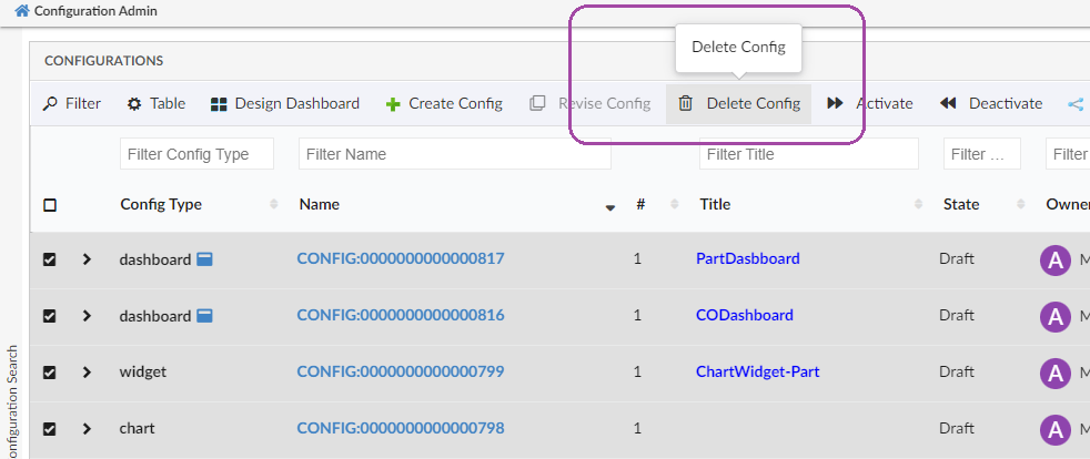
Figure 61. Delete Config
1.16.4. Autopromote Child Configs
When the Dashboard is activated, all its child components like widgets, tables, tablecolumns, and datasets will be auto promoted to an active state.
1.16.5. Preview dashboard Configs
Admin can preview the configured dashboard before sharing with end users. From release 2021.4.0, admin can preview the Draft dashboards also. This is to facilitate admin to make changes on draft dashboard as required before promoting to active and share with end user.
1.17. Validate XML against XSD
Admin can validate XML in both create and edit config forms using validate option.
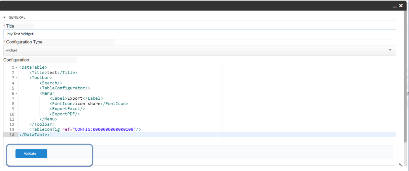
Figure 62. Validate Config
Sample XML to validate:
<DataTable>
    <Title>MyPartsTable</Title>
    <Toolbar>
        <Search/>
        <TableConfigurator/>
        <Menu>
            <Label>Export</Label>
            <FontIcon>icon share</FontIcon>
            <ExportExcel/>
            <ExportPDF/>
        </Menu>
    </Toolbar>
    <TableConfig ref="CONFIG:0000000000000108"/>
</DataTable>
Refer this video for more details:
1.18. Notifications
The Email notification will be sent to the user when an admin share or unshare the configurations and Also, on activation of a new revision of configuration which is already shared.
Email Notification requires the MX_SMTP_HOST is configured and users have valid email address.
Email Notification Handler uses templates configured in string resources.
Following are the default template property keys used for workflow email notifications.
tvc.inappdesigner.email.share.to.user.message =

tvc.inappdesigner.email.share.to.user.subject =

tvc.inappdesigner.email.unshare.to.user.message =

tvc.inappdesigner.email.unshare.to.user.subject =

tvc.inappdesigner.email.revision.active.to.user.message =

tvc.inappdesigner.email.revision.active.to.user.subject =

tvc.inappdesigner.email.share.to.team.message =
Following are the MACROs that can be used as $(MACRO) in the email templates.
TITLE
CONFIG_TYPE
CONTEXT_USER
TO_USER
DATE
Example:
tvc.inappdesigner.email.share.to.user.message = <p>Hello $(TO_USER),</p> \
<p>The Configuration "<strong>$(TITLE)</strong>" of type "$(CONFIG_TYPE)" has been shared with you by "<strong>$(CONTEXT_USER)</strong>" on $(DATE).</p> \
<p> </p> \
<p>Please accept "<strong>$(TITLE)</strong>" to use in your dashboards</p> \
<p> </p> \
<pre><em><sub>This message is system generated and sent by Administrator.</sub></em></pre>
tvc.inappdesigner.email.share.to.user.subject = New Config "$(TITLE)" is Shared1.19. List Accepted Configs in 3DDASHBOARD Widget Preference
Following image of 3DDashboard widget preference shows that user can view their 'Accepted Shared Config' from Helium. Currently configurations of Helium Dashboard, Helium Chart Widget and Helium Table Widget are listed in preferences of TVC widget.
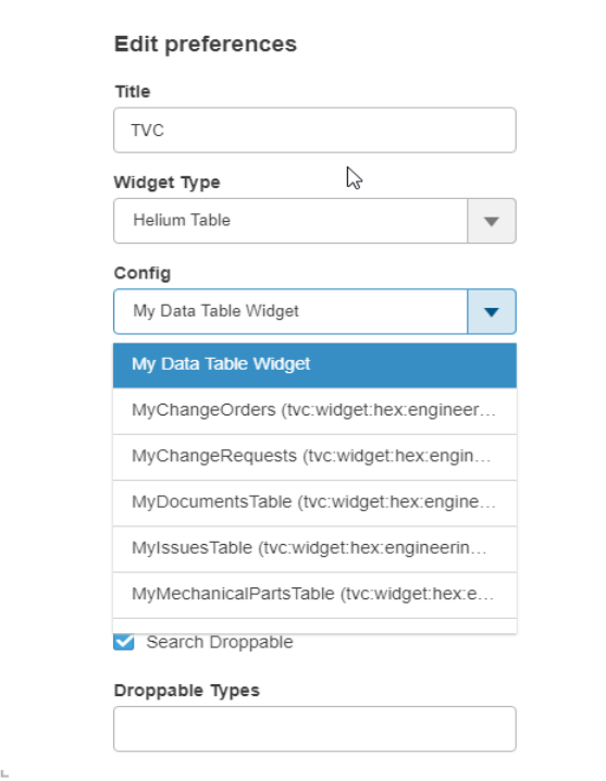
Figure 63. Accepted Shared Data Table widget in preferences
1.20. List Admin Configs in 3DDASHBOARD Widget Preference
Along with viewing Accepted Shared User Definitions, users who have 'TVC Config Admin' role, can view all the Admin Configs in 3DDashboard Widget. To disable this feature, please set tvc.3ddashboard.showAdminEndUserConfigObjects property to false in tvc.properties or web.xml file.
1.21. Export/Import Configurations
| This feature is introduced from 2022.4.0 release. |
In-App-Designer enables config-admins to create or configure dashboards, widgets, and their related configurations from the Config Admin UI page. Now Config-admin can copy the configurations from one environment to another environment using this export/import configuration feature. Using this feature, configs like dashboards or widgets can be configured and validated in pre-prod environments and then these validate configs can be exported and imported to the production enviromment.
1.21.1. Export Configuration
Config-admin can select the configurations from the admin UI and click the export command. The selected configurations will be downloaded as a ZIP file which can be imported into another environment or can be deployed in the web directories by extracting the needed files from the ZIP file.
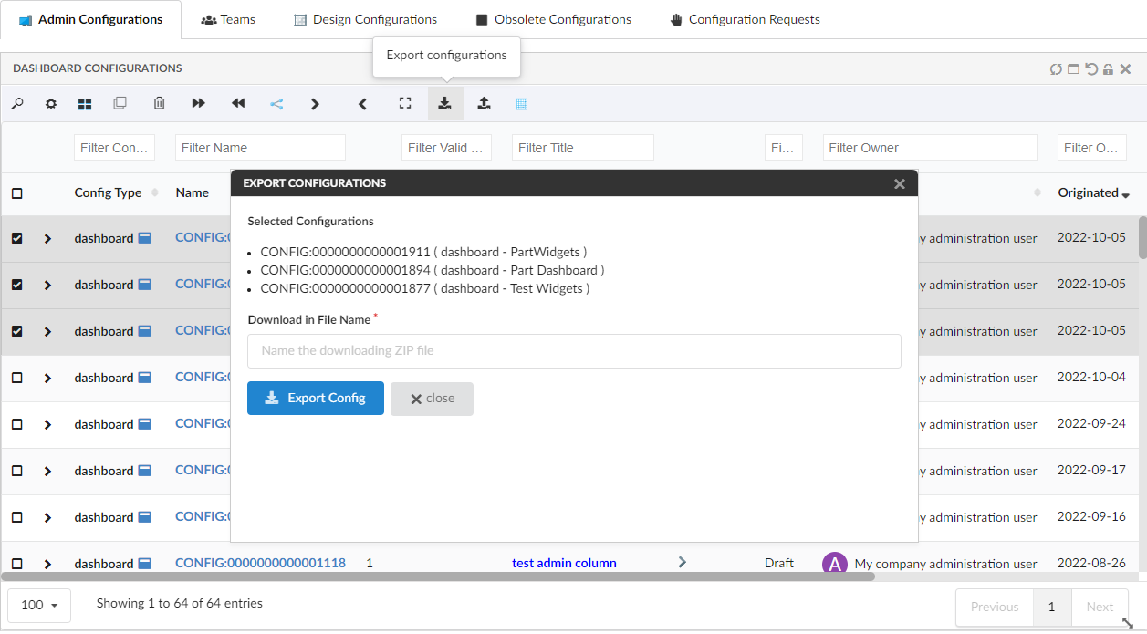
Figure 64. Export Config Form
1.21.2. Import Configuration
The exported file can be imported into the new environment using the built-in command available in the config admin UI. New set of business-objects will be created based on the imported files. These business-objects will be created in the draft state and config-admin can review and activate.
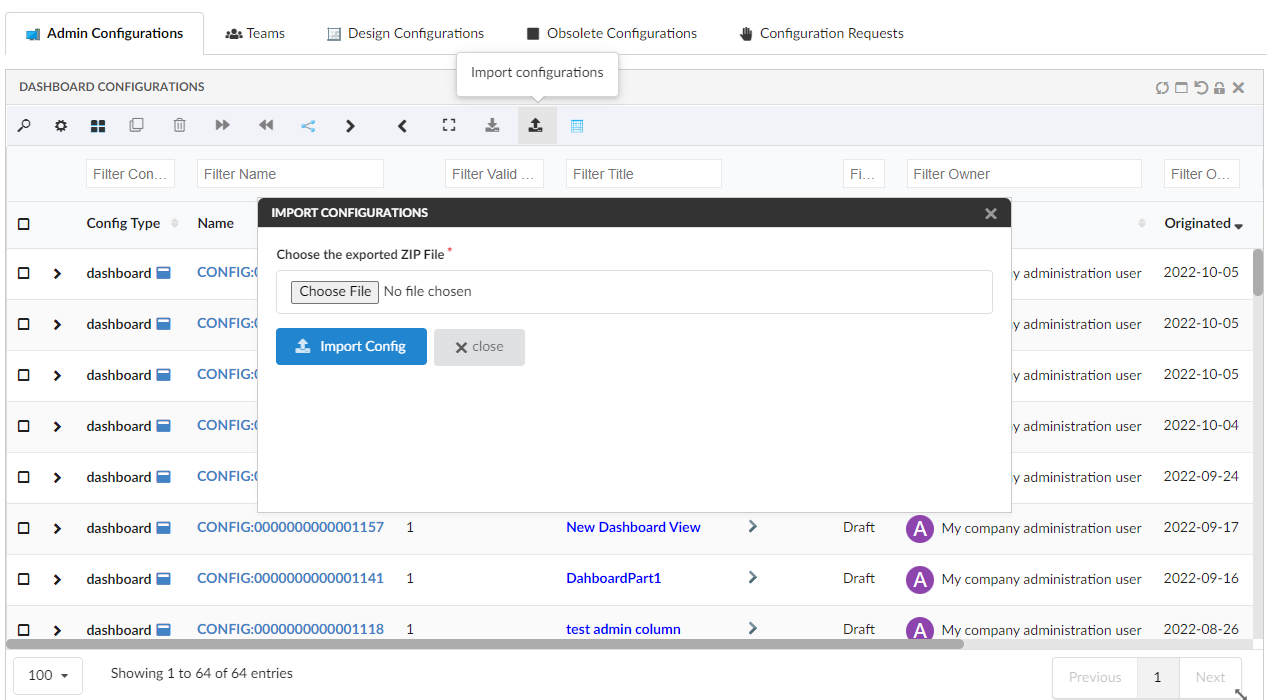
Figure 65. Import Config Form
Moreover, the exported XML files can also be deployed in the web directory and used as the regular file-based configurations. You can extract the needed configurations from the ZIP file and deploy them in the web directory.
Please refer to the video where a dashboard with 4 widgets is exported and imported back.
1.22. Page Config for classic tabs
In this release, enabling config-admin to create/configure helium-page configuration which inturn can be configured in the TVC Classic pages. By this way In-App Designer’s feature can be used in TVC Classic pages also.
By default, helium-page config is disabled to create. Enable it by adding tvc.enduser.page.enableToCreate = true setting in TVC.properies file. By default, this property is set to false
|
Config admin can design a helium-page by configuring dashboards in it and add to the classic or Enovia command to view from the TVC classic page.
Consider a scenario where you want to view drawing print object’s related parts and the related part’s CO. For such scenerio, config admin can configure the related UI using "In-App Designer".
From config-admin page, configure 2 dashboards to display the related parts and the part’s related CO. Then add the created dashboards to the helium-page object in a tabs as shown in the image.
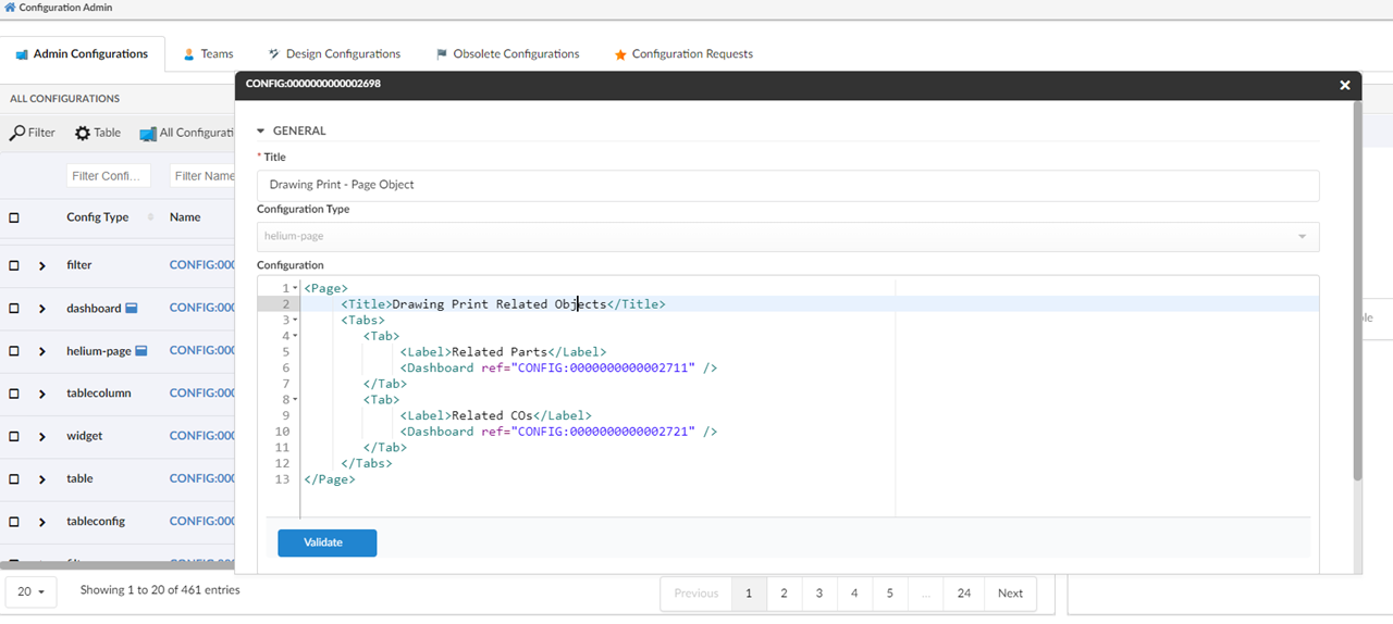
Figure 66. Configure helium-page with the created dashboards
Once the helium-page is created, configure a enovia command or TVC command by pointing the helium-page object in the HREF as shown below. And add the command to the drawing print object’s tree menu.
| The URL parameters used in the href are casesensitive. |
print command DrawingPrintInAppView

command DrawingPrintInAppView
  description config admin configured dashboard view for drawing print type
  label 'Helium View'
  href '${ROOT_DIR}/goto/foo.jsp?embed=true&inAppPage=CONFIG:0000000000002698/Active'
  setting Target Location value content
  nothidden
Once the command DrawingPrintInAppView is configured in menu type_DrawingPrint, the helium-page can be seen as shown in below image
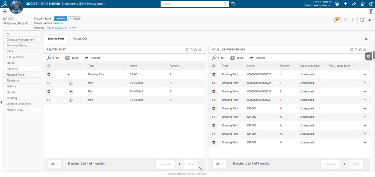
Figure 67. helium-page view configured for Drawing Print
1.23. EndUser
In-App-Designer enables the end users to customize how the content/information should displayed in the application.
End users can accept and apply the configurations shared by config-admin, and enables further customizations at user end as well.
End-user will be notified about the new configuration shared by config-admin. New configuration can be a dashboard, widget, table, tablecolumns or expressions. All the shared configurations will be listed in the Pending Shared Config tab in Shared-Config-UI as shown in image. End-user have to accept the configuration before using it. In upcoming sections, you will be seeing how the shared configs will be used by end-user.
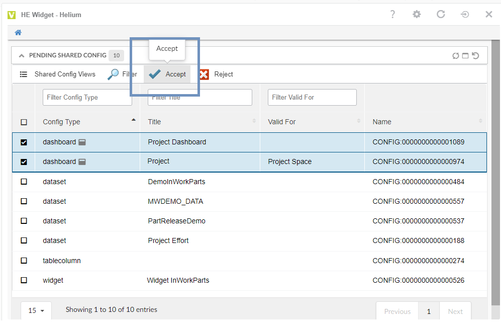
Figure 68. Pending Shared Config UI
1.24. Configure EndUser UI
Using the built-in Shared Config UI page, end-user can
-
View and manage the self created configurations,
-
Create a request for a new configuration (like dashboard, Widget, table, etc) and
-
View and manage the configurations shared by config-admin and the self created configurations.
1.24.1. Configure Shared Config UI in StandAlone Helium Page
In standalone helium page, Shared Config UI can be accessed through the command Shared Configuration. Add this command in Helium.xml file as shown below.
<?xml version="1.0" encoding="UTF-8"?>
<Application xmlns="http://technia.com/helium/Application">
   ...
    <TopBar>
      	...
      <Command>tvc:command:helium:enduser/SharedConfigUI.xml</Command>
   	...
    </TopBar>
<Application/>
In Helium UI, you can see the "Shared Configuration" command in the topbar as shown in the image.
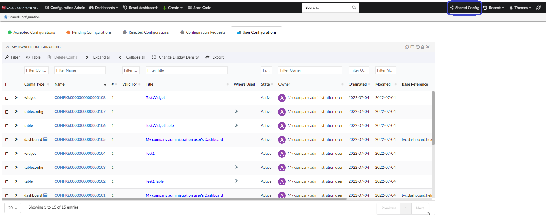
Figure 69. Shared config command and Page
1.24.2. Configure Shared Config in 3DDASHBOARD
In 3DDASHBOARD, create App for Shared Config UI from the "Additional Apps" UI as shown in the image.
Source code URL: https://domain-name/app-name/webapps/HETrueWidget/heliumWidget.html
Configuration file URL: https://domain-name/app-name/webapps/HETrueWidget/configuser/sharedConfigsUI.json
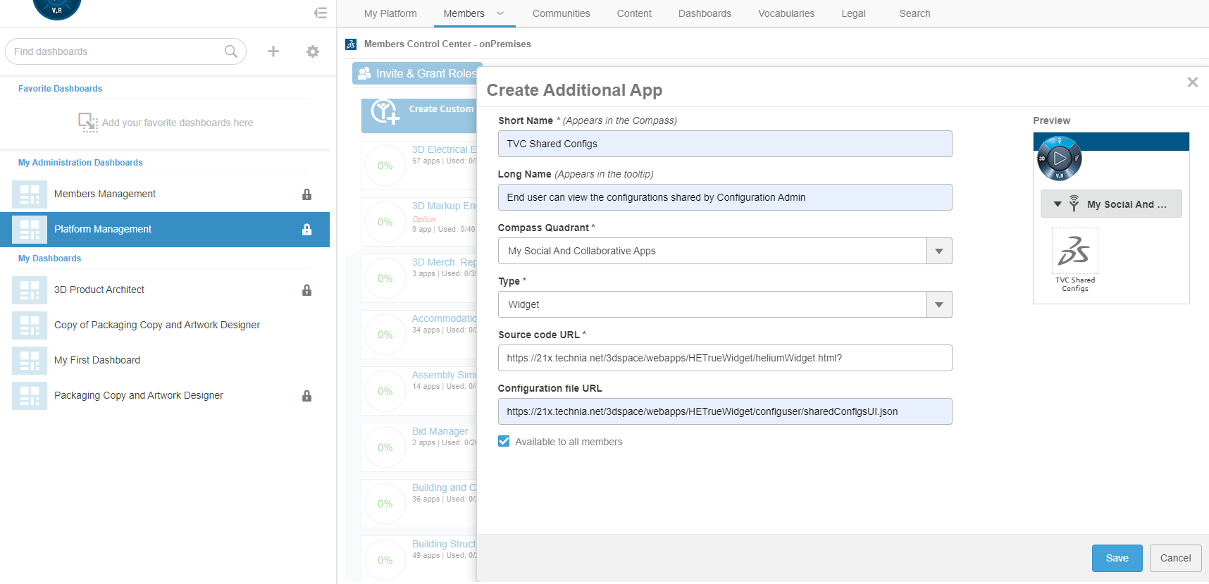
Figure 70. Configure Shared config App
You can also add 3DD widget for Shared Config UI by choosing "SharedConfigUI (tvc:page:helium:enduser/SharedConfigUI.xml)" dashboard in 3DD widget preference page as shown in the image.
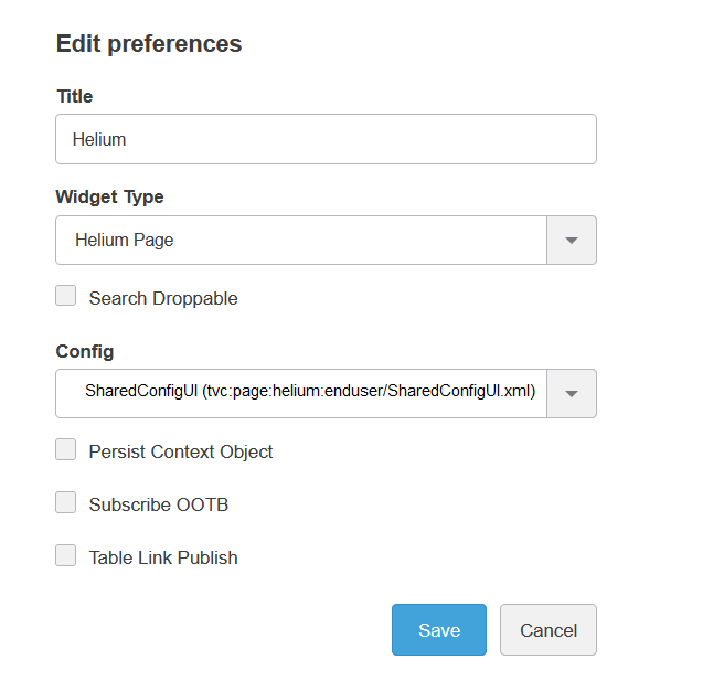
Figure 71. 3DDASHBOARD widget for Shared Conifg UI
1.25. Accept Shared Configurations
There is shared config widget which will be displayed, when user clicks on the configurable Shared Config command present in helium topbar. There are 3 tabs in this widget to display pending, accepted and rejected configurations. User will see all shared configurations in pending tab. Once it is accepted or rejected that will move to accepted or rejected tab.
| All configurations shared with end user’s team are by default in accepted mode. |
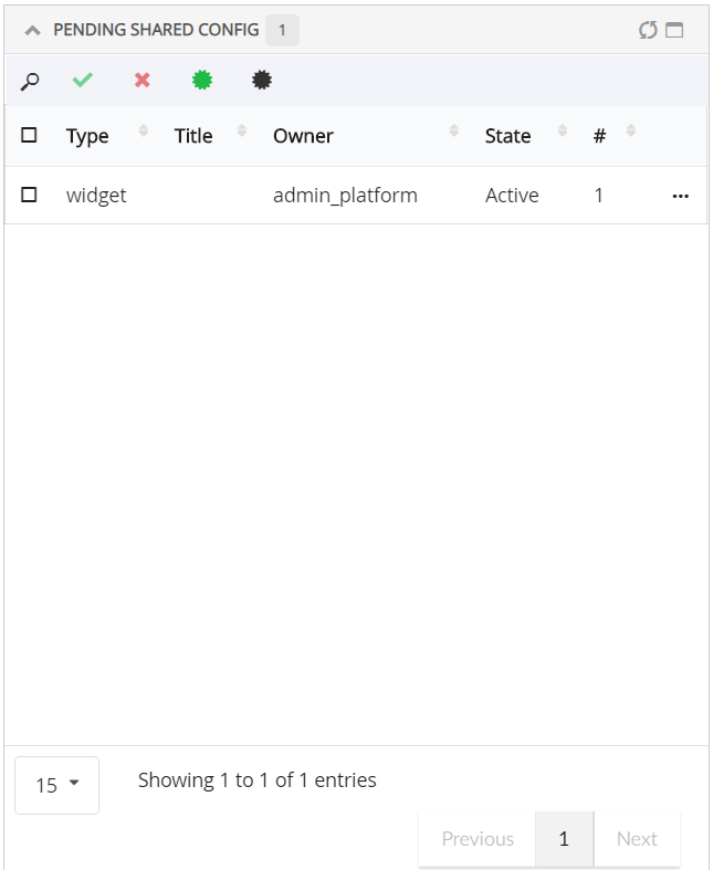
Figure 72. Shared configs with end user and team
1.26. View Accepted Dashboard
The accepted dashboard configurations can be used in 3 ways.
1.26.1. 1. Replace the existing dashboard with the Accepted Dashboard
Consider a scenario, where the default dashboard need to be replaced by the Admin shared dashboard.
-
Add Shared dashboardcommand opens the sidepanel with all the accepted dashboards. -
End-user can select the Shared Dashboard from sidepanel and click on
Applycommand to replace the existing dashboard with selected Shared Dashboard. -
End-user can use
Reset to Default Configcommand to resume back to the original dashboard it had earlier.
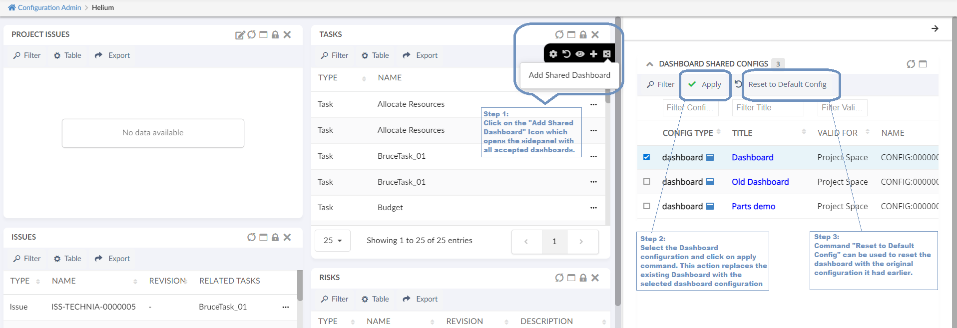
Figure 73. Replace Default dashboard with Shared Dashboard
1.26.2. 2. Add Accepted Dashboard in 3DDASHBOARD widgets.
All the accepted dashboard will be listed in 3ddashboard widget preference page. End-user can choose the accepted dashboard and add to the 3DDASHBOARD widget as shown in the images. Refer List Accepted Configs in 3DDASHBOARD widget preference section to enable or disable the accepted configs to list in 3DDASHBOARD widget preference.
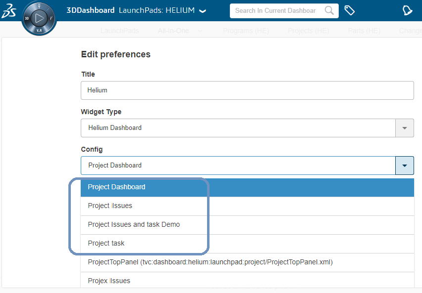
Figure 74. Choose Shared Dashboard in 3DDashboard widget preference
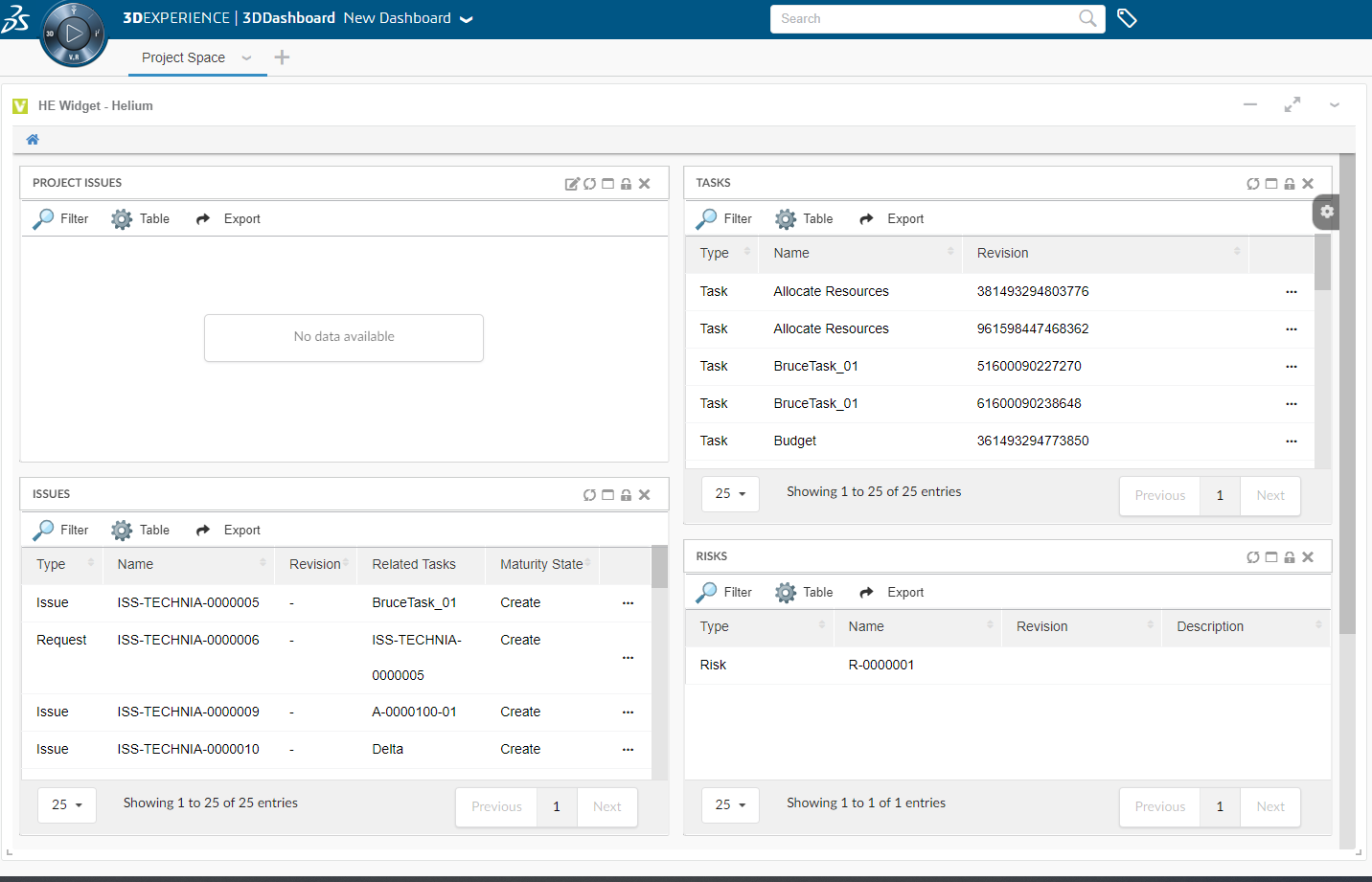
Figure 75. View Shared Dashboard added from 3DD widget preference
1.26.3. 3. On Helium Standalone application, add dashboard to MyDashboard dynamic menu
Accepted shared dashboards can be accessed directly from a dynamic menu known as "My Dashboard". Under "Accepted shared config" tab, add and remove dashboard command are available to manage "My Dashboard" menu. This dynamic menu can be added in topbar as shown below
In Helium.xml,
<?xml version="1.0" encoding="UTF-8"?>
<Application xmlns="http://technia.com/helium/Application">
   ...
    <TopBar>
      	...
      <Menu>tvc:menu:helium:myconfigdashboard/MyConfigDashboards.xml</Menu>
   	...
    </TopBar>
<Application/>
1.27. User Configurations
All user created configs will be listed under User Configurations tab. Delete Config command can be used to delete the unused configs or configs which are no more required.
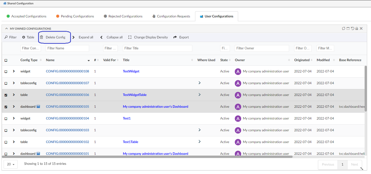
Figure 76. User Configurations
1.28. Create Dashboard By Enduser
Endusers can create dashboard and configure widgets in it. Previously, to set up a new dashboard, the end-user will have to request config-admin to configure and share. From now on, end-users can configure new dashboards themselves and that reduces config-admin dependency.
1.29. Widgets
Create and customize widgets.
1.29.1. Create widgets
A user can add new widgets to a dashboard by using the + sign in the dashboard settings menu. This will open a form at the top in the corresponding dashboard, where you can create your widget/specify things about the widget you want to create, like the name of the widget, what data to be displayed and more.
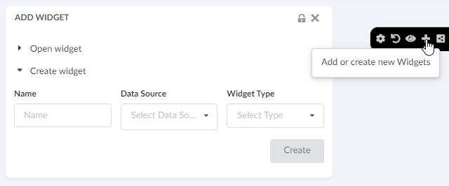
Figure 77. Create widget
User can also open this create widget form at the bottom of the corresponding dashboard by using the key tvc.helium.enduser.createWidget.placeHolder.bottomPosition in tvc.properties. The default value of this is false and valid value is either true or false.
There are two types of widgets one can create, a chart widget or a table widget.
1.29.2. Charts
Create different type of charts. In the "Chart Type" field you can choose how you want the data to be displayed. You can choose from all the different chart types, e.g. Bar, Line, Pie or Donut. In the "Data Source" field you select what set of objects you want to base the chart on. The list is populated by the datasets cached in your application. In the "Chart Expression" field you choose what information you want to be displayed in the chart. You can choose from the basics and attributes of the objects from the dataset selected in the "Data Scource" field.
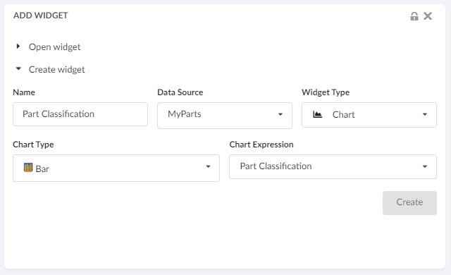
Figure 78. Create chart
For more information about charts in general, it can be found in the Chart chapter.
1.29.4. Edit Widgets
A user can edit their own chart/table widgets by using the edit icon in the widget. This will take the user to the edit form where you can make changes and save your edited widget.
Figure 80. Editable end user chart widget
1.29.5. Create Widgets with Accepted Dataset and Tables
All the Dataset and tables that are shared by config-admin will be listed in create Widget section as shown in image.
End user can use the "Valid For" field to filter the datasets and tables based on the selected business type in "Valid For" field.
The "Valid For" field lists only the business type for which the datasets or tables are available.
Figure 81. Shared dataset and Tables
Create Widget with existing table
Also end-users can create a table widget by pointing to an existing table. This will allow the end-user to reuse any previously created table. For example, if the end-user has already created a table for Parts, the same table can be used to create a different widget that can list the Released Parts or My InWork Parts, etc. This will only require changing the dataset.
Select existing table:
All the existing tables will be listed here, which includes self-created tables and the tables shared by Config-Admin.
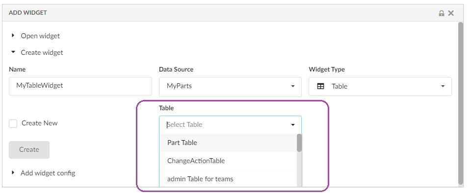
Figure 82. Select existing Table
Choose to create new table:
Here End-users can choose to create a new table by selecting the 'create new' checkbox.
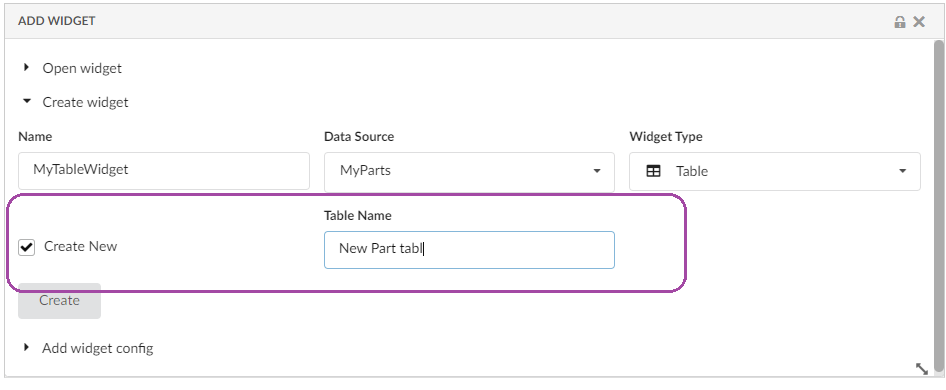
Figure 83. Create new table by selecting selectbox
1.29.6. Add Accepted Widgets in Dashboard
End-user can extend any dashboard to create a personalized dashboard. In this dashboard, end-user can create a new widget or add existing widget to his dashboard. End-user can also add any shared widget to his dashboard.
All the accepted widgets and existing widgets will be listed in Add Widget section as shown in image.
End user can use the "Valid For" field to filter the Widget Configs based on the selected business type in "Valid For" field.
The "Valid For" field lists only the business type for which the widgets are available in the 'Widget Configs' field.
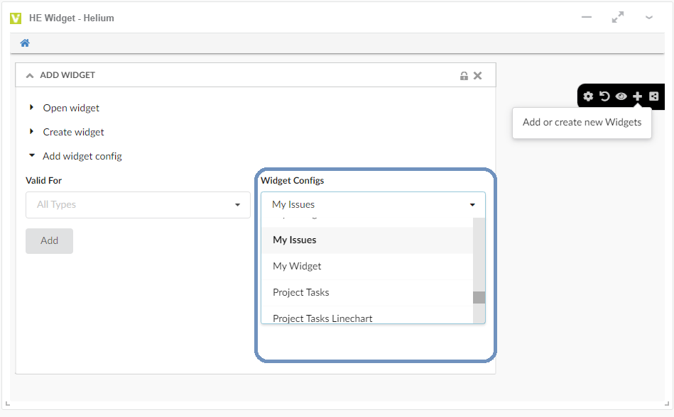
Figure 84. View Shared Widget
1.30. Teams Management widget
Team can be a logical group of people, of same or different department within organization. Admin can share UI configs to teams. This will be useful as admin will not have to share the configuration to individual users. Once a user is added to team, he/she will have access to all the configurations shared with that team. If user is removed from team, he/she will no longer have access to team shared configuration
Once admin user has created a configuration as per the request from end user or team of end users. Admin needs to define a team, and he will use this widget to create and manage a team. For managing teams a new widget called 'Teams' is added to Helium admin page with below functionalities.
-
Create a Team
-
Promote a Team
-
Demote a team
-
Connect with team members to a team
-
Disconnect team members from a team
Please refer the below video for more details on Teams widget functions.