 TVC Helium 2024.3.0
<Name>ACME</Name>Components
05 May 2016
1. Components
This chapter describes the built in features of TVC Helium. Some of them may be configurable and some may not be enabled by default.
1.1. Helium
The main configuration of the application is performed in a file named Helium.xml which is located in WEB-INF/classes/.
This file is responsible for the following.
-
The name of the application
-
The login page of the application
-
What pages should be accessible and to which users
-
What the application topbar should contain
1.1.1. Configuration
The root element of the Helium.xml is <Application> and it supports the following child elements.
| Name | Description | Example |
|---|---|---|
Name |
The name of the application. May be visible in the TopBar. |
|
LoginPage |
Describes the LoginPage |
|
Sidepanel |
Describes the PageSidepanel |
|
DateFormat |
How should dates be formatted on the client. All moment.js formats is supported but each format must contain month, day and year. If the
element is omitted |
|
DateTimeFormat |
How should dates with time (used in some places like the history widget) be formatted on the client. All moment.js formats is supported. If the
element is omitted |
|
StartPage |
Specifies which page the user should be redirected to after a successful login (if no other page is requested). |
|
TopBar |
Specifies what the TopBar should contain. |
|
PageMapping |
Specifies the PageMapping. What pages are accessible given object type and what roles the user has. |
|
Login page
The <LoginPage> element is responsible for customization of the login page and it supports the following child elements.
| Name | Description | Example |
|---|---|---|
Path |
The path to the login page. |
|
Title |
The title of the login page |
|
FormTitle |
Specifies what title the login form should have. |
|
FormSubTitle |
Specifies what sub title the login form should have. |
|
TopBar
The TopBar is placed in a fixed, always-visible container in the top of the page, and it holds common actions and menus for the entire application.

Figure 1. Top Bar
The <TopBar> element supports the following child elements.
| Name | Description | Example | ||
|---|---|---|---|---|
ShowAppName |
Whether the application name should be visible or not. Valid values:
|
|
||
TooltipSettings |
Optional settings as given in Semantic Popup Settings can be passed for tooltip.
|
|
||
Left |
Child elements to the |
|
||
Middle |
Child elements that are aligned in the middle of the available remaining space between
|
|
||
Right |
Child elements to the |
|
||
ShowBreadcrumb |
Whether the breadcrumb navigation should be visible or not. Valid values: true or false (default). See Breadcrumb section. |
|
Breadcrumb
A breadcrumb trail on a page indicates the page’s position in the application hierarchy. A user can navigate all the way up in the application hierarchy, one level at a time, by starting from the last breadcrumb in the breadcrumb trail. It has maximum length of 5 elements.
For breadcrumb trail to work properly, pages need Title element.
It is a fixed container below topbar of the and is configurable with ShowBreadcrumb setting in TopBar.
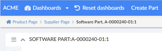
Figure 2. Breadcrumb
It is responsive by design. Once breadcrumb container exceeds device display width, it will get collapsed and an ellipsis icon will be shown to left of breadcrumb. One can expand it again by clicking on ellipsis icon.
Mobile Breadcrumb
Menu/Commands
The <Left> and <Right> elements mentioned above can have the following child elements.
Depending on their parent element, they will either be left or right aligned in the TopBar
| It is recommended to group commands in menus to avoid spill over of commands in topbar. |
| Name | Description | Example |
|---|---|---|
Separator |
Will render a horizontal separator |
|
Menu |
Will render a dropdown menu containing commands. The menu is defined in the xml referenced inside of the element. |
|
Command |
Will render a command. The command is defined in the xml reference from inside of the element. |
|
User |
Will display logged in user name ( |
|
Dynamic Menu
Normally, a menu holds a list of pre-configured commands and/ or menus. As opposed to this, a dynamically defined menu allows different content. A dynamic menu is still configured as a regular menu, but has some extra settings which when configured allows developer to get control when the menu is activated. This means, it’s also possible to have a dynamic menu that has a mix of predefined commands as well as dynamically added ones.
An example of such a menu is Recently Viewed objects.
Options
| Name | Description | Required | Example | ||
|---|---|---|---|---|---|
dynamicmenu |
Defines a menu as a dynamic menu |
true |
|
||
href |
Ajax endpoint to fetch JSON data for dynamic content |
true |
|
||
id |
Unique identifier for the dynamic menu. Can be used, for e.g. to get hold of the menu from JavaScript. |
false |
|
||
template |
Reference to Handlebars template to render content on client |
false* |
|
||
onActivate |
JavaScript callback to handle menu when activated. If defined, it’s this callbacks' responsibility to configure dynamic menu content.
|
false* |
|
A JavaScript API, App.Topbar.dynamicMenus.getById(menuId) can be used to get access to the dynamic menu.
| Dynamic menus are currently available only in Topbar. |
Example
<Menu xmlns="http://technia.com/TVC/Menu" xmlns:xsi="http://www.w3.org/2001/XMLSchema-instance"
xsi:schemaLocation="http://technia.com/TVC/Menu http://products.technia.com/tvc/schema/latest/Menu.xsd">
<Label>recent.title</Label>
<Setting name="dynamicmenu" value="true" />
<Setting name="id" value="recent-objects" />
<Setting name="template" value="helium/templates/recentobject/recentobjectcommand" />
<Setting name="onClick" value="App.routing.open" />
<Setting name="onActivate" value="App.RecentObjects.render" />
<Setting name="href" value="tvc-action/heliumDataTable?config=tvc:tableconfig:helium:recentobject/RecentlyViewed.xml&reload=true&bindKey=foo" />
</Menu>Recently Viewed objects
"Recently Viewed" objects is a built-in dynamic menu which when configured shows a list of objects that the user has recently visited. The built-in menu uses TableConfig for defining and retrieving its data and a handlebars template to display the data. Both of them can be overridden if needed, for e.g. to fetch and display information in a different way.
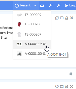
Figure 3. Recent Objects Menu
To enable it, add following in the Topbar definition in Helium.xml.
...
<TopBar>
<Right>
<Menu>tvc:menu:helium:recentobject/RecentlyViewed.xml</Menu>
</Right>
</TopBar>
...| Looking to configure recent objects in a widget instead? See Recent Object Widget Configuration for more information. |
Themes
"Themes" is a built-in dynamic menu which when configured gives user capability to switch between themes in real time. The built-in menu uses tvc.helium.themes property for retrieving the list of themes. Default value of this property is flat and light as tvc.helium.themes=flat|light.
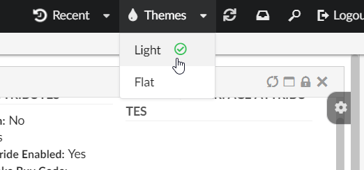
Figure 4. Themes Menu
To enable it, add following in the Topbar definition in Helium.xml.
...
<TopBar>
<Right>
<Menu>tvc:menu:helium:theme/ChangeTheme.xml</Menu>
</Right>
</TopBar>
...TopBar example
<TopBar>
<ShowAppName>true</ShowAppName>
<Left>
<Separator />
<Menu>tvc:menu:helium/MyDashboards.xml</Menu>
<Command>tvc:command:helium/ResetDashboards.xml</Command>
<Command>tvc:command:helium/Create.xml</Command>
</Left>
<Right>
<Myspace />
<User />
<Search />
<Logout />
</Right>
</TopBar>PageMapping
The <PageMapping> element controls which type of objects should be mapped to which pages. It is possible
to control the page mapping based on object type, object state and which access role the user belongs to.
This is done by creating a tree of Page elements with different rules. Given the following example:
<PageMapping>
<!-- Evaluate the 'PartPage' if the type of the current object is a part
and the state of the object is 'Released' and the current user belongs
to the 'SeniorDesignEngineer' or 'ManufacturingDesignEngineer' roles,
otherwise try the next page. -->
<Page namespace="helium" name="PartPage.xml">
<Type is="type_Part" and="current == Released">
<Access>
<Role>role_SeniorDesignEngineer</Role>
<Role>role_ManufacturingDesignEngineer</Role>
</Access>
</Type>
</Page>
<!-- If the above rule evaluates to false and the current object is of the 'Part'
type, evaluate 'OtherPartPage.xml' -->
<Page namespace="helium" name="OtherPartPage.xml">
<Type is="type_Part" />
</Page>
<!-- If the type of the page is ECR, evaluate the 'ECR.xml' page -->
<Page namespace="helium" name="ECR.xml">
<Type is="type_ECR" />
</Page>
<!-- If none of the above are true, evaluate the DefaultPage.xml -->
<FallbackPage namespace="helium" name="DefaultPage.xml" />
</PageMapping>The framework will try to evaluate the different pages from top to bottom until one of the criteria is met. If no
criteria is met, the <FallbackPage> will be evaluated.
The <PageMapping> element supports the following child elements.
| Name | Description | Example |
|---|---|---|
Page |
Specifies the current Page to evaluate via the Only evaluate the page if the rules given via the child elements |
|
FallbackPage |
The page to fall back to if none of the above rules have been applied. Supports the |
|
1.1.2. Example
<?xml version="1.0" encoding="UTF-8"?>
<Application xmlns="http://technia.com/helium/Application">
<Name>ACME</Name>
<LoginPage>
    <Path>/helium/login.jsp</Path>
    <Title>Login to Helium</Title>
    <FormTitle>Welcome to Helium</FormTitle>
    <FormSubTitle>Please enter your credentials</FormSubTitle>
</LoginPage>
<StartPage>
<Page namespace="helium">Page.xml</Page>
</StartPage>
<TopBar>
<ShowAppName>true</ShowAppName>
<Left>
<Separator />
<Menu>tvc:menu:helium/MyDashboards.xml</Menu>
<Command>tvc:command:helium/ResetDashboards.xml</Command>
<Command>tvc:command:helium/Create.xml</Command>
</Left>
<Right>
<Myspace />
<Search />
<Logout />
</Right>
</TopBar>
<PageMapping>
<Page namespace="helium" name="PartPage.xml">
<Type is="type_Part" and="current == Released">
<Access>
<Role>role_SeniorDesignEngineer</Role>
<Role>role_ManufacturingDesignEngineer</Role>
</Access>
</Type>
</Page>
<Page namespace="helium" name="PartPage.xml">
<Type is="type_Part" />
</Page>
<Page namespace="helium" name="ECO.xml">
<Type is="type_ECO" />
</Page>
<Page namespace="helium" name="ECR.xml">
<Type is="type_ECR" />
</Page>
<FallbackPage namespace="helium" name="DefaultPage.xml" />
</PageMapping>
<!--
<Sidepanel>
<Label>Collaboration</Label>
<OnInit>App.Collaboration.Panel.instance</OnInit>
</Sidepanel>
-->
</Application>1.2. Page
The page component contains Dashboards and/or Tabs. Each Dashboard holds references to one or more widgets and the Tabs element holds references to other Dashboards.
Pages are used when configuring start pages in the application. They are also used in the page mappings.
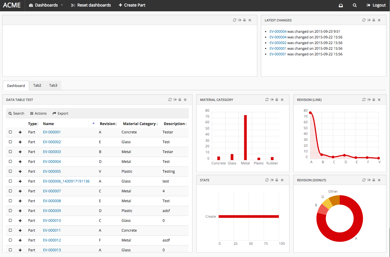
Figure 5. Page
1.2.1. Configuration
The <Page> element supports the following child elements.
| Name | Description | Example |
|---|---|---|
Title |
Optional. Page Title will be seen in browser window, and in Breadcrumb if enabled. Context object pages can use macros to resolve dynamic page titles. |
|
Dashboard |
Points to a reference to a Dashboard instance. |
|
Tabs |
Configures a list of Tabs |
|
Sidepanel |
Configures sidepanel Sidepanel |
|
Settings |
Simple key value pairs of settings that are passed to the page. If a setting named |
|
Access |
Defines access rules. |
See Access Control |
1.2.2. Example configuration
<?xml version="1.0" encoding="UTF-8"?>
<Page>
    <Title>${TYPE}, ${NAME}:${REVISION}</Title>
    <Dashboard ns="helium" name="TopPanel.xml" />
    <Tabs>
        <Tab>
            <Label>Dashboard</Label>
            <CacheBehaviour>disabled</CacheBehaviour>
            <Dashboard ns="helium" name="Dashboard.xml" />
        </Tab>
        <Tab>
            <Label>Tab2</Label>
            <CacheBehaviour>preload</CacheBehaviour>
            <Dashboard ns="helium" name="Tab2.xml" />
        </Tab>
        <Tab>
            <Label>Tab3</Label>
            <CacheBehaviour>cache</CacheBehaviour>
            <Dashboard ns="helium" name="Tab3.xml" />
        </Tab>
    </Tabs>
</Page>
1.3. Page Sidepanel
A sidepanel is a container component where additional content can be placed. It can be either built-in components like (Collaboration) or custom component with own rendering. The visibility of this sidepanel container is toggled by clicking it.
Each page supports defining a sidepanel which can be revealed (slided in) from the right side. When the page is first loaded, the initial state of the sidepanel can be controlled from the component’s status method. Ex: "expand", "hidden", "disabled" or "enabled"
The <Sidepanel> element supports the following child elements.
| Name | Description | Example |
|---|---|---|
Label |
The label of the sidepanel. If omitted no label will be rendered. If the value is an existing i18n key internationalisation will be performed |
|
OnInit |
Javascript function that creates the widget. |
|
OnInitOption |
Additional options that is to be passed to the OnInit function. |
|
Width of the sidepanel is configurable using the property tvc.helium.page.sidePanel.width. Width of the sidepanel can be manually adjusted, customized width will persist. Customized width can be reset using Reset widget positions in dashboard view action in dashboard menu.
Value of sidepanel width property must be provided in pixels, if no value is defined by default width is taken as 540px. Eg: tvc.helium.page.sidePanel.width=600px.
|
1.3.1. Javascript API
The sidepanel can be expanded, collapsed and disabled via javascript using the following syntax:
var sidepanel = App.page.sidepanel;
sidepanel.expand() // expands sidepanel
sidepanel.collapse() // collapses sidepanel
sidepanel.enable() // enables sidepanel
sidepanel.disable() // disables sidepanel
sidepanel.hide() // hides sidepanel
1.3.2. Custom Sidepanel Component
An Example Sidepanel component class with required methods in ES2016
    function ExampleSidepanel($container, objectId, options) {
        this.$container = $container;
        this.objectId = objectId;
        this.options = options;
    }

    ExampleSidepanel.prototype = {

        constructor: ExampleSidepanel,

        label: function() {
            return {
                label : 'custom.labels.example',
                iconClass: 'fa-comments-o'
            };
        },

        status: function() {
           return 'expand'; /* 'hidden', 'enabled', 'disabled' */
        },

        load: function() {
            this.$container.html('<div> Any html Content </div>');
        },

        unload: function() {
            this.$container.html('');
        }
    };

    ExampleSidepanel.instance = function($container, objectId, options) {
        return new ExampleSidepanel($container, objectId, options);
    };

    App.Example = { Sidepanel : ExampleSidepanel };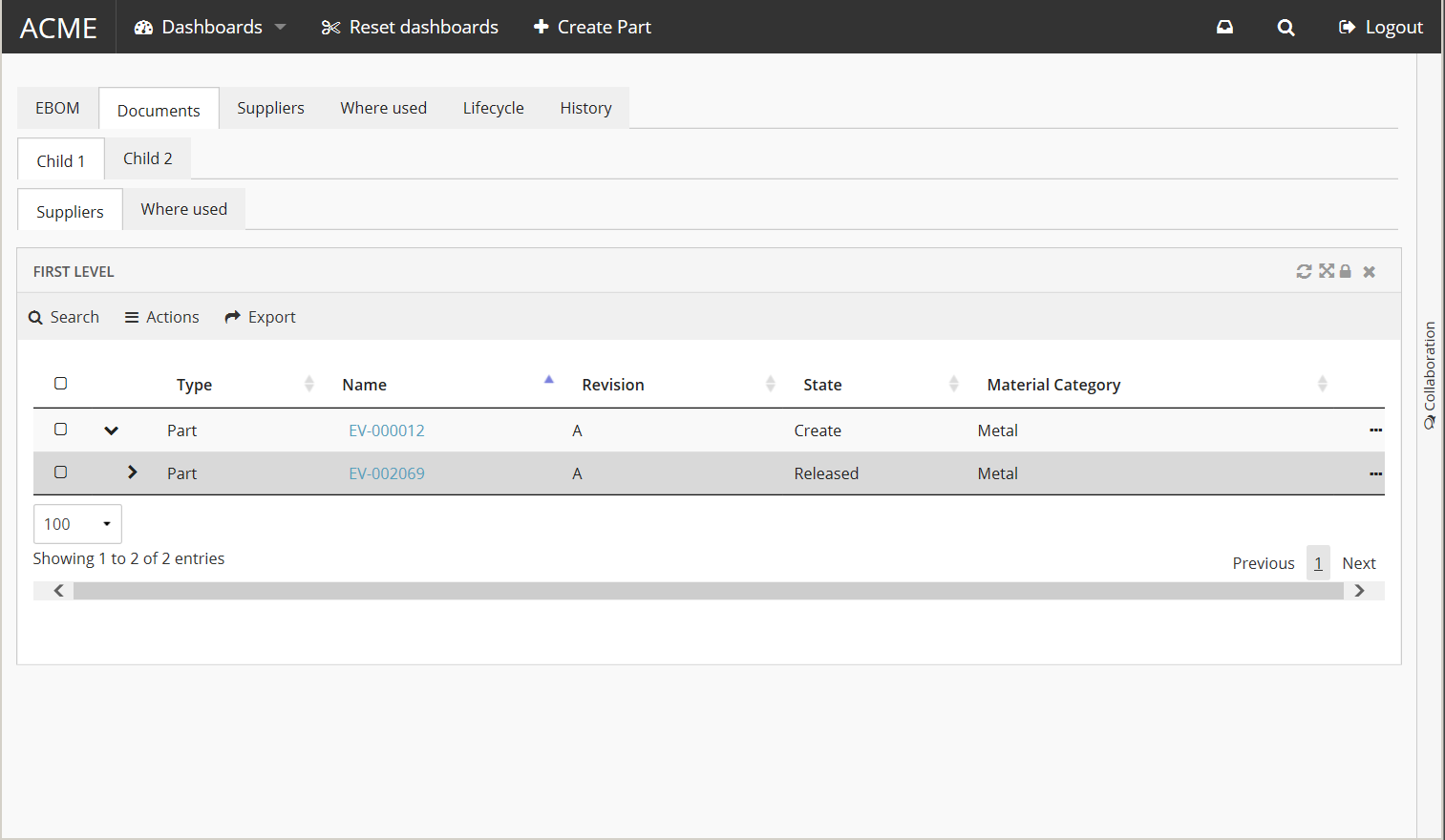
1.4. Tabs
The <Tabs> element renders a list of tabs, where each <Tab> element holds a reference to a Dashboard
or another set of <Tabs> that will be rendered beneath the current tab (multi-level tabs). It is possible to configure different cache behavior for each tab that holds a dashboard.

1.4.1. Tabs configuration
The <Tabs> Element supports the <Tab> child element which supports the following child elements.
| Name | Description | Example |
|---|---|---|
Label |
The text that should be rendered in the tab |
|
Tabs |
A new |
|
CacheBehaviour |
Describes how this tab should be cached. The cache behavior will only affect tabs that holds a dashboard. Valid values are:
|
|
Dashboard |
Holds a reference to a dashboard that will be rendered in this tab. |
|
Badge |
This element can be used to render a small "badge" on the side of the tab label that shows a status description (typically a number or other characters). See Tab Badge chapter for configuration syntax |
See Tab Badge section for example |
Access |
Defines access rules. |
See Access Control |
CustomClass |
Adds one or more HTML classes on the tab DOM element. This can be used for applying custom styling |
|
IconClass |
Adds an HTML class that represents a font icon. The icon will be rendered in front of the label |
|
Fixed |
Prevents users from hiding/moving the tab |
|
Visible |
Initially have the tab hidden or visible |
|
Settings |
Settings to control the behavior of this instance of tabs |
See Tab Settings section for details. |
1.4.2. Tab Settings
The Settings element is used to control the behavior of the tabs. Some settings can be set
as TVC properties to change the default values.
It supports the following child elements:
| Name | Description | Example | ||
|---|---|---|---|---|
Theme |
Control the visual style of the tabs. Valid values are:
|
|
||
IconTheme |
Control the visual style of all built in tabs icons. Valid values are:
|
|
||
Orientation |
Control the rendering of the tabs (vertical/horizontal)
|
|
||
TabDrop |
Feature that automatically "hides" tabs that does not fit on one row (default true) |
|
||
UserReset |
Ability for users to reset the customization (default true) |
|
||
UserRearrange |
Ability for users to change tab order (default true) |
|
||
UserOrientationSwitch |
Ability for users to toggle between horizontal and vertical orientation (default true) |
|
||
UserHide |
Ability for users to hide tabs (default true).
|
|
||
RememberUserSelection |
Enable the feature to automatically save the last selected tab (default true) |
|
1.4.3. Tab Customization
A user can customize tabs using the icon to the right. Depending on the settings: Visibility, order and orientation of tabs can be changed. Remembering the last visited tab can also be configured. All customization options are on by default but can be turned off by properties or settings.
If there are performance concerns the max size of the customizations can be controlled by the property:
tvc.core.customization.maxContentSize
default value: 100000 Characters
1.4.4. Tab Badge
The Badge element is used to render a small "badge" on the side of the tab label that shows a status description (typically a number or other characters).

It supports the following child elements:
| Name | Description | Example |
|---|---|---|
Label |
A simple text that should be rendered in the badge |
|
Position |
Badge position relative to the tab label. Valid values are:
|
|
Provider |
A provider can be used instead of a
|
|
1.4.5. Deeplinking to tab
If an id attribute is appended to the <Tab> element it will be possible to link to that specific tab.
Example:
Configure the tab with an id attribute, i.e <Tab id="documents"> and the following link will be accessible http://example.com/tvc/goto#documents.
| Currently it is only possible to deeplink to a root (top level) tab, i.e. child tabs are not supported for deeplinking. |
| It is possible to deeplink to a tab even if the user have hidden it. |
1.4.6. Example
This is placed within an Page element.
<Tabs>
    <Tab id="dashboard">
        <Label>Dashboard</Label>
        <CacheBehaviour>disabled</CacheBehaviour>
        <Dashboard ns="helium" name="Dashboard.xml" />
        <Badge>
            <Provider>mqlcount:temp query bus 'Part' * * where 'owner == context.user'</Provider>
        </Badge>
    </Tab>
    <Tab>
        <Label>Tab2</Label>
        <CacheBehaviour>preload</CacheBehaviour>
        <Dashboard ns="helium" name="Tab2.xml" />
    </Tab>
    <Tab>
        <Label>Tab3</Label>
        <CacheBehaviour>cache</CacheBehaviour>
        <Dashboard ns="helium" name="Tab3.xml" />
        <Badge>
            <Label>New!</Label>
            <Position>left</Position>
        </Badge>
    </Tab>
</Tabs>
Example with child tabs:
<Tabs>
    <Tab id="ebom">
        <Label>EBOM</Label>
        <CacheBehaviour>disabled</CacheBehaviour>
        <Dashboard ns="helium" name="PartEBOM.xml" />
    </Tab>
    <Tab id="documents">
        <Label>Documents</Label>
        <Tabs>
            <Tab>
                <Label>Child 1</Label>
                <Tabs>
                    <Tab>
                        <Label>Suppliers</Label>
                        <CacheBehaviour>cache</CacheBehaviour>
                        <Dashboard ns="helium" name="PartEBOM.xml" />
                    </Tab>
                    <Tab>
                        <Label>Where used</Label>
                        <CacheBehaviour>cache</CacheBehaviour>
                        <Dashboard ns="helium" name="Tab2.xml" />
                    </Tab>
                </Tabs>
            </Tab>
            <Tab>
                <Label>Child 2</Label>
                <CacheBehaviour>cache</CacheBehaviour>
                <Dashboard ns="helium" name="Tab2.xml" />
            </Tab>
        </Tabs>
    </Tab>
</Tabs>
1.5. Toolbar
Each widget supports an additional toolbar that may contain preconfigured actions. The toolbar can either be rendered in horizontal mode or in vertical mode. In vertical mode the toolbar will be placed to the left of the widget.
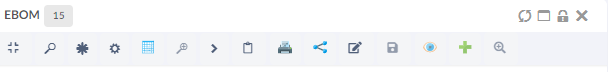
Figure 7. example horizontal toolbar
| If widget size is small and toolbar items are more than helium by default shows only icons corresponding to toolbar items. Hence, its always recommended to configure icon for toolbar items. |
1.5.1. Toolbar configuration
The <Toolbar> element supports the following attributes.
- actionHandler
-
Java class that points to an implementation of an action handler. See custom action handler
- vertical
-
Whether the toolbar should be configured to be rendered in vertical mode. Valid values
trueorfalse. Defaults tofalse.
- showUipToolbar
-
Whether to render uip-toolbar or default helium toolbar. Valid values
trueorfalse. Default is false. - isCustomizable
-
Signifies if the end user is allowed to customize the toolbar or not.If enabled the user hide and reorder the commands or rotate the toolbar. Valid values are
trueorfalse. Defaults to false.
The toolbar element supports the following child elements.
| Name | Description | Example |
|---|---|---|
Menu |
Creates a dropdown menu in the toolbar. The toolbar can have zero or multiple menus |
See specific Menu configuration below |
Command |
Creates a command in the toolbar |
See specific Command configuration below |
Toolbar menu
The <Menu> element renders a dropdown menu in the toolbar
The menu element supports the following child elements.
| Name | Description | Example | ||
|---|---|---|---|---|
Label |
The name of the dropdown for instance 'Actions' |
|
||
FontIcon |
What icon should be rendered next to the label. |
|
||
Image |
What image should be rendered next to the label |
|
||
RegisteredSuite |
Defines the registered suite. This will be used to resolve macros |
|
||
Command |
Creates a command in the toolbar |
See specific Command configuration below |
||
Menu |
If UIP Toolbar is configured, we can configure sub menus by configuring Menu inside.
|
|
||
Alt |
Tooltips can be configured for menu by adding <Alt>
|
|
Toolbar command
The <Command> element renders a command in either the toolbar itself, or in
an toolbar menu. A command describes a user action.
The <Command> element supports the following child elements.
| Name | Description | Example | ||
|---|---|---|---|---|
Label |
Name of the command, for example 'Promote'. By default, the content of it will be shown inside the tooltip. The tooltip is shown after a short interval after the mouse is over a "box". |
|
||
Alt |
Option for configuring tooltip other than label |
|
||
FontIcon |
What icon should be rendered next to the label. |
|
||
Image |
What image should be rendered next to the label |
|
||
RegisteredSuite |
Defines the registered suite. This will be used to resolve macros |
|
||
OnClick |
What javascript function should be executed when the
user clicks the command, for example:
|
|
||
OnClickParams |
Additional parameters to send to the javascript function. Usually a javascript object.
|
|
||
ValidFor |
Defines the command is valid for which rows in datatable.
|
|
Custom action handler
The <Toolbar> element supports the actionHandler attribute.
The actionHandler attribute value should point to an
implementation of a custom action handler. The action handler
can implement custom actions.
One actionHandler that ships with Helium is
com.technia.helium.table.config.action.TableActionHandler which provides
special actions that is intended to be used with a DataTable.
If the com.technia.helium.table.config.action.TableActionHandler is used, it is possible to add the following elements
to the toolbar.
| Name | Description | Example |
|---|---|---|
Search |
Whether the toolbar should have a search field. If the element is left out no search field will be rendered. If show parents is true than the parent rows of the matching rows will also be rendered in structure tables. It can also be defined using global setting |
default value of showparents is false |
ExpandAll |
Preconfigured command that fully expand all nodes in structure table. |
|
CollapseAll |
Preconfigured command that collapse all nodes in structure table. |
|
CreateAndConnectRow |
Preconfigured command that can be used to add a new child object row to the selected parent object row. This in-built command requires to configure CreateSettings in tableConfig. |
|
ExportExcel |
Preconfigured command that exports the rows of the table to Excel format. |
|
ExportPDF |
Preconfigured command that exports the rows of the table to PDF format. |
|
ExportCSV |
Preconfigured command that exports the rows of the table to CSV format. |
|
Collection |
Adds a collection menu with below commands to manage businessobjects in Clipboard and Collection.
Refer Customize Collection section for customizations |
|
Expand all nodes in structure table
Example of a table widget with a toolbar
<DataTable>
    <Title>First Level</Title>
    <TableConfig namespace="helium">EBOMConfig.xml</TableConfig>
    <Toolbar actionHandler="com.technia.helium.table.config.action.TableActionHandler">
        <Search />
        <ExpandAll />
        <Menu>
            <Label>Actions</Label>
            <FontIcon>fa-bars</FontIcon>

            <Command>
                <Label>Promote</Label>
                <FontIcon>fa-forward</FontIcon>
                <OnClick>App.table.action.promote</OnClick>
            </Command>
            <Command>
                <Label>Demote</Label>
                <FontIcon>fa-backward</FontIcon>
                <OnClick>App.table.action.demote</OnClick>
            </Command>
            <Command>
                <Label>Edit</Label>
                <FontIcon>fa-edit</FontIcon>
                <OnClick>App.form.edit</OnClick>
                <OnClickParams>{"formConfigName": "tvc:form:helium/Form1.xml", "fullscreen": true}</OnClickParams>
            </Command>
        </Menu>

        <Menu>
            <Label>Export</Label>
            <FontIcon>fa-share</FontIcon>
            <ExportExcel />
            <ExportPDF />
            <ExportCSV />
        </Menu>
    </Toolbar>
</DataTable>
Example of a form with a vertical toolbar
<FormWidget>
    <FormConfig namespace="helium">Form1.xml</FormConfig>
    <ResolveContextId>page</ResolveContextId>
    <FormMode>view</FormMode>
    <ShowToggleButton>false</ShowToggleButton>

    <Toolbar vertical="true">
        <Command>
            <Label>Toggle Edit Mode</Label>
            <FontIcon>he-pencil</FontIcon>
            <OnClick>App.custom.toggleEditMode</OnClick>
        </Command>
        <Command>
            <Label>Some action</Label>
            <FontIcon>he-chevron-right</FontIcon>
            <OnClick>App.custom.toggleEditMode</OnClick>
        </Command>
    </Toolbar>

</FormWidget>
1.5.2. Invoke Service
Like TVC Classic, 3DExperince services can be reused and called from Helium toolbar. This will allow leveraging existing 3DExperince in Helium table and perform actions like create change order, change request and other actions.
Built-in javascript function App.dataTable.invokeServiceAndCreateObject can be used to launch 3DExperince services, which can be configured using parameter config.
Invoke service requires that the result from the 3DExperience service is in form of objectId/physicalid that can be used with configured refreshBehavior.
	<Command>
		<Label>Invoke Service</Label>
		<FontIcon>icon ti-c ti-plus</FontIcon>
		<OnClick>App.dataTable.invokeServiceAndCreateObject</OnClick>
		<OnClickParams>{
			"config": "tvc:service:ups:classic:18x/CreatePartV5.xml",
			"resultExpression": "id",
			"from": "true",
			"selectionCriteria": "single",
			"refreshBehavior": "add"
		}</OnClickParams>
	</Command>
Following on click params can be used to invoke service / javascript function App.dataTable.invokeServiceAndCreateObject
| Parameter | Description | Required | Example |
|---|---|---|---|
config |
Name of the service configuration. It is used to configure the path to the service config. |
Yes |
|
resultExpression |
An expression that will be applied to the result from the service invoke. |
Yes |
|
from |
Direction to add the new object to table. |
Yes |
|
selectionCriteria |
It defines how many object can be selected to perform this action. |
No |
|
refreshBehavior |
It defines how a new node would be added from the result to the table. Default is |
No |
|
1.6. Service Toolbar
Like TVC Classic, we can also call OOTB service directly from client side. It will provide more flexibility and configuration support like allowing user to take input with the associated form and also it gives us possibility to perform multi selection and the chaining of the services. To call OOTB services, we need to predefined it in an XML configuration file. The services are then accessed from an ordinary service command, which contains the reference to the XML file that defines/configures the service.
Built-in javascript function App.dataTable.invokeServiceCall can be used to launch 3DExperience services, which can be configured using JSON config.
1.6.1. Service Command
ServiceCommand will be used to configure an OOTB service. XML configure is shown as below.
XML Definition
The example below illustrates how to define a service inside service command with xml.
<ServiceCommand>
<Label>Unreserve</Label>
<Setting name="OnClick" value="App.invokeServiceCallbacks.invokeService" />
<Setting name="OnClickParams">{
"url":
"resources/v1/collabServices/reservation/op/unreserve?tenant=OnPremise&isMultiSel=0&select=physicalid",
"header":{"content-type": "application/json"},
"addSecurityContext": "false",
"method":"POST",
"body":{"urls": ["{{model//{{physicalid}}}}"]},
"macro":"true",
"macroElements":"physicalid",
"selectionCriteria": "multi"
}</Setting>
</ServiceCommand>We can also use the reference of this command.
<DataTable>
    ...
    <Toolbar>
        ...
        <Menu>
            <Label>Service Actions</Label>
            <ServiceCommand ref="tvc:servicecommand:hex:engineering:homepage/ReserveProduct.xml" />
            <ServiceCommand ref="tvc:servicecommand:hex:engineering:homepage/UnreserveProduct.xml" />
            <ServiceCommand ref="tvc:servicecommand:hex:engineering:homepage/MultiServiceChaining.xml" />
        </Menu>
        ...
    </Toolbar>
</DataTable>
Child elements of OnClickParams
| Parameter | Description | Required | Example | ||
|---|---|---|---|---|---|
url |
This element defines the URL of intial service. |
Yes |
|
||
header |
The header of the initial service call. |
No |
|
||
body |
The body of the service call. It supports injecting macro statments |
No |
example: |
||
macro |
If we have any macros defined in Body, then this setting needs to be true |
No |
|
||
macroElements |
If we have any macros defined in Body, then that macro elements should be defined in this tag. It requires |
No |
|
||
addCsrfToken |
This setting can be configured as true to put 3dspace csrf token in service request header. |
No |
|
||
addSecurityContext |
This setting can be configured as true to put security context in service request header. |
No |
|
||
refreshRows |
It defines how the table rows will be refreshed after the processing is done. If this setting is enabled, only rows selected will be refreshed. |
No |
|
||
preRequestCallback |
Users can specify a reference to a javascript function that will be executed before service call. The function itself needs to be included in a javascript resource. The function needs to receive four parameter, which will be the payload of the service being modified or updated, second parameter is the response of macros, third and fourth parameter are resolve and reject respectively, which will be called at the end to resolve payload. |
No |
|
||
responseCallback |
Users can specify a reference to a javascript function that will be executed after service call. The function itself needs to be included in a javascript resource. The function needs to receive one parameter, which will be the response of the service being modified or updated. |
No |
|
||
successMessage |
User can specify, success messge in translation file (default.json) and use it’s key. |
No |
|
||
resolverPaths |
Service chaining can be configured using |
No |
|
Resolver-Paths Configuration
ResolverPaths configuration supports following elements/settings.
| Element | Description | Required | Example |
|---|---|---|---|
url |
This element defines the URL which we want to call after receiving the response of initial service. This can be resolved from response of intial service or can be configured separately. |
Yes |
Here, data[0].dataelements.ticketURL is the part of response object where we get the URL of next service call OR |
order |
A number value used to define in which order service will be executed. The lowest order number will get executed first. |
Yes |
|
header |
The header of the next service call can be configured for service request. |
No |
|
body |
The body of the service call. It supports injecting macro statments |
No |
` "body":{"fcsjobTicket":"{{data[0].dataelements.ticket}}"}` Here, |
bodyResolver |
It is used to resolve macro statement mentioned inside the |
No |
|
addCsrfToken |
This setting can be configured as true to put 3dspace csrf token in service request header. |
No |
|
addSecurityContext |
This setting can be configured as true to put security context in service request header. |
No |
|
method |
HTTP method/verb that should be used to invoke the next service. Valid values are:
By default it is |
No |
|
preRequestCallback |
Users can specify a reference to a javascript function that will be executed before service call. The function itself needs to be included in a javascript resource. The function needs to receive four parameter, which will be the payload of the service being modified or updated, second parameter is the resolved value of the macros, third and fourth parameters are resolve and reject respectively, which will be called at the end to resolve payload. |
No |
|
responseCallback |
Users can specify a reference to a javascript function that will be executed after service call. The function itself needs to be included in a javascript resource. The function needs to receive one parameter, which will be the response of the service being modified or updated. |
No |
|
XML Definition
Below is the example of uploading a document for a VPMReference object using 3DExperience services.
In the 3DExperience we see multiple requests. Initially it calls CheckinTicket and from its response object it will receive URL for the next service call and fcsjobTicket which it will pass in the body of next service. Then, it calls checkin service to upload the document. Below is the example illustrates how to configure this type of service chaining inside TVC Service command with xml.
<ServiceCommand>
<Label>Add New Document</Label>
<Setting name="OnClick" value="App.dataTable.invokeServiceCall" />
<Setting name="OnClickParams">{
"url":"resources/v1/modeler/documents/files/CheckinTicket?tenant=OnPremise&e6w-lang=en&e6w-timezone=-330",
"headers":{"content-type": "application/json"},
"addSecurityContext": true,
"method":"PUT",
"body":{"urls": ["model//{{physicalid}}"]},
"macro":true,
"macroElements":"physicalid",
"preRequestCallback": "App.invokeServiceCallbacks.initialRequestCallback",
"responseCallback":"App.invokeServiceCallbacks.initialResponseCallback",
"successMessage":"invokeservice.messages.service.documentSuccess",
"resolverPaths":[{
"order":1,
"preRequestCallback": "App.invokeServiceCallbacks.firstResolverPathCallback",
"url": "data[0].dataelements.ticketURL",
"header":{"content-type": "application/json"},
"body":{"__fcs__jobTicket":"{{data[0].dataelements.ticket}}"},
"method":"POST",
"bodyResolver": "data[0].dataelements.ticket",
"responseCallback": "App.invokeServiceCallbacks.firstResolverResponseCallback"
},
{
"order":2,
"url": "resources/v1/modeler/documents/?tenant=OnPremise&e6w-lang=en&e6w-timezone=-330&xrequestedwith=xmlhttprequest",
"method":"POST",
"addSecurityContext": true,
"header":{"content-type": "application/json"},
"body": {"csrf":{"name":"{{csrfName}}","value":"{{csrfValue}}"},"data":[{"dataelements":{"title":"{{fileName}}","parentId":"{{parentId}}","parentRelName":"PLMDocConnection","parentDirection":"from"},"relateddata":{"files":[{"dataelements":{"title":"{{fileName}}","receipt":"{{text}}"}}]},"tempId":"{{tempId}}"}]},
"bodyResolver": "csrfName,csrfValue,fileName,parentId,fileName,text,tempId",
"responseCallback":"App.invokeServiceCallbacks.secondResolverResponseCallback"
}
]
}</Setting>
</ServiceCommand>Here, at the begining, intial service will get call, the subsequent service call we define inside the tag of resolverPaths. The subsequents service will be executed in the defined order.
Below, is the definition of callback used for the above configuration.
(function(window, App, $) {

    var invokeServiceCallbacks = {

        // callbacks for creating doc element

        initialRequestCallback: function(options, payload, resolve, reject) {
            console.log('In initial service callback');
            this.serviceOptions.parentId = payload[0];
            var inputElement = document.createElement("input");
            inputElement.type = "file";
            inputElement.accept = window.accept;
            inputElement.dispatchEvent(new MouseEvent("click"));
        	inputElement.addEventListener('change', (event) => {
                event.preventDefault();
                event.stopImmediatePropagation();
                let files = event.target.files.length>0 ? event.target.files :event.dataTransfer.files; // FileList object
                for (var index = 0; index < files.length; index++) {
                  const file = files[index];
                  var documentInfo = {
                    title: file.name,
                    fileInfo: {
                      comments: '',
                      file: file
                    },
                    relInfo: {
                      parentId: this.serviceOptions.parentId,
                      parentRelName: 'PLMDocConnection',
                      parentDirection: 'from'
                    }
                  };
                  this.serviceOptions.documentInfo = documentInfo;
                  this.serviceOptions.documentInfo.fileInfo = documentInfo.fileInfo;
                }
                resolve(options);
            });
        },

        initialResponseCallback: function(response) {
            console.log('In Initial Service Response Callback' + response);
            this.serviceOptions.csrfTokenName = response.csrf.name;
            this.serviceOptions.csrfTokenValue = response.csrf.value;
        },

        firstResolverPathCallback: function(payload, response,resolve, reject) {
            console.log('In first pre request service callback');
            var fileInfo = this.serviceOptions.fileInfo || (this.serviceOptions.documentInfo && this.serviceOptions.documentInfo.fileInfo);
            var file = fileInfo && fileInfo.file;
            var fileName = file && fileInfo.file.name; //case of overwritten file name
            var formData = new FormData();
            formData.append(
                    Object.keys(payload.body)[0],
                    Object.values(payload.body)[0]
                );
            formData.append('file_0', file, fileName);
            payload.data = formData;
            payload = {
                method: payload.method,
                url: payload.url,
                data: payload.data,
                contentType: false,
                processData: false
            };
            resolve(payload);
        },

        firstResolverResponseCallback: function(response) {
            response.text = encodeURI(response.text);
            response.csrfName = this.serviceOptions.csrfTokenName;
            response.csrfValue = this.serviceOptions.csrfTokenValue;
            response.parentId= this.serviceOptions.parentId;
            var fileInfo = this.serviceOptions.fileInfo || (this.serviceOptions.documentInfo && this.serviceOptions.documentInfo.fileInfo);
            var file = fileInfo && fileInfo.file;
            var fileName = file && fileInfo.file.name;
            response.fileName = fileName;
            var d = new Date();
            var g = d.getTime();
            response.tempId = "temp_" + g;
            console.log('In first Service Response Callback' + response);
        },

        secondResolverPathCallback: function(options, payload,resolve, reject) {
            console.log('In second pre request service callback');
            resolve(options);
        },
        secondResolverResponseCallback: function(response) {
            console.log('In second pre response service callback');
        },
        formResponseCallback:function(formInput){
        	 console.log('In form response service callback');
        }
    };

    App.invokeServiceCallbacks = $.extend({}, App.invokeServiceCallbacks || {}, invokeServiceCallbacks);
})(window, App, jQuery);
1.6.2. Input Based Service
It is possible to call OOTB service and include the OOTB service response value in the Form for further processing. Also, it allows to open a form and prepare OOTB service body with the user input. First, form can be invoked to take user input and on submit it will process the OOTB service.
Form Configuration
Form configuration supports following elements/settings.
| Element | Description | Required | Example |
|---|---|---|---|
url |
This is the URL of service which will be called on the submission of the Form. This can be resolved from the response object of initial service or can be configured separately. |
Yes |
|
options |
This element defines Helium’s Form options setting which will looks for config file |
Yes |
|
header |
This setting can be configured to add addition values in the service request header which will be called on the submission of the form. |
No |
|
contentType |
This setting can be configured to add content type in service request header which will be called on the submission of the form. By default it is |
No |
|
body |
The body of the service which will be called on the submission of the form. It supports injecting macro statments |
No |
Here, |
bodyResolver |
It is used to resolve macro statement mentioned inside the |
No |
|
addCsrfToken |
This setting can be configured as true to put csrf token in service request header. |
No |
|
addSecurityContext |
This setting can be configured as true to put security context in service request header. |
No |
|
method |
HTTP method/verb that should be used to invoke the service. Valid values are:
|
No |
|
formCallback |
Users can specify a reference to a javascript function that will be executed after service call. The function itself needs to be included in a javascript resource. The function have two argumensts. First is formInput which will be the form input of the form being modified or updated. Second is |
No |
|
XML Definition
The example below illustrates how to define a form based service inside service command with xml.
Below is the example of updating a part number for a VPMReference object using 3DExperience service. In the 3DExperience we see multiple requests, initially it will call retrievePartNumber and from its response object it will open a form where it shows Old Part Number and take input from the form to set new part number and call setPartNumber service on submission of the form. This example illustrates how to configure this type of service chaining inside TVC Service command with xml.
Here, inside the OnClickParams tag we defined the initial service call configuration. For example, retrievePartNumber and then inside form tag we will define next service call inside the url tag, which will call on the submission of the form eg. setPartNumber. Inside Form’s Body tag, macros are defined like physicalid and partNumber (It is the field id defined in the form using which we take user inputs).
<ServiceCommand>
<Label>Retrieve And Set Part Number</Label>
<Setting name="OnClick" value="App.dataTable.invokeServiceCall" />
<Setting name="OnClickParams">{
"url":"resources/v1/engineeringItem/retrievePartNumber?tenant=OnPremise&xrequestedwith=xmlhttprequest&_=1611277466036",
"header":{"content-type": "application/json"},
"addSecurityContext": true,
"method":"POST",
"body":{"references": [{"physicalid": "{{physicalid}}"}]},
"macro":true,
"macroElements":"physicalid",
"selectionCriteria": "single",
"form":{
"options":{
        "formConfigName": "tvc:form:hex:engineering/Form1.xml",
        "fullscreen":true,
        "modal":{
        "position":{"top":"30%","bottom":"20%","left":"40%","right":"10%"},
        "controls":{"dock":true,"expand":true,"close":true}
    }
},
"url":"resources/v1/engineeringItem/setPartNumber?tenant=OnPremise&_=1613402130670&xrequestedwith=xmlhttprequest",
"header":{"content-type": "application/json"},
"body":{"references": [{"physicalid": "{{references[0].physicalid}}", "partNumber": "{{partNumber.values[0].value}}"}]},
"method":"PUT",
"addSecurityContext": true,
"bodyResolver": "references[0].physicalid,partNumber.values[0].value",
"formCallback": "App.invokeServiceCallbacks.formResponseCallback"
}
}</Setting>
</ServiceCommand>XML Definition for Helium Form
Below is the defination of Helium form, It will be as usual. If we want to show the response of first service inside the form field, then we need to define Setting to map the response object to that field.
In the below configuration in the Old Part Number field we want to show the value retrieved from the response of retrievePartNumber service call. For this we mapped it with the response object. Here, references[0].partNumber is the response object of retrievePartNumber service call.
<Form>
    <Title>Set Part</Title>
    <Layout>
        <Columns>1</Columns>
    </Layout>
    <Section>
        <Field>
            <Label>Old Part Number</Label>
            <Setting name="options">{"mapping":"references[0].partNumber"}</Setting>
            <Editable>false</Editable>
            <FieldType>text</FieldType>
        </Field>
        <Field id="partNumber">
            <Label>Part Number</Label>
            <Editable>true</Editable>
            <FieldType>text</FieldType>
        </Field>
	</Section>
</Form>
XML Definition
The example below illustrates how to take user input and pass it to the OOTB service.
<ServiceCommand>
<Label>Set Part Number</Label>
<Setting name="OnClick" value="App.dataTable.invokeServiceCall" />
<Setting name="OnClickParams">{
"macro":"true",
"macroElements":"physicalid",
"selectionCriteria": "single",
"form":{
"options":{
"formConfigName": "tvc:form:hex:engineering/Form1.xml",
"fullscreen":true,
"modal":{
"position":{"top":"30%","bottom":"20%","left":"40%","right":"10%"},
"controls":{"dock":true,"expand":true,"close":true}
}
},
"url": "resources/v1/engineeringItem/setPartNumber?tenant=OnPremise&_=1613402130670&xrequestedwith=xmlhttprequest",
"body":{"references": [{"physicalid": "{{physicalid}}", "partNumber": "{{partNumber.values[0].value}}"}]},
"method":"PUT",
"addSecurityContext": true,
"bodyResolver": "physicalid,partNumber.values[0].value",
"formCallback": "App.invokeServiceCallbacks.formResponseCallback"
}
}</Setting>
</ServiceCommand>1.7. Dashboard
The main responsibility of the Dashboard is to hold references to different widgets.
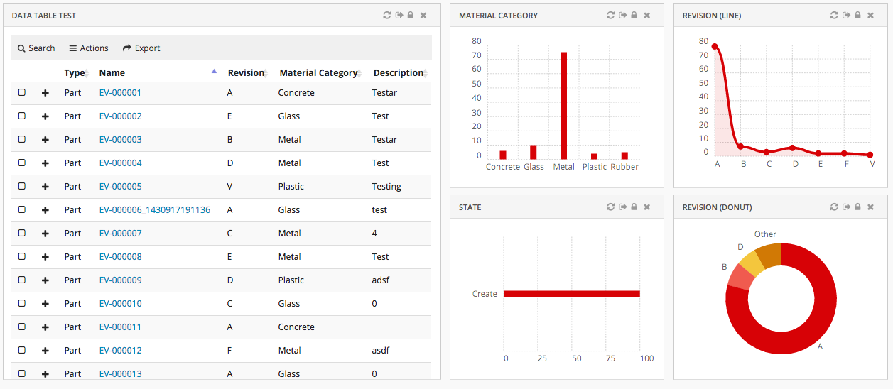
Figure 8. Dashboard with multiple widgets
1.7.1. Configuration
The <Dashboard> element supports the following child elements.
| Name | Description | Example |
|---|---|---|
Locked |
Whether the dashboard should be locked or not. A locked dashboard can not be customized. Valid values |
|
DisableCustomization |
Dashboard customization can be disabled for dashboard. Valid values |
|
Floating |
Whether the dashboard should be floating to the top of the page or not. Valid values |
|
ResizableHandles |
Configure different options i.e any combination of comma seperated valid value, to enable resize widget from different positions like right, left, bottom, left bottom or right bottom. Valid values are
|
|
Widgets |
Specifies what Widgets this dashboard should contain. |
|
1.7.2. Dashboard Customization
A user can customize a dashboard by changing size and position of widgets.
Customization is enabled by default but can be turned off with a property:
tvc.helium.dashboard.customization.enabled=false
or by configuring a dashboard or widget as locked.
Customization actions
For customizable dashboards, a small UI element is automatically appended on the right hand side*, and it slides in to expand when the user focuses on the element. From this menu, the end user can create and manage multiple dashboard views via a sidepanel and easily reset any customization they have done on that particular dashboard view, or re-add a previously removed widget.
Reset Customizations:
There are two icons to reset the customizations done on dashboard
Reset to default dashboard: Enduser can replace the default dashboard with the dashboard shared by config-admin. And also, when enduser adds new widgets to default dashboard, a new dashboard configuration will be created in background and replaces the default dashboard. In order to reset back to the default dashboard, you can click this icon reset to default dashboard.
Reset widget positions in dashboard: Enduser can shuffle widget’s positions inside dashboard or hide the default widgets in the default dashboard. This icon can be used to reset to the configured dashboard view.
| Any XML based widgets removed from dashboard will be added back when reset widget positions icon is clicked. |
Widget Gallery:
In a dashboard there can be widgets which are not visible but can be added as per requirement. User can add hidden widgets back to dashboard using Widget Gallery command. This will open overlay window with hidden widgets in tile view. Multiple widgets can be selected at once and added to dashboard.
Hidden widgets can be grouped and can have custom image to display by defining WidgetGalleryGroup config in dashboard widgets.
<Dashboard>
	...
	<Widgets>
		...
		<Widget namespace="hex:engineering" name="FixedHeaderEBOM.xml">
			...
			<Hidden>true</Hidden>
			<FontIcon>ti-c ti-preferences-c</FontIcon>
			<WidgetGalleryGroup>
				<Name>Engineering</Name>
				<Image>sample.png</Image>
			</WidgetGalleryGroup>
		</Widget>
		...
	</Widgets>
</Dashboard>| The Widget Gallery does not support widgets created using the 'create widget' command in the UI. |
Image should be the complete image name with extension and should we included in resource directory path under the folder structure custom/images.
Resource directory path can be set using the global setting tvc.helium.resources.directory.path = /helium, The default value is /helium.
If WidgetGalleryGroup is not defined for a widget, it will be grouped under DEFAULT. If image is not defined preference will be given to FontIcon
and if FontIcon is not available image will be auto-selected based on type of widget.
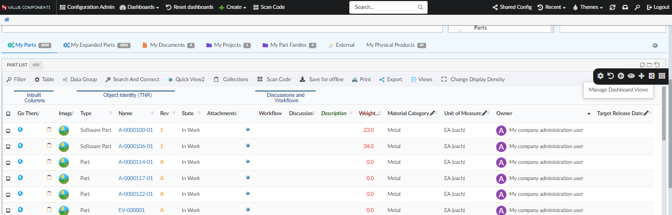
Figure 9. Customizable Dashboard, showing the customizations menu
Property tvc.helium.dashboard.customization.resetEnduserWidget is deprecated from 2022.4.0 release as the feature is separated into two different reset icons.
|
In empty dashboard, height of the dashboard is 0px. Due to this tooltip for the last command in slide-in Dashboard Menu blocks other commands. To avoid this and to set height for empty dashboard according to requirement, value can be defined in the property tvc.helium.dashboard.emptyDashboardHeight and its value will be set as height for empty dashboard. By default empty dashboard height is set to 750px.
In the property, only numerical value is to be given. Eg: if the required height is 800px then the property should be tvc.helium.dashboard.emptyDashboardHeight=800
|
(*) If the dashboard is presented in stacked mode, for instance if the user is on a mobile device in portrait mode, the menu is hidden. Customizations only apply to normal dashboard mode.
Dashboard Views
The end user can create and manage multiple dashboard views within a single dashboard, allowing the user to create customized dashboards to better fit their workflow.
From the dashboard menu, the end user can open a sidepanel where it is possible to create and manage multiple dashboard views and easily copy, delete or reset any customization they have done on a dashboard view.
Customization maximum cap
If there are performance concerns, the max size of the customizations object can be controlled by the property:
tvc.core.customization.maxContentSize
default value: 100000 Characters
Widget
The <Widget> element references widget instance via the ref attribute. For example <Widget ref="tvc:widget:helium/MaterialCategoryWidget.xml"/>
It also specifies where an widget should be rendered on the dashboard and what size the widget should have.
For sizes and placements of widgets, keep in mind that TVC Helium is based on a so called grid system, where a dashboard is generally divided into 12 columns. A Widget that should cover the entire browser window width should therefore specify its width to 12, two widgets side-by-side should each specify 6, and so on.
Expand and collapse icon on every widgets can be configured by defining global property tvc.helium.widget.enableHeaderExpandCollapse=true in tvc.properties. For enabling widgets floating behavior after collapsing , conventional <Floating> in dashboard should be false.
An icon can be configured on widget header along with widget’s title using the <Fonticon> tag. It can be placed left/right of the widget’s title using <IconPosition>. If no icon position is specified, it will be placed towards right of the widget’s title.
Header actions menu can be configured for every widget to group all the icons placed on the right side of the widget header into a single icon. All the icons can be displayed on hovering over the hamburger icon. <EnableHeaderActionsMenu> tag can be used to group all right sided widget header icons into one icon or global property tvc.helium.widget.enableHeaderActionsMenu=true can be used in tvc.properties to set hamburger icon for all widgets. The default value is false.
Priority will be given to <EnableHeaderActionsMenu> set for individual widget. For example, if individual <EnableHeaderActionsMenu> is set to false explicitly when global setting is true, priority will be given to <EnableHeaderActionsMenu> and therefore header actions menu icon will not be visible. Also it is recommended to configure the icon only when widget’s width can contain all right sided icons on widget header. We are either displaying all the icons or no icons at all.
|
The <Widget> element supports the following child elements.
| Name | Description | Example | ||||||
|---|---|---|---|---|---|---|---|---|
Id |
The identifier of the widget. Should be unique.
|
|
||||||
Locked |
Whether the widget should be locked or not. A locked widget can not be customized. Valid values |
|
||||||
Width |
The width of the widget. Valid value: Positive integer between 1 and 12. It supports the following attributes:
|
|
||||||
Height |
The height of the widget. Valid value: Positive integer. It supports the following attributes:
|
|
||||||
X |
Specifies where on the X axis the widget should be placed. Valid value: Positive integer. |
|
||||||
Y |
Specifies where on the Y axis the widget should be placed. Valid value: Positive integer. |
|
||||||
Template |
Specifies which template the widget should be rendered with.
If omitted a default template will be used. Useful if you would like to design your own widget frame template with full path from project root, or render
a widget without a header. The latter is accomplished by setting the element text
to |
or |
||||||
Badge |
This element is used to render a small |
|
||||||
Collapsed |
This element is used to configure preconfigured collapse behavior for widget. Valid value are |
|
||||||
EnableHeaderActionsMenu |
This element is used to configure hamburger icon which collapsed right sided widget header icons into itself and displays on hover. Valid value are |
|
||||||
FontIcon |
This element is used to configure font icon for widget title. |
|
||||||
IconPosition |
This element is used to specify the position of the widget’s font icon. Valid values are |
|
1.7.3. Example
<?xml version="1.0" encoding="UTF-8"?>
<Dashboard xmlns="http://technia.com/helium/Dashboard">
    <Locked>false</Locked>
    <Floating>true</Floating>
    <Widgets>
        <Widget id="dt1" width="6" height="10" x="0" y="0" locked="false"
            badge="true" ref="tvc:widget:helium/TableWidget.xml" />

        <Widget ref="tvc:widget:helium/MaterialCategoryWidget.xml">
            <Id>materialcategory</Id>
            <Width minWidth="2" maxWidth="5">3</Width>
            <Height>5</Height>
            <X>6</X>
            <Y>0</Y>
            <Badge>true</Badge>
            <EnableHeaderActionsMenu>true</EnableHeaderActionsMenu>
            <FontIcon>ti-c ti-eye-c</FontIcon>
            <IconPosition>right</IconPosition>
        </Widget>

        <Widget ref="tvc:widget:helium/RevisionLineWidget.xml">
            <Id>revision-line</Id>
            <Width>3</Width>
            <Height minHeight="3" maxHeight="7">5</Height>
            <X>9</X>
            <Y>0</Y>
        </Widget>

        <Widget ref="tvc:widget:helium/StateWidget.xml">
            <Id>state</Id>
            <Width minWidth="2" maxWidth="5">3</Width>
            <Height minHeight="3" maxHeight="7">5</Height>
            <X>6</X>
            <Y>5</Y>
        </Widget>

        <Widget ref="tvc:widget:helium/RevisionDonutWidget.xml">
            <Id>revision-donut</Id>
            <Width>3</Width>
            <Height>5</Height>
            <X>9</X>
            <Y>5</Y>
        </Widget>
    </Widgets>
</Dashboard>
1.7.4. Widget Customization
Just like for dashboards, an end user can do certain customizations on widget level. Exact customizations available will depend on the type of widget. For example, in a Table widget the end user can customize the pagination size, column visibilities, etc.
Customization on widget level is enabled by default, for dashboards where customization is enabled.
Customization actions
For the normal widget template, a Reset icon is available in the widget header. The user can reset widget level customizations from there. If you use your custom widget template, you can still use the JavaScript API .resetCustomizations(). After deleting a widget customization, the widget will refresh.
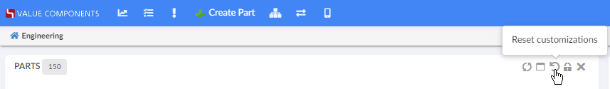
Figure 10. Resetting widget customizations
1.7.5. Open in Sidepanel
JavaScript API, App.page.sidepanel.openDashboard() can be used to open a dashboard in page’s sidepanel, e.g. App.page.sidepanel.openDashboard("tvc:dashboard:hex:engineering/PartInfoSidePanel.xml", "1.2.3.4");
This could be used for e.g. to quickly see contextual information about an object without navigating back and forth.

Figure 11. Dashboard in Sidepanel
1.7.6. Load Related Widgets
JavaScript API, .updateWidgets() is added to Dashboard instance. This API can be used to reload related widgets within the dashboard with different context ids. If the widget is initially hidden, it’ll be made visible.
| You need to have access to the dashboard instance to invoke this method. If you instead have access to Widget instance, see this |
For an implementation example, refer PartDetailActions.xml Column and Menu definitions available as part of HEX distribution.

Figure 12. Load Related Widgets
1.7.7. Widget lock unlock icon
The lock unlock icons can be configured for two different scenarios as given below:
Widget lock and unlock icon reflecting the action available to user. For ex :
-
If widget is locked it would show unlock icon.
-
If widget is unlocked it would show lock icon.
This is the default behaviour.
Widget lock and unlock icon reflecting the current state of widget.For ex :
-
If widget is locked, show lock icon.
-
If widget is unlocked, show unlock icon.
This can be enabled globally as init param tvc.helium.widget.lock.showAlternateIcon = true
1.8. Widget
All widgets (DataTable, Form, Charts) or any custom widget as described in the widget tutorial, share the following configuration options.
1.8.1. Configuration
| Name | Description | Example | ||
|---|---|---|---|---|
Title |
The title of the widget. Supports macros if a context object exists, e.g. |
|
||
OnInit |
Javascript function that creates the widget.
|
|
||
OnInitOption |
Additional options that is to be passed to the OnInit function. |
|
||
PostRender |
A javascript function that will be executed when the content of the widget has been rendered.
|
|
||
HeaderActions |
By providing a reference to a menu XML file, it is possible to add custom actions to the widget header. |
|
||
ShowActionTooltip |
Whether the header actions tooltip should be visible or not. Default value is true. |
|
||
Html |
HTML that should be rendered inside of the widget container |
|
||
Toolbar |
Describes the toolbar of the widget. For more information, see the Toolbar chapter. |
|
||
Sidepanel |
Describes an optional sidepanel in the widget. For more information see the Sidepanel chapter |
|
||
Access |
Defines access rules. |
See Access Control |
Replace/Toggle widgets
To toggle/replace a widget with another (switching views) you can do the following.
-
Create the initial widget as described in the Dashboard chapter.
-
Also add the other widget (that you want to toggle to) in the same Dashboard but add the element:
<Hidden>true</Hidden>. Make sure theX,Y,WidthandHeightelements have the same values as the initial widget.<ToggleWidget> <Label>Label for the command</Label> <FontIcon>he-some-font-icon</FontIcon> <To>the-id-of-the-widget-to-toggle-to</To> <Access>access-rules-for-this-action</Access> </ToggleWidget>The
<To>element must point to the id of the widget to toggle to. To toggle back to the initial widget create the same command as above but change the<Id>to point to the initial widget. This means that the relationships will most likely be symmetrical in your configurations.For
<Access>definition, see Access Control
1.8.2. Conditionally evaluate dataset on drilldown
In some cases, the user might want to evaluate a different dataset for a widget on a drilldown dashboard. This is possible by configuring the widget you want to evaluate with:
<OnInitOption name="evaluateWithDataSet" value="true" />Example widget configuration:
<ChartWidget>
    <Title>Multi Series Stacked Bar Chart</Title>
    <OnInitOption name="evaluateWithDataSet" value="true" />
    <ChartConfig namespace="hex:engineering">EBOMMultiSeriesStackedBarChart.xml</ChartConfig>
</ChartWidget>
1.8.3. Load Related Widgets
JavaScript API, .loadRelatedWidgets() is added to Widget instance. This API can be used to reload related widgets within the dashboard with different context ids. If any related widget is initially hidden, it’ll be made visible.
| You need to have access to the widget instance to invoke this method. If you instead have access to Dashboard instance, see this |
1.9. Widget Sidepanel
A sidepanel is a container element where additional content within a widget can be placed. It can be either any HTML content, or a menu containing commands. The visibility of this sidepanel container is toggled by clicking it.
Each widget supports defining a sidepanel which can be revealed (slided in) either from the left or the right side. When the widget is first loaded, the initial state of the sidepanel will be closed.
The <Sidepanel> element supports the position and width attribute. Valid values for position is "left" or "right".
Valid value for width is a positive integer.
| Currently widgets only supports one sidepanel each, either to the right or to the left. |
The <Sidepanel> element supports the following child elements.
| Name | Description | Example | ||
|---|---|---|---|---|
Label |
The label of the sidepanel. If omitted no label will be rendered. If the value is an existing i18n key internationalisation will be performed |
|
||
Html |
Custom html to be rendered in the widget |
|
||
Closable |
Whether sidepanel will be closed when clicking inside the same widget. Default is false. |
|
||
Toolbar |
A Toolbar definition. It is encouraged to supply the toolbar definition with the
|
|
1.9.1. Javascript API
The sidepanel can be opened, closed and toggled via javascript using the following syntax:
var widget = App.page.getWidgetById('widget-id');
widget.openSidepanel() // opens sidepanel
widget.closeSidepanel() // close sidepanel
widget.toggleSidepanel() // toggles the sidepanel visibility state
1.9.2. Example
<Sidepanel width="100" position="left">
    <Label>Sidepanel</Label>
    <!--<Html><![CDATA[<div>test</div>]]></Html>-->
    <Toolbar vertical="true">
        <Command>
            <Label>Toggle Edit Mode</Label>
            <FontIcon>he-pencil</FontIcon>
            <OnClick>App.custom.toggleEditMode</OnClick>
            <OnClickParams>{"foo": "bar"}</OnClickParams>
        </Command>
    </Toolbar>
</Sidepanel>
1.10. Search
Helium comes with basic search functionality, configurable in a number of ways. Search can be configured to appear in the global topbar by pointing out a search configuration file in Helium.xml:
<Search>tvc:search:helium/TopBarSearch.xml</Search> This will render a magnifying glass icon on which you click to launch the search GUI overlay.
You can also choose to render an input field inside the topbar, so that you can type a query directly into it. The configuration is similar to that of the Topbar Icon <Search> command. A full example can be found in the TopBar chapter.
Please note that for topbar inline search, only <Search version="2"> search configuration is supported, and that you will initiate the search by either hitting enter key or clicking the icon.
Figure 13. Top Bar
1.10.1. Search
The <Search> format supports the following child elements.
| Name | Description | Example | ||
|---|---|---|---|---|
Limit |
The maximum number of search results returned. |
|
||
Types |
Show only results of the listed types. |
|
||
Selects |
The statements listed within this element are fetched and returned to the browser for client-side use (for example, to show them in the search result template). NOTE: By default search result provide type, name, revision and description. |
|
||
Where |
A Where clause, following MQL syntax. Use %s to indicate where to inject the criteria entered by the user performing the search. |
|
||
HitOnClick |
Name of a JavaScript function to execute when clicking on a search result item. The argument passed will be the object ID. |
|
||
HitTemplate |
Customize design of search result by either specifying a template formatting the layout of single search result. Currently it’s only possible to specify templates which are located within the helium/template folder. |
|
||
ResultRenderCallback |
Customize complete search result. Great flexibility but requires custom implementation to handle onclick events, responsiveness etc. |
|
||
SearchProvider |
Search Provider to be used for this search config. If none is specified global Search Provider will used as default.
|
|
1.10.2. Example
<?xml version="1.0" encoding="UTF-8"?>
<Search>
<Limit>100</Limit>
<!-- Restrict to only search object of specified types -->
<Types>
	<Type>type_Part</Type>
	<Type>type_Document</Type>
</Types>
<!-- Fetch additional select statements which can be used for rendering -->
<Selects>
	<Select>current</Select>
	<Select><![CDATA[$<attribute[attribute_Originator]>]]></Select>
</Selects>
<!-- Where clause. Use %s to indicate where to inject the criteria entered by the user -->
<!-- <Where>name ~~ '*%s*'</Where> -->
<!-- Javascript callback when clicking search hits -->
<!-- <HitOnClick>App.custom.openSearchHit</HitOnClick> -->
<!-- Customize design of search result by either specifying a template formatting the layout of single search result. Currently it's only possible to specify templates which are located within the helium/template folder. -->
<!-- <HitTemplate>search/result-hit-test</HitTemplate> -->
<!-- Customize complete search result. Great flexibility but requires custom implementation to handle onclick events, responsiveness etc -->
<!-- <ResultRenderCallback>App.custom.renderSearchResult</ResultRenderCallback> -->
<!-- Custom Search Provider for this search config, if none is specified global Search Provider will used -->
<!-- <SearchProvider>com.acme.search.PartSearchProvider</SearchProvider> -->
</Search>1.11. Internationalisation
Helium supports both server-side and client-side internationalization.
The server-side internationalization is achieved by defining a set of string resource files inside <webapp-root>/WEB-INF/classes directory of the web application.
    <Column>
        <Label>emxFramework.Common.Name</Label>
    </Column>
The client-side internationalization is achieved by defining a set of language files in JSON format inside <webapp-root>/helium/lang or <webapp-root>/helium/custom/lang directory.
To decide which language to load, Helium will look at the current browser language (navigator.language), but if no
suitable file is found a default one will be used.
    <Column>
        <Label>column.common.name</Label>
</Column>|
For |
1.11.1. File format
Each file should be given a name based on the locale they are to support. For instance, a file containing US English should
be named en_us.json and a file containing Swedish should be named sv.json.
The files are simple JSON objects, with a key and a string as value, like the one below:
{
  "test": "My test message"
}
Where the key is test and the message is My test message. The keys can be nested arbitrarily deep in a nested object. For example the file below will
create the keys form.createNew.title and form.createNew.message.
{
 "form" : {
   "createNew" : {
     "title" : "New Object",
     "message" : "The object {objectId} was successfully created."
   }
 }
The value for the key form.createNew.message contains a placeholder ({objectId}) which will be populated with the actual value by the
framework. For an example see the JavaScript API.
1.11.2. Resolving files
The language files are located in <webapp-root>/helium/lang or <webapp-root>/helium/custom/lang.
The internationalisation framework will first look for files inside <webapp-root>/helium/custom/lang, if no suitable file is
found, it will fall back to files defined in <webapp-root>/helium/lang and if still no file is found, it will default to a file named default.json
1.11.3. Javascript API
The above described keys can be accessed through javascript with the following syntax:
// Will return "My test message"
App.i18n.t('test')
It is possible to pass arguments to the App.i18n.t function that will be interpolated. See example below.
//  Will return "The obejct 1.2.3.4 was successfully created."
App.i18n.t('form.createNew.message', {objectId: '1.2.3.4'})
Handlebars helper
In Helium, there is a Handlebars helper for easy access to the internationalisation API. It is invoked by using the i18n helper.
{{i18n myTranslationKey}}This will internally call the App.i18n.t function with the passed in key as its argument. The i18n helper of course also supports passing
in arguments, like so:
{{i18n myTranslationKey myObjectContainingVariables}1.12. Toaster
Helium use toaster message to provide user notification. These messgae can be shown using javascript api.
The default options use to show toaster notification can be changed through javascript as shown below :
(function () {
  App.toaster.defaultOpts = {
		"closeButton": true,
		  "newestOnTop": true,
		  "progressBar": true,
		  "positionClass": "toast-bottom-full-width",
		  "preventDuplicates": false,
		  "onclick": null,
		  "showDuration": "300",
		  "hideDuration": "1000",
		  "timeOut": "15000",
		  "extendedTimeOut": "1000",
		  "showEasing": "swing",
		  "hideEasing": "linear",
		  "showMethod": "fadeIn",
		  "hideMethod": "fadeOut"
  }
})();
The above javascript can be placed in webapps/helium/custom folder.
The toaster message are shown for 8 seconds by default, but user might want to see it for longer duration. This can be achieved by adding below configuration in tvc.properties:
tvc.helium.toaster.timeout = 25000 // default is 8000
1.13. Access Control
Helium has a common way of configuring access control that is shared among the different components (except table columns) that has this support (page, tab, commands etc.).
Access Control for table columns can be defined similar to TVC Classic. Please click here for more details.
The access restriction for components (other than table columns) can be defined based upon following:
-
Role Assignment
-
Group Assignment
-
Person (A named user)
-
Access Mask (Access mask for the current object)
-
Access Program (A JPO that evaluates the access rights)
-
Access Expression (MQL expression that evaluates the access)
The example below illustrates how you can construct the access restriction:
<Access>
    <Role>role_FirstRole</Role>
    <Role>role_SecondRole</Role>
    <Group>group_SomeGroup</Group>
    <Mask>modify,checkout</Mask>
</Access>
Or use an access program:
<Access>
    <Program name="MyJPO" method="checkAccess"/>
</Access>
Or use an access expression:
<Access>
    <Expression><![CDATA[owner == context.user]]></Expression>
</Access>
For Topbar Search command :
<Search ref="tvc:search:helium/TopBarSearch.xml">
    <Access>
        <Group>group_SomeGroup</Group>
    </Access>
</Search>
For Topbar Myspace and Logout command :
<Myspace>
    <Access>
        <Group>group_SomeGroup</Group>
    </Access>
</Myspace>
1.14. Loader
A loader alerts a user to wait for an activity to complete.
Figure 14. Loader
It can contain message also. This message appears just below the animation.
One can enable this feature by defining key-value pair like below in translation JSON files
"loader": {
    "message": "Loading..."
}
By defining this key/ value pair, all loading animations in the application will automatically display this value. No further configuration is needed.
It is also possible to define custom messages for different loading animations, e.g.
new App.Loader($element,{"message":'loader.customMessage'})Or
new App.Loader($element,{"message":'Loading...'})A mix of the above, i.e. default message and custom message is also possible.
Also we can add loader over any particular element on the UI, for ex a table row
new App.Loader(element, { rowLoader: true }JavaScript API, Loader.
Figure 15. Loader with message(Loading…).
1.15. Dimmable Modal
It would be helpful for users to have dim and non-reactive backgrounds while working on modal or fullscreen views.
This feature can be enabled by configuring tvc.helium.widget.overlay.dimmable= true // default is false in tvc.properties.
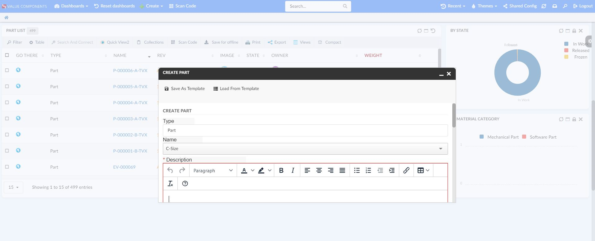
Figure 16. Dim and Non-reactive Background