 TVC Helium 2022.1.0
<?xml version="1.0" encoding="UTF-8"?>
<Application xmlns="http://technia.com/helium/Application">
   ...
    <TopBar>
      	...
      <Command>tvc:command:helium:admin/ConfigAdminUI.xml</Command>
   	...
    </TopBar>
<Application/>TVC Helium 2022.1.0 Release Information
04 March 2022
1. In-App Designer (End User Definition)
In-App Designer (previously known as End-User Definition/ End-User UI) is a concept that brings the idea of creating, editing and sharing configurations using the built-in admin user interface. These configurations can be used to define Helium dashboards, widgets, tables, charts, etc. Built-in Admin UI is provided to create, modify and share these configurations. In-App Designer can be used from Helium standalone or Helium widget in 3DDashboard. Once the config-admin is created and shared the configuration with the end-user, then the end-user receives the configuration to accept it. Once accepted, he can select and apply the configuration to his page, dashboard, or widget from UI. For detailed information, please refer In-App Designer.
In this release, we have enhanced this feature further as stated below.
1.1. Configuration Admin UI
Introduced new command "Configuration Admin" that navigates directly to Configuration Admin UI page. This command can be added to the topbar in the helium Standalone page by using the below configuration.
1.2. Reusable table columns
Previously when a column is added through the table configurator, a new column object was created. Due to this, multiple objects for the same column were created.
Now, when a new column is added, if there is an existing object for the column, it will be resued. If no object exists for the column, a new column object will be created.
Also, all these reusable columns are by default editable.
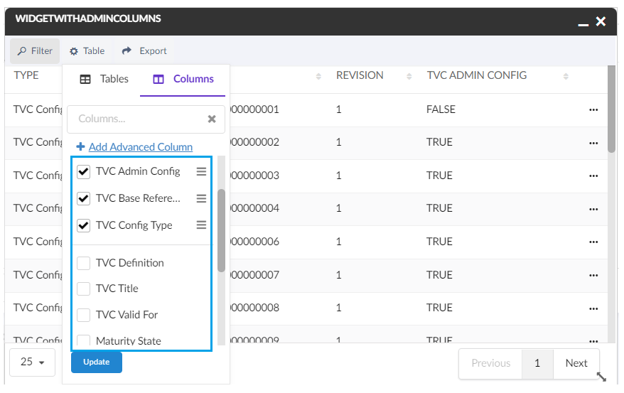
Figure 1. Reuse Table Columns
1.3. Widget Edit Restrictions
In previous releases, the widget edit option was available to all the users.
Now the edit option is only available when,
1) the widget is in draft state, owned by the logged in user and the user is admin.
2) widget is in an active state and owned by logged in end-user.
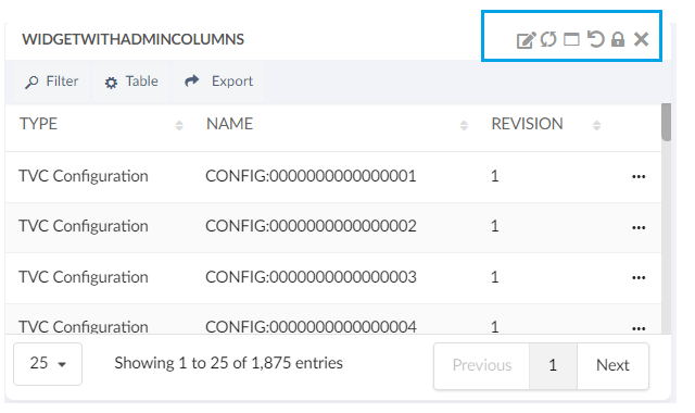
Figure 2. Editing a widget
1.4. Admin UI Improvements
The following UI improvements are done in edit config form.
1) Edit config form opens as a modal instead of sidepanel.
2) Increased the height of Configuration field for better readability.
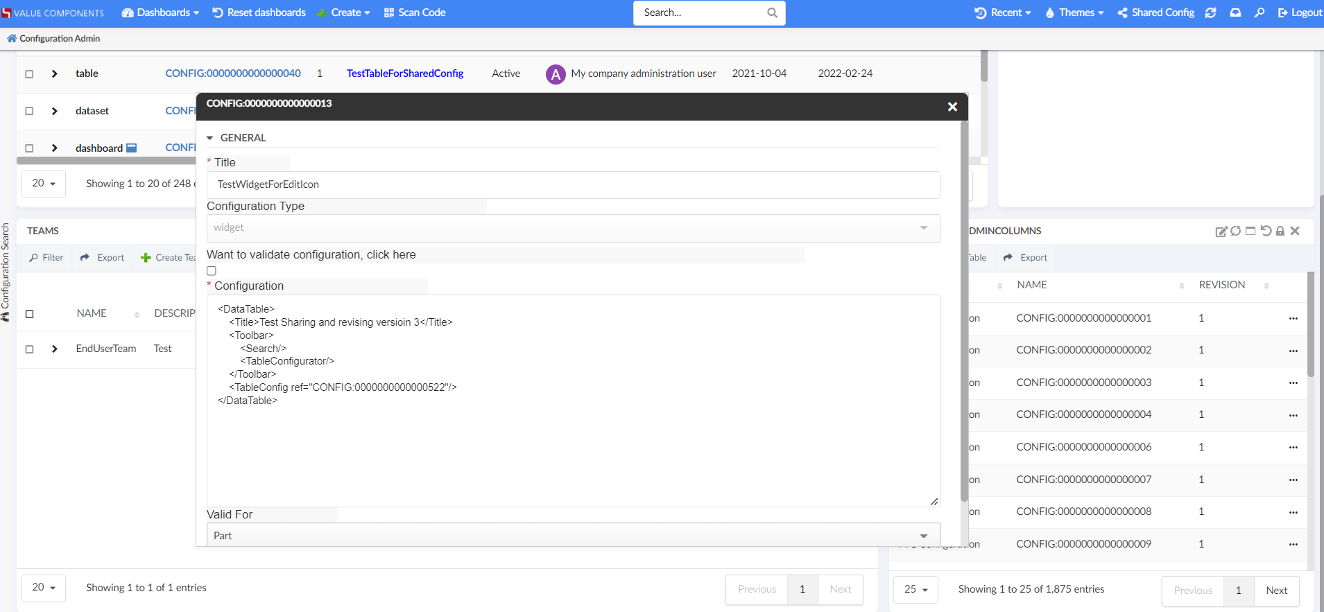
Figure 3. UI Improvements
1.5. Valid For Field In Widget
Introducing the Valid For field in the create and edit widget forms. In general, configurations like widgets, datasets, tables and dashboards can be created specifically for one business type or for all business types. For example, You can create dashboards or Widgets specific for a business type "Part".
Valid For helps to list the configs which are specific to the selected business type. This field helps to reduce the long list of options in the create and edit widget form fields.
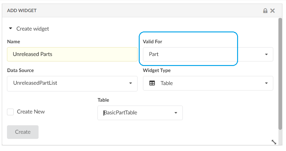
Figure 4. 'Valid For' Field
2. 3DDashboard
2.1. In-App designed configs in 3DDashboard
In-App designed configs can be loaded along with XML based configurations in widget preferences in 3DDashboard. Users can see shared and accepted configs in widget preferences. Also, the admin can test the draft configurations before sharing them with others.
This feature is enabled by default. This can be disabled by setting the below property in tvc.properties or web.xml file.
tvc.3ddashboard.showEndUserConfigObjects=false2.2. Support Preview In-App Designed Dashboard in overlay mode
Using In-App Designer Admin UI, admin can define a new dashboard. New dashboard is created in draft state and admin can add new widgets to this draft dashboard. Using �open with� capabilities it is possible to open the draft dashboard in separate widget from within the Admin UI. Once opened in separate widget in overlay mode, draft dashboard widget can be pinned to any 3DDashboard tab. This features allows admin to directly preview and load draft dashboard without having to leave Admin UI.
prerequisite:
The user must specify the name of the launch app that will be used to preview the In-App designed dashboard in "tvc.properties."
| Property | Value |
|---|---|
tvc.3ddashboard.inAppDesigner.configLaunchApp |
launch App Name |
| In future it will be allowed to define the launch app from UI instead of tvc.properties. |
3. New Search Experience
3.1. User settings
3.1.1. Search On Load
Search config setting SearchOnLoad can be used to perform the initial search as search form loads which increases the user efficiency because they get the search result immediately after landing on the search form. However, in some cases, users may want to disable search on load.
Users can now themself control whether the search should be initiated when the search form loads. Earlier this feature was limited to search config and it was not possible to enable or disable for a specific user.
A built-in command is added to support this. This built-in command needs to be added to the search form toolbar.
<Toolbar>
  <SaveSearchUserSettings />
</Toolbar>
SaveSearchUserSettings command is used to club both the user settings ie Search On Criteria Update and Search On Load
|
For detailed information on search on load, please refer Search On Load
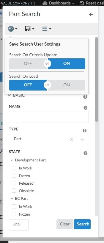
Figure 5. Usersetting search for criteria udate
3.2. Revision field
Using revision field, business objects can be filtered on different revision sequence conditions like - last revision, latest revision. Now two more options have been added to revision field - first revision and last + latest revision.
Different revision selection options can be added using tags as shown below
Please refer to below link for additional settings about revision field
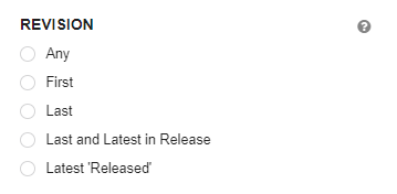
Figure 6. Revision filter in NSX search form
4. Datatable
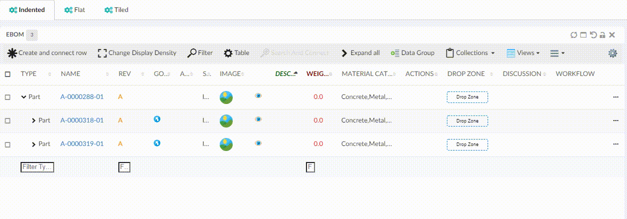
4.1. Fixed Columns
In a non-responsive table with lots of columns, while scrolling horizontally towards the right end that the user may lose the track of basic information of rows like the name and type of the object. Now users can lock some specific number of left-most columns. This can be achieved by using the FixedColumns tag in the table config.
<TableConfig>
	<Title>Parts Table</Title>
	<DataLoader>
		<DataSet namespace="hex:engineering:homepage">MyParts.xml</DataSet>
	</DataLoader>
	<Table namespace="hex:engineering:homepage">MyParts.xml</Table>
	<DisplayMode>flat</DisplayMode>
	<RowSelect>multi</RowSelect>
	<Pagination size="15" disabled="false" />
	<ClientSideProcessing enabled="true" threshold="10000" />
	<FixedColumns>4</FixedColumns>
</TableConfig>
Figure 7. Fixed Columns
For more detail see here Table Config
4.2. Group Header
When using tables to display data, it might be helpful to display column information in groups. For better readability and data representation admin can group the table columns in different groups based on the business use case. This can be achieved by using the GroupHeader tag in Column.
<Column>
    <Name>Name</Name>
    <Description>Name of this object</Description>
    <Expression>name</Expression>
    <Label>emxFramework.Common.Name</Label>
    <GroupHeader>Object Identity (TNR)</GroupHeader>
    .....
    .....
</Column>
User can also add some custom CSS classes on group header using the setting.
<Column>
	<Name>Type</Name>
	<Expression>type</Expression>
	<Description>Type of this object</Description>
	<Label>emxFramework.Common.Type</Label>
	<GroupHeader>Object Identity (TNR)</GroupHeader>
	.........
	.........
	<Setting name="groupHeaderClass" value="green-color" />
</Column>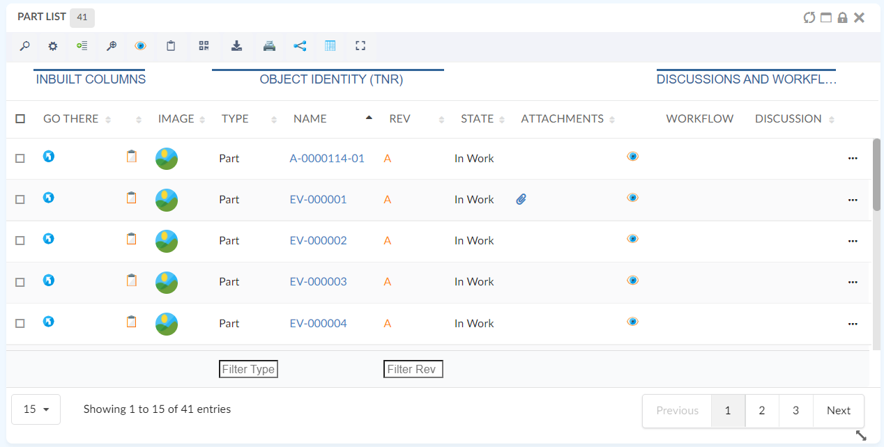
Figure 8. Group Header
For more detail see here Table Column Config
4.3. Responsive pagination content
While resizing datatable widget or working with compact width datatable, sometimes it’s difficult to show all pagination info in content div. Now it has been improved with more responsive behavior to show adequate pagination information according to available space.
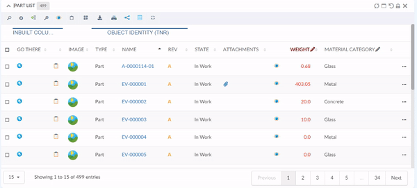
Figure 9. Responsive Pagination Content
5. Form
5.1. Invaild characters in text field
Sometimes it might be required to avoid users entering invalid or reserved characters in the free-text field. This can be configured as below :
<Field>
<Validation>
<BadCharacters>#@)~</BadCharacters>
<Validation>
</Field>
Or bad characters can be configured globally in tvc.properties tvc.helium.form.badCharacters = #@)~ with following configuration
<Field>
<Validation>
<BadCharacters>true</BadCharacters>
<Validation>
</Field>
For more detail see here Form Field Config
5.2. Cross section dependsOn support
Depends on was already supported in Helium but with limitation of fields to be in one section. This limitation is no more applicable now as depends on can be used in cross section too.
This can be achieved with following config :
<Field crossSectionDependsOn="someOtherFieldExpressionOrId" crossSectionDependsOnValue="someValue">For more detail see here Field Conditional dependencies
6. Core
6.1. Session timeout notification
The system will now show a warning message when the session is about to timeout. This will be helpful as the user can save unsaved data and also allow the user to not update any field when the session is already timeout. This feature can be enabled using a global setting -
tvc.helium.showTimeoutAlert= true // defaults to false
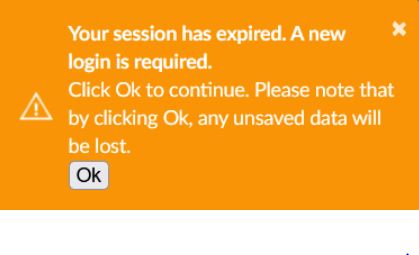
Figure 11. Logout Notification
To get this notification before getting timed out, this can configured as below :
tvc.helium.timeoutAlert= 60 // seconds
After adding the above property in tvc.properties users will get notification 60 seconds prior to the timeout so that they can save unsaved changes.