Structure Browser - Administration Guide : Side Panel
30 March 2016
1. Side Panel
As of TVC 6.0, a new UI feature called "Side Panel" was introduced. The side panel can be used in the Structure Browser view right to the table content to display arbitrary content generated by custom JSP pages. The idea behind the side panel is to reduce the need of having too much information inside the tables and also reduce the need of creating advanced cell content but also to reduce the need of opening up popup windows. I.e. increasing usability and reducing the time needed to create the table cells.
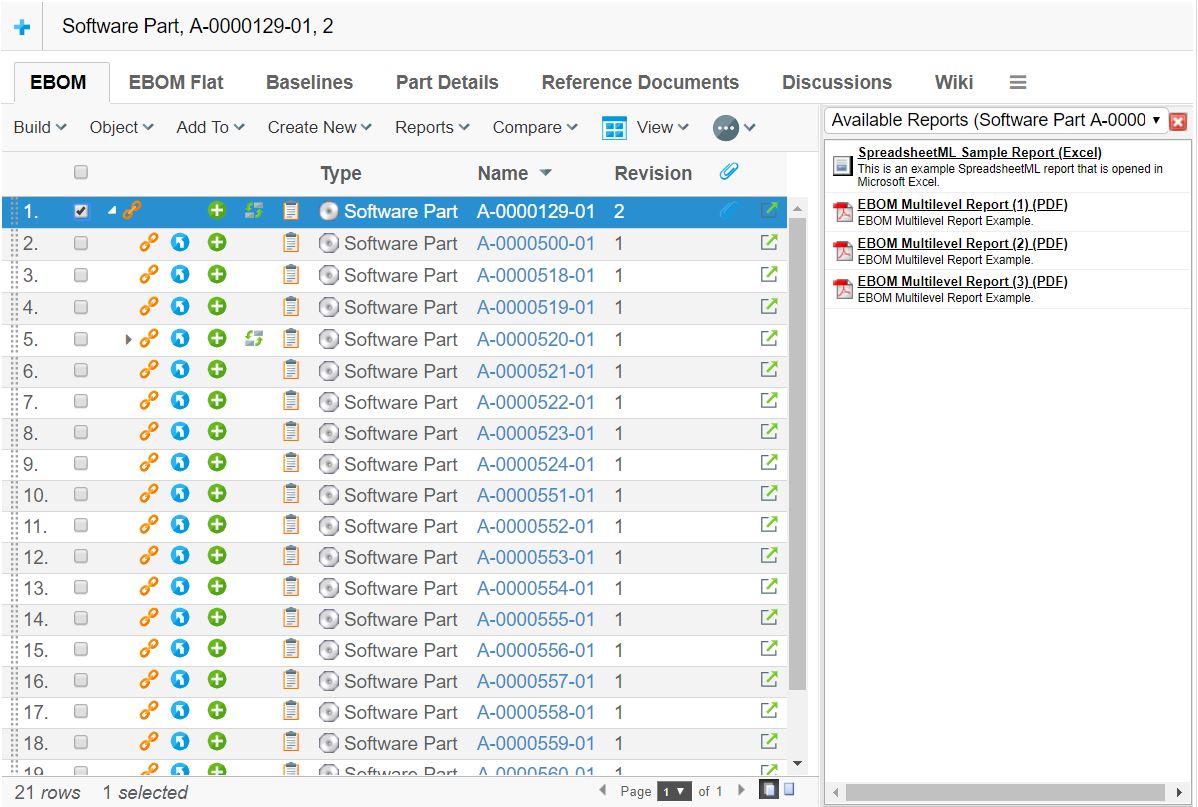
The side panel itself contains so called "cards", which in turn contains the content (JSP/HTML). The side panel can be used to display several cards, one at a time, and the user can switch between previously loaded cards through the drop down list. The screen shot below illustrates an example of how the side panel can be used.
Figure 1. Side Panel in Action
The side panel can be brought up either by clicking on a command within the toolbar, or by clicking on a link inside a table cell. In either of these cases, there are a couple of settings that must be set in order to use the side panel.
These settings are:
- Href
-
The resource to be loaded. This is specified under the "link" tab for the command or table column within "business".
- Target Location
-
The target location setting of the command or table column must be set to either "card" or "sidepanel", which will indicate for TVC that the Href is about to be displayed inside the side panel.
The difference between setting the value to "card" vs. "sidepanel" is that the "card" value will add the loaded page to the card-history (e.g. the user will be able to select a previous page loaded into the sidepanel from the card-dropdown-list). The sidepanel value will disable this feature and will not make it possible for the user to switch to that page later on.
- Card ID
-
This setting specifies the identifier of the card. If the identifier is set to "new" (which is the default value), a new card will always be opened up even if the same link has been invoked earlier. By setting the identifier, one can force TVC to reuse a particular Card when a card-link with the same id is clicked multiple times.
- Card Title
-
Defines the title of the Card as it will appear in the card selector (drop down list). If the value of this setting is set to "auto", then the title of the generated HTML page will be used as Card Title.
If the side panel is invoked through a link inside a table cell, one can use macros to define the Card Title. I.e. as card title, you can for example have:
Details of $<type>, $<name> rev: $<revision>, which then will be resolved once the link is clicked. - Card Load Script
-
Defines an arbitrary Java Script that should be launched when the card has been loaded. The Card Load Script must refer to a script available inside the loaded page.
If the side panel is invoked through a link inside a table cell, one can use special macros for adding special values such as "object-id", "relationship-id" etc. To use such a macro, look at the following example:
addObject(‘${OBJECTID}’, ‘${RELID}’); - Card Reloadable
-
This setting defines if the resource should be reloaded or not when a specific card is subsequently loaded. I.e. if this setting is set to false, the resource will not be reloaded BUT the "Card Load Script" will be executed only.
- Card Width
-
Defines the width of the card inside the side panel. Each card can have its own preferred width, and when the user toggles between cards through the card selector - the width of the side panel is adjusted according to the Card Width of the current displayed card.
1.1. Implementing Custom Cards
Typically when implementing cards inside the side panel, one will load a HTML page generated through a JSP page. Even though you can display any HTML page within a card, you should avoid loading too heavy pages inside the card, this because the size of the card is limited and also due to performance (card pages are intended to be "light weighted").