<servlet>
    <servlet-name>tvcaction</servlet-name>
    <servlet-class>com.technia.tvc.core.TVCServlet</servlet-class>
    <init-param>
        <param-name>tvc.core.login.mainPage.mobile</param-name>
        <param-value>/tvc-action/mobileInitDesk?menu=tvc:menu:tvx:mobile:common/desk/Desk.xml</param-value>
    </init-param>
    ...
</servlet>Mobile Access - Administration Guide
04 April 2016
1. Legal Notes
© Copyright 2003-2019 by TECHNIA AB
All rights reserved.
PROPRIETARY RIGHTS NOTICE: This documentation is proprietary property of TECHNIA AB. In accordance with the terms and conditions of the Software License Agreement between the Customer and TECHNIA AB, the Customer is allowed to print as many copies as necessary of documentation copyrighted by TECHNIA relating to the software being used. This documentation shall be treated as confidential information and should be used only by employees or contractors with the Customer in accordance with the Agreement.
This product includes software developed by the Apache Software Foundation. (http://www.apache.org/).
2. Mobile Access
TVC Mobile Access allows you to configure a web based mobile device application of your existing Enovia environment using different TVC Components. The user interface is designed to work on all popular smart phones, tablets and desktop platforms. The main features are:
-
Desk with shortcuts to different parts of the application
-
Object Search
-
Tables (Flat and Navigate mode) with Data Handler and Cell Renderer support
-
Top Panel
-
Tabs
-
Forms (View, Edit, Create)
-
Dashboard with charts and tables
-
Theme Support
2.1. System Requirements
The following is a list of the minimum requirements for the installation of TVC Mobile Access. If your system is different, consult TECHNIA before installing.
-
ENOVIA V6R2009x or higher
-
Application Server according to the Enovia core product requirements
-
TVC Core
-
TVC Structure Browser
-
TVC Graphic Reporting (For dashboards and charts)
3. Configuring TVC Mobile Access
3.1. General notes on configuration
TVC Mobile Access reuses some of the existing TVC Components like Structure Browser and Graphical Reporting and its configurations. Most parts of the configurations are the same when configuring for Mobile Access but there are settings that are not supported and some settings that differ slightly. Please read the sections in this guide to see exactly how a configuration should look for Mobile Access.
3.2. Login Page
3.2.1. Mobile Browser Configuration
Before you can use TVC Mobile access you have to define an entry point for it. This is done in your application web.xml file by adding an init parameter to the tvcaction Servlet. The normal entry point to use is the tvc-action called mobileInitDesk. You can read about configuring that one in the next section.
3.2.2. Desktop Browser Configuration
If you need to reach the mobile interface through a desktop browser some further configuration is needed. Add the following init-param section below the init-param described above.
<init-param>
    <param-name>tvc.core.login.mainPage</param-name>
    <param-value>/tvc-action/mobileInitDesk?menu=tvc:menu:tvx:mobile:common/desk/Desk.xml</param-value>
</init-param>
3.2.3. Login URL
When this section has been added to your web.xml and your application server has been restarted you can login to it with one of the following URL’s:
-
/tvc/core/tvcLogin.jsp
-
/tvc/mobile/tvcLogin.jsp
The first URL will redirect to the URL below if the user is reaching the page from a mobile device.
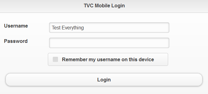
Figure 1. Login Page
3.2.4. Security Context
TVC Mobile Access has support for setting Security Context upon login (on 3D Experience versions that supports Security Context).
The following init parameters can be used to enabled the functionality:
<!-- Enable setting default context -->
<init-param>
    <param-name>tvc.core.login.useSecurityContext</param-name>
    <param-value>true</param-value>
</init-param>
<!-- Enable user selection of context -->
<init-param>
    <param-name>tvc.core.login.showSecurityContextChooser</param-name>
    <param-value>true</param-value>
</init-param>
3.2.5. 3DPassport
In order to use 3Dpassport for login and logout to TVC Mobile you need to configure the path to the 3DPassport logout page. This is done with the following init parameter.
<init-param>
    <param-name>tvc.core.login.logoutPage.mobile</param-name>
    <param-value>https://3dx.vs.com:444/3dpassport/logout</param-value>
</init-param>
3.3. Desk
The normal entry point to use when logging in to TVC Mobile Access is called Desk. The Desk is a grid that fills the screen with commands that link to different parts of the mobile application.
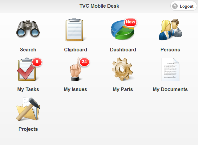
Figure 2. Desk
The tvc-action that loads the desk is called mobileInitDesk and has a parameter called menu. This parameter is mandatory and points to a menu XML definition that holds all the commands that should be on the Desk. Read more about configuring Menus and Commands in the TVC Core Admin Guide.
/tvc-action/mobileInitDesk?menu=tvc:menu:tvx:mobile:common/desk/Desk.xml
Each command in the desk menu has support for the following elements:
| Element | Description | Example |
|---|---|---|
Label |
The label to be shown below the command |
<Label>My Parts</Label> |
Image |
Url to the image file to be used for this command. It is recommended to use a high resolution png image with a transparent background for best visual appearance. |
|
Url |
Url that command should launch on click. |
|
Settings:
| Setting | Description | Example |
|---|---|---|
Count Bubble |
This setting can be used to populate a small "count bubble" in the top right corner of each command. There is currently three ways of populating a value using different providers:
|
|
The desk menu configuration can also point out another menu to create a "Sub Desk" containing a new set of commands. The sub desk menu must have the following settings:
| Element | Description | Example |
|---|---|---|
Label |
The label to be shown below the sub desk |
|
Image |
Url to the image file to be used for this sub desk. It is recommended to use a high resolution png image with a transparent background for best visual appearance. |
|
3.4. Top Panel
TVC Mobile Access has a version of the Top Panel that you can use to display object data at the top of a page. This version of the Top Panel has support for configuring your own Top Panel Form with support for Data Handlers and Cell Renderers for displaying the data. Below the Top Panel you configure a "Tab Menu" allowing you to switch to different sub pages while keeping the Top Panel in the top of the screen. Information on how to configure the Top Panel is found in the Admin Guide for TVC Core.
| Support for editing fields and custom controls is not available in the Mobile version of the Top Panel. |
Figure 3. Top Panel with Tab Menu
3.5. Tab Menu
TVC Mobile Access has a version of the TVC Tabs. These works like the normal tabs allowing you to switch between different sub pages. Since the device screen can be very narrow it is rendered as a drop down menu instead. You can read more about configuring Tabs in the Admin Guide for TVC Core.
Figure 4. Tabs rendered in top of the page
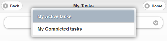
Figure 5. Showing the different tabs available when clicking on the Tab Menu
3.6. Table
If you have the TVC Structure Browser component installed in your application you can use it to display objects and object data in a Mobile version of a Table. These tables use many of the features from the normal versions of tables like the ability to have columns with support for data handlers and cell renderers.
3.6.1. Flat Mode
To load a table in Flat Mode you can use one of the following actions. These actions works like the normal versions that you can read more details about in the TVC Structure Browser Admin Guide. That guide also has information on how to use pageconfigs, views, tables and menus.
| Action Name | Description |
|---|---|
/mobileExecInquiryToTable |
Used to load a table with data from an inquiry |
/mobileExecCustomLoaderToTable |
Used to load a table with data from a custom java loader |
/mobileTableWithModel |
Used to load a table with data that is not business objects |
/mobileLoadClipboardIntoTable |
Used to load a table with data from the clipboard collection |
Example command for loading a table in flat mode:
<Command>
    <Label>My Parts</Label>
    <URL action="/mobileExecInquiryToTable">
        <Param name="pageConfig" value="tvc:pageconfig:tvx:mobile:enc/MyParts.xml"/>
    </URL>
    <Image>${ROOT_DIR}/tvc/mobile/images/desk/part.png</Image>
</Command>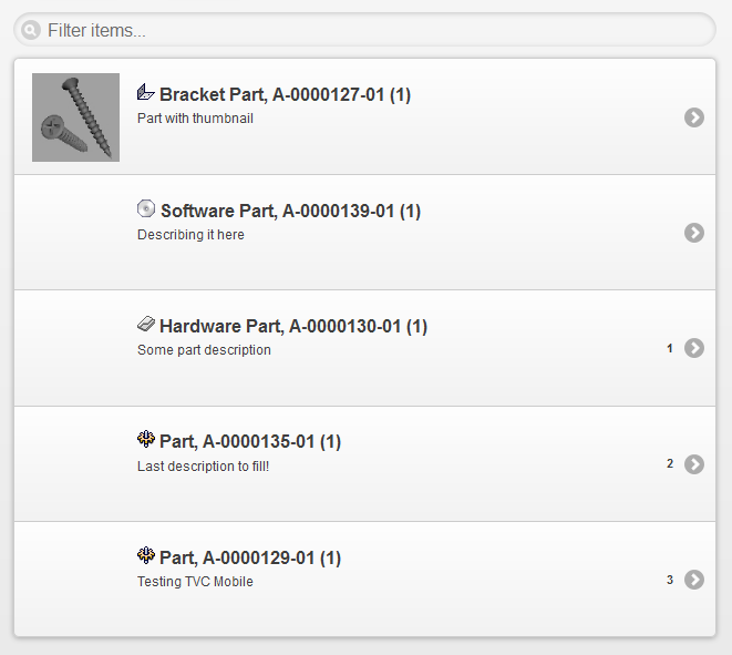
Figure 6. Table showing objects in flat mode
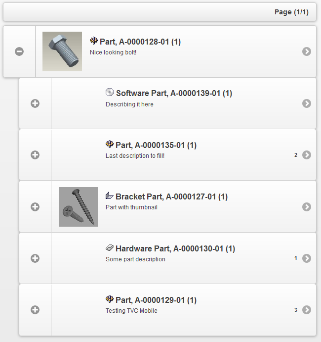
3.6.2. Navigate Mode
To load a table in Navigate mode you have to use the following action. This will load a table in a mobile version of Navigate mode with the ability to expand/collapse the structure.
| Action Name | Description |
|---|---|
/mobileNavigate |
Used to load a table in Navigate mode |
/mobileNavigateShadowStructure |
Used to load a table in navigate shadow structure mode |
3.6.3. Table configurations
The key difference in the Mobile version of table configurations is that you don’t have a dynamic amount of columns that is rendered from left to right. In the Mobile version you have 8 pre defined columns that you can use for rendering your data. In order to use these "columns" for rendering you need a specific name on each column in your configuration. You are free to choose which columns you want to use for rendering in a table.
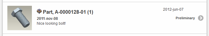
Figure 7. Table row with all pre defined columns used
The columns you can use in your table are:
| Name | Description | Example | ||
|---|---|---|---|---|
Thumbnail |
This column allows you to render a thumbnail in the space to the left on the table row. |
|
||
Header |
This is one of the columns in the table row center part. Text will be rendered bold and with a bigger font size as default. You can have any amount of columns with this name and they will be rendered in the order they are specified in the table configuration. |
|
||
SubHeader |
This is one of the columns in the table row center part. Text will be rendered bold as default. You can have any amount of columns with this name and they will be rendered in the order they are specified in the table configuration. |
|
||
Paragraph |
This is one of the columns in the table row center part. Text will be rendered without any styling as default. You can have any amount of columns with this name and they will be rendered in the order they are specified in the table configuration. |
|
||
ASide |
This is text rendered in the top right corner of the table row |
|
||
CountBubble |
This column allows you to render text in the "Count Bubble" to the right |
|
||
SplitButton |
This column allows you to render a cell in a "popup" that is launched from a button located to the right in the table. This column can only be used when you also have the "href" column.
|
|
||
Href |
This column is used only for setting the href to be used when clicking on a table row. Nothing visual will be rendered in this column. |
|
3.6.4. Table Toolbar
In your pageconfig you can specify a menu to be used as a toolbar. The commands of this menu will then be rendered as buttons above the table.
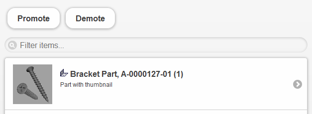
Figure 8. Table with toolbar
Example of a toolbar definition in a page-config file:
<ToolBar>tvc:menu:tvx:mobile:enc/toolbar/PartActions.xml</ToolBar>
A command in a toolbar has support for five different "TargetLocations":
| Name | Description | Example |
|---|---|---|
"no target location specified" |
If you don’t specify a |
|
tableHiddenFrame |
Executes your action in a hidden frame |
|
popup |
Will execute your action in a dialog window. |
|
content |
Executes the action in the current content window. |
|
newWindow |
Executes the action in a new browser window. |
|
3.6.5. Table context menu
You can enable the table "context menu" in your pageconfig just like you do in the normal version of TVC. This will be rendered as a clickable button to the right in each table row. When clicking this button it will launch the context menu for that row. The menu definition used for the context menu supports the same "TargetLocation" values as the table toolbar.
<ContextMenu>tvc:menu:tvx:mobile:common/context/IssueActions.xml</ContextMenu>
| The context menu cannot be used together with the "SplitButton" table column since they are both rendered in the same space. |
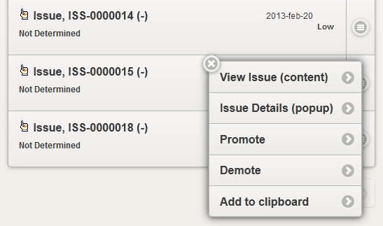
Figure 9. Context menu
3.6.6. Table pagination
There are two types of pagination modes used in TVC Mobile Access tables, "append" and "replace". The append pagination is default for flat tables and replace pagination is default in navigate mode. (Navigate mode cannot have append pagination)
Append pagination
The append pagination mode gives you the ability to append the next page of objects in the bottom of the table while keeping the previous page(s) visible as well.

Figure 10. Append pagination button in bottom of table with multiple pages
Replace pagination
The replace mode replaces the current page with the next/previous page. If you want to use the replace mode instead of default append mode for flat tables you can add a parameter to your pageconfig:
<Parameters>
    <Parameter name="mobilePaginationMode" value="replace"/>
</Parameters>
Figure 11. Replace pagination buttons above and below table
3.7. Search
You can configure and use a TVC Structure Browser search in TVC Mobile access. A search is launched in mobile mode by using the following action provided with a "Search Config". Read more about configuring a search in the admin guide for TVC Structure Browser.
| Action Name | Description |
|---|---|
/mobileBeginSearch |
Used to launch a TVC Structure Browser search in mobile mode |
You use the same configurations for search forms as you normally do in TVC Structure Browser but you have to specify a mobile renderer for each field. The renderers supported are:
| Name | Description | Example |
|---|---|---|
TypeFieldRenderer |
Used for rendering a type field |
|
RevisionFieldRenderer |
Used for rendering a revision field |
|
TextFieldRenderer |
Used for rendering plain text input fields. Can be used for mapping a field to an attribute or a basic. |
|
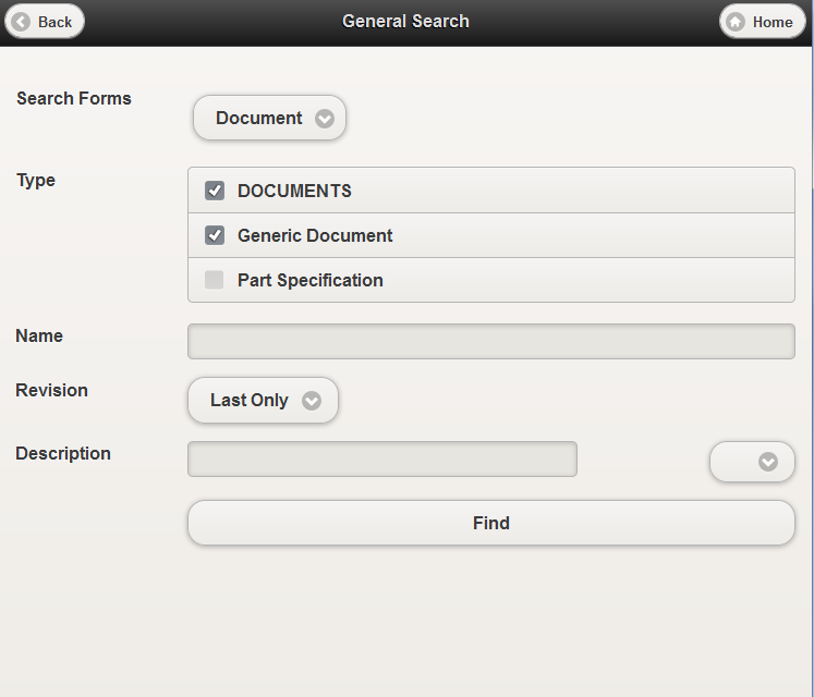
Figure 12. Search form
The mobile search configuration also supports having multiple search forms allowing the user to switch between them on the search page.
3.8. Forms
Create/View/Edit forms can be used in TVC Mobile Access. They can be used in the same way they are used normally in TVC Structure Browser (Viewing / Editing objects, or creating objects).
Configuration is done in the same way as in TVC Structure Browser. The exception is that the render mode needs to be specified on the action that launches the form. So to launch a form, one needs to add the "renderMode" parameter to the action.
Example command for adding a command creating an object:
<Command>
    <Label>Create New Issue</Label>
    <URL href="${ROOT_DIR}/tvc-action/initForm" submit="true">
        <Param name="formName" value="tvc:form:tvx:mobile:common/CreateNewIssue.xml"/>
        <Param name="renderMode" value="mobile"/>
    </URL>
    <TargetLocation>popup</TargetLocation>
</Command>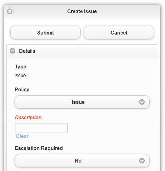
Figure 13. Create form
3.8.1. Check in Field
If you have a device with a browser that supports access to your camera you can use the <CheckinField> in your form configuration to upload files when creating/editing an object from a mobile device.
3.8.2. Limitations
| There are some limitations on which fields can currently be used. In general, only the basic fields and attribute fields are available, while those requiring more interaction and feedback from the user are not (For example, fields containing popup dialogs). The following fields are not yet fully supported, but will be added in coming releases: |
-
TypeField (Can be used, but only with a predetermined type, not editable)
-
ConnectField (Not Supported)
-
DynamicAttributesField (Not Supported)
-
OwnerField (Not Supported)
-
ClassificationField (Not Supported)
-
PersonField (Not Supported)
3.9. Dashboard / Charts
The dashboard / charts feature used in TVC Graphic Reporting can also be used in TVC Mobile Access. They are essentially the same; however it is not recommended to use any other gadgets than chart or table gadgets, since other gadgets may not be optimized for mobile use. Read more about configuring a dashboard and its gadgets in the TVC Graphic Reporting Admin Guide.
| An issue with touch events (on iOS devices) and the jQplot framework causes drill downs to stop working on charts that have tooltips enabled. So make sure to not use tooltips if you have users with iOS devices. |
There are a few differences in the mobile version of dashboard:
-
The gadget library is always visible, and can be scrolled by swiping left / right
-
The gadgets are added by tapping them
-
Gadgets can be removed from the dashboard by swiping them to the right
| Action Name | Description |
|---|---|
/mobileDashboard |
Used to launch a TVC Dashboard in mobile mode |
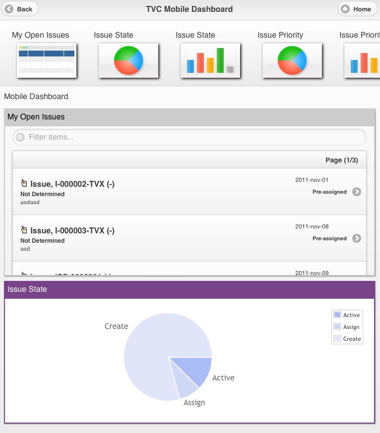
Figure 14. Dashboard with Table and Chart visible
3.10. Themes
TVC Mobile access contains three different themes that you can use to style the application, light (default), contrast and dark.
Figure 15. Light Theme
Figure 16. Contrast Theme
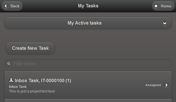
Figure 17. Dark Theme
In order to change the default theme there is an init parameter called
tvc.mobile.themes.default that can be used to set the theme. The
following keys are used for the different themes:
tvc.mobile.themes.light
tvc.mobile.themes.dark
If you need a custom theme to match your corporate colors you can contact TECHNIA for help on creating and implementing that.
3.10.1. Footer
There are two TVC init parameters that you can use to add a static footer to your TVC Mobile Access application.
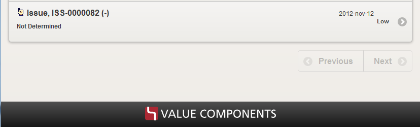
Figure 18. Footer logo
One parameter allows you to add a custom image and another parameter allows you to add a custom text in the footer.
tvc.mobile.footer.imageurl
tvc.mobile.footer.text
Example:
<init-param>
    <param-name>tvc.mobile.footer.imageurl</param-name>
    <param-value>/tvc/mobile/images/valuecomponents.png</param-value>
</init-param>
3.11. XML Baselines (XBL)
If you have XML Baselines (XBL’s) from the TVC XBOM Manager you can display them in mobile tables using a set of provided actions.
| Action Name | Description |
|---|---|
/mobileXblShowBaselines |
Lists all baselines for the context object in a flat table. |
/mobileXblShowBaseline |
Lists a single baseline in a structured table. |
/mobileShowBaselineDocumentsAction |
Lists all documents of a baseline in a flat table. |
All these actions load the objects in a table so you need to pass a pageconfig as a parameter to the action. Example configurations can be found in TVX (EBOM XBL’s).
4. Offline Functionalities
4.1. Purpose and use

To bring your objects with you as you travel or lack internet connection, you can use the TVC Mobile offline capabilities – select functionality within TVC Mobile, designed to work on your mobile device even when you are not connected to the internet. Please note that not all features of TVC Mobile work offline.
The intended use of the offline capabilities is mainly for downloading, viewing, editing or creating new ENOVIA objects; functionalities which can be assisted by TVC through XML form configurations. Users can store objects and their file attachments locally in their mobile or tablet, for reference while offline. Objects can then also be edited and eventually uploaded to the PLM server when connection is regained.
4.2. Configuration
To enable the offline capabilities of TVC Mobile, you need to set additional init-params in your web.xml file (or the corresponding params in tvc.properties using the same keys):
<init-param>
    <param-name>tvc.mobile.offlineFunctionality</param-name>
    <param-value>true</param-value>
</init-param>
<init-param>
<param-name>tvc.mobile.offline.settingsUrl</param-name>
<param-value>/tvx/mobile/offlinesettings.json</param-value>
</init-param>The first param simply enables the offline features, while the second init-param points out a JSON formatted configuration file for the Offline features. The following chapters will explain some of the possible configurations of this file, while we also recommend you to experiment with the TVX sample config file, at /tvx/mobile/offlinesettings.json.
After the init-params, you also need to define how to access the Offline desktop – which holds the functionality available when using TVC Mobile offline. In the TVX examples, you can see how this is done in /tvc/tvx/mobile/common/command/desk/Offline.xml;
<Command [...]>
    <Label>Work Locally</Label>
    <URL js="setOfflineDesk();" target="_blank"/>
    <Image>${ROOT_DIR}/tvc/mobile/images/desk/offline.png</Image>
</Command>
This Command should be included in the Desk XML file that you pointed
out in the init-param tvc.core.login.mainPage.mobile, and will serve
as the entry point to the Offline Desk. In other words, you will enter
the Offline Desk through an icon on the regular Desk. Alternatively, if
you get disconnected, TVC Mobile will detect this and redirect you to
the Offline desk automatically.
4.2.1. Object types
You can define which ENOVIA business object types to work with in the TVC Mobile offline mode. The below figure shows how the configuration works; each step pointing out the next.
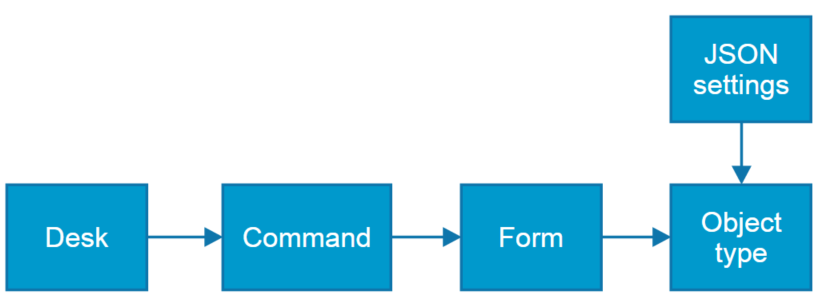
Figure 19. Offline configuration sequence
Sample configurations, in above sequential order:
In /tvc/tvx/mobile/common/menu/desk/Desk.xml, we point out the
offline-available Commands:
<!-- Offline functionalities below -->
<Command ref="tvc:command:tvx:mobile:common/desk/Offline.xml" />
<Command ref="tvc:command:tvx:mobile:common/desk/OfflineCreateIssue.xml" />
...
In the command XML’s, ensure the setting offline it set to true, and that it points out the TVC-action "offlineFormConfig" with form name as parameter.
/tvc/tvx/mobile/common/command/desk/OfflineCreateIssue.xml:
<Command ...>
    <Label>Issue</Label>
    <URL action="offlineFormConfig">
        <Param name="formName" value="tvc:form:tvx:mobile:common/CreateNewIssue.xml" />
    </URL>
    <Image>${ROOT_DIR}/tvc/mobile/images/desk/offline.png</Image>
    <Setting name="offline" value="true"/>
</Command>
In the Form XML, make sure to specify the business object type with the TypeField.
The Forms respect Field attributes such as ReadOnly, Required and Visible. To change a textfield into multi-line (textarea), use RichText setting. For attachments, use CheckInField.
If you need to retrieve attributes or basics from related objects, you can use <SelectField> with the desired mql expression to retrieve the data into a Field on your current object. Note however that if you modify such values locally, these values will not be updated when you submit – it is recommended to make these fields ReadOnly to reflect this to the end user. Read more about SelectField in the Structure Browser Admin Guide for Forms.
Hint: in tables, the topmost fields will be displayed in the leftmost columns, as they receive higher visibility priority if screen size is limited. Hence you might want to consider the field order, defining the most important fields first.
/tvc/tvx/mobile/common/command/desk/OfflineCreateIssue.xml (slightly shortened below):
<Form ...>
    <Header>Issue</Header>
    <Tab expanded="true">
        <Label>Basics</Label>
        <TypeField>
            <ReadOnly>true</ReadOnly>
            <Visible>false</Visible>
            <TypePattern>type_Issue</TypePattern>
        </TypeField>
        <PolicyField>
            <Visible>false</Visible>
        </PolicyField>
        <Field>
            <Label>Description</Label>
            <MapsTo>description</MapsTo>
            <RichText>true</RichText>
        </Field>
        <Field>
            <MapsTo>attribute_Priority</MapsTo>
            <Required>true</Required>
        </Field>
        <CheckinField useCDM="false">
            <Label>Attach Image</Label>
            <Format>generic</Format>
        </CheckinField>
    </Tab>
</Form>
Finally, you can configure access rights per business object type. It is possible to define whether user is allowed to Create new instances of the object type, and/or Edit existing ones. You can also define which sub-types of the type that should be considered to be equal, by defining an array under the property name "aliases". This is done in offlinesettings.json file, under the level "types". Be sure to point out the right form here as well.
"types" : {
    "Issue": {
        "create":true,
        "edit":true,
        "form":"tvc:form:tvx:mobile:common/CreateNewIssue.xml",
        "aliases": ["MyIssueSubtype", "MyIssueSubtype2"]
    },

    "Task": {
        "create":false,
        "edit":false,
        "form":"tvc:form:tvx:mobile:common/CreateNewTask.xml"
    }
}
4.2.2. Download objects
The Context Menu that is used in TVC Mobile tables via the SplitButton column, can be used to include a download Command. Here is an example, from /tvc/tvx/mobile/common/menu/context/IssueActions.xml:
<Command>
    <Label>Download offline</Label>
    <URL js="App.offline.download" target="_blank" />
    <Setting name="type" value="Issue" />
</Command>
This will then render in the list/table view like so:
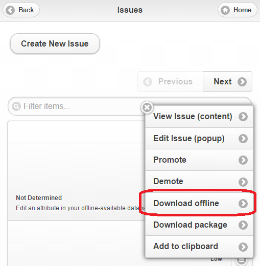
Figure 20. Context menu with command to Download offline
4.2.3. Download packages
In the JSON settings file mentioned, we can also define so called downloadPackages. The idea with these is that when you use the context menu to download a business object, you can in the same click trigger the download of other related objects. Two examples are provided below:
"packages": {
    "issuePackage": {
        "statements" : [
            "id",
            "$<from[relationship_ReferenceDocument].from.id>"
        ]
    },
    "issuePackageAdvanced": {
        "java" : "com.technia.tvx.mobile.offline.MyAdvancedPackage"
    }
}
The downloadPackage with name "issuePackage" is using mql statements inlined into the JSON configuration file to expand over relations. The downloadPackage called "issuePackageAdvanced" is illustrating the other way to define the package contents; using a Java class such as the one provided as an TVX example. Note that both of these methods are simply evaluating to an array of business object ID’s – the list of objects which will be downloaded.
After defining what the content of a downloadPackage is, you can include the Command to perform a package download to a Context menu, pointing out which type of package to bundle the download with:
<Command>
    <Label>Download package</Label>
    <URL js="App.offline.downloadPackage" target="_blank" />
    <Setting name="packageId" value="issuePackage" />
</Command>
Please note that the complete TVX sample JSON configuration file is available for reference, at location /tvx/mobile/offlinesettings.json
4.2.4. Advanced
Besides the two default icons on the Offline desk, for creating and viewing objects, you can extend the functionality by defining your own icons in the JSON config file, as an array under the property name "deskIcons":
"deskIcons": [{
    "icon": "activity_stream.png",
    "label": "Todays Paper",
    "count": "eval(new Date().toISOString().split('T')[0])",
    "href": "alert('This can be any JS function')"
}, ...]
Count is the only optional parameter, to provide input for a Count Bubble.
icons should be stored in the folder ${ROOT_DIR}/tvc/mobile/images/desk
|
The parameter "href" is pointing out a globally scoped JavaScript
function, which can be defined in your own .js source file. Make sure to
edit /tvc/mobile/tvcOfflineManifestExtensions.jspf to include the
reference to your file, otherwise it will not be included in the bundle
of cached resources, i.e. not available when offline. Also note that
this manifest file might be overwritten with any TVC upgrade, so
remember to back it up beforehand, and restore it after upgrade.
Finally, modify the relevant *.jsp files to include your js file in a
<script> tag.
It is also possible to change the default server endpoints (Java classes), as defined in /tvc/mobile/json/offlinesettings.json. You override them in your own offlinesettings.json file, at the location you pointed out in the init-param. For reference, the default values follow below with brief descriptions.
{
    "endPoints": {
        "onlineCheck": "/tvc-action/json/deviceService/offlineCheck",
        "download": "/tvc-action/offlineFormConfig",
        "upload": "/tvc-action/json/mobileOfflineSave/save",
        "uploadFile": "/tvc-action/json/mobileOfflineSave/uploadFile",
        "getUploadFileUrl": "/tvc-action/json/mobileOfflineSave/getUploadFileUrl",
        "getUploadFinalize": "/tvc-action/json/mobileOfflineSave/finalizeUpload",
        "packageResolver": "/tvc-action/json/mobileOffline/packageResolver",
        "objectsModified": "/tvc-action/json/mobileOffline/getObjectsLastModified"
    }
}- onlineCheck
-
The URL that TVC Mobile periodically uses to "ping" the PLM server in order to verify whether user is connected to the internet or not (i.e. redirect to Offline desk). Simply returns a HTTP status code in its default implementation.
- Download, upload
-
related to JSON serialization of business objects, which are stored locally
- Uploadfile
-
handling attachment uploading
- getUploadFileUrl, getUploadFinalize
-
handling tokens and verification of FCS file attachment uploads
- packageResolver
-
handles the downloadPackage bundling of related objects
- objectsModified
-
used to calculate which objects that have been modified serverside since a given timestamp
4.3. Usage and scenarios
After configuring the TVC Mobile offline settings as in the previous section, you are ready to use it.
4.3.1. Access and connection indicator
When navigating to the TVC Mobile URL in your browser, and if you have an internet connection, select parts of code and resource files are downloaded to the device using HTML5 Application cache. The exact file list can be found in /tvc/mobile/tvcOfflineManifest.jsp. After successfully caching these resources, the user is informed that TVC Mobile can now be accessed via the same URL even if offline:
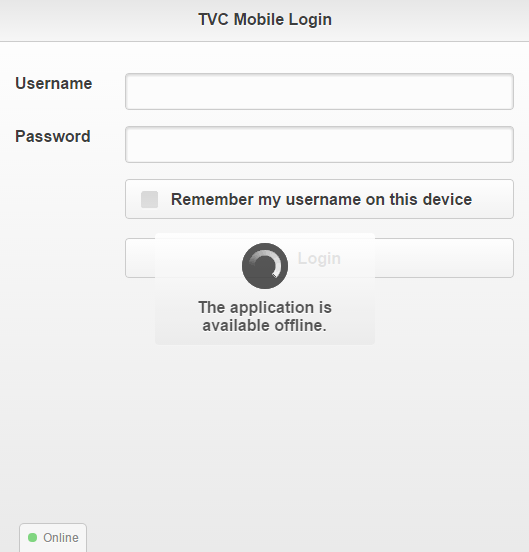
Figure 21. Notice to user when application is cached and available offline
| the first time you also need to login in order to download your settings and forms. |
In a similar notice, the user will be informed if a newer version of the TVC Mobile webapp exists. They then have to force refresh the page in their browser to cache the newest file versions.
When enabled, the Offline mode will add a connection status indicator (Online/Offline) in the bottom left corner. It is clickable, leading back to the default ‘Online’ desktop.
4.3.2. Offline desk
The icon on the Desk will lead you to a sub-desk, containing the Offline-available functionality. A brief explanation follows:
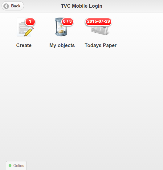
Figure 22. Offline Desk
-
One type of business object can be created. Clicking here will take you to creation forms
-
You have 3 locally stored business objects, of which 0 are modified since download or locally created. Clicking here will take you to table views listing these objects
-
Example of customer-specific extended functionality (any JavaScript can be executed) through added desk icons
-
Connection indicator (Online = green, Offline = red)
Note that it is clickable, returning you to the normal "online" Desk.
4.3.3. Creating new objects
If more than one type of business object is configured to be allowed for creation, clicking Create will ask you which type of object to create. If only one type of business object allows creating new instances, it will load the form directly. If no types allow creation, this icon will not be displayed at all.
The form is rendered based on the Form XML configuration you pointed out earlier during the config phase. A brief explanation follows.
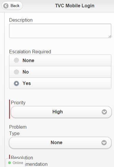
Figure 23. Form fields
Multiline text field, automatically grows as needed. Configured with
RichText = true in Form XML.
Range-values can be rendered as drop-Downs or radio buttons
Red indicator marks mandatory field; will turn green when properly filled in
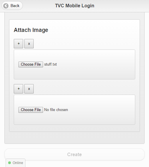
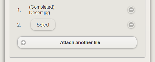
Figure 24. Attachments to forms
-
Attachments can be handled by configurating XML Form to have a
<CheckInField>Add another field / Remove a field -
Select which file to upload (or use Camera of device) and name of currently selected file
-
Form can only be saved when all required fields are filled in properly
4.3.4. My objects
In this view, you can get an overview of the objects you have stored locally. The form XML configuration maps each Field to a Column in this table. This view is responsively designed, so that more columns are displayed on a wider screen, or when you rotate your mobile to landscape orientation. You can also force the visibility of a certain column by clicking Columns and checking the column(s) you want to display or hide.
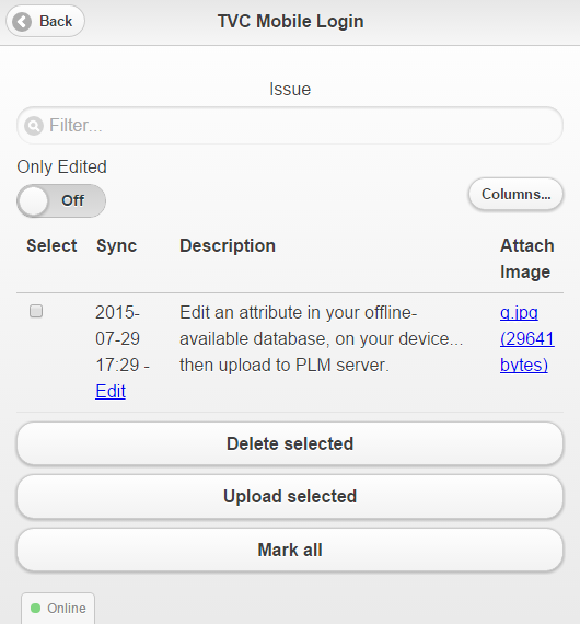
Figure 25. My objects
-
The business object type you are currently listing
-
Real-time wildcard search filter
-
Quick filter – only show items that are locally modified
-
Toggle visibility of specific columns
-
Open attachment
-
Edit this object
-
Select rows with the checkbox; then use bulk action buttons
| if the business object type has been disabled for editing, you cannot upload nor edit them (buttons and links will be hidden). |
4.3.5. Edit mode
The form view for editing an existing object looks very similar to the create form, only that the fields are prepopulated with their current values. Attachments also are displayed with thumbnail previews in the case the files are of image formats. You can also add additional attachment to the existing ones.
4.3.6. Downloading objects
As mentioned, you can download objects through Context menus of tables. There are some checks done when the download is initialized; verifying whether you already have the object locally stored. If so, you will be notified and asked whether you still want to download the object.
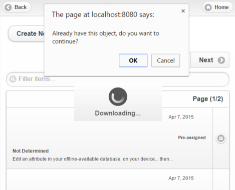
Figure 26. Download duplicate warning
If the user accepts, we then download the newer copy without replacing the old one, but this behavior will likely in a later release be made configurable through the JSON configuration file.
4.3.7. Clipboard – Bring your objects with you
If you are using ENOVIA on your desktop computer and have added your working set of objects to the TVC Clipboard, you could use it to bring your objects with you on your mobile device.
Access the TVC Mobile Clipboard, which now allows filtering by object type, allowing you for example to show only the objects of type Issue, so that you easily can download them for offline reference in TVC Mobile.
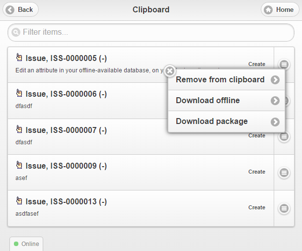
Figure 27. Clipboard configured for downloading
In this way you can work with the objects on the go, and when you are ready, bulk upload the edited objects to the PLM server.
4.4. Limitations and notes
4.4.1. System requirements
While TVC Mobile in Offline mode has been tested with a set of different mobiles, tablets and Desktop browsers during development, we have focused on supporting the major mobile operating systems and browsers (iOS with Safari browser, and Android with Chrome browser) in recent versions.
Note: some look and feel of the webapp may also differ between operating systems/browsers. Depending on browser, you may also have to click OK/Accept when the browser asks to reserve storage space for the webapp. If the free storage space is getting very low on the device, you may experience unexpected behavior.
4.4.2. Attachments
Since web browsers due to security reasons are not permitted direct access to the file system, attachments that are locally stored are serialized and stored within in-browser database. Serialization and deserialization of files can take some time, so we recommend that you limit the size of your attached files, or performance can be affected, leading TVC Mobile to slow down or even crash. The intention is to support easier use cases like photo attachment or PDF reference documents, rather than large files like full CAD drawings.
4.4.3. Localization
There is a basic localization support even for the Offline mode of TVC Mobile, determined by the preferred browser locale. However, since we need to store the translations client-side, we have intentionally limited localization to form field labels and range values (dropdown fields and radio button selections). These values are also localized in the table view. This means that templates are not localized.