Structure Browser - Administration Guide : Toolbar
29 March 2016
1. Toolbars
This section describes the available configuration options when creating and modifying toolbars displayed by the Structure Browser.
Toolbars are defined by Menus that contains Commands, where each Command defines an action available to the users. In addition, a toolbar can contain other Menus that are displayed as pull-down menus in the toolbar.
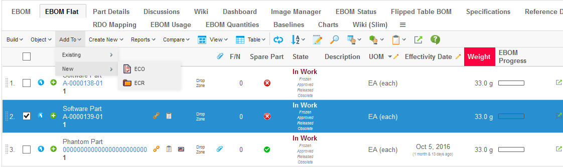
Figure 1. Structure Browser with a toolbar
The toolbar also contains other buttons for accessing built-in functions in the Structure Browser such as Exporting Data, Sorting, Changing Table etc.
The visibility of these buttons are controlled via the current Page Configuration.
1.1. Layout
The layout of the toolbar has as of version 2016.1.0 been improved in order to not occupy too much of the screen real estate.
The toolbar is designed to be displayed on one row, and buttons commonly used are accessible directly on the toolbar while other buttons are grouped together (ex: Object Actions, Table Actions etc).
| In certain views / modes, the toolbar may span over multiple rows. This is the case in for example the Grid Browser or in the Build Structure mode within the Structure Browser. |
It is possible to configure the layout to have the similar look as in previous releases. This is either done globally via the following init-parameter:
<init-param>
    <param-name>tvc.structurebrowser.render.toolbarLayout</param-name>
    <param-value>default</param-value>
</init-param>
Or per page config using this parameter
<Parameter name="toolbarLayout" value="default" />The possible values are
-
default
-
traditional
Below is an example screenshot when the layout has been changed to traditional.
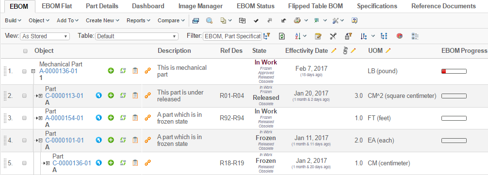
Figure 2. Traditional toolbar layout
1.2. IE9 Compatible Mode
Some old Enovia versions by default load internet explorer in compatibility mode 9. This is done using below setting in web.xml:
<filter>
  <filter-name>IECompatabilityFilter</filter-name>
  <filter-class>com.matrixone.apps.domain.util.IECompatabilityFilter</filter-class>
  <init-param>
     <param-name>http-equiv</param-name>
     <param-value>X-UA-Compatible</param-value>
  </init-param>
  <init-param>
     <param-name>content</param-name>
     <param-value>IE=9</param-valuel>
  </init-param>
</filter>
Some of the features of the toolbar are designed to work in modern browsers and will not work well with an older browser like IE9 or IE11 mode IE9. Global init-param tvc.structurebrowser.toolbar.renderIE9Compatible should be set to true to render toolbar in IE9 compatible mode:
<init-param>
    <param-name>tvc.structurebrowser.toolbar.renderIE9Compatible</param-name>
    <param-value>true</param-value>
</init-param>
1.3. User Customization
The commands in the toolbar can be rearranged by the user. For example, a user who often modifies data in the table may move the edit button to be the first command in the toolbar.
Commands can be moved within toolbar, from a group (e.g. the Printer Friendly in the Table Actions group) to the toolbar and between two groups. Commands the user have no interest of can be hidden by moving them to the "Unused Items" section.
The customization mode is accessed from the Settings icon located at the far right of the toolbar.
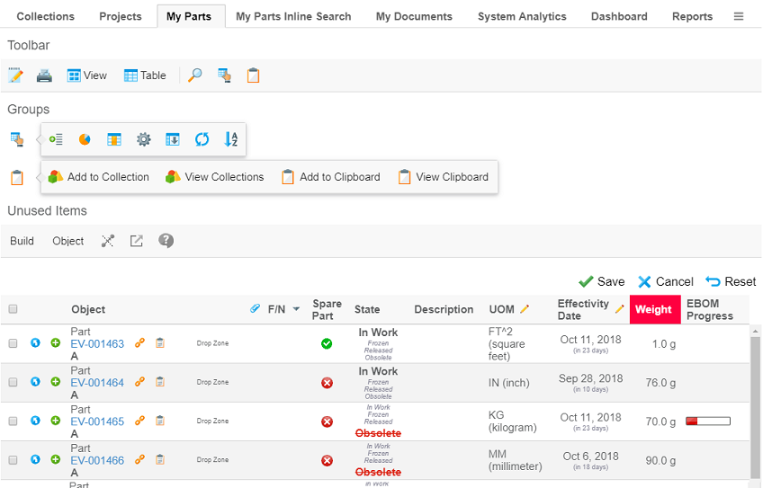
Figure 3. User customizing the toolbar
Customizations are, by default, stored per user and pageconfig. They are persisted across user sessions and devices. As the customizations are stored per pageconfig any customizations done at once place will also effect other pages using the same pageconfig. However pages with other pageconfigs will not be effect (might for example have different set of commands configured).
The pageconfig is by default used as the persistId, i.e. the key used to identify where the customizations are
applicable. It can be overridden using the parameter persistId in the pageconfig.
Using the same persistId across different pageconfigs might cause unexpected problems.
|
Example configuring a persistId:
<PageConfig>
    ...
    <Parameters>
        <Parameter name="persistId" value="ebom" />
    </Parameters>
</PageConfig>
The customization feature is enabled by default. It can be disabled either per pageconfig with the parameter
toolbarEditable or globally with the parameter tvc.core.toolbar.editable.
Example disabling customizations in pageconfig:
<PageConfig>
    ...
    <Parameters>
        <Parameter name="toolbarEditable" value="false" />
    </Parameters>
</PageConfig>
Example disabling customizations for toolbars globally:
<init-param>
    <param-name>tvc.core.toolbar.editable</param-name>
    <param-value>false</param-value>
</init-param>| The user customization feature is not available when using the traditional toolbar layout |
1.4. Orientation
The toolbar has either
-
horizontal orientation and is anchored above the table, or
-
vertical orientation and is anchored on the left hand side of the table.
Figure 4. Vertical toolbar anchored on the left hand side
By default the toolbar has horizontal orientation. The orientation can be configured in the pageconfig with the parameter toolbarOrientation.
Example changing orientation to vertical:
<PageConfig>
    ...
    <Parameters>
        <Parameter name="toolbarOrientation" value="vertical" />
    </Parameters>
</PageConfig>
When the toolbar has vertical orientation only the icon is displayed in order to preserve space. Menus without icons uses a default icon.
| Configure an icon on each menu in the toolbar to make it easier for user to distinguish them. |
| Not all items are suitable to be displayed in vertical orientation. For example the traditional view and table selector are not suitable. |
The toolbar can be rotated by the user. Rotating the toolbar is done from the Settings icon located at the far right (or at the bottom if in vertical orientation) of the toolbar.
The rotate feature is enabled by default. It can be disabled either per pageconfig with the parameter
toolbarRotatable or globally with the parameter tvc.core.toolbar.rotatable.
Example disabling possibility for users to rotate the toolbar in pageconfig:
<PageConfig>
    ...
    <Parameters>
        <Parameter name="toolbarRotatable" value="false" />
    </Parameters>
</PageConfig>
Example disabling possbility for users to rotate toolbars globally:
<init-param>
    <param-name>tvc.core.toolbar.rotatable</param-name>
    <param-value>false</param-value>
</init-param>| The rotate feature is not available when using the traditional toolbar layout |
1.5. Show View / Table Name
The current view and table is by default not displayed in the toolbar in order to save screen real estate.
It is possible to configure to show the current view and/or table name. This is either done globally via the following init-parameters:
<init-param>
    <param-name>tvc.structurebrowser.render.toolbarShowCurrentView</param-name>
    <param-value>true</param-value>
</init-param>
<init-param>
    <param-name>tvc.structurebrowser.render.toolbarShowCurrentTable</param-name>
    <param-value>true</param-value>
</init-param>
Or per page config using these parameters:
<Parameter name="showCurrentView" value="true" />
<Parameter name="showCurrentTable" value="true" />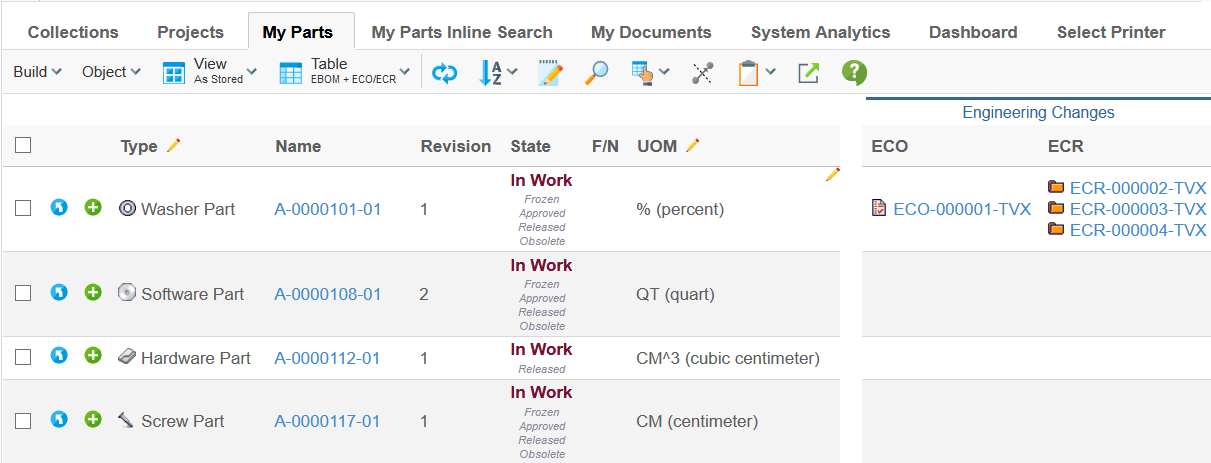
Figure 5. Toolbar showing both view and table name
1.6. Combine Toolbar Menu
It is also possible to configure the toolbar to group all menus and commands into one group. This is shown in the image below.
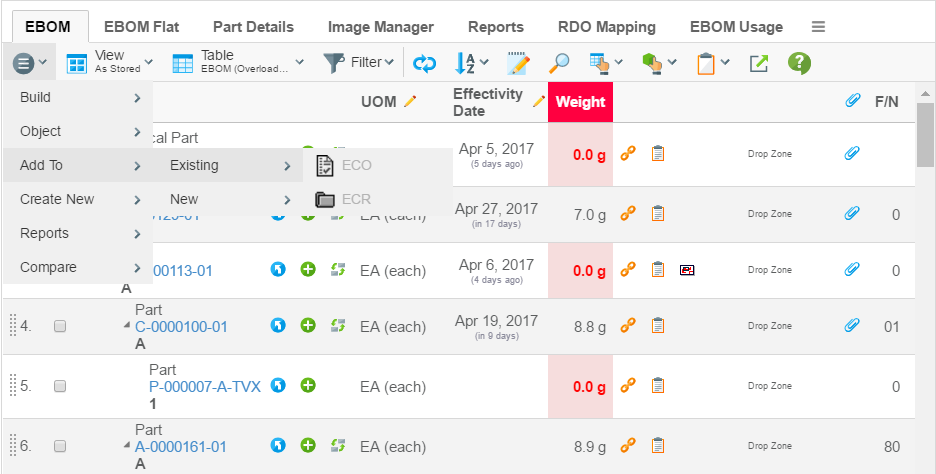
Figure 6. Toolbar with combined menu
You can either configure this globally via the following init-parameter:
<init-param>
    <param-name>tvc.structurebrowser.render.toolbarMenuCombined</param-name>
    <param-value>true</param-value>
</init-param>
Or per page config using this parameter
<Parameter name="combineToolbar" value="true" />1.7. Example Toolbar Menu
Below is an example of a toolbar menu definition.
<Menu xmlns="http://technia.com/TVC/Menu"
      xmlns:xsi="http://www.w3.org/2001/XMLSchema-instance"
      xsi:schemaLocation="http://technia.com/TVC/Menu http://products.technia.com/tvc/schema/latest/Menu.xsd">

    <Menu> (1)
        <Label>Menu Name</Label>

        <Command ref="tvc:command/Command1.xml" /> (2)
        <Command ref="tvc:command/Command2.xml" />
        <Command ref="tvc:command/Command3.xml" />
        <Command ref="tvc:command/Separator.xml" />
        <Command> (3)
            <Label>Edit Part [Popup]</Label>
            <URL action="initForm" submit="true" target="popup">
                <Param name="formName" value="tvc:form:tvx:enc/EditPart.xml" />
                <Param name="formMode" value="edit" />
                <Param name="renderMode" value="dialog" />
            </URL>
            <WindowWidth>800</WindowWidth>
            <WindowHeight>700</WindowHeight>
            <PopupModal>true</PopupModal>
            <RowSelectType>single</RowSelectType>
        </Command>
    </Menu>
    ...
</Menu>| 1 | Sub menu |
| 2 | Referencing externally defined command(s) |
| 3 | Inline definition of a command |
Please look into this document for further details regarding the XML configuration files.
1.8. Command Parameters
Each Command has a number of configurable parameters. The following table describes how these parameters can be configured and what effect the configuration will have on Commands in a toolbar.
| Parameter | Description | Accepted Values/Examples |
|---|---|---|
Access |
The access tab can be used to assign which persons, roles, and groups should have access to a specific command. The default value is "All", which means that all users will have access to the command. Note that if no explicit access has been defined on the command, the system assumes that all users should have access. |
Persons, roles, and groups. |
Alt |
This field defines a tooltip text for the command. The value can be either plain text or a string resource ID. Note that using a string resource ID requires that the "Registered Suite" setting have been defined. |
|
Href |
This field defines which URL to request when the command is executed. Note that directory macros are supported on this parameter. See Using Directory Macros for more information. |
emxTree.jsp ${COMMON_DIR}/emxTree.jsp ${ROOT_DIR}/tvc-action/navigate |
Label |
This field defines the command’s label. The value can be either
plain text or a string resource ID. Note that using a string resource ID
requires that the |
|
Name |
The name of the command admin object. |
|
Settings |
Additional settings for the command. See next chapter for more information. |
- |
1.9. Command Settings
Every command within a toolbar can contain an arbitrary number of settings. Settings are made up of name-value pairs. The following table describes how these settings can be configured and what effect they will have on Commands in a toolbar. Note that the names of the settings are case-insensitive while the values are case-sensitive.
| Setting | Description | Accepted Values/Examples |
|---|---|---|
Access Mask Access Expression Access Function Access Program |
These settings can be used to control user access to a command. See Controlling Access to UI Components for more information. |
- |
Action Type |
Can be used to define that a Command should be displayed as a separator within the toolbar menu. Only supported on Commands displayed in a toolbar. |
Separator – The Command will be displayed as a separator. If this setting isn’t defined or if it has a value different from Separator it will be rendered as a normal Command. |
Card ID |
Defines the id of the card opened inside the side panel. If this value equals to "new" or is left unspecified, the side panel will always load a new card. |
new |
Card Title |
Defines the title of the card opened inside the side panel. If this value equals to "auto" or is left unspecified, the title of the side panel is taken from the "title" of the loaded page inside the card. |
auto |
Card Load Script |
This setting can contain a Java Script, which is launched each time the card is loaded. |
pageLoad() |
Card Reloadable |
Defines if the card should be reloaded each time it is displayed, or if to launch the "Card Load Script" upon repeatedly loads. |
True / False |
Card Width |
Defines the width of the side panel, when displaying the specified resource. |
250 |
Confirm Message |
This setting defines a message that will be displayed to the user together with OK and Cancel buttons. If the user chooses OK the command will be executed otherwise not. The value can be either plain text or a string resource ID. Note that using a string resource ID requires that the "Registered Suite" setting has been defined. |
|
Font Icon |
Specifies the Font Icon to use by defining its CSS class(es). |
|
Popup Modal |
This setting applies when the "Target Location" is "popup". Note that when "Submit" is true the popup will always be modal. |
true:The popup will be modal. A modal popup will not allow the window that opened the popup to gain focus until the popup is closed. This is the default value. false:The popup will be modeless. |
Progress Message |
A progress message can be provided on commands to present a message while the action is in progress. The message is shown, if the "Show Progress" setting has been set to true. NOTE: The called action must turn off the progress message text once finished. This is accomplished by invoking a Java Script method called "hideProgress()" within the table frameset. |
Deleting objects, please wait… |
Registered Suite |
This setting defines which application the command belongs to. The value should be the name of an application as defined in the emxSystem.properties file when removing the "eServiceSuite" prefix. For instance, if the name of the application in emxSystem.properties is "eServiceSuiteEngineeringCentral" then the value for this setting should be "EngineeringCentral". This setting will cause the system to send the "suiteKey", "emxSuiteDirectory", and "StringResourceFileId" parameters in the URL when the column’s values are displayed as hyperlinks. NOTE: This setting is required for the system to know which string resource file to use when the Label or Alt of a command has been specified as a string resource ID. |
Framework InfoCentral EngineeringCentral ProgramCentral |
Row Select |
This setting defines the required row selections in the table when executing the command. |
none:No selection required. This is the default value. single:Exact one row must be selected. prevent:Force to uncheck the selected row. multiple:At least one row must be selected. |
Show Progress |
Defines whether or not the progress message should be shown or not. |
True / False (Default) |
Submit |
This setting defines whether the selections in the table should be submitted when executing the command. |
true:The current row selections will be submitted when executing the command. false:The current row selections will NOT be submitted. This is the default value. |
Submit OID |
This setting defines whether or not the object-id for the object used to launch the structure browser instance, should be sent within the URL of the command. |
True:The object id will be passed False: |
Target Location |
This setting defines the target frame when executing the command. Common values are "content", "popup", and "hiddenFrame", but there are other frames as well depending on in what context the table is shown. |
content:The page is displayed in the content frame. popup:The page is displayed in a popup window. card:The page is displayed inside the side-panel (see this chapter for more information how to use side panels). hiddenFrame:The page is displayed in a hidden frame (i.e., it will not be visible to the user). |
Visible In Edit Mode |
This setting defines whether a command should be visible in edit mode or not. |
true:The command will be visible in edit mode (default). false:The command will not be visible in edit mode. |
Visible In Flat Mode |
This setting defines whether a command should be visible in flat mode or not. |
true:The command will be visible in flat mode (default). false:The command will not be visible in flat mode. |
Visible In Read Mode |
This setting defines whether a command should be visible in read mode. |
true:The command will be visible in read mode (default). false:The command will not be visible in read mode. |
Visible In Structure Mode |
This setting defines whether a command should be visible in structure mode. |
true:The command will be visible in structure mode (default). false:The command will not be visible in structure mode. |
Window Height |
This setting applies when the "Target Location" is "popup" and defines the height of the popup window in pixels. The default value is 600. |
Any integer value greater than zero. |
Window Width |
This setting applies when the "Target Location" is "popup" and defines the width of the popup window in pixels. The default value is 600. |
Any integer value greater than zero. |
Add Enovia CSRF Token |
This setting defines whether Enovia OOTB CSRF token be added to href or not. |
true: Enovia OOTB CSRF token will be added to href. Default is false. |
1.10. Enable CSRF Token for OOTB command/JSP
Enovia OOTB CSRF protection can be extended to Enovia commands and JSPs when called from the TVC toolbar. This can be enabled by adding a setting Add Enovia CSRF Token to command which calls Enovia JSP or it can be added directly on Enovia command, if it is getting called from TVC toolbar. Once enabled, Enovia OOTB CSRF token is generated using Enovia APIs and appended to command action.
1.10.1. Using Enovia JSP in TVC Command
When TVC command calls Enovia OOTB JSP and Enovia JSP requires CSRF token, usually these JSPs are action JSPs which perform some database update and hence require Enovia CSRF token.
<Command>
	<Label>OOTB Action</Label>
	<URL href="${COMPONENT_DIR}/<OOT BJSP>.jsp"
	       submitParentOID="true" submitOID="true" submit="true" target="listHidden" />
	<Setting name="Add Enovia CSRF Token" value="true" />
	<RegisteredSuite>Components</RegisteredSuite>
</Command>