<Field id="typePart">
	<Label>Part To Be Search</Label>
	...
	...
</Field >

<RelatedObject>
	<Label>Specifications</Label>
	<FieldType>select</FieldType>
	...
	<Options><![CDATA[{
			"repopulateOn":{
					"field":"typePart",
					"autocompletehandler":"com.technia.helium.form.create.handler.PartSpecificationsyAutoCompleteHandler"
			},
			....
			}]]>
	</Options>
</RelatedObject>TVC Helium 2024.5.0 Release Information
13 December 2024
1. Tabs
1.1. Compact Tabs View
The <Tabs> element renders a list of tabs, where each <Tab> element holds a reference to a Dashboard
or another set of <Tabs> that will be rendered beneath the current tab (multi-level tabs).
When the orientation of tabs is vertical, user can switch to compact view by clicking on toggle action. When toggle action is clicked, icons configured for the tabs will be visible and title will be set as tooltip for that particular icon. View can be reset to original using same toggle icon. Toggle icon can be included by having a property tvc.helium.uipTabs.vertical.addToggleIcon=true, by default the value of this property is false.
This feature is beneficial to effectively utilise the available space in dashboard as in collapse mode only icons associated with tabs are displayed.
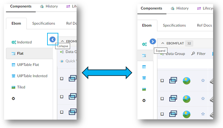
| Toggle of tab view is applicable only when the tabs orientation is vertical |
Read more about Tabs for more details.
2. Form
2.1. Auto-Update Related Fields
Previously, Helium allowed select fields to be automatically updated based on the selection made in a master field using the repopulateOn feature.
In this release, we’ve improved this functionality. Now, not only select fields but also related object fields can be repopulated. This means that based on the selected value in select fields, related object fields, or radio button fields, both select and related object fields will automatically update with the correct options.
Read more about repopulateOn for more details.
3. History
3.1. Relationship History
While working on structure table, it might be case some one would like to understand the changes and lifecycle of relationships. This required navigating through multiple screens or manually tracking updates—a time-consuming and error-prone process.
The History widget has the capability to display the history of an object you are in context of, as part of its existing behavior. In this release, the history widget has been enhanced to also display the history of relationship in sidepanel. This eliminates the need for manual tracking, saving valuable time.
A column can be configured in table to display the history of relationship in sidepanel.
<Column usesBusinessObject="false">
    <Name>ViewConnectionHistory</Name>
    <Label>View Connection History</Label>
    <Expression>id</Expression>
    <Setting name="template" value="helium/templates/tablecolumn/connection-history"/>
    <Setting name="options">{
        "dashboardRef": "tvc:dashboard:helium/History.xml"
        }
    </Setting>
</Column>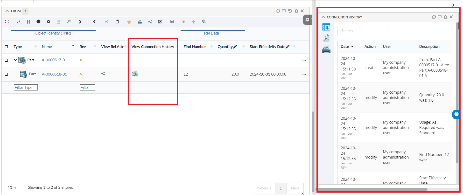
Click History of Connection Column to read more.
4. 3DDashboard Support
4.1. Drag and Drop from Helium to 3DEXPERIENCE Search
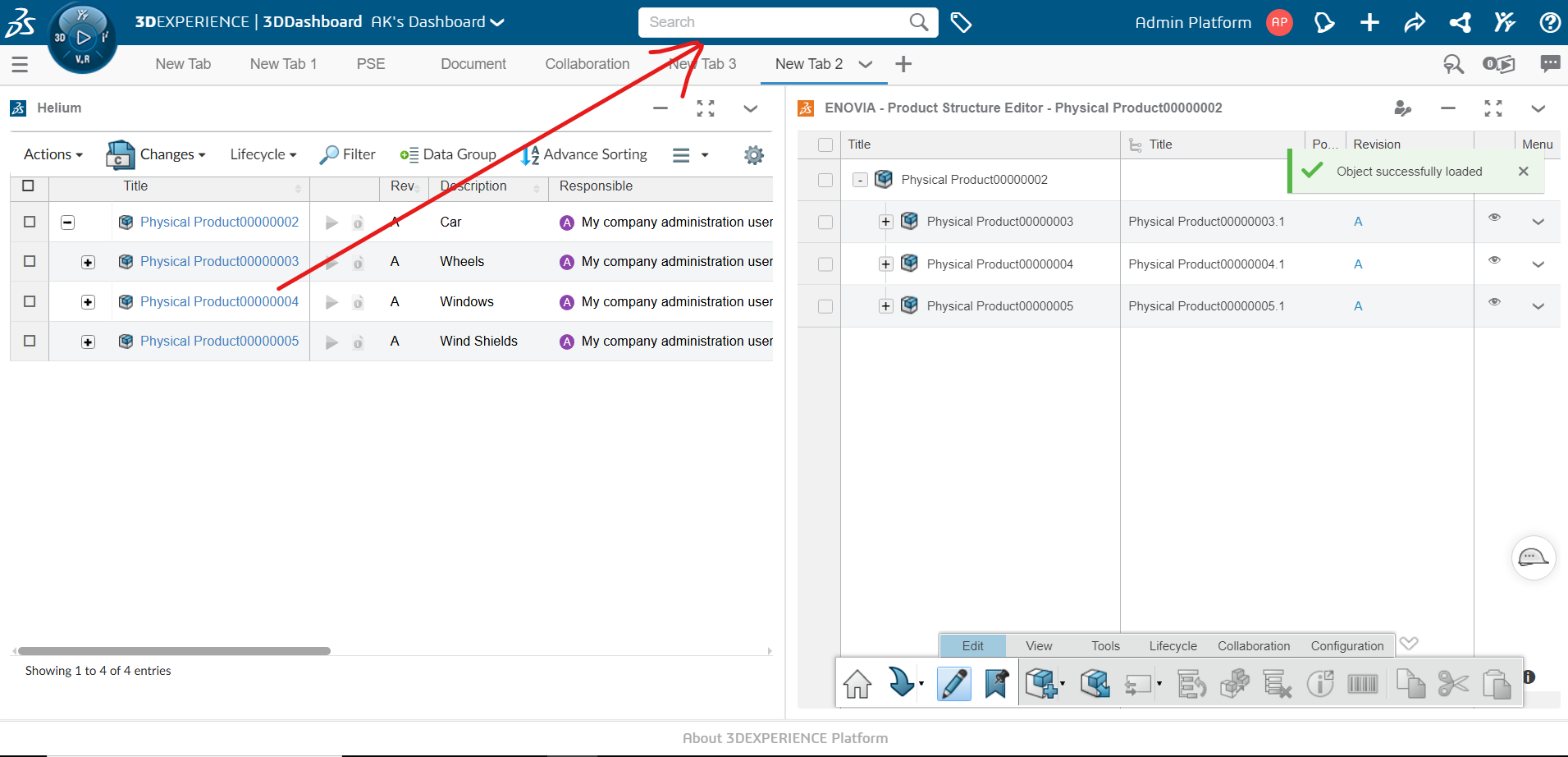
This enhancement allows users to quickly search by dragging and dropping objects from True Widget onto 3DEXPERIENCE Search. Dropping an object automatically populates its name in the search bar.
4.2. Publish Subscribe on Row Selection
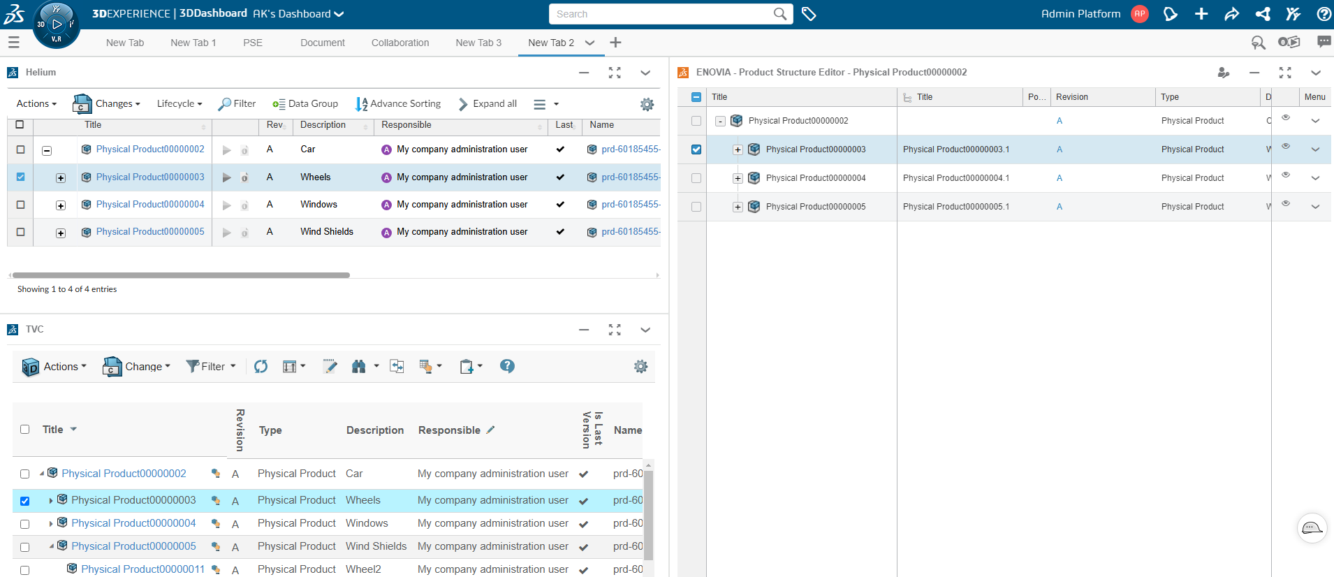
Once you enable OOTB subscription in True Widget preferences, it will synchronize with the OOTB widget. This means that selecting a row in True Widget will also select the corresponding object in the OOTB widget, and vice versa. This synchronization enhances the consistency and efficiency of widget interaction on the 3D Dashboard.
Read more about 3DDashboard Support for more details.
5. Table
5.1. UIP Table
UIP table is a standalone TECHNIA UI component developed using React. In this release, we have introduced UIPTable for rendering structure table data in Helium.
This can be enabled in Helium now by adding attribute UIPTable to TableConfig element of DataTable widget like below:
<TableConfig UIPTable="true">
    ...
</TableConfig>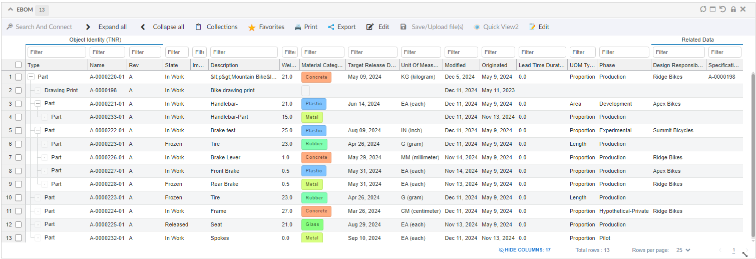
| This release has limited feature and not all DataTable features are supported in UIPTable. It will be improved with rest of features in upcoming releases. |
Read more about UIP Table for more details.
6. Tooltip
6.1. Global Properties
Helium now support global properties for tooltip. This will be helpful in configuring tooltip behavior at application level. Properties defined at Tooltip Settings would be supported.
One of example for this, is to configure tooltip with some delay like tvc.helium.tooltipSettings={'delay':{'show':1000}}.
7. Chart
7.1. Sum Expression
Helium Charts introduces a useful feature called Sum Expression to summarize numerical data across categories or groups. Instead of requiring external calculations or additional configurations, Helium Charts can perform these calculations dynamically and render the results in the visualization.

<Chart>
    <Options>{
  		"legendPosition": "top",
        "yaxis":{
            "title":{
                "text":"weight"
            }
        },
        "plotOptions": {
          "bar": {
            "columnWidth": "25%",
            "distributed": true
          }
        }
	}</Options>
    ...
    <DataSeries>
        <Serie>
            <DataLoader>
                <DataSet>tvc:dataset:hex:engineering/EBOM.xml</DataSet>
            </DataLoader>
            <Expression><![CDATA[$<attribute[attribute_MaterialCategory]>]]></Expression>
            <ChartType>bar</ChartType>
            <SumExpression>attribute[Weight]</SumExpression>
        </Serie>
    </DataSeries>
</Chart>
Click Chart to read more.
 TVC Helium 2024.5.0