 TVC Helium 2024.3.0
TVC Helium 2024.3.0 Release Information
12 July 2024
1. Installation
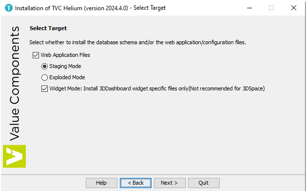
1.1. Widget Mode for 3DDashboard specific installation
Prior to this installation, the Helium installer places the specific files for 3DSpace and 3DDashboard into the target directory. For users who wish to deploy Helium only for 3DDashboard, we have introduced the Widget Mode target. This mode installs only the files specific to 3DDashboard and is not recommended for those who also want to set up Helium for 3DSpace.
Figure 1. Widget Mode for 3DDashboard only
In Widget Mode, users will be guided through the installation of the necessary TVC dependencies. First, they must select a valid license. Once a valid license is selected, the installer will display the required and valid TVC components based on the license file, providing options to select or deselect them.
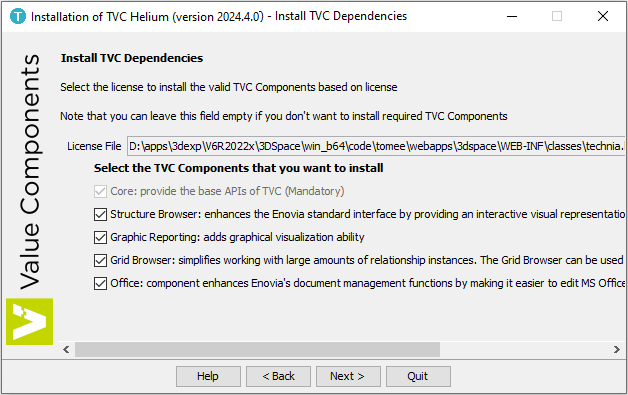
Figure 2. TVC dependencies installation for Widget Mode
Refer Installation for more details.
2. 3DDASHBOARD
2.1. Object Action with Search Link Integration
In last release, we introduced the capability to perform search based on parameters configured in URL as query string, and display search results in overlay mode.
In this release, we have enhanced this feature to perform object action on search result. This object action can be configured as query string in URL.
Configuring the Search Action:
To execute a search action on a search result, users can append a searchAction parameter to the widget’s URL with searchTerm or searchQuery. For instance
<3DDASHBOARD_URL>/#app:<APP Business Object Name>/content:searchTerm=DOC-0000015
In addition to searchAction, the fileName parameter can be appended to preview a specific file associated with the result object.
-
searchAction: Allows you to specify the action to execute on the search result. For example:[source,]
<3DDASHBOARD_URL>/#app:<APP Business Object Name>/content:searchTerm=DOC-0000015&searchAction=open
Supported searchAction parameters include:
| Search Action | Description |
|---|---|
openAndPreview |
Open the search result object then open the preview of file mentioned in fileName paramter. |
open |
Open the search result object into widget. |
preview |
Preview the file of search result object. |
-
fileName: Allows you to preview a specific file. For example:
<3DDASHBOARD_URL>/#app:<APP Business Object Name>/content:searchQuery=name%3DDOC-0000015&searchAction=openAndPreview&fileName=technia_products.pdf
| The search action will be performed on the first search result. |
Read more about Search Link Integration for more details.
2.2. Improved Drag & Drop UI
Drag and Drop UI has been improved to show an 'Insert' prompt when dropping an object on a row. This will make it easier to distinguish between row drop and widget context drop.
Read more about 3ddashboard Support for more details.
3. Topbar
The TopBar is placed in a fixed, always-visible container in the top of the page, and it holds common actions and menus for the entire application. Menus and actions are segregated into three sections left, middle and right. Middle section can exclusively hold a <Search inline="true"> command, rendering an inline search field.
3.1. Search with Recent Objects
Recent Object is now integrated with Search bar. This allow users to quickly review recent object before he/she performs search. This will save resources and time in case intended search is already available in Recent Object. This can be configured by defining attribute dynamicmenu in the search tag. By default its value is false.
Table config and template to be used for recent object dropdown menu are configurable using attributes config and template. If no value is specified default configs will be considered. Menu will list down all the values of available columns defined in table config.
|
- Width
-
Width of the search input is configurable by adding
widthattribute in the search tag. Value of width should be mentioned in pixels. Width will be applied when hovered over search input.
<Middle>
  <Search inline="true" dynamicmenu="true" width="450px">tvc:search:hex:common/TopBarSearchV2.xml</Search>
</Middle>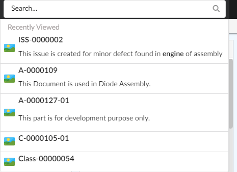
Figure 3. Advance Recent Objects
Read more about Topbar for more details.
4. Side Panel
A sidepanel is a container component where additional content can be placed and revealed (slide in) from the right side.
4.1. Configurable Width
From this release, the width of the sidepanel is configurable using the property tvc.helium.page.sidePanel.width. The width of the sidepanel can be manually adjusted by user, and it will persist. The customized width can be reset using Reset widget positions in dashboard view action in dashboard menu.
Value of sidepanel width property must be provided in pixels, if no value is defined by default width is taken as 540px. Eg: tvc.helium.page.sidePanel.width=600px.
|
Read more about Page Sidepanel for more details.
5. Dashboard Customization
Users can customize a dashboard by changing size and position of widgets. A small UI element is automatically appended on the right-hand side and slides in to expand when the user focuses on the element. From this menu, the end user can create and manage multiple dashboard views via a sidepanel and easily reset any customization they have done on that particular dashboard view, or re-add a previously removed widget.
5.1. Widget Gallery
In this release, we have introduced configurable widget gallery that will allow user to add widgets in dashboard.
In a dashboard, there can be widgets which are not visible but can be added as per requirement. User can add hidden widgets to dashboard using Widget Gallery. If configured Widget Gallery can be open in overlay window by clicking on leaf command. Multiple widgets can be selected at once and added to dashboard.
Hidden widgets in 'Widget Gallery' can be grouped and can have custom image to display by defining WidgetGalleryGroup config in dashboard widgets.
<Dashboard>
	...
	<Widgets>
		...
		<Widget namespace="hex:engineering" name="FixedHeaderEBOM.xml">
			...
			<Hidden>true</Hidden>
			<FontIcon>ti-c ti-preferences-c</FontIcon>
			<WidgetGalleryGroup>
				<Name>Engineering</Name>
				<Image>sample.png</Image>
			</WidgetGalleryGroup>
		</Widget>
		...
	</Widgets>
</Dashboard>| The Widget Gallery does not support widgets created using the 'create widget' command in the UI. |
Image should be the complete image name with extension and should we included in resource directory path under the folder structure custom/images.
Resource directory path can be set using the global setting tvc.helium.resources.directory.path = /helium, The default value is /helium.
If WidgetGalleryGroup is not defined for a widget, it will be grouped under DEFAULT. If image is not defined preference will be given to FontIcon and if FontIcon is not available image will be auto-selected based on type of widget.
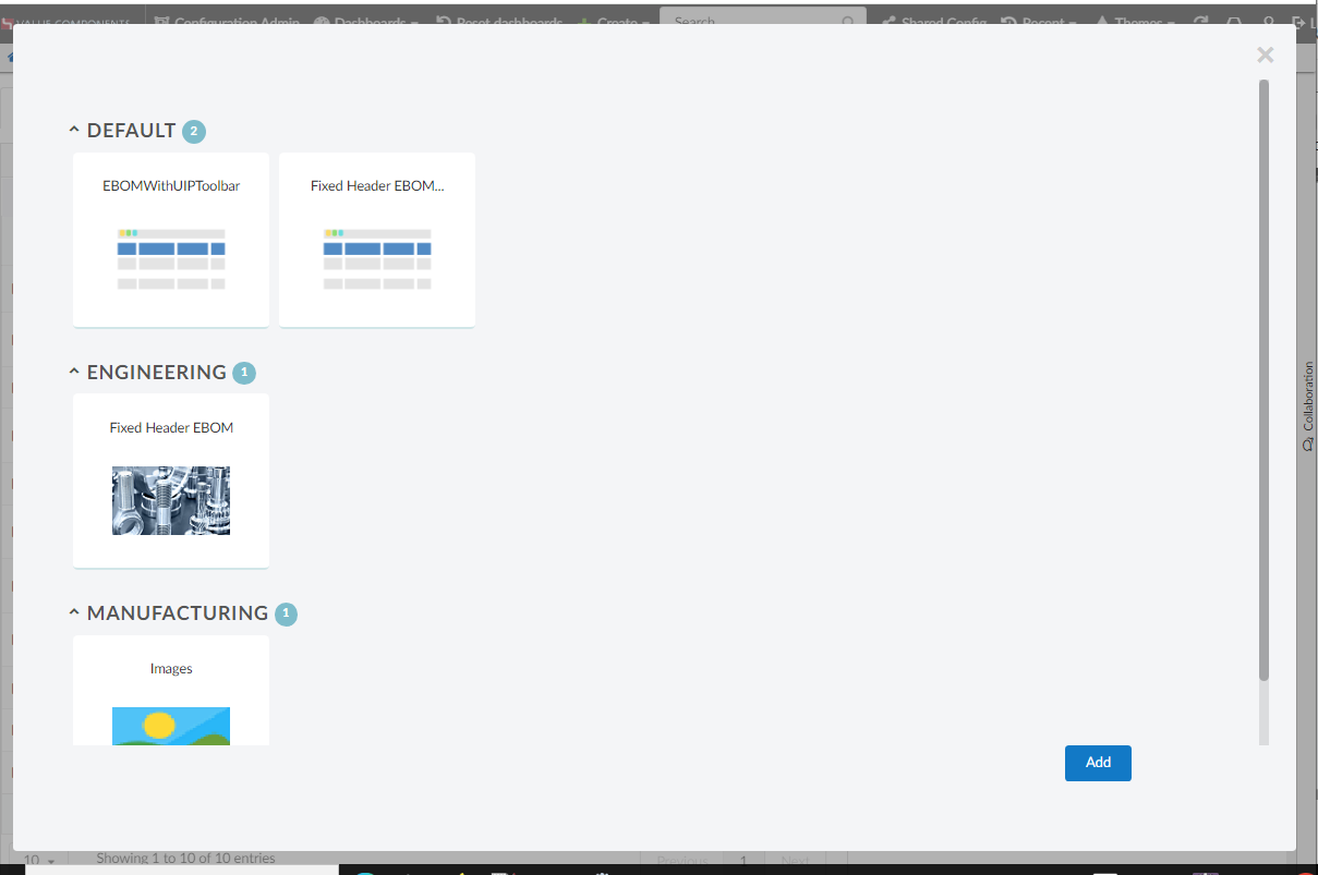
Figure 4. Widget Gallery
Read more about Dashboard Customization for more details.
6. Form and Table
6.1. Copy content
Helium allows users to select and copy content from text-based fields and columns. However, other columns and fields previously lacked this capability. In this release, the Copy capability has been introduced, allowing users to copy content from Date fields, Connect fields with Single Value, and Selected Range columns and fields. Users can now conveniently copy the text contained in these columns and fields by clicking the designated icon, enhancing the usability and efficiency of data handling within the application.
This copy feature can be activated with the setting <ShowCopyIcon>true</ShowCopyIcon>. The default value is false.
Figure 5. Copy Button
Refer Form for more details.
6.2. Files Column
6.2.1. Preview PDF and TXT file
Helium Table have capability to display all data from single view. Like files can be shown in row with respected connected object itself. From this release onwards, PDF and TXT file can be previewed in the side panel and also in the modal.
| PDF previews requires browser’s built-in PDF reader to be enabled. Supported image extensions: png, jpg, jpeg, gif, bmp. |
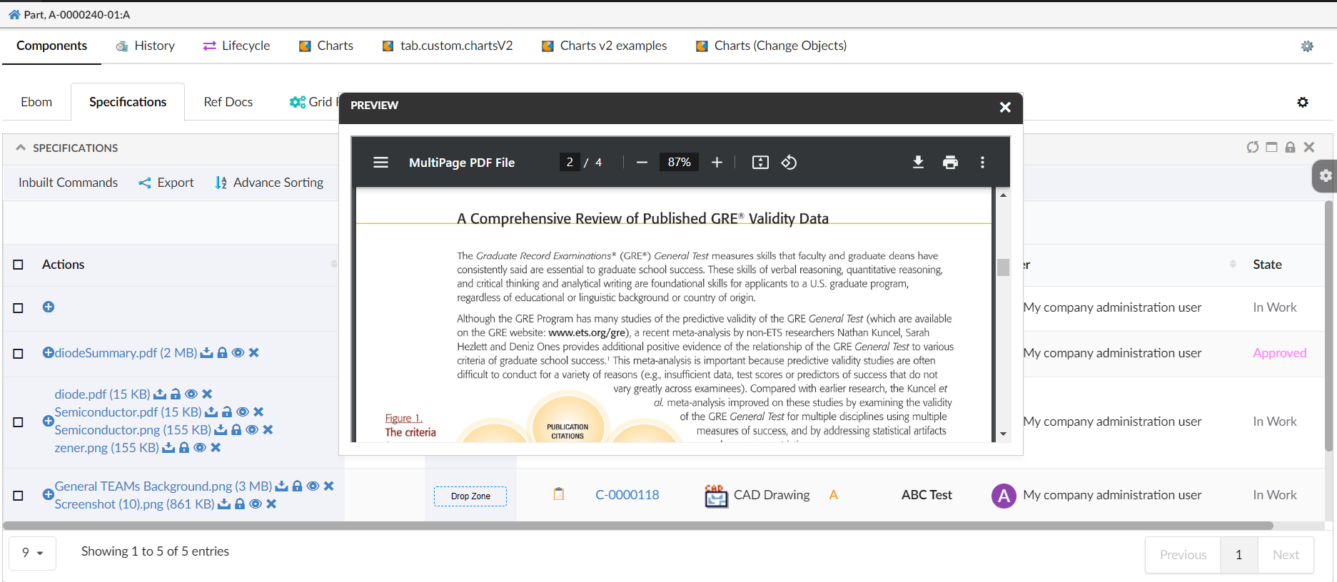
Figure 6. Files preview in modal
Refer Files Column for more details.
7. Color Mapping and Translations
7.1. Configurable Resource path
In previous versions, Helium was tightly coupled for directory paths related to Color Mapping and Custom Translations (i18n). From this release, one can configure the resource directory path for both by using the global setting tvc.helium.resources.directory.path. Default value is /helium.
For Example, If you want to use built-in translations or color mapping located in the directory <webapp-root>/webapps/HETrueWidget/helium then the global setting should be like this tvc.helium.resources.directory.path = /webapps/HETrueWidget/helium.
Refer Extended Configuration for more details.
8. In-App Designer
In-App Designer is a concept that brings the idea of creating, editing, and sharing configurations using the built-in admin user interface. These configurations can be used to define Helium dashboards, widgets, tables, charts, etc. Built-in Admin UI is provided to create, modify and share these configurations. In-App Designer can be used from Helium standalone or Helium widget in 3DDashboard. Once the config-admin is created and shared the configuration with the end-user, then the end-user receives the configuration to accept it. Once accepted, he can select and apply the configuration to his page, dashboard, or widget from UI. For detailed information, please refer In-App Designer.
8.1. Add Advanced column
8.1.1. New field - Is Relationship Select Expression
In addition to the existing functionality, a new field called "Is Relationship Select Expression" has been introduced. This field enables config-admin to specify whether the select expression pertains to the business-object itself or to its relationships.
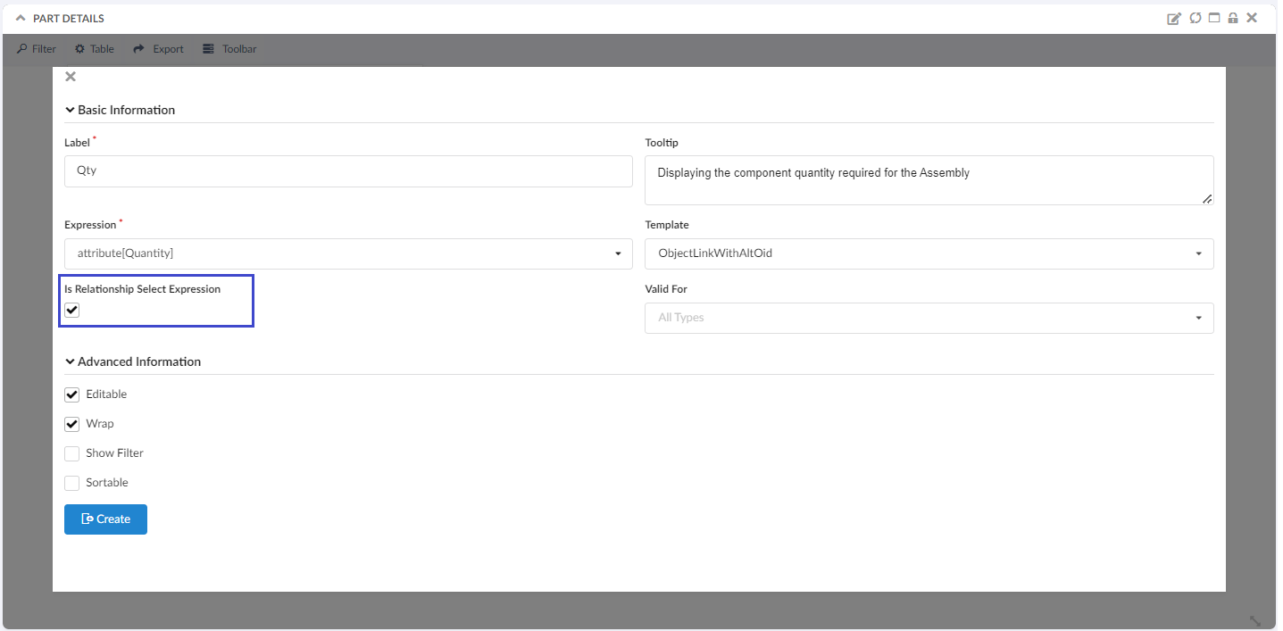
Figure 7. Is Relationship Select Expression
Refer Column Configurator for more details.
9. Dependencies Upgrade
We have upgraded following dependency
| Name | Old version | New Version |
|---|---|---|
semantic-ui |
2.3.3 |
2.9.3 (called as fomantic-ui) |
For more details of dependencies changes Click here.