 TVC Helium 2024.3.0
TVC Helium 2024.2.0 Release Information
26 April 2024
1. 3DDASHBOARD
1.1. Drag & Drop for multiple objects
The drag and drop functionality within Helium True Widget has been enhanced to support multiple objects simultaneously. Users can now:
-
Drag and Drop Multiple Objects: Select and drag multiple objects and drop them across all widgets.
-
Drop on Row to Connect (Multiple Objects): Utilize this feature to efficiently connect multiple objects using a single drop action on a object row.
Read more about Drag and Drop Objects for more details.
Read more about Drop on Row to Connect for more details.
1.2. Draggable Related Column Data
This feature streamlines user workflows by allowing users to directly drag data from related object columns and drop it across all widgets, eliminating the need to navigate through the entire object structure.
To achieve drag from Related Column, the below configuration need to be provided in the table column.
<Draggable>true</Draggable>Read more about Object-Link Column for more details.
1.3. Search Link Integration with Helium True Widget
This feature enhances the Helium True Widget by enabling the loading of specific search results through a link URL. Users can configure the search parameters directly within the URL, streamlining the process of displaying relevant information.
Configuring the Search Link:
To integrate a search within the Helium True widget, users simply append a search term or query parameter to the widget’s URL (<3DDASHBOARD_URL>/#app:<APP Business Object Name>). This can be done using either of the following parameters:
-
searchTerm: Allows you to specify the text or terms you wish to search. For example,
<3DDASHBOARD_URL>/#app:<APP Business Object Name>/content:searchTerm=Doc* -
searchQuery: Facilitates more complex search queries, possibly involving search field configuration. For example,
<3DDASHBOARD_URL>/#app:<APP Business Object Name>/content:searchQuery=owner%3Dadmin_platform
Search configuration for Helium True Widget:
-
searchConfig property in JSON config based APP
{
    ...
    "parameters": "tvc:page:helium:launchpad:common/MyDocuments.xml",
    "custom": "true",
    ...
    "searchConfig" : "tvc:search:hex:common/DocLinkSearchV2Federated.xml"
    ...
}-
Pass the searchConfig in content parameter with encode URI value as
<3DDASHBOARD_URL>/#app:<APP Business Object Name>/content:searchConfig=tvc%3Asearch%3Ahex%3Acommon%2FDocLinkSearchV2Federated.xml&searchTerm=Doc*
Read more about Search Configuration for more details.
2. Subscription Invoke Services
Invoke Service is generic capability in Value Component using which different 3DEXPERIENCE services can be called. These existing services can be used to load data into table or call the action from the toolbar. In this release, specialized configurations of invoke service are added to support subscription functionality as detailed below
2.1. Unsubscribe for context/other user
3DEXPERIENCE provides a service to allow current user to easily manage their and other users subscriptions for events associated with specific objects. By defining the Unsubscribe command as below in the toolbar settings, users gain quick access to the functionality needed to unsubscribe from events.
<Command>
    <Label>Unsubscribe</Label>
    <Id>unsubscribe</Id>
    <FontIcon>bell slash icon</FontIcon>
    <OnClick>App.ootbServices.unsubscribeUserAndGroup</OnClick>
    <OnClickParams>{
        "useObjectId":true,
        "type":"Document"
    }</OnClickParams>
    <ValidFor>
        <Types>
            <Type>Person</Type>
            <Type>Member List</Type>
            <Type>Group</Type>
        </Types>
    </ValidFor>
</Command>
2.2. Push Subscription
3DEXPERIENCE provides a service to allow current user to push subscription for events of a particular object to the other user. Helium provides a provision to add command in the toolbar of a datatable to facilitate push subscription. This command can be configured as below.
<SearchAndConnect >
    <Id>searchAndConnectSubscribeSidepanel</Id>
    <Label>Push Subscription</Label>
    <SelectionCriteria>single</SelectionCriteria>
    <Relationships>
        <Relationship default="true" direction="to">Subscribed Person</Relationship>
    </Relationships>
    <SearchConfig>tvc:search:helium/SearchAndConnectSubscription.xml</SearchConfig>
    <ExpandRow>true</ExpandRow>
    <SubmitButtonLabel>Subscribe</SubmitButtonLabel>
    <OnSubmit>App.ootbServices.searchAndConnectPerson</OnSubmit>
    <OnClickParams>{
        "closePanelOnSearch":true
    }</OnClickParams>
    <ValidFor>
        <Types>
            <Type>Event</Type>
        </Types>
    </ValidFor>
</SearchAndConnect>
2.3. Open Subscription Widget
Helium provides built-in widget to manage subcription on objects. This built-in widget facilates user to manage subcription and can do different operations like Subscribe, Unsubscribe, Edit Subscription and Push Subscription from same view.
This widget can be configured on toolbar command and table columns by using below API
App.page.sidepanel.openDashboard('tvc:dashboard:helium/OpenSubscription.xml','{{objectId}}')Files column have in-built support for it with below setting configuration
<Column>
	...
	<ColumnType>helium-files</ColumnType>
	<Setting name="options">
		{
			"showSubscription":true
		}
	</Setting>
</Column>| The subscription services are available from versions V6R2022x FP2250, V6R2023x FP2306 and can be used in versions starting with them or above. |
For more detailed information please refer Invoke Service
For more detailed information please refer Service Toolbar
3. Search
3.1. Integration with Federated Search
In later Enovia or 3DEXPERIENCE versions, Exalead CloudView search is accessed via a separate component known as Federated Search. 3DSpace and 3DDashboard call Federated Search API from the client to search and retrieve search results. Search results are loaded as static HTML components and does not allow table-level actions like mass edit, promote, demote, etc.
New Search Experience can directly call Federated Search client API for search and get 6W tags. These 6W tags are then added to the search form for the further filtering search result.
Federated Search URL needs to be added to Search Config and same will be used for search.
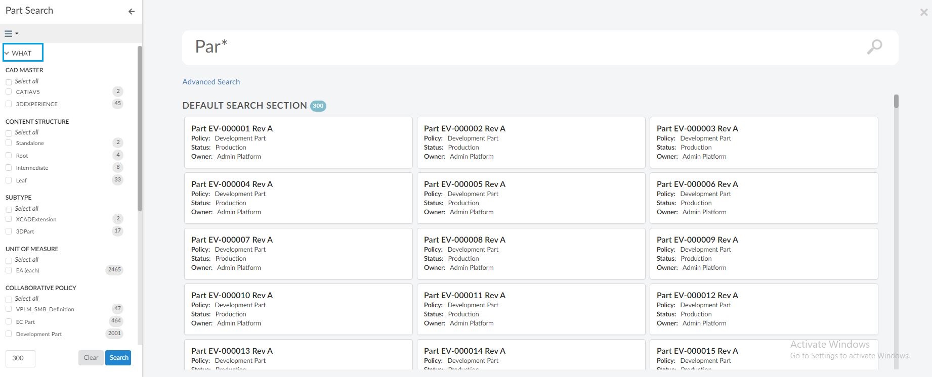
Read more about external search at Integration with Federated Search chapter with more details.
4. Grid Browser
Grid Browser can be used for viewing and/or working with the intersections/connections between objects in a grid/matrix view. Two different sets of objects are loaded and they are displayed on the Y- and X- axis (also referred to as row- and column- axis).
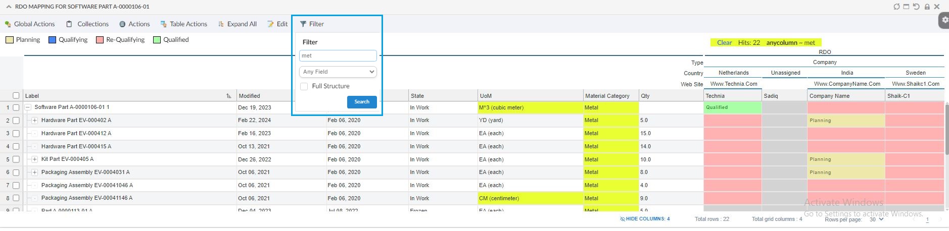
4.1. Data Filter
There can be scenario where we need to filter data in row axis whose field (eg. category) has some particular value or filter row-axis data which match a particular term in all fields. For such scenarios a preconfigured command <FilterChooser /> has been introduced. <FilterChooser /> tag can added in toolbar to filter data in the existing table rows or in full structure of grid browser. Filter can be applied for a particular field or any field. After data is filtered, cells of filtered data based on search term are highlighted accordingly.
Highlight color for matching result is configurable using the property tvc.helium.grid.filterHighlightColor, by default it is '#e9ff32'
4.2. Legend Filter
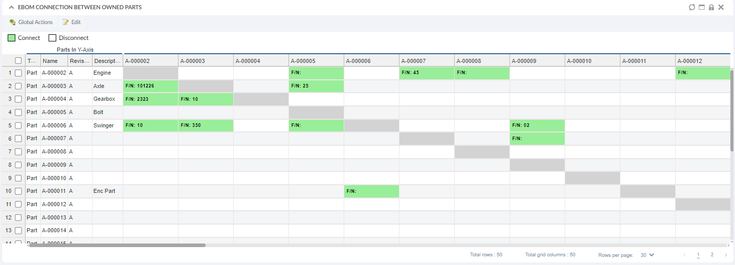
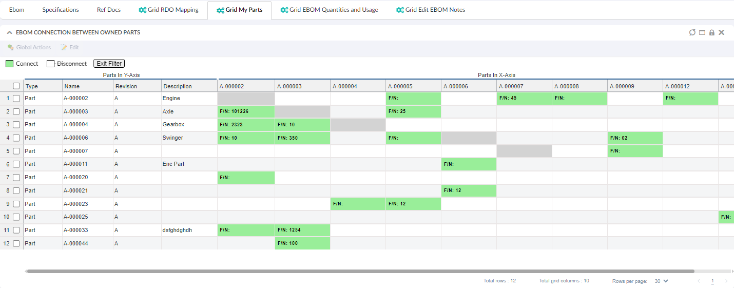
In this release, we’ve implemented a feature to filter grid data based on the legend. The image below showcases the "My Owned Parts" and the EBOM connection between them and displays the find number in connected cells.This grid comprises 50 rows and 50 columns. With the introduction of the Legend filter, users can now filter out the disconnected rows and colums and view only the connected rows and columns by clicking on the corresponding legend color.
Grid Browser with "My Owned Parts" and the EBOM connection between them and displays the find number in connected cells
Filter data
5. Form Field and Table Column
5.1. Date Picker Setting
Helium supports datepicker with table columns and form fields. Occasionally, there is a need to include time along with the date. In this release of Helium, we’ve enhanced our existing capability to display and edit both date and time together in the datepicker.
Now, users have the option to save time along with the date when working with table columns and form fields having time-sensitive data.
This enhancement can be configured by adding below setting, with the default value set to false.
<Setting name="showDateTime" value="true"/>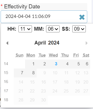
| While editing time, user need to select date to trigger submission. |
Refer DatePicker-settings for more details.