 TVC Helium 2024.3.0
TVC Helium 2023.4.0 Release Information
08 September 2023
1. Datatable
1.1. Export HTML As Text
Form supports richtext as field type that enables users to create rich text content. The richtext field value stored as HTML in the database. When exported as Excel or PDF, the exported value may contain HTML tags. To address this issue, a new setting called parseHTMLContentToText has been introduced for table columns.
When the parseHTMLContentToText setting is defined as true for a particular column, it instructs the export process to parse the HTML content and update it as plain text in the exported files. This means that any HTML tags present in the rich text content will be removed or converted to plain text during the export process. This makes the content more readable and user-friendly.
Name |
Description |
Example |
Setting |
Column level config setting to parse HTML content to plain text when exported to a file.
value can be By default it is considered as |
|
For more detailed information please refer Table Column
1.2. Persistable Advance Sorting
Starting from this release, users can now choose to save their sorting preferences by simply checking the 'Save Sorting' checkbox. If they decide not to save their sorting preferences, they can still sort directly without checking the checkbox.
This feature enhances user experience by allowing them to customize how they want sorting to be applied. When 'Save Sorting' is checked, the sorting preferences will be retained for future sessions. If users prefer to sort temporarily for the current session without affecting future sessions, they can sort without checking the checkbox.
For more detailed information please refer Advance Sorting
1.3. Exclude Format for Files Column
Some file formats like thumbnail are irrelevant to be shown on Files Column along with other regular files. A new setting excludeFormat is introduced to exclude specific format files from Files Column.
This behavior can be configured in column as follows :-
<Table>
	<Column>
		<Label>Related Files</Label>
		<RegisteredSuite>Components</RegisteredSuite>
		<ColumnType>helium-files</ColumnType>
		<Setting name="options">
		{
			"excludeFormat":"mxMedium Image"
		}
		</Setting>
	</Column>
</Table>
or can be configured with global setting in tvc.properties as tvc.helium.files.excludeFormat=mxMedium Image,GIF
"mxMedium Image" is default value.
For more detailed information please refer Files Column
2. Form
2.1. Generic Person Template
From this release, a new generic template <Template>helium/templates/form/user</Template> has been introduced for user-related fields. This template can be applied to fields such as the owner and other fields where the property <DataType>user</DataType> is defined.
A generic user template streamlines user fields in a form.
<Field>
	<Label>Originator</Label>
	<Expression>attribute[Originator]</Expression>
	<DataType>user</DataType>
	<Template>helium/templates/form/user</Template>
</Field>
For more detailed information please refer Form Field
2.2. Additional Options for Form API
There is now a provision to send reference objectId or any other run-time value when creating a form. These values can be utilized to populate form field values using value provider or for any other updates to form fields.
To achieve this, you can pass additional variables as envVariables in the options of the form input. These variables will be available in the environment map on the server side and can be consumed as needed. This capability provides more flexibility in populating and configuring form fields during the form creation process.
  var input = {
    options: {
      buttonClasses: {
        general: 'fa',
        edit: 'fa-eye',
        display: 'fa-pencil'
        save: 'fa-save'
      },
      envVariables: "1.2.3.4", // additional value passed as envVariable
      formMode: 'VIEW',
      updateServiceMethodMapping: {
        CREATE: {
          onSuccess: App.custom.myCreateSuccessHandler
        },
        EDIT: {
          onSuccess: App.custom.myEditSuccessHandler
        }
      }
    }
  };
  App.form.create(input);
This enhancement is useful when you need to pre-populate form fields or make adjustments to form field values based on run-time data, making it easier to tailor the form creation process to specific requirements.
3. Topbar
3.1. Display Username
Starting from this release, it is possible to display the logged-in user’s name and avatar on the topbar. This can be accomplished by adding inbuilt command <User /> in the top bar configuration.
<TopBar>
	...
	<Right>
		...
		<Myspace />
		<User />
		...
	</Right>
</TopBar>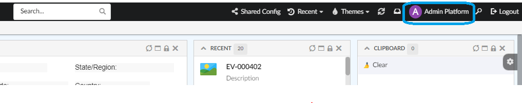
For more detailed information please refer Menu/Commands
4. Toolbar
4.1. ValidFor Support for Attributes
In earlier releases, the ValidFor setting in the command configuration was used to control the visibility of a command based on the Type and State of a row selected in the datatable. However, starting from this release, the capabilities of the ValidFor setting have been extended to allow visibility evaluation based on business-object attributes.
By incorporating this feature, you can make commands appear or disappear based on the values of specific attributes of the selected business object, providing a more dynamic and context-aware user interface for your application.
This functionality is achieved by following configuration :-
<Command>
   ...
    <ValidFor>
         <Attributes>
            <Attribute name="attribute_MaterialCategory" value="Glass, Metal"/>
            <Attribute name="attribute_AnotherAttribute" value="another Single or Multiples Values"/>
         </Attributes>
    </ValidFor>
   ...
<Command>
To enable the visibility evaluation of a command based on business-object attributes in a specific column, it is require to use the following setting:
<Setting name="ValidForAttributeLabel" value="attribute_name" />The value of ValidForAttributeLabel setting can either be a symbolic name or a name of attribute.
5. Search
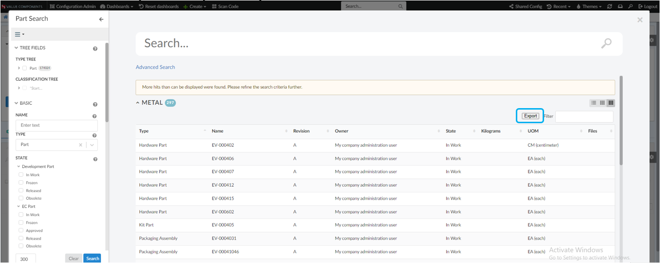
5.1. Export Search Table
Search results can now be exported to csv file. This can be configured by adding the setting <Setting name="export" value="true" /> in search table config.
<UI id="id3">
	<Type>table</Type>
	<ResultTemplate>helium/custom/hex/templates/common/search/table-result</ResultTemplate>
	<Table>
		...
	</Table>
	<Settings>
		<Setting name="title" value="Table" />
		<Setting name="export" value="true" />
		<Setting name="exportLabel" value="ExportToCSV" />
		<Setting name="exportFileName" value="SearchResult" />
	</Settings>
</UI>
Name |
Description |
Example |
exportLabel |
Label of Export Button. Default value : Export |
|
exportFileName |
Name of the Exported File. Default value : SearchResult |
|
If the values of exportLabel or exportFileName are an existing i18n key, internationalisation will be performed.
5.2. Chart Widget Based on Exalead Data
The search sidepanel can be configured with search providers to fetch data from either Exalead or Enovia servers. When the Exalead search provider is configured, the search provider component retrieves data from the Exalead server and populates the search results in the dashboard based on the ReloadDashboards settings found under the page configurations.
In this release, we have enhanced the ReloadDashboards configuration with additional settings, specifically designed to enable the loading of chart widgets with Exalead data. In previous releases, this feature was limited to loading only the table with Exalead results.
EXALEAD provides facet counts or result summary giving the break up of the total results found. These summary/facet counts are directly used to load the chart.
5.2.1. Configure Chart Widgets in ReloadDashboards
Introduced a new tag <LoadChartWidget id="" bySearchFieldId=""/> to specify the chartwidgets to load by search
panel field data. Refer to the sample Page configuration with LoadChartWidget tag.
<Page>
	.
	.
	<SearchPanel ref="tvc:searchpanel:acem:common/PSearchPanel.xml">
	<OnSearchResult>
	<ReloadDashboards>
		<LoadServerSide>true</LoadServerSide>
		<Dashboard ns="hex:engineering" name="PartFamilyParts.xml">
			<LoadTableWidget id="ebomtable" />
			<LoadChartWidget id="state" bySearchFieldId="partstates" />
			<LoadChartWidget id="owner" bySearchFieldId="personId" />
		</Dashboard>
	</ReloadDashboards>
</Page>
5.3. Disabling Fallback Section
Search result can be divided into sections based on some field like Type, State etc. Multiple sections can be configured and each section will have its own condition matching data field. For example a section for part can have condition like Type==Part.
Fallback section is used when a search result or hit does not satisfy condition on any of the configured section. It work as a default section. In some situation it is expected to show only configured section without any fallback section. disable attribute can be set to true to disable fallback section.
By default, the disable attribute is set to false, which results in the fallback section being visible.
        <FallbackSection disable='true'>
			<UIs> </UIs>
            <Label> </Label>
        </FallbackSection>
6. In-App Designer
In-App Designer is a concept that brings the idea of creating, editing, and sharing configurations using the built-in admin user interface. These configurations can be used to define Helium dashboards, widgets, tables, charts, etc. Built-in Admin UI is provided to create, modify and share these configurations. In-App Designer can be used from Helium standalone or Helium widget in 3DDashboard.Once the config-admin is created and shared the configuration with the end-user, then the end-user receives the configuration to accept it. Once accepted, he can select and apply the configuration to his page, dashboard, or widget from UI. For detailed information, please refer In-App Designer.
In this release, we have enhanced this feature further as stated below.
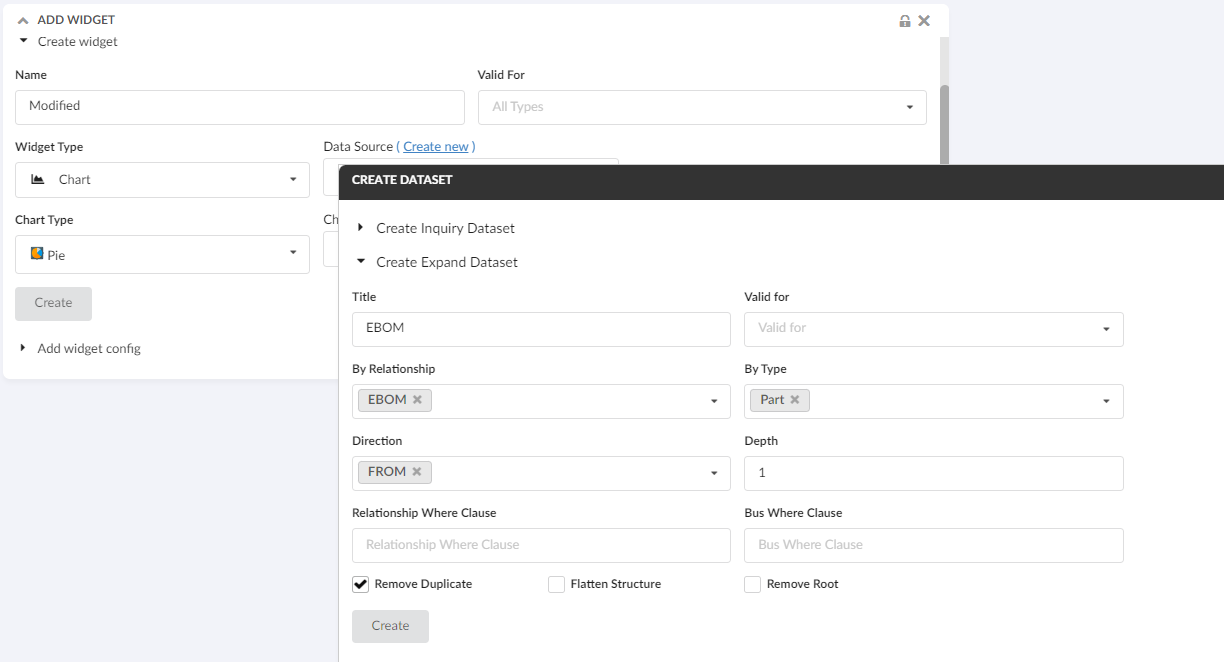
6.1. Configure Expand Dataset
From this release, similar to configuring the inquiry-based datasets, config-admin can also configure expand datasets.
In prior releases, config-admins can configure inquiry-based datasets by providing inquiry parameters in the UI form. Upon form submission, the system would generate inquiry-based dataset XML in the background, creating a configuration object.
Similarly, config-admin can now configure expand dataset, by providing the input parameters in the UI form.
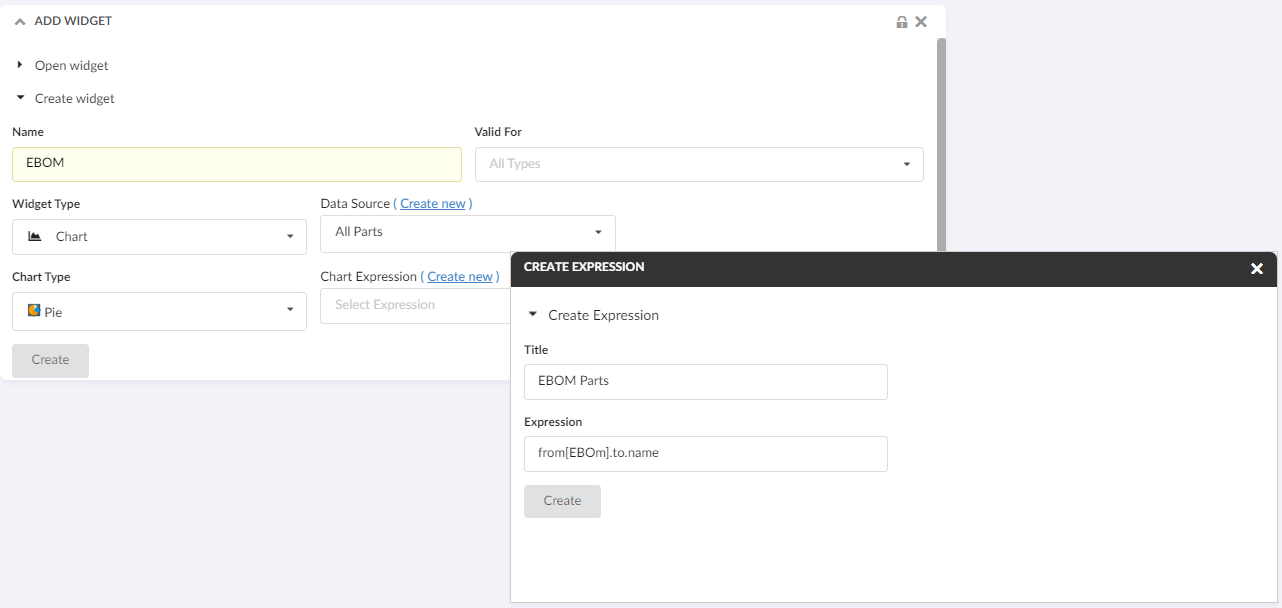
6.2. Create Expression Inline Create Widget
Config-admin can now create expression configs directly from the create widget screen. This enhancement enables config-admin to generate expressions without needing to navigate away from the create widget screen.
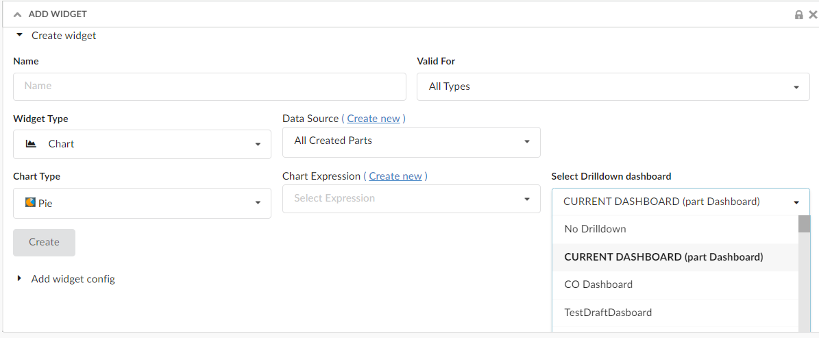
6.3. Select Drilldown Dashboard in Create Widget
Config-admin and endusers can now choose the drilldown dashboard for their configuring chart widgets. Additionally, it is enabled to choose 'No Drilldown' as well from the dropdown filed.
6.4. Chart Widget with Expand Dataset and Expression
With the support of expand dataset and create expression links on the create widget screen, it is now made easy to configure a contextual chart widget.
The linked video illustrates a scenario in which the context part is expanded via the EBOM relationship and a pie chart is generated using the 'material category' attribute of the child parts.