 TVC Helium 2024.3.0
<Column>
	<Name>Specifications</Name>
	<Expression>${from[relationship_PartSpecification].to}</Expression>
	<AlternateOIDExpression>${from[relationship_PartSpecification].to.id}</AlternateOIDExpression>
	<Label>Specifications</Label>
	<TextLength>10</TextLength>
	<Rows>5</Rows>
	<TruncateDirection>left</TruncateDirection>
	<GroupHeader>Related Data</GroupHeader>
	<Setting name="options">{
			"formConfig":"tvc:form:helium/RelatedObjectForm.xml",
			"formWidth" : "300",
			"formHeight" : "300"
	}</Setting>
	<ColumnType>helium-relatedobject</ColumnType>
</Column>TVC Helium 2023.3.0 Release Information
22 June 2023
Table of Contents
1. Datatable
1.1. Related Object Column
In order to facilitate the user’s need to create connections between objects while editing a table column, Helium offers in-built related object column.
With the related object column in Helium, you can create connections between different objects. For instance, from part ebom table one can directly connect specification object to Part object using this column.
Related Object Column can be configured as below:
The configuration mentioned above allows for passing a "formconfig" reference in the settings. This "formconfig" contains all the necessary details about the field that needs to be edited.
For more detailed information please refer Related Object Column
1.2. Configurable Behavior in Advance Sorting
Advance Sorting allows the user to sort data based on multiple criteria, such as sorting by one column first and then by another column in case of a tie. This allows for more precise and customized sorting of data, which can be especially useful when working with large table.
The initializeBlank attribute provides flexibility in the behavior of the Advance Sorting UI,
allowing users to start with a blank state or to continue working with their current sorting criteria,
depending on their needs.
<AdvanceSorting initializeBlank="true"/>
For more detailed information please refer Advance Sorting
1.3. Path Attachment Column
The File column type is beneficial for displaying related documents and their files. However, it should be noted that the File column type will only exhibit the related document(s) connected relationships.
In certain cases, there might be scenarios where the table row object has document(s) connected through a path, which can be considered a virtual relationship. To achieve this, we have introduced new column type Path Attachment Column.
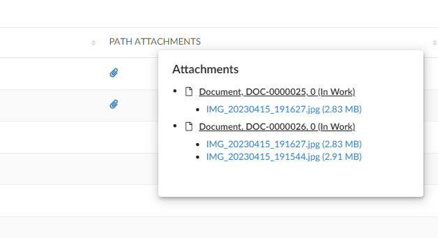
Path Attachment Column can be configured below
<Column>
	<ColumnType>helium-pathattachment</ColumnType>
	<Setting name="Relationship" value="SpecificationDocument" />
	<Setting name="Direction" value="from" />
	<PathType>SemanticRelation</PathType>
	<PathDirection>element</PathDirection>
	<PathExpression>from[VPLMrel/PLMConnection/V_Owner].to[PLMDocConnection]</PathExpression>
	<CardTitle>launchpad.ups.table.card.specDocs.Label</CardTitle>
	<CardID>ups_specdocuments</CardID>
	<Description>launchpad.ups.table.column.specDocFile.tooltip</Description>
	<Setting name="Render as Row Action" value="true" />
</Column>
For more detailed information please refer Path Attachment Column
1.4. Helium Files Column to Support Path Expression
Through the Helium Files column type, it is currently possible to display files that are directly attached to an object or connected through related objects. However, there are cases where files may be connected to objects via a path instead.
To accommodate this scenario, the Helium Files column type can be configured as follows:
    <Column>
		<Label>files</Label>
		<ColumnType>helium-files</ColumnType>
		<PathType>SemanticRelation</PathType>
		<PathDirection>element</PathDirection>
		<PathExpression>from[VPLMrel/PLMConnection/V_Owner].to[PLMDocConnection]</PathExpression>
    </Column>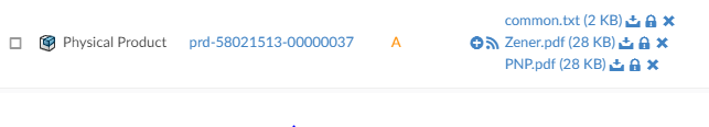
Figure 1. Files Column with Path Expression
1.5. Classification Column - Optional Setting 'classifyFromLevel'
Classification is an Enovia built-in feature provided by Library Central. Any business object can be classified as per the concept of Library Central. Classification is maintained as a hierarchy where Library objects act as roots followed by Family objects. There can be more Families (also known as Sub Family) beneath a Family object forming a hierarchy. At the end of the hierarchy, classified items will be present. Thus Library Central forms the classification path for any business object.
In release 2023.2.0, the column-type helium-classification has been enhanced to display the classification (Library and Family objects ) in structure view. This hierarchical view helps to find the required classification and update to the respective row business object.
Refer Classification Column section for more details and for more customization options
1.5.1. Classify from Specific Level of Library Hierarchy
In this release, a new optional setting called "classifyFromLevel" has been introduced to enable the classification of business objects from a specific level in the library hierarchy. Let’s consider a scenario where you have a library hierarchy structured as "Parts → Accessories → Bolts → Flanged Bolts". In this case, you want the "Part" business objects to be classified starting from the 2nd level, which is "Bolts" and not from "Accessories".
To achieve this, you can specify the built-in setting "classifyFromLevel=2" in the XML configuration, as shown below:
<Column>
	<Label>Classification</Label>
	<ColumnType>helium-classification</ColumnType>
	<Setting name="options">{
		"classifyFromLevel": "2"
	}</Setting>
</Column>
By including this setting in the configuration, the "Part" business objects will be classified starting from the specified level in the library hierarchy. This allows you to control the classification process and ensure that the desired level is considered for classifying the business objects. In the below image, the classification is enabled from second level of the hierarchy.
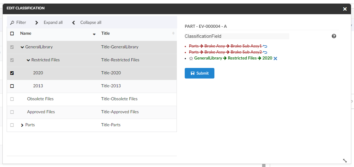
Figure 2. Enabled to select classification from second level
1.6. Auto Select Cell Content
Spreadsheet navigation of a Table makes for an attractive and rapid data input interface, and also a very familiar one for those users experienced in Excel, OpenOffice or similar, who are now transitioning to web based apps.
HotKeysNavigation adds keyboard navigation to Helium Tables, operating in exactly the same way as traditional spreadsheet applications.
Starting from this release, a new feature has been introduced in the datatable that allows for automatic selection of cell contents while editing. This feature enhances the editing experience by pre-selecting the contents of the cell, enabling faster editing using navigation keys. The auto-select functionality is configurable and can be defined at both the TableConfig and Column levels.
When configuring auto-select content, it is important to note that the setting defined at the Column level takes precedence over the one defined at the TableConfig level. If auto-select content is specified for a specific column, it will be applied to that column regardless of the TableConfig setting.
This feature can be configured as below:
1.6.1. TableConfig
Name |
Description |
Example |
AutoSelectContent |
While editing cell content, this enables to select contents of cell. Defaults to |
|
1.6.2. Column
Name |
Description |
Example |
Setting |
Column level config setting to enable auto select cell content while editing.
value can be By default it is considered as not defined. |
|
When column setting for autoSelectContent is not defined, cell content is selected based on table config’s AutoSelectContent.
Auto select of content is applicable only for textbox and textarea fields.
|
2. Form
2.1. Mandatory Fields
Starting from this release, a new improvement has been implemented to visually indicate mandatory form fields. When a form field is marked as mandatory, its label will be displayed in red italic font, in addition to the existing asterisk indication.
By default, this feature is enabled in the product. However, if you wish to disable this feature and revert to the previous behavior, you can set the property tvc.helium.form.requiredFieldLabel.red to false.
By disabling this feature, the mandatory field labels will no longer be shown in red italic font, but the asterisk indication will still be present to denote mandatory fields.
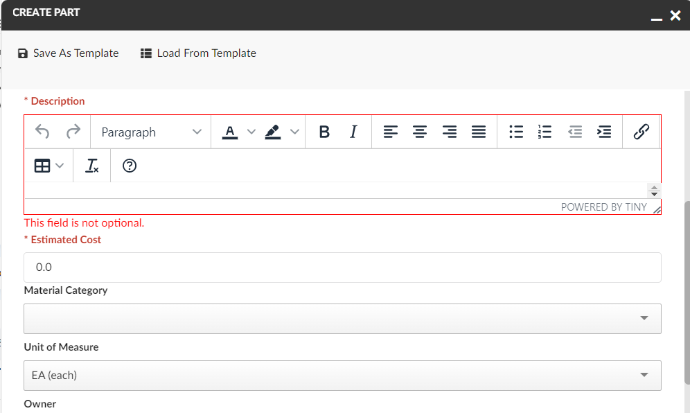
Figure 3. Mandatory fields in red color along with asterisk
2.2. Create New
The Create New button provides users with the capability to create an object and keep the form open to create another object. When the user clicks on the Create New button, the form will be submitted, an object will be created, and the user will receive a notification regarding the new object. Meanwhile, the form will remain open, allowing the user to continue creating more objects.
If the user does not intend to create another object and wishes to submit the form as they did earlier, they can use the Submit button.
The introduction of the Create New button provides users with a streamlined workflow, enabling them to efficiently create multiple objects without the need to repeatedly open and fill out the form. It offers greater convenience and flexibility for users who frequently need to create multiple objects in succession.
This feature can be configured as follows:
<Command>
    <Label>Create Part</Label>
    <FontIcon>plus</FontIcon>
    <OnClick>App.form.createNew</OnClick>
    <OnClickParams>{
        "formConfigName": "tvc:form:helium/CreatePart.xml",
        "fullscreen": true,
        "showCreateNew":true,
        "reloadForm":true
    }</OnClickParams>
</Command>
For more detailed information please refer Form
2.3. Default User Icon
To ease the process of selecting the owner, a new button has been added for the owner field to directly populate with context user. It reduces the manual effort required to search and select the owner from a list, improving efficiency and user experience.
This can be enabled by configuring the owner field with the option setDefaulUserIcon: true in the settings.
By default, the value for setDefaulUserIcon is set to false, meaning the default user icon is not enabled.
This feature can be configured as follows:
<Field>
	<Label>Owner</Label>
	<Expression>owner</Expression>
	<Editable>true</Editable>
	<FieldType>select</FieldType>
	<Setting name="options"><![CDATA[
		{
			...
			"setDefaultUserIcon": true,
			"setDefaultUserLabel": "App.info.user.fullName",
			"autocomplete": {
				"handler" : {
					"name": "user",
					...
				}
				...
			}
		}
		]]>
	</Setting>
</Field>
Value shown in the selectize field for default is configurable via setting setDefaultUserLabel. It can be a user info related string or a function. By default label will be context user’s full name. Some of the user info related strings
App.info.user.email |
|
firstName |
App.info.user.firstName |
lastName |
App.info.user.lastName |
fullName |
App.info.user.fullName |
userId |
App.info.user.id |
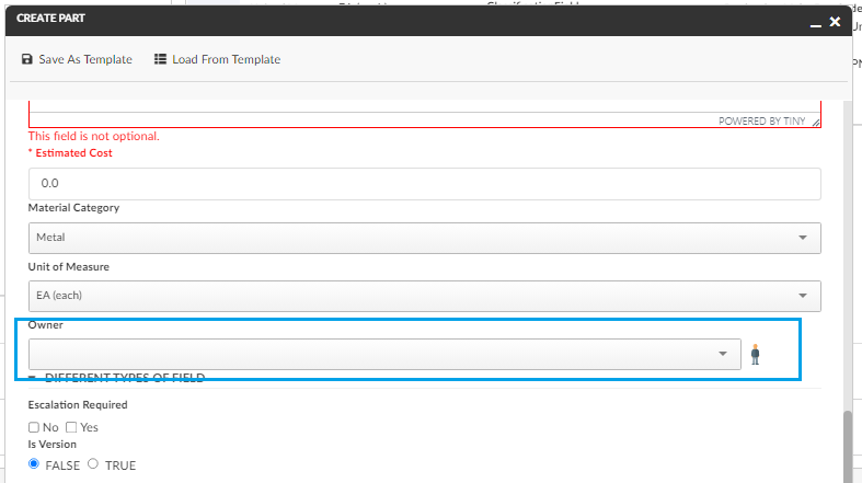
Figure 4. Default user icon to populate context user
Default user icon is applicable only for person field with FieldType as select.
|
3. Search
3.1. File Column in Search Table
By including the files column in the search table configuration, users can conveniently access and download the available files directly from the search results view, improving efficiency and workflow within the application.
It is now possible to include a files column in the table view of search results. This files column will display the available files with a download link. This enhancement is particularly useful as it allows users to stay within the search results UI, quickly view the available files, and download them without the need to navigate to the respective objects.
To configure the files column in the search table, you need to include the data fields format.file.name and format.file.format. The column field for files can be added to the table configuration as shown below:
| Name | Description | Example |
|---|---|---|
DataFields |
To display files available for the object with download link, data fields |
|
Table |
To display files of an object with download link column configuration in addition to defining data fields for |
|
3.2. Table DOM Element Update
In earlier release, we set the DOM attribute with appending a prefix of "data-" to the label tag. For eg. the UOM field will be read inside DOM as "data-uom" considering the label tag for Unit of Measure attribute doesn’t have a space in between. From this release, if there is a SPACE in between the label tag like "Unit of Measure" we are forming the DOM element like "data-unitofmeasure" in order to read the spaced attribute values as well. The scenario can be reflected in table view of search form. The particular label will be joined by two underscores.
4. Widget
4.1. Export and Print Capabilities in History Widget
By configuring the toolbar commands, one can provide users with convenient options to export history records to different file formats and to print the records directly from the application interface.
The export and print capabilities as toolbar commands to provide users with the ability to export history records to Excel or PDF files and to print the records. These export and print can be configured as toolbar commands as show below.
<HistoryWidget>
    <Title>History</Title>
    ...
    <Toolbar vertical="true">
        <Command>
            <Label>history.command.exportToExcel</Label>
            <FontIcon>ti-c ti-large ti-excelexport-c</FontIcon>
            <OnClick>App.Widget.exportHistoryToExcel</OnClick>
        </Command>
        <Command>
            <Label>history.command.exortToPDF</Label>
            <FontIcon>ti-c ti-large ti-file-pdf-c</FontIcon>
            <OnClick>App.Widget.exportHistoryToPDF</OnClick>
        </Command>
        <Command>
            <Label>history.command.print</Label>
            <FontIcon>ti-c ti-large ti-printer</FontIcon>
            <OnClick>App.Widget.print</OnClick>
        </Command>
    </Toolbar>
    ...
</HistoryWidget>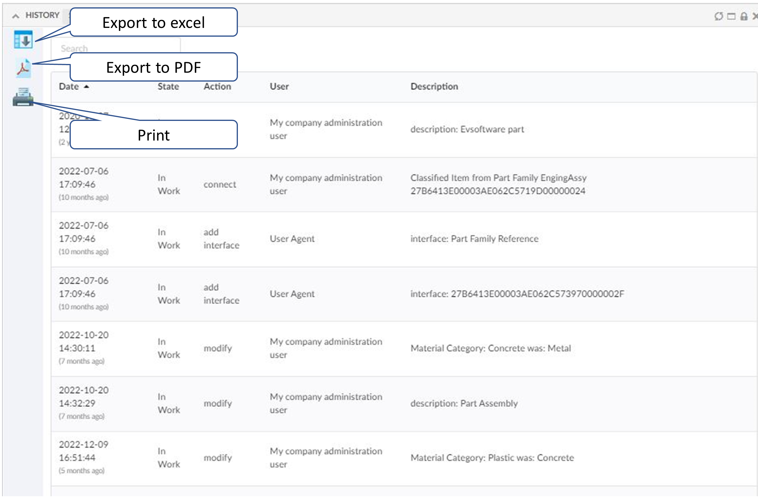
Figure 5. History widget with export and print toolbar commands
5. In-App Designer
In-App Designer is a concept that brings the idea of creating, editing, and sharing configurations using the built-in admin user interface. These configurations can be used to define Helium dashboards, widgets, tables, charts, etc. Built-in Admin UI is provided to create, modify and share these configurations. In-App Designer can be used from Helium standalone or Helium widget in 3DDashboard. Once the config-admin is created and shared the configuration with the end-user, then the end-user receives the configuration to accept it. Once accepted, he can select and apply the configuration to his page, dashboard, or widget from UI. For detailed information, please refer In-App Designer.
In this release, we have enhanced this feature further as stated below.
5.1. Table Configurator - Add more column link
From this release, the Add more column link can be configured by a property tvc.helium.tableconfigurator.showMoreColumnsLink. By default its value is true and will be visible for config-admin.
Refer to Table Configurator - Add more column link for more details.
5.2. Configure Form Widget
Using the In-App Designer, helium dashboards can be configured with the Table Widgets and Chart widgets. From this release, config admin can create Form Widgets and add to the helium dashboards or view from the 3DDashboard widgets.
To configure the Form Widget, config admin will have to create two config objects namely Form Config and Widget Config from command create config in Config Admin UI page.
Once the Form Widget is created, it can be added to the helium dashboard as like the table widget and can be view from the Helium dashboard or from the 3DD widgets.
Refer to Configure Form Widget section for more details.
Figure 6. FormWidget view from 3DDashboard
6. 3DDASHBOARD
6.1. 3DComments in HE True Widget
3DEXPERIENCE platform provides 3DComment feature to collaborate with others by adding and replying to comments. Now this is possible to do from Helium True Widget. 3DComment can be configured inside helium true widget by using below configurations :
<Widget>
    <Html><![CDATA[<div class="comments-widget" id="3d-comments-widget"></div>]]></Html>
    <OnInit>App.Comment.create</OnInit>
    //below configurations are optional
    <OnInitOption name="getCommentsUrl" value="resources/commentproxy/subjects/pid:$OBJECTID/contributions" />
    <OnInitOption name="getReplyUrl" value="resources/commentproxy/subjects/pid:$OBJECTID/comments/$COMMENTID" />
    <OnInitOption name="postCommentsUrl" value="resources/commentproxy/subjects/pid:$OBJECTID/comments" />
    <OnInitOption name="deleteCommentUrl" value="resources/commentproxy/subjects/pid:$OBJECTID/comments/$COMMENTID" />
    <OnInitOption name="likeCommentUrl" value="resources/commentproxy/subjects/pid:$OBJECTID/endorses/me" />
</Widget>
This can be also configured as toolbar command like below:
<Command>
	<Label>Comments</Label>
	<FontIcon>ti-c ti-eye-c</FontIcon>
	<OnClick>App.Comment.openCommentsInSidePanel</OnClick>
	<OnClickParams>{
		"selectionCriteria": "single",
		"dashboardRef":
		"tvc:dashboard:helium/Info.xml"
	}</OnClickParams>
</Command>
Init options for various url are optional as the path for the endpoints may vary in different 3DEXPERIENCE versions.
As the image of user is loaded from 3DSwym so 3DSwym image url can be configured in tvc.properties as below :
tvc.helium.3dswym.person.url = https://[domain-name]/3dswym/api/user/getpicture/login/