 TVC Helium 2024.3.0
<TableConfig>
    ...
	<OpenWithMenu>true</OpenWithMenu>
	...
</TableConfig>TVC Helium 2023.2.0 Release Information
11 April 2023
Table of Contents
1. 3DDASHBOARD
1.1. Open Objects in Available Apps
In 3DDASHBOARD, a business object can be opened in multiple apps, for example, a Physical Product can be opened in Product Explorer Editor, Product Explorer, Product Finder, or 3D Markup. Generally in OOTB Dashboard widgets or apps on right click row, a menu is presented with available apps. Users can click on available apps and the selected object will open in that app.
Now this feature is available in Helium True Widget and can be enabled by configuring as below:
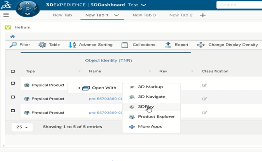
Figure 1. Open With Menu in true widget
For more detailed information please refer Open Available Apps
1.2. Drag and Drop
Drag and drop feature used to set the context of the widget. Now, this feature is enhanced for non-contextual widgets where dropped objects can be appended to listed objects.
| dropped object on non-contextual widget are temporarily available once the widget gets refresed dropped object won’t be visible. |
For more detailed information please refer Drag and Drop Objects
1.3. Set Context using Inline Search
Previously, when a widget requires context user has to use topbar/global search and drag-drop objects to set the context of the widget. Now, an inline search bar is visible to the user whenever widget requires a context object to load, user can search and select an object to set the context in widget itself. by default, it shows searched results in type, name, revision format.
Users can set the search result format by setting the following property in tvc.properties file.
tvc.3ddashboard.search.display.format = type, name, revision
User can also enable or disable this feature by setting the following property true/false in tvc.properties file, default value is true.
tvc.heliumtruewidget.searchtext.enabled
2. In-App Designer
In-App Designer is a concept that brings the idea of creating, editing, and sharing configurations using the built-in admin user interface. These configurations can be used to define Helium dashboards, widgets, tables, charts, etc. Built-in Admin UI is provided to create, modify and share these configurations. In-App Designer can be used from Helium standalone or Helium widget in 3DDashboard. Once the config-admin is created and shared the configuration with the end-user, then the end-user receives the configuration to accept it. Once accepted, he can select and apply the configuration to his page, dashboard, or widget from UI. For detailed information, please refer In-App Designer.
In this release, we have enhanced this feature further as stated below.
2.1. Validate Dataset Performance
In this release, introducing a new feature to validate the MQL query performance of an inquiry-based dataset.
Config-admin can configure the dataset using the "Create Config" and "Create Dataset" commands from the admin-UI. We have introduced a "Validate Inquiry" button in the create/edit forms of dataset configs, to verify the query performance used in the dataset.
To measure the performance, config-admin can set a time limit by which the query is expected to execute.
If a query is taking more than the defined time limit, it will be flagged as a bad-performing query.
By default, the time limit is set as 2 seconds. It can be modified by setting a property tvc.core.inappdesigner.validateInquiry.timeLimitInSeconds in tvc.properies file.
This feature enables the config-admin to assess the performance of a widget when it is loaded with the validated dataset. And by optimizing the query, the config-admin can ensure the best possible performance.
2.1.1. Create Dataset screen with Query performance
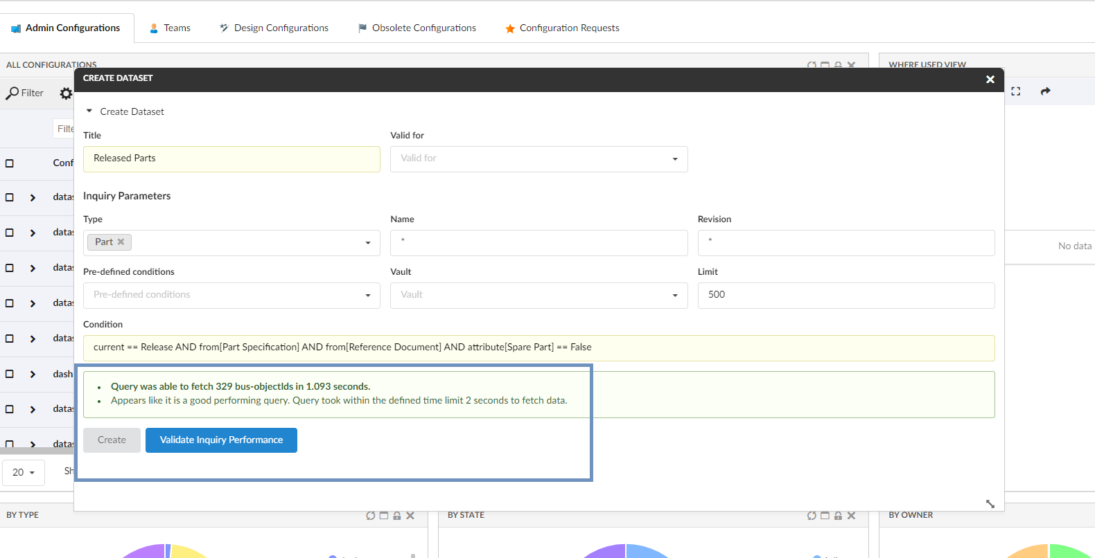
Figure 2. Query performance within defined time limit
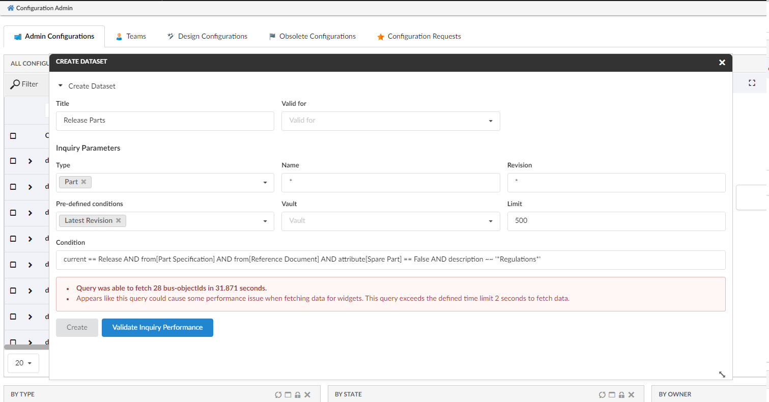
Figure 3. Query that exceed defined time limit
2.1.2. Edit Dataset screen with Query performance
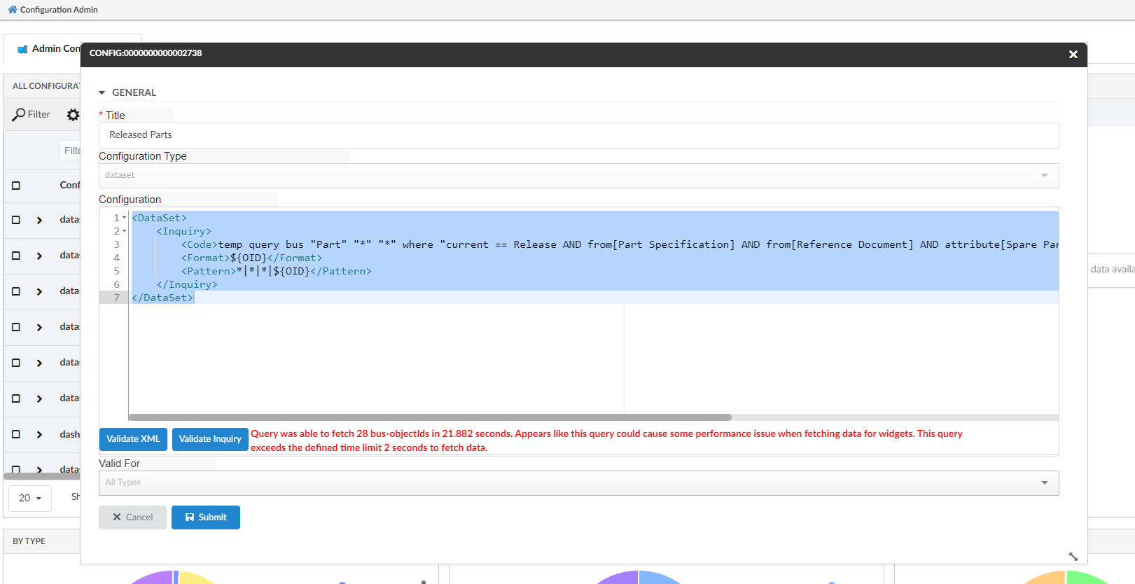
Figure 4. Edit Dataset - Query that exceed defined time limit
For more detailed information please refer Set Context using Inline Search
3. Invoke Services
3DExperience provides different services for subscription actions - Subscribe, Unsubscribe, Edit Subscription, and My Subscriptions. Helium provides provisions to make use of these services and perform the respective actions.
Invoke Service is generic capability in Value Component using which different 3DExperience services can be called. These existing services can be used to load data into table/widget or call the action from the toolbar. In this release, specialized configurations of invoke service are added to support subscription functionality as detailed below
3.1. Subscribe
3DExperience provides a service to subscribe for events of a particular object for the context user. Helium provides a provision to add command subscribe in the toolbar of a datatable to facilitate subscribe. This command can be configured as below:
<Command>
	<Label>Subscribe</Label>
	<FontIcon>bell icon</FontIcon>
	<OnClick>App.ootbServices.subscribe</OnClick>
	<OnClickParams>{
		"selectionCriteria" : "multi",
		"serviceUrl":"resources/v1/modeler/subscriptions"
		}
	</OnClickParams>
</Command>
3.2. Unsubscribe
3DExperience provides a service to Unsubscribe for events of a particular object for the context user. Helium provides a provision to add command unSubscribe in the toolbar of a datatable to Unsubscribe and object’s events for the context user. This command can be configured as below:
<Command>
	<Label>Unsubscribe</Label>
	<FontIcon>bell slash icon</FontIcon>
	<OnClick>App.ootbServices.unSubscribe</OnClick>
	<OnClickParams>{
		"selectionCriteria" : "multi",
		"serviceUrl":"resources/v1/modeler/subscriptions"
		}
	</OnClickParams>
</Command>
3.3. Edit Subscriptions
3DExperience provides a service to edit subscriptions where we can choose to add or remove events on a particular object or group of objects' subscription. Helium provides similar functionality, edit subscriptions can be added as a toolbar command and configured as below:
<Command>
	<Label>Edit</Label>
	<FontIcon>pencil alternate icon</FontIcon>
	<OnClick>App.ootbServices.editSubscription</OnClick>
	<OnClickParams>{
		"selectionCriteria" : "multi",
		"eventsSubscribed": "dataelements.eventsSubscribed",
		"objEventList_NLS": "dataelements.objEventList_NLS",
		"objEventList": "dataelements.objEventList"
		}
	</OnClickParams>
</Command>
There are a few parameters that can be configured in OnClickParams
| Name | Description | Example |
|---|---|---|
eventsSubscribed |
JSON path expression for events subscribed from the response of service call |
|
objEventList_NLS |
JSON path expression for available events(internationalized) for selected objects from the response of service call |
|
objEventList |
JSON path expression for available events for selected objects from the response of service call |
|
There is an option to provide a parameter called serviceUrl where we can specify a URL to make service calls for subscribe/unSubscribe/edit Subscriptions in OnClickParams. This parameter is optional and if no serviceUrl is specified default service will be used.
|
3.4. My Subscriptions
3DExperience provides a service which gives list of all subscribed objects for the context user. Helium provides a provision to make use of the service call and populate data in the table directly form the received response. As this table is populated from response, display mode will be flat and there are a few configurations to be taken care of for above requirement.
3.4.1. Table Config
For the table to populate data the information received from JSON response of service call, table config has to be configured as below:
<TableConfig>
    <Title>My Subscriptions</Title>
    <Table namespace="helium">MySubscriptions.xml</Table>
    <DisplayMode>flat</DisplayMode>
    <ForceReload>false</ForceReload>
    <RowSelect>multi</RowSelect>
    <Pagination size="20" disabled="true"/>
    <ClientSideProcessing enabled="true"/>
    <InvokeService>true</InvokeService>
    <ServiceParams>{
            "url":"resources/v1/modeler/subscriptions",
            "method":"GET",
            "dataSrc":"data",
            "objectId":"id",
            "urlParams": {
                "$language":"App.Utils.preferredLanguage",
                "xrequestedwith":"xmlhttprequest"
            },
        }
    </ServiceParams>
</TableConfig>
<InvokeService>true</InvokeService> is to be added to read data directly from the response received from service call.
ServiceParams are to be added which include information required to make service call.
| Name | Description | Example |
|---|---|---|
url |
Service url to fetch list of all items to populate in table |
|
method |
Method type for making the service call |
|
dataSrc |
JSON path expression where list of objects available from where information can be fetched to populate table data |
|
objectId |
JSON path expression where objectId is available in data from dataSrc |
|
urlParams |
List of parameters that are to be passed while making service call.
Parameters can be given in |
|
3.4.2. Table columns
As the data received from response is used to populate table, table column is to be defined as below.
<Column>
    <Name>Type</Name>
    <Label>Type</Label>
    <Expression>dataelements.type</Expression>
    <Setting name="options">{
		"jsonResponse":"true"
	}</Setting>
</Column>
In Expression we need to specify the JSON path expression where the corresponding data is available in the data received from response.
An additional setting option "jsonResponse":"true" is to be added so as to indicate to get data from response.
| The subscription services are available from versions V6R2022x FP2250, V6R2023x FP2306 and can be used in versions starting with them or above. |
3.5. Relationship Attributes as Columns
For more detailed information please refer Invoke Service
For more detailed information please refer Service Toolbar
4. Forms
4.1. Multi-Value Attribute Field
3DExperience supports multivalue attributes where multiple values can be added. Now we can configure such fields in helium forms where the user can select multiple values or type in values if it is allowed at the schema level.
Multi value attributes can be configured in helium form as below :
<Field>
    <Label>Test Multi Value</Label>
    <Expression>attribute[Test Multi Value]</Expression>
		<Editable>true</Editable>
    <FieldType multiple='true'>select</FieldType>
</Field>
Free text value can also be allowed in multivalue attributes, this can be configured as below:
<Field>
    <Label>Test Multi Value</Label>
    <Expression>attribute[Test Multi Value]</Expression>
		<Editable>true</Editable>
		<Setting name="options">
        {

            "autocomplete": {
                "selectize" : {
				"create":"true"
			}
            }

        }
    </Setting>
    <FieldType multiple='true'>select</FieldType>
</Field>| For dynamic multivalue attribute fields from interface this will be available by default based on schema configuration of attribute. |
For more detailed information please refer Multivalue Field
5. Datatable
5.1. Classification Column - Structured View
Classification is an Enovia built-in feature provided by Library Central. Any business object can be classified as per the concept of Library Central. Classification is maintained as a hierarchy where Library objects act as roots followed by Family objects. There can be more Families (also known as Sub Family) beneath a Family object forming a hierarchy. At the end of the hierarchy, classified items will be present. Thus Library Central forms the classification path for any business object. In this release, the column-type helium-classification has been enhanced to display the classification (Library and Family objects ) structure in edit classification modal. Column type helium-classification was introduced in release 2022.3.0, to display a classification column and an icon to edit the classification in flat list within an edit form. From this release, introducing a structured table to display the classification in hierarchy order. This hierarchical view helps to find the required classification and update to the respective row business object. Below XML configuration displays the built-in classification column with edit icon for the respective row object.
<Column>
	<Label>Classification</Label>
	<ColumnType>helium-classification</ColumnType>
</Column>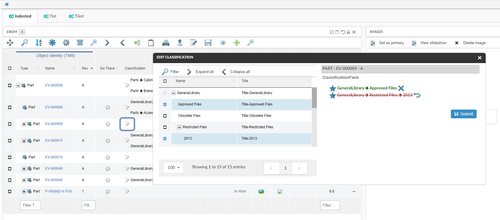
Figure 5. Edit Classification with Default Form and structure table
Refer Classification Column section for customization options
5.2. Row Highlight Duration
Previously, rows were highlighted for shorter duration, so to make it more user friendly this duration can now be changed by configuring duration in milliseconds below in tvc.properties :
tvc.helium.row.highlightDuration= 5000 //1000 is default value
This is applicable for actions like promote, demote, row refresh e.t.c .
6. In-App Designer
In-App Designer is a concept that brings the idea of creating, editing, and sharing configurations using the built-in admin user interface. These configurations can be used to define Helium dashboards, widgets, tables, charts, etc. Built-in Admin UI is provided to create, modify and share these configurations. In-App Designer can be used from Helium standalone or Helium widget in 3DDashboard. Once the config-admin is created and shared the configuration with the end-user, then the end-user receives the configuration to accept it. Once accepted, he can select and apply the configuration to his page, dashboard, or widget from UI. For detailed information, please refer In-App Designer.
In this release, we have enhanced this feature further as stated below.
6.1. Validate Dataset Performance
In this release, introducing a new feature to validate the MQL query performance of an inquiry-based dataset.
Config-admin can configure the dataset using the "Create Config" and "Create Dataset" commands from the admin-UI. We have introduced a "Validate Inquiry" button in the create/edit forms of dataset configs, to verify the query performance used in the dataset.
To measure the performance, config-admin can set a time limit by which the query is expected to execute.
If a query is taking more than the defined time limit, it will be flagged as a bad-performing query.
By default, the time limit is set as 2 seconds. It can be modified by setting a property tvc.core.inappdesigner.validateInquiry.timeLimitInSeconds in tvc.properies file.
This feature enables the config-admin to assess the performance of a widget when it is loaded with the validated dataset. And by optimizing the query, the config-admin can ensure the best possible performance.
6.1.1. Create Dataset screen with Query performance
Figure 6. Query performance within defined time limit
Figure 7. Query that exceed defined time limit
6.1.2. Edit Dataset screen with Query performance
Figure 8. Edit Dataset - Query that exceed defined time limit
6.1.3. Relationship Attributes as Columns
Using In-App Designer, config-admins and end-users can select and add business object attributes and expressions as columns. From this release, relationship attributes can also be added as columns on structure tables. For example, this feature can be used to add EBOM relationship attributes like find number, quantity, and notes, etc.
For more detailed information please refer Column configuration
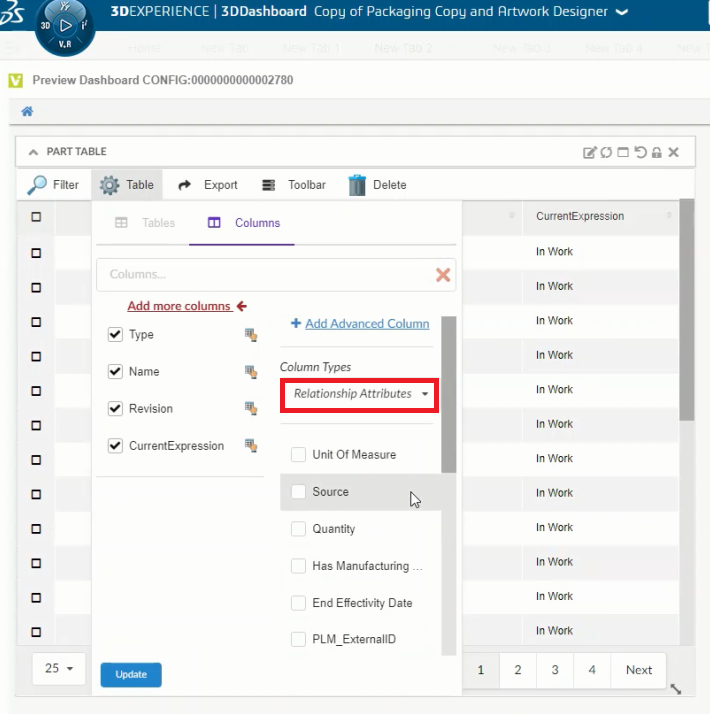
Figure 9. Relationship Attributes