 TVC Helium 2024.3.0
TVC Helium 2022.4.0 Release Information
21 October 2022
1. In-App Designer
In-App Designer is a concept that brings the idea of creating, editing, and sharing configurations using the built-in admin user interface. These configurations can be used to define Helium dashboards, widgets, tables, charts, etc. Built-in Admin UI is provided to create, modify and share these configurations. In-App Designer can be used from Helium standalone or Helium widget in 3DDashboard. Once the config-admin is created and shared the configuration with the end-user, then the end-user receives the configuration to accept it. Once accepted, he can select and apply the configuration to his page, dashboard, or widget from UI. For detailed information, please refer In-App Designer.
In this release, we have enhanced this feature further as stated below.
1.1. Create Dashboard By Enduser
In this release we have enabled endusers to create dashboard and configure widgets in it. Previously, to set up a new dashboard, the end-user will have to request config-admin to configure and share. From this release, end-users can configure new dashboards themselves and that reduces config-admin dependency.
1.2. Export/Import Configurations
In-App-Designer enables config-admins to create or configure dashboards, widgets, and their related configurations from the Config Admin UI page. Now Config-admin can copy the configurations from one environment to another environment using this export/import configuration feature. Using this feature, configs like dashboards or widgets can be configured and validated in pre-prod environments and then these validate configs can be exported and imported to the production enviromment.
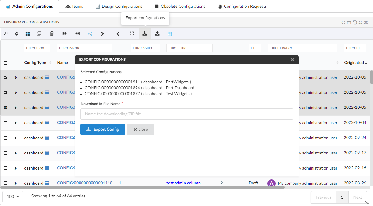
1.2.1. Export Configuration
Config-admin can select the configurations from the admin UI and click the export command. The selected configurations will be downloaded as a ZIP file which can be imported into another environment or can be deployed in the web directories by extracting the needed files from the ZIP file.
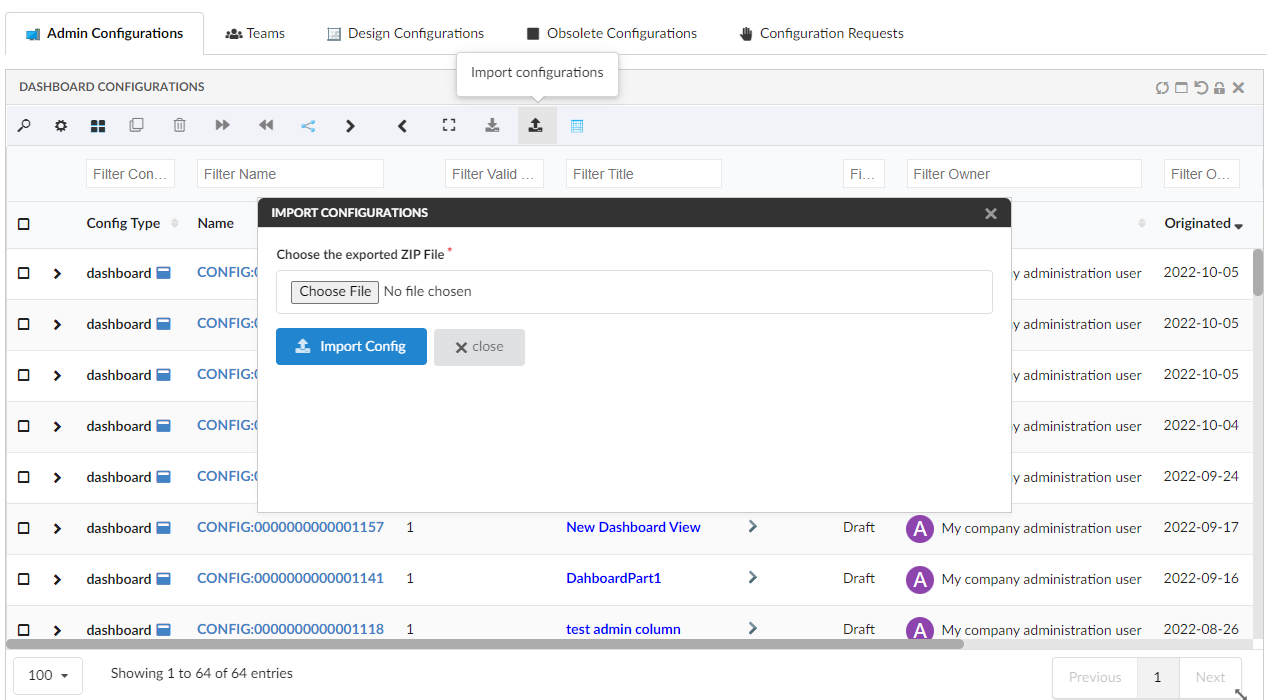
1.2.2. Import Configuration
The exported file can be imported into the new environment using the built-in command available in the config admin UI. New set of business-objects will be created based on the imported files. These business-objects will be created in the draft state and config-admin can review and activate.
Moreover, the exported XML files can also be deployed in the web directory and used as the regular file-based configurations. You can extract the needed configurations from the ZIP file and deploy them in the web directory.
Please refer to the video where a dashboard with 4 widgets is exported and imported back.
1.3. Reset Dashboard
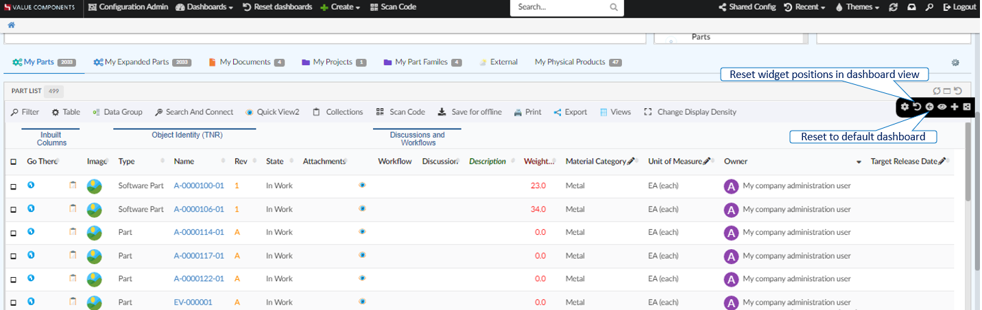
Earlier based on property tvc.helium.dashboard.customization.resetEnduserWidget, the reset icon in the dashboard will reset either to the default dashboard or only the changes done on the widget positions. From 2022.4.0 release onwards property tvc.helium.dashboard.customization.resetEnduserWidget has been deprecated. From now on there will be two icons to reset the customizations done on dashboard.
Reset to default dashboard:
Enduser can replace the default dashboard with the dashboard shared by config-admin. And also, when enduser adds new widgets to default dashboard, a new dashboard configuration will be created in background and replaces the default dashboard. In order to reset back to the default dashboard, you can click this icon reset to default dashboard.
Reset widget positions in dashboard:
Enduser can shuffle widget’s positions inside dashboard or hide the default widgets in the default dashboard. This icon can be used to reset to the configured dashboard view.
| Any XML based widgets removed from dashboard will be added back when reset widget positions icon is clicked. |
1.4. Update Related Configs
When the configuration XML is modified at Admin-Config UI, the related config connections will be updated as per the configs added in the XML.
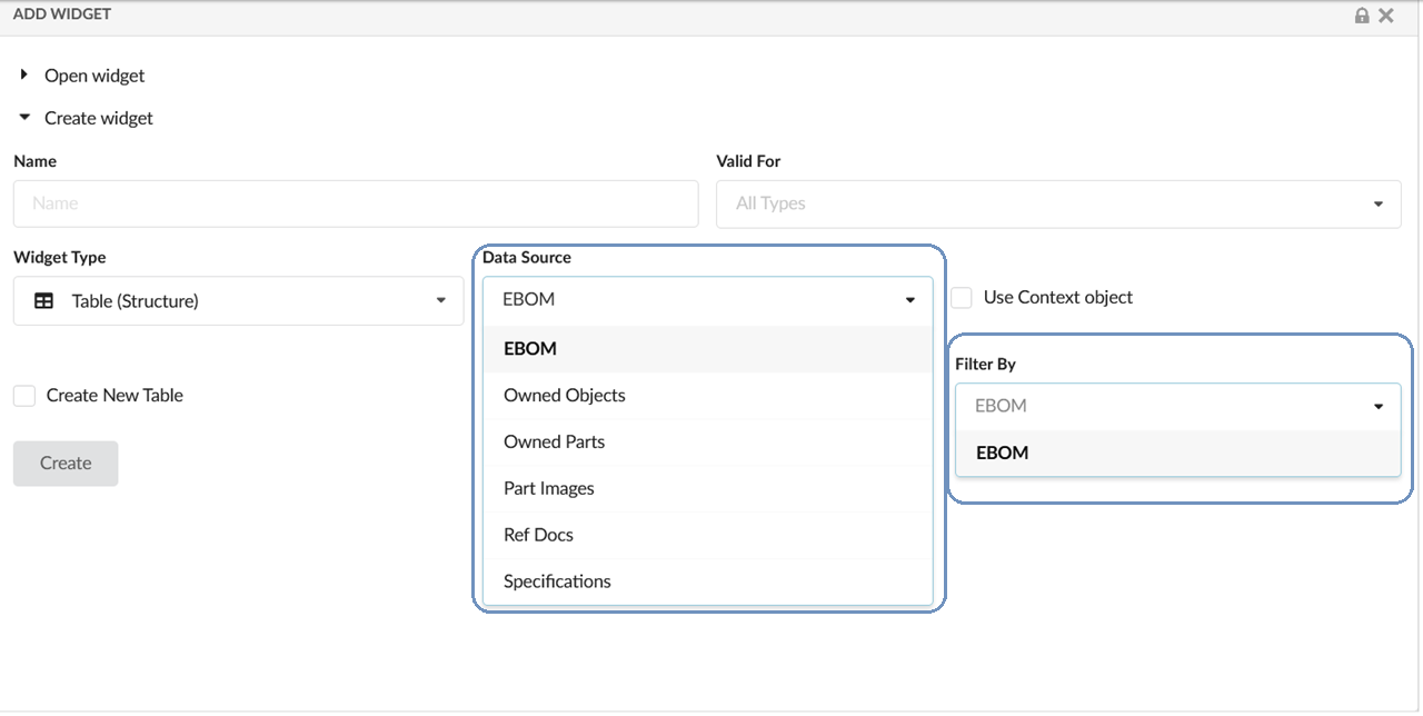
1.5. Pre-built Configs in Create Widgets
Using the TVC_InAppConfigurations.json file, config-admin can configure the file-based configurations to list under create widget form. If the JSON file is not configured, a few built-in file-based configurations will be displayed in the create widget form as shown below. To add or remove the file-based configs from the create widget dropdown, config-admin can create and configure them in TVC_InAppConfigurations.json in WEB-INF/classes/.
| TVC_InAppConfigurations.json.sample file with the built-in file-based configurations, is available in WEB-INF/classes/ folder. Config-admin can rename the sample JSON file and add more or remove existing file-based configs. |
2. Dashboard
2.1. Expand and Collapse Icon
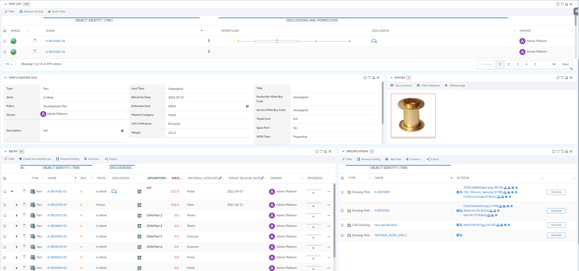
Helium supports multi-widget UI which means the user can have multiple widgets on UI at the same time. However, there might be the case that the user wants to focus on a single or couple of widgets. Like in the below example, the user would like to work on EBOM and Specification tables only. Many other widgets are also visible leaving lesser space available for EBOM and Specification table.
Expand and collapse icon can be used to collapse widgets. This feature can be enabled by defining global property tvc.helium.widget.enableHeaderExpandCollapse=true in tvc.properties. By enabling this feature now users will be able to collapse widgets and make space for focusing widgets like below. User action to expand and collapse is persisted.
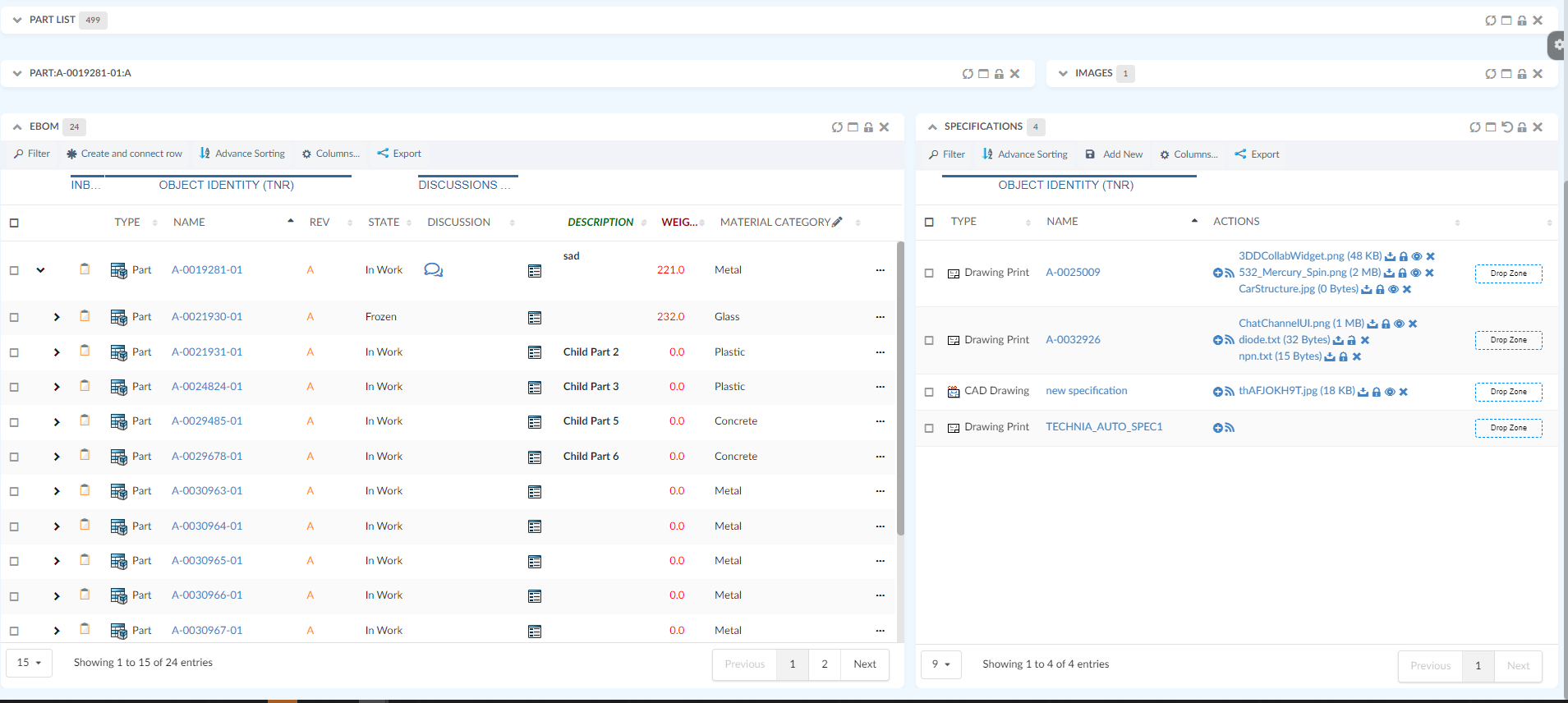
For more detailed information please refer Dashboard Widgets
3. Datatable
3.1. Multi-Column Sorting
When working with table, data sorting is of the most common things users do. In most of the cases, single column sorting is sufficient. But in some advance cases, especially with huge data, sorting on multiple columns would be beneficial.
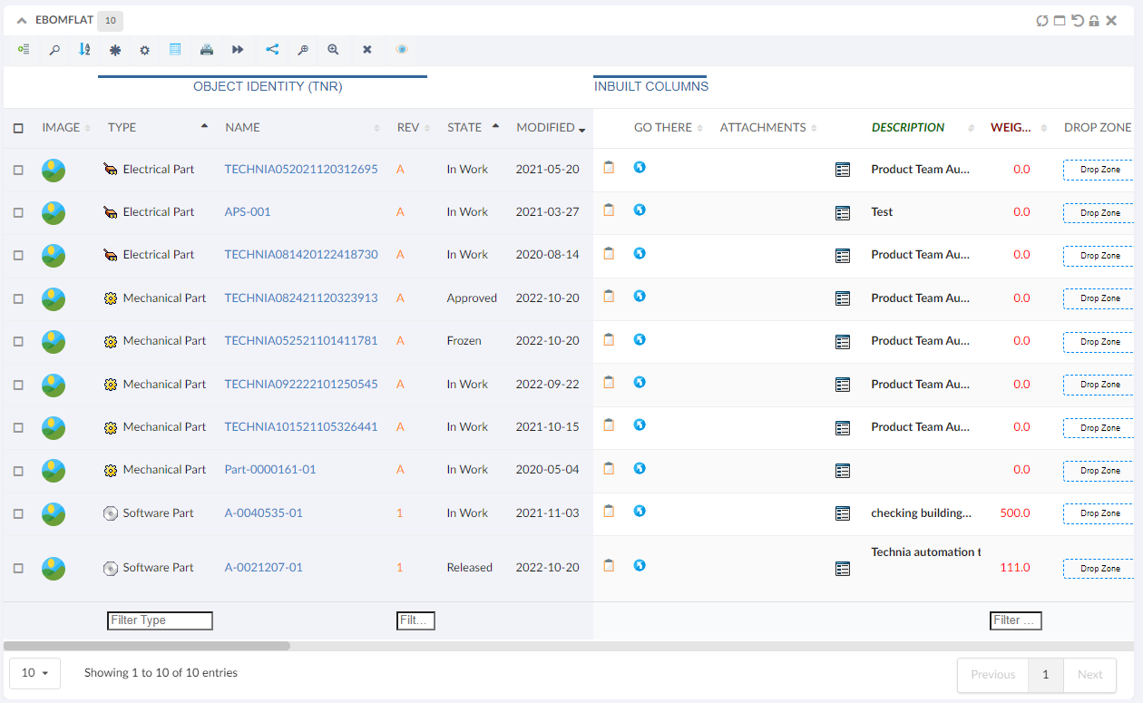
For example, in the below table, user would like to sort the data by the type column and then by the state followed by modified Column. This will allow user to see latest modified object in each state of every type.
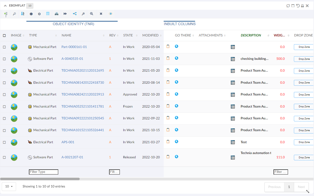
Now, with configuring <AdvanceSorting/> command in toolbar user can choose upto 3 level sorting.
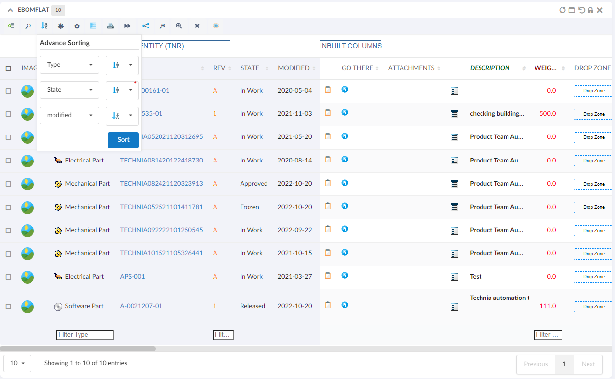
Below image shows data sorted first by type then by state followed by modified column.
For more detailed information please refer Multi-Column Sorting Command
3.2. Type Icon in Column
Type icon can provide better visual indicator for type. Table column now support <ShowTypeIcon>. Type icon improves user experience and helps user to make type idenfication faster. It can be configured with any column like below
<Column>
	<Name>Type</Name>
	<Expression>type</Expression>
	<ShowTypeIcon>True</ShowTypeIcon>
	<Setting name="Template" value="helium/templates/table/typeWithIcon" />
</Column>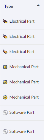
For more detailed information please refer Table Column
4. Form
4.1. Search And Add
RelatedObject field allows user to connect object by using autocomplete. Now it has been extended to support search along with autocomplete. Search can be helpful to enter additonal criteria. A Search config can be configured as Options setting.
<RelatedObject>
	<Label>Specifications</Label>
	<Editable>true</Editable>
	<Relationship direction="from" name="relationship_PartSpecification" />
    <Display>type</Display>
	<Display>name</Display>
	<Display>revision</Display>
	<Display>current</Display>
	<Options><![CDATA[{
        "searchAndAdd":{
			"searchConfig":"tvc:search:hex:common/SearchAndAdd.xml"
		},
		"autocomplete" : {
          		"handler" : {
                      "name" : "businessobject",
                      "typePattern" : "type_DOCUMENTS",
                      "vaultPattern" : "eService Production",
                      "revisionPattern" : "*",
                      "whereClause" : "${attribute[attribute_IsVersionObject]} == 'False'",
                      "caseSensitive" : false,
                      "searchType" : "contains",
                      "value" : "id",
                      "limit" : 100
                  }
              }
	}]]></Options>
</RelatedObject>
For more detailed information please refer Related Object Field
For more detailed information please refer Search
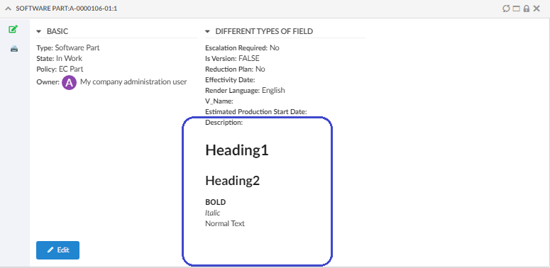
4.2. Markdown Editor Support
A Markdown editor is a text-to-HTML conversion tool. It can be used to format lists, headers, and for emphasis. This helps to produce content that is as easy to read as plain text.
Helium provides support for markdown for inline text formatting. This can be easily configured by the setting <FieldType>markdown</FieldType> tag. Example:
<Field>
    <Label>Description</Label>
    <Expression>description</Expression>
    <Editable>true</Editable>
    <FieldType>markdown</FieldType>
</Field>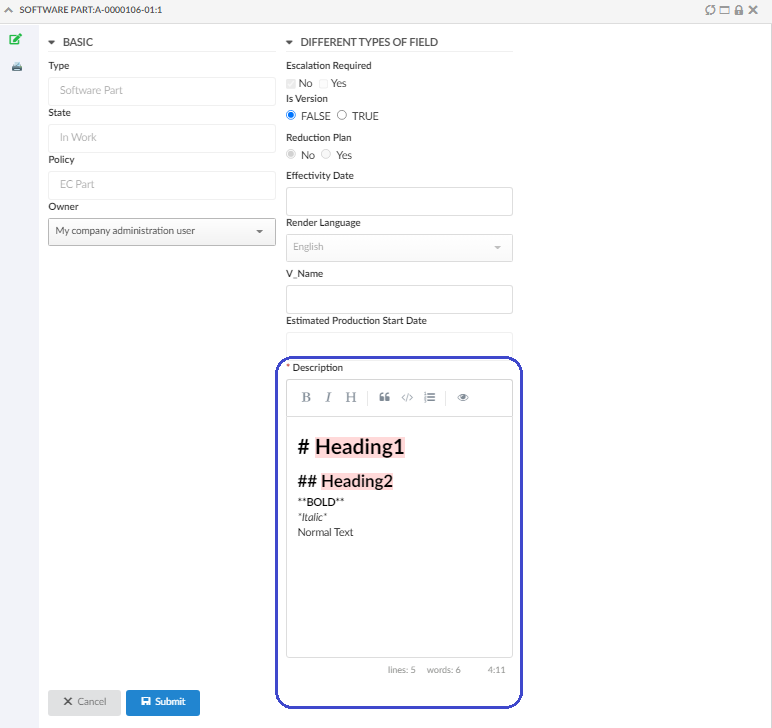
For more detailed information please refer Markdown Field
4.3. Trim Textarea Field Content
For textarea field, any leading or trailing whitespaces or newline characters are preserved in view mode. Sometimes this can affects formatting the content of form and it would be desired to remove leading and trailing spaces. This can be achieved by configuring a setting in options as below.
<Setting name="options"><![CDATA[
    {
    "trimOutput": true,
    }
    ]]>
</Setting>
For more detailed information please refer Trim Output
4.4. Type and Policy Exclude
Some policies like Cancelled are for internal use and should not be available for selection in the form. Similar case will be for types where some types should not be available for selection.
To achieve this, setting exclude has been introduced for built-in type and policy handlers. List of values mentioned in exclude will be excluded from the options to choose. List of values (comma separated) to exclude can be either symbolic or actual names of types or policies.
<Field id="typeField">
	<Label>Type</Label>
	...
	<FieldType>select</FieldType>
	<Setting name="options">
	{
		"autocomplete": {
			"handler" : {
				"name": "type",
				"rootTypes":["Part","DOCUMENTS"],
				"exclude":["type_ArtworkTemplate","Artwork Annotation"]
			}
		}
	}
	</Setting>
</Field >
<Field id="policyField">
	<Label>Policy</Label>
	<FieldType>select</FieldType>
	...
	<Options><![CDATA[{
			"repopulateOn":{
				"field":"typeField",
				"autocompletehandler":"com.technia.helium.form.create.PolicyAutoCompleteHandler",
				"exclude":["Pilot Product Data","policy_ManufacturerEquivalent"]
			},
			....
			}]]>
	</Options>
</Field>
5. Selectize Dropdown
Selectize dropdown element visiblity is by default bound to widget boundary. In some cases it would be beneficial to show selectize dropdown outside widget boundary. Now this can be configured with the global property tvc.helium.selectize.showDropdownOutsideFrame=true in tvc.properties file or can be configured on individual column or field like below.
For Column :
<Setting name="options">{
        "autocomplete": {
            "selectize" : {
				"showDropdownOutsideFrame" : true
			}
        }
}</Setting>
For more detailed information please refer Selectize
For Field :
<Options><![CDATA[{
			"selectize" : {
				"showDropdownOutsideFrame" : true;
    		}
}]]></Options>
For more detailed information please refer Selectize