 TVC Helium 2024.3.0
Widgets
05 May 2016
1. Widgets
1.1. Chart
Visualizes data in charts. Available type of charts:
-
Line
-
Bar
-
Pie
-
Donut
The chart solution is based on Chartist.js
A dataloader can be configured at dashboard level. The data loaded at dashboard level is available to all the chart widgets defined in the dashboard.
In this case, the data will not be cached by the service worker.
|
1.1.1. Widget
To create a chart widget you must first create an xml with the following contents:
<ChartWidget>
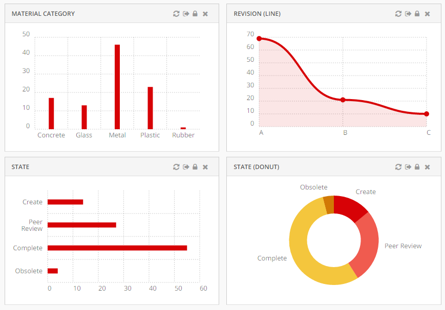
<Title>State</Title>
<ChartConfig namespace="helium">StateChart.xml</ChartConfig>
</ChartWidget>The <ChartWidget> element supports the following child elements.
| Name | Description | Example |
|---|---|---|
Title |
The title of the chart widget |
|
ChartConfig |
Specifies the chart config file |
|
UseVersion2 |
If set to true the new chart library ApexCharts will be used else the older one Chartist. This can be set globally by using |
|
1.1.2. Chart configuration
The <ChartConfig> element can have the following children. Full example.
| Name | Description | Example | ||
|---|---|---|---|---|
DataSeries |
Defines the data to display in the chart. More details |
|||
Sort |
Controls sorting of the data. Sorts by default on label. More details |
|
||
Tooltip |
Controls if tooltips are displayed. |
|
||
Top |
The number of entries to display in the chart. The ones with highest values are displayed and others are grouped together in the "other" section. Useful when there are lots of entries and the chart feels crowded. |
|
||
DrillDown |
Reference to dashboard to use when performing drilldowns. Use either |
|
||
OnClick |
Reference to javascript function which is invoked when user clicks on chart elements. Example |
|
||
Legend |
Controls if legend are displayed. For multi series, it is automatically enabled. |
|
||
Stack |
To show multi series bar chart as a stacked bar chart. Defaults to |
|
||
Options |
Options for the chart. For example you can control offsets/paddings of the chart, labels and layout. The full list of the available options is available in the Chartist documentation. Note that the options varies depends on the type of chart (bar, line etc). Option for legend : |
|
||
ResponsiveOptions |
Responsive options are used to adapt the chart to look good across different devices. Responsive options controls the layout based on media queries. The full list of the available options is available in the Chartist documentation. |
Example displaying only first character of the month (J, F, M, A …) on small screens: |
||
FunctionOptions |
There could be some use cases like events etc. to configure custom js function as documented in apex charts library.
|
Example for using custom js functions |
||
DataType |
Controls the type of data to display in the chart. By default it uses the data type |
|
||
AnimateOnLoad |
Reference to a JavaScript function which registers a chart animation. One included example for line charts is available via example.js as App.custom.registerLineChartAnimation. For more examples and details, please refer to Chartist - Examples.
|
|
||
ExternalSource |
A rest api url / some js function that returns request object or url |
|
||
ExternalSourceDataFunction |
A js function to convert the external source response to data expected by the chart library |
|
Sorting
Controls how to sort the data in the chart.
| Name | Description | Example | ||
|---|---|---|---|---|
Label |
Sort on the label. Supports |
|
||
Value |
Sort on the value. Supports
|
|
||
LabelFixed |
Sort on label with a fixed order. Useful when display states. |
Value |
DataSeries
Defines the data to display in the chart. There is pre-built support for multiple data series but the default data type 'group' supports only one serie. Multiple data series can be utilized when writing custom data type example.
| Name | Description | Example |
|---|---|---|
DataLoader |
Optional. Data loader to use across all series in the chart. Use this setting in case all data series uses same set of objects. |
|
Serie |
Respresents one serie of data serie in the chart. More Details |
| For multi series chart DataSeries may contain multiple Serie and ChartType for all serie must be same. |
Serie
Represents one serie of data in the chart.
| Name | Description | Example | ||
|---|---|---|---|---|
DataLoader |
Defines which data to use in data serie. Optional in case specified on |
|
||
Name |
Legend label for bar and line chart. |
|
||
Expression |
Data to select. Used to group data by default.
|
If user want to show chart based on EBOM relationship on relationship attribute |
||
Expressions |
Supports multiple Expression elements which can be used to select data. By default, the first expression in the list will be used to group chart data. In this example data will be grouped by Material Category. |
|
||
SeriesExpression |
Data used to create multi series chart. SeriesExpression value becomes legend label and Name setting ignored. For multiple Serie it will be ignored.
|
If user want to show multi series chart based on EBOM relationship on relationship attribute |
||
ChartType |
Type of chart. Available kind of charts:
|
|
Example configuration
<?xml version="1.0" encoding="UTF-8"?>
<Chart>
    <Sort>
        <Value ascending="false" />
    </Sort>
    <Tooltip>true</Tooltip>
    <Top>5</Top>
    <DrillDown>tvc:dashboard:helium/PartDrillDown.xml</DrillDown>
    <DataSeries>
        <Serie>
            <DataLoader>
                <DataSet>tvc:dataset:helium/MyParts.xml</DataSet>
            </DataLoader>
            <Expression><![CDATA[$<attribute[attribute_MaterialCategory]>]]></Expression>
            <ChartType>bar</ChartType>
        </Serie>
    </DataSeries>
</Chart>
Multi Series Chart Example configuration
Multi Series Bar Chart
<?xml version="1.0" encoding="UTF-8"?>
<Chart>
    <Sort>
        <Value ascending="false" />
    </Sort>
    <Options>{
  		"legendPosition": "top"
	}</Options>
    <Tooltip>true</Tooltip>
    <Legend>true</Legend>
    <Top>3</Top>
    <DrillDown>tvc:dashboard:helium/PartDrillDown.xml</DrillDown>
    <DataSeries>
        <Serie>
            <DataLoader>
                <DataSet>tvc:dataset:hex:engineering:homepage/MySoftwareParts.xml</DataSet>
            </DataLoader>
            <Expression><![CDATA[$<attribute[attribute_MaterialCategory]>]]></Expression>
            <ChartType>bar</ChartType>
            <Name>Software Part</Name>
        </Serie>
        <Serie>
            <DataLoader>
                <DataSet>tvc:dataset:hex:engineering:homepage/MyElectricalParts.xml</DataSet>
            </DataLoader>
            <Expression><![CDATA[$<attribute[attribute_MaterialCategory]>]]></Expression>
            <ChartType>bar</ChartType>
            <Name>Electrical Part</Name>
        </Serie>
         <Serie>
            <DataLoader>
                <DataSet>tvc:dataset:hex:engineering:homepage/MyMechanicalParts.xml</DataSet>
            </DataLoader>
            <Expression><![CDATA[$<attribute[attribute_MaterialCategory]>]]></Expression>
            <ChartType>bar</ChartType>
            <Name>Mechanical Part</Name>
        </Serie>
    </DataSeries>
</Chart>
Multi Series Stacked Bar Chart
<?xml version="1.0" encoding="UTF-8"?>
<Chart>
    <Sort>
        <Value ascending="false" />
    </Sort>
    <Options>{
  		"legendPosition": "top"
	}</Options>
    <Tooltip>true</Tooltip>
    <Legend>true</Legend>
    <Top>3</Top>
    <Stack>true</Stack>
    <DrillDown>tvc:dashboard:helium/PartDrillDown.xml</DrillDown>
    <DataSeries>
        <Serie>
            <DataLoader>
                <DataSet>tvc:dataset:hex:engineering:homepage/MyParts.xml</DataSet>
            </DataLoader>
            <Expression><![CDATA[$<attribute[attribute_MaterialCategory]>]]></Expression>
            <SeriesExpression>current</SeriesExpression>
            <ChartType>bar</ChartType>
            <Name>Software Part</Name>
        </Serie>
    </DataSeries>
</Chart>
Example custom onClick
The <OnClick> configuration can be used to perform custom action when the user clicks in the chart. This enables the possibility to do drill down, exchange information in tables or something else. In the configuration you specify the JavaScript function to invoke upon user clicks.
Configuration:
<OnClick>App.custom.chartOnClick</OnClick>JavaScript:
var App = App || {};
var App.custom ={
    chartOnClick: function(data) {
        console.log('Clicking in chart');
        console.log('  Clicked data=', data);
        console.log('  Chart reference=', this);

        // Code performing something nifty
    }
};
Use either DrillDown OR OnClick.
|
The javascript function will be executed with this set to the chart.
|
1.1.3. Data Type
The data type controls how the data series in the chart are calculated. The input to the data type processing is the configurations done in the chart configuration file along with information about which objects that are displayed in the chart.
Output format:
{
    'labels': ['<label>', '<another-label>', ...],
    'series': [{
        'name': '<name>',
        'data': [{
            'value': <value>
            'objectIds': [
                '<object-id>',
                '<another-object-id>',
                ...
            ]
        },{
            ...
        }]
     },{
        ...
    }]
}
Example output:
{
    'labels': ['W34', 'W35', 'W36'],
    'series': [{
        'name': 'Created',
        'data': [{
            'value': 1
            'objectIds': [
                '1.2.3.4'
            ]
        }, {
            'value': 0
            'objectIds': []
        }, {
            'value': 3
            'objectIds': [
                '2.3.4.5',
                '5.6.7.8',
                '9.8.7.6'
            ]
        }]
     }, {
         'name': 'Resolved',
         'data': [{
             'value': 0
             'objectIds': []
         }, {
             'value': 1
             'objectIds': [
                 '1.2.3.4'
             ]
         }, {
             'value': 2
             'objectIds': [
                 '5.6.7.8',
                 '9.8.7.6'
             ]
         }]
      }]
}
Charts comes with a built-in data type strategy, but it also possible to write a custom data type.
Data Type: Group
The objects are grouped by a configured expression, e.g. type or state. Each unique value gets one label and the amount of objects is the data value. It expects there to be exactly one dataserie in the configuration.
Example custom data type
Configuration:
<DataType>App.custom.timeDataType</DataType>JavaScript:
var App = App || {};
var App.custom = {
    timeDataType: function(config) {

        var getObjectDataValues = function(expression, objectId, relId) {
            if (expression.usesBusinessObject) {
                return App.ObjectStore.get(objectId).data[expression.name].values;
            }
            return App.ObjectStore.getRelationship(relId).data[expression.name].values;
        }


        // Check each label how many values there are per serie
        //    - 2015-06-24 5 created 3 solved issues
        //    - 2015-06-25 1 created 0 solved issues
        //    - 2015-06-26 3 created 2 solved issues

        var labels = ['2015-06-24', '2015-06-25', '2015-06-26'];
        var series = [];

        config.series.forEach(function(serie) {
            var expr = serie.expression;
            var result = {
                'name': expr.name
                'data': []
            };


            serie.objectIds.forEach(function(objectId, index) {
                let relId = serie.relIds[index];
                let values = getObjectDataValues(expr, objectId, relId);
                values.forEach(function(value) {

                    // Logic calculating amount of objects which have been created/resolved

                    var dataPoint = {
                        'value': 1,
                        'objectIds': ['1.2.3.4'],
                        'relIds': ['5.6.7.8']
                    };
                    result.data.push(dataPoint);
                });
            });

            series.push(result);
        });

        return {
            'labels': labels,
            'series': series
        };
    }
};
Example custom data type with support for multi-value attributes
Configuration:
<DataType>App.custom.customChartValues</DataType>JavaScript:
var App = App || {};
var App.custom = {
    customChartValues: function(config) {

        var setLabelData = function(labelPoints, value, objectId, relId) {
            labelPoints[value].value += 1;
            labelPoints[value].objectIds.push(objectId);
            labelPoints[value].relIds.push(relId);
        }

        var getObjectDataValues = function(expression, objectId, relId) {
            if (expression.usesBusinessObject) {
                return App.ObjectStore.get(objectId).data[expression.name].values;
            }
            return App.ObjectStore.getRelationship(relId).data[expression.name].values;
        }

        var labels = config.options.labels;
        var series = [];

        config.series.forEach(function(serie) {
            var points = [];
            var expr = serie.expression;
            var labelPoints = {};
            var legendLabel = serie.name || '';

            labels.forEach(function(label) {
                var dataPoint = {
                    value: 0,
                    objectIds: [],
                     relIds: []
                };
                labelPoints[label] = dataPoint;
            });

            serie.objectIds.forEach(function(objectId, index) {
                var relId = serie.relIds[index];
                var values = getObjectDataValues(expr, objectId, relId);
                var filteredValues = values.map(function(v) {return v.value;}).filter(function(v) {return labels.includes(v)});

                filteredValues.forEach(function(value) {
                    setLabelData(labelPoints, value, objectId);
                });
                if (filteredValues.length > 1) {
                    setLabelData(labelPoints, labels[2], objectId);
                };
            });

            labels.forEach(function(label) {
                points.push(labelPoints[label]);
            });

            series.push({
                name: legendLabel,
                data: points
            });
        });

        return {
            labels,
            series
        };
    }
};
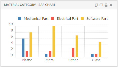
Figure 1. Chart displaying custom data type with multi-values
Image is showing:
-
DataSet is an inquiry that returns 33 objects based on attribute[Material Category]
-
29 of these objects have the attribute value ‘Glass’
-
10 of them have the attribute value ‘Plastic’
-
6 of them have both attribute values ‘Glass’ and ‘Plastic’
1.1.4. API
The chart javascript api can be found here
1.1.5. Path Support
In 3dexperince, more and more of the data model is moving towards path-based. Change Process is one good example and there is a need to be able to visualize the path-based data model by config only.
Now the path related object/relationship information can be used to generate charts. This can be done using the path query dataset in chart config.
Below example generates a chart based on the attribute Severity of Change Orders related to context part EBOM structure. In this case, the loader must point to Path Query which will return change order id’s and the Expression should point to selects on those change order id’s, in this case, attribute 'Severity'.
<?xml version="1.0" encoding="UTF-8"?>
<Chart>
	<DataSeries>
		<Serie>
			<DataLoader>
				<DataSet>tvc:dataset:hex:engineering/ChangeObjects.xml</DataSet>
			</DataLoader>
			<Expression><![CDATA[$<attribute[attribute_Severity]>]]></Expression>
			<ChartType>donut</ChartType>
		</Serie>
	</DataSeries>
</Chart>
Below is the loader definition used in the above example.
<?xml version="1.0" encoding="UTF-8"?>
<PathQuery>
	<PathType>Proposed Activity.Where</PathType>
	<PathSelect>owner.to[Proposed Activities].from.to[Change Action].from.id</PathSelect>
	<Expand>
		<From>true</From>
		<To>false</To>
		<Depth>1</Depth>
		<RelationshipPattern>
			<Relationship>relationship_EBOM</Relationship>
		</RelationshipPattern>
	</Expand>
</PathQuery>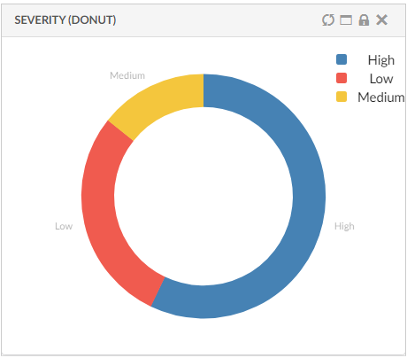
Figure 2. Path Support in Charts
Read the Path Support chapter for more details.
1.1.6. Combination Charts
Combination charts let you display different types of data in different ways on the same chart. You may display columns, lines, areas, and steps all on the same combination chart. Use them to visually highlight the differences between different sets of data.
There could be multiple combinations like line and bar or line, bar and area with different dataseries representing different chart type. One of the serie should have chart type as line.
This can be configured as below :
<ChartWidget>
	<Title>Multi Series Combo Charts</Title>
	<ChartConfig namespace="hex:engineering:homepage">CombinationCharts.xml</ChartConfig>
	<UseVersion2>true</UseVersion2>
</ChartWidget>
<Chart>
<DataSeries>
<Serie>
<Name>bar</Name>
<DataLoader>
<DataSet>tvc:dataset:hex:engineering:homepage/Dataset3.xml</DataSet>
</DataLoader>
<Expression>current</Expression>
<ChartType>line</ChartType>
</Serie>
<Serie>
<Name>area</Name>
<DataLoader>
<DataSet>tvc:dataset:hex:engineering:homepage/Dataset1.xml</DataSet>
</DataLoader>
<Expression>current</Expression>
<ChartType>area</ChartType>
</Serie>
<Serie>
<Name>line</Name>
<DataLoader>
<DataSet>tvc:dataset:hex:engineering:homepage/MyParts.xml</DataSet>
</DataLoader>
<Expression>current</Expression>
<ChartType>line</ChartType>
</Serie>
<Serie>
<Name>column</Name>
<DataLoader>
<DataSet>tvc:dataset:hex:engineering:homepage/Dataset1.xml</D
ataSet>
</DataLoader>
<Expression>current</Expression>
<ChartType>bar</ChartType>
</Serie>
</DataSeries>
</Chart>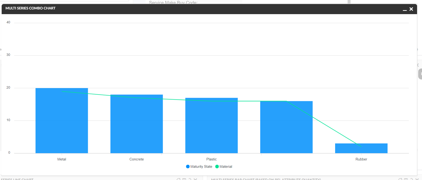
Figure 3. Combination Charts
1.1.7. Other Chart types
Now all the chart types available in Apex Charts are supported in helium, they can be configured by using below config :
<ChartWidget>
	<Title>EBOM Start Eff date to End Effectivity Date</Title>
	<ChartConfig namespace="hex:engineering">TimelineChart.xml</ChartConfig>
	<UseVersion2>true</UseVersion2>
</ChartWidget>

<Chart>
    <DrillDown>tvc:dashboard:hex:engineering:homepage/MyDocumentsDrillDown.xml</DrillDown>
    <Tooltip>true</Tooltip>
    <Legend>true</Legend>
    <Tooltip>true</Tooltip>
    <Stack>false</Stack>
    <DataType>App.custom.getTimelineChartData</DataType>
    <DataSeries>
        <Serie>
            <Name>Drawing Prints</Name>
            <DataLoader>
                <DataSet>tvc:dataset:hex:engineering/EBOM.xml</DataSet>
            </DataLoader>

            <Expressions>
            	<Expression>${attribute[attribute_StartEffectivityDate]}</Expression>
                <Expression>${attribute[attribute_EndEffectivityDate]}</Expression>
                <Expression>${name}</Expression>
            </Expressions>
            <ChartType>rangeBar</ChartType>
        </Serie>
    </DataSeries>
    <Options>{
    	"xaxis": {
          "type": "datetime"
        },
        "plotOptions": {
          "bar": {
            "horizontal": true
          }
        }
    }</Options>
</Chart>
Since every chart types expects data in different format so a js method can be passed in DataType which returns the data in the required format, refer below example.
var getTimelineChartData = function(config) {
		var objectIds = config.series[0].objectIds;
		var chartData = []
		var data = App.ObjectStore.getByIds(config.series[0].objectIds);
		objectIds.forEach(function(objectId){
			var objectData = data[objectId];
			var startDate = objectData.data['attribute[Start Effectivity Date]'].values[0].value;
			var endDate = objectData.data['attribute[End Effectivity Date]'].values[0].value;
			if(startDate ){
				endDate = endDate ? endDate : new Date();
				chartData.push({
				"x" : objectData.data['name'].values[0].value,
				"y" : [
					new Date(startDate).getTime(),
					new Date(endDate).getTime()
				]
			})
			}


		})
        return {
        	'dataType' : "version2",
            'series': [{"data" : chartData}]

        };
    }
Figure 4. TimelineChart
1.2. Datatable
The datatable widget presents data in a table. It is possible to interact with data in multiple ways. Some of the things the table supports are.
-
Filtering/Searching
-
Sorting
-
Pagination
-
Inline editing of cells
-
Exporting to PDF, CSV and Excel
-
Custom rendering of cells via either CSS or by applying a Handlebars template
Find the possible configuration options for a table below
1.2.1. Widget
To create a data table widget you must first create an xml with the following contents:
<DataTable>
    <Title>Data Table</Title>
    <TableConfig namespace="helium">TableConfig.xml</TableConfig>
</DataTable>
The <DataTable> element supports the following child elements.
| Name | Description | Example | ||||
|---|---|---|---|---|---|---|
Title |
The title of the data table.
|
|
||||
TableConfig |
Specifies the data table config file |
|
||||
Responsive |
Specifies whether the table should be responsive, i.e adjust it self to small screens. If this element is set to |
|
||||
|
This setting is deprecated and will no longer be supported from Helium release 2019.1.0 onward. The pagination setting provided in table configuration will be used for enabling/ disabling pagination. |
|
||||
Sortable |
Specifies whether the table should support sorting or not. Defaults to |
|
||||
FixedHeader |
Specifies whether the table headers should be fixed or not. Defaults to This can also be enabled at the global level for all the tables by using the key |
|
||||
PersistentExpandState |
Specifies whether the structure will be expanded the same way the next time the same object view is loaded.
|
|
||||
HotKeysNavigation |
Enables user to use arrow keys for navigating from one cell to another while editing, Defaults to
|
or globally
|
1.2.2. Table Configuration
The <TableConfig> element can have the following children. Full example.
| Name | Description | Example | ||||
|---|---|---|---|---|---|---|
Title |
The title of the table.
|
|
||||
DataLoader |
References to the dataset to be loaded into the table via the child element
|
|
||||
InvokeService |
Whether to consider input of response received from service call or dataset of dataloader. Valid value is either
|
|
||||
ServiceParams |
To load data into table from the response received after making service call. Dataoader will not be needed for this. To pick data from service call it is required have service parameters.
|
|
||||
Table |
References to table configuration file that defines the columns |
|
||||
DisplayMode |
Valid options are |
|
||||
ExpandSettings |
Mandatory element for
|
|
||||
CreateSettings |
Optional. Reference to the CreateAndConnectRow widget command to create and connect a new child row to the selected parent row. CreateSettings supports different child elements to pass values that are required to create and connect new child row object. |
Example: |
||||
ForceReload |
Whether the table is forced to load data from the server each time widget is refreshed. Valid value is either |
|
||||
RowSelect |
Whether the rows in the table should be selectable or not. Valid values |
|
||||
Pagination |
Whether the table should support pagination or not. The element supports the following attributes:
|
|
||||
ClientSideProcessing |
Whether sorting, filtering and pagination should be handled on the client or on the server. The element supports the following attributes:
|
|
||||
EvalCurrentPage |
Whether table columns should be evaluated page wise. It can also be defined globally via structure browser setting
|
|
||||
StructureGUI |
Whether the expand button should be rendered in its own column or in the first configured column.
|
|
||||
ResizeColumns |
Allow table columns to resize from UI. Valid value is either Resize columns feature can also be enabled at the global level for all the tables by using the key While resizing the column if column header or data is truncated, then tooltip automatically enabled on column header and data. This feature can be disabled at the global level for all the tables by using the key |
|
||||
FixedColumns |
Allowing the specified number of left most non reponsive table columns to fix while horizontally scrolling. |
|
||||
RowDragAllowed |
If row drag should be allowed from the table |
|
||||
DropConfigs |
A Drop config defines what happen when a object is dropped on the row.
|
|
||||
AutoSelectContent |
While editing cell content, this enables to auto select contents of cell. This applies to all eligible columns in the table. Defaults to This can be overridden by defining
|
|
Example
<TableConfig>
    <!-- This is the title element -->
    <Title>This is the default title</Title>
    <Title>Table title</Title>

    <DataLoader>
        <DataSet>tvc:dataset:helium/MyParts.xml</DataSet>
    </DataLoader>

    <Table>tvc:table:helium/BasicInfo.xml</Table>

    <DisplayMode>flat</DisplayMode>

    <StructureGUI>default</StructureGUI>

    <RowSelect>multi</RowSelect>

    <Pagination size="15" disabled="false" />

    <ClientSideProcessing enabled="false" threshold="100" />
</TableConfig>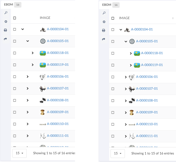
1.2.3. Column configuration
How to configure columns is described below. This is the file that is referenced above in the Table configuration
The <Table> element supports the following child elements.
| Name | Description | Example | ||
|---|---|---|---|---|
DisplayName |
The display name of the table.
|
|
||
Column |
Creates a column in the table |
See Column specific details below |
Column
The <Column> element describes the properties of a data table column.
The <Column> element supports the following child elements.
| Name | Description | Example | ||
|---|---|---|---|---|
ColumnType |
It is possible to add specific column types. The current supported values are: |
|
||
Description |
The brief details of the column that is rendered as a column header tooltip. |
|
||
Alt |
This setting renders brief details of the column as a column header tooltip. This setting is an alternative to the
|
|
||
Editable |
Whether the cells in the column should be editable or not.
|
|
||
Expression |
The expression that fetches the data from the backend.
If column is populated using data received from response of service call, JSON path expression in the dataSrc is to be specified and additional setting option |
|
||
InputType |
If the column is editable, what input element should be rendered. Allowed values are:
If no input type is given the cell will default to an |
|
||
Label |
The name of the column that is rendered as a table header. |
|
||
Name |
The name of the column
|
|
||
NoWrap |
This setting defines whether the column’s values will be wrapped or not. True False |
|
||
Setting |
Column specific setting. The supported attributes are:
If the ColumnType is set to If the name of the setting is If the name of the setting is If the name of the setting is If the name of the setting is If the name of the setting is |
|
||
AlternateOIDExpression |
This setting can be used to control to which object the user should be routed when the column’s data is displayed as a hyperlink.
|
|
||
AlternateTypeExpression |
This setting can be used to fetch the |
|
||
Sortable |
Specifies whether the column should be sortable or not. Valid values: |
|
||
SortDirection |
Specifies the sort direction. Valid values: |
|
||
SortOrder |
Specifies what column to make the initial sort on.
Valid values: A positive integer (zero based). For example if
you want the initial sorting to be based on the second column
you would add the value |
|
||
SortType |
Specifies the sort type, i.e |
|
||
TextLength |
Defines number of characters to be displayed before truncation. The rest will be displayed in a tooltip. |
|
||
TruncateDirection |
Defines truncate direction on column, If the number of characters in a cell text exceeds the text length. Valid values:
|
|
||
Rows |
Defines number of rows to be displayed before truncation. The rest will be displayed in a tooltip. |
|
||
usesBusinessObject |
This attribute value on column tag defines if column is for relationship. true false |
|
||
Visible |
This setting defines whether a column should be visible or not. The user is able to define his/her own set of visible columns. |
True False |
||
TargetLocation |
This setting can be used when we are opening routing to emxTree.jsp in 3dspace. |
Content Popup |
||
Href |
Defines the Href |
<Href>/${ROOT_DIR}/SomePage.jsp</Href> |
||
AllowMultipleEdit |
Specifies whether the column should be mass update or not. Valid values: |
|
||
GroupHeader |
Defines a group header for the column. Typically, a group header is used to group several columns together, with a common label. The setting need to be defined on all columns that are part of the group. |
|
||
ColumnWidth |
Defines the column width in pixels. If content is exceeding the defined width, then truncated content will be shown with ellipses and also tooltip will be enabled for the same. |
|
||
ShowTypeIcon |
Specifies if the type icon is shown or not. Default is false.
If you have already defined template then you can add following content to your existing template. |
|
||
ShowCopyIcon |
Facilitates copying text contained within a column cell. Default value is
|
|
Column template
The default rendering of a column cell can be overridden with a handlebars template.
{{!--
  Sample Handlebars template that can be applied to columns in a datatable.

  <Column>
  ...
  <Setting name="template" value="/path/to/this/template/test" />
  </Column>

  <Setting name="template" value="helium/templates/table/object-link" />
  <!-- If same table column is used in embeded mode, standalone mode and 3dashboard  -->

  <Setting name="template" value="helium\templates\table\object-link-with-alternate-oid" />
    <!-- For the column which has AlternateOIDExpression or columntype path, same table column is used in embeded mode, standalone mode and 3dashboard -->

  Available variables are:
  - object
  - row
  - cell

  To inspect what the content of the variables are, run {{debug variable}} and check your console

--}}
<a href="javascript:App.routing.open('{{objectId}}');">{{value}}</a>
Configurable column CSS classes
It is possible to add configurable CSS classes to columns in the column XML, use <Setting> with class as the name and the custom class names as value, separated by spaces
<Setting name="class" value="col-weight col-bold col-red col-small" />Then in your custom css, you can target column level styling, e.g.
Some selectors require higher specificity or the use of !important rule.
|
.col-bold {
    font-weight: bold !important;
}

.col-red {
    color: red;
}

.col-small {
    width: 50px;
}
You can also specifically target a column’s header or body with th/td, e.g.
th.col-weight {
    font-weight: bold !important;
    color: darkred !important;
}

th.col-description {
    font-style: italic;
    color: darkgreen !important;
}

td.col-revision {
    color: darkorange;
}
Client side validation
It is possible to provide a javascript function that performs client side validation. This is achieved by applying the following element to an column:
<Setting name="options">{
    "validator": "App.custom.someJavascriptFunction",
    "validatorMsg": "Error message, either an message or a i18n key"
}</Setting>
The javascript function will be executed when the cell is blurred and with the value of the field passed in. The function must return a boolean,
true if the value is valid and false otherwise.
Column filter
It is possible to add a filter to either the footer or the header of a column by specifying the following setting. Valid values
for position is "footer" and "header". Default value is "footer".
<Setting name="options">{
    "filter": {
        "position": "footer"
     }
}</Setting>
This will render an input field in the column footer, where the user can filter out rows based on the values in that column. User can use multiple queries by using "|" as delimeter in between query.
| It is not supported to have filters in both the header and the footer in the same table. |
Column filter with row filter
It is possible to add a row filter to a column filter by specifying the setting rowFilter. The value should be
a css class that matches the a row that the filter should be applied to. For example to apply the filter to only a certain level
of a structure table add the value ".row-level-n" where n is the level the filter should be applied to.
<Setting name="options">{
    "filter": {
        "position": "footer",
        "rowFilter": ".row-level-1"
    }
}</Setting>
If the filter is applied on a row in a structure table and that row is expanded the child rows will not be affected of the filter.
On Edit
It is possible to configure different behavior on edit of a cell. This can be configured as below :
<Column>
    ...
    <Setting name="onEdit" value="refresh-parents" />
    ...
</Column>
Possible values are refresh-parents, refresh-table, or some custom javascript function.
If onEdit is not configured than only the current row will get refreshed.
In custom js function it will have context of datatable and row jquery element and column instance as arguments.
onColumnEdit : function($rowElement,column)  {
    	    		App.toaster.success("column edit successfully")
},| Name | Description |
|---|---|
refresh-parents |
It will refresh the parent rows of the edited cell. |
refresh-table |
It will refresh the table. |
some custom js function |
It will call the js function passed in the value once the cell is edited. |
headerNoTruncate
ResizeColumns allow table columns to resize from UI. This will allow user to truncate the column below the actual content of the header. This behavior can be controlled using the headerNoTruncate setting i.e. user can not resize the column below the actaul content of the header. This can be configured as below :
<Column>
    ...
    <Setting name="headerNoTruncate" value="true" />
    ...
</Column>
Possible values are true, or false. The default value is false.
This can also be enabled at the global level for all the tables by using the key tvc.helium.datatable.headerNoTruncate.enabled=true in tvc.properties
Autocomplete
All columns which renders an select field have basic autocomplete support. With the options outlined below the behavior can be customized to great extent.
For autocomplete to work the <InputType> element must be set to combobox
|
To customize autocomplete provide the following setting:
<Setting name="options"><![CDATA[
{
    "autocomplete": {
        "template": "...",
        "selectize": { ... },
        "handler" : { ... }
    }
}
]]>
</Setting>
Each block, template, selectize and handler is described below.
| template |
Provide an path to an template to customize the dropdown. Example of template: |
| selectize |
The client utilizes Selectize and all options described in
the docs can be used here.
To show selectize dropdown outside the widget boundaries. The global level property |
<Setting name="options">{
        "autocomplete": {
            "selectize" : {
				"showDropdownOutsideFrame" : true
			}
        }
}</Setting>- handler
-
All settings that are described in the core admin guide can be used in the handler block including all predefined handlers.
If you wan’t to create a custom autocomplete handler, follow the admin guide and pass the java class as the value for the name key.
Full example:
<Setting name="options"><![CDATA[
    {
        "autocomplete": {
            "template": "/helium/templates/form/autocomplete",
            "selectize": {
                "preload": true,
                "maxItems": null,
                "labelField": "name",
                "searchField": ["name"]
            },
            "handler" : {
                "name": "dataset",
                "dataset": "tvc:dataset:helium/MyParts.xml",
                "select": ["name",  "current"]
            }
        }
    }
    ]]>
</Setting>
Highlight updated row cross-widget
Datatable rows that have their data updated via another widget will be highlighted to show the changes.
Showing cross-widget object update highlight
| There is a API for highlighting any jQeury element here |
Access Control
The access restriction for table column in Helium can be defined similar to TVC Classic based upon following settings:
-
AccessMask (Access mask for the current object)
-
AccessProgram and AccessFunction (A JPO and a function that evaluates the access rights)
-
AccessExpression (MQL expression that evaluates the access)
The example below illustrates how you can construct the access restriction:
<AccessMask>checkout,modify</AccessMask>Or use an access program and access function:
<AccessProgram>MyAccessProgram</AccessProgram>
<AccessFunction>checkAccess</AccessFunction>
Or use an access expression:
<AccessExpression>policy == 'EC Part'</AccessExpression>Please refer following links of TVC documentation for more details
Example
<Table xmlns="http://technia.com/TVC/Table" xmlns:xsi="http://www.w3.org/2001/XMLSchema-instance" xsi:schemaLocation="http://technia.com/TVC/Table http://products.technia.com/tvc/schema/latest/Table.xsd">
    <DisplayName>Basic Information</DisplayName>
    <Column>
        <Name>Type</Name>
        <Expression>type</Expression>
        <Label>Type</Label>
        <Fixed>TRUE</Fixed>
        <ShowTypeIcon>True</ShowTypeIcon>
        <NoWrap>true</NoWrap>
    </Column>
    <Column>
        <Name>Name</Name>
        <Expression>name</Expression>
        <Label>Name</Label>
        <Fixed>TRUE</Fixed>
        <SortDirection>ascending</SortDirection>
        <SortOrder>1</SortOrder>
        <Setting name="template" value="helium/templates/table/test" />
    </Column>
    <Column>
        <Name>Revision</Name>
        <Expression>revision</Expression>
        <Label>Revision</Label>
        <Fixed>TRUE</Fixed>
        <Editable>TRUE</Editable>
    </Column>
    <Column>
        <Name>Material Category</Name>
        <Expression>attribute[Material Category]</Expression>
        <Label>Material Category</Label>
        <AllowShowMore>TRUE</AllowShowMore>
        <Editable>TRUE</Editable>
        <InputType>combobox</InputType>
        <SortType>string</SortType>
        <AccessExpression>policy == 'EC Part'</AccessExpression>
    </Column>
    <Column>
        <Name>Desc</Name>
        <Expression>description</Expression>
        <Label>Description</Label>
        <Description>Describes this object in detail.</Description>
        <AllowShowMore>TRUE</AllowShowMore>
        <Editable>TRUE</Editable>
        <Columns>45</Columns>
        <Rows>5</Rows>
        <InputType>textarea</InputType>
        <SortType>string</SortType>
        <TextLength>40</TextLength>
    </Column>
    <Column>
        <Name>Owner</Name>
        <Expression>owner</Expression>
        <Label>Owner</Label>
    </Column>
    <Column>
        <Name>Weight</Name>
        <Label>Weight</Label>
        <Expression>attribute[Weight]</Expression>
        <Editable>TRUE</Editable>
        <SortDirection>ascending</SortDirection>
        <Setting name="class" value="col-weight col-bold col-red col-small" />
    	<AccessMask>checkout,modify</AccessMask>
    </Column>
</Table>| For Autocomplete functionality with Inquiry Dataset, USERQUERY macro can be used to pass user input to inquiry. |
Example:
<Setting name="options"><![CDATA[
    {
        "autocomplete": {
            "handler" : {
                "name": "dataset",
                "dataset": "tvc:dataset:helium/MyParts.xml",
            }
        }
    }
    ]]>
</Setting>
and Dataset Inquiry is:
<Inquiry>
    <Code>temp query bus Part '*${USERQUERY}*' * where "owner == '${USER}'" limit 100 select id dump |</Code>
    <Format>${OID}</Format>
    <Pattern>*|*|*|${OID}</Pattern>
</Inquiry>
Cell content in modal instead of tooltip
The data in the cell content can be huge and it will be better to such data in the modal as it provides the ability to scroll and makes more user friendly while ready such content.
This can be achieved by adding following configuration.
<Column>
	...
	<TextLength>25</TextLength>
	<Rows>5</Rows>
	<TruncateDirection>right</TruncateDirection>
	<Setting name="class" value="he-tooltip-as-modal" />
	...
</Column>
By default, after text length limit three dot (…) will be rendered on UI. If want to change this three dot then need to configure below properties in translation JSON files.
"dataTable": {
 "column": {
  "textLength": {
   "textToShowTooltip": "... (more)"
  }
 }
}
In some cases user might not want to see the close icon that could be achieved by below configuration.
<Column>
	...
	<UseVersion2>true</UseVersion2>
	<TextLength>25</TextLength>
	<Rows>5</Rows>
	<TruncateDirection>right</TruncateDirection>
	<Setting name="class" value="he-tooltip-as-modal he-without-close" />
	...
</Column>
By default a close icon will be shown on modal, to close the modal. If user doesn’t to see the close icon and wants the modal to close if he clicks anywhere outside the modal. this can be achieved with below config.
<Column>
	...
	<Setting name="class" value="he-tooltip-as-modal he-without-close" />
	...
</Column>
Hide static valued column in Data Grouping
Columns may contain static values, such as icons or images. However, these static values may also appear in the rows where data is grouped, which may not be desirable. To address this issue, a setting called DataGroupHidden can be applied to the column that contains static values. By setting this value to true in the column’s XML code, the static valued column will be hidden in the grouped rows.
Below setting is required for static valued columns to be hidden in data grouped rows
<Column>
	...
	<Setting name="DataGroupHidden" value="true" />
	...
</Column>
1.2.4. Progress Column
 The progress column will render a progress bar based on the value.
Unlike the progress column in TVC Classic this column is only responsible for rendering the value.
By default it will also show the percentage as text and in tooltip.
This can be controlled with the options setting.
The progress column will render a progress bar based on the value.
Unlike the progress column in TVC Classic this column is only responsible for rendering the value.
By default it will also show the percentage as text and in tooltip.
This can be controlled with the options setting.
<Setting name="options">
    	{
			"showText" : false,
			"showTooltip" : false
		}
</Setting>
<Column>
<Name>progress</Name>
<Label>Progress</Label>
<ColumnType>helium-progress</ColumnType>
<Expression>${attribute[attribute_PercentComplete]}</Expression>
<Setting name="options">
{
"showText" : false,
"showTooltip" : false
}
</Setting>
</Column>1.2.5. Files Column
| This feature requires the TVC File Manager license. |
In a table displayed in Helium, you may have a column containing links to files related to objects in ENOVIA. There is a built-in column type that simplifies configuring this.
<Table>
	<Column>
		<Label>emxComponents.Common.Actions</Label>
		<RegisteredSuite>Components</RegisteredSuite>
		<ColumnType>helium-files</ColumnType> (1)
	</Column>
</Table>| 1 | Column type set to helium-files |
This column inherts behaviour from the TVC File Manager component regarding configuration and others.
See this page for more details on how to configure the File Manager.
The screenshot below illustrates the file column
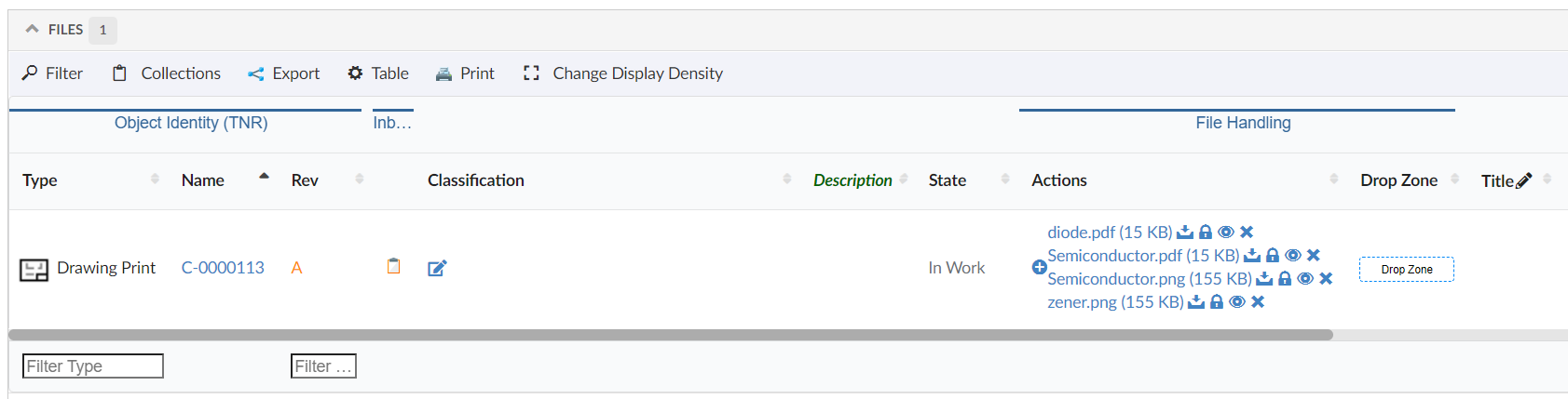
Figure 6. Files Column
Image, PDF and TXT file can be previewed in the modal. Setting tvc.helium.showPreviewFileInModal should be set to true. By default, it’s false.
| PDF previews requires browser’s built-in PDF reader to be enabled. Supported image extensions: png, jpg, jpeg, gif, bmp. |
Also, It is possible to reverse the lock icon to match the file lock status. Ex. When the file is locked, show the lock icon and similarly, when the file is unlocked, show the unlock icon.
This can be achieved by using below system property in tvc.properties.
| Property | Description | Default Value |
|---|---|---|
tvc.core.fileActions.reverseLockIcon |
Reverse the lock icon |
false |
<Expression> tag support for Column type set to helium-files
A column set to Column type helium-files along with <Expression> tag as shown below, will display the file from related object found through the expression value.
And file column with expression will always be non-editable.
<Table>
	<Column>
		<Label>Related Files</Label>
		<RegisteredSuite>Components</RegisteredSuite>
		<ColumnType>helium-files</ColumnType>
		<Expression>${from[relationship_ReferenceDocument].to}</Expression> (2)
        <Setting name="options">
		{
			"excludeFormat":"mxMedium Image"
		}
        </Setting>
	</Column>
</Table>
As an example in below screen, a part object displays the file from its related object found traversing through relationship "Reference Document"
|
All the files from all object found through the expression value will be displayed. For example, out of given expression if 3 objects are found, all files from all 3 objects will be displayed. |
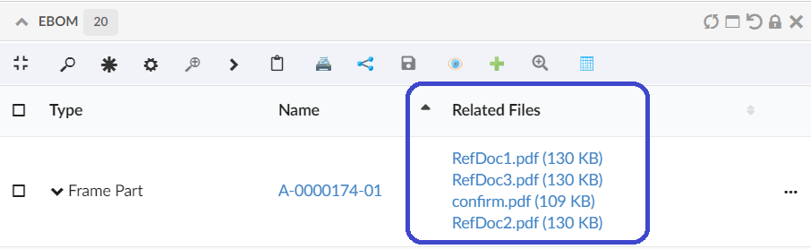
Figure 7. Files Column with Expression
Similarly we can show files that are connected the object using path, this can be achived by below configuration:
    <Column>
		<Label>files</Label>
		<ColumnType>helium-files</ColumnType>
		<PathType>SemanticRelation</PathType>
		<PathDirection>element</PathDirection>
		<PathExpression>from[VPLMrel/PLMConnection/V_Owner].to[PLMDocConnection]</PathExpression>
    </Column>
It might be scenario that some of files with specific format are irrelevant to show on UI. excludeFormat setting allows to exclude specified format files to show on UI.
This behavior can be configured in column as follows :-
<Table>
	<Column>
		<Label>Related Files</Label>
		<RegisteredSuite>Components</RegisteredSuite>
		<ColumnType>helium-files</ColumnType>
		<Setting name="options">
		{
			"excludeFormat":"mxMedium Image"
		}
        </Setting>
	</Column>
</Table>
or can be configured with global setting in tvc.properties as tvc.helium.files.excludeFormat=mxMedium Image,GIF
| Property | Description | Default Value |
|---|---|---|
tvc.helium.files.excludeFormat |
Exclude specified formats to show on UI |
mxMedium Image |
1.2.6. Drop Zone Column
| This feature requires the TVC File Manager license. |
In a table displayed in Helium, you may have a column containing a drop zone were the user may drag’n’drop files to be checked into ENOVIA™. Helium contains a built-in column type that simplifies configuring this.
<Table>
	<Column>
        <Alt>Drop Zone</Alt>
		<ColumnType>helium-dropzone</ColumnType> (1)
	</Column>
</Table>| 1 | Column type set to helium-dropzone to enable this feature. |
You may include a file-dropzone in many places, as long as you have configured the column regarding what to do with the file depending on what object it is being dropped for. In some cases, you should create a new Document object, connect it with a certain relationship and then check-in the file.
Here is a complete example of how to configure a helium dropzone:
<Column>
    <Name>Dropzone</Name>
    <Label>Dropzone</Label>
    <ColumnType>helium-dropzone</ColumnType>
    <Setting name="dropzone:type_Part">
        relationship=relationship_ReferenceDocument,
        direction=from,
        type=type_Document,
        policy=policy_Document,
        vault=vault_eServiceProduction,
        format=generic,
        oneobjectperfile=true,
        refresh=refresh,
        selectformat=false
    </Setting>
</Column>
Please see file manager chapter for more details on how to configure a Drop Zone using TVC.
1.2.7. Primary Image Column
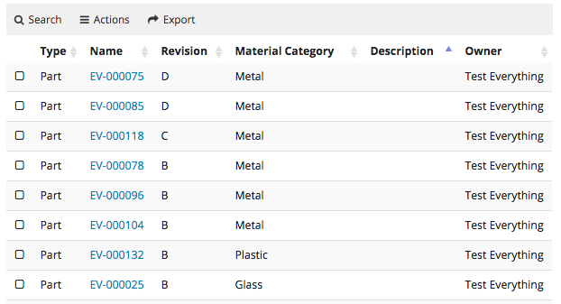
Showing a table column with thumbnails of an object’s primary image, is often helpful for identifying a particular object or to get an overview. Helium features a built-in columntype for this.

The tablecolumn uses lazy-loading to only request images that are within the visible area of the web browser, in order to not waste bandwidth. Images that come into the visible screen area after scrolling will be automatically fetched at that time.
<Table>
    <Column>
        <Name>PrimaryImage</Name>
        <Label>Image</Label>
        <ColumnType>helium-primaryimage</ColumnType>
    </Column>
</Table>| 1 | Column type set to helium-primaryimage to enable this feature. |
1.2.8. User Column
Inbuilt ColumnType for showing an avatar/profile picture in a table cell. Useful for indicating who owns, created, or is assigned to an object. Needs a valid <Expression> to identify the User.

The tablecolumn uses lazy-loading to only request images that are within the visible area of the web browser, in order to not waste bandwidth. Images that come into the visible screen area after scrolling will be automatically fetched at that time.
<Table>
    <Column>
    	<Name>owner</Name>
    	<Expression>owner</Expression>
    	<Label>Owner</Label>
    	<Editable>false</Editable>
    	<ColumnType>helium-user</ColumnType>
    </Column>
</Table>| 1 | Column type set to helium-user to enable this feature. |
1.2.9. Attachments Column
Showing a column with an attachments icon and clicking on the icon will open all the attachments related to that row in a modal. This can be configured as
<Column>
    <ColumnType>helium-attachment</ColumnType>
	<Setting name="Relationship" value="relationship_ReferenceDocument"/>
	<Setting name="Direction" value="From"/>
</Column>
Default value for Relationship is "Reference Document,Part Specification" and is defined on`tvc.office.server.attachmentRelationships` and for direction is "From".
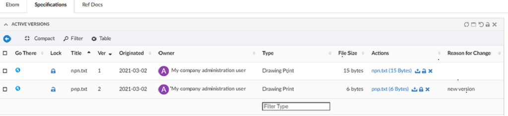
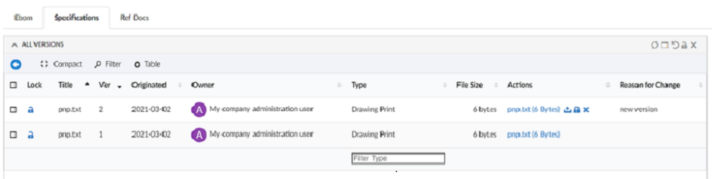
1.2.10. Version Actions
This can be used to show the actions available on a particular version objects like download a file, check in, check out e.t.c

1.2.11. Go There
Shows navigate icon which allows to navigate to a widget. The basic use case can be to show properties or structure of any object. This can be configured as below:
<Column>
	<Label>column.label.goThere</Label>
	<ColumnType>helium-go-there</ColumnType>
	<Setting name="widgetRef" value="tvc:widget:hex:engineering/EBOM.xml" />
</Column>
1.2.12. Add To Clipboard
Shows add to clipboard icon, which enables user to add an object to clipboard. This can be configured as below:
<Column>
		<Label>Add To Clipboard</Label>
		<ColumnType>helium-addToClipboard</ColumnType>
		<Alt>Add to Clipboard</Alt>
	</Column>
1.2.13. Classification Column
Classification is a Enovia built-in feature provided by Library central. Any business-object can be classified as per the concept of Library central. Classification is maintained as hierarchy where Library objects act as root objects followed by Family or Classification objects . There can be more Family or Classification objects (also known as Sub Family) beneath a Family or Classification object forming a hierarchy. At the end of hierarchy, classified items will be present. Thus Library central forms the classification path for any business-object.
Columntype helium-classification enables you to configure a column to view and edit the classification path for the businessobjects listing in the datatable.
Below XML configuration displays the built-in classification column with options to add and remove classifications for the respective row object.
<Column>
	<Label>Classification</Label>
	<ColumnType>helium-classification</ColumnType>
</Column>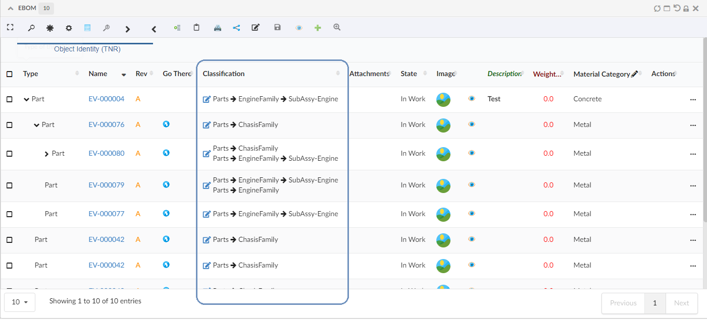
Figure 8. Default Classification column
Columntype helium-classification was introduced in release 2022.3.0, to display a classification column and a icon to edit the classification from table-column. A edit form was opening on clicking the edit icon, to update the classification path by typing-in the known classifications. But there was no option to see all the available classifications.
From 2023.2.0 release, introducing a structure table to display the classification in hierarchy order. The edit icon in the classification column opens the default dashboard with a structure table to display the classification in hierarchy order. This hieraracal view helps to find the required classification and update to the respective row businessobject.
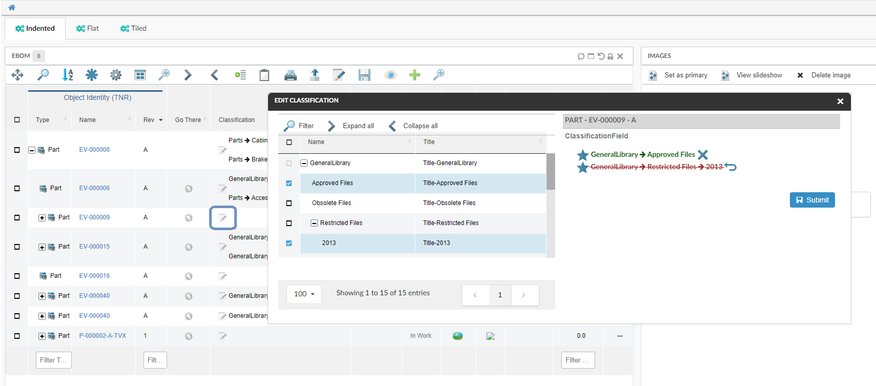
Figure 9. Edit Classification with Default Form and structure table
Refer a short video where a classification is updated to a row object.
Below are the optional settings to override the default behavior or the appearance of the classification column
| Settings | Description |
|---|---|
hideAddClassificationIcon |
By default this setting is
|
editDashboard |
The default dashboard is
|
editDashboardPosition |
you can specify the edit dashboard position using this setting and override the default position.
|
classificationRelationship |
"Classified Item" is the default relationship to get the classification path. This default relationship can be overriden by the below setting in column configuration.
|
classifyFromLevel |
This setting helps to specify from which level of the library heirarcy, the business object must be classified. The default value is 1, meaning that once the library is expanded, business objects can be classified from the first level of the hierarchy.
|
displayExpression |
By default, the name of the classification object is displayed in the classification path. This can be override by the below setting.
|
template |
You can choose to override the default template with you custom template.
|
Below is the sample classification column configuration with all optional settings.
<Column>
	<Label>Classification</Label>
	<ColumnType>helium-classification</ColumnType>

	<!-- Optional Settings -->
	<Setting name="classificationRelationship">relationship_PartClassification</Setting>
	<Setting name="displayExpression">${attribute[attribute_Title]}</Setting>
	<Setting name="template">helium/templates/classification</Setting>
	<Setting name="options">{
		"hideAddClassificationIcon": true,
		"editDashboard":"tvc:dashboard:helium/EditClassification.xml",
		"editDashboardPosition":{
				"left": "25%",
				"right": "25%",
				"top": "25%",
				"bottom": "25%"
			}
		}
	</Setting>
</Column>
Classification Column will work on 3DDashboard only if tvc.core.structure.expand.filter.usePhysicalId is set to true.
|
1.2.14. Related Object Column
As the user would like to make connections between object while editing a table cell, for ex connecting a specification to part. Now for such usecase we can configure related object column in helium.
    <Column>
	<Name>Specifications</Name>
	<Expression>${from[relationship_PartSpecification].to}</Expression>
	<AlternateOIDExpression>${from[relationship_PartSpecification].to.id}</AlternateOIDExpression>
	<AlternateTypeExpression>${from[relationship_PartSpecification].to.type}</AlternateTypeExpression>
	<Label>Specifications</Label>
	<TextLength>10</TextLength>
	<Rows>5</Rows>
	<TruncateDirection>left</TruncateDirection>
	<GroupHeader>Related Data</GroupHeader>
	<Setting name="options">{
				"formConfig":"tvc:form:helium/RelatedObjectForm.xml",
				"formWidth" : "300",
				"formHeight" : "300"
		}</Setting>
    <ColumnType>helium-relatedobject</ColumnType>
</Column>
As can be seen in the above config in settings we can pass a formconfig reference which would have all the details about the field which need to be edited.
1.2.15. Create and connect row command
In a structure table it is possible to create and insert a new row at a chosen depth. Select a row and click the "Create and connect row" command to add a child row to the selected parent row.
1.2.16. Upload File Command
| This feature requires the TVC File Manager license. |
This feature is similar to the "Dropzone above table" in the file manager chapter. Creates a row/new rows when a file is uploaded. The row will not be created until the file is uploaded successfully.
Currently supports the following options:
The table below shows and explains what parameters that you can use:
| Parameter | Value | Notes / Description |
|---|---|---|
createSettings |
String or Object |
The id of a predefined createSettings or the createSettings can be defined inline here. See the following createSettings: parameters. |
createSettings:type |
String type |
The type of object that will be created. Can be a symbolic name or real name |
createSettings:policy |
String policy |
The name of the policy to be used for the object that will be created. Can be a symbolic name or real name |
oneFilePerObject |
True or False |
Whether or not to create one document object per file that is dropped. E.g. if the user drops three files, if this setting is set to true, three document objects will be created. Default is false. |
badChars |
String/JS function |
Chars that are not allowed in the file name. [1] |
validFileExtensions |
Array of Strings/JS function |
Valid file extensions. [1] |
maximumFileSize |
Number/JS function |
The maximum allowed file size in bytes. [1] |
preProcessor |
JS function |
JS function executed before any table row is created. |
postProcessor |
JS function |
JS function executed after all table rows are created. when not configured, table is reloaded. custom postProcessor can take care of reloading the table or return true to reload. |
-
Can either be a value, or the name of a JS function returning a value
Example:
<Command>
    <Label>Save file</Label>
    <FontIcon>he-save</FontIcon>
    <OnClick>App.file.uploadFileCommand</OnClick>
    <OnClickParams><![CDATA[{
        "oneFilePerObject": true,
        "createSettings": {
            "type": "type_CADDrawing",
            "policy": "policy_CADDrawing"
        },
        "badChars": "App.custom.noSpaceOrComma",
        "validFileExtensions": [".png", ".jpg", ".jpeg", ".bmp", "gif", ".psd"],
        "maximumFileSize": "App.custom.fiveMegaBytes",
        "preProcessor" : "App.custom.validateFileSize",
        "postProcessor" : "App.custom.returnTrue"
    }]]></OnClickParams>
</Command>
1.2.17. Promote and Demote Command
In order to promote and demote business object(s) from a table widget, the promote and demote methods of App.table.BusinessObject JS API can be used. The API requires a data table reference as the mandatory first argument. After the action is performed, an optional status message can be displayed in the UI, informing whether action was successful or not. To display such message, an optional second argument containing a Toaster instance should be passed..
Example:
new App.table.BusinessObject(this).promote();
new App.table.BusinessObject(this, windows.App.toaster).promote();
new App.table.BusinessObject(this).demote();
new App.table.BusinessObject(this, windows.App.toaster).demote();
Inbuilt promote and demote command.
App.table.action.promote
App.table.action.demote
Example:
<Command>
    <Label>Promote</Label>
    <FontIcon>fa-forward</FontIcon>
    <OnClick>App.table.action.promote</OnClick>
</Command>

<Command>
    <Label>Demote</Label>
    <FontIcon>fa-backward</FontIcon>
    <OnClick>App.table.action.demote</OnClick>
</Command>
1.2.18. Print Command
To print the content of widget, the print method of App.Widget JS API can be used. Command can be used either in widget toolbar or header actions. In responsive table only visible content can be printed.
| This feature is supported only in View mode. |
Example:
In Widget Toolbar
<Command>
	<Label>Print</Label>
	<OnClick>App.Widget.print</OnClick>
</Command>
In HeaderActions
<Command>
    <Label>Print</Label>
    <Setting name="OnClick" value="App.Widget.print" />
</Command>
1.2.19. Display Density Command
A built-in command <DisplayDensity /> can be added to a toolbar in a Table widget. This command allows decreasing height between rows resulting in more rows to be visible. User preference is preserved across sessions.
| The user preference will be saved only for the Table widget where this command is used. |
Change Display Density
1.2.20. File Package Download Command
A built-in command <FilePackageDownload /> can be added to a toolbar in a Table widget. This command allows bulk download of documents from selected objects using native file manager.
<FilePackageDownload>
    <!-- Optional fields-->
    <Label>FPD</Label>
    <FontIcon>cloud download icon</FontIcon>
    <Configuration>tvc:fpd:hex:engineering:homepage/NativeFilesForSelectedModels.xml</Configuration>
</FilePackageDownload>| To use this command, native file manager needs to be installed and enabled in user’s device. |
1.2.21. Search And Connect Command
A built-in command <SearchAndConnect></SearchAndConnect> can be added to a toolbar in a Table widget. This command opens a search modal configured with given searchform and relationships and user can select search results and connect to selected object.
In datatable toolbar :
    <SearchAndConnect >
        <Relationships >
            <Relationship default="true">
                relationship_EBOM
            </Relationship>
            <Relationship direction="to">
                relationship_PartSpecification
            </Relationship>
        </Relationships >
        <SearchConfig>tvc:search:hex:common/SearchAndConnect.xml</SearchConfig>
        <ExpandRow>true</ExpandRow>
    </SearchAndConnect>
The table below shows and explains the available tags for SearchAndConnect` command:
| Field | Value | Notes / Description |
|---|---|---|
Relationships |
Relationship[] |
The list of relationships available for connection in search modal. |
Relationship |
string |
Name of the relationship to be added.It has two attributes default (sets the relationship as default selected for connection) and direction(the relationship direction to be used for connection) Default value for direction is false. Default value for default is false. |
SearchConfig |
string |
The search config path for the search modal.For further details see New Search Experience |
ExpandRow |
boolean |
Whether context object in table should be expanded after new objects are connected from the modal. |
OnSubmit |
The |
<OnSubmit>App.hex.doConnections</OnSubmit>. |
SubmitButtonLabel |
This will overide submit button label. Default value is |
<SubmitButtonLabel>Add To Collection</SubmitButtonLabel> |
Connect |
Want to perform custom action which is not dependent on relationship, then this tag can be set |
<Connect>false</Connect> |
SelectionCriteria |
To enable/disable command based on row selection. Valid values are |
<SelectionCriteria>none</SelectionCriteria> |
Improve the Search And Connect command by adding customizable settings like upperSearchLimitValue and enableSelectAllCheckboxes, similar to NSX search.
We can also customize the Search and Connect Form by including a custom message for users.
Search And Connect Objects
1.2.22. Data Group Command
The data grouping function can be used to group data, based upon column values, into different groups.This function is available from any table page (flat list or structure), and operates on the data within a table/structure.
The data grouping function is launched via a built-in command <DataGroup/>, that can be added to a toolbar in a Table widget.
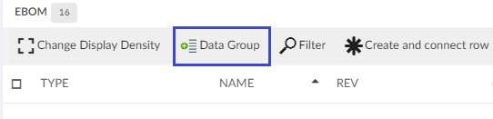
Figure 10. Data Grouping Button
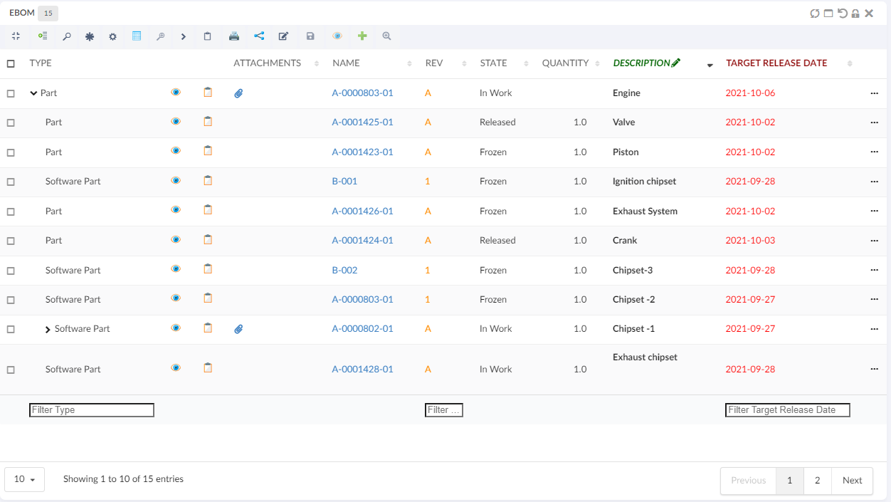
As an example, assume that you have a structure like in the screenshot below.
Launching the data grouping function and define two groups: type + current state, would give a result like the screenshot below.
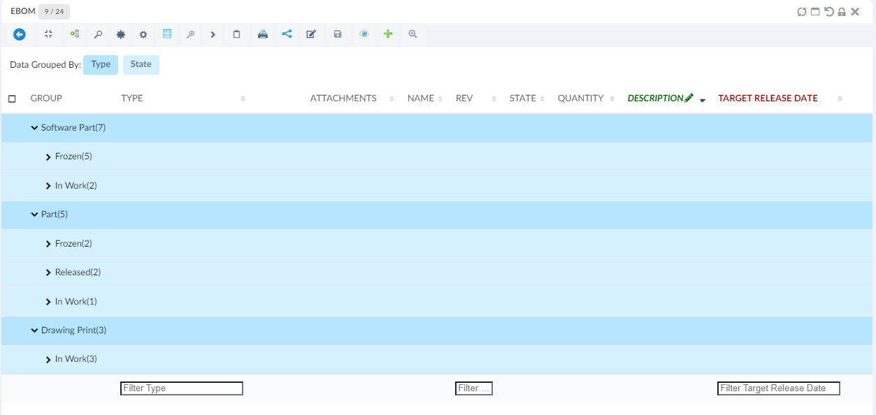
The different groups have different colours, and above the table there is a legend where the colour is mapped to the group. The first column after the structure shows the value (label) and the number of rows that mapped the group.
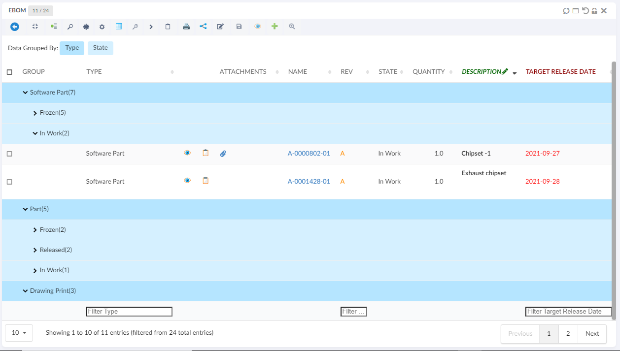
A group can be expanded in order to see the content of a particular group.
Creating data groups based on specific conditions provides a convenient and functional way to meet our data grouping needs.
Light Mode Data Group
This enable user to open a data grouping form inline where user can select the column and apply the grouping even user can cancel the grouping.
This can enable by passing an attribute lightMode value as a true in exiting data group commnad.
<DataGroup lightMode="true"/>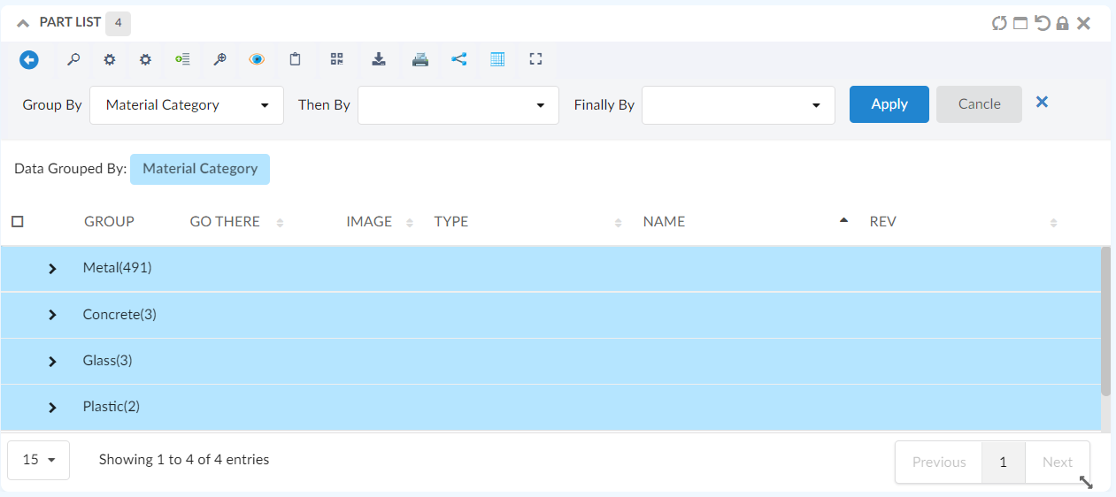
Figure 11. Light Mode Data Group Form
1.2.23. Pre configure Data Group
For some tables user might want to see the preconfigured datagroups, the data can be grouped when the tabe is loaded initially loaded by providing simple configurations in the table config as follows :
 <DataGroup>
    <GroupBy>
        <Name>Material Category</Name>
		<Group condition="match" value="Glass" />
	</GroupBy>
	<ThenBy>
	    <Name>owner</Name>
	</ThenBy>
	<FinallyBy>
		<Name>State</Name>
	    <Group condition="match" value="In Work" />
	</FinallyBy>
	<GoBackAllowed>true</GoBackAllowed>
</DataGroup>
1.2.24. Advance Sorting Command
<AdvanceSorting/> built-in command can be added to toolbar in table widget.
This command enable the user to sort the table. By clicking on this command, a UI will appear which enable user to choose desired sorting column and direction. Only sortable column will be appear in dropdown with which the user can choose to sort on up to three columns at same time.
When 'Save Sorting' is checked, the sorting preferences will be retained for future sessions or interactions with the application, providing consistency and convenience. If users prefer to sort temporarily for the current session without affecting future interactions, they can sort without checking the checkbox.
1.2.25. Internationalisation
The data table widget supports internationalization. If a translation key is given to an <Label> element
the translation for that key will be rendered. If no value is found for that key the actual value of the <Label> element
will be rendered.
Customize messages
The following messages is defined in the default.json language file.
{
    "dataTable": {
        "messages": {
            "decimal":        "",
            "emptyTable":     "No data available in table",
            "info":           "Showing _START_ to _END_ of _TOTAL_ entries",
            "infoEmpty":      "Showing 0 to 0 of 0 entries",
            "infoFiltered":   "(filtered from _MAX_ total entries)",
            "infoPostFix":    "",
            "thousands":      ",",
            "lengthMenu":     "_MENU_",
            "loadingRecords": "Loading...",
            "processing":     "Processing...",
            "search":         "Search:",
            "zeroRecords":    "No matching records found",
            "paginate": {
                "first":      "First",
                "last":       "Last",
                "next":       "Next",
                "previous":   "Previous"
            },
            "aria": {
                "sortAscending":  ": activate to sort column ascending",
                "sortDescending": ": activate to sort column descending"
            }
        },
        "editor": {
            "messages": {
                "create": {
                    "button": "New",
                    "title":  "Create new entry",
                    "submit": "Create"
                },

                "edit": {
                    "button": "Edit",
                    "title":  "Edit entry",
                    "submit": "Update"
                },

                "remove": {
                    "button": "Delete",
                    "title":  "Delete",
                    "submit": "Delete",
                    "confirm": {
                        "_": "Are you sure you wish to delete %d rows?",
                        "1": "Are you sure you wish to delete 1 row?"
                    }
                },

                "error": {
                    "system": "A system error has occurred (More information)"
                },

                "multi": {
                    "title": "Multiple values",
                    "info": "The selected items contain different values for this input. To edit and set all items for this input to the same value, click or tap here, otherwise they will retain their individual values.",
                    "restore": "Undo changes"
                }
            }
        }
    }
}
It is possible to override the each message in your own language file by providing a key that matches one of the above. For
example to override the dataTable.messages.emptyTable key you would add the following to your language files.
    {
        "dataTable": {
            "messages": {
                "emptyTable": "Currently no rows"
            }
        }
    }
Many translations for the tables can be found on here
1.2.26. API
The table javascript api can be found here
1.2.27. Mass Update
When <AllowMultipleEdit> has been set to true on a table column, the column is editable, and the
user has access to edit at least one cell in the column, an icon will appear on the column header
that the user can click in order to edit multiple cells in a single column to the same value.
Figure 12. Mass Update icon
The mass update form is shown in modal. If there is more than one column allowed for mass updating, the user can easily change the working column from the drop down list showing the column. The user can choose whether to edit the selected rows or all rows.
User can check "Keep Selection" to retain selection for further mass updating other columns.
By default "Keep Selection" is unchecked.
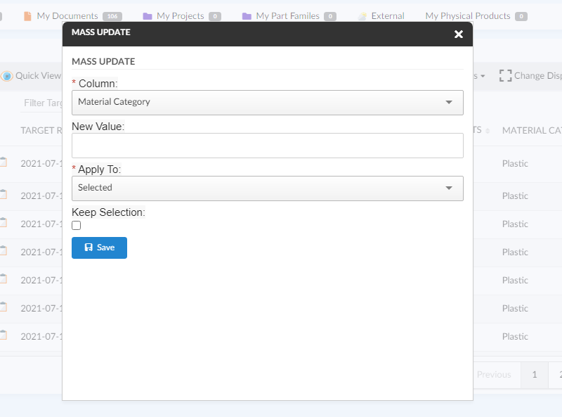
Figure 13. Mass Update form
1.2.28. Customization
The end user can change certain settings of a TableWidget, and automatically persist those customizations. Settings that are customizable include:
-
Column visibility (hide/show)
-
Data grouping (show/hide)
-
Column order (reorder the initial order from configuration)
-
Pagination length (number of table rows displayed per page)
-
Last sorted column (The column based on which the table should be sorted. Overrides the default/configured sort order)
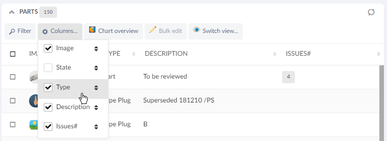
Figure 14. Checkbox indicates column visibility. Drag-and-drop to reorder.

Figure 15. Pagination
Changes to the above settings are stored per TableWidget, and remembered across page changes and browser sessions, as long as the Dashboard Customization property is enabled.
To reset any customizations for a TableWidget, you can use the Widget Customization reset icon.
1.2.29. Styling / CSS
Offline available table rows
If dynamic caching of object pages has been enabled, the TableWidget now automatically applies a CSS class .offline-available on every <tr> element that has a cached entry.
This opens up for conditional styling, that helps the user understand which objects are cached and thereby possible to open while offline.
Below example is achieved with CSS:
tr.offline-available {
	background-color: #9fd39f !important;
}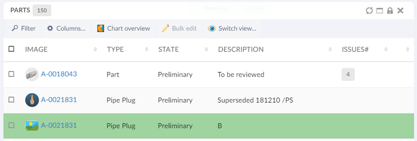
Figure 16. Specific styling of offline-available objects
1.2.30. Table Configurator
A built-in command <TableConfigurator /> can be added to a toolbar in a Table widget. This command allows adding,updating and removing user defined tables and maintaining End User Column Configurator for different tables.
| The addition of new columns can only be done for end user tables and not the default file based table defined for a widget. |
In datatable toolbar :
<TableConfigurator default="columns" excludeInterfacePrefix="true" />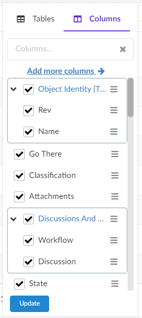
Figure 17. Table Configurator Menu Columns View
Figure 18. Table Configurator Menu Tables View
The table below shows and explains the available attributes for <TableConfigurator /> command:
| Field | Value | Notes / Description |
|---|---|---|
default |
columns or tables |
The default attribute defines which tab is active by default in menu. Default selected tab is columns. |
excludeInterfacePrefix |
True or False |
Whether the interface attributes should show interface name prefix in available columns' list. Default value is true. |
| It is recommended not to add <ToggleColumnVisibility /> command if <TableConfigurator /> is used as it would be redundant to have both together in a toolbar. |
Table Configurator
1.2.31. End User Column Configurator
Users can add and remove columns in a table from the existing list of attributes based on objects present in table including the unified type and interface attributes.
In datatable toolbar :
<TableConfigurator />Further, this feature has been extended to add advanced columns where config-admin can write the select expression manually. Refer Column Configurator section under In-App Designer section for more details.
Figure 19. Columns menu
1.2.32. CDM document details widget
We can view the versions of the document object by configuring the columntype helium-go-there as given below:
<Column>
	<Label>Go There</Label>
	<ColumnType>helium-go-there</ColumnType>
	<Setting name="widgetRef" value="tvc:widget:helium:cdm/CDMDocumentVersions.xml" />
</Column>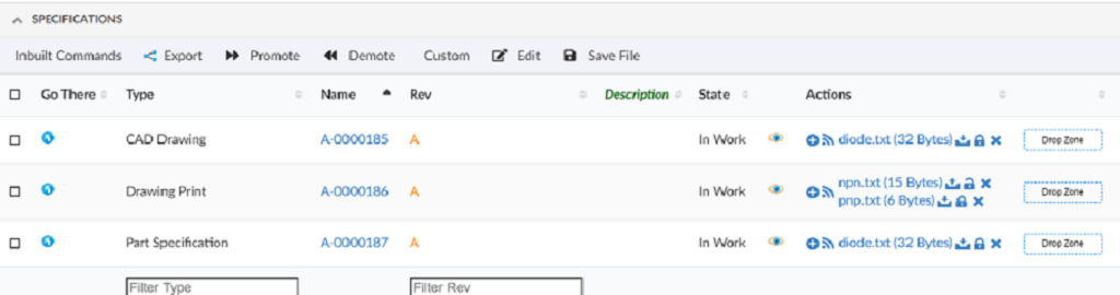
If a document object would have several files checked in, you will first see the active version objects for each file checked in.
By simply clicking the go-there again for a particular file, you will then see all the versions of that file.
1.2.33. Limitations of the date format table columns
When ClientSideProcessing is disabled, then the search performed using the column filter on date format columns will not give expected results if the date format specified with the tag DateFormat in Helium.xml is identified as invalid by the standard java class java.text.SimpleDateFormat.
For example, if the date format specified with the tag DateFormat in Helium.xml is MMMM Do YYYY, then the SimpleDateFormat Class consider this as an illegal pattern by logging error Illegal pattern character 'o'. In this case, the search results won’t be accurate.
1.2.34. Row Highlight Duration
Row highlight duration post actions such as promote, demote, row refresh e.t.c can be configured as below :
tvc.helium.row.highlightDuration= 5000 //1000 is default value
1.2.35. Path Attachment Column type
The File column type is useful to display the related document(s) and their files in the side panel. However, the File column type will only display the related document(s) connected via the given/default relationships.
There might be cases when the table row object can have the document(s) connected via path (A virtual relationship).If there are document(s) related to the object, a paper clip icon will be displayed and the user can click the icon to get the list of files in the modal.
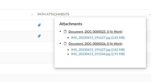
The list will show all related document(s) and the files related to each document.
For the document(s), the user will be able to check-in new files if user has access to do so, see basic properties of the document or open the document object in a popup window.
Also, per file, the user will be able to download, view, checkout, unlock, lock or update the file (again, depending on access rights, all actions might not be available).
Unless you provide any settings at all to this data handler, it will default look for "Reference Documents" and "Part Specifications" connected from the object in the table. You can change the behaviour by changing the following settings:
| Setting | Value | Description | Required |
|---|---|---|---|
Column Type |
helium-pathattachment |
This setting defines what type of column a particular column is. |
Yes |
Direction |
From |
The direction of the connection |
No |
Relationship |
relationship_PartSpecification |
A comma separated list of relationship names (or symbolic names) |
No |
PathDirection |
owner or element |
defines the direction for retrieving the path info for owner/element |
No (default is owner) |
PathType |
Proposed Activity.Where |
The Path type |
No |
PathExpression |
An expression |
The expression to retrieve the information in the context of path owner or to retreive the path owner in case of fetching the element information |
No. |
The example below illustrates how user/admin can construct the column of helium-pathattachment column type:
<Column>
	<ColumnType>helium-pathattachment</ColumnType>
	<Setting name="Relationship" value="SpecificationDocument" />
	<Setting name="Direction" value="from" />
	<PathType>SemanticRelation</PathType>
	<PathDirection>element</PathDirection>
	<PathExpression>from[VPLMrel/PLMConnection/V_Owner].to[PLMDocConnection]</PathExpression>
	<CardTitle>launchpad.ups.table.card.specDocs.Label</CardTitle>
	<CardID>ups_specdocuments</CardID>
	<Description>launchpad.ups.table.column.specDocFile.tooltip</Description>
	<Setting name="Render as Row Action" value="true" />
</Column>
1.3. Form
The form component is responsible for editing, creating or displaying object data.
A form can be configured to either be rendered inside of a widget or in standalone fullscreen mode.
The form component can be initialized in the following five modes.
- VIEW
-
the fields of the form is shown in 'view' mode. No editing controls are displayed.
- EDIT
-
the form is shown in edit mode with the form controls prepopulated with the values from the given object. The object to be edited is given by passing an
objectIdas an option in the constructor or if the form is rendered as a widget it can be configured to work with the current contextobject - CREATE
-
renders a form that creates a new object
- CREATE_AND_CONNECT
-
renders a form that creates an object and connects it to an existing object
- CREATE_WITH_CONNECTIONS
-
renders a form that creates an object and connects the created object to multiple existing objects
| CREATE & CREATE_AND_CONNECT form support "Create New" button. This button allows the user to create an object and keep the form open to create another object instantly. When the user clicks on "Create New" button, the form will be submitted, an object will be created, the user will be notified of the new object and the form will remain open for creation of another object. If the user wishes not to create another object, the user can simply submit the form as the user used to previously by using the "Submit" button. For further information see Form in modal |
The Edit Toggle button will not be displayed in the form unless the user owns modify access to any of the fields. In this case, if the form is opened in edit mode, the Toggle Edit Mode toolbar command can be used to toggle the modes.
There is factory functions for each mode described in the App.form API.
The form widget supports multiple languages, see i18n for more information.
1.3.1. Widget
To create a form widget create an widget definition XML with the following content:
<FormWidget>
    <FormConfig namespace="helium">Form1.xml</FormConfig>
    <ResolveContextId>page</ResolveContextId>
    <!--
    <FormMode>edit</FormMode>
     -->
</FormWidget>
The <FormWidget> element supports the following child elements.
| Name | Description | Example |
|---|---|---|
FormConfig |
Reference to the XML file that configures the form. See [Configuration](#FormConfig) for further information. |
|
ResolveContextId |
If the form should use the current context object. Valid value |
|
FormMode |
What mode should the form render in. Defaults to |
|
ShowToggleButton |
Whether the button that toggles between 'EDIT' and 'VIEW' mode should be visible. Defaults to |
|
1.3.2. Configuration
A form consists of sections and fields. Each section holds one or more fields.
The root element of a form configuration is <Form>. It supports the following child elements.
| Name | Description | Example |
|---|---|---|
Title |
The title of the form. |
|
Description |
The description of the form |
|
UsePhysicalId |
Create a new object utilizing the physicalid. |
|
SourceObjectResolver |
When the form is used for editing or viewing, a dataset can be used to load the source object for the form. If already in context of an object, that object can be used when for example an Expansion is necessary |
|
Layout |
Describes how the fields in form should be positioned. For further information see Layout |
|
SubmitStrategy |
Choose between submit strategies (Empty = default submit button, AUTO = Submit form on each field change) |
|
AlwaysShowEditButton |
Always shows the Edit toggle button in the view mode and View/Submit button in the edit mode irrespective of the user access.
Default value is |
|
Section |
Used to divide form fields in different collapsible sections. A form must have at least one |
For further information see the section chapter |
Section
The <Section> element groups different form fields together. A form must have at least one <Section>.
The <Section> element supports the following child elements.
| Name | Description | Example |
|---|---|---|
Label |
The label of the section. This will be rendered as a header for the current section. |
|
Field |
The field element describes the properties of an form field |
For further information see the field chapter |
RelatedObject |
A field used for showing / editing of related objects |
See this chapter for more info. |
Help messages
To configure a help message for a section specify the helperMessage setting.
Tooltip can be configured by passing the settings listed in Semantic Popup Settings into the tooltipConfig attribute.
A help message when configured is indicated by a 'question mark' next to the section label. On hovering over the icon, tooltip is shown. Tooltip icon (Default : question circle) and icon position (Default : right) can be changed as needed. Icons Link
<Setting name="options"><![CDATA[
    {
    "helperMessage": "Help message for this section. May contain html such as <a href='http://example.com'>a link</a> or an i18n key",
    "iconClass":"red question circle outline",
    "iconPosition":"left",
    "tooltipConfig": {
        "delay": {
            "show": 300,
            "hide": 800
            },
        "hoverable": true,
        "offset": 10
        }
	}
    ]]>
</Setting>
Or
<Options>
    <![CDATA[{
    "helperMessage": "Help message for this field. May contain html such as <a href='http://example.com'>a link</a> or an i18n key",
    "iconClass":"red question circle outline",
    "iconPosition":"left",
    "tooltipConfig": {
        "delay": {
            "show": 300,
            "hide": 800
            },
        "hoverable": true,
        "offset": 10
        }
    }]]>
</Options>
Field
The <Field> element describes the properties of a single field in a form.
It is possible to use the ref or namespace and name attributes to point to an external xml file. Example:
<Field namespace="helium" name="Policy.xml" />
<Field ref="tvc:formfield:helium/Policy.xml" />| If user does not have modify access then field is rendered in non-editable mode. |
The <Field> element supports the following child elements.
| Name | Description | Example | ||||
|---|---|---|---|---|---|---|
Label |
The label of the field. This will be rendered as an |
|
||||
Expression |
The expression that is used to fetch the data for the field |
|
||||
Editable |
Whether the field is editable or not. Valid values
|
|
||||
DataType |
What datatype is the field. For instance |
|
||||
FieldType |
What field type is the field. For instance |
|
||||
Defaults |
What default values should the field contain. The element supports the following attributes:
If none of the attributes are present the default values should be given as a list of
|
|
||||
Validation |
What client side validation rules should be applied to the field. The following child elements are supported
Or Globally configured in tvc.properties `tvc.helium.form.badCharacters = #@)~`. with following xml Mandatory fields that also appear in red color along with an asterisk on the create/view/edit forms.
By default this property is true
|
|
||||
Template |
A path to an handlebars template that is responsible for rendering the field. Custom field templates only work in 'VIEW' form mode currently. |
|
||||
Delimiter |
Defines a custom delimiter used internally to split/join the range value.
The default value is
|
|
||||
ShowCopyIcon |
Facilitates copying text contained within a form field. Default value is
|
|
Rich Text editor support
Especially multi line attributes that otherwise render as textareas, can sometimes benefit from allowing Rich Text (layouted text/HTML) input as well.
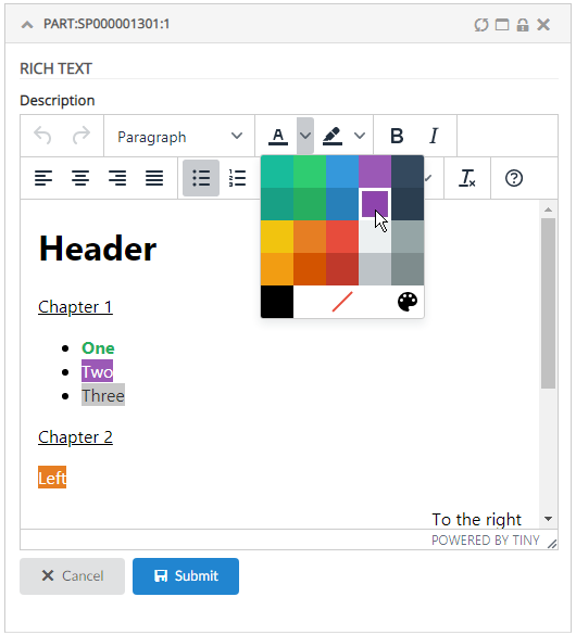
Figure 20. Rich Text editor
This can be easily configured by setting the <FieldType>richtext</FieldType> tag. Example:
<Field>
    <Label>Description</Label>
    <Expression>description</Expression>
    <Editable>true</Editable>
    <FieldType>richtext</FieldType>
</Field>
Hint: you may want to disable Table In-Cell-Editing for attributes containing HTML, and instead launch a Form, as showcased in the video above.
| All characters will be stored in non-entity form except these XML default entities: & ( stored as &), < ( stored as <), > ( stored as >). |
Markdown editor support
Markdown support for inline text formatting can be achieved with markdown editor using markdown field type.
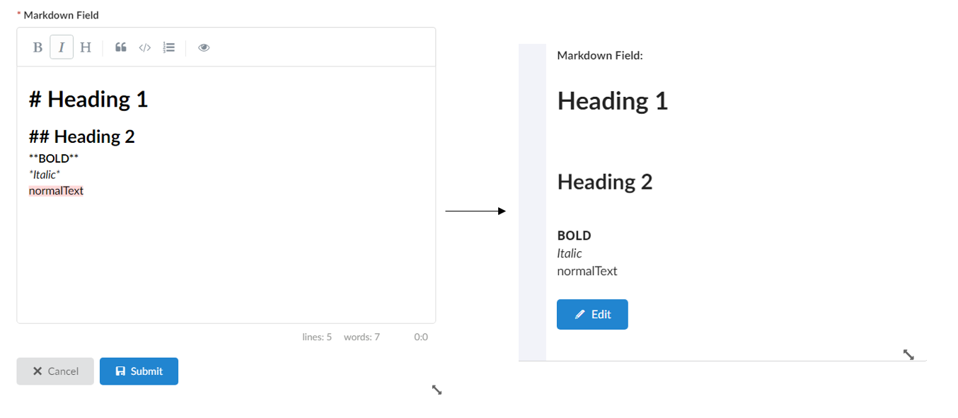
Figure 21. Markdown editor
This can be easily configured by setting the <FieldType>markdown</FieldType> tag. Example:
<Field>
    <Label>Description</Label>
    <Expression>description</Expression>
    <Editable>true</Editable>
    <FieldType>markdown</FieldType>
</Field>| Markdown editor support is available only for form fields. |
1.3.3. Primary Image Field
Images gives visual identification to enovia objects like Part or Assembly. Helium forms can now show primary image mapped to business object. A new field PrimaryImageField is introduced to render the "Primary Image" of the object. This field also allow user to set, change and delete primary image.
Following is example configuration :-
<PrimaryImageField>
	<Label>Image</Label>
	<Editable>true</Editable>
    <Format>generic</Format>
</PrimaryImageField>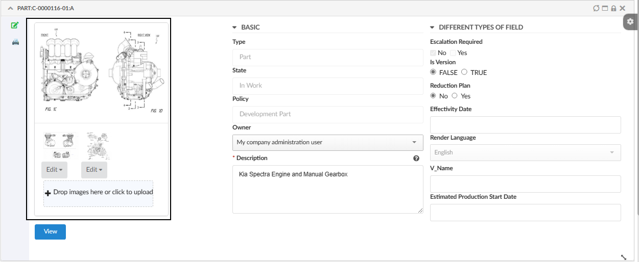
Figure 22. Primary Image
Autocomplete
All select fields have basic autocomplete support. With the options outlined below the behavior can be customized to great extent.
To customize autocomplete provide the following setting:
<Setting name="options"><![CDATA[
{
    "autocomplete": {
        "template": "...",
        "selectize": { ... },
        "handler" : { ... }
    }
}
]]>
</Setting>
Each block, template, selectize and handler is described below.
| template |
Provide an path to an template to customize the dropdown. Example of template: |
| selectize |
The client utilizes Selectize and all options described in
the docs can be used here. Apart from those settings, it also supports custom setting called |
To show selectize dropdown outside the widget boundaries. The global level property tvc.helium.selectize.showDropdownOutsideFrame can be defined in tvc.properties file or can be configured on specific field as below
<Options><![CDATA[{
			"selectize" : {
				"showDropdownOutsideFrame" : true;
    		}
}]]></Options>- handler
-
All settings that are described in the core admin guide can be used in the handler block including all predefined handlers.
If you wan’t to create a custom autocomplete handler, follow the admin guide and pass the java class as the value for the name key.
Full example:
<Setting name="options"><![CDATA[
    {
        "autocomplete": {
            "template": "/helium/templates/form/autocomplete",
            "selectize": {
                "preload": true,
                "cache": false,
                "maxItems": null,
                "labelField": "name",
                "searchField": ["name"]
            },
            "handler" : {
                "name": "dataset",
                "dataset": "tvc:dataset:helium/MyParts.xml",
                "select": ["name",  "current"]
            }
        }
    }
    ]]>
</Setting>
Custom client side validation
In addition to the validation rules described above in the <Validation> element,
it is possible to provide an javascript function that performs validation.
The function will be executed when the field is blurred and the value of the field
will be passed to the function. The function must return a boolean, true
if the value is valid and false if the value is invalid.
This is configured by providing the following setting:
<Setting name="options">{
    "validator": "App.custom.someJavascriptFunction",
    "validatorMsg": "Error message, either an messeage or a i18n key"
}</Setting>
Consolidated Error Message
In form by default errors are displayed at two places. One below respective field and one as consolidated error message near submit button. This is useful when form is big and consolidated message can give overall idea. However, in some cases it might be needed to disable consolidated error. This can be done using the key helium.form.error.consolidatedErrormessgae in tvc.properties. The valid value is either true or false and the default value is true.
Initial focus on a field
To set the focus on a field in edit/create mode add the focus option to the field.
| If more than one fields have the focus option set to true, then the last form field is given priority and set to focus. It is recommended to have only one field with focus true. |
<Setting name="options"><![CDATA[
    {
        "focus": true
    }
    ]]>
</Setting>
datePicker settings
The following settings are supported by date picker.
| Name | Description |
|---|---|
minDate |
The custom java script function which returns valid minimum selectable date. |
maxDate |
The custom java script function which returns valid maximum selectable date. |
showWeekNumber |
Boolean(true/false). Show the ISO week number at the head of the row. |
defaultDate |
The custom java script function which returns valid selectable date. This is the initial date to view when first opened. |
setDefaultDate |
Boolean (true/false). Make the defaultDate the initial selected value. |
disableWeekends |
Boolean(true/false). Disallow selection of Saturdays or Sundays. |
firstDay |
First day of the week (0: Sunday, 1: Monday, etc). |
yearRange |
Number of years either side (e.g. 10) or array of upper/lower range (e.g. [200,2030]). |
numberOfMonths |
Number of visible calendars. |
disableDayFn |
Callback function that gets passed a Date object for each day in view. Should return true to disable selection of that day. |
showDateTime |
Boolean(true/false). Enables both date and time to be shown and edited together. if disabled, only time can be accessed. The default value is false. NOTE: While editing time, user need to select date to trigger submission. |
<Setting name="options">{
    "datePicker":{
        "minDate": "App.hex.todayOrLater",
        "maxDate": "App.hex.endOfProjectDate",
        "showWeekNumber": true,
		"yearRange": [2000, 2030],
		"disableDayFn": "App.hex.disableDayFn",
		"firstDay": 2,
		"yearRange": [2000, 2030],
		"defaultDate": "App.hex.defaultDate",
		"setDefaultDate": true,
		"numberOfMonths": 2
    }
}</Setting>

<Setting name="showDateTime" value="true"/>
The below setting format is deprecated and will no longer be supported from Helium release 2019.2.0 onward. Please move it into subobject datePicker as shown above.
|
<Setting name="options">{
    "minDate": "App.hex.todayOrLater",
    "maxDate": "App.hex.endOfProjectDate"
}</Setting>
Conditional dependencies
It is possible to make fields dependent on values of other fields. This is achieved by
adding the dependsOn and dependsOnValue attributes to the dependent field element.
Example:
<Field dependsOn="someOtherFieldExpressionOrId" dependsOnValue="someValue">Given the example above, the field will only be visible if the field "someOtherFieldExpressionOrId" has the value "someValue". It is also possible to supply a list of comma separated values, if one of those values is equal to the value of the field "someOtherFieldExpressionOrId" the dependent field will be visible. Note: if the values contains commas you will need to create a custom javascript function as described below.
It is also possible to give an reference to a javascript function as the dependsOnValue value. In that case the
supplied function will be executed with the value of the dependsOn field as an parameter. The function must return a boolean
value. If the returned value is true the field will be shown otherwise it will be hidden.
For cross section dependencies
<Field crossSectionDependsOn="someOtherFieldExpressionOrId" crossSectionDependsOnValue="someValue">It is also possible to make sections dependent on value of some field. This can be achieved by adding the dependsOn and dependsOnValue attributes to the dependent section element.
Example:
<Section dependsOn="someFieldExpressionOrId" dependsOnValue="someValue">In above example, the section will only be visible if the field "someOtherFieldExpressionOrId" has the value "someValue". It is also possible to supply a list of comma separated values, if one of those values is equal to the value of the field "someFieldExpressionOrId" the dependent section will be visible.
It is also possible to give an reference to a javascript function as the dependsOnValue value. In that case the
supplied function will be executed with the value of the dependsOn field as an parameter. The function must return a boolean
value. If the returned value is true the field will be shown otherwise it will be hidden.
Loading custom ranges based on other field values
Specify the dependsOn attribute and also add the element <Defaults> with the attribute functionName set.
The functionName must point to an existing javascript function. That function will be executed every time the dependsOn
field changes passing the value of the field to the function.
The configured function must return either an array containing javascript objects with value and label properties or
a Promise that resolves to
an array containing objects with value and label properties.
Example of valid array:
[
    {"label": "Label 1", "value": "Value 1"},
    {"label": "Label 2", "value": "Value 2"}
]
Help messages
To configure a help message for a field specify the helperMessage setting.
Tooltip can be configured by passing the settings listed in Semantic Popup Settings into the tooltipConfig attribute.
A help message when configured is indicated by a 'question mark' next to the section label. On hovering over the icon, tooltip is shown. Tooltip icon (Default : question circle) and icon position (Default : right) can be changed as needed. Icons Link
<Setting name="options"><![CDATA[
    {
    "helperMessage": "Help message for this field. May contain html such as <a href='http://example.com'>a link</a> or an i18n key",
    "iconClass":"red question circle outline",
    "iconPosition":"left",
    "tooltipConfig": {
        "delay": {
            "show": 300,
            "hide": 800
            },
        "hoverable": true,
        "offset": 10
        }
    }
    ]]>
</Setting>
Preserve Output
Whether to preserve the values retrieved from the database or not. Preserve in this case means that HTML sensitive characters will not be escaped when displayed in the field, e.g., when an attribute contains HTML markup that should be displayed as such. Note that this setting will only be effective for textarea type field.
true |
The HTML sensitive characters in the output will not be escaped. This is the default value. |
false |
The HTML sensitive characters will be escaped. |
<Setting name="options"><![CDATA[
    {
    "preserveOutput": false,
    }
    ]]>
</Setting>
Trim Output
Whether to remove leading and trailing whitespace, newline characters in the value retrieved from the database or not. Trim in this case means that all leading and trailing whitespace, newline characters will be removed when displayed in the field, e.g., when an attribute contains any leading and trailing whitespace, newline characters will be removed and displayed. Note that this setting will only be effective for textarea type field.
true |
All leading and trailing whitespace, newline characters will be removed in the output. |
false |
All leading and trailing whitespace, newline characters will not be removed. This is the default value. |
<Setting name="options"><![CDATA[
    {
    "trimOutput": true,
    }
    ]]>
</Setting>
Default User Icon
Whether to have a default user icon for owner field in create form. This icon can be used to populate owner field with logged in user.
Value shown in the selectize field for default is configurable and to be given under setDefaultUserLabel. It can be a user info related string or a function. Some of the user info related strings. By default lable will be context user’s full name.
App.info.user.email |
|
firstName |
App.info.user.firstName |
lastName |
App.info.user.lastName |
fullName |
App.info.user.fullName |
userId |
App.info.user.id |
<Setting name="options"><![CDATA[
    {
        ...
        "setDefaultUserIcon": true,
        "setDefaultUserLabel": "App.info.user.fullName",
        ...
    }
    ]]>
</Setting>
Figure 23. Default user icon
Default user icon is applicable only for person field with FieldType as select.
|
Files Field
In a Helium form, you can have a field that enables form to checkin files to the main form object(s). Example:
<FilesField>
	<Label>Files</Label>
	<Format>generic</Format>
	<UseCDM>true</UseCDM>
	<Editable>true</Editable>
	<Store>store</Store>
</FilesField>|
By default the filesfield is editable as shown in below image. In order to make the filefield non-editable, need to specifically include |
Figure 24. Files Field
you can easily upload a file by using drag and drop.
There are two delete buttons for cdm enabled field, one for delete latest version and other for delete all versions. For CDM disabled field, there is only one delete button.
FilesField can also be used to display files from related objects.
For example, tag <Expression>${from[relationship_ReferenceDocument].to}</Expression> can be included in <FilesField> to display all the files from all objects found through expression value .
Expression tag will make the FilesField non-editable and displays the files from related objects found through the expression value alone.
|
All the files from all object found through the expression value will be displayed in files field. For example, out of given expression if 3 objects are found, all files from all 3 objects will be displayed in files field. |
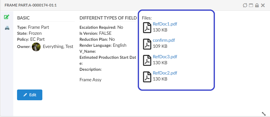
Figure 25. Files section with Expression
These are the sub-elements that are specific to a Files Field element:
| Name | Description | Example |
|---|---|---|
Label |
The label of field |
<Label>Files</Label> |
Format |
Specifies the format to use when checking in the file |
<Format>generic</Format> |
UseCDM |
It specifies if the "Common Document Model" functionality will be enabled for the field or not |
<UseCDM>true</UseCDM> |
Store |
Name of store |
<Store>store</Store> |
Editable |
Whether the field is editable or not. Valid values |
<Editable>true</Editable> |
Validation |
What client side validation rules should be applied to the field. The following child elements are supported
|
|
Template |
A path to an handlebars template that is responsible for rendering the field. |
|
OptionTemplate |
A path to an handlebars template that is responsible for rendering the selected field option. |
|
Expression |
displays the files from connected objects found through the expression |
<Expression>${from[relationship_ReferenceDocument].to}</Expression> |
Editable Expression |
define an expression used to control edit access. |
<EditableExpression>current!='Review'</EditableExpression> |
Related Object
A <RelatedObject> element is used to place a field in a form for showing/editing of related object information.
The following child elements are inherited from the Field element:
-
Label
-
Editable
In addition, the table below shows RelatedObject specific configuration elements:
| Name | Description | Example | ||
|---|---|---|---|---|
Relationship |
Specifies the relationship and direction to use as basis for this field. Allowed attributes on the
|
Examples: |
||
Display |
May be used to specify an ENOVIA select expression to be applied on the related object(s). Note that you may define multiple display selectables. |
|
||
Options |
A JSON configuration object that mainly is used to configure Auto Complete settings. If you enable editing of the RelatedObject, you must configure Auto Complete settings. For additional information regarding Auto Complete, see this chapter.
|
A search UI can be also configured for searching and adding value to field. See second example. |
||
|
DisplayDelimiter |
This can be used to separate different selectables configured in Display.
|
Now, the RelatedObject field can be used to set the relationship attributes during the creation of the connection. This can be achieved by adding the below two settings in the field definition.
Set Relationship Attribute Names: Can pass a comma-separated list of attribute names for updating multiple attributes at once. This setting only works in conjunction with the Setting Set Relationship Attribute Values. The number of attribute names configured for this setting must be equal to the number of values configured for the Setting Set Relationship Attribute Values. Otherwise, this setting is ignored, with no relationship attributes updated.
Set Relationship Attribute Values: Can pass a comma-separated list of attribute values for updating multiple attributes at once. This setting only works in conjunction with the Setting Set Relationship Attribute Names. The number of attribute values configured for this setting must be equal to the number of attribute names configured for the Setting Set Relationship Attribute Names. Otherwise, this setting is ignored, with no relationship attributes updated.
Also there might be a case where the attribute values contains comma, so in that case Delimiter can be configured and the attribute names and values should be separated with delimiter.
<RelatedObject>
    ...
    <Setting name="Set Relationship Attribute Names" value="TestRelAttribute2|TestRelAttribute" />
    <Setting name="Set Relationship Attribute Values" value="Mukesh|Ashish" />
    <Delimiter>|</Delimiter>
    ...
</RelatedObject>

    or

<RelatedObject>
    ...
    <Setting name="Set Relationship Attribute Names" value="TestRelAttribute2,TestRelAttribute" />
    <Setting name="Set Relationship Attribute Values" value="Mukesh,Ashish" />
	...
</RelatedObject>
Dynamic Attribute Field
Dynamic Attribute Field can be used to render multiple fields for an object, either from object type or classification interface. Dynamic Attribute Field is supported only on edit form.
<DynamicAttributeField> element is used to place a field in a form for showing/editing objects dynamic attributes.
The following child elements are inherited from the Field element:
-
Label
-
Editable
- Note
-
By default attribute fields added dynamically are non editable.
Table below shows the DynamicAttributeField specific configuration elements:
| Name | Description | Example |
|---|---|---|
Filter |
Specifies Exclude elements to exclude attributes. It supports both symbolic and actual attribute name. |
|
ForClassification |
Specifies whether DynamicAttributeField is to be used for ClassificationField. Valid values true or false Supports below attributes -
|
|
FromInterface |
Specifies whether DynamicAttributeField is to be used for Interface. Valid values true or false. Default is false. Supports below attributes -
|
|
Classification Field
Classification Field is designed based on Enovia Library Central classifications with flexibility to configure classification relationship. It works in correlation with DynamicAttributeField, which renders attributes from interface as defined on classification object. Classification Field is supported only on edit form.
A <ClassificationField> element is used to place a field in a form for showing/editing object classification information.
The following child elements are inherited from the Field element:
-
Label
-
Editable
- Note
-
By default Classification Field is non editable.
In addition, the table below shows ClassificationField specific configuration elements:
| Name | Description | Example | ||
|---|---|---|---|---|
ClassificationRelationship |
Specifies the relationship and direction to be used for classification field. By default Classified Item is used as relationship. Allowed attribute on the
|
|
||
LibraryLoader |
References to the dataset to load libraries for this classification field, via the child element <DateSet>. These libraries are passed as argument "libraryIds" to auto complete handler. In default auto complete handler, these libraries are expanded to show families beneath for user selection.
|
|
||
MultipleClassification |
Whether to allow multiple classifications. When enabled user can select more than one classification for same object. By default MultipleClassification is disabled and previous classifications are removed. |
|
||
DisplayExpression |
May be used to specify an ENOVIA select expression to be applied on the related object(s). |
|
||
LinksWith |
When DynamicAttributeField is intended to be used to display attributes corresponding to this ClassificationField, this element should point to DynamicAttribute field id.
|
|
||
Options |
A JSON configuration object that mainly is used to configure Auto Complete settings. If you enable editing of the ClassificationRelationship, you can configure Auto Complete settings. If no autocomplete handler is specified, a default autocomplete handler is used to retrive Classification objects. For additional information regarding Auto Complete, see this chapter.
|
|
Default Classfication Auto Complete Handler
There is a in built auto complete handler for Classification field, it expands libraries loaded from Library Loader on relationship Subclass. In built handler allows following configurations
| Name | Description | Example |
|---|---|---|
typePattern |
Type pattern to expand Library object |
|
relPattern |
Relationship pattern on which Library object should be expanded. Default is Subclass |
|
whereClause |
Object Where clause. |
|
searchType |
How the search criteria will operate. Available values:
Default is startsWith |
|
showClassificationPath |
Whether to show classification path in drop down. By default, it is true and classication path from library is shown. |
|
It is allowed to configure custom auto complete handler using standard Options and auto complete handler settings.
Structure Editing UI
Below are the optional settings to override the default behaviour or the appearance of the classification field that can be added in editClassification JSON object.
| Property | Description |
|---|---|
editDashboard |
The default dashboard is
|
editDashboardPosition |
you can specify the edit dashboard position using this setting and override the default position.
|
classificationRelationship |
"Classified Item" is the default relationship to get the classification path. This default relationship can be overriden by the below setting in column configuration.
|
classifyFromLevel |
This setting helps to specify from which level of the library heirarcy, the business object must be classified. The default value is 1, meaning that once the library is expanded, business objects can be classified from the first level of the hierarchy.
|
displayExpression |
By default, the name of the classification object is displayed in the classification path. This can be override by the below setting.
|
Below is an example to add classification form field configuration to open the classification heirarchy in a modal view where the settings are slightly changed as per use case.
<ClassificationField id="classificationField">
	<Label>ClassificationField</Label>
	<LibraryLoader>
		<DataSet namespace="helium">ClassificationLibrary.xml</DataSet>
	</LibraryLoader>
	<Editable>true</Editable>
	<LinksWith>dynamicField</LinksWith>
	<MultipleClassification>true</MultipleClassification>
	<DisplayExpression>name</DisplayExpression>
	<Options>
		<![CDATA[{
		"editClassification": {
			"editDashboard":"tvc:dashboard:helium/ClassificationFormEditByTitle.xml",
			"classifyFromLevel": "3",
			"editDashboardPosition":{
				"left": "20%",
				"right": "20%",
				"top": "10%",
				"bottom": "30%"
			},
			"displayExpression": "attribute[Title]"
		},
		 "autocomplete" : {
			 	"handler" : {
			 	    "searchType"             : "contains",
			  		"whereClause"            : "current == Active",
			   		"showClassificationPath" : true
				}
		 }
		}]]>
	</Options>
</ClassificationField>| The settings are provided under <Options> where the properties of classication form field are configurable. |
| Classification field is not supported in create forms. |
Layout
The <Layout> element is responsible for how the sections and fields in the form should be positioned. If the <Layout> element
is omitted all sections and fields will be rendered from top to bottom.
The <Layout> element supports the following child elements.
| Name | Description | Example |
|---|---|---|
Columns |
The number of columns the form should consist of. Each |
|
Template |
A path to an handlebars template that is responsible for rendering the form. If the |
|
TableTemplate |
In-built template for showing labels and values separated in a table-like, column based template view. For more information regarding TableTemplate see TableTemplate |
|
TableTemplate
Using TableTemplate, form can be rendered in table-like, column based template view.
Example:
<Form>
    <Layout>
        <TableTemplate/>
    </Layout>
    <Section>
    <!-- Lots of field elements -->
    </Section>
    <Section>
    <!-- More field elements -->
    </Section>
</Form>
It can also be combined with <Columns> setting.
Example:
<Form>
    <Layout>
        <TableTemplate/>
        <Columns>3</Columns>
    </Layout>
    <Section>
    <!-- Lots of field elements -->
    </Section>
    <Section>
    <!-- More field elements -->
    </Section>
</Form>
NOTE : While using table template with <Columns> setting, choose the number of columns according to the width of field labels for proper layout.
Layout template
By configuring a form to use a layout template it is possible to specify exactly where the different <Section> elements
should be rendered. This is accomplished by given each <Section> an dom-id attribute. The attribute value
should match an id in your template.
Consider the example configuration below:
<Form>
    <Layout>
        <Template>/path/to/my/template.handlebars</Template>
    </Layout>
    <Section dom-id="left">
    <!-- Lots of field elements -->
    </Section>
    <Section dom-id="right">
    <!-- More field elements -->
    </Section>
</Form>
And the following handlebars template (/path/to/my/template.handlebars):
<div class="form-template-example">
    <div id="left"></div>
    <div id="right"></div>
</div>
This will render the <Section> with dom-id="left" in the div with id="left" and the <Section> with dom-id="right"
in the div with id="right".
Form in modal
A form can be rendered in a modal via a custom command. This is achieved by passing in the fullscreen: true parameter when
the form is created. Example of such a command:
<Command>
    <Label>Create Part</Label>
    <FontIcon>plus</FontIcon>
    <OnClick>App.form.createNew</OnClick>
    <OnClickParams>{
        "formConfigName": "tvc:form:helium/CreatePart.xml",
        "fullscreen": true
    }</OnClickParams>
</Command>
It is possible to configure Create New button with Reload Form on Create Part & Create Connect Part form.
This is achieved by passing in the showCreateNew:true and reloadForm:true parameter when the form is created.
Default Value of showCreateNew and reloadForm is false.
|
Example:
<Command>
    <Label>Create Part</Label>
    <FontIcon>plus</FontIcon>
    <OnClick>App.form.createNew</OnClick>
    <OnClickParams>{
        "formConfigName": "tvc:form:helium/CreatePart.xml",
        "fullscreen": true,
        "showCreateNew":true,
        "reloadForm":true
    }</OnClickParams>
</Command>
<Command>
<Label>Create Part</Label>
<FontIcon>icon plus</FontIcon>
<URL href="javascript:App.form.createNew({options: {'formConfigName': 'tvc:form:helium/CreatePart.xml', 'fullscreen': true, 'showCreateNew':false, 'reloadForm':false, modal: {resizableHandles: {autoHide: true, handles:'e, se, s, sw, w'}} }});" />
</Command>It is possible to configure the size, position, resize and drag properties of the modal by the following modal property:
<Command>
    <Label>Create Part</Label>
    <FontIcon>plus</FontIcon>
    <OnClick>App.form.createNew</OnClick>
    <OnClickParams>{
        "formConfigName": "tvc:form:helium/CreatePart.xml",
        "fullscreen": true,
        "modal": {
            "position": {
                "top": "20%",
                "bottom": "20%",
                "left": "20%",
                "right": "20%"
            },
            "resizable": false,
            "draggable": false
        }
    }</OnClickParams>
</Command>
Resizable and draggable properties are by default true.
Valid values for the position is either the string auto which will try to center the modal in the middle of the screen
or you could pass in an object containing the properties top, bottom, left and right as the example above.
To toggle the controls that are visible in the header pass in the controls object. See example below:
<Command>
    <Label>Create Part</Label>
    <FontIcon>plus</FontIcon>
    <OnClick>App.form.createNew</OnClick>
    <OnClickParams>{
        "formConfigName": "tvc:form:helium/CreatePart.xml",
        "fullscreen": true,
        "modal": {
            "position": {
                "top": "20%",
                "bottom": "20%",
                "left": "20%",
                "right": "20%"
            },
            "controls": {
                "dock": true,
                "expand": true,
                "close": true
            }
        }
    }</OnClickParams>
</Command>
resizableHandles property is used to enable resize from different positions like right(e), left(w), bottom(s), left bottom(sw) or right bottom(se) of the modal. Default value is se.
Examples:
<Command>
    <Label>Create Part</Label>
    <FontIcon>icon plus</FontIcon>
    <URL href="javascript:App.form.createNew({options: {'formConfigName': 'tvc:form:helium/CreatePart.xml', 'fullscreen': true, modal: {resizableHandles: {autoHide: true, handles:'e, se, s, sw, w'}} }});" />
</Command>
<Command>
<Label>Create Part123</Label>
<FontIcon>plus</FontIcon>
<OnClick>App.form.createNew</OnClick>
<OnClickParams>{
"formConfigName": "tvc:form:helium/CreatePart.xml",
"fullscreen": true,
"modal": {
"resizableHandles": {
"autoHide": true,
"handles": "e, se, s, sw, w"
}
}
}</OnClickParams>
</Command>Example
<Form>

    <Title>Test Form</Title>

    <Description>Foo</Description>

    <Layout>
        <!--<Template>helium/templates/form/form</Template>-->
        <Columns>2</Columns> <!-- If columns is set it will override the template -->
    </Layout>

    <Section dom-id="left"> <!-- If a template is set the dom-id attribute will determine where the section should be rendered -->
        <Label>Section 1</Label>
        <Field>
            <Label>Type</Label>
            <Expression>type</Expression>
            <Editable>false</Editable>
        </Field>
        <Field>
            <Label>Name</Label>
            <Expression>name</Expression>
            <Editable>false</Editable>
        </Field>
        <Field>
            <Label>Revision</Label>
            <Expression>revision</Expression>
            <Editable>true</Editable>
        </Field>
    </Section>
    <Section dom-id="right">
        <Label>Section 2</Label>
        <Field>
            <Label>Beskrivning</Label>
            <Expression>description</Expression>
            <Editable>true</Editable>
            <Validation> <!-- Validation rules which are sent to the client -->
                <Required>true</Required>
                <MinLength>3</MinLength>
                <MaxLength>30</MaxLength>
                <Pattern>^(Hello|Goodbye)\sworld$</Pattern>
            </Validation>
            <!--<Template>helium/templates/form/description_field</Template>-->
        </Field>
        <Field>
            <Label>Owner</Label>
            <Expression>owner</Expression>
            <DataType>user</DataType>
            <Editable>true</Editable>
            <FieldType>select</FieldType>
            <Defaults>   <!-- Defaults supports attributes className='java.class' and functionName='javascriptFunctionName' -->
                <Value value="Test Everything">
                    <Label locale="en">Everything, Test</Label>
                    <Label locale="sv">Testar</Label>
                </Value>
                <Value value="Ove">
                    <Label locale="en">Ove</Label>
                    <Label locale="sv">Ove</Label>
                </Value>
                <Value value="Patrik">
                    <Label locale="en">Patrik</Label>
                    <Label locale="sv">Patrik</Label>
                </Value>
            </Defaults>
        </Field>
        <!--<Field>-->
            <!--<Label>Originated</Label>-->
            <!--<Expression>originated</Expression>-->
            <!--<DataType>date</DataType>-->
            <!--<Editable>true</Editable>-->
        <!--</Field>-->
        <Field>
            <Label>Vikt</Label>
            <Expression>${attribute[attribute_Weight]}</Expression>
            <Editable>true</Editable>
        </Field>
        <Field>
            <Label>Material</Label>
            <Expression>${attribute[attribute_MaterialCategory]}</Expression>
            <Editable>true</Editable>
            <FieldType>select</FieldType>
        </Field>
    </Section>

</Form>
1.3.4. Templates
Create Forms have built-in functionality for users to save form data as templates that be used for later.
As shown below, the form data can be saved as templates and same saved template can be used to load data on the new form.
Figure 26. Save Form Templates
Figure 27. Load Form Templates
Please note that the templates that are saved on one form can only be loaded on the same form type. Templates are saved per user, meaning they cannot be shared to other users.
Templates can be enabled/disabled on individual forms using a configuration:
<Form>

    <AllowTemplates>true</AllowTemplates>

</Form>| Templates are currently available on forms in Create mode. |
1.3.5. Multivalue attribute field
Multiple values can be added by selecting multiple values from the drop down or type in new values, this can be configured as below:
<Field>
    <Label>Test Multi Value</Label>
    <Expression>attribute[Test Multi Value]</Expression>
		<Editable>true</Editable>
    <FieldType multiple='true'>select</FieldType>
</Field>
For allowing free text value can in multivalue attribute fields, this can be configured as below:
<Field>
    <Label>Test Multi Value</Label>
    <Expression>attribute[Test Multi Value]</Expression>
		<Editable>true</Editable>
		<Setting name="options">
        {

            "autocomplete": {
                "selectize" : {
				"create":"true"
			}
            }

        }
    </Setting>
    <FieldType multiple='true'>select</FieldType>
</Field>| For dynamic multivalue attribute fields from interface this will be available by default based on schema configuration of attribute. |
1.3.6. i18n
The form widget supports multiple languages via the i18n framework. To make your form multilingual use translation keys in your configuration instead of hardcoded names.
For example instead of configure your form like this, where the <Label> is hardcoded to always show Weight:
<Field>
    <Label>Weight</Label>
    <!-- more elements -->
</Field>
Use a translation key that is defined in your language files instead. For example:
<Field>
    <Label>form.fields.labels.weight</Label> <!-- a key that points to a translation -->
    <!-- more elements -->
</Field>
If the translation key can’t be resolved the actual value of key will be rendered, in this case form.fields.labels.weight.
Form messages
The following form messages is defined in the default translation file (default.json). By looking at the key names it should
be pretty self explanatory when they will be rendered in the form.
{
    "form: {
        "messages": {
            "invalidPattern": "This field should have pattern {0}",
            "stringTooShort": "This field should contain at least {0} numbers or characters",
            "stringTooLong": "This field should contain at most {0} numbers or characters",
            "invalidTime": "Invalid time",
            "invalidEmail": "Invalid Email address",
            "invalidIPv4": "Invalid IPv4 address, e.g. 192.168.0.1",
            "invalidPassword": "Invalid Password",
            "invalidURLFormat": "The URL provided is not a valid web address.",
            "wordLimitExceeded": "The maximum word limit of {0} has been exceeded.",
            "invalidZipcodeFormatFive": "Invalid Five-Digit Zipcode (#####)",
            "invalidZipcodeFormatNine": "Invalid Nine-Digit Zipcode (#####-####)",
            "keyNotUnique": "Keys of map field are not unique.",
            "keyMissing": "Map contains an empty key.",
            "stringNotAnInteger": "This value is not an integer.",
            "invalidDate": "Invalid date for format {0}",
            "stringNotAJSON": "This value is not a valid JSON string.",
            "editorAnnotationsExist": "The editor has errors in it that must be corrected",
            "noneLabel": "None",
            "stringValueTooSmall": "The minimum value for this field is {0}",
            "stringValueTooLarge": "The maximum value for this field is {0}",
            "stringValueTooSmallExclusive": "Value of this field must be greater than {0}",
            "stringValueTooLargeExclusive": "Value of this field must be less than {0}",
            "stringDivisibleBy": "The value must be divisible by {0}",
            "stringNotANumber": "This value is not a number.",
            "stringValueNotMultipleOf": "This value is not a multiple of {0}",
            "invalidValueOfEnum": "This field should have one of the values in {0}.  Current value is: {1}",
            "notEnoughItems": "The minimum number of items is {0}",
            "tooManyItems": "The maximum number of items is {0}",
            "valueNotUnique": "Values are not unique",
            "notAnArray": "This value is not an Array",
            "addItemButtonLabel": "Add New Item",
            "addButtonLabel": "Add",
            "removeButtonLabel": "Remove",
            "upButtonLabel": "Up",
            "downButtonLabel": "Down",
            "chooseFile": "Choose file...",
            "chooseFiles": "Choose files...",
            "dropZoneSingle": "Click the Choose button or Drag and Drop a file here to upload...",
            "dropZoneMultiple": "Click the Choose button or Drag and Drop files here to upload...",
            "disallowValue": "{0} are disallowed values.",
            "notOptional": "This field is not optional.",
            "tooManyProperties": "The maximum number of properties ({0}) has been exceeded.",
            "tooFewProperties": "There are not enough properties ({0} are required)"
        }
    }
}
It is of course possible to override all of these messages in your custom language files, for example to override the stringTooShort
key you would add the following to your language files.
{
    "form": {
        "messages": {
            "stringTooShort": "The string you provided is to short. It should contain at least {0} letters"
        }
    }
}
1.3.7. API
The javascript API is described here
1.4. Lifecycle
The lifecycle widget can be used to display the lifecycle of an object you are in context of. It will render all of the states horizontally and has functionality for simple promoting and demoting.

| Currently the lifecycle widget is not able to render signatures. |
Below is an example of how this widget is configured:
<LifecycleWidget>
    <Title>Lifecycle</Title>
</LifecycleWidget>
1.5. History
The history widget can be used to display the history of an object you are in context of. It will render all of the history entries in a table with the ability to filter on it. Also it supports sorting and initial sort will be on basis of date in ascending order.
The data from history widget can be exported to excel or PDF and provision to print history can be included as toolbar commands.

Below is an example of how this widget is configured:
<HistoryWidget>
    <Title>History</Title>
    <OnInitOption name="sortDirection" value="asc" />
    <OnInitOption name="sortColumn" value="when" />
    <Toolbar vertical="true">
        <Command>
            <Label>history.command.exportToExcel</Label>
            <FontIcon>ti-c ti-large ti-excelexport-c</FontIcon>
            <OnClick>App.Widget.exportHistoryToExcel</OnClick>
        </Command>
        <Command>
            <Label>history.command.exortToPDF</Label>
            <FontIcon>ti-c ti-large ti-file-pdf-c</FontIcon>
            <OnClick>App.Widget.exportHistoryToPDF</OnClick>
        </Command>
        <Command>
            <Label>history.command.print</Label>
            <FontIcon>ti-c ti-large ti-printer</FontIcon>
            <OnClick>App.Widget.print</OnClick>
        </Command>
    </Toolbar>
</HistoryWidget>1.6. Count
The count widget executes a dataset and renders the number of hits.

1.6.1. Options
| Name | Description | Required |
|---|---|---|
dataset |
Reference to a dataset to load |
true |
color |
The text color (#FFF) |
false |
background |
The widgets background color (#34495e) |
false |
iconClass |
What icon to show (could be icons from semantic-ui.com) |
false |
iconColor |
The icon color (#FFF) |
false |
iconAlignment |
Possible values: right, left, center |
false |
template |
Your own handlebars template |
false |
drillDown |
Reference to a dashboard used for drilldown |
false |
onclick |
A function that is executed when the widget is clicked |
false |
maxCount |
If the result contains more hits than maxCount a + sign will be added (99+) |
false |
Below is an example of how this widget is configured:
<CountWidget xmlns="http://technia.com/helium/Widget">
    <!-- Title will be used in drilldowns -->
    <Title>Documents</Title>
    <!-- Required -->
    <DataSet>tvc:dataset:main:common/MyDocs.xml"</DataSet>

    <!-- Optional -->
    <OnInitOption name="background" value="#34495e" />
    <OnInitOption name="color" value="#fff" />
    <OnInitOption name="iconColor" value="#fff" />
    <OnInitOption name="iconClass" value="icon file" />
    <OnInitOption name="iconAlignment" value="right" />
    <OnInitOption name="maxCount" value="999" />
    <!-- You can specify dashboard to drilldown to -->
    <OnInitOption name="drillDown" value="tvc:dashboard:helium:main:projectspace/ProjectDrillDown.xml" />
    <!-- Or execute a Javascript function-->
    <OnInitOption name="onclick" value="App.custom.yourCustomFunction" />
</CountWidget>1.7. Tile
The tile widget can be used to display a table, rendered in another way. It still uses a TableConfig for defining and retrieving its data, but using a Handlebars template the objects can be rendered in a fully custom way. There is also a default tile template provided.

1.7.1. Options
| Name | Description | Required |
|---|---|---|
tableConfig |
Reference to a tableConfig to load |
true |
selection |
Enable selection of objects, for performing actions. Default is false. |
false |
template |
Your own handlebars template |
false |
onClick |
A function that is executed when the tile is clicked. Default is to navigate to the object. |
false |

Below is an example of how a TileWidget is configured:
<TileWidget>
    <Title>Tile widget</Title>
    <TableConfig>tvc:tableconfig:folder/MyTableConfig.xml</TableConfig>
    <!-- Optional parameters below -->
    <OnInitOption name="selection" value="true" />
    <OnInitOption name="onClick" value="App.routing.open" />
    <OnInitOption name="template" value="helium/custom/hex/templates/common/widget/images-tile" />
</TileWidget>
1.7.2. Built-in commands
Tile Widget supports local search (filtering) in the same way as a TableWidget. To enable it, configure the <Search/> command as described here

1.8. Recent Objects Widget
The recent widget can be used to display a list of objects that the user has recently visited. The built-in widget uses TableConfig for defining and retrieving its data and a handlebars template to display the data. Both of them can be overridden if needed, for e.g. to fetch and display information in a different way.
Figure 28. Recent Objects Widget
1.8.1. Options
| Name | Description | Required |
|---|---|---|
Title |
Title for widget, default, 'Recent' or value returned by i18n key, |
false |
tableConfig |
Reference to a |
false |
template |
Your own handlebars template |
false |
By default, 20 latest visited objects are stored/ displayed. A TVC property, tvc.core.recentobject.limit can be used to define different limit, e.g.
tvc.core.recentobject.limit = 30
Below is an example of how a RecentObject Widget is configured:
<RecentObjectWidget />If you’d like to use your own table for loading data and template for rendering, a sample configuration could be:
<RecentObjectWidget>
    <Title>acme.label.last.viewed</Title> <!-- i18n key  -->
    <OnInitOption name="tableConfig" value="tvc:tableconfig:acme/LastViewedObjects.xml" />
    <OnInitOption name="template" value="helium/custom/templates/common/widget/last-viewed" />
    <OnInitOption name="selection" value="false" />
    <OnInitOption name="onClick" value="App.custom.openObject" />
</RecentObjectWidget>
In addition, the com.technia.tvc.core.recentobject.RecentObjectHandlerManager Java class has APIs that can be used to get, save, and clear recently visited objects.
See TVC Core Admin guide for more information of configuring recent objects.
| Looking to configure recent objects within a menu in Topbar instead? See Recent Object Menu for more information. |
1.9. Clipboard Widget
The clipboard widget can be used to show objects, selected by the user. The content of the clipboard is maintained between sessions. The built-in widget uses TableConfig for defining and retrieving its data and a handlebars template to display the data. Both of them can be overridden if needed, for e.g. to fetch and display information in a different way.
Clipboard objects can be removed by clicking on minus circle icon.
| Clipboard widget is not supported with offline pages. |
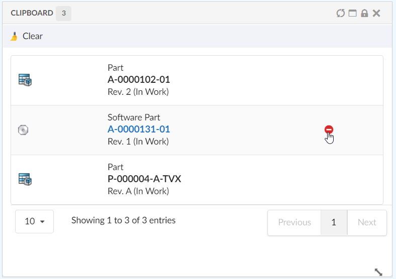
Figure 29. Clipboard Widget
1.9.1. Options
| Name | Description | Required |
|---|---|---|
Title |
Title for widget, default, 'Clipboard' or value returned by i18n key, |
false |
tableConfig |
Reference to a |
false |
template |
Your own handlebars template |
false |
Below is an example of how a Clipboard Widget is configured:
<ClipboardWidget />If you’d like to use your own table for loading data and template for rendering, a sample configuration could be:
<ClipboardWidget>
    <Title>acme.label.clipboard.items</Title> <!-- i18n key  -->
    <OnInitOption name="tableConfig" value="tvc:tableconfig:acme/ClipboardItems.xml" />
    <OnInitOption name="template" value="helium/custom/templates/common/widget/clipboard-items" />
    <OnInitOption name="selection" value="false" />
    <OnInitOption name="onClick" value="App.custom.openObject" />
</ClipboardWidget>| User can defined at most one clipboard widget per page. |
1.10. Clipboard Store
The content of the clipboard is by default stored into a set in the database.
This set is saved with the name mxClipboardCollections, if the ENOVIA
version is V6R2009 of later. For earlier versions, this name is
.clipboard.
It is however, possible to change this name through the following init-parameter (the name must not be longer than 127 characters, and might only contain characters that are valid for ENOVIA sets):
<init-param>
    <param-name>tvc.structurebrowser.clipboard.name</param-name>
    <param-value>My Clipboard</param-value>
</init-param>
1.11. Clear Clipboard
To clear the content of the clipboard, the clear method of App.clipboard JS API can be used. The command can be used in Clipboard widget toolbar.
Example:
In Clipboard Widget Toolbar
<ClipboardWidget>
	<Toolbar>
		<Command>
			<Label>Clear</Label>
			<Alt>Clear Clipboard</Alt>
			<FontIcon>ti-c ti-broom</FontIcon>
			<OnClick>App.clipboard.clear</OnClick>
		</Command>
	</Toolbar>
</ClipboardWidget>
1.12. Collections
Helium contains functionality allowing the user to work with collections. A collection is used to store arbitrary business objects.
1.12.1. Configure Collection:
Collections can be enabled from widget toolbars.
Adding <collection/> elements in toolbar, will enable a collection menu with 4 default commands.
-
Add to Clipboard
-
View Clipboard
-
Add to Collection
-
View Collection
Collection default menu will appear in UI as shown in below image.

Add to Collection command
This command opens a 'Add to Collection' widget in sidepanel and allows the user to add the selected objects from datatable to an existing or new collection. New collection can added by selecting the Add New Collection option in the select input field.
Add new Collection option can be internationalized by key helium.collection.addToCollection.addNewCollection using String Resource properties file.


1.12.2. Manage collections:
User can manage the collections and its content from collection widget. Below 6 default toolbar commands in Collection widget enables users to manage their collection objects.
-
Filter
-
Create Collection
-
Clear collections
-
Delete collections
-
Distribute selected collection(s)
-
Merge selected collections


1.12.3. Manage collection
User can manage the individual collection widget content by using default toolbar commands:-
-
Search and Add
-
Remove
-
Clear Collection


1.12.6. Customize Collection
Commands:
Collection default commands can be customized to change the label, font Icon, alt and visibility as shown in below xml.
<Collection>
    <Label>Favourites</Label>
    <FontIcon>Collection Icon</FontIcon>
    <AddToClipboard />
    <ViewClipboard />
    <AddToCollection>
    	<!-- 1 . Add to Collection label changed to My Collections -->
    	<Label>My Collections</Label>
    	<!-- 2. default Font Icon changed to 'Favourite Icon' -->
    	<FontIcon>Favorite Icon</FontIcon>
    	<!-- 3. Default Alt changed -->
    	<Alt>Add your favourite object</Alt>
    	<Label>My Collection</Label>
    	<FontIcon>Collection Icon</FontIcon>
    </AddToCollection>
    <!-- 4. visible='false' will hide "View Collection" command -->
    <ViewCollection visible='false'>
    	<Label>Display Collection</Label>
    	<FontIcon>Collection Icon</FontIcon>
    </ViewCollection>
</Collection>
Widgets:
Collection widget is configured to open in a sidepanel by default. But it can be customized to include in your required dashboards.
In order to configure in required dashboard, two widgets need to be included in the required dashboard as shown in below sample XML. The first widget (Collections.xml) is for viewing all collection objects, and the second widget(Collection.xml) is required for opening the individual collection object. Hence both the widgets should be included in the required dashboard.
Ideally no element values in the below widgets are suggested to change, except the positioning values.
<Dashboard">
	<Locked>false</Locked>
	<Floating>true</Floating>
	<Widgets>
		<Widget namespace="helium:collections" name="Collections.xml">
			<Id>collections</Id>
			<Width>12</Width>
			<Height>10</Height>
			<X>0</X>
			<Y>0</Y>
			<Locked>false</Locked>
			<Badge>true</Badge>
		</Widget>
		<Widget namespace="helium:collections" name="Collection.xml">
			<Id>collection</Id>
			<Width>12</Width>
			<Height>10</Height>
			<X>0</X>
			<Y>0</Y>
			<Locked>false</Locked>
			<Badge>true</Badge>
			<Hidden>true</Hidden>
		</Widget>
	</Widgets>
</Dashboard>
1.13. IframeWidget
While Helium is designed as a JSON-driven Single-Page Application, and we generally discourage the use of legacy iframes, sometimes embedding web pages from other applications or even servers can be necessary.
Another useful scenario of when to use an <IframeWidget> is if you want to reuse a JSP based tvc-action from the TVC Classic component family. Because the IframeWidget will receive the context objectId as a parameter, this enables using Helium for its standalone mode, while embedding TVC views that normally are seen inside 3DExperience.
The below example shows how you can embed the Gantt Chart view from TVC Graphic Reporting. Note that the Page’s objectId is passed into the <IframeWidget> automatically.

1.13.1. Options
| Name | Description | Required |
|---|---|---|
Title |
Widget title, seen in header |
false |
Src |
The URL to embed within the IframeWidget, to which ?objectId={objectId} will be appended |
true |
Options |
A way to pass CSS classes and styling, see below |
false |
Full example, showing the configuration for above Gantt Chart scenario.
<IframeWidget>
  <Title>Gantt Chart</Title>
  <!-- Wrap the URL in a CDATA section to avoid issues with ampersands and other special characters -->
  <!-- Some ${macro} variables can be used within the Src element: ${CONTEXT_URL}, ${ROOT_DIR}, ${TVC_ACTION} -->
  <Src><![CDATA[${TVC_ACTION}/ganttChart?name=Sample&subHeader=TVC Graphic Reporting Sample&suiteKey=ProgramCentral&suiteKey=ProgramCentral&emxSuiteDirectory=programcentral&emxSuiteDirectory=programcentral&StringResourceFileId=emxProgramCentralStringResource&StringResourceFileId=emxProgramCentralStringResource&mode=replace&valueIndex=0&colName=Name&targetLocation=content]]></Src>
    <!--<Options>{-->
        <!--"id": "hidden-iframe",-->
        <!--"template": "some/other/template",-->
        <!--"classes": "additional classes separated with space",-->
        <!--"width": "100%",-->
        <!--"height": "100%"-->
        <!--}-->
    <!--</Options>-->
</IframeWidget>