<Name>ACME</Name>Application Config
05 May 2016
1. Helium
The main configuration of the application is performed in a file named Helium.xml which is located in WEB-INF/classes/.
This file is responsible for the following.
-
The name of the application
-
The login page of the application
-
What pages should be accessible and to which users
-
What the application topbar should contain
1.1. Configuration
The root element of the Helium.xml is <Application> and it supports the following child elements.
| Name | Description | Example |
|---|---|---|
Name |
The name of the application. May be visible in the TopBar. |
|
LoginPage |
Describes the LoginPage |
|
Sidepanel |
Describes the PageSidepanel |
|
DateFormat |
How should dates be formatted on the client. All moment.js formats is supported but each format must contain month, day and year. If the
element is omitted |
|
DateTimeFormat |
How should dates with time (used in some places like the history widget) be formatted on the client. All moment.js formats is supported. If the
element is omitted |
|
StartPage |
Specifies which page the user should be redirected to after a successful login (if no other page is requested). |
|
TopBar |
Specifies what the TopBar should contain. |
|
PageMapping |
Specifies the PageMapping. What pages are accessible given object type and what roles the user has. |
|
1.1.1. Login page
The <LoginPage> element is responsible for customization of the login page and it supports the following child elements.
| Name | Description | Example |
|---|---|---|
Path |
The path to the login page. |
|
Title |
The title of the login page |
|
FormTitle |
Specifies what title the login form should have. |
|
FormSubTitle |
Specifies what sub title the login form should have. |
|
1.1.2. TopBar
The TopBar is placed in a fixed, always-visible container in the top of the page, and it holds common actions and menus for the entire application.

The <TopBar> element supports the following child elements.
| Name | Description | Example | ||
|---|---|---|---|---|
ShowAppName |
Whether the application name should be visible or not. Valid values:
|
|
||
TooltipSettings |
Optional settings as given in Semantic Popup Settings can be passed for tooltip.
|
|
||
Left |
Child elements to the |
|
||
Middle |
Child elements that are aligned in the middle of the available remaining space between
|
|
||
Right |
Child elements to the |
|
||
ShowBreadcrumb |
Whether the breadcrumb navigation should be visible or not. Valid values: true or false (default). See Breadcrumb section. |
|
Breadcrumb
A breadcrumb trail on a page indicates the page’s position in the application hierarchy. A user can navigate all the way up in the application hierarchy, one level at a time, by starting from the last breadcrumb in the breadcrumb trail. It has maximum length of 5 elements.
For breadcrumb trail to work properly, pages need Title element.
It is a fixed container below topbar of the and is configurable with ShowBreadcrumb setting in TopBar.

It is responsive by design. Once breadcrumb container exceeds device display width, it will get collapsed and an ellipsis icon will be shown to left of breadcrumb. One can expand it again by clicking on ellipsis icon.
Menu/Commands
The <Left> and <Right> elements mentioned above can have the following child elements.
Depending on their parent element, they will either be left or right aligned in the TopBar
| It is recommended to group commands in menus to avoid spill over of commands in topbar. |
| Name | Description | Example |
|---|---|---|
Separator |
Will render a horizontal separator |
|
Menu |
Will render a dropdown menu containing commands. The menu is defined in the xml referenced inside of the element. |
|
Command |
Will render a command. The command is defined in the xml reference from inside of the element. |
|
User |
Will display logged in user name ( |
|
Dynamic Menu
Normally, a menu holds a list of pre-configured commands and/ or menus. As opposed to this, a dynamically defined menu allows different content. A dynamic menu is still configured as a regular menu, but has some extra settings which when configured allows developer to get control when the menu is activated. This means, it’s also possible to have a dynamic menu that has a mix of predefined commands as well as dynamically added ones.
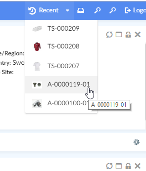
An example of such a menu is Recently Viewed objects.
Options
| Name | Description | Required | Example | ||
|---|---|---|---|---|---|
dynamicmenu |
Defines a menu as a dynamic menu |
true |
|
||
href |
Ajax endpoint to fetch JSON data for dynamic content |
true |
|
||
id |
Unique identifier for the dynamic menu. Can be used, for e.g. to get hold of the menu from JavaScript. |
false |
|
||
template |
Reference to Handlebars template to render content on client |
false* |
|
||
onActivate |
JavaScript callback to handle menu when activated. If defined, it’s this callbacks' responsibility to configure dynamic menu content.
|
false* |
|
A JavaScript API, App.Topbar.dynamicMenus.getById(menuId) can be used to get access to the dynamic menu.
| Dynamic menus are currently available only in Topbar. |
Example
<Menu xmlns="http://technia.com/TVC/Menu" xmlns:xsi="http://www.w3.org/2001/XMLSchema-instance"
xsi:schemaLocation="http://technia.com/TVC/Menu http://products.technia.com/tvc/schema/latest/Menu.xsd">
<Label>recent.title</Label>
<Setting name="dynamicmenu" value="true" />
<Setting name="id" value="recent-objects" />
<Setting name="template" value="helium/templates/recentobject/recentobjectcommand" />
<Setting name="onClick" value="App.routing.open" />
<Setting name="onActivate" value="App.RecentObjects.render" />
<Setting name="href" value="tvc-action/heliumDataTable?config=tvc:tableconfig:helium:recentobject/RecentlyViewed.xml&reload=true&bindKey=foo" />
</Menu>Recently Viewed objects
"Recently Viewed" objects is a built-in dynamic menu which when configured shows a list of objects that the user has recently visited. The built-in menu uses TableConfig for defining and retrieving its data and a handlebars template to display the data. Both of them can be overridden if needed, for e.g. to fetch and display information in a different way.

To enable it, add following in the Topbar definition in Helium.xml.
...
<TopBar>
<Right>
<Menu>tvc:menu:helium:recentobject/RecentlyViewed.xml</Menu>
</Right>
</TopBar>
...| Looking to configure recent objects in a widget instead? See Recent Object Widget Configuration for more information. |
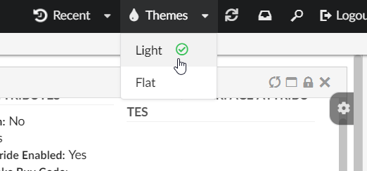
Themes
"Themes" is a built-in dynamic menu which when configured gives user capability to switch between themes in real time. The built-in menu uses tvc.helium.themes property for retrieving the list of themes. Default value of this property is flat and light as tvc.helium.themes=flat|light.

To enable it, add following in the Topbar definition in Helium.xml.
...
<TopBar>
<Right>
<Menu>tvc:menu:helium:theme/ChangeTheme.xml</Menu>
</Right>
</TopBar>
...TopBar example
<TopBar>
<ShowAppName>true</ShowAppName>
<Left>
<Separator />
<Menu>tvc:menu:helium/MyDashboards.xml</Menu>
<Command>tvc:command:helium/ResetDashboards.xml</Command>
<Command>tvc:command:helium/Create.xml</Command>
</Left>
<Right>
<Myspace />
<User />
<Search />
<Logout />
</Right>
</TopBar>1.1.3. PageMapping
The <PageMapping> element controls which type of objects should be mapped to which pages. It is possible
to control the page mapping based on object type, object state and which access role the user belongs to.
This is done by creating a tree of Page elements with different rules. Given the following example:
<PageMapping>
<!-- Evaluate the 'PartPage' if the type of the current object is a part
and the state of the object is 'Released' and the current user belongs
to the 'SeniorDesignEngineer' or 'ManufacturingDesignEngineer' roles,
otherwise try the next page. -->
<Page namespace="helium" name="PartPage.xml">
<Type is="type_Part" and="current == Released">
<Access>
<Role>role_SeniorDesignEngineer</Role>
<Role>role_ManufacturingDesignEngineer</Role>
</Access>
</Type>
</Page>
<!-- If the above rule evaluates to false and the current object is of the 'Part'
type, evaluate 'OtherPartPage.xml' -->
<Page namespace="helium" name="OtherPartPage.xml">
<Type is="type_Part" />
</Page>
<!-- If the type of the page is ECR, evaluate the 'ECR.xml' page -->
<Page namespace="helium" name="ECR.xml">
<Type is="type_ECR" />
</Page>
<!-- If none of the above are true, evaluate the DefaultPage.xml -->
<FallbackPage namespace="helium" name="DefaultPage.xml" />
</PageMapping>The framework will try to evaluate the different pages from top to bottom until one of the criteria is met. If no
criteria is met, the <FallbackPage> will be evaluated.
The <PageMapping> element supports the following child elements.
| Name | Description | Example |
|---|---|---|
Page |
Specifies the current Page to evaluate via the Only evaluate the page if the rules given via the child elements |
|
FallbackPage |
The page to fall back to if none of the above rules have been applied. Supports the |
|
1.2. Example
<?xml version="1.0" encoding="UTF-8"?>
<Application xmlns="http://technia.com/helium/Application">
<Name>ACME</Name>
<LoginPage>
    <Path>/helium/login.jsp</Path>
    <Title>Login to Helium</Title>
    <FormTitle>Welcome to Helium</FormTitle>
    <FormSubTitle>Please enter your credentials</FormSubTitle>
</LoginPage>
<StartPage>
<Page namespace="helium">Page.xml</Page>
</StartPage>
<TopBar>
<ShowAppName>true</ShowAppName>
<Left>
<Separator />
<Menu>tvc:menu:helium/MyDashboards.xml</Menu>
<Command>tvc:command:helium/ResetDashboards.xml</Command>
<Command>tvc:command:helium/Create.xml</Command>
</Left>
<Right>
<Myspace />
<Search />
<Logout />
</Right>
</TopBar>
<PageMapping>
<Page namespace="helium" name="PartPage.xml">
<Type is="type_Part" and="current == Released">
<Access>
<Role>role_SeniorDesignEngineer</Role>
<Role>role_ManufacturingDesignEngineer</Role>
</Access>
</Type>
</Page>
<Page namespace="helium" name="PartPage.xml">
<Type is="type_Part" />
</Page>
<Page namespace="helium" name="ECO.xml">
<Type is="type_ECO" />
</Page>
<Page namespace="helium" name="ECR.xml">
<Type is="type_ECR" />
</Page>
<FallbackPage namespace="helium" name="DefaultPage.xml" />
</PageMapping>
<!--
<Sidepanel>
<Label>Collaboration</Label>
<OnInit>App.Collaboration.Panel.instance</OnInit>
</Sidepanel>
-->
</Application> TVC Helium 2024.3.0