 TVC Helium 2024.3.0
Dashboards
05 May 2016
1. Dashboard
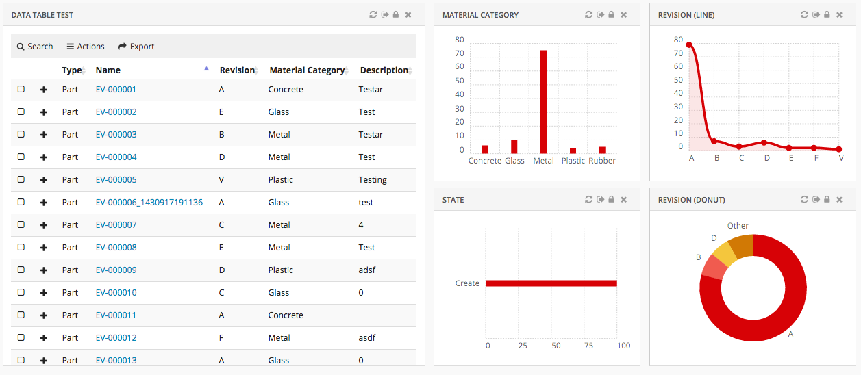
The main responsibility of the Dashboard is to hold references to different widgets.
Figure 1. Dashboard with multiple widgets
1.1. Configuration
The <Dashboard> element supports the following child elements.
| Name | Description | Example |
|---|---|---|
Locked |
Whether the dashboard should be locked or not. A locked dashboard can not be customized. Valid values |
|
DisableCustomization |
Dashboard customization can be disabled for dashboard. Valid values |
|
Floating |
Whether the dashboard should be floating to the top of the page or not. Valid values |
|
ResizableHandles |
Configure different options i.e any combination of comma seperated valid value, to enable resize widget from different positions like right, left, bottom, left bottom or right bottom. Valid values are
|
|
Widgets |
Specifies what Widgets this dashboard should contain. |
|
1.2. Dashboard Customization
A user can customize a dashboard by changing size and position of widgets.
Customization is enabled by default but can be turned off with a property:
tvc.helium.dashboard.customization.enabled=false
or by configuring a dashboard or widget as locked.
Customization actions
For customizable dashboards, a small UI element is automatically appended on the right hand side*, and it slides in to expand when the user focuses on the element. From this menu, the end user can create and manage multiple dashboard views via a sidepanel and easily reset any customization they have done on that particular dashboard view, or re-add a previously removed widget.
Reset Customizations:
There are two icons to reset the customizations done on dashboard
Reset to default dashboard: Enduser can replace the default dashboard with the dashboard shared by config-admin. And also, when enduser adds new widgets to default dashboard, a new dashboard configuration will be created in background and replaces the default dashboard. In order to reset back to the default dashboard, you can click this icon reset to default dashboard.
Reset widget positions in dashboard: Enduser can shuffle widget’s positions inside dashboard or hide the default widgets in the default dashboard. This icon can be used to reset to the configured dashboard view.
| Any XML based widgets removed from dashboard will be added back when reset widget positions icon is clicked. |
Widget Gallery:
In a dashboard there can be widgets which are not visible but can be added as per requirement. User can add hidden widgets back to dashboard using Widget Gallery command. This will open overlay window with hidden widgets in tile view. Multiple widgets can be selected at once and added to dashboard.
Hidden widgets can be grouped and can have custom image to display by defining WidgetGalleryGroup config in dashboard widgets.
<Dashboard>
	...
	<Widgets>
		...
		<Widget namespace="hex:engineering" name="FixedHeaderEBOM.xml">
			...
			<Hidden>true</Hidden>
			<FontIcon>ti-c ti-preferences-c</FontIcon>
			<WidgetGalleryGroup>
				<Name>Engineering</Name>
				<Image>sample.png</Image>
			</WidgetGalleryGroup>
		</Widget>
		...
	</Widgets>
</Dashboard>| The Widget Gallery does not support widgets created using the 'create widget' command in the UI. |
Image should be the complete image name with extension and should we included in resource directory path under the folder structure custom/images.
Resource directory path can be set using the global setting tvc.helium.resources.directory.path = /helium, The default value is /helium.
If WidgetGalleryGroup is not defined for a widget, it will be grouped under DEFAULT. If image is not defined preference will be given to FontIcon
and if FontIcon is not available image will be auto-selected based on type of widget.
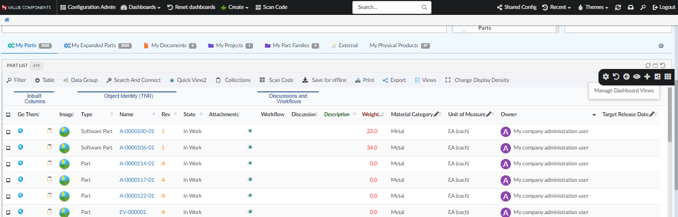
Figure 2. Customizable Dashboard, showing the customizations menu
Property tvc.helium.dashboard.customization.resetEnduserWidget is deprecated from 2022.4.0 release as the feature is separated into two different reset icons.
|
In empty dashboard, height of the dashboard is 0px. Due to this tooltip for the last command in slide-in Dashboard Menu blocks other commands. To avoid this and to set height for empty dashboard according to requirement, value can be defined in the property tvc.helium.dashboard.emptyDashboardHeight and its value will be set as height for empty dashboard. By default empty dashboard height is set to 750px.
In the property, only numerical value is to be given. Eg: if the required height is 800px then the property should be tvc.helium.dashboard.emptyDashboardHeight=800
|
(*) If the dashboard is presented in stacked mode, for instance if the user is on a mobile device in portrait mode, the menu is hidden. Customizations only apply to normal dashboard mode.
Dashboard Views
The end user can create and manage multiple dashboard views within a single dashboard, allowing the user to create customized dashboards to better fit their workflow.
From the dashboard menu, the end user can open a sidepanel where it is possible to create and manage multiple dashboard views and easily copy, delete or reset any customization they have done on a dashboard view.
Customization maximum cap
If there are performance concerns, the max size of the customizations object can be controlled by the property:
tvc.core.customization.maxContentSize
default value: 100000 Characters
1.2.1. Widget
The <Widget> element references widget instance via the ref attribute. For example <Widget ref="tvc:widget:helium/MaterialCategoryWidget.xml"/>
It also specifies where an widget should be rendered on the dashboard and what size the widget should have.
For sizes and placements of widgets, keep in mind that TVC Helium is based on a so called grid system, where a dashboard is generally divided into 12 columns. A Widget that should cover the entire browser window width should therefore specify its width to 12, two widgets side-by-side should each specify 6, and so on.
Expand and collapse icon on every widgets can be configured by defining global property tvc.helium.widget.enableHeaderExpandCollapse=true in tvc.properties. For enabling widgets floating behavior after collapsing , conventional <Floating> in dashboard should be false.
An icon can be configured on widget header along with widget’s title using the <Fonticon> tag. It can be placed left/right of the widget’s title using <IconPosition>. If no icon position is specified, it will be placed towards right of the widget’s title.
Header actions menu can be configured for every widget to group all the icons placed on the right side of the widget header into a single icon. All the icons can be displayed on hovering over the hamburger icon. <EnableHeaderActionsMenu> tag can be used to group all right sided widget header icons into one icon or global property tvc.helium.widget.enableHeaderActionsMenu=true can be used in tvc.properties to set hamburger icon for all widgets. The default value is false.
Priority will be given to <EnableHeaderActionsMenu> set for individual widget. For example, if individual <EnableHeaderActionsMenu> is set to false explicitly when global setting is true, priority will be given to <EnableHeaderActionsMenu> and therefore header actions menu icon will not be visible. Also it is recommended to configure the icon only when widget’s width can contain all right sided icons on widget header. We are either displaying all the icons or no icons at all.
|
The <Widget> element supports the following child elements.
| Name | Description | Example | ||||||
|---|---|---|---|---|---|---|---|---|
Id |
The identifier of the widget. Should be unique.
|
|
||||||
Locked |
Whether the widget should be locked or not. A locked widget can not be customized. Valid values |
|
||||||
Width |
The width of the widget. Valid value: Positive integer between 1 and 12. It supports the following attributes:
|
|
||||||
Height |
The height of the widget. Valid value: Positive integer. It supports the following attributes:
|
|
||||||
X |
Specifies where on the X axis the widget should be placed. Valid value: Positive integer. |
|
||||||
Y |
Specifies where on the Y axis the widget should be placed. Valid value: Positive integer. |
|
||||||
Template |
Specifies which template the widget should be rendered with.
If omitted a default template will be used. Useful if you would like to design your own widget frame template with full path from project root, or render
a widget without a header. The latter is accomplished by setting the element text
to |
or |
||||||
Badge |
This element is used to render a small |
|
||||||
Collapsed |
This element is used to configure preconfigured collapse behavior for widget. Valid value are |
|
||||||
EnableHeaderActionsMenu |
This element is used to configure hamburger icon which collapsed right sided widget header icons into itself and displays on hover. Valid value are |
|
||||||
FontIcon |
This element is used to configure font icon for widget title. |
|
||||||
IconPosition |
This element is used to specify the position of the widget’s font icon. Valid values are |
|
1.3. Example
<?xml version="1.0" encoding="UTF-8"?>
<Dashboard xmlns="http://technia.com/helium/Dashboard">
    <Locked>false</Locked>
    <Floating>true</Floating>
    <Widgets>
        <Widget id="dt1" width="6" height="10" x="0" y="0" locked="false"
            badge="true" ref="tvc:widget:helium/TableWidget.xml" />

        <Widget ref="tvc:widget:helium/MaterialCategoryWidget.xml">
            <Id>materialcategory</Id>
            <Width minWidth="2" maxWidth="5">3</Width>
            <Height>5</Height>
            <X>6</X>
            <Y>0</Y>
            <Badge>true</Badge>
            <EnableHeaderActionsMenu>true</EnableHeaderActionsMenu>
            <FontIcon>ti-c ti-eye-c</FontIcon>
            <IconPosition>right</IconPosition>
        </Widget>

        <Widget ref="tvc:widget:helium/RevisionLineWidget.xml">
            <Id>revision-line</Id>
            <Width>3</Width>
            <Height minHeight="3" maxHeight="7">5</Height>
            <X>9</X>
            <Y>0</Y>
        </Widget>

        <Widget ref="tvc:widget:helium/StateWidget.xml">
            <Id>state</Id>
            <Width minWidth="2" maxWidth="5">3</Width>
            <Height minHeight="3" maxHeight="7">5</Height>
            <X>6</X>
            <Y>5</Y>
        </Widget>

        <Widget ref="tvc:widget:helium/RevisionDonutWidget.xml">
            <Id>revision-donut</Id>
            <Width>3</Width>
            <Height>5</Height>
            <X>9</X>
            <Y>5</Y>
        </Widget>
    </Widgets>
</Dashboard>
1.4. Widget Customization
Just like for dashboards, an end user can do certain customizations on widget level. Exact customizations available will depend on the type of widget. For example, in a Table widget the end user can customize the pagination size, column visibilities, etc.
Customization on widget level is enabled by default, for dashboards where customization is enabled.
Customization actions
For the normal widget template, a Reset icon is available in the widget header. The user can reset widget level customizations from there. If you use your custom widget template, you can still use the JavaScript API .resetCustomizations(). After deleting a widget customization, the widget will refresh.
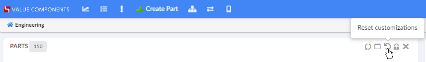
Figure 3. Resetting widget customizations
1.5. Open in Sidepanel
JavaScript API, App.page.sidepanel.openDashboard() can be used to open a dashboard in page’s sidepanel, e.g. App.page.sidepanel.openDashboard("tvc:dashboard:hex:engineering/PartInfoSidePanel.xml", "1.2.3.4");
This could be used for e.g. to quickly see contextual information about an object without navigating back and forth.

Figure 4. Dashboard in Sidepanel
1.6. Load Related Widgets
JavaScript API, .updateWidgets() is added to Dashboard instance. This API can be used to reload related widgets within the dashboard with different context ids. If the widget is initially hidden, it’ll be made visible.
| You need to have access to the dashboard instance to invoke this method. If you instead have access to Widget instance, see this |
For an implementation example, refer PartDetailActions.xml Column and Menu definitions available as part of HEX distribution.

Figure 5. Load Related Widgets
1.7. Widget lock unlock icon
The lock unlock icons can be configured for two different scenarios as given below:
Widget lock and unlock icon reflecting the action available to user. For ex :
-
If widget is locked it would show unlock icon.
-
If widget is unlocked it would show lock icon.
This is the default behaviour.
Widget lock and unlock icon reflecting the current state of widget.For ex :
-
If widget is locked, show lock icon.
-
If widget is unlocked, show unlock icon.
This can be enabled globally as init param tvc.helium.widget.lock.showAlternateIcon = true