TVC Helium 2019.1.0 Release Information
01 March 2019
1. Dashboard
1.1. Customization actions
For customizable dashboards, a small UI element is now automatically appended on the right hand side*, and it slides in to expand when the user focuses on the element. From this menu, the end user can easily reset any customization they have done on that particular dashboard, or re-add a previously removed widget.

(*) If the dashboard is presented in stacked mode, for instance if the user is on a mobile device in portrait mode, the menu is hidden. Customizations only apply to normal dashboard mode.
2. Widget
2.1. Table like form template
The <TableTemplate> tag within <Layout> of Form.xml now enables to render form in a table-like, column based template view. For more information, see TableTemplate.

2.2. DataTable Paginated Setting
This setting is deprecated and will no longer be supported from Helium release 2019.1.0 onward. The pagination setting provided in table configuration will be used for enabling/ disabling pagination.
3. Forms
3.1. Create and Connect Behavior Change
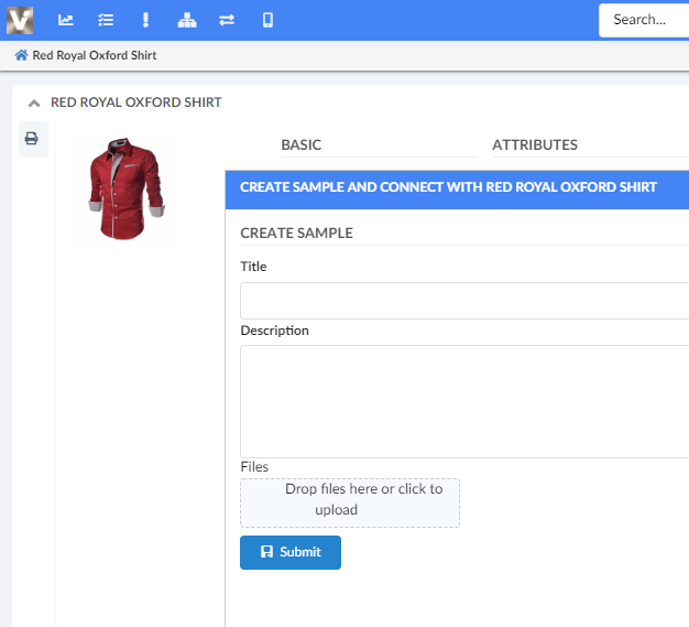
When using a form in Create and Connect mode, the new object will be connected to the object from where the Create and Connect modal window was initiated. The title of the object that will be connected to this new object is also shown in the Create and Connect modal.

3.2. JS API Improvement
Form JS API now contains setFieldRequired(field, required = true) method which accepts two input. One is alpaca form field and other is boolean value either true or false, by default this boolean value is true. This can be used to make the field mandatory depending upon boolean value.
Example: In form post render
formPostRender: function() {
	var form = this;
	var material = form.getFieldInstanceByDataIdentifier("attribute[Material Category].value");
	var weight = form.getFieldInstanceByDataIdentifier("attribute[Weight].value");
	material.on('change', function() {
		var materialValue = material.getValue();
		var isRequired = materialValue === 'Glass' || materialValue === 'Metal';
		form.setFieldRequired(weight, isRequired);
	});
}
4. Custom Service Worker support
Client side caching of TVC/ Helium resources using Service Worker technology was added in 2018.1.0 release. From this release it is now possible to add your own Service Worker to enable caching of your application resources. Here’s a tutorial on how to register and enable in your own environment.
There are API changes in SettingsProvider interface used for Service Worker registration. If you have previously extended this Interface, you might see a compilation error. Creating Settings Provider section in the tutorial should help resolve it.
|
| Service Workers are supported by all modern browsers. We highly recommend you enable Client Side Caching/ Service Workers to improve performance. Here’s a guide on how to enable. |
5. Collaboration
5.1. Link to Workflow for Helium
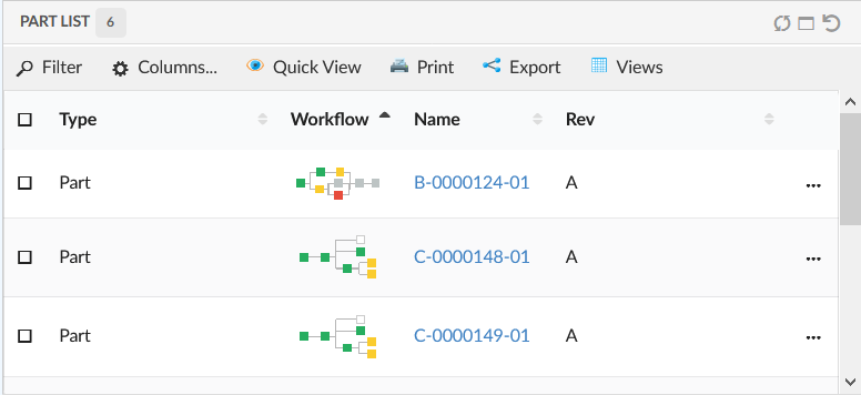
ColumnType "helium-workflow-chart" can be used in Helium table along with optional helium specific 'iconOnly' setting. For more information, see Workflow Chart Column.
	<Column>
		<Name>workflow-chart</Name>
		<Label>workflow-chart</Label>
		<ColumnType>helium-workflow-chart</ColumnType>
    </Column>
5.2. Collaboration’s Panel in Widget
Collaboration’s Panel component can be rendered inside Helium’s container component Widget using configuration.
<Widget xmlns="http://technia.com/helium/Widget">
	<Title>Collaboration</Title>
	<OnInit>App.Collaboration.Panel.load</OnInit>
	<OnInitOption name="key" value="value" />
</Widget>
6. New Search Experience
6.1. Search Panel
6.1.1. Quick Search Panel Open On Load
It is now possible to configure quick search panel to open on load. This can be done by using XML tag OpenOnLoad in search configuration. See Configuration Format for details.
 TVC Helium 2023.3.0