 TVC Helium 2022.1.0
TVC Helium 2021.3.0 Release Information
16 July 2021
2. Dashboard
2.1. Dashboard level customization setting
A user can customize a dashboard by changing the size, visibility, and position of widgets. Customization is enabled globally for all dashboards by default and
can be turned off with a property tvc.helium.dashboard.customization.enabled=false. Sometimes, It might be required where someone wants to disable customization
or some particular dashboard. Then DisableCustomization tag in the dashboard file can be used to achieve it. Read the Dashboard chapter for more details.
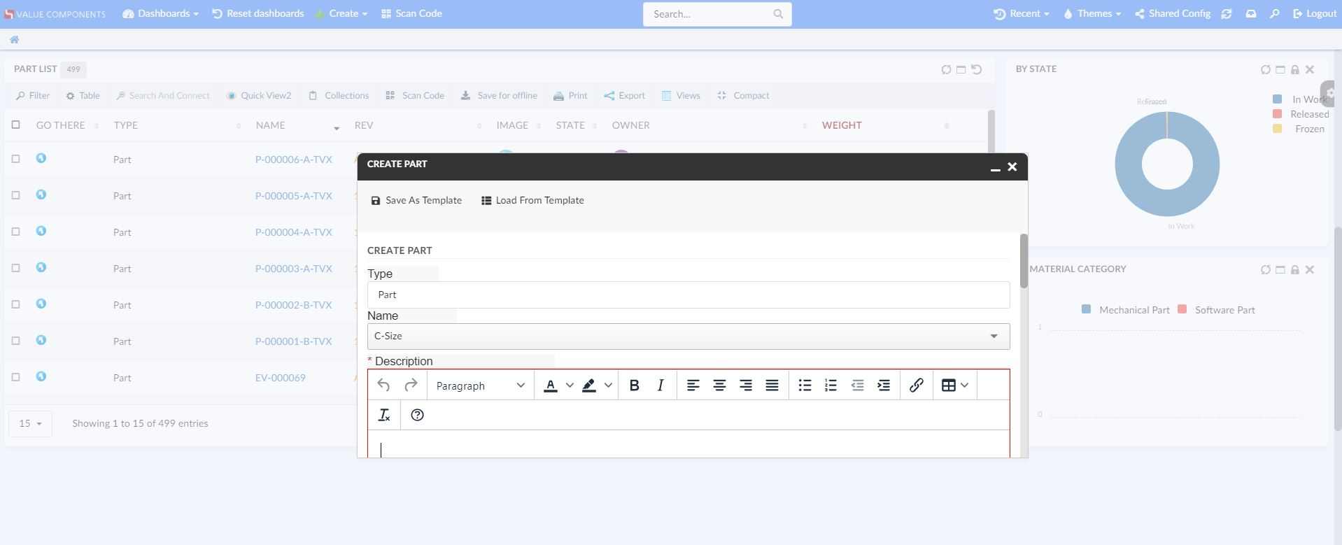
3. Form
3.1. Collapsible Sections
Helium forms do have features to group fields together by sections. A single form can have different sections. A user may be interested in one or a few sections and would like to see them expanded only at a time. This can be achievable in real-time now. A section can be collapsed or expanded by clicking on the section label.
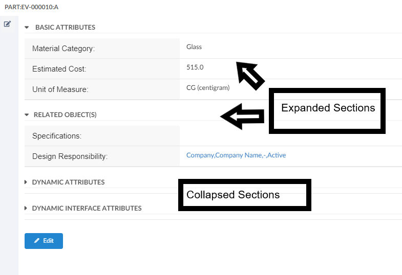
Figure 2. Collapsed/Expanded Sections
3.2. Hiding Toggle Edit Button
It may be a case where a form does not have any field editable because of access restrictions for logged-in users. In such a case showing the toggle edit button can be confusing as it will just show the field non-editable and hence toggle edit button will not be displayed in the form unless the user owns modify access to any of the fields.
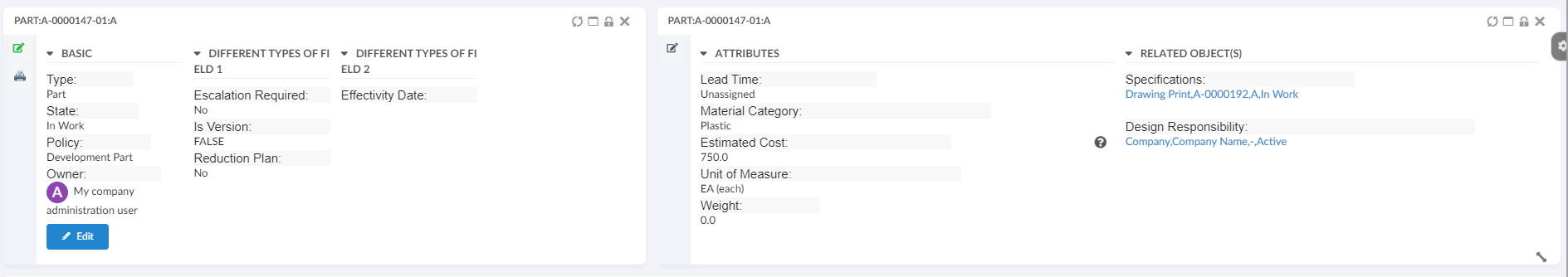
Figure 3. Hidden Edit Button - View Mode
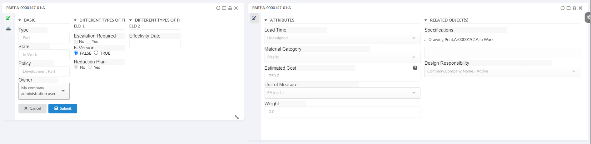
Figure 4. Hidden Submit Button - Edit Mode
This feature is by default enabled and can be disabled using the setting AlwaysShowEditButton in the form configuration as shown below. The default value is false.
<Form>
	...
	<AlwaysShowEditButton>true</AlwaysShowEditButton>
	...
</Form>
Read the Form chapter for more details.
4. Datatable
4.1. Table Column Resize
The user may need the ability to resize the table columns in real-time from the UI itself.
This can be enabled at individual table by adding configurable setting <ResizeColumns>true</ResizeColumns> in TableConfig.
Also it can be enabled at global level for all the tables by defining property tvc.helium.datatable.resizeColumns.enabled=true in tvc.properties. The default value is false. For more details, read Table Config chapter.
<TableConfig>
	<Title>Parts Table</Title>
	<ResizeColumns>true</ResizeColumns>
	<DataLoader>
		<DataSet namespace="hex:engineering:homepage">MyParts.xml</DataSet>
	</DataLoader>
	<Table namespace="hex:engineering:homepage">MyParts.xml</Table>
	<DisplayMode>flat</DisplayMode>
	<RowSelect>multi</RowSelect>
	<Pagination size="15" disabled="false" />
	<ClientSideProcessing enabled="true" threshold="10000" />
</TableConfig>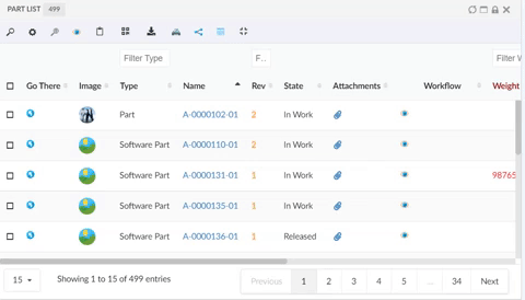
Figure 5. Column Resizing
4.2. Filtering with multi values
Filtering always is helpful when you have grouped structure data. It would be helpful for end-user to filtering data based on multiple queries. The query can be written with delimiters '|' / 'or' / 'Or' / 'OR' in between of each query.
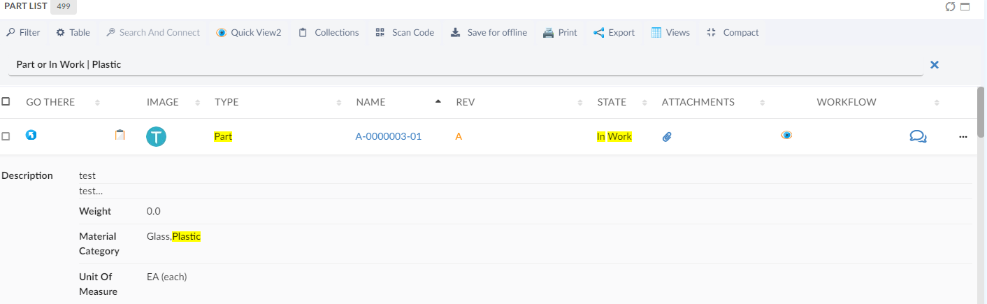
Figure 6. Fitering with multiple queries
4.3. Column Content Truncation
4.3.1. TruncateDirection
In some scenarios, the user may need the ability to truncate table column content in the desired direction. Now it is possible to control the truncate direction of table column content using the configurable setting TruncateDirection. This setting supports values right, left or center with default value as right.
<TruncateDirection>left</TruncateDirection>If truncate direction is center then user needs to provide additional setting LeftTextLength & RightTextLength.
<TruncateDirection>center</TruncateDirection>
<LeftTextLength>3</LeftTextLength>
<RightTextLength>3</RightTextLength>
4.3.2. Rows
Some time users enter long content in description row-wise using enter key and want to show only a few rows in column and the rest will be displayed in a tooltip. This can be achieved using the Rows tag.
<Rows>3</Rows><Column>
<Name>Desc</Name>
<Expression>description</Expression>
<Label>Description</Label>
<Description>Describes this object in detail</Description>
<Editable>true</Editable>
<RegisteredSuite>Framework</RegisteredSuite>
<InputType>textarea</InputType>
<SortType>string</SortType>
<NoWrap>false</NoWrap>
<TextLength>8</TextLength>
<Rows>3</Rows>
<TruncateDirection>left</TruncateDirection>
</Column>
Figure 7. Truncated column from left and allow only 3 row
Read the Table Column chapter for more details.
4.3.3. Add To Clipboard Column
The clipboard can be used to hold objects, selected by the user. Now we have provided a built-in clipboard column. The clipboard column has a simple UI with an icon and by clicking on the icon respective row object will be added to the clipboard. Clipboard column configuration is as follow :
    <Column>
		<Label>Add To Clipboard</Label>
		<ColumnType>helium-addToClipboard</ColumnType>
		<Alt>Add to Clipboard</Alt>
	</Column>
4.4. Invoke Service Toolbar
Like TVC Classic, we can also call the OOTB service directly from the client side. It will provide more flexibility and configuration support to give us the possibility to perform multi-selection and the chaining of the services. To call OOTB services, we need to predefine it in an XML configuration file. The services are then accessed from an ordinary service command, which contains the reference to the XML file that defines/configures the service.
Built-in javascript function App.dataTable.invokeServiceCall can be used to launch 3DExperience services, which can be configured using JSON config.
<ServiceCommand>
<Label>Unreserve Multiple</Label>
<Setting name="OnClick" value="App.invokeServiceCallbacks.invokeService" />
<Setting name="OnClickParams">{
"url":
"resources/v1/collabServices/reservation/op/unreserve?tenant=OnPremise&isMultiSel=0&select=physicalid",
"header":{"content-type": "application/json"},
"addSecurityContext": "false",
"method":"POST",
"body":{"urls": ["{{model//{{physicalid}}}}"]},
"macro":"true",
"macroElements":"physicalid",
"selectionCriteria": "multiple"
}</Setting>
</ServiceCommand>Read the Service Toolbar chapter for more details.
4.4.1. Input Based Service
For some more advanced 3dExperience services, it is required to capture user input in the form. For example, for the setPartNumber service user must provide the new part number as input to the service. We use helium forms to capture any such user input before calling the 3dExperience service.
Read more about how to use helium forms for user input in the Input Based Service chapter with more details.
5. 3DDashboard
5.1. Support for End User Configs in 3DDashboard Widget
The end-user definitions/configurations concept brings the idea of creating, editing, and sharing configurations using an in-built admin user interface. You can read more about it here Helium End User Definitions.
Helium True widget in 3DDashboard now supports accepted configs of Helium Dashboard and Helium Widgets. This functionality needs to be activated by setting tvc.3ddashboard.showEndUserConfigObjects property to true in TVC.properties or web.xml file.
-
User first needs to accept the shared configuration of Dashboard or Widgets in Helium.
-
User then can log in into the 3DDashboard portal and launch Helium True Widget.
-
In the Preferences section of Helium True Widget, when user selects appropriate 'Widget Type' such as Helium Dashboard or Helium Table or Helium Chart, they can see accepted configuration in list of Config as shown in below image.
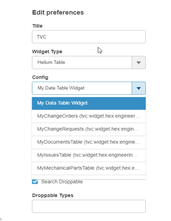
Figure 8. Accepted Shared Data Table widget in preferences
6. Toolbar
6.1. UIP Toolbar
UIP toolbar is a standalone UI component and it is being used in TVC classic currently for rendering menus, submenus and command. This is flexible in feature and support user customizations.
This can be enabled globally in helium now by configuring below property in tvc.properties :
tvc.helium.widget.toolbar.uipToolbar = true // default is false
At individual widget level UIP toolbar can be enabled by adding attribute showUipToolbar to Toolbar element like below:
<DataTable>
    ...
    <Toolbar  showUipToolbar="true">
    ...
</DataTable>|
This is released as an experimental feature and not all UIP toolbar features are supported in Helium. It will be improved and fully supported in upcoming releases. |
Figure 9. UIP Toolbar Enabled
7. User defined UI
End user definitions/configurations concept brings idea of creating, editing and sharing configurations using in-built admin user interface. These configurations can be used to create Helium Dashboards, Widgets, Tables, Charts, etc. Built-in Admin UI is provided to create, modify and share these configurations. Admin UI can be loaded in Helium standalone or in Helium widget in 3DDashboard. Through config chooser UI, user would be able to select and apply a configuration to his page, dashboard or widget. For detailed information, please refer End User Definition.
In this release, we have enhanced this feature further, by adding capability to revise and preview configurations.
7.1. Revise Configuration
Once a configuration is created, activated, and shared with end-users, they can start using it. It may be needed to modify these configurations since they are already in use, the admin cannot modify them directly. We have introduced the concept of revising configuration. Once revised, a new draft version of the configuration is created. Admin can work on this draft version and activate it once the draft is ready to be shared. On activation, this draft version of configuration will replace the prevision configuration and all users will see new configuration. And the previous revision will be auto-promoted to the obsolete state.
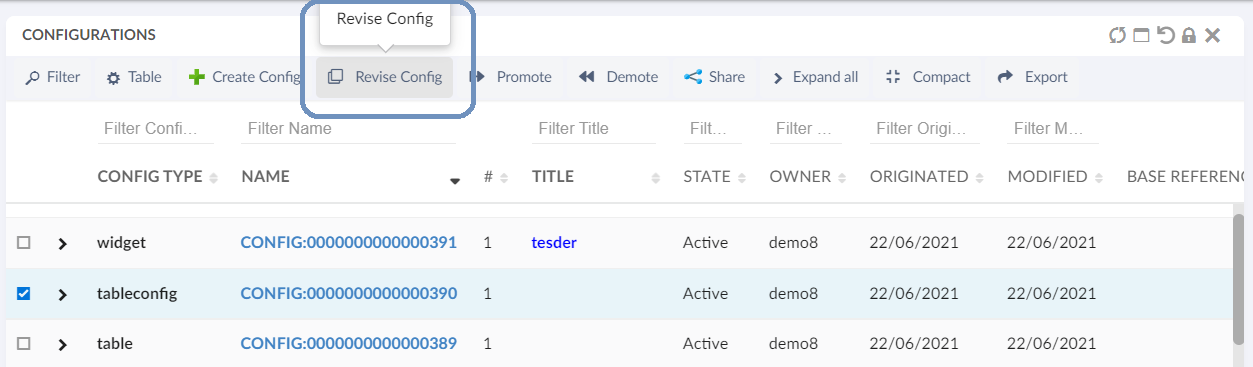
Figure 10. revise shared config
7.2. Preview Dashboard
Admin can build a new dashboard configuration for end-users, by adding new or existing widgets. However, before sharing, the admin can preview the dashboard configuration. This preview feature is available in admin UI.
| This preview feature is available only for dashbaord. |
7.3. Add Accepted Shared Widget
End users can extend any dashboard to create a personalized dashboard. In this dashboard, they can add a new widget. From this release, end users can also add any shared widget to the dashboard.
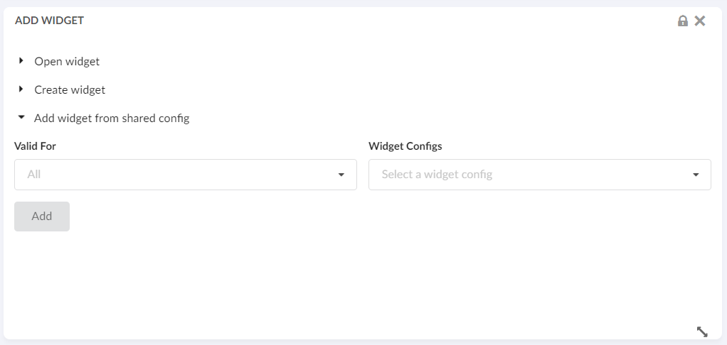
Figure 11. Add accepted shared widget
Using Add widget from shared config it is possible to add accepted shared widgets.
-
'Valid For' field: Lists all the business types from accepted shared widgets. Can be used to filter widgets.
-
'Widget Configs' field: Lists all accepted widgets based on 'Valid For' field selection
7.4. View Shared Dashboard
Previously config based dashboards can be used to replace an existing XML based dashboards. With this release, accepted shared dashboards can be accessed directly from a dynamic menu known as My Dashboard. Under Accepted shared config tab, add and remove dashboard command are introduced to manage My Dashboard menu. This dynamic menu can be added in topbar as shown below
In Helium.xml,
<?xml version="1.0" encoding="UTF-8"?>
<Application xmlns="http://technia.com/helium/Application">
   ...
    <TopBar>
      	...
      <Menu>tvc:menu:helium:myconfigdashboard/MyConfigDashboards.xml</Menu>
   	...
    </TopBar>
<Application/>
8. Search
8.1. User Defined Search Limit
In addition to static search limit configured in search config, it is now possible for end user to override search limit while doing the search. A new input field is added in the search form footer to support this. Initial value for text field is fetched from search config. In absence of Limit on search config, system default 100 is used.
<Limit>100</Limit>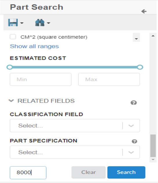
Figure 12. Search Limit on NSX.
9. File Manager
9.1. Firefox Extension Alert
Firefox does not allow the side loading of the web extensions which fails to auto install the file manager plugin.
To address this issue, We have enabled a feature to show an alert message in firefox so that user can add the plugin manually by clicking the url available on the message. If user does not want to install the filemanager web extension, user can continue with fallback HTML UI and in that case user needs to disable the alert message by clicking on the button which says Do not show this message again.
tvc.office.filemanager.extension.firefoxInstallAlert=true
Default value is set to false.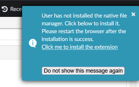
Figure 13. Filemanager extension alert for firefox.