 TVC Helium 2022.1.0
<Column>
	<Label>Go There</Label>
	<ColumnType>helium-go-there</ColumnType>
	<Setting name="widgetRef" value="tvc:widget:helium:cdm/CDMDocumentVersions.xml" />
</Column>TVC Helium 2021.2.0 Release Information
23 April 2021
Table of Contents
1. Datatable
1.1. CDM Document Details
3DExperience uses Common Document Model or CDM for maintaining versions of checked in files. In this release, a built-in column is provided to show CDM versions of a particular document object. This can be useful to downloand previous versions of file or to view the details like Reason for change.
This can be achieved by adding a column with configuration mentioned below:
Read CDM Document Details for more details.
1.2. Column type Version Actions
This columntype would be useful when we have table showing document versions data and we want to perform file actions like download, checkin, checkout etc. This can be configured as below :
<Column>
    <ColumnType>helium-versionActions</ColumnType>
    <Label>column.label.actions</Label>
</Column>
1.3. Column type Go There
It may be require that a user want in widget navigation. Now this can be achieved by adding a column with below configuration :
<Column>
	<Label>column.label.goThere</Label>
	<ColumnType>helium-go-there</ColumnType>
	<Setting name="widgetRef" value="tvc:widget:hex:engineering/EBOM.xml" />
</Column>
For example, user can see the EBOM structure of a part, documents object on the part, all the related version objects in same widget without navigating to any page. In case user wants to view the properties of the object in the same widget, the reference to properties widget can be passed in widgetRef setting.
1.4. Date Picker
Sometimes, it might be needed to add some validation, set default value or add some customization for date column calender. For examples setting some default value, disallowing selection of weekend, limiting the range of years, calendar start from Monday or some other days.
All these can be acheived by below date picker setting.
| Name | Description |
|---|---|
defaultDate |
The custom java script function which returns valid selectable date. This is the initial date to view when first opened. |
setDefaultDate |
Boolean (true/false). Make the defaultDate the initial selected value. |
disableWeekends |
Boolean(true/false). Disallow selection of Saturdays or Sundays. |
firstDay |
First day of the week (0: Sunday, 1: Monday, etc). |
yearRange |
Number of years either side (e.g. 10) or array of upper/lower range (e.g. [200,2030]). |
numberOfMonths |
Number of visible calendars. |
disableDayFn |
Callback function that gets passed a Date object for each day in view. Should return true to disable selection of that day. |
Example
<Column>
	<Name>ExpDate</Name>
	<Label>Expiration Date</Label>
	<Expression>attribute[Expiration Date]</Expression>
	<RegisteredSuite>Framework</RegisteredSuite>
	<Editable>TRUE</Editable>
	<InputType>datepicker</InputType>
	<SortType>date</SortType>
	<Setting name="options">{
		"datePicker":{
			"yearRange": [2000, 2030],
			"disableDayFn": "App.hex.disableDayFn",
			"firstDay": 2,
			"yearRange": [2000, 2030],
			"defaultDate": "App.hex.defaultDate",
			"setDefaultDate": true,
			"numberOfMonths": 2
		}
	}</Setting>
</Column>
Read more about it here Datepicker Settings.
2. Form
2.1. Form Templates
Many times users have to create similar parts or documents and it will be useful if users can create some kind of templates that has common field values. This will allow filling new form data without having to type everything from the beginning.
Example Scenario: To review a document, we may need to add multiple reviewers in the form. It is difficult to add all the reviewers again and again for similar documents creation. if we save the common field values of a document in one template and apply them on a new form makes the document creation easy.
Create Forms have built-in functionality for users to save templates of forms to be used for later.
As shown below, the form data can be saved as templates and load the saved data on the new form.
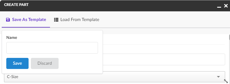
Figure 1. Save Form Templates
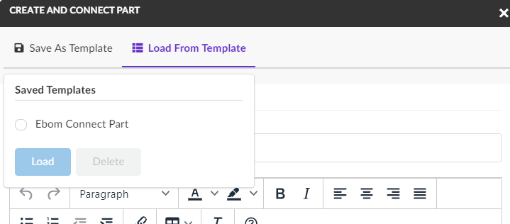
Figure 2. Load Form Templates
Please note that the templates that are saved on one form can only be loaded on the same form type. Templates are saved for user.
Templates can be enabled/disabled on individual forms using a configuration:
<Form>

    <AllowTemplates>true</AllowTemplates>

</Form>| Templates are currently available on forms in Create mode. |
Read Form Templates for more details.
3. Dashboard
3.1. Reset Dashboard Customization
At present user can add new widgets, resize the existing widget in a dashboard, these customizations are peristed at user level. By default on reseting the customization dashboard is restored to original configuration and all customization related to size, reorder or position are reset. However Any new widget added is still retained. Howerver sometimes users may want to remove dynamically added widgets on reset. This can be enabled with a property
tvc.helium.dashboard.customization.resetEnduserWidget=true
Once enabled, reset will remove all end user defined widgets from the dashboard.
3.2. Shared Loader for chart widgets
It is possible to have different charts on dashboard which have same loader. For Exmaple "MY Owned Parts" there can two charts one based on state and other on type. In that case it might be desired to configure the shared dataloader at dashboard level. This will improve the performance optimazation as data will be loaded once. The DataLoader element in dashboard enables one shared dataloader among several widgets in dashboard to retrieve the business objects or connections. This can be achieved by adding a DataLoader in dashboard config as mentioned below:
<Dashboard>
	...
	<DataLoader>
		<DataSet>tvc:dataset:hex/DatasetExample.xml</DataSet>
	</DataLoader>
	...
</Dashboard>|
One can still override the dashboard dataloader element with specific widget dataloader. This feature is available for chart widgets only for now. |
4. End user
4.1. End User Customization
4.1.1. Create widgets
By default create widget form opens at the top of the corresponding dashboard and newly created widget is also added at top which will disturb the current dashboard layout. Now this create widget form can be open at the bottom by using the key tvc.helium.enduser.createWidget.placeHolder.bottomPosition in tvc.properties and add newly created widget at the same place. This will not current disturb dashboard layout. The default value for this property is false.
5. 3DDashboard True Widget
5.1. Preconfigured json URL
Preconfigured json URL can be used to create app with specific preferenes. This app can be "My Parts", "My Documents" etc. and end user can use this app to directly add widget without setting preferences. For this user would need to use json file as below
{
	"title": "Preconfigured-UPS",
	"path": "/goto/p",
	"parameters": "tvc:page:ups:helium:18x/UPS.xml",
	"custom": "true"
}
Read more about it here True Widget in 3DDashboard.