Structure Browser - Administration Guide : Configuring Tables
21 March 2016
1. Tables
This section describes available configuration possibilities when you create your own tables and/or modify existing tables in order to configure how the Structure Browser displays information.

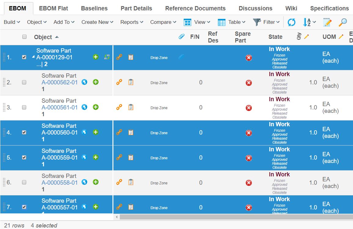
1.1. Selected Row Counter
The selected row counter gives the user the count of the number of objects that have been selected. This features is applicable for all tables.
1.2. Column Parameters
Tables consist of column definitions. Each column has a number of configurable parameters, which are described in the following table.
| Parameter | Description | Accepted Values/Examples |
|---|---|---|
Access |
The access tab can be used to assign which persons, roles, and groups who should have access to a specific column. The default value is "All", which means that all users will have access to the column. Note that if no explicit access has been defined on the column, the system assumes that all users should have access. |
Persons, roles, and groups. |
Alt |
This field defines a tooltip text that will be available when the column’s values are displayed as hyperlinks. The value can be either plain text or a string resource ID. Note that using a string resource ID requires that the "Registered Suite" setting have been defined. |
|
Applies To |
This property defines whether the expression applies to business objects or relationships. |
Business Objects Relationships |
Expression |
The select expression that should be used to retrieve the data that will be displayed in the column. Note that the "Applies To" parameter defines whether the expression applies to business objects or relationships. This parameter accepts select expression macros. See Using Select Expression Macros for more information. |
name
|
Heading |
This field defines the column heading. The value can be either plain text or a string resource ID. Note that using a string resource ID requires that the "Registered Suite" setting have been defined. |
Name Rev emxFramework.Basic.Name emxFramework.Basic.Revision |
Href |
This field defines which URL to request when the column’s values are displayed as hyperlinks. Note that the objected parameter is added to the URL by default and its value is the business object ID for the current row. Use the setting "Alternate OID expression" to configure which business object ID to send with the parameter. Also, note that directory macros are supported on this parameter. See Using Directory Macros for more information. |
EmxTree.jsp
|
Name |
The name of the column definition. |
Name Rev |
Settings |
Additional settings that can be used to configure the behaviour of the column. See Column Settings for more information. |
- |
1.3. Column Settings
Every column within a table can contain an arbitrary number of settings. Settings are made up of name-value pairs. The following table describes the settings that are recognized by the Structure Browser.
| Setting | Description | Accepted Values/Examples | ||||
|---|---|---|---|---|---|---|
Access Mask Access Expression Access Function Access Program |
These settings can be used to control user access to a table column. See Controlling Access to UI Components for more information |
- |
||||
Admin Type |
Defines the kind of admin type the selected values represents. Supported values are
|
attribute_UnitOfMeasure |
||||
Allow Multiple Edit |
This setting can be used to control if the column will have the multiple update icon present in the header. |
True / False (Default) |
||||
Allow Show More |
This setting is used to display conversions for those attributes that has a dimension (Matrix 10.7 feature) associated when using column type dimension. |
True (Default) / False |
||||
Allowed In Charts |
This setting can be used to disallow using a column within the chart tool. |
True (Default) / False |
||||
Alternate OID Expression |
This setting can be used to control which object ID is sent with the objectId parameter when the column’s data is displayed as a hyperlink. It can also be used to define what related id to modify when column is editable. An attribute called usesBusinessObject has been added to element to control if the selected ids is relationship ids. Note, editing of related multi value attribute is not supported. The value for this setting should be a valid select expression that returns object-ids. |
|
||||
Alternate OID Expression Uses Business Object |
This setting can used in combination with Alternate OID Expression to control if the selected ids is relationship ids when column is editable The value for setting is true or false. Default is true |
|
||||
Alternate Type expression |
This setting can be used to control which type icon is displayed in a
column when the The value for this setting should be a valid select expression that returns type names. |
|
||||
Alternate Policy expression |
This setting can be used to localize the related state configured through expression. The value for this setting should be a valid select expression that returns policy. |
|
||||
Always Visible |
This setting is used to disallow hiding the column. |
True / False (Default) |
||||
Auto Complete Handler |
This setting is used to define which autocomplete handler to use. This setting requires the column type to be set to autocomplete. See more details in the Autocomplete chapter for built-in column Data Handlers and Cell Renderers. |
|
||||
Auto Complete Settings |
Settings for autocomplete handler. See autocomplete chapter in TVC Core Admin guide for more details. |
|
||||
Calculate Average |
This setting can be used to calculate the average value of the cells within the column. |
True / False (Default) |
||||
Calculate Maximum |
This setting can be used to calculate the minimum value among the cells within the column. |
True / False (Default) |
||||
Calculate Median |
This setting can be used to calculate the median value of the cells within the column. |
True / False (Default) |
||||
Calculate Minimum |
This setting can be used to calculate the minimum value among the cells within the column. |
True / False (Default) |
||||
Calculate Standard Deviation |
This setting can be used to calculate the standard deviation of the cells within the column. |
True / False (Default) |
||||
Calculate Sum |
This setting can be used to calculate the sum of the cells within the column. |
True / False (Default) |
||||
Calculation Decimal Precision |
Default number of decimals when rounding results calculated within tables. This setting can be used to override the default setting from the AEF system properties. A negative value will force using the default AEF setting. |
An integer value |
||||
Card ID |
Defines the id of the card opened inside the side panel. If this value equals to "new" or is left unspecified, the side panel will always load a new card. See this chapter for more information regarding the side panel. |
new |
||||
Card Title |
Defines the title of the card opened inside the side panel. If this value equals to "auto" or is left unspecified, the title of the side panel is taken from the "title" of the loaded page inside the card. See this chapter for more information regarding the side panel. |
auto |
||||
Card Load Script |
This setting can contain a Java Script, which is launched each time the card is loaded. See this chapter for more information regarding the side panel. |
pageLoad() |
||||
Card Reloadable |
Defines if the card should be reloaded each time it is displayed, or if to launch the "Card Load Script" upon repeatedly loads. See this chapter for more information regarding the side panel. |
True / False |
||||
Card Width |
Defines the width of the side panel, when displaying the specified resource. See this chapter for more information regarding the side panel. |
250 |
||||
Cell Editable Expression |
This setting can be used to define an expression used to control edit access to a particular cell. See this chapter for more information. |
current == "Create" |
||||
Cell Showable Expression |
This setting can be used to define an expression used to control show access to a particular cell. See this chapter for more information. |
context.user.isassigned[A Role] |
||||
Cell Renderer Class |
Defines the class that responsible for rendering
the content of the cell. The value must be a fully qualified class name
of a class that inherits from
|
|
||||
Check From Access |
Whether to check modify access on the from-side of a relationship when rendering a cell in edit mode. If the value is true and the current user has modify-access on the from-side of the relationship the cell will be rendered as a form input field. |
True (Default) / False |
||||
Check To Access |
Whether to check modify access on the to-side of a relationship when rendering a cell in edit mode. If the value is true and the current user has modify-access on the to-side of the relationship the cell will be rendered as a form input field. |
True / False (Default) |
||||
Classification Attribute |
It is used along with the editable setting for the interface attribute column. When the interface attribute is used for expression and its default value is blank then this setting is required to be true to make the column editable. |
True / False (Default) |
||||
Column Function |
This setting is used to render the cell at client side using defined function in value. Defined function will be executed with two arguments. one is JSON object which is containing cell values and another is cell HTML element. |
|||||
Column Icon |
This setting defines which image file to use when the "Column Type" setting is an icon. The value of this setting should be a relative path to an image file originating from the "common" directory. |
|
||||
Column Type |
This setting defines what type of column a particular column is. Accepted values are program, programHTMLOutput, checkbox, image and icon.
|
|
||||
Column Width |
This setting defines the width of the column header. However, the width might be changed dynamically, depending on the width of the content within any cells in this column. |
Any integer value greater than zero |
||||
Columns |
This setting applies to the input elements of type "textbox" and "textarea" when a column is rendered in edit mode. The value should be an integer defining the width of the input element. |
Any integer value greater than zero. |
||||
Data Handler Class |
This setting defines a custom data handler for a particular column.
|
The value must point to a Java class available in the classpath, which
implements the interface
|
||||
Decimal Format |
This setting defines a custom decimal format to use for the display values of numerical cells. See The optional init-param |
A string value pattern conforming to the java.text.DecimalFormat syntax Example: |
||||
Decimal Format Scale |
Scales a numerical cell value equal to (value * 10n) where n is the configured value. The scale will only apply if Decimal Format is present. |
Example (millions): -6 |
||||
Delimiter |
Defines a custom delimiter used for multi value attributes. |
| (Default) |
||||
Description |
Defines a description for the column. The description appears as a tooltip when the mouse is over the column header. |
|||||
Display Format |
Defines behaviour when the "Format" setting is set to user. |
|
||||
Display Separator |
Defines the separator that will appear when multiple values are rendered inside one cell. This is only applicable for the HTML view of the table, and will not affect an export or printer friendly view. |
Default value is the |
||||
Editable Editable Mask Editable Expression Editable Function Editable Program |
These settings can be used to control whether a user should have access to edit a column or not. Note that the user must have modify access on the business object on a particular row in the table to actually be able to edit the value of the cell. |
- |
||||
Excel Data Format |
Defines the format of the value when exported into Excel (Native) |
0.00 |
||||
Exclude From Report |
This setting defines if the column should appear in reports / exports of the table. |
True (default) / False |
||||
Finder |
Defines if the column should be searchable in the finder search form. |
True / False (default) |
||||
Finder Label |
Displayed in the search form to identify the search field. If omitted the label of the column is used. |
|||||
Finder Order |
A number value used to define in what order to display the fields in the search form. The column with the lowest order number is displayed first. |
Any integer value. |
||||
Finder Tooltip |
Additional information displayed when mouse cursor is hovering the search field. The tooltip also supports localization using string resources. |
|||||
Finder Type |
Defines the type of search field to use. |
|
||||
Fixed |
This setting can be used to lock a column to the left side in the table when scrolling horizontally. |
True – The column will be fixed (if all columns to the left of the column also have "Fixed" to true). False – The column will not be fixed. This is the default. |
||||
Format |
This setting can be used to override the default data type of the values in a column. It will affect how the values are displayed, sorted and edited. This is particularly useful when you have an attribute whose data type is a string but it actually contains something else, e.g., integers, dates. For instance, the data type of the attribute "Find Number" on an "EBOM" relationship is a string but usually you want the system to treat the values as integers. |
|
||||
Format For Edit |
This setting defines if the new value in column should be formatted before updating. This could be useful when OOTB JPO is used for updating column value. This allows user to control whether to format the new value or not. |
|
||||
Function |
The name of the method that will be invoked on the JPO defined by the "program" setting. |
getSomething |
||||
Groupable |
Defines if the column is groupable. By default, the groupable value is the same as the setting "Allowed In Charts" |
|
||||
Group Header |
Defines a group header for the column. Typically, a group header is used to group several columns together, with a common label. The setting need to be defined on all columns that are part of the group. The value can refer to a value from a string resource file, if the Registered Suite setting is defined. |
A string |
||||
Group Header Is HTML |
Defines if the group header is in HTML format. |
True / False (default). |
||||
Header Rotation Angle |
An integer specifying the rotation in degrees for the header.
Note that Header text will be shown in Tooltip in case of rotated header,
except when the |
An integer, default is 0. |
||||
Rotated Header Font |
The font to be used for rotated headers. The value should be a value acceptable by the
|
|
||||
Header No Wrap |
This setting defines whether or not the header text for a column may wrap or not. |
|
||||
Header No Wrap on Print |
This setting defines whether or not the header text for a column may wrap or not when the table page is generated in PDF. |
|
||||
Header No Wrap on Export |
This setting defines whether or not the table header text for a column may wrap or not when the table is exported to Excel.
|
|
||||
Hidden |
Whether a column should be hidden or not. |
|
||||
Icon Class |
Specifies the font icon to use by defining its CSS class(es). The setting "Column Type" must be set to "icon". Font Awesome is included by default. |
fa fa-tags |
||||
In Cell Edit |
If cells in the column can be edited using in-cell-edit |
|
||||
Input Type |
This setting defines the type of input element that will be rendered for a column in edit mode. The default value for this setting depends on what type of value is displayed. If the column has range values the default type will be "combobox", or when the expression of the column returns the value of a multiline attribute the default type will be "textarea", otherwise the default type is "textbox". |
|
||||
Link Type Icon |
Whether to add icons on links to business objects (i.e. when the mxLink is used). |
True (default) / False |
||||
Locked |
This setting defines if the column is "locked" in the table; e.g. if the user can re-arrange it or not.
|
True / False (Default) |
||||
Match Range On Object ID |
This setting can be used to specify that the range value should be matched against the object-id associated with the cell. By default, the range value is matched against the value of the cell. |
True / False (Default) |
||||
Match Range On Relationship ID |
This setting can be used to specify that the range value should be matched against the relationship-id associated with the cell. By default, the range value is matched against the value of the cell. |
True / False (Default) |
||||
Navigation Column Enabled |
Used to disable the use of certain columns as navigation column. |
True (Default) / False |
||||
No Wrap |
This setting defines whether the column’s values will be wrapped or not.
|
|
||||
No Wrap on Print |
This setting defines whether the column’s values will be wrapped or not when the table page is generated in PDF.
|
|
||||
No Wrap on Export |
This setting defines whether the column’s values will be wrapped or not when the table page is exported to Excel.
|
|
||||
On Edit |
This setting defines the value which can be applied when the table column is in edit mode. Supported values are:
|
|
||||
parseHTMLContentToText |
This setting determines whether the exported table should have its values sanitized to plain text, removing any HTML tags if present. |
|
||||
Popup Modal |
This setting applies when the "Target Location" is "popup". |
|
||||
Preserve Output |
Whether to preserve the values retrieved from the database or not. Preserve in this case means that HTML sensitive characters will not be escaped when displayed in the table, e.g., when an attribute contains HTML markup that should be displayed as such. Note that if "Column Type" is set to "programHTMLOutput" this setting will not have any effect. |
|
||||
Printable |
Defines if the column should be present in the printer friendly format of the table |
|
||||
program |
The name of the JPO to invoke on a column which "Column Type" setting is "program", "programHTMLOutput", or "checkbox". |
SomeJPO |
||||
Range Handler Class |
The name of a class, which provides the column with range values. The
class must implement the interface |
|
||||
Range Function |
The name of the method to invoke on the JPO that is used to retrieve accepted range values for a column when editing. |
getSomething |
||||
Range Program |
The name of the JPO that is used to retrieve accepted range values for a column when editing. |
SomeJPO |
||||
Registered Suite |
This setting defines which application the column belongs to. The value
should be the name of an application as defined in the
This setting will cause the system to send the "suiteKey", "emxSuiteDirectory", and "StringResourceFileId" parameters in the URL when the column’s values are displayed as hyperlinks. Note that this setting is required for the system to know which string resource file to use when the Heading or Alt of a column has been specified as a string resource ID. |
|
||||
Render As Multi Value |
Controls how multi value attributes are rendered in edit mode. |
|
||||
Render As Row Action |
As of TVC 2012.1.0, it is possible to configure the Structure Browser to provide a row-actions menu holding common actions that applies to a row. This setting can be used to move a column that otherwise would have been displayed in a separate column into this menu. Note that all columns cannot be moved, there are some requirements. |
|
||||
Rows |
This setting applies to the input elements of type "textarea" when a column is rendered in edit mode. The value should be an integer defining the height of the input element. "Show More" icon depends on "Rows" and "Text Length" settings. See this chapter for more information regarding the Show More Icon. |
Any integer value greater than zero. |
||||
Searchable |
This setting can be used to disallow using the column within the structure search function. |
|
||||
Show Alternate Icon |
This setting can configure a column to show a different icon than the current row’s object icon. The "Alternate Type expression" setting must be defined in order for the system to know which icon to display. |
|
||||
Show Object Image |
This setting defines whether to show the current row’s business object image in the column or not. This setting will be ignored when "Show Alternate Icon" or "Show Type Icon" is defined. |
|
||||
Show Type Icon |
This setting defines whether to show the current row’s business object type icon or not. |
|
||||
Sortable |
This setting defines whether a column should be sortable or not. |
|
||||
Sort Comparator |
This setting defines a custom comparator to be used
when sorting the data within the column. The value is a fully qualified
class that implements the |
|
||||
Sort Direction |
This setting can be used to configure that a column should be sorted by default. |
|
||||
Sort Order |
This setting can be used to configure in which order a column sorted in when sorted by default. The value for this setting should be an integer value where a lower value gets a higher priority. The default value is 1. |
Any integer value. |
||||
Sort Type |
This setting defines how the values of a column should be sorted. |
|
||||
Style Header |
Apply custom style information to the table header.
|
Example:
|
||||
Style Cell |
Apply custom style information to a table cell. Javascript is applicable for dynamic cell styles. Call print to add style information. Available JavaScript variables:
|
Examples:
OR (dynamical) |
||||
Style Cell Value |
Apply custom style information to a table cell value. JavaScript is applicable for dynamic cell value styles. Call print to add style information. Available JavaScript variables:
|
Examples:
OR (dynamic) |
||||
Style Calculation |
Apply custom style information to a table calculation. JavaScript is applicable for dynamic table calculation styles. Call print to add style information. Available JavaScript variables:
|
Examples:
OR (dynamic) |
||||
Target Location |
This setting defines the target frame when the column’s values are displayed as hyperlinks. Common values are "content", "popup", and "tableHiddenFrame", but there are other frames as well depending on in what context the table is shown.
|
sidepanel |
||||
Text Align |
Defines how the text should align in the cell. If the cell represents numeric values, the values are automatically right aligned, unless overridden by this setting.
|
center |
||||
Text Length |
Defines the maximum number of characters to appear in the cell. If the number of characters in a cell text exceeds this value the text is truncated and a tooltip is used to display the full text. If the value is set to 0 (zero), the text will automatically truncate to a length that fits within the column. If the column is made wider the text will automatically truncate to a higher length or, if not needed, not at all. "Show More icon" depends on "Text Length" and "Rows" setting. See this chapter for more information regarding the Show More Icon.
|
An integer value |
||||
Translate |
Defines whether values should be localized or not.
|
|
||||
Truncate Direction |
Defines truncate direction on column, If the number of characters in a cell text exceeds this text Length .
|
|
||||
Update Function |
The name of the method to invoke on the JPO that is used to update the value of a row in the column while editing. |
updateSomething |
||||
Update Program |
The name of the JPO that is used to update the value of a row in the column while editing. See Update Column Values for more information. |
SomeJPO |
||||
Use Rule |
This setting defines if to handle access rights according to the rule assigned to the attribute for the column.
|
True / False (default) |
||||
Use Transaction On Edit |
Defines if an update transaction should be started that surrounds the modification of the cells value. |
True / False (default) |
||||
Visible |
This setting defines whether a column should be visible or not. The user is able to define his/her own set of visible columns.
|
|
||||
Visible In Edit Mode |
This setting defines whether a column should be visible in edit mode or not. |
|
||||
Visible In Flat Mode |
This setting defines whether a column should be visible in flat mode or not. |
|
||||
Visible In Read Mode |
This setting defines whether a column should be visible in read mode. |
|
||||
Visible In Structure Mode |
This setting defines whether a column should be visible in structure mode. |
|
||||
Window Height |
This setting applies when the "Target Location" is "popup" and defines the height of the popup window in pixels. The default value is 600. |
Any integer value greater than zero. |
||||
Window Width |
This setting applies when the "Target Location" is "popup" and defines the width of the popup window in pixels. The default value is 700. |
Any integer value greater than zero. |
||||
Publish |
This setting applies to publishing an event on the edit of the column. If the gadget has Subscribes to event, then that gadget will be automatically refreshed. |
Example: |
||||
Display Today’s Date |
This setting applies to the calendar whenever the user wishes to open a calendar with today’s date as the default. |
True / False (Default) |
||||
Draggable |
This setting applies to link column to make them draggable. This setting should be applicable in context of 3DDashboard only. |
|
1.4. Rotated Column Header
Column header rotation can now be achieved using pure CSS as opposed to the exisiting action call and generating an image. The rotated headers will render the column labels vertically. The existing method of generating rotated header using as an image can be achieved by using the below configuration in web.xml :-
<init-param>
    <param-name>tvc.structurebrowser.headerRotationLegacyMode</param-name>
    <param-value>true</param-value>
</init-param>
The default value for this setting is set to false.
1.4.1. Column Header Rotation
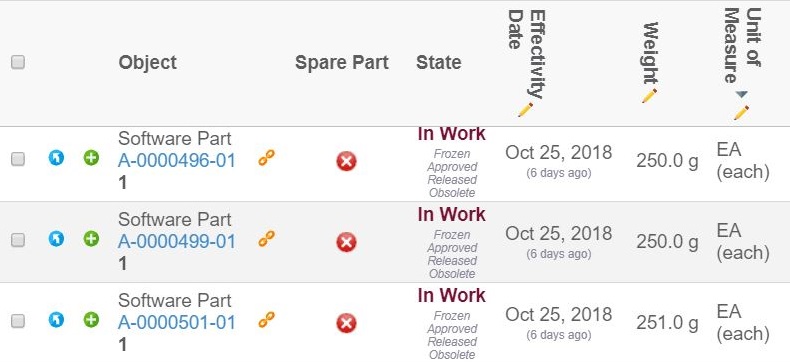
Users can rotate the column headers through the column context menu. The headers can be either vertical or horizontal. This feature requires the setting tvc.structurebrowser.headerRotationLegacyMode to be set to false. The user selection for column header orientation will be remembered for every table.
1.5. Show More Icon
To show many rows within one cell we truncate the cell value using Show More icon. On clicking the "Show More" icon all the values present in cell display as tooltip. Show More icon depends on "Rows" and "Text Length" setting. Default value of "Rows" is 3. This value can be override through global parameter as shown below.
<init-param>
  <param-name>tvc.structurebrowser.defaultMultiLineRows</param-name>
  <param-value>2</param-value>
</init-param>
Example:
Single Value
Single Value is the cell value having single object seperated by new line character. "Show More" icon for single value can be controlled through global parameter like below:
<init-param>
    <param-name>tvc.structurebrowser.splitMultilineValue</param-name>
    <param-value>true/false</param-value> (1)
</init-param>| 1 | Default is 'True' |
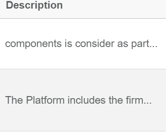
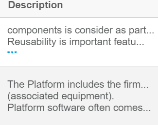
"Show More" indicator for single value can be enabled at column level using "Rows" and "Text Length" setting, as shown below and the show more icon for single line text can be enabled if the user can provide zero in the Rows tag.
Configuration
<Column>
    <Expression>description</Expression>
    <Rows>3</Rows>
    <TextLength>30</TextLength>
</Column>| Without Show More Icon | With Show More Icon |
|---|---|
|
|
Multiple Values
Multiple Values are the cell values having multiple object.
"Show More" icon for multiple values can be enabled at column level using "Rows" setting like below:
Configuration
<Column>
    <Expression>from[Multiple Objects].to.name</Expression>
    <Rows>3</Rows>
</Column>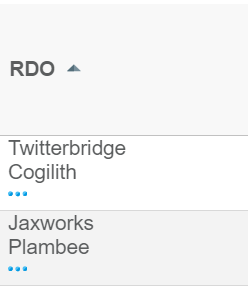
 TVC Classic - 2024.5.0