TVC 2019.4.0 Release Information
06 September 2019
Table of Contents
1. Core
1.1. Category Top Panel - Default Category
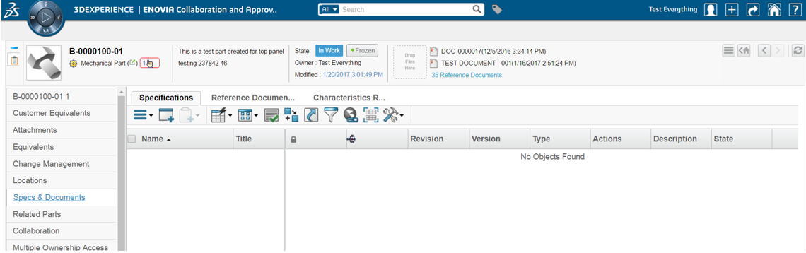
The out of the box category menu supports a setting Default Category controlling the command to execute when first landing on an object page of a certain type. As the Value Components category top panel implementation brings persistence to the last used category and is remembered over sessions, the behaviour is in conflict with how the out of the box 3dspace default category works.
To make the value components category behave more like out of the box the property tvc.core.categoryMenu.showDefaultCategory has been added to control if the Default Category should take precedence instead.
Note that if tvc.core.categoryMenu.showDefaultCategory is true along with tvc.core.gui.tabPage.rememberSelection then in this case it will first take precedence of 'Default Category' then it will remember the selected tab.
Figure 1. Default category Specs & Documents automatically loaded on object view
Read more here Default Category
1.2. Category Top Panel - Suite Specific
The out of the box allows defining separate category menus for a type based on registered suite defined in its suite/central property file, e.g. PMCtype_Project. As of this release the alternate category menus are also supported by value components and is enabled via the property tvc.core.categoryMenu.enableAlternateCategoryMenu set to true.
If enabled, the category top panel will first try to load the alternate category menu defined for the registered suite and type in suite/central property file. It further navigates the type hierarchy to find the alternate category menu defined for any of parent types. If an alternate category menu is not found, the default type category menu will be used.
Read more here Alternate Category
2. Structure Browser
2.1. New Search Experience
Since a few releases back there has been a new search experience available in Helium allowing you to configure search forms and result the way your users want it. It also supports making use of indexed data from different providers such as EXALEAD. The plan is to include full support to load the different classic value components with new search experience data throughout the application. As of this release the first step of adding new search experience for populating table data has been added.
To configure new search experience to load table data the searchBasedTable action has been added. In addition to the pageConfig parameter controlling the result table it also takes a searchConfig parameter to control the search form.
Note that the old search configuration format is similar but not compatible with the new search and new ones have to be implemented.
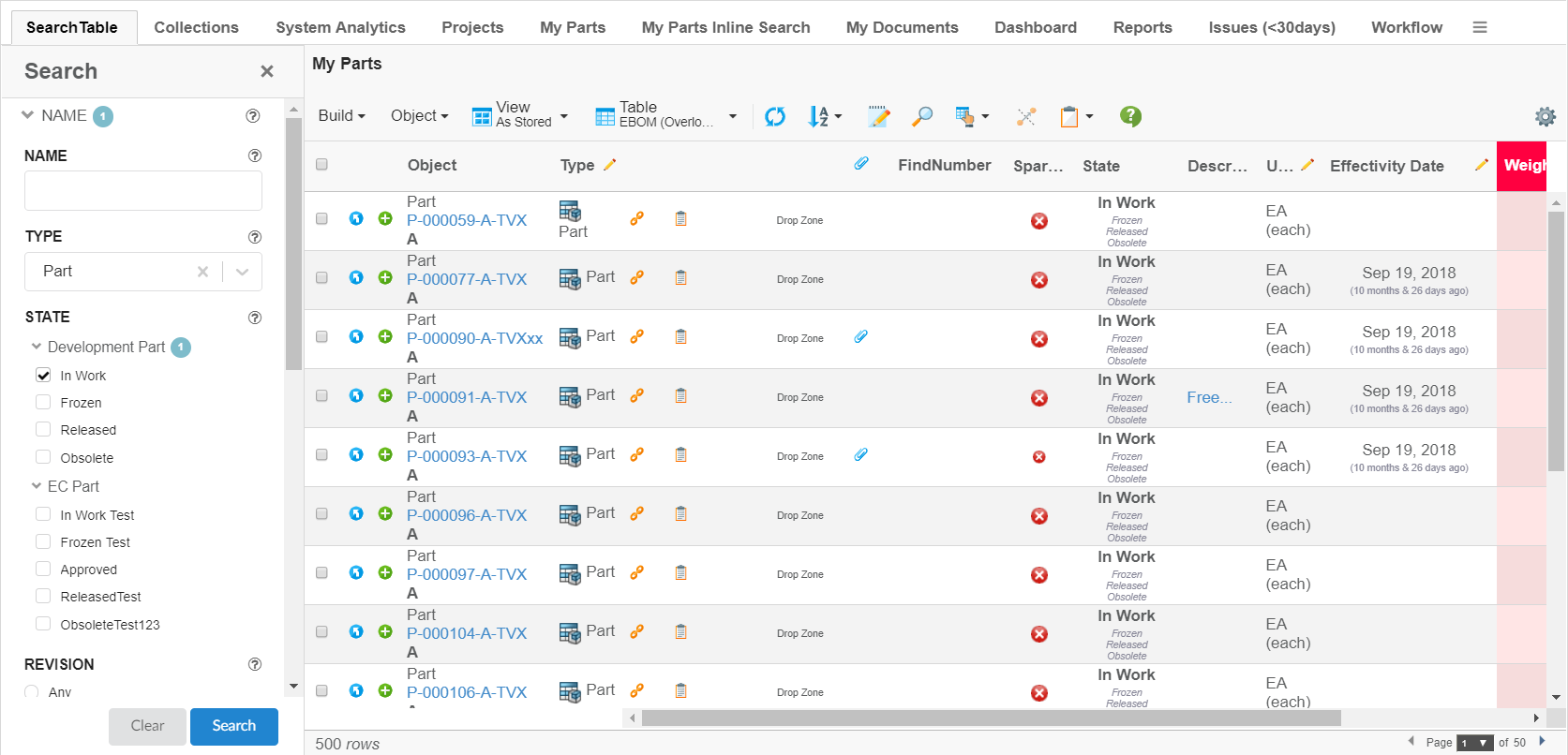
Figure 2. The new search experience input form is visible together with a result table allowing for search refinement without moving back and forward
For more details visit New Search Experience
3. UPS
3.1. 3DPlay in 3DDashboard
In a previous release we added good support for 3DPlay including cross highlighting for structures. Now we added a json configuration including 3DPlay support with the UPS 3DDashbaord configurations of MCAD Optimizer.
To distribute the 3DPlay widget with cross highlight support simply include webapps/tvc/widget/ups/18x/3dplay.json configuration file with the tvcWidget.
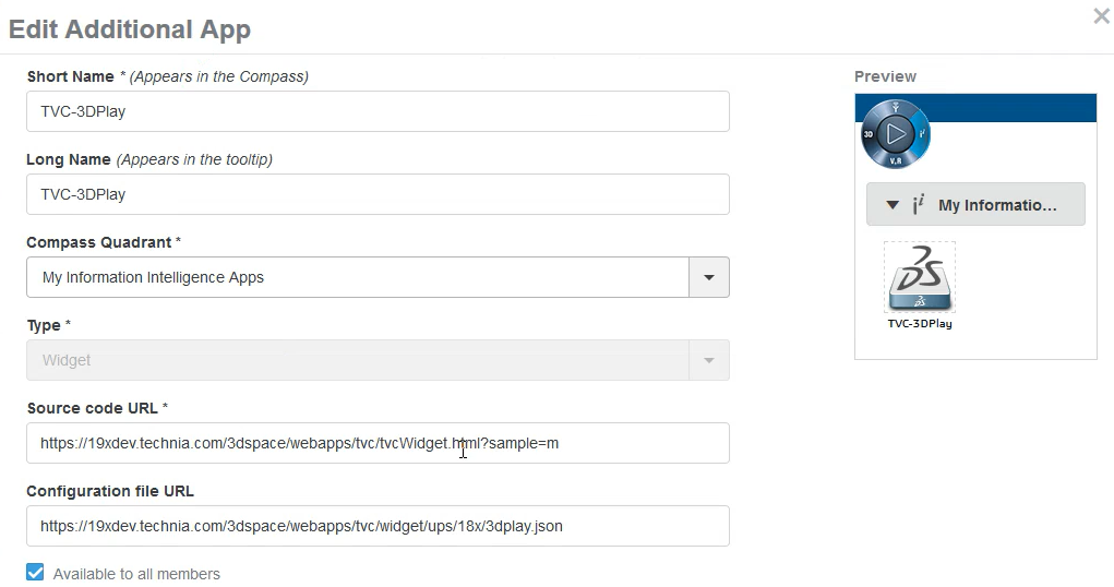
Figure 3. 3DPlay widget setup
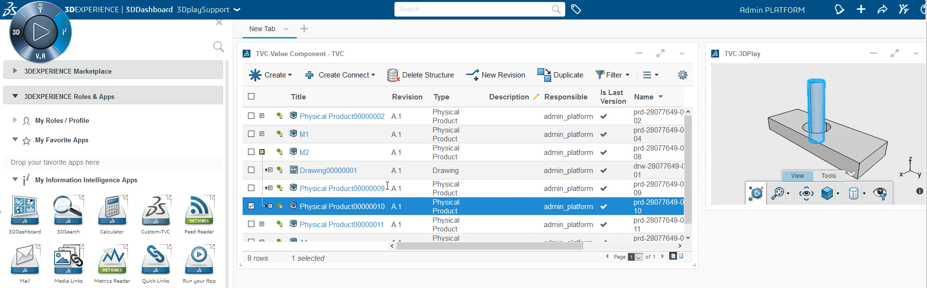
Figure 4. 3DPlay widget used to cross highlight its counterpart in MCAD Optimizer UPS navigator
4. Collaboration
4.1. Tab Persistence
To minimize the number of clicks the last visited collaboration panel tab and set (specific workflow or discussion) can be persisted. When using collaboration in widget mode for discussions or workflow specifically it should not be affected by what was last visited in the panel.
To enable persistence for collaboration panel only a new and default storage property memory has been added.
| Property Key | values | Description |
|---|---|---|
tvc.collaboration.panel.storage.preference |
memory(default) |
persist only for panel instance |
local |
persist until the user manually clears the browser cache or until your web app clears the data |
|
session |
persist until the window or tab is closed. |
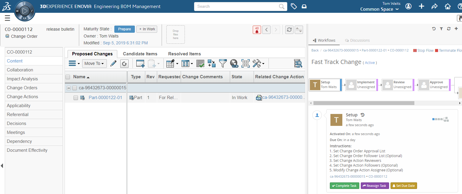
Figure 5. The workflow in the panel will be automatically loaded when viewing the object next time
Read more here
6. Workflow
6.1. One task per context object
A common scenario working with processes is to divide the work by the processed objects into separate tasks. E.g. if there are several documents to be worked one person could be assigned working with the first and another person cold work with the second.
To make separate tasks for each context object configurable the repeatable setting has been added to the task context configuration. If there are two objects matching the task context expression the task is simply split into two. If there a three it is split into three tasks etc. Instead of having one task with multiple context objects there would be multiple tasks with one context object each.
To allow splitting sequent tasks into parallel subprocesses the context configuration could be applied to a group.
Figure 6. The tasks Implement and Review has been split in groups by the number of configured context objects
Example repeatable context
    "contexts": [
        {
            "base": null,
            "id": "split-context-id",
            "context": "expression",
            "repeatable": true,
            "config": {
                "expressions": [
                   "from[Change Action].to.id"
                ]
            }
        }
        ...
    ]
Consider the following series of tasks
A - B - C - DExample 1 splitting B and C without group:
{
    "tasks": [
        {
            ...
            "id" : "B",
            "context": "split-context-id"
            ...
        },
        {
            ...
            "id" : "C",
            "context": "split-context-id"
            ...
        }
    ]
    ...
}
Example 1 result (for two context objects):
     - B1 -     - C1 -
A - |      | - |      | - D
     - B2 -     - C2 -
Example 2 splitting B and C as a group:
{
    "groups:" [
        {

         "base": null,
         "id": "group1",
         "tasks": [
            "B","C"
            ],
        "context": "split-context-id"
        }
    ],
    ...
}
Example 2 result (for two context objects):
     - B1 - C1 -
A - |           | - D
     - B2 - C2 -
Read more here Task Contexts
6.2. Automation Details
One of the key capabilities of the workflow component is to automate tedious tasks so that the user do not have to click so much (or in the right order). To communicate what automation to expect to the end user you had to write separate fields with this information. Maintaining these fields to match reality was hard and error prone.
To automatically display the automation for an operation descriptions can be added to triggers and the automationDetails field can be used to display it in its form.
Example of automationDetails field added to a task
    ...
    "fields": [
        "automationDetails",
        "instructions"
    ],
    ...
Example descriptions added to a trigger
    ...
    "id": "promote-co-inwork",
    "trigger": "promote",
    "descriptions": ["acme.promote.co.inWork"],
    "events": [
            "complete"
    ],
    ...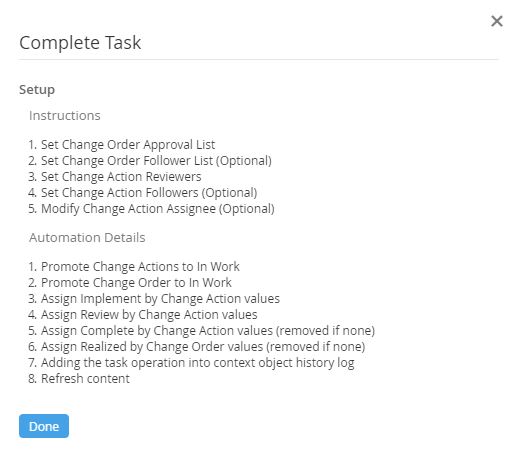
Figure 7. Example automation details explaining what will happen automatically in the background as user press complete
Read more here Automation Details