Structure Browser - Administration Guide : New Search Experience
06 September 2019
1. Introduction
The new search allow users a way to find objects of interest. With the new search, search can be configured within a page. Search side panel form allow users a way to easily find objects of interest and load search result into flat table. To launch new search you need to create a new command and add it to the Menu of your choice that is visible in your applications.
New Search supports usage of Search Providers This means that ENOVIA, EXALEAD or other data source can be used to find relevant information.
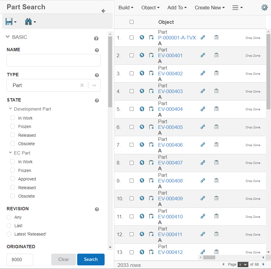
Figure 1. Search Based Table
1.1. Configuration
The new search is launched from command. The URL for new search command is shown below:
${ROOT_DIR}/tvc-action/searchBasedTable
This URL supports following parameters:
1.1.1. Parameters
| Parameter | Description | Example |
|---|---|---|
searchConfig |
Name of the search configuration. It is used to configure behaviour of the search. |
|
pageConfig |
Name of the page configuration. A page configuration is used to configure behaviour of the Structure Browser. |
|
1.1.2. Example Configuration
<Command>
    <Label>SearchBasedTable</Label>
    <URL action="searchBasedTable">
    <Param name="searchConfig" value ="tvc:searchv2:tvx:common/SearchV2Config.xml"/>
    <Param name="pageConfig" value="tvc:pageconfig:tvx:misc/MyParts.xml" />
    </URL>
</Command>
1.1.3. Configuration Format
The new search configuration files are placed inside the folder searchv2.
The root element of the configuration is <search> and the following child elements are supported:
| Name | Description | Example | ||||
|---|---|---|---|---|---|---|
Limit |
The maximum number of search results returned.
|
|
||||
upperSearchLimitValue |
The maximum number of search results allowed to be displayed.
|
|
||||
DataFields |
The data to include for the search result. For example, type, name, revision and current state. |
|
||||
SearchForm |
Search form which allows the user to further filter down the search result. See Search Form for more details. |
|
||||
SearchOnCriteriaUpdate |
Controls if the search is submitted when the search criteria is updated. For example, after the user has selected state "Released" in the search form or search for "00230" in the term field a search is submitted and the search result is displayed. This setting is useful when using indexing engine as search provider. The search is debounced to 1000ms. However, we can change this limit with 'searchDebounceMs' setting.
|
|
||||
searchDebounceMs |
When searchOnCriteriaUpdate is set to true, this setting is used to debounce the submit of search for specified number of milliseconds after the criteria have been updated. |
|
||||
Settings |
Additional settings for the search. These settings are accessible in |
|
||||
applyCriteriaWithoutField |
With this setting it will be possible to apply fields which are not present in the searchform. This setting will be useful when there are conditional fields like classification fields which are added on the searchform after search is performed. These conditional fields are not part of original searchform and will not get applied on save search unless this setting is set to true. Default value is false. |
|
||||
OpenOnLoad |
Controls if the search panel should be opened by default on load. Default value is false.
|
|
||||
retrieveFieldsOnCriteriaUpdate |
Defines whether conditional fields on searchform should be loaded without performing search.
|
|
1.1.4. Example Configuration
<Search provider="enovia">
	<Limit>500</Limit>
	<SearchOnCriteriaUpdate>true</SearchOnCriteriaUpdate>
	<OpenOnLoad>true</OpenOnLoad>
	<SearchForm name="tvc:searchformv2:tvx:search/SearchV2Form.xml" />
	<DataFields>
		<DataField>type</DataField>
		<DataField>name</DataField>
		<DataField>revision</DataField>
		<DataField>description</DataField>
		<DataField>modified</DataField>
		<DataField>primaryimage</DataField>
		<DataField>owner</DataField>
		<DataField>policy</DataField>
		<DataField>current</DataField>
		<DataField>attribute[Weight]</DataField>
	</DataFields>
	<Settings>
		<Setting name="termWhere"
			value="name ~~ '*%s*' OR description ~~ '*%s*'" />
	</Settings>
</Search>
1.2. Search Form
1.2.1. Form Configuration Format
The searchform configuration files are placed inside the folder searchformv2.
The root element of the configuration file is <SearchForm> and the following child elements are supported:
| Name | Description | Example |
|---|---|---|
Title |
Title of the search form. Displayed above the fields. |
|
Fields |
Available fields in the search form. See Field Configuration Format for details on how to configure each field. |
|
Toolbar |
Add toolbar in the search form. See Toolbar Configuration Format for details on how to configure each Toolbar. |
|
Sections |
Group fields into collapsible sections in the search form. See Section Configuration Format for details on how to configure a section. |
|
OnCreate |
Trigger executed when the search form has been created. Useful to manipulate the search form, e.g. updating field values or changing order of fields, before it’s sent to the client. Specify the Java class name containing the custom logic using the attribute com.technia.tvc.search.searchform.examples.SearchFormEvents |
|
1.2.2. Toolbar Configuration Format
Toolbar can be configured inline within a searchform.
Figure 3. SearchForm Toolbar
| Toolbar Command Name | Description | Example |
|---|---|---|
SaveSearch |
The in-built command will allow users to save search form criteria to be used again later on |
|
LoadSearch |
The in-built command will allow users to load the saved search or search directly by clicking on the search icon |
|
1.2.3. Field Configuration Format
Field can be configured inline within a searchform or it can be configured in a separate file. The field configuration files are placed inside the folder searchformfield. If configured in a separate file, it can be referred within searchform using attribute ref as below -
<Fields>
    <Field ref="tvc:searchformfield:acme:common/Name.xml"/>
    <Field ref="tvc:searchformfield:acme:common/Modified.xml"/>
</Fields>
The root element is <Field> and the following child elements are supported:
| Name | Description | Example |
|---|---|---|
Label |
The label for the field. I18n is supported through string resources file. |
|
RegisteredSuite |
Registered suite for label localization when string defined in Enovia string resource properties file. |
|
Required |
Specifies that a value is required for the field in order for the form to be valid. Alert toaster message will display only when user click on search button. Note: In case of "SearchOnCriteriaUpdate", search would be blocked but user would not be shown any alert message. |
|
Tooltip |
Tooltip for the field. Displayed when hovering the label. |
|
DataField |
The data to search among. The search provider might use this in different ways. See specific Search Providers for details about it. For example the ENOVIA Search Provider users standard statement as |
ENOVIA example: EXALEAD example: |
DataType |
Type of data to be searched. Valid values:
|
|
UIType |
Kind of user interface user presented to the user. For example, autocomplete, ranges and text. See UI Types for more details. |
|
Visible |
Defines visibility of field in search form. It allows configuration to make field visible or hidden based on selection on another field. By default field is visible. |
|
Values |
Values available for the field. For example, when ranges for an ENOVIA attribute is displayed each of the ranges is represented by one value. It also controls the default selected value. See Values for more details. |
Use ranges on attribute Material Category as values: Part is the default value: |
Settings |
Settings to further configure the field. Look at each UI Type for details on supported settings. |
Enabling the search box above the values when using |
casesensitive |
case sensitivity for the input value. Default value is false |
|
ConditionalFields |
Additional fields which should be added to search form based on value selected for this field. See Conditional Fields for details. |
|
The ENOVIA attribute can be specified on the <Field> element using the attribute attribute. This specifies that the field is searching in that specific attribute and sets sensible default values for the field, e.g. it picks <UIType>date</UIType> and sets <DataType>date</DataType> in case the attribute stores a date.
Example:
<Field attribute="attribute_MaterialCategory" />| Specifying the attribute is useful when searching for with for example EXALEAD. The attribute is used to get the correct UI Type etc. |
Values
Values are used for two purposes:
-
To define the values the user can search by
-
To define the value which is selected by default
There are a number of ways to control the available values:
-
Configure a predefined list of values, see below for configuration format
-
Specify an attribute using the attribute
attribute. Example:<Values attribute="attribute_MaterialCategory" />
-
Write a ValueProvider and configure it using the attribute
className, Example:<Values className="com.acme.MyValueProvider" />
Value Configuration Format
The <Values> and <Value> elements are used when configuring a predefined list or specifying default values for a field.
| Attribute Name | Description | Example |
|---|---|---|
value |
The value. It’s mandatory to specify it. |
|
label |
Text presented to the user. If none is provided the value is displayed. Label also supports localization. |
|
type |
Type of the value, if it is Enovia specific value like type, attribute range, state. For example if value is attribute range, its type should be |
|
default |
Controls if the value is selected by default. |
|
Conditional Fields
Additional fields can be added to search form based on value selected on this field. For example it may be desired for type field to add additional fields when Part is selected as type.
Conditional Fields can be implemented by implementing an interface com.technia.tvc.search.searchform.conditionalfields.ConditionalFieldsProvider and configure it using the attribute className, Example:
<ConditionalFields className="com.acme.MyConditionalFieldsProvider" />
| API | Description |
|---|---|
createConditionalFields |
Returns set of additional fields to be added to searchform |
Field Visibility
Field can be shown or hidden based on selection made on another field. It can be useful to configure use case when different attributes or fields are enabled for searching based on type selected. For example when type is selected as 'Part', part attributes like 'Weight' can be shown.
The <Visible> element within <Field> is used for configuring visibility rules for the field. Following attributes and sub elements can be used for configuration.
| Name | Element / Attribute | Description | Example |
|---|---|---|---|
hidden |
attribute |
Defines whether field should be hidden by default. |
|
ifField |
attribute |
Defines id of field on which visibility of this field depends. For example if 'Weight' field is to be shown when 'Type' field has value Part. |
|
HasValues |
element |
Defines discrete list of values, on which field will be visible. |
|
includeWhenHidden |
attribute |
Defines whether field should be considered in search criteria, when field is not visible. |
|
Examples
Example configuration to show part states when type selected is Part.
<Field id="partstates">
<Values>
<Value value="Review" default="true"/>
<Value value="Preliminary"/>
</Values>
<Label>Part States</Label>
<DataField>current</DataField>
<Visible ifField="enovia_type">
    <HasValues>
        <Value>Part</Value>
    </HasValues>
</Visible>
</Field>Custom Fields
Custom field definition can also be used to implement a field. It can be specified using attribute className on element Field.
Interface to implement:
com.technia.tvc.search.searchform.FieldDef
<Field className="com.acme.search.CustomField"/>TypeField
Field designed to select an ENOVIA type. The field uses autocomplete. Available types to search among is configurable using the SearchableTypes element.
Example configuration of a TypeField where the user can select any type in either Parts or Document hierarchy. The default value is set to 'Part':
<TypeField>
<Values>
<Value value="Part" default="true" />
</Values>
<SearchableTypes>
<Type>type_Part</Type>
<Type>type_DOCUMENTS</Type>
</SearchableTypes>
</TypeField>RevisionField
Field designed to select an ENOVIA revision. The field uses radio button type. Available values to search among is configurable using provided tags.
Example configuration of a RevisionField where the user can select any revision in either Parts or Document hierarchy. The default value is set using selected="true" attribute:
<RevisionField sectionId="basic">
<AnyRevision />
<FirstRevision />
<LastRevision />
<LatestInState policy="EC Part" state="Release" />
<LastAndLatestInState policy="EC Part" state="Release" />
</RevisionField>| Field | Description |
|---|---|
AnyRevision |
Shows all the revisions |
FirstRevision |
Shows only first revision |
LastRevision |
Shows only last revision |
LatestInState |
Shows latest revision with passed in state value |
LastAndLatestInState |
Shows the combination of |
NameField
This field uses a text input field and looks in the name field in ENOVIA.
Example:
<NameField />PersonField
Field used to select a person. The field uses autocomplete.
Example:
<PersonField>
<Label>Owner</Label>
<DataField>owner</DataField>
</PersonField>To make the default value equal to the name of the user currently logged in, the following setting can be applied on the element:
<Settings>
<Setting name="currentUserDefault" value="true" />
</Settings>StateField
Field used to select one or more states. The available states to choose from is configured by specifying one or more policies.
It’s mandatory to specify at least one policy.
Example where the user can select states from the EC Part and / or Development Part policy:
<StateField>
<Policies>
<Policy name="EC Part" />
<Policy name="Development Part" />
</Policies>
</StateField>The states are by default grouped by policy. The groups are expanded / collapsed when clicked. Clicking the label of the field expands / collapses all groups.
Tip: Use the setting expandGroups to control if the polices should be expanded / collapsed when the search form is loaded.
The StateField uses the UI type ranges. The settings described in the settings table of the UI type ranges is available for the StateField. For example, it’s possible to add the filter feature and control if the groups should be expanded when the search form is loaded. Two settings are not available: showAllRanges and showRangeAmount. All ranges are shown for the StateField.
Settings:
| Attribute Name | Description | Default | Example |
|---|---|---|---|
groupByState |
Groups the states into their corresponding policies. |
true |
|
valueSeparator |
The separator to use in the value to separate the policy and state name. For example, the value of state Preliminary for policy EC Part is |
|
|
ClassificationField
ClassificationField is a Enovia built-in field designed as preconfigured field to support Enovia classification hierarchy. In Enovia, classification is maintained as hierarchy where Library objects act as root objects. There can be single or multiple root Library objects, beneath a Library there are Family or Classification objects. There can be single or multiple Family or Classification objects below each Library object. There can be more Family or Classification objects (also known as Sub Family) beneath a Family or Classification object forming a hierarchy. At the end of hierarchy classified items will be present.
ClassificationField has a built in autocomplete handler which allows navigation through Library, Family and Sub Family or Classification objects. Handler also allows configurations on root Library and Family objects, more details can be found here Built-in Autocomplete Handler.
Once user selects a Family or Classification, built-in ConditionalFields loads attributes dynamically into searchform, see Built-in Conditional Fields for details.
Example:
<ClassificationField>
<Label>Part Family</Label>
<DataField>to[Classified Item].from.id</DataField>
<ConditionalFields></ConditionalFields>
<Settings>
<Setting name="defaultsToContextObject" value="true" />
<Setting name="autocompletehandler">
{
"name": "classification",
"rootTypePattern": "type_Libraries",
"rootVaultPattern": "vault_eServiceProduction",
"rootWhereClause": "current === Active",
"expandTypePattern": "type_PartFamily",
"relPattern": "relationship_Subclass",
"expandWhereClause": "current === Active",
"queryType": "expandWithTerm",
"displayMacro":"${name} ${current}"
}
</Setting>
<Setting name="defaultMinInteger" value="0" />
<Setting name="defaultMaxInteger" value="1000" />
<Setting name="defaultMinReal" value="0.0" />
<Setting name="defaultMaxReal" value="100.0" />
</Settings>
</ClassificationField>Settings:
| Setting Name | Description | Example |
|---|---|---|
defaultsToContextObject |
Context object is set as default selected in field. Useful when search panel is open in object context and it expected to default to context object. Default is false. |
|
defaultMinInteger |
Minimum value for integer type attribute when added dynamically via Classification Field. |
|
defaultMaxInteger |
Maximum value for integer type attribute when added dynamically via Classification Field. |
|
defaultMinReal |
Minimum value for a real type attribute when added dynamically via Classification Field. |
|
defaultMaxReal |
Maximum value for real type attribute when added dynamically via Classification Field. |
|
Built-in Autocomplete Handler
Classification built-in handler retrieves Family objects in two steps -
-
Query Library objects
-
Expand Library objects to retrive Family objects
Example:
<Setting name="autocompletehandler">
{
"name": "classification",
"rootTypePattern": "type_Libraries",
"rootVaultPattern": "vault_eServiceProduction",
"rootWhereClause": "current === Active",
"expandTypePattern": "type_PartFamily",
"relPattern": "relationship_Subclass",
"expandWhereClause": "current === Active",
"queryType": "expandWithTerm",
"displayMacro":"${name} ${current}"
}
</Setting>Following arguments provide flexibility in retrieving Library and Family or Classification objects.
| Argument | Description | Default | Example |
|---|---|---|---|
rootTypePattern |
TypePattern of top level Library. |
|
|
rootNamePattern |
NamePattern of top level Library. |
|
|
rootRevPattern |
RevisionPattern of top level Library. |
|
|
rootVaultPattern |
VaultPattern of top level Library. |
|
|
rootWhereClause |
Where clause for querying Library objects. |
|
|
relPattern |
Relationship pattern for expanding Library objects |
|
|
expandTypePattern |
Type pattern for Family or Classification objects. |
|
|
expandWhereClause |
Where clause for expanding Family or Classification objects. |
|
|
queryType |
Following four options are supported:
|
query |
|
searchType |
Defines how user input should be used in finding Family objects. Valid values are:
|
startswith |
|
Auto setting default value on field
The New Search Experience (NSX) in TVC allows user to find objects of interest by configuring the search within a page. NSX comes with side panel for search and the results are displayed in a flat table. NSX supports search providers - Enovia, Exalead or other data source.
When NSX form gets loaded, the fields can be pre-populated with their default values.
However, it might be needed that these default values are not pre-selected but can be added with a single click. For example, for a person field, the default value can be logged in user, but the user may not want to prefill but instead want to set on click on the icon. We have now added a new feature of setting the default value by clicking an icon This feature is only applicable for an auto-complete field. This can be enabled by using the below settings :
<Settings>
<Setting name="currentUserDefault" value="true" />
<Setting name="setToDefaultOnIconClick" value="true" />
<Setting name="populateDefaultValueIcon" value="ti-c ti-person-c" />
<Setting name="populateDefaultValueIconTooltip" value="Click to set context user" />
</Settings>The icon and its tool tip are configurable. The tooltip also supports localization.

Figure 4. NSX-Icon to set default value
Built-in Conditional Fields
Classification built-in conditional field add interface attributes from selected Classification/Family object to searchform.
Example:
<ClassificationField>
.
.
<ConditionalFields></ConditionalFields>
.
</ClassificationField>It is also possible to use custom conditional fields, see Conditional Fields for details.
UI Types
For each field a UI type is configured. It defines what kind of user interface that is presented to the user. Is it a simple text input field, datepicker, autocomplete field where data is fetched from the server or some other kind of UI.
| If no UI type is configured for a field a (hopefully) sensible decision is done |
Text
A simple input field where a user can enter a text.
Suitable for example when searching in name and description in ENOVIA.
Autocomplete
Autocomplete field aiding the user to select a value. As the user enters a value the available values are presented in a dropdown.
There are two ways to specify the values the user can choose from:
-
Predefined list of values. Configure the available values using the Values element. The values are sent to the client when the search form is rendered and no later requests to the server is required.
-
AutoCompleteHandler. Specify which AutoCompleteHandler which should provide values, e.g.
typeorperson. When the user enters a search term a request is sent to server for evaluating suitable values.
Configure which AutoCompleteHandler to use and other settings using a <Setting> with the name set to autocompletehandler.
Example configuring a field to use the type AutoCompeleteHandler:
<Field>
<Label>Type</Label>
<DataField>type</DataField>
<UIType>autocomplete</UIType>
<Settings>
<Setting name="autocompletehandler">
{
"name": "type",
"rootTypes": [ "Part" ]
}
</Setting>
</Settings>
</Field>| This is quite close to what is done behind the scenes when using the Built-in TypeField |
More information about AutoCompleteHandlers is found in the TVC Classic Core documentation.
The react-select component is used to provide the autocomplete feature. Settings available in the documentation is possible to configure using the <Setting value="reactselect"> element.
Example:
<Setting name="reactselect">
{
getOptionValue: (option) { return option.id; },
getOptionLabel: (option) { return option.login; }
}
</Setting>Multi Value Selection
React select supports selection of multiple values, to enable isMulti setting should be set to true using the <Setting name="reactselect"> element as shown below.
<Setting name="reactselect">
{
"isMulti": "true"
}
</Setting>Ranges
Presents a fixed number of ranges to the user. This could for example be the ranges of an ENOVIA attribute or a number of states.
The available ranges to choose from is specifid using the Values element.
Example displaying ranges for the Material Category attribute:
<Field>
<Label>Material Category</Label>
<DataField>ATTRIBUTE_MATERIAL_CATEGORY</DataField>
<UIType>ranges</UIType>
<Values attribute="attribute_MaterialCategory" />
</Field>Settings:
| Attribute Name | Description | Default | Example |
|---|---|---|---|
showFilter |
Show input field above ranges used to filter visible ranges. |
false |
|
showAllRanges |
If all ranges should be shown. User will need to scroll in case this setting is false. |
false |
|
showRangeAmount |
Number of ranges to show in case showAllRanges is false. |
5 |
|
expandGroups |
Controls if the groups should be expanded when the search form is loaded. Useful in case there are a large amount of groups / ranges. |
true |
|
hideRangesWithZeroCount |
Controls if ranges with count zero should be hidden. |
false |
|
| The count for each range is displayed in case that information is available in the provided values |
| Try exchanging the UIType to autocomplete to see if it fits better for your needs |
Date Picker
The user can select a date range to search within. If only start / end is selected all objects after / before the date is displayed.
Example:
<Field>
<Label>Modified</Label>
<DataField>modified</DataField>
<UIType>datepicker</UIType>
</Field>| The UI type is redundant in the example above. As modified is specified on the field element sensible default values for the field are applied. For example, the UIType is set to datepicker as modified has the data type date. |
The react-daterange-picker component is used to provide the datepicker feature.
Settings available in their documentation is possible to configure by adding a <Setting> with the name reactdates.
Example configuring react-dates to display three months in the picker and remove the clear button:
<Field>
<Label>Modified</Label>
<DataField>modified</DataField>
<UIType>datepicker</UIType>
<Settings>
<Setting name="reactdates">
{
"numberOfMonths": 3,
"showClearDates": false
}
</Setting>
</Settings>
</Field>Settings:
| Attribute Name | Description | Default | Example |
|---|---|---|---|
valuesInclusive |
Includes the specified ‘from’ and ‘to’ values |
true |
|
dateDisplayFormat |
Date Format to be used for this field. Input format based on Unicode Technical Standard. Supported values are: y, M, MM, MMM, MMMM, d, dd. |
'd-M-y' |
|
useOldDatePicker |
Displays older date picker for selection (depreciated) |
false |
|
| The old date picker using the setting useOldDatePicker is depreciated and might get removed in future releases. |
Slider
Used to define a number range to search within. Useful when searching for instance of Parts with weight between 12 and 30 grams.
A slider is displayed to allow the user to easily adjust the range.
Example configuration:
<Field attribute="attribute_Weight">
<Label>Weight</Label>
<UIType>Slider</UIType>
<Settings>
<Setting name="unit" value="g" />
<Setting name="min" value="0" />
<Setting name="max" value="100" />
</Settings>
</Field>| The UI type is redundant in the example above. As the attribute weight is specified on the field element sensible default values for the field are applied. For example, the UIType is set to slider as weight contains numeric values. |
Settings:
| Attribute Name | Description | Default | Example |
|---|---|---|---|
showSlider |
Should the slider be displayed |
true |
|
min |
The minimum value that is selectable. This setting is mandatory in case the slider is displayed. |
|
|
max |
The maximum value that is selectable. This setting is mandatory in case the slider is displayed. |
|
|
unit |
A unit to display next to the input fields, e.g. $ and g. |
|
|
step |
Increments when changing the value using the slider. |
1 |
|
precision |
Decimal precision for the field. |
1 |
|
valuesInclusive |
Includes the specified ‘from’ and ‘to’ values |
true |
|
Term Field
Term field is special field designed to be used for search overlay. Implementing Search Provider can decide on how to interpret term field and use for performing search. See Enovia Provider Settings for details on how built-in ENOVIA Search Provider uses term field. Term field can be identified by property FieldType as term on field.
Section Configuration Format
The root element is <Section> and the following child elements and attributes are supported:
| Name | Description | Example | ||
|---|---|---|---|---|
id |
Attribute on
|
|
||
Label |
The label for the section. I18n is supported through string resources file. |
|
||
Tooltip |
Tooltip for the field. Displayed when hovering the label. |
|
||
Expanded |
Whether section should be expanded on load of searchform. Default value is true. |
|
Sections can be used to divide fields into collapsible group or sections. Each field configuration should specify its section using attribute sectionId on <Field> tag, which should match with id on corresponding <Section>. See example configuration below -
<SearchForm>
<Title>Part Search</Title>
<Sections>
<Section id="basic">
<Label>com.technia.tvc.search.form.name.label</Label>
<Tooltip>
<Title>Basic Fields</Title>
<Content>This is a section for basic fields.</Content>
</Tooltip>
<Expanded>true</Expanded>
</Section>
<Section id="classification">
<Label>Classification</Label>
<Tooltip>
<Title>Classification Fields</Title>
<Content>This is a section for classification fields.</Content>
</Tooltip>
<Expanded>false</Expanded>
</Section>
<Section id="others">
<Label>Other</Label>
<Tooltip>
<Title>Other Fields</Title>
<Content>This is a section for other fields.</Content>
</Tooltip>
<Expanded>false</Expanded>
</Section>
</Sections>
<Fields>
<NameField sectionId="basic">
<Settings>
    <Setting name="casesensitive" value="true" />
</Settings>
</NameField>
<TypeField id="type" sectionId="basic">
...
</TypeField>
<StateField sectionId="basic">
...
</StateField>
<RevisionField sectionId="basic">
...
</RevisionField>
<ClassificationField sectionId="classification">
...
</ClassificationField>
<Field sectionId="others">
...
</Field>
<PersonField sectionId="others">
....
</PersonField>
<Field attribute="attribute_MaterialCategory" id="material_category" sectionId="classification">
...
</Field>
</Fields>
</SearchForm>Example Configuration
<?xml version="1.0" encoding="UTF-8"?>
<SearchForm>
<Title>Part Search</Title>
<Fields>
<NameField />
<TypeField>
<Values>
    <Value value="Part" default="true" />
</Values>
<SearchableTypes>
<Type>type_Part</Type>
<Type>type_DOCUMENTS</Type>
</SearchableTypes>
<Tooltip>
<Title>customer.search.type.tooltip.title</Title>
<Content>customer.search.type.tooltip.content</Content>
</Tooltip>
</TypeField>
<Field>
<Label>Material Category</Label>
<DataField>MATERIAL_CATEGORY</DataField>
<Values attribute="attribute_MaterialCategory" />
<Settings>
<Setting name="showFilter" value="true" />
<Setting name="showRangeAmount" value="10" />
</Settings>
</Field>
</Fields>
</SearchForm>1.3. Search Providers
1.3.1. ENOVIA Search Provider
Built-in ENOVIA Search Provider can be used to perform search in ENOVIA. It can be used with enovia callsign name in Search Configuration.
<Search provider="enovia" />1.3.2. Settings
ENOVIA Search Provider supports following settings, which are defined in Search Configuration. See Configuration Format for details on how to configure settings.
| Setting Name | Description | Default | Example |
|---|---|---|---|
vault |
Enovia vaults where search should be performed. Multiple comma separated vaults can be configured. |
eService Production |
|
where |
A custom where clause can be passed to search provider. For example it can be used to search only non-obsolete parts. |
none |
|
termWhere |
termWhere is applicable for term search. It defines where clause, into which user search term is to be injected while performing Enovia search. For example, if user entered term search as |
|
|
1.3.3. EXALEAD Search Provider
Built-in EXALEAD Search Provider can be used to perform search in Exalead. It can be used with exalead callsign name in Search Configuration.
<Search provider="exalead" />1.3.4. Settings
EXALEAD Search Provider supports following settings, which are defined in Search Configuration. See Configuration Format for details on how to configure settings.
| Setting Name | Description | Default | Example |
|---|---|---|---|
xl:termFields |
Fields against which term search should be evaluated. |
Term search is by default queried as against all indexed fields |
|
xl:sortField |
Field on which search should be sorted. |
none |
|
xl:sortOrder |
Sort order of search result. |
ascending |
|
xl:enableWildcardSearch |
Whether to add wildcard to term search. |
false |
|
xl:inlcudeFacets |
Whether to include facets or field counts. |
true |
|
1.3.5. RevisionField
In case of exalead search provider, RevisionField can be configured in search form like below
<RevisionField sectionId="basic">
    <AnyRevision />
    <FirstRevision />
    <LastRevision />
    <LatestInState policy="EC Part" state="Release" />
    <LastAndLatestInRelease />
    <Settings>
        <Setting name="xl:lastRevision" value="LASTREVISION"></Setting>
        <Setting name="xl:firstRevision" value="FIRSTREVISION"></Setting>
        <Setting name="xl:latestRevision" value="LATESTREVISION"></Setting>
        <Setting name="xl:lastAndLatestRevision" value="LASTANDLATESTREVISION"></Setting>
    </Settings>
</RevisionField>
Following Exalead settings can be defined on search form fields. See Field Configuration Format for details on how to configure settings.
| Setting Name | Description | Default | Example |
|---|---|---|---|
xl:firstRevision |
Exalead key for first revision.
|
FIRSTREVISION |
|
xl:lastRevision |
Exalead key for last revision.
|
LASTREVISION |
|
xl:latestRevision |
Exalead key for latest revision.
|
LATESTREVISION |
|
xl:lastAndLatestRevision |
Exalead key for lastAndLatestRevision revision.
|
LASTANDLATESTREVISION |
|
xl:showZeroCount |
Whether '0' should be shown when Exalead count for a field value is 0. |
false |
|
1.3.6. Total Result Count
When the search is performed against index based search engine like Exalead, search results are returned in terms of total hits and hits displayed on the page. Total hit count can now be seen on the top search result in Structure Browser. This can be useful for the user to get an idea of how many records search criteria match.
Follow string resource key can be used to customize the message. The first argument is page count and the second argument is the total count.
tvc.search.result.resultCount = Showing {} of total result {}1.3.7. Custom Search Provider
Custom Search Provider can be used to perform search. It should implement interface com.technia.tvc.search.api.SearchProvider and provide implementation to method search(SearchContext context). SearchContext object provides access to following apis to perform search.
| API | Description |
|---|---|
getCriteria |
Search criteria supplied by the client. Typically what the user enters in the search form including term search. |
getSearchForm |
Instance of |
getDataFields |
|
getSettings |
Custom |
1.4. Integration with Federated Search
In later Enovia or 3DExperience versions, Exalead CloudView search is accessed via a separate component known as Federated Search. 3DSpace and 3DDashboard call Federated Search API from the client to search and retrieve search results. Search results are loaded as static HTML components and does not allow table-level actions like mass edit, promote, demote, etc.
TVC New Search Experience can directly call Federated Search client API for search and getting 6W tags. These 6W tags are then added to the search form for further filtering search result. As standard implementation, TVC Search allows integrating or loading search results to structure browser flat table.
1.4.1. Search Config Changes
To enable this feature externalSearchURL should point to federated search:
<Search provider="enovia">
    <Limit>120</Limit>
    <SearchOnCriteriaUpdate>true</SearchOnCriteriaUpdate>
    <SearchOnLoad>false</SearchOnLoad>
    <OpenOnLoad>true</OpenOnLoad>
    <SearchForm ref="tvc:searchformv2:poc:mw:ups/SearchV2Form.xml" />
    <DataFields>
        <DataField>type</DataField>
    </DataFields>
    <Settings>
		<Setting name="externalSearchURL" value="https://19xdev.technia.com/federated/search" />
		<Setting name="applyCriteriaWithoutField" value="true" />
    </Settings>
</Search>
Alternatively, search URL can also be specified in global TVC init param or property in tvc.properties.
tvc.structurebrowser.search.external.searchURL = https://19xdev-search.technia.com/federated/search?xrequestedwith=xmlhttprequest
Even when global property is set, search config must explicitly set externalSearchURL to true.
<Search provider="enovia">
    <Limit>120</Limit>
    <SearchOnCriteriaUpdate>true</SearchOnCriteriaUpdate>
    <SearchOnLoad>false</SearchOnLoad>
    <OpenOnLoad>true</OpenOnLoad>
    <SearchForm ref="tvc:searchformv2:poc:mw:ups/SearchV2Form.xml" />
    <DataFields>
        <DataField>type</DataField>
    </DataFields>
    <Settings>
		<Setting name="externalSearchURL" value="true" />
		<Setting name="applyCriteriaWithoutField" value="true" />
    </Settings>
</Search>
For cross domain setup, please add query string xrequestedwith=xmlhttprequest to search URL
|
Below additional features are supported for federated search:
Search on load
Search config setting SearchOnLoad can be used to perform the initial search as search form loads.
<Search>
    <Limit>50</Limit>
    <SearchOnCriteriaUpdate>true</SearchOnCriteriaUpdate>
    <SearchOnLoad>true</SearchOnLoad>
    <OpenOnLoad>true</OpenOnLoad>
    ....
</Search>| When search on load is used, the search form must have default criteria selected, or else the search will fail. |
Get only facet counts on load
It might be desired that only facet counts are fetched when the search form is loaded. This can be helpful for the user to start a search as it will show all facet counts.
It can be enabled by setting SearchOnLoad to true and adding setting getFacetCountsOnLoad.
<Search>
    <Limit>50</Limit>
    <SearchOnCriteriaUpdate>true</SearchOnCriteriaUpdate>
    <SearchOnLoad>true</SearchOnLoad>
    <OpenOnLoad>true</OpenOnLoad>
    <Settings>
		<Setting name="getFacetCountsOnLoad" value="false" />
	</Settings>
    ....
</Search>
Add Security Context to search payload
In some Enovia versions, it is needed that security context is also passed with search payload. This can be enabled by using setting addSecurityContextToExternalSearch. Value of setting must point to how login payload is supposed to be added to search payload. %s is replaced with security context on search:
<Search>
    <Limit>50</Limit>
    <SearchOnCriteriaUpdate>true</SearchOnCriteriaUpdate>
    <SearchOnLoad>true</SearchOnLoad>
    <OpenOnLoad>true</OpenOnLoad>
    <Settings>
		<Setting name="addSecurityContextToExternalSearch" value='{"login":{"3dspace":{"SecurityContext":"%s"}}}' />
	</Settings>
    ....
</Search>
1.4.2. Search Form Changes
For enabling 6Wtags, below sections for 6W tags should be added to searchform:
-
what
-
when
-
where
-
how
-
who
-
why
-
6wtags
| The label of these sections can be changed as needed and it will also support internationalization. However, the section id should as specified in XML below. |
<SearchForm>
    <Title>Search</Title>
    <Toolbar>
		<Menu ref="tvc:menu:poc:mw:ups/toolbar/SixWTagsToolbar.xml" />
        <SaveSearch />
        <LoadSearch />
    </Toolbar>
		<Sections>
			<Section id="freetext">
				<Label>Free Text</Label>
			</Section>
			<Section id="what">
				<Label>What</Label>
			</Section>
			<Section id="when">
				<Label>When</Label>
			</Section>
			<Section id="where">
				<Label>Where</Label>
			</Section>
			<Section id="how">
				<Label>How</Label>
			</Section>
			<Section id="who">
				<Label>Who</Label>
			</Section>
			<Section id="why">
				<Label>Why</Label>
			</Section>
			<Section id="6wtags">
				<Label>6W Tags</Label>
			</Section>
		</Sections>
    <Fields>
    ....
</SearchForm>
Federated Search makes it mandatory to start a search using a minimum of two characters or alternatively Type chooser can be configured to start a search. This can be enabled as:
<?xml version="1.0" encoding="UTF-8"?>
<SearchForm>
    <Title>Search</Title>
    <Toolbar>
        <SaveSearch />
        <LoadSearch />
		<Menu ref="tvc:menu:poc:mw:ups/toolbar/SixWTagsToolbar.xml"/>
    </Toolbar>
		<Sections>
			<Section id="initialsearch">
				<Label>Initial Search</Label>
				<Tooltip>
					<Title>Initial Search</Title>
					<Content>This is a section for initial fields.</Content>
				</Tooltip>
			</Section>
			<Section id="what">
				<Label>What</Label>
			</Section>
			<Section id="when">
				<Label>When</Label>
			</Section>
			<Section id="where">
				<Label>Where</Label>
			</Section>
			<Section id="how">
				<Label>How</Label>
			</Section>
			<Section id="who">
				<Label>Who</Label>
			</Section>
			<Section id="why">
				<Label>Why</Label>
			</Section>
			<Section id="6wtags">
				<Label>6W Tags</Label>
			</Section>
		</Sections>
    <Fields>
        <Field id="term" sectionId="initialsearch">
            <Label>Free Text</Label>
            <DataField>term</DataField>
            <Tooltip>
                <Title>Free Text</Title>
                <Content>Free text federated search</Content>
            </Tooltip>
			<Settings>
				<Setting name="retainOnSearchForm" value='true'/>
			</Settings>
        </Field>

		<Field id="flattenedtaxonomies" sectionId="initialsearch">
			<Label>Select Type</Label>
			<DataField>types</DataField>
			<UIType>autocomplete</UIType>
			<Settings>
				<Setting name="retainOnSearchForm" value='true'/>
				<Setting name="queryParam" value='flattenedtaxonomies:"types/%q"'/>
				<Setting name="autocompletehandler">{
					"name": "type",
					"rootTypes": ["Part"]
				}
				</Setting>
				<Setting name="reactselect">{
					"valueKey": "value",
					"labelKey": "label",
					"isMulti": "true"
				}
				</Setting>
			</Settings>
		</Field>
    </Fields>
</SearchForm>
In the above example, two fields will be added other than the 6W Tags fields. These two fields will show on searchform initially and the user can start a search using these two fields.
Following field-level settings are supported by external federated search API
| Setting Name | Description | Default | Example | ||
|---|---|---|---|---|---|
retainOnSearchForm |
If it is needed that searchform field should be retained after 6W tags are fetched, it should be marked as retainOnSearchForm using below settings. |
false |
|
||
queryParam |
How query should be formed when field is added to search criteria for federated search. This is useful when we want to define fields to start search like Type field. |
none |
|
||
queryParamFromValue |
|
none |
|
||
queryParamToValue |
|
none |
|
1.4.3. Page Config Changes
To support the navigation of search results via structure browser pages, it is required to use the below built-in table bean and table renderer.
Search results are loaded in the structure browser table, defined using page config. Following parameters should be added to page config for table bean and table renderer.
<PageConfig>
    ...
	<Parameters>
		<Parameter name="bean" value="com.technia.tvc.structurebrowser.search.table.DefaultSearchTableBean" />
		<Parameter name="tableRenderer" value="com.technia.tvc.structurebrowser.searchv2.render.SearchResultTableRenderer" />
	</Parameters>
	...
</PageConfig>
1.4.4. Sorting 6W Tags Toolbar
It is possible to define a toolbar add it to searchform to control sorting and other actions on 6W tags once they are rendered inside searchform. An example of how this can be done is as below:
<Menu>
	<Label>6W</Label>
	<FontIcon>icon sort</FontIcon>
    <Command>
		<Id>sixwsort</Id>
		<Label>Weight</Label>
		<Setting name="onClick" value="tvc.searchV2.external.arrangeFieldsBy6WTags"/>
		<FontIcon>icon sort</FontIcon>
	</Command>
    <Command>
		<Id>alphasort</Id>
		<Label>Alpha</Label>
		<Setting name="onClick" value="tvc.searchV2.external.sortFieldsInAlphabeticalOrder"/>
		<FontIcon>icon sort alphabet  ascending</FontIcon>
	</Command>
	<Command>
		<Id>alphasortreverse</Id>
		<Label>Reverse Alpha</Label>
		<Setting name="onClick" value="tvc.searchV2.external.sortFieldsInAlphabeticalOrderReverse"/>
		<FontIcon>icon sort alphabet  descending</FontIcon>
	</Command>
		<Command>
		<Id>occurrencesort</Id>
		<Label>Occurrence</Label>
		<Setting name="onClick" value="tvc.searchV2.external.sortFieldsInOccurrenceOrderReverse"/>
		<FontIcon>icon sort numeric ascending</FontIcon>
	</Command>
	<Command>
		<Id>occurrencereversesort</Id>
		<Label>Reverse Occurrence</Label>
		<Setting name="onClick" value="tvc.searchV2.external.sortFieldsInOccurrenceOrder"/>
		<FontIcon>icon sort numeric descending</FontIcon>
	</Command>

</Menu>
This menu can then be added to searchform toolbar as shown below:
<SearchForm>
    <Title>Search</Title>
    <Toolbar>
        <SaveSearch />
        <LoadSearch />
		<Menu ref="tvc:menu:poc:mw:ups/toolbar/SixWTagsToolbar.xml"/>
    </Toolbar>
    ...
</SearchForm>
Following built in javascript APIs can be used for sorting and arranging 6W tags:
| JavaScript API | Description |
|---|---|
|
Used for arranging 6W tags based on 6W labels or sections. This is default sorting. |
|
Sort 6W Tags in alphabetical order.
|
|
Sort 6W Tags in reverse alphabetical order.
|
|
Sort 6W Tags in occurrence order. The number of values is counted as occurrence.
|
|
Sort 6W Tags in reverse occurrence order. The number of values is counted as occurrence.
|