${ROOT_DIR}/tvc-action/loadTopPanel?panel=tvc:toppanel/Panel.xmlCore - Administration Guide : Top Panel
21 March 2016
Table of Contents
- 1. Top Panel
- 1.1. Top-panel usage
- 1.2. Top Panel Configuration
- 1.3. Top Panel Form Configuration
- 1.3.1. Child Elements - Form
- 1.3.2. Child Elements - Section
- 1.3.3. Child Elements - Field
- 1.3.4. Child Elements – Settings
- 1.3.5. Auto Completion
- 1.3.6. Access Control
- 1.3.7. Built-in datahandlers
- 1.3.8. Top-panel configuration example
- 1.3.9. Top-panel title form configuration example
- 1.3.10. Top-panel form configuration example
1. Top Panel
As of release 2010.2, a new feature called Top Panel was added.
The Top Panel is used to display a configurable frame at the top a tabbed pages definition. The content of the top panel is configured through an XML file.
The screenshot below shows a top panel example, and a short description of the areas within the top panel and what they are called.
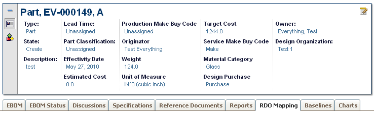
The top panel defines/contains the following areas:
-
Title Form (Shown when the top panel is minimized).
-
Control(s)
-
One control can link to a so called top-panel form.
-
A control can be used to link other pages using a HREF.
-
-
A form contains:
-
Section(s) where each section can have a number of Fields
-
A form can be switched between view and edit mode.
-
-
Tab Menu (name of a menu)
-
Below the top-panel, a tabbed page is shown.
-
1.1. Top-panel usage
To use the top-panel create a command that has the HREF property set to call the action "loadTopPanel" and pass the name your top-panel configuration through the parameter "panel". See example below:
The top panel definition is stored in a directory called "toppanel" among the XML resources (somewhere under /WEB-INF/tvc in your application directory).
If you omit the domain in the resource name, the location of the top panel definition is:
/WEB-INF/tvc/toppanel
If the top panel definition is stored in a domain, for example acme (tvc:toppanel:acme/Panel.xml) then the resource location is:
/WEB-INF/tvc/acme/toppanel
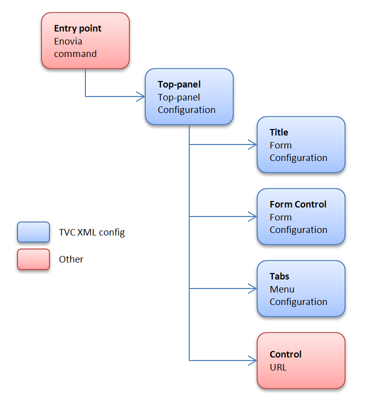
1.2. Top Panel Configuration
You define your top panel in XML. The root element must be <TopPanel>. Below you find child element definitions.
1.2.1. Child elements TopPanel
| Element Name | Description | Example |
|---|---|---|
Controls |
Container element to FormControl and Control |
- |
TabMenu |
Carries the tab menu definition |
<TabMenu>tvc:menu/tabs/TabMenu.xml</TabMenu> |
Title |
Defines the Form to carry the title definition |
<Form>tvc:toppanelform/Title.xml</Form> |
1.2.2. Child elements FormControl
| Element Name | Description | Example |
|---|---|---|
Form |
Defines the Form xml definition |
<Form>tvc:toppanelform/Form.xml</Form> |
Icon |
Points out the icon for the control. Use either |
<Icon>${COMMON_DIR}/images/iconSmallDescription.gif</Icon> |
IconClass |
Defines the CSS class(es) for the font icon for the control. Font awesome is included by default. Use either |
<IconClass>fa fa-tags</IconClass> |
Label |
Carries the tooltip definition for the control |
<Label>View/EditDetails</Label> |
Access |
Defines access rules for the control. |
|
1.2.3. Child elements Control
| Element Name | Description | Example |
|---|---|---|
Height |
Defines a specific height for the control |
<Height>300</Height> |
Href |
Defines a href to display in the control |
<Href>${COMMON_DIR}/emxLifecycle.jsp</Href> |
Icon |
Points out the icon for the control. Use either |
<Icon>${COMMON_DIR}/iconStatus.gif</Icon> |
IconClass |
Defines the CSS class(es) for the font icon for the control. Font awesome is included by default. Use either |
<IconClass>fa fa-tags</IconClass> |
Label |
Carries the tooltip definition for the control |
<Label>Lifecycle</Label> |
Popup |
Defines that the control should open in a popup window. |
<Popup width="800" height="600"/> |
Access |
Defines access rules for the section. |
|
1.3. Top Panel Form Configuration
You define your top panel form in XML. The root element must be <Form>.
Below you find child element definitions.
1.3.1. Child Elements - Form
| Element Name | Description | Example |
|---|---|---|
Section |
Container element for Filed elements. Defines the horizontal field sections in a form |
- |
1.3.2. Child Elements - Section
| Element Name | Description | Example |
|---|---|---|
Field |
Defines a form field |
- |
Separator |
Defines a field that acts as a "separator" in the section. |
<Separator/> |
Access |
Defines access rules for the section. |
|
1.3.3. Child Elements - Field
| Element Name | Description | Example |
|---|---|---|
DataHandler |
Point out a class used to retrieve more complex data from
matrix. The class must implement the interface
|
|
Editable |
Defines if the field should be editable or not |
|
Expression |
Defines an mql expression of the data to retrieve from matrix |
|
FieldCellRenderer |
Used to specify alternative rendering for the field.
The class must implement the interface
|
|
Label |
Defines the field label |
|
RangeHandler |
Defines a range handler class that must implement
|
- |
Settings |
Container element for settings |
- |
Access |
Defines access rules for the section. |
|
AutoCompleteHandler |
An autocomplete handler type:
See Autocomplete chapter for more details. |
|
AutoCompleteSettings |
Settings for autocomplete. Should it be case sensitive, what types to choose from, limits, which dataset to use and other. The settings varies for each kind of autocomplete handler. See Autocomplete chapter for more details. |
|
1.3.4. Child Elements – Settings
| Element Name | Description | Example |
|---|---|---|
Columns |
Used with InputType textarea to define columns |
|
InputType |
Specifies the type of input |
|
InputWidth |
Defines the width of the input |
|
Required |
Defines if an editable field should be required or not |
|
Rows |
Used with InputType textarea to define rows |
|
Setting |
Define custom settings |
|
SortRangeValues |
Defines if to sort range values |
|
SearchConfig |
Connect a search to a field |
|
RegisteredSuite |
Defines the registered suite. This can be used for localization of labels, where the value of the key is stored in a particular suite string resource file. |
|
Separator |
Only valid on a field in a Top panel title. Defines text to be put at the right hand side of a field, used for separating multiple fields. If you specify an empty Separator element then one space will be used. Values starting and ending with a single quote or double quote will be un-quoted, in order to be able to specify space characters. |
|
MaxLength |
Specifies the max length of an editable input field. |
|
MaxRows |
Specifies the max nr of rows to display of the text. |
|
ValueIfEmpty |
Specifies the value to be used if the actual value is an empty string. By default, the " " replacement is used. |
|
BadChars |
Specifies characters that are treated as "bad" and if the value contains any such character, the user will not be able to modify the value. |
|
ValidationJavaScript |
Can be used to declare custom validation JavaScript code that is inserted on the page that displays this form. |
|
LinkedWith |
Can be used if other fields are updated in the background. On a Refresh these fields will be updated as well. Format: COLUMN:FIELD Separate multiple fields using a comma. |
|
UseTransactionOnEdit |
Can be used to get an update-transaction surrounding the modification of the field. Default is FALSE. |
|
1.3.5. Auto Completion
The fields can take advantage of auto-completion. If you have a field that applies to "type" and is editable, the way to configure such field to take advantage of auto complete is slightly different. See example below:
<Field>
    <Label>Type:</Label>
    <Expression><![CDATA[$<type>]]></Expression>
    <Editable />
    <AutoCompleteHandler>type</AutoCompleteHandler>
    <AutoCompleteSettings>{
        'handler' : {
            'rootTypes' : ['type_HardwarePart', 'type_SoftwarePart']
        }
    }</AutoCompleteSettings>
</Field>
E.g. you use the setting "Type" to specify the "root" type for the object.
If you want to enable auto completion for users, then you can enable that through the following configuration:
<Field>
    <Label>Owner:</Label>
    <Editable />
    <Expression><![CDATA[$<owner>]]></Expression>
    <DataHandler>com.technia.tvc.core.gui.toppanel.form.builtin.UserNameHandler</DataHandler>
    <AutoCompleteHandler>user</AutoCompletHandler>
</Field>
Auto Complete Settings
Settings are configured in JSON format in the AutoCompleteSettings element.
Example setting limit to 50, case sensitive, disable localization and only matching values starting with the searched value:
<AutoCompleteSettings>{
    'handler' : {
        'limit' : 50,
        'caseSensitive' : false,
        'localize' : false,
        'contains' : false
    }
}</AutoCompleteSettings>
See the Autocomplete chapter for more details.
1.3.6. Access Control
Both on control, section level as well as per field level, one can restrict access to the control/section/field.
The access restriction can be defined based upon following:
-
Role Assignment
-
Group Assignment
-
Person (A named user)
-
Access Mask (Access mask for the current object)
-
Access Program (A JPO that evaluates the access rights)
The example below illustrates how you can construct the access restriction:
<Field> <!-- Or Section -->
    <Access>
        <Role>role_FirstRole</Role>
        <Role>role_SecondRole</Role>
        <Group>group_SomeGroup</Group>
        <Mask>modify,checkout</Mask>
    </Access>
</Field>
Or use an access program:
<Field> <!-- Or Section -->
    <Access>
        <Program name="MyJPO" method="checkAccess"/>
    </Access>
</Field>
1.3.7. Built-in datahandlers
RelatedObjectHandler
This datahandler can be used for modifying related objects, e.g connecting and disconnecting them.
<Field>
    <Label>Design Organization:</Label>
    <Editable />
    <DataHandler>com.technia.tvc.core.gui.toppanel.form.builtin.RelatedObjectHandler</DataHandler>
    <AutoCompleteHandler>organization</AutoCompleteHandler>
    <Settings>
        <Setting name="Relationship">relationship_DesignResponsibility</Setting>
        <Setting name="Direction">to</Setting>
        <Setting name="Display Property">name</Setting>
        <Setting name="OpenInPopup">true</Setting>
    </Settings>
</Field>| Setting | Description | Example |
|---|---|---|
Relationship |
The symbolic name of the relationship to use. |
relationship_DesignResponsibility |
Direction |
The direction of the connection |
|
Display Property |
What to select and display from the connected object(s) |
Name |
OpenInPopup |
Optional parameter to determine the link target. True (default) means that the related object is opened in a new popup window. False means that the link opens in the same parent window. |
|
UserNameHandler
This datahandler is used for handling user names. Auto-completion can be configured as well.
<Field>
    <Label>Owner:</Label>
    <Editable />
    <Expression><![CDATA[$<owner>]]></Expression>
    <DataHandler>com.technia.tvc.core.gui.toppanel.form.builtin.UserNameHandler</DataHandler>
    <AutoCompleteHandler>user</AutoCompleteHandler>
</Field>
Examples
1.3.8. Top-panel configuration example
<TopPanel>
    <Title>
        <Form>tvc:toppanelform/Title.xml</Form>
    </Title>
    <Controls>
        <FormControl>
            <Label>View/Edit Details</Label>
            <Icon>${COMMON_DIR}/images/iconSmallDescription.gif</Icon>
            <Form>tvc:toppanelform/Form.xml</Form>
        </FormControl>
        <Control>
            <Label>Lifecycle</Label>
            <Icon>${COMMON_DIR}/images/iconStatus.gif</Icon>
            <Href>${COMMON_DIR}/emxLifecycle.jsp</Href>
        </Control>
    </Controls>
    <TabMenu>tvc:menu/tabs/TabMenu.xml</TabMenu>
</TopPanel>
1.3.9. Top-panel title form configuration example
<Form>
    <Section>
        <Field>
            <Expression><![CDATA[$<type>]]></Expression>
        </Field>
        <Field>
            <Expression><![CDATA[$<attribute[attribute_Title]>]]></Expression>
            <Settings>
                <Separator>: </Separator>
            </Settings>
        </Field>
    </Section>
</Form>
1.3.10. Top-panel form configuration example
<Form>
    <Section>
        <Field>
            <Label>Style #:</Label>
            <Expression><![CDATA[$<attribute[attribute_StyleNumber].value>
            ]]></Expression>
            <Editable />
            <Settings>
                <InputType>textbox</InputType>
                <InputWidth>120</InputWidth>
                <Required>true</Required>
            </Settings>
        </Field>
        <Field>
            <Label>Selected Sizes:</Label>
            <Expression>dummy</Expression>
            <RegisteredSuite>ApparelAccelerator</RegisteredSuite>
            <DataHandler>com.technia.acme.SelectedSizesDataHandler</DataHandler>
        </Field>
        <Field>
            <Label></Label>
            <RegisteredSuite>ApparelAccelerator</RegisteredSuite>
        </Field>
        <Field>
            <Label>Comments:</Label>
            <Expression><![CDATA[$<attribute[attribute_Comment]>]]></Expression>
            <Editable />
            <Settings>
                <InputType>textarea</InputType>
                <Columns>25</Columns>
                <Rows>2</Rows>
                <Setting name="Text Length">200</Setting>
            </Settings>
        </Field>
    </Section>
    <Section>
        <Field>
            <Label>Marketing Name:</Label>
            <Expression><![CDATA[$<attribute[attribute_MarketingName].value>]]></Expression>
            <Editable />
            <Settings>
                <InputType>textbox</InputType>
                <InputWidth>120</InputWidth>
                <Required>true</Required>
            </Settings>
        </Field>
    </Section>
    <Section>
        <Field>
            <Label>Season:</Label>
            <Expression><![CDATA[$<to[relationship_ProductMeasurement].from.revision>]]></Expression>
            <Settings>
                <InputType>textbox</InputType>
                <InputWidth>120</InputWidth>
                <Required>true</Required>
            </Settings>
        </Field>
        <Field>
            <Label>M-Chart Revision:</Label>
            <Expression><![CDATA[$<revision>]]></Expression>
            <Settings>
                <InputType>textbox</InputType>
                <InputWidth>120</InputWidth>
                <Required>true</Required>
            </Settings>
        </Field>
    </Section>
    <Section>
        <Field>
            <Label>Supplier:</Label>
            <Expression><![CDATA[$<to[relationship_ProductMeasurement].from.to[relationship_ManufacturingResponsibility].from.name>]]></Expression>
            <Settings>
                <InputType>textbox</InputType>
                <InputWidth>120</InputWidth>
                <Required>true</Required>
            </Settings>
        </Field>
        <Field>
            <Label>Copied From:</Label>
            <Expression>dummy</Expression>
            <DataHandler>com.technia.acme.datahandler.CopiedFromDataHandler</DataHandler>
            <FieldCellRenderer>com.technia.acme.render.toppanel.CopiedFromRenderer</FieldCellRenderer>
            <Settings>
                <InputType>textbox</InputType>
                <InputWidth>120</InputWidth>
                <Required>true</Required>
            </Settings>
        </Field>
    </Section>
    <Section>
        <Field>
            <Label>State:</Label>
            <Expression><![CDATA[$<current>]]></Expression>
            <Settings>
                <InputType>textbox</InputType>
                <InputWidth>120</InputWidth>
                <Required>true</Required>
            </Settings>
        </Field>
        <Field>
            <Label>Template Revision:</Label>
            <Expression><![CDATA[$<from.revision>]]></Expression>
            <Settings>
                <InputType>textbox</InputType>
                <InputWidth>120</InputWidth>
                <Required>true</Required>
            </Settings>
        </Field>
    </Section>
</Form>