 TVC Helium 2026.1.0
<Title>{helium.widget.title} - ${TYPE}:${NAME}</Title>TVC Helium 2026.1.0 Release Information
23 January 2026
Table of Contents
2. Form
2.1. Translation in form title
There may be scenarios where form titles must vary based on the user’s language without requiring duplicated configurations. Helium now supports defining form titles using localization macros ({…}), which are resolved at runtime according to the user’s locale. The corresponding translation keys are maintained in language-specific resource files.
Example:
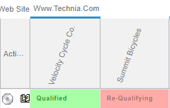
If the translation key helium.widget.title is defined as “Title” in English (en.json) and “Titel” in German (de.json) , the rendered result will be:
English: Title - Part:Cycle
German: Titel - Teil:Cycle
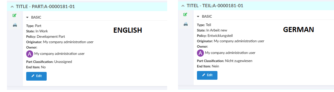
Figure 1. Form Title
This approach enables consistent, locale-aware titles while preserving dynamic business data in a single configuration.
Read the Form Config for more details.
2.2. Conditional recommended validation
In certain scenarios, a field should render as recommended only when specific business conditions are satisfied, rather than being recommended by default. This requirement is addressed by allowing the recommended state of a field to be evaluated dynamically at runtime based on another field’s value.
A field should render as recommended only when the configured dependsOn expression matches the specified dependsOnValue. For example, the Unit of Measure field should render as recommended when the Material Category is set to Metal. If the value changes to any other category, the field no longer renders as recommended.
This behavior is supported within the same form section as well as across sections, ensuring consistent rendering and reliable form updates.
<Field>
    ...
    <Validation>
        <Recommended dependsOn="${attribute[attribute_MaterialCategory].value}" dependsOnValue="Metal">true</Recommended>
    </Validation>
    ...
</Field>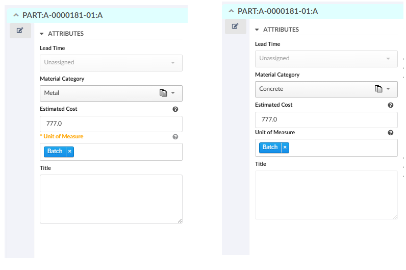
Figure 2. Conditional recommended validation
Read the Form Field for more details.
3. Table
3.1. Table export performance improvements
Helium provides robust table export capabilities that allow data to be exported in supported formats.
This release introduces significant performance enhancements to the table export functionality helium. These improvements focus on optimizing database operations and reducing unnecessary evaluations during the export process.
A major optimization has been implemented through the ExcludeFromReport setting for columns. ExcludeFromReport setting is used to exclude the columns in export.
Columns marked with this setting will be automatically excluded from evaluation during export operations, resulting in reduced number of statements executed with faster export processing time.
To address this, column-level setting can be configured as below:
<Column>
    ...
    <ExcludeFromReport>true</ExcludeFromReport>
</Column>
Please refer TVC release guide for more details.
4. Search
4.1. Value-based static search criteria
In typical scenarios, a search is performed by matching user input directly against a field’s value. However, there are cases where the user’s input should not be used as a literal search criterion, but instead determines a predefined (static) where condition that controls how the search is executed.
This behavior can be configured using staticWhereField setting, which allows defining value-specific where-conditions at the field level. When a value is selected, its corresponding condition is applied to refine search results.
To enable the feature, set staticWhereField to yes and define conditions using staticWhereField:<value>.
Example:
<Field id="state" sectionId="basic">
<Label>Maturity State</Label>
<DataField>dummy</DataField>
<Values>
	<Value value="Complete">Complete</Value>
	<Value value="FROZEN">Frozen</Value>
	<Value value="IN_WORK">In Work</Value>
	<Value value="Obsolete">Obsolete</Value>
</Values>
<Settings>
	<Setting name="staticWhereField" value="yes"/>
	<Setting name="staticWhereField:IN_WORK" value="(current == 'Create' AND owner == 'Corporate')"/>
</Settings>
</Field>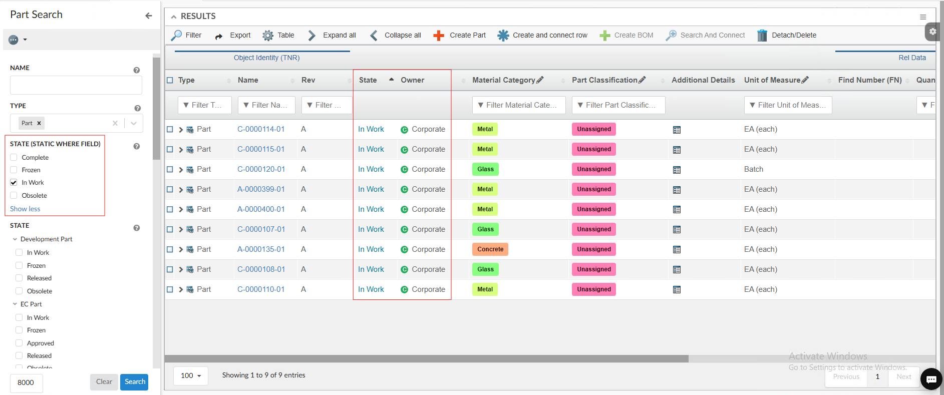
Figure 3. Value-Based Search
Please refer Dynamic, Value-Based Search Criteria for more details.
4.2. Close sidepanel on search
Helium provides a smoother experience when loading and interacting with search results in the table view. If a side panel is open for content
preview, it will automatically close whenever a new search is triggered. This behavior can be controlled using the global configuration
setting tvc.helium.paginated.search.closeSidePanelOnPageSearch. which can be configured in the tvc.properties file. The default value is true.
Read more about paginated search for more details.
5. In-App Designer
In-App Designer is a concept that brings the idea of creating configurations using the built-in admin user interface. These configurations can be used to define Helium dashboards, widgets, tables, charts, etc. Built-in Admin UI is provided to create, modify and share these configurations. For detailed information, please refer In-App Designer.
5.1. Preview revised draft child configs
Config-admin can now preview revised draft child configs using an Active dashboard by using the Load as Draft-Dashboard command.
5.1.1. Use case
In scenarios where a child configuration (for example, a column or dataset) is revised,the
dashboard normally also needs to be revised to preview those changes.However, by using
Load as Draft-Dashboard, the revised draft child configurations can be previewed within
the Active dashboard itself
This allows config-admin to:
-
Validate draft-level changes without revising the dashboard
-
Preview child configuration updates in the context of the Active dashboard
-
Reduce unnecessary dashboard revisions during configuration testing
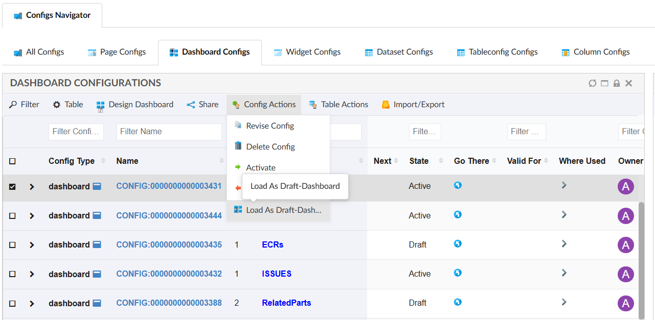
Figure 4. Load as Draft-Dashboard
5.2. Disable tabs in config admin UI
When using the In-App feature in TVC Classic, certain tabs on the Configuration Admin page
may not be required. To reduce UI clutter and avoid user confusion, these tabs can be disabled
by setting the corresponding properties to false in the tvc.properties file.
| Tab Name | Property | Default Value |
|---|---|---|
Technia Store |
tvc.core.inappdesigner.techniastore.enabled |
true |
Teams |
tvc.core.inappdesigner.teams.enabled |
true |
Configuration Request |
tvc.core.inappdesigner.configrequest.enabled |
true |
6. Grid Browser
Grid Browser can be used for viewing and/or working with the intersections/connections between objects in a grid/matrix view. Two different sets of objects are loaded and they are displayed on the Y- and X- axis (also referred to as row- and column- axis). The intersection between an object on the X axis and an object on the Y axis represents a connection between these (either directly connected, or indirectly via some intermediate object).
In Helium, the Grid Browser can be configured in widget using the in-built XML tag <GridBrowserWidget>.
6.2. Column template
Templates are now supported for columns in Grid Browser.
<Cols>
	...
    <Col>
        <Header>State</Header>
        <Expression>current</Expression>
        <Setting name="template" value="helium/templates/table/autocolorable"/>
    </Col>
	...
</Cols>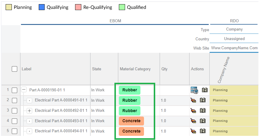
Figure 6. Column Template
6.3. Row actions
Now custom actions can be configured on the row objects. For more details refer Actions
<Rows>
	<Actions>
	    <Action>
	        <IconType>smallicon</IconType>
	        <Link>
	            <Href>../tvc/core/tvcDebugRequest.jsp</Href>
	            <TargetLocation>popup</TargetLocation>
	            <Modal>true</Modal>
	            <RegisteredSuite>EngineeringCentral</RegisteredSuite>
	            <WindowSize>800x600</WindowSize>
	        </Link>
	        <Label>Example</Label>
	    </Action>
	    <Action>
	        <IconSrc>/tvc/structurebrowser/images/history.gif</IconSrc>
	        <Link>
	            <Href>${ROOT_DIR}/tvc-action/showHistory</Href>
	            <TargetLocation>popup</TargetLocation>
	            <Modal>false</Modal>
	            <RegisteredSuite>EngineeringCentral</RegisteredSuite>
	            <WindowSize>600x500</WindowSize>
	        </Link>
	        <Label>History</Label>
	    </Action>
	</Actions>
</Rows>
Figure 7. Row Actions
6.4. ValidFor
ValidFor is supported for toolbar commands in grid browser, it can be used to define a command which check if it is valid for rows in the GridBrowser table.
| Name | Description | Example | ||
|---|---|---|---|---|
ValidFor |
Defines the command is valid for which rows in datatable.
|
|
6.5. Edit form fields
6.5.1. Validation support for fields
Client side validation rules are applied to the field. Below are the supported child elements:
<Required>-
if the field is required or not. Valid values:
trueorfalse <Recommended>-
if the field is recommended or not. Valid values:
trueorfalse <MinLength>-
the minimum length of the field. Valid value: Positive integer
<MaxLength>-
the maximum length of the field. Valid value: Positive integer
<Pattern>-
a regexp that the value must match. Valid value: Valid RegExp. Note: All characters within the <Pattern> tag will be included in the pattern, including initial or trailing spaces or newline characters.
<Validation>
    <Required>true</Required>
    <MinLength>3</MinLength>
    <MaxLength>30</MaxLength>
    <Pattern>^(Hello\|Goodbye)\sWorld$</Pattern>
</Validation>
<Validation>
...
<Recommended>true</Recommended>
...
</Validation>6.5.2. Defaults
Default values can be added to a field.
| Name | Description | Example | ||||||
|---|---|---|---|---|---|---|---|---|
Defaults |
What default values should the field contain. The element supports the following attributes:
If none of the attributes are present the default values should be given as a list of
|
|