 TVC Helium 2025.4.0
<ServiceParams>{
	"url":"App.hex.fetchExternalUsers",
	...
	...
	}
</ServiceParams>TVC Helium 2025.4.0 Release Information
17 October 2025
1. Table
1.1. Multi-services chaining
Helium supports loading data from rest services by configuring <InvokeService>true</InvokeService> with required Service Params .
In some cases, more than one services may need to be called before initializing the table with data. This can be achieved using a callback function. With this update, Helium now supports callback function as URL, offering greater flexibility. One can use either the URL of the single service call or a callback javascript function to call chained external/rest services, which can return data as an object. The example below illustrates how to use callback function as URL.
Read more about Service Params for more details.
1.2. Column
Earlier, Helium datatables always aligned numeric column values to the right by default.
Now, alignment can be configured using the custom CSS property --table-cell-numeric-align. Set this variable to left or right
to control text alignment for numeric cells. The default remains right. You can define this property in your custom theme.css
under the :root selector, as shown below:
:root {
    --table-cell-numeric-align: left;
}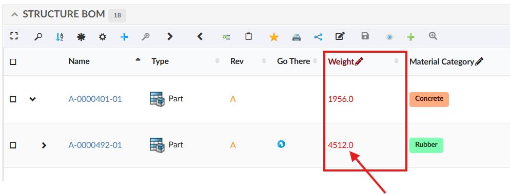
Figure 1. Numeric Column Alignment
Read the Datatable Numeric Column CSS Alignment for more details.
1.3. Data grouping
Helium now offers enhanced control over column visibility within the data grouping feature.
Previously, all columns were included by default when grouping data both in the data group definition form and in the grouped data table. However, in many cases, certain columns are not relevant for grouping or display purposes.
To address this, Helium introduces a new column-level setting:
<Column>
	...
	<Setting name="excludeFromDataGroup" value="true" />
	...
</Column>
This setting determines whether a column should be included in the data group form, the grouped data table, or both.
| Value | Description |
|---|---|
|
Excludes the column from both the data group form and the grouped data table. |
|
(default) – Includes the column in both places. |
|
Exclude only from the data group form. |
|
Exclude only from the grouped data table. |
With this setting, you can fine-tune which columns appear during data grouping setup and which are displayed in the grouped output, providing a cleaner and more relevant user experience. Read more about Data Grouping Command and Exclude column in data grouping for more details.
2. Form
2.1. Layout configuration
Helium allows configurable view in forms using <Layout> configuration.
When a <Layout> is present, the form title is not displayed by default. To render the title in the form UI alongside the layout, the <showTitleInline> setting
must be enabled.
Default value is false
<showTitleInline>true</showTitleInline>Read the Form Layout for more details.
3. Dashboard
3.1. Widget Gallery
The Widget Gallery provides users with an intuitive way to explore and add additional widgets to their dashboards.
When a dashboard includes a Widget Gallery reference, users can open the Widget Gallery panel to browse available
widgets and add them to their dashboard with minimal effort. Once added, these widgets behave like any other dashboard component and persist across page refreshes.
Widgets within the Widget Gallery can be organized into groups and displayed with custom images using the WidgetGalleryGroup definition in the widget configuration.
Read more about Widget Gallery
4. Search
4.1. Improved paginated search result
Helium already supports paginated search, allowing users to view and interact with search results efficiently within the structure view. In this release, we’ve further enhanced this functionality by improving performance, usability, and overall responsiveness. These updates make the paginated search smoother, more intuitive, and provide a better overall experience for users.
Read the Search In Page chapter for more details.
4.2. Preload support for autocomplete field
Autocomplete handlers in Search Forms now support preload functionality, which was previously available only in Helium Forms. With this enhancement, options can be displayed in the autocomplete field even before the user starts typing, improving usability and making it easier for users to select from commonly used or recommended values. This feature streamlines the search experience and helps users find relevant options more quickly.