 TVC Helium 2025.2.0
<TableConfig>
        ...
        <EntryProcessor>com.technia.helium.table.entryProcessor.SampleEntryProcessor</EntryProcessor>
        ...
</TableConfig>TVC Helium 2025.2.0 Release Information
16 May 2025
1. DataTable
1.1. Entry processor
In data-rich business applications, tables often display hundreds of rows, each representing a record, object, or transaction. But not all rows should behave the same—some might be actionable, others read-only; some might require attention, others should be hidden. The entry processor enables smart, context-aware row behaviors that enhance user efficiency and experience.
From this release, we have introduced a Java-based entry processor to define the behavior of rows within the table. The <EntryProcessor> element provides a mechanism to manage row behavior effectively. To utilize the entry processor, specify a Java class that implements com.technia.tvc.core.db.table.evaluator.EntryProcessor. This class is responsible for handling the row behavior in the data table.
The <EntryProcessor> configuration must be defined within the <TableConfig> element. Refer to the example below.

Figure 1. Entry Processor
Read more about Entry Processor for more details.
2. Form
2.1. Recommended or highlighted field
It might be case, some fields good to be filled but not required before form submission. Helium now supports indicating if the field is recommended to be filled. This can be defined in the validation using the <Recommended> tag. By default, the property is set to false. If a field’s recommended validation is set to true, the field will display in orange with an asterisk indicating that it is recommended to be filled before submitting the form.
The recommended field label will also appear in orange along with an asterisk on the create/view/edit forms and can be modified using a property. By default, this property is true
tvc.helium.form.recommendedFieldLabel.color = true
By default, the color of the recommended label is orange, there is also a possibility to add a custom color to the recommended field label. --form-recommended-field-label-color can be added in custom theme.css under :root as shown below.
:root {
   ...
   --form-recommended-field-label-color: #FFA500;
}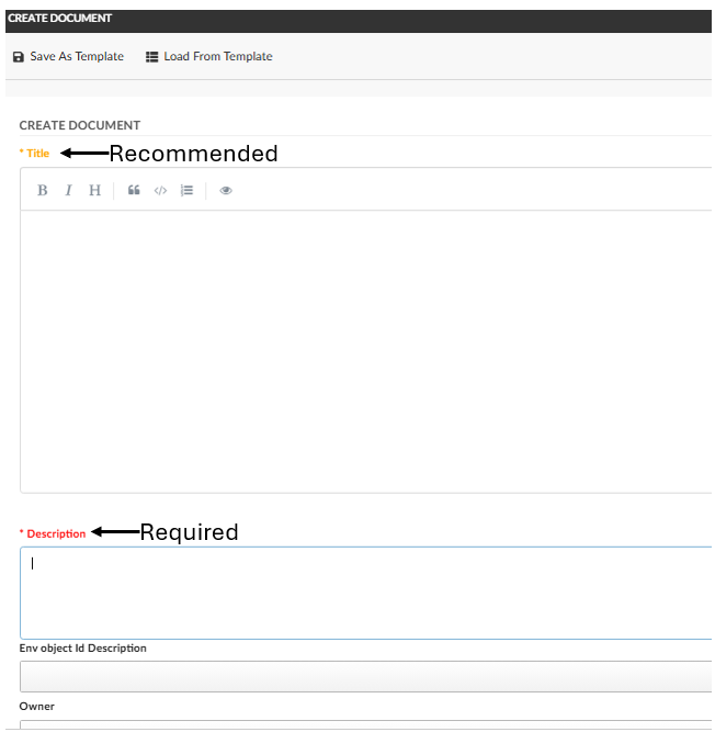
Figure 2. Recommended Field
Read more about Recommended Field for more details.
3. 3DDashboard support
3.1. Copy object link
The Helium True Widget provides built-in "copy link" command, facilitating direct sharing of business object URLs. This business object URL can be used to open object in relevant widget.
This functionality allows for the distribution of specific object links to a broad audience, ensuring precise referencing during discussions. Consequently, senders can accurately pinpoint relevant business objects, while receivers can swiftly access the intended information, streamlining team collaboration and communication.
To enable the "Copy Link" command, add the following XML snippet to the toolbar configuration
<Command>
        <Label>Copy Link</Label>
        <Id>copyLink</Id>
        <Alt>Copy direct link to object on clipboard</Alt>
        <FontIcon>ti-c ti-link-c</FontIcon>
        <OnClick>App.openWith.createCopyLink</OnClick>
        <OnClickParams>{
                "selectionCriteria": "single",
                "openObject":true,
                <!-- "appId":"MAP-BSLLKJUUA" -->
                }
        </OnClickParams>
</Command>
Users can pass openObject as true if want to open the object in default page configuration for that type.
For opening the link in a designated 3DDashboard widget, specify the appId within the OnClickParams. Upon configuration, the generated link will directly open the object in the defined widget. If appId is omitted, the link will default to opening the object in the current application.
3.2. Enhanced advanced filters
The Advanced Filter functionality in True Widget has been refined for an improved user experience. In this release, applied filters are now clearly reflected in the widget title, allowing users to quickly identify the active filter context. This enhancement reinforces the widget’s capability to support powerful functionality of filtering.
Read more about Advance Filters for more details.
4. DataTable
4.1. Multi-Value column filter
Helium now supports multi-value selection from dropdown for filtering column data in DataTables. Previously, filtering was limited to single-value text input. With this enhancement, users can filter column data by selecting multiple values from a dropdown, populated with attribute values.
This functionality is available for columns configured with the input types: radiobutton, combobox, and checkbox.
A Setting can be configured at column as follows:
<Setting name="options">{
	"filter": {
		...
		"useMultiValueFilter": true
	}
}</Setting>
Additionally, multi-value selection for filtering column data can be enabled with
tvc.helium.datatable.column.useMultiValueFilter global level setting, the default value is false;
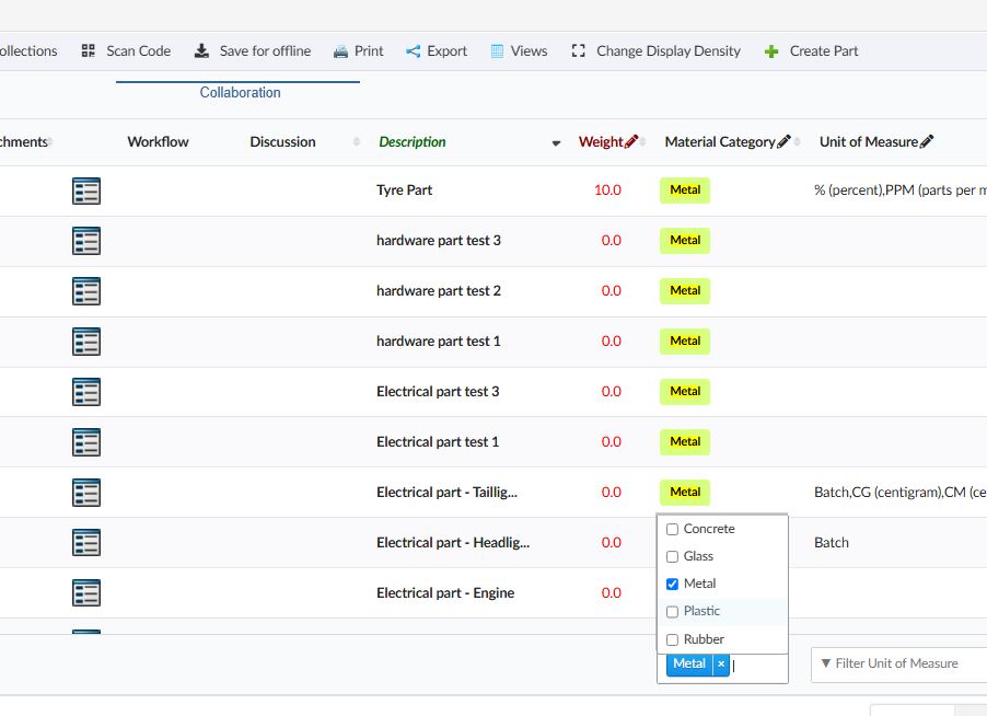
Figure 3. Multi-Value column filter
Read more about Datatable-ColumnFilter for more details.
5. Search
5.1. Internationalization support
5.1.1. Placeholders for Searchform
Depending on the type of field, placeholders can be defined in translation files, if entries are not defined, then translations available in default.json will be picked up. Entries are to be defined as follows:
"searchv2": {
	...
	"form": {
		"autocompleteField": {
			"placeholder": "Select..."
		},
		"numericField": {
			"minPlaceholder": "Min",
			"maxPlaceholder": "Max"
		},
		"rangeField": {
			"filterPlaceholder": "Filter..."
		},
		"dateField": {
			"minPlaceholder": "Start Date",
			"maxPlaceholder": "End Date"
		},
		"textField": {
			"placeholder": "Enter text"
		},
		"searchbutton": "Search",
		"clearbutton": "Clear"
	},
	...
}
5.1.2. Revision Field
For revision field, internationalisation can be done with the help of below properties in their respective files:
com.technia.tvc.search.form.revision.any = Any
com.technia.tvc.search.form.revision.first = First
com.technia.tvc.search.form.revision.last = Last
com.technia.tvc.search.form.revision.latest = Latest
com.technia.tvc.search.form.revision.latestInState = Latest '{0}'
com.technia.tvc.search.form.revision.lastAndLatestInState = Last and Latest '{0}'
com.technia.tvc.search.form.revision.lastAndLatestInRelease = Last and Latest in Release
5.1.3. Search Result Table
For search result table, column headers can be internationalised by defining their labels in respective string resource property files.
<UI id="id3">
        <Type>table</Type>
        <ResultTemplate>helium/custom/hex/templates/common/search/table-result</ResultTemplate>
        <Table>
                <Column>
                        <DataField>attribute_MaterialCategory</DataField>
                        <Label>helium.search.ui.table.attribute.MaterialCategory</Label>
                </Column>
                <Column>
                        <DataField>attribute[Unit of Measure]</DataField>
                        <Label>helium.search.ui.table.attribute.UnitOfMeasure </Label>
                </Column>
        </Table>
</UI>
helium.search.ui.table.attribute.UnitOfMeasure = UOM
helium.search.ui.table.attribute.MaterialCategory=Material