 TVC Helium 2025.1.0
TVC Helium 2019.3.0 Release Information
05 July 2019
1. Core
1.1. Scan QR, EAN (Barcode) and DataMatrix codes
New functionality is added that allows you to launch your device’s camera, to perform scanning of QR, EAN and DataMatrix codes. A command can be configured to initiate the scan and (optionally) get control once the camera detects a code.
The default behaviour, should you not configure your own callback, is to open the object page if an objectId is detected, and otherwise launching a search for the scanned string.
For more information, see Scan QR/ EAN/ DataMatrix Codes section.
1.2. Embedding/Routing to a specific Widget
It is now possible to launch a specific Helium widget "standalone" in any browser window, (i)frame or container, by using its routable URL. Routing to widgets is typically used when embedding a single Helium widget in another application, e.g. 3DExperience/3DDashboard, or when combining with TVC Classic. Read the embedding chapter for more details.
Example showing a specification widget with a context:
http://server:port/app/goto/w/Specifications?objectId=1.2.3.4
When routing to a widget the Helium page is rendered without
the topbar menu and the widget rendered as headerless.
2. Forms
2.1. Rich Text Editor support
Especially multi line attributes that otherwise render as textareas, can sometimes benefit from allowing Rich Text (layouted text/HTML) input as well.
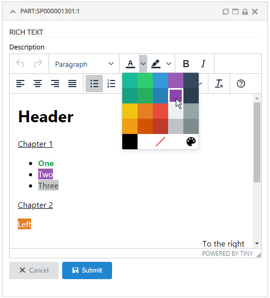
This can be easily configured by setting the <FieldType>richtext</FieldType> tag. Example:
<Field>
    <Label>Description</Label>
    <Expression>description</Expression>
    <Editable>true</Editable>
    <FieldType>richtext</FieldType>
</Field>
Hint: you may want to disable Table In-Cell-Editing for attributes containing HTML, and instead launch a Form, as showcased in the video above.
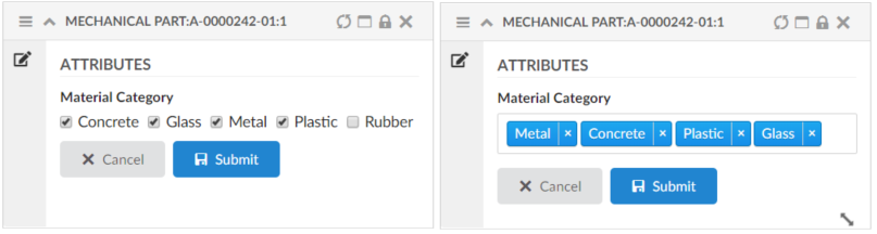
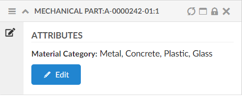
2.2. Multi Value Attribute Support
Helium now supports multi value attributes for FieldTypes select and checkbox, when the attribute is defined as multivalue at schema level in Enovia/3DEXPERIENCE.
- NOTE
-
This feature only works for an attribute having a Range defined on Schema level or configured options in XML.
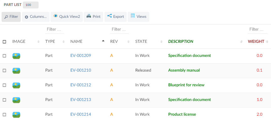
3. Table
3.1. Fully expand a structure table
There is now a command <ExpandAll /> to fully expand all nodes in a structure table. The command can be added to the table widgets' toolbar.
3.2. Configurable column CSS
It is possible to add configurable CSS classes to columns in the column XML, use <Setting> with class as the name and the custom class names as value, separated by spaces.
These settings are described here
<Setting name="class" value="col-weight col-bold col-red col-small" />Then in your custom css, you can target column level styling, e.g.
Some selectors require higher specificity or the use of !important rule.
|
.col-bold {
    font-weight: bold !important;
}

.col-red {
    color: red;
}

.col-small {
    width: 50px;
}
You can also specifically target a column’s header or body with th/td, e.g.
th.col-weight {
    font-weight: bold !important;
    color: darkred !important;
}

th.col-description {
    font-style: italic;
    color: darkgreen !important;
}

td.col-revision {
    color: darkorange;
}
Result:
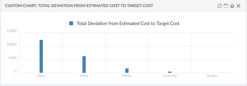
5. Chart
5.1. Serie
Now Serie supports Expressions which support multiple Expression elements to select the data. This data can be used to provide custom data to the chart.
<Expressions>
	<Expression><![CDATA[$<attribute[attribute_MaterialCategory]>]]></Expression>
	<Expression><![CDATA[$<attribute[attribute_TargetCost]>]]></Expression>
	<Expression><![CDATA[$<attribute[attribute_EstimatedCost]>]]></Expression>
</Expressions>
Below example shows how you can compare two series that were both selected via Expression elements.